Rate-Distortion Theory for Clustering in the Perceptual Space


Graphics and Imaging Laboratory, University of Girona, 17003 Girona, Spain
*
Author to whom correspondence should be addressed.
Entropy 2017, 19(9), 438; https://doi.org/10.3390/e19090438
Submission received: 7 July 2017
/
Revised: 28 July 2017
/
Accepted: 16 August 2017
/
Published: 23 August 2017
(This article belongs to the Special Issue Information Theory Application in Visualization)
Abstract
:How to extract relevant information from large data sets has become a main challenge in data visualization. Clustering techniques that classify data into groups according to similarity metrics are a suitable strategy to tackle this problem. Generally, these techniques are applied in the data space as an independent step previous to visualization. In this paper, we propose clustering on the perceptual space by maximizing the mutual information between the original data and the final visualization. With this purpose, we present a new information-theoretic framework based on the rate-distortion theory that allows us to achieve a maximally compressed data with a minimal signal distortion. Using this framework, we propose a methodology to design a visualization process that minimizes the information loss during the clustering process. Three application examples of the proposed methodology in different visualization techniques such as scatterplot, parallel coordinates, and summary trees are presented.
1. Introduction
Technology advances allow for obtaining large amounts of data related to any process in any application field. Examples include visual analysis of business data [1], scientific data [2], and images and videos [3], amongst others. Information visualization techniques have become a powerful tool to extract the valuable and useful information hidden in the data. The human ability to detect patterns and trends from data visualizations has led visualization techniques to be suitable strategies to provide qualitative overviews of large data sets or to summarize data sets, amongst others [4]. Although a great variety of visualization techniques has been proposed [5], most of them lose their effectiveness when dealing with large data sets. Screen space limitations transform visualizations into cluttered images that are incomprehensible. Moreover, visual exploration becomes more difficult. To overcome these limitations data, clustering techniques can be applied.
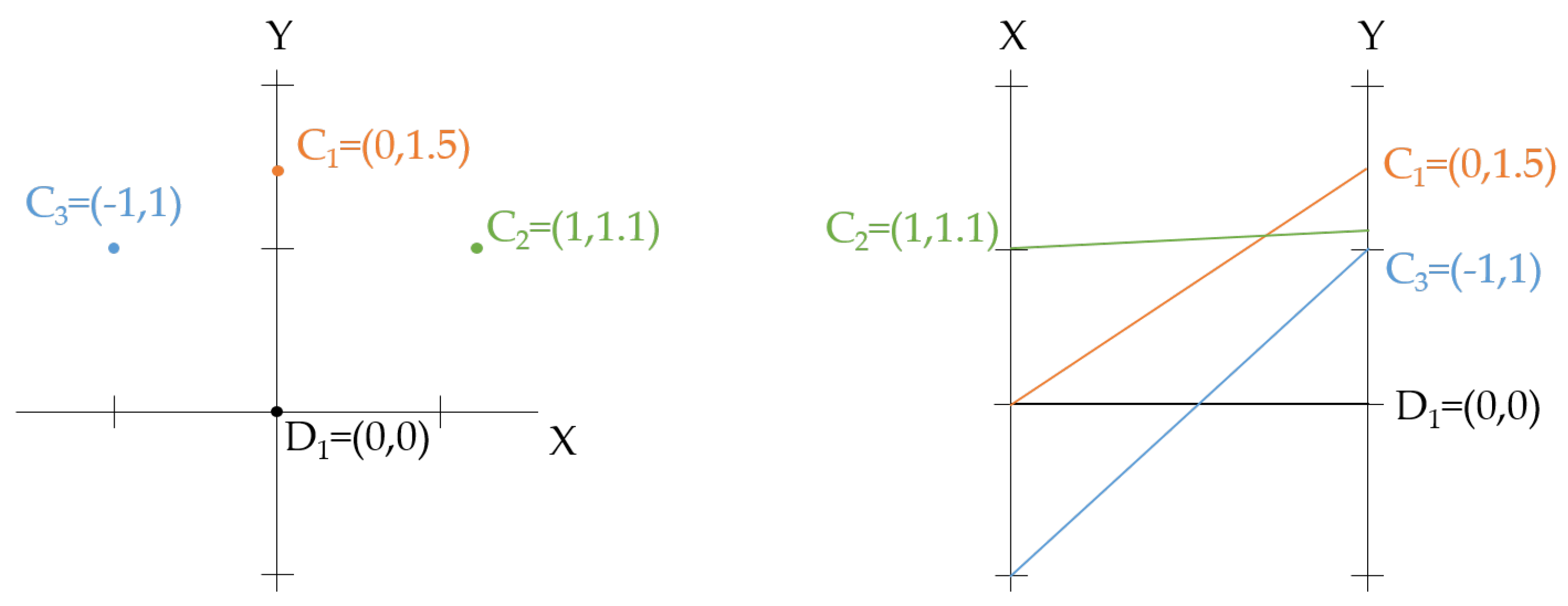
Clustering is used in many different fields such as engineering, computer sciences, life and medical sciences, earth sciences, and social sciences [6,7]. Clustering classifies data into groups (or clusters) such that data is similar within a cluster and dissimilar to data belonging to other clusters. The core issue in clustering is similarity estimation; once a similarity measure is chosen, clustering is formulated as an optimization problem [8]. Taking into account the three spaces of the visualization process [9] (the data space, the visual space, and the perception space), most clustering methods define the similarity measure in the data space. In this space, the different forms of data can be distinguished at an abstract level by the mathematical types of the individual data points, their organization, and their operational context. However, the abstract nature of the data makes the definition of the similarity measure and the interpretation of measure features more difficult. To tackle this problem, we could consider the other two spaces involved in the visualization process. The visual space provides a concrete representation of data in a computer, and the perceptual space aims to model how the user, who is the final receiver of the visual message, perceives the visual space. Therefore, we propose considering the perceptual space since it is user-centered. In addition, the non abstract nature of this space makes the interpretation of the similarity measure easier than in the data space. Moreover, there is a coherency between the measure used in the clustering process and the visualization since both are represented in the same space. On the contrary, when the similarity measure is defined in the data space, this coherency cannot be ensured. For instance, it would be possible to assign a data point to a cluster whose centroid was farther from the data point than another one from the perceptual point of view. This fact can be observed in the example of Figure 1. In this case, a data sample has to be assigned to one of the three centroids , , and . In the left plot, intuition indicates that it should be assigned to since it has minimum Euclidean distance, while, in the right plot, intuition indicates that it should be assigned to , since, although in the variable Y the distance is slightly greater than to the other clusters, in the X variable, it comes to zero. This intuitive measure is formally defined as Manhattan distance.
In this paper, we propose a new theoretical framework that is based on information theory. This theory has been extensively used in the visualization field [10]. In particular, Chen and Jänicke [11] described a framework based on information theory to evaluate the relationship between visualization and information theory that is able to characterize the visualization process. Our proposal is to extend this theoretical framework in order to tackle the clustering problem. We propose modeling the visualization process as an information process and applying the rate distortion theory in order to achieve maximally compressed data with minimal signal distortion, i.e., the original data in the perceptual space. The standard analysis of lossy source compression is rate distortion theory, which provides a tradeoff between the rate, or signal representation size, and the average distortion of the reconstructed signal. Rate distortion theory determines the level of inevitable expected distortion, D, given the desired information rate, R, in terms of the rate distortion function [12]. The aim of the paper is to present this new theoretical framework and a methodology to design a visualization process that minimizes the information loss during the clustering process. We will also show three application examples considering different channel variables in different visualization techniques such as scatterplot, parallel coordinates, and summary trees.
This paper is organized as follows. In Section 2, we present related work on information visualization and information theory, and clustering techniques. In Section 3, the theoretical background required for the method definition is described. In Section 4, the proposed framework and the motivation of the method are presented, as well as the methodology to design a visualization process that minimizes the information loss during the clustering process. In Section 5, three application examples of the proposed methodology are presented. Finally, conclusions and future work are given in Section 6.
2. Related Work
In this section, we review main works related to information visualization and information theory, which is the basis of our proposal, and information visualization and clustering.
2.1. Information Visualization and Information Theory
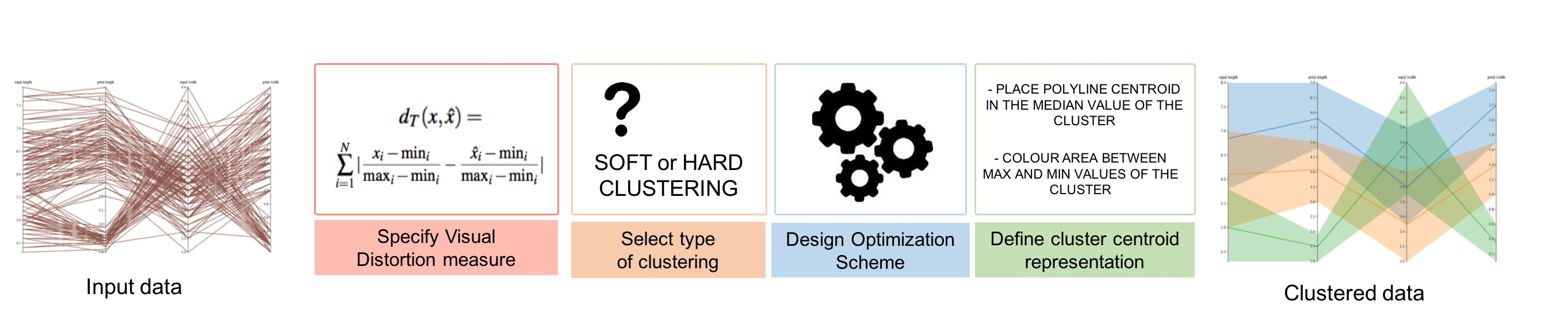
Chen and Jänicke [11] presented an information-theoretic framework for visualization that shows a strong relationship between information theory and visualization. They model the visualization process as a general communication system where input data is encoded in visual objects that are transmitted via a display device in a visualization. The viewer decodes this visualization making sense of the data being conveyed. As shown in Figure 2, they described the general visualization system as three subsystems: (i) the vis-encoder, which includes a filtering process that transforms raw data into information, a visual mapping that translates information into geometry and labels, and a rendering process that generates the image; (ii) the vis-channel which includes a displaying process that transforms the received image to an optical signal, an optical transmission process that translates the received optical signal to a new optical signal that will be viewed as the new image and (iii) the vis-decoder, which includes the perception, cognition, and destination processes that receive the generated image from which information and knowledge will be extracted. From this approach, the visualization process can be studied from the perspective of information transfer or as an “information discovery process”.
A similar perspective was presented in [13], where the authors define an information channel between the original data and the colors depicted by the volume rendering visualization. By optimizing the information transfer of this channel, some automatic solutions arise to design problems related to volume rendering, such as view-point selection and transfer function definition. It can be seen that the information channel proposed in [13] roughly corresponds to the vis-encoder subsystem proposed in [11] for the volume rendering technique. In our case, we will also consider only the vis-encoder subsystem, due to the availability to quantify both the input and output variables involved in this information channel. For a survey of main contributions based on information theory in the visualization field, see [10].
Information theory provides a powerful framework to evaluate the quality of graphical representations. However, other theoretical frameworks have been proposed to generate and evaluate visualizations on the basis of both the underlying data and desired perceptual tasks. These frameworks focus more on the perceptual features of the human visual system than on the statistical properties of the data, as information theory does. Demiralp et al. [14] proposed visual embedding as a model for visualization construction and evaluation. Kindlmann and Scheidegger [9], based on algebraic considerations of the visualization process, presented a model of visualization design that helps characterize visual encodings, guide their design, evaluate their effectiveness, and highlight their shortcomings. They also proposed general principles for good visualization design. These models, as the proposed methodology will do, use both the visual and perceptual spaces in order to guide the visualization design.
2.2. Information Visualization and Clustering
Clustering is a well studied problem and a very active research area with diverse applications like data mining [15], gene and protein analysis [16], or image processing [17], among others. Different clustering methods have been proposed and these can be grouped into four main categories: (i) partitioning methods that classify data into k groups such that each group contains at least one object, and each object belongs to a unique group. K-means is the most popular approach of the group; (ii) hierarchical methods that create a hierarchical decomposition of a given data set following a bottom-up (agglomerative) or a top-down (divisive) strategy. In the first case, each object forms a separate group and objects that are close to each other are successively merged until a termination condition is satisfied or a single group is obtained. In the second case, all the objects are in the same cluster which is iteratively split into two sub-clusters until each object is in one cluster or a termination condition is satisfied; (iii) density-based methods that instead of distance between objects focus on the local density of data points. Clusters are dense regions in the data space, separated by regions of lower object density. A cluster is defined as a maximal set of density-connected points [18]; (iv) grid-based methods perform clustering operations on a grid structure created by quantization of object space into a finite number of cells. This approach has a low processing time since it only depends on the number of cells in each dimension of the quantized space. For a review of clustering methods, see [19], and, for a comparison of state-of-the-art methods for big data clustering, see [20].
In the context of visualization, clustering is used to classify input data into groups that are then visualized instead of the individual elements. The challenge is to determine what constitutes a cluster, which samples and features will be taken into account or what number of clusters will be considered to obtain a proper visualization. To tackle this problem, exploration frameworks that combine clustering with visualization techniques have been proposed. The Hierarchical Clustering Explorer [21] supports the exploration of hierarchical clusterings of gene expression datasets through dendrograms (hierarchical clustering trees) stacked up with heatmap visualizations. Matchmaker [22] is a visualization technique that makes it possible to split and individually combine a multidimensional dataset into several groups of dimensions, run clustering algorithms on these groups separately and then visually compare the results. ClusterSculptor [23] is a tool that enables users to supervise clustering processes in various clustering methods. Schreck et al. [24] proposed a framework that enables the user to visually monitor the clustering process and control the unsupervised self-organizing map algorithm at an arbitrary level of detail. XCluSim [25] supports comparison of several clustering results of gene expression datasets using an approach similar to that of the Hierarchical Clustering Explorer. Clustrophile [26] supports iterative, interactive exploration of data with the ability to explore multiple choices of algorithmic parameters along with hypothesis testing through visualizations and interactions as well as formal statistical methods. To help visualization designers determine which visualization methods are appropriate for specific multidimensional data projection tasks, Etemadpour et al. [27] provided a systematic user-centric taxonomy of visual tasks related to projected multidimensional data. More recently, Etemadpour and Forbes [28] proposed incorporating density-based motion into visualization analytics systems to effectively explore and analyze multidimensional datasets. They improve different visualization tasks such as pattern identification between or within clusters. The effect of density on the perception of clusters was documented in [29,30].
3. Theoretical Background
In this section, we introduce different theoretical concepts that are required to define our framework. First, we present the most basic information-theoretic measures. Then, we introduce the rate-distortion theory and a related fundamental algorithm. Finally, we describe the relationship between rate-distortion theory and data clustering.
3.1. Information-Theoretic Measures
Let be a finite set and X a random variable taking values x in with distribution . Likewise, let Y be a random variable taking values y in . An information channel between the random variable X (input) and Y (output) is characterized by a probability transition matrix (composed of conditional probabilities) that determines the output distribution given the input [31].
The Shannon entropy of a random variable X is defined by
Entropy measures the average uncertainty of a random variable X. All logarithms are base 2 and entropy is expressed in bits. The convention is used.
The joint entropy is defined by
where is the joint probability. The joint entropy measures the average uncertainty associated with the pair . It is symmetric, , and it is greater than the marginal entropies of X and Y, and .
The conditional entropy is defined by
where is the conditional probability. The conditional entropy measures the average uncertainty associated with Y if we know the outcome of X. In general, , and .
The mutual information (MI) between X and Y is defined by
and measures the shared information between X and Y. It can be seen that [31]. A fundamental property of MI is given by the data processing inequality that can be expressed in the following way: if is a Markov chain, i.e., , then
This result demonstrates that no processing of Y, deterministic or random, can increase the information that Y contains about X.
3.2. Rate-Distortion Theory
A distortion function is a mapping
from the set of source alphabet-reproduction alphabet pairs into the set of non-negative real numbers [31]. The distortion is a measure of the cost of representing the symbol x by the symbol . Thus, the expected distortion for a given joint probability is defined as
The information rate distortion function for a source X with a distortion measure is defined as
where the minimization is over all conditional distributions for which the joint distribution satisfies the expected distortion constraint. This is a variational problem that can be solved by introducing a Lagrange multiplier, , for the constrained expected distortion [12]. Then, the functional that needs to be minimized over all normalized distributions is given by
Fortunately, this functional has an analytical solution, which is given by
where is a normalization term and is the parameter that controls the trade-off between compression and fidelity.
3.2.1. Blahut–Arimoto Algorithm
Blahut [32] and Arimoto [33] simultaneously introduced an iterative algorithm to compute the optimal encoding, given by the conditional probabilities , that generates the compressed signal that minimizes the expected distortion . This algorithm consists of two steps given by
and
where is a normalization term.
This method is a powerful tool that allows us to obtain the optimal assignment between each data element x and its corresponding representation value . On the other hand, note that it does not compute which is the optimal choice of the representation value . In practice, this is also an important point, which is usually tackled by expectation-maximization procedures [12].
3.2.2. Rate-Distortion Theory and Clustering
In its original interpretation, the rate-distortion theory related the original symbols x and the encoded symbols . However, this approach can also be used to model the clustering process [34]. In this case, the original data is also represented by x, but its corresponding representation is given by the values of the clusters c. Then, each data element belongs to a cluster c with a given conditional probability . We can differentiate between two different types of clustering: hard clustering, where each data element only belongs to one cluster and, thus, for this cluster and 0 for the other clusters; and soft clustering where each data element is assigned to each cluster with a certain probability (in general, different from 0).
Then, clustering can be seen as the process of finding class-representatives (or cluster centroids), such that the average distortion is small and the correlation between the original data and the clusters is large. Therefore, there is a trade-off between accuracy and compression which is controlled by the parameter (see Equation (9)). As we have presented in the previous section, the conditional probabilities can be estimated by, for instance, the Blahut–Arimoto algorithm. However, as we have also mentioned, this algorithm does not provide the optimal position for the centroids. To do so, we should find the centroid value that minimizes the distortion. Therefore, the centroid value would be the one that fulfills the following equation:
This equation is usually known as centroid condition [34].
4. Method
Taking into account the three fundamental spaces of creating and viewing visualizations [9], the data, the visual, and the perceptual spaces, our proposal for clustering, in contrast with the majority of proposed techniques, is not considering data space but the perceptual space. Based on rate-distortion theory, we propose defining the distortion function on the perceptual space, denoted here as perceptual distortion.
In this section, we first analyze how the distortion can be applied in the perceptual space, and then we propose a methodology to design a visualization process that minimizes the information loss during the clustering process.
4.1. Perceptual Distortion
One of the main limitations of the rate-distortion theory is the difficulty to define the distortion function. This problem is mainly due to the abstract nature of the data space. In our approach, we propose using the distortion in the perceptual space, which is usually a more natural measure, since several studies have analyzed the human perception on certain visual representations.
Below, we describe which measures are more suitable to describe the perceptual distortion for different types of visual encodings of single channels, and then we give some advice on how to extend them in the case of multiple channel encoding.
4.1.1. Single-Channel Distortion
The information visualization design can be seen as a process that encodes data into a visual space. It considers two main aspects: the graphical elements, called marks, and the visual channel that controls their appearance [35]. Marks are geometrical primitives that can be points (0D), lines (1D), areas (2D), or volumes (3D). Visual channels are features of the geometrical primitives that can be used to encode certain data. Taking into account the main visual channels, we discuss the most suitable perceptual distance measures associated with them.
- Position Channel. This channel can be restricted to a given direction (for instance, the horizontal and vertical directions) or in the 2D plane. In both cases, the most natural measure of distortion is the Euclidean distance between the actual position and the position of the cluster that represents the data. More formally, for the 1D case (limited to one direction), the distortion is given bywhere the subindex i indicates the position along the axis, and, for the 2D case, bywhere the subindexes i and j indicate the position coordinates in the 2D plane. Special attention requires the 3D case, since although humans live in a 3D space, our perceptual system does not really work in 3D. Most of the visual information that we have is about the projected 2D image plane while the depth has a minor perceptual weight [35,36]. This fact can be considered in the definition of the perceptual distortion measure and, hence, a possible measure of distortion iswhere the subindexes and indicate the projection of the 3D position in the image plane, the subindex d stands for the depth of the 3D position, and the parameter weights the contribution of the depth in the distortion measure. Perceptual studies could be performed to determine how to adjust the value of for a specific application.
- Color Channel. Two main uses are given to the color channel. First, a scalar value can be encoded, typically, through the luminance or the saturation color channels. In this case, the difference between the values in the original data and the cluster center would be the most natural distortion measure. Second, a categorical value can be encoded, typically, through the hue color channel. In this case, the most natural measure is the Hamming distortion, which is defined asIn general, if a more complex color encoding scheme is used, the distortion measure could be defined in the CIELab color space [37], since distances in this color space are perceptually uniform.
- Shape Channel. This channel refers to the different shapes that visual marks can take. Usually, it is used to encode categorical values, assigning a different shape (for instance, a circle, a square, a cross, or a triangle) to each category. In this case, the most appropriate measure would be the Hamming distortion (see Equation (17)). Other perceptual measures can also be defined. For instance, Demiralp et al. [38] analyzed the perceptual similarity of different shapes (as well as other channels such as color and size). From similar experiments, a similarity value between any pair of shapes can be computed and used for the clustering process.Other examples involving shape are to represent numerical data, such as the use of ellipsoids to represent the eigenvectors and eigenvalues of a tensor. In this case, the distortion measure can be related to the differences between the ellipsoid surfaces of the original data and the clustered one.
- Tilt Channel. This channel, also called angle, encodes a numerical value as an angular representation. A typical example is its use in a pie chart. In this case, the most natural measure of distortion would be the angular distance (equivalently to Equation (14)).
- Size Channel. This channel encodes a number as length when the mark is 1D, as area when it is 2D, and as volume when it is 3D. Here again, the most natural measure is the absolute difference between both values (see Equation (14)), although other measures arise due to the perceptual differences between the different number of dimensions of the mark. For instance, according to the Stevens’ psychophysical law [39], visual areas have a coefficient . Thus, in this case, an alternative distortion measure would bewith equals to 0.7.
Although other channels can be taken into account, in our proposal, we have only considered the most basic ones. A specific study will be required to propose a proper distance measure for other channels.
4.1.2. Multi-Channel Distortion
A more complex scenario arises when multiple channels are combined to encode multidimensional information. In this case, the distortion measure should represent somehow the total distortion from each of the channels. Therefore, the simplest definition of the total distortion would be given by
where is the distortion at the i-th visual channel and N is the total number of channels. In addition, as several perceptual studies have shown, humans are more sensitive to some channels than others. For that reason, a weighted sum of the individual distortions could be a reasonable measure:
where is the weight given to the i-th visual channel. Therefore, the user has the means to assign more importance to certain channels.
Another aspect that can be taken into account is the channel separability. In some cases, channels are easy to distinguish in a pre-attentive way, while, in other cases, the channels can not easily be decoupled. For this reason, it could be interesting to take this fact into account in the total distortion definition:
where is the weight given to the i-th visual channel and n is a parameter that depends on the level of integrality between dimensions [38]. A value of would indicate total separability and the Equation coincides with Equation (20), whereas a value of would indicate complete integrality.
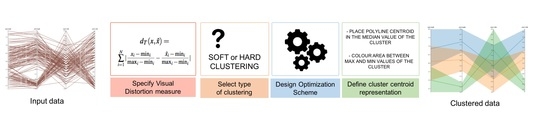
4.2. Perceptual Clustering
In this section, we propose a methodology to design a visualization process that minimizes the information loss during the clustering process. The four steps of this methodology are illustrated in Figure 3 and described below:
- Specify the perceptual distortion measure. Following the guidelines presented in the previous section and according to the selected visual channel, we have to define the distortion measure between original data representation and the cluster centroid one.
- Select the type of clustering. We can select between hard or soft clustering. For applications where each data element has to be identified in a single cluster, a hard clustering technique is more appropriate, while, in the other applications, the recommended strategy is soft clustering.
- Design the optimization scheme. The optimization strategy depends on the selected clustering. As we have shown in Section 3.2.1, for a soft clustering strategy, the Blahut–Arimoto algorithm is the most common algorithm. In this case, the parameter has to be chosen to tune the trade-off between compression and accuracy. With the given distortion measure, the function that fulfills the centroid condition must also be found. For a hard clustering, a great variety of optimization techniques can be applied [40].
- Design the cluster centroid representation. Finally, the centroid values have to be shown in an appropriate way to the final user. In addition to the value itself, other information such as cluster probability could also be introduced in the final visualization.
5. Application Examples
In this section, we present three application examples of the proposed methodology. The first two examples show how the visualization space leads to well-known clustering algorithms, giving a theoretical justification on why they may be used instead of similar clustering algorithms. The third one illustrates how different distortion measures that emphasize different aspects of the visualization produce different results, and we compare the results using these distortion measures with a standard method based on entropy maximization.
5.1. Example 1: Scatterplot
The first application example is focused on scatterplot visualization. A scatterplot primarily consists of two axes and marks that represent the data points. The attributes of the data encoded on the x and y axes are typically quantitative in nature, and other data attributes are often encoded using visual properties of the marks, such as color, shape, and size. In this example, we have used the Corel Image Features dataset [41], comparing the values between the vertical and horizontal pixel correlation. In Figure 4a, the scatterplot of the studied dataset is illustrated; since each data point is presented as a single mark, a cluttered visualization is obtained. Thus, a clustering strategy seems a reasonable technique to improve this data visualization. Following our proposed methodological process, we apply the following steps:
- The second step refers to the definition of the type of clustering. In this case, we are not specially constrained to the fact that each data element corresponds to a single cluster and, thus, the most appropriate selection would be soft clustering.
- In the third step, we have to decide the optimization scheme. In this case, we can use the Blahut–Arimoto algorithm, and it can be proved that the function that fulfills the centroid condition is the expected mean value of the centroid. Note that we have not discovered a new clustering strategy. This method is known in the literature as the soft k-means [42]. In this study, we will let the user modify the value of the parameter in order to illustrate its performance.
- Finally, the fourth step determines the cluster centroids representation. In our case, we assign the two values of the centroid to the 2D position (in the same way than the original data) and we encode the probability of the cluster (i.e., how many data are represented by the cluster) to the area.
The obtained results are presented in Figure 4. In the first row of Figure 4b–d, the visualizations obtained with 100 clusters and considering different values are shown ( and 1000, respectively). As it can be seen, the parameter does not have a critical impact on the obtained cluster centroids, and the three visualization results in the first row are very similar. In the second row of Figure 4, the data elements that belong to the cluster pointed with an arrow are visualized. To do so, the probability of belonging to that cluster has been encoded with the opacity of the data mark. Note that, in these cases, the effect of the parameter has a great impact. For high values, the data probability of belonging to the cluster is close to 1 or to 0, i.e., there is a hard relationship, while, for low values, there are data elements with a low probability of belonging to the cluster, i.e., there is a soft relationship.
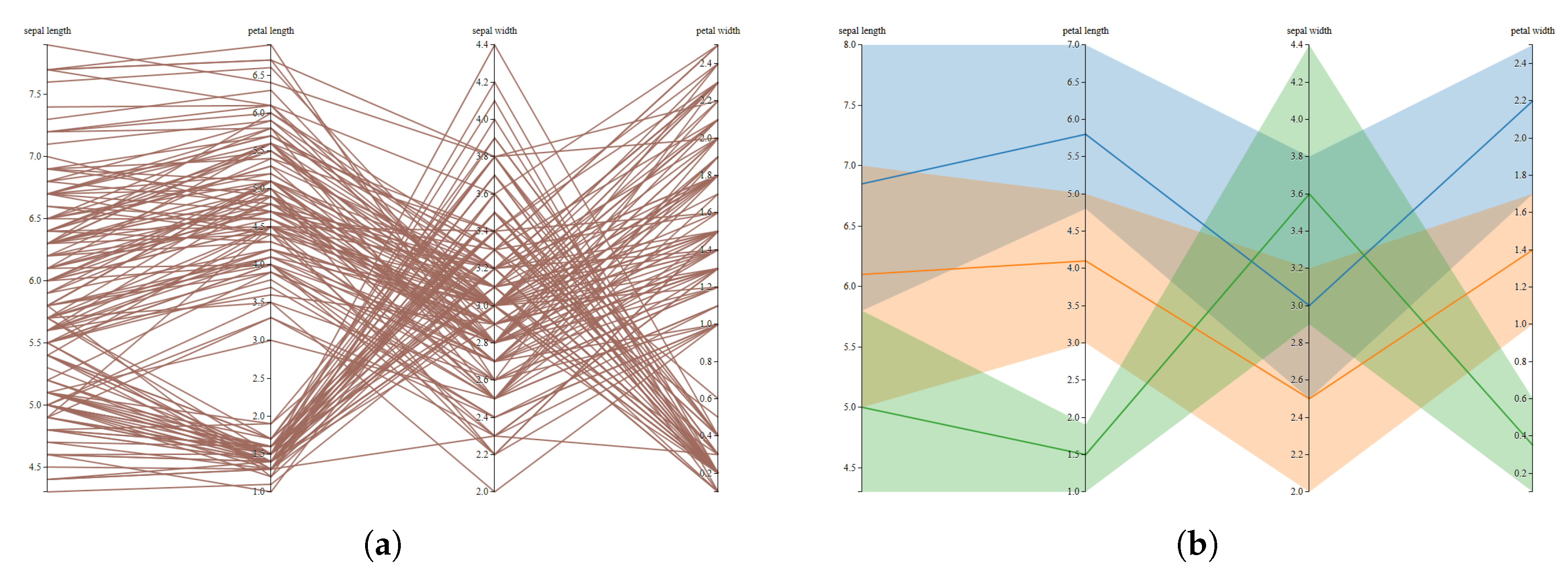
5.2. Example 2: Parallel Coordinates
For the next example, we have considered parallel coordinates visualization. Parallel coordinates were introduced by Inselberg [43] and developed for visualizing multidimensional geometry [44]. They are based on a system of parallel coordinates, which includes a non-projective mapping between multidimensional and two-dimensional sets. In this example, we have used the well-known Iris dataset [41] represented using parallel coordinates in Figure 6a. As in the previous example, to apply the proposed methodology, we have to define the four steps that define it.
- The visual encoding for parallel coordinates converts each data value into a polygonal line whose m vertices are at on the axes for ( are the axes of the parallel coordinates system for the Euclidean m-dimensional space ). In this scenario, the well-known root mean square distance is not the most appropriate, since it lacks of geometrical meaning in the visual space of the parallel coordinates visualization. Instead of this, a more suitable choice would be the following distortion measure:where and represent the maximum and the minimum values of the ith variable. Note that this distortion measure can be seen as the generalization of Equation (14) to several variables. This measure is also known as -distance or Manhattan distance. The lack of geometrical significance of the Euclidean distance and the suitability of the Manhattan distance for the parallel coordinates visualization is presented in Figure 5.
- Once the distortion measure has been defined, the second step requires selecting the type of clustering. In this example, in order to have a different scenario than the previous one, we have considered hard clustering. Thus, every data element will belong to a single cluster.
- In the third step, we have to decide the optimization scheme. In order to minimize the distortion measure of Equation (22), the centroid of the cluster has to be placed in the median point of the data. This clustering process has been previously introduced with the name of k-medians [45]. This method is an expectation-maximization algorithm that iteratively converges to the final clustering. Note that the fact of representing the data with parallel coordinates has lead us to considering the k-medians method as the most suitable clustering algorithm to perform this task.
- The last step defines the visualization strategy. As shown in Figure 6b, each polyline centroid has been placed in the median value of the cluster and a different color has been assigned to the area contained between maximum and minimum values of the cluster.
5.3. Example 3: Summary Trees
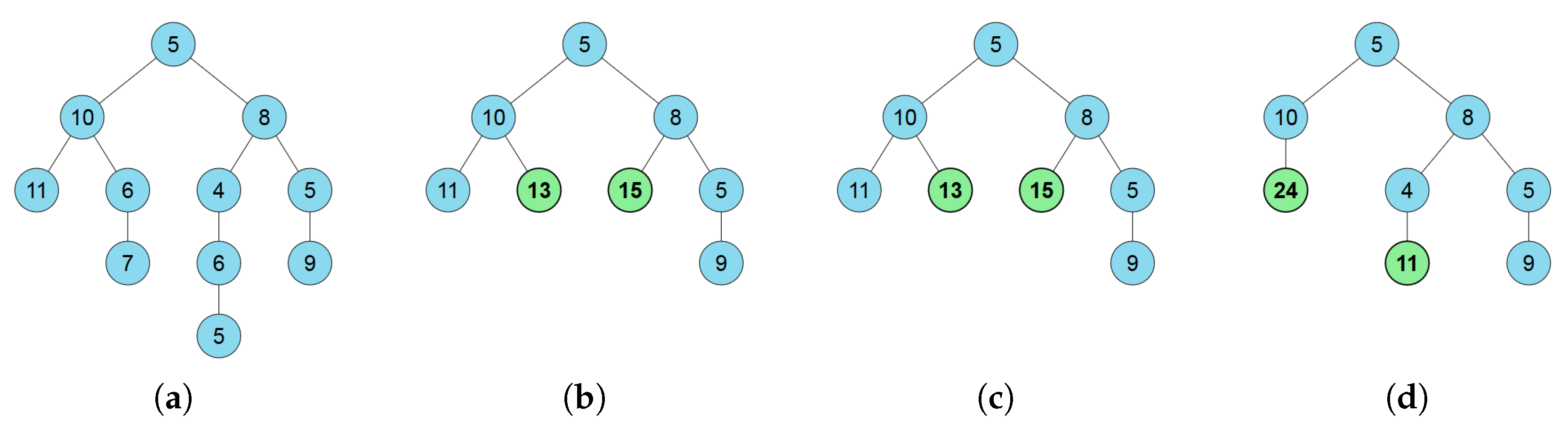
Tree visualization is one of the best-studied areas of information visualization [46]. In 1981, Reingold and Tilford proposed one of the most famous algorithms that produces layered drawings of trees where all nodes at the same depth are aligned [47]. Since then, many different techniques have been proposed to arrange the tree nodes in 2D and 3D, encode them in different shapes or forms, fold and unfold, or to interactively manipulate them [48]. Despite these advances, there are still many issues that need further research. Amongst them, the visualization of trees with a large number of nodes that are difficult to represent in the limited screen space. To tackle this problem Karloff and Shirley [49] proposed summary trees, simplified trees that result from aggregating nodes of the original weighted tree, subject to certain constraints. To define a summary tree, two contraction strategies are allowed. The first one contracts subtrees to single nodes that represent them, while the second one contracts multiple sibling subtrees (subtrees whose roots are siblings) to single nodes representing them. The node resulting from the latter is called the group node. One constraint in the definition of summary trees is that each node has at most one child that is an group node. Karloff and Shirley [49] focused on the problem of how to simplify a very large node-weighted rooted tree by using a summary tree in the most informative way. They suggested that the best choice among all the possible summary trees with a fixed number of nodes is the one that maximizes the entropy of the probability distribution associated with the summary tree. Formally, the definition of the entropy, , of a k-node summary tree T with node weights is defined as:
where and W is the sum of all node weights. This definition corresponds to the Shannon entropy (see Equation (1)), where the probability density function is given by the normalized weight of each tree node.
Note that summary trees can be interpreted as a clustering problem where each node in the summary tree is a cluster that represents a single node (if the node has not been contracted) or a set of nodes (if some nodes have been contracted). Since each node is only assigned to a single cluster, it can be considered as a hard clustering. Taking into account all these considerations, we can use the proposed methodology to visualize the summary tree as follows:
- In the presented theoretical framework, we propose minimizing the functional (see Equation (9)). In this example context, the first term of the functional, the mutual information between the original data and the clustered one, issince there is not uncertainty on the cluster when the original node is known and, thus, .Note that corresponds to the same measure proposed in [49], but, while in our approach the measure has to be minimized, in [49], it has to be maximized. This is due to the fact that the maximum entropy approach tends to maximize the information, leading to as much as possible equal-sized nodes, while, in our approach, this term is used together with a second term, , that measures the expected distortion and, therefore, is a trade-off between two components.The second term of the functional is the expected distortion. In our context, a basic measure to quantify the distortion is the Hamming distortion:Observe that this measure does not take into account how different the original node is from the clustered one, but only if it is contracted or not. Note that more complex measures that quantify in some aspect the distance between the original node and the cluster one can also be used. For instance,where the function is the depth level on the tree of the node, being 0 for the root node. With this second measure, depending on the level of distance from the original node to the contracted one, the distortion will vary. Note that this measure allows introducing new considerations that were not taken into account in the first approach or in the maximum entropy one. Therefore, the proposed method gives more flexibility to the visualization designers, allowing, for instance, to give importance on the subtree depth on the clustering criterion.
- Once the distortion rate function has been defined, we select the type of clustering. As it was previously described, from the summary tree definition, we consider a hard clustering, since each original node is only represented by a single cluster.
- The optimization scheme is a force-brute algorithm, since in the used example there are only a small number of possible solutions. To summarize a real-world tree with a large number of nodes, other strategies such as simulated annealing or genetic algorithms could be used in this application. Note that the Blahut–Arimoto algorithm could not be used due to the discrete nature of the problem.
- Finally, we determine the visualization strategy. As shown in Figure 7c,d, contracted nodes are represented in bold and green backgrounds in contrast to original nodes that are represented with regular font and blue background.
Figure 7 illustrates an example of the differences of the approaches. In Figure 7a, the original tree is shown. The original tree has to be represented using an 8-node summary tree. Figure 7b shows the maximum entropy summary tree. The same result, shown in Figure 7c, is obtained by the proposed approach with the distortion measure. The parameter has been set to 10 since, in this case, it gives a good balance between both parts of the optimization function, . We have empirically observed that the method is not very sensitive to this parameter. Note that, although the first method maximizes the entropy value and the proposed one tends to minimize it, the effect of the distortion term leads to the same results. In Figure 7d, the results obtained with distortion measure and are shown. Remember that the penalizes contracted nodes far away (in terms of depth) from the original ones. In this case, the method prefers to contract the leafs of the left branch while giving an extra node to the longest branch of the right part of the tree. In this way, the overall structure is better preserved than in the cases that do not take into account the depth distance between nodes.
6. Conclusions
In this paper, we have presented a new methodology to deal with the visualization of clustered data that ensures an optimal information transfer between the original data and the final visualization. We have presented a new mathematical framework, based on information theory and rate-distortion theory, that models the visualization as an information channel between the source data and the final user. Since a key point of this mathematical framework is the definition of a distortion measure, we have analyzed possible definitions of this measure for different visualization encodings. From this framework, we have also proposed a four-step methodology to analyze and design a clustering-based visualization. In addition, we have shown three application examples that cover different visualization techniques, such as scatterplot, parallel coordinates and summary trees.
Note that we have analyzed the fundamentals of the information visualization, modeling it as an information transfer process, and we have proposed a new mathematical and methodological approach to deal with the visualization of clusters of data. Although we have focused on clustered data, we think that similar approaches can be developed to deal with other problems where there is an information loss. For instance, sampling techniques show only a subset of the original data when its size is too large. We could define an approach to quantify the representativeness of the sample with respect to the whole dataset. In this way, we could select the most representative from a number of different data samples. Another problem with an associated loss of information is the node placement for graph drawing, where the distance between nodes depends on the edge weight but, in general, the distances cannot be strictly kept. From the definition of a distortion measure, an optimization process would be defined in order to keep the maximum information. Our future work will be centered on the extension of our approach to these new scenarios.
Acknowledgments
This work has been funded in part by grants from the Spanish Government (Nr. TIN2016-75866-C3-3-R) and from the Catalan Government (Nr. 2014-SGR-1232). These grants cover the costs to publish in open access.
Author Contributions
A.B. proposed the theoretical framework; A.B., R.B., M.R., and I.B. conceived and designed the experiments; R.B. and M.R. implemented and performed the experiments; A.B., M.R., and I.B. analyzed the data; A.B., M.R., and I.B. wrote the paper.
Conflicts of Interest
The authors declare no conflict of interest.
References
- Ko, S.; Maciejewski, R.; Jang, Y.; Ebert, D.S. MarketAnalyzer: An Interactive Visual Analytics System for Analyzing Competitive Advantage Using Point of Sale Data. Comput. Graph. Forum 2012, 31, 1245–1254. [Google Scholar] [CrossRef]
- ElHakim, R.; ElHelw, M. Interactive 3d visualization for wireless sensor networks. Vis. Comput. 2010, 26, 1071–1077. [Google Scholar] [CrossRef]
- Chen, T.; Lu, A.; Hu, S. Visual storylines: Semantic visualization of movie sequence. Comput. Graph. 2012, 36, 241–249. [Google Scholar] [CrossRef]
- Fayyad, U.; Grinstein, G.G.; Wierse, A. (Eds.) Information Visualization in Data Mining and Knowledge Discovery; Morgan Kaufmann Publishers Inc.: San Francisco, CA, USA, 2002. [Google Scholar]
- Liu, S.; Cui, W.; Wu, Y.; Liu, M. A Survey on Information Visualization: Recent Advances and Challenges. Vis. Comput. 2014, 30, 1373–1393. [Google Scholar] [CrossRef]
- Everitt, B.; Landau, S.; Leese, M.; Stahl, D. Cluster Analysis, 5th ed.; John Wiley and Sons Inc.: Hoboken, NJ, USA, 2001. [Google Scholar]
- Hartigan, J. Clustering Algorithms; Wiley: Hoboken, NJ, USA, 1975. [Google Scholar]
- Xu, R.; Wunsch, D. Survey of Clustering Algorithms. IEEE Trans. Neural Netw. 2005, 16, 645–678. [Google Scholar] [CrossRef] [PubMed]
- Kindlmann, G.; Scheidegger, C. An Algebraic Process for Visualization Design. IEEE Trans. Vis. Comput. Graph. 2014, 20, 2181–2190. [Google Scholar] [CrossRef] [PubMed]
- Chen, M.; Feixas, M.; Viola, I.; Bardera, A.; Shen, H.W.; Sbert, M. Information Theory Tools for Visualization; AK Peters: Natick, MA, USA; CRC Press: Boca Raton, FL, USA, 2016. [Google Scholar]
- Chen, M.; Jänicke, H. An Information-theoretic Framework for Visualization. IEEE Trans. Vis. Comput. Graph. 2010, 16, 1206–1215. [Google Scholar] [CrossRef] [PubMed]
- Tishby, N.; Pereira, F.C.; Bialek, W. The Information Bottleneck Method. In Proceedings of the 37th Annual Allerton Conference on Communication, Control, and Computing, Urbana-Champaign, IL, USA, September 1999; pp. 368–377. [Google Scholar]
- Bramon, R.; Ruiz, M.; Bardera, A.; Boada, I.; Feixas, M.; Sbert, M. An Information-Theoretic Observation Channel for Volume Visualization. Comput. Graph. Forum 2013, 32, 411–420. [Google Scholar] [CrossRef]
- Demiralp, Ç.; Scheiddegger, C.E.; Kindlmann, G.L.; Laidlaw, D.H.; Heer, J. Visual Embedding: A Model for Visualization. IEEE Comput. Graph. Appl. 2014, 34, 10–15. [Google Scholar] [CrossRef] [PubMed]
- Berkhin, P. A Survey of Clustering Data Mining Techniques. In Grouping Multidimensional Data-Recent Advances in Clustering; Springer: Berlin/Heidelberg, Germany, 2006; pp. 25–71. [Google Scholar]
- Daxin, J.; Chun, T.; Aidong, Z. Cluster Analysis for Gene Expression Data: A Survey. IEEE Trans. Knowl. Data Eng. 2004, 16, 1370–1386. [Google Scholar] [CrossRef]
- Feixas, M.; Bardera, A.; Rigau, J.; Xu, Q.; Sbert, M. Information Theory Tools for Image Processing; Synthesis Lectures on Computer Graphics and Animation; Morgan & Claypool Publishers: San Rafael, CA, USA, 2014. [Google Scholar]
- Kriegel, H.P.; Krüger, P.; Sander, J.; Zimek, A. Density-based clustering. Wiley Interdiscip. Rev. Data Min. Knowl. Discov. 2011, 1, 231–240. [Google Scholar] [CrossRef]
- Han, J.; Kamber, M.; Pei, J. Data Mining: Concepts and Technique, 3th ed.; The Morgan Kaufmann Series in Data Management Systems; Morgan Kaufmann Publishers: Burlington, MA, USA, 2011. [Google Scholar]
- Fahad, A.; Alshatri, N.; Tari, Z.; Alamri, A.; Khalil, I.; Zomaya, A.Y.; Foufou, S.; Bouras, A. A Survey of Clustering Algorithms for Big Data: Taxonomy and Empirical Analysis. IEEE Trans. Emerg. Top. Comput. 2014, 2, 267–279. [Google Scholar] [CrossRef]
- Seo, J.; Shneiderman, B. Interactively Exploring Hierarchical Clustering Results. Computer 2002, 35, 80–86. [Google Scholar]
- Lex, A.; Streit, M.; Partl, C.; Schmalstieg, D. Comparative Analysis of Multidimensional, Quantitative Data. IEEE Trans. Vis. Comput. Graph. 2010, 16, 1027–1035. [Google Scholar] [CrossRef] [PubMed]
- Bruneau, P.; Pinheiro, P.; Broeksema, B.; Otjacques, B. Cluster Sculptor, an interactive visual clustering system. Neurocomputing 2015, 150, 627–644. [Google Scholar] [CrossRef]
- Schreck, T.; Bernard, J.; Von Landesberger, T.; Kohlhammer, J. Visual Cluster Analysis of Trajectory Data with Interactive Kohonen Maps. Inf. Vis. 2009, 8, 14–29. [Google Scholar] [CrossRef]
- Yi, S.L.; Ko, B.; Shin, D.; Cho, Y.; Lee, J.; Kim, B.; Seo, J. XCluSim: A visual analytics tool for interactively comparing multiple clustering results of bioinformatics data. BMC Bioinf. 2015, 16, 1–15. [Google Scholar]
- Demiralp, Ç. Clustrophile: A Tool for Visual Clustering Analysis. In Proceedings of the Workshop on Interactive Data Exploration and Analytics, San Francisco, CA, USA, 14 August 2016; pp. 1–9. [Google Scholar]
- Etemadpour, R.; Linsen, L.; Crick, C.; Forbes, A. A user-centric taxonomy for multidimensional data projection tasks. In Proceedings of the IVAPP 2015—6th International Conference on Information Visualization Theory and Applications, Berlin, Germany, 11–14 March 2015; pp. 51–62. [Google Scholar]
- Etemadpour, R.; Forbes, A.G. Density-based motion. Inf. Vis. 2017, 16, 3–20. [Google Scholar] [CrossRef]
- Sedlmair, M.; Tatu, A.; Munzner, T.; Tory, M. A Taxonomy of Visual Cluster Separation Factors. Comput. Graph. Forum 2012, 31, 1335–1344. [Google Scholar] [CrossRef]
- Etemadpour, R.; Motta, R.; de Souza Paiva, J.G.; Minghim, R.; Ferreira de Oliveira, M.C.; Linsen, L. Perception-Based Evaluation of Projection Methods for Multidimensional Data Visualization. IEEE Trans. Vis. Comput. Graph. 2015, 21, 81–94. [Google Scholar] [CrossRef] [PubMed]
- Cover, T.M.; Thomas, J.A. Elements of Information Theory; Wiley Series in Telecommunications; Wiley: Hoboken, NJ, USA, 1991. [Google Scholar]
- Blahut, R.E. Computation of channel capacity and rate distortion functions. IEEE Trans. Inf. Theory 1972, 18, 460–473. [Google Scholar] [CrossRef]
- Arimoto, S. An algorithm for computing the capacity of arbitrary memoryless channels. IEEE Trans. Inf. Theory 1972, 18, 14–20. [Google Scholar] [CrossRef]
- Rose, K. Deterministic annealing for clustering, compression, classification, regression, and related optimization problems. Proc. IEEE 1998, 86, 2210–2239. [Google Scholar] [CrossRef]
- Munzner, T. Visualization Analysis and Design; AK Peters: Natick, MA, USA; CRC Press: Boca Raton, FL, USA, 2014. [Google Scholar]
- Ware, C. Visual Thinking for Design; Morgan Kaufmann: Burlington, MA, USA, 2008. [Google Scholar]
- International Commission on Illumination. Colorimetry L*a*b* Colour Space. 1976. Available online: http://cie.co.at/index.php?i_ca_id=485 (accessed on 22 August 2017).
- Demiralp, Ç.; Bernstein, M.S.; Heer, J. Learning Perceptual Kernels for Visualization Design. IEEE Trans. Vis. Comput. Graph. 2014, 20, 1933–1942. [Google Scholar] [CrossRef] [PubMed]
- Stevens, S.S. On the psychophysical law. Psychol. Rev. 1957, 64, 153–181. [Google Scholar] [CrossRef] [PubMed]
- Jensi, R.; Jiji, D.G.W. A Survey on Optimization Approaches to Text Document Clustering. Int. J. Comput. Sci. Appl. 2013, 3. [Google Scholar] [CrossRef]
- Newman, D.; Hettich, S.; Blake, C.; Merz, C. UCI Repository of Machine Learning Databases. 1998. Available online: http://archive.ics.uci.edu/ml/index.php (accessed on 22 August 2017).
- Bezdek, J.C. Pattern Recognition with Fuzzy Objective Function Algorithms; Kluwer Academic Publishers: Norwell, MA, USA, 1981. [Google Scholar]
- Inselberg, A. The plane with parallel coordinates. Vis. Comput. 1985, 1, 69–97. [Google Scholar] [CrossRef]
- Inselberg, A.; Dimsdale, B. Parallel Coordinates: A Tool for Visualizing Multi-dimensional Geometry. In Proceedings of the 1st Conference on Visualization, San Francisco, CA, USA, 23–26 October 1990; IEEE Computer Society Press: Washington, DC, USA, 1990; pp. 361–378. [Google Scholar]
- Jain, A.K.; Dubes, R.C. Algorithms for Clustering Data; Prentice-Hall: Upper Saddle River, NJ, USA, 1981. [Google Scholar]
- Lima, M. The Book of Trees: Visualizing Branches of Knowledge; Princeton Architectural Press: New York, NY, USA, 2014. [Google Scholar]
- Reingold, E.M.; Tilford, J.S. Tidier drawing of trees. IEEE Trans. Softw. Eng. 1981, 7, 223–228. [Google Scholar] [CrossRef]
- Graham, M.; Kennedy, J. A Survey of Multiple Tree Visualisation. Inf. Vis. 2010, 9, 235–252. [Google Scholar] [CrossRef]
- Karloff, H.; Shirley, K.E. Maximum Entropy Summary Trees. Comput. Graph. Forum 2013, 32, 71–80. [Google Scholar] [CrossRef]
Figure 1.
Example of how different visualization techniques can be associated with different distance metrics. In the left plot, the Cartesian representation is associated with Euclidean distance, and, in the right plot, the parallel coordinate representation is associated with the Manhattan distance.

Figure 2.
Decomposition of a general visualization system into three subsystems: vis-encoder, vis-channel, and vis-decoder. Adapted from [11].
Figure 2.
Decomposition of a general visualization system into three subsystems: vis-encoder, vis-channel, and vis-decoder. Adapted from [11].
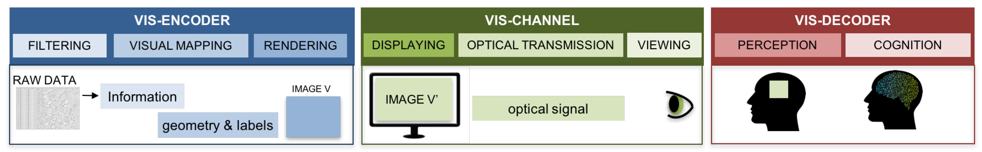
Figure 3.
The four-step methodology to analyze and design a clustering-based visualization applied to parallel coordinates visualization. The obtained visualization process minimizes the information loss during clustering.
Figure 3.
The four-step methodology to analyze and design a clustering-based visualization applied to parallel coordinates visualization. The obtained visualization process minimizes the information loss during clustering.
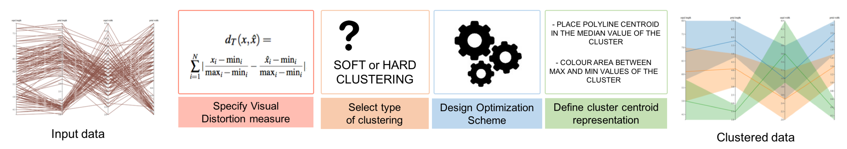
Figure 4.
Scatterplots of Corel Image Features data set comparing the values between the vertical and horizontal pixel correlation. In the first row, in (a), the plot using the original data shows a highly cluttered effect, and the visualizations of the clustered data considering 100 clusters and different values of ((i.b) ; (i.c) ; (i.d) ). In the second row, plots (ii.b), (ii.c), and (ii.d) show the belonging of the original input data to the selected cluster marked with an arrow in plots (i.b), (i.c), and (i.d), respectively.
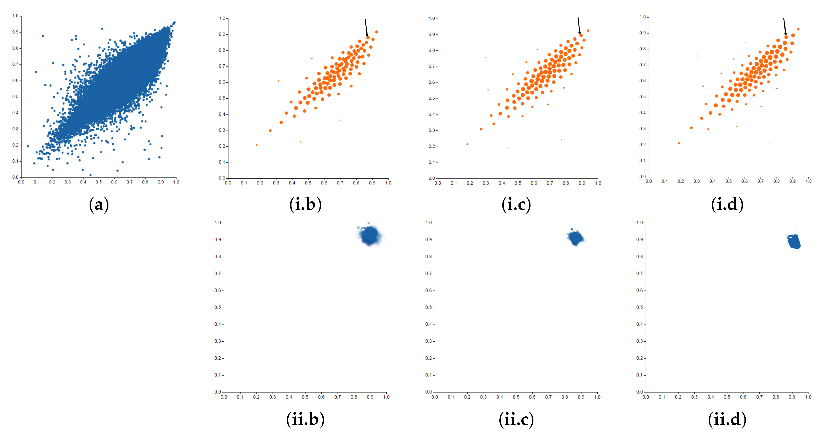
Figure 5.
Illustration of the distortion measure for scatter plot (left), which mathematically corresponds to the Euclidean distance, and parallel coordinates (right), which mathematically corresponds to the -distance or Manhattan distance.
Figure 5.
Illustration of the distortion measure for scatter plot (left), which mathematically corresponds to the Euclidean distance, and parallel coordinates (right), which mathematically corresponds to the -distance or Manhattan distance.
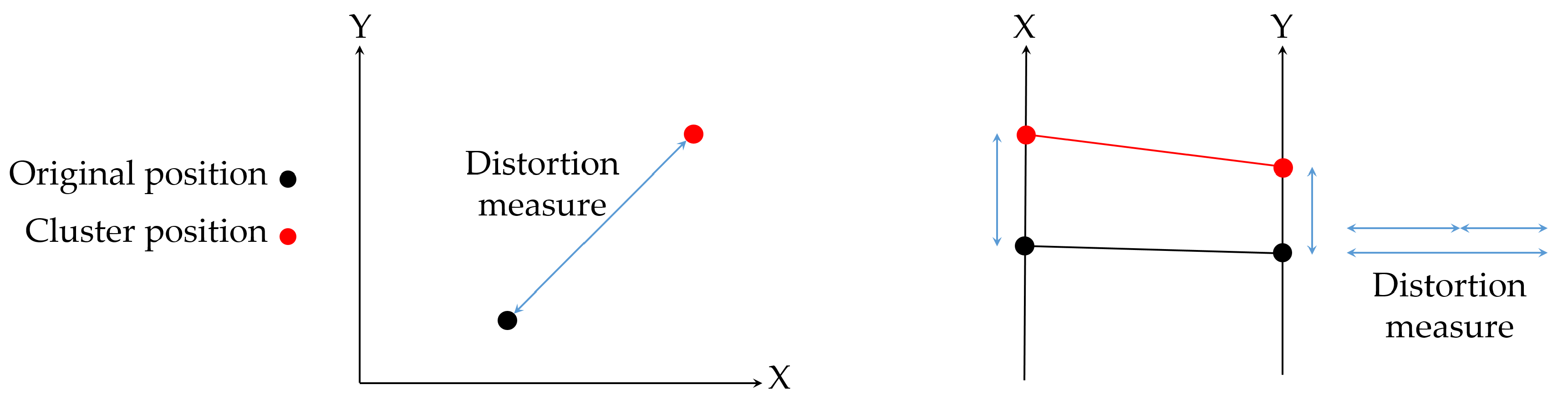
Figure 6.
Parallel coordinates visualization of Iris data set: (a) the original data, which shows a large cluttering effect and (b) a clustered visualization, which only shows the main behaviour of the groups in the data. The clustering processes have been done using the k-medians, which is the most appropriate clustering method for the parallel coordinate visualization according to the proposed method.

Figure 7.
(a) the original tree and 8-node summary trees obtained (b) with the maximum entropy method; (c) with the proposed method using (Equation (25)) and and (d) with the proposed method using (Equation (26)) and . Note that (b,c) obtain the same results. (a) original tree; (b) maximum entropy; (c) proposed with , ; (d) proposed with , .
© 2017 by the authors. Licensee MDPI, Basel, Switzerland. This article is an open access article distributed under the terms and conditions of the Creative Commons Attribution (CC BY) license (http://creativecommons.org/licenses/by/4.0/).
Share and Cite
MDPI and ACS Style
Bardera, A.; Bramon, R.; Ruiz, M.; Boada, I. Rate-Distortion Theory for Clustering in the Perceptual Space. Entropy 2017, 19, 438. https://doi.org/10.3390/e19090438
AMA Style
Bardera A, Bramon R, Ruiz M, Boada I. Rate-Distortion Theory for Clustering in the Perceptual Space. Entropy. 2017; 19(9):438. https://doi.org/10.3390/e19090438
Chicago/Turabian StyleBardera, Anton, Roger Bramon, Marc Ruiz, and Imma Boada. 2017. "Rate-Distortion Theory for Clustering in the Perceptual Space" Entropy 19, no. 9: 438. https://doi.org/10.3390/e19090438
Note that from the first issue of 2016, this journal uses article numbers instead of page numbers. See further details here.