4.1. Illuminance, Luminous, and Subject Characteristics
In general, office occupants experience visual stimulation factors and perception under visual environments maintained at particular illuminance and luminous levels, and at certain color temperature of light sources.
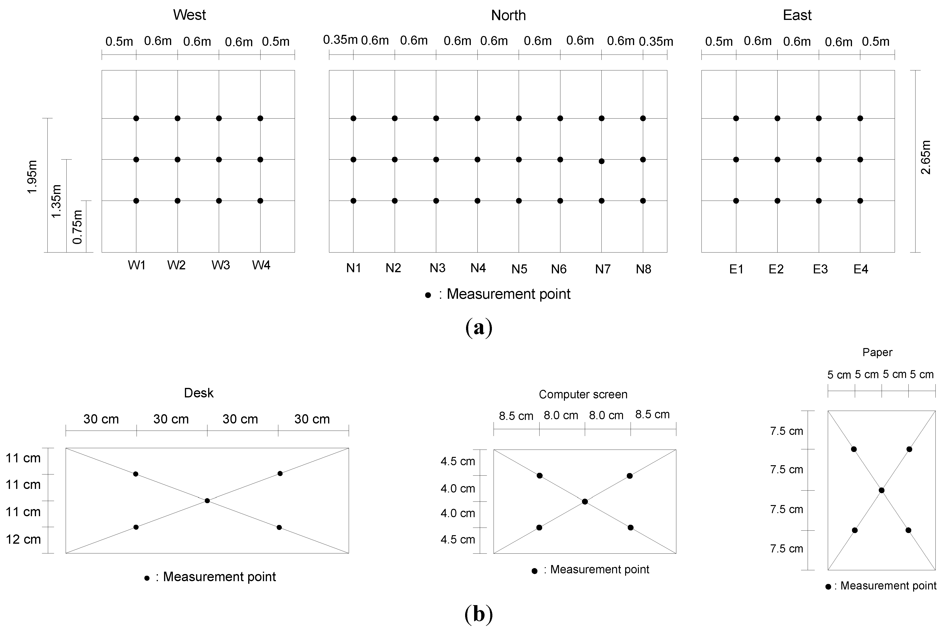
Figure 5,
Figure 6,
Figure 7 and
Figure 8 show the illuminance and luminous levels on the wall surfaces of the full-scale mock-up model space, when the target illuminance levels for the desktop were 500 lx and 750 lx. Overall, the illuminance and luminous levels were the lowest at the top of the desktop and increased with distance from the desktop due to the influence of parabolic louvers installed in the lighting fixtures. Differences in the illuminance and luminous levels on the three wall surfaces were insignificant, except at some points on the east and west walls.
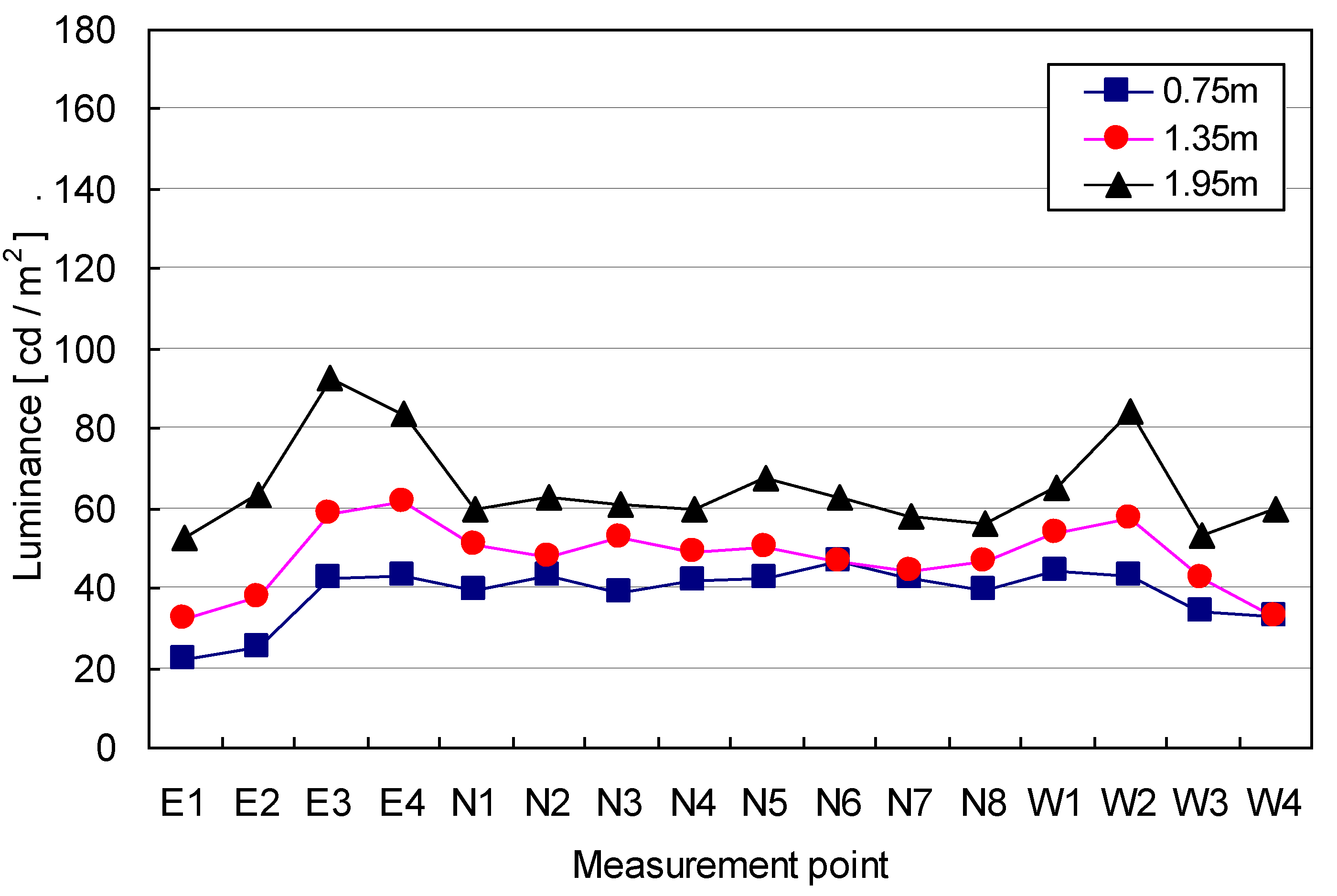
Figure 5.
Variation of illuminance on walls (500 lx condition).
Figure 5.
Variation of illuminance on walls (500 lx condition).
Figure 6.
Variation of luminance on walls (500 lx condition).
Figure 6.
Variation of luminance on walls (500 lx condition).
For the 500 lx condition, the illuminance on the wall ranged from 154 lx to 368 lx. The illuminance levels at a height of 1.35 m from the floor ranged from 219 lx to 264 lx, which were equal to 43.8% and 52.8% of the target illuminance. The mean illuminance level on the north wall increased by 16.63% and 20.89% as the height from the floor increased from 0.75 m to 1.35 m and from 1.35 m to 1.95 m, respectively. The luminous level on the north wall was the background luminous level during the computer reading task. The luminous level on the north wall varied from 38.6 cd/m2 to 67.4 cd/m2.
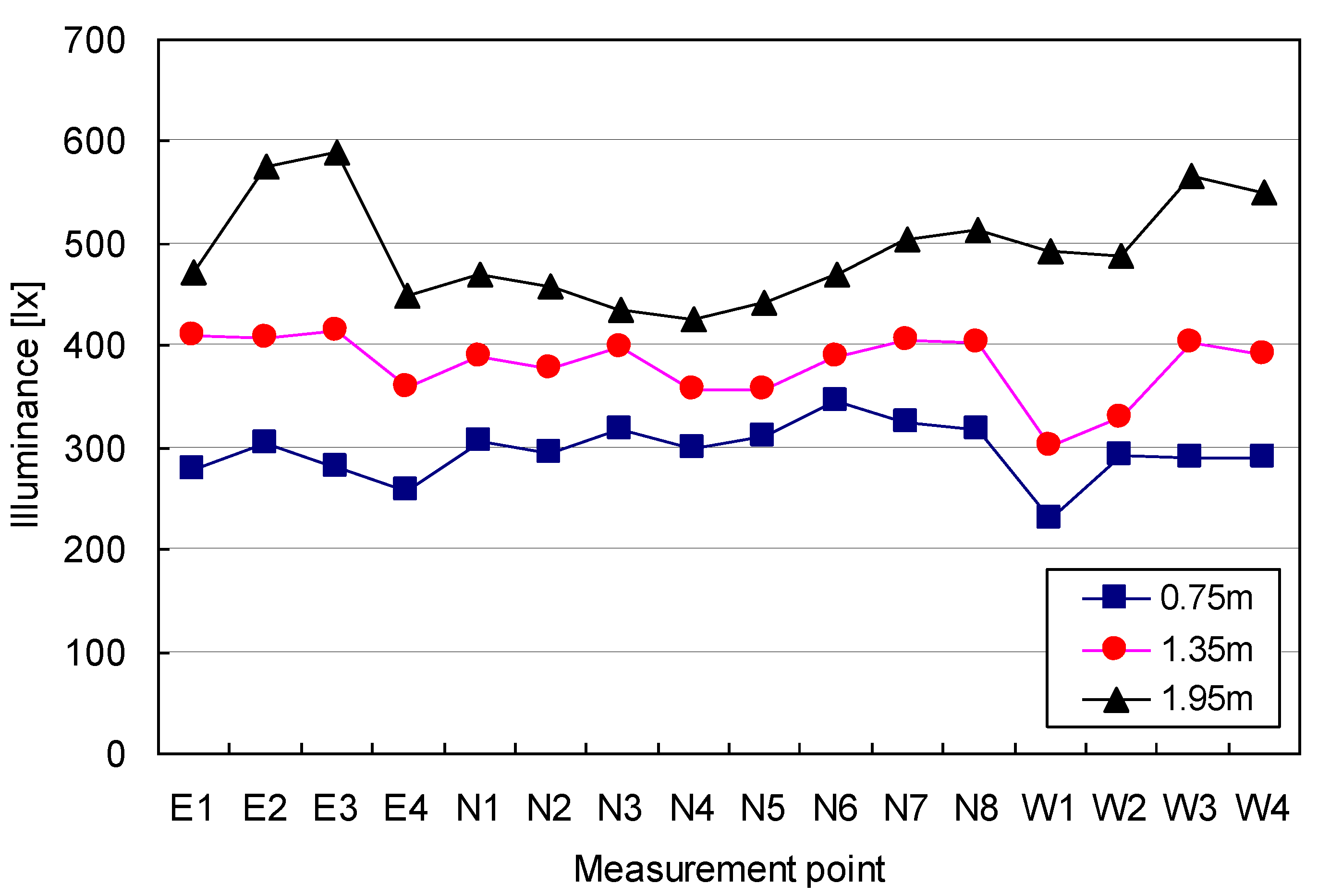
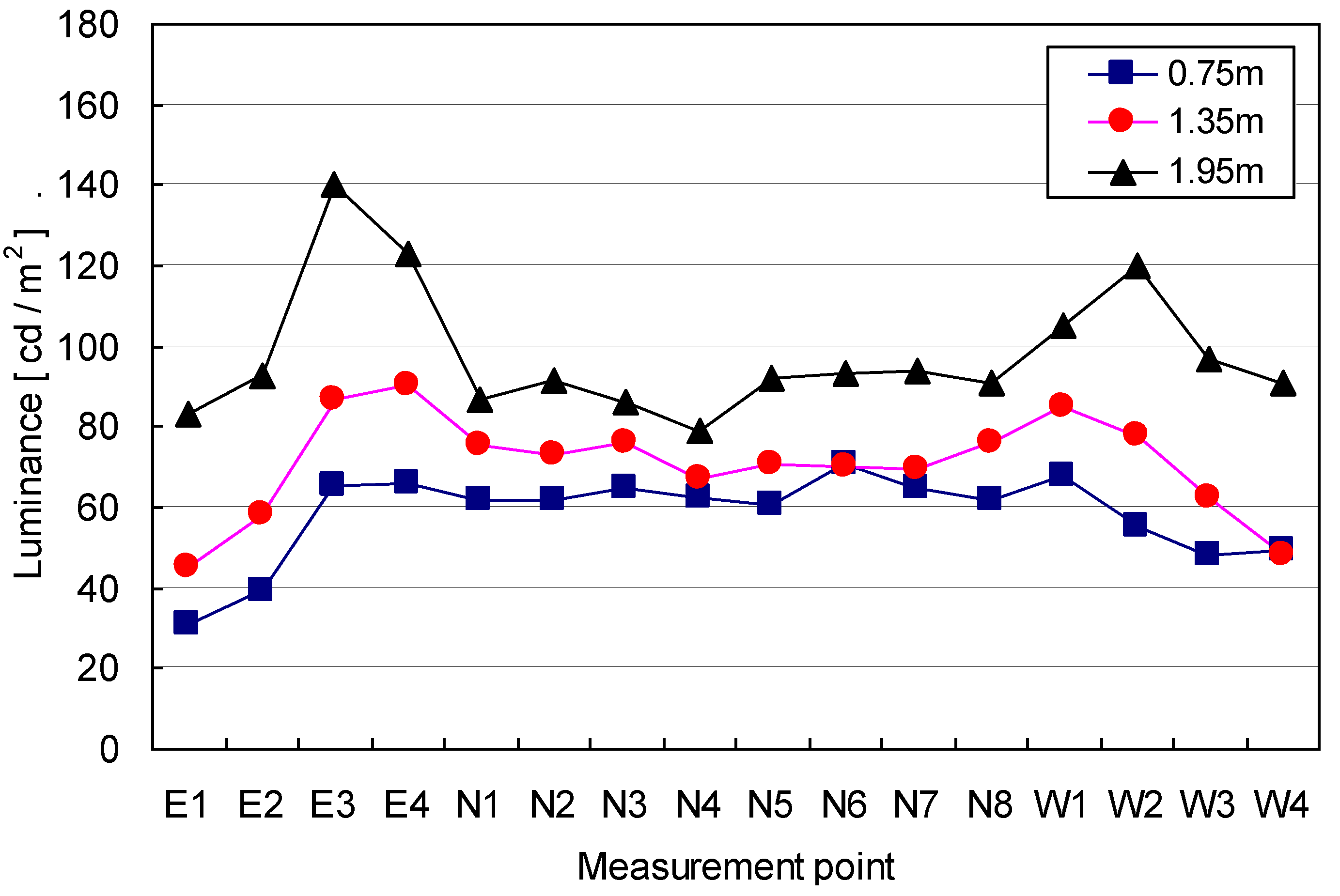
For the 750 lx conditions, the illuminance on the north wall varied from 426 lx to 590 lx. The illuminance on the east and west walls varied from 259 lx to 415 lx, and 229 lx to 403 lx, respectively. The luminance on the north wall varied from 60.5 cd/m2 to 94.1 cd/m2. The mean luminous levels at the heights of 0.75 m, 1.35 m and 1.95 m on the north wall were 63.59 cd/m2, 72.17 cd/m2 and 89.72 cd/m2, respectively.
Figure 7.
Variation of illuminance on walls (750 lx condition).
Figure 7.
Variation of illuminance on walls (750 lx condition).
Figure 8.
Variation of luminance on walls (750 lx condition).
Figure 8.
Variation of luminance on walls (750 lx condition).
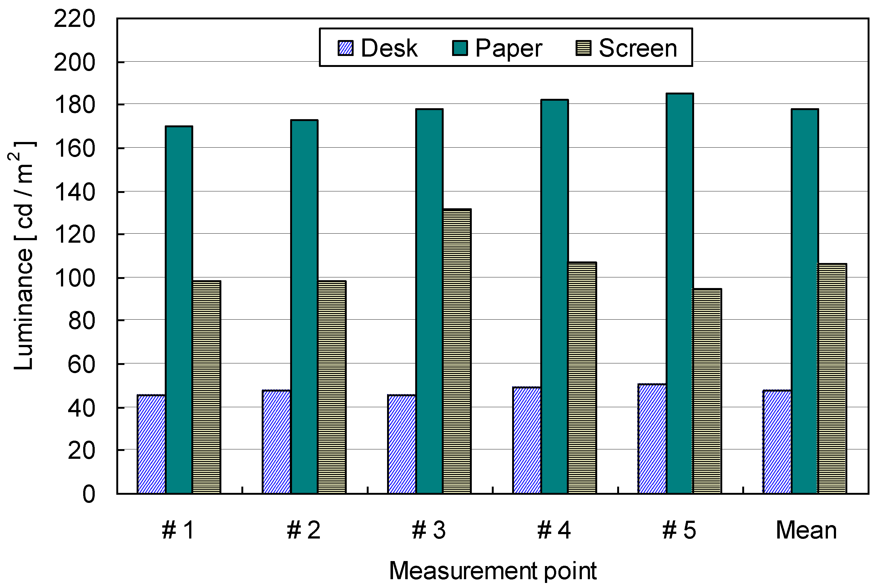
Figure 9 and
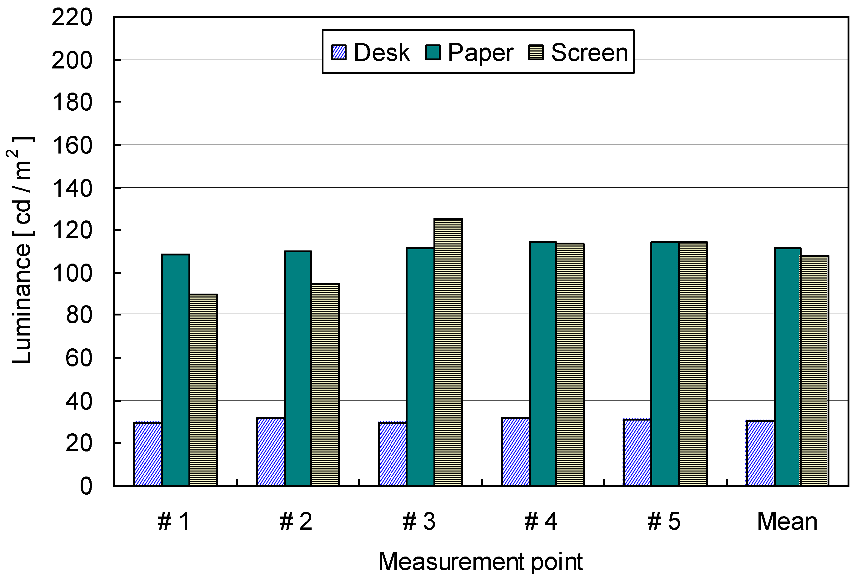
Figure 10 show the luminous distribution on the desktop, paper, and the computer screen when the target illuminance levels on the desktop were 500 lx and 750 lx. For the 500 lx desktop illuminance condition, the luminous from the desktop surface varied from 29.36 cd/m
2 to 31.68 cd/m
2, while the luminous from the paper surface varied from 111.1 cd/m
2 to 114 cd/m
2. The contrast between the two surfaces was 2.63. The luminous projected from the computer screen ranged from 89.71 cd/m
2 to 125.5 cd/m
2.
For the 750 lx conditions, the luminous from the paper surface increased significantly compared with the luminous from the desktop. The mean luminous from the surfaces of the desktop and paper increased by 54.97% and 59.22%, respectively, compared to the 500 lx conditions. The contrast between the desktop and paper surface was 2.73. The mean luminous from the computer screen was 106.12 cd/m2.
Figure 9.
Variation of luminance on desktop and computer screen (500 lx condition).
Figure 9.
Variation of luminance on desktop and computer screen (500 lx condition).
Figure 10.
Variation of luminance on desktop and computer screen (750 lx condition).
Figure 10.
Variation of luminance on desktop and computer screen (750 lx condition).
The illuminance and luminous on the walls influenced visual perception when reading tasks were conducted, since the visual fields of the subjects’ eyes were not always confined to the area in which the reading materials were presented. For both target illuminance conditions, no critical problems relevant visual adaptation were observed when the subjects’ eyes moved from the desktop to the walls, since the differences in illuminance between them were within ranges that satisfy photopic vision conditions. This implies that the reading tasks were not influenced by illuminance differences between the desktop and wall surfaces.
The subjects were nine male and 11 female undergraduate students with a mean age of 25. Six subjects wore glasses and five subjects wore contact lenses to correct their vision. The rest of the subjects had normal vision. None of the subjects were color blind. The subjects were experienced with conducting documentation tasks for 4 hours per a day using paper or computers.
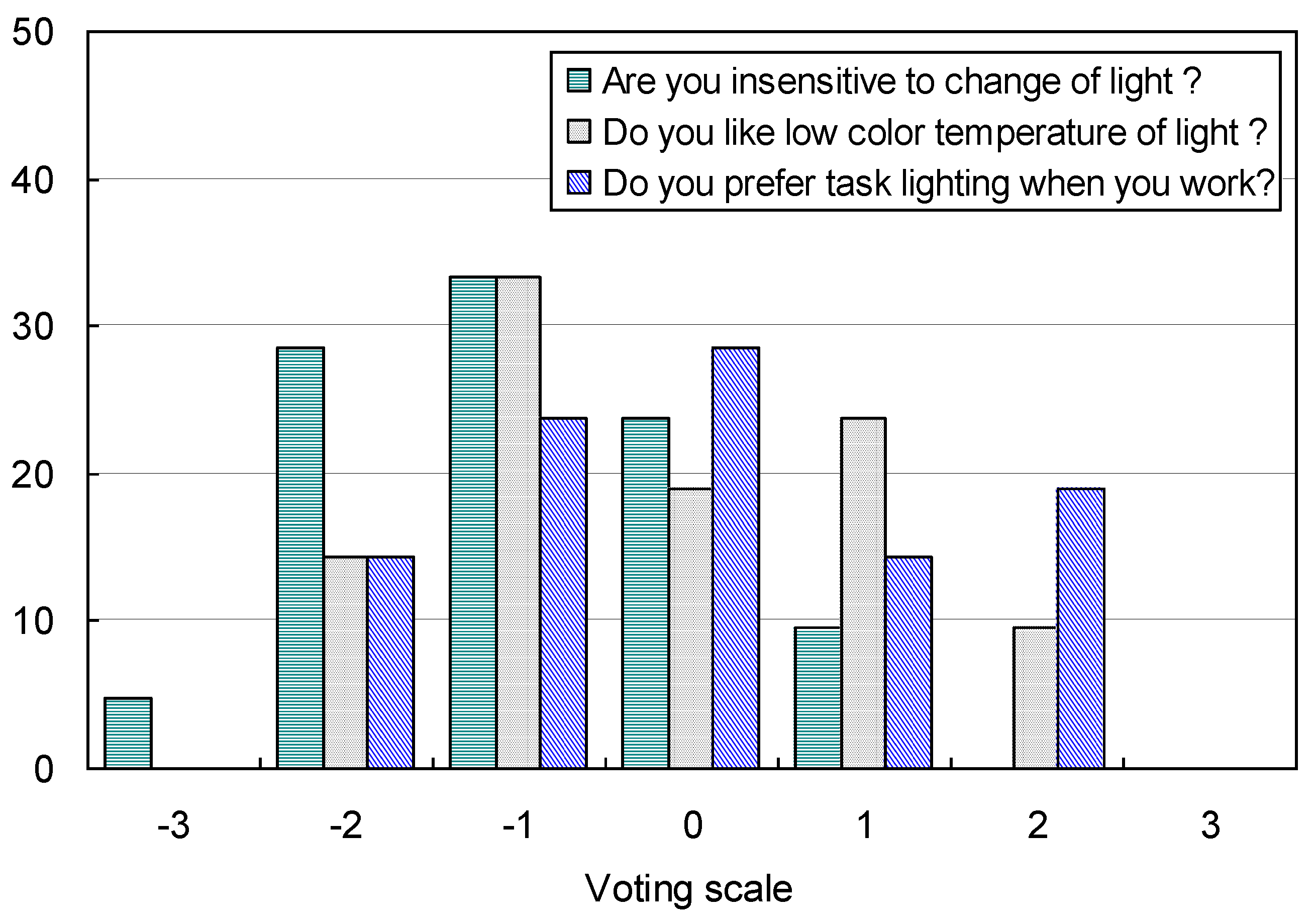
Figure 11 shows subject sensitivities and preferences regarding lighting conditions. Overall, the subjects responded sensitively to lighting changes in the test space. It was found that 33.33% of the subjects were very sensitive to changes in the lighting environment while 33.3% of the subjects were slightly sensitive. Also, 23.1% of subjects were neutral, indicating that they were neither sensitive nor insensitive to lighting conditions.
Figure 11.
Subjects’ sensitivity and preference to indoor lighting environment.
Figure 11.
Subjects’ sensitivity and preference to indoor lighting environment.
While 33.33% of subjects preferred low color temperatures that generated reddish colors, 47.6% of subjects preferred high color temperatures associated with bluish light. It was found that 33.34% of subjects preferred task lighting when they performed tasks on the desktop, while 38.1% of subjects did not need task lighting for reading tasks. In summary, the general characteristics of subject preferences regarding lighting conditions did not show a significantly skewed distribution, although the distribution was not perfectly normal.
4.2. Perceptions of Visual Annoyance and Comfort
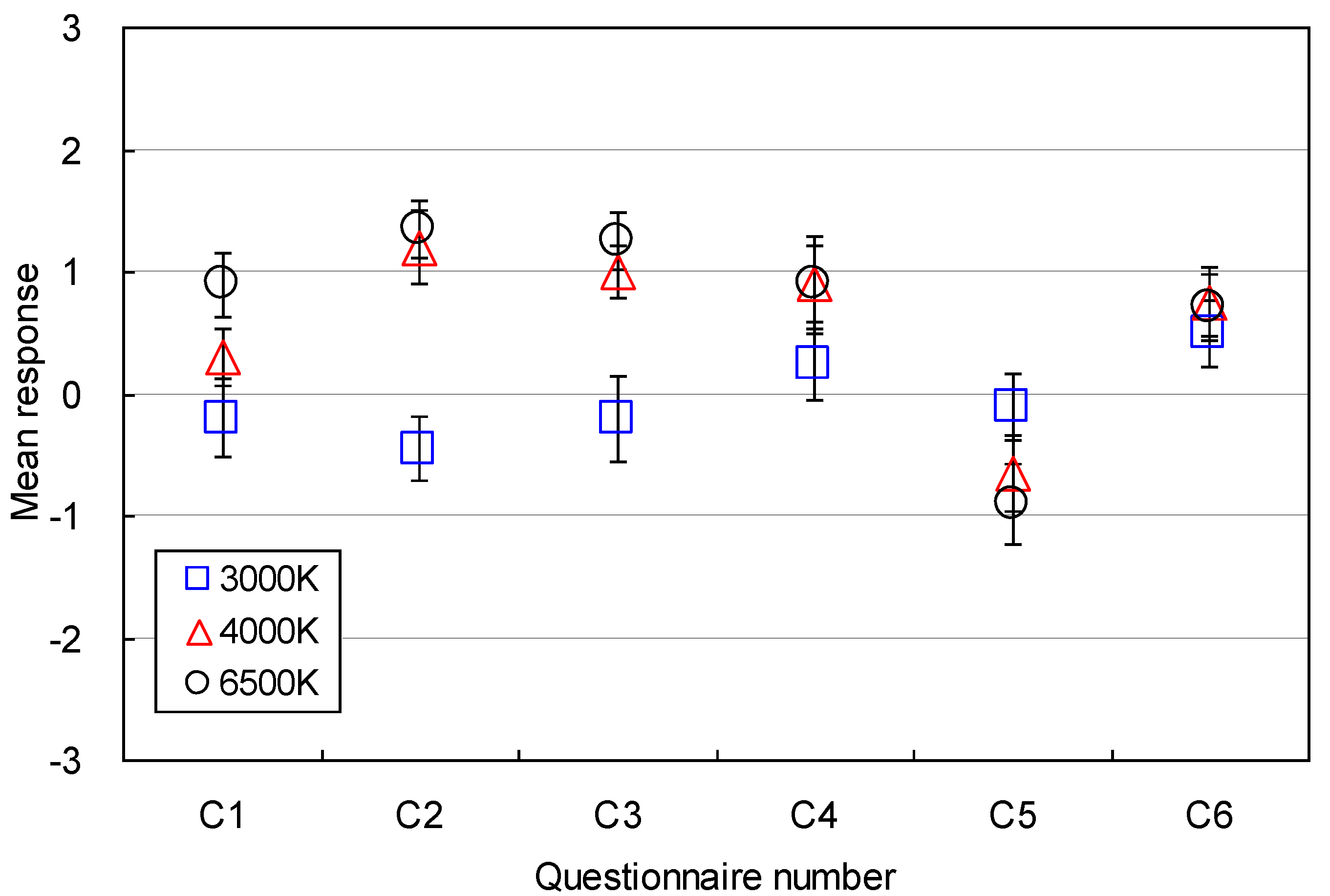
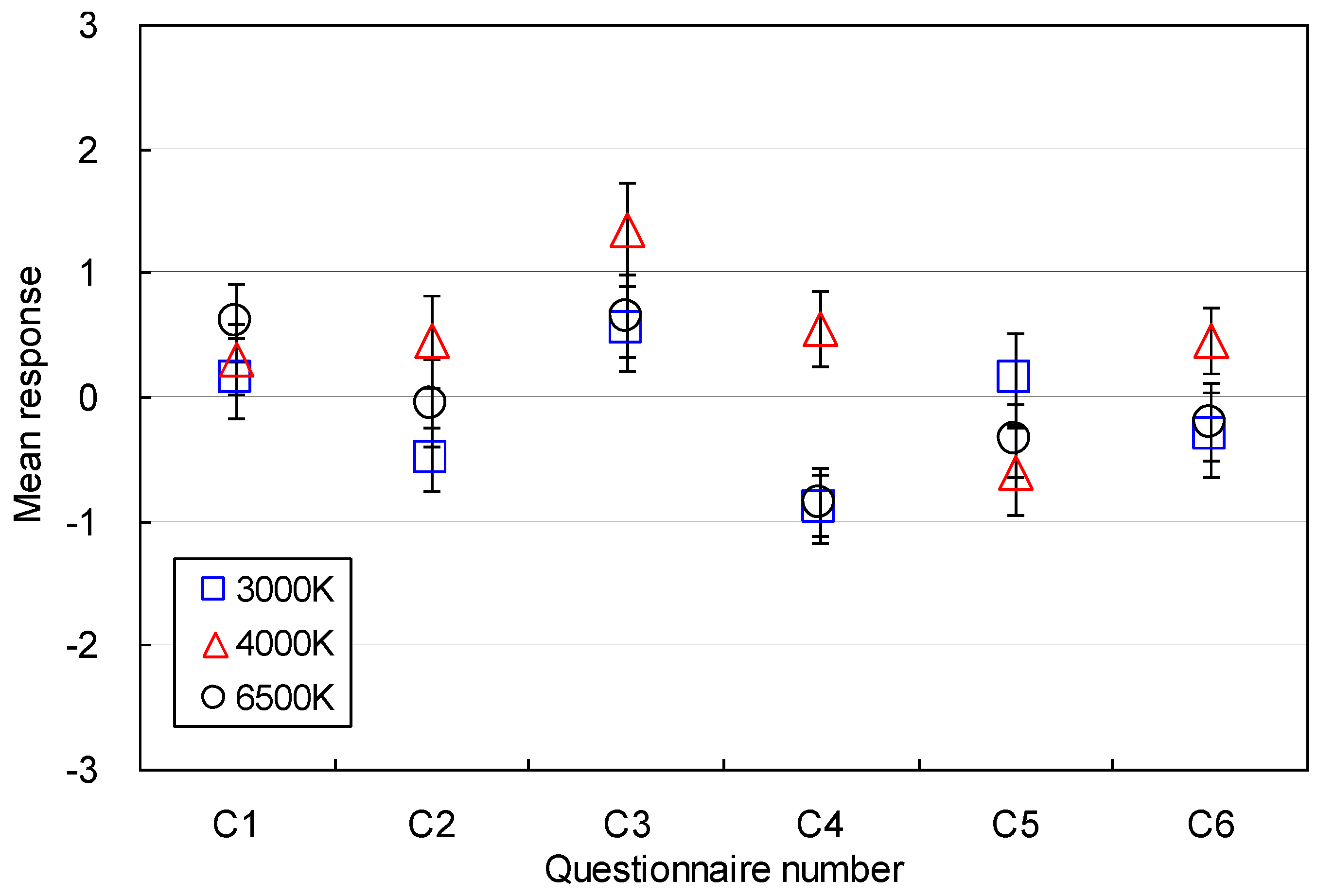
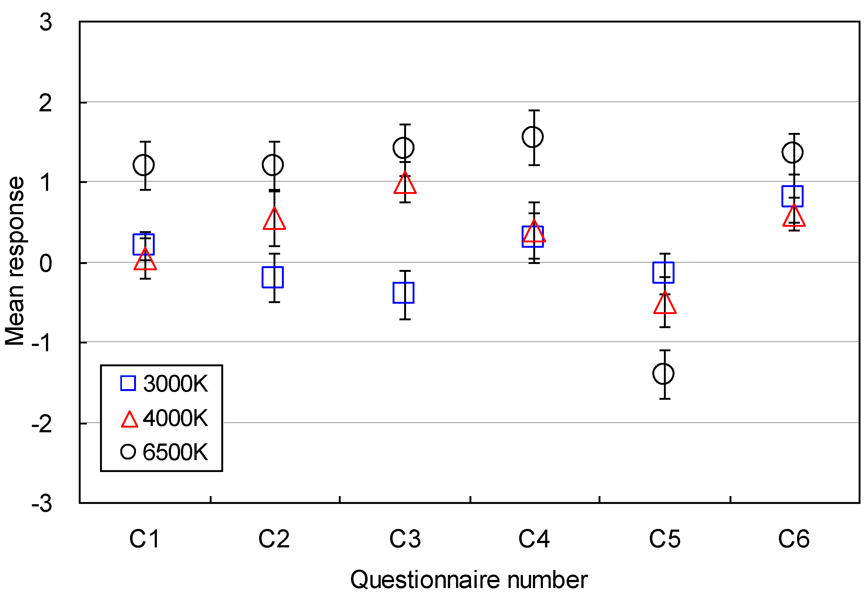
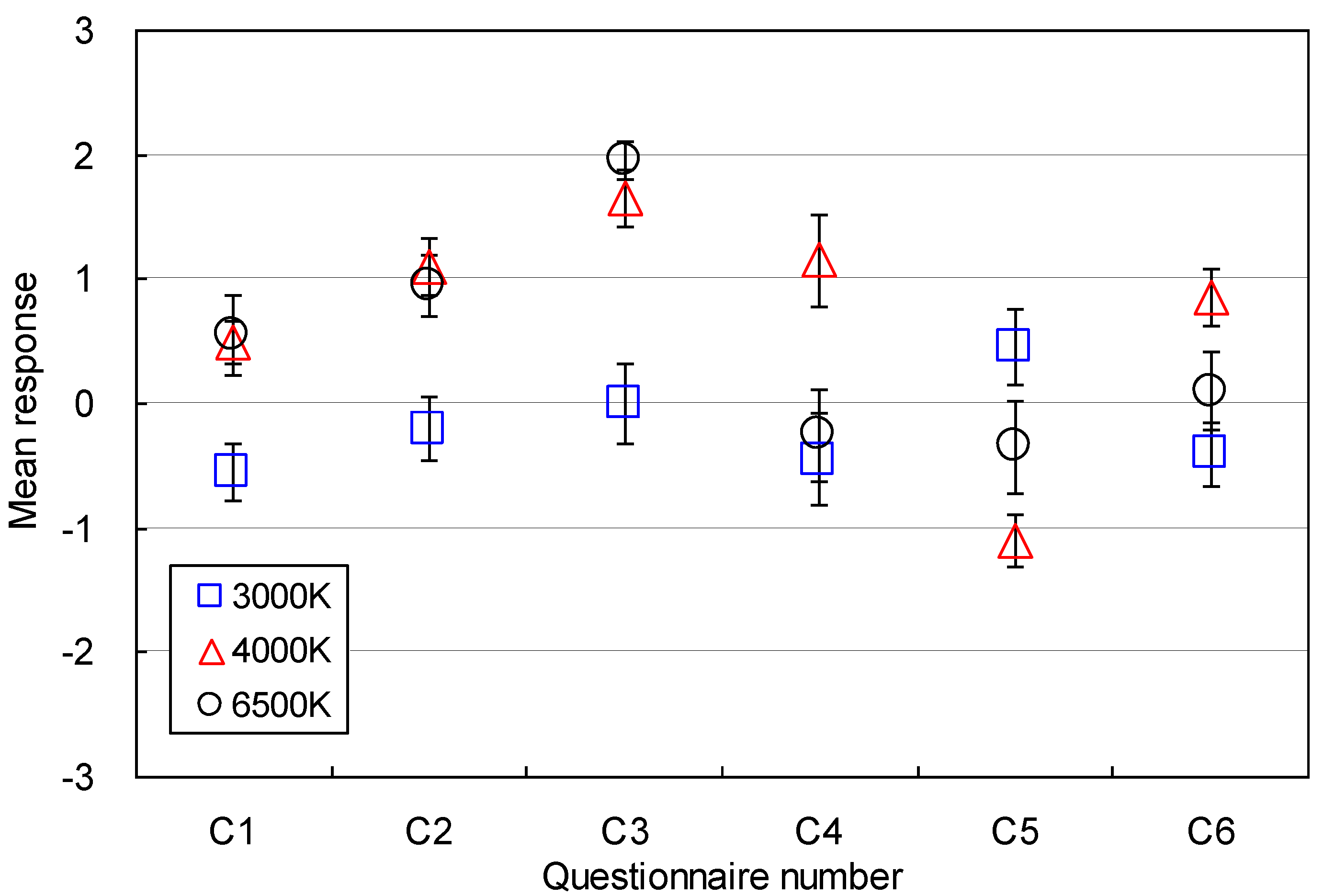
The perceptions of visual annoyance and comfort under different lighting conditions combined with three color temperatures, 3,000 K, 4,000 K and 6,500 K, and two illuminance levels, 500 lx and 750 lx were examined in this study. The subjects’ visual perceptions of the six lighting conditions are shown in
Figure 12,
Figure 13,
Figure 14 and
Figure 15. Each data point represents the mean of visual responses from all 20 subjects for each question.
Figure 12.
Visual comfort and annoyance (500 lx, Computer task).
Figure 12.
Visual comfort and annoyance (500 lx, Computer task).
Figure 13.
Visual comfort and annoyance (750 lx, Computer task).
Figure 13.
Visual comfort and annoyance (750 lx, Computer task).
Satisfaction (C1) with the color of light was reported under all conditions. Under the 500 lx conditions, subjects preferred the color of the 6,500 K lamps (M = 1.20, SD = 1.36), but their responses were near neutral to the color of the 3,000 K lamps, (M = 0.2, SD = 1.44). Under the 750 lx conditions, satisfaction with the color of light decreased. The decrease in the mean response for the paper task under the 3,000 K condition was noticeable, (M = −0.55, SD = 1.05) although the mean vote was still within an acceptable range.
The lighting conditions formed by the three color conditions maintained favorable visual environments under which subjects could see letters clearly for the reading tasks (C3). However, the 500 lx condition with the 3,000 K lamp was less favorable for paper-based reading tasks, (M = −0.40, SD = 1.35). The increase of illuminance was effective for paper-based reading tasks, but was not useful for the computer-based reading tasks since the increase of illuminance caused stronger background luminous levels that may cause glare.
Figure 14.
Visual comfort and annoyance (500 lx, Paper task).
Figure 14.
Visual comfort and annoyance (500 lx, Paper task).
Figure 15.
Visual comfort and annoyance (750 lx, Paper task).
Figure 15.
Visual comfort and annoyance (750 lx, Paper task).
Overall, the six lighting environments did not affect (C5) reading tasks significantly, except for the two cases under 750 lx. The disturbance was the greatest when the two target illuminance levels were kept under 3,000 K. The 4,000 K and 6,500 K conditions produced acceptable lighting conditions for computer-based and paper-based reading tasks.
Significant visual discomfort (C6) was not reported under any of the lighting environments used in this study. The 500 lx conditions were favorable for all color conditions in terms of visual comfort (M = 0.50, SD = 1.24~M = 1.36, SD = 1.09). The 6,500 K condition provided superior visual comfort for paper-based reading tasks compared with other conditions (M = 1.36, SD = 1.09). As the desktop illuminance increased to 750 lx, subjects reported lower visual comfort for the 3,000 K and 6,500 K conditions (M = −0.40, SD = 1.14~M = 0.10, SD = 1.41). However, better visual comfort was reported for paper tasks under 4,000 K (M = 0.85, SD = 1.04).
These results indicate that lamps with higher and lower color temperatures decreased visual comfort under the 500 lx condition, which is the minimum illuminance level for the performance of medium contrast or small size visual tasks in office environments [
18]. In particular, 3,000 K lamps do not provide visual comfort in office environments. However, 4,000 K lamps are effective when the illuminance is greater than 500 lx.
These results might reflect the sensitivity of photoreceptors in human eyes. According to the characteristics of cone photoreceptors in the fovea and retina [
18], the reddish color produced by lower color temperatures stimulate the photoreceptors more intensely than the bluish color produced by higher color temperatures. Therefore, the increase of luminance under lower color temperature conditions, such as 3,000 K, was sensed more sensitively and caused greater visual discomfort to subjects. This result is consistent with the original hypothesis of this study.
The results discussed in this section are valid for office environments where lighting conditions include a variety of color temperatures and illuminance conditions. These results also agree with those of previous studies. According to Knez, lower illuminance conditions are considered dim visual environments compared with higher illuminance conditions regardless of the color temperature of fluorescent lamps, and higher illuminance conditions were evaluated as more intense than lower illuminance conditions [
6,
8]. However, this previous study was confined to analyses of mood under different lighting conditions, and lacked analysis of the effects of stimulating factors on visual discomfort.
Manav showed that color temperature and illuminance levels influenced visual perception in office environments [
3]. An illuminance level of 2,000 lx was preferred for comfort, spaciousness, brightness, and saturation evaluations. A color temperature of 4,000 K was preferred for favorable perceptions of visual comfort and spaciousness, and 2,700 K conditions were preferred for relaxed feelings in office environments. Under 2,000 lx conditions, occupants experienced direct or reflected glare, which causes significant visual discomfort, however visual discomfort was not analyzed in the study.
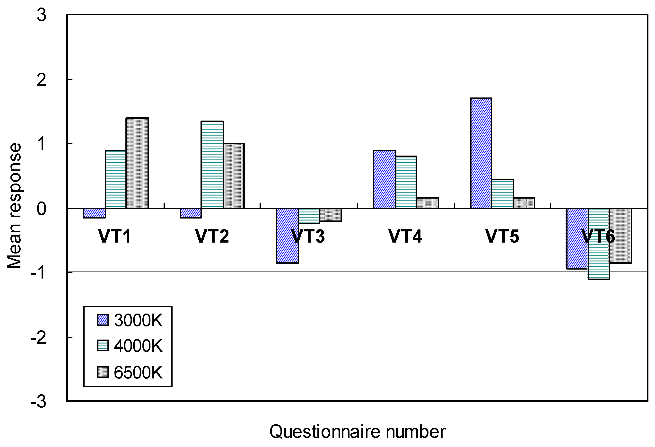
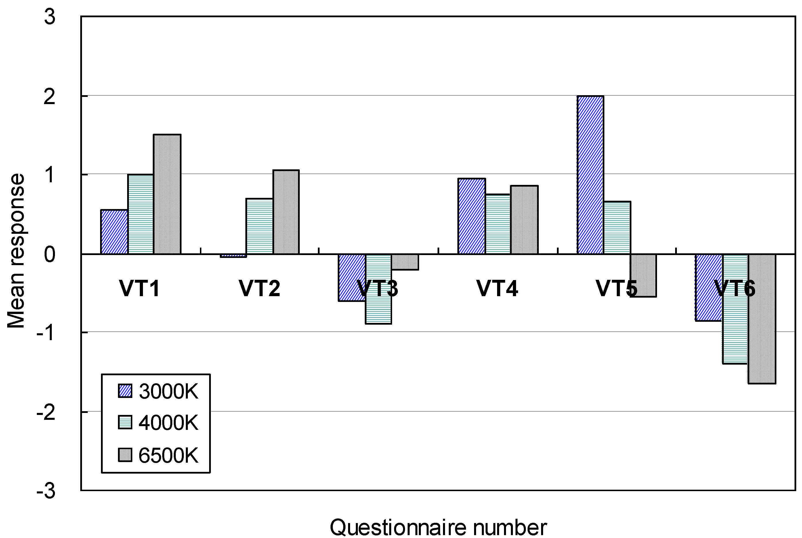
4.3. Perceptions of Visual Stimulation Factors and Mood
The perceptions of visual stimulation under each different color and illuminance conditions were examined. The mean responses to visual stimulation are shown in
Figure 16,
Figure 17,
Figure 18 and
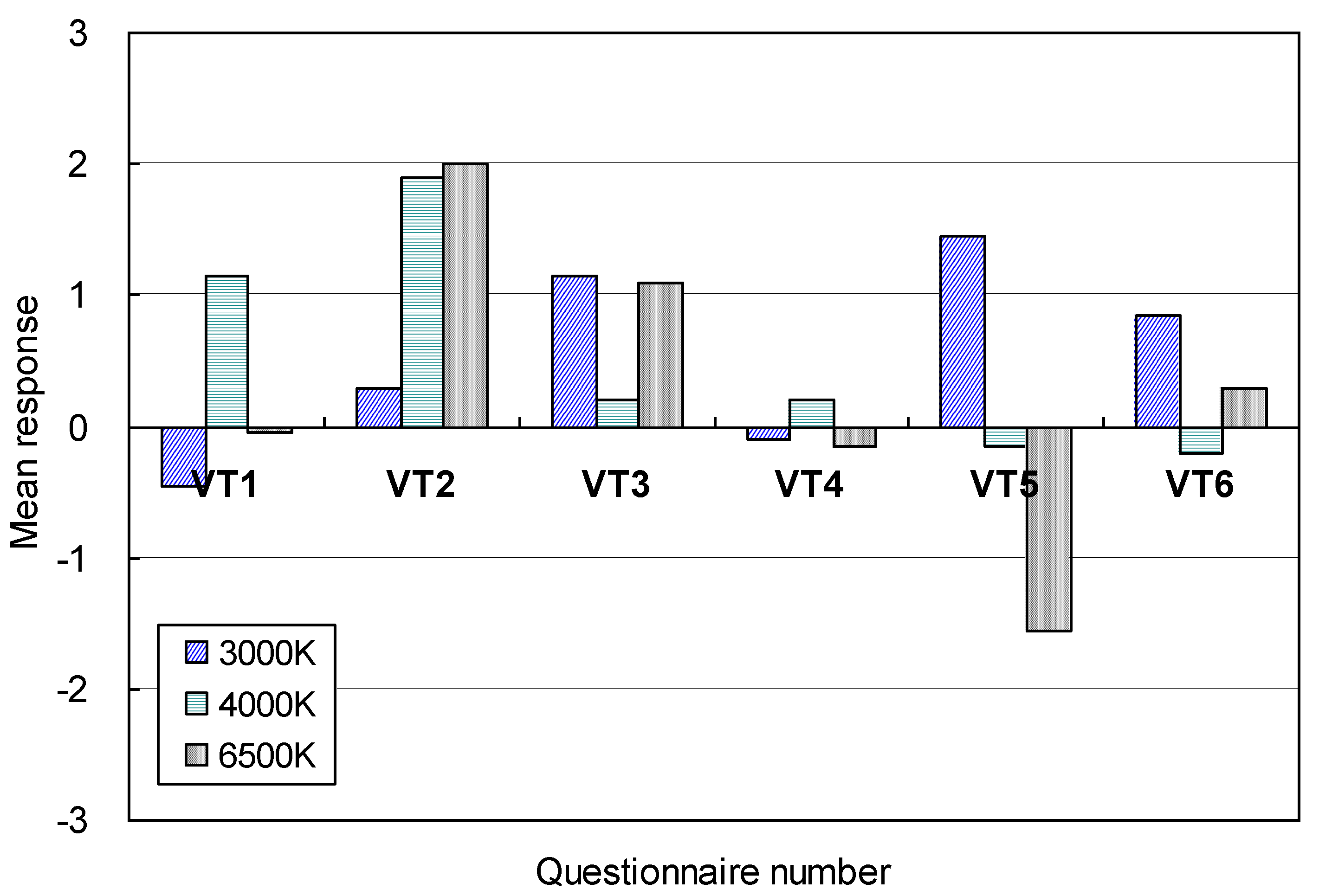
Figure 19. Overall, perception was influenced by changes of illuminance and color temperature. The visual perceptions of brightness or dimness for conducting reading tasks (VT3) were not significantly affected by color temperature when the desktop illuminance was 500 lx. The mean responses for the three color conditions ranged from −0.9 (M = −0.9, SD = 0.72) to −0.2 (M = −0.2, SD = 1.06) on the voting scale. In particular, the 3000 K condition was evaluated as a less bright visual environment when computer-based reading tasks were conducted.
As the illuminance changed to 750 lx, the influence of color temperature on the perception of brightness became stronger. In particular, the influence of 3,000 K conditions on computer-based reading tasks was noticeable (M = 1.50, SD = 0.69). The 6,500 K condition was a bright environment for paper-based reading tasks (M = 1.10, SD = 1.07), but its effect was weaker than that of 3,000 K. The perception of brightness for 4000 K was not significant although the mean response increased slightly.
Figure 16.
Perception of visual stimulation (500 lx condition, Computer task).
Figure 16.
Perception of visual stimulation (500 lx condition, Computer task).
Figure 17.
Perception of visual stimulation (750 lx conditions, Computer task).
Figure 17.
Perception of visual stimulation (750 lx conditions, Computer task).
This indicates that as illuminance increased beyond 500 lx, the perception of brightness was affected more strongly by long wave lengths in the visible spectrum than by short wave lengths that generate bluish light. Hence, this study recommends that 3,000 K conditions should not be used for office lighting, since 500 lx and 750 lx illuminance levels were evaluated as dim and bright environments, respectively, and therefore were not within the acceptable range. However, 4,000 K may be effectively used to reduce potential visual complaints, since the perception of brightness did not increase significantly as desktop illuminance increased to 750 lx.
Under the 3,000 K condition, the majority of subjects felt visually warm (VT5) but their visual perception was less favorable compared than for the other two conditions. Overall, the mean responses for visual perception under 3,000 K were within an acceptable range, below under which significantly worse perceptions were reported. However, the 3,000 K condition did not result in more favorable visual environments than the other two color temperature conditions. For instance, the perception of visual stimulation at 500 lx under the 6,500 K condition was effectively decreased. The 4,000 K condition also reduced visual stimulation, but not more than the 6,500 K condition.
Figure 18.
Perception of visual stimulation (500 lx condition, Paper task).
Figure 18.
Perception of visual stimulation (500 lx condition, Paper task).
Figure 19.
Perception of visual stimulation (750 lx condition, Paper task).
Figure 19.
Perception of visual stimulation (750 lx condition, Paper task).
As the desktop illuminance increased to 750 lx under 6,500 K, the visual environment became slightly worse, and subjects felt stronger visual stimulation of the kind that potentially influences overall visual comfort. The 3,000 K condition decreased the mean response of visual perception within a very limited range. In comparison, the mean responses for 4,000 K imply more visually favorable perception. Therefore, the visual responses to visual stimuli vary according to color temperature and illuminance levels in the context of office lighting environments. The 4,000 K color temperature was suitable for 500 lx and 750 lx target illuminance conditions, and was associated with better visual perception.
The 500 lx illuminance condition caused no glare under all three color temperatures (VT6) (M = −1.65, SD = 1.31~M = −0.85, SD = 1.42). The weakest glare was reported under the 6,500 K condition. The lowest mean response occurred for 6500 K (M = −1.65, SD = 1.31), and the highest mean responses for 3,000 K and 6,500 K conditions (M = −0.85, SD = 1.42). As the desktop illuminance increased to 750 lx, the sensation of glare also increased. In particular, under 3,000 K the sensation of glare increased for the paper based-reading tasks to 0.85 from −0.95 on the rating scale (M = 0.85, SD = 1.04). The perception of glare was also affected by the 4,000 K and 6,500 K conditions, although the influence was not stronger than that of 3,000 K. The mean responses under 4,000 K and 6,500 K conditions were still within a comfortable range and no significant glare was perceived.
It appears that lower color temperatures containing longer wave lengths influenced visual perception of glare more than high color temperatures when office tasks were performed under desktop illuminance levels higher than 500 lx. In order to reduce the effects of glare, 3,000 K color temperatures should not be used for illuminance levels higher than 500 lx.
The variations of subject mood under each lighting condition are shown in
Table 4. Overall, subject mood varied under the three color conditions according to illuminance and color temperature. No unfavorable moods were reported under 500 lx. The 3,000 K condition maintained favorable visual environments, and the subjects reported slightly better moods than for any other color conditions. In particular, the subjects felt that the lighting condition was cozy and attractive.
Table 4.
Mood Perception under illuminance and color temperature conditions.
Table 4.
Mood Perception under illuminance and color temperature conditions.
| No. | Stats. | Computer-based reading task | Paper-based reading task |
|---|
| 500 lx | 750 lx | 500 lx | 750 lx |
|---|
| 3,000 [K] | 4,000 [K] | 6,500 [K] | 3,000 [K] | 4,000 [K] | 6,500 [K] | 3,000 [K] | 4,000 [K] | 6,500 [K] | 3,000 [K] | 4,000 [K] | 6,500 [K] |
|---|
| M1 | Mean | 0.05 | 0.40 | 0.35 | −1.00 | 0.65 | 0.15 | 0.75 | 0.20 | 1.15 | −0.40 | 0.90 | 0.05 |
| SD | 1.39 | 1.23 | 1.31 | 1.21 | 1.57 | 1.14 | 1.25 | 1.20 | 1.23 | 1.23 | 1.12 | 1.23 |
| M2 | Mean | 0.25 | 0.50 | 0.60 | −0.80 | 0.35 | 0.05 | 0.60 | 0.10 | 0.85 | −0.55 | 0.55 | 0.10 |
| SD | 1.29 | 1.10 | 1.54 | 1.28 | 1.60 | 1.43 | 1.47 | 1.02 | 1.27 | 1.10 | 1.00 | 1.33 |
| M3 | Mean | 0.35 | 0.25 | 0.45 | −0.15 | −0.30 | −0.15 | 0.90 | −0.20 | 0.15 | −0.40 | 0.55 | −0.05 |
| SD | 1.14 | 1.52 | 1.61 | 1.66 | 1.42 | 1.31 | 0.97 | 1.20 | 1.35 | 0.99 | 0.76 | 1.54 |
| M4 | Mean | 0.80 | 0.90 | 0.75 | −0.55 | −0.30 | −0.20 | 0.85 | 0.90 | 0.40 | −0.20 | 0.30 | −0.45 |
| SD | 1.47 | 1.02 | 1.02 | 1.64 | 0.98 | 1.01 | 1.60 | 1.02 | 0.94 | 1.15 | 0.86 | 0.94 |
| M5 | Mean | −0.05 | 1.10 | 1.55 | −0.25 | 1.20 | 0.35 | 1.30 | 1.65 | 1.15 | 0.60 | 1.70 | 0.60 |
| SD | 1.64 | 1.17 | 1.61 | 1.25 | 1.32 | 1.42 | 1.59 | 1.09 | 1.09 | 1.10 | 1.13 | 1.14 |
| M6 | Mean | 1.15 | 0.65 | 0.70 | −0.15 | −0.75 | −0.30 | 0.90 | 0.60 | −0.10 | 0.20 | 0.20 | −0.25 |
| SD | 1.31 | 1.04 | 1.03 | 1.35 | 1.25 | 1.17 | 1.62 | 0.88 | 1.07 | 1.01 | 1.11 | 1.45 |
| M7 | Mean | −0.55 | 0.05 | 0.35 | −0.65 | 0.85 | 0.15 | −0.45 | −0.25 | 0.40 | −0.40 | 0.45 | 1.25 |
| SD | 1.19 | 1.15 | 1.14 | 1.31 | 1.31 | 1.23 | 1.23 | 1.02 | 1.47 | 1.43 | 0.89 | 1.52 |
The mean responses for mood for the 3,000 K and 6,500 K conditions became lower on the voting scale at 750 lx. The decrease for 3,000 K was noticeable but not significant. Slightly better moods were reported when computer-based reading tasks were performed at 4,000 K. In summary, subject mood was affected by color temperature and illuminance. Lower color temperatures such as 3,000 K were more effective for producing better moods at lower illuminance levels. However, higher color temperatures were preferred at 750 lx.
The results of this study are valid for office environments in which lighting conditions include a variety of color temperatures and illuminance conditions. These results generally agree with those of previous study [
3]. Manav found that the 3,000 K condition at 500 lx made subjects feel relaxed. The 3,000 K color temperature felt visually warm, while the 6,500 K conditions made subjects feel tense and visually cold. While Manav used an illuminance of 2,000 lx for experiments, 500 lx and 750 lx, which are more common in office lighting conditions were used in this study. Although the illuminance levels used for Manav and the present study were different, the visual perceptions of color temperature conditions reported by subjects were similar.
According to Knez [
8,
9], 4,200 K fluorescent lamps made the test space brighter than did 2,950 K lamps. The 4,200 K condition at 300 lx and 2,950 K condition at 1,500 lx were associated with more positive moods by subjects. However, Knez analyzed only mood under different lighting conditions, and not the effects of stimulating factors on visual discomfort, as in the present study. Knez
et al. [
6,
10] stated that younger adults (average 23 years of age) most often experienced negative moods in more reddish color temperatures such as 3,000 K, while mood was more positive under bluish color conditions at 4,000 K when cognitive tasks were performed. They also showed that glare was perceived under 1,500 lx independent of color temperature, but glare was not discussed in terms of visual discomfort.
In the present study, similar results to those of Knez under three color temperature conditions were observed. The perception of glare was strongly relevant to visual discomfort at 750 lx regardless of color temperature. The 3,000 K condition was preferred as it resulted in a better mood, while 6,500 K was the least preferred.
Kim
et al. [
15,
16] stated that increases in illuminance decrease visual perception in office environments lighted with 5,000 K fluorescent lamps. As illuminance increases beyond 500 lx, the perceptions of brightness and glare became strong, and negatively impact visual comfort. In addition, feelings of eye fatigue, distraction, inability to see letters clearly, and visual annoyance are important influential factors that affect visual comfort in office environments.
The results of previous studies are therefore generally consistent with the results of the present study, in which the perception of visual comfort was strongly influenced by visual distraction and stimulation, glare, and degree of visual annoyance due to light. Stimulating factors that impair visual comfort and perception in office environments were examined in all of these studies. The results of these studies imply that visual comfort is not improved unless factors that impede visual perception are effectively reduced under office lighting conditions.
4.4. Prediction Models for Visual Annoyance and Mood
Prediction models that explain the influence of visual stimulation factors on the perception of visual comfort were developed in this study to examine relationships between them. The response of visual comfort (C6) was considered as a dependent variable, and the visual stimulation factors that affect visual response were considered as independent variables in the prediction models. All answers regarding stimulation factors from questionnaires were included in initial multiple linear regression models as independent variables. Only independent variables that were acceptable given a significance level of 0.05 were included in final models.
Analysis of variance (ANOVA) was employed to examine linear relationships between independent and dependent variables. The prediction models expressed by multiple linear regressions are summarized in
Table 5. Overall, the linear regression models show that perceptions of visual comfort (C6) for reading tasks and visual stimulation factors under given lighting conditions are linearly correlated. The coefficients of determination (
r2) of the prediction models varied from 0.6073 to 0.7649. This implies that the reduced error variances in the sensation of visual comfort under the given lighting conditions ranged from 60.73% to 76.49%, when visual stimulation factors were utilized to predict the perception of visual comfort.
Table 5.
Prediction model of visual comfort for lighting environment.
Table 5.
Prediction model of visual comfort for lighting environment.
Color
temperature | Variable | Unstandardized Coefficients | t | Sig. | ANOVA |
|---|
| B | Std. Error |
|---|
| 3,000 K | (Constant) | 0.18 | 0.10 | 1.80 | 0.08 | F (3,76) = 39.18,
Sig. = 0.00,
r2 = 0.6073 |
| Q1 | −0.43 | 0.06 | −6.30 | 0.00 |
| Q3 | 0.45 | 0.08 | 5.27 | 0.00 |
| M9 | 0.24 | 0.07 | 3.28 | 0.00 |
| 4,000 K | (Constant) | 0.15 | 0.09 | 1.68 | 0.10 | F (4,75) = 29.13,
Sig. = 0.00,
r2 = 0.6084 |
| Q2 | −0.28 | 0.08 | −3.17 | 0.00 |
| Q3 | 0.39 | 0.08 | 4.60 | 0.00 |
| Q6 | −0.34 | 0.07 | −4.91 | 0.00 |
| M6 | 0.13 | 0.05 | 2.40 | 0.02 |
| 6,500 K | (Constant) | −0.35 | 0.11 | −3.05 | 0.00 | F (5,74) = 48.07,
Sig. = 0.00,
r2 = 0.7649 |
| Q1 | −0.30 | 0.07 | −4.16 | 0.00 |
| Q2 | 0.24 | 0.08 | 2.73 | 0.01 |
| Q3 | 0.35 | 0.07 | 5.08 | 0.00 |
| M6 | 0.17 | 0.07 | 2.22 | 0.03 |
| M7 | 0.30 | 0.07 | 3.95 | 0.00 |
| Q4 | 0.50 | 0.08 | 5.91 | 0.00 |
| Q6 | −0.37 | 0.08 | −4.60 | 0.00 |
The perception of glare (VT6), satisfaction with the color of light (C1), sensation of being bothered by light (C5), visual distraction (C2), and feelings of dimness or brightness (T5) were primary influential factors that affected the perception of visual comfort. The satisfaction with the color of light (C1) was an important factor in the prediction of visual comfort under all lighting conditions. The perception of visual comfort was linearly proportional to the satisfaction with the color of the light source.
The perception of glare (VT6) was a strong contributor to the perception of visual comfort at 3,000 K and 6,500K, but became weaker at the 4,000 K. The 3,000 K and 6,500 K conditions that generated red and bluish spectra were more irritating to subjects than were 4,000 K conditions that contain less red and bluish spectra.
These results appear to be relevant to the perception of satisfaction with the color of light (C1) and visual distraction (C2) under both lower and higher color temperature. Visual stimulation was reported at 3,000 K, and distraction was reported at 6,500 K. The satisfaction with the color of light (C1) and perception of being bothered by light (C5) were influential contributors to visual comfort for reading tasks under 4,000 K conditions.
The sensation of brightness or dimness (VT3) in lighting environments was also a meaningful influential factor to the perception of visual comfort under 4,000 K and 6,500 K. This indicates that office spaces should be bright, in order to improve visual comfort for office tasks, at 6,500 K. However, less bright environments are necessary for better visual comfort at 4,000 K.
The perception of eye fatigue (C4) was reported along with visual distraction at 6,500 K. Eye fatigue was less influential on visual comfort than was the perception of visual distraction. The effects of eye fatigue on visual comfort were also reported at 4,000 K, although they were slightly weaker than under 6,500 K.
The ANOVA results for mood prediction shown in
Table 6 indicate that the prediction models in this study were acceptable at a significance level of 0.01, and that an appropriate linear relationship existed between independent and dependent variables. Compared with a prediction model of visual comfort, less reduction in error variation occurred for the prediction of mood, since the coefficients of determination (
r2) varied from 0.4454 to 0.6104.
Table 6.
Prediction model of mood for lighting environment (mood: pleasant/unpleasant).
Table 6.
Prediction model of mood for lighting environment (mood: pleasant/unpleasant).
Color
temperature | Variable | Unstandardized Coefficients | t | Sig. | ANOVA |
|---|
| B | Std. Error |
|---|
| 3,000 K | (Constant) | −0.07 | 0.12 | −0.62 | 0.53 | F (3,76) = 20.35,
Sig. = 0.00,
r2 = 0.4454 |
| Q2 | −0.37 | 0.09 | −3.76 | 0.00 |
| Q4 | 0.40 | 0.09 | 4.38 | 0.00 |
| M8 | 0.22 | 0.08 | 2.59 | 0.01 |
| 4,000 K | (Constant) | −0.31 | 0.13 | −2.36 | 0.02 | F (2,77) = 43.77,
Sig. = 0.00,
r2 = 0.5320 |
| Q3 | 0.42 | 0.09 | 4.34 | 0.00 |
| Q5 | 0.45 | 0.08 | 5.36 | 0.00 |
| 6,500 K | (Constant) | −0.12 | 0.11 | −1.12 | 0.27 | F (2,77) = 60.32,
Sig. = 0.00,
r2 = 0.6104 |
| Q4 | 0.50 | 0.08 | 5.91 | 0.00 |
| Q6 | −0.37 | 0.08 | −4.60 | 0.00 |
Overall, the perception of visual comfort (C6) and visual annoyance (C5) strongly affected the perception of lighting conditions as pleasant. Subjects who experienced greater visual comfort and less annoyance also felt that the lighting environment was more pleasant. In particular, the influence of visual comfort on pleasantness was the strongest at 6,500 K, when less visual annoyance (C5) due to lighting conditions increased perceptions of pleasure.
For the 3,000 K conditions, the ability to see letters clearly (VT2) was also a contributor to the perception of pleasantness. The satisfaction with the color of light (C1) was a meaningful contributor at 4,000 K. Visual annoyance (C5) was reduced at 6,500 K and produced better visual environments in which occupants experienced more pleasure. This implies that improved visual environments, where occupants can easily distinguish letters on paper or on a computer screen are necessary to improve the perception of pleasantness.
In summary, the prediction models imply that the less the subjects were visually bothered by the light required for their tasks, the more visual comfort they felt. The color of the light source should be carefully chosen to maintain favorable visual environments for office surroundings, since color predicts visual comfort.
The results of this study imply that the illuminance levels produced by 3,000 K lamps should not exceed 500 lx to improve visual comfort in office environments. At 6,500 K, visual distraction and glare were important factors that should be carefully considered to mitigate the perception of visual discomfort for office tasks. In order to reduce visual discomfort at 4,000 K, careful attention should be paid to the visual annoyance that may be caused by light.
The most influential factor on mood was visual comfort, which was important under most of the lighting conditions examined in this study. Additional factors affecting mood response were the color of light and visual stimulation factors such as stimulation and distraction. A comprehensive consideration of the color and visual stimulation factors involved in lighting design would be useful to improve visual environments for office tasks.


