Quantification of the Variability of Continuous Glucose Monitoring Data

Abstract
: Several measurements are used to describe the behavior of a diabetic patient's blood glucose. We describe a new, wavelet-based algorithm that indicates a new measurement called a PLA index could be used to quantify the variability or predictability of blood glucose. This wavelet-based approach emphasizes the shape of a blood glucose graph. Using continuous glucose monitors (CGMs), this measurement could become a new tool to classify patients based on their blood glucose behavior and may become a new method in the management of diabetes.1. Introduction
Over the past ten years, continuous glucose monitors (CGMs) have become readily available for use by type 1 diabetic patients, and insurance companies are beginning to accept them as a legitimate part of managing diabetes. As the use of CGMs increases, both physicians and patients are faced with the question of how to make sense of the tidal wave of data generated by these devices. Unlike the measuring of blood sugar four to six times a day through a finger-prick or the determination four times a year of A1c (a measure of the average blood glucose level over the past 3–4 months), current CGMs generate a reading every five minutes, leading to nearly 9000 readings and approximately thirty graphs of data per month, if the patient wears the monitor all the time. What can be done to mine this data and learn new facts about a patient's blood glucose management?
This paper presents an analysis of this data via an experimental, unsupervised learning algorithm that uses data generated by a wavelet analysis of a patient's daily CGM data. The results indicate that the shape of a graph corresponding to a day's worth of CGM data may be an important attribute in diabetes care. The shape is intimately connected to the variability of blood glucose readings, which past research suggests is a fundamental part of diabetes care [1]. Using ad hoc clustering methods we suggest one possible interpretation of the results of the wavelet-based algorithm, a single measurement which we call the PLA index. The PLA index quantifies the shape by capturing the number of trend changes in blood glucose in a given day and is subsequently described. Although several simpler measures of variability exist (such as computing the variance of first differences), we have chosen a wavelet-based analysis due to the previous success in shape-related applications (cf. [2] and [3]).
2. Continuous Glucose Monitor Data
The CGM data utilized in this analysis (which were provided by Medtronic) contained blood glucose readings for 106 type 1 patients [4]. Readings were taken at five minute intervals and recorded with the corresponding time they were taken. To compare the patients, we segmented the data of each patient into days beginning at 12:00 AM and ending at 11:59 PM. This led to 288 readings per day for days in which there was a full series of data. To avoid having to analyze partial data, we only considered complete days of a patient. A day was not considered complete if there were two or more missing entries in succession from 12:00 AM to 11:59 PM. A single, isolated reading was interpolated by simply repeating the preceding blood glucose measurement. The average number of complete days for a patient was just under 63 days with the range being from 13 to 214 days. Considering all data, we had over 6600 days of full readings.
3. PLA Index
For each day of CGM data, a graph can be generated. The PLA index is a scalar value that depends on the shape, and hence character, of a graph. It quantifies how variable a graph is.
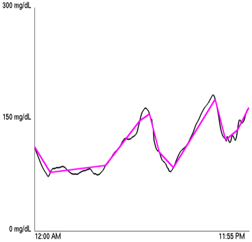
A Piecewise Linear Approximation (henceforth PLA) can approximate any function using a piecewise linear function. (This was first mathematically formulated in [5], and it is the basis of the “Zig-Zag” method of stock price analysis [6].) The approximating function minimizes the number of linear pieces necessary to remain within a specified distance of the original function at each 5 minute interval. For our purposes, the PLA of a diabetic's CGM blood glucose graph was calculated using the sliding window algorithm of [7]. We call the number of linear pieces used in the PLA the PLA factor for a graph and the specified distance the PLA's tolerance. Therefore, at any given time, the PLA is no further than the PLA's tolerance from the CGM graph. A sample PLA is shown superimposed over the original blood glucose graph in Figure 1.
Thus, we can fix a tolerance, and then for each of the over 6600 graphs, we can compute a PLA factor. Testing different tolerances, we found that choosing 12 mg/dL led to an adequate representation of the data, as it was sufficient in capturing overall trends while not introducing extraneous segments when blood sugar is relatively stable. When referring to the PLA factor throughout, it is therefore implied that the tolerance is 12 mg/dL. We then take the average PLA factor for a particular person to calculate for each patient a single PLA index. Using this PLA index, we classified each patient into one of three groups depending on whether the patient possessed a high or low PLA index or fell between the two extremes.
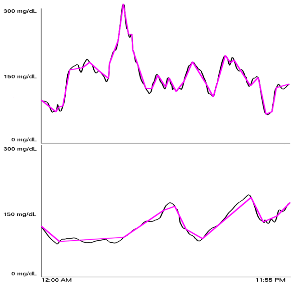
The PLA indices were found to range from 13 to 40, with most being between 21 and 26. Figure 2 shows a high PLA index adjacent to a low PLA index. Our definitions of high, medium, and low PLA indices are summarized in Table 1.
The classification scheme in this table corresponds with a separate classification, discovered independent of any knowledge of the PLA index, which was generated using a wavelet-based unsupervised learning algorithm that is described in Section 4. The algorithm clusters data based on some inherent similarities within the data. The unsupervised quality of the algorithm is vital because we start with no predisposition about what clusters, if any, exist in the data. When clusters do form, there is a significant relationship between points within them as seen in [8]. Specifically, we followed the lead of Lyu et al. who used data from a wavelet analysis of image pixels to successfully distinguish between the artist or artists of alleged Pieter Bruegel and Perugino paintings [2]. The clusters they found corresponded to the actual artist of the painting, while other points corresponded to imitators. These ideas have also been used to detect forged handwriting [9].
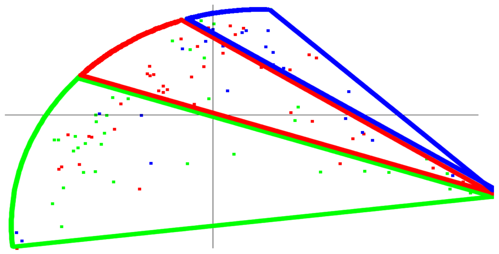
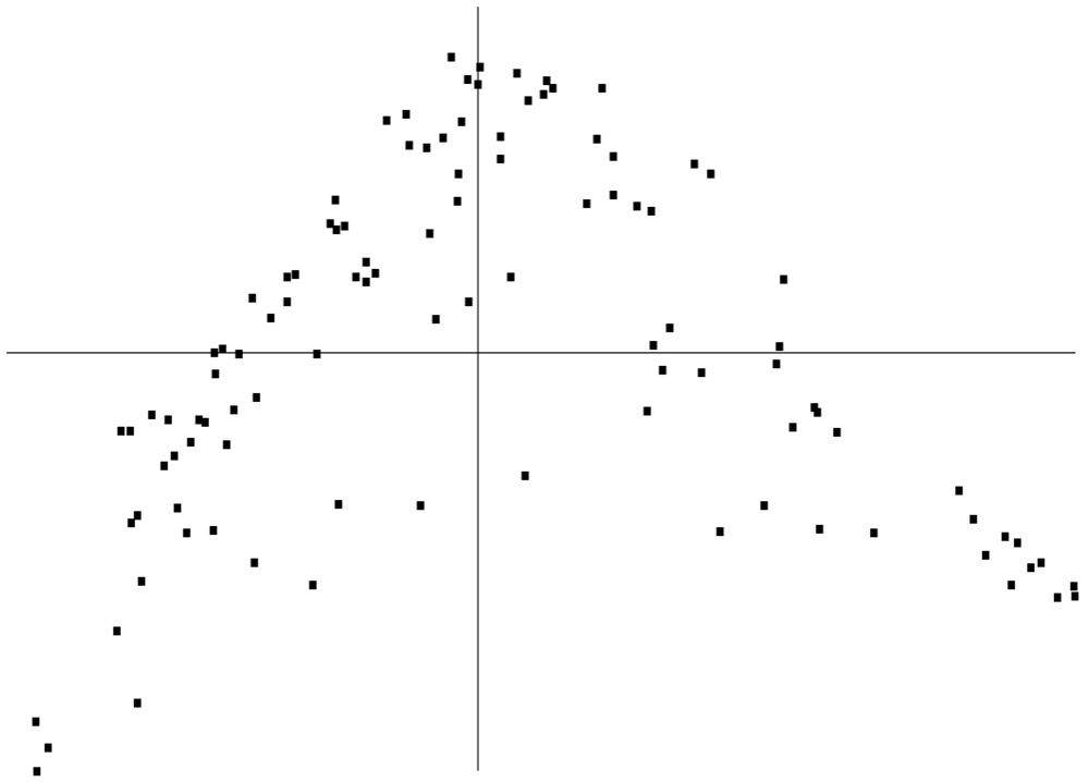
Using our wavelet-based approach, one possible way to identify clusters from the blood glucose data is the three banded clusters shown in Figure 3. When we colored this same graph based on the PLA index, a similar, banded appearance results, as shown in Figure 4. Thus, the results of the wavelet-based approach, an approach which has a track record of being able to identify similarities and differences within a data set, were roughly consistent with the classification by the simple PLA index. The correspondence between the wavelet based method and PLA index is admittedly not as strong as one would hope (simply note different colored patients in different clusters), but it could serve as a potential starting point for further research and refinement into similar methods that yield even stronger relationships. Should such a relationship be shown more empirically, then we believe that this PLA index—just a single value—would represent some fundamental characteristic of a patient's glycemic control. One possible application that further research and clinical tests might validate would be to use the PLA index in conjunction with A1c to analyze the interaction between average glucose value and variability for a patient.
The PLA index characterizes a graph in terms of its variability. A high PLA index means the typical glucose graph requires a larger number of line segments in its PLA approximation, and this is evidence of unpredictable blood glucose behavior. This suggests the patient is having difficulty controlling his or her diabetes well, because he or she is prone to a large amount of variability and hence unpredictability, and an adjustment to basal dosage, bolus dosage, diet, or exercise is recommended. A low PLA index would alternatively suggest the patient is in control. That being said, a low PLA index does not necessarily indicate good control. (Take the extreme example of blood sugar being constant at 300 mg/dL—low PLA index but certainly not healthy.) But it could denote a high level of predictability meaning only slight adjustments are needed to successfully control their diabetes.
4. Wavelet Based Unsupervised Learning Algorithm
The methods involved in the wavelet analysis used to create Figure 3 rely on several techniques applied previously to images, which can be thought of as 2-dimensional signals. To our knowledge, they have yet to be applied to 1-dimensional signals, e.g., time series (although wavelets alone have been used to analyze time series [10]). Using statistics generated from wavelet filters applied to CGM data, we created a digital signature of a single day of a diabetic patient that can be compared with days of the same patient or days of different patients. A unitless “distance” between two patients was computed, and a clustering algorithm allowed us to visualize the results in 2 dimensions. Finally, clusters were determined based on variations in the generated statistics.
4.1. Filtering the CGM Data
After partitioning the CGM data into days as described in Section 2, we applied wavelet filters to the data. We give a brief description of wavelet filtering here. For a complete description, see [11] or any introductory text on wavelets.
Using a pair of filters called the low pass filter, H, and high pass filter G, wavelet filters act via averaging and differencing of a signal, s. (In this paper, the signal is a day's worth of CGM data for a patient.) The results of the low pass filter, known as the approximating coefficients, are obtained by forming a dot product of the entries in H with entries in s so that the kth approximating coefficient is given by
The high pass filter results, called the detail coefficients, are calculated similarly,
A property of wavelets ensures that only finitely many of the coefficients hi and gi will be nonzero in the above equations. Applying the low and high pass filters multiple times to the approximating coefficients allows the signal to be viewed at different levels of detail or resolution. Specifically, we applied the Daubechies-4, or D4, wavelet filters three times to yield three different levels, or sets of data describing a patient's daily CGM data. The filters determined by the D4 wavelet are
The D4 has the interesting property that when applied to a linear signal, the detail coefficients are 0. Thus, it is able to detect sections of a signal that have a local linear trend; these trends are indicated by 0's in the high pass results. This provides a possible mathematical justification for the correspondence between the wavelet-based analysis and the PLA index.
4.2. Linear Predictors of Wavelet Coefficients and Their Errors
Along with performing the wavelet filtering, we also augmented the data with the calculation of linear predictors and their associated errors. Linear predictors, developed by Simoncelli and Buccigrossi in [3], attempt to express each wavelet coefficient magnitude as a linear combination of nearby, or neighboring, coefficient magnitudes. These neighbors can be located on the same level or in nearby levels. In the work of Simoncelli and Buccigrossi, wavelet filters were applied to 2-dimensional images. It was shown that detail coefficients adjacent to each other on the same level and adjacent to each other on different levels had related values. The reasoning was that distinct image structures such as an edge have an effect on neighboring coefficients and subsequent levels since these coefficients are being created from the same pixels. Since blood sugar readings in close temporal proximity should have dependent values, an analogous result should hold for the detail coefficients in our time series analysis.
Our analysis expressed each first level detail coefficient magnitude as a linear combination of four neighboring coefficient magnitudes. They were the coefficient immediately prior to it in the time series analysis, the neighbor coefficient two values past it in the time series, the parent coefficient in the next level of high pass filtering, and the grandparent coefficient in the level above the parent. Each first level coefficient, vi, can then be associated with a linear equation in four unknowns, w1, w2, w3, w4:
Because this is an overdetermined system, the most predictive w will minimize the quadratic error function
This amounts to setting (The derivation of this can be found in [2].)
The base two log error for the linear predictor is also computed as
By taking the logarithm of a vector, we mean taking base two log of each component of the vector. Additionally, |Qw| denotes taking the absolute value of each component of the vector Qw.
4.3. Statistical Representation of CGM Data
From the first level detail coefficients and errors associated with their linear predictors, we created a statistical signature for a single day of a diabetic's CGM data. Four statistics—the mean, standard deviation, skewness, and kurtosis—were generated directly from the first level detail coefficient magnitudes (and not directly from the blood glucose readings of a diabetic over the course of a day, which have distributions best approximated by a log-normal distribution). The same four statistics were also calculated from the data set of errors associated with a linear predictor for each detail coefficient. Hence, the blood glucose readings of a single day were encapsulated by an 8-dimensional vector of statistics. These specific statistics were chosen due to their success in the detection of art and handwriting forgeries [2,9].
4.4. Clustering Algorithm and Graph Generation
With these vectors in ℝ8, a distance or measure of similarity was calculated between two different days' worth of blood glucose data by computing the Euclidean norm between the vectors associated with each day. But in order to first compare two patients, we had to ensure that the samples were as representative as possible of an “ordinary” day for the patient under investigation. Due to the inherent unpredictability of diabetes, there are almost assuredly going to be a few days for each patient that are not representative of the patient's typical blood glucose behavior. To find these “outlying” days, we applied the Laplacian Eigenmap Method of Belkin and Niyogi using a slight modification of the Euclidean norm, known as the heat kernel (The parameter value we used in the heat kernel was t = 0.5.) (see [8] and Appendix) to assign a similarity measure between two days of a patient. The resulting 2-dimensional graph typically contained one main cluster with several days isolated away from the main cluster. A total of 25% of the days were then removed by computing the centroid of the plotted points in ℝ2, removing the point farthest from the centroid, recomputing the centroid, and repeating until 25% of the points were removed. Subsequently, only these non-outlying days were considered. We chose 25% to ensure that the outlying days were removed while still leaving enough days within the central cluster to properly compare to other diabetics. Refining this process of selecting a subset of the CGM data to appropriately represent a patient is a possibility for future research.
With each patient being represented by a set of 8-dimensional vectors associated with these non-outlying days, two different patients were compared by using the Hausdorff metric. Hausdorff distances were then used to calculate the four patients nearest to a particular patient (one of these will always be the particular patient himself), and this information was used as input in the Laplacian Eigenmap Method using the nearest neighbor strategy developed in [8]. This yielded Figure 5, which is a 2-dimensional embedding of the 8-dimensional vectors into the unit square and is similar to other clustering graphs found in [8] and elsewhere in the literature.
Examination of the statistics vectors revealed significant variation primarily in three statistics: skewness of the coefficient magnitudes, kurtosis of the coefficient magnitudes, and skewness of the error of the linear predictors. Thus, these were the factors that most strongly influenced the clustering. Additionally, all three statistics were related in the sense that if one was high for a patient, the other two were also likely to be high. (High values were as follows: skewness of the coefficient magnitudes (7 or higher), kurtosis of the coefficient magnitudes (65 or higher), and skewness of the error of the linear predictors (−0.05 or higher).) From this information, we devised a coloring scheme that indicated the average level of these statistics. They were colored green, red, and blue for high, medium, and low values respectively. Coloring Figure 5 with this scheme led to Figure 3.
Figure 5 can also be independently colored based on the PLA index with green, red, and blue representing low, medium, and high PLA indices respectively. This coloring led to Figure 4. As previously described, Figures 3 and 4 are similar in their banded appearance. It is important to note that high values of the three statistics correspond to most of the wavelet detail coefficients being small, which means less variability in the CGM data, and hence a small PLA index. Therefore, the relatively simple PLA index potentially incorporates the entire sophisticated analysis relying on wavelets into a single value.
Computationally, this method is highly dependent on the number of diabetic patients being compared and the number of day's worth of complete data for each patient. The actual steps to compute the 8-dimensional vector for each day's worth of blood glucose readings are very simple, but the input and output operations required to produce and store the vectors dramatically increase the running time to several minutes for patients with hundreds of days of readings. Once this is completed, the main limiting factors are performing the Laplacian Eigenmap method and computing Hausdorff distances between patients. The former relies on numerically solving for eigenvectors for matrices with sizes equal to the number of days worth of data for each patient. Even for hundreds of days worth of data, this is a very feasible operation. Computing Hausdorff distances, however, requires comparing each day of each diabetic versus each day of every other diabetic. Still, this operation need only be carried out once so for the purposes of this paper was not an inhibiting factor.
5. Conclusions
We have presented a new tool, the PLA index, that encompasses blood glucose tendencies, specifically variability. This measure was discovered while applying a wavelet-based approach to clustering time series—a technique previously shown to capture fundamental characteristics of data. We anticipate further research and further refinements of our method will confirm the utility of the PLA index and that the PLA index will become part of a robust toolkit of analytic methods that will help type 1 diabetic patients better control their blood glucose.
One way the application of this index can be refined is to calculate the index using data from a limited amount of time, such as three months. In this way, doctors and patients can observe how the index is changing over time, much like A1c, and whether these changes are due to changes in therapy, stress, or other factors can be explored.
There are several papers that develop other mathematical methods to quantify glucose variability, or to use CGM data. Kovatchev et al. investigated the rate of change of blood glucose, incorporating Poincare plots and Markov chains, and introduced ADRR (average daily risk range) [12]. Methods from chaos theory have been created by Arita et al. to predict blood glucose levels [13]. McDonnell et al. have developed CONGA (continuous overall net glycemic action) to assess intra-day glycemic variability [14]. MAGE (mean amplitude of glycemic excursions) was created in 1970 [15] by Service et al. Hill et al. report the degree of risk represented by a glycemic profile by using CGM data to compute a Glycemic Risk Assessment Diabetes Equation, or GRADE, score [16]. Finally, methods to quantify glycemic variability were recently surveyed and expanded upon by David Rodbard and his collaborators in a series of articles in Diabetes Technology and Therapeutics [17–20].


| Color | PLA index | |
|---|---|---|
| Low | Green | 22 or less |
| Medium | Red | 23, 24, or 25 |
| High | Blue | 26 or more |
Acknowledgments
This research was conducted at the Grand Valley State Research Experience for Undergraduates program, which was partially supported by the National Science Foundation under Grant No. DMS-0451254. Any opinions, findings and conclusions or recommendations expressed in this material are those of the author(s) and do not necessarily reflect the views of the National Science Foundation.
We thank Medtronic for sharing the data with us. We thank Cesar Palerm for sharing his comments on an earlier version of this paper. We also thank Larry Shepp of the Department of Statistics at Rutgers University for introducing us to Medtronic and for his support. Our two anonymous reviewers also provided helpful observations to strengthen the final version of this paper.
Derek Olson was an undergraduate mathematics major at Drake University and is now a graduate student at the University of Minnesota. Robert Castellano is an undergraduate mathematics major at Stony Brook University. Edward Aboufadel is a Professor of Mathematics at Grand Valley State University and served as a faculty advisor to Olson and Castellano throughout.
Appendix
Laplacian Eigenmap Method
The Laplacian Eigenmap Method used in Section 4 is a non-linear dimensionality reduction algorithm developed by Belkin and Niyogi [8]. Given k vectors x1, …, xk, where xi ∈ ℝn, the purpose of the Laplacian Eigenmap Method is to represent these vectors as k vectors y1, …, yk, where yi ∈ ℝ2. The algorithm finds yi's so that if xi and xj are close, yi and yj remain close together. This closeness is contained in a k × k weight matrix W, where Wij represents the closeness between xi and xj.
Given the symmetric weight matrix W, the Laplacian Eigenmap Method is given by the following steps:
Let D be a diagonal matrix with Dij = Σj Wji.
Let L = D − W.
Compute eigenvectors z1 and z2 satisfying
where λ1 and λ2 are the two smallest non-zero eigenvalues.The vector yi is then given by
References
- Kovatchev, B.; Otto, E.; Cox, D.; Gonder-Frederick, L.; Clarke, W. Evaluation of a new measure of blood glucose variability in diabetes. Diabetes Care 2006, 29, 2433–2438. [Google Scholar]
- Lyu, S.; Rockmore, D.; Farid, H. A digital technique for art authentication. Proc. Nat. Acad. Sci. 2004, 101, 17006–17010. [Google Scholar]
- Buccigrossi, R.; Simoncelli, E. Image compression via joint statistical characterization in the wavelet domain. IEEE Trans. Image Process. 1999, 8, 1688–1701. [Google Scholar]
- Mastrototaro, J.; Shin, J.; Marcus, A.; Sulur, G.; Investigators, S..C.T. The accuracy and efficacy of real-time continuous glucose monitoring sensor in patients with type 1 diabetes. Diabetes Technol. Ther. 2008, 10, 385–390. [Google Scholar]
- Stone, H. Approximation of curves by line segments. Math. Comput. 1961, 15, 40–47. [Google Scholar]
- Achelis, S. Technical Analysis from A to Z; Irwin Professional Publishing: Chicago, IL, USA, 1995. [Google Scholar]
- Keogh, E.; Chu, S.; Hart, D.; Pazzani, M. Segmenting time series: A survey and novel approach. In Data Mining in Time Series Databases; Last, M., Kandel, A., Bunke, H., Eds.; World Scientific Publishing Company: Singapore, 2004; pp. 1–22. [Google Scholar]
- Belkin, M.; Niyogi, P. Laplacian eigenmaps for dimensionality reduction and data representation. Neural Comput. 2003, 15, 373–396. [Google Scholar]
- Lytle, B.; Yang, C. Detecting forged handwriting with wavelets and statistics. Rose-Hulman Undergrad. Math. J. 2006, 7. [Google Scholar]
- Percival, D.; Walden, A. Wavelet Methods for Time Series Analysis; Cambridge University Press: Cambridge, UK, 2000. [Google Scholar]
- Aboufadel, E.; Schlicker, S. Wavelets, introduction. In Encyclopedia of Physical Sciences and Technology; Meyers, R., Ed.; Academic Press: San Diego, CA, USA, 2001; pp. 773–788. [Google Scholar]
- Kovatchev, B.; Clarke, W.; Breton, M.; Brayman, K.; McCall, A. Quantifying temporal glucose variability in diabetes via continuous glucose monitoring: mathematical methods and clinical application. Diabetes Technol. Ther. 2005, 7, 849–862. [Google Scholar]
- Arita, S.; Yoneda, M.; Iokibe, T. System and method for predicting blood glucose level. U.S. Patent 5,971,922, 1999. [Google Scholar]
- McDonnell, C.; Donath, S.; Vidmar, S.; Werther, G.; Cameron, F. A novel approach to continuous glucose analysis utilizing glycemic variation. Diabetes Technol. Ther. 2005, 7, 253–263. [Google Scholar]
- Service, F.; Molnar, G.; Rosevear, J.; Ackerman, E.; Gatewood, L.; Taylor, W. Mean amplitude of glycemic excursions, a measure of diabetic instability. Diabetes 1970, 19, 644–655. [Google Scholar]
- Hill, N.; Hindmarsh, P.; Stevens, R.; Stratton, I.; Levy, J.; Matthews, D. A method for assessing quality of control from glucose profiles. Diabetes Med. 2007, 24, 753–758. [Google Scholar]
- Rodbard, D.; Bailey, T.; Jovanovic, L.; Zisser, H.; Kaplan, R.; Garg, S. Improved quality of glycemic control and reduced glycemic variability with Use of continuous glucose monitoring. Diabetes Technol. Ther. 2009, 11, 717–723. [Google Scholar]
- Rodbard, D. Interpretation of continuous glucose monitoring data: glycemic variability and quality of glycemic control. Diabetes Technol. Ther. 2009, 11, S55–S67. [Google Scholar]
- Rodbard, D. New and improved methods to characterize glycemic variability using continuous glucose monitoring. Diabetes Technol. Ther. 2009, 11, 551–565. [Google Scholar]
- Rodbard, D.; Jovanovic, L.; Garg, S. Responses to continuous glucose monitoring in subjects with type 1 diabetes using continuous subcutaneous insulin infusion or multiple daily injections. Diabetes Technol. Ther. 2009, 11, 757–765. [Google Scholar]
© 2011 by the authors; licensee MDPI, Basel, Switzerland. This article is an open access article distributed under the terms and conditions of the Creative Commons Attribution license (http://creativecommons.org/licenses/by/3.0/.)
Share and Cite
Aboufadel, E.; Castellano, R.; Olson, D. Quantification of the Variability of Continuous Glucose Monitoring Data. Algorithms 2011, 4, 16-27. https://doi.org/10.3390/a4010016
Aboufadel E, Castellano R, Olson D. Quantification of the Variability of Continuous Glucose Monitoring Data. Algorithms. 2011; 4(1):16-27. https://doi.org/10.3390/a4010016
Chicago/Turabian StyleAboufadel, Edward, Robert Castellano, and Derek Olson. 2011. "Quantification of the Variability of Continuous Glucose Monitoring Data" Algorithms 4, no. 1: 16-27. https://doi.org/10.3390/a4010016