1. Introduction
Efforts have been underway for many years to measure progress (or not) towards sustainable development, including the Millennium Development Goals (MDG) initiative. The logic is compelling; there needs to be some means of assessing progress otherwise it is not possible to select the right interventions. It follows from this that it is possible to know what sustainable development should look like, or perhaps more realistically to know what it should not look like. Some of these signs may be obvious, even to a layperson not versed in the technical intricacies of sustainable development, but others may be less obvious. Hence the setting of sustainable development goals (e.g., a desire to provide good quality drinking water to a community as set out under Target 7c of the MDGs) as well as specific targets within those goals (e.g., specific targets for “acceptable” concentrations of contaminants in drinking water). Given that those expected to make sustainability happen are typically those who may not necessarily have any technical expertise regarding such data then tools are required to help convey what can be highly complex information. Given this chain of reasoning it is no wonder that quantitative indicators and indices, where an index is a single figure produced by combining a number of indicators, have emerged as the popular way forward. Indicators allow the conveying of complex information and a comparison of current state against a notional target (as in the eight MDGs for example), but can also help frame what is meant by sustainable development.
There have been numerous initiatives to develop and apply sustainable development indicators over the past two decades, and targets have been an important part of that process. Targets may be:
- (1)
Nominal: A fixed value for an indicator in both time and space that has to be reached or exceeded. Thus one can say that an “acceptable” concentration of a contaminant in drinking water is zero.
- (2)
Variable: A value that needs to be reached but which can vary over a context provided by time and/or space. Thus, for example, one can tolerate a level of contamination in drinking water but that toleration may decline over time as technology to remove the contaminant improves or if knowledge of its impacts on the environment and/or human health increases.
- (3)
Comparative: Here there is no defined target but the indicators are used to make comparisons between entities with the idea that those performing less well will try and match or exceed those doing better.
There have been no empirical analyses of the prevalence of these three types of target, although it can probably be assumed that the second category is the most prevalent. An example of the third category is the Human Development Index (HDI) which is designed to capture the more socio-economic dimension of sustainable development [
1,
2]. The HDI was created by the United Nations Development Programme (UNDP), and each year since 1990 a “league” table of countries ranked in terms of their HDI value has been presented in the Human Development Reports (HDRs). The HDI is widely promoted by the UNDP [
3], and the intention is for countries to compare themselves with their peers and hence try to improve their ranking in subsequent years as a target [
4]. While it cannot be considered to be a sole measure of sustainable development given that it does not have an environmental dimension, it is to date the longest running example of a composite index that tries to capture a number of dimensions of human development, even if those dimensions are limited to just three (income, health and education). It has a longer history of routine (annual) presentation to those meant to use the index than do a number of popular measures of sustainability such as the Ecological Footprint (EF) and the Environmental Performance Index (EPI). The Ecological Footprint has existed in various forms since the early 1990s, but perhaps the version that is most reported is that in the “Living Plant Reports” published on a biennial basis since 2000 and which contain values of the EF for nation-states presented in a “league table” format. The EPI, championed by the World Economic Forum, spun out of the Environmental Sustainability Index (ESI) first published in 1999, and also has a nation state “league table” style of presentation. Thus the HDI can provide many experiential-based lessons for those interested in sustainable development indicators and indices.
An important issue with setting goals and targets is that much depends upon the methodology behind the indicators used to monitor progress towards attainment. This is not a new observation, of course, and various researchers have pointed to the potential impacts of changes in methodology since 1990 on the HDI [
5]. Indeed the UNDP has for some time produced values of the HDI based upon current methodology as well as values based on previous methodologies. Each shift in methodology could impact on countries in different ways and result in moves up or down the league table. A country may do well under one methodology only to find itself doing badly if the methodology changes.
But to what extent has this change in HDI methodology had an impact on country rankings and thus an implied target for them to do “better”? This question has been asked many times, and the UNDP has tried to accommodate such change by publishing league tables of the HDI based on previous methods, but to date there have been few empirical analyses of this impact. Hence the broad objective of this paper is to explore the impact of changes in HDI methodology on the ranking of countries in the HDI tables. To what extent does a change in methodology impact upon HDI ranking of countries? This is an important question to ask given the upcoming process to develop a new set of sustainable development targets and indicators for the post-MDG development agenda.
2. The Human Development Index
As noted above the HDI is one of the longest surviving international comparisons designed to incorporate a number (although certainly not all) of the key social concerns in sustainable development. It first appeared in the HDR of 1990, partly with the intention of moving attention away from a narrow focus on economic indicators such as the Gross Domestic Product (GDP). Ironically the first regularly published sets of international comparators of social development were not those of the UNDP but the World Bank as a part of its World Development Reports (WDR). The first WDR was published in 1978; some 12 years before the first HDR and well before the rise in popularity of sustainable development in the late 1980s. It is perhaps ironic as the World Bank is normally thought of as being the archetypal agency promoting economic development rather than social development. Indeed the WDR of 1978 was dominated by tables of economic indicators, but the last two tables in the report were referred to as “
social indicators” and were focused on “
health-related indicators” (life expectancy, mortality rates, access to safe water) and education indicators (enrolment in primary, secondary and higher education and adult literacy rate). Between 1987 and 1996 the World Bank published a series of annual “Social Indicators of Development” (SID) reports that had a wider array of social indicators than those seen in WDR 1978. The HDR of 1990 was published in the middle of that period, with the intention to present a balance between economic and social development. Or as the UNDP put it on page 10 of their 1990 HDR “
The end of development must be human well-being” [
6]. Economic development is, of course, one of the paths towards well-being, but it is not an end in itself and neither is it the only pre-requisite [
7,
8,
9].
Given that GDP is such a powerful indicator in the sense of influencing policy makers the UNDP decided to develop an alternative indicator, the HDI, to help promote an emphasis on well-being [
4,
10,
11,
12,
13]. In the first HDR of 1990 the UNDP published league tables of the HDI for 130 nations, with high values of the HDI (equates to good human development) at the top and those with low values of the HDI (poor human development) at the bottom [
4,
10,
11,
12,
13]. Thus policy makers in any state could readily see how they compared with their peer countries. This intended targeting of the HDI at consumers who may not necessarily be technically-minded also required maximum transparency so they could absorb the meaning of the index. Hence from its inception the HDI was designed to be as simple as possible and over the following 22 years of the HDRs one reads a constant tension between pressures to make the HDI more encompassing of the breadth of human development issues [
14,
15] such as the need for environmental quality [
16,
17,
18,
19], and a desire to keep its simplicity [
20]. There are arguments than can be put either way [
21,
22], but to this date the UNDP have resisted any attempt to broaden out the HDI into a “Sustainable Human Development Index” despite calls for them to do so [
18].
From 1990 the HDI has had just three components, and these reflect the concerns of the World Bank in its very first WDR of 1978 as well as those within the MDGs; income, health and education. Indeed these three components have appeared in many lists of development indicators [
23]. The components have been measured as follows:
- (1)
Monetary income per annum and per capita of the population. This has been proxied throughout by GDP/capita figures, with GDP adjusted for purchasing power parity. The latter reflects local cost of living, which can vary significantly across the globe. Hence a US dollar can buy more in Niger than it can in France, and use of dollars unadjusted for purchasing power can give a false picture. At first glance the inclusion of GDP in the HDI might appear to be odd given that the intention of the UNDP was to create an index to widen development beyond just economics but it should be noted that the use of GDP in this way was purely a device of convenience; a relatively easy means by which financial income per capita could be captured. The argument for the inclusion of per capita income is that this is a key consideration in terms of the options open to people. Hence, in terms of sustainability it may be argued that very low incomes suggest that there are segments of the population more likely to degrade their environment in order to survive. In effect they would have little choice.
- (2)
Health of the population. This has been proxied by average life expectancy (years). It is assumed that the longer the life expectancy then the greater the health of the population, with the latter being a function of good sanitation, housing, nutrition, health care services, etc. Thus rather than have an amalgam of indicators to assess the quality of a population’s health it was deemed easier to use a single measure as a proxy.
- (3)
Education. One of the assumptions here is that the better the level of education of a population then the better the opportunities for employment, but education can also bring other societal benefits such as greater awareness of environmental issues and engagement in society.
However, while the three components has remained constant the methodology for calculating the HDI has changed significantly although always within the ambition of keeping the index as simple as possible. It is not necessary to go into all the details of the HDI methodology here, the interested reader can find them in the technical appendices of the HDRs, so only a summary of the pertinent points will be provided. It should first be mentioned that the number of countries included in the HDI tables each year has varied, partly because nation states have changed (e.g., the break-up of the USSR and Yugoslavia) and partly because data availability has changed as a result of factors such as war or other social and natural catastrophes. At the time of writing the largest number of countries included in any HDR was 187 (in HDR 2011). Hence a country’s rank in the HDI “league table” will obviously be influenced by the countries included that year. An individual country could find itself going up or down the table if new countries (relative to the previous year) were included or omitted.
With all three components of the HDI the result is a single figure for the whole country, and variation within the country becomes lost. Hence the per capita income for the country is captured by a single value while in practice, of course, there may well be significant intra-country variation. In the HDI it is also assumed that the three components have an equal weighting—each comprising a third of the index. This is a subjective choice, of course, as there is no evidence which suggests that human well-being is equally influenced by each of these components and the additivity has the disadvantage of allowing a degree of compensation so that a low value in one component can be balanced by a higher value in another [
24,
25,
26].
The first step in the calculation of the HDI is the putting together of a dataset across the countries included for that year, with adjustments made to allow for missing data (usually by extrapolation from peer-group countries) and some “capping” of high values so that they do not dominate the HDI. For example, with GDP/capita there can be very wide differences between countries, and UNDP made a decision to cap the high values. For a number of years the cap was set at $40,000/capita, so countries which exceeded this were given a value of $40,000. The next step involves the standardisation of the data so that they were between 0 and 1, thereby allowing the calculation of an average across the three components. This was achieved by setting notional targets of maximum and minimum for each component and expressing the value of the country relative to this scale. The UNDP have adopted a number of approaches to the setting of the maximum and minimum. In the early HDRs (1990 to 1993) they took them from the list of countries included; hence standardisation was set relative to the best and worst performing countries respectively (once high values had been capped of course). As of 1994 they have employed constant values in terms of what they see as “reasonable” maximums and minimums. Once standardised, the three partial indices are added and divided by three to provide the HDI.
While the preceding paragraph set out the basics of the HDI methodology much has changed since 1990 and a summary of some of the more significant changes is shown as
Table 1. Arguably the most significant changes to the HDI have been in the education and income/capita components. Indeed the latter has perhaps caused the greatest difficulty, and this is perhaps ironic given that a central ethos behind the HDI was to set out an index that moved the development debate beyond a sole focus on economics. In the case of income/capita, the UNDP has argued consistently for a diminishing return in human development from GDP/capita and hence high values should not be allowed to dominate within the HDI [
24]. This was addressed in part by the use of a maximum “cap” as noted above but this was not deemed to be enough as even up to that ceiling there can be large differences between countries. Hence UNDP have argued for some form of transformation prior to standardisation. In the first HDR of 1990 this was achieved by simply taking the logarithm (base 10) of the GDP/capita data. Between 1991 and 1998 the method of transformation was changed so as to employ the more complex Atkinson formula which has the effect of severely penalizing real GDP/capita above a notional target (adjusted GDP/capita more or less levels out beyond this target) whereas logarithms continue to allow a gradual increase without ever leveling off. The Atkinson formula gives different weights to different levels of income and details can be found in the HDR for 1991. Between 1999 and 2012 there was a return to the logarithm method as it was felt the Atkinson transformation was too severe on middle-income countries.
Given the changes seen in
Table 1 it can reasonably be assumed that some of the movement of countries in the HDI league tables may have been driven by shifts in both the countries included in the table as well as the HDI methodology and not all of it will be because countries have genuinely improved the lot of their people through planned intervention. This issue has not been lost on the writers of the HDRs, and they have tried to compensate by including tables of the HDI based on a previous methodologies. However, this is arguably a cumbersome response given that the “headline” table of the HDI is presented first in the list of tables at the end of the HDRs, and discussed at length in the text, and thus inevitably will attract the most attention. Indeed if a reader did consult the “alternative” HDI rankings it could generate some confusion, and the tendency might simply be for a country to opt for the version that gives it the highest rank. Thirdly there is the problem of multiple changes to methodology shown in
Table 1 which, in effect, would require a multiple set of “alternative” HDIs to give a true comparison.
To date there has been little research on how the changes in HDI methodology have impacted upon the ranking of countries. Given the changes summarised in
Table 1 this is perhaps not surprising, as such research would undoubtedly raise a number of challenges. However, given that a number of indices of sustainable development have also been created and applied at the scale of the nation state then it is nonetheless an important question to ask. Returning to the point made earlier about equal weighting of the three HDI components and the use of the mean of the three as the HDI, Cherchye
et al. [
5] explored how country rankings were influenced by different weighting and aggregation of the components, although they did not explore how some of the deeper methodological changes made within each of the components may have had an influence on ranking . Indeed Høyland
et al. [
27] point to the dangers of such country rankings, especially as a difference of just a few places in the ‘league table’ may in fact mean very little in terms of development . But such research is required nonetheless given the increasing use of targets and indicators within sustainable development, especially when these are meant to be employed over a number of years. The HDI provides a unique experience to explore this issue given its existence for 23 years and its relatively wide exposure to policy makers and indeed within the popular press.
Table 1.
Notable changes in the evolution of the methodology for the Human Development Index (HDI) from 1990 to 2011.
Table 1.
Notable changes in the evolution of the methodology for the Human Development Index (HDI) from 1990 to 2011.
| Year | Number of countries | Health | Education | GDP/capita/annum (US$ PPP) |
|---|
| 1990 | 130 | Life expectancy (years)
Maximum (78.4 years) and minimum (41.8 years) taken from data set. | Adult literacy rate (%)
Maximum = 100%
Minimum = taken from data | logarithm (base 10) of GDP/capita
Maximum = $4,786/capita
Minimum = taken from data |
| 1991 to 1993 | 160 (1991 and 1992)
173 (1993) | Life expectancy (years)
Maximum (78.6 years) and minimum (42.0 years) taken from data set. | Adult literacy rate (%) and years of schooling weighted 2/3 and 1/3 respectively. | Adjusted GDP/capita obtained with the Atkinson formula.
Minimum for formula set at $4,829/capita.
Maximum and minimum for adjusted GDP/capita taken from data set. |
| 1994 | 173 | Life expectancy (years)
Maximum and minimum set as constants:
Maximum = 85
Minimum = 25 | Adult literacy rate (%) and years of schooling weighted 2/3 and 1/3 respectively.
Literacy: maximum = 100% minimum = 0
Schooling: maximum = 15 minimum = 0 | As for 1991.
Minimum for Atkinson formula set at $5,120/capita.
Maximum and minimum for GDP/capita set as constants:
Maximum = $40,000/capita
Minimum = $200/capita |
| 1995 | 174 | as for 1994 | Adult literacy rate (%) and combined enrolment ratio (primary, secondary and tertiary; %) weighted 2/3 and 1/3 respectively.
Maximum= 100%
Minimum = 0%. | As for 1991.
Minimum for Atkinson formula set at $5,120/capita.
Maximum and minimum for GDP/capita set as constants:
Maximum = $40,000/capita
Minimum = $100/capita |
| 1996 to 1998 | 174 (1996, 1998)
175 (1997) | as for 1994 | as for 1995 | As for 1991.
Minimum for Atkinson formula set at $5,711/capita (1996), $5,835/capita (1997) and $5,990/capita (1998).
Maximum = $40,000; Minimum = $100 |
| 1999 and 2000 | 174 (both years) | as for 1994 | as for 1995
In 2000 adult literacy was taken from age 15 and above | Logarithm (base 10) of GDP/capita
Maximum = $40,000; Minimum = $100 |
| 2001 to 2009 | 162 (2001)
173 (2002)
175 (2003)
177 (2004, 2005, 2006)
179 (2007~2008)
182 (2009) | as for 1994 | as for 2000 | as for 1999/2000 |
| 2010 | 169 | Life expectancy (years)
Maximum taken from dataset
Minimum set at 20 | Based upon mean years of schooling and expected years of schooling (adult literacy rate no longer included)
Maximum values taken from dataset and minimum set at 0 | Logarithm (base e) of GDP/capita
Maximum set at $108,211/capita and minimum set at $153/capita |
| 2011 | 187 | As for 2010 | As for 2010 | As for 2010
Maximum set at $107,721/capita and minimum set at $100/capita |
3. Methodology
In order to keep the research manageable it was decided to focus specifically on how the shift in the GDP/capita component has been handled in the HDI between the years 1991 and 2009. The HDI for 1990 was omitted given that it was the first attempt to produce a published table for wide distribution. The HDI for 2010 onwards has been omitted because a number of major changes were introduced, especially for the education component. During the period 1991 to 2009 the education component remained broadly constant in terms of the use of adult literacy and school enrolment rates. Thus while there were changes in the life expectancy and education components over that time (largely in terms of the assumed maximum and minimum values) these can be assumed to be relatively minimal. The major change in that period was the switch from the Atkinson transformation (used between 1991 and 1998) and logarithmic transformation (between 1999 and 2009).
The research involved a recalculation of the HDI across the years 1991 and 2009 using both the Atkinson and the logarithmic transformations. Thus there were three sets of the HDI:
- (1)
The original values of the HDI and thus the original ranking presented in the HDRs.
- (2)
A set of HDI tables based upon the use of the logarithmic transformation for all the years. For 1999 to 2009 the tables would be identical to the original tables, but for 1991 to 1998 the tables would be different.
- (3)
A set of HDI tables calculated using the Atkinson transformation for all the years. For 1991 to 1998 these tables would be identical to the original tables but for 1999 to 2009 they would be different.
In effect Methods 2 and 3 were the HDIs calculated based on an assumption that UNDP would have retained either transformation for the income component. In the case of the Atkinson transformation the minimum values employed in the equation, and the rationale behind them, are provided in
Table 2.
Once the three sets of HDI values and tables were calculated the ranks of the countries were adjusted to allow for the varying number of countries included. It is the adjusted table ranking that was employed in subsequent analyses—not the HDI values. The logic for this decision is that it is the league table placement that consumers of the information will note and act upon—not the value of their HDI. This fits the logic of a comparative target; countries acting on their league table placement. The adjusted ranks were between 1 and 2, with 1 being the highest rank in the table (high HDI) and 2 the lowest (low HDI).
For each country the key comparisons were between the years 1991 to 1998 and 1999 to 2009. It can be assumed that any difference in adjusted rank between these series of years can largely be due to either progress in human development (at least as measured by HDI) or the change in the way income was transformed. The statistical comparison between these two periods was with the Kruskal-Wallis technique, which is the non-parametric equivalent of the one-way analysis of variance. The equation for the Kruskal-Wallis statistic (H) is:
Where
k = number of samples (each labeled with i) being compared in the test
ni = number of observations in sample I (sample sizes do not have to be equal)
n = sum of all sample sizes (= n1+ n2+…+ nk)
Ri = rank sum of sample i. The rank of each observation is computed according to its relative magnitude in the totality of data for the k samples. An adjustment is made for tied ranks (ties are each given the average of their ranks).
The H statistic approximates a Chi-square distribution with degrees of freedom given by k − 1.
Table 2.
Assumed minimum values for the Atkinson transformation. Years 1991 to 1998 are the values employed by the United Nations Development Programme (UNDP) for the HDI. Years 1999 to 2009 are assumptions about what the minimum values may have been if the Atkinson transformation had been continued. It was assumed that the minimum value would increase by 2% each year.
| Year | Minimum value for GDP/capita (US$) | Increase in value over previous year (%) |
|---|
| 1991 | 4,829 | |
| 1992 | 4,829 | 0 |
| 1993 | 4,829 | 0 |
| 1994 | 5,120 | 6 |
| 1995 | 5,120 | 0 |
| 1996 | 5,711 | 11.5 |
| 1997 | 5,835 | 2.2 |
| 1998 | 5,990 | 2.7 |
| 1999 | 6,110 | |
| 2000 | 6,232 | |
| 2001 | 6,357 | |
| 2002 | 6,484 | |
| 2003 | 6,614 | |
| 2004 | 6,746 | |
| 2005 | 6,881 | |
| 2006 | 7,019 | |
| 2007–2008 | 7,159 | |
| 2009 | 7,302 | |
The Kruskal-Wallis test assumes that the k samples are random and independent and that the sample size (ni) is a minimum of 5. For each country in this analysis the sample sizes were kept at a minimum of 5 for each of the two periods. In cases where a country may not have had a suitable sample size in either or both periods then it was omitted from the analysis. As noted earlier, this can happen if a country is a new state or if there were disruptions in the ability of the government to collect data.
2. Results and Discussion
There is no space to present the details of all the HDI rankings and how they change between the three methods.
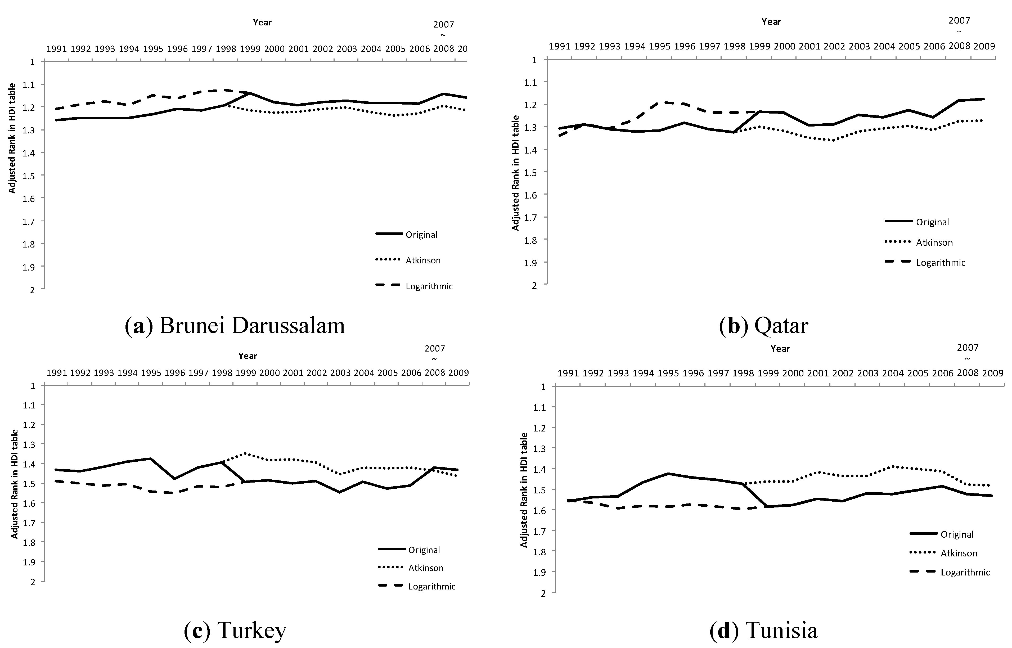
Figure 1 provides a taste of the sort of change that occurred. The figure presents the results for just four countries—Brunei Darussalam, Qatar, Turkey and Tunisia. These examples have been selected as illustrations of the sort of changes in league table rank that the results generated; some benefitting from the Atkinson methodology while others benefitting from the logarithmic methodology. In each figure the vertical axis is the adjusted rank, with 1 (towards the top of the axis) being the highest rank in the table and 2 (bottom of the axis) the lowest, and the horizontal axis is the year. The lines represent the rank for the country in the relevant HDI “league” table for that year. The solid line is the rank as per the original HDI tables, while the other two lines are the ranks based upon transformed GDP/capita using the logarithmic and Atkinson methods. In the cases of Brunei Darussalam (
Figure 1a) and Qatar (
Figure 1b) the ranks based on the original HDI values improved between 1998 and 1999, suggesting that the countries went up the HDI league table, whereas the ranks for Turkey (
Figure 1c) and Tunisia (
Figure 1d) worsened suggesting that they went down the HDI league table. Hence Brunei Darussalam and Qatar benefitted from the methodological change to logarithms as their ranking in the table improved. If the Atkinson methodology had continued from 1999 onwards then their ranking in the league table would have been lower then was actually the case. With Turkey and Tunisia the opposite is the case as they appeared to benefit from the Atkinson methodology up to 1998. When the shift to the use of logarithms occurred from 1999 the ranking of these countries worsened relative to what it would have been if the Atkinson methodology had continued to be used.
Figure 1.
Changes in rank of the Human Development Index for four countries between 1991 and 2009. Note that low values of adjusted rank equate to that country being nearer the top of the HDI table (higher development). The solid line are the ranks in the original HDI league tables published by UNDP while the other two lines are the ranks using the Atkinson and Logarithmic transformation of the GDP/capita component.
In order to analyse the story across all of the countries in the HDRs since 1990,
Table 3 presents a summary of the “resilience” of the ranking for each country using three categories. This is admittedly something of a subjective judgment, but the assumption is that greater resilience of the rank occurs when it is more or less the same across all three methods. Here equivalence in rank was assessed by comparing the country rank for the two periods 1991–1998 and 1999–2009. For a high resilience to be given to the results, the results of the significance test (as assessed using the Kruskal-Wallis statistic) for the Atkinson and Logarithmic transformations had to be the same as for the ranks using the original HDI. For example, if there was no significant difference in rank between the two periods for the original HDI tables, as with Algeria, and that result was repeated using the Atkinson and Logarithmic transformed GDP/capita data then it was regarded as high resilience. For changes that were statistically significant the degree of significance was not considered when making the comparison. For example, in the case of Peru where the original HDI tables showed a significant increase in rank at
p < 0.001 and the use of the Atkinson and Logarithmic transformations showed a significant change in rank in the same direction (increase or decrease) at
p < 0.01 then this was still considered to be high resilience. In effect the use of the Atkinson and Logarithmic transformations still gave the same broad change as seen in the original tables. If the original result was confirmed by one out of the two alternative methods—either the Atkinson or logarithmic—then this was deemed to be a medium resilience. An example is Ireland, where the change in rank in the original HDI ranking was positive and significant at
p < 0.05 yet this was only confirmed by the Logarithmic transformation (
p < 0.001). If the original difference was not confirmed by either of the two alternatives then this was deemed to be a low resilience. An example is provided by Jamaica. Thus, a medium and low resilience suggests that the respective country ranking was being significantly influenced by the methodology chosen for handling the GDP/capita data.
A summary of the results in
Table 3 is presented as
Table 4. Out of the 167 countries in the dataset, the majority (65%) showed a high resilience. Thus for these countries the use of the two alternatives do not alter the difference seen in the original ranking between the two periods. However, a significant proportion of countries had a medium (18%) and low (17%) resilience to the methodology for handling GDP/capita. For those countries the choice of methodology does matter in terms of their ranking, with some doing better and others worse relative to the original ranking. Just why it is that some countries are more sensitive to the shift in methodology than are others is not very apparent, and may indeed be caused by a number of factors related to the components of the HDI for the country plus those for its immediate group of neighbors in the table. The factors might be quite subtle as the shifts in rank may only be a few places, as can be seen in the case of Brunei Darussalam in
Figure 1a. This would undoubtedly be an interesting question for further research.
Table 3.
Summary of comparisons between the country rank for the two periods 1991–1998 and 1999–2009.
Table 3.
Summary of comparisons between the country rank for the two periods 1991–1998 and 1999–2009.
| Original | Atkinson | Logarithmic | |
|---|
| Direction | Sig. | Direction | Sig. | Direction | Sig. | Resilience |
|---|
| Albania | | ns | | ns | | ns | High |
| Algeria | | ns | | ns | | ns | High |
| Angola | | ns | | ns | | ns | High |
| Argentina | | ns | | ns | | ns | High |
| Antigua and Barbuda | | ns | | ns | | ns | High |
| Armenia | | ns | | ns | − | * | Medium |
| Australia | + | *** | + | *** | + | *** | High |
| Austria | | ns | − | * | | ns | Medium |
| Azerbaijan | | ns | | ns | | ns | High |
| Bahamas | − | ** | − | *** | − | *** | High |
| Bahrain | + | *** | | ns | | ns | Low |
| Bangladesh | + | * | + | * | + | * | High |
| Barbados | − | *** | − | * | − | ** | High |
| Belarus | | ns | | ns | − | ** | Medium |
| Belgium | + | * | + | * | + | * | High |
| Belize | | ns | | ns | | ns | High |
| Benin | | ns | | ns | | ns | High |
| Bhutan | + | *** | + | *** | + | *** | High |
| Bolivia | | ns | | ns | | ns | High |
| Botswana | − | *** | − | * | − | ** | High |
| Brazil | − | * | | ns | + | *** | Low |
| Brunei Darussalam | + | *** | | ns | | ns | Low |
| Bulgaria | | ns | | ns | | ns | High |
| Burkina Faso | | ns | | ns | | ns | High |
| Burundi | − | ** | − | * | − | ** | High |
| Cambodia | + | *** | + | *** | + | *** | High |
| Cameroon | − | *** | − | *** | − | ** | High |
| Canada | − | ** | − | ** | − | ** | High |
| Cape Verde | + | *** | + | ** | + | ** | High |
| Central African Republic | − | *** | − | *** | − | *** | High |
| Chad | | ns | | ns | | ns | High |
| Chile | − | * | | ns | | ns | Low |
| China | | ns | | ns | | ns | High |
| Colombia | − | ** | | ns | | ns | Low |
| Comoros | + | ** | + | ** | + | ** | High |
| Congo | | *** | − | *** | − | ** | High |
| Congo (Democratic Republic of the) | − | *** | − | *** | − | *** | High |
| Costa Rica | − | ** | | ns | − | * | Medium |
| Cote d Ivoire | − | *** | − | *** | − | *** | High |
| Cuba | + | *** | | ns | | ns | Low |
| Cyprus | | ns | | ns | | ns | High |
| Denmark | | ns | | ns | | ns | High |
| Djibouti | + | *** | + | *** | + | *** | High |
| Dominica | | ns | − | ** | − | ** | Low |
| Dominican Republic | | ns | + | ** | | ns | Medium |
| Ecuador | | ns | | ns | | ns | High |
| Egypt | | ns | | ns | + | * | Medium |
| El Salvador | + | ** | + | *** | + | * | High |
| Equatorial Guinea | + | *** | + | *** | + | *** | High |
| Estonia | | ns | | ns | | ns | High |
| Ethiopia | | ns | | ns | | ns | High |
| Fiji | − | ** | − | *** | − | * | High |
| Finland | | ns | | ns | | ns | High |
| France | − | ** | − | * | − | *** | High |
| Gabon | | ns | + | *** | + | *** | High |
| Gambia | + | *** | + | ** | + | *** | High |
| Georgia | | ns | | ns | | ns | High |
| Germany | | ns | | ns | − | * | Medium |
| Ghana | | ns | | ns | | ns | High |
| Greece | | ns | | ns | + | *** | Medium |
| Grenada | | ns | | ns | − | * | Medium |
| Guatemala | − | *** | | ns | | ns | Low |
| Guinea | + | ** | + | *** | + | *** | High |
| Guinea-Bissau | − | *** | − | *** | − | *** | High |
| Guyana | | ns | | ns | − | * | Medium |
| Haiti | | ns | | ns | | ns | High |
| Honduras | | ns | − | * | − | * | Low |
| Hong Kong | | ns | − | ** | − | * | Low |
| Hungary | | ns | | ns | | ns | High |
| Iceland | | ns | | ns | + | * | Medium |
| India | + | *** | + | *** | + | *** | High |
| Indonesia | − | * | − | ** | − | * | High |
| Iran | | ns | | ns | + | * | Medium |
| Ireland | + | * | | ns | + | *** | Medium |
| Israel | | ns | | ns | | ns | High |
| Italy | + | * | + | * | | ns | Medium |
| Jamaica | | ns | − | *** | − | *** | Low |
| Japan | − | *** | − | *** | − | *** | High |
| Jordan | | ns | | ns | | ns | High |
| Kazakhstan | | ns | | ns | | ns | High |
| Kenya | − | *** | − | *** | − | *** | High |
| Korea (Republic of) | + | ** | + | *** | + | *** | High |
| Kuwait | + | *** | | ns | | ns | Low |
| Kyrgyzstan | | ns | − | ** | − | *** | Low |
| Lao | | ns | | ns | | ns | High |
| Latvia | | ns | | ns | | ns | High |
| Lebanon | | ns | + | * | | ns | Medium |
| Lesotho | − | * | − | * | − | ** | High |
| Libya | + | * | + | *** | + | *** | High |
| Lithuania | | ns | | ns | | ns | High |
| Luxembourg | + | *** | | ns | + | * | Medium |
| Madagascar | | ns | | ns | | ns | High |
| Malawi | − | * | − | * | − | ** | High |
| Malaysia | − | * | | ns | | ns | Low |
| Maldives | + | *** | + | *** | + | *** | High |
| Mali | | ns | | ns | | ns | High |
| Malta | | ns | | ns | | ns | High |
| Mauritania | | ns | + | * | + | * | Low |
| Mauritius | − | *** | − | ** | | ns | Medium |
| Mexico | | ns | | ns | + | * | Medium |
| Moldova | | ns | − | ** | − | ** | Low |
| Mongolia | − | ** | − | *** | − | *** | High |
| Morocco | | ns | | ns | | ns | High |
| Mozambique | − | ** | − | *** | − | ** | High |
| Myanmar | | ns | | ns | | ns | High |
| Namibia | | ns | + | ** | | ns | Medium |
| Nepal | + | *** | − | *** | + | *** | Medium |
| Netherlands | | ns | | ns | | ns | High |
| New Zealand | − | *** | + | ** | | ns | Low |
| Nicaragua | | ns | | ns | | ns | High |
| Niger | | ns | | ns | | ns | High |
| Nigeria | − | *** | − | *** | − | *** | High |
| Norway | + | *** | | ns | + | *** | Medium |
| Oman | + | ** | + | ** | + | *** | High |
| Pakistan | | ns | − | * | | ns | Medium |
| Panama | | ns | | ns | | ns | High |
| Papua New Guinea | − | *** | − | ** | − | ** | High |
| Paraguay | | ns | | ns | − | * | Medium |
| Peru | + | *** | + | ** | + | ** | High |
| Philippines | + | * | | ns | | ns | Low |
| Poland | + | ** | + | *** | + | ** | High |
| Portugal | + | *** | + | *** | + | ** | High |
| Qatar | + | *** | | ns | | ns | Low |
| Romania | + | ** | + | ** | | ns | Medium |
| Russian Federation | | ns | | ns | | ns | High |
| Rwanda | − | * | − | * | − | ** | High |
| Saint Kitts and Nevis | | ns | | ns | | ns | High |
| Saint Lucia | | ns | | ns | | ns | High |
| Saint Vincent and the Grenadines | − | ** | − | ** | − | ** | High |
| Samoa | | ns | | ns | | ns | High |
| Sao Tome and Principe | | ns | | ns | | ns | High |
| Saudi Arabia | | ns | | ns | + | *** | Medium |
| Senegal | | ns | | ns | | ns | High |
| Seychelles | + | ** | + | * | + | *** | High |
| Sierra Leone | | ns | | ns | − | * | Medium |
| Singapore | + | *** | + | * | + | * | High |
| Solomon Islands | | ns | − | * | | ns | Medium |
| South Africa | − | *** | | ns | − | *** | Medium |
| Spain | | ns | | ns | | ns | High |
| Sri Lanka | | ns | − | *** | − | *** | Low |
| Sudan | + | *** | + | *** | + | *** | High |
| Suriname | | ns | | ns | − | * | Medium |
| Swaziland | − | * | − | * | − | * | High |
| Sweden | + | * | + | ** | + | ** | High |
| Switzerland | | ns | | ns | − | *** | Medium |
| Syria | − | *** | − | *** | − | *** | High |
| Tajikistan | | ns | − | *** | − | ** | Low |
| Tanzania | − | * | − | ** | − | ** | High |
| Thailand | − | * | | ns | | ns | Low |
| Togo | | ns | | ns | | ns | High |
| Trinidad and Tobago | − | *** | − | *** | − | *** | High |
| Tunisia | | ns | + | * | + | ** | Low |
| Turkey | − | ** | | ns | | ns | Low |
| Turkmenistan | | Ns | − | * | − | ** | Low |
| Uganda | | ns | | ns | | ns | High |
| Ukraine | | ns | | ns | | ns | High |
| United Arab Emirates | | ns | | ns | | ns | High |
| United Kingdom | | ns | | ns | | ns | High |
| Uruguay | − | *** | | ns | | ns | Low |
| United States | | ns | − | *** | − | *** | Low |
| Uzbekistan | − | * | − | ** | − | *** | High |
| Vanuatu | | ns | | ns | | ns | High |
| Venezuela | − | *** | − | ** | − | ** | High |
| Viet Nam | + | ** | | ns | | ns | Low |
| Yemen | | ns | | ns | | ns | High |
| Zambia | − | *** | − | *** | − | *** | High |
| Zimbabwe | − | ** | − | ** | − | *** | High |
| Total number of countries | | | | | | | 167 |
The HDI is, of course, a highly simplified vision of human development and as a result has certainly attracted much criticism since it first appeared in 1990 [
28]. It is not the intention here to rehearse that debate and the interested reader is referred to Morse [
29] (for a summary of some of the main criticisms and how UNDP have responded . One of these has been the absence in the HDI of a “natural capital” component alongside the financial, human and social capitals proxied by the three components but, throughout, the UNDP have argued for the need for as much consistency as possible in the form of the HDI [
18]. There are also issues related to the use of such “league table” style of presentation of the HDI [
27], although this has been popular with other indices often employed to assess sustainability at the scale of the nation-state such as the Ecological Footprint. But in the research reported here, the HDI has been accepted, for all its faults, as a “given”, as indeed is its style of presentation. After all, it has been in the public domain for over twenty years and “consumed” by policy makers, the media, NGOs and others [
3,
25].
Table 4.
Summary of the resilience categories in
Table 3.
Table 4.
Summary of the resilience categories in Table 3.
| Resilience | Number of countries | % of total number of countries |
|---|
| High | 109 | 65 |
| Medium | 30 | 18 |
| Low | 28 | 17 |
| Total | 167 | 100 |
The results illustrate how important it can be to maintain the same methodology when using indicators and indices to assess performance, especially when the main presentational device is geared towards highlighting relative performance of states against others. The good news is that a majority of countries in the sample of 167 had rank changes over the two periods that were not affected all that much by the way in which GDP/capita was handled. The alternative HDI tables produced the same broad change in rank over the two periods as was observed with the original HDI tables. For those countries the change in methodology made no significant difference in rank although that is not to say that more minor differences were not observed. However, the bad news is that the ranking of more than a third of the countries was influenced significantly by the methodology employed to handle the GDP/capita component. This is a sizeable proportion and adds some empirical substance to the assumptions often made about changing index methodology. For individual countries there are “winners” and “losers” in terms of rank. Honduras and Hong Kong, for example, went from a position of no significant difference in rank with the original HDI tables to an improvement in rank with both alternatives. Similarly, Brunei Darussalam went from a position where it declined in rank over the two periods in the original HDI tables to no significant change in rank with the alternatives. A “loser” is Brazil. This country had a significant improvement in rank in the original HDI tables but no change with the Atkinson alternative and a fall in rank with the Logarithmic transformations. The fact that some countries are susceptible in this way, while others are not, is an intriguing aspect of these results and worthy of further exploration. Indeed it should also be remembered that only the GDP/capita calculation was amended here, while over the years the HDI has been in existence the methodologies for the other two components—education and life expectancy—have also changed (
Table 1).
The focus on ranks in the HDI league tables for the years in question, rather than the HDI itself, is a relatively novel approach in the HDI literature. One of the few other examples is provided by Cherchye
et al. [
5] and their work on the influence of component weights . However, it is defendable largely because, after all, it is the rank in the tables that is the most apparent facet for those meant to “consume” the information and thus they are likely to be more influenced by ranking relative to their peers rather than by the absolute value of the HDI. This is admittedly an assumption as no research exists which explores how policy makers and other consumer groups react to the HDI ranking, but it appears to be reasonable.
While the results of this research reinforce existing warnings about the problems involved in changing indicator and index methodologies there is always a conundrum. On the one hand it should be noted that the methodology of the HDI evolved for reasons that its creators were very open about and the rationale they set out for each change was reasonable. However, for all their apparent objectivity these tools are human constructs designed to help manage complex situations. The HDI was never meant to be a measure of human development in the same way that a measure of the hydrogen ion concentration in water equates to an assessment of its acidity. Human development is far more complex and dynamic than is a measure of the chemical property of water. Inevitably this rough approximation to a perceived human condition is bound to have faults. However, the driving force for such change is often centered upon those who make the indicators, and not those who consume them. It is not entirely clear from the HDRs as to the extent of influence consumers of the HDI have had on the evolution of the index, but frankly it does not appear to have been a significant consideration. If the ranking of some countries is so vulnerable to a change in methodology the danger is that those meant to use the index will dismiss it as being unreliable.
Any attempt to set sustainable development goals and indicators associated with those goals needs to be cognisant of this subjectivity as well as the difference in “influence” coming from creators and consumers of the indicators. This is not just an awareness needed at the onset of the journey—when goals and indicators are being set—but an awareness of how the indicators may change in the coming years and what forces may influence that change, even if the name remains the same. After all, the HDI has not changed its name since 1990 despite all the changes that have occurred. Indeed it can be argued that while the three core elements have remained in place the HDI now being published has little resemblance to its form during most of the 1990s. It should, of course, be noted that critiques of such composite indices are by no means confined to the HDI [
30], and there are other measures often employed in sustainable development at the level of the nation state with a league table style of presentation such as the Ecological Footprint [
31] and the Environmental Performance Index. All such indices are built upon assumptions made by their creators, and these are not immutable “Laws of Nature” such as the four Laws of Thermodynamics but are in part subjective judgment calls and these can change over time with experience and indeed as the world changes. However, despite the very best of intentions held by the index creators and their desire to make the methodology and assumptions as transparent as possible this is no guarantee that the non-specialist consumers of such measures will take the time to understand and appreciate the nuances involved and there repercussions. Hence it cannot be taken for granted that such non-specialist “users” of such indices such as policy makers, the press or even the public will necessarily appreciate, or even want to appreciate, the technicalities behind the “headline” index and it is far more likely that they will simply trust the technicians to get it “right”. Much responsibility comes with that trust, indeed each requires the other.
The Millennium Development Goals are meant to be achieved by 2015, and no doubt progress towards the eight goals and their associated targets will be mixed, with some countries doing well with some targets and others not so; at least in terms of the indicators employed to assess attainment of the targets. Discussions will soon be underway as to what happens next and there is little doubt that indicators, for all their faults, will remain in place as the key tools for assessing progress towards sustainable development at the scale of the nation state.


