Revived Beauty: Research into Aesthetic Appreciation of Materials to Valorise Materials from Waste

1
Industrial Design Engineering, Delft University of Technology, 2628 CE Delft, The Netherlands
2
Department of Design, Politecnico di Milano, 20133 Milano, Italy
*
Author to whom correspondence should be addressed.
Sustainability 2017, 9(4), 529; https://doi.org/10.3390/su9040529
Submission received: 10 January 2017
/
Revised: 20 March 2017
/
Accepted: 23 March 2017
/
Published: 30 March 2017
(This article belongs to the Section Environmental Sustainability and Applications)
Abstract
:The use of materials derived from waste is one of the prominent ways to contribute to sustainable product design. However, there is a stark gap in literature concerning how people appraise such materials. In this paper, we present our initial attempts to understand the aesthetic appreciation of materials, in particular those derived from discarded raw materials, i.e., revived materials. Two studies were conducted for which we took the aesthetic principle unity-in-variety as the departure point. In the first study, we explored material appraisals by testing whether different visual and tactile qualities interrelate with each other in a similar or contradictory way. Based on these findings, two revived materials were modified and our main assumptions were further explored in Study 2. We outline our findings and show that the aesthetic appreciation of a material can be influenced by the (in)congruity between visual and tactile qualities of the material.
1. Introduction
The growth of sustainable product design has led to the use of alternative materials (e.g., materials derived from waste, bio-based materials, etc.) as substitute to regular, petroleum-based ones [1,2,3,4,5]. In parallel, new or improved aesthetics for materials are emphasised as an essential way to foster sustainability in societies [6,7,8,9,10,11,12]. Currently, most sustainable materials either fully express their purpose through natural patterns and avoidance of, for example, material colorants [8]; or they avoid any aesthetic reference to their “sustainable” nature and imitate a conventional material [3]. Neither of the above approaches seems to fully succeed in wide uptake of such materials by societies [3,9]. Materials that express their natural patterns puts strong emphasis on “green aesthetics”, which might not always be desired by people [8,11,13]. Materials that hide their natural origin do not clearly convey their difference from the conventional materials. In both cases, the result is that material appreciation is limited to niche user groups in societies [7,12,14].
In this paper, we focus on materials from waste. They create a double benefit in the life cycle analysis, because they do not require the extraction of resources, and they make use of waste that would otherwise be disposed [15,16]. Despite their environmental benefits, materials made from waste are not always positively received by end users [17]. On the other hand, while the environmental performance and the suitability of materials from waste have been discussed in the literature to a great extent [18,19,20,21,22], the reception of these materials by users, who come into contact with these materials in consumer products, has only been studied to a limited extent.
In this paper, we present our preliminary attempts to understand the aesthetic appreciation of materials from waste, in particular of those derived from discarded raw materials, i.e., revived materials [23]. We introduce the term revived materials in order to distinguish such materials from recycled materials. Recycled materials are obtained through reusing materials that previously embodied (a part of) a product. In contrast, revived materials are made from discarded sources, such as leftovers from production streams or pruning. For example, they can be waste or by-products from food production, raw material production or agriculture, or leftover food. As designing with revived materials is becoming prevalent in design practice [24], we argue that understanding how these materials are received by consumers, whether they are appreciated or not, is crucial.
Product designers play an important role in setting new values in society. In fact, by presenting different materials in various contexts and forms embedded in artefacts, they can influence the appreciation of certain aesthetic approaches and affect people’s behaviours [25]. We argue that how revived materials are aesthetically appraised should be carefully considered by designers to valorise them in design. Our ultimate aim is to support designers in understanding and mobilising revived materials in ways that people will appreciate their aesthetic qualities. Therefore, our initial research questions are: When do we think a particular material is beautiful? How would that relate to the designers’ willingness to design with the material?
2. Method
This research grounds on the Design Research Methodology (DRM) as described by Blessing and Chakrabarti [26]. DRM includes four stages: (1) Research Clarification, in which the researchers find evidence that support their assumptions in order to formulate a research goal; (2) Descriptive Study I, where more literature is reviewed and a descriptive study is conducted to model the existing situation; (3) Prescriptive Study, in which a new theory, model, method, tool, etc. is proposed to support or improve the existing situation; and (4) Descriptive Study II, to evaluate the implication of the proposed support. The DRM methodology is widely applied in design research, particularly for the design research questions which concern finding behavioural patterns in people–product interactions through more empirical ways. Accordingly, we conducted four main activities that build upon each other, not only to understand when people appreciate the aesthetic qualities of a material, but also to develop guidelines for (material) designers to improve the aesthetic qualities of a material at hand according to our findings. In Figure 1, the overview of the phases, which fall under these four main activities, are summarised. The first phase focuses on setting the boundaries for Study 1. For example, “aesthetic pleasure in design” is defined grounding on previously conducted studies in the field of product design; a preliminary study is performed to select a number of material samples to be used in the next phase (Study 1). In Study 1, an empirical user study is conducted to explore when designers think a particular material is beautiful and are willing to design with it. This led to the creation of a hypothesis, which was further explored in the second descriptive study (Study 2). To support Study 2, we varied the visual and tactile qualities of two revived materials (Prescriptive phase): Ecovative (a mycelium-based material) and Goodhout (a coconut-based material). In the following sections, these main activities are presented.
3. Aesthetic Pleasure in Design
Aesthetics has been defined as “pleasurable to the senses” since the eighteenth century. There are general principles of aesthetic pleasure, which are uniform in human nature. For example, patterns and features that favour adaptive functions are perceived as pleasant, because they support human survival [27].
In the field of product design, one of these aesthetic principles is unity-in-variety. The world around us is inherently chaotic and therefore our brain tries to organize and structure incoming sensory information. In order to understand an object and find it pleasurable, a form of unity between the various parts is needed. However, too much unity leads to boredom and loss of interest [27,28]. Therefore, pleasure can also be experienced in finding variety. Post et al. [29] show that product designs that exhibit an optimum balance between unity and variety are aesthetically preferred. They also argue that while some of the aesthetic principles, such as “most advanced yet acceptable” (MAYA), have been researched extensively, little empirical research exists on the joint effect of unity and variety on aesthetic pleasure for human artefacts, let alone, materials of artefacts.
Unity-in-variety proceeds from the ordering principles, which are frequently described in literature as the aesthetic universals (Table 1) [30,31,32,33]. In our study, we took these universals as the departure point and asked ourselves: how would these universals be mobilised when transferred into the “materials” domain?
In material appraisals, touch and vision are the most dominant sensorial modalities [34,35]. Earlier studies show that unity-in-variety work in the visual and tactile domain [29,36]. We argue that the aesthetic universals in the materials domain may refer to the relationships between visual and tactile qualities in material appraisals. Subject to our experiences with and through materials [37,38] some assumptions are developed on how a particular material would feel when it is touched based on its visual qualities.
In product design, the visual–tactile (in)congruity between visual and tactile sensations is known to elicit certain emotions such as surprise. This reaction can be beneficial, because it can lead to more attention and recognition [39]. Therefore, by analysing the relationships between tactile and visual qualities of a material within the scope of “aesthetic universals”, we assume that we can predict the potential aesthetic appreciation of a material. When we touch the material, the tactile sensation may either complement or contradict our visual perception. This experience can directly be linked to the aesthetic universals “similarity” and “contrast”, and therefore these universals were selected for further exploration in our studies.
4. Preliminary Study: Selection of the First Set of Revived Materials
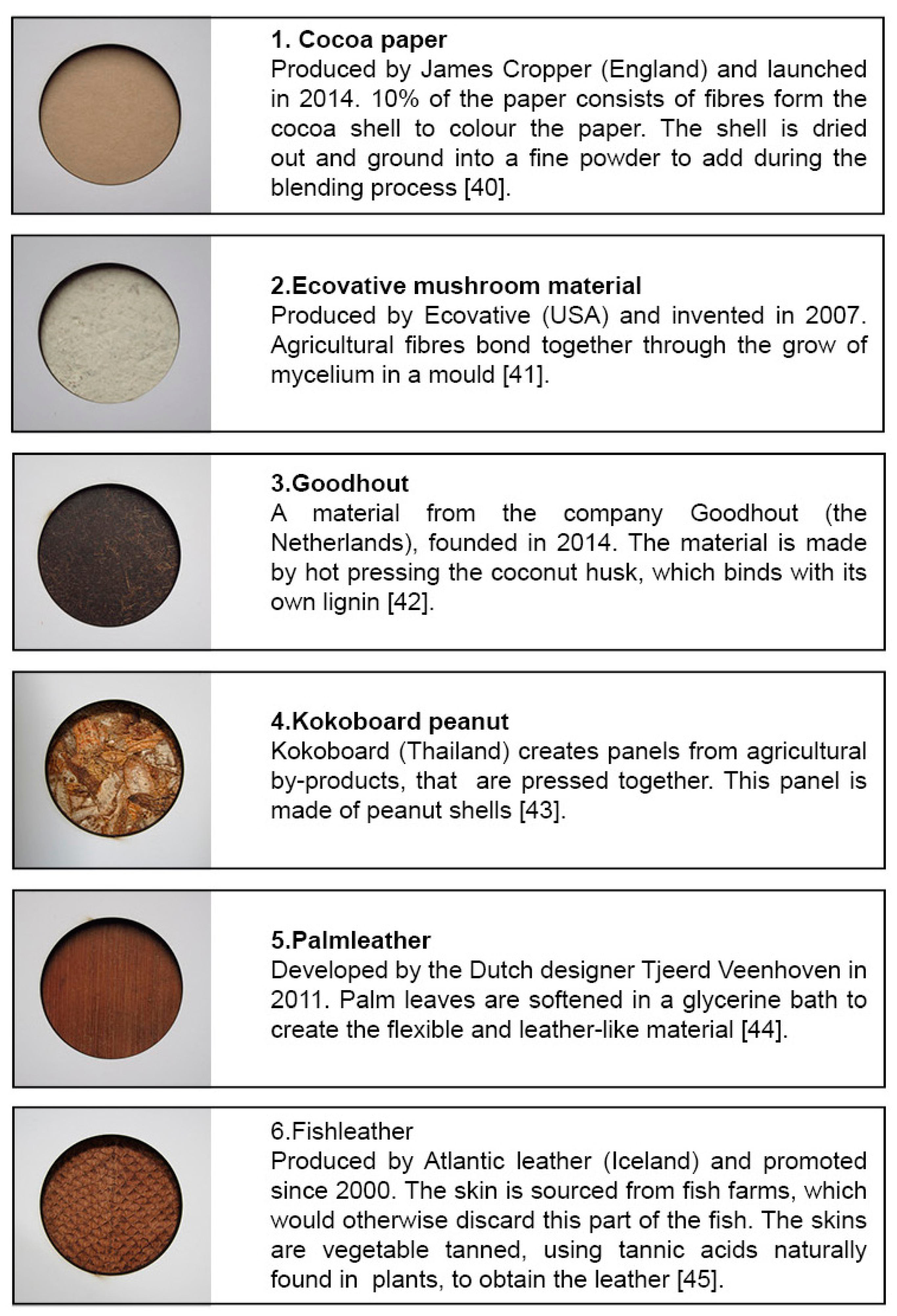
A set of revived materials was collected for use within the study. These materials are usually leftovers from the production of other materials/products or landscape maintenance. In total, fourteen materials were collected (see Appendix A) and first conducted a preliminary study to obtain a general understanding of whether and to what extent these materials are found beautiful or ugly. Our ultimate aim was to select a manageable number of materials set which includes the materials which are commonly found beautiful, or ugly, or which are confusingly found beautiful by some participants, and ugly by others. This set could then be used in a next study to be further explored.
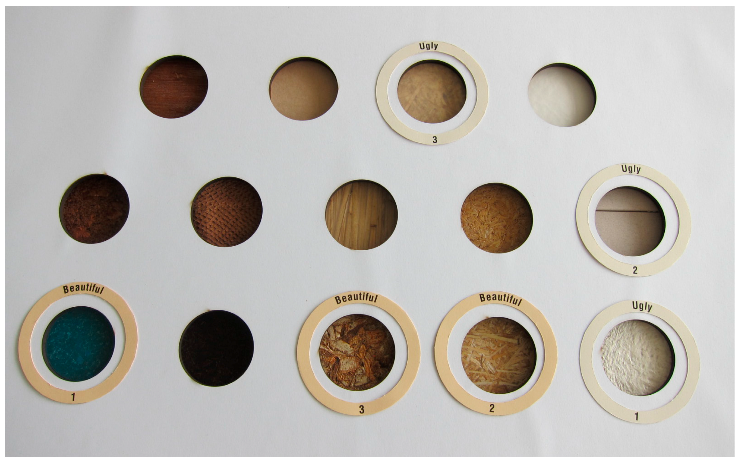
In this preliminary study, nine participants including students who completed at least three years of design education, and academic staff of the Faculty of Industrial Design Engineering (IDE) at Delft University of Technology (DUT) were asked to select the three most beautiful and the most ugly samples and explain their choices. The samples were presented altogether in the same format. In order to focus on visual and tactile surface qualities (note that weight and wall thickness are not included) all samples were masked. The participants could only touch to the surface of the materials, but could not hold them (Figure 2 depicts the stimuli set up for the preliminary study).
Based on the results of the preliminary study, we selected in total six materials for the next study (Study 1): Cocoa paper, Ecovative, Goodhout, Kokoboard peanut, Palmleather and Fishleather (Figure 3). Goodhout (Sample 3 in Figure 3) and Fishleather (Sample 6 in Figure 3) were the two samples, among 14 samples, which were commonly found to be beautiful by all participants; conversely, Kokoboard peanut (Sample 4 in Figure 3) and Ecovative (Sample 2 in Figure 3) were commonly found to be ugly. Cocoa paper (Sample 1 in Figure 3) and Palmleather (Sample 5 in Figure 3) were the most ambiguous samples, which were considered beautiful by some participants and ugly by others.
5. Study 1: When Is a Material Appreciated as Beautiful? When Do Designers Want to Design with a Material?
An empirical study was conducted with 30 participants (15 male, 15 female) ranging in age between 22 and 30 years (M (mean) = 25.1, SD (standard deviation) = 1.689). The participants were Master students in IDE at DUT, whom we approached via online announcement through a social student platform. The aim of the study was to explore the effects of similarity and contrast between the visual and tactile qualities of revived materials on aesthetic appreciation. We further aimed to explore whether designers (in this case, design students) would like to design with those materials, and how this would relate to aesthetic appreciation of such materials.
5.1. Method
Thirty participants were individually invited to a room at the Faculty of Industrial Design Engineering. All six material samples (Figure 3) were assessed one by one under daylight, presented in a randomized order. Each sample has been masked individually as depicted in Figure 4. The materials were unfamiliar to the participants. The procedure was briefly explained to the participants before they were given the first sample. We provided participants with a set of sensorial qualities (Figure 5), which were presented in seven-point scales. Participants were first asked to assess the materials visually and fill in the scales concerning both visual qualities of materials, i.e., colour related scales such as gradient-abrupt, similar-contrasting, and gloss-matte; and tactile qualities, such as smooth–rough, hard–soft, moist–dry, sticky–non-sticky and cold–warm. Next, they were asked to touch the samples and fill in the same scales about tactile qualities.
In order to construct the sensorial quality set, we adapted the expressive-sensorial atlas of Rognoli [46], the sensorial scales of Karana [34,47], and the Matrix of Zuo [48]. In these earlier studies, a number of sensorial qualities were found as the most commonly used qualities to describe materials. For example, Karana [34] conducted a series of user studies through which she collected above 300 sensorial descriptive items (e.g., smooth, slippery, and sticky) that are used by people to describe how a material touches and feels. She analysed these descriptions and revealed the most frequently and commonly used descriptions, which constructed the sensorial scales she introduced in Karana et al. [47].
Two more qualities were added, which were not found in the existing scales used by those three scholars: “regular/irregular texture” and “fibreness”. The visible fibres and irregular texture were found to be important in the appraisals of sustainable materials as natural and high quality materials [3]. Since most of the materials we chose for this study had visible fibres, we included this aspect to be further explored in our study. The scales were presented in a randomized order.
After completing the sensorial scales, participants were asked to assess the materials first on “beauty”, as suggested by Blijlevens et al. [30], in order to explore to what extent these materials were appreciated. To study how this would relate to the willingness to design with such materials, participants were asked whether they would design with the material if they had a chance and if so, why. The study took about 30 min per participant.
5.2. Results
One-way analysis of variance (ANOVA) and Pearson’s r test were conducted on the raw data. With the first test, we compared the mean between the visual–tactile relation and beauty, as well as willingness to design. Hochberg’s GT2 test served as the post-hoc test of the one-way ANOVA, because the visual–tactile relation is composed of different group sizes [49]. Pearson’s r correlation test was applied to show the correlation between beauty and willingness to design, as well as the mono-sensorial and multi-sensorial aspects for the visual domain. All data of the materials could be merged within one data sheet, because the relation between the visual and tactile aspects is tested, i.e., absolute value difference of the variables between the materials does not influence the analysis. This resulted in a larger data set.
The results of the Pearson’s r correlation test showed that Goodhout (Sample 3, Figure 3) and Palmleather (Sample 3, Figure 3) were the most beautiful materials according to the participants (Palmleather: M = 5.00, SD = 1.050, Goodhout: M = 4.57, SD = 1.501), while Ecovative (Sample 2 in Figure 3) was considered as the ugliest Material (M = 3.50, SD = 1.592). Expectedly, the Pearson’s r correlation test showed a strong relation between “beauty” and “willingness to design” (r = 0.682, n = 180, p = 0.000).
The relationship between vision and touch in relation to beauty was analysed using one-way ANOVA. As we focussed on “similarity” and “contrast” in between what you see and what you find when you touch, the visual and tactile ratings were compared for every scale, for example rough–smooth. Based on the difference between the ratings, outcomes were grouped according Table 2, e.g., the average rate of a certain quality, such as roughness, for vision was equal to or differed by 1 (≤1) from the tactile rating, we labelled that sample as “similar”.
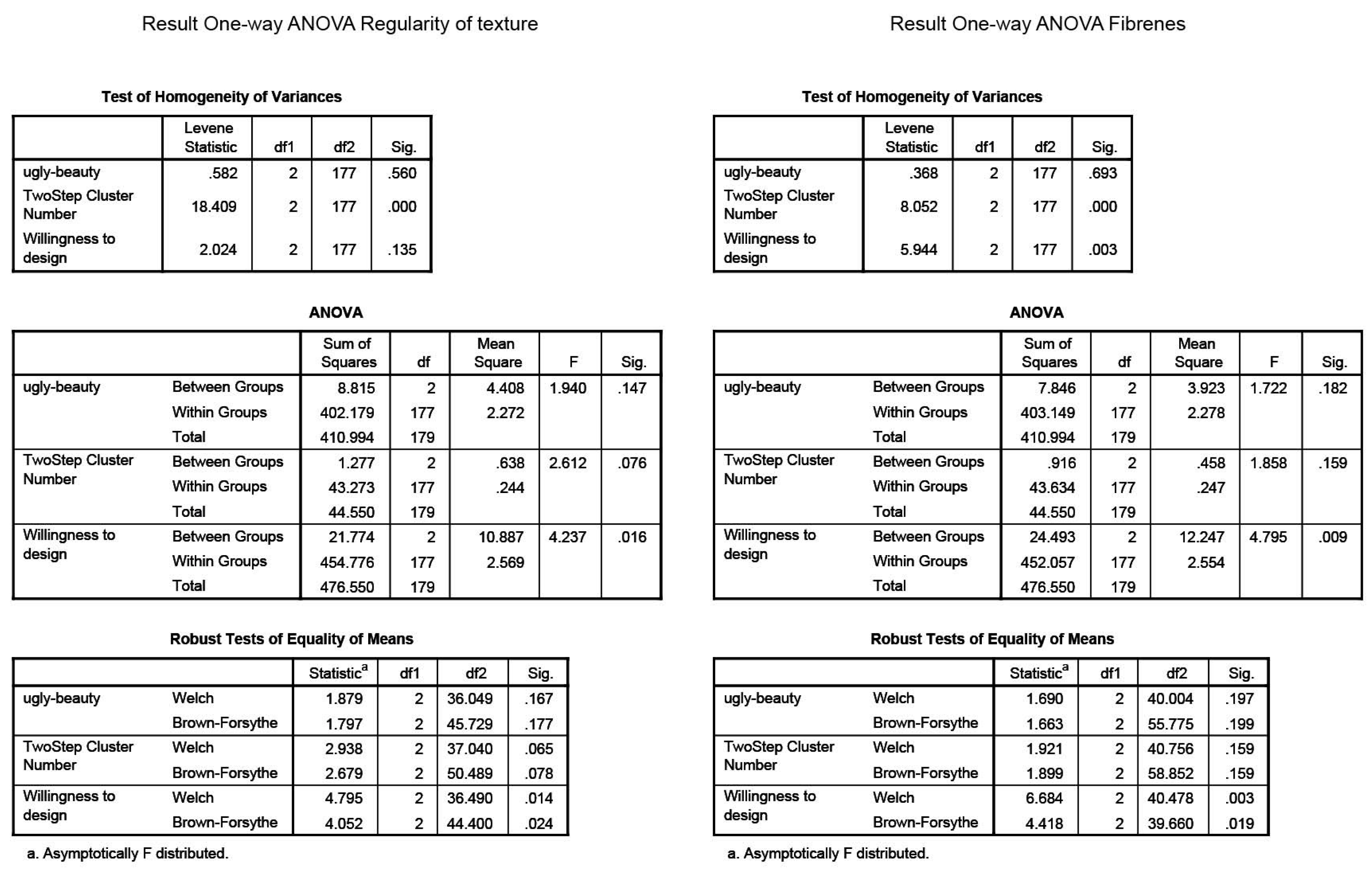
The participant detected the contrast and similarity between the visual and tactile qualities for only two material qualities: “regularity of texture” and “fibreness”. We have found a significant effect for these material qualities on “Willingness to design” (regularity: F(2,177) = 4.237, p = 0.016, Fibreness: F(2,405) = 6.684, p = 0.003) (Figure 6, Appendix B). Post hoc comparison using Hochberg’s GT2 test indicated that the participants were willing to design with the samples, which they thought had contrasting qualities for regularity of texture (M = 5.09, SD = 1.422) and fibreness (M = 5.08, SD = 1.233), in comparison to similar (regularity of texture; M = 4.26, SD = 1.617, fibreness; M = 4.16, SD = 1.633). The samples that were assessed as variance did not significantly differ from either similar or contrasting samples (regularity of texture for variance; M = 3.94, SD = 1.819, fibreness for variance; M = 4.50, SD = 1.978) (Table 3 and Table 4).
Figure 6 shows the highest mean for contrast for regularity of texture (a) and fibreness (b) in relation to willingness to design. This means that, when there is a contrast between for example how fibred a material looks, and how fibred it feels when touched (e.g., it may feel very smooth though it has many visible fibres), the designers that took part in Study 1 were willing to design with the material.
In the final question, participants were asked to explain their willingness to design with the material as they indicated on the seven-point scale. There were six samples and 30 participants, resulting in a total of 180 answers for willingness to design. Over half of these answers were positive (96 out of 180). In 20 out of 96 positive answers, participants explained their choice by mentioning that they liked the ambiguity between what they saw and what they felt (e.g., participant about Fishleather: “It feels softer than it looks, which was a nice surprise”). Other response often mentioned “association with nature” (18 out of 96) or connotations with certain contexts or products (14 out of 96) (e.g., participant about Palmleather: “It looks like a leaf of an exotic tree. So maybe you could use this material for architectural purposes”. The motivation behind their answers is in line with the outcome of the one-way ANOVA test (Section 5.1, Appendix B). People were often willing to design with the material when there was a surprising tactile experience, i.e., when there was incongruity between the tactile experience and its visual clues (e.g., participant about Goodhout: “The material looks kind of rough, but feels polished. I like these kind of contradictions in a product”). Indeed, the materials, which were rated as most beautiful have this quality in common, e.g., Palmleather looks hard, but feels soft and Goodhout looks rough, but feels smooth.
Finally, a Pearson’s r test was conducted to check which tactile qualities are interrelated with which visual qualities. The results are outlined in Table 5. For example the smoothness, which is a tactile quality, is significantly correlated with a glossy appearance and gradual colour changes. The significant results are summarised in Table 6. This table outlines how tactile qualities should be translated to the visual domain, e.g., to obtain a visual rough surface, a material designer should create an abrupt colour transitions and matte surface. These results guided the formulation of the prescriptive phase in which we modified the sensorial qualities of two revived materials to create contrasting and similar effects.
6. Material Modification: Developing a New Set of Material Samples for Study 2
The significant outcomes of the one-way ANOVA (Section 5.2, Appendix B) revealed a preference among the participants for contrast between visual and tactile sensations. This was also supported by their answers on why they would like to design with these materials. Based on the results from Study 1, we argue the following: Contrast between the visual and tactile qualities of revived materials favours beauty and willingness to design. This is particularly strong when the contrast is related to the regularity of texture and the fibreness of a material. For example, when there is a contrast between how fibred a material looks, and how fibred it feels when touched (e.g., it may feel very smooth though it has many visible fibres), designers would think that the material is beautiful and they would want to design with the material.
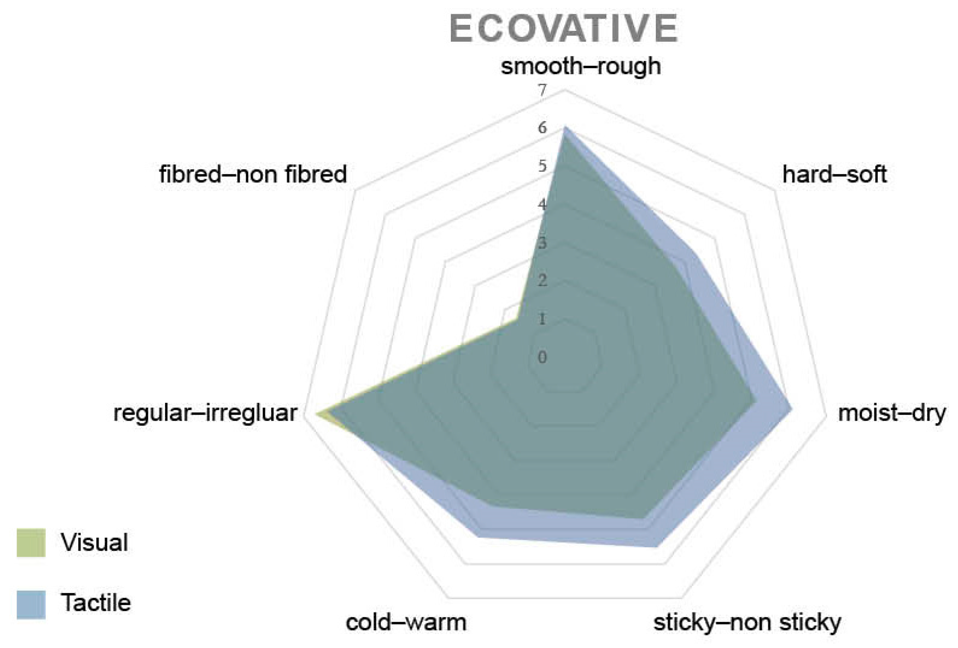
In Study 2, we wanted to explore this argument further. In order to do so, we first developed new material samples based on our findings presented in Table 6. We challenged ourselves by selecting the ugliest samples (according to the results obtained in Study 1), and argued that even such a material, which was initially appraised as ugly, when modified based on our results, could be perceived as beautiful. Likewise, a beautiful material might be perceived as ugly when modified in accordance with our results. Accordingly, we manipulated the visual and tactile qualities of two revived materials: Ecovative (Sample 2, Figure 3), which was assessed as the ugliest material, and Goodhout (Sample 3, Figure 3), which was assessed as one of the most beautiful materials in Study 1. Figure 7 shows the ratings of Ecovative from Study 1. The material was perceived as rough, hard, dry, non sticky, warm, irregular and fibred. Figure 7 also shows that the visual and tactile appraisals for this particular material were quite similar. Figure 8 shows the ratings of Goodhout from Study 1. In comparison to the Ecovative sample, there is significant contrast between the visual and tactile ratings of the Goodhout sample. By modifying their sensorial qualities, we aimed to achieve two samples of the same material; one with similar visual and tactile qualities and the other one with contrasting visual and tactile qualities.
We used the results presented in Table 6 to pick the qualities to modify. For example, in order to obtain contrast between tactile and visual qualities of materials for “roughness”, we created a rough surface (to touch) yet glossy with gradual colouring (to sight). Several samples were created to obtain contrast on the surface of Ecovative, by applying different surface finishes, different colour pigments and pressure during growth (Figure 9). These trial samples illustrated the possible ways to manipulate the Ecovative material, in line with the significant characteristics outlined in Table 6. It became clear that a contrasting sample was hard to create with the Ecovative material; the texture stayed irregular in both the visual and tactile domain and fibres remained visible. The only contrast could be reached by creating a glossy and gradual coloured visual surface that felt rough.
Figure 10a shows the similar sample for Ecovative. The sample looks irregular, fibred, matte and abrupt, which was accomplished by the colouring. It also feels irregular, fibred and rough. Creating a real contrasting sample was quite demanding for this material. The contrasting sample (Figure 10b) feels and looks irregular and fibred, but rougher than expected due to a gradual colouring and a slightly glossy appearance.
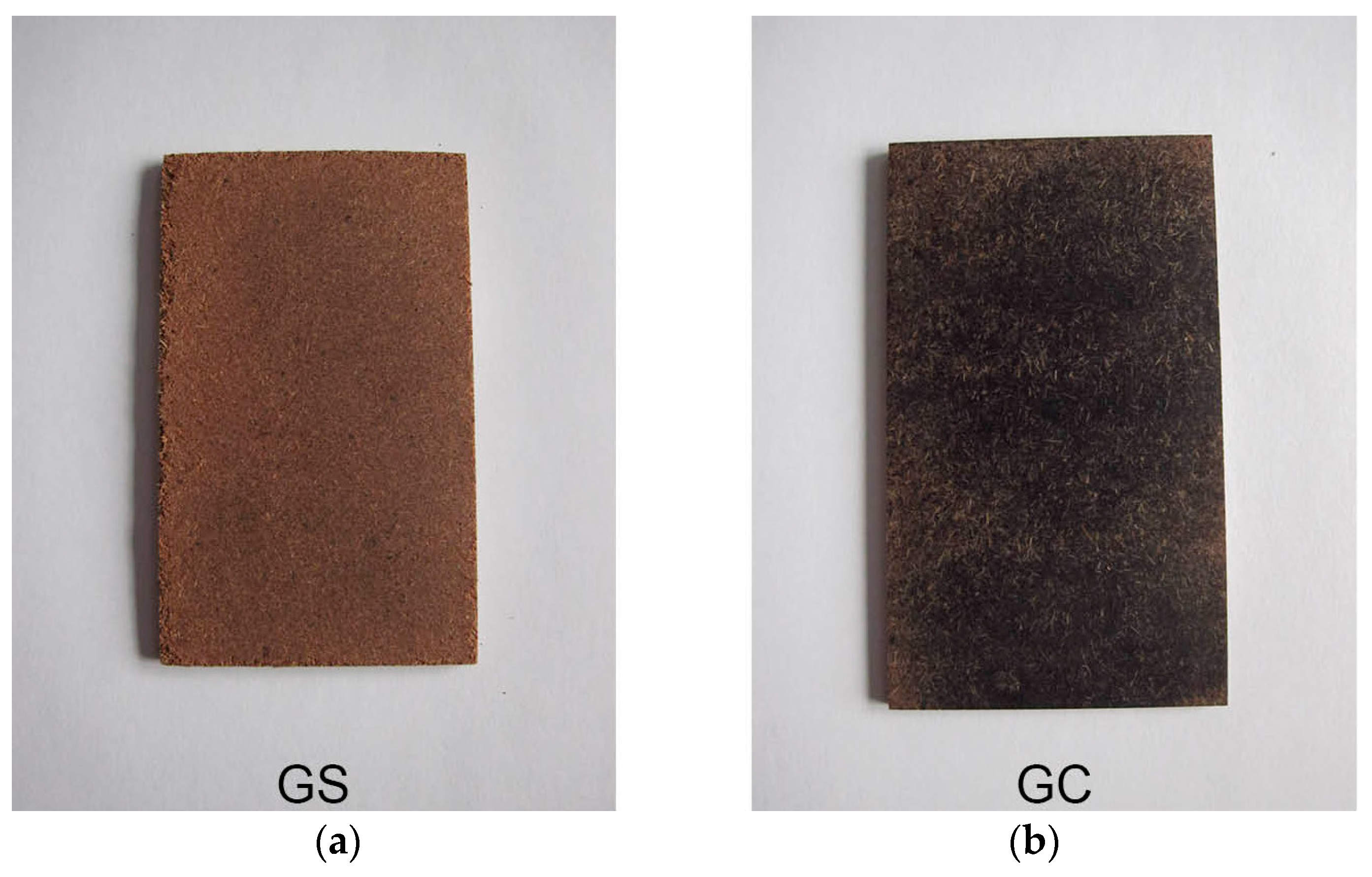
Four Goodhout samples were created through applying different amount of pressure and with different fibre sizes. These initial samples showed to what extent the quality of the material facilitates the modification of the material as described in Table 6. A “contrasting” sample could be obtained by creating an irregular, fibred, matte and abrupt visual surface, while the material felt regular, non-fibred and smooth. The “similar” sample looked regular, fibred and matte with a gradual colouring and felt regular, fibred and rough.
7. Study 2: Do the Created Material Samples Represent Similarity or Contrast as Intended? Are They Aesthetically Appreciated?
The four developed material samples were presented to participants who were asked to evaluate whether they thought the samples were similar or contrasting; and whether they appreciated the samples. Thirty-eight IDE students (DUT) (19 male, 19 female) ranging in age between 17 and 26 years (M = 22.2, SD = 2.905) participated in the empirical study. Both bachelor and master students, who were not involved in the previous studies, were randomly approached. They voluntarily participated individually to the study, which took about 10 min per participant. The main aim of the study was to verify the hypothesis obtained from Study 1.
7.1. Method
All four materials were provided pairwise to the participants, to allow them to compare the developed samples. The participants were asked to touch and feel the samples and fill in the questionnaire on a computer screen. The paired samples were given in different orders and participants were allowed to touch and hold the samples. The study was conducted by daylight. All questions were presented in a seven-point scale. Participants were first asked to rank the material from ugly to beautiful and to score their willingness to design with material. Then they were asked to answer whether the tactile and visual experience of the material was similar or contrasting and expected or unexpected.
7.2. Results of Study 2
The collected data were analysed quantitatively. The data were tested on normality, due to a relatively small group size [50]. Most factors scored significant on the Shapiro–Wilk test, meaning that they were not normally distributed. Therefore, the Wilcoxon signed-rank test was conducted on the raw data to assess whether the mean ranks differed. This test can be seen as the non-parametric equivalent of the dependent t-test [49]. It was performed to analyse whether the samples were perceived as similar and contrasting and to reveal which samples were appraised as the most beautiful. A Kendall’s tau test (non-parametric equivalent of Pearson’s r test) was performed to compare contrast and similarity in relation to beauty and willingness to design for each of the samples.
Goodhout samples scored significant for both similar-contrast and expected-unexpected in the Wilcoxon signed-rank test (Table 7). The similar-contrasting perception of the material was significantly higher for the Goodhout Contrasting (GC) sample (Mdn (median) = 5.0) than the Goodhout Similar (GS) sample (Mdn = 2.0, Z = −3.658, p = 0.000). The expected-unexpected rankings were also significantly higher for the Goodhout Contrasting sample (Mdn = 5.0) than the Goodhout Similar sample (Mdn = 2.0, Z = −4.487, p = 0.000). This means that the Goodhout Similar sample, which was intended to have congruent visual and tactile qualities, was perceived as “similar”. The Goodhout contrasting sample was also assessed as intended, i.e., as “contrasting tactile and visual qualities”. Following these results, we analysed the Goodhout samples further as they were appraised as intended. Ecovative samples (Ecovative Similar; ES, Ecovative Contrasting; EC) were not analysed further as the Wilcoxon test reported the comparisons were not significant at p = 0.050 level (Table 7).
A second Wilcoxon signed-rank test was performed for beauty in relation to the similar and contrasting samples of Goodhout (Table 8). For Goodhout, beauty is significantly higher for the contrasting (GC) sample (Mdn = 5.0) than the similar (GS) sample (Mdn = 4.0, Z = −2.319, p = 0.020). In a Kendall’s tau test we found a significant negative correlation between beauty and similarity for the contrasting Goodhout sample (r = −0.294, n = 32, p = 0.041).
Summarizing these findings, the contrast sample was found to be significantly more beautiful than the similar sample. However, when participants were asked about the contrast sample, a minority of them considered the visual and tactile qualities to be similar and appraised the contrast sample as significantly more beautiful than the majority of participants who considered the visual and tactile qualities as contrast. Furthermore, as opposed to Study 1, there was only a significant correlation for beauty and not for willingness to design (Table 8).
8. Discussion
In this paper, we presented our initial attempts to understand the aesthetic appreciation of materials, in particular those derived from discarded raw materials, i.e., revived materials. We conducted four main phases: In the first phase, boundary conditions where defined with literature and material sample selection, which were further explored in phase 2 within an empirical study (Study 1). In phase 3, material samples were created, based on the findings in Study 1, to be used in the final phase, in which we conducted Study 2 to validate our findings. In this section, we will discuss on our findings, limitations of the studies conducted, and list a number of directions for future research.
When creating the desired contrasting and similar material samples, we modified sensorial qualities as suggested in Table 6 to test if our theory worked in practice. We experienced that “regularity of texture” and “fibreness” in combination with the colour changes for the visual domain and smooth–rough for the tactile domain, were the most convenient to work with. This corresponds with the significant findings for “regularity of texture” and “fibreness” of Study 1 and suggests that among the study participants, these parameters were most suitable for testing cross-sensory relations. However, developing high-fidelity material samples were more difficult than anticipated. This was confirmed by the results of Study 2, in which we found that the participants did not consider the Ecovative samples as distinct samples.
The results of Study 2 also showed that the created samples of Goodhout distinguished significantly and could be seen as a representation of a similar and contrast sample. Therefore we considered these samples as “high-fidelity/reliable” samples and further analysed them. In line with our assumption, the participants found the contrasting sample of Goodhout significantly more beautiful than the similar one. However, when participants were asked about the contrast sample, a minority of them considered the visual and tactile qualities to be similar and appraised the contrast sample as significantly more beautiful than the majority of participants who considered the visual and tactile qualities as contrast. Although this is a contradictory finding, it seems to be in line with the findings of Ludden [51]. Ludden suggests that due to unfamiliar characteristics of materials we might dislike them; however, when this elicits positive surprise at the same time, we tend to like the material. For example, one of the participants stated about Goodhout that, “I really liked the surprising smoothness and even surface!” and another about Palmleather that, “I liked the unexpected softness”. Since revived materials are new unfamiliar materials to many of us, we could argue that positive surprise could be an appropriate design strategy to adapt in order to make these materials accepted by the end users.
This study has an explorative character to open up new territories for further research. However, it has some shortcomings, other than the reliability of the final set of samples, we would like to emphasise. This study only focuses on the revived materials Goodhout and Ecovative, in order to generalize the results, the findings should be tested on more revived materials. Moreover, the results of the Study 2 could benefit from a more in-depth understanding of the underlying reasons behind the participants’ reactions toward certain material qualities. We would recommend a future qualitative study to delve into such an understanding. Finally, this research focussed on materials, presented to the participants in isolated settings. However, in real life, we experience materials embodied in products, within a specific situational whole [34,37]. In other words, the study results would be different when a material is situated within a context. This should be further explored in a next study.
While the results of the study do not necessarily indicate whether our assumption contrast between the visual and tactile qualities of revived materials favours beauty and willingness to design is true or not, we believe that our approach offers an entry point for other researchers who aim to conduct further explorations into this subject. We suggest that other factors, e.g., familiarity with a material, might also have a great impact on the appraisals of materials as beautiful, which can be another direction for future research.
9. Conclusions
Although the aesthetic appreciation of materials is recognized as an essential way to foster sustainability in societies, few studies have explored the subject matter in a systematic way. This study systematically explored the meaning of beauty at a material level. In a series of four phases, we aimed to understand the aesthetic appreciation of revived materials to create guidelines for their future development and recognition in design. We believe that improved aesthetic qualities of such materials can help valorise these materials within a wider public. Grounding on our first findings, we argue that material appreciation can be influenced by modifying visual and tactile qualities in a congruent (similar) or incongruent (contrasting) way. More specifically, in order to introduce an unfamiliar material to a society, particularly “incongruity” (contrasting visual and tactile qualities) might be a possible design strategy to elicit positive surprise, and ultimately appreciation. However, these assumptions should be analysed in real life settings, with different type of revived materials for more sound and generalizable results. The translations between visual and tactile qualities should be further explored, and more consistent samples should be created in order to establish guidelines for aesthetic pleasure of materials.
Acknowledgments
We would like to thank Paul Hekkert for his insightful feedback on the study results.
Author Contributions
This paper presents the results of the graduation project of Marita Sauerwein. Experiments and analyses were performed under supervision of Elvin Karana and Valentina Rognoli. The paper is written and approved by all three authors.
Conflicts of Interest
The authors declare no conflict of interest.
Appendix A

Table A1.
Description of collected samples of revived materials.
| Revived Material | Description |
|---|---|
Bagasse paper | A by-product of the production of sugarcane sugar. The production process of this paper is similar to that of conventional paper [52]. |
Biolaminate | Developed by the Dutch designer Tjeerd Veenhoven in 2012. The plant fibres are bonded by a potato starch through cold pressing [53]. |
Biopolymer | Produced by FluidSolids since 2012. The material is made of fibre, filling materials and a binding agent. All these materials are generated as industrial waste in the processing of renewable materials. They are coloured with natural pigments, available in several colours [54]. |
Cocoa paper | Produced by James Cropper and launched in 2014. Ten per cent of the paper consists of fibres form the cocoa shell to colour the paper. The shell is dried out and ground into a fine powder to add during the blending process [40]. |
Ecoboard | Sold by Maiburg since 2008 and produced in China. To produce the material, the agricultural residues are boned together with the natural lignine of the cellulose fibres with a three per cent additive [55]. |
Ecovative | Produced by Ecovative and invented in 2007. Agricultural fibres bond together through the growth of mycelium in a mould [41]. |
Goodhout | A material from the company Goodhout, founded in 2014. The material is made by hot pressing the coconut husk, which binds with its own lignin [42]. |
Kokoboard peanut and rice  | This company creates panels from agricultural by-products that are pressed together. They use rice, peanuts, straw, coco dust and vetiver grass [43]. |
Novofibre | Produced by the company Novofibre and introduced in 2009. The material is produced by mixing straw with maximal 5% p-MDI through a hot press process. P-MDI is a resin, free from formaldehyde. Currently Novofibre is trying to replace this resin for ACRODUR, but this is under development [56]. |
Organoid decorative coating | These coatings are produced by Organoid in Austria since 2012. Different natural and authentic source materials are bonded by a biodegradable binder to receive a decorative surface. A special effect of these coatings is that they spread their natural scent [57]. |
Palmleather | Developed by the Dutch designer Tjeerd Veenhoven in 2011. Palm leaves are softened in a glycerine bath to create the flexible and leather-like material [44]. |
Treeplast | Produced by the Dutch designer Paul Eilbracht since 1999. The material is made from wood chips, lignite, crushed corn (starch) and natural resins [58]. |
Fishleather | Produced by Atlantic leather and promoted since 2000. The skin is sourced from fish farms, which would otherwise discard this part of the fish. The skins are vegetable tanned, using tannic acids naturally found in plants, to obtain the leather [45]. |
Appendix B
Figure A1.
Results of one-way ANOVA for Regularity of texture and Fibreness.

References
- Freinkel, S. Plastic: A Toxic Love Story. J. Soc. Hist. 2013, 46, 811–814. [Google Scholar]
- Geiser, K.; Commoner, B. Materials Matter: Toward a Sustainable Materials Policy; MIT Press: London, UK, 2001. [Google Scholar]
- Karana, E. Characterization of “natural” and “high-quality” materials to improve perception of bio-plastics. J. Clean. Prod. 2012, 37, 316–325. [Google Scholar] [CrossRef]
- Papanek, V. Design for the Real World: Human Ecology and Social Change, 2nd ed.; Chicago Publishers: Chicago, IL, USA, 1985. [Google Scholar]
- Terry, B. Plastic-Free: How I Kicked the Plastic Habit and How You Can Too; Skyhorse publishers: New York, NY, USA, 2012. [Google Scholar]
- Ljungberg, L.Y. Materials & Design Materials selection and design for development of sustainable products. Mater. Des. 2005, 28, 466–479. [Google Scholar]
- Rognoli, V.; Milano, P.; Salvia, G.; Milano, P.; Levi, M.; Milano, P. The aesthetic of interaction with materials for design: The bioplastics identity. In Proceedings of the Designing Pleasurable Products and Interfaces, Milano, Italy, 22–25 June 2011; ACM: New York, NY, USA, 2011. [Google Scholar]
- Rognoli, V.; Karana, E. Toward a new materials aesthetic based on imperfection and graceful aging. In Materials Experience: Fundamentals of Materials and Design; Karana, E., Pedgley, O., Rognoli, V., Eds.; Butterworth-Heinemann: Oxford, UK, 2014; pp. 145–154. [Google Scholar]
- Saito, Y. Everyday Aesthetics; Oxford University Press: New York, NY, USA, 2007. [Google Scholar]
- Stegall, N. Designing for sustainability: A Philosophy for Ecologically Intentional Design. Des. Issues 2006, 22, 56–63. [Google Scholar] [CrossRef]
- Walker, S. The Power and Appearance. Des. J. 2009, 12, 35–40. [Google Scholar]
- Zafarmand, S.J. Aesthetic and sustainability: The aesthetic attributes promoting product sustainability. J. Sustain. Prod. Des. 2003, 3, 173–186. [Google Scholar] [CrossRef]
- Chapman, J. Meaningful Stuff: Towards longer lasting products. In Materials Experience: Fundamentals of Materials and Design; Karana, E., Pedgley, O., Rognoli, V., Eds.; Butterworth-Heinemann: Oxford, UK, 2014; pp. 134–144. [Google Scholar]
- Cardon, L.; Lin, J.W.; De Groote, M.; Ragaert, K.; Kopecká, J.; Koster, R. Challenges for bio-based products in sustainable value chains. Env. Eng. Manag. J. 2011, 10, 1077–1080. [Google Scholar]
- Halada, K.; Yamamoto, R. The Current Status of Research and Ecomaterials. MRS Bull. 2001, 11, 871–879. [Google Scholar] [CrossRef]
- Vezzoli, C. The “materials” side of design for sustainability. In Materials Experience: Fundamentals of Materials and Design; Karana, E., Pedgley, O., Rognoli, V., Eds.; Butterworth-Heinemann: Oxford, UK, 2014; pp. 105–121. [Google Scholar]
- Dehn, J. Conception and realization of a sustainable materials library. In Materials Experience: Fundamentals of Materials and Design; Karana, E., Pedgley, O., Rognoli, V., Eds.; Butterworth-Heinemann: Oxford, UK, 2014; pp. 155–168. [Google Scholar]
- Allen, D.T.; Behmanesh, N. Wastes as Raw Materials. In The Industrial Green Game: Implications for Environmental Design and Management; Richards, D.J., Ed.; National Academy Press: Washington, DC, USA, 1997; pp. 69–89. [Google Scholar]
- Manzini, E.; Vezzoli, C. A strategic design approach to develop sustainable product service systems: Examples taken from the “environmentally friendly innovation” Italian prize. J. Clean. Prod. 2003, 11, 851–857. [Google Scholar] [CrossRef]
- Hopewell, J.; Dvorak, R.; Kosior, E. Plastics recycling: challenges and opportunities. Phil. Trans. R. Soc. B 2009, 364, 2115–2126. [Google Scholar] [CrossRef] [PubMed]
- Ordoñez, I.; Rexfelt, O.; Rahe, U. From industrial waste to product design. In Incorporating Disciplinary Dynamics into Design Education, Proceedings of DesignEd Asia Conference, Hong Kong, China, 4–5 December 2012; Jachna, T., Lam, Y.Y., Yung, S.T., Eds.; DesignEd Asia Conference Secretariat: Hong Kong, China, 2012; pp. 65–77. [Google Scholar]
- Ordoñez, I.; Rexfelt, O.; Rahe, U. Waste as a starting point-How to educate design students to become active agents in closing material loops. In Proceedings of the International Conference on Engineering and Product Design Education, Enschede, The Netherlands, 4–5 September 2014; pp. 1–6. [Google Scholar]
- Sauerwein, M. Revived Beauty: Researching Aesthetic Pleasure in Materials Experience to Valorise Waste in Design. Master’s Thesis, Delft University of Technology, Delft, The Netherlands, 2015. [Google Scholar]
- Rognoli, V.; Bianchini, M.; Maffei, S.; Karana, E. DIY Materials. Mater. Des. 2015, 86, 692–702. [Google Scholar] [CrossRef]
- Lerma, B.; De Giorgi, C.; Allione, C. Design and Materials. SENSORY Perception, Sustainability, Project; FrancoAngeli: Milan, Italy, 2013. [Google Scholar]
- Blessing, L.T.M.; Chakrabarti, A. DRM: A Design Research Methodology. In DRM: A Design Research Methodology; Springer: London, UK, 2009; pp. 13–42. [Google Scholar]
- Hekkert, P. Design aesthetics: Principles of pleasure in design. Psychol. Sci. 2006, 48, 157–172. [Google Scholar]
- Hung, W.-K.; Chen, L.-L. Effects of Novelty and Its Dimensions on Aesthetic Preference in Product Design. Int. J. Des. 2012, 6, 81–90. [Google Scholar]
- Post, R.A.G.; Blijlevens, J.; Hekkert, P. To preserve unity while almost allowing for chaos: Testing the aesthetic principles of unity-in-variety in product design. Acta Psychol. 2016, 163, 142–152. [Google Scholar] [CrossRef] [PubMed]
- Blijlevens, J.; Thurgood, C.; Hekkert, P.; Whitfield, T.W.A. The Development of a Reliable and Valid Scale to Measure Aesthetic Pleasure in Design. In Proceedings of the the 23rd Biennial Congress of the International Association of Empirical Aesthetics 2014, New York, NY, USA, 22–24 August 2014; Kozbelt, A., Ed.; pp. 100–106. [Google Scholar]
- Hekkert, P.; Leder, H. Product aesthetics. In Product Experience; Schifferstein, H.N.J., Hekkert, P., Eds.; Elsevier: Oxford, UK, 2008; pp. 259–285. [Google Scholar]
- Moshagen, M.; Thielsch, M.T. Facets of visual aesthetics. Int. J. Hum. Comput. Stud. 2010, 68, 689–709. [Google Scholar] [CrossRef]
- Schifferstein, H.N.J.; Hekkert, P. Multisensory aesthetics in product design. In Art and the Senses; Bacc, F., Melcher, D., Eds.; Oxford University Press: Oxford, UK, 2008; pp. 543–570. [Google Scholar]
- Karana, E. Meaning of Material; Delft University of Technology: Delft, The Netherlands, 2009. [Google Scholar]
- Schifferstein, H.N.J.; Wastiels, L. Sensing materials: Exploring the building blocks for experiential design. In Materials Experience: Fundamentals of Materials and Design; Karana, E., Pedgley, O., Rognoli, V., Eds.; Butterworth-Heinemann: Oxford, UK, 2014; pp. 15–26. [Google Scholar]
- Gallace, A.; Spence, C. To What Extent Do Gestalt Grouping Principles Influence Tactile Perception? Psychol. Bull. 2011, 137, 538–561. [Google Scholar] [CrossRef] [PubMed]
- Giaccardi, E.; Karana, E. Foundations of Materials Experience: An Approach for HCI. In Proceedings of the 33rd Annual ACM Conference on Human Factors in Computing Systems, CHI 2015, Seoul, Korea, 18–23 April 2015; pp. 2447–2456. [Google Scholar]
- Karana, E.; Pedgley, O.; Rognoli, V. Materials Experience. Fundamentals of Materials and Design; Karana, E., Pedgley, O., Rognoli, V., Eds.; Butterworth-Heinemann: Oxford, UK, 2014. [Google Scholar]
- Ludden, G.D.S. Surprise as a design strategy. Des. Issues 2008, 24, 28–38. [Google Scholar] [CrossRef]
- James Cropper-Cocoa. Available online: http://www.jamescropper.com/collection/cocoa/ (accessed on 9 March 2014).
- Ecovative Design. Available online: http://www.ecovativedesign.com/ (accessed on 17 March 2015).
- Goodhout. Available online: http://www.goodhout.com/ (accessed on 11 March 2015).
- Kokoboard. Available online: http://www.kokoboard.com/en/home (accessed on 24 March 2015).
- Palmleather. Available online: http://palmleather.nl/ (accessed on 9 March 2015).
- Atlantic Leather. Available online: http://www.atlanticleather.is/ (accessed on 1 April 2015).
- Rognoli, V. A broad survey on expressive-sensorial characterization of materials for design education. METU J. Fac. Archit. 2010, 27, 287–300. [Google Scholar] [CrossRef]
- Karana, E.; Hekkert, P.; Kandachar, P. Meanings of Materials through Sensorial Properties and Manufacturing Processes. J. Mater. Des. 2009, 30, 2778–2784. [Google Scholar] [CrossRef]
- Zuo, H.; Hope, T.; Jones, M. Tactile aesthetics of materials and design. In Materials Experience: Fundamentals of Materials and Design; Karana, E., Pedgley, O., Rognoli, V., Eds.; Butterworth-Heinemann: Oxford, UK, 2014; pp. 22–37. [Google Scholar]
- Field, A. Discovering Statistics Using SPSS: (And Sex, Drugs and Rock “n” Roll), 3rd ed.; Sage Publications Ltd.: London, UK, 2005. [Google Scholar]
- Lund, A.; Lund, M. One-Way ANOVA Statistical Guide. Available online: https://statistics.laerd.com/statistical-guides/one-way-anova-statistical-guide-3.php (accessed on 7 September 2015).
- Ludden, G.D.S.; Schifferstein, H.N.J.; Hekkert, P. Beyond Surprise: A Longitudinal Study on the Experience of Visual-Tactual Incongruities in Products. Int. J. Des. 2012, 6, 1–10. [Google Scholar]
- Mintra. Available online: www.mintra.com.eg/index.php?option=com_content&view=article&id=82&Itemid=125&lang=en (accessed on 11 March 2015).
- Huis Veendam Bio Laminates. Available online: www.huisveendam.nl/portfolio-item/bio-laminates (accessed on 9 March 2015).
- FluidSolids Biopolymers. Available online: http://www.fluidsolids.com/ (accessed on 9 March 2015).
- Eco-Boards. Available online: http://www.eco-boards.eu/ (accessed on 9 March 2015).
- Novofibre. Available online: www.novofibre.com (accessed on 11 March 2015).
- Organoid. Available online: www.organoids.com (accessed on 18 May 2015).
- Treeplast. Available online: http://www.treeplast.com/ (accessed on 9 March 2015).
Figure 1.
Design research methodology grounding on Blessing and Chakrabarti [26].
Figure 1.
Design research methodology grounding on Blessing and Chakrabarti [26].
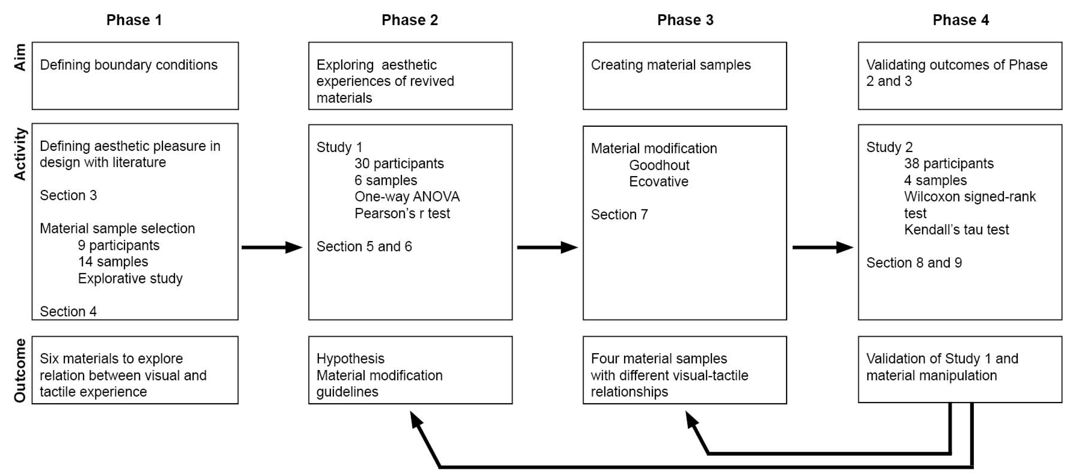
Figure 2.
The set up for the preliminary study, with “cardboard rings” given to the participants to specify the most beautiful and the ugliest materials.
Figure 2.
The set up for the preliminary study, with “cardboard rings” given to the participants to specify the most beautiful and the ugliest materials.

Figure 4.
Presentation of materials (Fishleather (left) and Palmleather (right)) during Study 1.
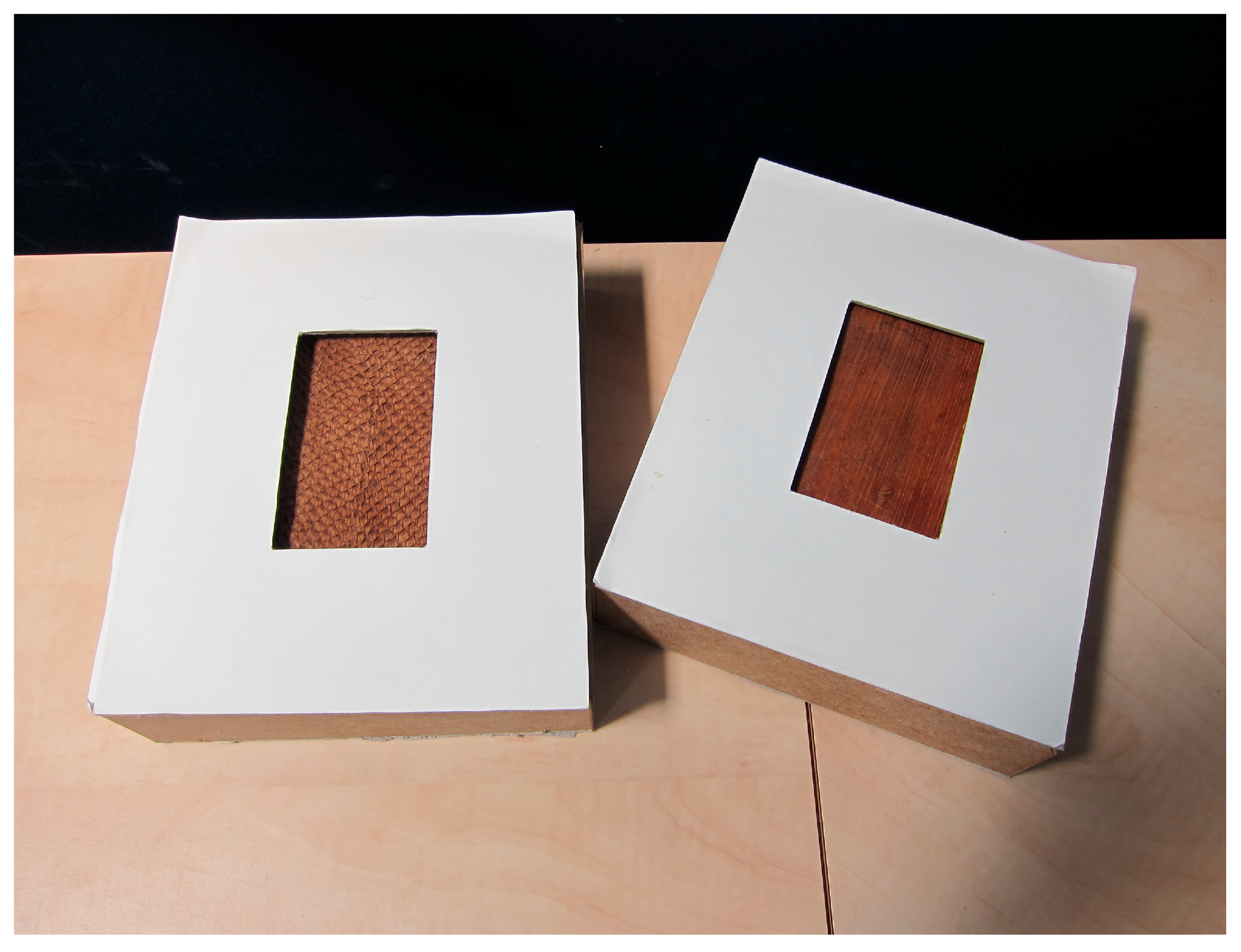
Figure 5.
Sensorial scales used in Study 1.
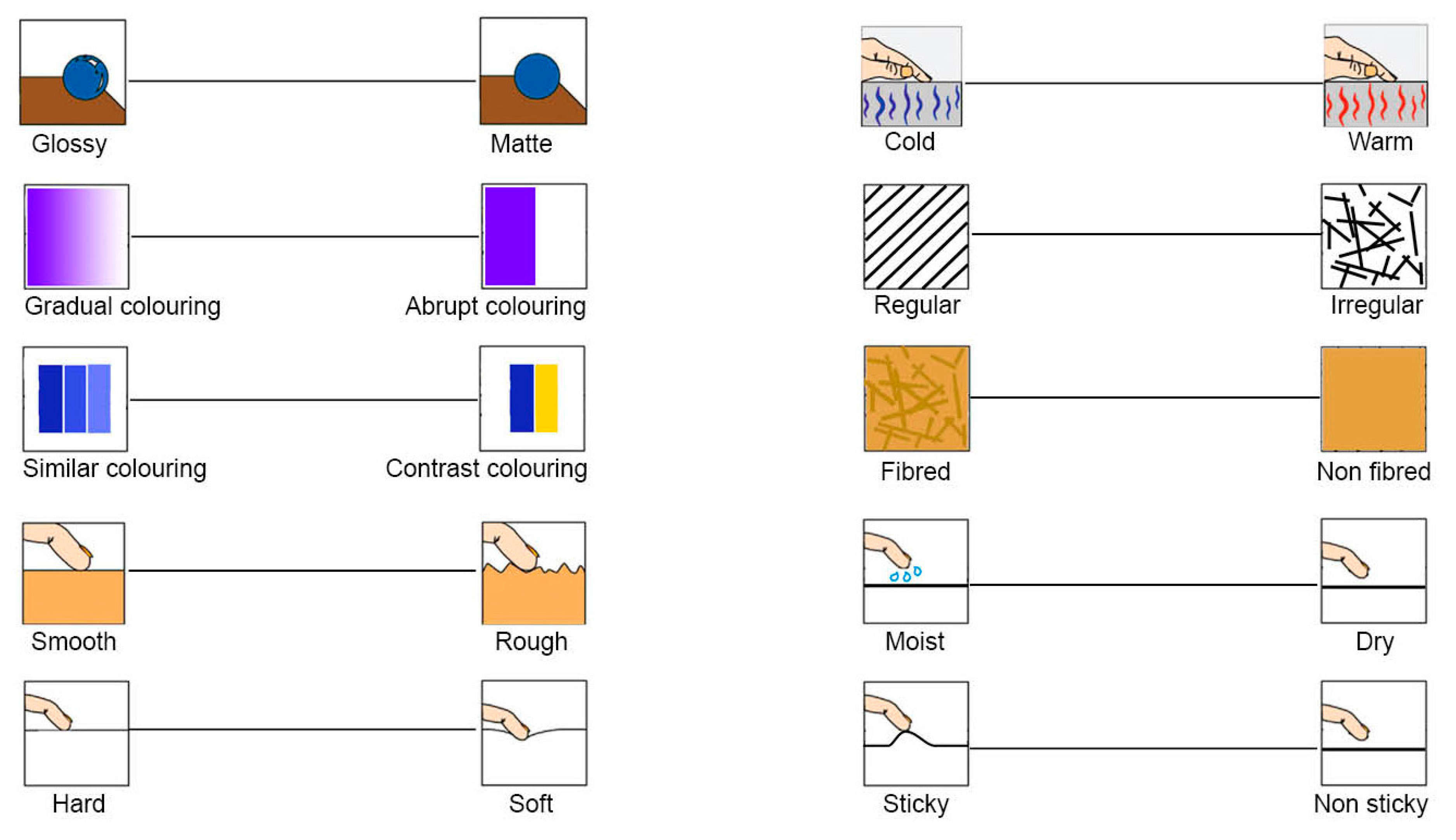
Figure 6.
Highest mean for contrast for regularity of texture (a) and fibreness (b) in relation to willingness to design.
Figure 6.
Highest mean for contrast for regularity of texture (a) and fibreness (b) in relation to willingness to design.
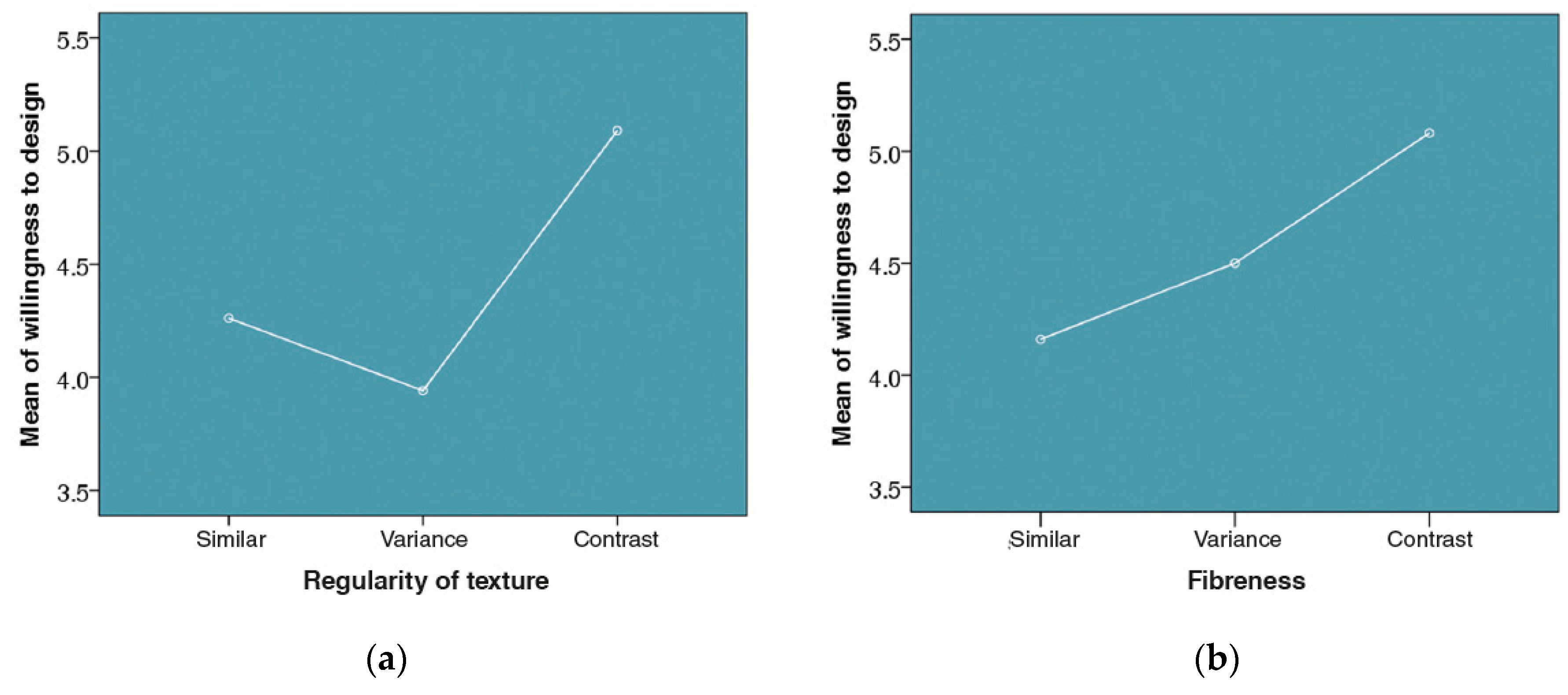
Figure 7.
Mean ratings for Ecovative from Study 1 (n = 30).

Figure 8.
Mean ratings Goodhout from Study 1 (n = 30).
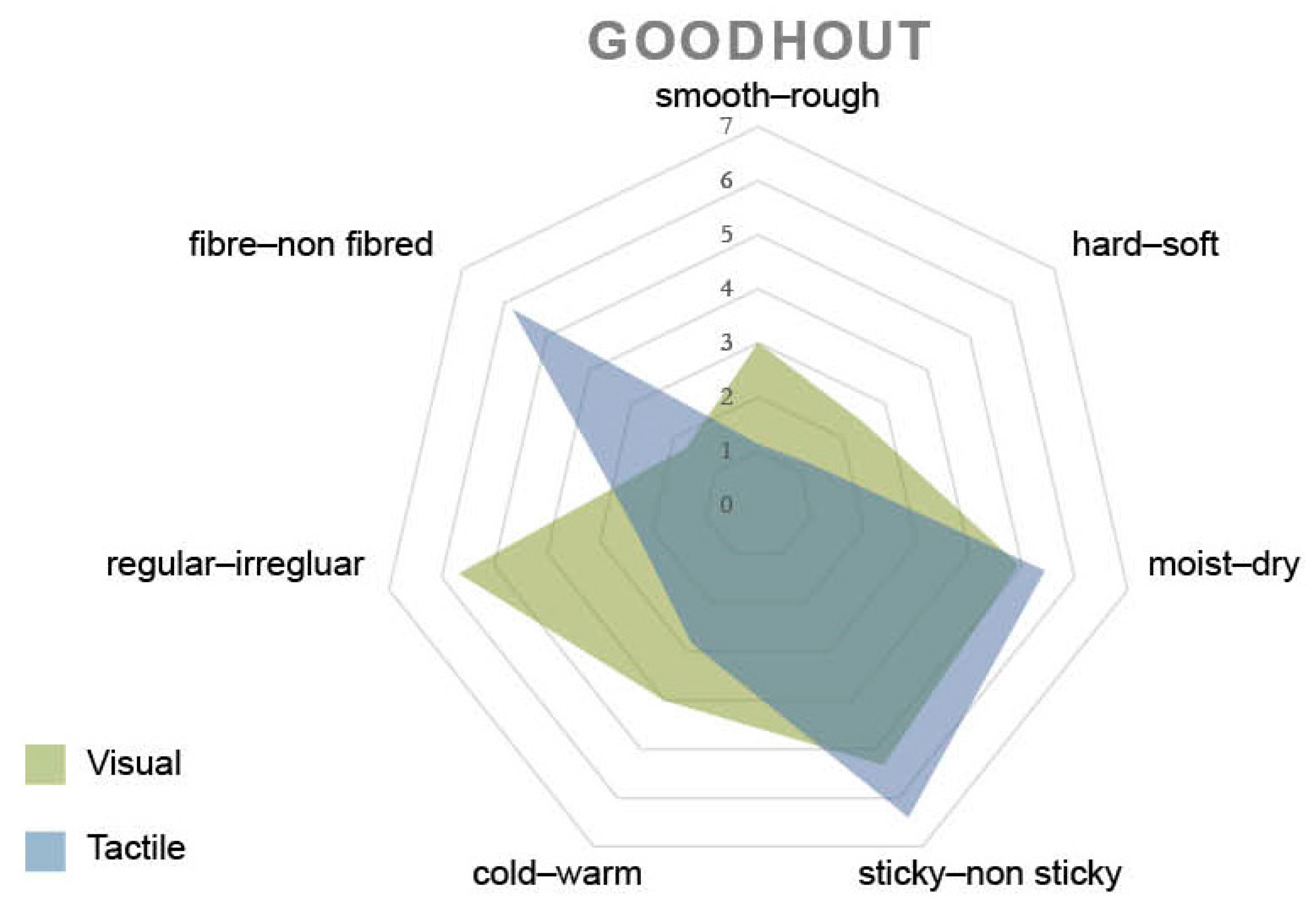
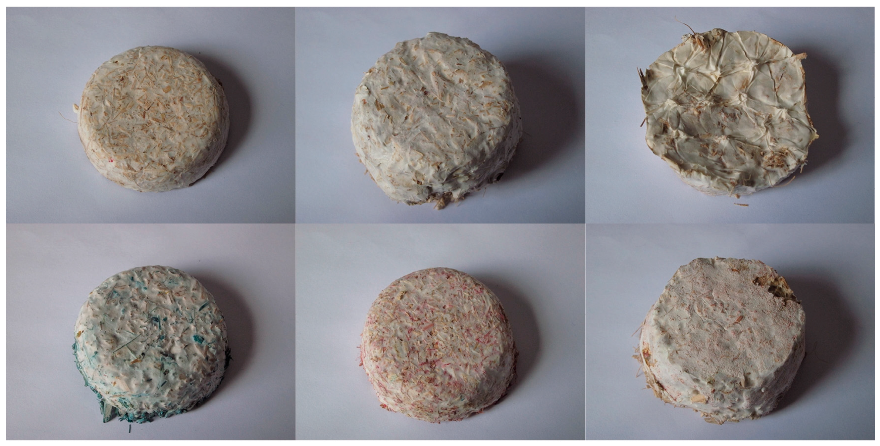
Figure 9.
The Ecovative (mycelium based-material) samples with different tactile and visual qualities.
Figure 9.
The Ecovative (mycelium based-material) samples with different tactile and visual qualities.

Figure 10.
Similar sample (a); and contrasting sample (b) of Ecovative. Including coding for analysis: ES is Ecovative Similar (expected tactile qualities based on visual clues), EC is Ecovative Contrasting (unexpected tactile qualities with regards to visual clues).
Figure 10.
Similar sample (a); and contrasting sample (b) of Ecovative. Including coding for analysis: ES is Ecovative Similar (expected tactile qualities based on visual clues), EC is Ecovative Contrasting (unexpected tactile qualities with regards to visual clues).
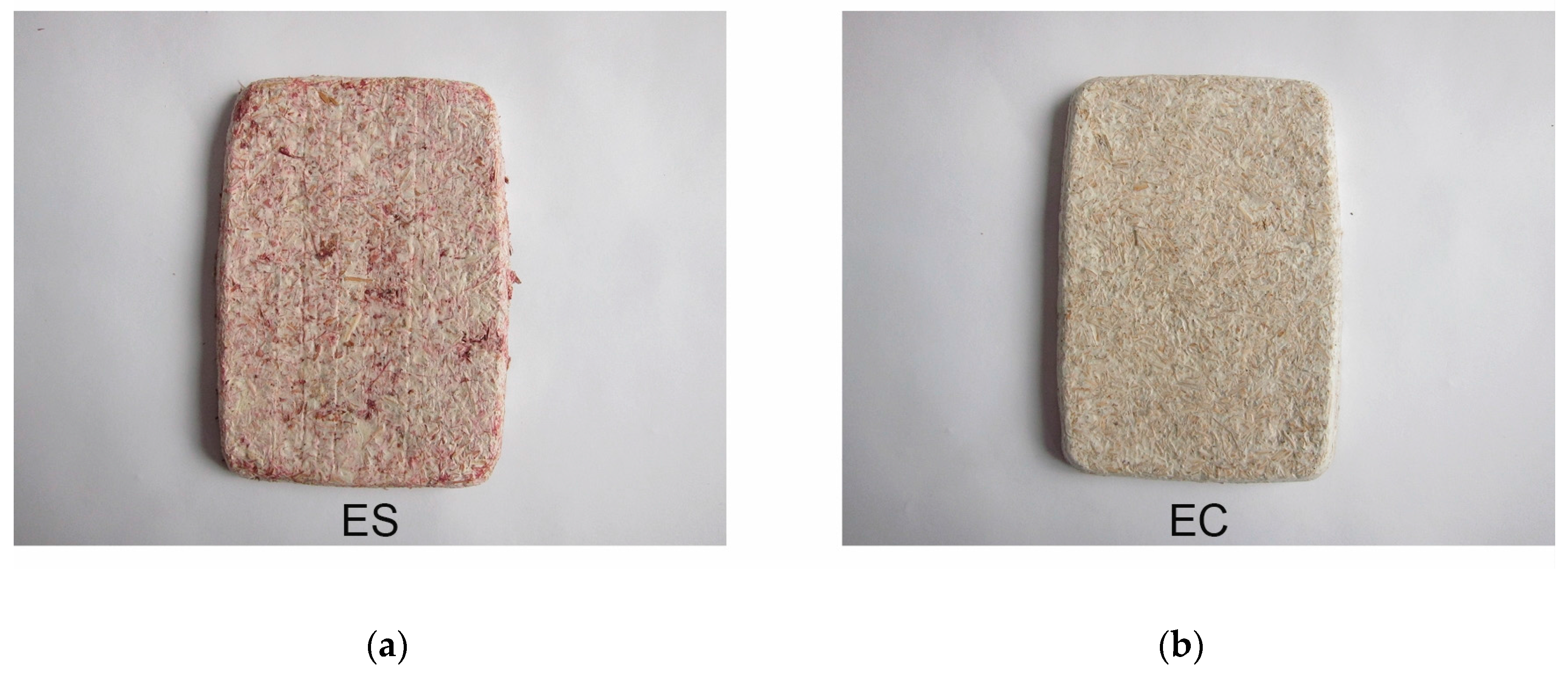
Figure 11.
Similar sample (a); and contrasting sample (b) of Goodhout. Including coding for analysis: GS is Goodhout Similar and GC is Goodhout Contrasting.
Figure 11.
Similar sample (a); and contrasting sample (b) of Goodhout. Including coding for analysis: GS is Goodhout Similar and GC is Goodhout Contrasting.
| Universals that Create Unity | Universals that Allow Variety |
|---|---|
| Symmetry | Originality |
| Simplicity Similarity | Contrast Peak-shift principle Solving puzzles |
Table 2.
Classifications of means for tactile (T) and visual (V) sensations.
| Scale | Boundaries |
|---|---|
| Similar | ≤1 |
| Contrast | V > 4 and T < 4 or vice versa, V = 1 and T = 4 or V = 7 and T = 4 |
| Variance | Relation V–T ≠ boundaries of Similar or Contrast |
Table 3.
Post hoc comparison (Hochberg’s GT2) for regularity of texture. Significant results are emphasized in bold (p < 0.05).
Table 3.
Post hoc comparison (Hochberg’s GT2) for regularity of texture. Significant results are emphasized in bold (p < 0.05).
| Dependent Variable | Regularity of Texture | Regularity of Texture | Mean Difference (I-J) | Std. Error | Sig. | 95% Confidence Interval | ||
|---|---|---|---|---|---|---|---|---|
| Lower Bound | Upper Bound | |||||||
| Willingness to design | Hochberg | Similar | Variance Contrast | 0.320 −0.829 | 0.413 0.312 | 823 0.026 | −0.68 −0.1.58 | 1.32 −0.08 |
| Variance | Similar Contrast | −0.320 −1.150 | 0.413 0.479 | 0.823 0.051 | −1.23 −2.30 | 0.68 0.00 | ||
Table 4.
Post hoc comparison (Hochberg’s GT2) for fibreness. Significant results are emphasized in bold (p < 0.05).
Table 4.
Post hoc comparison (Hochberg’s GT2) for fibreness. Significant results are emphasized in bold (p < 0.05).
| Dependent Variable | Fibreness | Fibreness | Mean Difference (I-J) | Std. Error | Sig. | 95% Confidence Interval | ||
|---|---|---|---|---|---|---|---|---|
| Lower Bound | Upper Bound | |||||||
| Willingness to design | Hochberg | Similar | Variance Contrast | 0.340 −0.921 | 0.403 0.299 | 0.783 0.007 | −1.31 −0.1.64 | 0.63 −0.20 |
| Variance | Similar Contrast | −0.340 −0.581 | 0.403 0.459 | 0.783 0.501 | −0.63 −1.69 | 1.31 0.53 | ||
Table 5.
Pearson’s r test showing which tactile qualities are interrelated with which visual qualities. Significant results are emphasized in bold (p < 0.05).
Table 5.
Pearson’s r test showing which tactile qualities are interrelated with which visual qualities. Significant results are emphasized in bold (p < 0.05).
| Gradual-Abrupt Colour Change | Similar-Contrasting Colour Change | Glossy-Matte | ||
|---|---|---|---|---|
| Smooth–rough | Pearson Correlation | 0.203 | -0.051 | 0.193 |
| Sig. (2-tailed) | 0.008 | 0.512 | 0.009 | |
| n | 170 | 170 | 180 | |
| Hard–soft | Pearson Correlation | −0.080 | −0.058 | 0.073 |
| Sig. (2-tailed) | 0.299 | 0.45 | 0.392 | |
| n | 170 | 170 | 180 | |
| Moist–dry | Pearson Correlation | −0.138 | −0.118 | 0.211 |
| Sig. (2-tailed) | 0.072 | 0.125 | 0.004 | |
| n | 170 | 170 | 180 | |
| Sticky–non sticky | Pearson Correlation | −0.161 | −0.151 | 0.213 |
| Sig. (2-tailed) | 0.036 | 0.05 | 0.004 | |
| n | 170 | 170 | 180 | |
| Cold–warm | Pearson Correlation | 0.028 | −0.033 | 0.17 |
| Sig. (2-tailed) | 0.718 | 0.673 | 0.023 | |
| n | 170 | 170 | 180 | |
| Regular–irregular | Pearson Correlation | 0.26 | 0.295 | 0.011 |
| Sig. (2-tailed) | 0.001 | 0 | 0.885 | |
| n | 170 | 170 | 180 | |
| Fibred–non fibred | Pearson Correlation | −0.293 | −0.198 | 0.15 |
| Sig. (2-tailed) | 0 | 0.01 | 0.045 | |
| n | 170 | 170 | 180 |
Table 6.
Visual translation of tactile properties.
| Tactile Quality | Visual Quality |
|---|---|
| Smooth | Gradual colouring and glossy |
| Rough | Abrupt colouring and matte |
| Moist | Glossy |
| Dry | Matte |
| Sticky | Abrupt and contrasting colouring, glossy |
| Non sticky | Gradual and similar colouring, matte |
| Cold | Glossy |
| Warm | Matte |
| Regularity of texture | Gradual and similar colouring |
| Irregularity of texture | Abrupt and contrasting colouring |
| Fibred | Abrupt and contrasting colouring, glossy |
| Non fibred | Gradual and similar colouring, matte |
Table 7.
Outcome of Wilcoxon signed-rank test for similar-contrasting and expected-unexpected samples. Significant results are emphasized in bold (p < 0.05).
Table 7.
Outcome of Wilcoxon signed-rank test for similar-contrasting and expected-unexpected samples. Significant results are emphasized in bold (p < 0.05).
| EC_Similar–ES_Similar | EC_Expected–ES_Expected | GC_Similar–GS_Similar | GC_Expected–GS_Expected | |
|---|---|---|---|---|
| Z | −0.313 | −0.318 | −3.658 | −4.487 |
| Asymptotic. Sig. (2-tailed) | 0.754 | 0.750 | 0.000 | 0.000 |
EC: Ecovative similar; ES: Ecovative contrasting; GC: Goodhout contrasting; GS: Goodhout similar.
Table 8.
Outcome Wilcoxon Signed-rank test for aesthetic pleasure of Goodhout samples. Significant results are emphasized in bold (p < 0.05).
Table 8.
Outcome Wilcoxon Signed-rank test for aesthetic pleasure of Goodhout samples. Significant results are emphasized in bold (p < 0.05).
| GC_Beauty–GS_Beauty | GC_Design–GS_Design | |
|---|---|---|
| Z | −2.319 | −0.992 |
| Asymptotic. Sig. (2-tailed) | 0.020 | 0.321 |
© 2017 by the authors. Licensee MDPI, Basel, Switzerland. This article is an open access article distributed under the terms and conditions of the Creative Commons Attribution (CC BY) license (http://creativecommons.org/licenses/by/4.0/).
Share and Cite
MDPI and ACS Style
,, M.S.; Karana, E.; Rognoli, V. Revived Beauty: Research into Aesthetic Appreciation of Materials to Valorise Materials from Waste. Sustainability 2017, 9, 529. https://doi.org/10.3390/su9040529
AMA Style
, MS, Karana E, Rognoli V. Revived Beauty: Research into Aesthetic Appreciation of Materials to Valorise Materials from Waste. Sustainability. 2017; 9(4):529. https://doi.org/10.3390/su9040529
Chicago/Turabian Style,, Marita Sauerwein, Elvin Karana, and Valentina Rognoli. 2017. "Revived Beauty: Research into Aesthetic Appreciation of Materials to Valorise Materials from Waste" Sustainability 9, no. 4: 529. https://doi.org/10.3390/su9040529
Note that from the first issue of 2016, this journal uses article numbers instead of page numbers. See further details here.