An Icon-Based Synoptic Visualization of Fully Polarimetric Radar Data

1
Envision 3D Limited, 21 Lansdowne Crescent, Edinburgh EH12 5EH, UK
2
School of GeoSciences, The University of Edinburgh, Drummond Street, Edinburgh EH8 9XP, UK
*
Author to whom correspondence should be addressed.
Remote Sens. 2012, 4(3), 648-660; https://doi.org/10.3390/rs4030648
Submission received: 18 January 2012
/
Revised: 18 February 2012
/
Accepted: 18 February 2012
/
Published: 2 March 2012
Abstract
:The visualization of fully polarimetric radar data is hindered by traditional remote sensing methodologies for displaying data due to the large number of parameters per pixel in such data, and the non-scalar nature of variables such as phase difference. In this paper, a new method is described that uses icons instead of image pixels to represent the image data so that polarimetric properties and geographic context can be visualized together. The icons are parameterized using the alpha-entropy decomposition of polarimetric data. The resulting image allows the following five variables to be displayed simultaneously: unpolarized power, alpha angle, polarimetric entropy, anisotropy and orientation angle. Examples are given for both airborne and laboratory-based imaging.
1. Introduction
It can be argued that the wide use of polarimetric SAR data for Earth science applications is hindered by an incomplete understanding of the interactions of radar waves with multi-component landscape elements such as forest and crop structures. Such understanding may be improved by exploring the data through visual interpretation since human vision is particular effective at identifying spatial patterns and correlations. Current visualization strategies for polarimetric radar data can be split into two broad categories. Firstly there are those which examine the full co- and cross-polarized response of individual covariance matrices, or averages of these matrices (e.g., [1–3]). Secondly, there are techniques which attempt to apply standardized image processing techniques to polarimetric data sets in the form of grey scale intensity images (e.g., [4,5]), RGB composites (e.g., [6,7]) or IHS (Intensity, Hue, Saturation) composites (e.g., [8]). Both of these approaches, however, provide only a partial representation of the data since neither is capable of showing simultaneously both the details of the polarimetric response and the spatial context of such data. Data analysis is therefore always constrained in some way, with the potential for partial or limited understanding of the nature of polarimetric response across a particular target scene.
The exploration of polarimetric response patterns may be improved by visualizing iconic representations of response graphs over large areas. Woodhouse et al. [9] describe a technique which combines polarimetric response graphs with the synoptic overview which is characteristic of traditional pixel-based remotely sensed imagery. In the current study a different methodology is described for visualizing fully polarimetric radar data in a synoptic manner by actively employing basic principles of scientific visualization to create graphical icons that convey five variables that can be extracted from the alpha-entropy decomposition [10]. This icon-based approach allows for the creation of synoptic images that can be used to simultaneously examine five polarimetric variables and the spatial inter-relationships between them within the same image.
The conceptual basis for the visualization strategy exploits the varying perceptual qualities of visual variables to map total power, entropy, alpha angle, beta angle and anisotropy. As some of these variables have explicit geometric analogues, they can be mapped to the parameters of an ellipse. Even when the variables used do not relate directly to the geometric properties of scatterers, the use of the ellipse as an icon provides a match between the technical language of polarimetry and the graphical language developed by Bertin [11].
Despite the structural simplicity of the proposed visualization technique, it is notable that the resulting images represent the first time, to the authors’ knowledge, that more than three polarimetric variables have been represented in a single synoptic image. Note, however, that the technique is presented here as an informative methodology for initial data inquiry and not as a substitute for model-based data analysis or classification maps. Instead, it forms an effective first-stage of visualization that is not difficult to implement, but allows a broad appreciation of the information contained within the data. In addition it should be noted that this work presents the methodology but makes no special claim to the efficacy of such a technique—rather it is presented as a novel way of exploring the geographic variation in polarimetric response.
2. Extracting Further Variables from the Cloude/Pottier Decomposition
The alpha-entropy (α-H) decomposition provides a means of extracting variables that characterize the nature of interactions found in polarimetric datasets [12]. These are the entropy, alpha angle, beta angle, anisotropy and the unpolarized intensity.
The alpha angle and entropy can be considered as basis-invariant analogues of the polarimetric phase difference and coherence variables, which can be estimated directly from the coherency matrix [12]. These variables can be used to create images that are similar in structure to interferograms by combining them as IHS images, rather than RGB. Such images have proved useful in relating the alpha angle and entropy to the scattering properties of different landscape components [8].
Here the IHS approach is extended in order to visualize two more variables that can be derived from the α-H decomposition; namely the anisotropy (A) and the beta angle (β). These variables can be extracted from the eigenvalues and eigenvectors of the coherency matrix [13], and represent parameters which are less well-understood than α and H in terms of their application. Both A and β, however, have properties which may be useful in the analysis of vegetation: β, for example, is linked to the orientation of scatterers in a plane perpendicular to the incident wavefront [12], whilst A is believed to provide information on the number of scattering elements in high to medium entropy environments [14,15]. Both variables have been applied to classification strategies over vegetated environments. In [14], anisotropy was used to improve an unsupervised classification procedure based on entropy and alpha angle values, whilst in [16], β was used in the classification of forested areas. However, classification assumes at least a bimodal distribution of the variable, otherwise it lies on a continuous distribution with no clear discrete boundary with which to define the class. Additionally, while there may be interdependences between the variables, the spatial patterns of these interdependences are lost in the classification process and results are constrained by our prior assumptions of where the class boundaries should be.
Few attempts have been made to visualize the nature of these variables with respect to their spatial distribution, or in a manner that allows analysis of their relationship with other parameters that can be derived from the α-H decomposition. In cases where some attempt is made at spatial analysis, there tends to be a reliance on standard image processing procedures. In [16], for example, an intensity image is shown representing the distribution of β for data collected over Glen Affric. The resulting image appears very noisy, with only lake surfaces providing areas of continuous values.
Similarly, the visualization of A uses either single channel intensity or rainbow color scale images to represent the geographic distribution of values, which in general contain fewer recognizable geographic features than either H or α (for examples, see [17] or [18]). In [14], the visualization of α-H space (normally represented as a 2D scatterplot) is extended to a three-dimensional image cube, using A as the third dimension. Although this allows an assessment of the inter-relationships between these three variables, it does not allow for an assessment of any spatial patterns in their distribution that may be instructive in gaining further understanding of the nature of these parameters. These methods are not at fault—it is simply that they are all constrained by the nature of three-channel visualization of whole images.
3. β and A
The beta angle (β) varies between −π and π and describes the orientation angle of a scatterer about the radar line of sight [10]. A value for the anisotropy (A) of the target can be derived from the second and third eigenvalues (k2 and k3, respectively) of the coherency matrix and lies between 0 and 1.
Anisotropy is believed to provide information on the number of scattering mechanisms in high to medium entropy environments. Low anisotropy values indicate the presence of numerous different scatterers, whilst high values indicate that the observed response is the product of two separate scattering mechanisms. The value of anisotropy in low entropy environments dominated by a single scattering mechanism is believed to be negligible, as the low values for the second and third eigenvalues in this case make the parameter susceptible to system noise [19].
4. Development of the Visualization Methodology
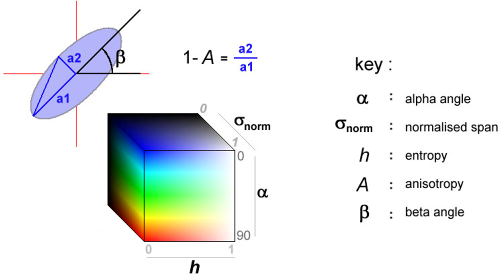
The new visualization technique presented here allows five variables to be mapped to a single location through the use of colored ellipses, in a manner similar to the technique used by Laidlaw et al. [20,21] for visualizing diffusion tensors in a mouse’s spinal column. In Figure 1, the visual parameterization of the ellipse is illustrated. The construction of images from these ellipses is achieved using the six stages outlined below:
- Prior to the creation of each symbol, the pixels are sorted in terms of decreasing entropy, for reasons which are discussed later.
- The values for A, α, β, H, and the normalized total power (σnorm) for each pixel are stored in a temporary vector, which is assigned to an image location where the ellipse will be created.
- The initial size of the ellipse is found by setting the major axis to a value equal to the normalized total power (σnorm). Although there may be some advantage in mapping the power to the area of the ellipse, this would make narrow ellipses too large.
- The anisotropy (A) is then used to define the minor axis, which is equal to (0.1 + 0.9 × (1 − A))σnorm. This means for locations where A= 0, a circular icon is produced, and where A= 1, a thin ellipse is used. The size of the minor axis is restricted to a minimum of 0.1 in order to ensure that the icon remains visible for the highest anisotropy values.
- The ellipse is subsequently oriented about its center by β to represent scatterer orientation.
Finally, using the visualization technique proposed by [8], the color of the ellipse is defined by the alpha angle (α), entropy (H) and normalized total power (σnorm), which are ascribed to hue, saturation and intensity values, respectively. The alpha angle is inverted and re-scaled to range between 240° and 0°, and the saturation channel inverted, so that low entropy surface interactions appear as saturated blue ellipses, and low entropy dihedral interactions as saturated red ellipses. Such a scheme therefore maps to the common visual language used for radar imagery.
The images presented in the following section are the result of many iterations, whereby the visualization structure was adapted in order to produce an optimum strategy which allowed the maximum information to be derived from the variables. Such iterations were based on visual analysis of output images, and included alterations to the maximum size of ellipses, and the scaling of intensity values. Preliminary visualizations, for example, placed ellipses in a sequential column-row structure, leading to visual artifacts in the final image caused by pronounced vertical bands of ellipses. In order to remove the banding, the ordering of the ellipses was changed. Instead of using the column/row structure of the data, the ellipses were placed at geographic locations based on the sorting of the entropy channel from high to low values. This produces a ‘jitter’ effect [21] which acts to apparently randomize the placement of icons.
An additional advantage of this approach is that the high entropy values (from which little information can be derived) are plotted first, and form an underpainting onto which the lower entropy ellipses are placed. This is particularly useful as very low entropy icons are pushed to the front of the image, guiding the viewer to areas where potential information content is highest.
Even after this adjustment, however, the quality of the image was compromised due to the overcrowding of ellipses. In order to overcome this, it was decided that only one in every four data points would be represented on the image. This resulted in a cleaner image where the properties of an individual ellipse could be more easily analyzed. However, this approach runs the risk of ‘missing’ single low entropy targets, such as corner reflectors, which often form the most easily recognizable features in polarimetric datasets. For this reason, the routine was altered so that all ellipses for the final ten percent of the dataset (when sorted in order of decreasing entropy) were always represented.
5. Examples and Analysis
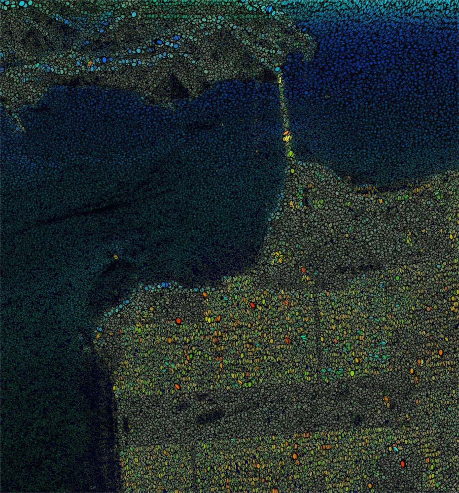
The following examples illustrate the application of the new visualization technique to polarimetric datasets. The first example, shown in Figure 2, shows L-band quad-pol data collected over San Francisco by the JPL airborne polarimeter (AirSAR). This dataset is commonly used in polarimetric research as a means of testing new techniques, as it contains a variety of well-defined landscape components, including zones of urban development, vegetation, open water and bare rock. Other features of interest include geographical landmarks such as the Golden Gate Bridge, and individual buildings in Golden Gate Park. Examples of the usage of this dataset thus stretch from the first papers to appear on radar polarimetry [22] up to more recent studies [23,24].
The visualization shown in Figure 2, however, is unique in that it allows for the spatial analysis of five separate variables derived from the Cloude/Pottier decomposition, and reveals a number of interesting relationships and anomalies. In general, there is a clear divide between the three major landscape components. The ocean area, which dominates the majority of the image is characterized by low backscatter values, which decrease with increasing range distance. The dominant blue hue is indicative of low entropy surface scattering, although this is masked in areas of very low backscatter where entropy is high and the black background begins to dominate. The urban areas, in contrast, are characterized by high backscatter values and higher alpha angle values, evident in the yellow/red coloring of the ellipses. The final general regions of the image are the vegetated areas (including Golden Gate Park), which are characterized by high entropy values, and thus contain little color information.
It should be noted that the example images here are purposefully presented without a key to explain the characteristics of the individual ellipses. This is to emphasize the perceptual qualities of the image, rather than concentrate on the information content. The viewer is thus encouraged to ‘look at’ rather than ‘read’ the image, allowing patterns in the data to be established prior to the application of any prior knowledge relating to the nature of polarimetric scattering. If required, however, Figure 1 acts as a key for all of the images shown here.
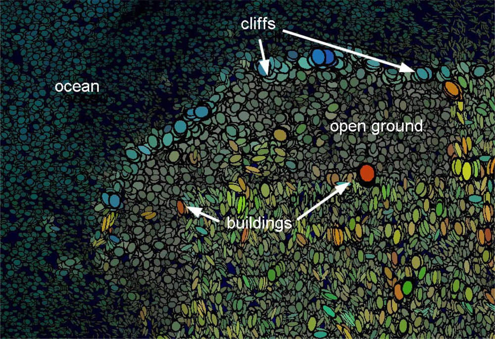
A further advantage of the icon-based approach is that it allows for multiple-scale enquiries. While the overview of Figure 2 allows a quick orientation and assessment of the major scattering properties, a closer inspection allows a more detailed assessment of particular features. Figure 3 shows a detail of Figure 2, and allows contemplation of the extra information encoded in the beta angle and anisotropy values. Of particular interest is the difference between the cliffs and the built-up area. It is immediately apparent from the shape of the ellipses that the cliff are characterized by variable anisotropy values, whilst the urban area appears to be dominated by higher values. Both regions, however, have well-defined hues and so are low entropy environments, suggesting the presence of well-defined scattering regimes.
Over the cliffs, the low anisotropy and the low alpha angles support an interpretation of strong single scattering events caused by direct reflection. In the case of the built-up area, there is more variation in the anisotropy, and it is notable that many of the anisotropic ellipses have a yellow/green hue indicating intermediate alpha angle values. Where anisotropy is low, the alpha angle tends to be closer to 180, leading to red, circular icons. This relationship offers support for the assertion that anisotropy is related to the number of scattering mechanisms in a resolution element. In the built-up area, the bright red circular icons are likely to be indicative of pure dihedral scattering, especially as the most obvious example of this phenomena (just below the ‘s’ in buildings in Figure 3) occurs on the range-ward side of the urban expanse. Deeper into the urban areas, backscatter is more likely to be dominated by a combination of dihedral scattering and direct backscatter, leading to higher anisotropy values, and intermediate alpha angle values.
The proposed visualization technique allows sets of hypotheses similar to those outlined above to be quickly applied to other regions of the image. For example, the presence of low entropy, low anisotropy surface scattering is also evident on the range-ward side of the hills in the upper portion of Figure 2.
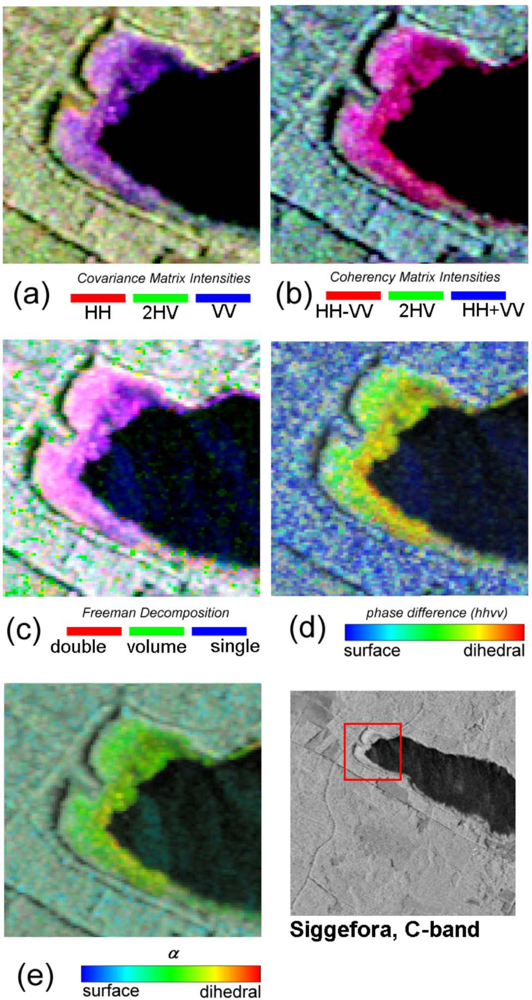
In Figure 4, a second visualization is presented which shows C-band data collected by the EMISAR airborne polarimeter [25]. Unlike the previous example, the majority of this dataset is dominated by a single landcover type, namely, managed boreal-type forest. The application of the new visualization technique immediately reveals that little information can be obtained from the anisotropy and beta angle parameters over this region, both of which exhibit apparently random values. The blue/green hue of the ellipses over the forested region suggests a mixture of direct canopy scatter and volume scattering, with stronger blue hues along gaps in the forest corresponding to roads and tracks.
By way of comparison, Figure 5(a–d) shows the same data represented in some common RGB formats typically used to display polarimetric images. Figure 5(e) shows not an RGB composite but a Hue-Saturation-Intensity image using the α-H decomposition composed of alpha angle for hue, entropy inversely mapped to saturation, and span to intensity. This is similar to how the color of the ellipses are derived in Figure 4, but without the information on anisotropy and orientation angle. By definition, all the images in Figure 5 are only able to show at most three channels of data, whereas Figure 4 contains five.
What is also immediately apparent, however, is the presence of a region in the image which exhibits spatially continuous values for A and β. This region corresponds with an area of reed beds towards the shore of lake Siggefora, and is shown in the inset of Figure 4. Note that the continuous beta angle values suggest the presence of vertically oriented scatterers, whilst the high anisotropy values indicate the presence of more than one dominant scattering mechanism. It is also notable that the alpha angle parameter is also continuous over this region, exhibiting an intermediate value. This is particularly interesting, as intermediate alpha angles are more typically associated with volume scattering [14]. The low entropy angles, however, suggest the presence of a well-defined scattering regime which, on the basis of this visual representation alone, is worthy of further investigation.
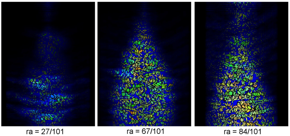
The final example in this paper illustrates how the new visualization technique can be applied to a wide variety of polarimetric datasets. In Figure 6, the technique is applied to a three-dimensional dataset derived from an experiment carried out at the European Microwave Signature Laboratory in 1996 into the application of polarimetric interferometry. The experiment involved placing a 5 m high Balsam Fir tree (Abies Nordmanniana) in an anechoic chamber and measuring the full scattering matrix using two dual polarized horn antennas [26].
The images shown in Figure 6 are constructed using the same technique used for the previous 2D synoptic images. By viewing each of the individual slices, it is possible to examine the scattering properties of vegetation elements such as the tree trunk and major branches. The exploratory nature of these images can be further enhanced by creating animations that illustrate variations in polarimetric properties with respect to canopy depth. On viewing this data as an animation a number of features are readily apparent which can be used to describe the recorded data. The initial images, for example, contain blue, almost circular icons that represent the initial surface backscatter from the major branches in the tree. As the animation proceeds, these ellipses apparently become more anisotropic and migrate towards intermediate alpha angle values. Towards the end of the animation, the lower middle part of the image is dominated by highly anisotropic red ellipses, as a result of dihedral interactions between the chamber floor and the tree trunk. These ellipses also have similar beta angle values, suggesting the presence of vertically oriented scatterers.
6. Discussion
In this paper a visualization technique has been described that allows for the simultaneous visualization of five separate parameters, each of which describes a different aspects of polarimetric scattering. The use of an icon-based approach to visualize variables at specific geographic locations overcomes the three-channel limitation of both RGB and HSV pixel-based images and provides an intuitive link between the jargon of polarimetry and the visual image. This approach thus allows two less well-understood variables (namely, the beta angle and anisotropy) to be compared with three regularly applied variables (the alpha angle, entropy and total power) within their spatial context.
The visualization technique has been applied to a number of different datasets, highlighting areas where the inter-relationships between the five variables may provide further information on how each variable relates to different scattering properties. The value of such images is that the viewer is drawn to areas where strong patterns are apparent, and encouraged to develop hypotheses based on their spatial location and extent. Such an approach can be contrasted with other forms of visualization in remote sensing which rely more heavily on the identification of training areas, or areas of known cover type, and which therefore inherently involve either a priori assumptions or background knowledge of the area in questions.
A further advantage of this visualization strategy is that it is adaptable, and can be simply adjusted to accommodate different variables from those used above. In addition, the structure of the visualization can be adapted to emphasize particular aspects of the dataset. For example, in the above images, decreasing entropy was used to order the sequential layering of the ellipses. A minor adjustment to the IDL procedure would allow this ordering to be based on the total power, or indeed, any of the other variables used. This flexibility encourages an exploratory approach to visualization, whereby hypotheses can be quickly constructed and examined.
In summary, therefore, it can be stated that this new visualization technique allows the synoptic comparison of polarimetric variables which accommodates some of the benefits of both the standard full-image visualization methods with the non-geographic scatterplots. This approach, however, is limited by the fact that, by using a set of derived variables, any interpretation must be weighed against the validity of the chosen set of parameters as adequate indicators of polarimetric properties. The problem of how to most appropriately visualize ‘raw’ polarimetric data for any particular applications, therefore, remains unanswered and is the subject of further study by the authors.
Acknowledgments
The authors would like to extend their gratitude to David Laidlaw for his continued enthusiasm and insight into the subtleties of visualization. Thanks also to William Mackaness for ideas on geographic visualization and especially to Joaquim Fortuny-Guasch for the use of the laboratory-based tree data.
References
- Agrawal, A.P.; Boerner, W.M. Redevelopment of Kennaugh’s target characteristic polarization state theory using the polarization transformation ratio formalism for the coherent case. IEEE Trans. Geosci. Remote Sens 1989, 27, 2–14. [Google Scholar]
- Dong, Y.; Forster, B. Understanding of partial polarisation in polarimetric SAR data. Int. J. Remote Sens 1996, 17, 2467–2475. [Google Scholar]
- Woodhouse, I.H.; Turner, D. On the visualization of polarimetric response. Int. J. Remote Sens 2003, 24, 1377–1384. [Google Scholar]
- Skriver, H.; Svendsen, M.T.; Thomsen, A.G. Multitemporal C- and L-band polarimetric signatures of crops. IEEE Trans. Geosci. Remote Sens 1999, 37, 2413–2429. [Google Scholar]
- Van Zyl, J.J.; Zebker, H.A.; Elachi, C. Imaging radar polarization signatures: Theory and observation. Radio Science 1987, 22, 529–543. [Google Scholar]
- Le Toan, T.; Beaudoin, A.; Riom, J.; Guyon, D. Relating forest biomass to SAR data. IEEE Trans. Geosci. Remote Sens 1992, 30, 403–411. [Google Scholar]
- Christensen, E.L.; Skou, N.; Dall, J.; Woelders, K.W.; Jorgensen, J.H.; Granholm, J.; Madsen, S.N. EMISAR: An absolutely calibrated polarimetric L- and C-band SAR. IEEE Trans. Geosci. Remote Sens 1998, 36, 1852–1865. [Google Scholar]
- Imbo, P.; Souyris, J.C.; Lopes, A.; Marthon, P. Synoptic Representation of Polarimetric Information. Proceedings of CEOS SAR Workshop, Toulouse, France, 26–29 October 1999. (ESA Special Publications).
- Woodhouse, I.H.; Turner, D.; Laidlaw, D. Improving the Visualisation of Polarimetric Response in SAR Imagery—From Pixels to Images. Proceedings of IGARSS 2002, Toronto, ON, Canada, 24–28 June 2002.
- Cloude, S.R.; Pottier, E. An entropy based classification scheme for land applications of polarimetric SAR. IEEE Trans. Geosci. Remote Sens 1997, 35, 68–78. [Google Scholar]
- Bertin, J. Graphic and Graphic Information Processing; Walter de Gruyter and Co.: Berlin, Germany, 1981. [Google Scholar]
- Cloude, S.R.; Pottier, E. A review of target decomposition theorems in radar polarimetry. IEEE Trans. Geosci. Remote Sens 1996, 34, 498–518. [Google Scholar]
- Cloude, S.R.; Fortuny, J.; Lopez-Sanchez, J.M.; Sieber, A.J. Wide-band polarimetric radar inversion studies for vegetation layers. IEEE Trans. Geosci. Remote Sens 1999, 37, 2430–2441. [Google Scholar]
- Pottier, E.; Lee, J.S. Application of the H/A/α Polarimetric Response Decomposition Theorem for Unsupervised Classification of Fully Polarimetric SAR data based on the Wishart Distribution. Proceedings of CEOS SAR Worksho, Toulouse, France, 26–29 October 1999.
- Hajnsek, I.; Pottier, E.; Cloud, S.R. Inversion of surface parameters from polarimetric SAR. IEEE Trans. Geosci. Remote Sens 2003, 41, 727–744. [Google Scholar]
- Lumsdon, P.; Wright, G. A Polarimetric SAR Classification for Comparison Test against Aerial Photography Images in Glen Affric Radar Project. Proceedings of PolInSAR 2003, Frascati, Italy, 14–16 January 2003. (ESA Publications).
- Cloude, S.R.; Hajnsek, I.; Papathanassiou, K.P. An Eigenvector Method for the Extraction of Surface Parameters in Polarimetric SAR. Proceedings of CEOS SAR Workshop, Toulouse, France, 26–29 October 1999. (ESA Special Publications).
- Schuler, D.L.; Lee, J.S.; Kasilingam, D.; Pottier, E. Measurement of Ocean Wave Spectra Using Polarimetric SAR Data. Proceedings of IGARSS 2003, Toulouse, France, 21–25 July 2003.
- Titin-Schnaider, C. Radar Polarimetry for Vegetation Observation. Proceedings of CEOS SAR Workshop, Toulouse, France, 26–29 October 1999. (ESA Special Publications).
- Laidlaw, D.H.; Kremers, D.; Ahrens, E.T.; Avalos, M.J. Applying Painting Concepts to the Visual Representation of Multi-Valued Scientific Data. Proceedings of SIGGRAPH 98, Orlando, FL, USA, 19–24 July 1998.
- Laidlaw, D.H.; Kirby, R.M.; Davidson, J.S.; Miller, T.S.; Silva, M.D.; Warren, W.H.; Tarr, M. Quantitative Comparative Evaluation of 2D Vector Field Visualization Methods. Proceedings of IEEE Visualization 2001, San Diego, CA, 21–26 October 2001.
- Zebker, H.A.; Van Zyl, J.J.; Held, D.N. Imaging radar polarimetry from wave synthesis. J. Geophys. Res 1987, 92, 683–701. [Google Scholar]
- Gu, J.; Yang, J.; Zhang, H.; Peng, Y.; Wang, C.; Zhang, H. Speckle filtering in polarimetric SAR data based on subspace decomposition. IEEE Trans. Geosci. Remote Sens 2004, 42, 1635–1641. [Google Scholar]
- Lee, J.S.; Grunes, M.R.; Pottier, E.; Ferro-Famil, L. Unsupervised terrain classification preserving polarimetric scattering characteristics. IEEE Trans. Geosci. Remote Sens 2004, 42, 722–731. [Google Scholar]
- Woodhouse, I.H.; Hoekman, D.H. Radar modeling of coniferous forest using a tree growth model. Int. J. Remote Sens 2000, 21, 1725–1737. [Google Scholar]
- Fortuny, J.; Sieber, A.J. Three-Dimensional Synthetic Aperture Radar imaging of a Fir Tree: First results. IEEE Trans. Geosci. Remote Sens 1999, 37, 1006–1014. [Google Scholar]
Figure 1.
Parameterization of the visual variables of an ellipse icon using data variables derived from the Cloude/Pottier decomposition. The upper left ellipse demonstrates how the values of A and β are mapped to the orientation and ellipticity. The color box illustrates the HIS mapping for the alpha angle, the normalized span and the entropy.

Figure 2.
Visualization of L-band data over the North West part of San Francisco (near range is at the top of the image). The Golden Gate Bridge is clearly seen to the North of the city. The unsaturated rectangular area near the bottom of the image is Golden Gate Park.
Figure 2.
Visualization of L-band data over the North West part of San Francisco (near range is at the top of the image). The Golden Gate Bridge is clearly seen to the North of the city. The unsaturated rectangular area near the bottom of the image is Golden Gate Park.

Figure 3.
Detail of San Francisco dataset over the area around Lincoln Park, showing the different patterns evident for different landscape components.
Figure 3.
Detail of San Francisco dataset over the area around Lincoln Park, showing the different patterns evident for different landscape components.

Figure 4.
Visualization of C-band data over a forested region. Note that while no strong patterns are evident in the forested area, an area of reed beds on the lake shore exhibits spatial continuous values for A and β.
Figure 4.
Visualization of C-band data over a forested region. Note that while no strong patterns are evident in the forested area, an area of reed beds on the lake shore exhibits spatial continuous values for A and β.

Figure 5.
(a–d) RGB visualizations of the same C-band data as in Figure 4 but using typical visualizations used for polarimetric imagery. Plate (e) is not an RGB composite but is a Hue-Saturation-Intensity image using the α-H decomposition composed of alpha angle for hue, entropy inversely mapped to saturation, and span to intensity. This is similar to how the color of the ellipses are derived in Figure 4.

Figure 6.
Azimuthal slices through a three-dimensional dataset of a fir tree, taken from a time series animation. When viewed in series, the ellipses show the scattering properties of individual branches.
Figure 6.
Azimuthal slices through a three-dimensional dataset of a fir tree, taken from a time series animation. When viewed in series, the ellipses show the scattering properties of individual branches.

Share and Cite
MDPI and ACS Style
Turner, D.; Woodhouse, I.H. An Icon-Based Synoptic Visualization of Fully Polarimetric Radar Data. Remote Sens. 2012, 4, 648-660. https://doi.org/10.3390/rs4030648
AMA Style
Turner D, Woodhouse IH. An Icon-Based Synoptic Visualization of Fully Polarimetric Radar Data. Remote Sensing. 2012; 4(3):648-660. https://doi.org/10.3390/rs4030648
Chicago/Turabian StyleTurner, Dean, and Iain H. Woodhouse. 2012. "An Icon-Based Synoptic Visualization of Fully Polarimetric Radar Data" Remote Sensing 4, no. 3: 648-660. https://doi.org/10.3390/rs4030648