Article

Continuous Learning Graphical Knowledge Unit for Cluster Identification in High Density Data Sets

by
K.K.L.B. Adikaram
1,2,3,*,
Mohamed A. Hussein
1,
Mathias Effenberger
2 and
Thomas Becker
4
1
Group Bio-Process Analysis Technology, Technische Universität München, Weihenstephaner Steig 20, 85354 Freising, Germany
2
Bavarian State Research Center for Agriculture, Institute for Agricultural Engineering and Animal Husbandry, Vöttinger Straße 36, 85354 Freising, Germany
3
Computer Unit, Faculty of Agriculture, University of Ruhuna, Mapalana, Kamburupitiy 81100, Sri Lanka
4
Lehrstuhl für Brau- und Getränketechnologie, Technische Universität München, Weihenstephaner Steig 20, 85354 Freising, Germany
*
Author to whom correspondence should be addressed.
Symmetry 2016, 8(12), 152; https://doi.org/10.3390/sym8120152
Submission received: 8 June 2016 / Revised: 7 November 2016 / Accepted: 5 December 2016 / Published: 14 December 2016
(This article belongs to the Special Issue Scientific Programming in Practical Symmetric Big Data)

Abstract

:
Big data are visually cluttered by overlapping data points. Rather than removing, reducing or reformulating overlap, we propose a simple, effective and powerful technique for density cluster generation and visualization, where point marker (graphical symbol of a data point) overlap is exploited in an additive fashion in order to obtain bitmap data summaries in which clusters can be identified visually, aided by automatically generated contour lines. In the proposed method, the plotting area is a bitmap and the marker is a shape of more than one pixel. As the markers overlap, the red, green and blue (RGB) colour values of pixels in the shared region are added. Thus, a pixel of a 24-bit RGB bitmap can code up to 224 (over 1.6 million) overlaps. A higher number of overlaps at the same location makes the colour of this area identical, which can be identified by the naked eye. A bitmap is a matrix of colour values that can be represented as integers. The proposed method updates this matrix while adding new points. Thus, this matrix can be considered as an up-to-time knowledge unit of processed data. Results show cluster generation, cluster identification, missing and out-of-range data visualization, and outlier detection capability of the newly proposed method.

1. Introduction

Plotted data are visually cluttered by overlapping data points. Reducing, avoiding and reformulating (as a cluster) such overlap are the three major techniques recommended for clutter reduction in the data visualization field [1,2,3,4,5]. However, especially with large numbers of overlap, reducing and avoiding techniques are not feasible [4,6] and reformulation is a complex task [4,7]. In contrast, the method we introduce in this paper incorporates overlaps to generate density clusters without reducing, avoiding or reformulating overlaps. The proposed method requires more overlaps for better cluster formation and better visualization, which contrasts the general practice. Furthermore, the proposed method can be considered as an anytime cluster formation technique (without a separate cluster identification algorithm), which provides faster cluster generation than online methods [8].
Limiting the number of data points on a plot is the most popular technique to avoid overlaps [6]. Typically, when there are few data points, the probability of an overlap occurring is low. Changing the opacity of data points and displacing data points that address the issue of overlapping are among overlap reducing techniques [4]. Changing the opacity of data points enables the identification of small numbers of underlying or partially overlapping data points [4]. Displacement (agitating or jittering) is a technique that randomly moves a data point over a small distance to overcome the overlap [4,6,9]. However, when too many overlaps occur, limiting the number of data points, changing the opacity or displacing data points does not work very effectively. Reformulating overlapped data points as density clusters is a solution for eliminating the overlap that represents different overlapping density ranges as different clusters, even with big data. The final output depends on the cluster identification algorithm.
In real-world applications, overlapping increases the colour intensity of a redrawn area in contrast to other areas of a picture and hence generates a visually identifiable cluster. This phenomenon indicates that the number of overlaps is proportional to the colour intensity. We have found that step-by-step increase of the colour value of a pixel in a bitmap resembles the phenomenon of overlapping. This motivated us to develop a method to overcome overlapping data points by means of a bitmap. To deal with such a situation, we use bitmaps, clustering techniques, cluster representation techniques and contour lines.
A bitmap is the major component of our proposed method for plotting data and is a raster graphics image comprising a rectangular array of pixels [10]. There are different methods to represent the colour of pixels. The 8-bit RGB and 8-bit red, green, blue, and alpha (RGBA) formats are the most popular methods [6]. The RGB format uses the red, green and blue colour channels, whereas the RGBA format uses the red, green, blue and alpha colour channels, where the alpha channel determines the level of transparency of a colour [11]. In both formats, each colour component has 8 bits representing 256 codes (values of 0–255) for each of the R, G and B channels. The colour value of a pixel is represented as a combination of channel values separated by commas (e.g., dark green in RGB: (0, 100, 0) and in RGBA: (0, 100, 0, 0)). In general, if the total effective bit length of a pixel is n, a pixel can represent 2n colours. Thus, the 8-bit RGB and 8-bit RGBA formats can represent 224 and 232 different colours, respectively. If the whole bit series of a pixel is considered as a single channel, then each pixel is a number of base 256 (e.g., dark green in RGB: (0, 100, 0) = 25,600). Thus, a bitmap is a matrix that contains numerical values. The visual representations of these numbers indicate different colours. If these numbers are used to represent up-to-time processed data, the bitmap becomes an up-to-time knowledge unit. This is a different usage of bitmaps for representing data.
As already mentioned, clustering is the most popular technique and is capable of eliminating overlaps, especially with big data. Overall, the process of cluster identification is comprised of three components: data (database), algorithm and cluster information (processed data). The processed data are represented in different forms, primarily as data in a database or as visualized output. In almost all clustering methods, clusters are first determined by a separate algorithm and then visualized by a suitable technique. Typically, clusters are represented as a visual output such as a histogram, scatterplot or scatterplot matrix [12]. The graphical output is used only as a visual aid to facilitate the understanding of the clusters. The graphical output cannot be used as a source of processed data for another algorithm. After the cluster analysis process, it is sometimes still possible to find some unidentified clusters. In this case, the general practice is to modify the existing algorithm or introduce a new algorithm to identify new patterns. In contrast, the proposed method does not require a separate algorithm to identify density clusters as it generates clusters on the bitmap while adding data points.
This new approach based on overlapping data points provides a mechanism to access and view information directly without further processing. Our findings are highly relevant for applications in fields of big data visualization, process control, data modelling and bit data representation.

1.1 Related Work

As mentioned above, the proposed method is based on clustering. Therefore, clustering techniques used for clutter reduction are the most related techniques. Clustering or cluster analysis is an unsupervised (i.e., it requires no training data sets) data classification method [13,14,15] for identifying homogenous groups of objects known as clusters [16,17,18]. Cluster analysis is used in many fields, such as knowledge discovery in databases (KDD), pattern recognition, image analysis, and machine learning and data mining [19,20,21,22,23,24]. Typically, existing clustering techniques used for clutter reduction eliminate overlaps by representing a group of data points or a group of lines by means of a single data point or line [2,3,25,26]. After identifying clusters, these clusters can be used to understand and identify correlations, patterns, features and outliers in the data set.
There are several special methods based on clustering that are intensively related to elimination of overlaps such as heat maps [27,28,29] variable binned scatter plots [30], hierarchical multi-class sampling [5] and Splatter-plots [31]. A heat map represents data in a matrix using a colour scale that represents the values in the matrix. The quadrat method is a popular technique for creating such a matrix [32,33,34]. The hierarchical multi-class sampling technique is another effective technique for showing specific feature-clusters by enhancing density contrast by means of different colours. The visual exploration system developed by Haidong et al. is a good example of such an approach [5]. The variable binned scatter plots technique allows visualization of large amounts of data without overlaps [30]. This technique incorporates variable size bins [35] and classifies them into different groups using a colour scheme. The Splatter-plots technique automatically groups dense data points into contours and samples the remaining points. Colour blending is used to reveal the relationship between data subgroups after processing the whole data set. Pre-processing of the original data is a compulsory step for all these cluster visualization techniques to convert the original data into the desired format. In contrast, the proposed method does not require pre-processing of the original data prior to visualization.
A contour line is a different technique used to indicate clusters. The term contour line (also known as isolines, isopleths or isarithms) was originally used in the cartography field. According to Imhof, “Contour lines are lines on the map depicting the metric locations of points on the Earth’s surface at the same elevation above sea level” [36]. However, contour lines are also used to map equal values for other properties such as temperature or pressure. In a contour map, contour lines with a certain interval display different values. The main feature of a contour map is that each contour line indicates a certain value, and it is impossible to have crossing contour lines. This technique is used to show the borders of clusters in kernel identification methods [37,38]. The proposed method creates contour lines automatically to separate different density clusters.

2. Methodology

In a bitmap, the coordinates of a pixel specify its location. As in a common plot, these coordinates can be used to represent parameter values (dimensions) that can be considered as data. In addition, the colour value of the pixel can be mapped with information related to the data, e.g., the number of overlaps (or data density) in the proposed method. Furthermore, updating the colour value of the pixel resembles updating the information. An individual pixel is capable of holding 2n number of different values; thus, a pixel is a memory cell or a knowledge cell. Therefore, we introduce a bitmap that forms a graphical knowledge unit (GKU) out of knowledge cells to represent data and information.
The clustering range of influence is defined as the radius around the cluster centre (the highest density data point of the cluster) [39]. When the clustering range of influence is small, many small clusters are produced. In contrast, when the clustering range of influence is large, a few large clusters are produced. When developing the proposed method, we used the size and shape of a marker (a graphical symbol of a data point) and the position of a data point in the marker to characterize the clustering range of influence. The shape and size of the marker are used to depict the effective clustering range of influence. Typically, the marker is comprised of several pixels. From these pixels, we use one pixel to represent the data point. For example, if the marker is a circle with a diameter of x pixels, the data point is represented by the pixel in the centre of the circle. Figure 1 shows an example of such data point. Here we have highlighted the location of the data point using a different colour, whereas in reality, no distinct colour is used for this.

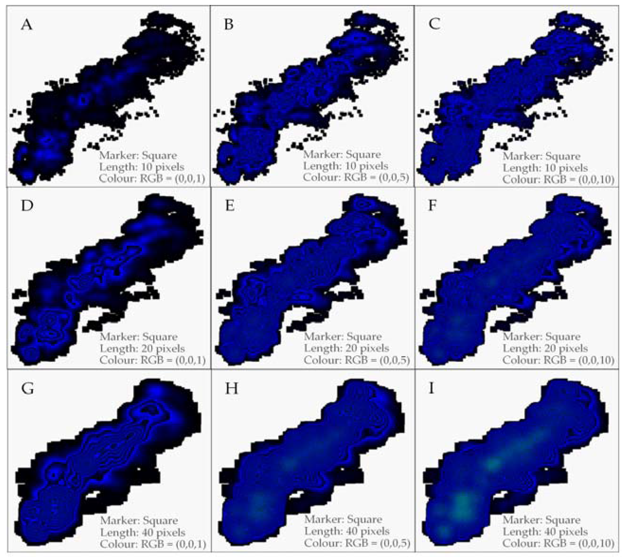
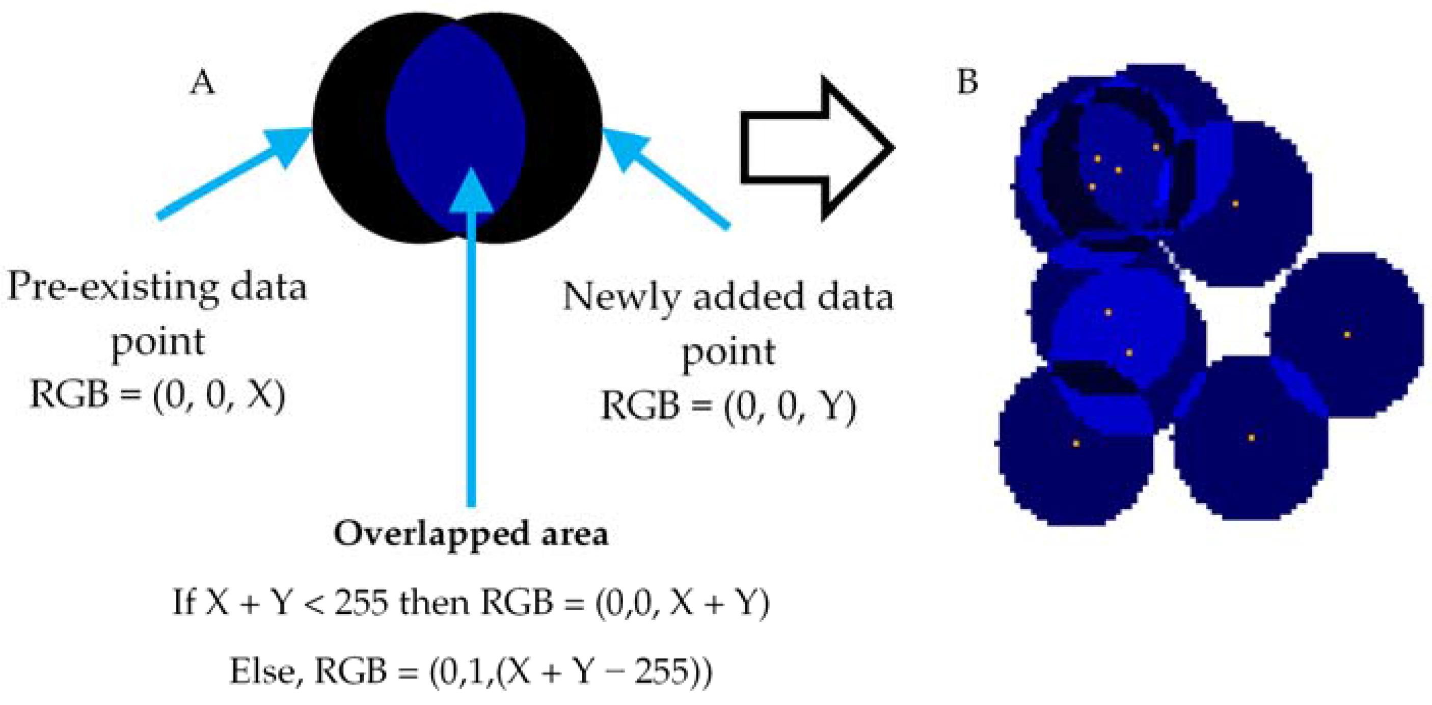
2.1. Colour Coding Method

When an overlap occurs, there is always a shared area (intersection) between both existing and newly added markers. We then update the colour of the overlapping area by adding the colour values of pre-existing and newly added markers (Figure 2A). When adding colour, the colour of each pixel in the shared area is updated according to the Equations (1) and (2). We first convert the colour of a pre-existing pixel in the shared area and the corresponding pixel of the newly added marker using (1). Subsequently, we add those two values and convert the single value to an RGB value using (2). Finally, we update the considered pixel in the shared area using the new colour derived from (2). Applying this technique for all pixels in the shared area updates the colour of the shared area (Figure 2B). The colour of the new marker is applied if there is no overlap.
If CV is the single integer colour value of a pixel, RV is the red colour value, GV is the green colour value and BV is the blue colour value, then
CV = RV × 2562 + GV × 2561 + BV × 2560.
The function QUOTIENT(<numerator>, <denominator>) performs division and returns only the integer portion of the result. If C2 = RV, C1 = GV and C0 = BV, then
C i = QUOTIENT ( C V   j   =   1 2 ( C i   +   j   × 2 i   +   j ) , 256 i ) ;   i   ϵ   { 2 , 1 , 0 }   and   C k = 0   when   k > 2 .
For example, according to Equation (1), a pixel with RGB colour (1, 2, 3) can be represented as 66,051 (1 × 2562 + 2 × 2561 + 3 × 2560). In addition, when CV = 66,051, according to Equation (2), C2 = 1, C1 = 2 and C0 = 3. Because C2 = RV, C1 = GV and C0 = BV, the RGB representation of 66,051 is (1, 2, 3). Note that only these two equations are used for density calculation and density cluster formation.

2.2. Data Preparation

Because the location (coordinates) in a bitmap is a positive integer, it is impossible to depict decimal and negative values. In addition, it is impractical to represent a very large range of numbers with bitmaps, as this would require a very large bitmap. Applying transformation techniques is one of the ways to overcome these challenges. Base line correction is used to eliminate negative values and very large values. This gives a value range that begins from zero. Scaling up or down is applied to overcome very small and very large ranges, respectively. If the data set is a combination of negative, decimal and large values, the respective transformations must be implemented accordingly. Finally, a suitable offset is used to shift the data from the origin. Table 1 shows the basic transformation techniques used for the different value types.

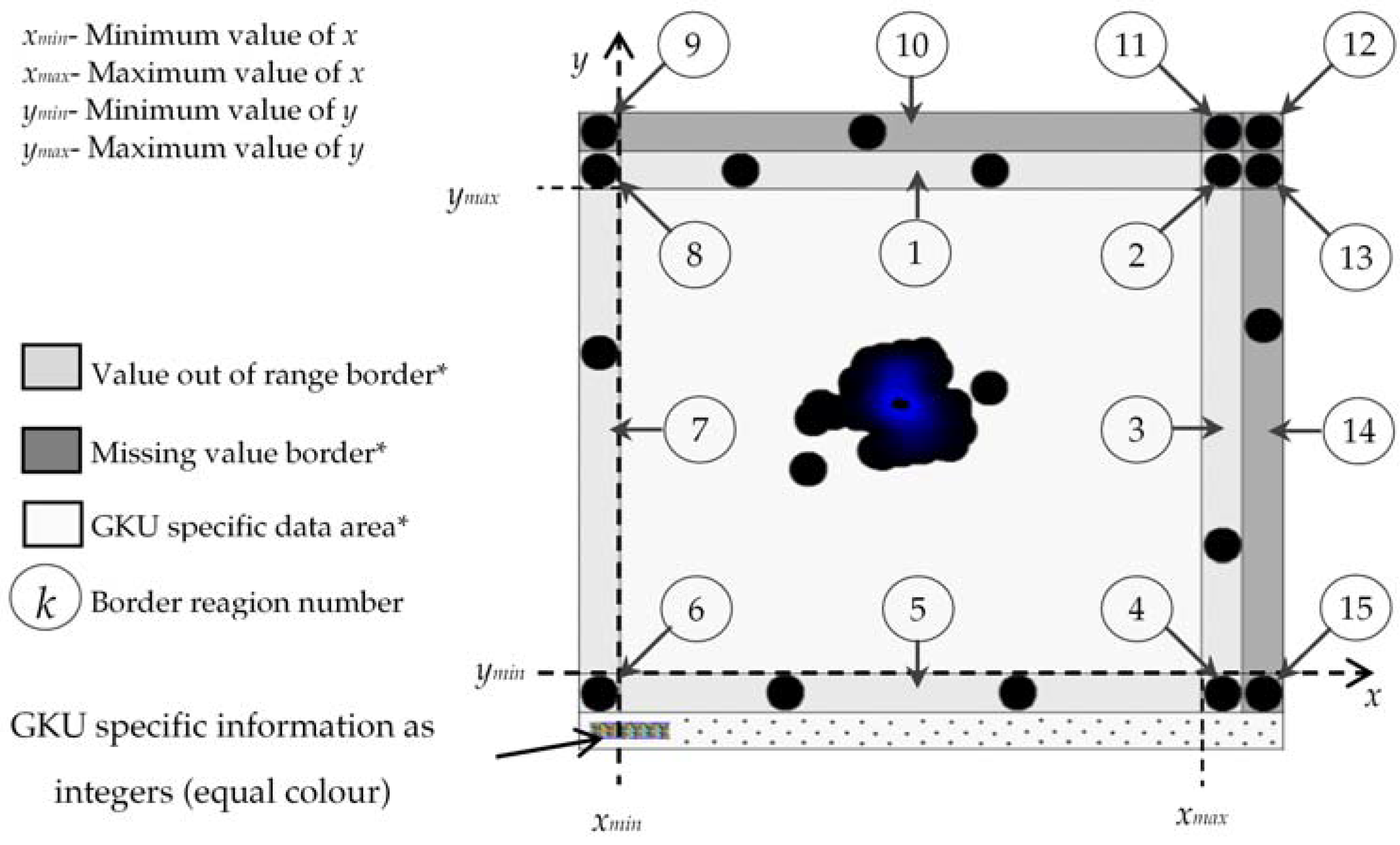
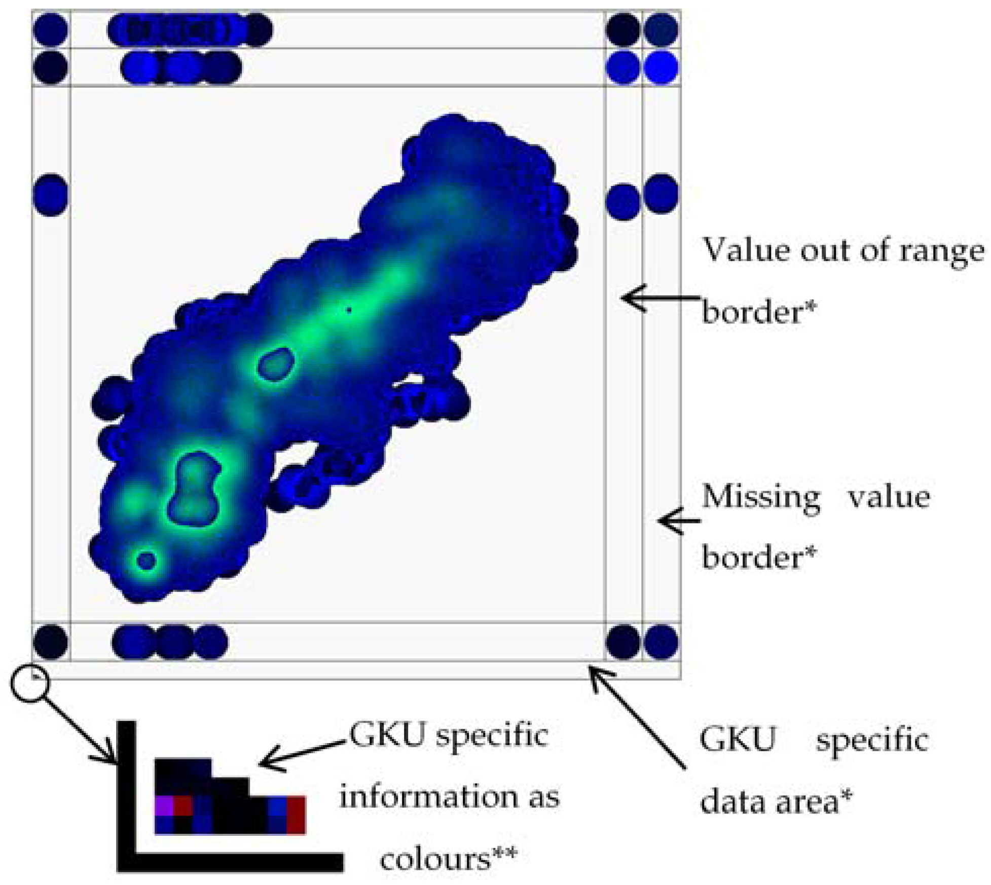
2.3. Visualization of Missing and Out of Range Values

A method that can show missing data and data that have unexpected (out of range) values would provide important information for understanding the quality of the data. We have included two border regions in the GKU for recording missing values and data with out of range values. In these borders, different regions are defined to identify the nature of the missing or out of range data (Figure 3). If there are missing or out of range values, these are shown on the relevant border region of the bitmap in the same manner as regular data points (Figure 3).

2.4. Embed GKU Specific Information into Bitmap

The GKU contains several parameters related to data transformation, marker type (circle, square, etc.), marker dimensions, marker colour and border information (width of borders of missing and unexpected values). This GKU information could be stored in a separate file; however, it would be more convenient if this information was embedded in the same bitmap file as integers (=colour). Thus, at the bottom (or top) of the bitmap after (or before) the real data points, the GKU specific data are depicted with the respective colour (Figure 3). The starting location (offset) of the GKU specific data area is stored in the first unused slot of the bitmap header (Table 2).
As discussed above, it is necessary to convert GKU specific data into integers to embed this information into the bitmap. However, certain properties such as marker type or negative values cannot be mapped directly with the colour value of a pixel. Therefore, a protocol is required to map this information. The existing 24-bit pixel RGB structure can represent positive numbers. We refer to this as the unsigned 24-bit pixel format. In addition, using 24 bits, it is possible to represent negative integers, where the first bit is used to indicate the sign of the value (e.g., 1 = negative and 0 = positive). We refer to this as the signed 24-bit pixel format. Furthermore, any number can be represented as a product of an integer and a power of ten (e.g., −123.45 = −12345 × 10−2). Thus, any number can be represented (one for the integer part and the other for power of ten) with two pixels in the signed 24-bit single pixel format. Finally, the structure of the GKU specific data is designed as shown in Table 3 using relevant number representation techniques.

2.5. GKU Evaluation Method

We tested the new method using automatically recorded data from near-infrared (NIR) spectroscopy at a biogas plant over a period of nearly 75 days with a frequency of 20 values per hour (35,620 data points). Volatile solid (VS) and volatile fatty acid (VFA) concentrations were selected as dimensions. The selected data were part of a data set used to develop NIR spectroscopy online calibration for monitoring VS and VFAs as process indicators during anaerobic digestion [40]. In the selected data set, there were some missing data. The missing data were ignored in the offline version of the GKU; however, missing data were considered in the online version. Thus, in the online version, the total number of data points was 35,864.
The creation of a GKU for an online situation was tested by simulating an online environment. An out-of-range data environment was artificially created by replacing some of the missing data with very high and very low values. In the missing data, for some data points, only the x or y parameter was missing, whereas for others, both parameters were missing. The method was implemented with Visual Studio 2008 (Net framework version 3.5 SP1) (Microsoft Cooperation, Way Redmond, WA, USA). MATLAB (Version 7.4.0) (The MathWorks Ins, Natick, MA, USA) was used to create plots that were required to validate the proposed method.

3. Results and Discussion
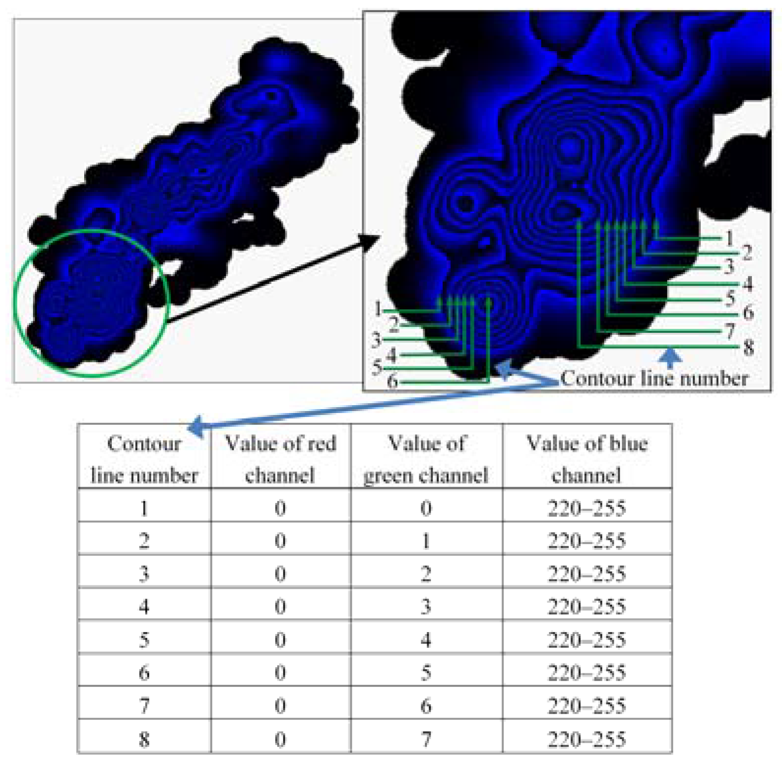
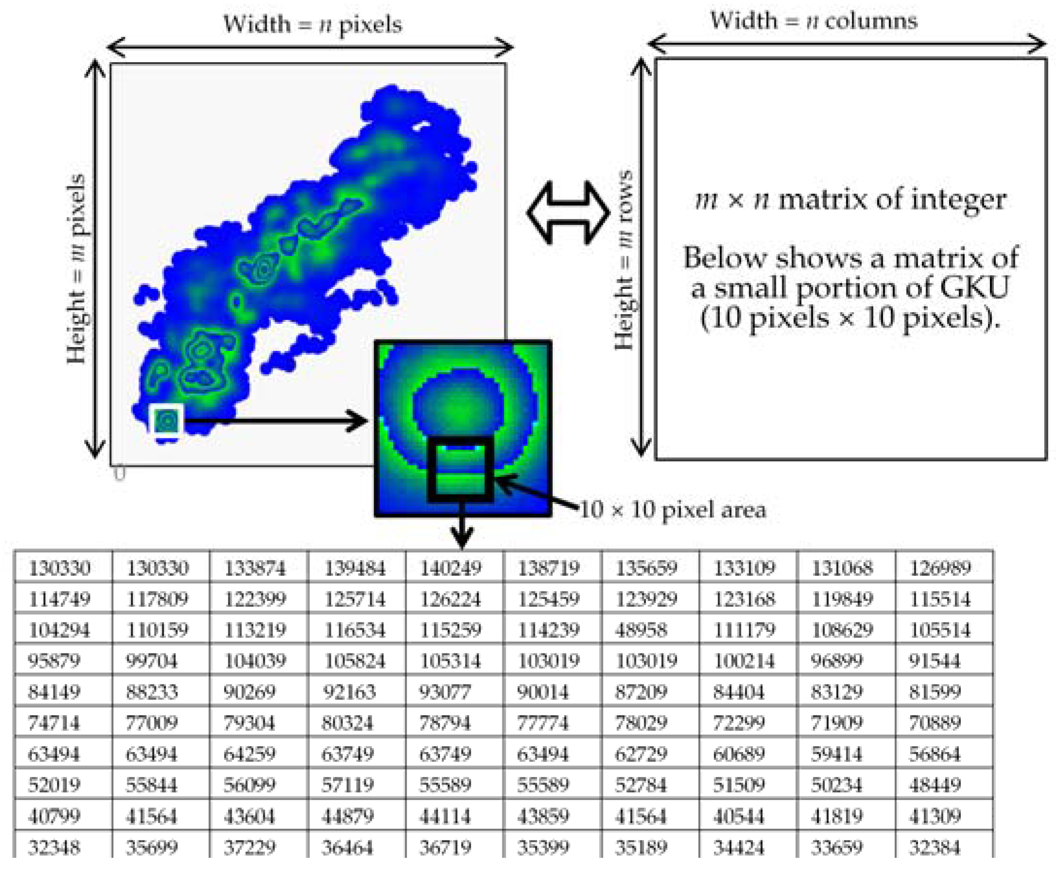
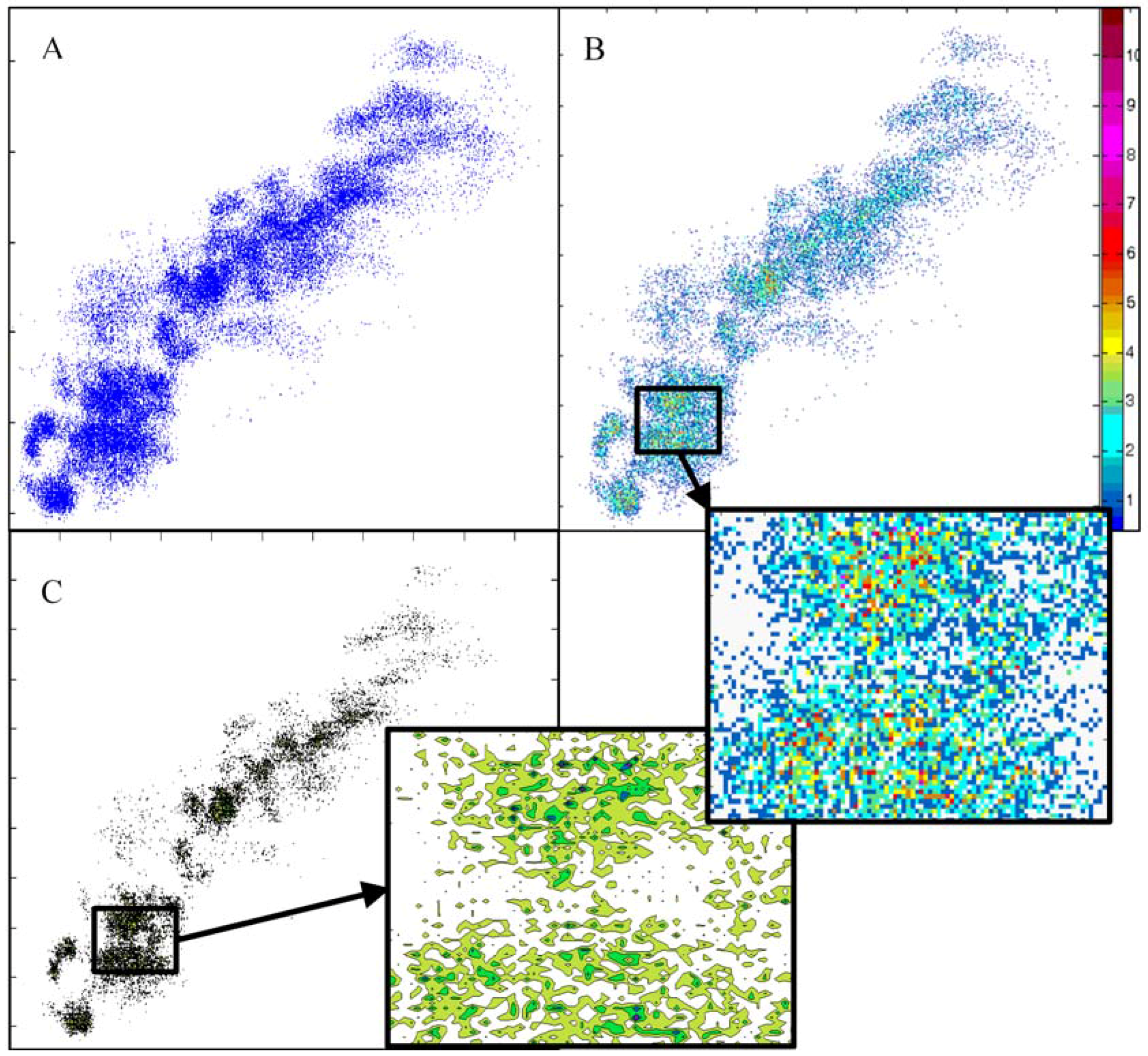
Determination of the type, size and colour of the marker strongly influences the visual standard and cluster formation of the final GKU output. Therefore, it is very important to select the best combination of those features before creating the real GKU. We determined the best combination after conducting a series of trials. Figure 4 and Figure 5 show several GKUs for the same data set with two different markers (circle and square) and different combinations of features such as size and colour. In Figure 4, the diameter of a circle is equal to the length of one side of a square in the corresponding plot in Figure 5. When comparing corresponding plots in Figure 4 and Figure 5, it can be seen that visual notion of clusters in Figure 5 are more intensive than in Figure 4. A square comprises more pixels than a circle whose diameter is equal to the length of one side of a square. This generates more overlapping when a square is used. Plot D in both figures is a good example.
In both figures, bitmaps A, B and C do not show adequate numbers of visual clusters. In contrast, bitmaps F, H and I show too many clusters, especially visually. Bitmaps D, E and, in particular, G show an appropriate number of clusters. In general, the correct selection of marker size and initial colour will produce clusters with good visual standards. We selected a circle as the marker for generating GKUs, because plots with circles produce better overall visual clarity than squares. Therefore, all results are based on circles with different diameters and colours. We show colours (0, 0, 1) to (0, 0, 10) in this section; however, plots with other colour values are also presented in this paper.

3.1. Reading GKUs

There are two methods for reading or understanding a GKU. The first method relies on an algorithm (computer-aided method). A GKU is a bitmap and a bitmap is a matrix of pixels; therefore, the content of a GKU can be converted into a matrix of integers (GKU matrix) using (1) (Figure 6). In Figure 6, we used the RGB colour (0, 0, 254) for the marker. These integers in GKU matrix represent the data density of a particular location and can be used to extract or derive information. This feature is an advantage of the GKU over existing clustering methods.
The second method is reading visual information by considering the presented graphical output (observation) as a usual plot. The GKU plot does not include a colour scale or legend to aid the understanding of the clusters. However, clusters and density of clusters can be determined with the aid of colour boarders that are automatically generated due to sudden change of colour values of adjacent pixels in the GKU. These colour boarders are identical to contour lines and maintain the same colour value difference between consecutive borders as in a contour map (Figure 7). For example, consider the RGB colours (0, 0, 255) and (0, 1, 0). According to Equation (1), colour values (Cv) of RGB colour (0, 0, 255) and (0, 1, 0) are 255 and 256, respectively. The RGB colour (0, 0, 255) is blue and RGB colour (0, 1, 0), which, next to (0, 0, 255), is visually black and create sudden change in colour blue to black, even though the difference between colour values is 1. The table in the Figure 7 shows the RGB values of the inner border (blue side) of each contour line. Usually, all colour borders are visually the same. However, the green colour values (Gv) of those lines maintain constant difference of one between adjacent colour borders; which resembles the contour lines (Figure 7). We numbered the contour lines from the outside to the inside (i.e., 1, 2, 3, …) and observed that contour lines with the same numbers have nearly the same colour values (same green value + nearly the same blue value) (Figure 7). Thus, it is possible to compare the density of different clusters even without a colour scale or legend. This is another advantage of the GKU over existing clustering methods.

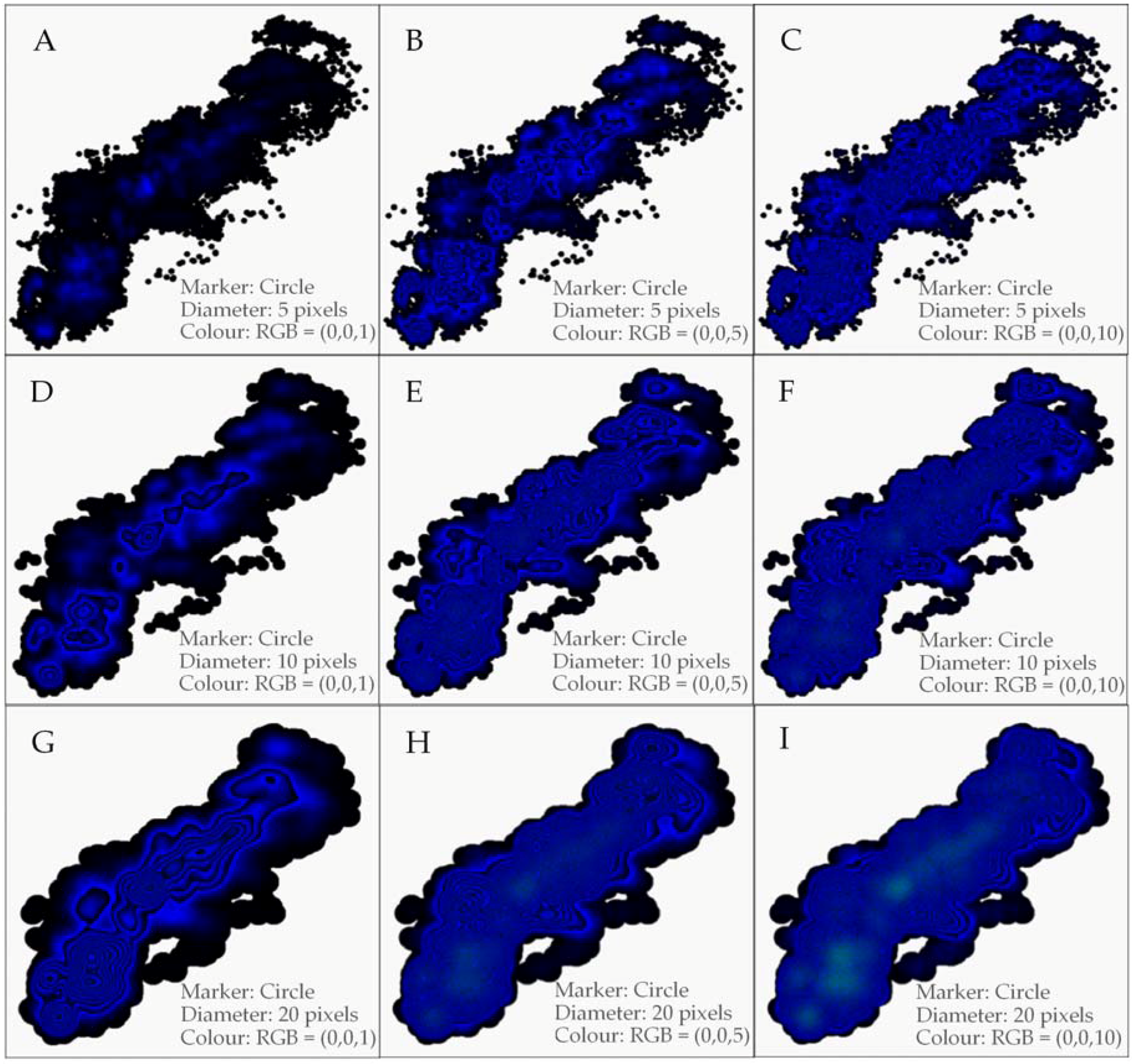
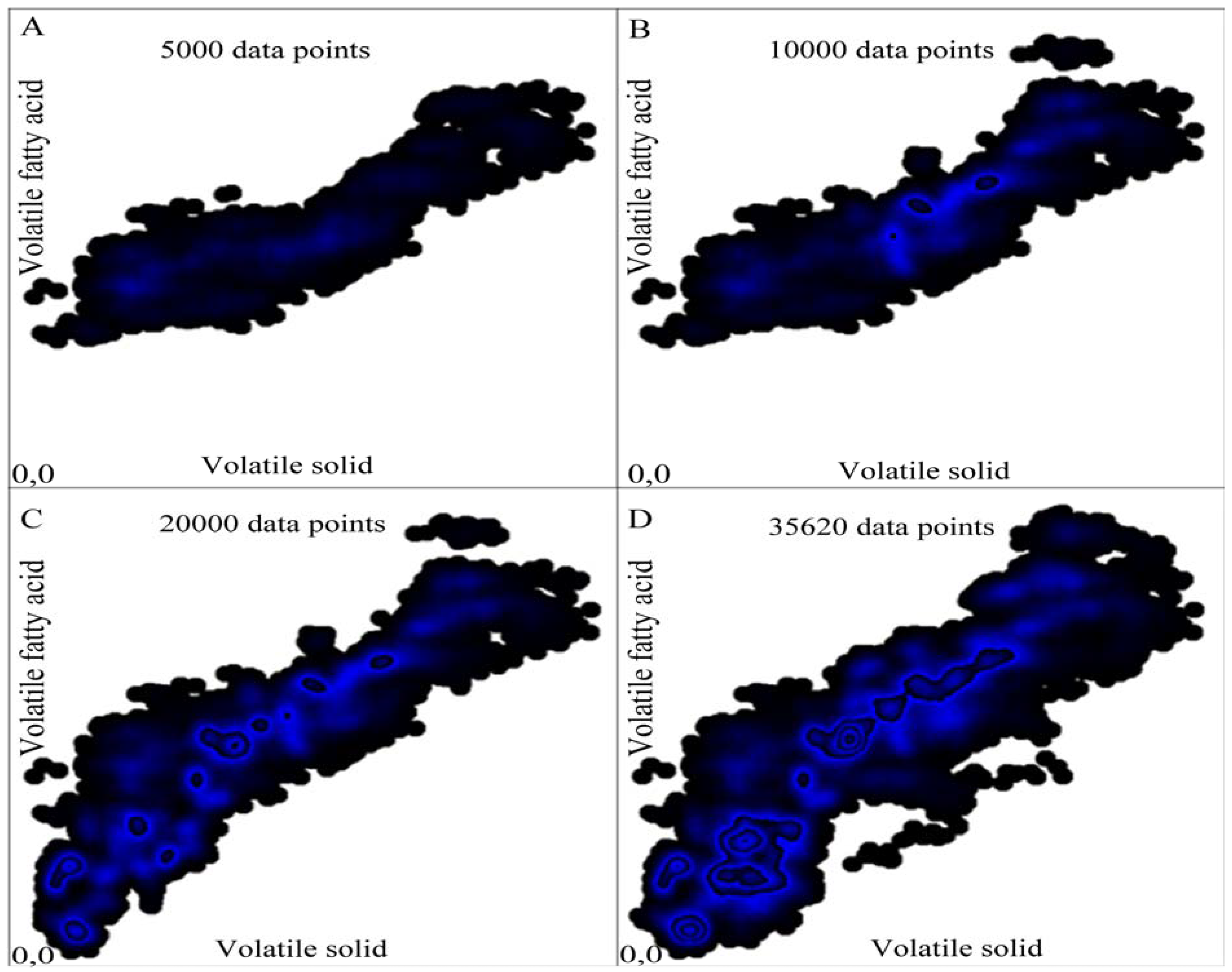
3.2. Anytime Cluster Formation

Note that the GKU is not a cluster analysis method; it is an anytime cluster formation method. As above mentioned anytime techniques make an explicit effort to speed up the cluster generation. The related methods discussed in this paper process all existing data to find clusters. If there are new data, the data must be processed again to find new clusters or update existing clusters. In contrast, the GKU shows up-to-time clusters and waits for new data. After adding a new data point, it is not necessary to process the whole data set again to obtain the current state. Adding a new data point to the GKU will update only those pixels that are covered by the marker. All other pixels in the bitmap remain unchanged. This requires a relatively small computational effort. Because the GKU is a matrix that is continuously updated, it can be seen as a continuous learning database of already processed data. Usually, the process of knowledge extraction becomes more difficult when dealing with large data sets because the algorithm needs to check a very large number of data points [41]. In contrast, with the proposed cluster formation technique, the time for updating is independent of the number of data points. The bitmaps in Figure 8 show the development of a GKU over time. All the plots in Figure 8 imply the importance of overlapping in the GKU concept. Initially, the GKU does not show clear clusters (Figure 8A). As overlap increases, the GKU shows clusters that can be easily identified by the naked eye (Figure 8C,D).

3.3. Representation of Missing and Out of Range Values and GKU Specific Data

When considering very large data sets, information about missing and out of range data is vital because it provides a complete overview of the data and its quality. None of the existing clustering methods is capable of visualizing this information. In contrast, the GKU is capable of indicating density of out-of-range values as well as missing values (Figure 9). This makes the GKU a very efficient and effective means of representing big data. The GKU shows the density of out-of-range and missing data categorized in different regions (Figure 3). Figure 9 illustrates the use of a GKU specific data area to save feature information such as marker type (circle, square, etc.), colour and dimensions and border information (width of borders of missing and unexpected values). This information is saved as colours after converting such feature information according to the standards listed in Table 3. Furthermore, the initial row of the GKU specific data is encoded in the bitmap header according to the standards listed in Table 2. Thus, GKU specific data can be identified by reading the bitmap header.

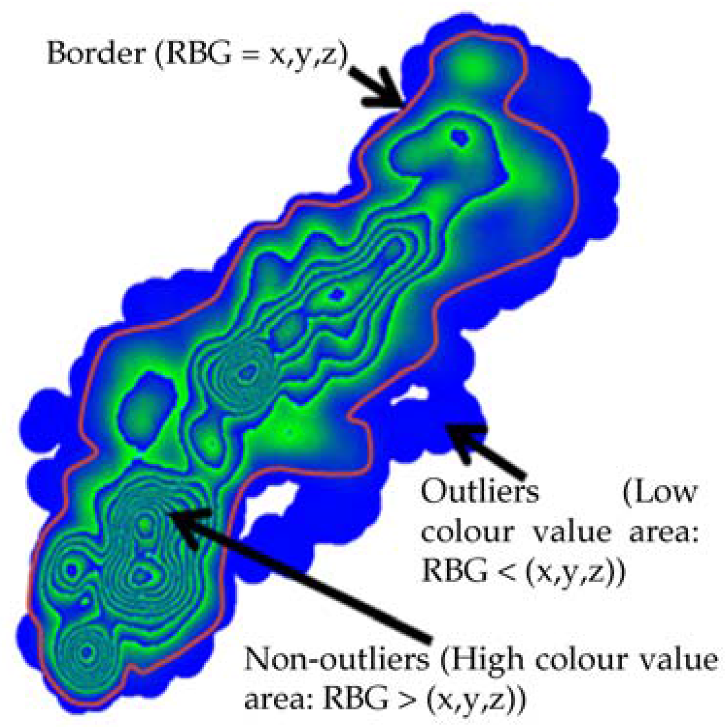
3.4. GKU as an Outlier Detection Method

The GKU can be used to identify outliers in a data set. If data points in low-density areas are outliers, they will always have low colour values. Therefore, it is possible to define a certain colour value in the GKU as a border for outliers. Then, all points with colour values below the colour value of the border can be removed manually or by means of an algorithm. Figure 10 illustrates a very simple way of identifying outliers in a very large data set using a GKU. If the GKU is visually interpretable, it is possible to define a border to identify outliers by checking the colour value of the area. A very simple bitmap reading application can be used to identify the colour values of each pixel and then manually define a border for outliers. If higher accuracy is required, this can be done by means of an algorithm. Because the method is based on knowledge discovery in databases (KDD), this can be considered an unsupervised outlier detection method [42,43].
We compared the visual standards of the proposed GKU method with the three most popular data representation methods: scatter plot, heat map and contour plot. Figure 11A–C show the visualization of 35,620 data points with a scatter plot, heat map and contour plot, respectively. All plots were generated using MATLAB (Version 7.4.0). According to the Figure 11A, scatter plot does not support for identifying data density in systematic manner. However, scatter plot is useful to illustrate the nature of data distribution and this is the default usage of scatter plot. Nevertheless, heat map and contour plot were employed to illustrate data density. The results show that the heat map was unable to create clusters and the contour plot was unable to generate contour lines. Even after zooming, it is difficult to identify density clusters with heat map and contour map. In contrast, the GKU could generate both clusters and contour lines in the same bitmap which help to illustrate the nature of data distribution in systematic manner, which can be identified by the naked eye (Figure 7). The GKU is capable of indicating density of out-of-range values as well as missing values (Figure 3). However, heat map and contour map have no method for representing out-of-range values and missing values. Therefore, GKU can be considered as a powerful and efficient method for identifying density clusters.
With the GKU approach, the marker has particular significance compared to a usual plot. In this paper, we used the size of the marker to represent the clustering range of influence and the colour to represent data density. However, the size, type and location of the data point in the marker and the colour of the marker can be mapped with specific properties such as tolerance, error or minimum or maximum distance between two data points. In addition, depending on the domain, these properties can be mapped with different features such as concentration (chemistry) or the signal strength and coverage area of a transmitter (networking/electronics). In all GKUs shown in this paper, we used the same colour for the pixels in the marker. However, using marker colour as a function of a certain feature will result in different coloured pixels depending on the function. For example, the density of seed propagation of a plant is not linear over distance. In this situation, the colour of the marker can be mapped as a function of seed propagation and the area of propagation can be mapped to the dimensions of the marker. If the propagation covers a certain area such as a sector, then the location of the plant can be represented by the angular point of the sector.
An existing GKU can be used directly in an online environment as a trained set or template. In addition, within an online environment, it is possible to recreate new versions of the GKU repeatedly according to new value ranges. If the number of out of range data points is higher than a certain value (e.g., more than x% of total data), a new GKU can be created according to the new range. Then, the old GKU can be replaced with a new GKU and recording can continue.
The proposed method has three major drawbacks. The first is that the GKU cannot be applied to non-overlapping data. The second is that the GKU is not capable of visualizing high-dimensional data. The third is that the number of overlapping incidents is limited to 2n, where n is the total bit length of the colour format. This drawback can be overcome by using colour formats with higher bit length.
If a GKU is nearly full, red regions that did not occur in any GKU shown in this paper will appear. This implies that we could handle a much larger number of data points than the maximum number used in this study (35,620). We employed the three-channel RGB colour format with 8 bits for each channel. To create larger GKUs, it is possible to use four channel colour formats (ARGB) and more than 8 bits per channel [44,45]. The 16-bit RGBA format provides a maximum of 264 overlapping incidents.

4. Conclusions

The GKU is a container to process data that is capable of immediately maintaining and displaying a large number of data points in a small area. The GKU can be seen as a combination of the quadrat sampling method with contour lines. It is a very effective method for representing density clusters in offline and online environments. In addition, the GKU is a continuous learning graphical database that can be used as a direct input for another algorithm or as a trained set, template or signature for a certain process. Furthermore, the GKU can be used to identify outliers effectively, particularly in data sets with non-linear relations. In this paper, we presented a GKU with one dependent and one independent variable. However, it is possible to use a GKU with RGB colour scheme to visualize one dependent variable with three independent variables by assigning each colour slot for different independent variables (R for variable 1, G for variable 2, etc.). The major requirement for this is that all independent variables must be in the same value range. This would enable easy identification of correlations between variables and would provide a convenient way to visualize multidimensional data in two dimensions. In addition, compression and integration with swarm intelligence methods such as monarch butterfly optimization (MBO), earthworm optimization algorithm (EWA), and elephant herding optimization (EHO) will enhance the outcome of the GKU.

Supplementary Materials

The following are available online at https://www.mdpi.com/2073-8994/8/12/152/s1, File S1: Data sets of all the plots in Figure 4, Figure 5, Figure 7, Figure 8, Figure 10 and Figure 11, File S2: Data sets of all the plots in Figure 9.

Acknowledgments

This work was supported by the German Research Foundation (DFG) and the Technical University of Munich (TUM) in the framework of the Open Access Publishing Program. In addition, we are grateful to the German Academic Exchange Service (Deutscher Akademischer Austauschdienst, DAAD) for providing a scholarship to K.K.L.B. Adikaram during the research period.

Author Contributions

K.K.L.B.A. conceived and designed the experiments and algorithms; K.K.L.B.A. performed the experiments; K.K.L.B.A., M.A.H., and M.E. analysed the data; K.K.L.B.A., M.A.H., M.E., and T.B. contributed reagents/materials/analysis tools; and K.K.L.B.A. wrote the paper.

Conflicts of Interest

The authors declare no conflict of interest.

References

  1. Stone, M.C.; Fishkin, K.; Bier, E.A. The Movable Filter as a User Interface Tool. In Proceedings of the ACM SIGCHI Conference on Human Factors in Computing Systems, Boston, MA, USA, 24–28 April 1994; pp. 306–312.
  2. Woodruff, A.; Landay, J.; Stonebraker, M. Constant density visualizations of non-uniform distributions of data. In Proceedings of the 11th Annual ACM Symposium on User Interface Software and Technology, San Francisco, CA, USA, 1–4 November 1998.
  3. Yang, J.; Ward, M.O.; Rundensteiner, E.A. Visual hierarchical dimension reduction for exploration of high dimensional datasets. In Proceedings of the Eurographics/IEEE TCVG Symposium on Visualization, Grenoble, France, 26–28 May 2003.
  4. Ellis, G.; Dix, A. A Taxonomy of Clutter Reduction for Information Visualisation. IEEE Trans. Vis. Comput. Graph. 2007, 13, 1216–1223. [Google Scholar] [CrossRef] [PubMed]
  5. Chen, H.; Chen, W.; Mei, H.; Liu, Z.; Zhou, K.; Chen, W.; Gu, W.; Ma, K.L. Visual Abstraction and Exploration of Multi-class Scatterplots. IEEE Trans. Vis. Comput. Graph. 2014, 20, 1683–1692. [Google Scholar] [CrossRef] [PubMed]
  6. Cleveland, W.S. Visualizing Data; Hobart Press: Hobart, Australia, 1993. [Google Scholar]
  7. Bachthaler, S.; Weiskopf, D. Efficient and Adaptive Rendering of 2-D Continuous Scatterplots. Comput. Graph. Forum 2009, 28, 743–750. [Google Scholar] [CrossRef]
  8. Mai, S.T.; He, X.; Feng, J.; Plant, C.; Böhm, C. Anytime density-based clustering of complex data. Knowl. Inform. Syst. 2015, 45, 319–355. [Google Scholar] [CrossRef]
  9. Hoffman, P.; Grinstein, G. Visualizations for High Dimensional Data Mining-Table Visualizations. 1997. Available online: http://web.simmons.edu/~benoit/infovis/MIV-datamining.pdf (accessed on 28 January 2014).
  10. Salomon, D. Raster Graphics. In The Computer Graphics Manual; Springer: Berlin/Heidelberg, Germany, 2011; pp. 29–131. [Google Scholar]
  11. Salomon, D. Graphics Standards. In The Computer Graphics Manual; Springer: Berlin/Heidelberg, Germany, 2011; pp. 947–972. [Google Scholar]
  12. Everitt, B.S.; Landau, S.; Leese, M.; Stahl, D. Index. In Cluster Analysis; John Wiley & Sons, Ltd.: New York, NY, USA, 2011; pp. 321–330. [Google Scholar]
  13. Lee, R.C.T. Clustering Analysis and Its Applications. Adv. Inform. Syst. Sci. 1981, 8, 169–292. [Google Scholar]
  14. Næs, T.; Brockhoff, P.B.; Tomic, O. Cluster Analysis: Unsupervised Classification. In Statistics for Sensory and Consumer Science; John Wiley & Sons, Ltd.: New York, NY, USA, 2010; pp. 249–261. [Google Scholar]
  15. Okun, O.; Priisalu, H. Unsupervised data reduction. Signal Process. 2007, 87, 2260–2267. [Google Scholar] [CrossRef]
  16. Anderberg, M.R. Cluster Analysis for Applications; Academic Press: New York, NY, USA, 1973. [Google Scholar]
  17. Chui, C.K.; Filbir, F.; Mhaskar, H.N. Representation of functions on big data: Graphs and trees. Appl. Comput. Harmon. Anal. 2015, 38, 489–509. [Google Scholar] [CrossRef]
  18. Avramenko, Y.; Ani, E.-C.; Kraslawski, A.; Agachi, P.S. Mining of graphics for information and knowledge retrieval. Comput. Chem. Eng. 2009, 33, 618–627. [Google Scholar] [CrossRef]
  19. Yu, H.; Yang, J.; Han, J.; Li, X. Making SVMs Scalable to Large Data Sets using Hierarchical Cluster Indexing. Data Min. Knowl. Discov. 2005, 11, 295–321. [Google Scholar] [CrossRef]
  20. De Vito, E.; Rosasco, L.; Toigo, A. Learning sets with separating kernels. Appl. Comput. Harmon. Anal. 2014, 37, 185–217. [Google Scholar] [CrossRef]
  21. Galluccio, L.; Michel, O.; Comon, P.; Hero, A.O., III. Graph based k-means clustering. Signal Process. 2012, 92, 1970–1984. [Google Scholar] [CrossRef] [Green Version]
  22. Sebzalli, Y.M.; Li, R.F.; Chen, F.Z.; Wang, X.Z. Knowledge discovery from process operational data for assessment and monitoring of operator’s performance. Comput. Chem. Eng. 2000, 24, 409–414. [Google Scholar] [CrossRef]
  23. Barbará, D.; Chen, P. Using Self-Similarity to Cluster Large Data Sets. Data Min. Knowl. Discov. 2003, 7, 123–152. [Google Scholar] [CrossRef]
  24. David, G.; Averbuch, A. Hierarchical data organization, clustering and denoising via localized diffusion folders. Appl. Comput. Harmon. Anal. 2012, 33, 1–23. [Google Scholar] [CrossRef]
  25. Zhang, L.; Tang, C.; Song, Y.; Zhang, A.; Ramanathan, M. VizCluster and its Application on Classifying Gene Expression Data. Distrib. Parallel Databases 2003, 13, 73–97. [Google Scholar] [CrossRef]
  26. Johansson, J.; Ljung, P.; Jern, M.; Cooper, M. Revealing structure in visualizations of dense 2D and 3D parallel coordinates. Inform. Vis. 2006, 5, 125–136. [Google Scholar] [CrossRef]
  27. Wilkinson, L.; Friendly, M. The History of the Cluster Heat Map. Am. Stat. 2009, 63, 179–184. [Google Scholar] [CrossRef]
  28. Niida, A.; Tremmel, G.; Imoto, S.; Miyano, S. Multilayer Cluster Heat Map Visualizing Biological Tensor Data. In Proceedings of the 2013 8th Brazilian Symposium on Advances in Bioinformatics and Computational Biology, Recife, Brazil, 3–7 November 2013; Setubal, J., Almeida, N., Eds.; pp. 116–125.
  29. Weinstein, J.N. A Postgenomic Visual Icon. Science 2008, 319, 1772–1773. [Google Scholar] [CrossRef] [PubMed]
  30. Hao, M.C.; Dayal, U.; Sharma, R.K.; Keim, D.A.; Janetzko, H. Variable binned scatter plots. Inform. Vis. 2010, 9, 194–203. [Google Scholar] [CrossRef]
  31. Mayorga, A.; Gleicher, M. Splatterplots: Overcoming Overdraw in Scatter Plots. IEEE Trans. Vis. Comput. Graph. 2013, 19, 1526–1538. [Google Scholar] [CrossRef] [PubMed]
  32. Nievergelt, J.; Widmayer, P. Spatial data structures: Concepts and design choices. In Algorithmic Foundations of Geographic Information Systems; van Kreveld, M., Nievergelt, J., Roos, T., Widmayer, P., Eds.; Springer: Berlin/Heidelberg, Germany, 1997; pp. 153–197. [Google Scholar]
  33. Yoo, J.; Bow, M. Mining spatial colocation patterns: A different framework. Data Min. Knowl. Discov. 2012, 24, 159–194. [Google Scholar] [CrossRef]
  34. Gross, M.; Pfister, H. Point-Based Graphics; Morgan Kaufmann Publishers Inc.: San Mateo, CA, USA, 2007; p. 248. [Google Scholar]
  35. Carr, D.B.; Littlefield, R.J.; Nicholson, W.L.; Littlefield, J.S. Scatterplot Matrix Techniques for Large N. J. Am. Stat. Assoc. 1987, 82, 424–436. [Google Scholar] [CrossRef]
  36. Imhof, E. Cartographic Relief Presentation; ESRI Press: Redlands, CA, USA, 2007; p. 111. [Google Scholar]
  37. Bowman, A.; Foster, P. Density based exploration of bivariate data. Stat. Comput. 1993, 3, 171–177. [Google Scholar] [CrossRef]
  38. Lampe, O.D.; Hauser, H. Interactive visualization of streaming data with Kernel Density Estimation. In Proceedings of the 2011 IEEE Pacific Visualization Symposium (PacificVis), Hong Kong, China, 1–4 March 2011.
  39. George, G.R. New Methods of Mathematical Modeling of Human Behavior in the Manual Tracking Task. Ph.D. Thesis, University of New York, Binghamton, NY, USA, 2008; p. 190. [Google Scholar]
  40. Krapf, L.C.; Heuwinkel, H.; Schmidhalter, U.; Gronauer, A. The potential for online monitoring of short-term process dynamics in anaerobic digestion using near-infrared spectroscopy. Biomass Bioenergy 2013, 48, 224–230. [Google Scholar] [CrossRef]
  41. Huang, Z. Extensions to the k-Means Algorithm for Clustering Large Data Sets with Categorical Values. Data Min. Knowl. Discov. 1998, 2, 283–304. [Google Scholar] [CrossRef]
  42. Angiulli, F.; Fassetti, F. Exploiting domain knowledge to detect outliers. Data Min. Knowl. Discov. 2014, 28, 519–568. [Google Scholar] [CrossRef]
  43. Akoglu, L.; Tong, H.; Koutra, D. Graph based anomaly detection and description: A survey. Data Min. Knowl. Discov. 2015, 29. [Google Scholar] [CrossRef]
  44. Salomon, D. The Computer Graphics Manual; Springer: Berlin/Heidelberg, Germany, 2011; p. 967. [Google Scholar]
  45. Van Verth, J.M.; Bishop, L.M. Essential Mathematics for Games and Interactive Applications: A Programmer’s Guide, 2nd ed.; CRC Press: Boca Raton, FL, USA, 2008; p. 264. [Google Scholar]
Figure 1. Definition of marker in graphical knowledge unit (GKU): The marker is a circle (radius = 10 pixels), and the RGB colour value of the circle is (0, 0, X), where 0 ≤ X ≤ 255. The centre of the circle represents the data point (highlighted).
Symmetry 08 00152 g001
Figure 2. (A) Two overlapped markers; and (B) overlapped markers. The data point is represented by the pixel in the centre of the marker (the data point is highlighted in orange).
Symmetry 08 00152 g002
Figure 3. GKU with borders to record missing and out of range values: (1) y > ymax at x = x; (2) x > xmax and y > ymax; (3) x > xmax at y = y; (4) x > xmax and y < ymin; (5) y < ymin at x = x; (6) x < xmin and y < ymin; (7) x < xmin at y = y; (8) x < xmin and y > ymax; (9) y is missing and x < xmin; (10) y is missing at x = x; (11) y is missing and x > xmax; (12) both x and y are missing; (13) x is missing and y > ymax; (14) x is missing at y = y; and (15) x is missing and y < ymin. * Shading is used in the figure to highlight different areas. In the real GKU, there will be no shading.
Symmetry 08 00152 g003
Figure 4. GKUs for the same data set with 35,620 data points using a circle as the marker with different sizes and colours. The correct selection of shape, size and initial colour of the data point will produce clusters that are visually clear and separated by colour borders similar to contour lines. For data set of plots in this figure, see Supplementary Materials, File S1. (A): GKU for 35,620 data points generated using a circle as the marker, where diameter is 5 pixels and RGB colour is (0, 0, 1); (B): GKU for 35,620 data points generated using a circle as the marker, where diameter is 5 pixels and RGB colour is (0, 0, 5); (C): GKU for 35,620 data points generated using a circle as the marker, where diameter is 5 pixels and RGB colour is (0, 0, 10); (D): GKU for 35,620 data points generated using a circle as the marker, where diameter is 10 pixels and RGB colour is (0, 0, 1); (E): GKU for 35,620 data points generated using a circle as the marker, where diameter is 10 pixels and RGB colour is (0, 0, 5); (F): GKU for 35,620 data points generated using a circle as the marker, where diameter is 10 pixels and RGB colour is (0, 0, 10); (G): GKU for 35,620 data points generated using a circle as the marker, where diameter is 20 pixels and RGB colour is (0, 0, 1); (H): GKU for 35,620 data points generated using a circle as the marker, where diameter is 20 pixels and RGB colour is (0, 0, 5); (I): GKU for 35,620 data points generated using a circle as the marker, where diameter is 20 pixels and RGB colour is (0, 0, 10).
Symmetry 08 00152 g004
Figure 5. GKUs for the same data set with 35,620 data points using a square as the marker with different sizes and colours. The correct selection of shape, size and initial colour of the data point will produces clusters that are visually clear and separated by colour borders similar to contour lines. For data set of plots in this figure, see Supplementary Materials, File S1. (A): GKU for 35,620 data points generated using a square as the marker, where length is 10 pixels and RGB colour is (0, 0, 1); (B): GKU for 35,620 data points generated using a square as the marker, where length is 10 pixels and RGB colour is (0, 0, 5); (C): GKU for 35,620 data points generated using a square as the marker, where length is 10 pixels and RGB colour is (0, 0, 10); (D): GKU for 35,620 data points generated using a square as the marker, where length is 20 pixels and RGB colour is (0, 0, 1); (E): GKU for 35,620 data points generated using a square as the marker, where length is 20 pixels and RGB colour is (0, 0, 5); (F): GKU for 35,620 data points generated using a square as the marker, where length is 20 pixels and RGB colour is (0, 0, 10); (G): GKU for 35,620 data points generated using a square as the marker, where length is 40 pixels and RGB colour is (0, 0, 1); (H): GKU for 35,620 data points generated using a square as the marker, where length is 40 pixels and RGB colour is (0, 0, 5); (I): GKU for 35,620 data points generated using a square as the marker, where length is 40 pixels and RGB colour is (0, 0, 10).
Symmetry 08 00152 g005
Figure 6. Relation between bitmap and matrix versions of a GKU. A GKU matrix is a simple way to represent the same GKU. Marker: circle, radius: 10 pixels, marker colour: (0, 0, 254). The table shows the colour values of 10 × 10 pixels in the bitmap, which is a portion of the GKU matrix.
Symmetry 08 00152 g006
Figure 7. Contour lines in a GKU. Representation of 35,620 data points; marker: circle, radius: 20 pixels, marker colour: (0, 0, 1). This shows clear colour borders that can be considered as contour lines. Contour lines are numbered from the outside to the inside of the cluster. Contour lines with same contour line number have the same green channel value. For such contour lines, blue channel values are in the same range. The higher the number of contour lines, the higher the data density. Therefore, it is possible to understand cluster density without a colour scale or legend. For data set of plots in this figure, see Supplementary Materials, File S1.
Symmetry 08 00152 g007
Figure 8. Development of a GKU over time. Bitmaps (AD) show GKUs with 5000, 10,000, 20,000 and 35,620 data points, respectively. Marker: circle, radius: 10 pixels, initial colour of the data point: (0, 0, 1). For data set of plots in this figure, see Supplementary Materials, File S1.
Symmetry 08 00152 g008
Figure 9. Representation of 35,864 data points in a GKU with borders to record missing values, out of range values and GKU specific information. Marker: circle, radius: 20 pixels, colour of the data point: (0, 0, 50). * Refer to Figure 3 for structure information and usage. ** Refer to Table 3 for structure information about the GKU specific information. For data set of plots in this figure, see Supplementary Materials, File S2.
Symmetry 08 00152 g009
Figure 10. Outlier identification using GKU by defining a border manually. Areas with low colour values are defined as outliers (noise) and vice versa. Shape of the data point: circle, radius: 20 pixels, colour of the data point: (0, 0, 254). For data set of plots in this figure, see Supplementary Materials, File S1.
Symmetry 08 00152 g010
Figure 11. Visualization of 35,620 data points with: (A) scatter plot; (B) heat map; and (C) contour plot. The scatter plot shows the distribution of the data, whereas the heat map and the contour plot show density clusters. However, compared to the GKU, the heat map and contour plot do not show density clusters. For data set of plots in this figure, see Supplementary Materials, File S1.
Symmetry 08 00152 g011
Table 1. Transformation rules used to convert numbers into integers. Depending on the nature of the data, a combination of two or more techniques may be required to achieve a data set suitable to plot on a bitmap.
Value TypeTransformation Technique
Negative integer valuesBase line correction. This will convert all negative values to positive values while maintaining the same regression.
Very large valuesBase line correction. This will convert large numbers to small numbers while maintaining the same regression.
Decimal valuesMultiplication by 10d (d ϵ {1, 2, 3,…}). This will convert decimal values to integers (we named d as “decimal to integer factor”).
Small or large rangeScale up or down. This will change the range.
Table 2. Bitmap header (example of an m × n pixel bitmap with red, green, and blue (RGB) (24-bit) colour scheme) * this unused slot is used to store the offset for graphical knowledge unit (GKU) specific data. BM: a value in Bitmap Header.
Header SectionOffsetSize/BytesValueDescription
Bitmap (BMP) Header (14 Bytes)02“BM”Identification (ID) field
24Size of BMP header, DIB header, and ImageSize of the BMP file
62Unused*Application specific
82UnusedApplication specific
10454 Bytes (14 + 40)Offset where the pixel array (bitmap data) can be found
Device-independent bitmap (DIB) header12 40 Bytes
50
Bitmap data51 m × n × 4 Bytes
Table 3. Example of GKU specific data layout. The value K is the starting location (offset) of the GKU specific data area. The value of K is stored in the first unused slot of the bitmap header.
GKU Specific DataOffset of PixelsNo. of PixelsContent in the Pixels, According to the OrderPixel Format Used to Store InformationExample
Properties of point markerK3Data point = Circle (1 = circle, 2 = square, …), radius of the circle, colour of the circle.unsigned 24-bit pixel format1, 10, 1
Border widthsK + 15Out of range border, missing value border, GKU specific data border, border padding, offset.unsigned 24-bit pixel format10, 10, 10, 1, 10
X value informationK + 28Minimum value, maximum value, decimal to integer factor, scale up/down factor.two signed 24-bit pixel format(65, 0), (90, 0), (10, 0), (2, 0)
Y value informationK + 38Minimum value, maximum value, decimal to integer factor, scale up/down factor.two signed 24-bit pixel format(223, −2), (9055, −3), (10, 0), (3, 0)

