A Top-Down Interactive Visual Analysis Approach for Physical Simulation Ensembles at Different Aggregation Levels

1
Department of Computer Science & Electrical Engineering, Jacobs University, 28759 Bremen, Germany
2
Department of Mathematics and Informatics, Westfälische Wilhelms-Universität Münster, 48149 Münster, Germany
*
Author to whom correspondence should be addressed.
Information 2018, 9(7), 163; https://doi.org/10.3390/info9070163
Submission received: 30 April 2018
/
Revised: 13 June 2018
/
Accepted: 27 June 2018
/
Published: 3 July 2018
(This article belongs to the Special Issue Selected Papers from IVAPP 2018)
Abstract
:Physical simulations aim at modeling and computing spatio-temporal phenomena. As the simulations depend on initial conditions and/or parameter settings whose impact is to be investigated, a larger number of simulation runs is commonly executed. Analyzing all facets of such multi-run multi-field spatio-temporal simulation data poses a challenge for visualization. It requires the design of different visual encodings that aggregate information in multiple ways and at multiple abstraction levels. We present a top-down interactive visual analysis tool of multi-run data from physical simulations named MultiVisA that is based on plots at different aggregation levels. The most aggregated visual representation is a histogram-based plot that allows for the investigation of the distribution of function values within all simulation runs. When expanding over time, a density-based time-series plot allows for the detection of temporal patterns and outliers within the ensemble of multiple runs for single and multiple fields. Finally, not aggregating over runs in a similarity-based plot allows for the comparison of multiple or individual runs and their behavior over time. Coordinated views allow for linking the plots of the three aggregation levels to spatial visualizations in physical space. We apply MultiVisA to physical simulations from the field of climate research and astrophysics. We document the analysis process, demonstrate its effectiveness, and provide evaluations involving domain experts.
1. Introduction
Simulations of time-varying phenomena over a 2D or 3D spatial domain are widely used in the field of physics (among others) to test the respective mathematical or computational models. The simulations typically depend on several parameter settings or initial conditions. Since one of the research tasks is to understand how the input settings influence the simulation result, the simulations are run multiple times with varying settings. Thus, researchers gather multi-run spatio-temporal data with many runs and many time steps, where each time step of each run represents planar or volumetric data fields. The analysis of such a data set raises the challenges of efficiently handling the large amount of data and effectively comparing the outcome of multiple simulation runs. Since it is not feasible to analyze all time steps of all runs individually, one needs to aggregate information about the entire ensemble of simulation runs.
Currently, in research communities dealing with simulation ensembles, there is the lack of a unified approach for processing, navigation, feature detection, and comparative analysis of entire ensembles. It is common practice that researchers develop their own ad-hoc solutions to their analysis tasks by developing scripts that stitch together existing tools for solving subproblems. Visualization methods are typically only used for the rendering of phenomena in physical space, i.e., at the very end of the analysis process. In this paper, we present MultiVisA, an approach to the interactive visual analysis of multi-run spatio-temporal physical simulations that supports a top-down analysis process of entire ensembles.
MultiVisA is based on three types of aggregated plots linked with physical space visualizations and a portfolio of interaction mechanisms. The plots intuitively provide comprehensive information of the simulation ensemble at different aggregation levels. The field distribution histogram aggregates field value occurrences over all time steps and all runs. This first overview allows the user to identify the relevant data range for further analysis. The function plots aggregated over all runs support multiple analysis steps related to time series. First, they allow for the detection of relevant time steps and the synchronization of features in multiple runs. This feature detection and selection step restricts the subsequent analysis steps to the relevant time intervals, which often reduces the amount of data to be analyzed tremendously. Second, the function plots intuitively depict behavioral patterns over time. The governing patterns and outliers within the ensemble or within individual runs can be detected. In addition, multiple coordinated function plots allow for an intuitive comparative analysis of multiple fields. Finally, the function plots exhibit the range of activity, which allows the user to identify representative isovalues for further analysis. This further analysis is supported by the multi-run plot, which is a similarity plot based on isocontour similarity of different time steps of different runs. Hence, it allows for a comprehensive understanding of the entire ensemble of simulation runs by depicting each of them as a polyline, where divergence or convergence of the polylines indicate how much simulations differ over time. Our plots are incorporated in one interactive analysis tool using coordinated views, which includes brushing and linking to physical space renderings.
The visual encodings and interaction mechanisms provided by MultiVisA are described in Section 3, while Section 4 is dedicated to documenting how MultiVisA is applied to a top-down analysis of physical simulations. We chose three application scenarios of quite different data characteristics. The first application provides multiple runs of astrophysical smoothed particle hydrodynamics (SPH) simulations over 3D point-based spatial domains, where the runs differ by setting different initial parameters. The second and third applications provide ensembles of climate simulations over 2D gridded spatial domains with a set of different initial conditions. We show the effectiveness of our analysis tool by documenting the processing pipeline of our approach, discussing the findings that can be obtained at the various analysis stages, and reporting the feed-back from domain scientists.
2. Related Work
Many approaches for the exploration and visualization of time-varying data exist. They are based on novel visual representations [1], exploring derived spaces [2], volume visualizations [3], or coordinated views [4,5]. However, all these approaches only address single-run data.
Recently, in [6] some techniques to support ensemble exploration and comparison were proposed. These techniques are limited to comparing a small number of ensemble members at any given time. The pairwise sequential animation technique begins to suffer when more than three members are shown. For the estimation of the uncertainty represented by the simulations within an ensemble, in [7] authors proposed a method for quantifying spatial uncertainty of isocontours considering arbitrary spatial correlations of the probability distributions of the input data. In an approach presented by [8], a collection of statistical descriptors is used for analyzing ensemble data sets. The same authors also presented “Ensemble-Vis”, a framework consisting of a collection of overview and linked statistical displays [9]. Similarly, the “Noodles” approach has been developed to interactively visualize ensemble output and associated uncertainty of weather event datasets [10]. All these approaches are based on displaying statistical information like mean and standard deviation, which supports important analysis aspects, but does not cover all analysis needs. In particular, the influence of initial conditions cannot be evaluated.
In [11] authors present an interactive linked-view visualization system that focuses on simultaneously exploring dark matter halos. Dealing with large particle-based simulation data it has very narrow specialization on cosmology data looking for a hierarchical tree-based structures. An approach for uncertainty-aware multidimensional ensemble data visualization and exploration was recently presented by [12]. Both approaches do not allow for comparing behavior patterns of individual simulations over time. An interactive approach to enable a continuous analysis of a sampled parameter space with respect to multiple target values was investigated by [13]. It is a suitable approach for a certain frame analysis, but it does not tackle spatio-temporal data. Follow-up studies such as the one by [14] looking into families of curves also provide methods for the analysis of non-spatial multi-run data.
In [15] authors presented a survey on multi-run multi-field data visualization and referred to the data as multi-faceted. They concluded in their paper that: “The majority of the approaches discussed in this survey specifically address one or two facets of scientific data. What is often missing are general concepts for handling the heterogeneity of multi-faceted data (e.g., multi-run data are often spatio-temporal and multi-variate as well)”. An approach presented by [16] tackles the aspect of multi-run multi-field spatio-temporal data visualization and analysis, which allows for an exploration of the parameter space in conjunction with the physical space of the fields. For that an isosurface similarity between the fields of different time steps and different runs is used. However, to successfully apply the approach, one needs to find representative isolevels sufficient for capturing relevant information from all simulation time steps.
Despite the availability of existing techniques, most researchers who are trying to analyze their ensemble simulations spend days or weeks to prepare and analyze simulated data for further analysis. Usually they implement their own scripts (customized to their needs) for data management, filtering, navigation, feature detection, pattern detection, outlier detection, etc. Quite frequently this even involves some manual or semi-automatic steps. Hence, it is desired to develop visual approaches that support such a processing pipeline for an intuitive and more efficient analysis. After discussions with domain scientists of different research areas within physics (namely, geo-sciences and astrophysics) we identified general requirements for the tools and methods for multi-run data analysis, which led to the techniques and workflow below.
3. Visual Analysis of Multi-Run Simulation Data
Since the main purpose of executing multi-run simulations is to capture the variety in the model with respect to different initial settings or parameter selections, an ensemble can consist of tens or even hundreds of simulations. Despite the same nature of all runs within an ensemble, their outcome may have high dispersion that needs to be investigated. Independent of the simulation method (Eulerian or Lagrangian), the spatial data structure (gridded or point-based), and the purpose (impact of simulation parameters or model evaluation), the visualization tasks can be identified as (1) defining visual encodings in the form of plots that exhibit the proper level of aggregation and (2) defining interaction methods for operating on differently aggregated plots and physical space renderings using coordinated views. The MultiVisA system is shown in Figure 1a.
For the development of a successful analysis tool, several characteristics of multi-run spatio-temporal simulation have to be considered. First, the data size frequently exceeds hundreds of Gigabytes, i.e., the data set does not fit into the main memory of a system. Thus, every access to the entire data is extremely time consuming. Even simple computations such as computing the mean can take up to hours. Hence, aggregated information plays an important role and being able to concentrate on a region of interest (part of the data) can substantially reduce the computational load. Second, due to the multiple facets of multi-run data [15], different representations are required to shed light on different aspects. Finally, it is of interests to compare the simulations’ behavior and evolution over time, which is complex task due to the large number of simulation runs. Computing means is often not sufficient, as behaviors of individual runs may not be reflected anymore.
Having pointed out the challenges we are facing, the analysis of multi-run spatio-temporal data can be executed according to the following workflow:
- Overview analysis of field range distribution. In a first stage, one is interested in getting an overview of the ensemble, which can be achieved by investigating the range of the considered data field and the distribution of field values within the simulation runs. Respective histograms allow for first conclusions and to narrow down the field range for subsequent analysis stages (see Section 3.1).
- Analysis of field distribution over time. In this stage, one would like to investigate the change within the simulation runs over time, which supports multiple important tasks. First, one can detect features and the time intervals they occur, which narrows down the time interval for further analysis steps. Second, one can identify individual field values of interest, which can be further examined, e.g., by choosing them as isovalues. Third, one can detect overall patterns in the ensemble as well as outliers. A run identified to be of interest can also be observed individually as well as in further analyses with physical domain visualizations. Finally, one can also compare and correlate different fields of a multi-field data set at this level (see Section 3.2).
- Comparative analysis of individual runs. While the second stage was operating on an aggregation over multiple runs, this stage shall allow for a detailed understanding of the behavior of individual runs in a comparative view. Making appropriate selections in the preceding stage (i.e., identifying time interval and field value of interest) allows for an accurate and efficient analysis approach (see Section 3.3).
3.1. Field Distribution Histogram
Assuming that the data to be analyzed have not been studied yet and the simulation results are still unknown, we propose to start with a simple overview plot based on the estimation of the range of the investigated data field and the analysis of the probability distribution of the occurrence of the field values. This step allows us to detect simulations with outstanding field values and to define the main global data features such as global field range, shared field range (i.e., the intersection of the ranges of all simulation runs), or values with high and low frequencies of occurrence.
The visual encoding is implemented by building a histogram with field values on the horizontal axis and normalized frequencies of occurrence on the vertical axis. The histogram aggregates information from all points in space and time for all simulation runs. The field values from the intersection of the ranges of all time steps of all runs are colored in green, values from the intersection of ranges of all runs (but not from all their time steps) are colored in blue, and values that do not occur in all runs are colored in red, see Figures 5 and 15a for examples discussed in Section 4.
The interaction mechanisms that support the analysis allows for the selection of individual field values (using a vertical line), which report back all simulation runs where this field value occurs, and this is particularly useful for investigating outliers. Also, it is possible to visualize frequencies of occurrence of the selected field value over spatial domain (see Figure 15b,c). Vice versa, it is possible to select a spatial region of interest and show the corresponding field histogram only for the selected region (see Figure 15d,e). Moreover, the user can select a field range for further investigations by cutting intervals to be neglected, which narrows down the analysis to a region of interest.
3.2. Function Plot
At the next analysis stage, we aim at investigating change over time. We propose to use function plots that record how the field values at the spatial data samples vary over time for the simulation runs. The plot represents the function values of each spatial data sample of each simulation run as a piece-wise linear graph of a time series. For the visual encoding, we aggregate the time series lines over a 2D grid leading to a 2D density histogram (effectively aggregating over spatial positions and simulation runs). Then, we can apply a transfer function to map the accumulated density values to color. An example of a function plot is shown in Figure 1a (top right) when applying the transfer function shown in Figure 1a (top middle). We use this transfer function throughout the paper. Note that the transfer function is applied to the range of interest that was selected using the field distribution histogram, i.e., the selection in the field distribution histogram makes the visual representation of the function plot more effective.
Function plots (or time histograms) have been used before for time-varying scalar fields [4,17,18,19]. We extend their application to visualize ensembles of simulations. Moreover, we want to point out that the underlying data structure is that of piecewise linear curves that represent time series. Consequently, we do not generate static histograms, but can perform interactions on our plot. More precisely, we can brush on the function plots to interactively select all curves that traverse a selected region of interest and interactively update the plot to only render the aggregated selected curves (see Figure 16). Furthermore, we can interactively switch between aggregating over all runs, a selected subset of runs, or individual runs. When rendering function plots of individual runs, brushing on the plot (see Figure 7) triggers linked physical space visualizations of the selection (see Figure 8). Vice versa, we can select a spatial region of interest and report the respective function plot only for the selected region. When observing multi-fields, we can produce one function plot per field, compare and correlate them with each other, and have coordinated brushing and linking between the multiple function plots (see Figure 16). Finally, we can also select a specific region of interest for further analysis. In particular, when detecting a feature, one can cut the time axis to a time interval that contains the feature, which makes the subsequent analysis steps more efficient and effective. Also, we can select a field value for further analysis purposes (based on similarity plots, see below) using a horizontal line (see Figure 11).
Since we are typically dealing with a large amount of runs with a high spatio-temporal resolution, we have to accumulate many curves with many time steps for the generation of a plot. To allow for their generation at interactive frame rates, we use a level-of-detail representation of the curves coupled with progressive rendering. The level-of-detail (LOD) approach uses a hierarchical representation based on 1D Haar wavelets, where a sequence of values is successively decomposed into a sequence of a coarser representation and a sequence of detail coefficients. The progressive rendering approach accumulates all curves first at their coarsest resolution and refines the representation iteratively until the finest resolution is reached. Moreover, using the LOD representation it is also possible to compute similarities between time series such that when selecting a spatial region of interest we can compute all other regions of the spatial domain with a similar behavior (similar field values) over the whole simulation time (see Figure 18). This is possible by setting a threshold for a maximum field value deviation from the values at the selected domain points (e.g., in absolute field values or in a relative percentage of the field range), such that points which have their field values for all the time steps within the defined corridor are considered to be similar.
3.3. Similarity Plot
In our third stage, we want to generate a visual encoding that allows us to perform a comparative analysis between the runs of an ensemble. Hence, we should not anymore aggregate over the runs. The idea of the proposed approach is to use time lines in a similarity plot (or multi-run plot), where the similarity is measured by looking at (2D or 3D) isocontours of individual time steps. This plot is based on the work by [16]. Isocontours are known to be effective field descriptors and can capture the simulation states within the physical domain for the runs at each point in time. Since data are spatio-temporal, we investigate for each ensemble member a sequence of discrete time steps. The simulation state for every time step is represented by an isocontour, where the respective isovalue was identified in the preceding stage using the function plots. Considering the isocontours of the selected scalar field, every ensemble member is represented by one thread, where the threads represent the change of isocontours over time. Defining an appropriate isocontour distance function, we can use projection methods to generate a similarity (or distance) plot of all the samples to visualize the data. The points in the projection can be connected by polylines according to the threads they belong to. Figure 2 sketches the idea by showing four polylines for four different simulation runs in different colors (e.g., color-coded according to a parameter value of the simulation). The four polylines start from the same point, but diverge over time, where proximity in the plot encode similarity of the isocontours. Points which represent similar simulation states are expected to be located closely (i.e., occurrence in one simulation will cause a self-intersection), while a great distance between points represents a high dissimilarity.
To compute isocontour similarity, we use a quasi-Monte Carlo (qMC) approach to estimate a degree of volume matching between two isocontours. Based on the volumes enclosed by the isocontours, we use a Jaccard distance between isosurfaces A and B defined by
The qMC approach allows for fast computations by evaluating the fields at several quasi-random points. Then, denotes the number of points inside both isocontours (logical ) and the number of points inside of, at least, one of the isocontours (logical ).
Having defined a proper distance function, it is possible to build a distance matrix (or dissimilarity matrix) with pairwise distances between isosurfaces of all time steps of all simulation runs. Based on the distance matrix, we can apply a projection method to map the high-dimensional binary vectors to a 2D or 3D visual space for the multi-run plot, where the high-dimensional binary vectors represent the inside-outside information for each of the qMC points. Many projection methods exist. Since we want to create the plots at interactive rates, we took the simplest and, thus, fastest multi-dimensional scaling (MDS) approach by [20]. The detailed discussion of the similarity-plot generation can be found in [16].
We also support several interaction mechanisms on the similarity plot. First, instead of showing all runs, we can show a subset or even individual ones (see Figure 13c). Also, parts of the plot can be selected and a new projection of the selected part can be generated. Since the precomputed similarity matrix can be re-used, this remains interactive. In particular, we can select one time step such that the time lines reduce to points (see Figure 13b). We can also select individual points on the time lines to trigger a physical-space visualization either in a coordinated view (see Figure 12) or in an embedded view (see Figure 13b). Furthermore, we allow for switching between projections to 2D and 3D visual space using two or three principal components. Alternatively, one can only use one principal component as a vertical axis in a 2D plot, where the horizontal axis represents time (see Figure 13a).
3.4. Top-Down Analysis
The overall structure of MultiVisA is reflected in Figure 1b. Starting with the raw data, the general pipeline is shown with the orange arrows: first, one extracts the field histogram. Then, after selecting a region of interest and a desired field range, one computes the function plots. Finally, after the representative time interval, simulation runs, and isovalues are identified and selected, one can generate the multi-run plot. All the possible interactions between different data representations including spatial domain rendering are shown using black arrows. Based on this structure, we have designed our tool with a graphical user interface as shown in Figure 1a.
4. Implementation Features
The described methods aim st the analysis of spatio-temporal simulation data. We assume that the user has access to all scalar fields of all time steps of all simulation runs within the data set. Thus, we describe further implementation details independently of the given data formats. However, the computation time of the pre-processing steps highly depends on the efficiency of the data reading operations. All the computations for the examples in this paper were performed on a laptop with Intel Core i7-3630QM, NVIDIA GTX 660M, and 8 GB DDR3.
4.1. Computation of Field Distribution Histogram for Interactive Use
Assuming that the user has knowledge about, which physical phenomenon has been simulated, but has never looked at the resulting data of the simulation, our first plot provides the user with a summary information about the distribution of the values in all the scalar fields of the data set. For ensembles of spatio-temporal simulations the overall data size is commonly huge, such that unnecessary data reading would lead to dramatically increasing processing time, which should be avoided. Thus, we would like to minimize the number of data readings. Ideally, we want to read the complete data set only once per visualization method.
The purpose of the field distribution histogram is to provide information about distributions of the field values in an interactive setting. Hence, we do not have a static plot, but the plot can be generated dynamically for a selected region of interest. Therefore, we propose to provide information of the field distribution for every spatial data point. These distributions are accumulated for different data points when interactively selecting a region or the entire spatial domain.
The challenge we are facing for such an interactive setting is that every histogram is computed and represented with respect to a chosen resolution , but without having read the entire data, there is no information about the ranges of the field values yet. Thus, we cannot know and define the histogram’s bin size in advance. We propose to use a dynamically adopting , where we assume the minimum resolution of the histogram to be predefined by the user (in our examples we used ). We initialize using the first available data frame, and then add new bins when necessary during the processing of further frames, i.e., we extend the resolution during the process. Please note that the extension is possible at both ends of the histogram. However, it may happen that the initialization using the first data frame does not represent the distribution of the entire data set well and the extended resolution exceeds by an order of magnitude. Whenever this happens, we propose to re-scale the histogram by merging neighboring bins pairwise, i.e., bin size is doubled, when the current extended resolution exceeds , see Figure 3. We also store and update the overall encountered minimum and maximum field values for every time step of every simulation run, which is required for the color coding of the histogram as described in Section 3.1.
Finally, we extract histograms for every data point of every simulation run in the data set and save them in a file for a further usage. The file size depends on the spatial resolution (i.e., number of spatial samples), number of simulation runs, and the resolution of the histograms. Having stored this intermediate information enables us to extract minimum and maximum field values for each simulation separately as well as to visualize the simulation runs in different combinations for a more detailed analysis.
4.2. Computation of Function Plot for Interactive Use
Having information about the distributions of the field values, one can set up the main parameters for the extraction of the function plots. Basically there are three parameters, which affect the visualization result: vertical resolution , the field range to be considered, and a horizontal distance between the simulation time steps on the plot. Please note that every re-configuration of these parameters would require us to process the entire data set again. The usage of field distribution histograms may significantly help users to choose the required field range efficiently depending on the purposes of the further analysis. Vertical resolution should be high enough for distinguishing the data patterns and for precise selection/highlighting interactions. According to our observations was sufficiently high for all purposes. Horizontal time step distance is important in terms of representing time connections on the plot. Since we use linear interpolation between the neighboring values, the resulting plot can be easily scaled horizontally (i.e., one can stretch the texture) and there is no need to use high distances for . In our examples, we used , which already suffices to observe line intersections between time steps.
As for the field distribution histograms, we also want to use the function plot in an interactive setting. In particular, the function plots may only be shown for selected spatial regions of interest (a set of spatial data samples) instead of for the full spatial domain. As already explained in Section 3.2, we use a level-of-detail (LOD) approach based on 1D Haar wavelets for a progressive rendering of the sets of curves in the plot. Thus, we have to pre-compute and save the function values for each level of detail for every data point. Using a wavelet scheme, the overall storage of the hierarchy of LODs is equal to the storage for the highest LOD only. For the generation of the hierarchy, one has to define the lowest LOD by setting its resolution (number of time points) and the number of the levels . The proposed progressive rendering visualizes the first approximation immediately and iteratively refines the plot, which may take up to a minute for our examples. The first LOD with resolution shall appear without noticeable delay. In our examples, we used . Following the 1D Haar wavelet scheme, the number of time steps approximately doubles from resolution to the next-higher resolution, more precisely, , see Figure 4. In practice is rarely used because of the significant data size to be loaded for the highest LODs, which could take several minutes.
4.3. MDS for Similarity Plot Generation
The similarity plot is generated by applying a multi-dimensional scaling (MDS) approach to the pairwise distance metric that is computed as explained in Section 3.3. According to the description in [20], the multidimensional scaling algorithm can be summarized as follows:
- Set up matrix of squared distances .
- Apply double centering: , where , is the identity matrix, is the matrix with all entries being 1, and n is the number of samples.
- Extract the m largest positive eigenvalues of and the corresponding m eigenvectors .
- An m-dimensional spatial configuration of the n objects is derived from the coordinate matrix , where is the matrix of the m eigenvectors and is the diagonal matrix of the m eigenvalues of .
Here, m is the dimensionality of the space into which we project, i.e., 2 or 3 for 2D or 3D visual spaces, respectively. If the intrinsic dimensionality of the data is larger than three, different combinations of the respective eigenvectors can be chosen interactively for further investigation, i.e., we project into a space with dimensionality m being the intrinsic dimensionality and then analyze that m-dimensional space by interactively switching the 2 or 3 eigenvalues for the similarity plot.
Since matrix multiplication algorithms are very well parallelizable one can perform the described steps with a high efficiency using a GPU implementation. However, the main issue here is that when using a GPU with 2 GB of memory for the calculations, it is only possible to project a distance matrix which consists of up to approximately 10,000 values (as some memory is reserved by the operating system and other services). Thus, it is important to use the first two plots (field distribution histogram and function plot) in order to narrow down the analysis area and decrease the number of samples to be projected. Also, it is commonly possible to downsample the data in the temporal dimension due to temporal coherence, but the amount of downsampling, of course, depends on the underlying simulation set-up. One could also perform all computations on the CPU without using the GPU, which would then allow us to use more samples, but computation times would be rather high. Technically, there are no restrictions for a distance matrix size.
5. Case Studies
5.1. Astrophysical Simulations
To test the effectiveness of MultiVisA for the analysis of multi-run physical simulations, we executed three case studies, where we apply the methods and workflow as described above. The first case study is concerned with an astrophysical two-stars system of White Dwarfs. The ensemble consists of 45 simulations with two main parameters representing the masses of the two stars. Each simulation run consists from 400 to 1300 time steps. Overall this data set contains about 36,000 time steps, which sums to approximately 170 GB of data.
Stage 1—Field Distribution Histogram. We start our analysis by computing the field distribution histogram for the scalar field of Internal Energy as shown in Figure 5. It is a simple plot, but nevertheless allows for some first interesting observations: (1) The distribution is skewed towards the lower values. In fact, only very few values are populating the upper half of the histogram. The respective simulation runs can immediately be identified as outliers by selecting the respective regions in the histogram. (2) After having identified the outliers, further analysis steps shall be applied to a narrowed (more saturated) field interval that excludes the outliers. This will make the automatic application of the transfer function in Stage 2 more effective. (3) Higher values do not occur in all simulation runs (red). The intersection areas (green and blue) are rather small. Still, due to the smooth transition, the entire range up to the dashed line seems to be of interest.
Stage 2—Function Plot. In the second stage, we operate on the function plots. Figure 6 shows the function plot for a single simulation run that was identified as an outlier in Stage 1. In this simulation run, both stars have the same mass. To observe the outlier values, we did not apply the narrowing of the field range from Stage 1. We can observe that there are very few field values with an internal energy greater than and that they occur around time step 300. Selecting those outliers and investigating them in a coordinated physical space visualization, one can observe that they belong to particles that transition from one star to the other. When hitting the other star the internal energy of these particles suddenly rises to high values, but also very quickly drops down again.
Apart from the investigation of the outliers, Figure 6 clearly indicates that we can distinguish three phases during the simulation. First, there is relatively steady state up to a short period, where things are changing (around time step 300), which is followed by another relatively steady state. Looking at other simulation runs from the same ensemble, we can observe a similar behavior pattern consisting of three phases, but the distributions of field values during the simulations are different. Figure 7 shows the function plot for a simulation run where one of the stars is much larger than the other (now the field range is cropped according to the observations in Stage 1). When comparing Figure 6 and Figure 7, we can observe an additional feature. To further analyze this, we again brush on the plot and investigate what corresponds to those features in a coordinated physical space, see Figure 8. We observe that initially we have two stars (a) in the first phase. In the second phase, for the heavier one we have a slightly increasing internal energy (b), while the lighter star loses its mass and internal energy (c). At these time steps when the stars are merging, the function plot allows us to easily and clearly separate the matter of the two stars according to their field values. Finally, the lighter star is completely absorbed by the heavier star in the third phase (d).
As mentioned above, the three phases occur in every simulation run. Moreover, the initial and the final phase are pretty static. Not much is happening there. Indeed, from an astrophysical point of view, the transitions between the phases is of interest. Hence, one can crop most of the initial phase and the final phase without losing valuable information. Using our function plots, we can interactively cut the simulation runs to a small time interval that fully captures the merging phase and only the end of the initial phase and the beginning of the final phase. Hence, it still includes all transitions. Identification of such time intervals for multi-run simulations is crucial and usually takes a significant amount of time. With our tool, it is possible to visually identify the time intervals and manually crop to the desired time interval.
Using side-by-side comparisons, we can intuitively compare the function plots of two simulation runs. When trying to get an overview of the entire ensemble, we proposed to aggregate the information of all runs in one plot. When comparing the two plots in Figure 6 and Figure 7 we observe that the merging phases occur at different time steps during the simulation. This lies in the nature of the simulation, as the runs are not synchronized and different runs even have different amount of time steps. Thus, when aggregating all 45 simulation runs without synchronization, we cannot observe any general pattern, see Figure 9. Using the manual cutting of our function plots as described above, a manual synchronization of all runs is intuitively possible. Although this just requires a single selection for each run, we still need to go through all plots once. Hence, we considered that it may be useful to automate this step. The idea is to synchronize the plots by the merging phase and to apply a respective shifting. The advantage of our method is that such features can be estimated using image-based processing. We simply identify the highest gradient of the plot density, as it is reached in the merging phase. Since the duration of this phase is different for the runs, we take the center of the time interval of 20 time steps with the highest sum of gradients as our synchronization point. Figure 10 shows the function plot aggregated over all simulations runs after automatic synchronization. Now, we can also clearly observe the three phases in this function plot.
Another feature of our function plot approach is that it is not restricted to create this one representation of the data field, but we can also derive further fields. For example, when taking the function plot aggregated over all synchronized runs as the average mean, we can compute a plot representing the standard deviation. Figure 11 shows the result of such a computation. We can see the benefit of such a standard deviation plot. While the plot in Figure 10 did not exhibit strong differences, the standard deviation plot exhibits more clearly visible structures. Despite the similar structure of the field distribution in all the simulation runs over the simulation time, we can observe that the highest deviation is present in the lowest field values. The reason is that in every simulation run there is the same total number of data points, but describing different simulation states the proportion of data points representing the considered field range is different. It means that a more detailed comparative analysis is required to investigate, how the simulation states differ in terms of physical structure. To do so, we proceed to Stage 3 by choosing a representative field value, i.e., a field value which describes best the important data features in each individual simulation run. Selecting the field value around , as shown by the green horizontal line in Figure 11, we cover the main part of the structure with the highest deviation for all three simulation phases.
Stage 3—Similarity Plot. Having cropped the time intervals in Stage 2, which significantly reduces the amount of data to be handled, and having identified a representative field value, we can make use of that field value as the selected isovalue for the isosurface similarity computation. Having computed the isosurface similarity matrix, we generate the similarity plot. For the given application, we decided to generate a 3D similarity plot (see Figure 12a), which can be visually inspected using rotation and zooming. It shows all 45 astrophysical simulations. The polylines are color-coded using a continuous transfer function that maps the simulation parameter of the star’s mass to the hue of the color. Increasing ratio between the stars’ masses leads to changing the color towards yellow. We can observe a clear structure in the 3D similarity plot. Figure 12a confirms the finding from Stage 2 that we have three simulation phases. When selecting a point in the plot, the field of the respective time step of the respective run is displayed in the physical space visualization. Figure 12b–d show the physical space visualization of the selections made in Figure 12a. The linked views represent the initial phase (b), the merging phase (c), and the final phase (d). Moreover, when looking at the projection, we can see that beside of the main behavior pattern there is another repeating pattern, which produces a rotational structure in the upper part of the projection. Investigating this feature using linked views for different projection points it becomes clear, that this pattern is due to the rotation of the stars around their center of masses during the simulation.
Since we are displaying all simulation runs together, it is obvious that the visual complexity of the plot increases with increasing number and duration of the simulation runs. The similarity plot including all geometry is meant to give an overview and exhibit the main patterns. Interaction mechanisms such as selecting, filtering, navigating, and linking to the physical space support further analysis purposes. Figure 13c shows the selection of an individual run in the similarity plot. We observe that the simulation remains for longer time in the initial and the final phase, while the merging phase is represented by a short time interval with a rapid change.
Another option we provided was to plot the first principal component of our projection against the time dimension, see Figure 13a. The red-to-yellow color map encodes the increasing value of the simulation’s input parameter reflecting the ratio of the stars’ masses. Now, we can easily see that increasing ratio between the stars’ masses leads to a shift of the lines to lower positions in the projection. Hence, there is a straight dependence between initial parameter and a simulation behavior, which is documented by the continuous color transition in the plot.
To investigate this phenomenon, we propose to operate with the projections interactively. We can select certain parts of the similarity plot and recompute the projection only considering the selection, i.e., not selected points do not affect the projection result. Figure 13b shows a recomputed projection for a selected single time step from the end of simulation. There is a clear triangular structure shown, where the yellow points, which are representing stars with biggest mass difference (i.e., with the highest ratio), have been grouped in the right corner, while more reddish points are located on the opposite edge of the triangle. In between, there is a color transition visible. To correlate that to physical space, we chose the option of embedded views, i.e., the physical space visualizations of selected points are embedded as small icons in the similarity plot.
Domain Expert Feedback. We discussed the MultiVisA tool and its components with the domain expert who generated the data set. We asked for advantages and limitations of our approach and to comment on the effectiveness or usefulness of our approach. The main findings were:
- To identify simulation features within a whole ensemble, researchers are using their own scripts and subroutines, as even advanced applications such as SPLASH [21] do not provide enough functionality. With our tool a multi-run simulation analysis becomes easy to visualize and it allows for a faster data investigation.
- The task of time alignment is one of the most time consuming for the researchers. From expert’s experience to perform the alignment on an ensemble of 250 runs one needs to spend couple of weeks, while with our tool one can do it by a single click.
- Correct and precise time definition of the analyzed features leads to increased accuracy of the analysis steps. For example, one can significantly increase the quality of the MDS projection when narrowing down the time interval. Figure 13d shows the same similarity plot as in (c), where in (c) one could use all time steps within the shorter time interval, while in (d) one could only use every other time step of the full time series.
- The domain expert has been working on this data set for a long time and knows it very well. Using our tools he was able to recognize most of the known data features in one session. Moreover, he even identified some additional features for further investigation.
Investigating Projection Dimensions
The analysis of the projection dimensions is an important aspect, because, despite of the low magnitudes of corresponding eigenvalues, it is still possible that such dimensions reflect the influence of some weaker data features that are dominated by some stronger data feature. Thus, we investigated this in more detail. Indeed, it is possible, that some dimensions of the MDS projections represent data features, which dominate the projection output. Hence, less prominent patterns may not be clearly visible in the projected space. Since those less prominent patterns can be important, we performed a more detailed analysis in this regard. More precisely, we propose to extract more than the dominant eigenvectors, i.e., not only the eigenvectors with respect to the 2 or 3 largest eigenvalues, but those up to the 8 largest eigenvalues. The resulting 8-dimensional space is visually encoded and analyzed using a similarity plot matrix of the corresponding 2D projections in analogy to a scatterplot matrix (SPLOM). The similarity plot matrix for the astrophysical data set is shown in Figure 14. Before, we pointed out that for the SPH simulation data the rotational pattern is dominant. One could make an effort to exclude the rotational pattern from the data in a pre-processing step, e.g., using a registration procedure. Instead, however, we can also observe from the similarity plot matrix that some eigenvector dimensions (1 and 6) represent features without rotation. Please note that other dimensions also exhibit clear structural patterns, which means that they also reflect some data features. However, these features are not necessarily different, because they are multi-dimensional and we navigate over their projections. Basing on the obtained results we can conclude that our approach is capable of capturing main data features as well as more subtle ones in the extracted dimensions, which can be examined visually using our plots.
5.2. Global Climate Simulations
In the second application scenario, we investigate an ensemble simulation using a global climate simulation model over one to three years with different initial conditions. The 11 simulation runs have a duration of 1460 to 4380 time steps. The simulations start at the same initial time, but are based on different initial conditions. The total data size is GB and includes four different scalar fields: sea surface temperature, sea ice thickness, sea ice concentration, and sea snow thickness.
Computing of the field distribution histogram for sea snow thickness does not allow us to identify any outlier (see Figure 15a). Hence, we consider the whole field range for further analysis. When a certain field value is of interest, it can be selected (see Figure 15b) and the distribution of the frequency of occurrence of this value over spatial domain is rendered (see Figure 15c). Vice versa, we can select a spatial region of interest and show the histogram only for that region (see Figure 15d,e). Such interactions allow to estimate where and which isovalues can be representatively used in a further analysis.
As it is of interest to analyze the multi-field aspect, we generate function plots for multiple fields. Since the simulations are synchronized, we can immediately aggregate over all runs. Figure 1a shows the function plot for sea ice thickness, Figure 16 (top) the respective plot for sea snow thickness. In both plots we can observe the repeating annual pattern, but the overall structure of the plots is different. To investigate the plot in Figure 16, we made two selections. We rendered the selected trajectories in the function plot, see Figure 16 (middle) and in a coordinated physical domain visualization, see Figure 17a,b. We observe that the selections exhibit two annual patterns, which correspond to high snow thickness values for the winter season in the arctic and antarctic region, respectively. Our tool also allows for brushing and linking between multiple function plots. Thus, in Figure 16, the selection for snow thickness (second from top) is transferred to ice thickness (bottom). We can clearly observe the correlation between the two patterns, yet there are visible differences. Another application of the information from the function plots is a search of similarly behaving points. In Figure 18 we select domain points which belong to Hudson Bay, and using a small threshold for a desired deviation we find all the points with a similar change of the field value over the whole simulation time.
We also generate similarity plots for the ensemble using one data frame per day, see Figure 1 (bottom right). Annual patterns can be observed again, but we also see that the runs differ quite a bit for certain months (to the left), while they are similar for other months (to the right). It is of interest to analyze, where in physical space the differences occur. We use the first principal component of the MDS projection plotted against time and compute the plots considering arctic and antarctic regions separately, see Figure 19. One can observe that both regions exhibit a seasonal pattern, but in the arctic (a) there is no activity during the summer season, while in the antarctic (b) there is activity throughout the year. Moreover, the plot in (b) has higher variance and outliers, which are candidates for further investigations.
Again, we discussed the application of our tool with the domain expert who generated the data and had the following findings:
- Visualization of the entire ensemble at once allows for estimating the diversity of the simulations’ behavior and identifying patterns and outliers.
- A strong advantage is the option to easily estimate activities of subregions. Usually one would need to look at some physical domain visualization for some selected time steps. Our tools leads to increased accuracy of feature detection.
- Estimating the influence of initial conditions to the simulation result is usually performed in sensitivity studies. A large number of statistical descriptors needs to be used. While it is complicated to capture the behavioral differences with a single value descriptor, our approach captures them in a multidimensional fashion and allows for interaction and navigation.
5.3. Local Climate Simulations
The scenarios presented so far considered multiple spatio-temporal simulation runs spanning the same space and time domain. However, our methods are also applicable to comparing multiple time intervals within a single spatio-temporal simulation run. The next application scenario we consider is the analysis of a single local ocean model multi-year simulation over the North Sea. The simulation outcome covers 18 years from 1995 to 2012 and the analysis task is to compare them individually with each other. Thus, we interpret the 18 years as 18 runs of simulated water characteristics (e.g., velocity, temperature, salinity). Each run contains 365 or 366 time steps. The simulation was performed over a 3D spatial grid, but in this case the domain experts are only interested in analyzing a curved cross section, i.e., a 2D curve defined at the sea surface that is extruded vertically down to the sea floor, which represents the open boundary conditions. On the 2D curve there are 406 surface points, which are extruded for up to 17 depth layers each. The total data size is GB.
Considering the water temperature field we extracted the field distribution histogram shown in Figure 20a. There is no green colored field range, which means that there is no water temperature value appearing in all the time steps of all the simulation years. However, there are red areas in the histogram which represent some outstanding values. Selecting some values from these ranges (e.g., and ) one can investigate in a coordinated view the spatial distribution of the outliers. The spatial visualization we used renders the temperature values along the curved cross section as a 2D image, where the horizontal axis represents the 2D surface curve in arc length parametrization and the vertical axis represents the depth down to the ocean floor. Using this visual representation and color-coding the occurrence of the selected field value, we can observe from Figure 20b,c that the selected temperatures appear in the upper-right corner of the image.
The function plot for the same data field exhibits a structure combining different patterns, see Figure 21 (top), i.e., there are patterns with high and low annual amplitudes. We can now interactively select the spatial areas with outstanding values that we had identified in the spatial view in Figure 20 to filter the corresponding trajectories. This spatial region exhibits the highest possible amplitude in the data set, see Figure 21 (bottom), which means that it has the highest energy exchange among all spatial points within the curved cross section.
Finally, we want to investigate deviations among the different simulation years computing 2D similarity plot of the entire data set, see Figure 22d. Since every simulation year is continuously connected to its preceding and succeeding years, we encode them by different colors in order to be able to distinguish them. We change the hue from blue to red equidistantly over the 18 years. We use a projection into a 2D visual space instead of a projection to 1D over time, as we have more than one principal dimension with high eigenvalues. The 2D projection exhibits a clear loop pattern as expected due to the annual changes. We observe that there is no visible structure in a distribution of the colors on the plot, i.e., there is not monotonous trend over the years. However, we can investigate the development of the yearly patterns on the scale of individual time steps. Filtering the months that are being displayed in the similarity plot, the evolution within the simulation years can be investigated, see Figure 22a–d. We observe that during the winter season the simulation behavior is similar for all the years. The maximum spreading is achieved at the end of the summer season.
In addition, further investigations using the linked visualizations are possible in order to get more details about spatial distributions of the field values at points of interest, which can be selected directly on the projection plot.
5.4. Computation Times
All the proposed visualization approaches can be used in an interactive setting. Of course, this requires that we have extracted and prepared the necessary information during pre-processing steps. In Table 1 we show the computation times for the main pre-processing steps allowing us to use the proposed visualizations at interactive rates: extraction of the Field Histogram (FH), Function Plot (FP), computation of the Distance Matrix (DM), and MDS projection.
6. Discussion
Our tool aims at being generally applicable to the interactive visual analysis of any type of spatio-temporal simulation data. The numerical schemes for such physical simulations follow the Eulerian or Lagrangian approach (or a combination thereof), thus, operate on static grids or on dynamic particles. We have documented in our case studies that our tool is applicable to both scenarios. We have also been using simulations from different domains, namely astrophysics and geosciences. Moreover, we have shown that our tool works for analyzing 3D spatial fields as well 2D spatial fields, that we can handle single fields as well as multi-fields, and that we can analyze multi-run as well as single-run data. In the multi-run setting, we have used ensembles that were obtained by varying parameter settings of the simulation (leading to an multi-dimensional ordering of the runs) or by using different initial configurations (leading to an unordered set of runs). In summary, our use cases capture all possible variations of spatio-temporal simulation data, which documents the general applicability of our approach.
The analysis tasks that we wanted to support are listed in Section 3 and comprise (1) providing an overview of the entire ensemble, (2) analyzing changes of the ensemble over time, and (3) comparing individual runs of the ensemble. In particular, the tasks include to detect spatial regions with some outstanding behavior, temporal points or time intervals of outstanding events, and individual runs with outstanding behavior. For providing an overview, field value distributions are being visualized, which allows for a global pattern and outlier detection. Filtering and selection interactions allow for drilling down on regions of interest in multiple coordinated views. Hence, the task of detecting spatial regions with globally interesting field values is supported. The changes over time can be analyzed using a visualization of time series accumulated in a density encoding, which immediately supports the detection of global temporal patterns and of time intervals with outstanding events. Interactions allow for the analysis of spatio-temporal features. Analyzing individual runs is achieved within a similarity plot of the time steps of all runs. Such a visual encoding allows for observing the influence of simulation parameters, the detection of outliers within the simulation ensemble, and the observation of temporal patterns and trends of the ensemble. Again, linked coordinated views allow for relating the detected features to spatial regions. In summary, the support of all desired tasks have been accomplished in a top-down analysis workflow that starts with an overview (highest aggregation level) and allows for drilling down into more and more details (increasingly lower aggregation levels).
All the proposed visualizations are designed to get a detailed overview of the data with a focus requested by the user. For the function plot and domain visualizations a proper transfer function is needed for the representative output. Our tool uses by default a transfer function that follows perceptional guidelines such as increasing luminance, while incorporating multiple hues for a better interpretation of the values. The default transfer function has proven to be effective and serves as a good starting point. However, based on the application domain, there may be specific requests concerning the colors. For example, for temperature fields one may want to use blue colors for cold and red colors for warm temperatures. Our transfer function is fully customizable by supporting interaction mechanisms for changing key colors and their transitions. In particular, the range of colors can also be adjusted to have larger color gradients in values ranges of interest. However, tweaking the transfer function is, at least initially, not necessary, as our default transfer function allows for immediate analysis steps.
Our analysis tool is mainly targeted at domain experts. The idea of interactive visual analysis systems is to extract information from the large amount of data using automatic data processing and providing an overview of the information to the user in the form of a visual representation. Taking the next analysis step using interaction mechanisms is then often based on the expertise of the user. Obviously, the more expertise a user has, the easier it is to make meaningful interactive queries. Novices in the application domain can, nevertheless, easily use our tool to detect patterns and outliers (like spatial regions of particularly high values or time intervals with particularly high changes). The interpretation of the findings would, of course, often not be meaningfully possible for a novice who does not know much about the underlying simulation ensemble.
The methods described in this paper scale quite well, where steps early in the pipeline scale even better than later ones, as the idea of the pipeline is to reduce the amount of data to be analyzed from step to step, which is important for a successful comparative visualization at high interactivity. Hardware limitations such as data reading speed from hard disk or GPU memory size are the main bottle necks of our system. One of the features of our system is that it works equally well with data of any type and any spatial configuration. Thus, our general tools can be amended for specific purposes.
7. Conclusions
We presented MultiVisA, a visual analysis approach for multi-run spatio-temporal data analysis in the context of physical simulations. We identified the needs of domain scientists to have a visualization tool that supports early steps of the analysis process. MultiVisA uses plots at different aggregation levels to support the analysis workflow in a top-down manner. We applied our tool for case studies in climate research and astrophysics. We were able to perform effective and efficient analyses and got encouraging feedback from the domain scientists saying that MultiVisA can indeed improve their analysis tasks. All the proposed algorithms were efficiently implemented using parallelization on CPU and GPU where applicable, which allowed for a smooth user experience during the interactive sessions using standard PCs or laptops.
Author Contributions
Supervision, L.L.; Writing—original draft, A.F.; Writing—review & editing, L.L.
Funding
This work was funded by the Deutsche Forschungsgemeinschaft (DFG) under contract LI 1530/21-1.
Conflicts of Interest
The authors declare no conflict of interest.
References
- Moere, A. Time-Varying Data Visualization Using Information Flocking Boids. In Proceedings of the IEEE Symposium on Information Visualization, Austin, TX, USA, 10–12 October 2004; pp. 97–104. [Google Scholar] [Green Version]
- Busking, S.; Botha, C.P.; Post, F.H. Dynamic multi-view exploration of shape spaces. In Proceedings of the 12th Eurographics/IEEE—VGTC Conference on Visualization, Bordeaux, France, 9–11 June 2010; pp. 973–982. [Google Scholar]
- Woodring, J.; Shen, H.W. Multi-variate, Time Varying, and Comparative Visualization with Contextual Cues. IEEE Trans. Vis. Comput. Graph. 2006, 12, 909–916. [Google Scholar] [CrossRef] [PubMed]
- Akiba, H.; Ma, K.L. A tri-space visualization interface for analyzing time-varying multivariate volume data. In Proceedings of the 9th Joint Eurographics/IEEE VGTC Conference on Visualization, Norrköping, Sweden, 23–25 May 2007; pp. 115–122. [Google Scholar]
- Lee, T.Y.; Shen, H.W. Visualization and Exploration of Temporal Trend Relationships in Multivariate Time-Varying Data. IEEE Trans. Vis. Comput. Graph. 2009, 15, 1359–1366. [Google Scholar] [PubMed]
- Phadke, M.N.; Pinto, L.; Alabi, O.; Harter, J.; Taylor, R.M.; Wu, X.; Petersen, H.; Bass, S.A.; Healey, C.G. Exploring ensemble visualization. Proc. SPIE 2012, 8294, 1–12. [Google Scholar]
- Pöthkow, K.; Weber, B.; Hege, H.C. Probabilistic Marching Cubes. Comput. Graph. Forum 2011, 30, 931–940. [Google Scholar] [CrossRef] [Green Version]
- Potter, K.; Wilson, A.; Bremer, P.T.; Williams, D.; Doutriaux, C.; Pascucci, V.; Johnson, C. Visualization of uncertainty and ensemble data: Exploration of climate modeling and weather forecast data with integrated ViSUS-CDAT systems. J. Phys. Conf. Ser. 2009, 180, 012089. [Google Scholar] [CrossRef] [Green Version]
- Potter, K.; Wilson, A.; Bremer, P.T.; Williams, D.; Doutriaux, C.; Pascucci, V.; Johnson, C. Ensemble-Vis: A Framework for the Statistical Visualization of Ensemble Data. In Proceedings of the 2009 IEEE International Conference on Data Mining Workshops, Miami, FL, USA, 6 December 2009; pp. 233–240. [Google Scholar]
- Sanyal, J.; Zhang, S.; Dyer, J.; Mercer, A.; Amburn, P.; Moorhead, R.J. Noodles: A Tool for Visualization of Numerical Weather Model Ensemble Uncertainty. IEEE Trans. Vis. Comput. Graph. 2010, 16, 1421–1430. [Google Scholar] [CrossRef] [PubMed]
- Preston, A.; Ghods, R.; Xie, J.; Sauer, F.; Leaf, N.; Ma, K.L.; Rangel, E.; Kovacs, E.; Heitmann, K.; Habib, S. An integrated visualization system for interactive analysis of large, heterogeneous cosmology data. In Proceedings of the 2016 IEEE Pacific Visualization Symposium (PacificVis), Taipei, Taiwan, 19–22 April 2016; pp. 48–55. [Google Scholar]
- Chen, H.; Zhang, S.; Chen, W.; Mei, H.; Zhang, J.; Mercer, A.; Liang, R.; Qu, H. Uncertainty-Aware Multidimensional Ensemble Data Visualization and Exploration. IEEE Trans. Vis. Comput. Graph. 2015, 21, 1072–1086. [Google Scholar] [CrossRef] [PubMed]
- Berger, W.; Piringer, H.; Filzmoser, P.; Gröller, E. Uncertainty-Aware Exploration of Continuous Parameter Spaces Using Multivariate Prediction. Comput. Graph. Forum 2011, 30, 911–920. [Google Scholar] [CrossRef] [Green Version]
- Konyha, Z.; Lež, A.; Matković, K.; Jelović, M.; Hauser, H. Interactive visual analysis of families of curves using data aggregation and derivation. In Proceedings of the 12th International Conference on Knowledge Management and Knowledge Technologies, Graz, Austria, 5–7 September 2012; pp. 24:1–24:8. [Google Scholar]
- Kehrer, J.; Hauser, H. Visualization and Visual Analysis of Multifaceted Scientific Data: A Survey. IEEE Trans. Vis. Comput. Graph. 2013, 19, 495–513. [Google Scholar] [CrossRef] [PubMed]
- Fofonov, A.; Molchanov, V.; Linsen, L. Visual Analysis of Multi-run Spatio-temporal Simulations Using Isocontour Similarity for Projected Views. IEEE Trans. Vis. Comput. Graph. 2016, 22, 2037–2050. [Google Scholar] [CrossRef] [PubMed]
- Akiba, H.; Fout, N.; Ma, K.L. Simultaneous Classification of Time-varying Volume Data Based on the Time Histogram. In Proceedings of the Eighth Joint Eurographics/IEEE VGTC Conference on Visualization, Lisbon, Portugal, 8–10 May 2006; pp. 171–178. [Google Scholar]
- Buono, P.; Aris, A.; Plaisant, C.; Khella, A.; Shneiderman, B. Interactive pattern search in time series. Proc. SPIE 2005, 5669, 175–186. [Google Scholar] [Green Version]
- Kehrer, J.; Member, S.; Ladstädter, F.; Doleisch, H.; Steiner, A.; Hauser, H. Hypothesis Generation in Climate Research with Interactive Visual Data Exploration. IEEE Trans. Vis. Comput. Graph. 2008, 14, 1579–1586. [Google Scholar] [CrossRef] [PubMed]
- Wickelmaier, F. An Introduction to MDS; Institut for Elektroniske Systemer, Afdeling for Kommunikationsteknologi, Aalborg Universitetscenter Rapport; Aalborg Universitetsforlag: Aalborg, Denmark, 2003. [Google Scholar]
- Price, D.J. SPLASH: An Interactive Visualisation Tool for Smoothed Particle Hydrodynamics Simulations. Publ. Astron. Soc. Aust. 2007, 24, 159–173. [Google Scholar] [CrossRef] [Green Version]
Figure 1.
(a) MultiVisA: Interactive visual analysis system for physical simulations: (left) interaction panel for options and data settings; (top middle) transfer function used for function plots; (top right) plot view used for field distribution histograms or function plots; (bottom right) similarity plot; (bottom middle) domain visualization. (b) System structure: orange arrows show analysis pipeline, black arrows show possible interactions between different components.

Figure 2.
Schematic illustration of the similarity plot idea. Curves represent simulation states over time, where distances between points on the curves represent dissimilarity of corresponding simulation states.
Figure 2.
Schematic illustration of the similarity plot idea. Curves represent simulation states over time, where distances between points on the curves represent dissimilarity of corresponding simulation states.

Figure 3.
Illustration of a re-scaling for the field distribution histogram for minimal resolution and bin size changing from to .
Figure 3.
Illustration of a re-scaling for the field distribution histogram for minimal resolution and bin size changing from to .

Figure 4.
Illustration of hierarchical LOD scheme for function plots with resolutions , , and .

Figure 5.
Field distribution histogram (for astrophysical simulation). Field values from the intersection of all time steps’ ranges of all runs are colored in green, from the intersection of all simulations’ ranges (but not for all time steps) in blue, otherwise red.
Figure 5.
Field distribution histogram (for astrophysical simulation). Field values from the intersection of all time steps’ ranges of all runs are colored in green, from the intersection of all simulations’ ranges (but not for all time steps) in blue, otherwise red.

Figure 6.
Function plot of the simulation of two stars both with masses equal to 1.05 of the solar mass. Time steps around 300 contain outliers in field values and exhibit a significant change in the simulation structure, while before and after this change almost steady patterns can be observed.
Figure 6.
Function plot of the simulation of two stars both with masses equal to 1.05 of the solar mass. Time steps around 300 contain outliers in field values and exhibit a significant change in the simulation structure, while before and after this change almost steady patterns can be observed.

Figure 7.
Function plot of the simulation of two stars with different masses equal to 0.65 and 1.05 of the solar mass. Same three phases can be distinguished as in Figure 6, but additional feature can be observed for a hot matter. Interactive selection (shown in green) for coordinated view to the linked physical domain visualization.

Figure 8.
Linked views of selections in Figure 7 in physical domain. Selection (a) represents two separated stars. Selection (b) shows that the shell of the core of one star is in the same condition, while selection (c) shows that the matter of the other star is absorbed by the first one. Selection (d) shows the merged structure. Please note that the representation of the heavier star seems smaller, as it represents data points with higher internal energy and therefore is only a core.

Figure 9.
Function plot aggregated from all 45 astrophysical multi-run simulations without synchronization. General structure cannot be recognized. Vertical discontinuities indicate ends of simulations.
Figure 9.
Function plot aggregated from all 45 astrophysical multi-run simulations without synchronization. General structure cannot be recognized. Vertical discontinuities indicate ends of simulations.

Figure 10.
Result of automatic function plot synchronization for the astrophysical multi-run simulation data. As opposed to the unsynchronized representation in Figure 9, details of the general structure (three phases) can be observed.
Figure 10.
Result of automatic function plot synchronization for the astrophysical multi-run simulation data. As opposed to the unsynchronized representation in Figure 9, details of the general structure (three phases) can be observed.

Figure 11.
Function plot representing standard deviation from Figure 10. Despite of similar structure of the field distribution in all simulation runs in the ensemble, this plot shows high deviations for lower field values. Green horizontal line indicates selection of representative field value used for isocontour similarity computation.

Figure 12.
3D similarity plot (a) with selected keyframes displayed in linked views to the domain visualization (b–d).
Figure 12.
3D similarity plot (a) with selected keyframes displayed in linked views to the domain visualization (b–d).

Figure 13.
(a) Plotting first principal component of projection over time. (b) 2D similarity plot for one selected time step with embedded physical space visualizations. (c) Similarity plot of one selected simulation run after cropping time interval. (d) Similarity plot of same selected simulation run for the full time series but skipping every other time step, which leads to down-sampling artifacts.

Figure 14.
Similarity plot matrix of 8-dimensional MDS projection for the astrophysical simulation ensemble (45 simulations differently color coded) with 28 different combinations of 8 dominant eigenvectors.
Figure 14.
Similarity plot matrix of 8-dimensional MDS projection for the astrophysical simulation ensemble (45 simulations differently color coded) with 28 different combinations of 8 dominant eigenvectors.

Figure 15.
(a) Field distribution histogram for sea snow thickness in global climate simulation. (b) Interactive selection of a field value and linked visualization (c) of its distribution of appearance. (d) Interactive selection of a domain area and linked visualization (e) of its field histogram.
Figure 15.
(a) Field distribution histogram for sea snow thickness in global climate simulation. (b) Interactive selection of a field value and linked visualization (c) of its distribution of appearance. (d) Interactive selection of a domain area and linked visualization (e) of its field histogram.

Figure 16.
(a) Function plot for snow thickness aggregated over all climate simulation runs exhibits annual patterns of 3 years, which are selected as shown in green. (b,c) Function plots for snow thickness when filtering the trajectories according to selections a and b. (d) Function plots for ice thickness (as in Figure 1) when filtering the trajectories according to selection a.

Figure 17.
Coordinated views to physical space visualizations of selections in Figure 16 exhibit that selections correspond to arctic region (a) and antarctic region (b).
Figure 17.
Coordinated views to physical space visualizations of selections in Figure 16 exhibit that selections correspond to arctic region (a) and antarctic region (b).

Figure 18.
(top) Function plot for sea surface temperature aggregated over all climate simulation runs exhibits annual patterns of 3 years. (middle) Interactive selection of spatial region of interest (red) and display of similarly behaving spatial regions (green) using information from the function plot. (bottom) Function plot for sea surface temperature when filtering the trajectories according to selected area.

Figure 19.
Plotting principal component of projection (vertical axis) over time (horizontal axis) for all 11 simulations when selecting arctic (a) and antarctic (b) region separately. For isocontour similarity, we considered isovalue of sea snow thickness. We observe no activity during summer months in (a), but activity throughout the year in (b). Please note that the metric for the distance computation returns absolute values such that both plots are oriented the same way.

Figure 20.
(a) Field distribution histogram for water temperature t in the local climate simulation. (b,c) Linked visualizations of the spatial distribution of appearance for the selected temperatures in (a) using transfer function (d).
Figure 20.
(a) Field distribution histogram for water temperature t in the local climate simulation. (b,c) Linked visualizations of the spatial distribution of appearance for the selected temperatures in (a) using transfer function (d).

Figure 21.
(a) Function plot for water temperature aggregated over all simulation years. (b) Function plot for water temperature when filtering the trajectories according to the small area highlighted in Figure 20b,c.
Figure 21.
(a) Function plot for water temperature aggregated over all simulation years. (b) Function plot for water temperature when filtering the trajectories according to the small area highlighted in Figure 20b,c.

Figure 22.
(a) Field distribution histogram for a water temperature in the local climate simulation. (b,c) Linked visualizations of the distribution of appearance for the selected in (a) field values.
Figure 22.
(a) Field distribution histogram for a water temperature in the local climate simulation. (b,c) Linked visualizations of the distribution of appearance for the selected in (a) field values.


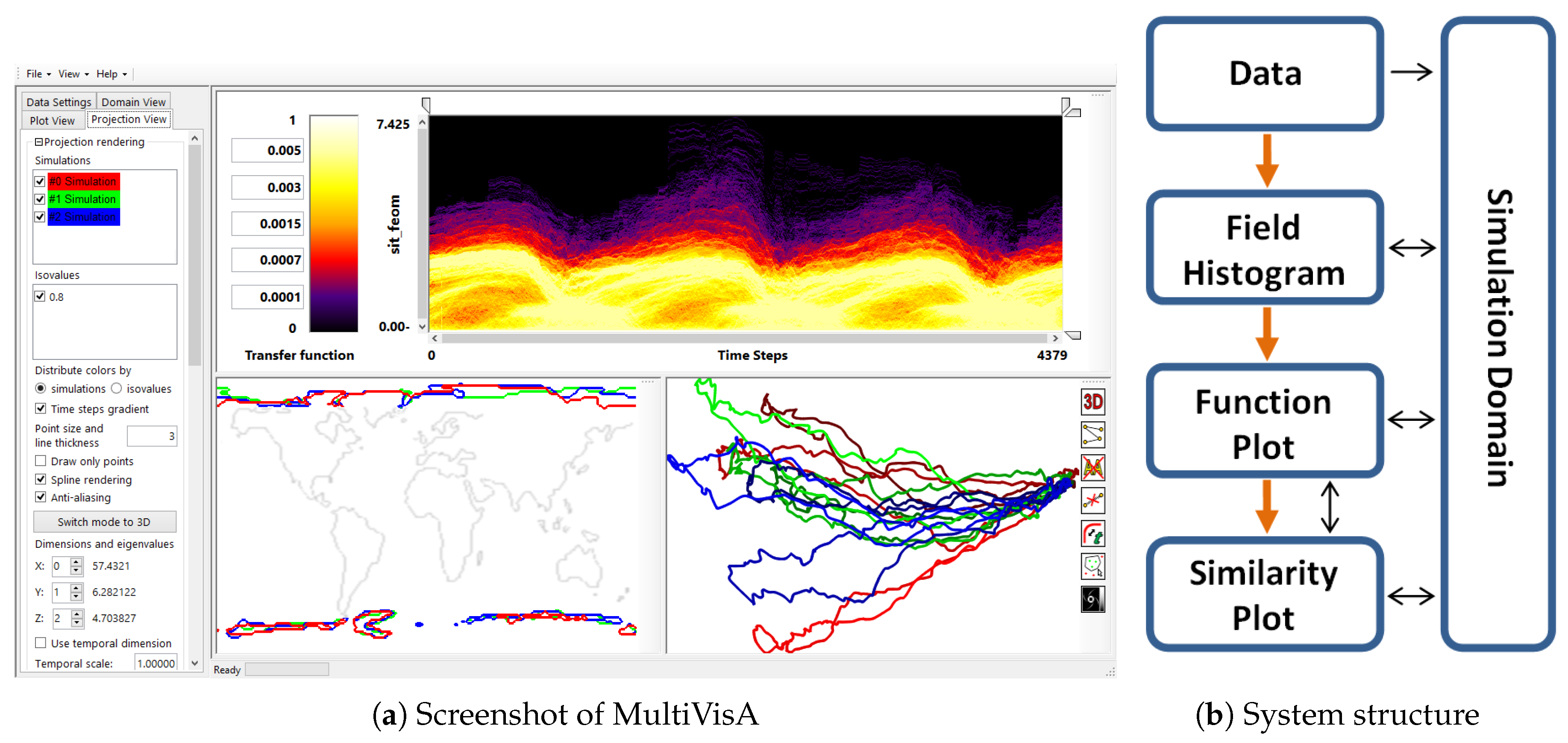
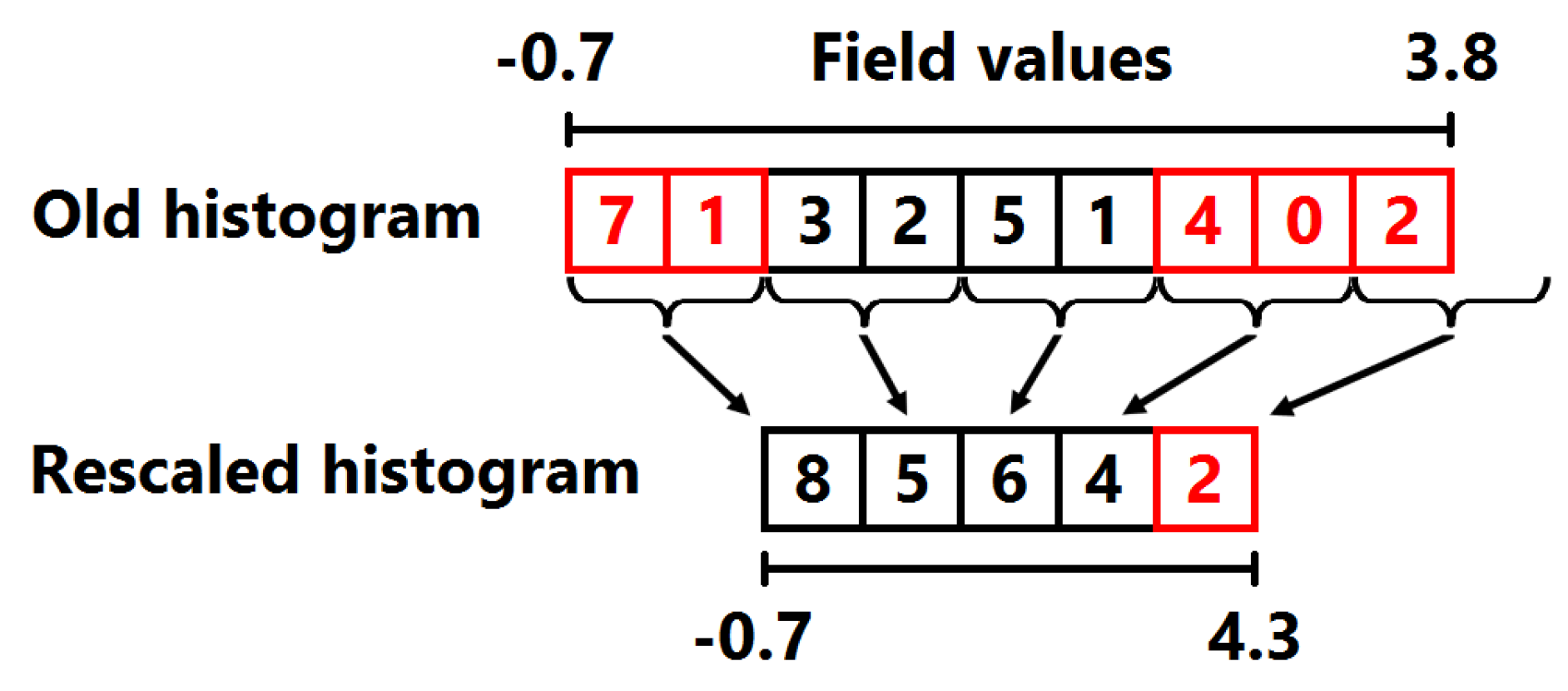
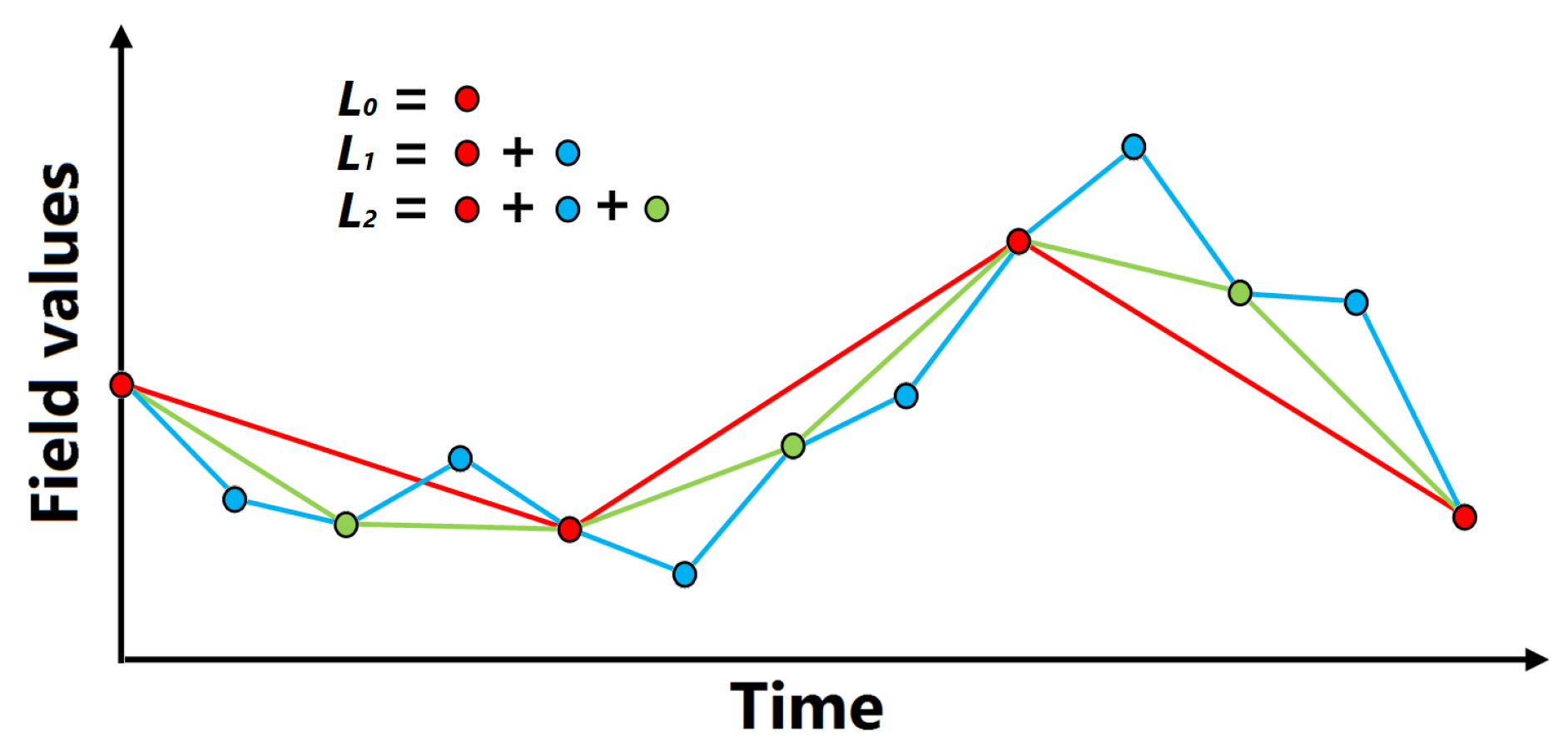
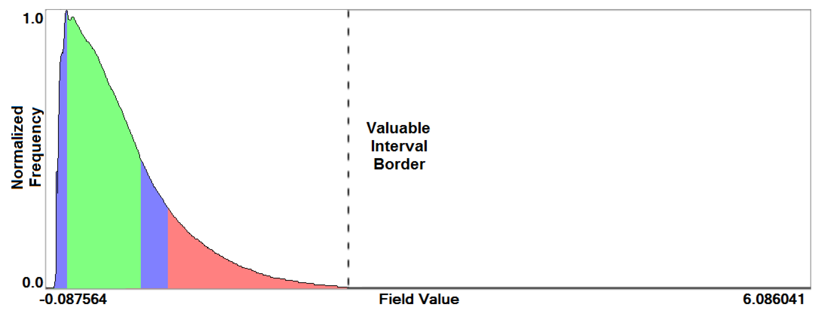
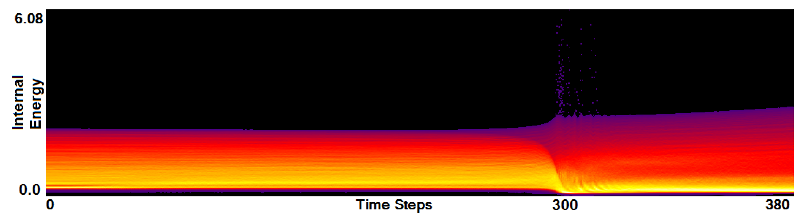
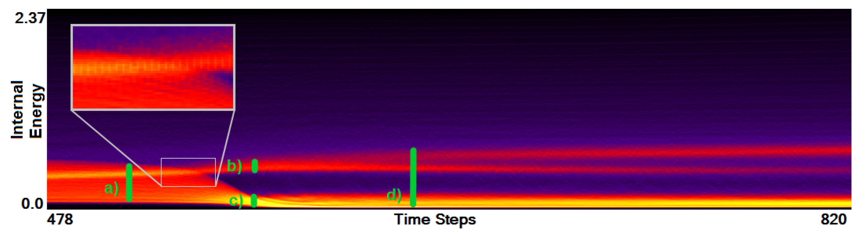
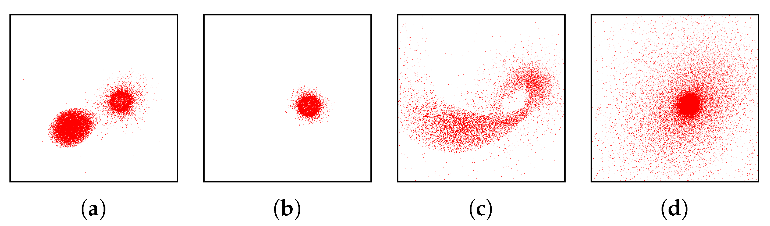
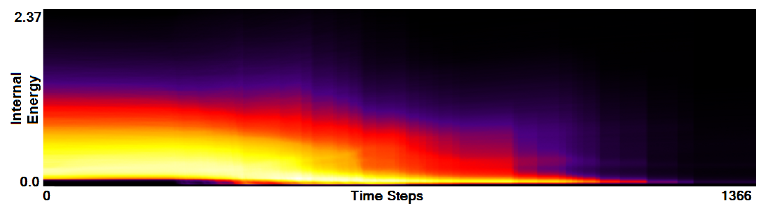
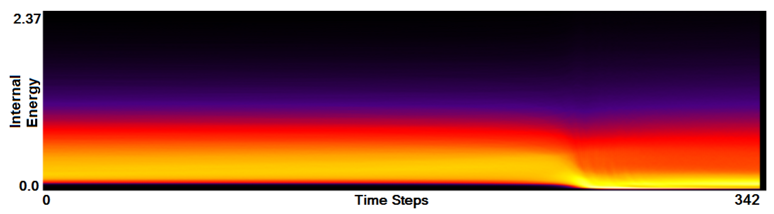
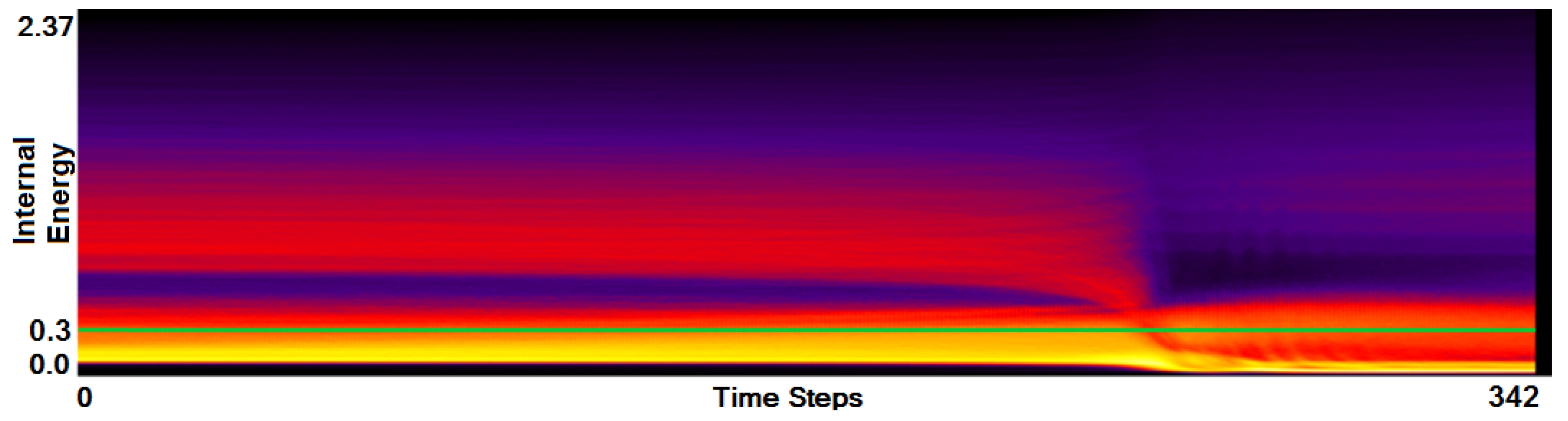
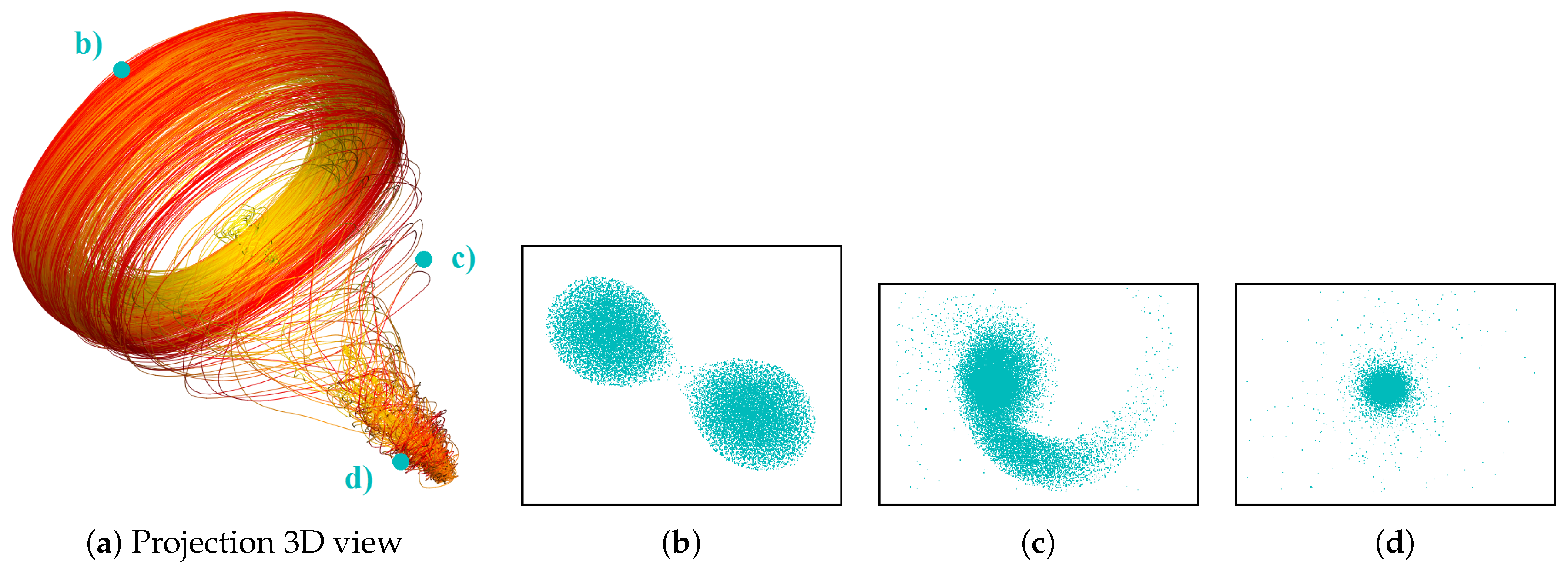
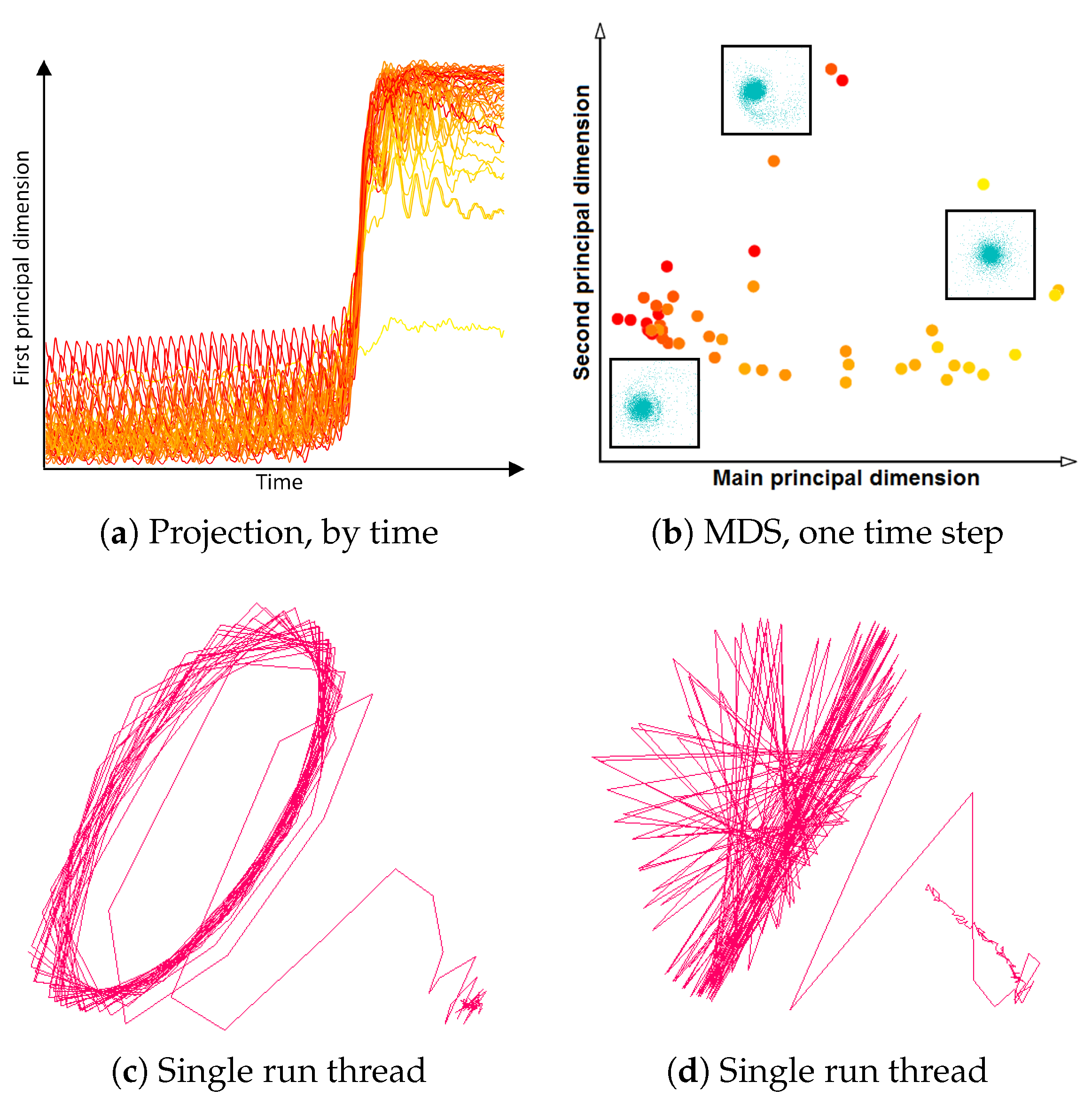
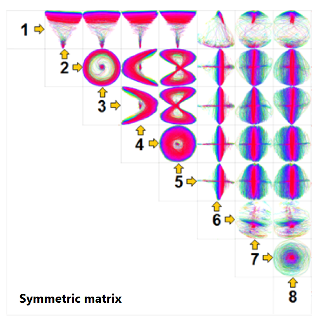
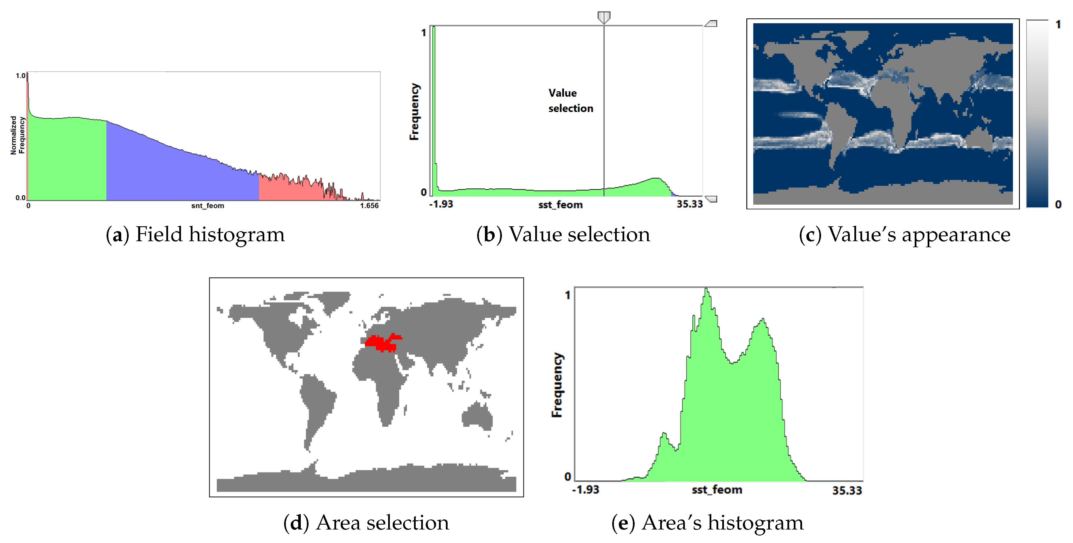
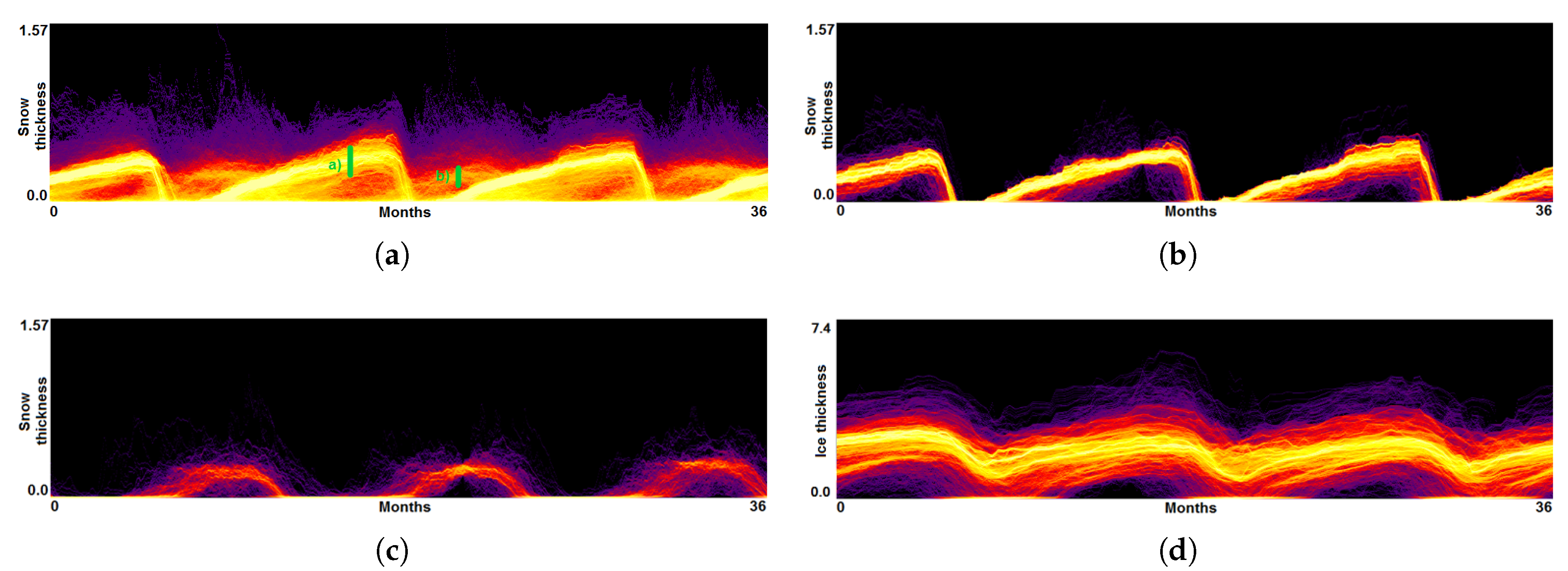
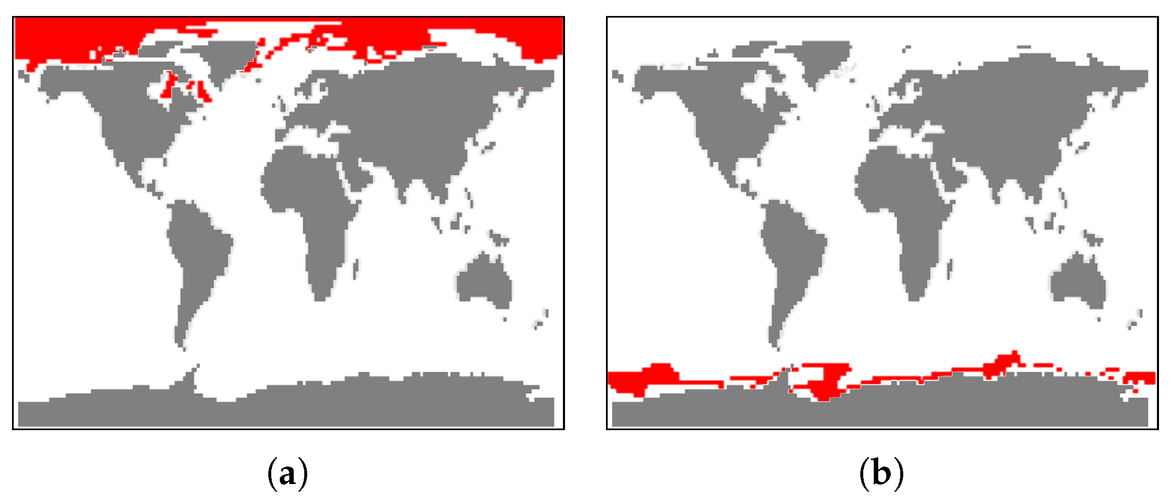
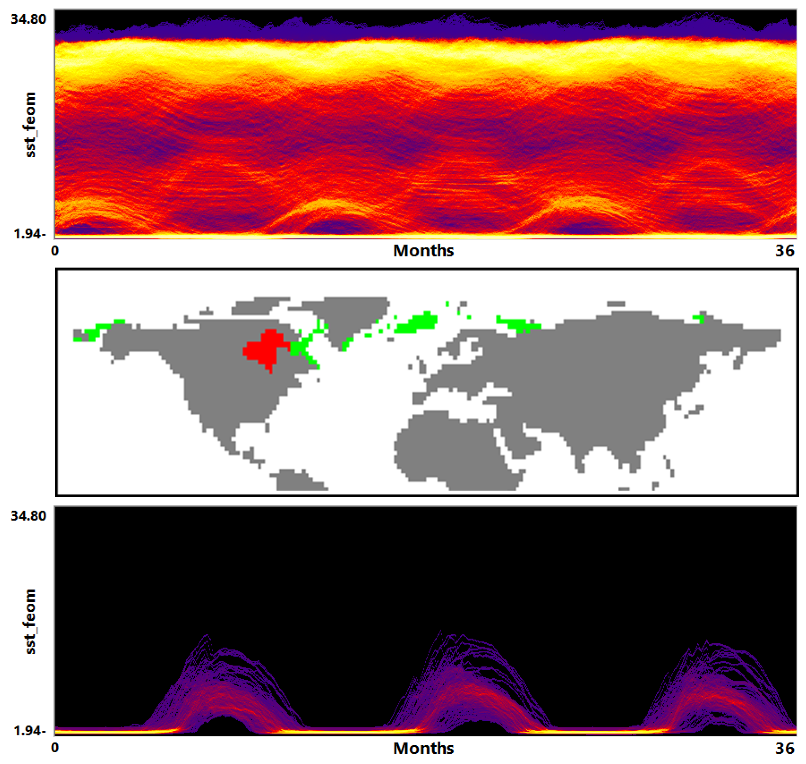
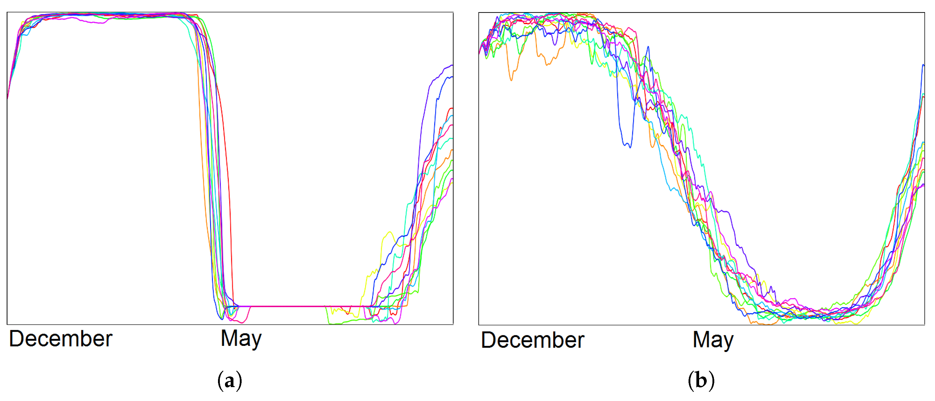
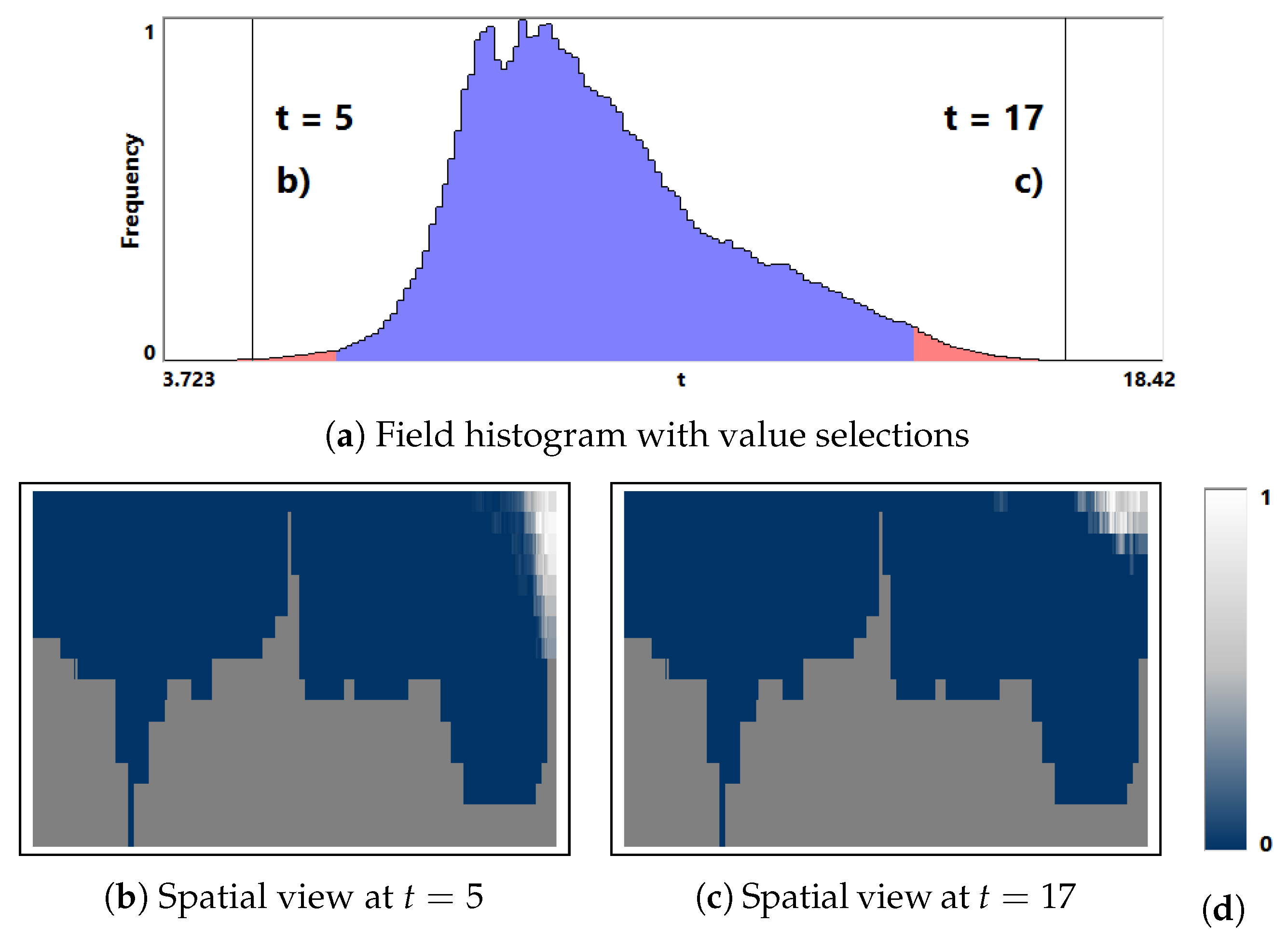
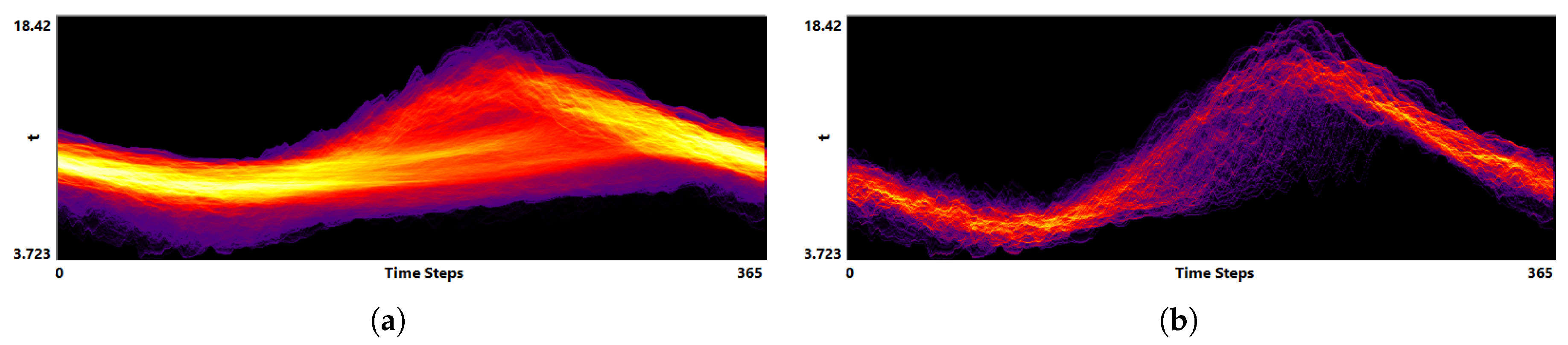
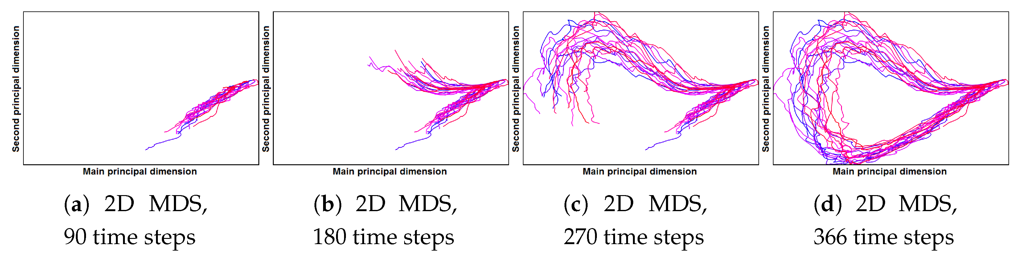
Table 1.
Pre-computation times (in seconds) for the visualization approaches used in the examples above.
Table 1.
Pre-computation times (in seconds) for the visualization approaches used in the examples above.
| Data | FH | FP | DM | MDS |
|---|---|---|---|---|
| Astrophysical data | 8743 | 7014 | 3107 | 679 |
| Global climate data | 1061 | 1037 | 214 | 70 |
| Local climate data | 117 | 100 | 103 | 189 |
© 2018 by the authors. Licensee MDPI, Basel, Switzerland. This article is an open access article distributed under the terms and conditions of the Creative Commons Attribution (CC BY) license (http://creativecommons.org/licenses/by/4.0/).
Share and Cite
MDPI and ACS Style
Fofonov, A.; Linsen, L. A Top-Down Interactive Visual Analysis Approach for Physical Simulation Ensembles at Different Aggregation Levels. Information 2018, 9, 163. https://doi.org/10.3390/info9070163
AMA Style
Fofonov A, Linsen L. A Top-Down Interactive Visual Analysis Approach for Physical Simulation Ensembles at Different Aggregation Levels. Information. 2018; 9(7):163. https://doi.org/10.3390/info9070163
Chicago/Turabian StyleFofonov, Alexey, and Lars Linsen. 2018. "A Top-Down Interactive Visual Analysis Approach for Physical Simulation Ensembles at Different Aggregation Levels" Information 9, no. 7: 163. https://doi.org/10.3390/info9070163
Note that from the first issue of 2016, this journal uses article numbers instead of page numbers. See further details here.