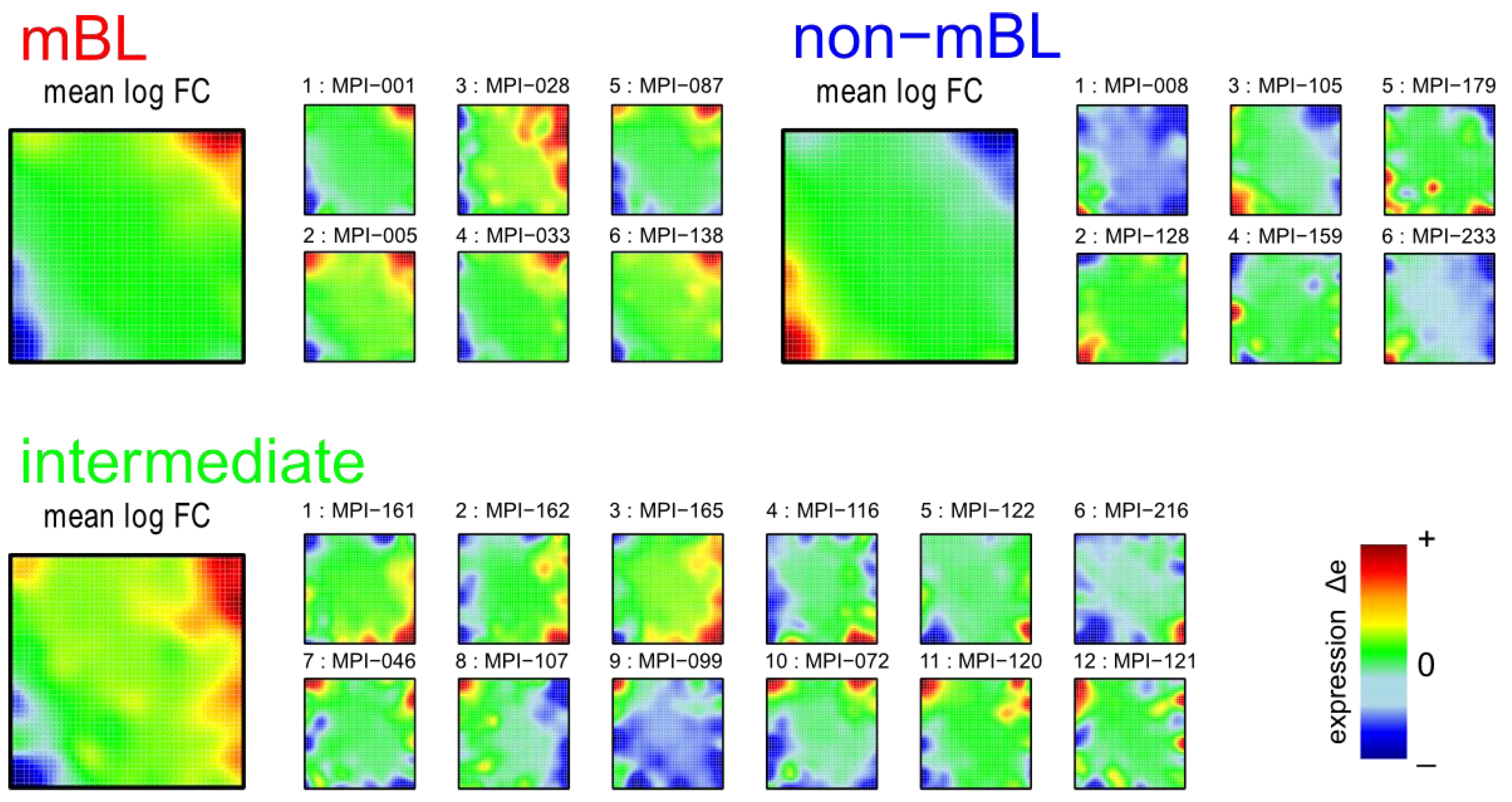
3.1. SOM Expression Portraits of Lymphoma Samples and Subtypes
SOM machine learning transforms the whole genome expression pattern of the ‘single’ genes into metagene expression data. Thereby, the number of single genes exceeds the number of metagenes by about one order of magnitude (N = 22,283 and K = 2,500). We visualize the expression meta-state of the samples as mosaic images, consisting of 50 × 50 tiles each representing one metagene. These metagenes serve as representatives of clusters of co-expressed single genes the number of which usually varies from metagene to metagene. The color gradient of the portraits was chosen to visualize over- and under-expression of the metagenes in each particular sample: red to green colors indicate over-expression with decreasing strength, while blue to green colors indicate under-expression. The colored texture of each mosaic thus individually characterizes the gene expression landscape in each sample.
Figure 1 shows the expression portraits of selected lymphoma samples arranged according to their previous classification into subtypes [
10]. The individual portraits reveal a handful of clusters of co-expressed metagenes frequently observed. These so-called over- and under-expression spots selectively characterize the different lymphoma subtypes: samples of the mBL and non-mBL subtypes are mostly characterized by spots of overexpressed metagenes in top
-right and bottom-left corners of the map, respectively. However, many additional spots can be observed in the portraits, indicating additional functional modules activated in the respective samples (see below). Samples of the intermediate subtype show more volatile patterns with over-expressed metagenes frequently tending to occupy the top
-left and bottom-right corners of the SOM. The full gallery of the 221 SOM portraits is given in
Supplementary File 2. Supporting maps characterizing the population of metagene clusters with single genes and the variance of the expression profiles of the metagenes are provided in
Supplementary File 1.
Figure 1.
Self-organizing map (SOM) gallery of lymphoma subtypes with a resolution of 50 × 50 metagenes: The small mosaic images refer to selected individual tumor samples assigned to the mBL, non-mBL and intermediate subtypes. The larger images represent the respective mean subtype portraits (see methodical section). Dark red/blue colored metagenes refer to the 90th/10th-percentile of expression in each sample, respectively. The complete gallery of all sample portraits is available in
Supplementary File 2.
We generate mean subtype portraits by averaging the expression values of each metagene over all the subtype members. This averaging cancels out the highly fluctuating, individual features and, thus, amplifies consistent subtype-specific features. In support of the observations from the individual portraits we found that the mBL and non-mBL subtypes are characterized by two spots in opposite corners of the map: one spot in the top
-right corner is over-expressed and the other one in the bottom-left corner is under-expressed in mBL samples and
vice versa in non-mBL samples, revealing the antagonistic character of their expression patterns. These subtype-specific spots collect highly populated, highly variable and well resolved metagenes (see
Supplementary File 1).
In summary, SOM expression portraits reflect the individual expression landscapes of each sample in terms of characteristic color textures which enable visual perception of subtype-specific spot-like features representing clusters of differentially and co-expressed genes.
3.2. Characterizing the Expression Modules: Spot Analysis
Standard analysis tools usually evaluate the whole expression states of the individual samples to perform similarity or cluster analyses, or to generate lists of differentially expressed genes. Such global comparisons might overlook subtle effects due to individual properties of small groups of genes. These details are however projected into the color textures of the individual SOM portraits which change from sample to sample and can be assessed by means of feature selection (see [
12] for a detailed review). The most prominent patterns are the over- and under-expression spots formed by neighboring metagenes of similar profiles which, in turn, represent clusters of correlated and thus potentially co-regulated genes strongly over- and/or under-expressed in a subset of samples.
We analyze the spot patterns in order to identify specific properties of the lymphoma subtypes.
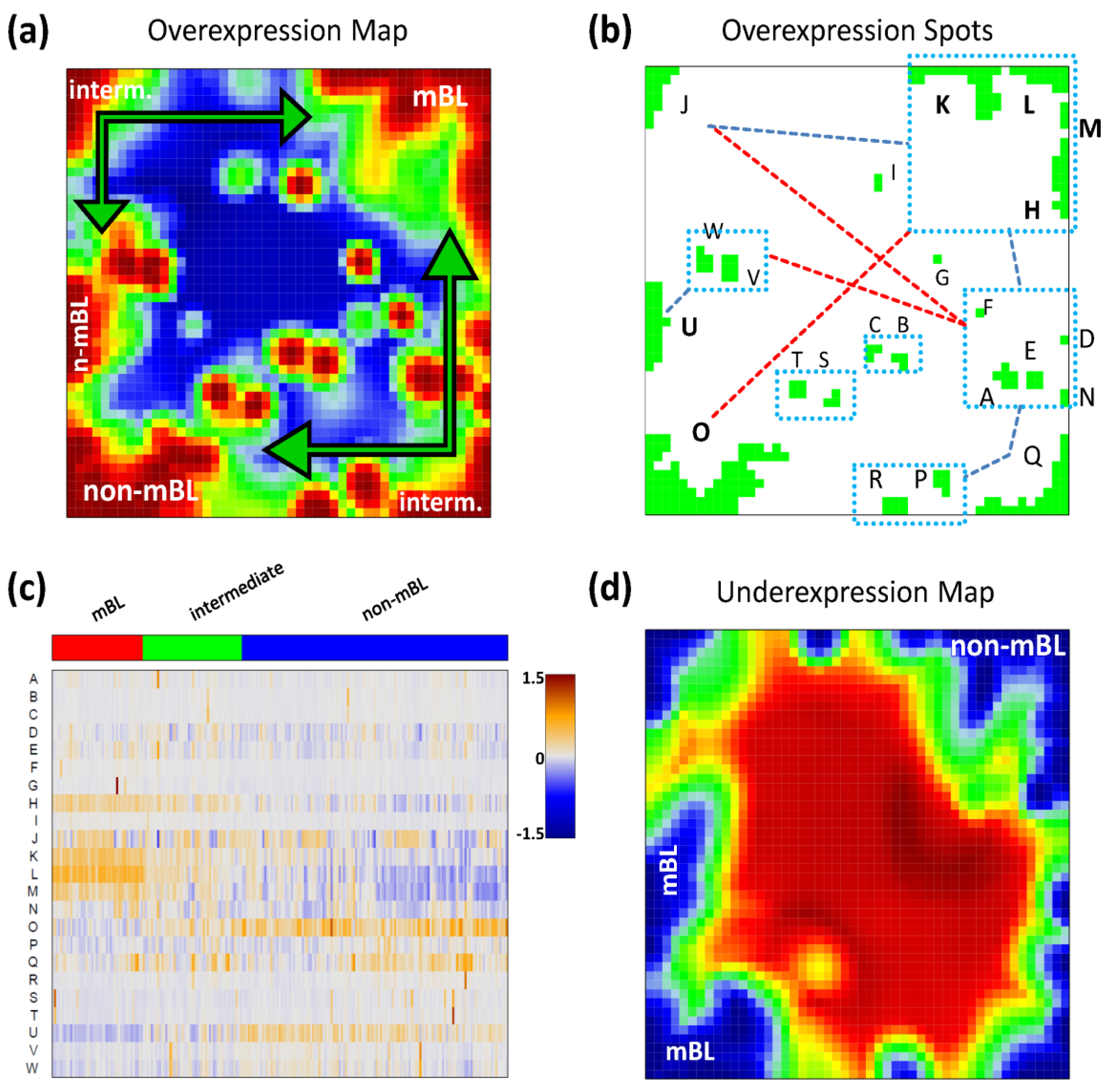
Figure 2a shows the so-called over-expression summary map which collects all over-expression spots observed in the individual sample portraits into one master map (see also [
11]). Each disjunctive region of this map exceeding the 98th-percentile threshold defines one global overexpression spot. It represents a distinct expression module inherent in the data. In total, we identified 23 over-expression spots labeled with capital letters ‘A’–‘W’ (
Figure 2b).
Please note that our spot selection algorithm neglects the abundance of each spot in the individual portraits and identifies both rare (e.g., observed in only one sample) and frequent spot modules. The over-expression heatmap in
Figure 2c visualizes the spot expression profiles,
i.e., the mean expression level of the metagenes in each of the spots across all samples. The colors range from blue representing the lowest mean expression values, to red representing the highest values. The samples are arranged according to their subtype classification. The heatmap provides an overview of the degree of subtype-specific expression in each of the spot modules. For example, spots ‘L’ and partly also spot ‘K’ are selectively over-expressed in samples of the mBL subtype, while spot ‘O’ is characteristic for the non-mBL subtype. Contrary, more ubiquitous spots as ‘N’, as well as rare spots as ‘A’ or ‘G’, lack of subtype-specific overexpression. Note that frequent spots are usually located in the peripheral part of the map (
i.e., in the corners and along the edges) whereas rare spots tend to accumulate in the central part.
Figure 2.
Spot module characteristics: (a) The over-expression summary map collects all over-expression spots observed in the individual portraits into one map. Subtypes frequently showing the respective spots are indicated. (b) The over-expression spot map defines the spots used for further analysis. Regions beyond the 98th-percentile threshold of metagene expression are selected. The spots are assigned by large capital letters. The blue rectangles include highly correlated spots (r > 0.7). The blue and red dashed lines connect correlated (0.4 < r < 0.7) and anti-correlated (r < −0.6) spots, respectively. (c) The overexpression heatmap shows the mean expression of the spots across all samples in the data set. The samples are sorted according to their subtype. (d) The under-expression summary map collects all under-expressed spots observed in the individual portraits. Note the antagonistic nature of mBL and non-mBL expression: spots over-expressed in mBL become under-expressed in non-mBL and vice versa (compare with panel a).
![Biology 02 01411 g002]()
We use the spot information and the mean subtype portraits to assign subtype labels to the most prominent and specific spot modules (
Figure 2a): Spots ‘L’ and ‘K’ are ascribed to mBL while spot ‘O’ is prominent in non-mBL. Those three spot modules contain marker genes over-expressed in the respective subtypes as validated below. Spots ‘J’ and ‘Q’, also frequently observed in the sample portraits, are assigned to the intermediate subtype. Interestingly, they constitute two alternative intermediate states located in between the main-subtypes mBL and non-mBL. They are characterized either by spot ‘J’ or by spot ‘Q’ as indicated by the arrows in
Figure 2a.
Please note that the training algorithm distributes the metagenes in such a way that strongly correlated profiles are located at adjacent positions in the map whereas metagenes with anti-correlated profiles tend to occupy more distant regions, e.g., in the opposite corners of the map. This rule also applies to the spots detected. In order to discover the covariance between the spot modules we calculated Pearson correlation coefficients for all pairs of spot profiles. It turned out that, as a rule of thumb, neighboring spots are strongly positively correlated and spots located in opposite corners of the map are often strongly anti-correlated. The results of this correlation analysis are visualized in
Figure 2b. One sees that, for example, the mBL marker spots ‘K’ and ‘L’ are highly correlated and usually appear together in the sample portraits whereas the anti-correlated over-expression spots ‘K’ and ‘O’ will not be observed together in the same expression portrait.
For this dataset, we also detected 11 global under-expression spots emerging as blue regions in the SOM portraits. The under-expression summary map is shown in
Figure 2d. Position and size of most of the detected under-expression spots agree with those of the over-expression spots. Hence, overexpression of the respective metagenes in part of the samples changes into under-expression in other samples. For the analyses described in this paper, we therefore use only the over-expression spots detected without loss of essential information. Interestingly, virtually no blue under-expression spot was detected in the central area of the map indicating that the rare over-expression spots do not show this dualism. Below we will show that these spots potentially constitute clusters of outlier genes the expression of which is affected by bias effects.
In summary, the heterogeneous expression patterns observed in the individual portraits can be condensed to a few major expression modules represented by over- and under-expression spots. This way the relevant dimension of the data set is reduced by three orders of magnitude from about 20,000 single genes to approximately 12 spot modules.
3.3. Mining the Functional Context: Gene Set Enrichment Analysis
Each global overexpression spot module represents a cluster of potentially co-regulated genes. We applied gene set overrepresentation analysis to each spot-cluster taking into account a collection of more than 5,000 predefined gene sets referring to different GO-categories, pathways, diseases, human tissues and specific cell experiments (see methodical section). For each spot we obtained a list of gene sets ranked with increasing p-value estimating the probability that genes of the set are found within the spot by chance.
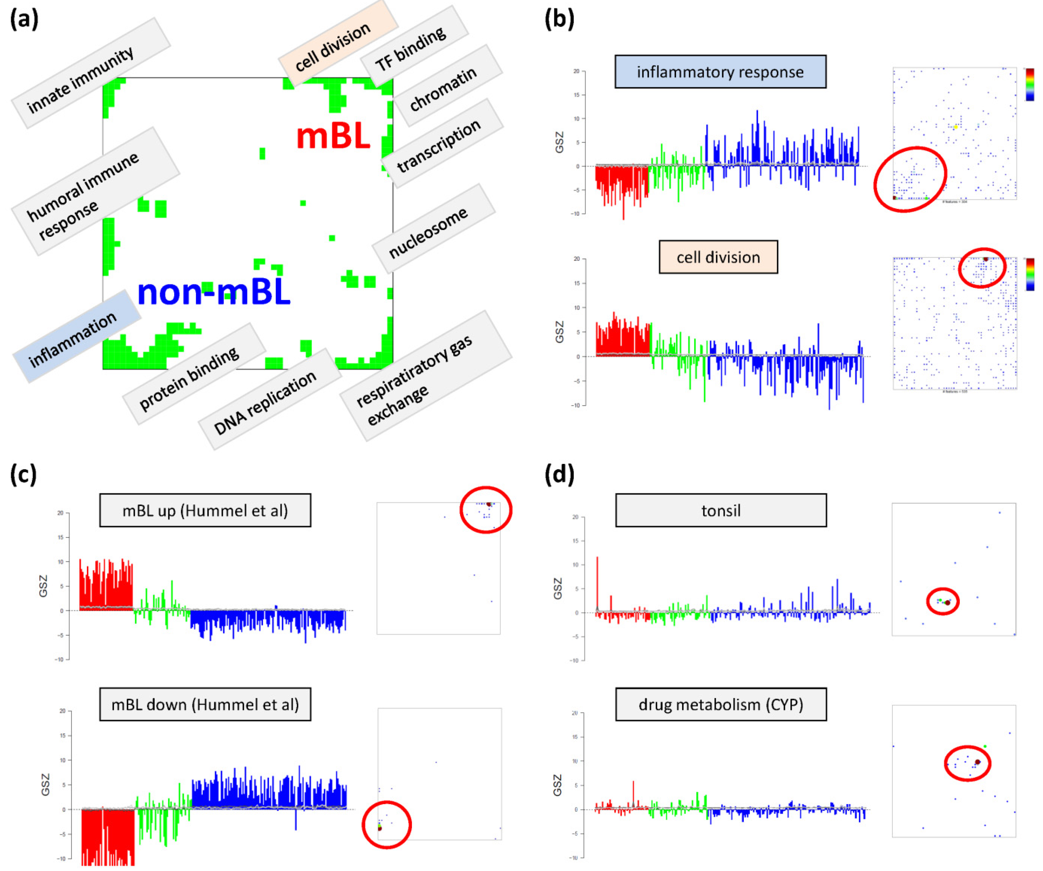
Based on the functional context of the overrepresented sets obtained we assign a short notation to each of the spots (see
Figure 3a). Some spots are obviously related to processes associated with general hallmarks of cancer such as ‘inflammation’ and ‘cell division’ (spots ‘O’ and ‘K’, respectively). Panel b of
Figure 3 depicts the GSZ-expression profiles (left part) and the population maps (right part) of those two leading gene sets. The profiles clearly reflect the fact that the respective processes are selectively over- or under-expressed in a subtype-specific fashion. While ‘inflammatory response’ is activated in the non-mBL subtype, genes annotated to the gene set ‘cell division’ are active in the mBL subtype. The respective gene set population maps reveal that the associated genes accumulate in the regions of spots overexpressed in the respective subtype, as expected.
Figure 3.
Functional analysis: (
a) The functional context of the most abundant spots is assigned according to the topmost overexpressed gene sets in each of the spots. (
b–
d) GSZ-profiles and population maps are shown for gene sets accumulating in the mBL and non-mBL specific overexpression spots as indicated by the red ellipses (panel b), for mBL-
vs-non-mBL signature sets published previously [
10] (
c) and for sets accumulating in rare spots (
d).
Neighboring spots of strongly correlated profiles can be assigned to related biological processes: the ‘cell division’ spot is surrounded by spots assigned to ‘transcription factor binding’, ‘chromatin’ and ‘transcription’ according to the most overrepresented gene sets in each of the spots. Note that, although related, these neighboring spots are usually characterized by subtle differences in their expression profiles and presumably also by fine differences in the functional context of the overrepresented gene sets. Population maps and overexpression spot maps therefore represent complementary tools for discovering the functional context of the expression landscapes. The results so far show that the lymphoma samples split into pairs of subtypes differing by the antagonistic activation of processes related to ‘inflammation’ and ‘immune response’ on one hand and to ‘cell division’ and the ‘transcriptional and translational machinery’ on the other hand (non-mBL-vs-mBL).
To validate the subtype-specific spot patterns identified above, we included the signature set that differentiates between mBL and non-mBL subtypes provided by Hummel
et al. [
10] (see
Figure 3c). As expected, genes of this set clearly accumulate in the subtype-specific spots ‘L’ and ‘O’ assigned to mBL and non-mBL, respectively.
Another important question is about the possible origin of the rare spots in the central part of the map. In
Figure 3d, we show the characteristics of two gene sets related to tissue specific gene expression in tonsils [
11,
12] and to drug response (‘drug metabolism, cytochrome P450 (CYP)’, see [
44]), respectively. Their genes strongly accumulate in localized regions of the map agreeing with the positions of the rare spots ‘S’ and ‘G’, respectively.). Both gene sets are overexpressed in only few samples suggesting that the respective samples are outliers contaminated either with healthy tissue or affected by patient specific medication. Both effects are not related to the cancer studied and thus reflect systematic biases of the respective expression patterns.
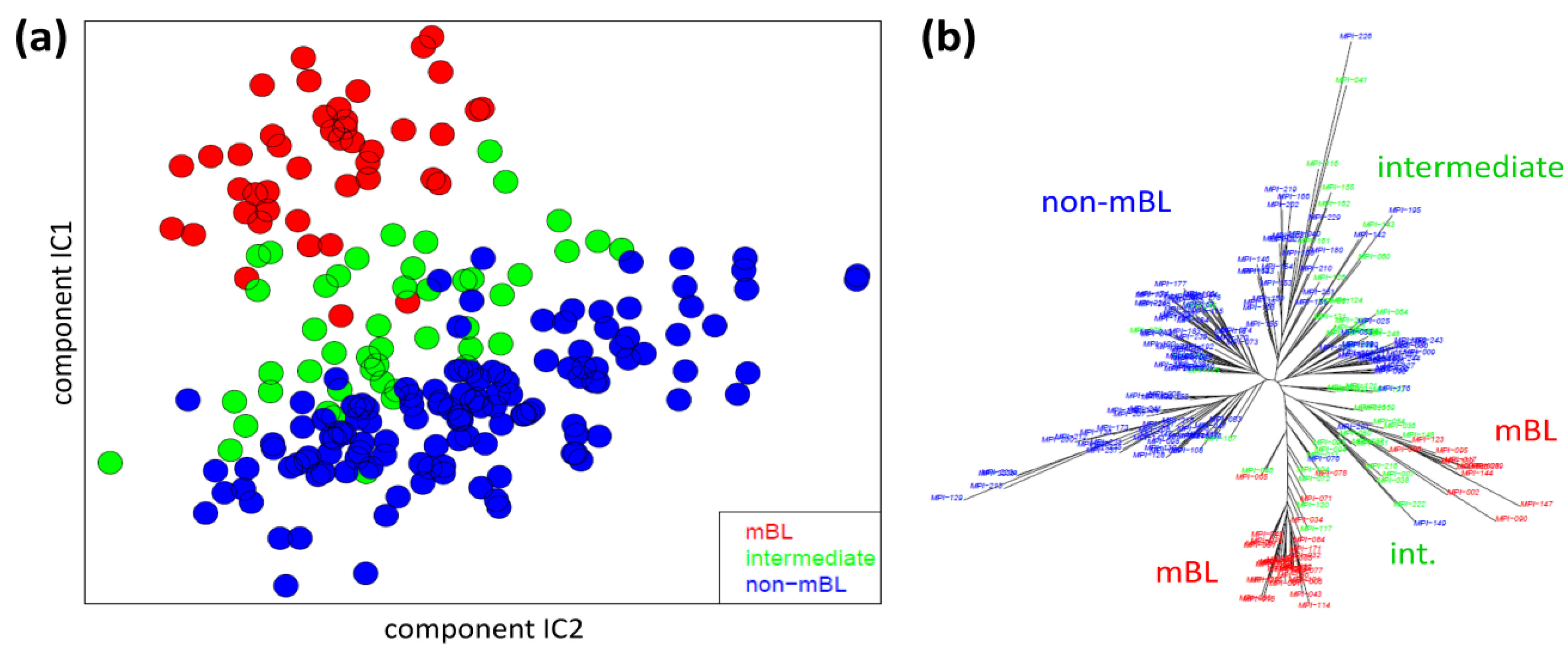
3.4. Analyzing the Sample Similarity Space
We applied two standard sample similarity analyses, namely independent component analysis (ICA) and neighbor-joining clustering (NJ), to visualize and to analyze the mutual relations between the samples. In the two-dimensional ICA-plot shown in
Figure 4a, the samples distribute along the first two components of minimal statistical dependency. It reveals basically three clusters referring to the three subtypes, however without clear boundaries limiting them. It also shows that the three subtypes mainly separate along the IC1-coordinate, whereas intra-subtype variability mainly spreads along the IC2-coordinate.
Figure 4.
Sample similarity analysis: (a) Independent component analysis (ICA) of lymphoma samples. The distribution of the samples is shown in the space spanned by the two leading independent components. (b) The neighbor-joining tree projects the sample similarity relations into a dendrogram. The bush-like structures reveal a finer granularity of subtypes beyond the three classes considered so far.
The NJ algorithm visualizes sample similarity relations as seen by Euclidean distances. The obtained star-like dendrogram shown in
Figure 4b identifies ‘bush-like’ clusters containing mostly samples of the same subtype. Interestingly, each of the different subtypes distributes over more than one of such bush-like branches reflecting its intrinsic heterogeneity in terms of disjoint clusters.
In summary, the ICA-analysis allows for estimating the mutual dependence of the expression changes associated with the different subtypes. We found a one-dimensional distribution of the lymphoma subtypes, supporting the ‘longitudinal’ classification into the three subtypes considered so far. The transversal heterogeneity however remains unconsidered in this case. The NJ-dendrogram, on the other hand, reveals finer details in terms of disjunct substructures potentially reflecting a finer granularity of subtype clusters.
3.5. Sample Correlation Structure
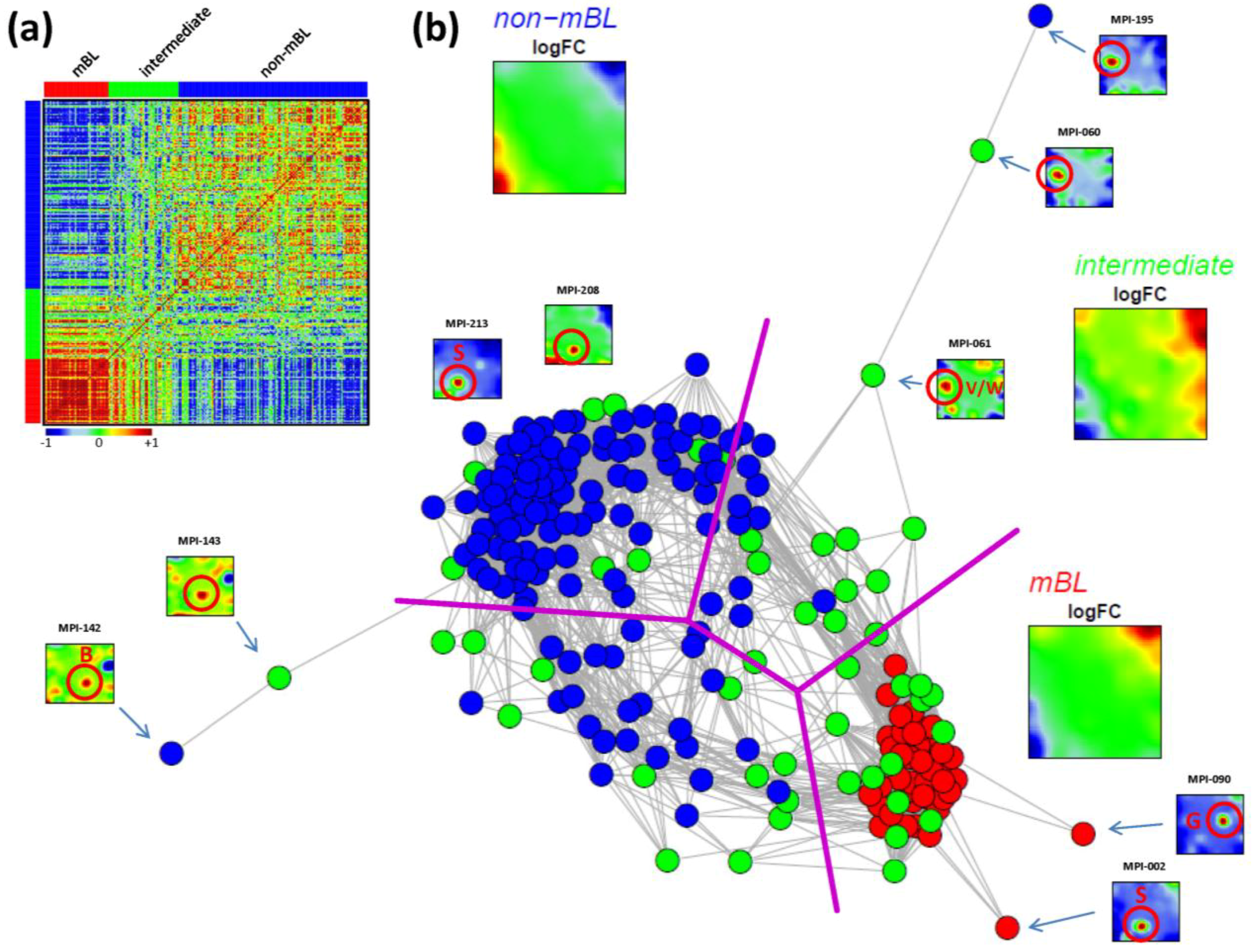
As an alternative metric to study sample similarities, we calculated Pearson’s correlation coefficients for all pairwise combinations of samples. The pairwise correlation map (PCM) given in
Figure 5a visualizes the correlation coefficients for all sample pairings which are arranged according to their subtype assignments (see the color bars along the borders of the map). The compact red square of mBL sample couples reflects the strong similarity between their expression landscapes whereas the blue off-diagonal area formed between the mBL and non-mBL samples indicates their anti-correlated expression states. Note that the pairings between non-mBL samples, although correlated, reveal a much more fuzzy pattern due to the more heterogeneous expression states compared to the mBL subtype. The samples of the intermediate subtype either correlate with the mBL or non-mBL samples or with both in some cases.
The correlation matrix can be transformed into the correlation network (CN) shown in
Figure 5b. In this graph representation, the samples are represented by nodes connected by edges if the mutual correlation coefficient exceeds a certain threshold. The length of the edges approximately inversely scales with the respective correlation strength. Visual inspection of the CN shows that the mBL and non-mBL samples accumulate into well separated clusters whereas samples of the intermediate subtype heterogeneously spread over the region between these two clusters. Interestingly, these intermediate samples distribute along two disjunctive branches of the CN, which both link the mBL and non-mBL clusters. These two separate branches also include a fraction of the mBL and non-mBL samples (see the purple lines in
Figure 5b roughly separating the clusters and branches). This distribution of the intermediate subtype samples reflects the heterogeneous spot characteristics of the subtypes as discussed above.
A few samples are located far away from their subtype-specific cluster and/or from the majority of the other samples in the CN. Those samples are usually characterized by rare or unique spots as indicated in
Figure 5b. We will address this issue in the next section more in detail.
In summary, the correlation net of the lymphoma samples forms a ‘donut-like’ structure composed of alternating compact and more fuzzy clusters. The former ones refer to the main subtypes and the latter ones to two distinct groups of samples mainly assigned to the intermediate subtype. The mutual correlation analysis as seen by the CN in combination with the SOM portraits thus provides additional information complementing the other similarity analyses applied.
Figure 5.
Pairwise correlation analysis of all lymphoma samples: (a) The pairwise correlation map (PCM) visualizes the correlation coefficients for all pairs of samples. The samples are arranged according to their subtype membership as indicated by the color bars. In the heatmap, red colors indicate positive, blue colors negative correlations between the samples. (b) The correlation network (CN) translates the PCM into a graph structure. The nodes are given by the samples and the edges connect positively correlated sample pairs (r > 0.5). Mean subtype portraits are given within the figure (large maps). Outlier nodes are highlighted by arrows. The SOM portraits of the respective samples are shown by small maps. The red circles and the spot letters indicate the outlier spots differing from the subtype specific patterns (compare these individual sample portraits with the mean subtype portraits).
3.6. Detection and Correction of Outliers
Inspection of the CN in
Figure 5b reveals a series of samples which are located outside of the main network body. The portraits of these outlier samples reveal overexpression spot patterns deviating from the subtype specific patterns identified in terms of their mean SOM portraits. Particularly the spots ‘G’, ‘S’ and ‘W’ are identified in the outlier sample portraits (red circles in
Figure 5b; see
Figure 2b for spot-letter assignments). Here, we exemplarily focus on spot ‘S’, located in the bottom-left region of the SOM and strongly overexpressed in samples MPI-002, MPI-208 and MPI-213 (see
Figure 5b). The topmost enriched gene set in this spot is the ‘tonsils’-set. It was extracted as the tonsil-signature from a large expression data set of healthy human tissues previously analyzed with our SOM pipeline [
11,
12]. Enrichment of this set suggests that overexpression of spot ‘S’ is caused by contamination of the tumor biopsy with adjacent healthy lymph node tissue.
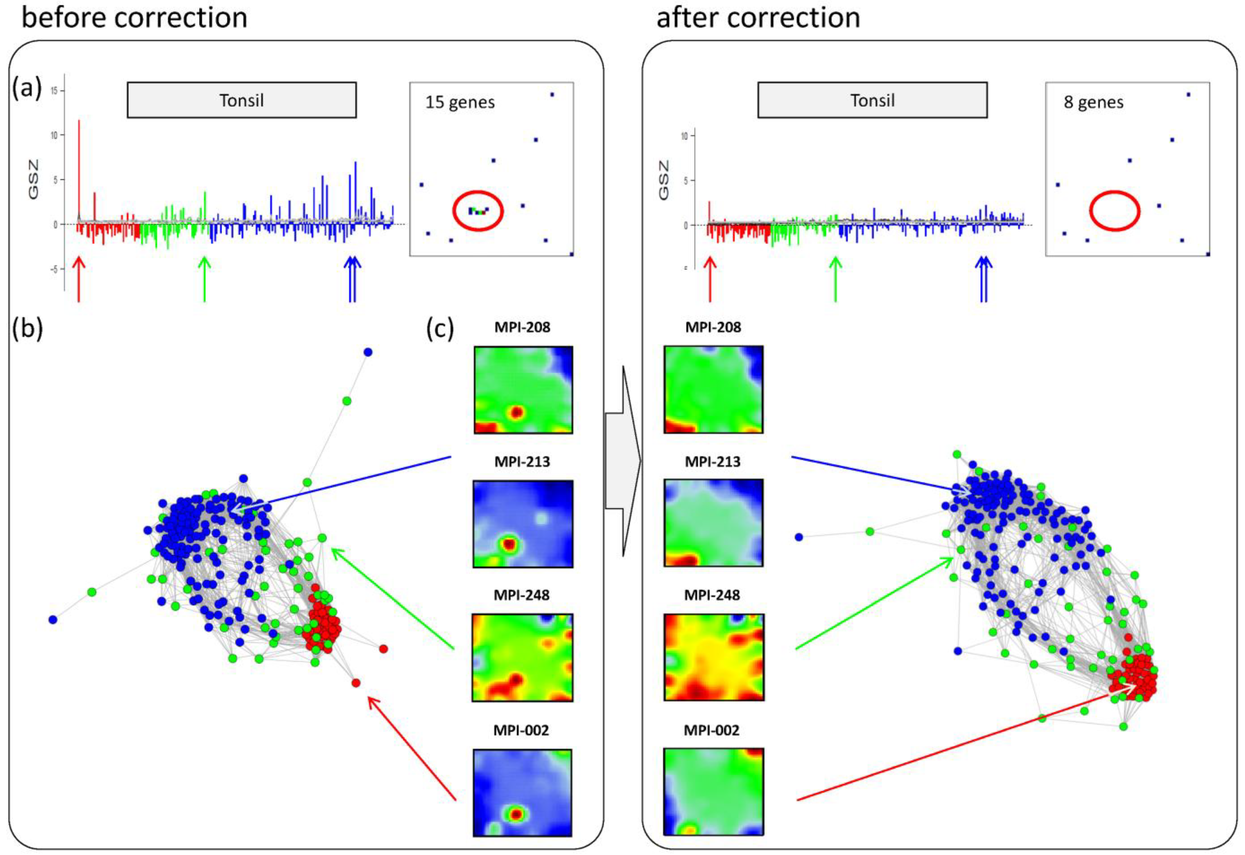
Panel a in the left part of
Figure 6 shows the GSZ-profile and the population map of the ‘tonsil’ set. The GSZ-profile reveals very strong overexpression of the set in a number of samples independent of their subtype assignment. The corresponding genes mainly accumulate in spot ‘S’. Selected samples which possess this particular spot in their portraits are shown in Panel c. They can already be identified as potential outliers by simple visual inspection of the SOM portrait gallery (
Supplementary File 2). We highlighted the samples in the GSZ-profile (Panel a) and in the CN (Panel b) by arrows. Note however that not all of these samples protrude as clear outliers in the CN. Despite the strong overexpression of the contamination spot ‘S’, the overall expression state of e.g., samples MPI-208 and MPI-213 obviously resemble those of the unbiased samples.
Figure 6.
Correction of outlier samples contaminated with healthy lymph node tissue. The left and right parts of the figure refer to the uncorrected and corrected data, respectively. (a) GSZ-profile and population map of the ‘tonsil’ gene set: The signature is not characteristic for one of the subtypes and their genes accumulate in spot ‘S’ of the map. (b) Correlation network of the lymphoma data set. (c) SOM portraits of selected outlier samples. The arrows point to the position of these samples in the CN and in the GSZ-profile. After correction, the expression landscape of the selected samples reveals subtype-specific signatures.
In a simple correction step we removed the genes included in the outlier spots from the whole data set (see red circle in the population maps in
Figure 6). This procedure can be repeated for the other contamination spots identified: For example, spot ‘G’ was found to be related to drug metabolism (‘cytochrome p450’, see
Figure 3d and sample MPI-090 in
Figure 5b), presumably due to individual medication of the patient. Spots ‘V’/’W’ show an intense increase in expression of the G-antigen-family for unknown reasons (samples MPI-060, MPI-061 and MPI-195 in
Figure 5b).
After removing strongly biased genes from the training data, we generated a new SOM. Note that, depending on the purpose, also re-evaluation of only parts of the analyses may be sufficient. The right part of
Figure 6 shows the results after correction for tonsil-contamination accumulated in spot ‘S’. The corresponding GSZ-profile shows a more uniform expression of the gene set after correction. The respective sample portraits now show the characteristic spot signatures of the respective subtypes,
i.e., of mBL for MPI-002 and non-mBL for MPI-208 and MPI-213. Especially the outlier sample MPI-002 is now located within the mBL cluster in the CN, such that it attains a more compact shape.
In summary, the combination of individual portraits, enrichment analysis and the correlation network provides a framework for easy and intuitive detection of outlier spots and samples. After correction, more reliable expression landscapes of the samples are obtained.
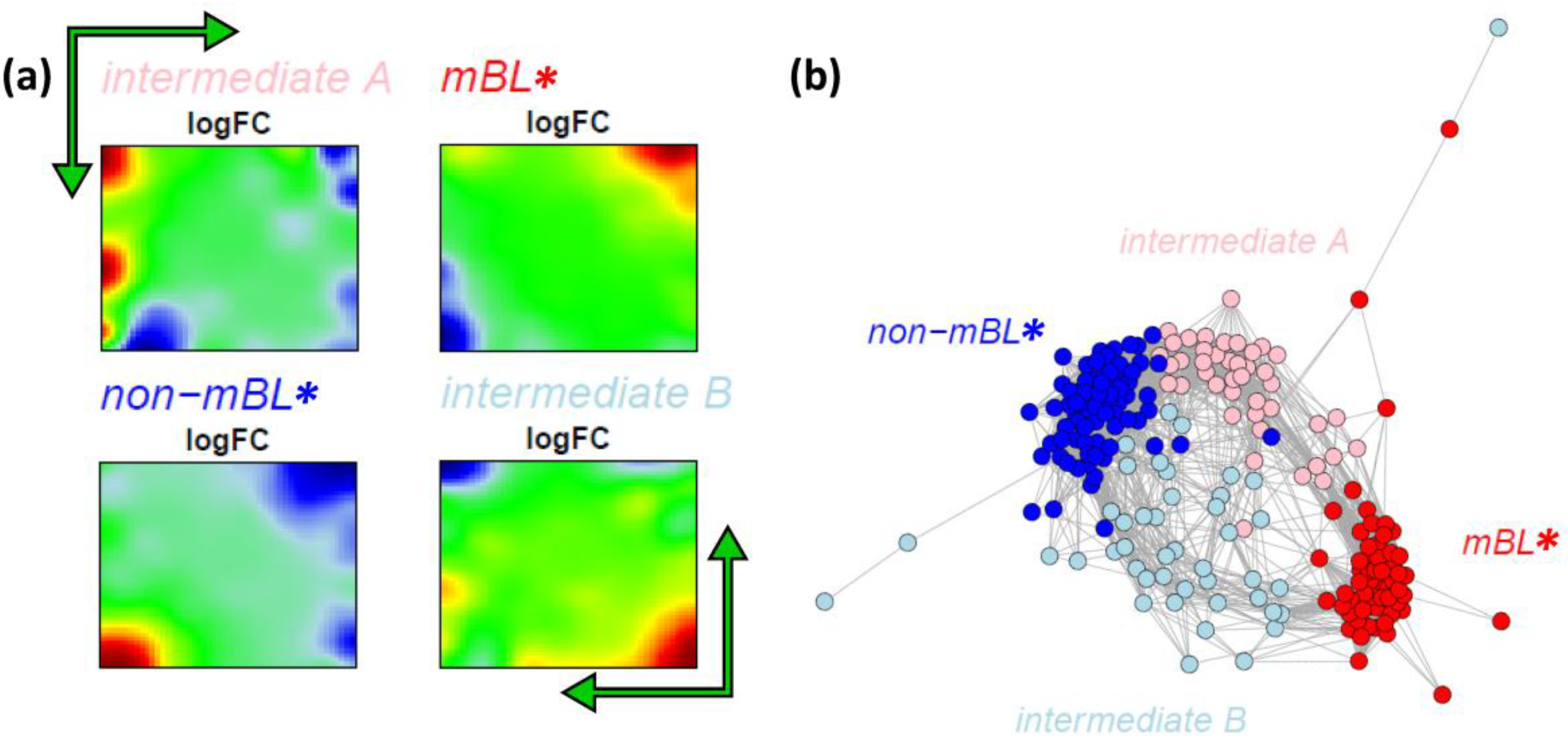
3.7. Alternative Subtyping of B-Cell Lymphoma
Our analysis so far suggests that the samples assigned to the intermediate subtype split up into two separate branches which also include samples previously assigned to the mBL and especially the non-mBL subtypes. These two branches are characterized by overexpression spots in the bottom-right and top-left part of the expression portraits, respectively (compare the first and the second row of the intermediate sample portraits in
Figure 1). Note that these spot modules are frequently overexpressed in the intermediate-type samples (see spots ‘J’ and ‘Q’,
Figure 2a–c). Both, neighbor-joining clustering and correlation network analyses clearly show two distinct sample groups forming two continuous transition ranges linking the compact mBL and non-mBL clusters. These transition ranges include samples of the intermediate and also of the mBL and non-mBL types (
Figure 4b and
Figure 5b). These results suggest the existence of four subtypes partly differing from the classification into three subtypes discussed so far. In order to further verify this hypothesis, we applied our prototype-guided k-Means algorithm to cluster the samples into four groups (see methods section). The algorithm uses initial prototypes of the expression landscapes which are given by artificial spot patterns referring to the four desired subtypes: spot ‘K’ initializes the new mBL-like subtype
mBL*, spot ‘O’ the non-mBL-like subtype
non-mBL* and spots ‘J’ and ‘Q’ the two new intermediate subtypes
intermediate A and
intermediate B, respectively.
Figure 7a shows the obtained four cluster centroids after convergence of the k-Means algorithm. They represent the mean portraits of the four new subtypes
mBL*,
intermediate A,
intermediate B and
non-mBL*. Note that the mean portraits of the
mBL* and
non-mBL* subtypes closely resample that of the initial mBL and non-mBL classes, respectively (compare with
Figure 1). In contrast, the mean portraits of the new
intermediate A and
intermediate B subtypes clearly differ from that of the initial intermediate subtype and from that of the
mBL* and
non-mBL* patterns.
Figure 7.
k-Means clustering into four subtypes: (a) Mean expression portraits of the four new subtypes. The green arrows indicate the spot pattern transitions from mBL to non-mBL via intermediate A or B. (b) CN colored according to the new subtypes obtained.
Figure 7.
k-Means clustering into four subtypes: (a) Mean expression portraits of the four new subtypes. The green arrows indicate the spot pattern transitions from mBL to non-mBL via intermediate A or B. (b) CN colored according to the new subtypes obtained.
We re-colored the CN plot according to the new subtype classification (
Figure 7b). The
mBL* and
non-mBL* clusters are more compact compared to the initial mBL and non-mBL clusters (compare with
Figure 5b). The expression landscapes of the new groups obtained are obviously more homogeneous (see the complete gallery of new assigned sample portraits in
Supplementary File 3). The samples of the two intermediate subtypes accurately accumulate along the two separated branches linking the
mBL* and
non-mBL* clusters except a certain region of overlap in the center of the CN. Further sample similarity analyses based on the four subtype classification support these results (see
Supplementary File 1).
In the next step, we compare the robustness of the old and new subtype cluster assignments by applying the bootstrap clustering approach described in the methods section. It returns the bootstrap stability score for each sample in the range of [0, 1] for unstable to very stable assignments. For the previous classification into three subtypes, the stability scores of the intermediate and mBL subtype samples show a broad distribution with scores of 0.5 and below (see
Supplementary File 1 for details). The new four subtype classification is clearly more robust, reflecting a more consistent and stable clustering of the samples. Only a small number of relatively uncertainly assigned samples are found even in the transition ranges between the different clusters.
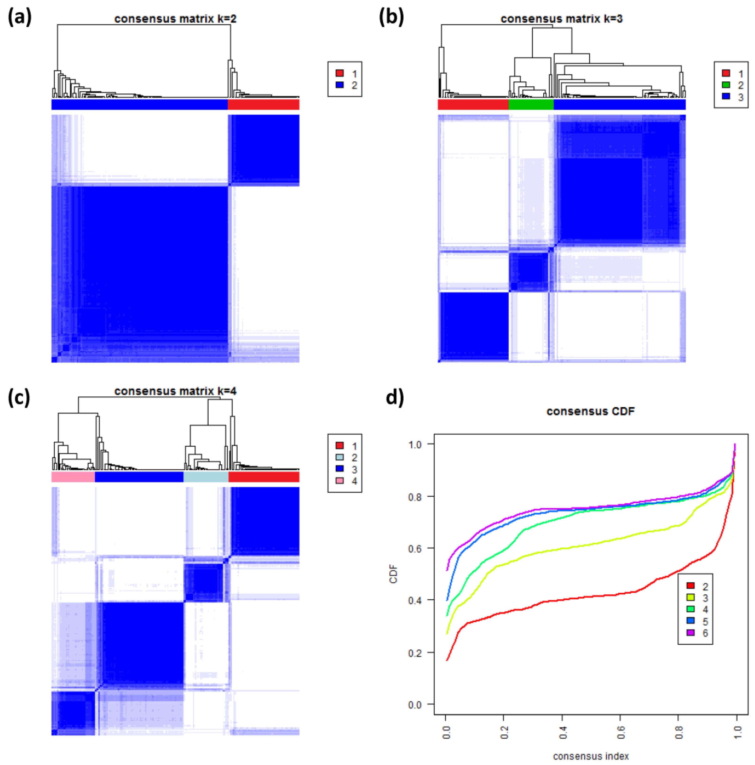
3.8. Consensus Clustering of B-Cell Lymphoma
To further validate our new subtypes we applied consensus clustering to estimate the optimal number of classes in the lymphoma data by an independent method which assumes class numbers
k ranging from two to six.
Figure 8a–c shows the heatmaps of the consensus matrix for two to four classes, respectively. Pairs of samples, robustly assigned to the same cluster, accumulate within one of the blue squares along the diagonal of the heatmap. The two-class approach basically divides the samples into an mBL-like and a non-mBL-like cluster (
Figure 8a). The three-class approach essentially splits the samples into the mBL/intermediate/non-mBL subtype structure as proposed in [
10] (
Figure 8b). The four-class consensus clustering resembles our new subtype classification with the two intermediate subtypes (
Figure 8c). The five- and six-cluster approaches virtually do not change this result: the additional fifth and sixth clusters collect only one and three outlier samples, respectively (data not shown).
The cumulative distribution functions (CDFs) allow judging the incremental gain of increasing the number of clusters (see
Figure 8d). The obtained CDFs support the four-class approach: the CDF converge for
k > 3 showing only small incremental changes with further increasing
k. Note that the increment between
k = 4 and 5 is caused by a single-sample cluster. Hence, consensus clustering confirms our four-subtype classification.
Figure 8.
Consensus clustering: (a–c) Cluster-heatmaps of the consensus matrices for class numbers ranging from two to four, respectively. Pairs of samples frequently found in one joint class accumulate in the blue regions along the diagonal of the map. (d) Cumulative distribution function (CDF) for class numbers ranging from two to six.
3.9. Functional, Molecular and Phenotypic Characterization of the New Subtypes
The four new subtypes are defined by their distinct expression patterns and their particular functional contexts,
i.e., they represent molecular subtypes. The question arises if these molecular subtypes associate with selected genetic, clinical, or alternative molecular phenotypes collected independently [
10]. We used these data and calculated the frequency distribution of patients for each of the characteristics over the four subtypes.
Table 1 reveals associations between these characteristics and the subtypes in terms of enriched or depleted patient numbers (
p-values are obtained from Fisher’s exact test). The full table of patient characteristics is provided as
Supplementary File 4.
Table 1.
Phenotypic and molecular characterization of the four new subtypes.
Table 1.
Phenotypic and molecular characterization of the four new subtypes.
| Characteristic a | | | Lymphoma subtype | | | p-value b |
|---|
| | | mBL* | intermediate A | intermediate B | non-mBL * | |
| Total | number of patients | 221 | 62 (28%) | 42 (19%) | 44 (20%) | 73 (33%) | |
| Age | <20 y | 32 (14%) | 26 (42%) | 0 (0%) | 1 (2%) | 5 (7%) | <0.001 |
| 21–65 y | 92 (42%) | 27 (44%) | 14 (33%) | 22 (50%) | 29 (40%) | |
| >66 y | 95 (43%) | 9 (15%) | 27 (64%) | 20 (45%) | 39 (53%) | |
| Gender | male | 127 (57%) | 40 (65%) | 26 (62%) | 23 (52%) | 38 (52%) | 0.44 |
| female | 91 (41%) | 22 (35%) | 15 (36%) | 20 (45%) | 34 (47%) | |
| Diagnosis | Burkitt's lymphoma | 15 (7%) | 15 (24%) | 0 (0%) | 0 (0%) | 0 (0%) | <0.001 |
| Atypical Burkitt’s lymphoma | 20 (9%) | 16 (26%) | 3 (7%) | 0 (0%) | 1 (1%) | |
| Diffuse large-B-cell lymphoma | 164 (74%) | 24 (39%) | 37 (88%) | 38 (86%) | 65 (89%) | |
| Mature aggressive B-cell lymphoma, unclassifiable | 18 (8%) | 5 (8%) | 2 (5%) | 5 (11%) | 6 (8%) | |
| Ann Arbor stage | I or II | 72 (33%) | 25 (40%) | 9 (21%) | 15 (34%) | 23 (32%) | 0.37 |
| III or IV | 82 (37%) | 19 (31%) | 15 (36%) | 22 (50%) | 26 (36%) | |
| Response to treatment | Complete remission | 68 (31%) | 27 (44%) | 8 (19%) | 10 (23%) | 23 (32%) | 0.40 |
| Complete remission, unconfirmed | 18 (8%) | 4 (6%) | 2 (5%) | 6 (14%) | 6 (8%) | |
| No change | 2 (1%) | 0 (0%) | 0 (0%) | 1 (2%) | 1 (1%) | |
| Partial response | 16 (7%) | 1 (2%) | 3 (7%) | 5 (11%) | 7 (10%) | |
| Progress | 24 (11%) | 7 (11%) | 4 (10%) | 7 (16%) | 6 (8%) | |
| Molecular classification | mBL | 44 (20%) | 44 (71%) | 0 (0%) | 0 (0%) | 0 (0%) | <0.001 |
| Hummel et al. [10] | intermediate | 48 (22%) | 18 (29%) | 11 (26%) | 10 (23%) | 9 (12%) | |
| non-mBL | 129 (58%) | 0 (0%) | 31 (74%) | 34 (77%) | 64 (88%) | |
| GCB-ABC classification | Activated B-cells | 58 (26%) | 2 (3%) | 26 (62%) | 15 (34%) | 15 (21%) | <0.001 |
| Wright et al. [45] | Germinal center B-cells | 120 (54%) | 53 (85%) | 10 (24%) | 18 (41%) | 39 (53%) | |
| unclassified | 43 (19%) | 7 (11%) | 6 (14%) | 11 (25%) | 19 (26%) | |
| Translocations | | | | | | | |
| MYC translocation | IG-MYC | 60 (27%) | 49 (79%) | 1 (2%) | 6 (14%) | 4 (5%) | <0.001 |
| non-IG-MYC | 15 (7%) | 6 (10%) | 5 (12%) | 2 (5%) | 2 (3%) | |
| neg | 144 (65%) | 7 (11%) | 36 (86%) | 35 (80%) | 66 (90%) | |
| BCL6 Break | pos | 37 (17%) | 2 (3%) | 9 (21%) | 11 (25%) | 15 (21%) | 0.002 |
| neg | 179 (81%) | 59 (95%) | 32 (76%) | 31 (70%) | 57 (78%) | |
| IGH Break | pos | 115 (52%) | 53 (85%) | 11 (26%) | 23 (52%) | 28 (38%) | <0.001 |
| neg | 103 (47%) | 9 (15%) | 30 (71%) | 20 (45%) | 44 (60%) | |
| t(14;18) translocation | pos | 25 (11%) | 5 (8%) | 2 (5%) | 6 (14%) | 12 (16%) | 0.19 |
| | neg | 193 (87%) | 57 (92%) | 40 (95%) | 37 (84%) | 59 (81%) | |
| Immunohisto-chemistry | | | | | | | |
| CD10 | low | 114 (52%) | 3 (5%) | 33 (79%) | 26 (59%) | 52 (71%) | <0.001 |
| high | 96 (43%) | 56 (90%) | 6 (14%) | 14 (32%) | 20 (27%) | |
| BCL2 | low | 62 (28%) | 38 (61%) | 2 (5%) | 7 (16%) | 15 (21%) | <0.001 |
| high | 153 (69%) | 22 (35%) | 39 (93%) | 35 (80%) | 57 (78%) | |
| BCL6 | low | 34 (15%) | 5 (8%) | 9 (21%) | 7 (16%) | 13 (18%) | 0.21 |
| high | 168 (76%) | 52 (84%) | 29 (69%) | 32 (73%) | 55 (75%) | |
| MUM1 | low | 66 (30%) | 29 (47%) | 7 (17%) | 8 (18%) | 22 (30%) | 0.001 |
| high | 139 (63%) | 27 (44%) | 33 (79%) | 32 (73%) | 47 (64%) | |
| KI67 | low | 125 (57%) | 17 (27%) | 26 (62%) | 26 (59%) | 56 (77%) | <0.001 |
| high | 89 (40%) | 44 (71%) | 15 (36%) | 14 (32%) | 16 (22%) | |
For
mBL* and
non-mBL* one finds analogous frequency distributions of a series of characteristics as described in previous studies, e.g., the age dependency [
10], the effect of the MYC-gene translocation [
10], different immune-phenotypes [
46] and the GCB-ABC-signature [
45]. Nearly 90% of the lymphoma assigned to the
non-mBL* and to
intermediate A&B subtypes are classified as diffused, large B-cell lymphoma (DLBCL) suggesting a close similarity between these three subtypes. A series of characteristics such as the IG-MYC status and immune-phenotypes CD10, BCL6 and BCL2 support this result.
However, the new intermediate A and intermediate B subtypes also show specific properties. Interestingly, the tumors with the activated B-cell (ABC) signature are clearly overrepresented in the intermediate A subtype, whereas the alternative germinal center B-cell (GCB) signature clearly depletes in this subtype. They also show differential characteristics with respect to the appearance of genetic aberrations (MYC translocation and IGH break) and to the BCL2 immune-phenotype: Firstly, the IG-MYC translocation is more frequently found in the intermediate B subtype compared with the intermediate A and the non-mBL* lymphoma. Secondly, intermediate A lymphomas less frequently show the IGH break and the BCL2+ immuno-phenotype than the other subtypes. Thirdly, intermediate B and non-mBL* lymphomas possess slightly enriched populations of t(14;18)(q32;q21) translocations, which juxtapose the BCL2 oncogene to the immunoglobulin heavy chain locus (IGH).
In the supplementary text (
Supplementary File 1), we provide a thorough analysis of the expression signatures of the subtypes, the co-expression network of the spot modules and their functional impact. It turned out that each of the subtypes is characterized by different hallmarks of cancer, e.g., proliferation and high transcriptional and translational activity in
mBL*; activated immune response and inflammation in
non-mBL*, innate immunity in the
intermediate A subtype and up-regulated expression of common cancer gene signatures [
47] in the
intermediate B subtype. Generic, MYC-related poor prognosis gene signatures [
48] are associated with the
mBL* and, to a lesser degree,
intermediate A subtypes. Moreover, we found that
intermediate A subtype lymphomas show expression signatures of activated B-cells and strong dissimilarity with expression landscapes of germinal center B-cells and healthy lymph node tissue suggesting different cell-of-origins. On the level of gene regulation, the decomposition of lymphoma into four subtypes obviously further diversifies into different modes which, in turn, reflect driving effects on the genetic and epigenetic levels. The understanding of these molecular mechanisms thus requires the combined analysis of genetic, epigenetic and transcriptional data.
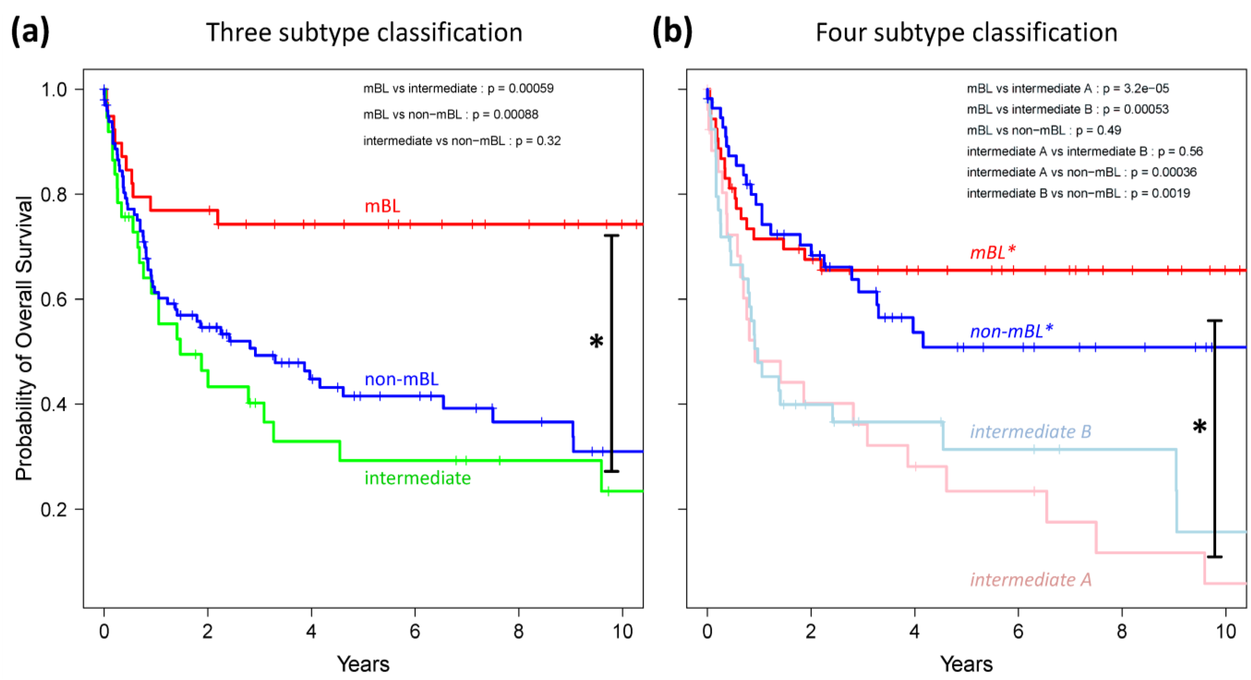
Finally, we generated Kaplan-Meier diagrams to estimate the probability of subtype specific overall patient survival as a function of time [
49].
Figure 9a,b show the curves for the three and four subtype classifications, respectively. Based on the original definition by Hummel
et al., patients with mBL lymphomas show significantly better survival rates as intermediate and non-mBL patients (
p < 0.001 in log-rank test, see also [
10]). In contrast, our new classification now reveals that both
mBL* and
non-mBL* patients show better survival rates than patients of the
intermediate A & B subtypes. Assignment of lymphoma to either of the two intermediate subtypes roughly halves the survival rate. The diversification of lymphoma subtypes thus clearly impacts prognosis.
A recent study also proposed new classes of B-cell lymphoma based on a correlation gene set analysis and using a larger patient collective [
42]. This study excluded mBL samples from the patient cohort and divided the remaining diffuse large B-cell cases into three classes. Their expression signatures and phenotypic characteristics show certain similarities with our
non-mBL*,
intermediate A and
B subtypes; however, they also differ in other properties, for example in the assignment of cell-of-origin properties and of energy metabolism signatures.
Figure 9.
Kaplan-Meier survival curves of the original three subtypes (a) and the new four subtype (b) classifications. Tick marks indicate patients alive at the time of last follow-up. Subtype specific survival curves are compared using log-rank test and the respective p-values are indicated within the figures.


