
Limits of Colour Perception in the Context of Minimum Dimensions in Digital Cartography


1
AGH University of Science and Technology, Department of Geoinformatics and Applied Computer Science, 30-059 Kraków, Poland
2
AGH University of Science and Technology, Department of Integrated Geodesy and Cartography, 30-059 Kraków, Poland
*
Author to whom correspondence should be addressed.
ISPRS Int. J. Geo-Inf. 2017, 6(9), 276; https://doi.org/10.3390/ijgi6090276
Submission received: 8 August 2017
/
Revised: 27 August 2017
/
Accepted: 28 August 2017
/
Published: 1 September 2017
Abstract
:The commonly used methods in digital cartography are based on the minimum dimensions of black and white objects. This article presents a solution in which both the colour of the symbols and the background on which they are presented are relevant in the context of setting the minimum dimensions of the objects on a map. To achieve this, the authors have developed a perception coefficient that is an extension of the formal definitions of minimum object dimensions. In support of the presented solutions, the authors offer several cartographic examples. The article also contains experimental research that examines the impact of colour on the recognition of objects by means of specially prepared surveys. These results are compared against the theoretical values of the perception coefficient. The research objective was achieved by developing new solutions that could be used in the cartographic production processes of any national map agency.
1. Introduction
There are no ideal maps. This controversial statement contained in the thesis [1] was the author’s motivation during this research. From a cartographic point of view, there is much truth in it, because even the most thorough map is only a model—an approximation of the real world. The way in which we perceive this model is an individual matter that is determined by a wide range of factors, including the psychophysical disposal of the map reader. Therefore, two different people can perceive the same map very differently. Thus, how can a fragment of reality be translated into an image on a map to meet the requirements of a wide audience? In other words, how can a map be developed that will remain readable for most people in a range of usage conditions?
Seeking answers to these questions, cartographers have developed a series of principles that perform the role of symbol posts during the graphic design of map elements based on the assumptions of behavioural and cognitive psychology and semiotics [2,3,4,5,6]. However, among the many rules that govern cartographic visualisation [7,8], it is difficult to find any unambiguous solution that can comprehensively describe how to select a colour palette for map symbols. One approach concerns the graphic design of a map based on Rudolf Arnheim’s rule of order [9,10]. The author claims that proper alignment, establishing relationships between objects, and pre-processing will allow symbols, colours, or patterns to match the capabilities of a viewer’s perception and cognition of the map. This method can be considered as a general step-by-step guide to designing perceptually customised maps.
However, the influence of colour on the dimensions of elementary map components (i.e., single objects) has not yet been formalised. Perception of achromatic figures is different from the perception of those in colour, so it is worth considering whether the principles set out for symbols in black and white are relevant for their chromatic representation, as most maps are produced in colour. These issues may lead to a change in the understanding of geovisualisation as a whole; digital cartographic generalisation, the fundamental assumption (unambiguity) of which is based on rigidly set standards, is appropriate only for achromatic drawing.
Following the Introduction, Section 2 addresses the common issues related to visual perception of colour objects on maps. The authors’ thesis is presented in Section 3, along with pre-processing methods. Section 4 contains a definition of a perception coefficient that is dedicated to the minimum dimensions of colour objects on a map. Section 5 deals with some practical examples of line simplification and design of map symbols. The experimental evidence of the proposed solutions using questionnaires is shown in Section 6. Section 7 contains a statistical summary of the results. Finally, discussion and conclusions are summarised respectively in Section 8 and Section 9.
2. Visual Perception of Colour Objects on Maps
Perception is a relative term and many complex cognitive processes are involved, including sight, which is an extremely complex process of receiving sensory impressions. Pyka [11] argues that the Human Visual System is not fully understood, despite many studies, especially in the case of the perception of stimuli. The processes that accompany visual perception become clearer if we assume that the key function of the human visual system is to extract and correctly recognise (distinguish) objects’ properties in the surrounding world [12]. The extraction and reduction of information in the context of visual perception and the experience of map users was empirically investigated by Bektas et al. [13], where the authors tested the possibilities of gaze-contingent displays (GCDs) by testing different HVS models, including models of contrast sensitivity, colour perception and depth of field.
As is explained by Fiser et al. [14], visual perception is a process that interprets spatiotemporal changes of light reaching the retina, where descriptions of shapes, surface characteristics, and the location of objects are formed. This definition is consistent with the physiology of eyesight, which engages the intellectual capacity of the recipient.
The aforementioned definitions are consistent with [15], where it was noted that the human visual system requires concurrent operation of the eyes and brain; the human visual system acts as an image processing system, equipped with a mechanism for extracting and interpreting separated information.
Besides physical conditions, the level of information interpretation ability depends on the individual characteristics of a person, i.e., individual visual capabilities, psychological factors, motivation, intelligence, and general health [16]. Moreover, as shown in the work by Patterson et al. [17], another important factor influencing the way we understand the map is the approach to geographic education, e.g., hypsometric tins reading, which differs in Europe and North America. Therefore, visual perception is a highly controversial issue in contemporary science [18]. The author agrees with this statement, while stressing that this opinion is correct for studies of perception in general.
Thus far, analysis has related only to various aspects of the reception of visual stimuli; however, as Pastuszak writes, “Certainly it should be something physical in the process of viewing between the object and the eye (and that something is light)” [19]. He also stresses that the mystery of visual perception is even further intensified by colour. This statement seems to have been proven by the latest methods of visual perception measurement, where the readability of cartographic products is empirically assessed using EyeTracking [20]. An example of such study is the article by Brychtová et al. [21] where the authors examined the relationship between colour distance and font size on map readability. Moreover, as it was shown in article by Çöltekin et al. [22], the EyeTracker could be also used to assess the perceptual complexity of soil-landscape maps. Furthermore, three main visual variables (colour hue, size and frequency) in the context of visual perception of animated traffic maps were tested using the EyeTracking method [23].
Considering these findings and the practical dimension of research on visual perception [24,25], it can be seen that colour and the way we perceive coloured stimuli are key factors in the quality of vision.
This fact prompted the author’s reflections on the perception of colour objects on maps, which is a principal part of this work. This issue is particularly important in the context of cartographic generalisation, because it affects the automated design methods by which the subjectivity of the cartographer can be minimised [26,27]. Therefore, the question of how the perception of maps in colour (after graphic design) differs from the raw data in a database (Digital Landscape Model) needs an answer. The literature still leaves the design rules of colour maps undefined. Ostrowski [28] states, “Not much attention has been paid to the formulation of the practical rules and principles of graphic design of maps, except for the use of colour scales in cartography”.
Cartography manuals contain guidelines on colour as a collection of generalities or “best practices” in which there is no quantitative guidance, which is quite important in the context of automatic generalisation. An interesting example is the book [29], in which the authors collect and precisely define the minimum dimensions specific to each type of symbol and the content of topographic maps. In the context of colour objects, the authors only mention that the proposed dimensions are only suitable for the colour black; in the case of brighter colours, the dimensions must be increased proportionally (no information is given about the proportions, colour, or background; only one example is given of a green point whose dimensions were enlarged by 100%). Ostrowski [28] citing Kelnhofer [30] states that, if the minimum thickness of a black line is 0.05 mm, in the case of a colour line (red or blue), it should be increased to 0.1 mm. These rules are not specified for other colours and the impact of background colour is excluded. It should be noted that these dimensions were obtained empirically after many years of work and the authors’ extensive experience. Robinson [31] emphasises that graphic symbols do not necessarily go hand-in-hand with a sense of art, but must be supported by experience gained empirically.
The author of this work does not undermine the rules described above, nor deny the importance of knowledge and skills resulting from long-term practice or analysis of existing solutions. The aim of these considerations is to determine a quantitative coefficient of the perception of colour symbols that complements the knowledge contained in these studies. The presented solutions could also be linked to the minimum dimensions specified for symbols in black and white (e.g., [29,32,33]).
3. The Issue and Thesis
The theory concerning minimum dimensions of map objects is well known and is based on the limits of visual perception that determine the physical limitations of normal map reading. Studies to determine the minimum dimensions have been conducted (e.g., [29,34,35,36]). Furthermore, despite considering the impact of line width on the readability of maps, the authors of these works do not mention the effect of colour and background colour. In each of the aforementioned studies, these minimum dimensions are specified for the greatest possible contrast between white and black. The influence of colour graphic design on perception has not yet been determined. Perception of achromatic figures is different from that of colour symbols; therefore, commonly known minimum dimensions cannot be used directly in cartographic generalisation. The consequences of this approach are revealed in the following four aspects:
- A decrease in map readability that affects the aesthetics of the final product and visualisation;
- A loss of unambiguity of the generalisation process, as, when the correction of object dimensions performed (e.g., during graphic conflict resolution) is based on unspecified and unformalised guidelines, it is non-deterministic;
- The lack of automation of cartographic generalisation, which so far requires manual human intervention; and
- Not taking into account the impact of background colour on the readability of map symbols (how much does the perception of a blue river change when the canvas on which it is presented changes colour from white to green?).
The aforementioned circumstances led the authors to determine a quantitative measure that defines the level of map legibility decline due to the use of colour symbols. Based on the relationship between the function of visual acuity and colour contrast, the authors proposes that the colour contrast calculated between any map object and its background makes it possible to develop a perception coefficient of colour map objects that formally and unambiguously is an extension of the widely used minimum dimensions on digital maps.
3.1. Selected Factors Affecting Human Perception
The process of distinguishing details by sight comprises factors determining the performance of the human visual system, the characteristics of the observed detail, its size, colour, and the background on which it is located. Werner [37] demonstrates that observation time, which may vary depending on the level of contrast (for contrast definition, see Section 3.2), has a symbolic impact on the quality of vision. In the case of the visual system, the critical components are the ambient luminance and the observer’s position in relation to the observed object [15]. Additionally, analysis of the characteristics of the observed object and object-background contrast has shown that increasing the contrast between a visual task and its background increases the accuracy of its perception, which can also be expressed by the value of Threshold Visual Performance that was defined by Blackwell [38]. This value presents accurate perception as the probability of correct identification of an object depicted against a solid background. The value of the Threshold Visual Performance depends on the luminance contrast of the object and its background [15].
The contrast at which 50% of details are identified is called Threshold Luminance Contrast. Blackwell [39] shows that Threshold Luminance Contrast depends on the age of the observer. In the context of visual perception definitions, Wolska [16] characterises the parameters of the visual reaction: “to even see the visual task, it must be illuminated to a minimum level, and also must have a sufficiently large minimum size and a minimum contrast with the background. It was assumed that the visual response depends on two parameters: the size of the detail and the detail contrast with the background”. If we exclude the physiological factors of the viewer, as well as the time and angle of the observation, it leads to the conclusion that the contrast between the observed object and its background has a great influence on the accuracy of the recognised details.
These concepts affect the relations between the physical parameters of visual perception and light stimuli; however, transforming them into rules for the optimal clarity of digital maps is not possible due to the ambiguity of values that correspond to them. For example, how can the percentage of recognised details of an object at a given contrast be translated into a change in its size? When considering only the size of the object, or rather its influence on visual perception, we can assume that it is the same as the minimum dimensions [29,36]. However, assigning colour attributes to objects should adapt them to the perceptive abilities of the recipient.
3.2. Contrast
Recognizing the sum of object details at a certain time is defined by Blackwell [39] as useful vision. The authors argues that an essential element of useful vision is contrast, which allows for a subjective estimation of the difference between the two parts of the field of view that are observed simultaneously or sequentially.
There are several definitions of contrast [15,40,41]; therefore, it is necessary to choose them correctly to avoid ambiguity. Some bypass perceptual experiences and concern the physical aspects of visual stimuli (differences in physical values such as luminance), which are closely related to colourimetry. Therefore, it is necessary to distinguish the concept of contrast as a difference in physical values (luminance contrast) from contrast as the impression of visual perception, which should be explained in terms such as a difference in perceived colour or a difference in perceived brightness (for black and white characters). The difference in perceived colour that makes it possible to translate physical to perceptual attributes can be expressed in the simplest terms by Equation (3) (the authors are aware of further modifications to the ΔE formula; nonetheless, for the purpose of these studies, it is assumed that the aforementioned version is sufficient), defined by the CIE [42,43]:
where represent two colours in L*u*v* space.
The authors decided to use CIELUV due to its perceptual character (this colour space is also designed for digital photography and images rendered on monitors (light emitting devices), which is very important in the context of the presented issues). Colour contrast, expressed by the colour difference (Equation (3)), also determines the difference in brightness, which can be defined as the ratio of the brightness of the object to the brightness of white. However, brightness is dependent on physical luminance (which should be understood as an analogy for luminance contrast), colour difference, and saturation. Considering the fact that the discussion concerns coloured map objects, this choice appears to be legitimate. Moreover, brightness is based on perceptual attributes, which are determined based on the value of physical stimuli for a standard colourimetric observer (the average eye of the average observer and its mechanisms of perception).
The importance of contrast in the process of identifying details of objects is described by Bąk [40], who stated, “due to contrast, the visualisation of object details or a general outline of the object occurs”. We see not only because of light, but also because of contrast.
4. The Perception Coefficient of Colour Objects on Maps
With reference to the theory quoted above, there is a need to capture the effect of reducing contrast on the ability to recognise details (e.g., the shape of map objects at a given scale). Such events can be expressed with the visual acuity function, which is defined as the ability to separate objects that are close to each other. Quantitatively, visual acuity can be expressed as the minimum angle of discernment, i.e., angular distance, for which a unit is a minute of an arc [40]. This is usually the angular size of the smallest detail that the eye can recognise [16,44,45]. It may be practically assumed that visual acuity increases in proportion to background luminance (luminance of light in the case of monitors/screens), size (shape) of the object, and the contrast between the object and its background [40]. This simplification allows the visual acuity function to be used during the process of graphic map design and, more specifically, to determine the rules of sufficient visibility of topographic symbols on digital maps.
The above statement has support in the literature; for example, Ostrowski [28] writes that visual acuity determines the minimum angle at which a map object is recognisable, as it sets its threshold for visibility. Furthermore, Robinson [46] in the publication Elements of Cartography found that the visibility threshold is determined by the minimum discriminate angle of 2′ equals 50 cm of observation distance, which gives a minimum object size of 0.3 mm. Nonetheless, this minimum object size was developed for analogue maps. Its adaptation for use in digital technology requires modification based on the monitor resolution and pixel size. A similar solution for digital maps is used by the Swiss NMA [29], where the minimum dimensions are based on the minimum number of pixels for certain symbols. In addition, Ostrowski states that visual acuity is only an average value that has only theoretical importance in the context of the different characteristics of map symbols. The author agrees with this point only partially. The value of visual acuity itself does not actually have a practical dimension, but linking it to minimum dimensions will allow us to determine how to change their visual perception after the graphic design/editing process (how much should I increase the size of the object so that after its change of colour it remains readable?). These ideas are consistent with the information given in [29], in which visual acuity is distinguished as a determinant of the minimum dimensions of topographic maps. These dimensions were determined assuming good contrast between an object and its background. Under less ideal conditions, the authors recommend a proportional increase in dimensions, without specifying the size ratio. Therefore, it was necessary to determine the effect of contrast (background-object) on visual acuity.
The relationship between visual acuity and contrast was proposed by Golik [47]. For low contrast values, a small increase in the luminance contrast is accompanied by large changes in the relative field of view.
Studies on the impact of contrast and background luminance on visual acuity have also been conducted by the authors of [48], who support their solutions by the equation proposed by Kaneko [49]. Moreover, a function was proposed using empirical data [50] that describes the dependence of visual acuity on luminance contrast and background luminance. This equation has the following form:
where is the visual acuity (rcmin−1), , is the background luminance, and is the contrast (%).
The above equation was used to determine the perception coefficient of colour map objects, which is indicated with the symbol Pc.
where is the perception coefficient of colour map objects, is the visual acuity (arcmin−1) and is the reference visual acuity for the contrast C% = 100 (arcmin−1).
After bringing the above equation to the form:
We can simplify it thus:
Example coefficient values are shown in Table 1. An eightfold increase of minimum size (at a contrast of 2%) is a result of the threshold values of the eye when distinguishing contrast. Some studies indicate that this threshold is 1%. Such a low contrast visual system is able to recognise objects only of considerable size.
The reference luminance contrast is 100% contrast, for which both Speiss [29] and Chrobak [51] assigned the minimum dimensions for topographic map objects. However, it should be emphasised that their considerations were related only to monochrome images, for which fluctuations of Weber’s contrast between a map object and its background clearly indicate the level of map perception disorder. Therefore, Equation (7) only makes sense for maps which use grayscale. In the case of chromatic map objects, further modifications are required to take into account the colour contrast of map symbols (the difference between two colours—see Equation (3)). In the context of these considerations, the necessary condition is to link the visual acuity function to the colour contrast.
Post, Constanza and Lippert [48,52] indicate the relationship between luminance contrast (monochrome) and colour contrast. The authors showed that the correlation between colour contrast (represented by three independent components of the adopted colour space (L*u*v*)) and monochrome contrast greatly simplifies the graphic design of efficient colour images viewed on a monitor that are adapted to the perceptive capabilities of the recipient.
As for CIELUV, the relationship between luminance contrast and colour contrast is expressed by the following formula:
where is the luminance contrast expressed as the function of colour contrast; and , and are the differences between two colour components in L*u*v* colour space.
The above relation makes it possible to bind the colour contrast to the function of visual acuity (4) that was used to determine the perception coefficient (7).
Assuming the contrast between black and white is the reference contrast for which minimum dimensions were defined, the perception coefficient of colour map objects takes the following form:
where is the reference contrast (the difference between black and white), is the contrast between any two colours in relation to the background, and .
Example values of the perception coefficient for the selected pairs of colours are shown in Table 2.
The above form of perception coefficient is based on a perceptual difference between two colours in relation to the background and is related to the visual acuity function. This approach makes it possible to specify the impact of significance of the colour on the recipient’s (observer’s) perception. (In the context of the minimum dimensions of paper maps, a significant phenomenon is colour assimilation. For very small objects occurring close to each other (minor points, thin lines), the colours of these objects and of their backgrounds begin to resemble each other. This phenomenon is used in offset printing (in which dots are sufficiently small that there is not only subtractive colour mixing, but also additive mixing of waves of the reflected colour stimuli). Therefore, we are dealing with the impression of a reduction of contrast). In other words, the perception coefficient can unambiguously answer the question: how much should the minimum dimensions be increased if the objects (map symbols/symbols) are in colour?
The proposed solution has a universal character; therefore, the perception coefficient can be used both with the minimum dimensions specified in the book [29], and with the recognition norms suggested by Chrobak [31,33,51]. Table 3 shows example recommendations for colour map symbols (based on the perception coefficient) for which the monochrome counterparts (left side of the table) were proposed in [29] as minimum dimensions. Visual assessment of the contrast leads to the conclusion that point features have the highest contrast value (this observation coincides with the values of Pc).
5. Practical Examples
Minimum dimensions of objects also include the distance between two adjacent lines and a minimum length thereof whose maintenance makes the identification of its details possible. The norms governing these dimensions were proposed by Chrobak [34] using elementary triangles.
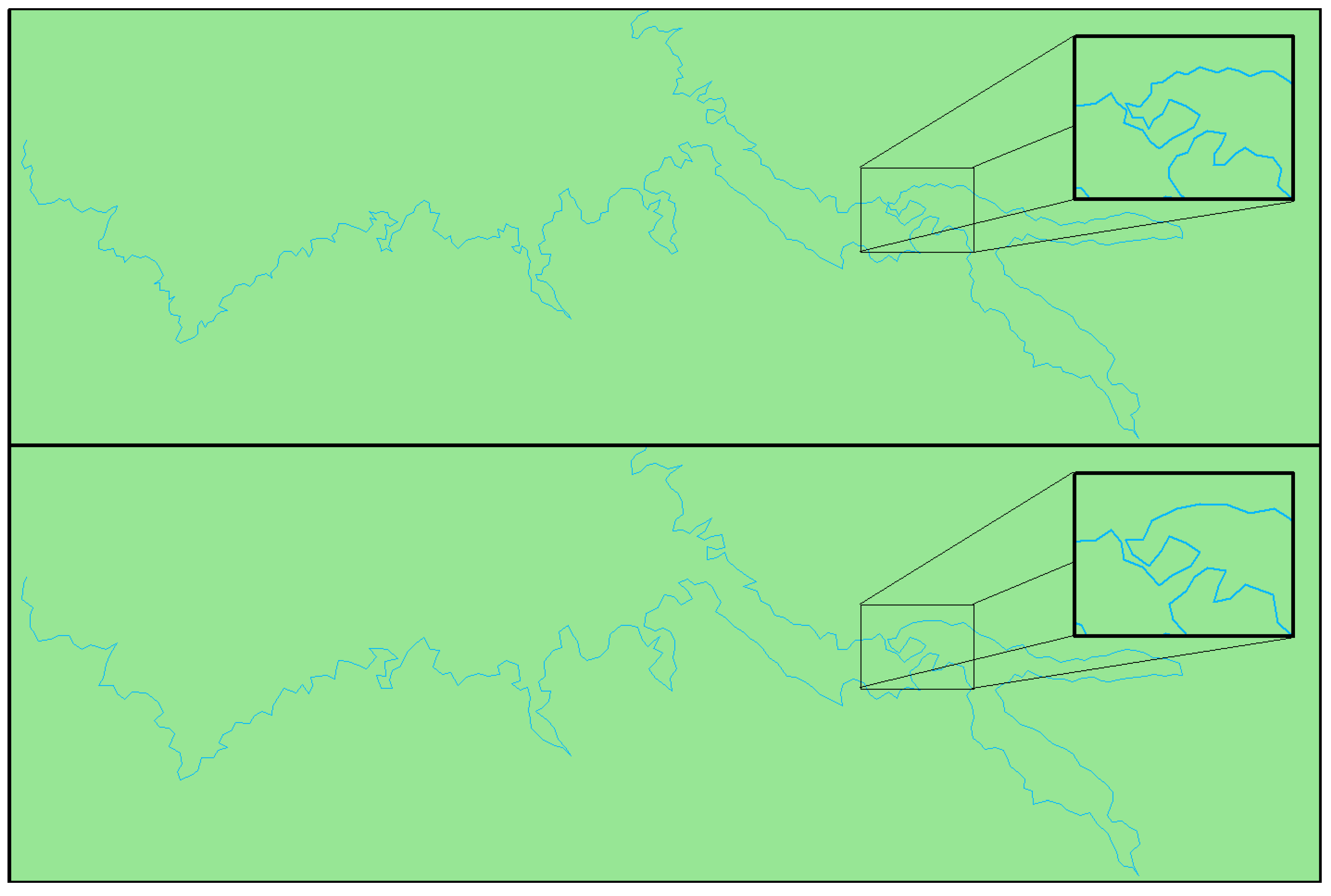
In order to illustrate these principles in practice, a comparative analysis of two lines generated using Chrobak’s [51] simplification algorithm was conducted. The adopted operational scale was 1:250,000. In the case of the first line (Figure 1, top image), it was simplified with recognition norms (minimum dimensions) for monochrome objects. In the line below, the input parameters of the algorithm were modified in order to adapt them to their colour form (including Pc). The numeric results of the simplification are presented in Table 4.
The values listed in Table 4 illustrate the quantitative differences between the results of the simplification monochrome and colour line simplification. The experiment included an adaptation of the line dimensions to its coloured background and therefore to the perceptual possibilities of the recipient. In addition to reducing the number of vertices, we can observe an increase of the average segment length that results in more easily identifiable details. The visual comparative analysis of the lines shown in Figure 1 demonstrates that the perception of the line simplified using the Pc coefficient (Figure 1) increases. This is manifested, among other things, by reducing the number of details that are unreadable due to colour symbols. When comparing these lines, it should be remembered that they were created because of the simplification. Furthermore, their perceptual level of detail was reduced to a minimum.
Therefore, the perception coefficient of colour map objects should be understood as a determinant of the minimum level of detail to which the minimum dimensions should be adjusted. Moreover, this adaptation should be done while ensuring that the result is an appropriate Digital Cartographic Model and taking into account the impact of the background colour (which was previously neglected in all studies).
Figure 2, Figure 3 and Figure 4 illustrate the discussed conclusion. Figure 2 contains point features (trees) whose size is consistent with the classic minimum dimensions (monochromatic). Figure 3 demonstrates the decrease in perception (and the drawbacks of monochromatic dimensions) that occurs because of the colour assignment to the features. The application of the perception coefficient (Pc = 1.62) can be seen in Figure 4, where the size of features has been adapted to the applied colours.
The difference between monochrome and minimum colour dimensions should be subtle and not disturb the geometry of objects (Figure 3 and Figure 4). An endorsement of the approach presented in this paper can be found in the publication by Speiss et al. [29], in which the authors state that the minimum dimensions are at the absolute minimum of perception and therefore should be increased as much as possible.
However, because differences in perception and readability may be difficult to assess, the authors decided to conduct additional research to prove the validity of their claims.
6. Empirical Tests
Experimental surveys were conducted to verify the validity of the presented theses and the empirical examination of the suggested Pc perception coefficient formula. Fifteen respondents completed a questionnaire examining the differences in the recognisability of polyline shapes according to the colour contrast on a map. The survey was prepared as an interactive SVG graphic (Figure 5). SVG files were viewed and filled on an Iiyama 22 inch ProLite e2207WS monitor.
The survey included five colour cards. The colours were chosen according to the directive of the Polish Minister of Interior and Administration of 17 November 2011 on the database of topographic objects and databases of general geographic objects, as well as standard cartographic works. This directive defines colours in the CMYK colour space. To apply these colours in an SVG file displayed on a monitor screen, they were converted to RGB colour space using the CMYK ISO Coated v2 (ECI) and sRGB IEC61966-2.1 (Table 5) colour profiles.
On each colour card, there were 360 boxes containing a 0.1 mm wide line break with a 0.05 mm increment (Figure 6). The line break was made up of a triangle whose height and base were 0.15–1.00 mm and 0.05–1.00 mm, respectively.
The respondents’ task was to mark the shapes they recognised as line breaks, which is equivalent to recognizing the “light” of the line triangle [33]. On all cards, the layout and dimensions of the triangles in the corresponding fields were the same, and the variables were only the colours of the symbol and the background, and thus the colour contrast. Thanks to this assumption, it was possible to check whether the theoretical value of perception of Pc was reflected in practice by comparing respondents’ answers on colour cards (K2–K5) and black and white (BW) cards.
The idea of interpreting the results on individual questionnaires was based on three assumptions:
- The triangular refraction of the smallest dimension is undoubtedly unrecognisable by respondents.
- The triangular refraction of the lines of greatest dimensions is certainly recognised by respondents.
- Among the remaining cells on the card, some cards contain shapes with dimensions that allow them to be recognisable; some of these shapes remain unrecognisable.
The respondents indicated the cells they considered recognisable in each row. The selection was made by clicking the button in the cell (Figure 7). All cells to the left of the marked one are automatically marked unrecognisable.
Sample survey results for one respondent are shown in Figure 8. The following results clearly show that the “area” of recognisable shapes is greater in the case of maximum contrast.
Based on the questionnaire, regression models were made showing the triangular shape of the broken line depending on its height and width.
Respondents were student volunteers with a background in geomatics. These were eight women and seven men aged 20–30.
7. Results
Based on the questionnaire, regression models (Figure 9) were made showing the recognisability of the triangular shape of the polyline depending on its height and width. According to the theoretical assumptions contained in the publication by Seber et al. [53], a nonlinear regression model was constructed using the power model (Equation (10)) and the least squares method.
where b0 and b1 are the model coefficients, Y is the dependent variable-visibility of signs, and X is the independent variable-visibility of signs.
As a result, 15 models for single questionnaires were collected for five types of questionnaire. The boundary lines separate the area where characters are not recognisable (below the curve) and above, where they are recognisable.
Based on the survey conducted, it was found that the results of three respondents differed from the others. For this reason, two regression models were used: the first included all respondents R(15r) —regression model of 15 responses, while the second excluded rejected respondents 3, 4, and 10, R(12r)—regression model of 15 responses.
A measure of the R2 determinant was used to evaluate the quality of the resulting models by evaluating the value of the explained variation of the original data. In addition, the Mean Absolute Percentage Error linear correlation was calculated by comparing the theoretical models obtained. All calculated models are statistically significant at p = 0.05 (see Table 6).
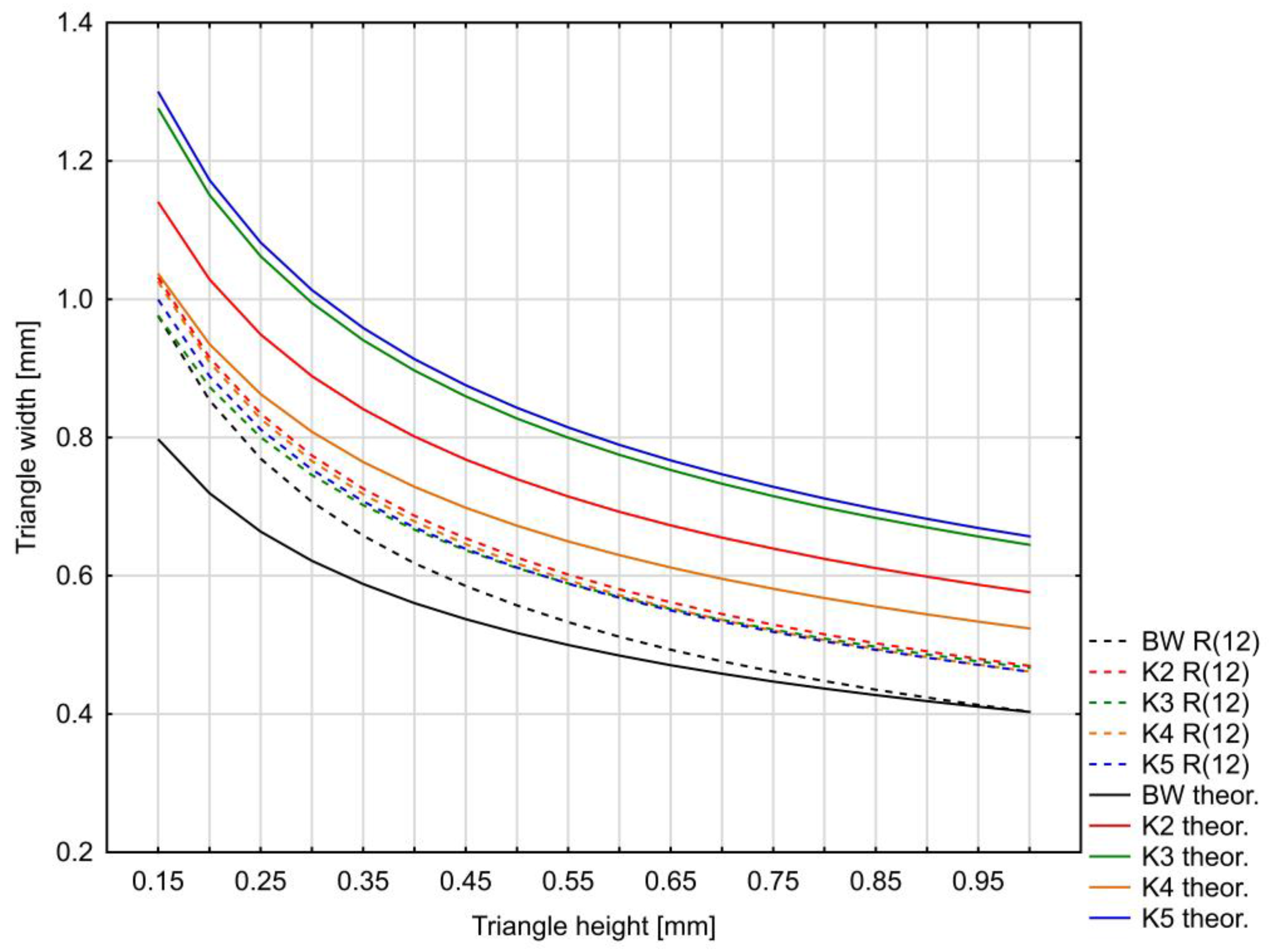
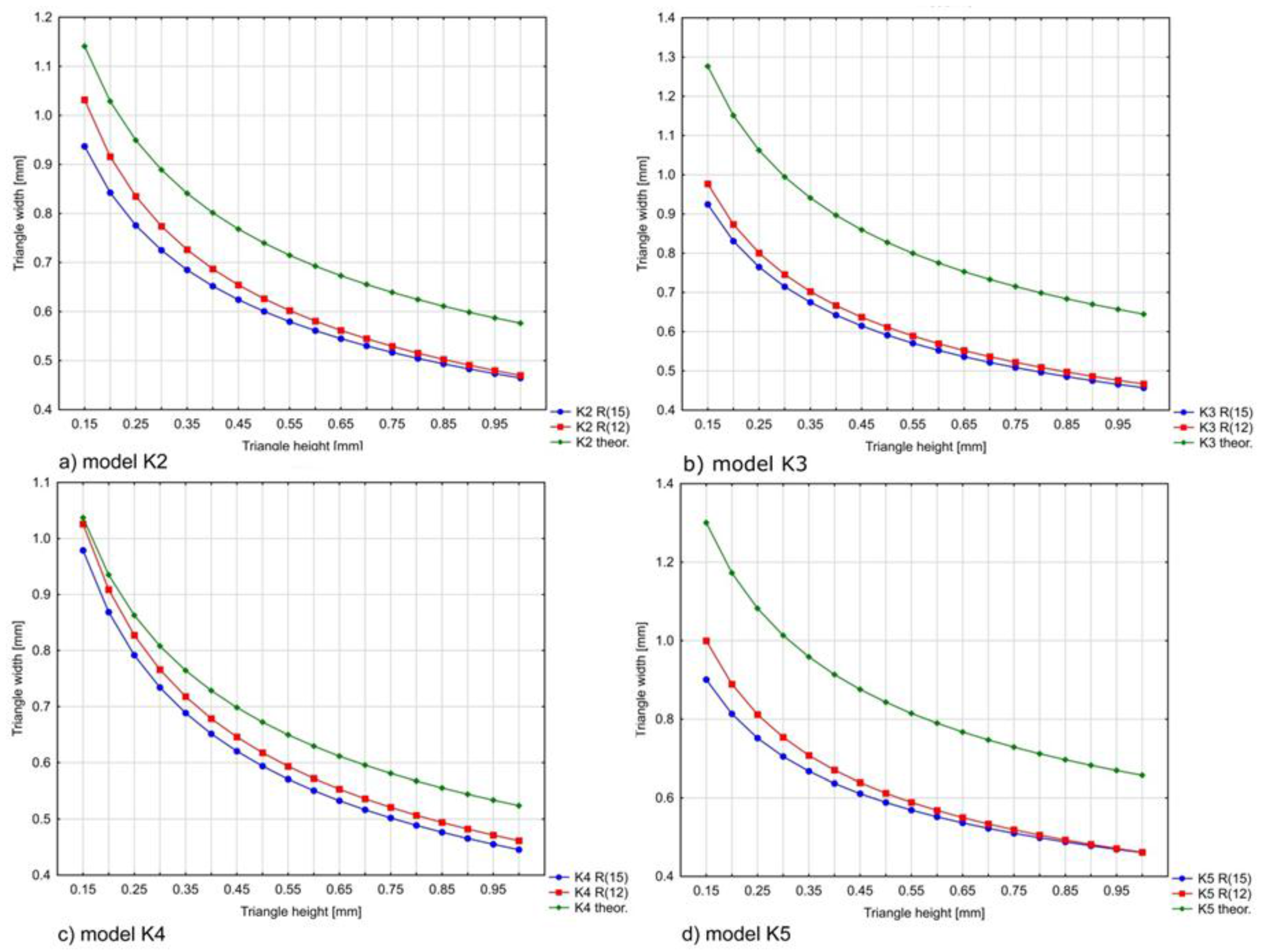
Figure 10 and Figure 11 show the comparison of the curves for each model (BW and K2–K5) and the theoretical curve. The theoretical curve contains values calculated from the perception coefficient formula Pc (Equation (9)). In other words, these graphs represent a comparison between the minimum size of colour symbols that were readable by respondents and those calculated theoretically.
Models that do not take into account the three surveys R(12r) show a better resemblance to the theoretical curve (Table 6, and Figure 10 and Figure 11). The biggest difference between the theoretical curve and the models is for surveys K3 and K5. However, even for these surveys, the shape of the model is preserved and the quality of the fit is better for the R(12r) models. For the remaining models, the theoretical and regression models show a good similarity that can be observed in the graphs and the table.
A summary of all curves for the R(12r) model with theoretical values is shown in Figure 12.
Matching the theoretical line with multiple regression using the least squares method is the most commonly used method of modelling real data [54,55]. The advantage of multiple regression is the relationship between the height and width of the triangle and their influence on respondents’ perception. The survey models are characterised by a relatively low value of the determination coefficient R2, which is related to individual differences in perceiving colours and shapes (see Table 6), and the high variability of the information about the visibility of the characters included in the surveys. The value of the determination coefficient does not exceed 0.46 for colour model (K4) and 0.38 for black and white (BW). The calculated MAPE (Mean Absolute Percentage Error) value for models does not exceed 30% and for individual models is less than 10% (models K4 and BW). This means the models match the survey data quite well, despite the calculated R2 value. The correctness of the multiple regression models can also be proven by the high correlation of data, which is close to 1.0 for all models with questionnaire data and the theoretical model presented above. Comparison of BW models based on surveys R(12r) and R(15r) and the theoretical model shows their similarity and a slight error between them (Figure 11). Moreover, for one of the colour models, the similarity between the theoretical and regression models is also high (model K4, Figure 10). A good fit for the two BW models and K4 indicates the correct direction of the research. Further research will require a larger number of surveys to improve the multiple regression models.
8. Discussion
The solutions presented in the article are universal in that different NMAs in different countries apply different standards in terms of the minimum dimensions of objects. What connects these standards is the definition for black and white and the lack of consideration for the reduced readability of cartographic symbols presented on coloured backgrounds. Therefore, the perception coefficient can be applied in the process of automatic generalisation; more specifically, it can be applied in the automation of graphic design of maps.
The examples presented in section four are related to point symbols. Nevertheless, the same principle would apply, for example, to the spacing between lines or buildings, because these spacings were also determined based on the perceptive capabilities of the user. Literature examples include solutions based solely on the greatest possible contrast between white and black, and thus the situation in which a user best distinguishes details.
Section 5 presents GIS examples of simplified linear objects in which a river is presented on a green background. Another example illustrates the differences between the perception of black and white objects and the classic DLM, in which colours are automatically assigned to objects and do not cover layer themes. The use of the perception factor has definitely increased the readability of point objects (in the case of poor map content (several layers)).
Section 6 presents the results of experimental research carried out on the respondents. In Figure 12, the results show the convergence of theoretical considerations and the black-and-white survey questionnaires. In the results for specific colour cards (Figure 11, K2–K5), we observe a similar constant difference between the theoretical values and the survey results. This difference (the distance between the curves) should be treated as an error. This error consists of factors that were skipped during the design of the perception factor: observation time, intellectual ability, eye defects, ergonomics, environment, and type of monitor. Consequently, the minimum size of objects, which is increased by the perception coefficient, should be understood as the optimal size that takes into account the aforementioned factors. In other words, the difference between the theoretical and empirical values will be less if we take into account the individual characteristics of the receiver and the parameters of the device. In the case of human characteristics, this is impossible, because, when creating a map, we want it to be legible for everyone. As for the parameters of the device, this will be part of the further research by the authors.
The intention of the authors of the article is not to develop a finite set of minimum measures taking into account colour, but to give general principles for the convention of increasing the recognisability of a map. In this way, an experiment was prepared in which the relative differences in the recognisability of the shapes on the map were examined. The experiment did not check recognition of a specific value of the minimum dimension, but rather a set of 360 pairs of such dimensions for the four colour composition and a monochrome one. Such an approach, in the opinion of the authors, will allow at least partial generalisation of the results of the experiment.
Future research includes further studies of the perception coefficient in order to clarify it and reduce errors. The CIECAM02 model will be tested, which takes into account the conditions of observation. Moreover, the authors plan new research using a colourimeter to see and assess the true colours on a computer screen. The authors also assume that the presented solutions will be expanded by a factor that changes the Pc value depending on the type of object (e.g., different for a point on a uniform background or for lines and the minimum distance of line spacing).
9. Conclusions
The issues presented in this study include the multi-faceted visual perception of digital maps and its role in the context of geovisualisation and automation of cartographic generalisation. Automatic map production methods minimise subjectivity, which was previously the cartographer’s domain. Cartography handbooks consider issues related to colour only from the context of tools, disregarding its impact on the legibility of the information provided by the map.
In the context of the aforementioned subjectivity, we can observe a certain paradox. On the one hand, modern cartography aims to automate the generalisation process fully. On the other hand, there is little reflection on the substitution of the subjective factor (the cartographer), which affects the final appearance of maps. Therefore, the task faced by the authors was to develop restrictions (conditions) that could be used as input parameters to simulate the cartographer’s decision processes. Therefore, a perception factor (Pc) was developed, which allows for better mimicry of the subjective decision of the cartographer, increasing the degree of readability of the symbols. This coefficient is a universal modifier for the set of minimum dimensions used in different NMAs. Further, this solution is a quantitative and qualitative answer, indicating how much the readability of each symbol locally decreases when it is presented on a specific colour background. The theoretical considerations of the authors were supported by empirical research, based on the author’s own method of map symbols readability testing. In the case of shapes of a simplified line with limited recognisability, the study showed a decrease in perception and readability of the symbols, depending on the contrast. Moreover, the existence of correlation between the observed results and the presented solutions was also noted. Therefore, the solutions presented may be universal, and further research by the authors will show whether they can be applied to all types of symbols in connection with generalisation operators on digital maps. These conditions, in the form of minimum dimensions, play a batch role in restrictive modelling, thus determining the manner and process of generalisation. Furthermore, they indicate how the readability of the map changes when the database objects are identified with the target colour or symbols (the perception coefficient). Therefore, restriction generalisation models, which are methodologically the most advanced, are able to control the visual quality of the final product. This control, which already occurs at the level of creating and editing object geometry, will greatly simplify the post-processing stage, which usually involved the manual corrections of cartographers. The implementation of solutions that satisfactorily enable the automation of the whole process of map production will be part of a further study by the author.
Acknowledgments
The work is partially financed by the funds of the Faculty of Geology, Geophysics and Environmental Solutions, AGH University of Science and Technology in Krakow and also Department of Integrated Geodesy and Cartography (AGH University of Science and Technology) no. 11.11.150.444.
Author Contributions
Michał Lupa put forward the original idea and designed the methodology, performed the examples and drafted the manuscript. Stanisław Szombara performed the experiments, analysed the data and revised the manuscript. Monika Chuchro conducted and described the statistical analysis. Tadeusz Chrobak checked the experiments and revised the manuscript.
Conflicts of Interest
The authors declare no conflict of interest.
References
- Żyszkowska, W. Semiotyczne Aspekty Wizualizacji Kartograficznej; Seria, Studia Geograficzne; Publikacje Wydawnictwa Uniwersytetu Wrocławskiego: Wrocław, Poland, 2000. [Google Scholar]
- Brewer, C.A. Spectral Schemes: Controversial. Color Use on Maps. Cartogr. Geogr. Inf. Syst. 1997, 24, 203–220. [Google Scholar] [CrossRef]
- Buard, E.; Ruas, A. Processes for improving the colours of topographic maps in the context of Map-on-Demand. In Proceedings of the 24th International Cartographic Conference (ICC ’09), Santiago, Chile, 15–21 November 2009. [Google Scholar]
- Harrower, M.; Brewer, C.A. ColorBrewer.org: An Online Tool for Selecting Colour Schemes for Maps. Cartogr. J. 2003, 40, 27–37. [Google Scholar] [CrossRef]
- Jaroszewicz, J. Colour progression scales balanced to constant depth colours. Geod. Kartogr. 2003, 52, 179–188. [Google Scholar]
- Bartram, L.; Patra, A.; Stone, M. Affective Color in Visualization. In Proceedings of the 2017 CHI Conference on Human Factors in Computing Systems (CHI ’17), Denver, CO, USA, 6–11 May 2017. [Google Scholar]
- MacEarchen, A.M. How Maps Work: Representation, Visualization, and Design; Guilford: New York, NY, USA, 2004. [Google Scholar]
- Burghardt, D.; Duchêne, C.; Mackaness, W. Abstracting Geographic Information in a Data Rich World; Springer: Basel, Switzerland, 2014. [Google Scholar]
- Arnheim, R. Art and Entropy; University of California Press: Berkeley, CA, USA, 1971. [Google Scholar]
- Stolle, H.J. Relational Data Structures: A Rule-based Paradigm of Map Design. Meta-Carto-Semiotics 2017, 9, 14–21. [Google Scholar]
- Pyka, K. Uwarunkowania fizjologiczne i techniczne wpływające na percepcję obrazu obserwowanego na ekranie monitora. Roczniki Geomatyki Ann. Geomat. 2005, 3, 131–137. [Google Scholar]
- Ware, C. Information Visualization, Third Edition: Perception for Design (Interactive Technologies), 3rd ed.; Morgan Kaufmann: Waltham, MA, USA, 2012. [Google Scholar]
- Bektas, K.; Çöltekin, A.C.; Krüger, J.; Duchowski, A.T. A testbed combining visual perception models for geographic gaze contingent displays. In Proceedings of the Eurographics Conference on Visualization (EuroVis) Short Papers, Sardinia, Italy, 25–29 May 2015. [Google Scholar]
- Fiser, J.; Bex, P.J.; Makous, W. Contrast conservation in human vision. Vis. Res. 2003, 43, 2637–2648. [Google Scholar] [CrossRef]
- Boyce, P.; Raynham, P. The SLL Lighting Handbook. The Society of Light and Lighting; Chartered Institution of Building Services Engineers (CIBSE): London, UK, 2009. [Google Scholar]
- Wolska, A. Zdolność widzenia a oświetlenie. Bezp. Pracy Nauka Prakt. 1999, 1, 11–14. [Google Scholar]
- Patterson, T.; Jenny, B. Evaluating Cross-blended Hypsometric Tints: A User Study in the United States, Switzerland, and Germany. Cartogr. Perspect. 2014, 75, 5–17. [Google Scholar] [CrossRef]
- Turner, S.R. In the Eye’s Mind: Vision and the Helmholtz-Hering Controversy; Princeton University Press: Princeton, NJ, USA, 1994. [Google Scholar]
- Pastuszak, W. Barwa w Grafice Komputerowej; Wydawnictwo Naukowe PWN: Warszawa, Poland, 2000. [Google Scholar]
- Brychtová, A.; Çöltekin, A. The effect of spatial distance on the discriminability of colors in maps. Cartogr. Geogr. Inf. Sci. 2017, 44, 229–245. [Google Scholar] [CrossRef]
- Brychtová, A.; Çöltekin, A. An empirical user study for measuring the influence of colour distance and font sise in map reading using eye tracking. Cartogr. J. 2016, 53, 202–212. [Google Scholar] [CrossRef]
- Çöltekin, A.; Brychtová, A.; Griffin, A.L.; Robinson, A.C.; Imhof, M.; Pettit, C. Perceptual complexity of soil-landscape maps: A user evaluation of color organization in legend designs using eye tracking. Int. J. Digit. Earth 2017, 10, 560–581. [Google Scholar] [CrossRef]
- Dong, W.H.; Liao, H.; Xu, F.; Liu, Z.; Zhang, S.B. Using eye tracking to evaluate the usability of animated maps. Sci. China Earth Sci. 2014, 57, 512–522. [Google Scholar] [CrossRef]
- Mullen, K.T. The contrast sensitivity of human colour vision to red-green and blue-yellow chromatic gratings. J. Physiol. 1985, 359, 381–400. [Google Scholar] [CrossRef] [PubMed]
- Jameson, D.; Hurvich, L.M. Color Adaptation: Sensitivity, Contrast, After-images. In Visual Psychophysics. Handbook of Sensory Physiology; Springer: Basel, Switzerland, 1972; Volume 7/4, pp. 568–581. [Google Scholar]
- Lupa, M.; Kozioł, K.; Leśniak, A. An attempt to automate the simplification of building objects in multiresolution databases. In Beyond Databases, Architectures and Structures; Springer International Publishing, Cop.: Basel, Switzerland, 2015; pp. 448–459. [Google Scholar]
- Weibel, R. Generalization of Spatial Data: Principles and Selected Algorithms. In Algorithmic Foundations of Geographic Information Systems; Van Kreveld, M., Nievergelt, J., Roos, T., Widmayer, P., Eds.; Springer: Berlin/Heidelberg, Germany, 1997; pp. 99–152. [Google Scholar]
- Ostrowski, W. Semiotyczne Podstawy Projektowania Map Topograficznych na Przykładzie Prezentacji Zabudowy; Uniwersytet Warszawski, Wydział Geografii i Studiów Regionalnych: Warszawa, Poland, 2008. [Google Scholar]
- Spiess, E.; Baumgartner, U.; Arn, S.; Vez, C. Topographic Maps Map Graphics and Generalisation; Swiss Society of Cartography: Zürich, Switzerland, 2005. [Google Scholar]
- Kelnhofer, F. Darstellungs-und Entwurfsprobleme in Topographischen Karten Mittlerer Maßstäbe; Verlag der Österreichnischen Akademie der Wissenschaften: Wien, Austria, 1980. [Google Scholar]
- Robinson, A.H. Psychological aspects of color in cartography. Int. Jahrb. Kartogr. 1967, 7, 52–59. [Google Scholar]
- Chrobak, T.; Kozioł, K.; Krawczyk, A.; Lupa, M.; Szombara, S. Automatyzacja Procesu Generalizacji Wielorozdzielczej Bazy Danych; AGH; Uczelniane Wydawnictwa Naukowo-Dydaktyczne: Kraków, Poland, 2013. [Google Scholar]
- Chrobak, T.; Szombara, S.; Kozioł, K.; Lupa, M. A method for assessing generalized data accuracy with linear object resolution verification. Geocarto Int. 2017, 32, 238–256. [Google Scholar] [CrossRef]
- Saliszczew, K.A. Kartografia Ogólna, 3rd ed.; Wydawnictwo Naukowe PWN: Warszawa, Poland, 2003. [Google Scholar]
- McMaster, R.B.; Shea, K.S. Generalisation in Digital Cartography; Association of American Geographers: Washington, DC, USA, 1992. [Google Scholar]
- Chrobak, T. Badanie Przydatności Trójkąta Elementarnego w Komputerowej Generalizacji Kartograficznej; AGH; Uczelniane Wydawnictwa Naukowo-Dydaktyczne: Kraków, Poland, 1999. [Google Scholar]
- Werner, A. The effect of observation time and contrast on visual acuity. Clin. Exp. Optom. 2003, 86, 179–182. [Google Scholar]
- Blackwell, H.R. Contrast tresholds of human eye. J. Opt. Soc. Am. 1946, 36, 624–643. [Google Scholar] [CrossRef] [PubMed]
- Blackwell, O.M.; Blackwell, H.R. Visual Performance Data for 156 Normal Observers of Various Ages. J. Illum. Eng. Soc. 1971, 1, 3–13. [Google Scholar] [CrossRef]
- Bąk, J.; Pabjańczyk, W. Podstawy Techniki Świetlnej; Skrypty dla szkół Wyższych; Politechnika Łódzka: Łódź, Poland, 1994. [Google Scholar]
- Żagan, W. Podstawy Techniki Świetlnej; Oficyna Wydawnicza Politechniki Warszawskiej: Warszawa, Poland, 2005. [Google Scholar]
- Commission Internationale de l’Éclairage. CIE Colorimetry—Part 4: 1976 L*a*b* Colour Space; Commission Internationale de l’Éclairage: Vienna, Austria, 1976. [Google Scholar]
- Robertson, A.R. The CIE color-difference formulae. Color Res. Appl. 1977, 2, 7–11. [Google Scholar] [CrossRef]
- Hendee, W.R.; Peter, N.T. The Perception of Visual Information, 2nd ed.; Springer: New York, NY, USA, 1997. [Google Scholar]
- Rea, M. Vision and Perception w Lighting Handbook, Reference & Application; Wydanie 8; IES of North America: New York, NY, USA, 1993. [Google Scholar]
- Robinson, A.H.; Sale, R.; Morrison, J. Elements of Cartography; John Wiley & Sons: New York, NY, USA, 1978. [Google Scholar]
- Golik, W. Laboratorium z Techniki Świetlnej, Wydanie drugie poprawione; Golika, W., Ed.; Wydawnictwo Politechniki Poznańskiej: Poznań, Poland, 1994. [Google Scholar]
- Cai, H. A Legibility Equation for Determining Ideal Viewing Areas in Lecture Halls. Ph.D. Dissertation, University of Michigan, Ann Arbor, MI, USA, 2008. [Google Scholar]
- Kaneko, T. An Alternative ESI System Based on Human Visual Acuity. J. Illum. Eng. Soc. 1982, 11, 171–177. [Google Scholar] [CrossRef]
- Nakane, Y.; Ito, K. Study on Standard Visual Acuity Curves for Better Seeing in Lighting Symbol. J. Light Vis. Environ. 1978, 2, 38–44. [Google Scholar] [CrossRef]
- Chrobak, T. The role of least image dimensions in generalized of object in spatial databases. Geod. Cartogr. 2010, 59, 99–120. [Google Scholar]
- Post, D.L.; Constanza, E.B.; Lippert, T.M. Expressions of color contrast as equivalent achromatic contrast. In Proceedings of the Human Factors Society—26th Annual Meeting, Seattle, WA, USA, 25–29 October 1982. [Google Scholar]
- Seber, G.A.F.; Wild, C.J. Nonlinear Regression; Wiley: Hoboken, NJ, USA, 2003. [Google Scholar]
- Holt, D.; Smith, T.M.F.; Winter, P.D. Regression analysis of data from complex surveys. J. R. Stat. Soc. Ser. A 1980, 143, 474–487. [Google Scholar] [CrossRef]
- Jewell, N.P. Least squares regression with data arising from stratified samples of the dependent variable. Biometrika 1985, 72, 11–21. [Google Scholar] [CrossRef]
Figure 1.
Line feature simplified to 1:250,000 scale: (Top) simplification without Pc; and (bottom) including Pc = 1.48. Windows on the right have 2× zoom to 1:125,000 scale.
Figure 1.
Line feature simplified to 1:250,000 scale: (Top) simplification without Pc; and (bottom) including Pc = 1.48. Windows on the right have 2× zoom to 1:125,000 scale.

Figure 2.
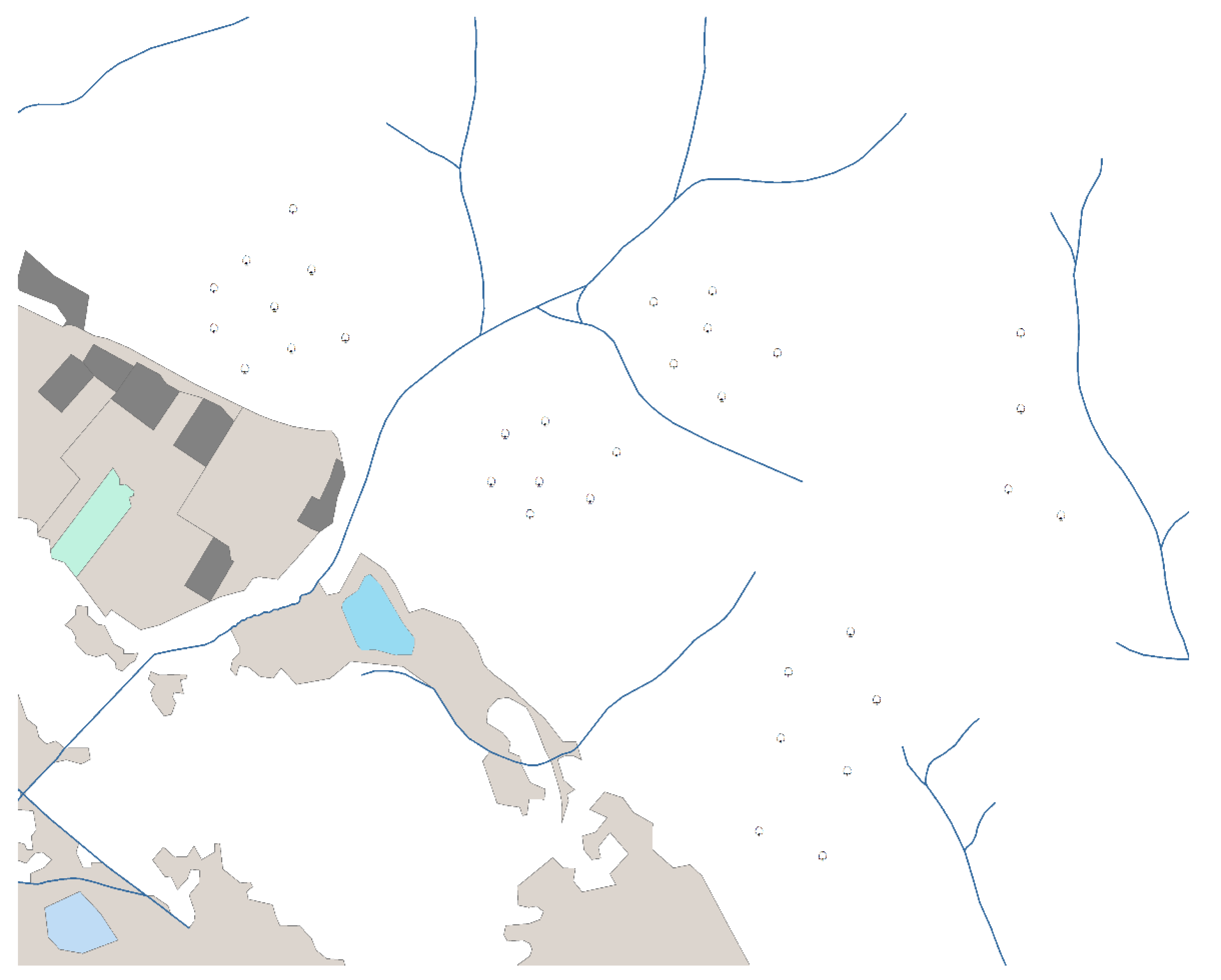
Point features (trees) represented with monochrome minimum dimensions. Points are shown in black on a white background.
Figure 2.
Point features (trees) represented with monochrome minimum dimensions. Points are shown in black on a white background.

Figure 3.
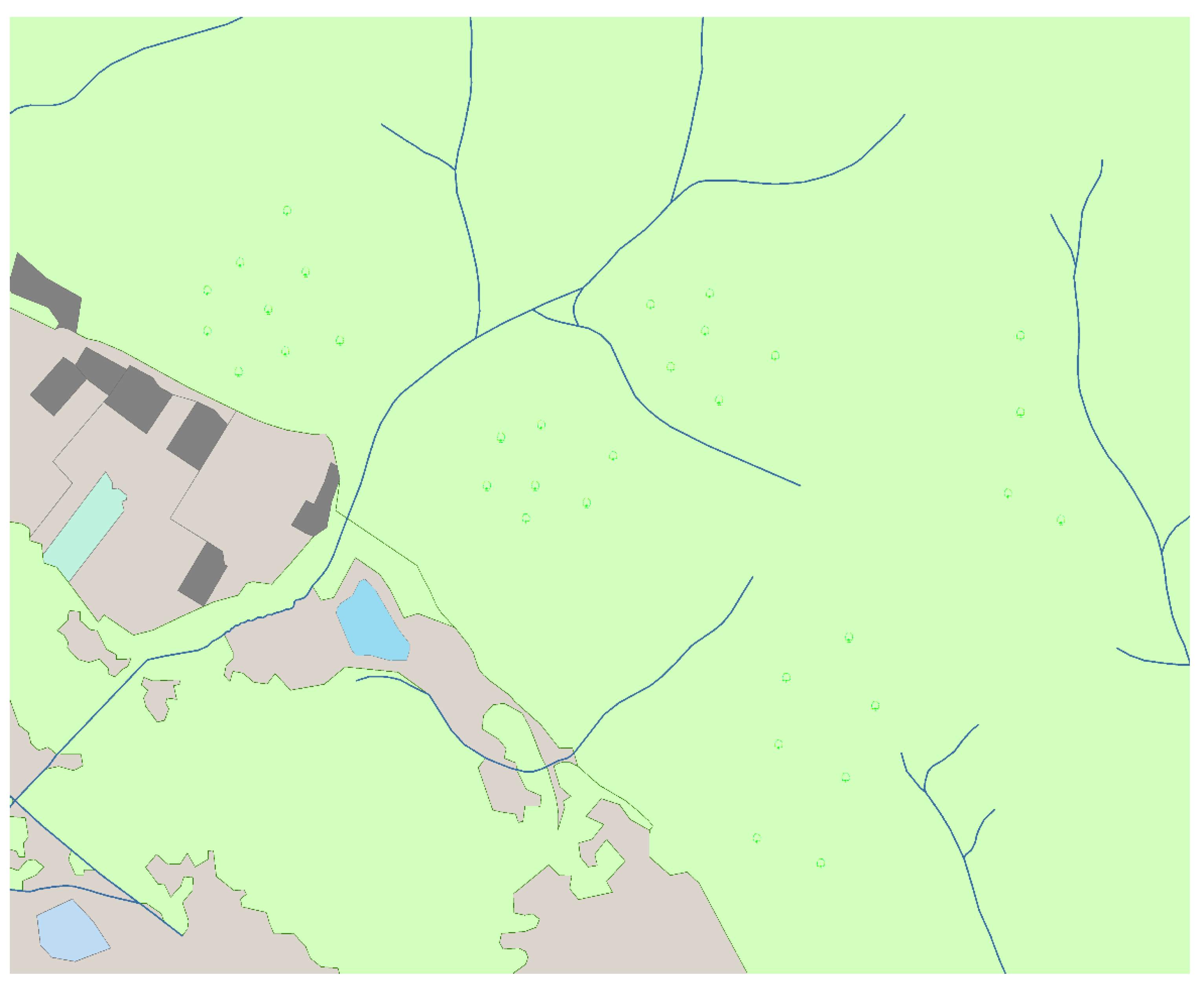
Point features (trees) represented with minimum monochrome dimensions. Points are shown in green on a light green background. The decrease in perception is significant.
Figure 3.
Point features (trees) represented with minimum monochrome dimensions. Points are shown in green on a light green background. The decrease in perception is significant.

Figure 4.
Point features (trees) represented with minimum colour dimensions using perception coefficient (Pc = 1.64).
Figure 4.
Point features (trees) represented with minimum colour dimensions using perception coefficient (Pc = 1.64).
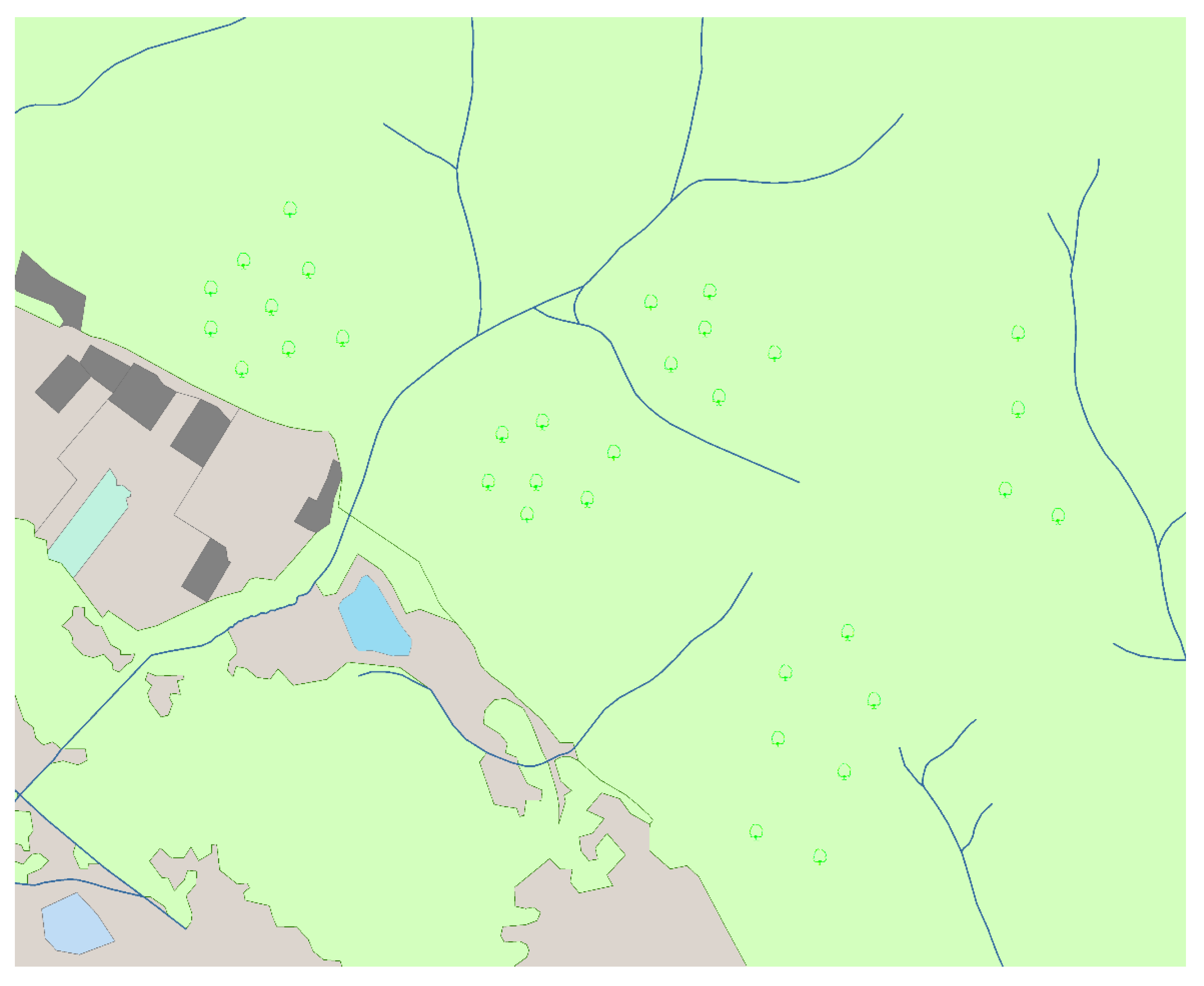
Figure 5.
Sample interactive questionnaires: black and white card (BW) (left); and colour card with a chromatic background and a sign (K2) (right).
Figure 5.
Sample interactive questionnaires: black and white card (BW) (left); and colour card with a chromatic background and a sign (K2) (right).
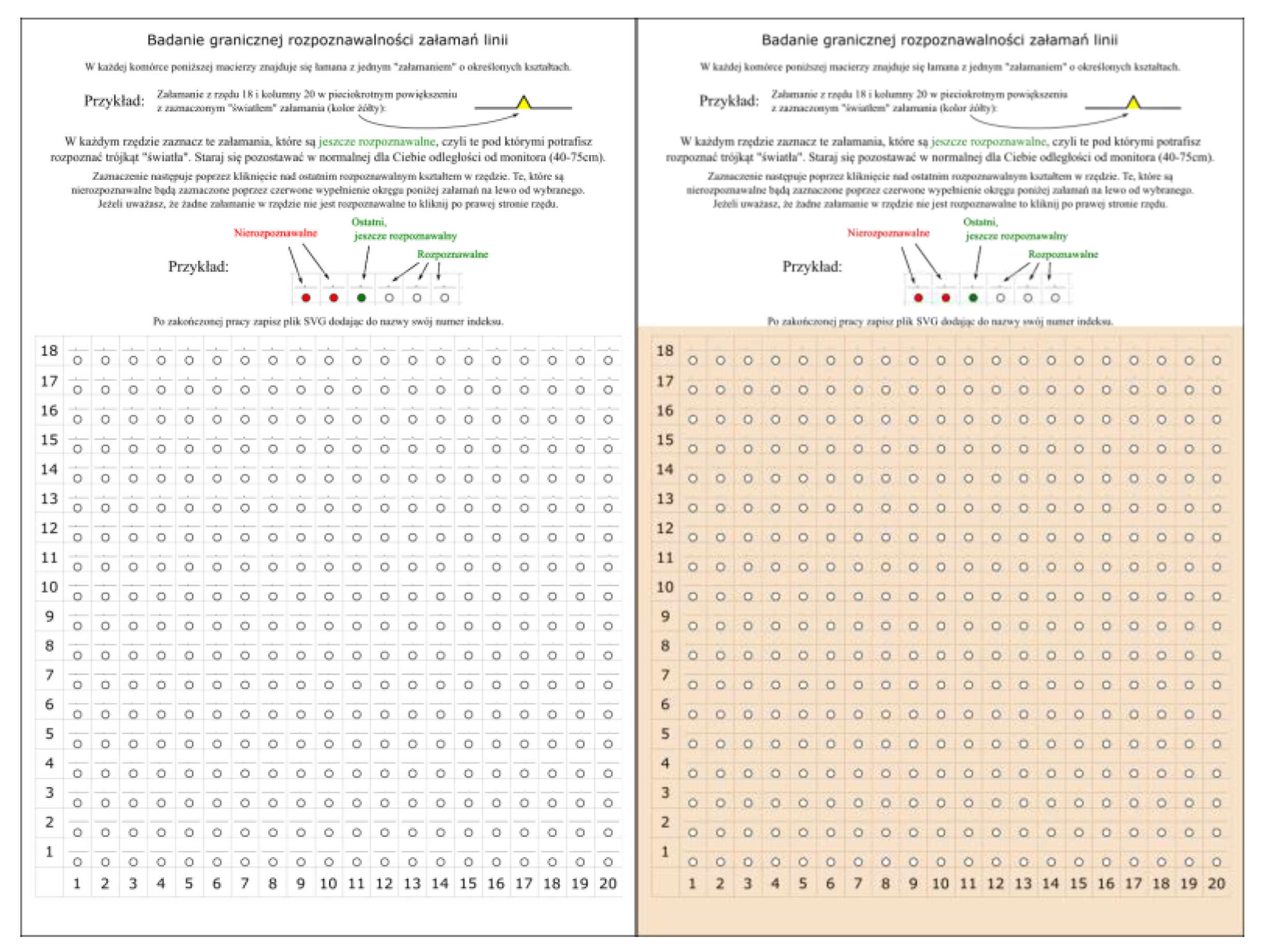
Figure 6.
Visualisation of the polyline in the cell of the survey card. Magnification (10×) of the cell in row 18 and column 20; dimensions are given for all cells.
Figure 6.
Visualisation of the polyline in the cell of the survey card. Magnification (10×) of the cell in row 18 and column 20; dimensions are given for all cells.
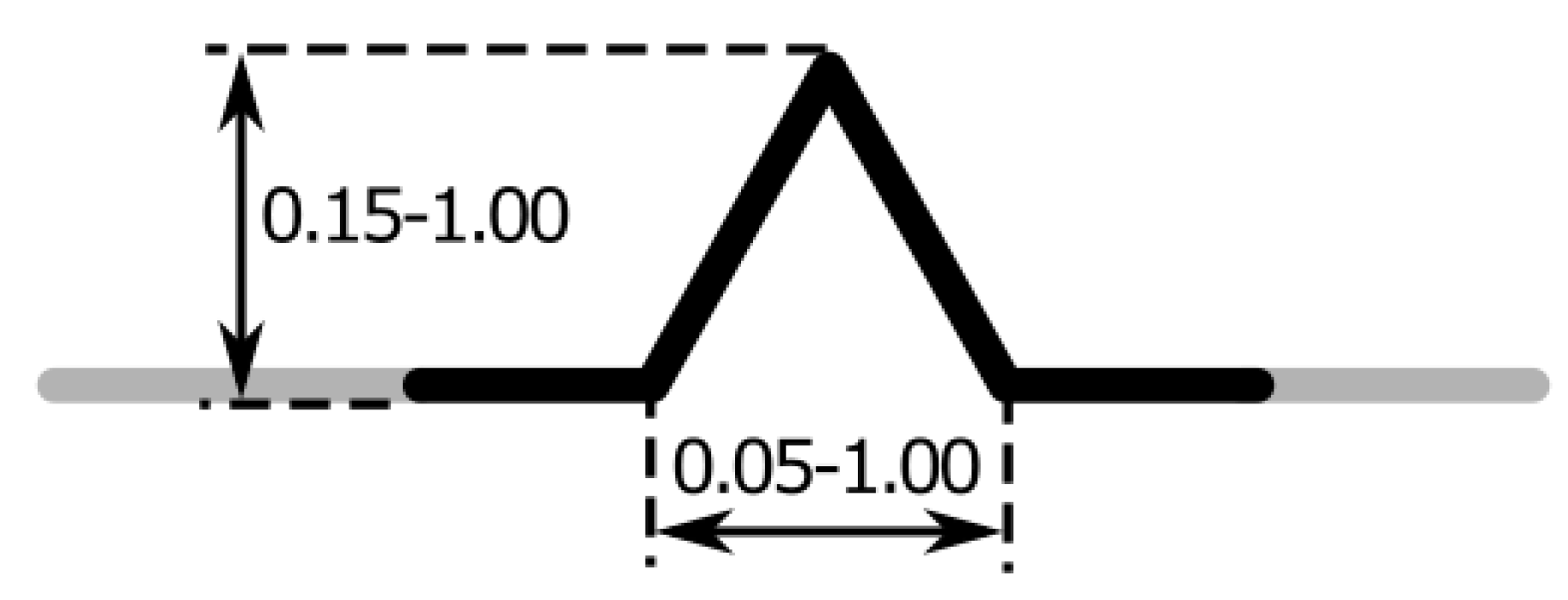
Figure 7.
Fragment of a row with cells marked as recognisable and unrecognisable.
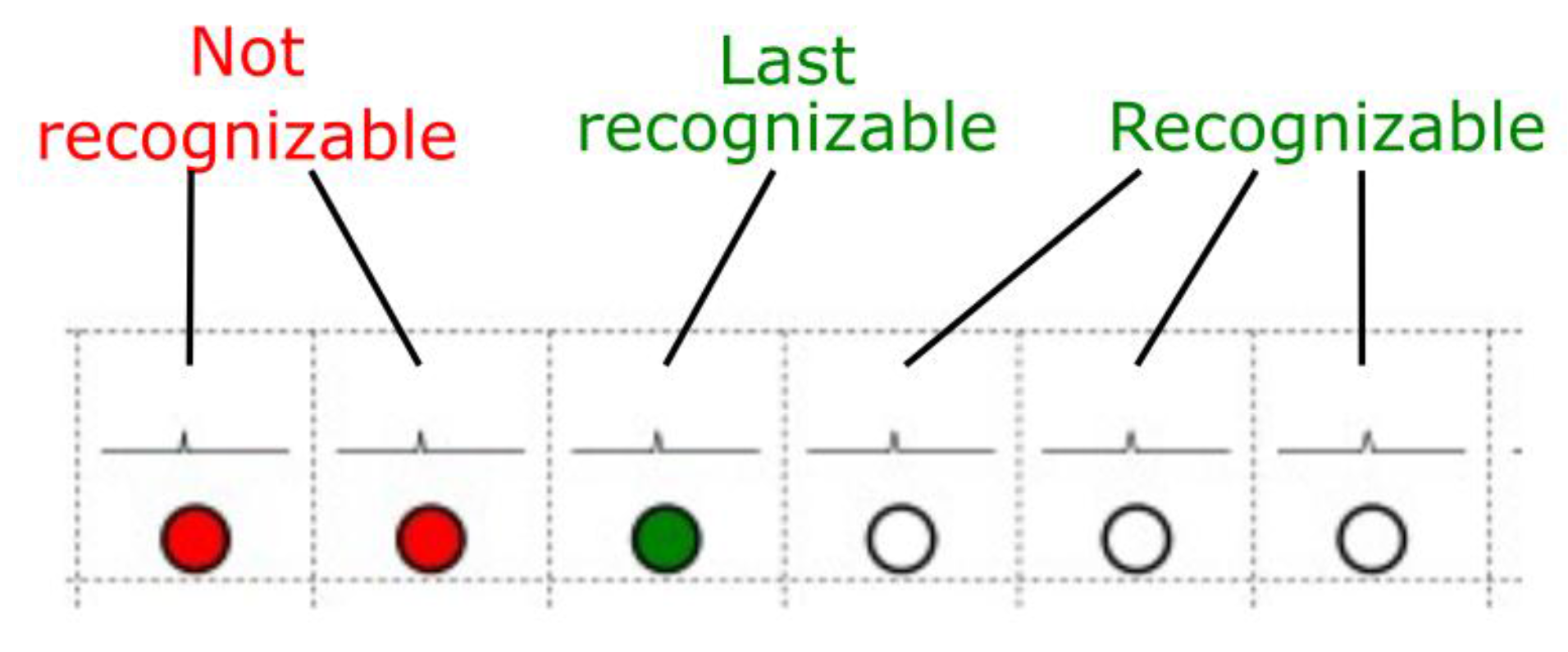
Figure 8.
Sample responses in a single respondent survey.
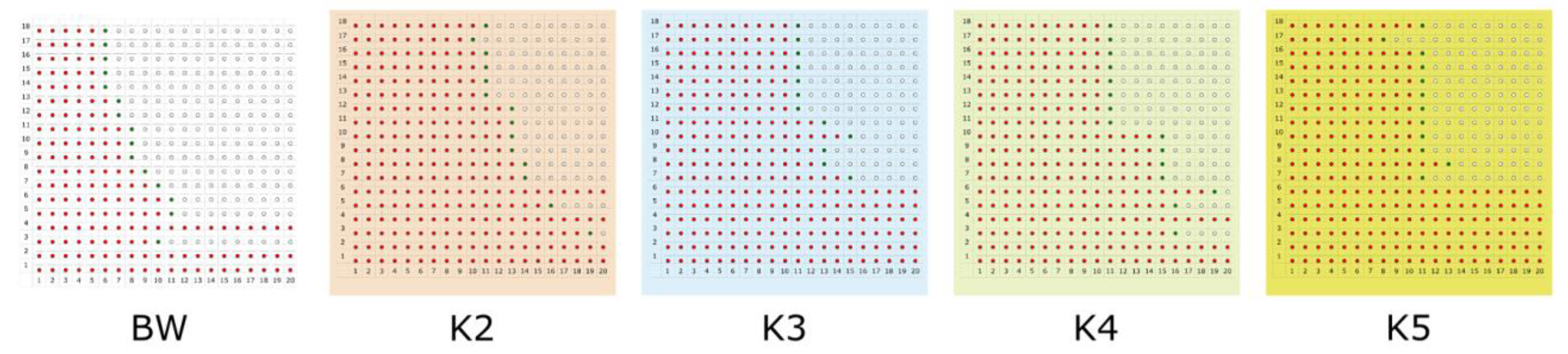
Figure 9.
Regression models for single card types (BW and K2-K5). (a) Models BM; (b) Models K2; (c) Models K3; (d) Models K4; (e) Models K5.
Figure 9.
Regression models for single card types (BW and K2-K5). (a) Models BM; (b) Models K2; (c) Models K3; (d) Models K4; (e) Models K5.
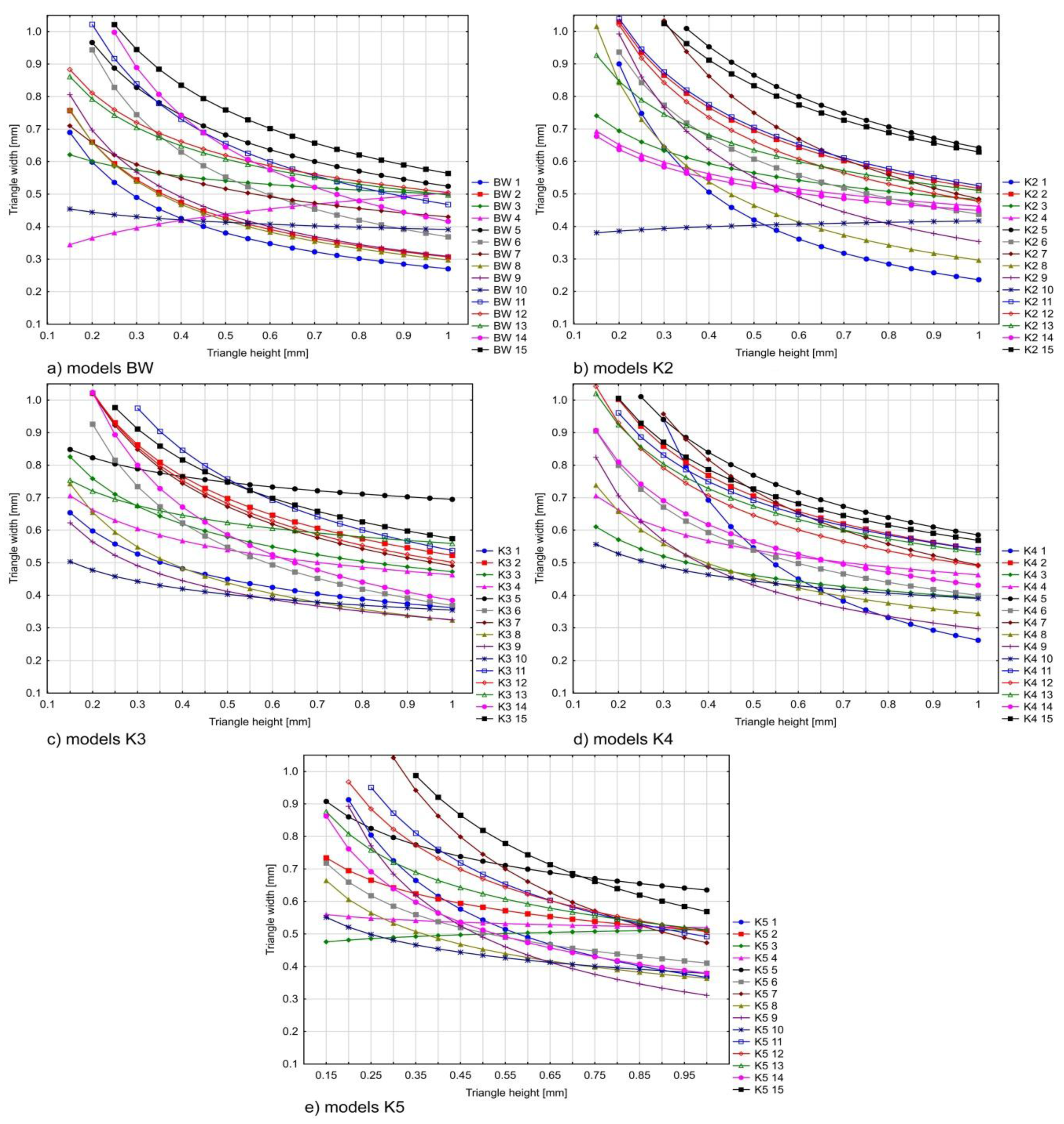
Figure 10.
Comparison of performed regression models (cards K2–K5) with theoretical curve. Blue curve is the model that includes all responses; red curve is the model without the three rejected surveys; and green curve is the theoretical values according to Pc formula. (a) Model K2; (b) Model K3; (c) Model K4; (d) Model K5.

Figure 11.
Comparison of performed regression models (BW black and white card) with theoretical curve. Blue curve is the model that includes all responses; red curve is the model without the three rejected surveys; and green curve is the theoretical values according to Pc formula.
Figure 11.
Comparison of performed regression models (BW black and white card) with theoretical curve. Blue curve is the model that includes all responses; red curve is the model without the three rejected surveys; and green curve is the theoretical values according to Pc formula.

Figure 12.
Comparison of performed regression models in all variants (BW and K2–K5, dashed line) with theoretical curves.
Figure 12.
Comparison of performed regression models in all variants (BW and K2–K5, dashed line) with theoretical curves.

Table 1.
Example coefficient values for map objects in grayscale.
| Contrast (%) | Pc |
|---|---|
| 2 | 8.00 |
| 5 | 4.91 |
| 10 | 3.40 |
| 20 | 2.35 |
| 30 | 1.90 |
| 40 | 1.63 |
| 50 | 1.45 |
| 60 | 1.31 |
| 70 | 1.21 |
| 80 | 1.12 |
| 90 | 1.06 |
| 100 | 1.00 |
Table 2.
Example values of the perception coefficient for the selected pairs of colours from L*u*v* colour space.
Table 2.
Example values of the perception coefficient for the selected pairs of colours from L*u*v* colour space.
| Colour | L* | u* | v* | ΔL*2 | Δu*2 | Δv*2 | ΔE | Cm | Pc |
|---|---|---|---|---|---|---|---|---|---|
| White | 100 | 0 | 0 | 10,000.00 | 0.00 | 0.00 | 100.00 | 199.44 | - |
| Black | 0 | 0 | 0 | ||||||
| Light blue | 76.6 | −16.11 | −29.67 | 522.12 | 2357.10 | 4028.44 | 83.11 | 51.55 | 1.43 |
| Strong brown | 53.75 | 32.44 | 33.8 | ||||||
| Light green | 68.76 | −9.76 | 24.04 | 636.55 | 137.59 | 5440.54 | 78.83 | 53.89 | 1.41 |
| Blue | 43.53 | −21.49 | −49.72 | ||||||
| Greenish grey | 63.47 | 1.71 | 0.36 | 816.24 | 2454.21 | 1030.41 | 65.58 | 60.37 | 1.37 |
| Strong brown | 34.9 | 51.25 | 32.46 | ||||||
| Red | 53.23 | 175.02 | 37.75 | 2833.43 | 30,632.00 | 1425.06 | 186.79 | 124.49 | 1.13 |
| Black | 0 | 0 | 0 | ||||||
| Yellow | 97.13 | 7.7 | 106.78 | 8.23 | 59.29 | 11,401.97 | 107.09 | 27.96 | 1.68 |
| White | 100 | 0 | 0 |
Table 3.
On the left are minimum dimensions of achromatic objects proposed by the Swiss Cartographic Society [29], while on the right are colour components of L*u*v* colour space for the map symbol and its background, calculated perception coefficient and representation of the colour map symbol of colour on a 1:1 scale.
| Monochromatic Object Dimensions | Example Dimensions for Colour Objects | |||||||||
|---|---|---|---|---|---|---|---|---|---|---|
| Scale 4:1 | Scale 1:1 | Minimum Dimensions | Object | Background | Pc | Scale 1:1 | ||||
| L* | u* | v* | L* | u* | v* | |||||
 |  | 0.80 mm | 87.73 | 83.00 | 107.40 | 79.71 | −19.80 | 45.98 | 1.49 | + × |
 |  | 1.20 mm | 63.50 | −38.73 | −86.96 | 88.72 | −49.13 | −18.97 | 1.42 | △ |
 |  | 0.70 mm | 76.97 | 0.00 | 0.00 | 46.44 | 41.28 | 46.48 | 1.35 | ▫ |
 |  | 0.30 mm | 47.41 | −21.92 | −126.06 | 77.10 | −21.00 | −33.45 | 1.35 | • |
Table 4.
Comparison of the vertices and segments of the lines simplified with and without perception coefficient Pc.
Table 4.
Comparison of the vertices and segments of the lines simplified with and without perception coefficient Pc.
| Scale: 1:250,000; the Number of Vertices before Simplification: 11,716; Line Width: 0.1 mm | |||||
|---|---|---|---|---|---|
| Without Pc | With Pc | ||||
| The number of vertices after simplification | The number of new vertices | Average length of line segments (m) | The number of vertices after simplification | The number of new vertices | Average length of line segments (m) |
| 784 | 26 | 225.23 | 559 | 13 | 167.40 |
Table 5.
Colours in the CMYK, RGB and CIELUV colour space used in the survey.
| Card 0-BW | Card-K2 | Card-K3 | Card-K4 | Card-K5 | ||||||
|---|---|---|---|---|---|---|---|---|---|---|
| Black Line | White Background | Building | Settlement | Isobath | Water | Contour Level | Forest | Park Border | Orchard | |
| C | 0 | 0 | 20 | 4 | 65 | 18 | 0 | 14 | 76 | 17 |
| M | 0 | 0 | 45 | 14 | 15 | 0 | 0 | 2 | 7 | 2 |
| Y | 0 | 0 | 70 | 24 | 0 | 0 | 0 | 31 | 90 | 73 |
| K | 100 | 0 | 0 | 0 | 0 | 0 | 45 | 0 | 0 | 0 |
| R | 0 | 255 | 208 | 247 | 105 | 221 | 163 | 236 | 63 | 234 |
| G | 0 | 255 | 149 | 225 | 178 | 240 | 164 | 242 | 175 | 230 |
| B | 0 | 255 | 90 | 201 | 220 | 250 | 164 | 199 | 66 | 100 |
| L | 0 | 100 | 66.2 | 90.7 | 69.5 | 93.7 | 67.3 | 94.1 | 63.4 | 89.4 |
| u | 0 | 0 | 45.2 | 14.7 | −32.3 | −10.7 | −0.6 | −1.3 | −49.1 | 8.3 |
| v | 0 | 0 | 44.6 | 20.5 | −42.9 | −10.1 | −0.1 | 30.1 | 62.4 | 78.1 |
Table 6.
Statistical summary for each card in two variants (models).
| Measure Model | BW | K2 | K3 | K4 | K5 | |
|---|---|---|---|---|---|---|
| b0 | R(15r) | 0.41 | 0.46 | 0.46 | 0.45 | 0.46 |
| R(12r) | 0.40 | 0.47 | 0.47 | 0.46 | 0.46 | |
| b1 | R(15r) | −0.39 | −0.37 | −0.37 | −0.41 | −0.35 |
| R(12r) | −0.47 | −0.41 | −0.39 | −0.42 | −0.41 | |
| R2 | R(15r) | 0.27 | 0.28 | 0.28 | 0.40 | 0.26 |
| R(12r) | 0.38 | 0.36 | 0.33 | 0.46 | 0.34 | |
| MAPE | R(15r) | 4.38 | 18.9 | 28.6 | 11.7 | 30.2 |
| R(12r) | 7.79 | 15.4 | 26.2 | 8.1 | 27.4 | |
© 2017 by the authors. Licensee MDPI, Basel, Switzerland. This article is an open access article distributed under the terms and conditions of the Creative Commons Attribution (CC BY) license (http://creativecommons.org/licenses/by/4.0/).
Share and Cite
MDPI and ACS Style
Lupa, M.; Szombara, S.; Chuchro, M.; Chrobak, T. Limits of Colour Perception in the Context of Minimum Dimensions in Digital Cartography. ISPRS Int. J. Geo-Inf. 2017, 6, 276. https://doi.org/10.3390/ijgi6090276
AMA Style
Lupa M, Szombara S, Chuchro M, Chrobak T. Limits of Colour Perception in the Context of Minimum Dimensions in Digital Cartography. ISPRS International Journal of Geo-Information. 2017; 6(9):276. https://doi.org/10.3390/ijgi6090276
Chicago/Turabian StyleLupa, Michał, Stanisław Szombara, Monika Chuchro, and Tadeusz Chrobak. 2017. "Limits of Colour Perception in the Context of Minimum Dimensions in Digital Cartography" ISPRS International Journal of Geo-Information 6, no. 9: 276. https://doi.org/10.3390/ijgi6090276
Note that from the first issue of 2016, this journal uses article numbers instead of page numbers. See further details here.