Storytelling in Interactive 3D Geographic Visualization Systems


1
Department of Informatics, University of Zurich, 8057 Zurich, Switzerland
2
Institute of Cartography and Geoinformation, ETH Zurich, 8093 Zurich, Switzerland
*
Author to whom correspondence should be addressed.
ISPRS Int. J. Geo-Inf. 2018, 7(3), 123; https://doi.org/10.3390/ijgi7030123
Submission received: 12 January 2018
/
Revised: 2 March 2018
/
Accepted: 14 March 2018
/
Published: 19 March 2018
(This article belongs to the Special Issue Storytelling with Geographic Data)
Abstract
:The objective of interactive geographic maps is to provide geographic information to a large audience in a captivating and intuitive way. Storytelling helps to create exciting experiences and to explain complex or otherwise hidden relationships of geospatial data. Furthermore, interactive 3D applications offer a wide range of attractive elements for advanced visual story creation and offer the possibility to convey the same story in many different ways. In this paper, we discuss and analyze storytelling techniques in 3D geographic visualizations so that authors and developers working with geospatial data can use these techniques to conceptualize their visualization and interaction design. Finally, we outline two examples which apply the given concepts.
1. Introduction
Interactive 3D geographic visualization systems such as Google Earth provide geographic information to users in an effective and attractive way. The purpose of such systems lies in the interactive visualization of geospatial data from an existing data source. Such systems usually contain two main shortcomings: First, users are guided only rudimentarily by the application. Users often do not manage to identify relevant but possibly hidden places and spatial patterns in a map because they are overwhelmed by the sheer amount of data, map elements, and functions. Second, these systems are not designed to entice users to explore the geographic space and the thematic data by curiosity. Typically, the motivation to use these systems is gone after a short time of browsing or executing simple fact finding or localization tasks, e.g., “Where is the nearest bus station to my location?”.
The idea of any visualization system is to improve the understanding of visualized information [1]. Optimally, this is done by activating an intrinsically motivated learning process. Interactive storytelling is a means to activate user participation and is widely used in other media and entertainment formats such as games or interactive theme park amusements. Thus, our main question for interactive storytelling is how authors can design effective stories for geographic visualization systems that motivate users to explore interactive maps. From this question, we can derive four different target requirements to support interactive visual geographic storytelling:
- Users are attracted by the visual representation to explore the data.
- Users are affected by the story and can identify themselves with the topic and the scenery.
- Users are able to interact with the visualized data to gain more insight.
- Users return on a single or regular basis to refresh their learning process.
The aim of our contribution is to discuss all of these four requirements for storytelling in 3D geo-visualization systems. We propose a design concept that includes also 2D environments as a subset. To facilitate the design process, we outline different types of storyboards to sketch ideas quickly and to check the sequence of the story. Furthermore, we list and evaluate scene components to communicate more complex or hidden facts.
2. Related Work
Interactive storytelling has been studied intensively by several research communities and thus is too broad to be covered in its entirety. In this section, we give a brief overview of designing stories for information visualization in general and for geospatial applications in particular.
2.1. Storytelling in Visualization Research
Visualization research focuses on how to effectively communicate data to the users by means of graphical representations. Gershon et al. [2] emphasize that users better memorize stories than pure facts. At the example of a hostage taking scenario, they provide a story script which first gives an overview of the scene, then zooms-in to certain locations while highlighting entities and adding content. Gershon et al. [2] also promote the use of metaphors such as a comic-like presentation. The idea of so-called data comics which focus on one key message per comic frame can be found in Bach et al. [3]. They distinguish between visualizations (e.g., charts), flow (i.e., types of transitions between frames), narration (providing context and structure), as well as words and pictures as main components for these single frames. By dividing the story into several chunks, the complexity is split up which allows the audience to grasp the main idea one step at a time for every scene.
Segel et al. [4] identify comics as one of seven suitable genres for storytelling used in online newspapers. Structure (e.g., a timeline), highlighting techniques (e.g., close-ups), and transitions (e.g., animations) serve as visual narratives while the ordering of a story (e.g., linear), interactivity means (e.g., navigation buttons), and messages (e.g., annotations) form the narrative structure. Segel et al. [4] conclude with outlining exemplary structures within the spectrum of author-driven (mainly messaging) and reader-driven (mainly no ordering and free interactivity) approaches. Kosara et al. [5] add the concept of affordances which lead the reader intuitively through the story. Other techniques like highlighting, arrows, and transitions may serve as further guides.
Interactive application design usually follows an iterative design process. This procedure is essential and often uniquely implemented in design and media companies. A typical semi-guided process is the Five Sheet Story Sketch which has been coined by Roberts in [6,7]. The main idea is to filter and categorize sketches of ideas and subsequently combine and refine these sketches based on a given sheet structure. By using these steps, the designer assures that the final result holds the advantages of several design alternatives so that the designer is not lost in details of a single design draft.
2.2. Storytelling in GIS and Cartography
Common stories depicted on maps are oral, literary, and audio-visual stories as described in Caquard et al. [8]. An example of an audio-visual story map is given by Cartwright et al. [9]. The work tells the story of a soldier during the First World War while showing his travel route on a gray-scaled base map. A navigable timeline with photos, videos, diary entries, and military forms familiarizes the reader with key moments on the soldier’s journey. Storytelling with maps has been successfully introduced to schools as presented by Marta et al. [10]. They report an increased motivation of students to learn from and to create their own story maps. Moreover, the authors noticed a positive impact on the students’ imagination and understanding of global relationships. Another project by Ma et al. [11] explains the benefits of storytelling at the hand of two projects installed in science museums: a sphere showing cosmic background radiation and a 3D landscape model with projected water flows on it. The conclusion from their projects is that storytelling can make scientific findings more accessible to users and taking the narrative context into consideration helps to create successful and more compelling scientific visualizations.
Interactive storytelling is strongly influenced by computer games. An interactive game keeps the attention on a high level by repeatedly challenging the user with interesting decisions, which is often achieved by an interesting game mechanic. Cartwright [12] shows an example to apply these concepts in cartography as well. In this work a game-like interface is implemented for a 3D atlas. Evaluations show that multimedia content and gaming strategies motivate the reader to access geographic information. The users appreciated especially the usability of the atlas (e.g., spatial navigation), however, also remarked a loss of scientific quality. Kelleher et al. [13] tried to find a way to lower the students’ barrier for programming tasks by using 3D game characters. In storyboards, the students can draft high-level actions and reactions of these characters. Consequently, they are familiarized with concepts like object-orientated programming in a playful way. However, storytelling is not only restricted to desktop computers. Danilicheva et al. [14] mention that also virtual reality devices are suitable for storytelling in education. Here, users get a strong immersive feeling inside the virtual 3D environment and they are able to interact with objects and characters inside the 3D space.
Lidal et al. propose a design method for geological storytelling in [15]. They developed a tool for domain experts to model geological phenomena like erosion, intrusions, or faults. The experts sketch 2D profiles at different points in time in a virtual environment which is subsequently extruded to 3D and animated by interpolating key frames.
3. The Concept of Storytelling
Storytelling describes a communicative process that conveys a story in a sequence of events. According to Bordwell et al. [16], a story consists of two types of events: the presumed and inferred events, such as expectations and imaginations, and the explicitly presented events. The plot of the story incorporates the explicitly presented events, but also non-diegetic visual and auditorial material that is not part of the story, e.g., background music. The narrative of a story is also concerned with the explicitly presented events; the audience is guided in reconstructing the causal relationships of the events. Thus, “a narrative provides the connective tissue between facts to make them memorable” as mentioned in Kosara et al. [5]. Like in well-designed animations, the events should be related by cause, intervention, and effect. As an example, the narrative of rabies epidemic consists of detecting and locating fox rabies cases (cause), a vaccination campaign (intervention), and finally the disappearance of rabies (effect). Narratives are effective educational means because users become engaged and therefore remember them [17].
3.1. Storytelling with Maps
Narrative elements are inherently incorporated in every printed or digital cartographic product. Nevertheless, they have been neglected or ignored in most map concepts. In today’s cartography, storytelling is mainly achieved by story maps where users get additional context-based, narrative information as explained in Straumann et al. [18].
Story maps are usually implemented using a top-down approach to focus on a specific theme or issue. Although several story formats (e.g., map journal, guided tour) and tools (e.g., spyglasses, swipe) supporting storytelling are used in story maps, they virtually neglect the narrative character of the map itself. This results in interactive maps consisting of independent thematic features or spatial referenced individual stories but hardly of map-centered, consistent stories. Since those story maps remain highly motivated by specific topics, this approach can be classified as extrinsic storytelling. As a complementary approach, intrinsic storytelling has been proposed in Sieber et al. [19]. In this case, the story becomes an integral part of the map and the story enrolls in the map itself: the narrative structure becomes visible on the map.
Whether following an intrinsic or extrinsic storytelling approach, the process of narrative data visualization starts bottom-up with analyzing and filtering the geo-data (Figure 1a). The consideration of the spatial, temporal, and thematic dimension of geo-data helps in the process of turning data into information. The spatial dimension of geo-data can be used to interpret the spatial relation between data entities. The temporal dimension can be used to interpret the change in the data, and the thematic dimension to interpret what the data is about. In the visualization phase, a map is then created, and finally the story has to be elaborated and presented. This workflow is often used in data-driven journalism as described by Lorenz [20]. As explained in Bradshaw et al. [21], this workflow opens the mind to detect unknown spatial or temporal patterns in maps, independently of the map theme.
3.2. Storylines
The user’s perception of a story is always sequential, although time as a narrative element can occur in many forms. Therefore, we stick to the term storyline for further investigations when talking about the experience path of the user through the story. Looking at storylines from a content- or data-related perspective, they can follow a person or a theme, which may vary across locations, across time, or across space and time. As a further variation, they could also follow data highlights like extreme values, data clusters, min-max values, similarities, or some striking attributes. However, because we want to “sell the story”, the question remains what is a good storyline and how can we create it.
As we all know from storytelling, a good storyline has a plot that develops over time in a tension curve, based on cause, intervention, and effect. Looking at Freytag’s triangle in Figure 1b introduced by Freytag [22] and adjusted by Laurel [23], the tension is reached by stepping through the phases of exposition (a), incident (b), critical action (c), and crisis (d) to a climax (e). Then, the (re)solution takes place (f), and finally, the plot ends up in a relaxation phase (g).
Crucial for a good and interesting storyline is, on the one hand, the starting incident as an attractor. If there is no trigger event to look at the story, it remains unnoticed. On the other hand, it is also important how the story evolves. If the events are presented in the same order as the user expects, the user’s emotional engagement will be low. Higher emotional response by the user is created, when the events in the plot are presented in a different order than expected. Here, we can apply the three kinds of tension: suspense, surprise, and curiosity, as explained by Tan [24]. Suspense is created when a cause is presented, but the effect is shown delayed. Surprise arises when an effect is shown that later on turns out to be unexpected or even incorrect. Curiosity or mystery is evoked when an effect is presented without information about the cause. Curiosity often occurs at the beginning of a story.
3.3. Interactive Storylines
The most well-known interactive stories are produced by the games industry and most games heavily rely on interactive stories. Therefore, many concepts can be adapted to interactive stories in geographic space. Rouse et al. [25] conclude that the story structure and plot is overrated in games because people tend to remember game mechanics and characters more than specific elements of the narrative. Many games adjust or reject the traditional storyline structure because player decisions might lead to other plot outcomes. We expect that stories in geographic visualizations will face similar challenges because the storytelling potential is closer to games than to traditional narratives.
A story experience gets more intense when the user is allowed to make decisions, choose tools, or influence the narrative. Interactivity is set well when the user gets the feeling of liberty in making decisions, although the plot—unconsciously for the user—sets some regulations and restrictions. What is most important for storytelling is the possibility to experience serendipity: users detect something new or exciting in a map by pure chance but on the track of the story. Thus, serendipity supports strongly the tension technique of surprise. Knowing the story concepts, the question is how can we motivate users of interactive geographic visualization systems to follow the story and explore 3D maps and data?
3.4. Storylines for 3D Environments/Applications
Geographical 3D views strongly support the storyline, especially if the story has a topographic component. An exemplary comparison between a 2D hazard map and a corresponding 3D view is depicted in Figure 2. The 3D view enables map readers to identify more easily where hazards such as landslides or floodings are arising and how they are expanding, which areas are affected by them, and how the topology will influence evacuation plans and safety routes.
There are several other reasons to have a closer look at 3D visualizations, and even to work with them in storytelling. First, maps and representations serve as visual attractors and are visually more pleasing in 3D. Thus, they are well-suited as a trigger. Second, 3D representations can be used as a dramaturgic element of the story. In interactive 3D views, the visual perspective and spatial navigation creates stronger awareness and an in-site experience. The 3D surface and depth information provide an augmented visual impression but also a semantic augmentation, such as a content-related meaning of topography. In combination with an interactive-continuous navigation, this leads to immersion of the user into the story and scenery as described by Abend [27] and illustrated in Figure 3. Third, 3D is applied as an essential means of storytelling. Obviously, the setting or scenery, and the camera position and track are predestined story elements for 3D applications. Furthermore, storytelling is supported by the thematic content of a map, personal characters such as narrators or actors, as well as 3D tools such as terrain slicers, terrain profiles, and comparisons of 3D views.
4. An Iterative Design Process for Storytelling
The creation of such 3D stories is a challenging, time-consuming, and expensive process. As with interaction design, stories are designed iteratively, starting with a wide range of ideas concerning the storyline and the graphic design. Often, storyboards are used to sketch these ideas quickly, and to check the sequence within a single scene, but also the transition between different scenes of the story. In order to facilitate and accelerate this design process, we present an overview of storyboards that are applicable to interactive 3D stories. Furthermore, scene components are listed and evaluated concerning the four key target requirements of user engagement: attraction, affection, interaction, and potential of user return.
4.1. Storyboards
The draft of an interactive story starts with a series of ideas on a storyboard. Storyboards are used as an iterative design tool to put ideas on paper and create an atmosphere of concepts by using artworks shown in reference [28]. In addition, storyboards can be used as a tool for interaction design as well by showing transitions from one scene to another. Usually, a scene in a storyboard has always one main topic or message to tell. Components of individual storyboard scenes will be discussed in Section 4.2. In this section, we will discuss different story structures and corresponding storyboard layouts as shown in Figure 4.
A simple storyboard might follow a linear structure such as a 1D time line or a 2D route from start to end as shown in Figure 4a. The linearity is often inherited from storylines in books or movies, or time dependent data series, e.g., crime statistics over the last 20 years. Usually, such storylines come naturally to the reader. Other examples of stories following a linear storyline are the ones using a rigorous template structure, such as research presentations or also the comic layouts used in [4]. In these cases, the idea is to help the audience by guiding them through the linear plot.
Stories following a linear structure might introduce flashbacks, parallel actions, multiple epochs, and different character developments. Quite often these elements are challenging to follow and meant as a challenge to understand the story. Interactive applications can also align stories to one or more storyline axes such as multiple interconnected time axis and introduce variety in story structures.
4.1.1. Decision-Based Storyboards
Interactive stories can contain one or multiple decisions as shown in Figure 4b. In these cases, the user intervenes with the story and depending on the decisions the story has a different ending. A simple example for such an multi-end story is an application about a voting system where users can take the role of a parliament and vote for laws which lead the story to individual outcomes. Despite a user’s conscious decision, it is also possible that the application decides on the story path depending on the user’s behavior during the interactive story. The user might then not realize that his story is different from the one of another participant.
In opposition to a multi-end story, there is also the pattern of a multi-start story shown in Figure 4c. Different start scenes lead to the same end but basically never merge in content before. Such storylines can be used when users might have different starting points or starting characters. The scenes and the story might be completely different until a common scene is reached and the storylines are unified. Such storyboard layouts can be used for tutorials to teach a user the application’s handling. The tutorial storyline is started for first time users and is specifically prepared to understand the user controls, e.g., with a narrative character as helper. If the same story is started a second time, the first part of the story will differ in content because the user is already familiar with the application handling.
An alternative to a decision-based story with multiple endings (Figure 4b) can be to unify the storylines of different users to the same ending as shown in Figure 4d. A practical example for this is a digital 3D hiking tour with different view points but the same start and end scenes. By choosing different view points during the story, the user has the decision to alter the route of this digital hike. The user’s attention level is raised because the decision is perceived as important and a customized awareness for this problem is created. Thus, a personal storyline experience was created for this user.
Scenes do not have to be ordered by a temporal attribute necessarily, they can also have a spatial or thematic connection. In Figure 4e, the scenes have two way connections to neighboring scenes, assuming that in every scene there is some kind of decision element which connects the scene logically together. In principle, the user is free to decide where to start and the story ends when the user visited all scenes. An example for this structure could be the appearance of wildlife in a certain ecosystem which can be visited by the user in a given order. Since this storyboard structure violates typical tension curves, it might be challenging to create an interesting, still believable, and intuitive experience for all traversal possibilities.
4.1.2. Open World Storyboards
In open world storyboards, see Figure 4f, all scenes are loosely connected to each other. Typically, the user is confined by some kind of world boundaries but is able to move freely between scenes without predefined transition triggers or predefined level structures. The major challenge with open worlds is that the user tends to get lost if no guidance is given or the user loses interest if there are no additional reward-systems. Open world concepts work successfully for games where the user has an interesting character interaction or is faced with a gripping game mechanic, maybe a quest system or an epic tale the user is following with multiple self-consistent stories. In this case, the user might miss parts of the story, however, without losing the motivation. Important not-yet-visited story elements might appear more attractive so that the user is motivated to visit those as well.
Storyboards can get very complicated, for instance, when scenes involve interactive conversations between characters. Such elements are known from role-playing games where users can choose the path through a conversation with a digital character by choosing prepared text pieces as questions or as answers. The digital opponent reacts depending on the choice and in the process the user might lose or gain more conversation options allowing him to access other parts of the story. Such interactive conversations can be part of a storyboard where different users experience completely different parts of the remaining story later on.
4.2. Scene Components for Interactive Stories
The purpose of a single scene in a storyboard is to tell a specific moment of the story. Therefore, it usually has one main message. A scene is integrated into the story plot and logically related to other storyboard scenes. Scenes consist of a well combined set of narrative elements and user engagement aspects which will be discussed in the following sections. Furthermore, we link narrative and user engagement elements to typical elements of geographic visualizations in Table 1. The purpose of this overview is to offer story creators a set of ideas for story elements in 3D geographic visualizations.
4.2.1. Narrative Elements
In this paper, narrative elements are conceptually similar to the fundamental elements of fiction, in particular plot, theme, setting, style, point of view, and character as described by Obstfeld [29].
Story plot and story theme are often tightly coupled. We understand the plot as the short summary of the story. In opposition to that, the theme can be defined as the central idea of the story and is usually less detailed. Often, it can be expressed by a single expression, e.g., crime, love, solitude. The setting of the story can be defined as the time, place, and environment where the story is happening. This can include social environments, locations, institutions but also the set of interaction tools for a user within an interactive story. The style of a story is the unique manner of how the story is told and visualized on a map. Often, the style is an indicator for a specific creator, such as an author, a producer, or a media company. The setting and style heavily influence the atmosphere of a story. For instance, showing an abandoned place at night with dark colors and hard cuts between the scenes causes a gloomy atmosphere.
The point of view of a story outlines what story information the user has and what story information is hidden. Users experience visualizations mostly from a god-like perspective which is inherently technology driven. However, in interactive stories, we can use data, other perspectives, and also characters to build the point of view for the user. Telling stories from one perspective and hiding specific details can be used to create unique emotional bounds.
The last narrative scene element is characters. Geographic visualizations have generally been reluctant in character usage, most probably because character creation is an extra effort in time and technology. However, characters in visualizations can be used to interact and guide through stories as in tutorials, but also to enforce narrative elements and personalize the narrative of the story. Movies and games often build their stories around main characters, therefore, we expect that characters will be a much more fundamental part of geographic storytelling in the future.
4.2.2. User Engagement
Successful interactive stories go hand in hand with good user engagement. To consider this, we defined four key criteria shown in Table 1 as indicators for user engagement, particularly attraction, affection, interaction, and comeback.
User attraction is important to raise the interest for the story or even for a specific scene. Interesting content and also visual guides can help raise the attraction. Furthermore, the user should have a certain degree of affection to the scene and to the data. Affection can be raised by evoking emotional responses and also by personal involvement. In addition, the interaction design may engage users to participate in a story. Good interaction offers interesting choices, shows connections and hints, and motivates the user constantly to move a step forward. Bad interaction design causes the user to wait, overwhelms the user with options, or is just not designed interestingly enough. Obviously, repetitive tasks or irrational decisions are violating a good story experience by a bad interaction design.
The last user engagement aspect is return. Interactive stories can be brilliant without any attempt of the user ever coming back again. However, usually, revisiting users are an indicator for high-quality interactive stories. As reported in Rouse et al. [25], it is estimated that a major part of game players do not finish a game and never experience the later stages of the stories. However, the learned content at the end of the story might be equally as important to the user as the beginning. Revisits can be promoted by content updates, unique features, and experience or achievement systems.
4.2.3. Scene Elements
In Table 1, we provide a tabular overview of how user engagement and narrative elements relate to scene elements of typical geographic visualizations which we categorize into four groups:
- Cartographic elements providing the geospatial data and the semantic interpretation space.
- Visualization techniques providing the methods to display the geospatial data.
- Graphics techniques providing algorithms for animation and rendering of scenes and objects.
- Human computer interaction (HCI) techniques providing the methods to experience stories.
These categories interact and overlap with each other in various ways and are not strictly separable. While computer graphics constitutes a research and technology field in its own right, it at the same time is a sub-component of any visualization method acting as a rendering engine to display the necessary 2D/3D graphical elements. HCI encloses all aspects of the interaction with computing machines and hence can be seen as spanning across all the other categories but is concerned with the user side. While visualization and cartographic techniques have a significant overlap, we see the visualization techniques more from an algorithmic point of view, i.e., addressing the technical aspects of data analysis and interactive visualization. The cartographic elements in this context thus refer more to the geospatial aspects of the data, its semantics, presentation, and handling. Table 1 indicates how strongly the scene elements of these four categories are influencing specific narrative elements and user engagement criteria in a supportive way.
Geospatial data used in maps mostly influence the theme and setting of the story. The selection of data can be an effective instrument to decide which information is hidden or visible for the protagonists in the story. Interesting data can attract and affect users, for example by personal involvement. Special care should be taken for revisiting users when applying data updates because repetitious story elements can be disruptive for the experience.
Specific visualization techniques can captivate users and can successfully communicate the main message or the setting of the story, but to create a specific atmosphere or a character other techniques have to be used as well. On the other hand, graphics techniques on their own are not sufficient to deliver the main message of a story. Graphics techniques enhance specific moods and settings of the story. Furthermore, digital characters and avatars are important anchor points to tell interactive stories.
Additional HCI techniques such as speech and sound effects are good ways to strengthen characters, enrich the story’s atmosphere and engage the user. Game elements such as achievement systems, experience systems, or interactive dialogues foster the development of characters as well. Together with competitive or collaborative social gaming aspects, these elements have a positive influence on the return rate for users. The story design for collaboration tools and specific hardware setups change the user engagement heavily, for example virtual reality (VR) and augmented reality (AR) hardware can be physically and mentally exhausting to use.
In summary, Table 1 shows that geographic visualization environments offer a broad range of possibilities to create settings and atmospheres for interactive stories. Some demand for long-term motivation techniques can be identified which can be overcome with interesting additional interaction techniques.
5. Case Studies
In the previous sections, we discussed the story creation and scene details which can be combined and used to achieve narrative objectives and engage user participation. In the following passage, we discuss two short exemplary plots for interactive applications, in particular one plot about natural disaster awareness and another one about bird migration. Furthermore, we will describe selected scene elements of Table 1 in more detail.
5.1. Natural Disaster Awareness
Natural landslides in SwitzerlandLandslides are a rising problem from climate change. Through the mountainous regions, Switzerland is heavily exposed to landslides. This interactive application explains how mud movements emerge and how the disaster management system works.
This story sample is conceived as an application with an open world environment. The user starts in a 3D view over Switzerland showing historic occurrences of mud avalanches. If the user selects one location, the camera automatically flies to this place and the user can explore the setting in a 3D view. By a sophisticated terrain visualization, it is possible to show the difference before and after the avalanche took place as well as an animated simulation of it.
The open world concept requires more interaction possibilities and a more elaborated game mechanic than linear stories. More interaction is enabled by specific points of view showing real avalanche photos and also by animated characters within the scene which have a relation to the mud avalanche. We would offer here a wide range of characters, such as residents explaining how they are personally affected, landslide experts explaining more details about this specific avalanche location, and rescue members explaining their work at the accident scene. The character interaction allows to conceptually introduce a reward system, e.g., the user can be rewarded by talking to every character, or also a quest system where the user solves challenges, e.g., he has to find missing objects or move an object for the rescue teams. We believe that if we generate awareness of what it means when mud avalanches happen, we are also able to create awareness for a potential cause (e.g., climate change) and an understanding for costs of a disaster management system.
5.2. Bird Migration
Fly like a birdEach year, millions of birds undertake an adventurous journey between their breeding and wintering grounds. On their way, they have to overcome challenges like finding suitable places to rest or hiding from illegal hunters. This educative story map lets the user discover the topic of bird migration from different perspectives and in a playful manner.
In this example, the storyboard could be planned to follow a multi-end linear structure (Figure 4b) from the time of birth to the breeding season. At the beginning, the user can select a bird species which affects the storyline and the ending. In the 3D map environment, the user sees the bird’s typical flight altitude and resting times. The bird migration routes are complemented with lakes and nature reserves as well as 3D models of buildings. The viewpoint can be changed in several ways from an all over scientific viewpoint to a bird’s view, or to third person observer on the ground, e.g., a biologist. The bird itself can be animated as a 3D character and augmented with species specific sound effects to explain communication. In addition, celestial bodies can be used to explain how stars serve as orientation aid for the birds. Users may be attracted by edge bundled bird routes or animated stream lines for bird traces.
Having a 3D birds-eye view is particularly interesting and affecting to the user as it goes beyond human capabilities. The topic also offers various interaction possibilities like avoiding danger elements such as wind turbines or hunters. Additionally, there are options for collaboration with other users, such as building bird flocks or finding food during the bird’s journey. These options can be coupled with a reward system as well. Real-time tracking data or yearly data updates can motivate users to revisit the story map from time to time.
These two examples connect several concepts collected in this paper and show that we are able to create plots for advanced stories in the context of geographic visualization with the help of our table reference. Depending on the topic, we can decide more easily which elements might be missing in our stories to enforce a specific narrative target or which ones work well in combination. In addition, the table can be used to compare whether a story plot fulfills basic criteria or not.
6. Discussion
The realization of stories in interactive 3D environments—such as the described case studies—is a challenging endeavour. First, data can be scattered, not available, and incomplete, or it can be difficult to combine data from multiple sources with different temporal, spatial, and thematic resolutions and semantics. Furthermore, scaling, level-of-detail, styling, and arrangement of map objects largely influence the setting of the story. Important map elements, e.g., birds as protagonists could be depicted very realistically, whereas less important scenery features could be represented on a parametric or symbolic level. Similar to 3D artists for games, larger projects will require a team of specialists and authors to create models for such stories.
Technical challenges may also emerge when combining several graphics and visualization techniques within the same 3D environment. Spatial conflicts between map objects such as cluttering and occlusions might be solved by filtering and scaling techniques. Visibility and perspective deserve closer attention due to ineffective 3D depth comparison and missing reference points for the user. Often seen are ground views where aliasing and jittering artifacts appear. Scene transitions as well as panning and zooming can suffer from loading lags and artifacts through adaptive generalization techniques.
However, in an optimal case the design phase can neglect such challenges, because the technologies have to adapt based on the design problems to produce high quality results. Similar to an interaction design process, several iterations should be done to the rough design phase: wireframes/sketches and moodboard/artwork design before starting the detailed realization phase.
Designing story maps is always centred around a target user group. For example, children are affected differently than adults and also interact in a different way. Digital natives are familiar with swipe gestures, whereas digital immigrants may need additional user interface elements to proceed from one scene to another. Moreover, a good balance has to be found for the number and intensity of applied scene elements and techniques. Too many or playful effects may distract the user from the story. The ultimate goal is to find the selection of techniques and elements to design a coherent and convenient story.
7. Conclusions
Storytelling is a technique dedicated to transport messages behind the data to a broad public. It has been demonstrated that it is well suited for cartographic and GIS applications. Especially when using interactivity and 3D visualizations, the immersion into the story and the visualized data is facilitated. For map makers who want to profit from these benefits, a useful collection of resources for storytelling has been provided. The presented resources in this paper are not exhaustive, especially since narrative possibilities are constantly changing. However, the presented concepts give people who are unfamiliar with the design and the requirements of interactive storytelling a framework to orient themselves within the interactive story creation process in a 3D geographic visualization. With respect to the target requirements for user engagement, an overview has been given as to how these requirements can be achieved. As supporting evidence, two examples of stories have been discussed, differing in type of storyboard and scene components.
Based on the theoretical background and the examples in this paper, future work will concentrate on designing stories with the presented concepts. This incorporates mainly the transformation of the concept into storyboards and furthermore into running visualization systems.
Acknowledgments
This project was partially supported by a research grant of the University of Zürich (Grant No. FK-16-015) and a Swiss National Science Foundation (SNSF) research grant (Project No. 200021_169628).
Author Contributions
M. Thöny, R. Schnürer, R. Sieber did the literature research and designed the case studies. L. Hurni and R. Pajarola critically revised the article. M. Thöny, R. Schnürer, R. Sieber, L. Hurni and R. Pajarola wrote the paper.
Conflicts of Interest
The authors declare no conflict of interest.
References
- Munzner, T. Visualization Analysis and Design; AK Peters Visualization Series; CRC Press: Boca Raton, FL, USA, 2014. [Google Scholar]
- Gershon, N.; Page, W. What Storytelling Can Do for Information Visualization. Commun. ACM 2001, 44, 31–37. [Google Scholar] [CrossRef]
- Bach, B.; Riche, N.H.; Carpendale, S.; Pfister, H. Emerging Genre of Data Comics. IEEE Comput. Graph. Appl. 2017, 38, 6–13. [Google Scholar] [CrossRef] [PubMed]
- Segel, E.; Heer, J. Narrative Visualization: Telling Stories with Data. IEEE Trans. Vis. Comput. Graph. 2010, 16, 1139–1148. [Google Scholar] [CrossRef] [PubMed]
- Kosara, R.; Mackinlay, J.D. Storytelling: The Next Step for Visualization. IEEE Comput. 2013, 46, 44–50. [Google Scholar] [CrossRef]
- Roberts, J.C. The Five Design-Sheet (FdS) Approach for Sketching Information Visualization Designs. Proceedings Eurographics Education Papers. Available online: https://pdfs.semanticscholar.org/51c4/e858894534dde3836a3020b0bfa62f1e1bae.pdf (accessed on 8 February 2018).
- Roberts, J.; Headland, C.; Ritsos, P. Five Design-Sheets: Creative Design and Sketching for Computing and Visualisation; Springer: Berlin, Germany, 2017. [Google Scholar]
- Caquard, S.; Cartwright, W. Narrative Cartography: From Mapping Stories to the Narrative of Maps and Mapping. Cartogr. J. 2014, 51, 101–106. [Google Scholar] [CrossRef]
- Cartwright, W.; Field, K. Exploring cartographic storytelling. Reflections on mapping real-life and fictional stories. In Proceedings of the International Cartographic Conference, Rio de Janeiro, Brazil, 23–28 August 2015. [Google Scholar]
- Marta, M.; Osso, P. Story Maps at school: Teaching and learning stories with maps. J. Res. Didact. Geogr. 2015, 2, 61–68. [Google Scholar]
- Ma, K.L.; Liao, I.; Frazier, J.; Kostic, H.N.; Hauser, H. Scientific Storytelling Using Visualization. IEEE Comput. Graph. Appl. 2012, 32, 12–19. [Google Scholar] [PubMed]
- Cartwright, W. Using the web for focussed geographical storytelling via gameplay. In Proceedings of the International Joint Workshop on Ubiquitous, Pervasive and Internet Mapping, Tokyo, Japan, 7–9 September 2004; ICA Commission on Ubiquitous Computing: Tokyo, Japan, 2004. [Google Scholar]
- Kelleher, C.; Pausch, R. Using Storytelling to motivate programming. Commun. ACM 2007, 50, 58–64. [Google Scholar] [CrossRef]
- Danilicheva, P.; Klimenko, S.; Baturin, Y.; Serebrov, A. Education in Virtual Worlds: Virtual Storytelling. In Proceedings of the International Conference on CyberWorlds, Bradford, UK, 7–9 September 2009; pp. 333–338. [Google Scholar]
- Lidal, E.M.; Natali, M.; Patel, D.; Hauser, H.; Viola, I. Geological Storytelling. Comput. Graph. 2013, 37, 445–459. [Google Scholar] [CrossRef]
- David Bordwell, K.T.; Ashton, J. Film Art: An Introduction; Mcgraw-Hill: New York, NY, USA, 2004. [Google Scholar]
- Fuchs, W. Warum das Gehirn Geschichten Liebt—Mit Storytelling Menschen Gewinnen und Űberzeugen, 3rd ed.; Haufe Lexware: Freiburg, Germany, 2015. [Google Scholar]
- Straumann, R.; Sulzberger, N. Partizipation mit Bundesgeodiensten und Story Maps. In Proceedings of the GeoSummit, Bern, Switzerland, 31 January 2014. [Google Scholar]
- Sieber, R.; Bonassi, N. Storytelling in Atlases—The intrinsic way. In Proceedings of the Internationl Cartographic Conference, Washington, DC, USA, 2–7 July 2017. [Google Scholar]
- Lorenz, M. Data-Driven Journalism: What is There to Learn? In Proceedings of the Conference on Innovation Journalism, Stanford, CA, USA, 1–5 June 2010. [Google Scholar]
- Bradshaw, P.; Rohumaa, L. The Online Journalism Handbook: Skills to Survive and Thrive in the Digital Age, 2nd ed.; Taylor & Francis: Abingdon, UK, 2017. [Google Scholar]
- Freytag, G. Freytag’s Technique of the Drama; Scott, Foresman & Company: Glenville, IL, USA, 1894. [Google Scholar]
- Laurel, B. Computers as Theatre, 2nd ed.; Pearson Addison Wesley: Boston, MA, USA, 2013. [Google Scholar]
- Tan, E.S. Emotion and the Structure of Narrative Film: Film as an Emotion Machine; Lawrence Erlbaum Associate: Hillsdale, NJ, USA, 1996. [Google Scholar]
- Rouse, R.; Abernathy, T. Death to the Three-Act Structure! Available online: https://www.gdcvault.com/play/1020050/Death-to-the-Three-Act (accessed on 8 February 2018).
- Swedish Geotechnical Institute. Nyttiggörande av Material Från Göta Älvutredningen; Technical Report; Swedish Geotechnical Institute: Linköping, Sweden, 2012. [Google Scholar]
- Abend, P. Google Earth und Co.—Nutzungspraktiken Einer Digitalen Erde; Transcript Verlag: Bielefeld, Germany, 2014. [Google Scholar]
- videogamesartwork.com. Available online: https://www.videogamesartwork.com (accessed on 8 February 2018).
- Obstfeld, R. Fiction First Aid: Instant Remedies for Novels, Stories and Scripts; Writer’s Digest Books: Cincinnati, OH, USA, 2002. [Google Scholar]
Figure 1.
(a) Data-driven journalism workflow. (b) Plot development according to Freytag’s triangle [22]: a function of suspense/complication and time.
Figure 1.
(a) Data-driven journalism workflow. (b) Plot development according to Freytag’s triangle [22]: a function of suspense/complication and time.
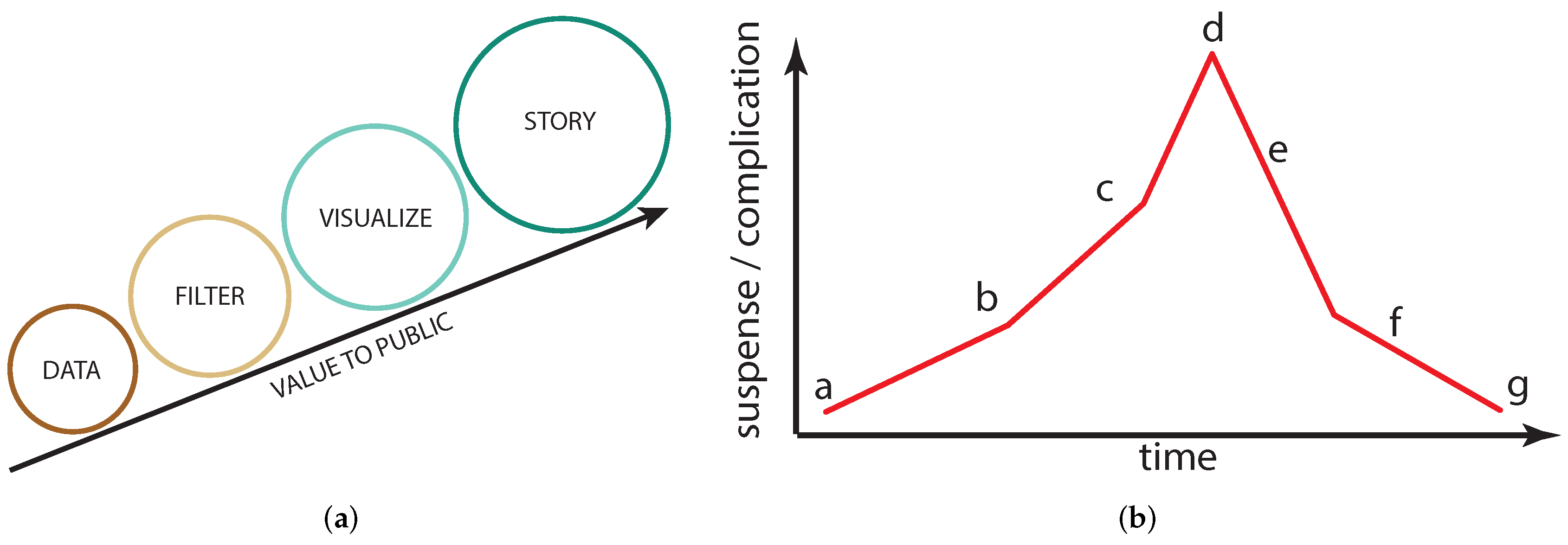
Figure 2.
(a) A 2D hazard map showing locations of potential landslides. (b) The same information displayed in a 3D scene. Image courtesy of the Swedish Geotechnical Institute [26].
Figure 2.
(a) A 2D hazard map showing locations of potential landslides. (b) The same information displayed in a 3D scene. Image courtesy of the Swedish Geotechnical Institute [26].
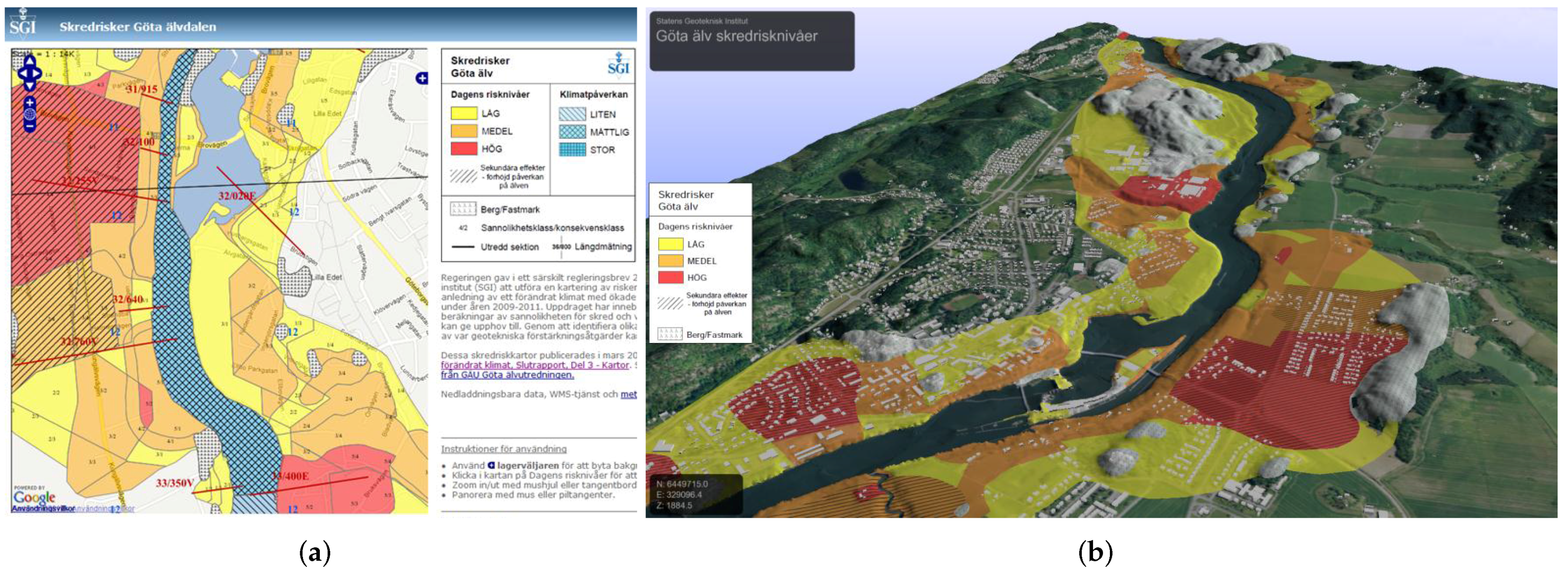
Figure 3.
Immersion as a product of interactive navigation and 3D information.

Figure 4.
Examples for a linear storyboard (a); a decision-based storyboard with one ending (b); a storyboard with multiple starting options (c); a decision-based storyboard with multiple endings (d); a circular storyboard (e); and an open world storyboard without any connectivity restrictions (f).
Figure 4.
Examples for a linear storyboard (a); a decision-based storyboard with one ending (b); a storyboard with multiple starting options (c); a decision-based storyboard with multiple endings (d); a circular storyboard (e); and an open world storyboard without any connectivity restrictions (f).


Table 1.
An overview over scene elements and their expected impact on a narrative element or user engagement element given with (some) examples. Green boxes indicate a lot of amplification possibilities, yellow boxes show a low application, and red boxes show none or potentially negative amplifications. Scene elements marked with are used in the case study about natural disaster awareness and scene elements marked with are used in the case study about bird migration.
 |
© 2018 by the authors. Licensee MDPI, Basel, Switzerland. This article is an open access article distributed under the terms and conditions of the Creative Commons Attribution (CC BY) license (http://creativecommons.org/licenses/by/4.0/).
Share and Cite
MDPI and ACS Style
Thöny, M.; Schnürer, R.; Sieber, R.; Hurni, L.; Pajarola, R. Storytelling in Interactive 3D Geographic Visualization Systems. ISPRS Int. J. Geo-Inf. 2018, 7, 123. https://doi.org/10.3390/ijgi7030123
AMA Style
Thöny M, Schnürer R, Sieber R, Hurni L, Pajarola R. Storytelling in Interactive 3D Geographic Visualization Systems. ISPRS International Journal of Geo-Information. 2018; 7(3):123. https://doi.org/10.3390/ijgi7030123
Chicago/Turabian StyleThöny, Matthias, Raimund Schnürer, René Sieber, Lorenz Hurni, and Renato Pajarola. 2018. "Storytelling in Interactive 3D Geographic Visualization Systems" ISPRS International Journal of Geo-Information 7, no. 3: 123. https://doi.org/10.3390/ijgi7030123
Note that from the first issue of 2016, this journal uses article numbers instead of page numbers. See further details here.