Article

Evaluation of the Omaha System Prototype Icons for Global Health Literacy

1
School of Nursing, University of Minnesota, Minneapolis, MN 55455, USA
2
Department of Speech-Language-Hearing-Sciences, University of Minnesota, Minneapolis, MN 55455, USA
3
College of Design, University of Minnesota, Minneapolis, MN 55455, USA
*
Author to whom correspondence should be addressed.
Informatics 2017, 4(2), 13; https://doi.org/10.3390/informatics4020013
Submission received: 13 April 2017 / Revised: 23 May 2017 / Accepted: 30 May 2017 / Published: 1 June 2017
(This article belongs to the Special Issue Nursing Informatics)

Abstract

:
Omaha System problem concepts describe a comprehensive, holistic view of health in simple terms that have been represented in a set of prototype icons intended for universal use by consumers and clinicians. The purpose of this study was to evaluate Omaha System prototype icons internationally across ten languages through an on-line survey and in-person focus groups. The icons were generally rated above 3 on a scale of 1 to 5 by 1568 survey respondents, with notable exceptions for some of the more abstract concepts. Overall, the icons were rated 3.49 on a scale of 1 = strongly disagree to 5 = strongly agree, with a range of 3.09 (Japanese language) to 3.88 (Norwegian language). A pattern of differential agreement was noted among respondents from Asiatic languages compared to all other languages. Feedback from survey respondents and focus group participants was used to refine the icons. General themes related to icon development were synthesized from focus group interviews. Further research should continue to refine and evaluate the icons in different languages for international use to support health literacy through visual literacy.

1. Introduction

The use of symbols to represent knowledge in digital platforms is continually expanding in the digital world through growing use of technology in computers and handheld devices [1,2,3,4,5,6]. User-friendly health information in visual icons can be an effective method for improving understanding of health information and supporting successful health-related communication [1,2,3,4,5,6,7,8,9,10,11]. This is especially important for disadvantaged groups that may face digital disparities due to low literacy or other barriers [12,13,14]. To address this need, a collaborative international research team developed prototype icons for 42 Omaha System problem concepts using design thinking principles [14,15,16,17,18]. The icons were intended for universal use in digital platforms by consumers and clinicians across health care systems and jurisdictions to aid in health literacy through visual literacy [18]. The purpose of this study was to evaluate Omaha System prototype icons which can be interpreted internationally across language users regardless of health literacy level or cultural differences.

1.1. Use of Symbols in the Digital World

Symbols developed through collaborative work with design professionals and various governmental and commercial agencies are common in wayfinding and digital communication [1,2]. For example, the American Institute of Graphic Arts (AIGA) together with the Society for Experimental Graphic Design (SEGD) have developed symbols that are commonly used for healthcare, accessibility, travel, and recreation.

1.2. Use of Symbols in Health Care

Several studies have demonstrated how icons can be developed, evaluated, and used in health care, employing techniques such as participatory design and usability testing [3,4,5,6,7,8,9,10,11,12,13,14,15,16]. Kim and colleagues employed participatory design techniques [14,15,16] to develop pictographs, and they assessed the pictographs using an on-line survey tool [9], and Lalloo and colleagues advanced the use of icons for pain assessment for adults and adolescents with arthritis through usability testing [11]. Such efforts have been used to address issues related to health literacy [3,7,10,12,13]. For example, Wolpin and colleagues examined the use of pictographs, redesigning them for use in mobile platforms by patients with low health literacy [3], Choi enhanced instructions for low literacy women using pictographs in the context of breast-health instructions [7], and Kriplani and colleagues developed low literacy patient education tools for medication management [10]. As described separately, icons have been developed to enhance communication about health and health care using the Omaha System [17,18].
Efforts have also been directed toward information consumption by health care professionals. Lamy and colleagues developed, implemented, and evaluated a set of human health icons called the Visualization of Concepts in Medicine (VCM), an iconic language to improve rapid consumption of complex information in electronic health records by medical professionals [4,5,6]; and Griffon and colleagues conducted a design and usability study evaluating the use of an icon-based interface to improve medical guideline information retrieval in electronic platforms [8]. These efforts combined with those described above demonstrate active research toward the goal of leveraging visual information to transcend various health information and communication barriers such as low literacy and the need for rapid interpretation of large information corpora.

1.3. Interpretation of Visual Information to Transcend Communication Barriers

The interpretation of visual information has been studied in diverse contexts, and cultural influences and differences have been well documented [19,20,21,22]. The notion of seeing as part of sensing and that sensing is constitutive of thinking can help us understand differential knowledge representation interpretations of persons and cultures [21]. There is evidence that on-line platforms are useful for evaluation of visual representation across cultures [20]. While it is acknowledged that cultural memes are changing with exposure to television and the internet [20], to achieve universal knowledge representation of healthcare concepts, it is critical to understand and transcend differential interpretations across cultures and languages. This goal underlies the rationale for use of the Omaha System icons universally [17,18].

1.4. The Omaha System

The Omaha System is a standardized interface terminology that exists in the public domain. It has been shown to be amenable to visual representation and useful for consumer communication [17,18,23,24,25]. Icons representing the Omaha System concepts have been developed, embedded within digital platforms, and are available on-line [25].
The Omaha System has three components that are valid, reliable instruments related to a central problem concept: the Problem Classification Scheme, the Intervention Scheme, and the Problem Rating Scale for Outcomes [17]. The icons were developed to represent the concepts of the Problem Classification Scheme. The Problem Classification Scheme consists of 42 health concepts called problems. The problem concepts are classified taxonomically within four Domains: Environmental, Psychosocial, Physiological, and Health-related Behaviors (Table 1). Each problem concept is defined and has a unique list of signs/symptoms. It is intended for use by consumers and clinicians to describe strengths and needs relative to any of the 42 problem concepts [17,23,24]. Data generated by use of the Problem Classification Scheme can be used in community assessments to describe the strengths and needs of populations [17].
The purpose of this study was to evaluate a set of prototype Omaha System icons for international use. Specific aims were (1) using on-line surveys to evaluate acceptability of the icons to individuals responding to a survey in ten languages, and (2) using focus groups to investigate the experience of individual interpretations of the icons specifically and in general.

2. Materials and Methods

This mixed methods survey and focus group study [26,27,28,29] consisted of two aims. Each study aim was approved by the University Institutional Review Board. The survey findings from Aim 1 were instrumental in planning for the focus groups in Aim 2. The research was conducted through the Omaha System Partnership, an international practice-based research network within the University of Minnesota School of Nursing, Center for Nursing Informatics [30]. The research team consisted of a group of research faculty and students in design, nursing, and other health professions that participated in the research virtually and in person from all of the language groups in the survey. In particular, faculty, students, and colleagues from countries including but not limited to Brazil, China, the Czech Republic, Germany, Korea, Mexico, Norway, New Zealand, Spain, Saudi Arabia, Turkey, the United Arab Emirates, and the United States were involved with the team over the four years of research during which the icons were developed and validated.

2.1. Aim 1. Surveys

This survey aim was conducted using a web-based questionnaire that was developed in the web-based survey platform Qualtrics [26]. Initially, the web-based survey was developed in English. It was then translated into nine other languages: Arabic, Brazilian Portuguese, Chinese, German, Japanese, Korean, Norwegian, Spanish, and Turkish. To assure precision of language, at least two native speakers verified the survey translations. Prior to dissemination, native speakers of all languages verified that the respective survey language and questions were accurate. No major issues were detected by the native speakers in their review. Internationally standardized Problem Classification Scheme terms were used for the Omaha System icon names in each language. The study was designed to collect responses on-line from any individual who self-selected to respond. There was one criterion for inclusion in the study: being age 18 or older. No identifying information was solicited or recorded. Respondents were encouraged to take questionnaires written in their native language.
All questionnaires randomized 21 of the 42 icons for each respondent. Respondents were asked to identify if the displayed prototype icon accurately represented its Omaha System problem concept. Responses were solicited based on a 5-point Likert scale (1 = strongly disagree, 2 = disagree, 3 = neither agree nor disagree, 4 = agree, 5 = strongly agree). Following the icon questions, participants were asked to provide feedback to improve the icons that they rated as a 3 or less on the Likert scale. Minimal demographic information was also solicited: What is your highest level of education? (primary/elementary education, lower secondary education/middle schooling, upper secondary education/high schooling/sixth form, some college completed, associate’s degree or equivalent, technical/vocational degree or equivalent, bachelor’s or equivalent level, master’s or equivalent level, doctoral or equivalent level) and Are you or have you ever been involved with professional health care? (yes, no).
Survey participants were recruited on-line through e-mail messages to international listserv and professional and social media networks. There were no incentives for participation, although the research team monitored responses by language, and individuals working with each language were persistent in spreading the invitation to obtain additional responses through the support of colleagues and acquaintances.
Survey results were analyzed using standard descriptive and inferential statistics and visualization techniques in Excel, calculating average ratings overall and by icon and language. A heat map visualization [28] (Figure 1) was developed in Excel to enable identification of patterns among the icon ratings by language. Comments were evaluated by native speakers to illuminate reasons for lower ratings and gain insight into potential icon refinements.

2.2. Aim 2. Focus Groups

Focus groups were used to further evaluate Omaha System icons with an average score of 3 or less in the survey results from Aim 1. The focus groups were designed by the research team using standard focus group methods [27]. Participants were recruited from the University of Minnesota through the use of flyers and short class presentations. Inclusion criteria were being a University of Minnesota student or researcher between the ages of 18 and 55 years. Participants were consented using standard human subject protections protocols.
Ten icons were evaluated: Sanitation, Mental health, Caretaking/parenting, Personal care, Social contact, Communication with community resources, Consciousness, Grief, Health care supervision, and Medication regimen. The ten icons were selected because of relatively low survey responses and the potential to improve the representation of these concepts with further input from individuals who were not familiar with the icon study. During the focus groups, full page icon images and small icons matching a realistic use case size were presented (about 2 cm × 2 cm). Each icon was presented individually, and participants were asked to guess the meaning of the icon without knowledge of the Omaha System. The Omaha System definition was then read and participants were asked if they felt that the definition matched the icon. Open-ended follow up questions allowed participants to give feedback on the icon. Each focus group lasted for sixty minutes. Transcriptions of the focus group recordings were completed by the focus group moderators. The focus group transcripts were interpreted using content analysis methods to identify common themes [27,29].

3. Results

Survey and focus group findings were positive overall. Differential icon ratings were discovered by language (Aim 1). Icons with lower ratings in the survey results were further examined in focus groups (Aim 2).

3.1. Aim 1. Surveys

There were 1568 total responses across 10 languages (Figure 1). The number of responses varied by language: Arabic (n = 88), Brazilian Portuguese (102), Chinese (75), English (810), German (24), Japanese (216), Korean (93), Norwegian (47), Spanish (75), and Turkish (38) (Figure 1).

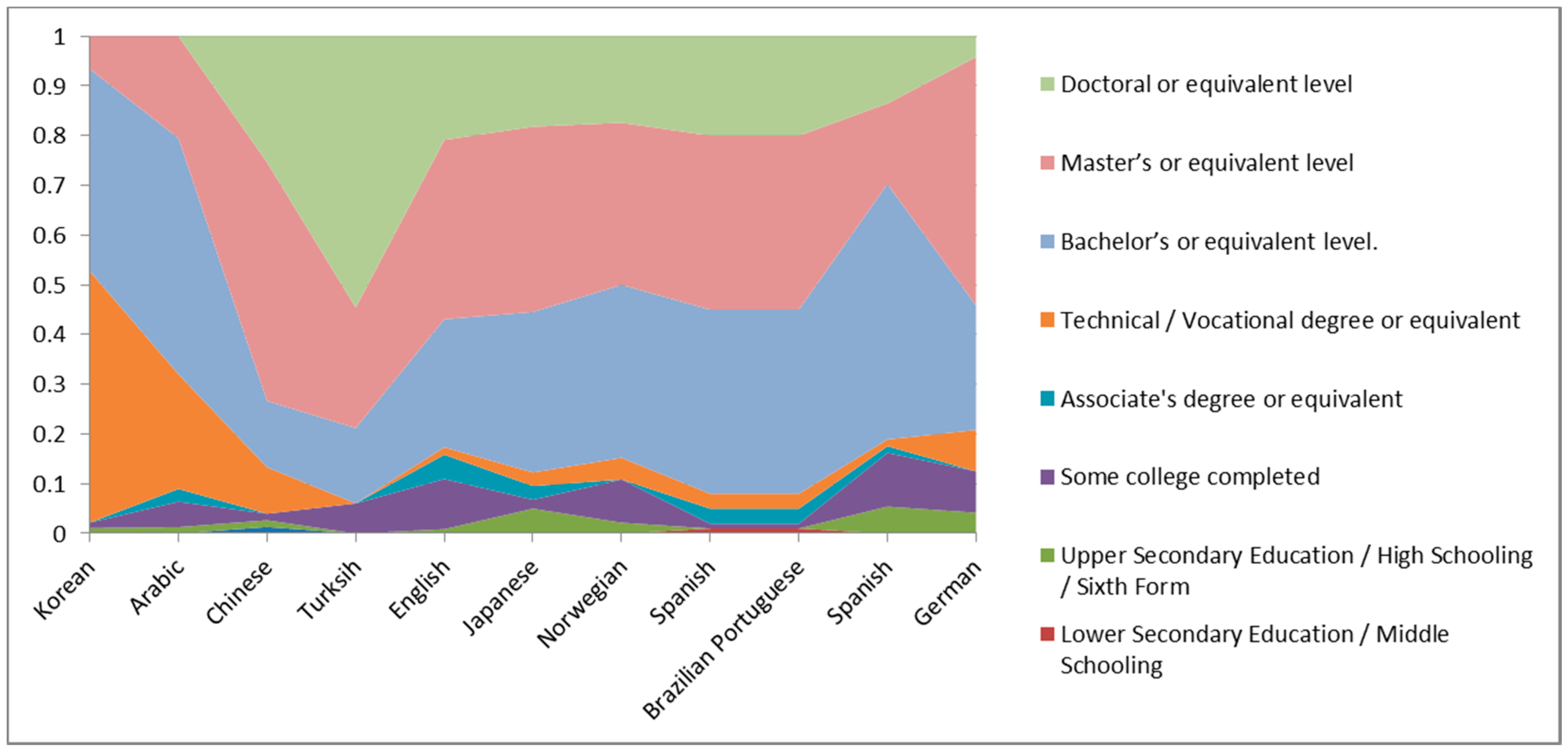
3.1.1. Level of Education of Respondents

Most respondents had bachelor’s, master’s, and doctoral level education (Figure 2). Overall, icon ratings by education level averaged 3.48, and ranged from 3.42 to 3.60. The highest average rating (3.60) was shown by high school level respondents, and the lowest level rating (3.42) was shown by master’s level or equivalent responses. Evaluating each of the icons for differences by education level showed that ratings for only 6 of the 42 icons (14%) differed by education level (ANOVA, p < 0.05). In Figure 1, icons that differed by education level are denoted by the § symbol.

3.1.2. Involvement in Professional Health Care

On average across all languages, 74% responded affirmatively to the question “Are you or have you ever been involved with professional health care”; however, three languages had a higher percentage that responded negatively (Brazilian Portuguese, 66%; Korean, 59%; and Japanese, 55%). Overall, icon ratings were 3.47 (have been involved with professional health care) and 3.43 (have not been involved). Evaluating each of the icons for differences by involvement in professional health care showed that ratings for 10 of the 42 icons (24%) differed by involvement in health care. In Figure 1, icons that differed by professional health care involvement are denoted by the * symbol.

3.1.3. Overall Ratings

Descriptive analysis of ratings by icon showed 36 icons were rated 3 or greater across all languages, and five icons were rated 4 or greater across all languages (Sexuality, Residence, Income, Vision, and Pregnancy) (Figure 1). Six icons rated less than 3 on average across languages (Neighborhood/workplace safety, Neglect, Neuro-musculo-skeletal function, Role change, Spirituality, and Medication regimen).

3.1.4. Ratings by Language

Analysis of variance (ANOVA) comparison of mean ratings for each of the 42 icons by language showed significant differences for 36 icons (p < 0.05). In Figure 1, names of icons that differed by language are denoted by bold font. Tukey honest significant difference (HSD) post hoc analyses differed by icon and were inconclusive. Means were then displayed in a heat map to search for hidden patterns by language group [28] (Figure 1).

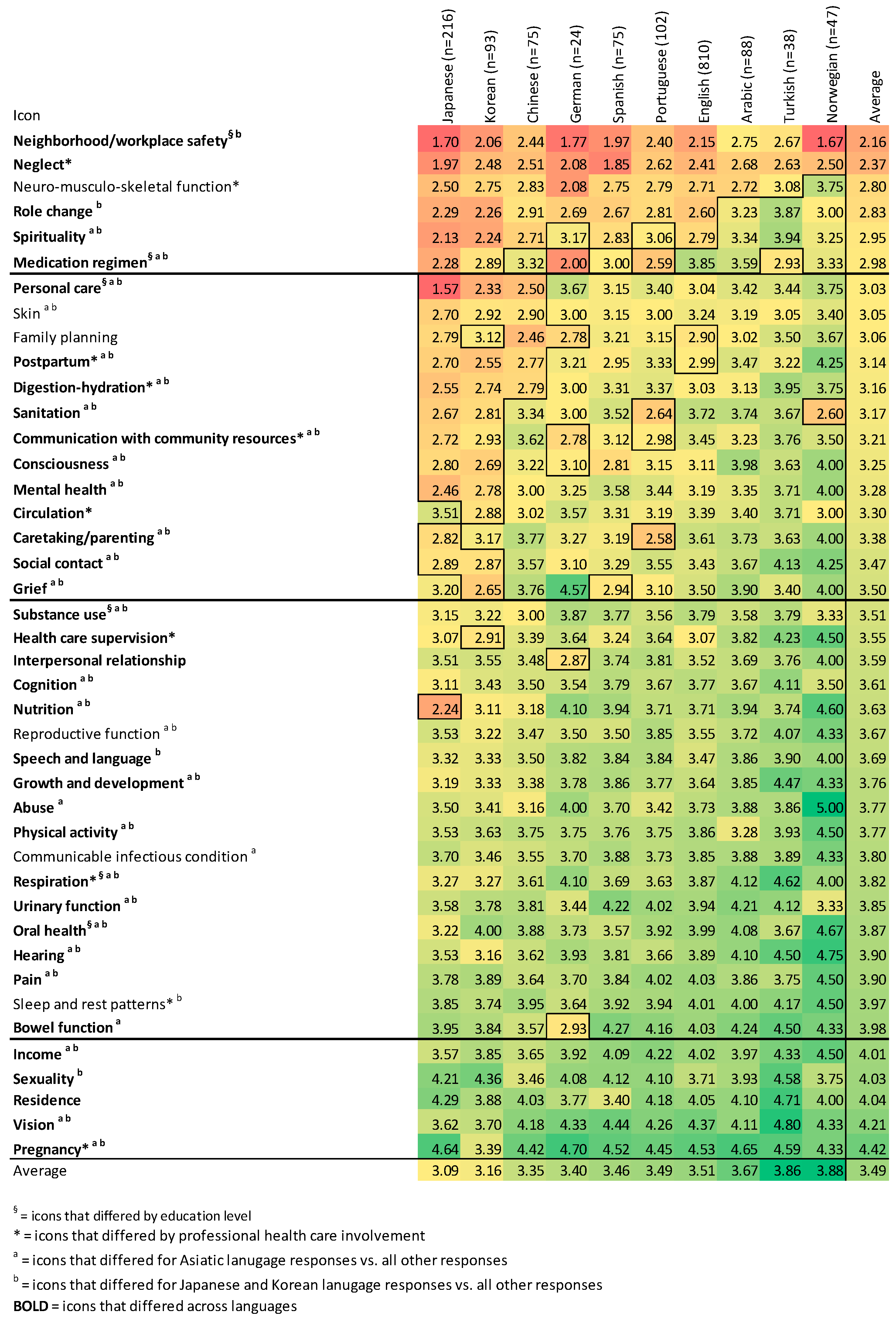
3.1.5. Patterns in Heat Map of Survey Results by Language and Overall

Heat map visualization (Figure 1) enabled pattern detection of lower Japanese and Korean language responses compared to the other language responses, especially between cut points 3.0 and 3.5. Some of the Chinese language responses also followed the pattern observed with Japanese and Korean responses. We then evaluated Japanese, Korean, and Chinese ratings compared to all other ratings; and Japanese and Korean ratings compared to all other ratings using independent samples t-tests for each icon.
Results showed that most of the icons were rated at 3 or higher by all Asiatic (Chinese, Japanese, and Korean) languages (N = 29, 69%), and similar results were found for Japanese and Korean combined responses (N = 25, 59%). However, a majority of icons were rated significantly lower by Asiatic language respondents (Table 2). For Chinese, Japanese, and Korean vs. all other language responses, 30 (71%) of icons received significantly lower ratings on average compared to all other languages. In Figure 1, icons that differed significantly for Chinese, Japanese, and Korean languages compared to all other languages are denoted with the letter a. Similarly, for Japanese and Koreancompared to all other languages, 30 (71%) of icons received significantly lower ratings on average compared to all other languages, and one icon (Sexuality) received significantly higher ratings on average compared to all other languages. In Figure 1 icons that differed significantly for Japanese and Korean languages compared to all other languages are denoted with the letter b.

3.1.6. Comments Provided by Respondents

Comments from respondents ranged from positive (e.g., “Appreciate difficulty of task. Understood them, but needed clues on a couple”) to critical (e.g., “Oh well, at least you tried”). Selected comments for icon improvement are provided below by language of respondent. Comments from English language respondents:
  • Low literacy people may not be able to recognize the organs for bowel/the icon representing the Bowel function is too static, should be more dynamic to hint at the actual movement/organ for bowel may only be recognized by health care professionals.
  • Consciousness and Mental health could be easily confused.
  • For Neglect, have someone alone far away from a group of people/perhaps a closed door with another person outside with their back turned to indicate the seated figure is left alone/maybe have someone turning head away from another.
  • Sexuality: This was a tough one to associate an image with. But should know more about sexuality rather than just being male or female. This is really about sexual behavior/activity/identification/intimacy.
Comments from Japanese language respondents:
  • Most of the icons do not appeal to me.
  • The mental health icon represents the image of a head, but for Japanese, they tend to associate the heart or chest with where the mind or spirit exists.
  • Consciousness might exist in the brain.
  • The symbol of oral health as dental floss looks American.
  • These points of view are necessary if you use the icons globally.
Comments from Korean language respondents:
  • The human image is old-fashioned. It might be due to straight line instead of curvy line. And the human image is relatively large in icons of human group. And icons have both women and men but it might not be necessary. If so, then keep both of them equally.
  • Overall, the icons are complicated and too much. It would be better to reduce the images in the icon and to show more intuitive images. I cannot get Digestion-hydration, Sanitation, and Post-partum but I like the way of Medication regimen and Growth & development.
  • How about expressing breathing, actual action for respiratory icon?
  • What does Rx mean? The Korean word for grief seems inappropriate (Figure 3).
Comments from Arabic language respondents:
  • When you asked about vision, do you mean sight or look to the future?
  • For example the symbol for blood circulation, I wanted to guess ‘heart’. If it had arrows to show blood in motion then maybe I would guess circulation.
  • The sleeping person only invoked the word or idea of sleep but not the phrase ‘styles of sleep’.
  • Pregnant woman should be shown sideways to show pregnancy bump.
  • Dental hygiene should show a tooth brush.
  • Nutrition should show a variety of fruit and vegetables
  • Infectious diseases should show sneezing person more clearly.
Comments from Spanish language respondents:
  • The message is not very clear with the Reproductive function. I see the image as a gynecological problem which is not always the same as reproductive function.
  • For Hearing—the ear should be the only icon for hearing, it would be better understood if changed to sound waves.
  • I do not understand why in some icons the red indicates a function and in others red indicates a problem.
  • I believe that the Pain icon should express pain throughout the body and with a frown gesture
  • Postpartum, too similar to the icon of pregnancy. Perhaps the female figure should have the arms holding the baby.
  • Safety in the workplace/neighborhood: For me that icon represents neither the workplace nor the neighborhood.
  • I think the eye icon does not have to refer to Vision, it could refer to the eye, so you should clarify.
  • The icon of Cognition may be representative, but is more like calculation. You are on the right track but it can be improved

3.2. Aim 2. Focus Groups

In general, participants found the icons to be suitable for consumer use representing Omaha System concepts. Focus group findings guided next steps in revision of selected icons, and overall themes were identified regarding development of icons to represent healthcare concepts. The themes are described below.
  • Challenging to depict abstract and/or complex concepts. Participants emphasized the challenges of depicting abstract concepts of Consciousness: “I think consciousness and higher thinking is so abstract it can be hard to portray the icon” and depicting complexity: Communication with community resources: “I think it fits well with the communication part but not the community resources part. I just see people in a circle talking.” An abstract icon displayed with a hint or a definition was more easily identified. For example, a participant explained “I think it definitely fits. It just took a little while, like the first time seeing it to get there. But now that I know it then, it like correlates once you know it”.
  • Level of detail should be sufficient but not excessive. Participants tended to examine details of icons, missing the main message that the icon was intended to convey. For example, participants over-analyzed minute details as in this exchange regarding the Social contact icon.
    • P1: Umm… I’m not sure why its red. Those look like coffee cups to me. Unless they are like cups of water? Maybe like that person’s a little higher so maybe that the lower person is the patient.
    • P2: Yeah I would agree. So there are two cups of coffee on the table, two people maybe. We can’t see if they are holding hands or not… maybe something about interpersonal…
    • P1: Maybe like patient care? Maybe? Yeah.
    • P2: I do not see that because there’s nothing really… but I do see that one is higher so maybe… but when its smaller I’m not sure if you would be able to tell… Let’s see because this is a really good point… well this cup is also closer so maybe that another point or just how they are positioned.
    • P2: ... Hold on, Hold on. So interpersonal stuff. Two individuals having a conversation about stuff. This one is a little lower well but the same height, that might not be necessary… And then uhh. I have no idea.
    • P3: Their hands at first threw me off—are they holding hands? Could one of them, I think the coffee and the table bring them together and the hands under the table… what are they doing back there? That was my only thought about their body language, it’s definitely intimate. I assume they’re holding hands behind the table.
    • P4: But if I were to imagine this without arms, it looks more confrontational.
    • P3: What if they had that same body language, but one hand over the other. Maybe the ambiguity is good so it doesn’t look too romantic. It also looks a little romantic.
  • Literal interpretation is common. Icons were interpreted literally, as in the case of a prototype for Mental health that was intended to show that thoughts needed healing, but instead participants interpreted the image as head trauma. Similarly, a participant commented regarding Caretaking/parenting:I think it’s still difficult to show caretaking. The first thing you go to is family and not the aspects within the family”.
  • Balance between simplicity and specificity. Participants said “I think simple is the way to go, it should not be very explicit because they have to learn [the icons/definitions], correct?” and more specific details tended to decrease the overall appreciation of the image, even while participants recognized the need for them in describing the icons.
  • Balance between representing the definition of the concept fully vs. the essence of the definition. For example, the definition of the Medication regimen concept is “use or application of over-the-counter and prescribed/recommended medications and infusions to meet guidelines for therapeutic action, safety, and schedule” [17], p. 373. “I drew a lady who’s like throwing pills into her mouth… I have a pillbox with pills in front of it and I thought the lady taking them would kind of complete the circle so those are the three elements that I thought should be there: actually someone taking them, having them, and having them on your schedule to kind of map out some of the strategies you would use. But that’s probably a big icon”. Participants agreed that representing this concept with one oral medication (capsule) image would convey the essence of the concept sufficiently. This was common across the definitions. When provided with the definition, participants seemed to simplify the definition (synthesize in their heads) to a few key words.

4. Discussion

This survey and focus group study aimed to evaluate prototype Omaha System icons across ten languages. Icons were evaluated in two phases, with an on-line survey followed by in-person focus groups. Overall, icons were well accepted across all languages, and focus group participants found the icons to be meaningful. Themes described nuanced details that may inform further icon development and refinement. Icons were revised based on survey and focus group feedback. The updated icons are available in Appendix A. Further research is ongoing to test the icons in digital platforms with consumers.
Icons that had the highest mean scores were among the most concrete Omaha System concepts (e.g., Vision, Hearing). Icons that had lowest mean scores were among the most abstract and difficult to depict concepts (e.g., Neighborhood/workplace safety, Neglect). This finding aligned with the focus group participant observations regarding difficulty interpreting abstract icons. From a comprehensive, holistic perspective, much of health is intangible in a psychosocial or spiritual sense [17,23,24]. Thus, the dual challenges of visual representation of intangible concepts in a culturally universal way are clearly demonstrated in these findings with respect to health and health care. The challenges of transcending differences among languages and cultures to promote health literacy and shared understanding are urgent [12], and this study provides a starting point for conversations about icon-based solutions for global health assessments, care planning, and collaboration.
All factors examined in the survey related differently to icon ratings. The complexity of interrelating factors that may be related to health literacy and icon interpretation may be seen in the various combinations of factors that were found to differ by icon. Only one icon (Family planning) did not differ significantly by any of the factors evaluated in this study. The pattern of language differences between Asiatic language responses and all other responses aligns with the literature [20] and suggests that universality of health care concepts may be challenging to achieve, despite aiming for the simplest representations of the concepts. Comments from Japanese and Korean language survey participants provided insight into interpretation of the findings. For example, a Japanese response noted “Most of the icons do not appeal to me”, and a Korean response noted “The human image is old-fashioned”. Universality of seemingly ubiquitous symbols should not be assumed. For example, a prototype icon represented in the survey depicted a pill bottle with the text “Rx” to signify a pharmacy. This was changed to a simple capsule (as seen in Appendix A), because of feedback from Korean and Japanese responses that Rx is not a symbol for prescription medication or pharmacy in Japan or Korea. Despite these findings, a majority of icons were rated 3 or above by Asiatic language responses, indicating that most of the icons were considered acceptable across the 10 languages. The ten languages that were chosen for the global survey represented diverse cultures and governmental jurisdictions. This strategy revealed useful information. Future studies should incorporate other languages, especially languages used in India and Africa as there were none in the current study.
The five overarching themes from focus group analysis provide guidance for further icon development in healthcare and other disciplines. Synthesis of these themes suggests that designers should aim for simple, literal images to represent the essence of a concept while providing sufficient details to be interpreted correctly. These themes underscore design principles [14,15,16] and should be applied with attention to the overall messages that were intended in the original source. The first theme, Challenging to depict abstract and/or complex concepts, emphasized that in general, very abstract icons such as Consciousness (awareness of and responsiveness to stimuli and the surroundings) and complex concepts such as Communication with community resources (overcoming barriers to obtain resources) were difficult to represent using symbolic representation. Several focus group participants noted that comprehension of the icon differed before and after the intended concept was revealed, and that once the user knows what the icon stands for, comprehension is less of an issue. This is the case for symbols used in traffic and navigation as well as health care symbols and icons for mobile devices in general [1,2,3,4,5,6]. Thus, the challenges of representing abstract concepts may need to be overcome through education of users as well as continued efforts to refine and improve the icons.
The second theme, Level of detail should be sufficient but not excessive, was revealed through participant discussion of icon meanings before the intended meaning was known. The size of icons in digital platforms limits the amount of detail that can be included and, therefore, the detail in each icon must be specific, meaningful, and limited. Additional details may not aid in interpretation, as sometimes by looking too deeply into an icon, unnecessary conclusions were drawn. This aligns with the third theme, Literal interpretation is common. Icons were interpreted literally unless there was a reason or suggestion provided to the focus group participants to think more globally about possible meanings. This also aligns with the first theme, in the notion that cues aid in interpretation of abstract icons.
The fourth theme, Balance between simplicity and specificity, and fifth and final theme, Balance between representing the definition of the concept fully vs. the essence of the definition, both emphasize the notion that the duality of visual representation presents opportunities for full, detailed depictions vs. simplified images that point to the essence of a concept. The focus group participants preferred the simpler, less comprehensive icons, and supported the notion of teaching full meaning based on simple, more general images that are related to or partially depict the concept. This reinforces the notion that when the icons are deployed in health care applications, simple icons will likely be most successful for the necessary learning of concept meanings and their intended uses.
The icons are available on-line in the public domain [25] for use (acknowledging the Omaha System [17] and the Icons study [18]) in digital platforms such as mobile applications and patient-facing technologies (with acknowledgment of the Omaha System [17] and the Icons study [18]). Research is in progress using the icons in a web-based app and consumer-friendly terms regarding self-identified strengths, challenges, and needs for each of the 42 Omaha System concepts. While further refinement of some icons is expected, these 2017 icons represent a comprehensive, holistic view of health that may facilitate a paradigm shift from assessment and data collection based on beyond typical disease-centric approaches to a more holistic perspective.
There are limitations that are common to on-line studies that are conducted with convenience samples, because individuals who self-select to participate in the studies may share similar perspectives and this may bias the findings [20]. In this study, the majority of respondents had formal educational training after high school and also had professional experience in health care, which limits the generalizability of the findings across lower educational levels and broader consumer perspectives. Further research is needed to understand differential icon acceptability for diverse education and consumer perspectives across many more languages. Furthermore, the focus group feedback was limited to English language speakers and may not be generalizable to other languages. However, the survey sample sizes and the similarities of results across most languages lend validity to the findings and further support testing and use of the icons for digital health care platforms. Further research is underway evaluating use of the icons by consumers.

5. Conclusions

The multi-language mixed methods study evaluated prototype Omaha System icons for universal use. Most icons were rated positively across all languages, with differential ratings noted particularly for Asian language responses. The 2017 Omaha System icons are available online. Further research should continue to refine and evaluate the icons in different languages for international use toward the goal of use in electronic platforms for consumers, in order to support health literacy through visual literacy.

Acknowledgments

This study was conducted through the Omaha System Partnership for Knowledge Discovery and Health Care Quality of the University of Minnesota Center for Nursing Informatics. The authors acknowledge Chikako Seebold and Jehad Adwan and numerous other native-language speaker assistants for their translation of surveys and respondent comments.

Author Contributions

All authors contributed to icon design; survey design, data collection, and analysis; and focus group design, data collection and analysis. B.E.M. created prototype icons and revised icons.

Conflicts of Interest

The authors declare no conflict of interest.

Appendix A

Table A1. Omaha System Icons by Domain (2017) (best viewed on-line in color).
Environmental Domain Informatics 04 00013 i001 Informatics 04 00013 i002 Informatics 04 00013 i003 Informatics 04 00013 i004
IncomeSanitationResidenceNeighborhood/workplace safety
Psychosocial Domain Informatics 04 00013 i005 Informatics 04 00013 i006 Informatics 04 00013 i007 Informatics 04 00013 i008 Informatics 04 00013 i009 Informatics 04 00013 i010
Communication with community resourcesSocial contactRole changeInterpersonal relationshipSpiritualityGrief
Informatics 04 00013 i011 Informatics 04 00013 i012 Informatics 04 00013 i013 Informatics 04 00013 i014 Informatics 04 00013 i015 Informatics 04 00013 i016
Mental healthSexualityCaretaking/parentingNeglectAbuseGrowth and development
Physiological Domain Informatics 04 00013 i017 Informatics 04 00013 i018 Informatics 04 00013 i019 Informatics 04 00013 i020 Informatics 04 00013 i021 Informatics 04 00013 i022
HearingVisionSpeech and languageOral healthCognitionPain
Informatics 04 00013 i023 Informatics 04 00013 i024 Informatics 04 00013 i025 Informatics 04 00013 i026 Informatics 04 00013 i027 Informatics 04 00013 i028
ConsciousnessSkinNero-musculo-skeletal functionRespirationCirculationDigestion-hydration
Informatics 04 00013 i029 Informatics 04 00013 i030 Informatics 04 00013 i031 Informatics 04 00013 i032 Informatics 04 00013 i033 Informatics 04 00013 i034
Bowel functionUrinary functionReproductive functionPregnancyPostpartumCommunicable/infectious condition
Health-related Behaviors Domain Informatics 04 00013 i035 Informatics 04 00013 i036 Informatics 04 00013 i037 Informatics 04 00013 i038
NutritionSleep and rest patternsPhysical activityPersonal care
Informatics 04 00013 i039 Informatics 04 00013 i040 Informatics 04 00013 i041 Informatics 04 00013 i042
Substance useFamily planningHealth care supervisionMedication regimen

References

  1. American Institute of Graphic Arts (AIGA). Symbol Signs. Available online: http://www.aiga.org/symbol-signs/ (accessed on 4 April 2017).
  2. Society for Experimental Graphic Design (SEGD). Healthcare Symbols. Available online: https://segd.org/healthcare-symbols (accessed on 4 April 2017).
  3. Wolpin, S.E.; Nguyen, J.K.; Parks, J.J.; Lam, A.Y.; Morisky, D.E.; Fernando, L.; Chu, A.; Berry, D.L. Redesigning pictographs for patients with low health literacy and establishing preliminary steps for delivery via smart phones. Pharm. Pract. 2016, 14, 686. [Google Scholar] [CrossRef] [PubMed]
  4. VCM: An Iconic Language for the Visualization of Concepts in Medicine. Available online: http://vcm.univ-paris13.fr/content/clinical-guidelines (accessed on 21 May 2017).
  5. Lamy, J.B.; Duclos, C.; Bar-Hen, A.; Ouvrard, P.; Venot, A. An iconic language for the graphical representation of medical concepts. BMC Med. Inform. Decis. Mak. 2008, 8, 16. [Google Scholar] [CrossRef] [PubMed]
  6. Lamy, J.B.; Soualmia, L.F.; Kerdelhué, G.; Venot, A.; Duclos, C. Validating the semantics of a medical iconic language using ontological reasoning. J. Biomed. Inform. 2013, 46, 56–67. [Google Scholar] [CrossRef] [PubMed]
  7. Choi, J. Development and pilot test of pictograph-enhanced breast health-care instructions for community-residing immigrant women. Int. J. Nurs. Pract. 2012, 18, 373–378. [Google Scholar] [CrossRef] [PubMed]
  8. Griffon, N.; Kerdelhué, G.; Hamek, S.; Hassler, S.; Boog, C.; Lamy, J.B.; Duclos, C.; Venot, A.; Darmoni, S. Design and usability study of an iconic user interface to ease information retrieval of medical guidelines. J. Am. Med. Inform. Assoc. 2014, 21, e270–e277. [Google Scholar] [CrossRef] [PubMed]
  9. Kim, H.; Nakamura, C.; Zeng-Treitler, Q. Assessment of pictographs developed through a participatory design process using an online survey tool. J. Med. Internet Res. 2009, 11, e5. [Google Scholar] [CrossRef] [PubMed]
  10. Kripalani, S.; Robertson, R.; Love-Ghaffari, M.H.; Henderson, L.E.; Praska, J.; Strawder, A.; Katz, M.G.; Jacobson, T.A. Development of an illustrated medication schedule as a low-literacy patient education tool. Patient Educ. Couns. 2007, 66, 368–377. [Google Scholar] [CrossRef] [PubMed]
  11. Lalloo, C.; Stinson, J.N.; Hochman, J.R.; Adachi, J.D.; Henry, J.L. Adapting the Iconic Pain Assessment Tool Version 2 (IPAT2) for adults and adolescents with arthritis pain through usability testing and refinement of pain quality icons. Clin. J. Pain 2013, 29, 253–264. [Google Scholar] [CrossRef] [PubMed]
  12. Glassman, P. Health Literacy. Accessed from the National Network of Libraries of Medicine. Available online: http://nnlm.gov/outreach/consumer/hlthlit.html (accessed on 4 April 2017).
  13. Lee, T.W.; Lee, S.H.; Kim, H.H.; Kang, S.J. Effective intervention strategies to improve health outcomes for cardiovascular disease patients with low health literacy skills: A systematic review. Asian Nurs. Res. 2013, 6, 128–136. [Google Scholar] [CrossRef] [PubMed]
  14. Brown, T. Change by Design: How Design Thinking Transforms Organizations and Inspires Innovation; HarperCollins: New York, NY, USA, 2009. [Google Scholar]
  15. Papanek, V. Design for the Real World: Human Ecology and Social Change, 2nd ed.; Van Nostrand Reinhold Company: New York, NY, USA, 1984. [Google Scholar]
  16. Reed, D.J.; Monk, A. Design for Inclusion. In Designing Accessible Technology; Clarkson, J., Langdon, P., Eds.; Springer: London, UK, 2006; pp. 53–63. [Google Scholar]
  17. Martin, K.S. The Omaha System: A Key to Practice, Documentation, and Information Management, reprinted 2nd ed.; Health Connections Press: Omaha, NE, USA, 2005. [Google Scholar]
  18. Monsen, K.A.; Martinson, B.; Lawrence, E.C.; Maki, T.A.; Stromme, A.E.; Weirich, E.G.; Martin, K.S. Toward population health literacy, wellbeing, consumer engagement, and informational exchange: Developing Omaha System icons for digital platforms. Int. J. Healthc. 2015, 2, 71–81. [Google Scholar] [CrossRef]
  19. Knight, E.; Gunawardena, C.N.; Aydin, C.H. Cultural interpretations of the visual meaning of icons and images used in North American web design. Educ. Media Int. 2009, 46, 17–35. [Google Scholar] [CrossRef]
  20. McMaster, S.R. Crowdsourcing Global Culture: Visual Representation in the Age of Information. Ph.D. Thesis, Concordia University, Montreal, QC, Canada, 1 September 2016. [Google Scholar]
  21. Drewal, H.J. Visual and Sensorial Aspects. In Ifá Divination, Knowledge, Power, and Performance; Olupona, J., Abiodun, R.A., Eds.; Indiana University Press: Bloomington, IN, USA, 2016; pp. 325–339. [Google Scholar]
  22. Blake Huer, M. Examining perceptions of graphic symbols across cultures: Preliminary study of the impact of culture/ethnicity. Augment. Altern. Commun. 2000, 16, 180–185. [Google Scholar] [CrossRef]
  23. Monsen, K.A.; Holland, D.E.; Fung-Houger, P.W.; Vanderboom, C.E. Seeing the whole person: Feasibility of using the Omaha System to describe strengths of older adults with chronic illness. Res. Theory Nurs. Pract. 2014, 28, 299–315. [Google Scholar] [CrossRef] [PubMed]
  24. Monsen, K.A.; Peters, J.; Schlesner, S.; Vanderboom, C.E.; Holland, D.E. The gap in Big Data: Getting to wellbeing, strengths, and a whole person perspective. Glob. Adv. Health Med. 2015, 4, 31–39. [Google Scholar] [CrossRef] [PubMed]
  25. Omaha System Guidelines. Available online: http://omahasystemguidelines.org/ (accessed on 4 April 2017).
  26. Qualtrics. Research Made Simple. Available online: https://www.qualtrics.com/research-core/ (accessed on 4 April 2017).
  27. Parker, A.; Tritter, J. Focus Group Method and Methodology: Current Practice and Recent Debate. Int. J. Res. Method Educ. 2006, 29, 23–27. [Google Scholar] [CrossRef]
  28. Gehlenborg, N.; Wong, B. Points of view: Heat maps. Nat. Methods 2012, 9, 213. [Google Scholar] [CrossRef] [PubMed]
  29. Boyatzis, R.E. Transforming Qualitative Information: Thematic Analysis and Code Development; SAGE Publications: Thousand Oaks, CA, USA, 1998. [Google Scholar]
  30. University of Minnesota Center for Nursing Informatics. Omaha System Partnership. Available online: http://omahasystempartnership.org (accessed on 21 May 2017).
Figure 1. Heat map of survey results depicting differential patterns of acceptability of the icons by icon and language (best viewed on-line in color). Horizontal lines separate icons at cut points 3.0, 3.5, and 4.0.
Informatics 04 00013 g001
Figure 2. Respondent proportions of highest education level by language (best viewed on-line in color).
Informatics 04 00013 g002
Figure 3. Original Medication regimen icon with Rx symbol tested in the survey.
Informatics 04 00013 g003
Table 1. Concepts in the Problem Classification Scheme by domain 1.
Domains: EnvironmentalPsychosocialPhysiologicalHealth-Related Behaviors
IncomeCommunication with community resourcesHearingNutrition
SanitationSocial contactVisionSleep and rest patterns
ResidenceRole changeSpeech and languagePhysical activity
Neighborhood/workplace safetyInterpersonal relationshipOral healthPersonal care
SpiritualityCognitionSubstance use
GriefPainFamily planning
Mental healthConsciousnessHealth care supervision
SexualitySkinMedication regimen
Caretaking/parentingNeuro-musculo-skeletal function
NeglectRespiration
AbuseCirculation
Growth and developmentDigestion-hydration
Bowel function
Urinary function
Reproductive function
Pregnancy
Postpartum
Communicable/infectious condition
1 Problems within each Domain are listed in order from general to specific as defined in the Omaha System.
Table 2. Significance of differences between mean language responses by icon.
All Languages (ANOVA)Japanese and Korean vs. All Others (Independent Samples t-Test)Chinese, Japanese, and Korean vs. All Others (Independent Samples t-Test)
Comparison of Mean Ratings LowerHigherLowerHigher
Significant differences (p < 0.05)36311300
No differences682102
Total42393402

