Constructing Interactive Visual Classification, Clustering and Dimension Reduction Models for n-D Data

Department of Computer Science, Central Washington University, Ellensburg, WA, 98926, USA
*
Author to whom correspondence should be addressed.
Informatics 2017, 4(3), 23; https://doi.org/10.3390/informatics4030023
Submission received: 31 May 2017
/
Revised: 17 July 2017
/
Accepted: 19 July 2017
/
Published: 25 July 2017
(This article belongs to the Special Issue Scalable Interactive Visualization)
Abstract
:The exploration of multidimensional datasets of all possible sizes and dimensions is a long-standing challenge in knowledge discovery, machine learning, and visualization. While multiple efficient visualization methods for n-D data analysis exist, the loss of information, occlusion, and clutter continue to be a challenge. This paper proposes and explores a new interactive method for visual discovery of n-D relations for supervised learning. The method includes automatic, interactive, and combined algorithms for discovering linear relations, dimension reduction, and generalization for non-linear relations. This method is a special category of reversible General Line Coordinates (GLC). It produces graphs in 2-D that represent n-D points losslessly, i.e., allowing the restoration of n-D data from the graphs. The projections of graphs are used for classification. The method is illustrated by solving machine-learning classification and dimension-reduction tasks from the domains of image processing, computer-aided medical diagnostics, and finance. Experiments conducted on several datasets show that this visual interactive method can compete in accuracy with analytical machine learning algorithms.
1. Introduction
Many procedures for n-D data analysis, knowledge discovery and visualization have demonstrated efficiency for different datasets [1,2,3,4,5]. However, the loss of information, occlusion, and clutter in visualizations of n-D data continues to be a challenge for knowledge discovery [1,2]. The dimension scalability challenge for visualization of n-D data is present at a low dimension of n = 4. Since only 2-D and 3-D data can be directly visualized in the physical 3-D world, visualization of n-D data becomes more difficult with higher dimensions as there is greater loss of information, occlusion and clutter, Further progress in data science will require greater involvement of end users in constructing machine learning models, along with more scalable, intuitive and efficient visual discovery methods and tools [6].
A representative software system for the interactive visual exploration of multivariate datasets is XmdvTool [7]. It implements well-established algorithms such as parallel coordinates, radial coordinates, and scatter plots with hierarchical organization of attributes [8]. For a long time, its functionality was concentrated on exploratory manipulation of records in these visualizations. Recently, its focus has been extended to support data mining (version 9.0, 2015), including interactive parameter space exploration for association rules [9], interactive pattern exploration in streaming [10], and time series [11].
The goal of this article is to develop a new interactive visual machine learning system for solving supervised learning classification tasks based on a new algorithm called GLC-L [12]. This study expands the base GLC-L algorithm to new interactive and automatic algorithms GLC-IL, GLC-AL and GLC-DRL for discovery of linear and non-linear relations and dimension reduction.
Classification and dimension reduction tasks from three domains: image processing, computer-aided medical diagnostics, and finance (stock market) are used to illustrate the method. This method belongs to a class of General Line Coordinates (GLC) [12,13,14,15] where the review of the state of the art is provided. The applications of GLC in finance are presented in [16]. The rest of this paper is organized as follows. Section 2 presents the approach that includes the base algorithm GLC-L (Section 2.1) the interactive version of the base algorithm (Section 2.2), the algorithm for automatic discovery of relations combined with interactions (Section 2.3), visual structure analysis of classes (Section 2.4), and generalization of algorithms for non-linear relations (Section 2.5). Section 3 presents the results for five case studies using the algorithms presented in Section 2. Section 4 discusses and analyses the results in comparison with prior results and software implementation. The conclusion section presents the advantages and benefits of proposed algorithms for multiple domains.
2. Methods: Linear Dependencies for Classification with Visual Interactive Means
Consider a task of visualizing an n-D linear function F(x) = y where x = (x1, x2, …, xn) is an n-D point and y is a scalar, y = c1x1 + c2x2 + c3x3 + … + cnxn + cn+1. Such functions play important roles in classification, regression and multi-objective optimization tasks. In regression, F(x) directly serves as a regression function. In classification, F(x) serves as a discriminant function to separate the two classes with a classification rule with a threshold T: if y < T then x belongs to class 1, else x belongs to class 2. In multi-objective optimization, F(x) serves as a tradeoff to reconcile n contradictory objective functions with ci serving as weights for objectives.
2.1. Base GLC-L Algorithm
This section presents the visualization algorithm called GLC-L for a linear function [12]. It is used as a base for other algorithms presented in this paper.
Let K = (k1, k2, …, kn+1), ki = ci/cmax, where cmax = |maxi=1:n+1(ci)|, and G(x) = k1x1 + k2x2 + …. + knxn + kn+1. Here all ki are normalized to be in [−1,1] interval. The following property is true for F and G: F(x) < T if and only if G(x) < T/cmax. Thus, F and G are equivalent linear classification functions. Below we present steps of GLC-L algorithm for a given linear function F(x) with coefficients C = (c1, c2, …, cn+1).
- Step 1: Normalize C = (c1, c2, …, cn+1) by creating as set of normalized parameters K = (k1, k2, …, kn+1): ki = ci/cmax. The resulting normalized equation yn = k1x1 + k2x2 + … + knxn + kn+1 with normalized rule: if yn < T/cmax then x belongs to class 1, else x belongs to class 2, where yn is a normalized value, yn = F(x)/cmax. Note that for the classification task we can assume cn+1 = 0 with the same task generality. For regression, we also deal with all data normalized. If actual yact is known, then it is normalized by Cmax for comparison with yn, yact/cmax.
- Step 2: Compute all angles Qi = arccos(|ki|) of absolute values of ki and locate coordinates X1 – Xn in accordance with these angles as shown in Figure 1 relative to the horizontal lines. If ki < 0, then coordinate Xi is oriented to the left, otherwise Xi is oriented to the right (see Figure 1). For a given n-D point x = (x1, x2, …, xn), draw its values as vectors x1, x2, …, xn in respective coordinates X1 – Xn (see Figure 1).
- Step 3. Draw vectors x1, x2, …, xn one after another, as shown on the left side of Figure 1. Then project the last point for xn onto the horizontal axis U (see a red dotted line in Figure 1). To simplify, visualization axis U can be collocated with the horizontal lines that define the angles Qi as shown in Figure 2.
- Step 4.
- Step 4a. For regression and linear optimization tasks, repeat step 3 for all n-D points as shown in the upper part of Figure 2a,b.
- Step 4b. For the two-class classification task, repeat step 3 for all n-D points of classes 1 and 2 drawn in different colors. Move points of class 2 by mirroring them to the bottom with axis U doubled as shown in Figure 2. For more than two classes, Figure 1 is created for each class and m parallel axis Uj are generated next to each other similar to Figure 2. Each axis Uj corresponds to a given class j, where m is the number of classes.
- Step 4c. For multi-class classification tasks, conduct step 4b for all n-D points of each pair of classes i and j drawn in different colors, or draw each class against all other classes together.
This algorithm uses the property that cos(arccos k) = k for k [−1,1], i.e., projection of vectors xi to axis U will be kixi and with consecutive location of vectors xi , the projection from the end of the last vector xn gives a sum k1x1 + k2x2 +….+ knxn on axis U. It does not include kn+1. To add kn+1, it is sufficient to shift the start point of x1 on axis U (in Figure 1) by kn+1. Alternatively, for the visual classification task, kn+1 can be omitted by subtracting kn+1 from the threshold.
Steps 2 and 3 of the algorithm for negative coefficients ki and negative values xi can be implemented in two ways. The first way represents a negative value xi, e.g., xi = −1 as a vector xi that is directed backward relative to the vector that represent xi = 1 on coordinate Xi. As a result, such vectors xi go down and to the right. See representation A1 in Figure 2c for point A = (−1,1,−1,1) that is also self-crossing. The alternative representation A2 (also shown in Figure 2c) uses the property that kixi > 0 when both ki and xi are negative. Such kixi increases the linear function F by the same value as positive ki and xi. Therefore, A2 uses the positive xi, ki and the “positive” angle associated with positive ki. This angle is shown below angle Q1 in Figure 2c. Thus, for instance, we can use xi = 1, ki = 0.5 instead of xi = −1 and ki = −0.5. An important advantage of A2 is that it is perceptually simpler than A1. The visualizations presented in this article use A2 representation.
A linear function of n variables, where all coefficients ci have similar values, is visualized in GLC-L by a line (graph, path) that is similar to a straight line. In this situation, all attributes bring similar contributions to the discriminant function and all samples of a class form a “strip” that is a simple form GLC-L representation.
In general, the term cn+1 is included in F due to both mathematical and the application reasons. It allows the coverage of the most general linear relations. If a user has a function with a non-zero cn+1, the algorithm will visualize it. Similarly, if an analytical machine learning method produced such a function, the algorithm will visualize it too. Whether cn+1 is a meaningful bias or not in the user’s task does not change the classification result. For regression problems, the situation is different; to get the exact meaningful result, cn+1 must be added and interpreted by a user. In terms of visualization, it only leads to the scale shift.
2.2. Interactive GLC-L Algorithm
For the data classification task, the interactive algorithm GLC-IL is as follows:
- It starts from the results of GLC-L such as shown in Figure 2b.
- Next, a user can interactively slide a yellow bar in Figure 2b to change a classification threshold. The algorithm updates the confusion matrix and the accuracy of classification, and pops it up for the user.
- An appropriate threshold found by a user can be interactively recorded. Then, a user can request an analytical form of the linear discrimination rule be produced and also be recorded.
- At this stage of the exploration the user has three options:
- (a)
- modify interactively the coefficients by rotating the ends of the selected arrows (see Figure 4),
- (b)
- run an automatic coefficient optimization algorithm GLC-AL described in Section 2.3,
- (c)
- apply a visual structure analysis of classes presented in the visualization described in section.
For clustering, the interactive algorithm GLC-IL is as follows. A user interactively selects an n-D point of interest P by clicking on its 2-D graph (path) P*. The system will find all graphs H* that are close to it according to the rule below.
Let P* = (p1, p2, …, pn) and H* = (h1, h2, …, hn), where pi = (pi1, pi2) and hi = (hi1, hi2) are 2-D points (nodes of graphs),
T be a threshold that a user can change interactively,
L(P, T) be a set of n-D points that are close to point P with threshold T (i.e., a cluster for P with T),
L(P, T) = {H: D(P*, H*) ≤ T}, where D(P*, H*) ≤ T i ||pi − hi|| < T, and
||pi − hi|| be the Euclidian distance between 2-D points pi and hi.
The automatic version of this algorithm searches for the largest T, such that only n-D points of the class, which contains point P, are in L(P, T) assuming that the class labels are known,
where Class(P) is a class that includes n-D point P.
max T: {H ∈ L(P, T) ⇒ H ∈ Class(P)},
2.3. Algorithm GLC-AL for Automatic Discovery of Relation Combined with Interactions
The GLC-AL algorithm differs from the Fisher Linear Discrimination Analysis (FDA), Linear SVM, and Logistic Regression algorithms in the criterion used for optimization. The GLC-AL algorithm directly maximizes some value computed from the confusion matrix (typically accuracy), A = (TP + TN)/(TP + TN + FP + FN), which is equivalent to the optimization criterion used in the linear perceptron [18] and Neural Networks in general. In contrast, the Logistic Regression minimizes the Log-likelihood [19]. The GLC-AL algorithm also allows maximization of the truth positive (TP). Fisher Linear Discrimination Analysis maximizes the ratio of between-class to within-class scatter [20]. The Linear SVM algorithm searches for a hyperplane with a large margin of classification, using the regularization and quadratic programming [21].
The automatic algorithm GLC-AL is combined with interactive capabilities as described below. The progress in accuracy is shown after every m iterations of optimization, and the user can stop the optimization at any moment to analyze the current result. It also allows interactive change of optimization criterion, say from maximization of accuracy to minimization of False Negatives (FN), which is important in computer-aided cancer diagnostic tasks.
There are several common computation strategies to maximize accuracy A in [−1,1]n+1 space of coefficients ki Gradient-based search, random search, genetic and other algorithms are commonly used to make the search feasible.
For the practical implementation, in this study, we used a simple random search algorithm that starts from a randomly generated set of coefficients ki, computes the accuracy A for this set, then generates another set of coefficients ki again randomly, computes A for this set, and repeats this process m times. Then the highest value of A is shown to the user to decide if it is satisfactory. This is Step 1 of the algorithm shown below. It is implemented in C++ and linked with OpenGL visualization and interaction program that implements Steps 2–4. A user runs the process m times more if it is not satisfactory. In Section 4.1, we show that this automatic step 1 is computationally feasible.
- Step 1:
best_coefficients = [] while n > 0 coefficients <- random(−1, 1) all_lines = 0 for i data_samples: line = 0 for x data_dimensions: if coefficients[x] < 0: line = line – data_dimensions[x]*cos(acos(coefficients[x])) else: line = line + data_dimensions[x]*cos(acos(coefficients[x])) all_lines.append(line) //update best_coefficients n-- - Step 2: Projects the end points for the set of coefficients that correspond to the highest A value (in the same way as in Figure 4) and prints off the confusion matrix, i.e., for the best separation of the two classes.
- Step 3:
- Step 3a:
- 1:
- User moves around the class separation line.
- 2:
- A new confusion matrix is calculated.
- Step 3b:
- 1:
- User picks the two thresholds to project a subset of the dataset.
- 2:
- n-D points of this subset (between the two thresholds) are projected.
- 3:
- A new confusion matrix is calculated.
- 4:
- User visually discovers patterns from the projection.
- Step 4: User can repeat Step 3a or Step 3b to further zoom in on a subset of the projection or go back to Step 1.
Validation process. Typical 10-fold cross validation with 90–10% splits produces 10 different 90–10% splits of data on the training and validation data. In this study, we used 10 different 70–30% splits with 70% for the training set and 30% for the validation set in each split. Thus, we have the same 10 tests of accuracy as in the typical cross validation. Note that supervised learning tasks with 70–30% splits are more challenging than the tasks with 90–10% splits.
These 70–30% splits were selected by using permutation of data. The splitting process is as follows:
- (1)
- indexing all m given samples from 1 to m, w = (1,2,…,m)
- (2)
- randomly permuting these indexes, and getting a new order of indexes, π(w)
- (3)
- picking up first 70% of indexes from π (w)
- (4)
- assigning samples with these indexes to be training data
- (5)
- assigning remaining 30% of samples to be validation data.
This splitting process also can be used for a 90%–10% split or other splits.
The total validation process for each set of coefficients k includes:
- (i)
- applying data splitting process.
- (ii)
- computing accuracy A of classification for this k.
- (iii)
- repeating (i) and (ii) t times (each times with different data split).
- (iv)
- computing average of accuracies found in all these runs.
2.4. Visual Structure Analysis of Classes
For the visual structure analysis, a user can interactively:
- Select border points of each class, coloring them in different colors.
- Outline classes by constructing an envelope in the form of a convex or a non-convex hull.
- Select most important coordinates by coloring them differently from other coordinates.
- Selecting misclassified and overlapped cases by coloring them differently from other cases.
- Drawing the prevailing direction of the envelope and computing its location and angle.
- Contrasting envelopes of difference classes to find the separating features.
2.5. Algorithm GLC-DRL for Dimension Reduction
A user can apply the automatic algorithm for dimension reduction anytime a projection is made to remove dimensions that don’t contribute much to the overall line in the x direction (angles close to 90°). The contribution of each dimension to the line in the horizontal direction is calculated each time the GLC-AL finds coefficients. The algorithm for automatic dimension reduction is as follows:
- Step 1: Setting up a threshold for the dimensions, which did not contribute to the line significantly in the horizontal projection.
- Step 2: Based on the threshold from Step 1, dimensions are removed from the data, and the threshold is incremented by a constant.
- Step 3: A new projection is made from the reduced data.
- Step 4: A new confusion matrix is calculated.
The interactive algorithm for dimension reduction allows a user to pick up any coordinate arrow Xi and remove it by clicking on it, which leads to the zeroing of its projection. See coordinates X2 and X7 (in red) in Figure 5b. The computational algorithm for dimension reduction is as follows.
- Step 1: The user visually examines the angles for each dimension, and determines which one is not contributing much to the overall line.
- Step 2: The user selects and clicks on the angle from Step 1.
- Step 3: The dimension, which has been selected, is removed from the dataset and a new projection is made along with a new confusion matrix. The dimension, which has been removed, is highlighted.
- Step 4:
- Step 4a: The user goes back to Step 1 to further reduce the dimensions.
- Step 4b: The user selects to find other coefficients with the remaining dimensions for a better projection using the automatic algorithm GLC-AL described above.
2.6. Generalization of the Algorithms for Discovering Non-Linear Functions and Multiple Classes
Consider a goal of visualizing a function F(x) = c11x1 + c12x12 + c21x2 + c22x22 + c3x3 + … + cnxn + cn+1 with quadratic components. For this F, the algorithm treats xi and xi2 as two different variables Xi1 and Xi2 with the separate coordinate arrows similar to Figure 1. Polynomials of higher order will have more than two such arrows. For a non-polynomial function F(x) = c1f1(x1) + c2f2(x2) + … + cnfn(xn) + cn+1, which is a linear combination of non-linear functions fi, the only modification in GLC-L is the substitution of xi by fi(xi) in the multiplication with angles still defined by the coefficients ci. The rest of the algorithm is the same. For the multiple classes the algorithm follows the method used in the multinomial logistic regression by discrimination of one class against all other k-1 classes together. Repeating this process k times for each class will give k discrimination functions that allow the discrimination of all classes.
3. Results: Case Studies
Below we present the results of five case studies. In the selection of data for these studies, we followed a common practice in the evaluation of new methods—using benchmark data from the repositories with the published accuracy results for alternative methods as a more objective and less biased way than executing alternative methods by ourselves. We used two repositories: Machine Learning Repository at the University of California Irvine [17,22], and the Modified National Institute of Standards and Technology (MNIST) set of images of digits [23]. In addition, we used S&P 500 data for the period that includes the highly volatile time of Brexit.
3.1. Case Study 1
For the first study, Wisconsin Breast Cancer Diagnostic (WBC) data set was used [17]. It has 11 attributes. The first attribute is the id number which was removed and the last attribute is the class label which was used for classification. These data were donated to the repository in 1992. The samples with missing values were removed, resulting in 444 benign cases and 239 malignant cases. Figure 6 shows samples of screenshots where these data are interactively visualized and classified in GLC-L for different linear discrimination functions, providing accuracy over 95% of these data. The malignant cases are drawn in red and benign in blue.
Figure 6 and Figure 7 show examples of how splitting the data into training and validation affects the accuracy. Figure 6 shows results of training on the entire data set, while Figure 7 shows results of training on 70% of the data randomly selected. The visual analysis of Figure 7 shows that 70% of data used for training are representative for the testing data too. This is also reflected in similar accuracies of 97.07% and 96.56% on these training and validation data. The next case studies are shown first on the entire data set to understand the whole dataset. Accuracy on the training and validation data can be found in Section 3.4, where a 70/30 split was also used.
Figure 8a shows the results for the best linear discrimination function obtained in the first 20 runs of the random search algorithm GLC-AL. The threshold found by this algorithm automatically is shown as a yellow bar. Results for the alternative discriminant functions from multiple runs of the random search by algorithm GLC-AL are shown in Figure 8b,c and Figure 9.
In these examples the threshold (yellow bar) is located at the different positions, including the situations, where all malignant cases (red cases) are on the correct side of the threshold, i.e., no misclassification of the malignant cases.
Figure 9a–c shows the process and results of interactive selecting subsets of cases using two thresholds. This tight threshold interval selects heavily overlapping cases for further detailed analysis and classification. This analysis removed interactively the 2nd dimension with low contribution without decreasing accuracy (see Figure 9c).
3.2. Case Study 2
In this study the Parkinson’s data set from UCI Machine Learning Repository [22] was used. This data set, known as Oxford Parkinson’s Disease Detection Dataset, was donated to the repository in 2008. The Parkinson’s data set has 23 attributes, one of them being status if the person has Parkinson’s disease.
The dataset has 195 voice recordings from 31 people of which 23 have Parkinson’s disease. There are several recordings from each person. Samples with Parkinson’s disease present are colored red in this study. In the data preparation step of this case study, each column was normalized between 0 and 1 separately.
Figure 10 and Figure 11 show examples of how splitting the data into training and validation sets affects the accuracy. Figure 10 shows results of training on the entire dataset, while Figure 11 shows results of training on 70% of the data randomly selected. The visual analysis of Figure 11 shows that 70% data used for training is also representative for the validation data. This is also reflected in similar accuracies of 91.24% and 88.71% respectively. The rest of illustration for this case study is for the entire dataset to understand the dataset as a whole. Accuracy on the training and validation can be found later in Section 3.4, where a 70/30 split was also used.
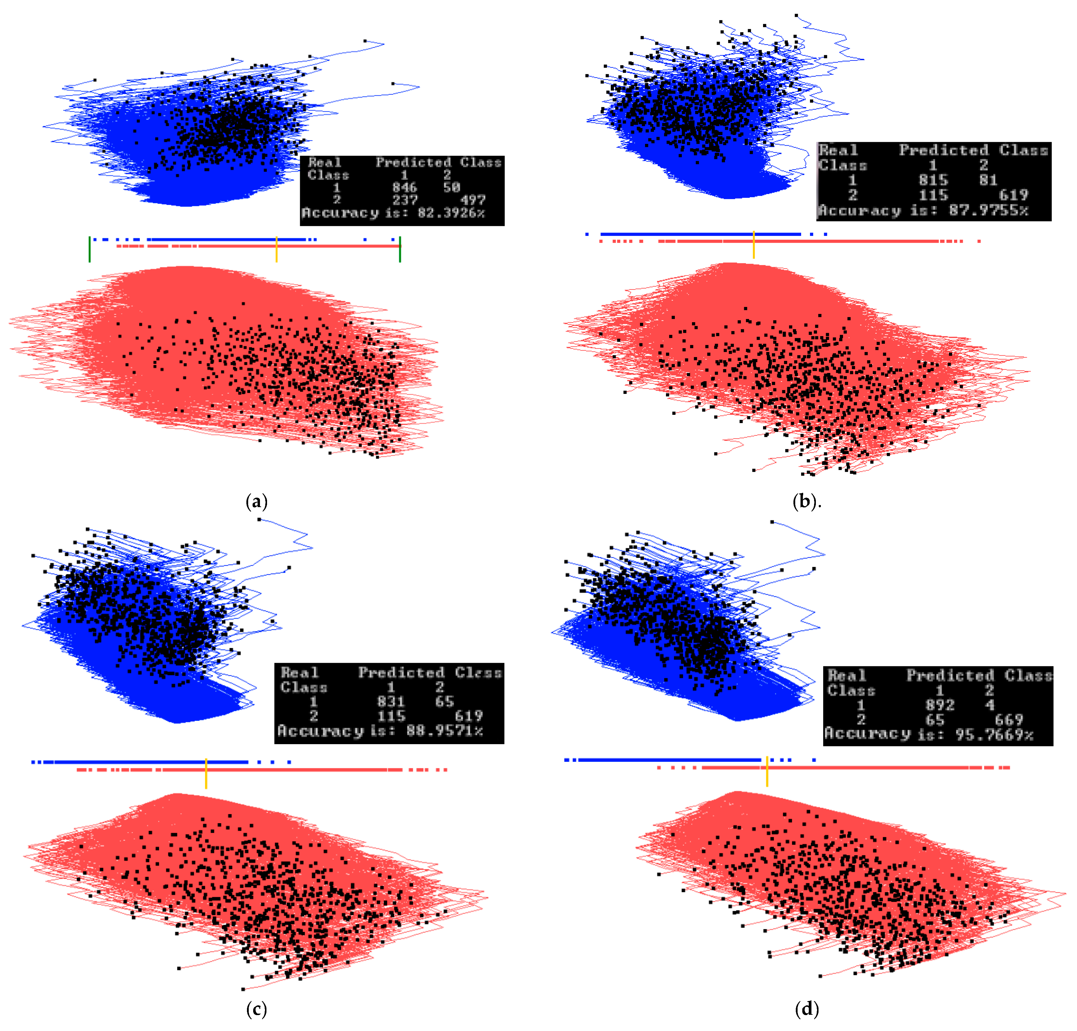
The result for the best discrimination function found from the second run of 20 epochs is shown in Figure 12a. In Figure 12b, five dimensions are removed, some of them are with angles close to 90°, and the separation line threshold is also moved relative to Figure 12a. In Figure 12c, the two limits for a subinterval are set to zoom in on the overlapping samples.
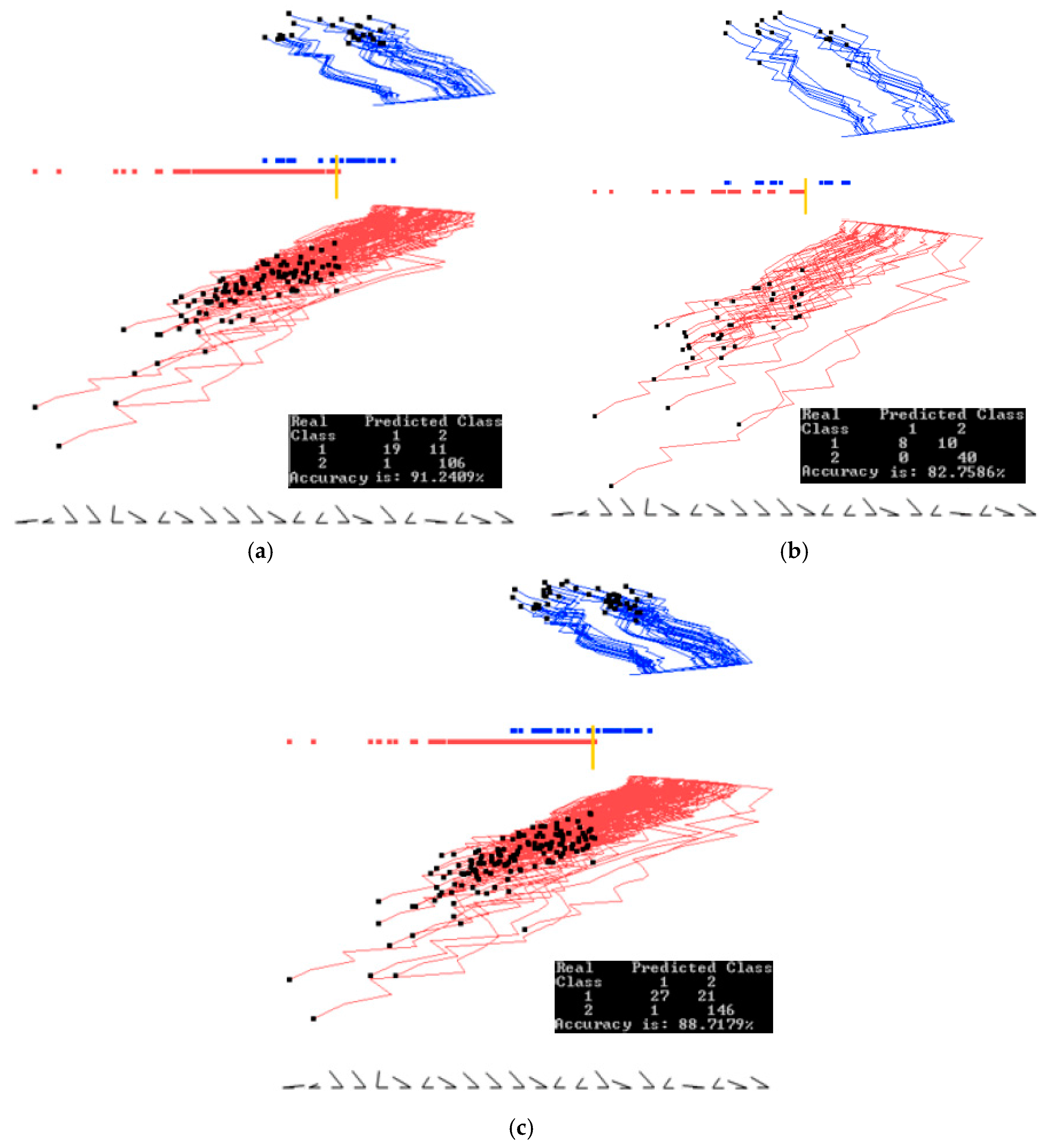
In Figure 12d, where the subregion is projected and 42 samples are removed, the accuracy only decreases by 4% from 86.15% to 82.35%. Out of those 42 cases, 40 of them are samples of Parkinson’s disease (red cases), and only 2 cases are not Parkinson’s disease.
With such line separation as in Figure 12a–c, it is very easy to classify cases with Parkinson’s disease from this dataset (high True Positive rate, TP); however, a significant number of cases with no Parkinson’s disease are classified incorrectly (high False Positive rate, FP).
This indicates the need for improving FP more exploration, such as preliminary clustering of the data, more iterations to find coefficients, or using non-linear discriminant functions. The first attempt can be a quadratic function that is done by adding a squared coordinate Xi2 to the list of coordinates without changing the GLC-L algorithm (see Section 2.5).
3.3. Case Study 3
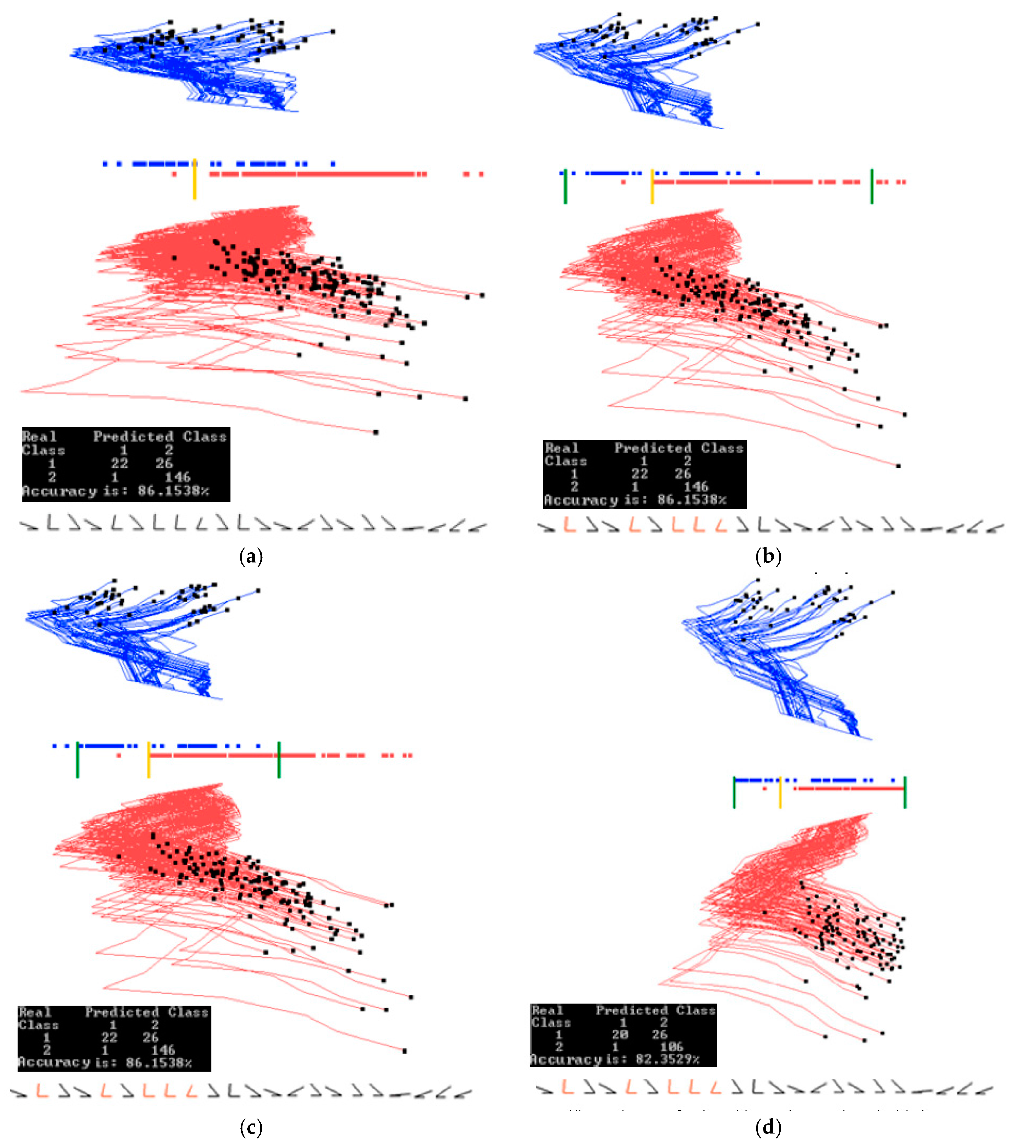
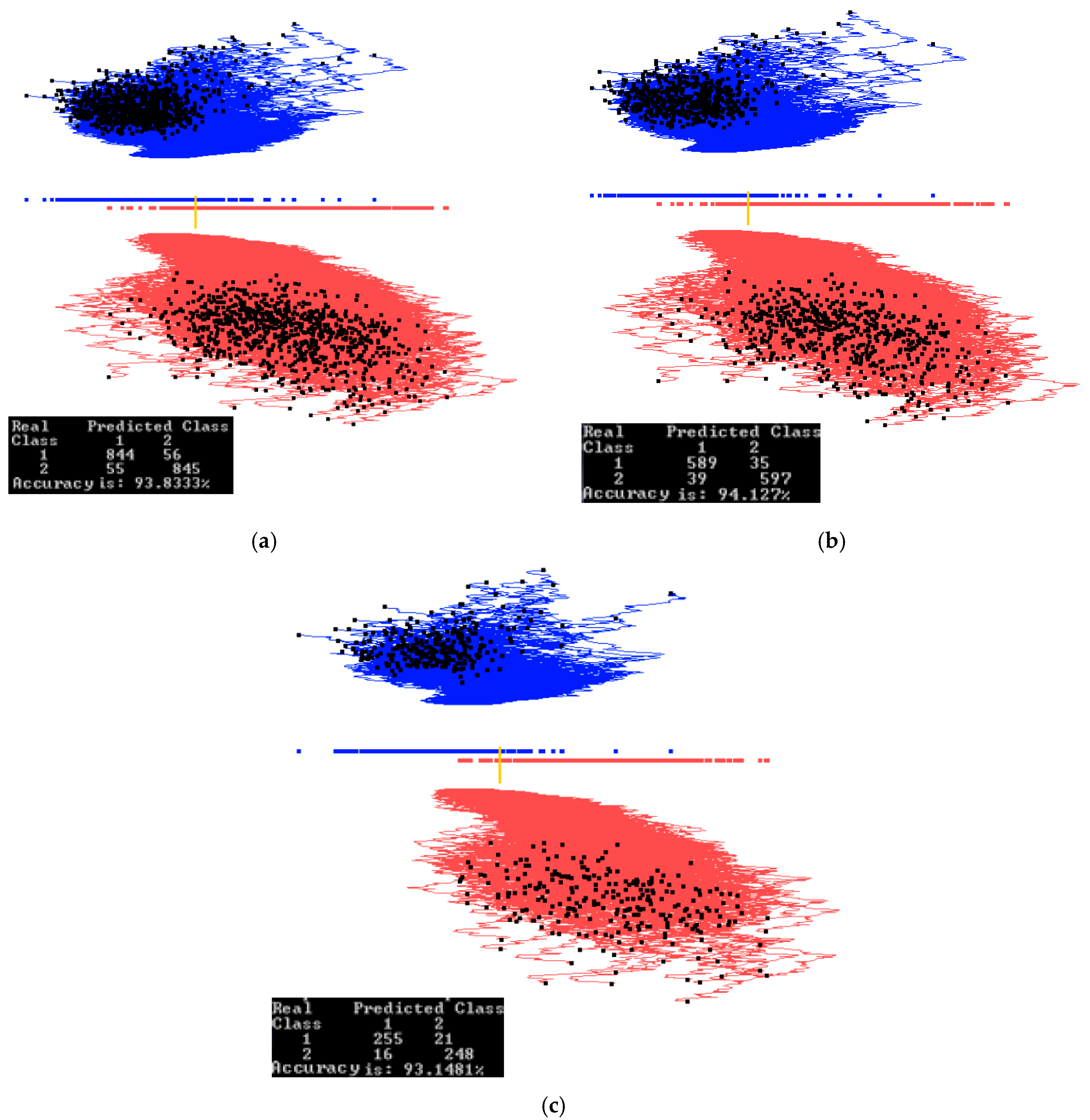
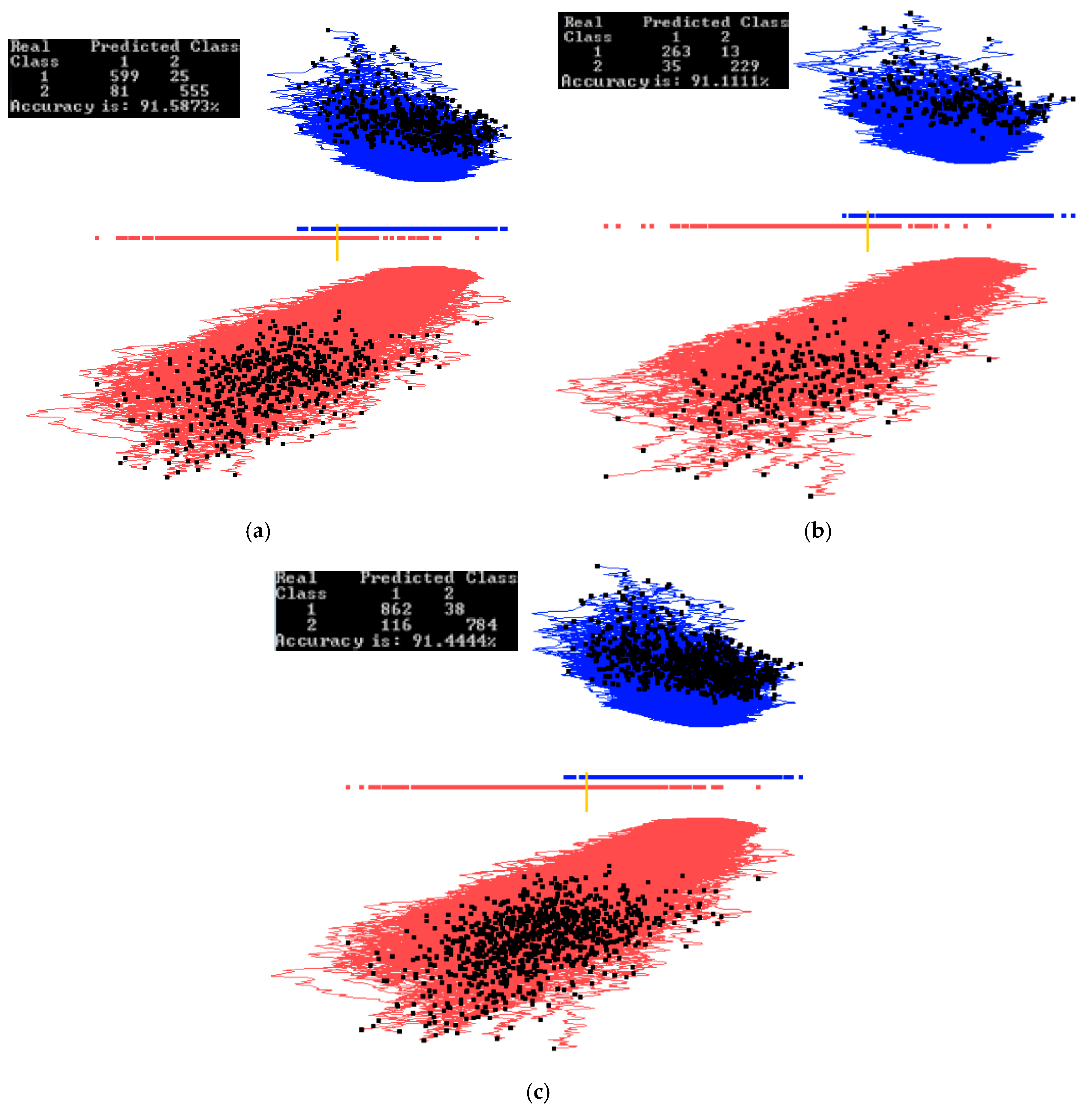
In this study, a subset of the Modified National Institute of Standards and Technology (MNIST) database [23] was used. Images of digit 0 (red) and digit 1 (blue) were used for projection with 900 samples for each digit. In the preprocessing step, each image is cropped to remove the border. The images after cropping were 22 × 22, which is 484 dimensions.
Figure 13 and Figure 14 show examples of how splitting the data into training and validation changes the accuracy. Figure 13 shows the results of training on the entire data set, while Figure 14 shows the results of training on 70% of the data, which are randomly selected. The visual analysis of Figure 14 shows that 70% of the data used for training are also representative for the validation data. This is also reflected in similar accuracies of 91.58% and 91.44% respectively. The rest of this case study is illustrated on the entire data set to understand the dataset as a whole. Accuracy on the training and validation can be found later in Section 4.1, where a 70/30 split was also used.
Figure 15a shows the results of applying the algorithm GLC-AL to these MNIST images. It is the best discriminant function of the first run of 20 epochs with the accuracy of 95.16%. Figure 15b shows the result of applying the automatic algorithm GLC-DRL to these data and the discriminant function. It displays 249 dimensions and removes 235 dimensions, dropping the accuracy only slightly by 0.28%. Figure 15c shows the result when a user decided to run the algorithm GLC-DRL a few more times. It removed a total of 393 dimensions, kept and projected the remaining 91 dimensions with the accuracy dropping to 83.77% from 93.84% as shown in Figure 15b.
Figure 15d shows the result of user interaction with the system by setting up the interval (using two bar thresholds) to select a subset of the data of interest in the overlap of the projections. The selected data are shown in Figure 16a. Figure 16b shows the results of running GLC-AL algorithm on the subinterval to find a better discriminant function and projection. Accuracy goes up by 5.6% in this subinterval.
Next, the automatic dimension reduction algorithm GLC-DRL is run on these subinterval data, removing the 46 dimensions and keeping and projecting the 45 dimensions with the accuracy going up by 1% (see Figure 16c). Figure 16d shows the result when a user decided to run the algorithm GLC-DRL a few more times on these data, removing 7 more dimensions, and keeping 38 dimensions, with the accuracy gaining 6.8%, and reaching 95.76%.
3.4. Case Study 4
Another experiment was done on a different subset of the MNIST database to see if any visual information could be extracted on encoded images. For this experiment, the training set consisted of all samples of digit 0 and digit 1 from the training set of MNIST (60,000 images). There was 12,665 samples of digit 0 and digit 1 combined in the training set. The validation set consisted of all the samples of digit 0 and digit 1 from the validation set of MNIST (10,000 images). There was 2115 samples of digit 0 and digit 1 combined in the validation set. The preprocessing step for the data was the same as for case study 3, where pixel padding was removed resulting in 22 × 22 images.
A Neural Network Autoencoder which was constructed using Python library Keras [24] encoded the images from 484 (22 × 22) dimensions to 24 dimensions. The Keras library originally was developed by François Chollet [25]. We used Keras version 1.0.2 running with python version 2.7.11. The Autoencoder had one hidden layer and was trained on the training set (12,665 samples). Examples of decoded images can be seen in Figure 17. The validation set (2115 images) was passed through the encoder to get its representation in 24 dimensions. The encoded validation set is what has been used in this case study images) was passed through the encoder to get its representation in 24 dimensions. The encoded validation set is what has been used in this case study.
The goal of this case study is to compare side-by-side GLC-L visualization with parallel coordinates. Figure 18 shows the comparison of these two visualizations using 24 dimensions found by the Autoencoder among the original 484 dimensions. Figure 18a,b shows the difference between the two classes more clearly than Parallel coordinates (PC) in Figure 18c,d. The shapes of the clouds in GLC-L are very different. The red class is elongated and the blue one is more rounded and shifted to the right relative to the red cloud. It also shows the separation threshold between classes and the accuracy of classification.
Parallel coordinates in Figure 18c,d do not show a separation between classes and accuracy of classification. Only a visual comparison of Figure 18c,d can be used for finding the features that can help in building a classifier. In particular, the intervals on features 10, 8, 23, 24 are very different, but the overlap is not, allowing the simple visual separation of the classes. Thus there is no clear way to classify these data using PCs. PCs give only some informal hints for building a classifier using these features.
3.5. Case Study 5
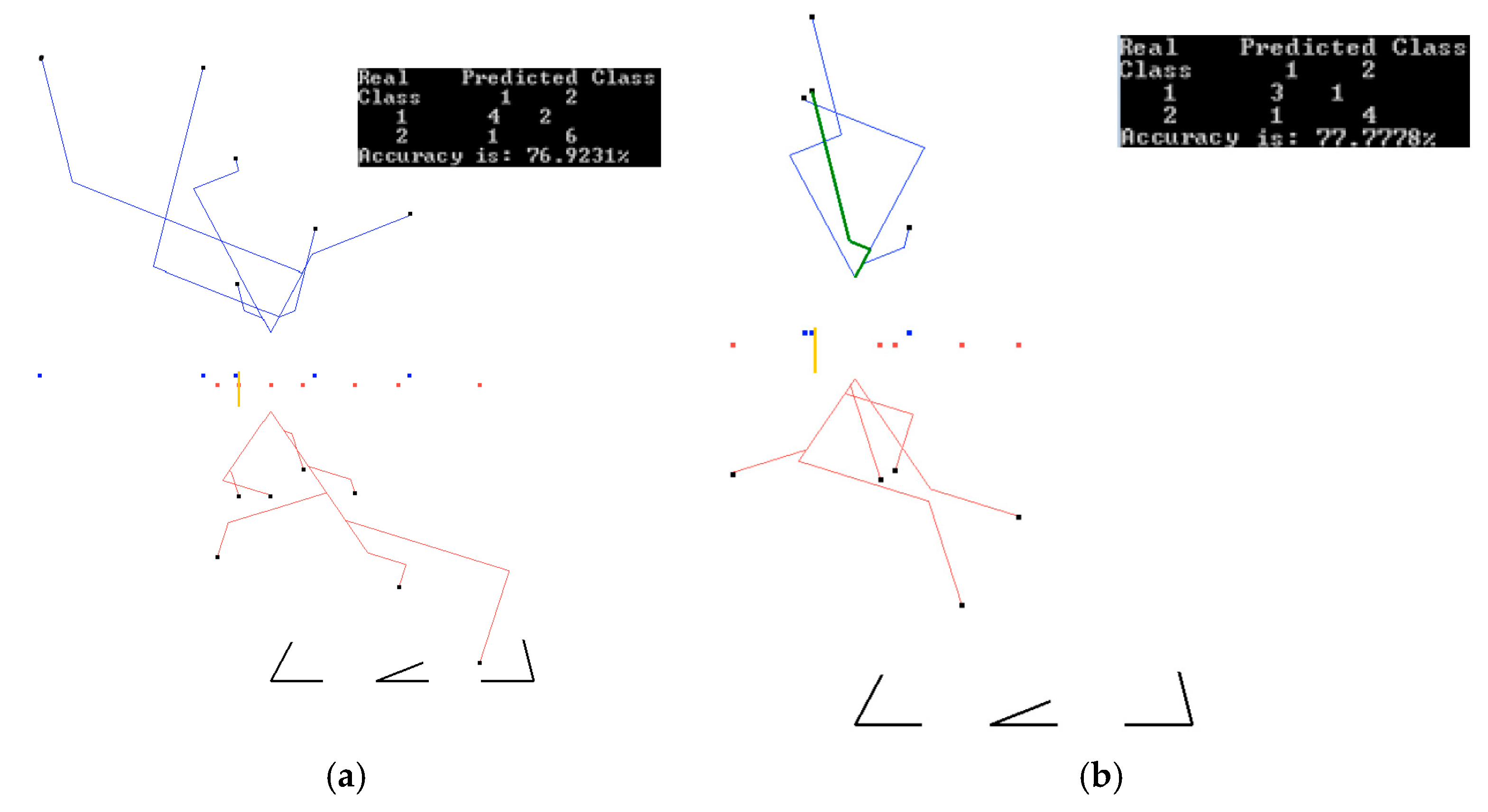
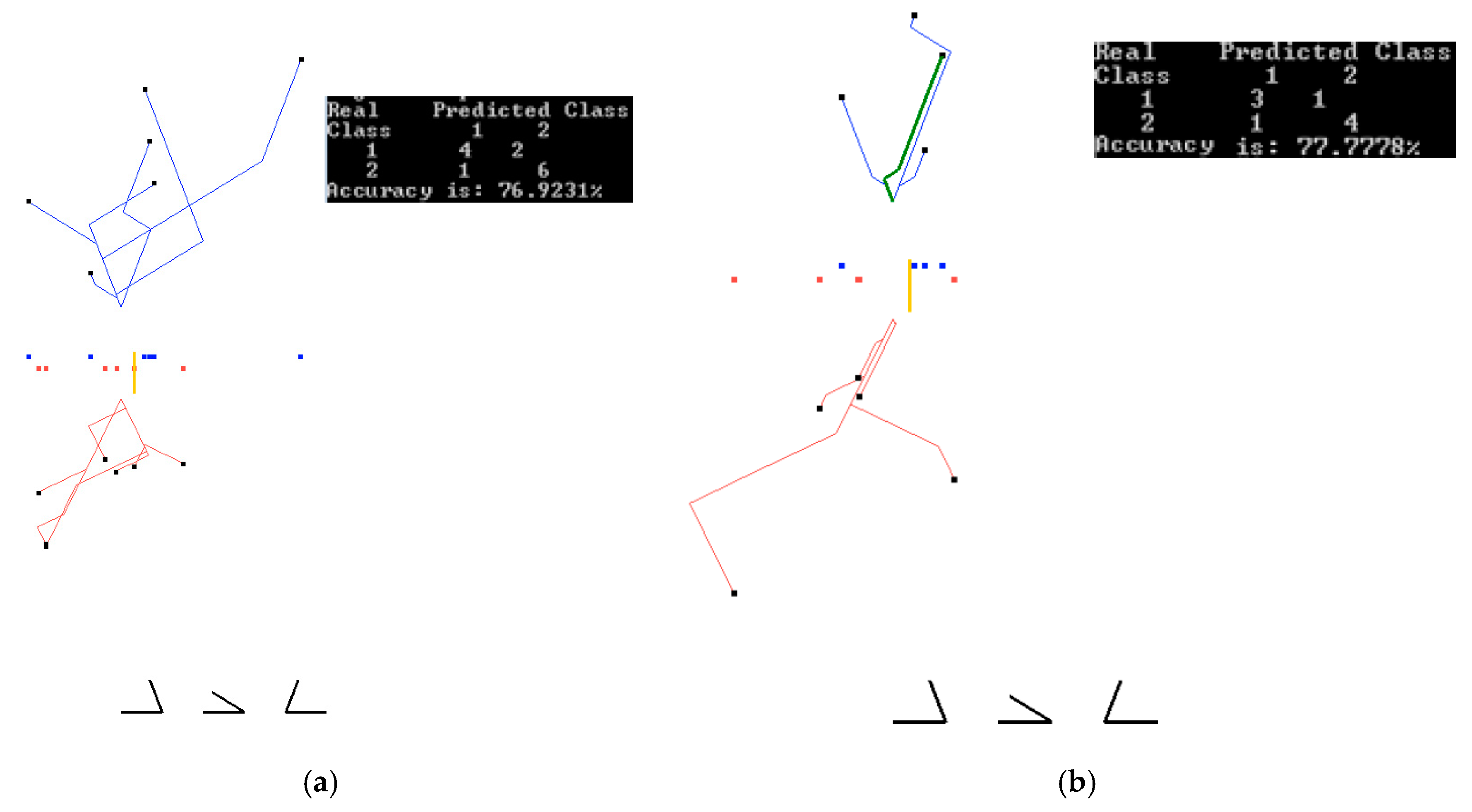
This study uses S & P 500 data for the first half of 2016 that include highly volatile S&P 500 data at the time of the Brexit vote. S & P 500 lost 75.91 points in one day (from 2113.32 to 2037.41) from 23 June to 24 June 2016 and continued dropping to 27 June to 2000.54 with total loss of 112.78 points since 23 June. The loss of value in these days is 3.59% and 5.34%, respectively. The goal of this case study is predicting S&P 500 up/down changes on Fridays knowing S&P 500 values for the previous four days of the week. The day after the Brexit vote is also a Friday. Thus, it is also of interest to see if the method will be able to predict that S&P 500 will go down on that day.
Below we use the following notation to describe the construction of features used for prediction:
- S1(w), S2(w), S3(w), S4(w), and S5(w) are S&P 500 values for Monday-Friday, respectively, of week w;
- Di(w) = Si+1(w) − Si(w) are differences in S&P 500 values on adjacent days, i = 1:4;
- Class(w) = 1 (down) if D4(w) < 0, Class(w) = 2 (up) if D4(w) > 0, Class(w) = 0 (no change) if D4(w) = 0.
We computed the attributes D1(w)–D4(w) and Class(w) from the original S & P 500 time series for the trading weeks of the first half of 2016. Attributes D1–D3 were used to predict Class (up/down). We excluded incomplete trading weeks, getting 10 “Friday down” weeks, and 12 “Friday up” weeks available for training and validation. We used multiple 60%:40% splits of these data on training and validation due to a small size of these data. The Brexit week was a part of the validation data set and was never included in the training datasets. Figure 19 and Figure 20 show the best results on the training and validation data, which are: 76.92% on the training data, and 77.77% on the validation data. We attribute the greater accuracy on the validation data to a small dataset. These accuracies are obtained for two different sets of coefficients. The accuracy of one of the runs was 84.81% on training data, but its accuracy on validation was only 55.3%. The average accuracy on all 10 runs was 77.78% on all training data, and 61.12% on the validation data. While these accuracies are lower than in the case studies 1–4, they are quite common in such market predictions [16]. The accuracy of the down prediction for 24 June (after Brexit) in those 10 runs was correct in 80% of the runs, including the runs shown in Figure 19 and Figure 20 as green lines.
4. Discussion and Analysis
4.1. Software Implementation, Time and Accuracy
All algorithms, including visualization and GUI, were implemented in OpenGL and C++ in the Windows Operating System. A Neural Network Autoencoder was implemented using the Python library Keras [24,25]). Later, we expect to make the programs publicly available.
Experiments presented in Section 3 show that 50 iterations produce a nearly optimal solution in terms of accuracy. Increasing the number of iterations to a few hundred did not show a significant improvement in the accuracy after 50 epochs. In the cases where better coefficients were found past 50 epochs, the accuracy increase was less than 1%.
The automatic step 1 of the algorithm GLC-AL in the case studies above had been computationally feasible. For m = 50 (number of iterations) in the case study, it took 3.3 s to get 96.56% accuracy on a PC with 3.2 GHz quad core processor. Running under the same conditions, case study 2 took 14.18 s to get 87.17% accuracy, and for case study 3, it took 234.28 s to get 93.15% accuracy. These accuracies are on the validation sets for the 70/30 split of data into the training and validation sets. In the future, work on a more structured random search can be implemented to decrease the computation time in high dimensional studies.
Table 1 shows the accuracy on training and validation data for the case studies 1–3. We conducted 10 different runs of 50 epochs each with the automatic step 1 of the algorithm GLC-AL. Each run had freshly permutated data, which were split into 70% training and 30% validation as described in Section 2.3. In some runs for case study 1, the validation accuracy was higher than the training one, which is because the data set is fairly small and the split heavily influences the accuracy.
The training accuracies in Table 1 are the highest ones obtained in each run of the 50 epochs. Validation accuracies in this table are computed for the discrimination functions found on respective training data. The variability of accuracy on training data among 50 epochs in each run is quite high. For instance, the accuracy varied from 63.25% to 97.91% with the average of 82.46% in case study 1.
4.2. Comparison with Published Results
Case study 1. For the Wisconsin breast cancer (WBC) data, the best accuracy of 96.995% is reported in [26] for the 10 fold cross-validation tests using SVM. This number is slightly above our average accuracy of 96.955 on the validation data in Tab1e 1, using the GLC-L algorithm. We use the 70:30 split, which is more challenging, for getting the highly accurate training, than the 10-fold 90:10 split used in that study. The best result on validation is 98.04%, obtained for the run 8 with 97.49% accuracy on training (see Table 1) that is better than 96.995% in [26].
The best results from previous studies collected in [26] include 96.84% for SVM-RBF kernel [27] and 96.99% for SVM in [28]. In [26] the best result by a combination of major machine learning algorithms implemented in Weka [29] is 97.28%. The combination includes SVM, C4.5 decision tree, naïve Bayesian classifier and k-Nearest Neighbors algorithms. This result is below the 98.04% we obtained with GLC-L. It is more important in the cancer studies to control the number of misclassified cancer cases than the number of misclassified benign cases. The total accuracy of classification reported [26] does not show these actual false positive and false negative values, while figures in Section 3.2 for GLC-L show them along with GLC-L interactive tools to improve the number of misclassified cancer cases.
This comparison shows that the GLC-L algorithm can compete with the major machine learning algorithms in accuracy. In addition, the GLC-L algorithm has the following important advantages: it is (i) simpler than the major machine learning algorithms, (ii) visual, (iii) interactive, and (iv) understandable by a user without advanced machine learning skills. These features are important for increasing user confidence in the learning algorithm outcome.
Case study 2. In [30] 13 Machine Learning algorithms have been applied to these Parkinson’s data. The accuracy ranges from 70.77 for Partial Least Square Regression algorithm, 75.38% to ID3 decision tree, to 88.72 for Support Vector Machine, 97.44 for k-Nearest Neighbors and 100% for Random decision tree forest, and average accuracy equal to 89.82% for all 13 methods.
The best results that we obtained with GLC-L for the same 195 cases are 88.71% (Figure 11c) and 91.24 % (Figure 11a). Note that the result in Figure 11a was obtained by using only 70% of 195 cases for training, not all of them. The split for training and validation is not reported in [30], making the direct comparison with results from GLC-L difficult. Just by using more training data, the commonly used split 90:10 can produce higher accuracy than a 70:30 split. Therefore, the only conclusion that can be made is that the accuracy results of GLC-L are comparable with average accuracy provided by common analytical machine learning algorithms.
Case study 3. While we did not conduct the full exploration of MNIST database for all digits, the accuracy with GLC-AL is comparable and higher than the accuracy of other linear classifiers reported in the literature for all digits and whole dataset. Those errors are 7.6% (accuracy 92.4%), for a pairwise linear classifier, and 12% and 8.4% (accuracy 88% and 91.6%), for two linear classifiers (1-layer NN) [31]. From 1998, dramatic progress was reached in this dataset with non-linear SVM and deep learning algorithms with over 99% accuracy [23]. Therefore, future application of the non-linear GLC-L (as outlined in Section 2.5) also promises higher accuracy.
For Case study 4, the comparison with parallel coordinates is presented in Section 3.4. For case study 5, we are not aware of similar experiments, but the accuracy in this case study is comparable with the accuracy of some published stock market predictions in the literature.
5. Conclusions
This paper presented GLC-L, GLC-IL, GLC-AL, and GLC-DRL algorithms, and their use for knowledge discovery in solving the machine learning classification tasks in n-D interactively. We conducted the five case studies to evaluate these algorithms using the data from three domains: computer-aided medical diagnostics, image processing, and finance (stock market). The utility of our algorithms was illustrated by these empirical studies.
The main advantages and benefits of these algorithms are: (1) lossless (reversible) visualization of n-D data in 2-D as graphs, (2) absence of the self-crossing of graphs (planar graphs), (3) dimension scalability (the case studies had shown the success with 484 dimensions), (4) scalability to the number of cases (interactive data clustering increases the number of data cases that can be handled), (5) integration of automatic and interactive visual means, (6) reached the accuracy on the level of analytical methods, (7) opportunities to justify the linear and non-linear models vs. guessing a class of predictive models, (8) simple to understand for a non-expert in Machine Learning (can be done by a subject matter expert with minimal support from the data scientist), (9) supports multi-class classification, (10) easy visual metaphor of a linear function, and (11) applicable (scalable) for discovering patterns, selecting the data subsets, classifying data, clustering, and dimension reduction.
In all experiments in this article, 50 simulation epochs were sufficient to get acceptable results. These 50 epochs correspond to computing 500 values of the objective function (accuracy), due to ten versions of training and validation data in each epoch. The likely contribution to rapid convergence of data that we used is the possible existence of many “good” discrimination functions that can separate classes in these datasets accurately enough. This includes the situations with a wide margin. In such situations a “small” number of simulations can find “good” functions. The indirect confirmation of multiplicity of discriminant functions is a variety of machine learning methods that produced quite accurate discrimination on these data that can be found in the literature. These methods include SVM, C4.5 decision tree, naïve Bayesian classifier, k-Nearest Neighbors, and Random forest. The likely contribution of the GLC-AL algorithm is in random generation of vectors of coefficients {K}. This can quickly cover a wide range of K in the hypercube [−1,1]n+1 and capture K that quickly gives high accuracy. Next, a “small” number of simulations is a typical fuzzy set with multiple values. In our experiments, this number was about 50 iterations. Building a full membership function of this fuzzy set is a subject of future studies on multiple different datasets.
The proposed visual analytics developments can help to improve the control of underfitting (overgeneralization) and overfitting in learning algorithms known as bias-variance dilemma [32], and will help in more rigorous selection of a class of machine learning models. Overfitting rejects relevant cases by considering them irrelevant. In contrast, underfitting accepts irrelevant cases, considering them as relevant.
A common way to deal with overfitting is adding a regularization term to the cost function that penalizes the complexity of the discriminant function, such as requiring its smoothness, certain prior distributions of model parameters, limiting the number of layers, certain group structure, and others [32]. Moreover, such cost functions as the least-squares can be considered as a form of regularization for the regression task. The regularization approach makes ill-posed problems mathematically solvable. However, those extra requirements often are external to the user task. For instance, the least-square method may not optimize the error for most important samples because it is not weighted. Thus, it is difficult to justify a regularizer including λ parameter, which controls the importance of the regularization term.
The linear discriminants considered in this article are among the simplest discriminants with lower variance predictions outside training data and do not need to be penalized for complexity. Further simplification of linear functions commonly is done by dimension reduction that is explored in Section 2.5. Linear discriminants suffer much more from overgeneralization (higher bias).
The expected contribution of the visual analytics discussed in the article to deal with the bias-variance dilemma is not in a direct justification of a regularization term to the cost function. It is in the introduction of another form of a regularizer outside of the cost function. In general, it is not required for a regularizer to be a part of the cost function to fulfil its role of controlling underfitting and overfitting.
The opportunity for such an outside control can be illustrated by multiple figures in his article. For instance, Figure 7a shows that all cases of class 1 form an elongated shape, and all cases of class 2 form another elongated shape on the training data. The assumption that the training data are representative for the whole data leads to the expectation that all new data of each class must be within these elongated shapes of the training data with some margin. Figure 7b shows that this is the case for validation data from Figure 7b. The analysis shows that only a few cases of validation data are outside of the convex hulls of the respective elongated shapes of classes 1 and 2 of the training data. This confirms that these training data are representative for the validation data. The linear discriminant in Figure 7a,b, shown as a yellow bar, classifies any case on the left to class 1 and any case on the right to class 2, i.e., significantly underfits (overgeneralizes) elongated shapes of the classes.
Thus, elongated shapes and their convex hull can serve as alternative regularizers. The idea of convex hulls is outlined in Section 2.4. Additional requirements may include snootiness or simplicity of an envelope at the margin distance µ from the elongated shapes. Here µ serves as a generalization parameter that plays a similar role that λ parameter plays to control the importance of the regularization term within a cost function.
Two arguments for simpler linear classifiers vs. non-linear classifiers are presented in [33]: (1) non-linear classifiers not always provide a significant advantage in performance, and (2) the relationship between features and the prediction can be harder to interpret for non-linear classifiers. Our approach, based on a linear classifier with non-linear constraints in the form of envelopes, takes a middle ground, and thus provides an opportunity to combine advantages from both linear and non-linear classifiers.
While the results are positive, these algorithms can be improved in multiple ways. Future studies will expand the proposed approach to knowledge discovery in datasets of larger dimensions with the larger number of instances and with heterogeneous attributes. Other opportunities include using GLC-L and related algorithms: (a) as a visual interface to larger repositories: not only data, but models, metadata, images, 3-D scenes and analyses, (b) as a conduit to combine visual and analytical methods to gain more insight.
Acknowledgments
We are very grateful to the anonymous reviewers for their valuable feedback and helpful comments.
Author Contributions
Boris Kovalerchuk and Dmytro Dovhalets conceived and designed the experiments; Dmytro Dovhalets performed the experiments; Boris Kovalerchuk and Dmytro Dovhalets analyzed the data; Boris Kovalerchuk contributed materials/analysis tools; Boris Kovalerchuk wrote the paper.
Conflicts of Interest
The authors declare no conflict of interest.
References
- Bertini, E.; Tatu, A.; Keim, D. Quality metrics in high-dimensional data visualization: An overview and systematization. IEEE Trans. Vis. Comput. Gr. 2011, 17, 2203–2212. [Google Scholar] [CrossRef] [PubMed]
- Ward, M.; Grinstein, G.; Keim, D. Interactive Data Visualization: Foundations, Techniques, and Applications; A K Peters/CRC Press: Natick, MA, USA, 2010. [Google Scholar]
- Rübel, O.; Ahern, S.; Bethel, E.W.; Biggin, M.D.; Childs, H.; Cormier-Michel, E.; DePace, A.; Eisen, M.B.; Fowlkes, C.C.; Geddes, C.G.; et al. Coupling visualization and data analysis for knowledge discovery from multi-dimensional scientific data. Procedia Comput. Sci. 2010, 1, 1757–1764. [Google Scholar] [CrossRef] [PubMed]
- Inselberg, A. Parallel Coordinates: Visual Multidimensional Geometry and Its Applications; Springer: New York, NY, USA, 2009. [Google Scholar]
- Wong, P.; Bergeron, R. 30 years of multidimensional multivariate visualization. In Scientific Visualization—Overviews, Methodologies and Techniques; Nielson, G.M., Hagan, H., Muller, H., Eds.; IEEE Computer Society Press: Washington, DC, USA, 1997; pp. 3–33. [Google Scholar]
- Kovalerchuk, B.; Kovalerchuk, M. Toward virtual data scientist. In Proceedings of the 2017 International Joint Conference On Neural Networks, Anchorage, AK, USA, 14–19 May 2017; pp. 3073–3080. [Google Scholar]
- XmdvTool Software Package for the Interactive Visual Exploration of Multivariate Data Sets. Version 9.0 Released 31 October 2015. Available online: http://davis.wpi.edu/~xmdv/ (accessed on 24 June 2017).
- Yang, J.; Peng, W.; Ward, M.O.; Rundensteiner, E.A. Interactive hierarchical dimension ordering, spacing and filtering for exploration of high dimensional datasets. In Proceedings of the 9th Annual IEEE Conference on Information Visualization, Washington, DC, USA, 19–21 October 2003; pp. 105–112. [Google Scholar]
- Lin, X.; Mukherji, A.; Rundensteiner, E.A.; Ward, M.O. SPIRE: Supporting parameter-driven interactive rule mining and exploration. Proc. VLDB Endow. 2014, 7, 1653–1656. [Google Scholar] [CrossRef]
- Yang, D.; Zhao, K.; Hasan, M.; Lu, H.; Rundensteiner, E.; Ward, M. Mining and linking patterns across live data streams and stream archives. Proc. VLDB Endow. 2013, 6, 1346–1349. [Google Scholar] [CrossRef]
- Zhao, K.; Ward, M.; Rundensteiner, E.; Higgins, H. MaVis: Machine Learning Aided Multi-Model Framework for Time Series Visual Analytics. Electron. Imaging 2016, 1–10. [Google Scholar] [CrossRef]
- Kovalerchuk, B.; Grishin, V. Adjustable general line coordinates for visual knowledge discovery in n-D data. Inf. Vis. 2017. [Google Scholar] [CrossRef]
- Grishin, V.; Kovalerchuk, B. Multidimensional collaborative lossless visualization: Experimental study. In Proceedings of the International Conference on Cooperative Design, Visualization and Engineering (CDVE 2014), Seattle, WA, USA, 14–17 September 2014; Luo, Y., Ed.; Springer: Basel, Switzerland, 2014; pp. 27–35. [Google Scholar]
- Kovalerchuk, B. Super-intelligence challenges and lossless visual representation of high-dimensional data. In Proceedings of the 2016 International Joint Conference on Neural Networks (IJCNN), Vancouver, BC, Canada, 24–29 July 2016; pp. 1803–1810. [Google Scholar]
- Kovalerchuk, B. Visualization of multidimensional data with collocated paired coordinates and general line coordinates. Proc. SPIE 2014, 9017. [Google Scholar] [CrossRef]
- Wilinski, A.; Kovalerchuk, B. Visual knowledge discovery and machine learning for investment strategy. Cogn. Syst. Res. 2017, 44, 100–114. [Google Scholar] [CrossRef]
- UCI Machine Learning Repository. Breast Cancer Wisconsin (Original) Data Set. Available online: https://archive.ics.uci.edu/ml/datasets/breast+cancer+wisconsin+(original) (accessed on 15 June 2017).
- Freund, Y.; Schapire, R. Large margin classification using the perceptron algorithm. Mach. Learn. 1999, 37, 277–296. [Google Scholar] [CrossRef]
- Freedman, D. Statistical Models: Theory and Practice; Cambridge University Press: Cambridge, UK, 2009. [Google Scholar]
- Maszczyk, T.; Duch, W. Support vector machines for visualization and dimensionality reduction. In International Conference on Artificial Neural Networks; Springer: Berlin/Heidelberg, Germany, 2008; pp. 346–356. [Google Scholar]
- Cristianini, N.; Shawe-Taylor, J. An Introduction to Support Vector Machines and Other Kernel-Based Learning Methods; Cambridge University Press: Cambridge, UK, 2000. [Google Scholar]
- UCI Machine Learning Repository. Parkinsons Data Set. Available online: https://archive.ics.uci.edu/ml/datasets/parkinsons (accessed on 15 June 2017).
- LeCun, Y.; Cortes, C.; Burges, C. MNIST Handwritten Digit Database, 2013. Available online: http://yann.lecun.com/exdb/mnist/ (accessed on 12 March 2017).
- Keras: The Python Deep Learning Library. Available online: http://keras.io (accessed on 14 June 2017).
- Chollet, F. Keras. 2015. Available online: https://github.com/fchollet/keras (accessed on 14 June 2017).
- Salama, G.I.; Abdelhalim, M.; Zeid, M.A. Breast cancer diagnosis on three different datasets using multi-classifiers. Breast Cancer (WDBC) 2012, 32, 2. [Google Scholar]
- Aruna, S.; Rajagopalan, D.S.; Nandakishore, L.V. Knowledge based analysis of various statistical tools in detecting breast cancer. Comput. Sci. Inf. Technol. 2011, 2, 37–45. [Google Scholar]
- Christobel, A.; Sivaprakasam, Y. An empirical comparison of data mining classification methods. Int. J. Comput. Inf. Syst. 2011, 3, 24–28. [Google Scholar]
- Weka 3: Data Mining Software in Java. Available online: http://www.cs.waikato.ac.nz/ml/weka/ (accessed on 14 June 2017).
- Ramani, R.G.; Sivagami, G. Parkinson disease classification using data mining algorithms. Int. J. Comput. Appl. 2011, 32, 17–22. [Google Scholar]
- LeCun, Y.; Bottou, L.; Bengio, Y.; Haffner, P. Gradient-Based Learning Applied to Document Recognition. Proc. IEEE 1998, 86, 2278–2324. [Google Scholar] [CrossRef]
- Domingos, P. A unified bias-variance decomposition. In Proceedings of the 17th International Conference on Machine Learning, Stanford, CA, USA, 29 June–2 July 2000; Morgan Kaufmann: Burlington, MA, USA, 2000; pp. 231–238. [Google Scholar]
- Pereira, F.; Mitchell, T.; Botvinick, M. Machine learning classifiers and fMRI: A tutorial overview. NeuroImage 2009, 45 (Suppl. 1), S199–S209. [Google Scholar] [CrossRef] [PubMed]
Figure 1.
4-D point A = (1,1,1,1) in GLC-L coordinates X1 – X4 with angles (Q1,Q2,Q3,Q4) with vectors xi shifted to be connected one after another and the end of last vector projected to the black line. X1 is directed to the left due to negative k1. Coordinates for negative ki are always directed to the left.
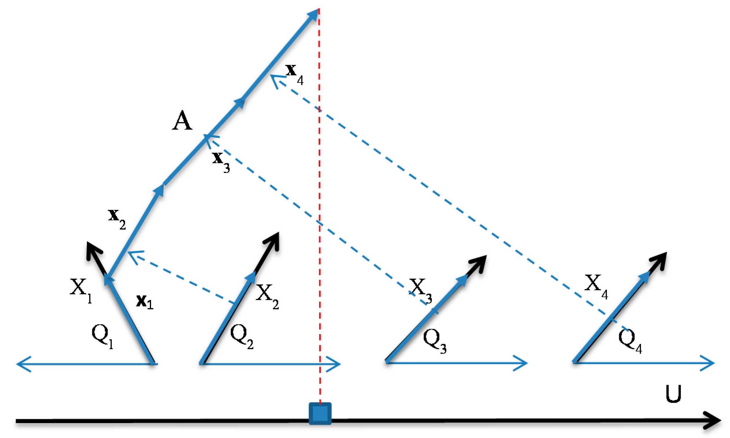
Figure 2.
GLC-L algorithm on real and simulated data. (a) Result with axis X1 starting at axis U and repeated for the second class below it; (b) Visualized data subset from two classes of Wisconsin breast cancer data from UCI Machine Learning Repository [17]; (c) 4-D point A = (−1,1,−1,1) in two representations A1 and A2 in GLC-L coordinates X1 – X4 with angles Q1 – Q4.
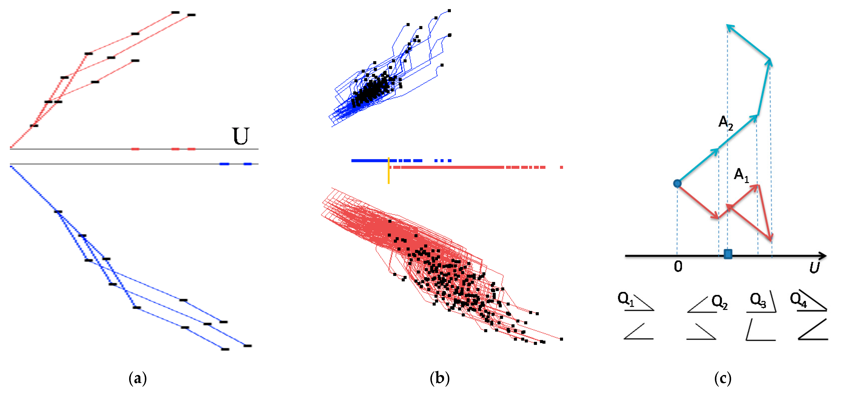
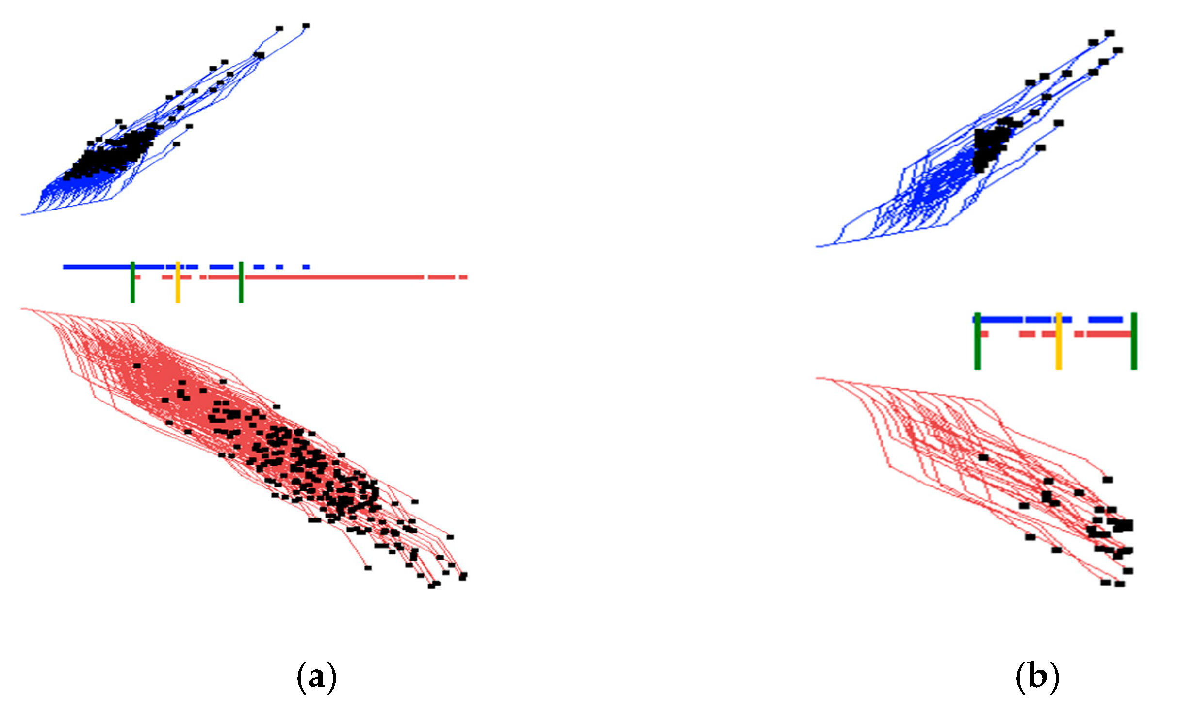
Figure 3.
Interactive GLC-L setting with sliding green bars to define the overlap area of two classes for further exploration.(a) Interactive defining of the overlap area of two classes; (b) Selected overlapped n-D points.
Figure 3.
Interactive GLC-L setting with sliding green bars to define the overlap area of two classes for further exploration.(a) Interactive defining of the overlap area of two classes; (b) Selected overlapped n-D points.

Figure 4.
Modifying interactively the coefficients by rotating the ends of selected arrows, X2 and X4 are rotated.
Figure 4.
Modifying interactively the coefficients by rotating the ends of selected arrows, X2 and X4 are rotated.
Figure 5.
Interactive dimension reduction, angles for each dimension are shown on the bottom. (a) Initial visualization of two classes optimized by GLC-AL algorithm; (b) Visualization of two classes after 2nd and 7th dimensions (red) with low contribution (angle about 90°) have been removed.
Figure 5.
Interactive dimension reduction, angles for each dimension are shown on the bottom. (a) Initial visualization of two classes optimized by GLC-AL algorithm; (b) Visualization of two classes after 2nd and 7th dimensions (red) with low contribution (angle about 90°) have been removed.
Figure 6.
Results for the Wisconsin breast cancer data showing the training, validation, and the entire data set when trained on the entire data set. (a) Entire training and validation data set. Best projections of one of the first runs of GLC-AL. Coefficients found on the entire data set; (b) Data split into 70/30 (training and validation) showing only 70% of the data, using coefficients and the separation line found on the entire data set in (a); (c) Showing the 30% (validation set). Using the coefficients and the separation line same as in (a). Accuracy goes up.

Figure 7.
Results for the Wisconsin breast cancer data showing the training, validation, and the entire data set when trained on the training set. (a) Data are split using 70% (training set) to the find coefficients with the projecting training set. Best result from the first runs of GLC-AL; (b) Using the coefficients found by the training set in (a) and projecting the validation data set (30% of the data); (c) Projecting the entire data set using the coefficients found by the training set in (a).
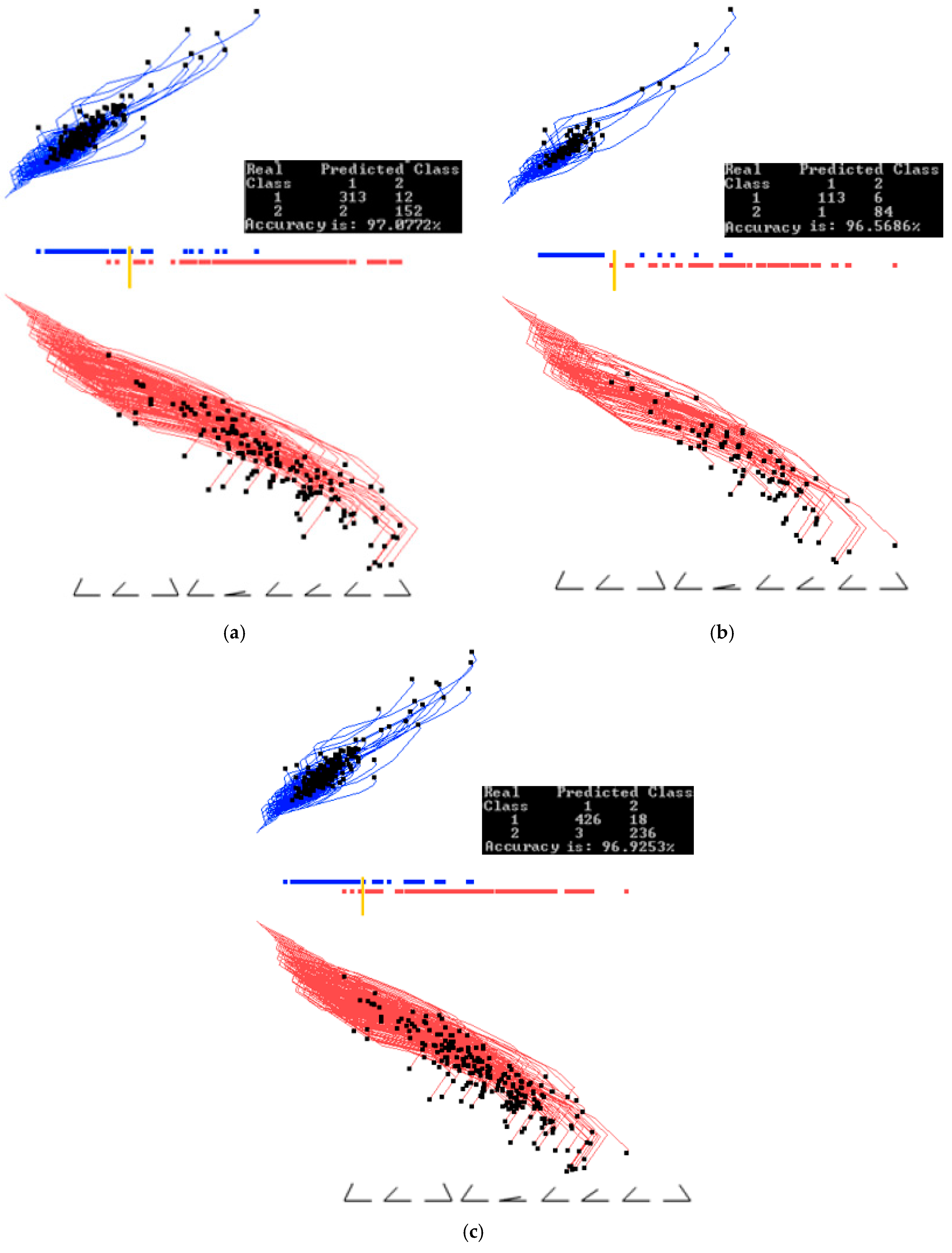
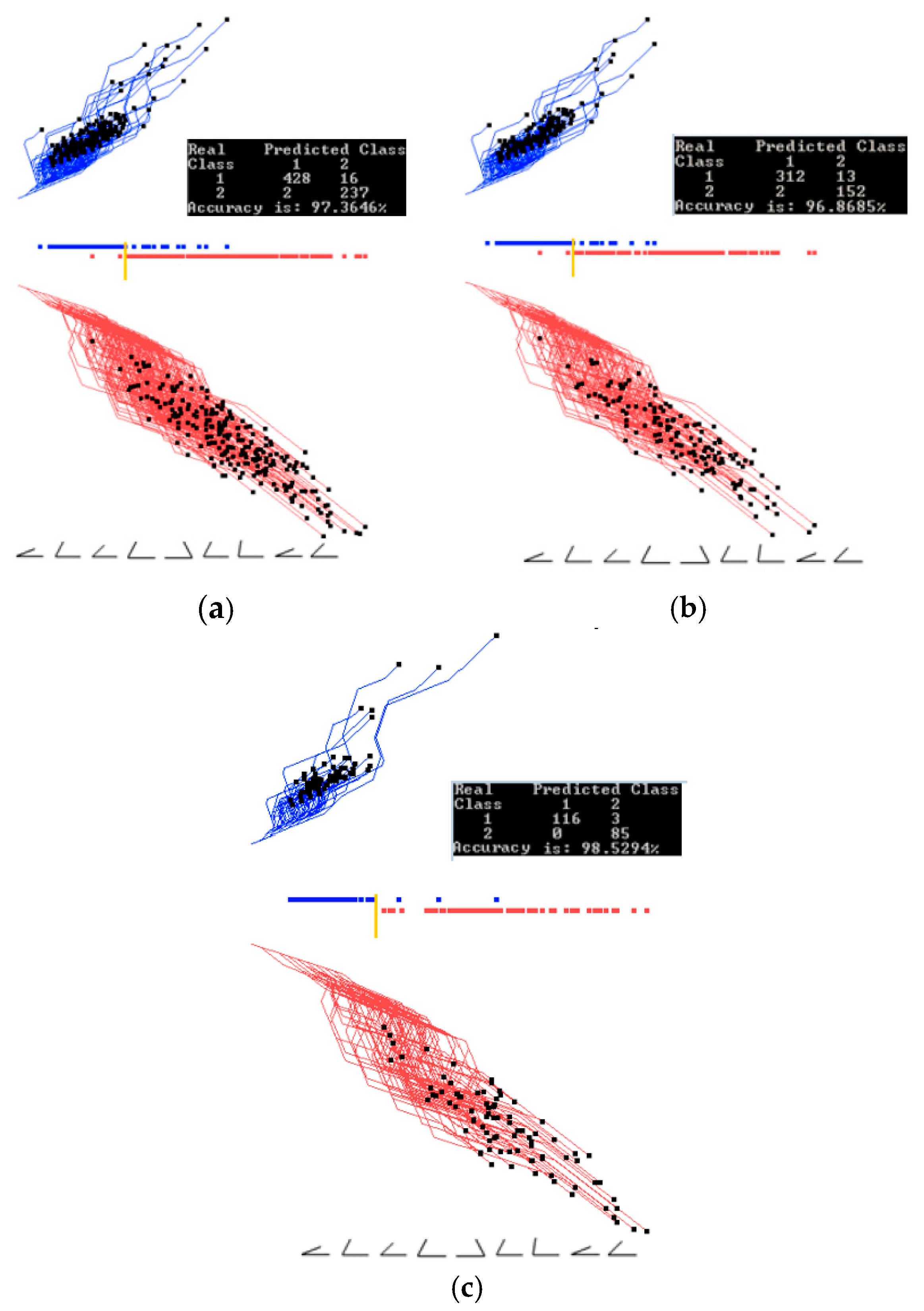
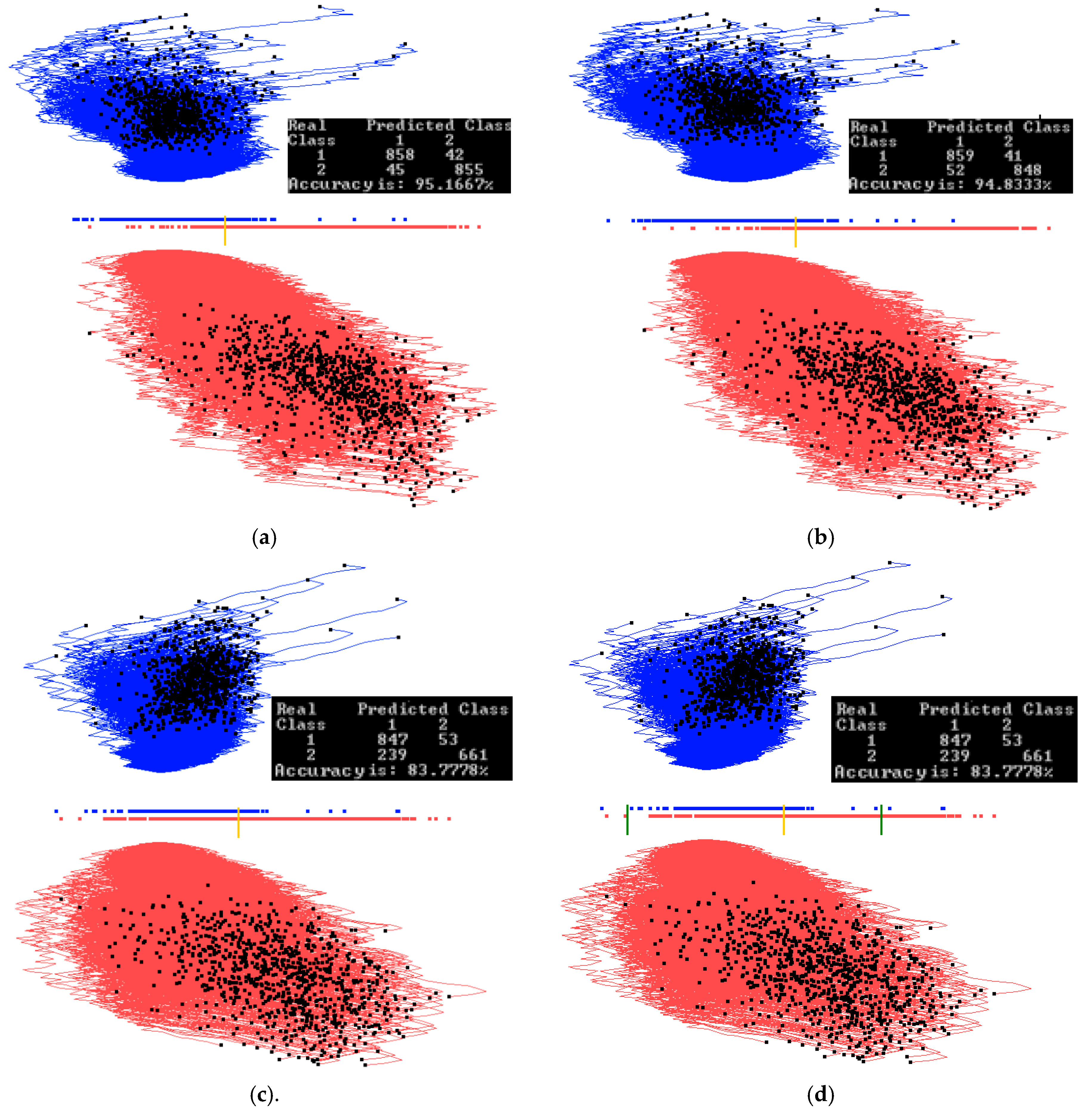
Figure 8.
Wisconsin breast cancer data interactively visualized and classified in GLC-L for different linear discrimination functions. (a) Data visualized and classified using the best function of the first 20 runs of the random search with a threshold found automatically shown as a yellow bar; (b) Data visualized and classified using an alternative function from the first 20 runs with the threshold (yellow bar) at the positions having only one malignant (red case) on the wrong side and higher overall accuracy than in (a). (c) Visualization (b) where the separation threshold is moved to have all malignant (red cases) on the correct side with the tradeoff in the accuracy.

Figure 9.
Wisconsin breast cancer data interactively projecting a selected subset. (a) Two thresholds are set from Figure 8c for selecting overlapping cases. (b) Overlapping cases from the interval between two thresholds from (a). (c) Overlapping cases from the interval between two thresholds, with the 2nd dimension with low contribution removed without decreasing accuracy.

Figure 10.
Results with Parkinson’s disease data set showing the training, validation and the entire data set when trained on the entire data set. (a) Training and validation on the entire dataset. Best projections of one of the first runs of GLC-AL. Coefficients found on the entire data set; (b) Data split into 70/30% (training/validation) showing only 70% of the data, using the coefficients and the separation line found on the entire data set in (a). (c) Showing the 30% (validation set). Using coefficients and the separation line the same as in (a). Accuracy goes down.
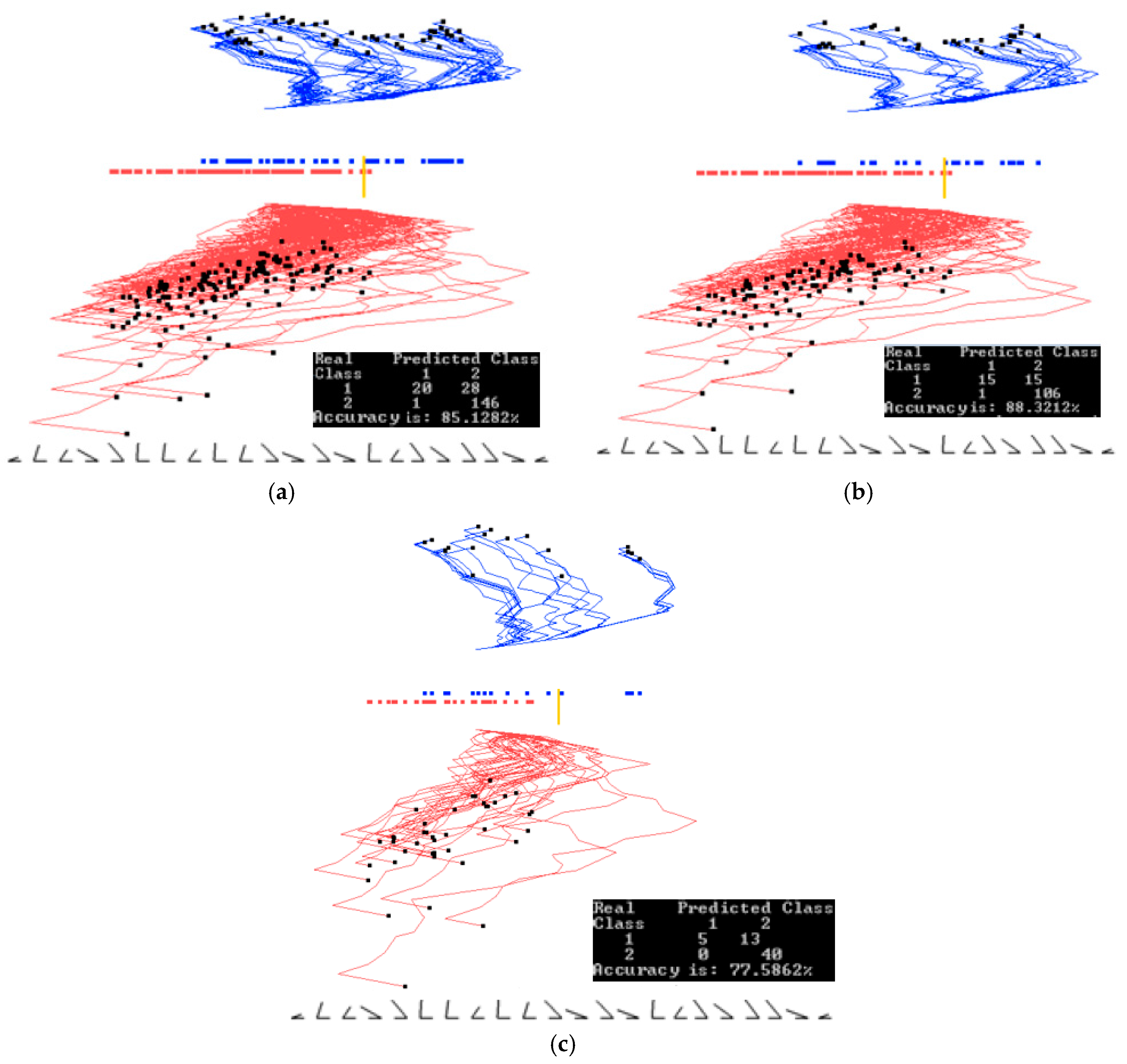
Figure 11.
Results with Parkinson’s disease data set showing the training, validation and the entire data set when trained on the training set. (a) Data is split. Using 70% (training set) to find the coefficients. Projecting training set, best from the first runs of GLC-A; (b) Using coefficients found by the training set in (a) and projecting the validation dataset (30% of the data); (c) Projecting the entire data set using coefficients found by the training set in (a).

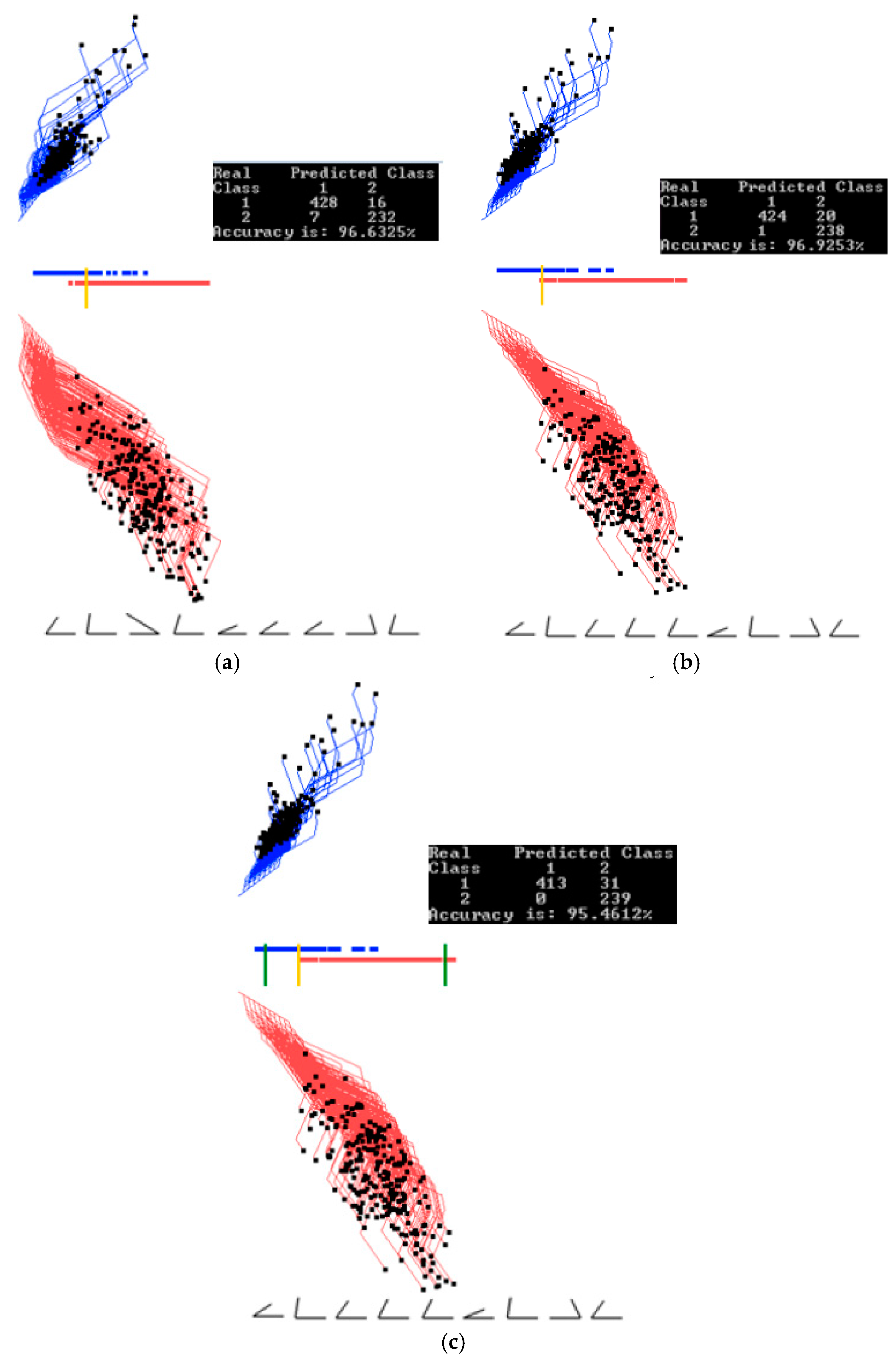
Figure 12.
Additional Parkinson’s disease experiments. (a) Best projection from the second run of 20 epochs. (b) Projection with 5 dimensions removed. Separation line threshold is also moved. Accuracy stays the same; (c) Two limits for a subinterval are set; (d) Only cases for the subinterval are projected with the separation line moved. Accuracy drops.

Figure 13.
MNIST subset for digits 0 and 1 dataset showing training, validation, and the entire data set when trained on the entire data set. (a) Training and validation on the entire data set. Best projections of one of the first runs of GLC-A. Coefficients found on the entire data set; (b) Data split into 70/30% (training/validation) showing only 70% of the data, using coefficients and separation line found on the entire data set in (a); (c) Showing the 30% (validation set). Using the coefficients and the separation line same as in (a). Accuracy goes down.

Figure 14.
MNIST subset for digits 0 and 1 data set showing training, validation, and the entire data set when trained on the training set. (a) Data is split. Using 70% (training set) to find the coefficients. Projecting training set, best from the first runs of GLC-A; (b) Using the coefficients found by the training set in (a) and projecting the validation dataset (30% of the data); (c) Projecting the entire data set using the coefficients found by the training set in (a).

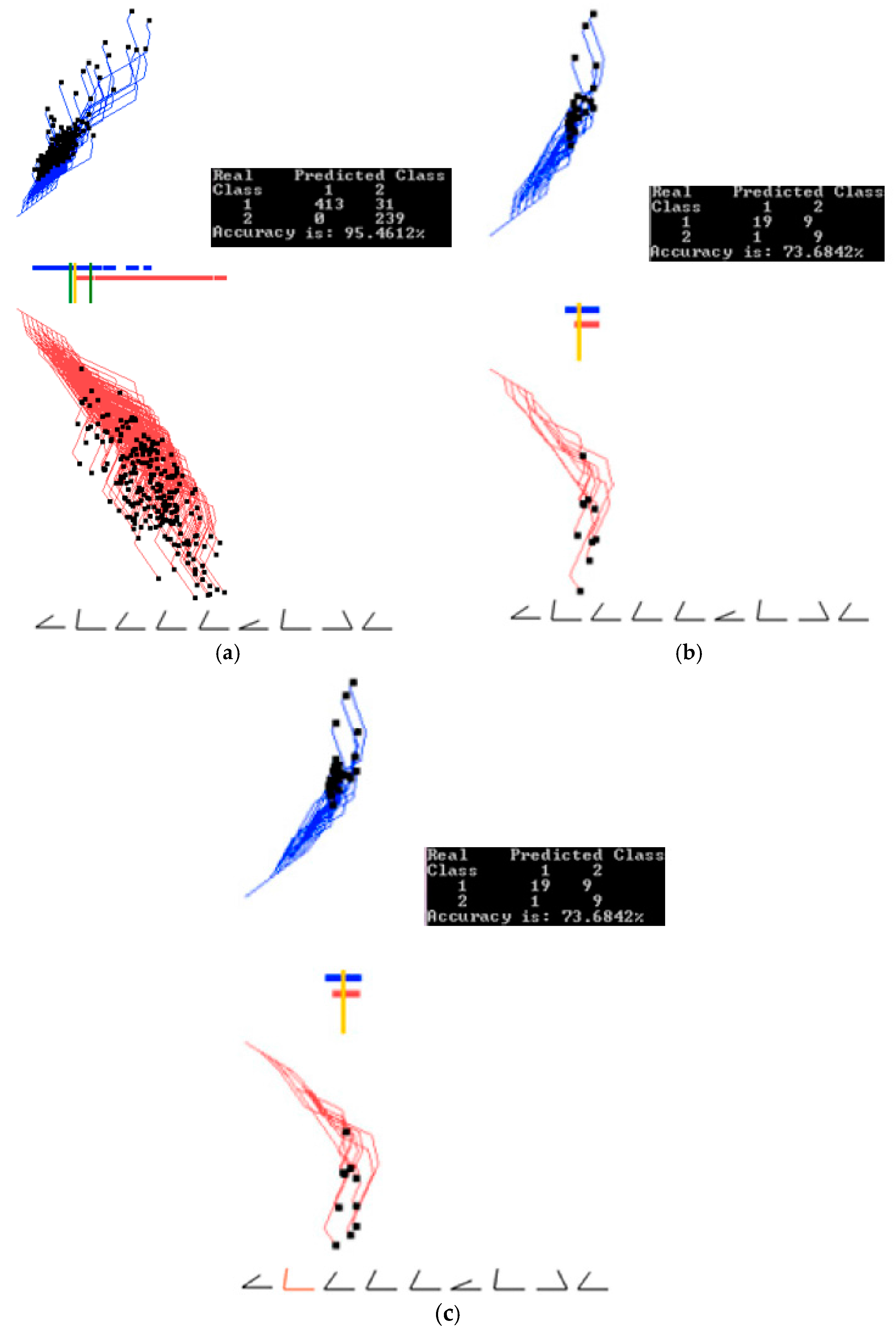
Figure 15.
Experiments with 900 samples of MNIST dataset for digits 0 and 1. (a) Results for the best linear discriminant function of the first run of 20 epochs; (b) Results of the automatic dimension reduction displaying 249 dimensions with 235 dimensions removed with the accuracy dropped by 0.28%; (c) Automatic dimension reduction, which is run a few more times removing a total of 393 dimensions and keeping 91 dimensions with dropped accuracy; (d) Thresholds for a subinterval are set (green bars).

Figure 16.
Experiments with a 900 samples of MNIST dataset for digits 0 and 1 doing automatic dimension reduction. (a) Data between the two green thresholds are visualized and projected; (b) GLC-AL algorithm on the subinterval to find a better projection. Accuracy goes up by 5.6% in the subregion; (c) Result of automatic dimension reduction running a few more times that removes 46 dimensions and keeps 45 dimensions with accuracy going up by 1%; (d) Result of automatic dimension reduction running a few more times that removes 7 more dimensions and keeps 38 dimensions with accuracy going up 6.8% more.

Figure 17.
Examples of original and encoded images. (a) Example of a digit after preprocessing; (b) Decoded image from 24 values into 484. Same image as in (a); (c) Another example of a digit after preprocessing; (d) Decoded image from 24 values into 484. Same image as in (c).
Figure 17.
Examples of original and encoded images. (a) Example of a digit after preprocessing; (b) Decoded image from 24 values into 484. Same image as in (a); (c) Another example of a digit after preprocessing; (d) Decoded image from 24 values into 484. Same image as in (c).
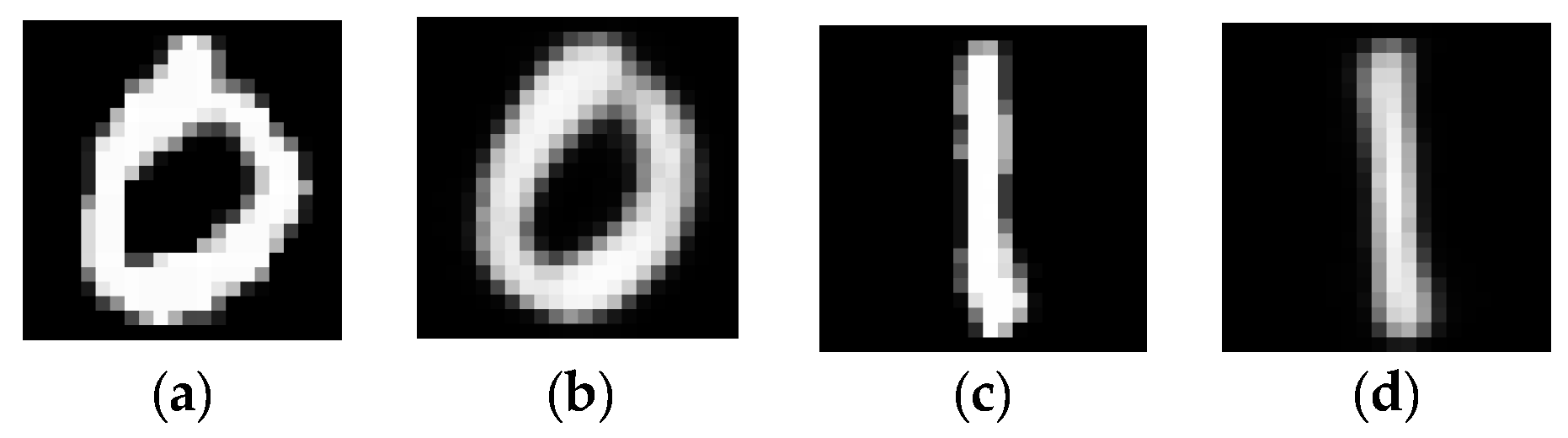
Figure 18.
Comparing encoded digit 0 and digit 1 on the parallel coordinates and GLC-L, using 24 dimensions found by the Autoencoder among 484 dimensions. Each vertical line is one of the 24 features scaled in the [0,35] interval. (a) Results for the best linear discriminant function of the first run of 20 epochs; (b) Another run of 20 epochs, best linear discriminant function from this run. Accuracy drops 1%; (c) Digit 1 is visualized on the parallel coordinates; (d) Digit 0 is visualized on the parallel coordinates
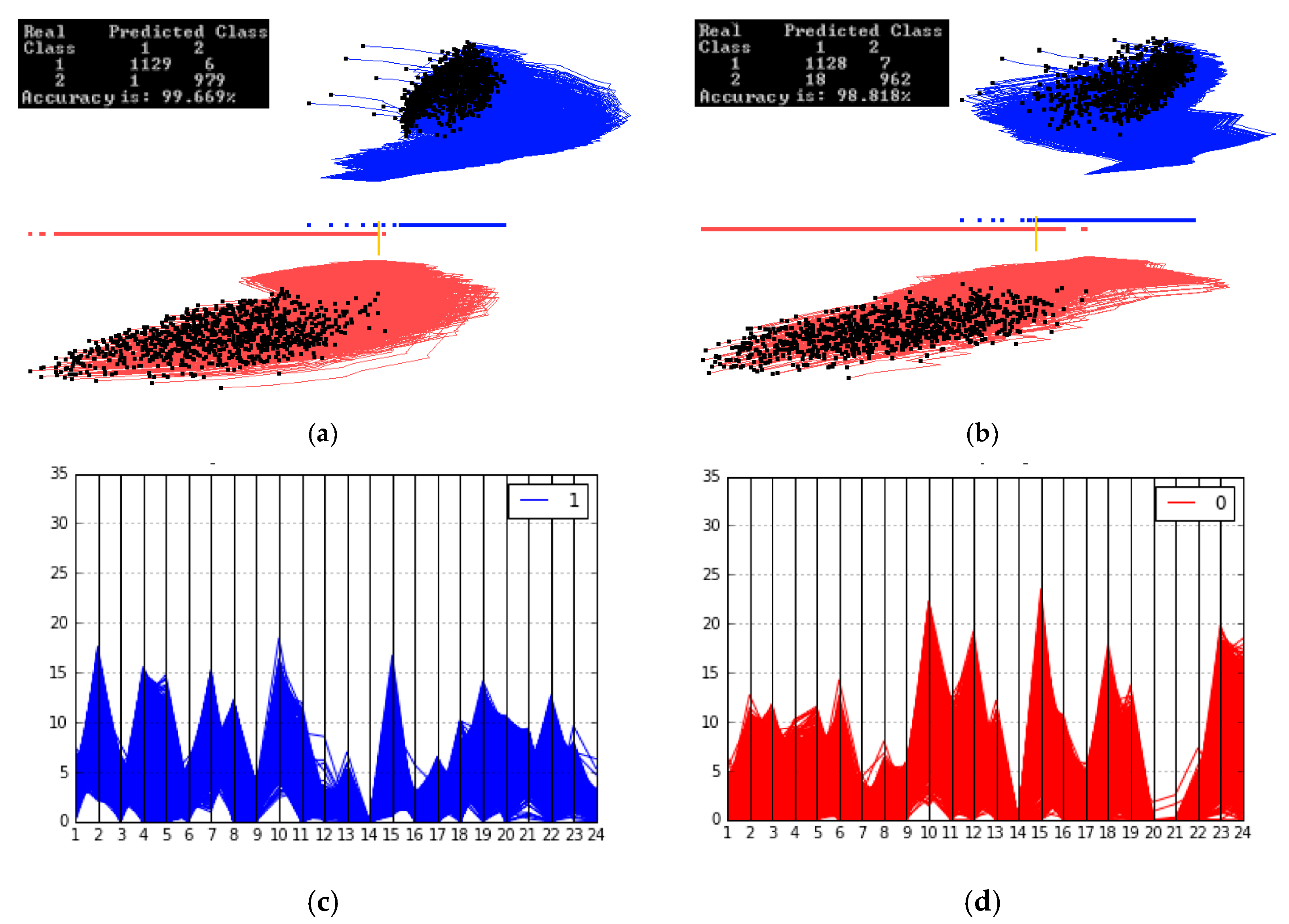
Figure 19.
Run 3: data split 60%/40% ((training/validation) for the coefficients K = (0.3, 0.6, −0.6). (a) Results on training data (60%) for the coefficients found on these training data; (b) Results on validation data (40%) for coefficients found on the training data. A green line (24 June after Brexit) is correctly classified as S&P 500 down.

Figure 20.
Run 7: data split 60%/40% ((training/validation) for coefficients K = (−0.3, −0.8, 0.3). (a) Results on training data (60%) for coefficients found on these training data; (b) Results on validation data (40%) for a coefficient found on training data. A green line (24 June after Brexit) is correctly classified as S&P 500 down.


Table 1.
Best accuracies of classification on training and validation data with 70%–30% data splits.
Table 1.
Best accuracies of classification on training and validation data with 70%–30% data splits.
| Case Study 1 Results. Wisconsin Breast Cancer Data | Case Study 2 Results. Parkinson’s Disease | Case Study 3 Results. MNIST-Subset | ||||||
|---|---|---|---|---|---|---|---|---|
| Run | Training Accuracy, % | Validation Accuracy, % | Run | Training Accuracy, % | Validation Accuracy, % | Run | Training Accuracy, % | Validation Accuracy, % |
| 1 | 96.86 | 96.56 | 1 | 89.05 | 74.13 | 1 | 98.17 | 98.33 |
| 2 | 96.65 | 97.05 | 2 | 85.4 | 84.48 | 2 | 94.28 | 94.62 |
| 3 | 97.91 | 96.56 | 3 | 84.67 | 94.83 | 3 | 95.07 | 94.81 |
| 4 | 96.45 | 96.56 | 4 | 84.67 | 84.48 | 4 | 97.22 | 96.67 |
| 5 | 97.07 | 96.57 | 5 | 85.4 | 77.58 | 5 | 94.52 | 93.19 |
| 6 | 97.91 | 96.07 | 6 | 84.67 | 93.1 | 6 | 92.85 | 91.48 |
| 7 | 97.07 | 96.56 | 7 | 84.67 | 86.2 | 7 | 96.03 | 95.55 |
| 8 | 97.49 | 98.04 | 8 | 87.59 | 87.93 | 8 | 94.76 | 94.62 |
| 9 | 97.28 | 98.03 | 9 | 86.13 | 82.76 | 9 | 96.11 | 95.56 |
| 10 | 96.87 | 97.55 | 10 | 83.94 | 87.93 | 10 | 95.43 | 95.17 |
| Average | 97.16 | 96.95 | Average | 85.62 | 85.34 | Average | 95.44 | 95.00 |
© 2017 by the authors. Licensee MDPI, Basel, Switzerland. This article is an open access article distributed under the terms and conditions of the Creative Commons Attribution (CC BY) license (http://creativecommons.org/licenses/by/4.0/).
Share and Cite
MDPI and ACS Style
Kovalerchuk, B.; Dovhalets, D. Constructing Interactive Visual Classification, Clustering and Dimension Reduction Models for n-D Data. Informatics 2017, 4, 23. https://doi.org/10.3390/informatics4030023
AMA Style
Kovalerchuk B, Dovhalets D. Constructing Interactive Visual Classification, Clustering and Dimension Reduction Models for n-D Data. Informatics. 2017; 4(3):23. https://doi.org/10.3390/informatics4030023
Chicago/Turabian StyleKovalerchuk, Boris, and Dmytro Dovhalets. 2017. "Constructing Interactive Visual Classification, Clustering and Dimension Reduction Models for n-D Data" Informatics 4, no. 3: 23. https://doi.org/10.3390/informatics4030023
Note that from the first issue of 2016, this journal uses article numbers instead of page numbers. See further details here.