RadViz Deluxe: An Attribute-Aware Display for Multivariate Data †

1
Computational Science Initiative, Brookhaven National Lab, Computer Science Department, Stony Brook University, Stony Brook, NY 11794, USA
2
Visual Analytics and Imaging Lab, Computer Science Department, Stony Brook University, Stony Brook, NY 11794, USA
*
Author to whom correspondence should be addressed.
†
This paper is an extended version of our paper published in the 2015 IEEE Pacific Visualization Symposium as titled “Improving the fidelity of contextual data layouts using a Generalized Barycentric Coordinates framework”.
Processes 2017, 5(4), 75; https://doi.org/10.3390/pr5040075
Submission received: 12 October 2017
/
Revised: 8 November 2017
/
Accepted: 17 November 2017
/
Published: 22 November 2017
(This article belongs to the Collection Process Data Analytics)
Abstract
:Modern data, such as occurring in chemical engineering, typically entail large collections of samples with numerous dimensional components (or attributes). Visualizing the samples in relation of these components can bring valuable insight. For example, one may be able to see how a certain chemical property is expressed in the samples taken. This could reveal if there are clusters and outliers that have specific distinguishing properties. Current multivariate visualization methods lack the ability to reveal these types of information at a sufficient degree of fidelity since they are not optimized to simultaneously present the relations of the samples as well as the relations of the samples to their attributes. We propose a display that is designed to reveal these multiple relations. Our scheme is based on the concept of RadViz, but enhances the layout with three stages of iterative refinement. These refinements reduce the layout error in terms of three essential relationships—sample to sample, attribute to attribute, and sample to attribute. We demonstrate the effectiveness of our method via various real-world domain examples in the domain of chemical process engineering. In addition, we also formally derive the equivalence of RadViz to a popular multivariate interpolation method called generalized barycentric coordinates.
1. Introduction
Due to the many advances in domain knowledge and acquisition hardware the amount and specificity of data is increasing rapidly. This is true not only in chemical and biological process engineering, but also in general. In any of these cases, a given data point or sample typically has information about multiple components or attributes of the sample. Numerous methods have been described that allow users to reveal patterns that may exist among these multivariate data samples, such as clusters and outliers There is Principal Component Analysis (PCA) [1], Multidimensional Scaling (MDS) [2,3] or more recently, t-Distributed Stochastics Neighborhood Embedding (t-SNE) [4]. All of these layout methods can also be used to visualize the relations among the attributes, instead of those among the samples. This can be achieved simply by transposing the data matrix which exposes the similarities among the attributes instead of those among the samples.
But there are settings in which it can be of interest to see the data points in relation to their attributes. This requires a layout that jointly considers these two aspects of the data matrix. For example, to obtain a proper solvent among hundreds of candidates, a chemical scientist might want to see the composition in relation of the chemical’s properties, for example “Dielectric”, “Boilpoint”, “Solubility” etc. The scientist would then analyze these components and pick those solvents that best fit the intended experiment(s). These types of visual analyses are difficult to do with PCA and related displays, such as biplots, since the data layout is not optimized in terms of these tasks. The plots are just linear projections that become inaccurate when the data variance significantly extends into more than two principal directions. Adversely, operations of this type are not supported at all by layout-optimizing displays such as MDS or t-SNE since the other (not-optimized) aspect of the data matrix is lost in the optimization process.
Our work focuses on what we call contextual layout displays—displays that can simultaneously present the relations of the samples, the relations of the attributes, as well as the relations of the samples to the attributes. We have chosen a method that is based on the concept of RadViz [5] which in turn in similar to a scheme that can be derived from Generalized Barycentric Coordinate (GBC) Interpolation [6,7] (see Section 3 for this derivation). However, while these displays are contextual in principle they are still linear mappings and for this reason cannot convey the simultaneous relations of samples and attributes accurately. Achieving high accuracy requires numerical optimization, similar to MDS and t-SNE. Our scheme fulfils this requirement. It automatically adjusts the locations of both types of spatial representations—those for the points and those for the attributes—such that these multiple relations are better preserved.
Our paper is structured as follows. Section 2 presents related work. Section 3 provides theoretical aspects. Section 4 describes our RadViz Deluxe framework. Section 5 demonstrates our framework by ways of a set of real-world applications in chemical process engineering. Section 6 ends the paper with conclusions.
2. Related Work
The visualization of high-dimensional datasets essentially follows three major paradigms—parallel coordinates, scatterplots, and 2D space embeddings. Since the visualization of high-dimensional data on a 2D canvas is inherently an ill-posed problem, there is no method without drawbacks. Parallel coordinates [8], and its radial version, the star plot [9], have the least ambiguity in the 2D mapping process and the serialization of the high dimensional space into the parallel axis configuration allows all attributes to be seen at once. However, the overplotting of polylines and the need to re-order the parallel axes to see certain patterns in the data can become a significant problem once the number of data points and attributes grows even moderately large.
Contextual data layouts [10], as defined above, represent the attributes as special nodes on the data canvas where data points that are ‘stronger’ in certain attributes also come to rest more closely to these attributes (although there can be significant errors—see below). RadViz [11,12,13] uniformly spaces the attributes as dimensional anchors along the circumference of a circle. The location of the data points is then determined by a weighting formula where data point attributes with higher values receive a higher weight and so increase the attraction of the point to the corresponding anchor points. However, similar to star coordinates [14], this can lead to location ambiguities which can be—but typically not entirely eliminated—by re-ordering the anchor points manually or algorithmically. Gravi++ [15] uses a different weighting formula but also spaces the attributes at uniform distances onto an encompassing circle. Even more general is the Dust & Magnet system [16] which allows one not only to move but also adjust the weights of the nodes representing the attributes. As shown in the next section (and also in [10]) all of these contextual layouts are in fact special forms of RadViz.
With any of these contextual displays, users can focus on the attribute nodes of greater interest and view the data points in their neighborhoods. They can assess and recognize conflicts in their set of criteria. For example, in the practical scenario of this paper, there might be no solvents that can fulfil two competing criteria, and thus some sort of trade-off is required. However, none of the methods so far can guarantee that nearby data and variables points are actually neighbors in high-dimensional space. Often data points that are not related at all may come to rest very closely to one another which can lead to false conclusions. Moving the attribute nodes in an interactive fashion can reduce, but not completely eliminate this error, at least not in general. Our method overcomes these shortcomings by adding an extra multi-objective optimization steps to the initial layout. In our effort we build on our previous work [10], but focus on data originating in process engineering.
Lastly, another general multivariate visualization paradigm is the projective scatterplot. It suffers less from overplotting, but the projection operation can lead to ambiguities as points located far away in high-dimensional space may project to similar 2D locations. Assembling all possible axis-aligned scatterplots into a scatterplot matrix [17] or supporting the projections by an interactive view manipulation system [7] can help but both require effort to navigate. Similar to the star plot, the method of Star Coordinates arranges the attribute axes in a radial fashion but instead of constructing polylines it plots the data points as a vector sum of the individual axis coordinates. However, the locations of the data points are not unique and so an interactive interface is provided that allows users to manually rotate and scale axes to resolve ambiguities, at least partially. To that end, these projections share the shortcomings of the other contextual displays as noted above.
3. Theoretical Background and Derivations
Let be the data matrix with rows and columns,
where the rows denote the data points, the columns denote the attributes and is the data value in the th row and th column. Without loss of generality, we assume is normalized to [1]. Furthermore, let Di be the ith data points (we shall simply refer to them as data):
Finally, let be the jth data attributes (we shall refer to them as variables).
where T is the transpose operator. We shall now use this notation to describe the various contextual layout methods mentioned in Section 2.
3.1. The Space of Contextual Layout Methods
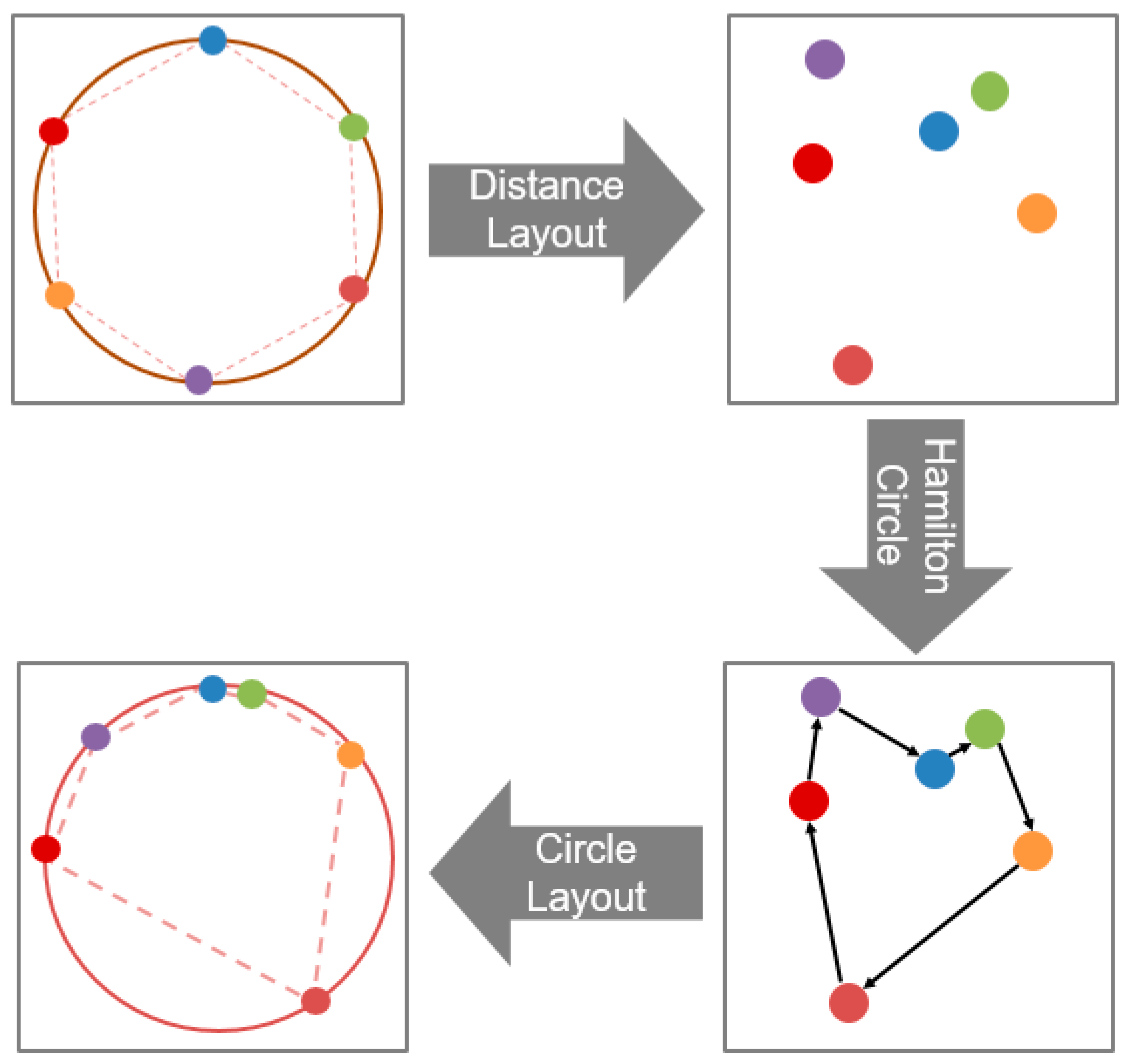
In Section 2, we argued that RadViz, Star Coordinates, Dust & Magnet, and Gravi++ are similar in that they all arrange the variables as vertices in the outward periphery of the data points. To unify these methods into a common framework, we require a unified notation. These plots typically differ from the way they arrange the vertices and the mechanism they use to map the data items. For the arrangement of the vertices coding the variables, we define the function VF. To map the data based on the vertices’ locations, we define the mapping function MF. We consider two layout stages: (1) the arrangement VF of the vertices coding the variables; and (2) the mapping function MF that uses VF to map the data. Table 1 compares the various methods using this common notation.
For VF, a circular layout is most common, and so for this paper, we only consider this type of arrangement for the variables. The MF, on the other hand, uses slightly different forms of weights to compute the variable node locations. The mapping concept is identical—all apply a linear function—just some methods perform normalization and others do not. Consider, for example, Figure 1 which shows a data visualization with RadViz. It uses VF to map the attributes onto the surrounding circle, and it uses MF to map the data points into the circle. The result of MF is dependent on the attribute placement generated by VF, as well as the data themselves.
3.2. The GBC Plot and Its Relation to RadViz
In this section we formally derive the GBC plot which is the last row in Table 1. The GBC plot is based on the method of generalized barycentric coordinate interpolation which extends barycentric interpolation from 3-sided to n-sided convex polygons, where n ≥ 3. Generalized barycentric coordinate interpolation was devised by Meyer et al. [6] and was later used by Nam and Mueller [7] to specify views onto n-dimensional data spaces. In the following, we shall denote as an interior point whose value is to be interpolated and the as the values of the polygon vertices. The interpolation weight of vertex for P is given by (see Figure 2 for an illustration):
where the bottom part of this equation is the Euclidian distance of the locations of P and the vertex . The interpolated value at P is then given as follows:
We can modify this scheme for our purposes and instead of computing the value of a point P at a given location inside the polygon we can compute its location given its n-dimensional vector . Assuming a normalized data matrix (see Section 3.1) a weight is then simply the value of data point at coordinate j. The location of the point in the polygon is then given by:
where the are the 2D locations of the polygon vertices. Note that this equation is equivalent to the RadViz equation in Table 1. For more details, please see [6,11,13].
We therefore refer to the plot derived from the Generalized Barycentric Coordinate Interpolation scheme as the Generalized Barycentric Coordinate (GBC) plot. The only difference of the GBC plot to RadViz is that it is defined on a polygon. But we can simply discard the polygon edges and replace the contour by an enclosing circle, as shown in Figure 1. As such the GBC plot and RadViz are virtually equivalent.
3.3. A Demonstration of RadViz
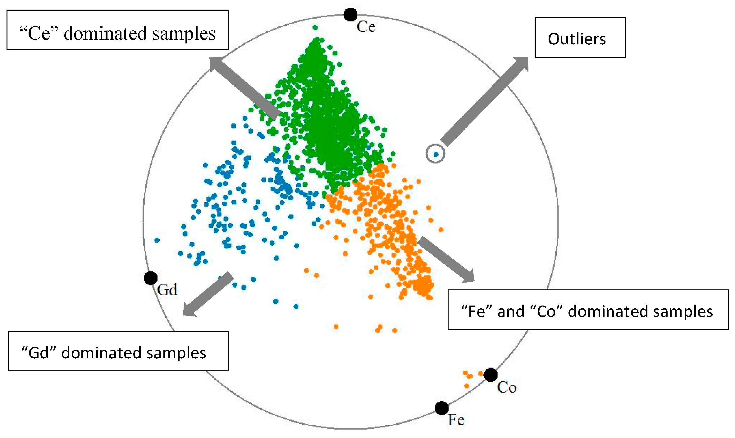
For a demonstration of RadViz (and a motivation for our work), we use a battery dataset we obtained from Brookhaven National Lab, Upton, NY, USA. It has 2006 samples with four components each: “Ce”, ”Co”, ”Fe”, and “Gd”. Figure 1 shows the RadViz/GBC visualization for this dataset. In this plot each colored point corresponds to one sample. The colors of the points encode three clusters we obtained via k-means clustering. We observe that the points due to different clusters are mixed in the plot center. Also, the high density and small size of the yellow cluster suggests that these samples have very similar values for the four elements.
To verify the fidelity of this plot, we visualize the samples using a parallel coordinate display, shown in Figure 3. In this display each component is a vertical axis and each sample is a piecewise linear line (called polyline) going across each axis at its respective value. While the parallel coordinate display makes it more difficult to see the spatial extent of distributions, it clearly conveys the actual values of the data. In Figure 3, we see the three clusters as bands of colored polylines. We observe that the yellow cluster has rather high values for “Co” and “Fe” and low values for “Ce” and “Gd” which is not what the RadViz of Figure 1 suggests. This significant error motivated the RadViz optimizations described in Section 4.
3.4. The Distance Matrix
RadViz conceptually can show three types of distances: (1) sample to sample; (2) sample to attribute and (3) attribute to attribute. Here, a sample is a data point (or simply a point) and an attribute is a component or variable. These relations give rise to three distance matrices:
where and store the pairwise distances (dissimilarities) of the points or variables, respectively, and stores the affinity a point has to a certain variable.
There are various measures suitable to express distance or dissimilarity. We have chosen the Euclidean Distance for DD since it is an intuitive measure for distance in (high-dimensional) space. For DV, we use the point’s component value, as it is a good measure of affinity. In practice, we use 1-value since distance and value have opposite meaning. Finally, for VV, we choose correlation since it captures the statistical distribution of the attributes. In practice, we use 1-correlation to make it comparable to the other two distance metrics. Let be the set of Distance Metrics, then
3.5. RadViz Layout Error
From the example in Section 3.3, the properties the Radviz presently do not match the properties in the original data set. To be more specific, the error is the distance in the original data space and the distance in the mapped 2D space. Since the distance contains the data to data distance, data to variable distance and variable to variable distance, the error also contain these three types of error.
We denote as the error, where , and represent the error of data to data, data to variable and variable to variable, respectively; is the overall error of the RadViz mapping. We will use this metric to gauge the quality of the layout.
Numerous error measurement methods have been devised in the past. Since we use MDS (Section 4.3) to adjust the data to data error, we choose the stress as the metric. We use the normalized stress metric between , the matrix of low-dimensional distances , and , the matrix of high-dimensional distances :
We use this stress metric to gauge , and . However, since each error has a different origin, we set L and C differently. For more details about the L and C in the , and , please see the Appendix A. As suggested before, users may have different priorities in the types of distances they try to optimize. We can express these by giving different weights to the three distances. The overall error is then defined as follows:
Based on the discussion in Section 4.4, these priorities are likely , then followed by and so we set .
4. RadViz Deluxe: An Improved RadViz for More Accurate Contextual Data Mappings
As discussed above, the conventional RadViz plot has three types of errors: , and . It is difficult to reduce three types of errors with the same strategy reduce since the mapping mechanism are different. To reduce these errors, we first analyze each type, reduce them separately, and then combine these reduction effects together to reduce the overall error, .
4.1. Distance Spaced Attribute Layouts
We begin with . The attributes (variables) are arranged around the circle—this type of layout is a mapping from high dimensional space to 1D. Standard manifold learning can achieve this by projecting the high dimensional data into low dimension while preserving the pairwise data similarity. For example, project the distance matrix into 1D using MDS. However, we cannot guarantee that this method provides a good mapping since MDS and other projecting methods become increasingly error-prone as the distance matrix increases.
Another and more direct way to obtain a linear closed ordering of the attributes on the circle is by arranging them along a Hamilton Cycle that operates on the matrix of pairwise correlation distances. Note that this only provides an ordering—the spacing of adjacent attributes is determined by their respective dissimilarity value. This process is illustrated in Figure 4 and the algorithm is given in Algorithm 1. Finding the solution for Hamilton Cycle is a NP-complete problem.
| Algorithm 1. Distance Based Attribute Layout Scheme |
| Input: The distance matrix (VV) |
| Output: The variables locations v |
| 1: V = HC(VV) // Reorder the variables. is the circle 2: sum VV = // layout neighbor of . 3: 4: for 5: 6: end for 7: for // Lay out the variables around the circle. 8: 9: 10: end for |
We solve an approximation of it using a dynamic programming approach [18] inspired by the original scheme independently developed by Bellman, and Hell and Karp. Initially, we divide the entire set of connections into different subsets. Then we optimize for the best solution over subsets and eventually expand to the whole set.
4.2. Iterative Data to Atrribute Layout Error Reduction
Next we aim to reduce . In the original RadViz plot, a data point’s value can be gauged by its location—if it is located close to a given variable point then it has a high value in the corresponding attribute, and vice versa. Hence, each variable point has a set of iso-contours where a data point’s value is constant. In the current algorithm we restrict our study to linear contours, but an extension to non-linear contours would follow similar error-reduction principles.
Our method seeks to reconstruct an error polygon for each data point and iteratively reduces the size of this polygon. Figure 6a provides an illustration and Algorithm 2 lists the pseudo code. The first concept our algorithm makes is the existence of a set of distance contours that encode the importance of a variable to a given data point. Suppose we have the variables vertices and a test data item (x1, x2, x3, x4, x5) with its mapping location as P. Figure 6a examines the distance contours for . Assuming the data item has been normalized to a unit vector, the maximum importance a variable can have is 1.0. This would mean in the case examined that = 1.0 and so P would coincide with in the plot. In contrast, if = 0.0 which is the minimum importance, then with the current vertex ordering P would need to fall on the edge , or . Any other value would lead to a placement of P onto some contour in between. Figure 6a shows the contour for = 0.6. It is constructed by connecting v4 with all vertices vi and marking the points where . Connecting these points yields the contour.
Next we find on the error polygon (marked as ) by intersecting the contour with the line that connects with P. Performing this procedure for all variables yields all vertices of the error polygon (marked as polygon ). The iterative step concludes by moving P into the center of the error polygon, marked as P’, and then a new iteration begins. This type of iteration is also like MDS, using iteration to optimize the error. From our test [10] and theoretical prove [19], this algorithm reduces the error monotonically. The complexity of this algorithm is O (IDV × m × n).
In practice, we iterate about 20 times which completes in a couple of seconds and so does not cause a significant performance drop. After running this algorithm, the data-to-variable error is reduced to roughly 75% of the original error (see Table 2).
| Algorithm 2. Iterative Data to Attribute Layout Error Reduction. |
| Input: the distance matrix (DV), the RadViz plot (variables point locations, data item point locations), the error threshold () and maximum iterations (). |
| Output: the data points locations. |
| 1: while < threshold || > max-threshold 2: for each data point P 3: for each variable vertex vj 4: Compute distance contour. 5: Compute error polygon vertex . 6: end for 7: Construct error polygon EP formed by all the . 8: Move P to the center of EP. 9: end for 10: Compute and iterations . 11: end while |
4.3. Force Directed Adjustment of the Data Points
The remaining error is the data to data error. We can adjust the locations of the data points via MDS to reduce the data to data error. A way to implement MDS is via force directed layout [20].
As the data items already have the locations, we can easily get the error between each data items from the real distance to the 2-D mapping distance. We should move the data item according to the all the data errors relevant to reduce the error. The input is the pairwise distance of data to data in the original data space and in the mapped space. In order to move the data item, we construct a network where the vertices correspond to the data points and the edges are springs loaded according to the error. This scheme adjusts the data locations one by one as shown in Figure 6b.
Since we have m points, we should fix the other m-1 points and take turns to move one data point at a time. Suppose A, B, C, D, and E are fixed data points and P is the point we plan to adjust the location for. P has two types of distances to these five points: (1) the high-dimensional space distance and (2) the 2D layout distances. The difference of these two distances forms the error and we should move P to the error reduction direction. We set the difference of these two distances as a force either drag or push in each vertex direction. We use , , , and to denote the force vectors from each vertex and the five force vectors together form an aggregate force in direction to move P. The direction of force is the same as the direction of the error reduction gradient. The algorithm is given in Algorithm 3. The complexity of this algorithm is O (IDD × m × m) and it converges [19]. After running this algorithm, we observe in Table 2 that the data to data error is reduced significantly to roughly 15% of the original error.
| Algorithm 3. Force Directed Adjustment of the Data Points |
| Input: DD, P, v, error threshold EDD, maximum iterations IDD. |
| Output: the data points locations. |
| 1: if < threshold || > max-threshold, return. 2: for each data point Di 3: Compute the forces according to the error. 4: Compute the resultant force . 5: Compute the acceleration by the force. 6: Move this data point for small step (typically 0.2). 7: end for 8: Compute the error and iterations . 9: end if |
4.4. Comprehensive Layout
The previous sections described the three algorithms we designed to reduce the three types of error. Now, to reduce the overall error, we need to combine them into a single algorithm and create a comprehensive plot we call RadViz Deluxe. The problem is to determine the order in which to apply the three algorithms since they can affect each other. In practice we fix the variables first since this provides a mapping that is more accurate than the one obtained when the mapping error is reduced first. Next we adjust the data items to make the layout more accurate. Concretely, we apply our schemes in the following order: (1) distance spaced attribute layout; (2) iterative data to attribute error reduction; and (3) force directed data point adjustment. We observe that the layout has inherited improvements from all three schemes, but the effect of the distance spaced layout seems to the strongest. Figure 7 shows the final result of RadViz Deluxe after all schemes have been applied.
In Figure 7 we can easily recognize three distinguished clusters—green, blue and yellow clusters. The green cluster is dominated by “Ce”, the blue cluster is dominated by “Gd” while the yellow cluster is dominated by “Fe” and “Co”. This in fact corresponds to the features we also observed in the parallel coordinate plot (Figure 3). At the same time, we also observe some outliers, for example, the point marked by a grey circle in Figure 7. This is an outlier because its values with respect to all attributes are low so that it tries to stay away from all the attributes. Compared to the original RadViz (see Figure 1), the samples in the visualization generated by RadViz Deluxe are more scattered based on their components. This can assist scientists to label each cluster according to its component features. We performed such as (simple) labelling in Figure 7.
Table 2 lists the various error metrics. We can clearly see that with the distance spaced layout, the reduces sharply; then the iterative error reduction yields a large improvement of the ; and finally, the force directed adjustment reduces the . The has a higher error than and since the layout of variable to variable maps the variables to 1D but the other two map the data to 2D. But and are also important—they can preserve an accurate data distribution. As demonstrated above, RadViz Deluxe improves the fidelity of conventional RadViz dramatically.
4.5. Assessiong the Fidelity of Presserving Contextual Relation
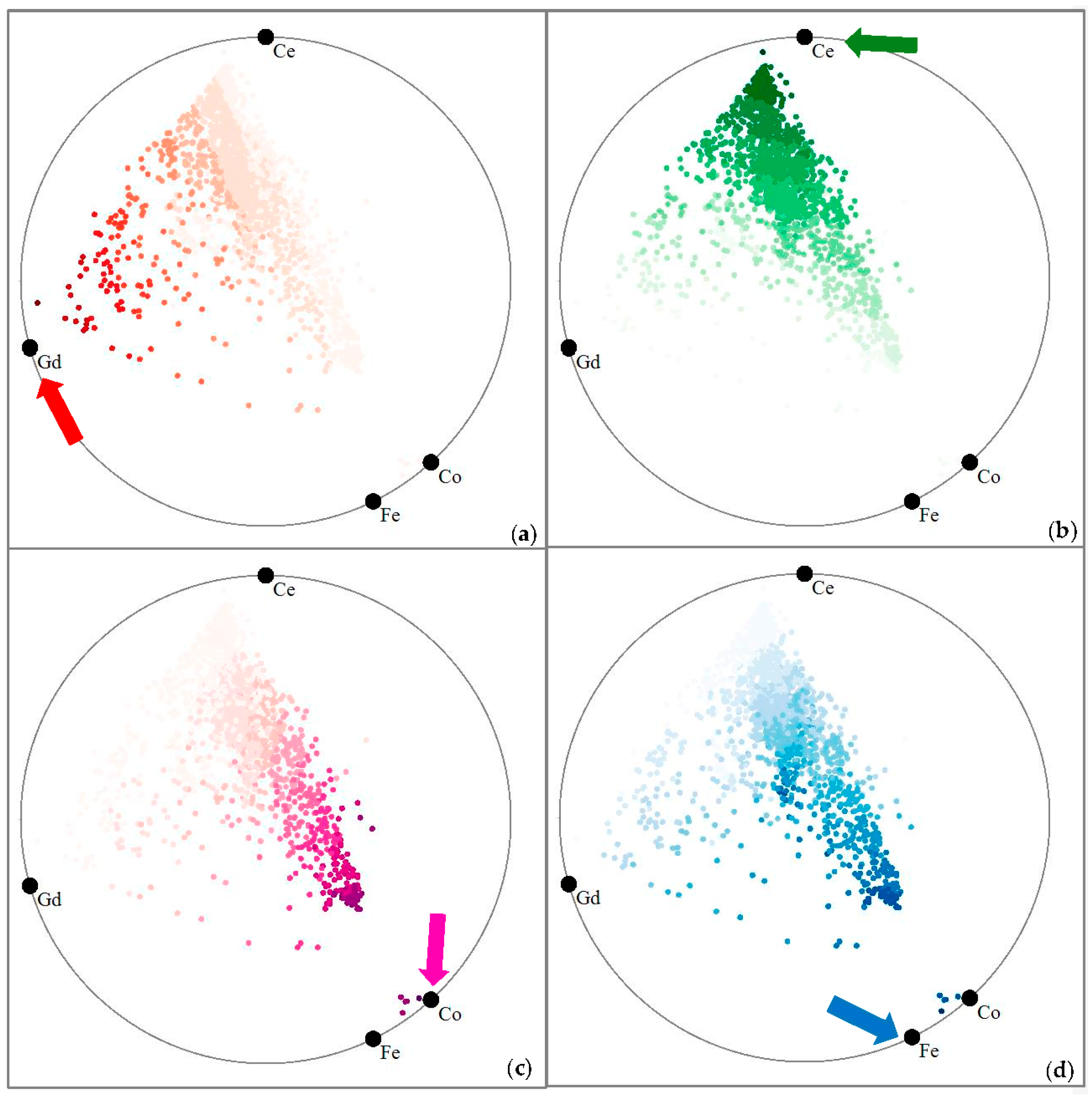
In this section, we verify if, and by how much, RadViz Deluxe improves upon the fidelity of RadViz in its ability to preserve contextual relations, expressed as the distance of each data point to the attribute’s vertex. We again use the battery dataset as an example. Figure 8 visualizes the true high-dimensional distances with respect to each of the four attributes—“Gd” (red arrow), “Ce” (green arrow) and “Co” (pink arrow) and“Fe” (blue arrow), respectively—by intensity-shading all points in terms of that distance (here ‘distance’ refers to (1-value) in the chosen attribute). An irregular or adverse shading pattern would point to problems. This does not seem to be the case. We can clearly see that for each attribute, the respective shading of the samples gradually fades out as the distance becomes larger.
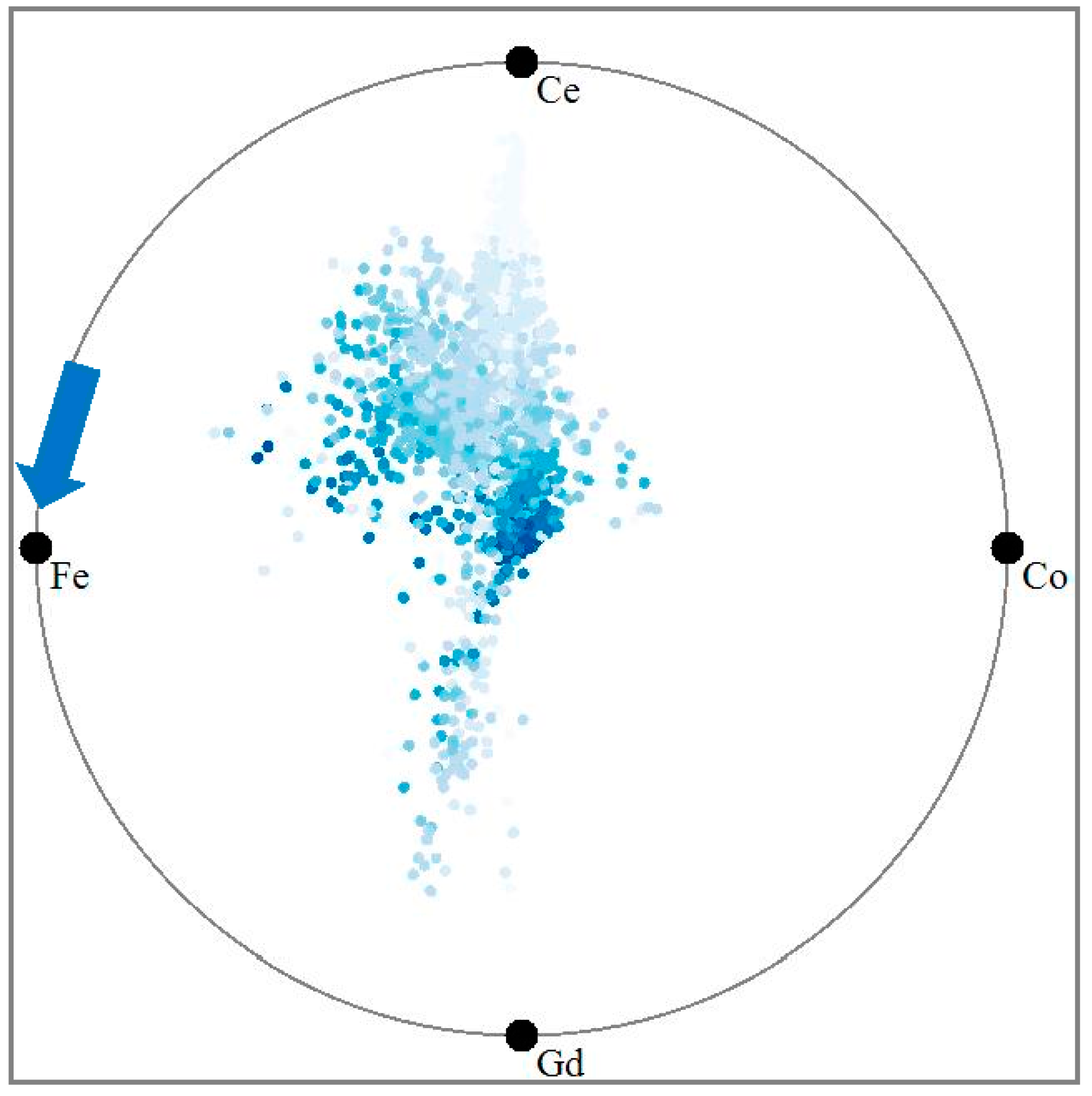
Next, Figure 9 uses the same intensity-shading no for RadViz, for the “Fe” attribute. We observe that there is no gradual fading of intensities away from the “Fe” vertex node. Instead there is a darker shaded cluster distant to the node, and multiple shaded sprinkles throughout the display. It is obvious that the original distance and the mapped distances do not match overly well, while they do with RadViz Deluxe (see Figure 8d).
To quantitatively measure the contextual relation preservation, we plot the Euclidean distance between the sample and each of the four attribute vertices vs. the sample value in the given attribute. Figure 10 and Figure 11 show these plots for RadViz and for RadViz Deluxe, respectively. We observe that the point clouds in Figure 10 appear significantly more scattered than those in Figure 11. This shows that RadViz Deluxe performs better in preserving the contextual relation—the value reduces while the distance becomes larger.
Ideally, the plots would show a straight line, which would have a correlation factor of 1.0. In our final measurement we compute the correlation coefficients for each plot of Figure 10 and Figure 12. Figure 12 visualizes the outcome as a bar chart. We observe that RadViz Deluxe has a significantly better correlation factor for all plots. Also, during the optimization process, we found that the distance spaced layout process accounts for most (average 81.5%) of this improvement.
5. Case Study
Now that we have described our method, we can move to a set of case studies that illustrate how it can be used to assist scientists as well as practitioners to extract insightful information about the properties of chemical data.
5.1. Case Study 1: Determining Promsing Solvents for Chemical Experiments
In chemical experiments, numerous solvents/materials are typically available. Figuring out the most appropriate solvents for a given experiment can save much time for scientists. The solvents typically contain multiple components (mapped to attributes) and due to this it is often difficult to obtain the solvent most suitable for a certain task. For our case study we used a dataset [21] of 103 solvents with 9 attributes each which are “Boilpoint”(BoilP), “Dielectric” (Diel), “DipoleMoment” (DipoM), “RefractiveIndex” (RefI), ”ET30”, “Density”, “logP” and “Solubility”(Solu). We used this dataset and produced the RadViz Deluxe visualization shown in Figure 13. The error of original Radviz is 1.314, while that of Radviz Deluxe is 0.637. This reduces the error to 51.5%.
In this plot we observe that the majority of the solvents have rather similar properties. They aggregate quite closely in the center which means that are somewhat average blends of most of the attributes, although they have slight biases. There are also a few interesting outliers located close to the circle boundary, circled in red. These are possibly interesting solvents with properties dominated by one or two properties, “Diel”, “Density”, “Refl” & “logP”, “Solu” & “DipoM”, respectively.
In chemical experiments, oftentimes not all of the properties of the solvents are taken into consideration, limiting the exploration to a subset of high-impact properties. Let us consider the case in which the scientists only care about three specific properties: “DipoM”, “BoilP” and “Refl”. This allows us to restrict the layout to these three properties and so achieve a more differentiated display with respect to only these three. In this particular example, since these three properties locate right next to one another on the circle, the display will reveal much more detail on this data subspace when only these properties are selected via mouse interactions in the display.
Figure 14a shows the outcome of this refined layout. As before, analysts can select a certain solvent according to the distance it has to each of these three properties. For example, a visual search for a solvent with low “BoilP” would lead to a quick discovery of the one marked by a red circle. On the other hand, if one would look for a solvent with high “BoilP” and “DipoM” and low “Refl”, the green circled solvent would be quickly identified via visual inspection.
Note that the focused visual searches explained just now are a bit harder to do, but not impossible, in the all-property display of Figure 13. Clearly, the ability to turn properties on and off on the fly can come in handy in the exploration process. Furthermore, to enable users to keep track of the changing topology of the embedded point cloud our display supports animated transitions.
While small experiments can be accomplished with only a few solvents large experiment require a large number of solvents. To quickly pick numerous solvents with certain properties, our system supports k-means clustering to divide the set of points into groups of similar points. Figure 14b shows the outcome of this process for k = 3. In this figure, the blue cluster is the low “Refl”, “BoilP” and “DipoM” solvents, the green cluster contains high “Refl” and “BoilP” materials, while the yellow cluster consists of high “BoilP” and “DipoM” and low “Refl” ones.
5.2. Case Study 2: Multivariate Root Cause Analysis of Forest Fires
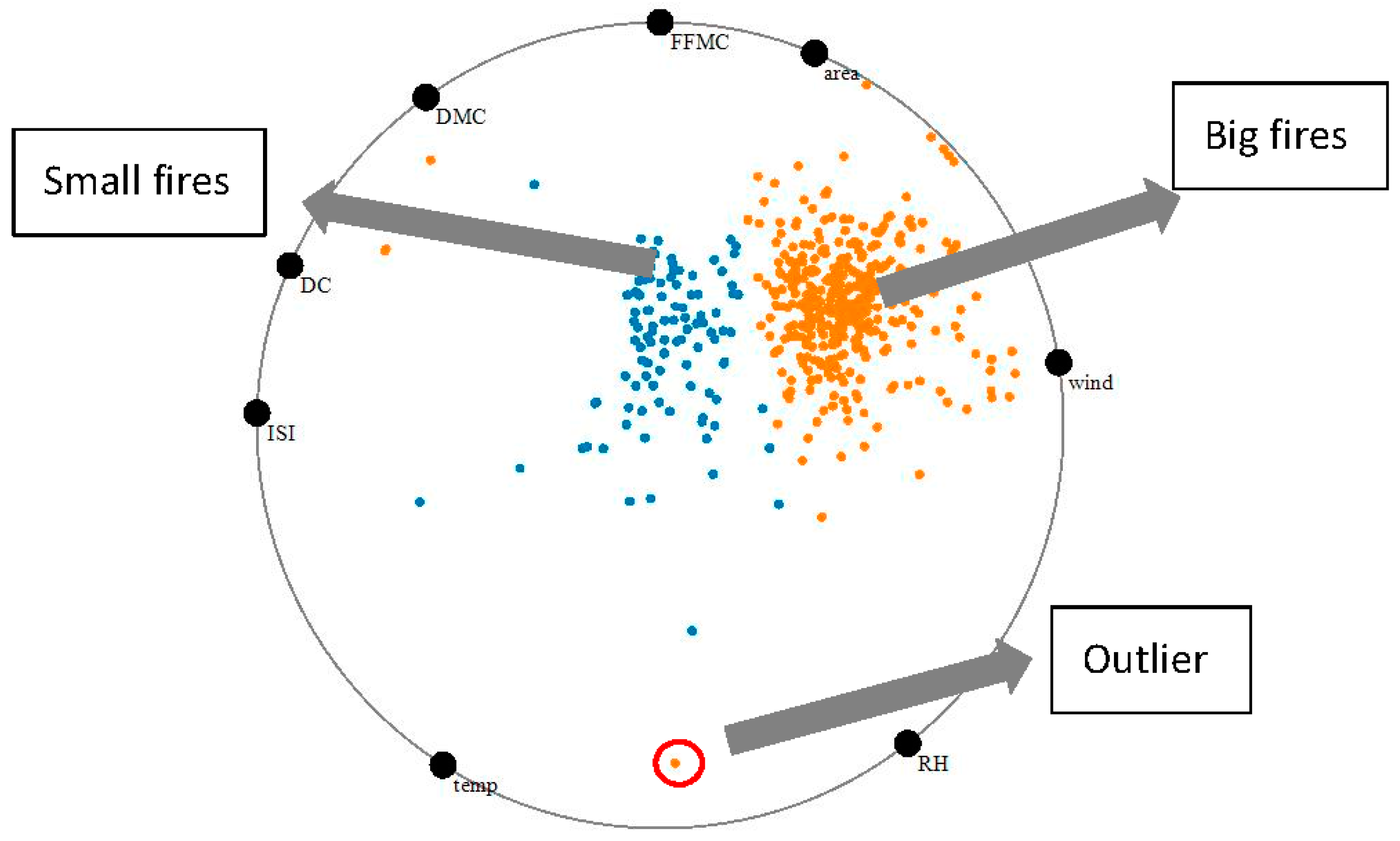
Forest fires are fairly frequent and many factors are at play that may lead to their cause. We obtained a forest fire data from the Montesinho Natural Park, which is the Tr´as-os-Montes Northeast region of Portugal [22]. This park contains a fairly high diversity in flora and fauna and is therefore interesting to study. Inserted within a supra-Mediterranean climate, the average annual temperature is within the range 8 to 12 °C. The data set has 581 different fire instances with the following eight environmental and atmospheric factors and encodings—Fine Fuel Moisture Code (FFMC), Duff Moisture Code (DMC), Drought Code (DC), Initial Spread Index (ISI), temperature, relative humidity (RH), wind speed, and the forest area burnt by the fire. Figure 15 shows a visualization of the dataset with RadViz Deluxe. The error of original Radviz is 1.107, while that of Radviz Deluxe is 0.687. The error reduces 40%.
We used k-means (k = 2) to identify two distinct types of fires, colored blue and orange.
There are some interesting observations we can make just by looking at the locations of the various factors on the circle boundary. We observe that wind and burnt area are fairly closely spaced and therefore more related which makes sense because stronger winds promote the spread of the fire. We also observe that humidity and temperature are closely related which also makes sense given the specific origin of the data.
Now looking at the data themselves we see some outliers close to the border of the circle. These fires are not regular fires and are caused by extreme settings. For example, the fire marked by the red circle is mainly caused by extremely high temperature and extremely high relative humidity. This is not a usual condition, apparently. Typically, high humidity prevents large fires, however when it comes to extremely high temperature, we learn that there is a possibility of fire nevertheless. Fortunately this condition is rare, as evidenced by the sparsity of the data.
The fires in the center of plot occur more regularly. The two clusters can be well distinguished in terms of burn area (and wind). The orange cluster has fires that burn large areas and at high speed. These are essentially “big fires”. The fires in the blue cluster are then consequently “small fires”. We also see that both types of fires have similar spreads in temperature and humidity, but small fires have higher values in DMC, DC, and ignite faster (higher ISI).
6. Conclusions
We have presented a framework that improves upon the fidelity of RadViz, aptly called RadViz Deluxe. It enforced three types of distance constraints via dedicated optimization procedures—the similarity among data samples, the similarity among data attributes, and the affinity of the data sample attributes. Using these non-linear layout optimizations we are able to achieve displays that are less ambiguous and more insightful about the phenomena manifest in the data. We demonstrated the effectiveness of our display via three domain studies.
Future work will look into scalability issues for large data and high dimensionality, possibly by using a level of detail approach. We would also like to conduct a set of formal user studies to gain more insight into the usability of our system. We did receive a number of encouraging comments from casual users of our system and so we believe that the formal user studies will largely support the design we have now.
Acknowledgments
This research was partially supported by NSF grant IIS 1527200, by the MSIP, Korea, under the “ICT Consilience Creative Program” and by LDRD grant 16-041 from Brookhaven National Lab.
Author Contributions
Shenghui Cheng and Klaus Mueller collaborated on deriving both the theoretical and practical aspects of the algorithm. Shenghui Cheng coded the implementation and Shenghui Cheng and Wei Xu ran the experiments. Klaus Mueller wrote the paper based on a draft prepared by the Shenghui Cheng.
Conflicts of Interest
The authors declare no conflict of interest.
Appendix A
Appendix A.1. Data to Data Error
The data to data error results from the difference between the distances in high-dimensional space and 2D layout space. These two types of distances can be computed easily—the former is one of the distance metrics F given in Equation (A1) and the other is the Euclidean distance that gauges user perception. Suppose the location of data item is , and is the Euclidean distance. Then we can compute the normalized form of each distance and compare them.
Appendix A.2. Data to Variable Error
RadViz and RadViz Deluxe place each point in a position relative to the variables. However, since the location of the data point is defined by the contour—it uses to represent , there is a scale ratio for in the variable .
Then the real distance and mapped distance can be obtained as
Appendix A.3. Variable to Variable Error
RadViz and RadViz Deluxe place the variables around the circle. Thus, we can use the arc length to measure the distance between two variables. As we know, the sum of distances of neighboring variables around the circle is its perimeter:
where is the neighbor point in the counterclockwise of . However, in the variable to variable distance, we cannot guarantee that the sum of the neighbor variables distances satisfies condition (A5), so we must define a scale ratio :
Then the real and mapping distance, respectively, can be obtained as:
References
- Jolliffe, I.T. Principal Component Analysis. In Springer Series in Statistics, 2nd ed.; Springer: New York, NY, USA, 2002. [Google Scholar]
- Kruskal, J.; Wish, M. Multidimensional Scaling; Sage Publications: Thousand Oaks, CA, USA, 1977. [Google Scholar]
- Cheng, S.; Mueller, K. The Data Context Map: Fusing Data and Attributes into a Unified Display. IEEE Trans. Vis. Comput. Graph. 2016, 22, 121–130. [Google Scholar] [CrossRef] [PubMed]
- Maaten, L.; Hinton, G. Visualizing data using t-SNE. J. Mach. Learn. Res. 2008, 9, 2579–2605. [Google Scholar]
- Nováková, L.; Stepánková, O. Visualization of trends using RadViz. J. Intell. Inf. Syst. 2011, 37, 355–369. [Google Scholar] [CrossRef]
- Meyer, M.; Barr, A.; Lee, H.; Desbrun, M. Generalized Barycentric Coordinates on Irregular Polygons. J. Graph. Tools 2002, 7, 13–22. [Google Scholar] [CrossRef]
- Nam, J.; Mueller, K. TripAdvisorN-D: A Tourism-Inspired High-Dimensional Space Exploration Framework with Overview and Detail. IEEE Trans. Vis. Comput. Graph. 2013, 19, 291–305. [Google Scholar] [CrossRef]
- Inselberg, A.; Dimsdale, B. Parallel Coordinates: A Tool for Visualizing Multi-Dimensional Geometry. In Proceedings of the First IEEE Conference on Visualization, San Francisco, CA, USA, 23–26 October 1990; pp. 361–378. [Google Scholar]
- Chambers, J.; Cleveland, W.; Tukey, P. Graphical Methods for Data Analysis; Duxbury Press: North Scituate, MA, USA, 1983. [Google Scholar]
- Cheng, S.; Mueller, K. Improving the Fidelity of Contextual Data Layouts using a Generalized Barycentric Coordinates Frame-work. In Proceedings of the 2015 IEEE Pacific Visualization Symposium (PacificVis), Hangzhou, China, 14–17 April 2015. [Google Scholar]
- Daniels, K.; Grinstein, G.; Russell, A.; Glidden, M. Properties of normalized radial visualizations. Inf. Vis. 2012, 11, 273–300. [Google Scholar] [CrossRef]
- Grinstein, G.; Trutschl, M.; Cvek, U. High-dimensional visualizations. In Proceedings of the Visual Data Mining Workshop, KDD, San Francisco, CA, USA, 26–29 August 2001. [Google Scholar]
- Hoffman, P.; Grinstein, G.; Marx, K.; Grosse, I.; Stanley, E. DNA Visual and Analytic Data Mining. In Proceedings of the IEEE Visualization, Phoenix, AZ, USA, 18–24 October 1997; pp. 437–441. [Google Scholar]
- Kandogan, E. Star Coordinates: A Multi-Dimensional Visualization Technique with Uniform Treatment of Dimensions. In Proceedings of the ACM SIGKDD, San Francisco, CA, USA, 26–29 August 2001; pp. 107–116. [Google Scholar]
- Hinum, K.; Miksch, S.; Aigner, W.; Ohmann, S.; Popow, C.; Pohl, M.; Rester, M. Gravi++: Interactive Information Visualization to Explore Highly Structured Temporal Data. J. Univers. Comput. Sci. 2005, 11, 1792–1805. [Google Scholar]
- Yi, J.; Melton, R.; Stasko, J.; Jacko, J. Dust & Magnet: Multivariate Information Visualization using a Magnet Metaphor. Inf. Vis. 2005, 4, 239–256. [Google Scholar]
- Hartigan, J. Printer Graphics for Clustering. J. Stat. Comput. Simul. 1975, 4, 187–213. [Google Scholar] [CrossRef]
- Bollobás, B.; Frieze, A.; Fenner, T. An algorithm for finding Hamilton paths and cycles in random graphs. Combinatorica 1987, 7, 327–341. [Google Scholar] [CrossRef]
- Leeuw, J. Convergence of the majorization method for multidimensional scaling. J. Classif. 1998, 5, 163–180. [Google Scholar] [CrossRef]
- Zhang, Z.; McDonnell, K.; Mueller, K. A Network-Based Interface for the Exploration of High-Dimensional Data Spaces. In Proceedings of the 2012 IEEE Pacific Visualization Symposium (PacificVis), Songdo, Korea, 28 February–2 March 2012; pp. 17–24. [Google Scholar]
- OpenMV.net Datasets. Available online: https://openmv.net/info/solvents (accessed on 8 January 2017).
- Cortez, P.; Morais, A. Forest Fires Data Set. Available online: https://archive.ics.uci.edu/ml/datasets/forest+fires (accessed on 8 January 2017).
Figure 1.
The battery dataset visualized with RadViz.
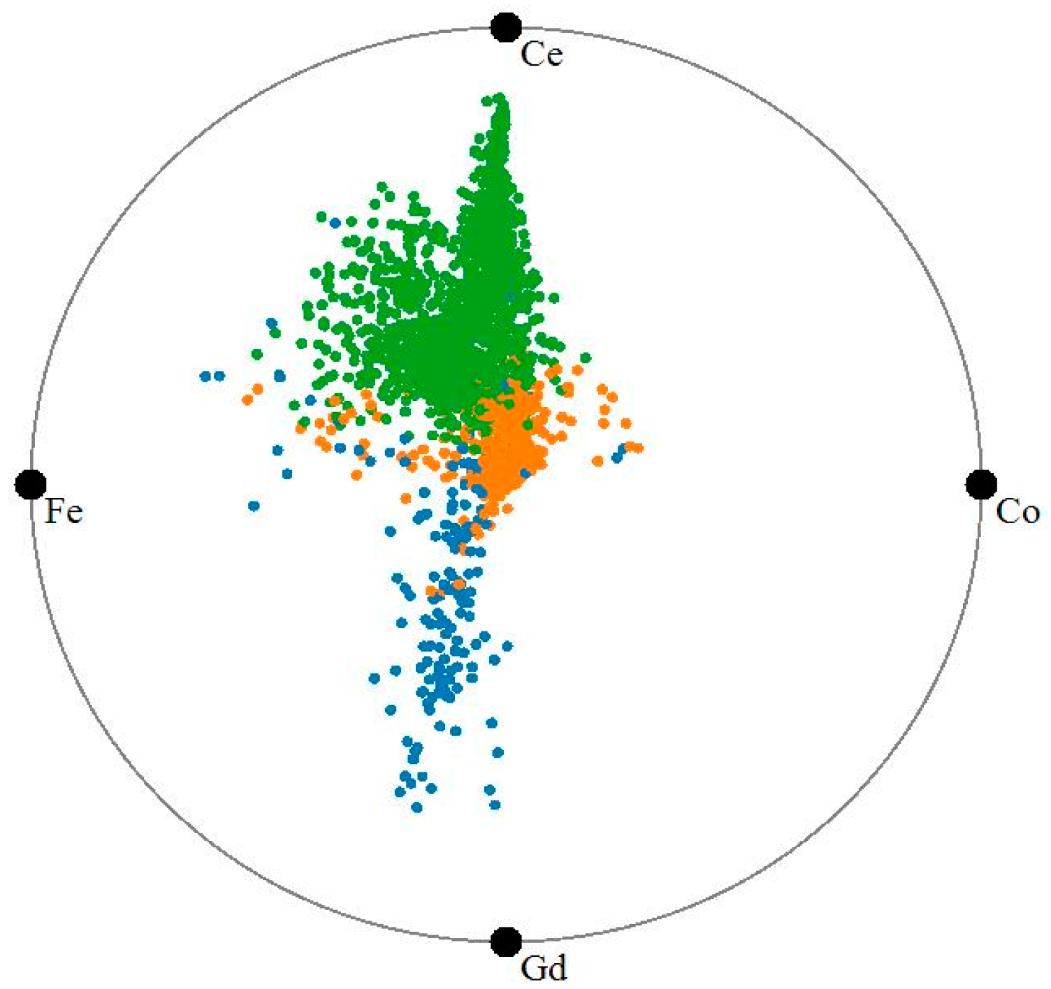
Figure 2.
Generalized barycentric coordinate interpolation.
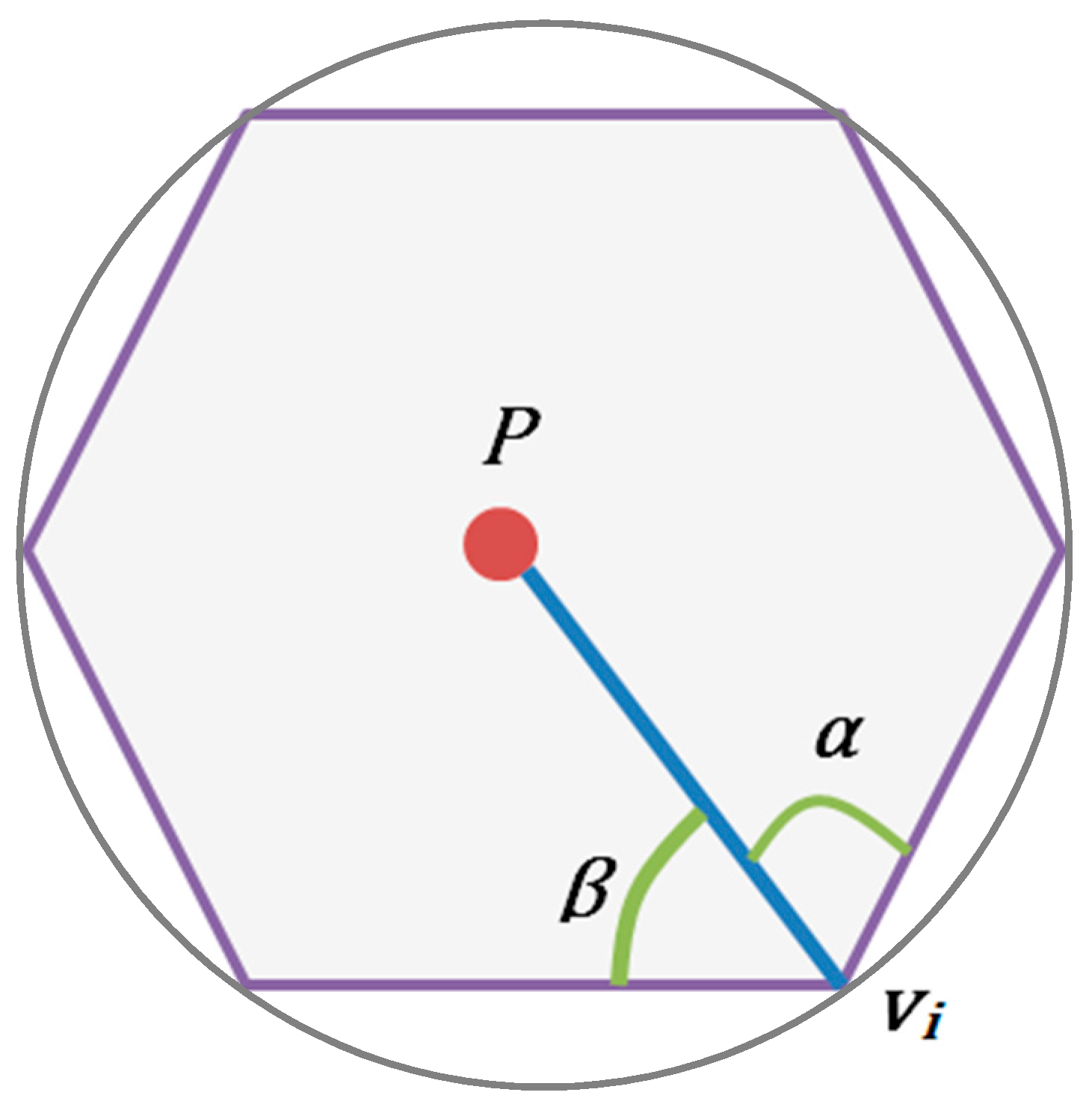
Figure 3.
The battery dataset visualized with parallel coordinates.

Figure 4.
Illustration of the distance spaced attribute layout scheme.

Figure 5.
Attribute layout schemes: (a) original RadViz layout; and (b) distance-spaced RadViz layout.
Figure 5.
Attribute layout schemes: (a) original RadViz layout; and (b) distance-spaced RadViz layout.
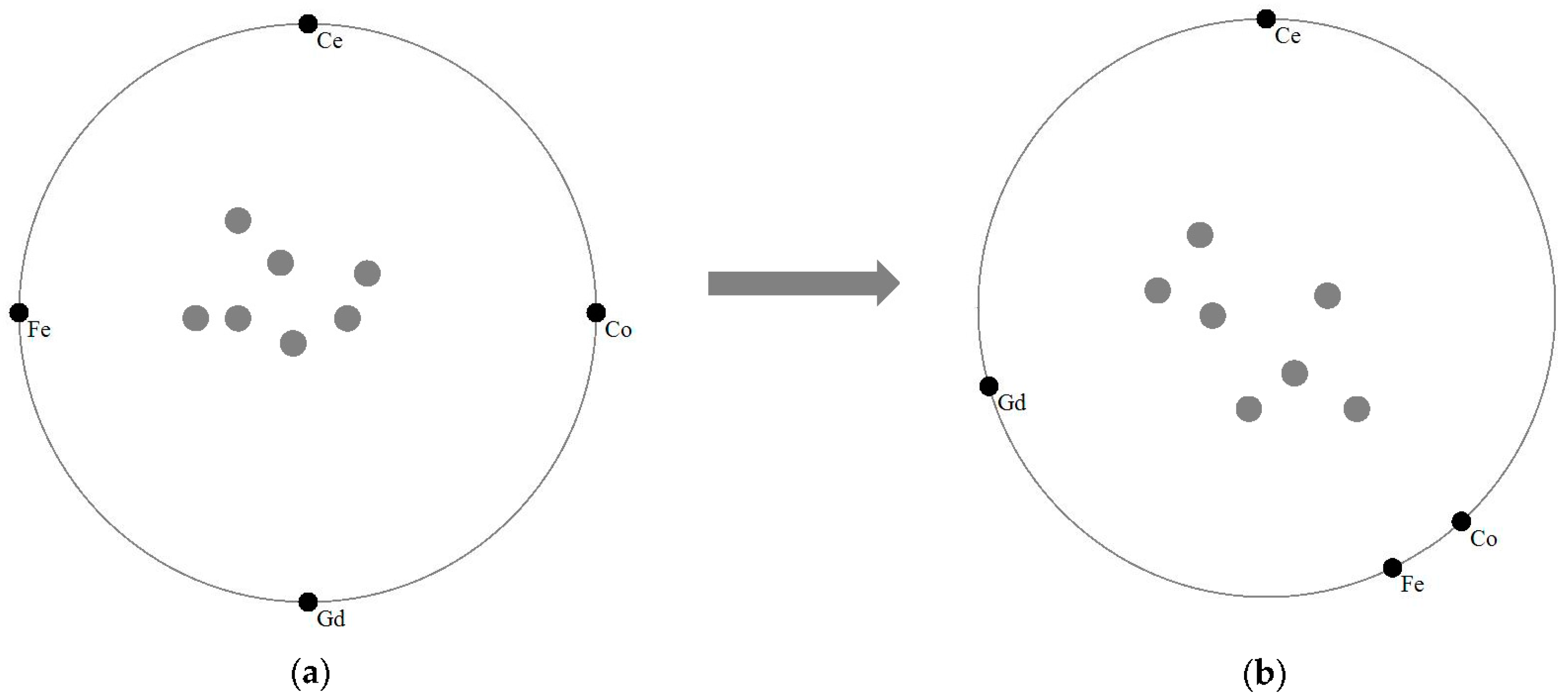
Figure 6.
(a) The error contours for the iterative data to attribute layout error reduction; (b) the force directed adjustment procedure for the data to data layout error reduction.
Figure 6.
(a) The error contours for the iterative data to attribute layout error reduction; (b) the force directed adjustment procedure for the data to data layout error reduction.
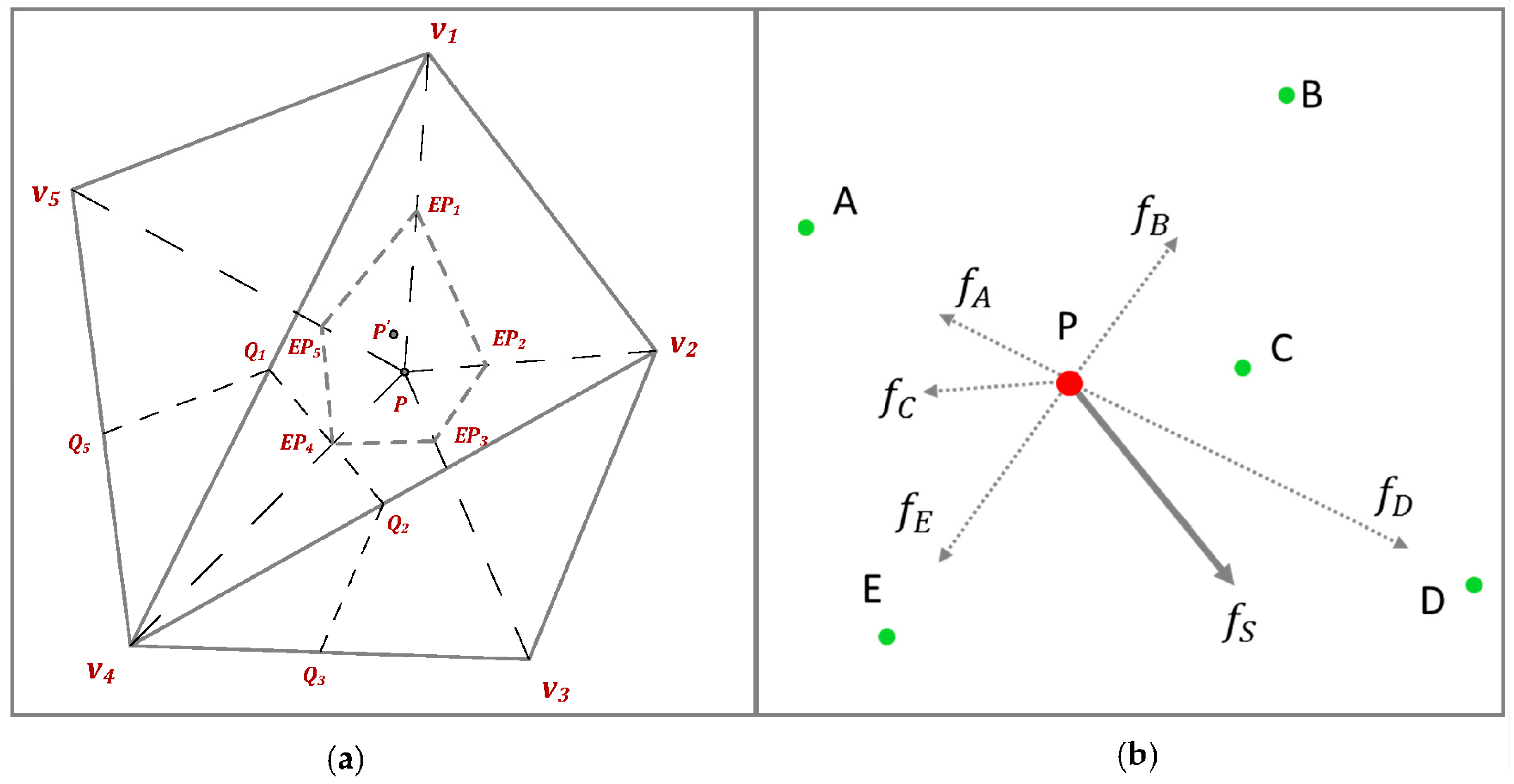
Figure 7.
The battery data set visualized with RadViz Deluxe.

Figure 8.
The sample values in terms of “Gd” (a); “Ce” (b); “Co” (c) and “Fe” (d) respectively. The darker intensities correspond to higher values.
Figure 8.
The sample values in terms of “Gd” (a); “Ce” (b); “Co” (c) and “Fe” (d) respectively. The darker intensities correspond to higher values.

Figure 9.
Mapping sample value to intensity for RadViz.

Figure 10.
Distance vs. value plot for RadViz for (a) Gd; (b) Ce; (c) Co and (d) Fe.

Figure 11.
Distance vs. value plot for RadViz Deluxe for (a) Gd; (b) Ce; (c) Co and (d) Fe.

Figure 12.
Comparing RaViz and RadViz Deluxe in terms of the correlation factor for the plots shown in Figure 10 and Figure 11. A higher factor means a better approximation to the ideal straight line with a correlation factor of 1.0.
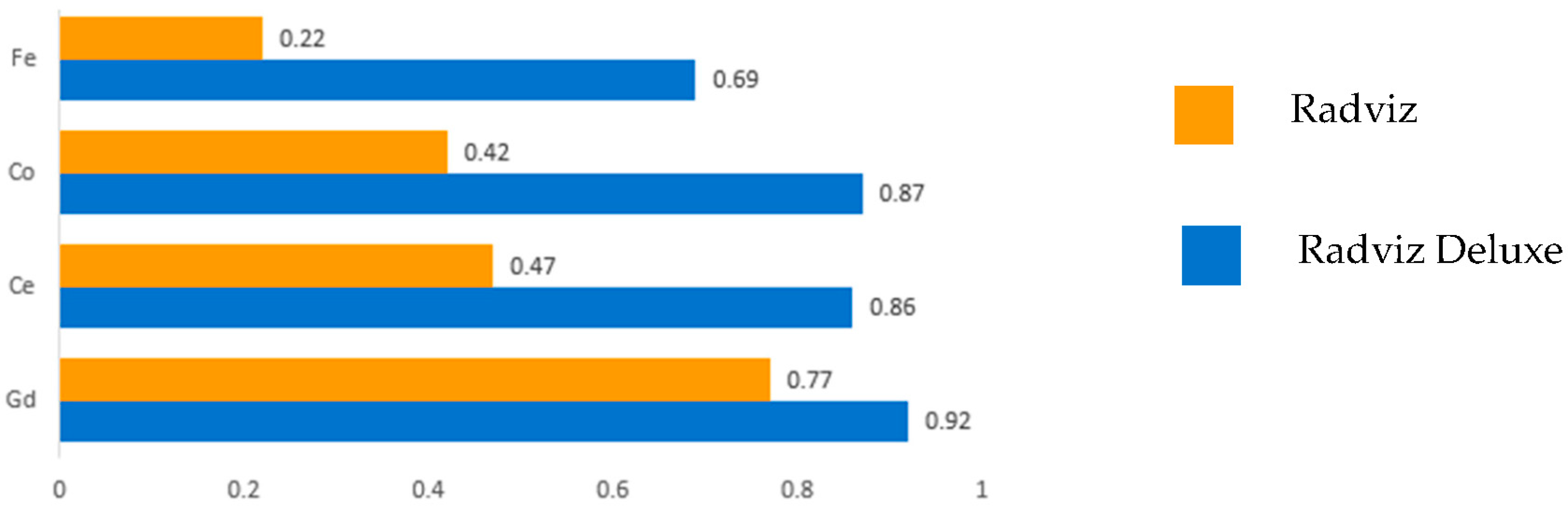
Figure 13.
RadViz Deluxe visualizing the solvents data.
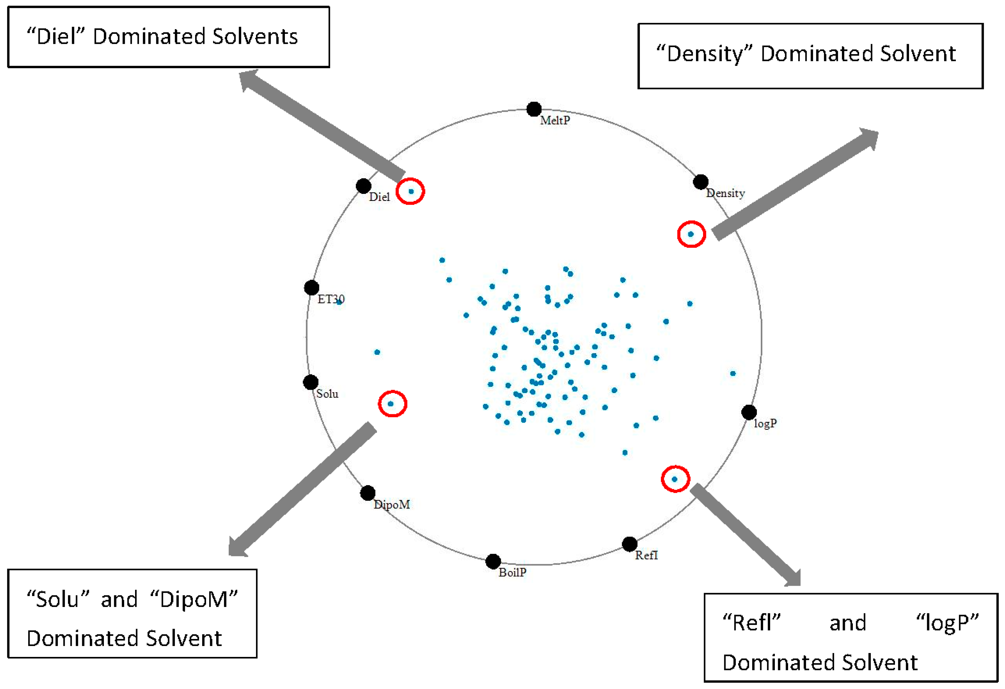
Figure 14.
RadViz Deluxe visualization for a subset of properties chosen by the user: (a) choose interesting solvents based on distance from properties; or (b) choose interesting solvents based on cluster.
Figure 14.
RadViz Deluxe visualization for a subset of properties chosen by the user: (a) choose interesting solvents based on distance from properties; or (b) choose interesting solvents based on cluster.
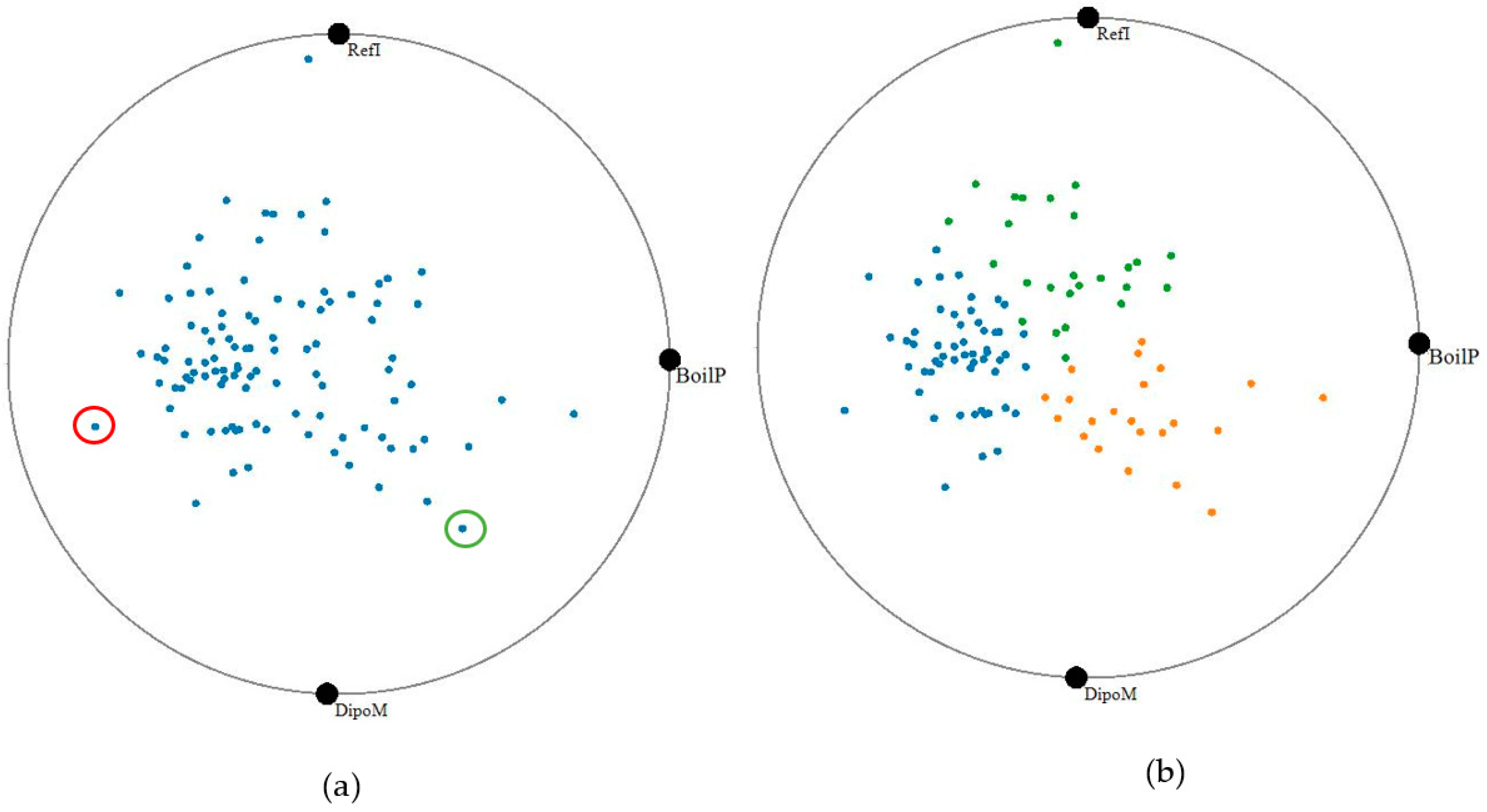
Figure 15.
RadViz Deluxe visualization of the forest fire data set.

Table 1.
The various contextual layout methods expressed in a common notation (VF: vertices’ function, MF: mapping function).
Table 1.
The various contextual layout methods expressed in a common notation (VF: vertices’ function, MF: mapping function).
| Method | VF () | MF () |
|---|---|---|
| RadViz | ||
| Star Coordinates | or other | |
| Gravi++ | or other free layout | |
| Dust & Magnet | or other free layout | |
| GBC | or other convex polygon | |
| Remarks | . stands for the strength multiplicator of . is the attraction between dust i and magnet j, and is the circle radius. | |
Table 2.
RadViz vs. RadViz Deluxe in terms of the various layout errors.
| EDD | EDV | EVV | EA | |
|---|---|---|---|---|
| RadViz | 0.416 | 0.232 | 0.999 | 0.697 |
| RadViz Deluxe | 0.138 | 0.172 | 0.056 | 0.101 |
| Error Reduction | 66.8% | 25.9% | 94.4% | 85.5% |
© 2017 by the authors. Licensee MDPI, Basel, Switzerland. This article is an open access article distributed under the terms and conditions of the Creative Commons Attribution (CC BY) license (http://creativecommons.org/licenses/by/4.0/).
Share and Cite
MDPI and ACS Style
Cheng, S.; Xu, W.; Mueller, K. RadViz Deluxe: An Attribute-Aware Display for Multivariate Data. Processes 2017, 5, 75. https://doi.org/10.3390/pr5040075
AMA Style
Cheng S, Xu W, Mueller K. RadViz Deluxe: An Attribute-Aware Display for Multivariate Data. Processes. 2017; 5(4):75. https://doi.org/10.3390/pr5040075
Chicago/Turabian StyleCheng, Shenghui, Wei Xu, and Klaus Mueller. 2017. "RadViz Deluxe: An Attribute-Aware Display for Multivariate Data" Processes 5, no. 4: 75. https://doi.org/10.3390/pr5040075
Note that from the first issue of 2016, this journal uses article numbers instead of page numbers. See further details here.