An Effect of White Space on Traditional Chinese Text-Reading on Smartphones †

1
Department of Mechanical Design Engineering, National Formosa University, No. 64, Wenhua Road, HuWei, Yunlin 632, Taiwan
2
Department of Environmental Engineering, Kun Shan University, No. 195, Kunda Road, Yongkang, Tainan 71070, Taiwan
*
Author to whom correspondence should be addressed.
†
This paper is an extended version of our paper published in the 2018 IEEE International Conference on Applied System Invention (ICASI), Chiba, Japan, 13–17 April 2018.
Appl. Syst. Innov. 2018, 1(3), 24; https://doi.org/10.3390/asi1030024
Submission received: 1 April 2018
/
Revised: 1 July 2018
/
Accepted: 20 July 2018
/
Published: 23 July 2018
(This article belongs to the Special Issue Selected papers from IEEE ICASI 2018)
Abstract
:The study explored the effects of white space on reading performance of Chinese essays on smartphones. The experiment was a 2(Line spacing) × 2(Paragraph spacing) × 3(Page spacing) Latin square design with two replicates. The Line spacing had two levels: two-font leading and three-font leading. The Paragraph spacing included two levels: one-leading space and two-leading space. The Page spacing included three levels: none spacing, one-third spacing, and one-half spacing. The objective performance measure was reading time; and subjective performance measures included ratings of ease, comfort, aesthetic appeal, and preference. Results of analysis of variance indicated that the main effects of Page spacing, Line spacing, and Paragraph spacing were significant on reading time. Additionally, Page spacing was also significant on ratings of ease, comfort, aesthetic appeal and preference; Line spacing was significant on comfort and aesthetic appeal. However, Paragraph spacing was not significant on ratings of effortlessness, comfort, aesthetic appeal, and preference.
1. Introduction
Due to the convenience of smartphones, users use them at any time, place or occasion. The penetration rate of smartphone users is growing rapidly. According to eMarketer’s estimates [1], 73.4% of Taiwan’s population uses smartphones. Smartphones are no longer cutting-edge communication gadgets but are now necessities in peoples’ lives. The Global Views Survey Research Center [2] reported that 46.4 percent of the Taiwan population had reading experiences on e-books and that 27.1 percent of them used a smartphone to read an e-Book. The population reading either e-news or e-books on smartphones should continuously increase due to increasing penetration of smartphones in Taiwan. Moreover, Taiwanese are accustomed to reading articles written in traditional Chinese characters. Therefore, it is necessary to explore effects of traditional Chinese typography on reading performance for Taiwanese readers.
Traditional Chinese characters have substance and occupy space on the text page. Space occupied by characters is known as positive space; unoccupied or empty space is known as negative space [3], which is called white space in traditional two-dimensional print design. White space is a frequently used term in graphic and web design and applied to graphics or visual communication design. The white space of the typographic design includes the margin, line spacing, and paragraph spacing, etc.
Many readers without design backgrounds believe that large white space in a text wastes space. However, the white space may be one of the factors improving reading performance [4]. Golombisky and Hagen argued that the white space would not waste space because it provided readers with a relief, which was conducive to visual communication and reading comprehension [4]. Keyes proposed typographic tonality, defined as the ratio of the area of positive space to the area of white space [5]. He believed low tonality (i.e., more white space) would increase text legibility and comprehension. Summarily, white space provides relief to readers in reading tedious text and reduces reading loadings.
However, except for line spacing, the above suggestions of applying white space to typographic design were drawn from practical experiences of design practitioners; they did not offer any scientific evidence to support their claims. Hence, this paper tries to explore the impact of typographical white space on reading performance on smartphones based on scientific evidence.
1.1. Line Spacing
Line spacing, a kind of white spaces, refers to the distance between text lines. The size of line spacing is expressed by leading, the distance between the baselines of successive text lines. The baseline is a reference line on which the characters rest. Consequently, there is no white space span between the two successive lines when the leading is equal to a character height. Some authors define single line spacing as when the distance of empty spaces between two adjacent horizontal lines is one character high (cf. [6]). Under their definition, the leading of single line spacing is equal to two fonts high. Others denoted single line spacing as the distance of successive text baselines (cf. [6]). Under their definition, the leading of single line spacing is equal to one font high. For consistency, this study uses the line spacing defined by leading.
Previous studies on English reading found that larger line spacing had an advantage on computer screens because it decreased lateral masking [7,8,9]. However, the findings may be not be appropriate to generalize to Chinese text. In English, an alphabetic writing system, the words are separated by spaces. On the contrary, written Chinese text is formed by strings of equally spaced symbols, not composed of letters, neither separated by spaces. In English reading, the spaces between words help demarcate the word boundary [10]. By contrast, Chinese readers depend on lexical knowledge to segment Chinese text into words [10]. Besides, Chinese characters have more structural details and are visually more complex in form than alphanumeric characters. Possibly, suggestions of alphanumeric typography could not be generalized to Chinese typography owing to the difference between alphanumeric and ideographic writing systems. Therefore, it is necessary to explore the line spacing effects of traditional Chinese characters on reading performance.
Like alphanumeric typography, larger line spacing would decrease the lateral masking effect, reducing confusion in location of characters and facilitating reading performance when reading Chinese text in desktop displays [6,11]. For example, Chan and Lee found that two-font leading produced faster reading speed than one-font leading and reported higher preferences for reading comfort, reading ease and low fatigue on a 15-in display [6]. Chan and his colleagues also showed that two-font leading performed better than one-font leading on reading speed and correction rate when performing proofreading tasks on a desktop display [11].
Few studies explored the line spacing of Chinese text on smartphones because many people think that larger line spacing is a waste of the limited space on smartphones [12]. Despite this, Wang et al. examined the differences between four leadings of Chinese text on a smartphone, including 1.125, 1.25, 1.325 and 1.5 fonts high [12]. They also found that participants preferred the larger line spacing because of higher readability, less fatigue, and more attractiveness; but they found no significant effect of line spacing on reading time [12]. However, it is not clear whether leading sizes more than two characters in height could facilitate reading performance because they did not investigate leadings over two characters high.
Previous studies fixed the viewing distance in their experiments. However, users can adjust their viewing distances in real situations. Users can adjust their viewing distances to attain an optimal visual angle subtended to the retina to see the text clearly: short (near) for small character sizes; and long (far) for large character sizes. Consequently, all character sizes are legible and would not affect performance of reading Chinese text [10]. It may not be appropriate to generalize the findings to the typographic design of traditional Chinese texts on smartphones [10]. For simulating real situations, the present study does not set a fixed viewing distance and encouraged subjects to adjust their viewing distances at any time to attain their optimally comfortable viewing situations.
1.2. Paragraph Spacing
Little research has discussed the Paragraph spacing effect on reading performance. Paragraph spacing refers to the white space span from the last line of one paragraph to the first line of the next. Paragraph spacing chunks continuous text into manageable units according to the subject matter. Keyes [4] argued that the chucking would facilitate reading comprehension. Soegaard [13] also believed that the paragraph spacing kept each page from looking busy, enhancing the overall readability and flow of the text. However, they did not offer any scientific evidence to support their claims. Therefore, this article tries to explore if paragraph spacing could be conducive to reading when reading on smartphones.
1.3. Page Spacing
Page spacing, a kind of white space, refers to the margin from the top title of the page to the beginning of the text. For example, the white space on the top of the page as shown in Figure 1 is called page spacing. Sometimes, an illustration would be put in the page spacing as shown in Figure 1b. Page spacing is frequently applied to the typography of the first page of texts, or of a children’s book. It may make the screen look concise and provide relief to readers in reading a text. However, little research has discussed the page spacing effect on reading performance. Hence, the present study tries to explore if page spacing would positively affect reading performance.
1.4. Scrolling Effect
Conversely, page spacing would reduce the amount of information on a page, which might decelerate reading speeds. Besides, increasing the area of white space would result in the text overflowing into multiple screens, prompting users to scroll the screen to read, which might negatively affect performance [14,15]. Previous studies indicated that scrolling would reduce reading comprehension on full-size displays [16], and eliminate remembering of text-reading on small displays [17]. It is possible that scrolling changes the locations of characters in the text, resulting in difficulty for users in locating information by recalling their spatial locations [14]. Consequently, white space may degrade reading performance because of the increase in scrolling behaviors.
In summary, applying white space to typography was advocated by professional designers and practitioners. However, white space might also degrade reading performance because of increasing scrolling behaviors. Therefore, the paper investigates if positive effects of white space exist on reading Chinese text.
2. Methods
The experiment was a 2(Line spacing) × 2(Paragraph spacing) × 3(Page spacing) Latin Square design with two replicates. The Line spacing included two levels: two-font leading and three-font leading. Two-font leading (2-F leading) refers to the white space between the successive lines of text equal to the height of the text font size; three-font leading (3-F leading) refers to twice the text height. Previous studies did not discuss the differences of leading larger than two fonts high on small screens. Therefore, this study will focus on leading larger than two fonts high.
The Paragraph spacing also included two levels: one-leading spacing and two-leading spacing. One-leading spacing (1-L spacing) refers to the white space between the successive paragraphs equal to the line spacing of the text; for example, the paragraph spacing would be two fonts high when the text line spacing is two fonts high. Two-leading spacing (2-L spacing) refers to the white space of the successive paragraphs twice the line spacing of the text. For example, the paragraph spacing would be four characters high when text line spacing is two fonts high. When the paragraph spacing is 1-L spacing, it means that the line spacing and paragraph spacing are identical; consequently, the effect of chunking the text would be not significant.
Page spacing included three levels: no spacing, one-third spacing and one-half spacing as shown in Figure 2. No spacing (0H) refers to the white space between the text title and main text equal to the line spacing. One-third (1/3H) or one-half spacing (1/2H) refers to a one-third or a one-half length of the screen, respectively.
Participants found typos by reading the twelve essays selected in the study. Reading time spent on finding the typos was recorded as a performance measure of readability. The shorter the reading time, the better performance the typography has.
2.1. Subjects
Twenty-four undergraduate students from different Medical Colleges in Taiwan participated in the experiment. The mean age was 20.83 years. (SD = 2.60 years). These participants had taken the Chinese language portion of the General Scholastic Ability Test, which has scores ranging from 0 to 15, and all had scores over 14, indicating high Chinese reading competence. Each was paid about $12 USD for their participation in the experiment. All subjects reported normal ocular health with no clinically significant anomalies of accommodation. Before participating in the test, all subjects consented to perform the trials by signing the agreements outlined by the committee on Governance Framework for Human Research Ethics of National Cheng Kung University in Taiwan.
2.2. Materials
A 5.5-inch smartphone (ZenFone 2 Laser model ZE550KL) with a display resolution of 267 ppi was used to display a reading comprehension test. The screen size is 6.85 cm × 12.18 cm. Its physical size is 148.2 cm × 72.8 cm × 10.34 mm. The smartphone was programmed with Android 5.0 (Lollipop) to control the experimental procedures and collect data.
There are twelve essays chosen from reading comprehension tests used in an elementary school in Taiwan. The number of characters in each was close to 501 characters. They were slightly modified to get an identical length. Finally, each essay, including punctuation marks, has 501 characters in length.
Each essay includes ten typos classified into three types. First, homophone typos refer to the wrong Chinese characters pronounced identically to the correct ones in the text, but with different meanings and shapes from the correct ones. Second, lookalike typos refer to the wrong characters that are very similar in physical appearance to the correct characters in the text but have different meanings and shapes from the correct ones. Last, spelling typos refer to the location swap of characters of a word composed of the two characters, resulting in different meanings from the correct word in the text. Therefore, participants must read and comprehend the text to find those typos. Participants conducted readings in the experiment. Hence, reading time, the time spent on finding typos, is used as a performance measure to evaluate the pros and cons of the typography.
The text font was a 12-point Hei style of traditional Chinese characters. One point (pt.) is equal to 1/72 inches and each Chinese character is confined to a box-shaped area. Therefore, the height of the box-shaped area for a 12-point font is 4.2 mm. However, the actual sizes measured from the screen directly are 2.8 mm.
2.3. Tasks and Procedure
Participants performed a typo-finding task by reading essays, after consenting to the experiment. At the start of the trial, a preparing page showed a “To start time counting” button (written in Chinese). Participants were reminded to take a breath and be ready to go before tapping on the button. After they tapped it, the screen showed an essay with one of the design combinations, and the programmed smartphone recorded the start time. Participants discovered and tapped on the typos as soon as possible. The tapped typo was turned red and replaced by a figure indicating the order of the typo in the essay. After participants found the ten typos, the experiment program recorded the ending time of the reading task and calculated the reading time by subtracting the starting time from the ending time.
Next, a rating page with four questions was showed. The questions asked participants to subjectively rate their preference, aesthetic appeal, and ease and comfort with the typography of the preceding essay. Each included five choices: most agree, agree, no opinion, less agree, and least agree, scored as “5”, “4”, “3”, “2” and “1” respectively. The higher the score, the more the participants agreed.
The typo-finding test until participants completed the twelve reading tasks. Each participant had a five-minute break after finishing every two tasks. It took about two hours for each participant to complete the tasks. Familiarization was based on three training trials with an additional essay with different typographic variables.
2.4. Performance Measures and Data Analysis
Reading time, as a performance measure, was calculated for each part of the test by subtracting the starting time from the ending time. The less the reading time, the better the design combinations performed. As for ratings, the higher the scores of ease, comfort, aesthetic appeal, and preference on reading the article was, the easier and more comfortable, attractive and preferred, respectively, the participant felt about the design combinations. Analysis of variance was employed to analyze the data. All calculations were made using SPSS.
3. Results
Results of analysis of variance indicated that the main effects of Page spacing (F (2, 242) = 3.49, p = 0.032), Line spacing (F (1, 242) = 5.68, p = 0.018) and Paragraph spacing were significant (F (1, 242) = 9.95, p = 0.002) on reading time. However, the interactions of those factors were not significant. Post hoc analysis was also conducted.
Table 1 shows the means and standard deviations of reading time for each level of the independent variables. Multiple comparison methods using contrasts were also used to test the difference of means for each level. The result showed no significant difference of reading time between 0H page spacing (212.78 s) and 1/2 H page spacing (227.19 s), and between 0H page spacing (212.78 s) and1/3H page spacing (193.11 s). However, the reading time of 1/2H page spacing (227.19 s) was significantly longer than 1/3H page spacing (193.11 s). Additionally, the result also showed the reading time for line spacing with a 3-Font leading (223.62 s) was significantly longer than that with a 2-Font leading (198.43 s). Besides, the result also showed the reading time for page spacing with 1-L spacing (227.71 s) was significantly longer than that with 2-L spacing (194.35 s).
The results of analysis of variance indicated that the effect of Page spacing was significant on ratings of ease (F (2, 242) = 9.861, p < 0.01), comfort (F (2, 242) = 11.514, p < 0.001), aesthetic appeal (F (2, 242) = 20.404, p < 0.001) and preference (F (2, 242) = 25.565, p < 0.001).
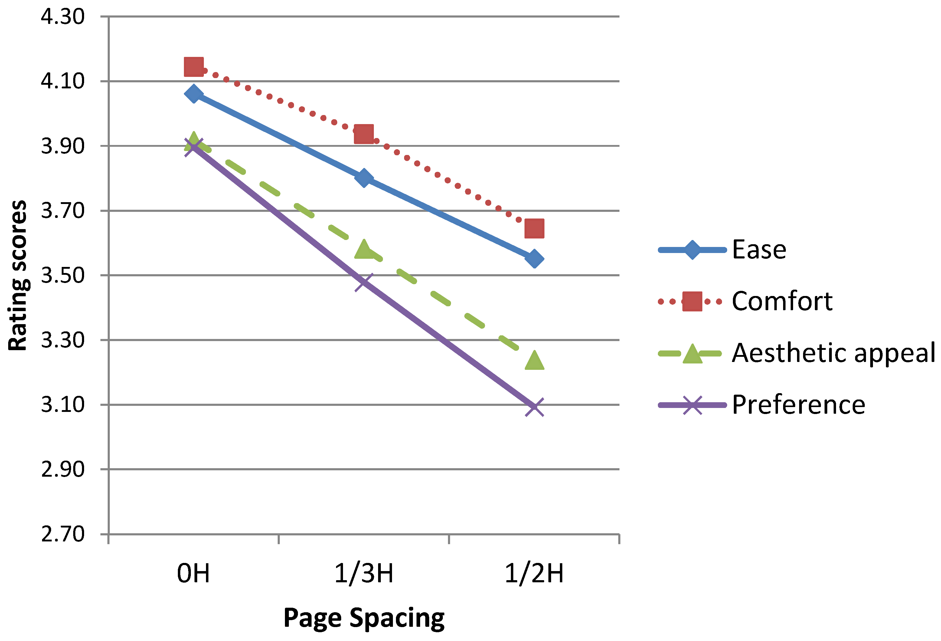
Table 2 shows the means and standard deviations of subjective rating scores for each level of Page spacing. Multiple comparison methods using contrasts were used to test the difference in treatment means. Figure 3 shows the line chart of subjective ratings for each level of Page spacing. On ratings of ease, the result showed the rating score of 0H page spacing (4.06) was the highest; 1/3H page spacing (3.80) the next; and 1/2 H page spacing (3.55) the least. It suggested that oversized page spacing would reduce subjective ease of reading. On comfort, the scores of 0H page spacing (4.15) was significantly higher than 1/3H page spacing (3.94), and both were higher than 1/2H page spacing (3.65). For aesthetic appeal, the score of 0H page spacing (3.92) was the highest; 1/3H page spacing (3.58) the next; and 1/2 H page spacing (3.24) the least. For preference, the score of 0H page spacing (3.90) was the highest; 1/3H page spacing (3.48) the next; and 1/2H page spacing (3.09) the least.
Next, results of analysis of variance also indicated a significant effect of Line spacing on comfort ratings (F (1, 242) = 9.533, p = 0.002) and on aesthetic appeal (F (1, 242) = 4.694, p = 0.031). However, the effect was not significant on the other subjective ratings.
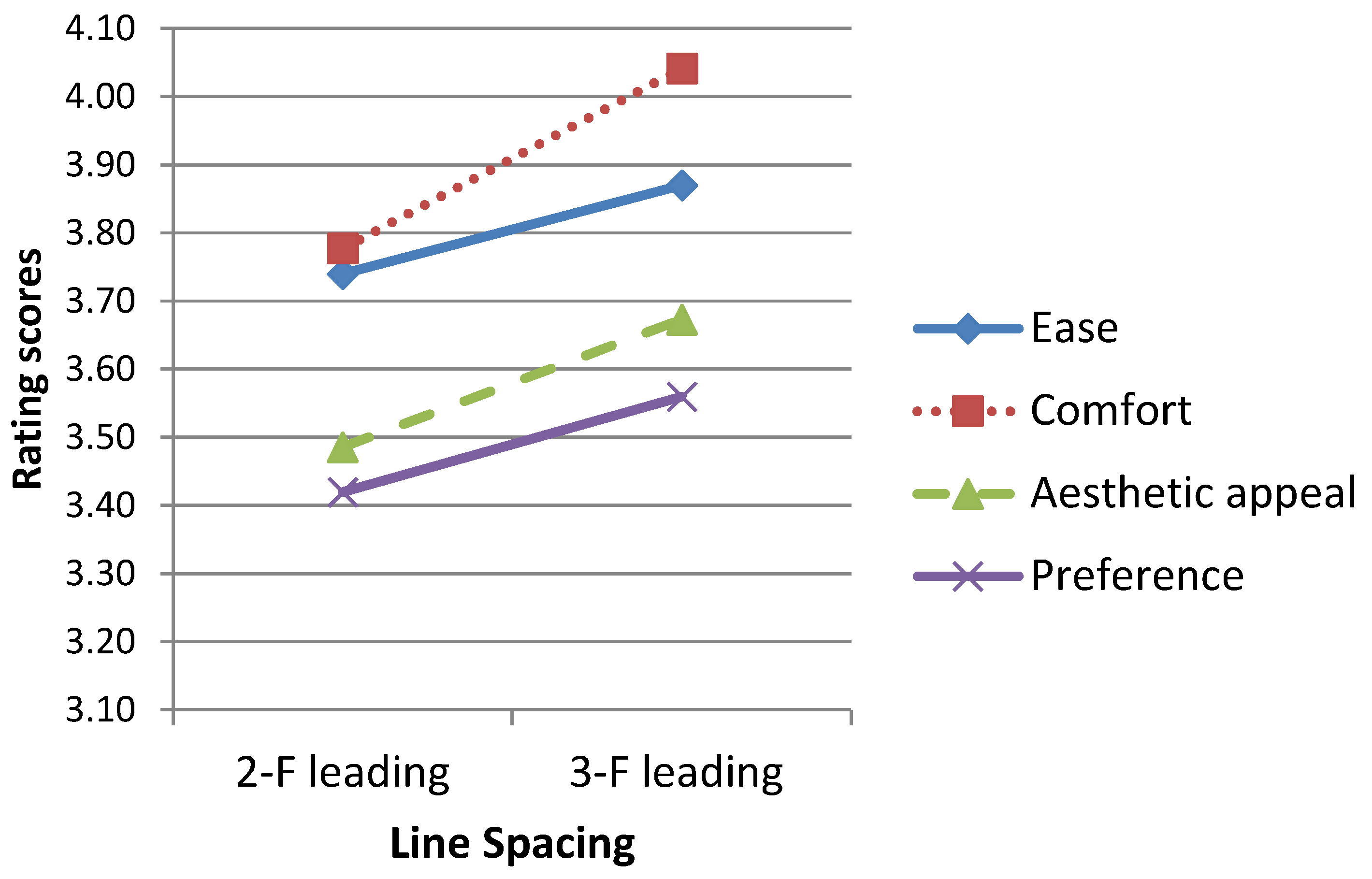
Table 3 shows the means and standard deviations of both comfort and appeal rating scores for each level of Line Spacing. Multiple comparison methods using contrasts were used to test the difference of means for each level. Figure 4 shows the line chart of subjective ratings for each level of Line Spacing. On comfort ratings, the result indicated that the scores of line spacing with a 3-F leading (4.04) was significantly higher than that a 2-F leading (3.78). On aesthetic appeal, the result showed the appealing scores for line spacing with a 3-F leading (3.67) was significantly higher than that a 2-F leading (3.49).
Finally, the results showed no Paragraph spacing effect on the four subjective ratings: ease, comfort, aesthetic appeal and preference. Table 4 shows the means and standard deviations of rating scores for each level of Paragraph spacing.
4. Discussion
Previous studies found no significant effect of Chinese typographic variables on reading comprehension if the participants’ performance was measured by the accuracy of untimed multiple-choice comprehension tests [9,18,19]. The reason may be the ease of the reading task chosen for these participants. Their reading materials are collected from junior high schools or elementary schools, and the participants are college students with excellent linguistic competence who can get high comprehension scores easily. Therefore, the effect of typographic variables on comprehension scores could have been masked by participants’ reading competencies when the reading time is not limited. Hence, comprehension scores may be not appropriate measures to test the typographic effects without limiting reading time [10].
Conversely, the time spent on the comprehension test showed significant differences between different typographic variables [9,20,21,22]. It seems that the reading time may be more sensitive than comprehension scores to the subtle influences of typographic variables [10]. Therefore, this paper used reading time as an objective performance measure. The outcomes also demonstrated the effects of Page spacing, Line spacing, and Paragraph spacing was significant on reading time.
4.1. Line Spacing
This study tested the difference between two sizes of line spacing: 2-F leading and 3-F leading. The result demonstrated that the difference was significant on reading time and ratings of aesthetic appeal and comfort. This study indicated that the text with 2-F leading was faster on reading speed than with 3-F leading. Chan and Lee also found that 2-F leading was faster in reading speed than 1-F leading; however, Wang et al. found no Line spacing effect on reading time when the levels of Line spacing on the experiment were 1.125, 1.25, 1.325 and 1.5-F leadings. Extrapolating these findings, it may indicate that oversized line spacing (i.e., 3-F leading) would degrade reading speed.
Scrolling may explain why oversized line spacing (i.e., 3-F leading in this study) would degrade reading performance. Due to the limit of the display size of mobile phones, the text on the small display would overflow into multiple screens. Users must slide their fingers to scroll text to read all the time. Scrolling text might negatively affect performance because it would change the locations of all characters [14,15,16,17], resulting in difficulty for users in locating information by recalling their spatial locations [14]. The length of an essay with 3-F leading would almost be 1.5 times the length of that with 2-F leading, resulting in 3-F leading having more scrolling frequencies than 2-F leading. Consequently, the result showed that participants took more time to read an article with 3-F leading than that with 2-F leading.
However, the outcome showed that ratings of the 3-F leading were higher than 2-F leading on aesthetic appeal and comfort. That is, participants felt that the larger line spacing was more beautiful and comfortable although they had to spend more time reading it. Additionally, Chan and Lee found 2-F leading line reported higher preferences than 1-F leading. Wang et al. also found that participants subjectively preferred to the larger line spacing to the smaller one when comparing the four kinds of leadings (1.125, 1.25, 1.325 and 1.5 leadings) on readability, fatigue, and attractiveness. Extrapolating these findings, we could conclude that participants favored larger line spacing.
Hence, considering tradeoffs of outcomes from objective and subjective measures, we may conclude that 2-F leading or 1.5-F leading spacing may be the optimal line spacing for Chinese text-reading on a smartphone.
4.2. Paragraph Spacing
Paragraph spacing also included two levels: 1-L spacing and 2-L spacing. The size of paragraph spacing and line spacing for the text would be identical when the paragraph spacing is 1-L spacing high, and the size of paragraph spacing is twice of the line spacing when it is 2-L spacing high. In other words, the text was chunked into discriminable blocks when paragraph spacing was 2-L; the paragraph blocks were not discriminable when paragraph spacing was 1-L.
The result indicated that the reading time of 2-L spacing was significantly less than 1-L spacing. That is, the 2-L spacing had significantly better reading performance than 1-L spacing. Keyes [5] and Soegaard [13] believed that the text chucked into discriminable paragraphs by inserting white space would facilitate reading performance. The white space between two chunks provides relief to readers in reading a tedious text and reduces reading loadings. The reason participants spent less time reading may be that the 2-L spacing offers white space, chunking text into discriminable paragraphs.
On the other hand, the physical length of the text with 2-L spacing increases more than that with 1-L spacing. 2-L spacing should increase sliding frequencies and worsen reading performance compared to 1-LSpacing. However, the outcomes did not demonstrate the negative impact of scrolling behaviors on reading time. We found that each essay is chunked into four paragraphs in the experiment when inspecting paragraphs. In this situation, the physical length of the text with 2-L spacing essay is only three more lines than that with 1-L spacing one. Possibly, the increased length is not significantly long enough to increase scrolling frequencies that affect reading performance.
Last, the results showed no Paragraph spacing effect on subjective ratings. Participants did not significantly feel differences between 1-L spacing and 2-L spacing on ease, comfort, aesthetic appeal, and preference. We found that this rating means both 1-L spacing and 2-L spacing for each subjective rating are close to 3.6 when inspecting the rating scores. Nielsen and Levy [23] argued that the value of 3.6 on a 1–5 scale is a good estimate of neutral subjective satisfaction. Possibly, user satisfaction is only ordinary for these two types of paragraph spacing. Hence, it is necessary to consider the most satisfactory paragraph spacing in future studies.
4.3. Page Spacing
The result showed no significant difference in reading time between 0H and 1/2H page spacing, nor between 0H and 1/3H page spacing. However, the reading time of 1/2H page spacing was significantly longer than 1/3H page spacing. It indicated that too large page spacing is not conducive to reading performances. Oversized page spacing would decrease a display area dramatically, which would limit the number of characters presented in one screen and increase screen pages. Consequently, participants must slide the text frequently, resulting in degraded readability. Therefore, the result showed that the reading performance of moderate page spacing (i.e., 1/3H page spacing) was significantly better than that of the larger page spacing (i.e., 1/2H page spacing).
However, the result also showed the reading performance of the smallest page spacing (i.e., 0H page spacing) was not significantly better than the moderate page spacing (i.e., 1/3H page spacing). It is possible that too small a page spacing (0H) causes overcrowded typography, not providing readers with visual relief and relaxation in reading tedious text. Accordingly, the smallest page spacing increases loadings of the reading task, degrading reading performances. On the contrary, at the same time, the smallest page spacing (i.e., 0H) does decrease participants’ scrolling frequencies, promoting reading performances. This advantage dilutes its disadvantage. Therefore, the outcomes did not show the difference in reading time between 0H page spacing and 1/3H page spacing.
In conclusion, the reading performance of the 1/3H page spacing was significantly better than that of the 1/2H page spacing and not less than that of the 0H page spacing. Hence, it seemed that 1/3H page spacing was suitable for page spacing on smartphones.
However, the results demonstrated that 0H page spacing was rated the best, 1/3H page spacing was the next, and 1/2H page spacing was the worst. Larger page spacing may reduce more rating scores of ease, comfort, aesthetic appeal, and preferences. That is, participants felt more ease, comfort and attractiveness, and higher overall satisfaction toward larger page spacing. In short, participants believed that white space would degrade overall preference.
The participants in this study did not have design experience. Many people without a design background considered white space wasted space and believed it should house more information or other visual elements to avoid waste [5]. Therefore, the findings agreed with the design laypeople’s opinions that the white space would degrade subjective preference [5]. Conversely, design practitioners believed white space would not waste the screen space but improve visual communication and reading comprehension. They promoted the use of white space for elegance and ensuring a high-quality user experience. It seems to be an individual difference between design practitioners and laypersons in page spacing evaluation. Future studies should explore the differences between designers and laypeople.
5. Conclusions
Design practitioners believe that white space provides relief in reading tedious text, reducing reading burden. However, readers who do not have design backgrounds oppose this opinion. This study explored the impacts of white space on reading Chinese essays on smartphones to resolve this dispute. The independent variables were Line spacing, Paragraph spacing, and Page spacing. Two types of performance measures predicting the impacts of the white spaces were an objective measure and three subjective measures. The objective measure was the reading time spent to find ten typos. Three subjective measures were ratings of effortless, comfort, aesthetic appeal and overall preference. The following are the conclusions of the findings.
First, for Line spacing, the result demonstrated that participants felt that 3-F leading was more beautiful and comfortable than 2-F leading although 3-F leading took more time to read.
Second, for Paragraph spacing, the result indicated that reading text with 2-L spacing was significantly faster than that with 1-L spacing; however, subjective ratings of the 1-L and 2-L paragraph spacing did not differ significantly on effortless, comfort, aesthetic appeal, and preference. Participants’ satisfaction was only ordinary for these two kinds of paragraph spacing.
Third, for Page spacing, the outcomes showed that too large (i.e., 1/2H in this study) page spacing size was not conducive to reading speeds. Participants felt that the smaller page spacing (i.e., 0H in this study) provided more ease, comfort, attractiveness and overall satisfaction.
In conclusion, appropriate use of white space would increase user performance and satisfaction on reading a traditional Chinese text on smartphones. This study suggests that typographical design on smartphones may consider applying white spaces to the text to promote reading performance and subjective preferences, such as line spacing, paragraph spacing, or page spacing.
Author Contributions
S.-M.H. conceived and designed the experiments, analyzed the data, and wrote the paper; W.-J.L. co-designed and programed the experiment application; and S.-C.T. performed the experiments and statistics analysis.
Funding
This work was supported by The Ministry of Science and Technology, Taiwan, under Contract No. MOST-105-2221-E-150-034.
Conflicts of Interest
The authors declare no conflict of interest.
References
- eMarketer: Mobile Taiwan: A Look at a Highly Mobile Market. Country Has the highest Smartphone Penetration in the World. Available online: https://www.emarketer.com/Article/Mobile-Taiwan-Look-Highly-Mobile-Market/1014877 (accessed on 22 July 2017).
- Global Views Survey Research Center: Taiwan’s Digital Reading Trends. Available online: http://www.gvsrc.com/dispPageBox/GVSRCCP.aspx?ddsPageID=OTHERS&&dbid=3098763327 (accessed on 22 July 2017).
- Wong, W. Principles of Form and Design; John Wiley & Sons: New York, NY, USA, 1993; ISBN 978-0471285526. [Google Scholar]
- Golombisky, K.; Hagen, R. White Space Is not Your Enemy: A Beginner’s Guide to Communicating Visually through Graphic, Web & Multimedia Design, 2nd ed.; Focal Press: Boston, MA, USA, 2010; ISBN 978-0240824147. [Google Scholar]
- Keyes, E. Typography, color, and information structure. Tech. Commun. J. Soc. Tech. Commun. 1993, 40, 638–654. [Google Scholar]
- Chan, A.; Lee, P. Effect of display factors on Chinese reading times, comprehension scores and preferences. Behav. Inf. Technol. 2005, 24, 81–91. [Google Scholar] [CrossRef]
- Kolers, P.A.; Duchnicky, R.L.; Ferguson, D.C. Eye movement measurement of readability of CRT displays. Hum. Factors 1981, 23, 517–527. [Google Scholar] [CrossRef] [PubMed]
- Morrison, R.E.; Inhoff, A.W. Visual factors and eye movements in reading. Vis. Lang. 1981, 15, 129–146. [Google Scholar]
- Ling, J.; van Schaik, P. The influence of line spacing and text alignment on visual search of web page. Displays 2007, 28, 60–67. [Google Scholar] [CrossRef]
- Huang, S.-M.; Li, W.-J. Format effects of traditional Chinese character size and font style on reading performance when using smartphones. In Proceedings of the 2017 IEEE International Conference on Applied System Innovation (IEEE-ICASI 2017), Sapporo, Japan, 13–17 May 2017. [Google Scholar]
- Chan, A.H.; Tsang, S.N.; Ng, A.W. Effects of line length, line spacing, and line number on proofreading performance and scrolling of Chinese text. Hum. Factors 2014, 56, 521–534. [Google Scholar] [CrossRef] [PubMed]
- Wang, L.; Sato, H.; Rau, P.; Fujimura, K.; Gao, Q.; Asano, Y. Chinese text spacing on mobile phones for senior citizens. Educ. Gerontol. 2009, 35, 77–90. [Google Scholar] [CrossRef]
- Soegaard, M. The Power of White Space. Interaction Design Foundation, 2017. Available online: https://www.interaction-design.org/literature/article/the-power-of-white-space (accessed on 20 July 2017).
- Morrison, D.L.; Duncan, K.D. The effect of scrolling, hierarchically paged displays and ability on fault diagnosis performance. Ergonomics 1988, 31, 889–904. [Google Scholar] [CrossRef]
- Piolat, A.; Roussey, J.Y.; Thunin, O. Effects of screen presentation on text reading and revising. Int. J. Hum. Comput. Stud. 1977, 47, 565–589. [Google Scholar] [CrossRef]
- Sanchez, C.A.; Wiley, J. To scroll or not to scroll: Scrolling, working memory capacity and comprehending complex text. Hum. Factors 2009, 51, 730–738. [Google Scholar] [CrossRef] [PubMed]
- Sanchez, C.A.; Goolsbee, J.Z. Character size and reading to remember from small displays. Comput. Educ. 2010, 55, 1056–1062. [Google Scholar] [CrossRef]
- Wang, A.; Chen, C.-H. Effects of screen type, Chinese typography, text/background color combination, speed, and jump length for VDT leading display on users’ reading performance. Int. J. Ind. Ergon. 2003, 31, 249–261. [Google Scholar] [CrossRef]
- Chen, C.; Chien, Y. Reading Chinese text on a small screen with RSVP. Displays 2005, 26, 103–108. [Google Scholar] [CrossRef]
- Cai, D.; Chi, C.-F.; You, M. The legibility threshold of Chinese characters in three-type styles. Int. J. Ind. Ergon. 2001, 27, 9–17. [Google Scholar] [CrossRef]
- Moret-Tatay, C.; Perea, M. Do serifs provide an advantage in the recognition of written words? J. Cognit. Psychol. 2011, 23, 619–624. [Google Scholar] [CrossRef]
- Chan, A.H.; Ng, A.W. Effects of display factors on Chinese proofreading performance and preferences. Ergonomics 2012, 55, 1316–1330. [Google Scholar] [CrossRef] [PubMed]
- Nielson, J.; Levy, J. Measuring usability: Preference vs. performance. Commun. ACM 1994, 37, 66–75. [Google Scholar] [CrossRef]
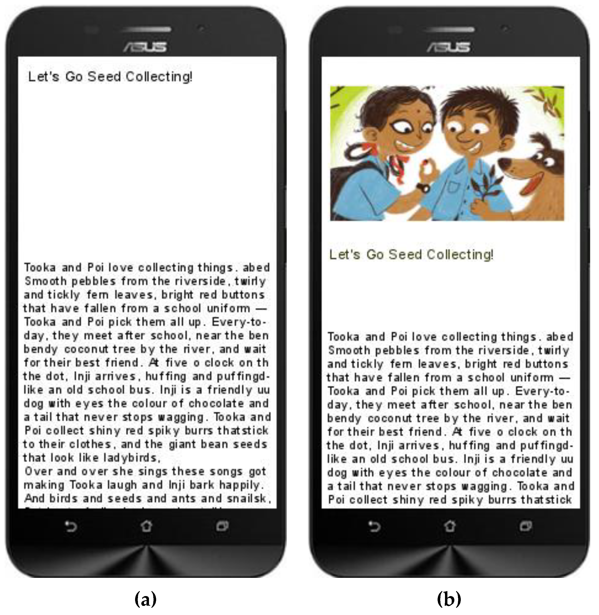
Figure 1.
Examples of the page spacing. Page spacing refers to the margin from the top title of the page to the beginning of the text. (a) the page spacing between the title and the text; (b) an image inserted on the page spacing. The story “Let's Go Seed Collecting!” is written by Neha Sumitran, published by Pratham Books, 2016.

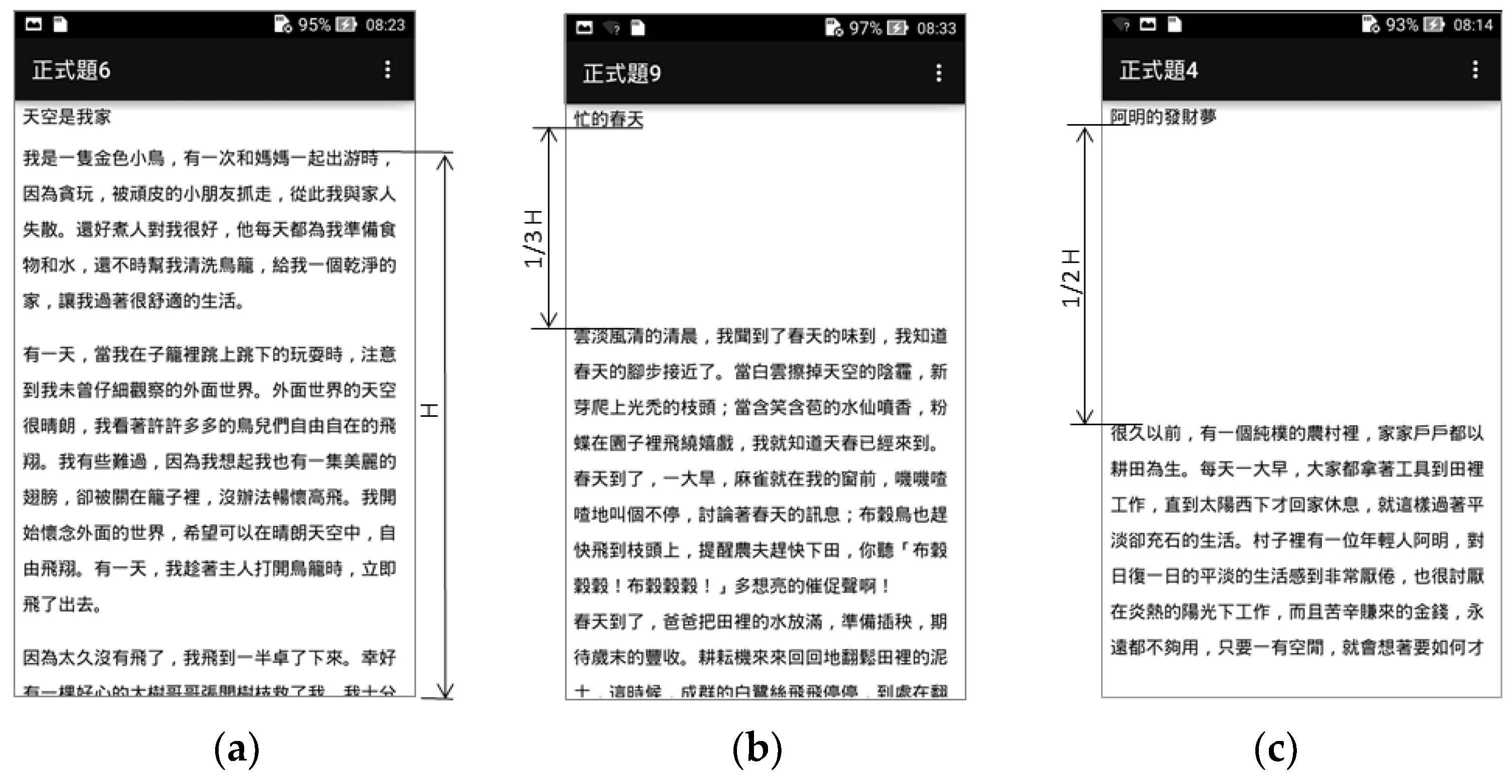
Figure 2.
Three types of page spacing were used in the experiment. (a) shows no page spacing (0H); (b) one-third page spacing (1/3H); and (c) half page spacing (1/2H). It also shows parts of three essays in this study.
Figure 2.
Three types of page spacing were used in the experiment. (a) shows no page spacing (0H); (b) one-third page spacing (1/3H); and (c) half page spacing (1/2H). It also shows parts of three essays in this study.

Figure 3.
A line chart demonstrating the subjective ratings of ease, comfort, aesthetic appeal, and preference for Page spacing.
Figure 3.
A line chart demonstrating the subjective ratings of ease, comfort, aesthetic appeal, and preference for Page spacing.

Figure 4.
A line chart shows the subjective ratings of comfort and aesthetic appeal for Line spacing.
Figure 4.
A line chart shows the subjective ratings of comfort and aesthetic appeal for Line spacing.


Table 1.
Means and standard deviations of reading time (second) for levels of independent variables.
Table 1.
Means and standard deviations of reading time (second) for levels of independent variables.
| Variables | Levels | n | Mean | S.D. | Grouping | |
|---|---|---|---|---|---|---|
| Page spacing | 0H | 96 | 212.78 | 117.07 | A | B |
| 1/3H | 96 | 193.11 | 107.46 | A | ||
| 1/2H | 96 | 227.19 | 128.56 | B | ||
| Line spacing | 2-F leading | 144 | 198.43 | 122.59 | A | |
| 3-F leading | 144 | 223.62 | 113.14 | B | ||
| Paragraph spacing | 1-L spacing | 144 | 227.71 | 130.34 | A | |
| 2-L spacing | 144 | 194.35 | 102.95 | B | ||
Note: Different letters in group indicate significant differences at 0.05 levels.
Table 2.
Means and standard deviations of subjective ratings for each level of Page spacing.
| Dep. Variable | Page Spacing | n | Mean | S.D. | Grouping |
|---|---|---|---|---|---|
| Ease | 0H | 96 | 4.06 | 0.86 | A |
| 1/3H | 96 | 3.80 | 0.99 | B | |
| 1/2H | 96 | 3.55 | 1.07 | C | |
| Comfort | 0H | 96 | 4.15 | 0.81 | A |
| 1/3H | 96 | 3.94 | 1.00 | B | |
| 1/2H | 96 | 3.65 | 1.13 | C | |
| Aesthetic appeal | 0H | 96 | 3.92 | 0.74 | A |
| 1/3H | 96 | 3.58 | 0.87 | B | |
| Preference | 1/2H | 96 | 3.24 | 1.11 | C |
| 0H | 96 | 3.90 | 0.75 | A | |
| 1/3H | 96 | 3.48 | 0.87 | B | |
| 1/2H | 96 | 3.09 | 1.18 | C |
Note: Different letters in group indicate significant differences at 0.05 levels.
Table 3.
Means and standard deviations of subjective comfort and aesthetic appeal for each level of Line spacing.
Table 3.
Means and standard deviations of subjective comfort and aesthetic appeal for each level of Line spacing.
| Dep. Variable | Line Spacing | n | Mean | S.D. | Duncan |
|---|---|---|---|---|---|
| Ease | 2-F leading | 144 | 3.74 | 0.98 | A |
| 3-F leading | 144 | 3.87 | 1.00 | A | |
| Comfort | 2-F leading | 144 | 3.78 | 1.05 | A |
| 3-F leading | 144 | 4.04 | 0.95 | B | |
| Aesthetic appeal | 2-F leading | 144 | 3.49 | 0.99 | A |
| 3-F leading | 144 | 3.67 | 0.91 | B | |
| Preference | 2-F leading | 144 | 3.42 | 1.01 | A |
| 3-F leading | 144 | 3.56 | 0.98 | A |
Note: Different letters in group indicate significant differences at 0.05 levels.
Table 4.
Means and standard deviations of subjective ratings for each level of paragraph spacing.
| Dep. Variable | Paragraph Spacing | n | Mean | S.D. | Duncan |
|---|---|---|---|---|---|
| Ease | I-L spacing | 144 | 3.78 | 1.05 | A |
| 2-L spacing | 144 | 3.83 | 0.95 | A | |
| Comfort | I-L spacing | 144 | 3.90 | 1.03 | A |
| 2-L spacing | 144 | 3.92 | 0.99 | A | |
| Aesthetic appeal | I-L spacing | 144 | 3.55 | 0.94 | A |
| 2-L spacing | 144 | 3.61 | 0.98 | A | |
| Preference | I-L spacing | 144 | 3.47 | 0.98 | A |
| 2-L spacing | 144 | 3.51 | 1.02 | A |
Note: Different letters in group indicate significant differences at 0.05 levels.
© 2018 by the authors. Licensee MDPI, Basel, Switzerland. This article is an open access article distributed under the terms and conditions of the Creative Commons Attribution (CC BY) license (http://creativecommons.org/licenses/by/4.0/).
Share and Cite
MDPI and ACS Style
Huang, S.-M.; Li, W.-J.; Tung, S.-C. An Effect of White Space on Traditional Chinese Text-Reading on Smartphones †. Appl. Syst. Innov. 2018, 1, 24. https://doi.org/10.3390/asi1030024
AMA Style
Huang S-M, Li W-J, Tung S-C. An Effect of White Space on Traditional Chinese Text-Reading on Smartphones †. Applied System Innovation. 2018; 1(3):24. https://doi.org/10.3390/asi1030024
Chicago/Turabian StyleHuang, Shih-Miao, Wu-Jeng Li, and Shu-Chu Tung. 2018. "An Effect of White Space on Traditional Chinese Text-Reading on Smartphones †" Applied System Innovation 1, no. 3: 24. https://doi.org/10.3390/asi1030024