Article

Smart Visualization of Mixed Data

1
Department of Statistics, University Carlos III of Madrid, 28903 Getafe, Spain
2
Department of Economics, Management and Quantitative Methods and Data Science Research Center, University of Milan, 20122 Milan, Italy
*
Author to whom correspondence should be addressed.
Stats 2021, 4(2), 472-485; https://doi.org/10.3390/stats4020029
Submission received: 28 April 2021 / Revised: 13 May 2021 / Accepted: 20 May 2021 / Published: 1 June 2021
(This article belongs to the Special Issue Robust Statistics in Action)

Abstract

:
In this work, we propose a new protocol that integrates robust classification and visualization techniques to analyze mixed data. This protocol is based on the combination of the Forward Search Distance-Based (FS-DB) algorithm (Grané, Salini, and Verdolini 2020) and robust clustering. The resulting groups are visualized via MDS maps and characterized through an analysis of several graphical outputs. The methodology is illustrated on a real dataset related to European COVID-19 numerical health data, as well as the policy and restriction measurements of the 2020–2021 COVID-19 pandemic across the EU Member States. The results show similarities among countries in terms of incidence and the management of the emergency across several waves of the disease. With the proposed methodology, new smart visualization tools for analyzing mixed data are provided.

1. Introduction

The diversity of data is continuously increasing with the increase of the availability of massive datasets from multiple sources, making mixed-type-data analysis tools more important than ever. This diversity is not only “objective”, but may become “subjective” as more and more people enter the world of Big Data analysis. For some working on data in certain areas, it may not be sufficient to only consider the objective nature of the data (for example, human height can be “objectively” considered as continuous), but, depending on the context in which the analysis is carried out, transforming the data into another type and using different data analysis tools could be more strategically effective (human height could be considered as simply “small” or “big”). Furthermore, when combining data of different types, a flexible data analysis, i.e., less specific to a particular data type, could give better results [1].
One common issue when dealing with tools applied to mixed data is the choice of the distance. Different choices of the distance measure might impact the results of dimension reduction, clustering, classification, and so on, and in the more general context of machine learning, for example, the concept of distance metric learning when dealing with mixed data has been widely explored [2,3], leading to the search for more robust and sensitive metrics with respect to mixed data [4].
In the context of multidimensional scaling (MDS), Grané and Romera [5] compared multiple MDS configurations to visualize the intrinsic data profile structure and used a robust joint metric combining different distance matrices through related metric scaling [6,7]. They also proposed a novel statistic for outlier detection in mixed data. Grané et al. [8] proposed a method to hierarchically cluster mixed data using an approach based on the Forward Search algorithm [9]. Their proposal was to build an algorithm (called Forward Search Distance-Based (FS-DB)), which was a combination of the distance function proposed by Grané and Romera and a forward search algorithm in order to improve the robustness of the results and to visualize and identify outliers, even if they were masked in the bulk of the data.
The aim of this work was twofold. First, we wanted to complement the FS-DB algorithm by enlarging the collection of distance functions by adding a robustified version of Gower’s distance and by adding new graphical tools in order to visualize the complex structure of mixed data. In particular, we implemented interactive scatter plots to visualize quantitative variables conditioned on categorical ones, we developed cross-correlation heat maps in order to visualize the complex relationship among the original variables and the MDS axes, and finally, we implemented a robust hierarchical clustering to visualize the proximities among individuals through a dendrogram representation. To illustrate this methodology, we produced a complex dataset related to the spread of the COVID-19 pandemic in the 27 EU Member States, covering the period from the first day that COVID-19 data were published to the last month before the start of vaccination programs in Europe.
This paper is organized as follows. In Section 2, we present an overview of the FS-DB method and propose a novel algorithm for the improved FS-DB method, as well as a protocol to visualize mixed data. In Section 3, we apply the algorithm and the protocol to a dataset related to three waves of the COVID-19 pandemic in the 27 EU Member States. Section 4 concludes the paper.

2. Materials and Methods

2.1. FS-DB Algorithm

The FS-DB algorithm was introduced by [8] for the analysis and clustering of mixed data. In particular, the FS-DB algorithm combines the forward search method [9,10] with a distance-based tool, used in [5], to detect outliers in mixed-type datasets.
The idea behind this algorithm is to help understand the structure of mixed-type datasets by identifying the subset of the closest units (according to a user-selected distance measure), as well as those units that are the most distant from the set(s) of data. When the algorithm is applied to a dataset some numerical outputs and two interesting graphical outputs are produced. The first one, called the forward plot, depicts the trajectories of the units and serves to illustrate the units’ performance along the steps of the algorithm. This is an interactive plot, where the user can select a subset of units for further analysis, and it allows identifying outlying observations at glance. The second one is the MDS plot, which contains the final MDS representation of the dataset, where the user-selected subsets of units are subsequently highlighted.
Two possible distance measures are available in the FS-DB algorithm: a distance measure based on Gower’s classical similarity coefficient and a metric obtained via related metric scaling, which satisfies several axioms related to the property of identifying and discarding redundant information. See [8] for details.

2.2. A Protocol to Visualize Mixed Data

In this section, we present our new contributions to the FS-DB algorithm. In particular, we incorporated a smart visualization of mixed data to help understand the complexity of the data structure, as well as the relationships among the variables. This was achieved in several directions, for example by adding scatter plots of quantitative variables colored according to the categorical variables; these types of plots can be used to represent either the original quantitative variables or the resulting principal coordinates (MDS-maps); we also added a brushing option so that the user could select several sets of units to be highlighted. Another interesting contribution was to enlarge the collection of distance measures to be used for mixed data. In this work, we proposed to use a robustified version of Gower’s distance. The code implemented for the algorithm followed the standards of the common and flexible framework provided by the FSDA Toolbox of MATLAB [11]; the authors’ intention is to submit the code for future releases.
In what follows, we describe the different steps of the protocol.
  • Exploratory step.
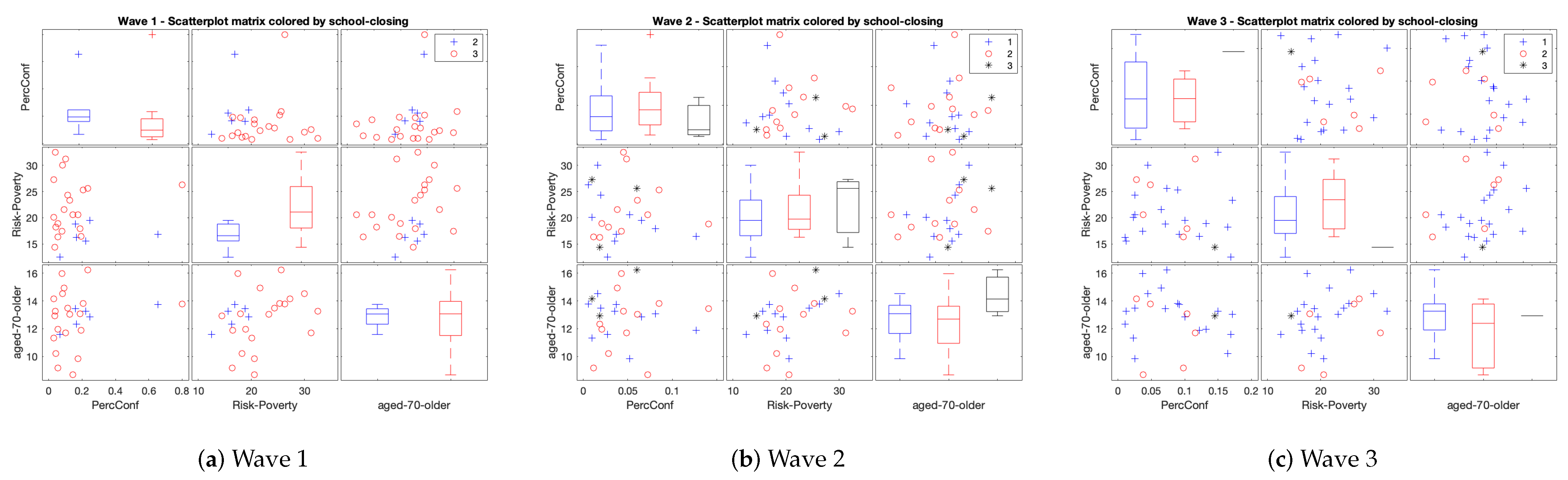
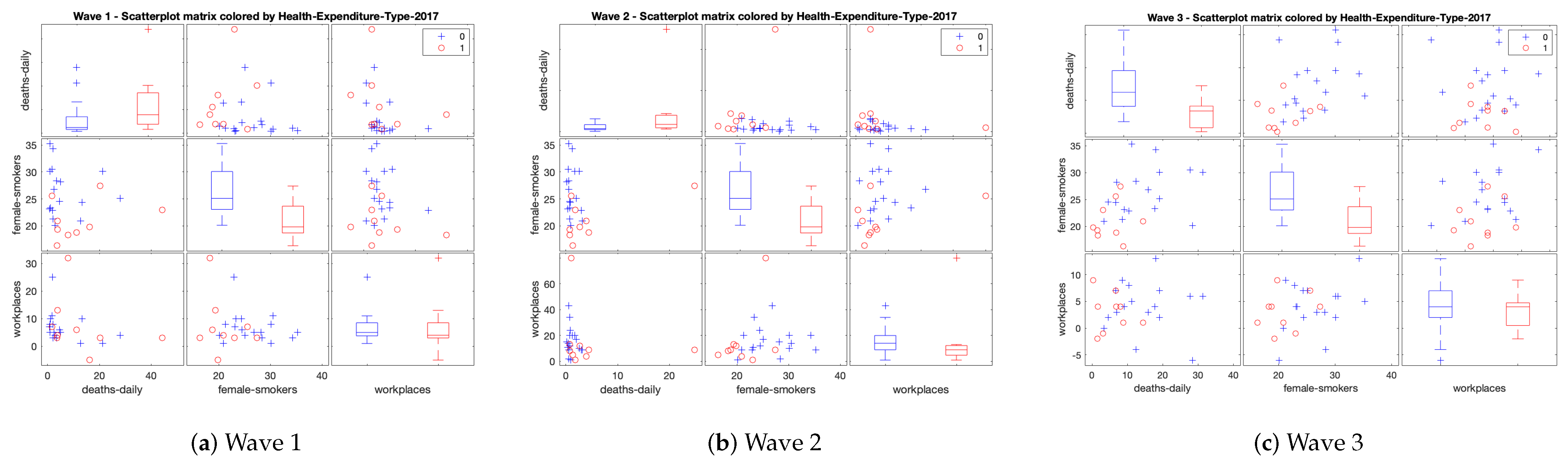
    • Multiple scatter-plots and box-plots of quantitative variables by categorical ones. Due to the mixture nature of the data, we represent the individuals in the original variable space and color them according to the categories of the categorical variables in order to better understand the complexity of the data.
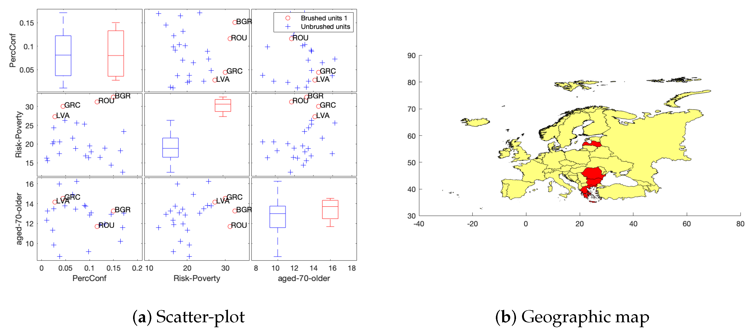
    • Spatial data tool. In multiple scatter-plots the user can select which data points wants to be highlight in a geographical map. The code allows the possibility to link the data to a shape-file (when available), inspired by the GeoDa user friendly tool for spatial data analysis (https://geodacenter.github.io, accessed on 1 February 2021).
  • Data analysis step.
    • Starting point: A data matrix of mixed data n × p .
    • Metric construction: Robustification of Gower index. Gower’s similarly coefficient [12] is one of the most popular similarity measures for mixed data. This well-known similarity coefficient is the Pythagorean sum of three similarity coefficients for quantitative, binary and multi-state categorical variables. For quantitative variables, the similarity is related to range-standardized city-block distance and for binary and multi-state categorical ones, respectively, simple matching and Jaccard’s similarity coefficients are computed. One of the main drawbacks of Gower’s coefficient is its lack of robustness which yields to non-stable MDS configurations [5,8]. Inspired by Gower’s idea, we construct a robust distance by adding three distance measures: robust Mahalanobis distance for quantitative variables, Hamming distance for binary ones and for multi-state categorical variables we calculate the distance associated to Jaccard’s similarity coefficient. We denote this new distance measure by δ . Note that, first, our robust proposal only concerns quantitative variables, since distance measures for binary and multi-sate categorical are left unchanged, and second, by considering (robust) Mahalanobis distance, we also take into account the redundant information within quantitative variables, which is not taken into account by Euclidean or Minkowski distances, since these well-known distances always increase despite the added statistical information is not relevant. Thus, the choice of the distance measure is a key point. Here we are not interested in a general distance measure but in a statistical distance measure, that is, we want to see close those individuals that share the same kind of information and we want to see distant those with very different characteristics.
    • Data analysis: FS-DB algorithm is applied to the n × n distance matrix obtained from metric δ .
  • Visualization step.
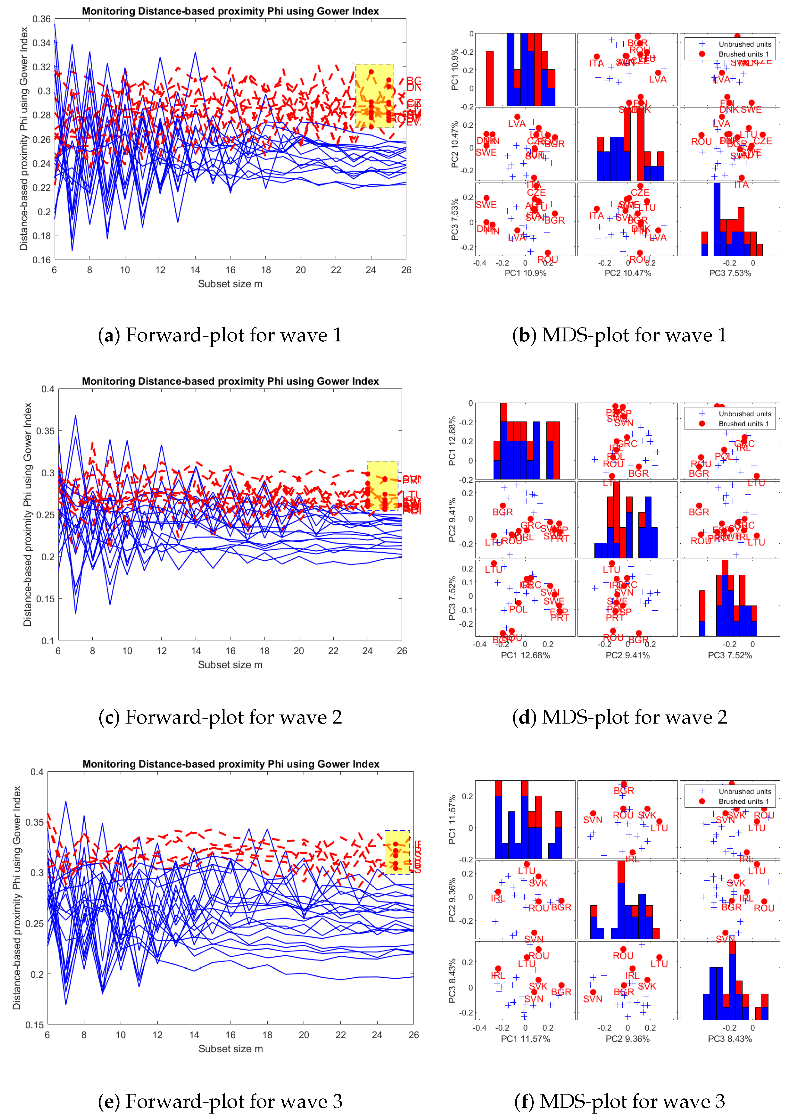
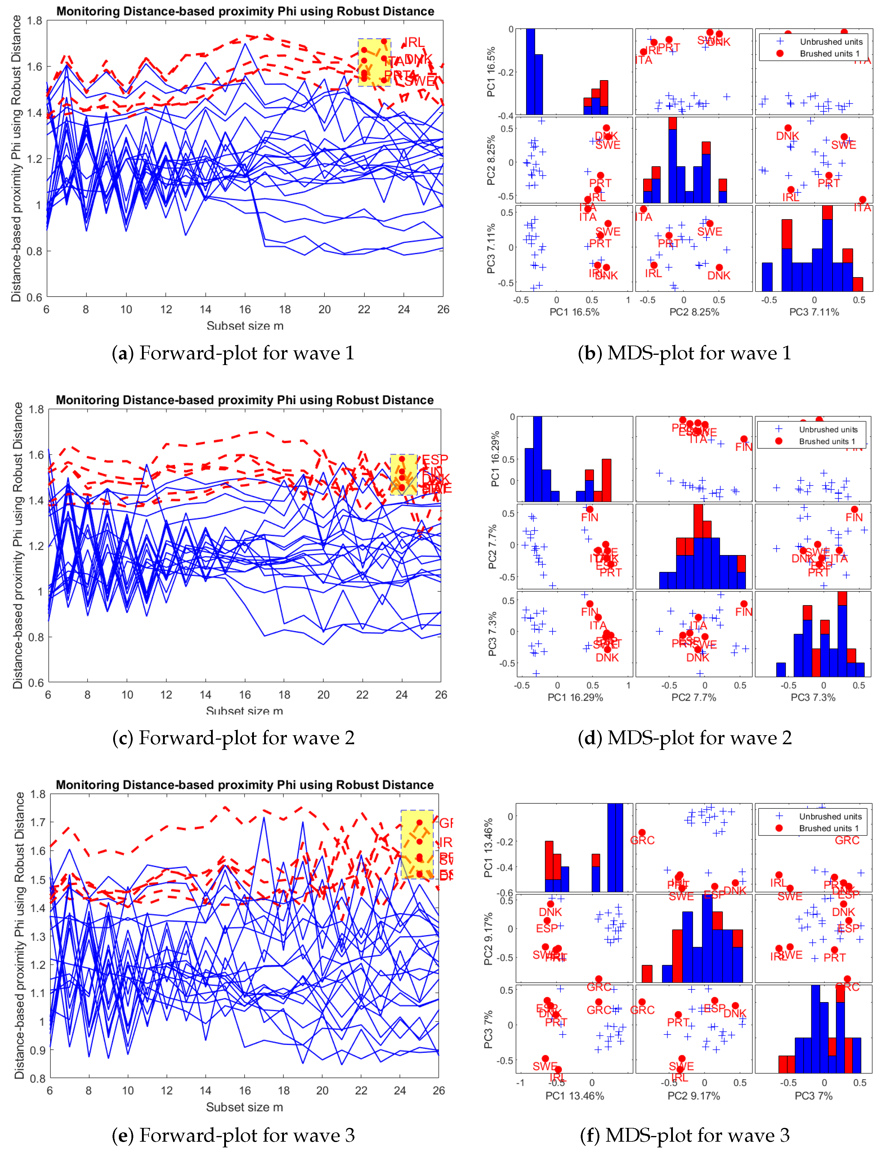
    • Outliers. We use FS-DB algorithm to visualize the most inner and most outer observations in the dataset, according to δ . The Forward-plot is an interactive plot, where the user can select a group of individuals to explore.
    • Multiple scatter-plots with MDS-maps. We produce MDS maps to visualize the proximities among individuals, according to δ . Groups of user-selected individuals are subsequently highlighted with colors.
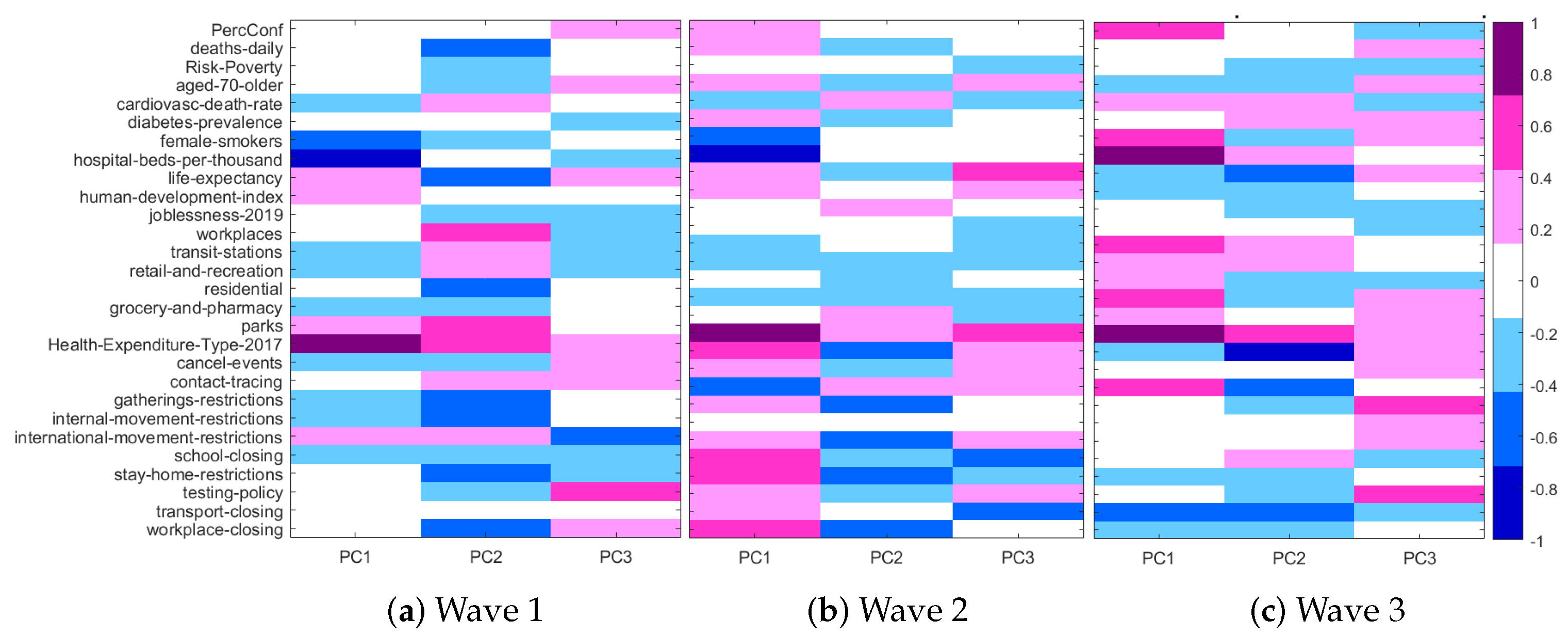
    • Relationship between original mixed-type variables and MDS coordinates. A way to see the influence of each original variable in the principal coordinates is to compute a correlation coefficient or a association measure between the original variables and the axes. We use Pearson’s correlation coefficient for quantitative variables, Cramer’s V for nominal ones and Spearman’s correlation coefficient for ordinal ones. Other measures of association (Kendall’s τ B and τ C , γ , etc.) can be implemented. We visualize these relationships through a heat map.
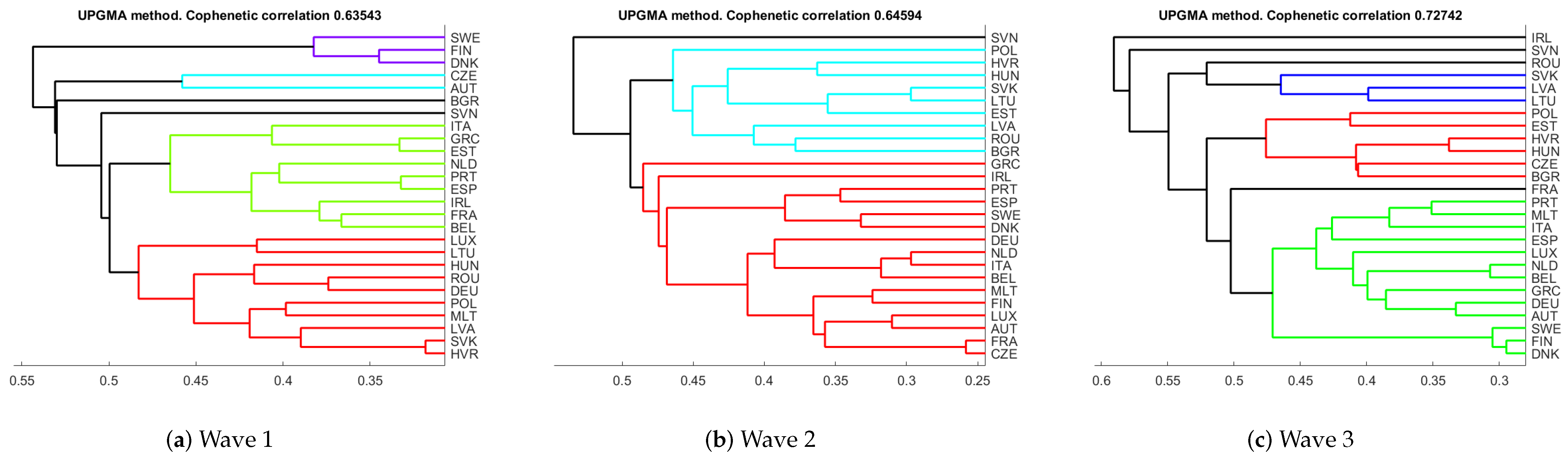
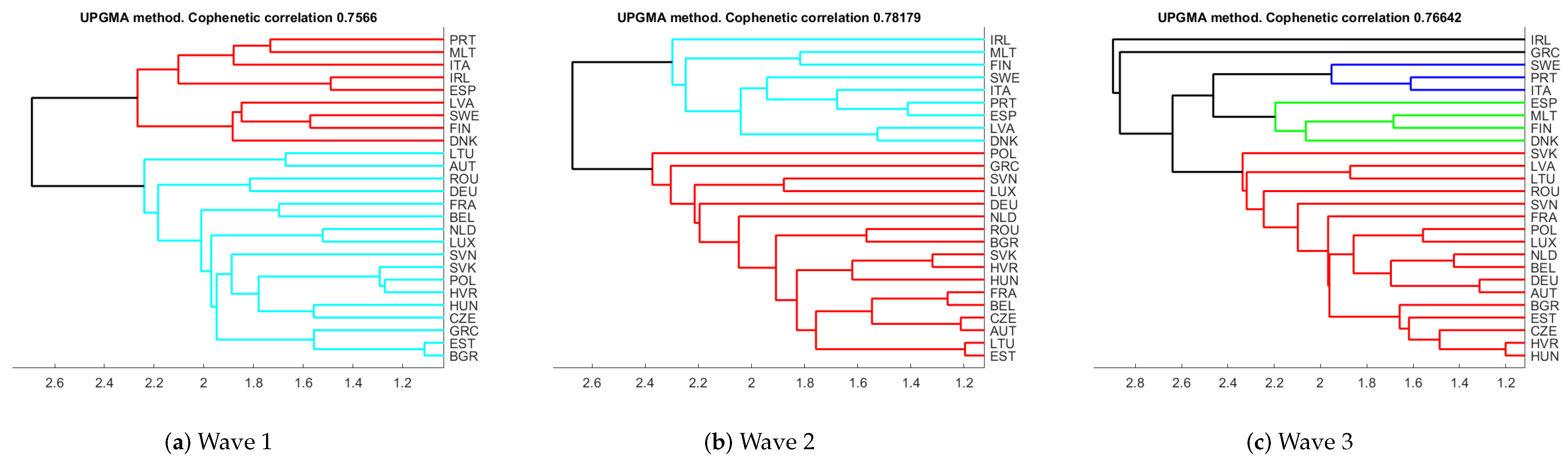
    • Clustering. We give hierarchical clustering representations of the individuals based on distance δ . We also give cophenetic correlation coefficient as a measure of discrepancy between δ and the corresponding ultrametric distance. This analysis allows to check the coherence with the previous clusterings observed in the Forward-plot and the MDS-maps.

3. Results

3.1. Data Description

We applied the tools described in Section 2.2 to a dataset related to the spread of the COVID-19 pandemic in the 27 EU Member States. The data cover the period from 24 February 2020 to 30 November 2020, i.e., from the first day when collected COVID-19 data were published to the last month before the start of vaccination programs in Europe.
Data sources were general data repositories for COVID-19 data [13,14], data repositories of research projects on COVID-19 [15,16] and institutional repositories (Eurostat, United Nations, World Health Organisation, the World Bank). Our data collection procedure is in line with the recent literature on COVID-19 data modeling [17,18,19].
Figure 1 shows a sketch of the data sources and the way they were structured in our dataset.
We looked for different data sources regarding three main types of variables: (i) pandemic variables; (ii) restriction variables; (iii) mobility variables; (iv) public health variables; (v) socioeconomic and demographic variables. Pandemic and restriction/mobility variables are stored on a daily basis, socioeconomic variables have generally a wider time periodicity (from monthly to annual). The type of variables is very diverse: there are discrete quantitative (pandemic variables), percentage (pandemic, mobility and public health variables), ordinal (restriction variables), rate variables (in the public health variables group), continuous quantitative and index variables in the socioeconomic variable group. The variable Health_Expenditure_Type is the only binary variable expressing whether the national health system is prevalently private or public. Overall the dataset comprises 7587 records and amounts to 48 variables divided in 11 ordinal variables, 14 (discrete or continuous) quantitative variables, 1 binary variable, 14 percentage or percentage change variables, 6 rate variables and 2 index variables. As for periodicity we get 27 daily variables, 1 monthly variable, 2 quarterly variables and 18 annual variables. For some variables with similar meaning (like 2019_Risk_Poverty, which is a percentage, and extreme_poverty, which is ordinal) we considered different types to enrich the mixed nature of our dataset.
Therefore, the formed dataset is rich in variable type variety, can be used for time series analysis or for multivariate analysis by using appropriate aggregation functions (as we will see in the following sections), can be used for outlier and robustness checking in the context of the 27 EU Member States. It will be freely available together with all the MATLAB code implemented for this work.
Table A1 in Appendix B lists in detail the characteristics of the variables in the dataset together with their type, group, periodicity and source.

3.2. Visual Exploratory Data Analysis

In our analysis we divided the epidemiological time series in three periods, the first one corresponding to the first wave of the pandemic when Western EU countries were more affected than Eastern EU countries (from the end of February 2020 to mid June 2020), the second one during the Summer of 2020 when the pandemic was less strong almost in every EU country, and the final one corresponding to the third pandemic wave which affected almost all the EU Member States (from mid September 2020 to end of November 2020). The three periods are referred to as Wave 1, Wave 2 and Wave 3 in the following.
Despite the original data were time series data, the aim this work was to explore the overall characteristics of the different waves in the EU Member States using visual tools. For this reason we aggregated our data according to: type of variable, wave, country and aggregating statistics. The statistics considered for aggregation were mean, median and max for quantitative variables, and the mode for qualitative variables (including the only binary variable in the dataset, i.e., the country’s health system type).
Our first visualization tool is about displaying in the same multiple scatter-plot the pairwise relationships among several variables together with the box-plots of the chosen variables on the main diagonal of the multiple scatter-plot. At the same time, individuals (country data points) in the multiple scatter-plot are colored according to the values of another variable which can be viewed as a conditional or data point grouping variable.
Figure 2 shows an example of this tool for three variables (PercConf (No. of tested positive over No. of tests), 2019_Risk_Poverty and aged_70_older) colored by the levels of school_closing in all the three waves. From the figure it can be seen that, for example, all countries adopted a strong form of school closing at levels 2 and 3 (the latter being the maximum level out of 4 levels, from 0 to 3). Two outlying countries can be identified with respect to PercConf, one with school_closing at level 2 and another one at level 3. In wave 2 highest school_closing levels are related to countries having lower percentages of PercConf. Again, we can see two outlying countries with respect to PercConf one with school_closing at level 1 and one at level 2. In wave 3, only one country adopted the highest school closing level, having experienced a medium-high level of PercConf, and now no outliers are present. This visual representation is dynamic and aims to detect outliers on some combinations of variables according to the selected conditioning variable. Looking at the different waves one can see what is the ‘overall outlier evolution’ among the EU Member States with respect to the measures on school closing, which have been adopted in almost all the EU countries, but at a different level. In this way, it is easier to see if the EU Member States adopted a more or less ‘common policy’ with respect to the effects of these measures on tackling the pandemic. Of course one can choose different conditioning variables and different ‘output’ variables.
Figure 3 shows scatter-plots and box-plots for deaths_daily, female_smokers and workplaces_mobility, colored by Health_Expenditure_Type (1 = ‘mainly public’, 0 = ‘mainly private’) in all the waves considered. It can be observed, for example, that in wave 1 three countries (of which two have mainly a private health system) were outliers with respect to the number of deaths per 1000 inhabitants. In wave 2 only one country (with public health system) was an outlier with respect to deaths_daily, whereas in wave 3 there were no outliers. These can be seen by looking at the conditional box-plots. Another finding is that in wave 3 the first quartile of deaths_daily for countries with private health system equals the third quartile of this variable for countries with public health system, indicating that the number of deaths per 1000 inhabitants was much greater in those countries with a mainly private health system. This in an important example about using this visual tool to immediately check the impact of EU countries’ policies with respect to some macro-features of the countries, like the type of health system, in this case. There has been a long and controversial debate on the effectiveness of private or public health system to tackling the pandemic. The neoliberalism in healthcare has been the prevalent trend in almost all Western EU countries in recent decades, but the COVID-19 pandemic has re-ignited some recent literature in favor of the public system [20].
Our second exploratory visualization tool is about brushing a multiple scatter-plot, similar to those in Figure 2 and Figure 3, with the purpose of highlighting some data points of interest, for example the outliers. The visual effect is the appearance of the acronyms or name of the countries and the corresponding map regions highlighted in colors. This could be done dynamically, i.e., the brushing can be done consecutively, and new countries will be added in the map as a result of consecutive selections. some examples are shown in Figure 4, Figure 5 and Figure 6, where we display a multiple scatter-plot for PercConf, 2019_Risk_Poverty and aged_70_older for waves 1, 2 and 3, respectively. In wave 1, Austria and Lithuania are outlying countries with respect to PercConf, in wave, 2 Italy, Germany and Portugal are outlying points for aged_70_older and, in wave 3, the same happens for Bulgaria, Romania, Greece and Latvia regarding 2019_Risk_Poverty.
Figure 7 contains the graphical output of the FS-DB algorithm for outlier detection in datasets of mixed data. Left panels show the Forward-plots and right panels contain the MDS-plots. To produce these plots, all the variables in the dataset were used, and distance between countries was measured using our proposal for robust Gower index.
The Forward-plots monitor the trajectories of the units in order to illustrate their performance along the steps of the FS-DB algorithm. In the first step of the algorithm the subset of closest units is identified (according to a proximity function based on distance δ ). In the subsequent steps, units are added one-by-one to this subset until there are no more units to add. In each iteration, units are allowed to enter and exit the subset, since in each iteration the current subset is formed by those units with lowest distance measure. Thus, the Forward-plots are useful to understand how the metric unfolds rather than providing only a final picture of the outcome, like the final MDS-plot. For example, trajectories which end close to one another represent units which are similar among themselves, but different from others. Moreover, those units that enter in the final steps of the algorithm can be seen as multivariate outliers according to the monitored distance.
The Forward-plot is an interactive graph, which allows the user to select a trajectory or group of trajectories, which are immediately highlighted and, at the same time, new MDS-maps are produced with the corresponding highlighted units. To illustrate this, in panels (a), (c) and (e) of Figure 7, we highlighted those countries that enter at the end of the search, so the most distant from the bulk of the data. These countries are also highlighted in the corresponding MDS-plots on the right hand side panels of Figure 7. They are Italy, Ireland, Portugal, Sweden, and Denmark for wave 1; Italy, Spain, Portugal, Sweden, Denmark, and Finland for wave 2; Spain, Portugal, Greece, Ireland, Sweden, and Denmark for wave 3. So, there are three countries which show a similar pattern along the three waves (Portugal, Sweden and Denmark), while others like Italy, Spain or Ireland maintain consistency along two of the three waves.
Clearly, results substantially differ when we consider Gower’s index instead of its robustified version. As expected, there are more countries that can be considered as multivariate outliers. For example, in Figure A1 in Appendix A we can see that for wave 1, Italy, Sweden, Denmark and Finland still appear as outlying countries, but also Austria, Czech Republic, Latvia, Lithuania, Slovenia, Romania and Bulgaria. Regarding wave 2, the outlier set formed by Ireland, Portugal, Sweden, Spain and Greece has enlarged with Poland, Lithuania, Slovenia, Romania and Bulgaria. These four latter countries appear as outliers along the three waves regarding Gower’s distance.
A way to interpret the influence of the original variables in the MDS-plots is to compute a coefficient of correlation or a measure of association between the original variables and MDS coordinates. Figure 8 provides an overview of the cross-correlations between the original variables and the three MDS coordinates in the three waves. In wave 1 Health_Expenditure_Type was the variable with highest positive correlation with PC1, whereas hospital_beds showed the highest negative correlation with PC1. Health_Expenditure_Type was also highly positively correlated with PC2 together with workplaces_ mobility and parks_mobility, whereas workplace_closing showed a highly negative correlation with PC2. As for PC3, testing_policy had a high positive correlation and international_movement_restrictions had a high negative correlation with PC3.
For wave 2, a similar pattern of correlation can be observed for PC1, with Health_Expenditure_Type having the highest positive correlation and hospital_beds the highest negative one. Regarding PC2, there is a less clear correlation pattern, since all variables are weakly or moderately correlated with PC2. For PC3 Health_Expenditure_Type and life_expectancy were highly positively correlated, whereas school_closing and transport_closing showed high negative correlations with PC3.
In wave 3, Health_Expenditure_Type was again highly positively correlated with PC1, but this time hospital_beds showed high positive correlation (not negative correlation as in wave 1) with PC1. High negative correlation is present for transport_closing. cancel_events is highly negatively correlated with PC2 whereas for PC3 there are neither positive nor negative patterns of strong correlation.
In Figure 9, we give the hierarchical clustering representations obtained from the robust distance measure, for the three waves. Cophenetic correlation coefficient is also provided as a measure of distortion between original distance and the ultrametric distance. This coefficient took a minimum value of 0.75 (attained in the first wave) and a maximum of 0.78 (in second wave), meaning that there is a high degree of coherence between both metrics.
Similar clusterings can be observed at level 2.4. For the first and second wave two clusters are clearly defined, whereas for the third wave one of the previous clusters seems to split in two or three groups. In particular, countries like Portugal, Malta, Italy, Ireland, Spain, Latvia, Sweden, Finland, and Denmark are in the same cluster during the first and second waves. Note that all the countries identified as outliers with the FS-DB algorithm are in this group. If we look at those variables most correlated with the MDS axes, we see that all these countries share common characteristics: they all have a mainly public health system, with a rather low number of hospital beds per 1000 inhabitants (below 4.5), a median life expectation of 81.9, a medium record of confinement to home during the first wave that reduced to low levels in the second wave, and medium-high values of school-closing during the first wave that reduced to medium values during the second wave. On the other hand, the rest of EU State Members have a mainly private health system, with a high number of hospital beds per 1000 inhabitants (from 3 to 8), a median life expectation of 81.3, a varying record of confinement to home during the first wave (0–3 values), that reduced to none/low levels in the second wave, and medium-high values of school-closing during the first wave that reduce to low values during the second wave. In the third wave, the smallest cluster is split in three groups, Spain, Malta, Finland, and Denmark; Sweden, Portugal and Italy; Ireland and Greece. All these countries have the highest level of bans on private gatherings, low values of school-closing and they differ in stay-home restrictions. On the other hand, the EU State Members in the biggest cluster have in common wide ranges on the level of bans on private gatherings and on school-closing.
Concerning Gower’s distance, cophenetic correlation coefficient took lower values (from a minimum of 0.64 in the first wave to a maximum of 0.73 in the third wave), indicating that the degree of coherence between Gower’s and ultrametric distance is lower than between robust Gower’s and the ultrametric one. Regarding the dendrograms, in Figure A2 in the Appendix A we observe a very different pattern in the three waves. Moreover, those countries identified as multivariate outliers by the FS-DB algorithm are no longer in the same cluster. This may indicate that a non-robust distance can produce misleading results.

4. Discussion

A new protocol that integrates robust classification and visualization techniques for mixed data was proposed. The protocol was based on the combination of the FS-DB algorithm and robust hierarchical clustering.
The methodological contributions of this paper are several: First, the collection of distance functions to be used in FS-DB algorithm was enlarged by adding a robustified version of Gower’s distance. Second, new interactive plots were implemented in the exploratory step, such as multiple-scatter plot to visualize the relationship between several numerical variables conditioned to a categorical one. The code also allowed the possibility to link these plots to geographical maps, so that user-selected points in the scatter-plot appeared as highlighted countries in the map. Third, in the visualization step, a heat map was added to help the user visualize the complex relationship between the original variables and the MDS coordinates. Finally, a dendrogram based on robust hierarchical clustering was provided.
The methodology was illustrated on a rather complex dataset, produced by the authors, related to the spread of the COVID-19 pandemic in the 27 EU 27 Member States, covering the period from the first day when collected COVID-19 data were published to the last month before the start of vaccination programs in Europe. Data sources were general data repositories for COVID-19 data [13,14], data repositories of research projects on COVID-19 [15,16] and institutional repositories (Eurostat, United Nations, World Health Organisation, the World Bank).
As a result, the FS-DB algorithm identified several multivariate outliers, that is, countries that could be considered less similar to the others. This was the case for Portugal, Sweden and Denmark, which showed a similar pattern along the three waves, but different form the other Member States. The same happened to Italy, Spain and Ireland in two of the three waves.
Regarding the influence of the original variables in the MDS-coordinates, we found a common pattern along the three waves in the first coordinate, being Health_Expenditure_ Type and hospital_beds the highest correlated variables with PC1. The second and third coordinates presented more heterogeneity, although variables such as Health_Expenditure _Type, gathering_restrictions, stay_home_restrictions or life_expectancy showed moderate correlations with PC2 in two of the three waves.
Finally, with the dendrogram representation based on a robust metric, several groups of countries were identified at different levels. For instance, two clusters were observed at level 2.4 in waves 1 and 2, which could be interpreted in terms of health resources and management of the emergency.
We left for further research other implementations in the FS-DB algorithm, like a k-means clustering algorithm based on metric δ or the extension of the algorithm for large datasets, by applying the fast-MDS proposal in Grané and Sow-Barry [21].

Author Contributions

Conceptualization, S.S. and A.G.; methodology, S.S., A.G., G.M.; software, S.S., A.G.; validation, S.S., A.G., G.M.; formal analysis, S.S., A.G., G.M.; investigation, S.S., A.G., G.M.; resources, G.M.; data curation, S.S., G.M.; writing—original draft preparation, S.S., A.G., G.M.; writing—review and editing, S.S., A.G., G.M.; visualization, S.S., A.G., G.M.; supervision, S.S.; project administration, A.G.; funding acquisition, S.S. All authors have read and agreed to the published version of the manuscript.

Funding

This research received no external funding.

Institutional Review Board Statement

Not applicable.

Informed Consent Statement

Not applicable.

Data Availability Statement

Dataset and codes will be made available with open access. Both could be included in the FSDA MATLAB toolbox in the future.

Conflicts of Interest

The authors declare no conflict of interest.

Appendix A. Results Concerning Gowers’ Distance

Figure A1. Visualization step: Graphical output of the FS-DB algorithm for waves 1 to 3. Gower’s distance.
Stats 04 00029 g0a1
Figure A2. Visualization step: Hierarchical clustering for waves 1 to 3. Gower’s distance.
Stats 04 00029 g0a2

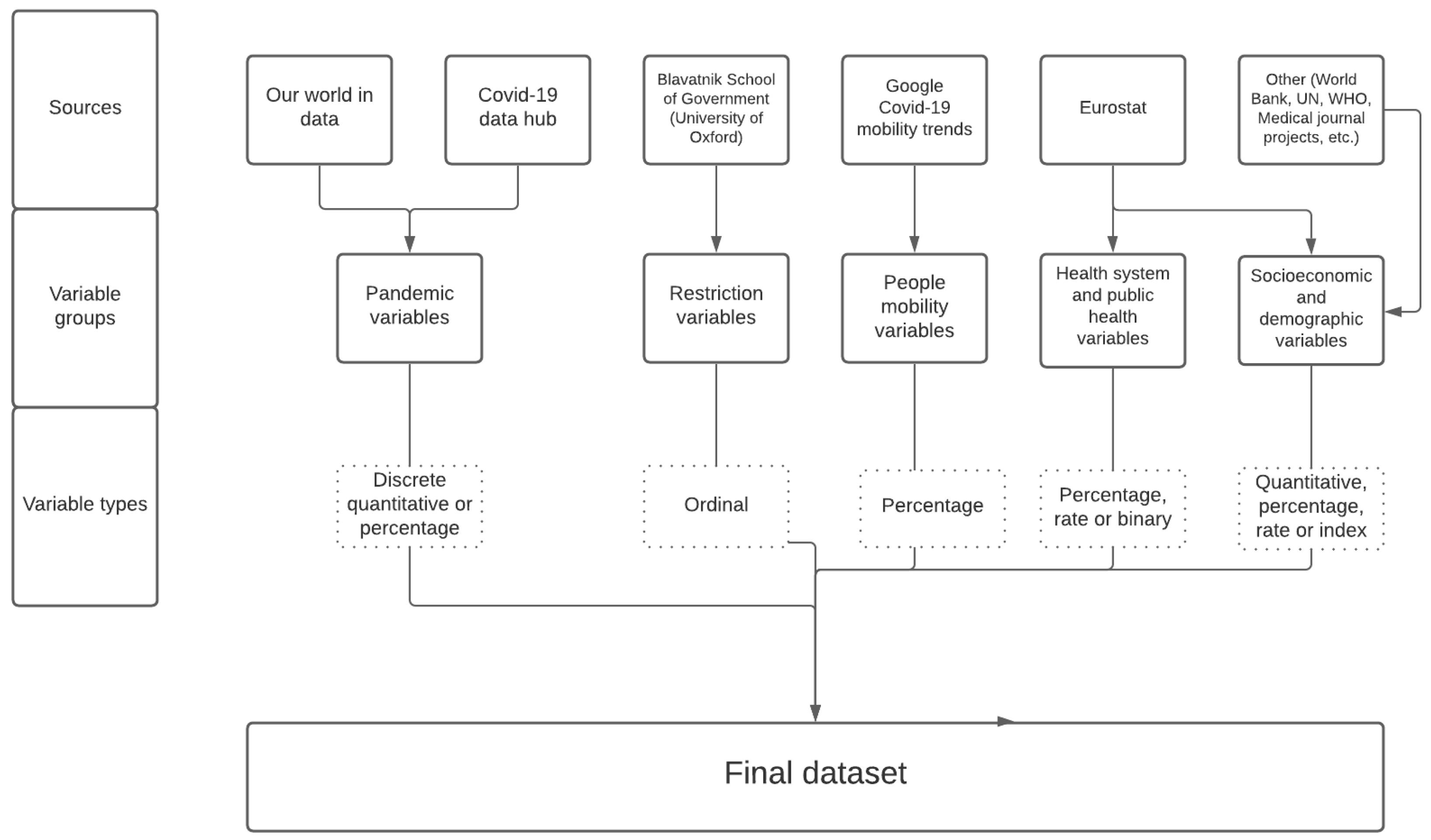
Appendix B. Variable Description and Sources

Table A1. Variable description and sources—Variable values are referred to the period 24 February 2020–30 November 2020, unless stated otherwise.
Variable NameVariable GroupVariable TypeDescriptionPeriodicitySource; Accessed on 1 January 2021
TestsPandemicDiscrete quantitativeCumul. no. of SARS-CoV-2 testsDailygithub.com/owid
confirmedPandemicDiscrete quantitativeCumul. no. of new COVID-19 casesDailygithub.com/owid
recoveredPandemicDiscrete quantitativeCumul. no. of recoveredDailygithub.com/covid19datahub/COVID19
people from COVID-19
deaths_accumulatedPandemicDiscrete quantitativeCumul. no. of COVID-19 deathsDailygithub.com/owid
deaths_dailyPandemicDiscrete quantitativeNo. of daily COVID-19 deaths per 1000 inhab.Dailygithub.com/owid
PercConfPandemic% rateNo. of tested positive over No. of tests (×100)Dailygithub.com/owid
hospPandemicDiscrete quantitativeNo. of people currentlyDailygithub.com/owid; github.com/covid19datahub
hospitalized for COVID-19
icuPandemicDiscrete quantitativeNo. of people currently inDailygithub.com/owid; github.com/covid19datahub
intensive care for COVID-19
school_closingRestrictionOrdinalRecord closings of schools and universitiesDailywww.bsg.ox.ac.uk
workplace_closingRestrictionOrdinalRecord closings of working placesDailywww.bsg.ox.ac.uk
cancel_eventsRestrictionOrdinalRecord canceling public eventsDailywww.bsg.ox.ac.uk
gatherings_restrictionsRestrictionOrdinalRecord bans on private gatheringsDailywww.bsg.ox.ac.uk
transport_closingRestrictionOrdinalRecord closing of public transportDailywww.bsg.ox.ac.uk
stay_home_restrictionsRestrictionOrdinalRecord confinement to home.Dailywww.bsg.ox.ac.uk
internal_movement_restrictionsRestrictionOrdinalRecord restrictions on internal movementDailywww.bsg.ox.ac.uk
international_movement_restrictionsRestrictionOrdinalRecord restrictions on international travelDailywww.bsg.ox.ac.uk
information_campaignsRestrictionOrdinalRecord presence of public info campaignsDailywww.bsg.ox.ac.uk
testing_policyRestrictionOrdinalRecord testing policyDailywww.bsg.ox.ac.uk
contact_tracingRestrictionOrdinalRecord government contact tracingDailywww.bsg.ox.ac.uk
stringency_indexRestrictionIndexWeighted average of closures variables (×100)Dailywww.bsg.ox.ac.uk
retail_and_recreation_mobilityMobility% change% change in mobility for retail and recreationDailywww.google.com/covid19/mobility
grocery_and_pharmacy_mobilityMobility% change% change in mobility for grocery and pharmacyDailywww.google.com/covid19/mobility
parks_mobilityMobility% change% change in mobility for parksDailywww.google.com/covid19/mobility
transit_stations_mobilityMobility% change% change in mobility in stationsDailywww.google.com/covid19/mobility
workplaces_mobilityMobility% change% change in mobility for workplacesDailywww.google.com/covid19/mobility
residential_mobilityMobility% change% change in mobility for residential placesDailywww.google.com/covid19/mobility
2019_Risk_PovertySocioeconomic% rate% of population at risk of povertyAnnual (2019)www.ec.europe.eu
PopulationSocioeconomicDiscrete quantitativeEstimated country’s populationQuarterlyec.europa.eu/eurostat/data/database
excess_mortalitySocioeconomic% changeEstimated country’s excess mortalityMonthlyec.europa.eu/eurostat/data/database
per_capita_gdpSocioeconomicDiscrete quantitativeQuarterly per-capita GDPQuarterlyec.europa.eu/eurostat/data/database
gdp_per_capitaSocioeconomicDiscrete quantitativeAnnual per-capita GDPAnnualec.europa.eu/eurostat/data/database
population_densitySocioeconomicRatePopulation densityAnnualwww.ec.europe.eu
median_ageSocioeconomicQuantitativePopulation median ageAnnualwww.ec.europe.eu
aged_65_olderSocioeconomic%% of population aged 65 or olderAnnualwww.ec.europe.eu
aged_70_olderSocioeconomicQuantitativePopulation median ageAnnualwww.ec.europe.eu
extreme_povertySocioeconomic%% of people living in extreme povertyAnnualdata.worldbank.org
cardiovasc_death_ratePublic healthRateDeath rate from cardiovascular diseaseAnnual (2017)www.thelancet.com/gbd
diabetes_prevalencePublic health%% of people aged 20–79 diagnosed with diabetesAnnual (2017)idf.org
female_smokersPublic health%% of women who smokeAnnualapps.who.int/gho
male_smokersPublic health%% of men who smokeAnnualapps.who.int/gho
hospital_bedsPublic healthRateNo. of hosp. beds per 1 K inhabitantsAnnualwww.ec.europe.eu
life_expectancyPublic healthQuantitativeLife expectancy at birthAnnual (2019)population.un.org/wpp
human_development_indexSocioeconomicIndexComposite index measuring basic develop.Annual (2019)hdr.undp.org
joblessnessSocioeconomic%% of people living in jobless householdsAnnualwww.ec.europe.eu
gps_per_100k_inhabSocioeconomicRateNo. of GPs per 100 K inhabitantsAnnual (2018)gateway.euro.who.int/en/indicators
Health_Expenditure_TypePublic healthBinaryPrevalent health system (private or public)Annualwww.ec.europe.eu

References

  1. Van Rijmenam, M.; Erekhinskaya, T.; Schweitzer, J.; Williams, M.-A. Avoid being the Turkey: How big data analytics changes the game of strategy in times of ambiguity and uncertainty. Long Range Plan. 2019, 52, 1–21. [Google Scholar] [CrossRef]
  2. Bar-Hillel, A.; Hertz, T.; Shental, N.; Weinshall, D. Learning a mahalanobis metric from equivalence constraints. J. Mach. Learn. Res. 2005, 6, 937–965. [Google Scholar]
  3. Jian, S.; Hu, L.; Cao, L.; Lu, K. Metric-Based Auto-Instructor for Learning Mixed Data Representation. In Proceedings of the AAAI Conference on Artificial Intelligence, New York Hilton Midtown, New York, NY, USA, 7–12 February 2020. [Google Scholar]
  4. Wang, D.; Tan, X. Robust Distance Metric Learning via Bayesian Inference. IEEE Trans. Image Process. 2018, 27, 1542–1553. [Google Scholar] [CrossRef] [PubMed]
  5. Grané, A.; Romera, R. On visualizing mixed-type data: A joint metric approach to profile construction and outlier detection. Sociol. Methods Res. 2018, 47, 207–239. [Google Scholar] [CrossRef]
  6. Cuadras, C.M. Multidimensional dependencies in classification and ordination. In Analyses Multidimensionelles des Données; CISIA-CERESTA: Saint-Mandé, France, 1998; pp. 15–25. [Google Scholar]
  7. Cuadras, C.M.; Fortiana, J. Visualizing categorical data with related metric scaling. In Visualization of Categorical Data; Elsevier: Amsterdam, The Netherlands, 1998; pp. 365–376. [Google Scholar]
  8. Grané, A.; Salini, S.; Verdolini, E. Robust multivariate analysis for mixed-type data: Novel algorithm and its practical application in socio-economic research. Socio Econ. Plan. Sci. 2020, 73, 100907. [Google Scholar] [CrossRef]
  9. Atkinson, A.; Riani, M. The forward search and data visualization. Comput. Stat. 2004, 19, 29–54. [Google Scholar] [CrossRef]
  10. Atkinson, A.C.; Riani, M.; Cerioli, A. The forward search: Theory and data analysis. J. Korean Stat. Soc. 2010, 39, 117–134. [Google Scholar] [CrossRef]
  11. Riani, M.; Perrotta, D.; Torti, F. FSDA: A matlab toolbox for robust analysis and interactive data exploration. Chemom. Intell. Lab. Syst. 2012, 116, 17–32. [Google Scholar] [CrossRef]
  12. Gower, J.C. A General Coefficient of Similarity and Some of its Properties. Biometrics 1971, 27, 857–874. [Google Scholar] [CrossRef]
  13. Guidotti, E.; Ardia, D. COVID-19 Data Hub. J. Open Source Softw. 2020, 5, 2376. [Google Scholar] [CrossRef]
  14. Roser, M.; Ritchie, H.; Ortiz-Ospina, E.; Hasell, J. Coronavirus Pandemic (COVID-19). 2020. Available online: OurWorldInData.org (accessed on 1 December 2020).
  15. Hale, T.; Angrist, N.; Goldszmidt, R.; Kira, B.; Petherick, A.; Phillips, T.; Webster, S.; Cameron-Blake, E.; Hallas, L.; Majumdar, S.; et al. A global panel database of pandemic policies (Oxford COVID-19 Government Response Tracker). Nat. Hum. Behav. 2021, 5, 529–538. [Google Scholar] [CrossRef] [PubMed]
  16. The Lancet Global Burden Desease Editorial. Global health: Time for radical change? Lancet 2020, 396, 1129. [Google Scholar] [CrossRef]
  17. Chang, S.; Pierson, E.; Koh, P.W.; Gerardin, J.; Redbird, B.; Grusky, D.; Leskovec, J. Mobility network models of COVID-19 explain inequities and inform reopening. Nature 2021, 589, 82–87. [Google Scholar] [CrossRef] [PubMed]
  18. Nouvellet, P.; Bhatia, S.; Cori, A.; Ainslie, K.E.; Baguelin, M.; Bhatt, S.; Boonyasiri, A.; Brazeau, N.F.; Cattarino, L.; Cooper, L.V.; et al. Reduction in mobility and COVID-19 transmission. Nat. Commun. 2021, 12, 1090. [Google Scholar] [CrossRef] [PubMed]
  19. Savaris, R.F.; Pumi, G.; Dalzochio, J.; Kunst, R. Stay-at-home policy is a case of exception fallacy: An internet-based ecological study. Sci. Rep. 2021, 11, 5313. [Google Scholar] [CrossRef] [PubMed]
  20. Williams, D.W.; Yung, K.C.; Grépin, K.A. The failure of private health services: COVID-19 induced crises in low- and middle-income country (LMIC) health systems. Glob. Public Health 2021, 1–14. [Google Scholar] [CrossRef] [PubMed]
  21. Grané, A.; Sow-Barry, A.A. Visualizing profiles of large datasets of weighted and mixed data. Mathematics 2021, 9, 891. [Google Scholar] [CrossRef]
Figure 1. Sources and structure of the dataset used for the analysis.
Stats 04 00029 g001
Figure 2. Exploratory step: Multiple scatter-plots for PercConf, 2019_Risk_Poverty and aged_70_older) colored by school_closing.
Stats 04 00029 g002
Figure 3. Exploratory step: Multiple scatter-plot for deaths_daily, female_smokers and workplaces_mobility, colored by Health_Expenditure_Type.
Stats 04 00029 g003
Figure 4. Exploratory step: Data brushing on multiple scatter-plot and box-plots to highlight countries on a map: points highlighted on scatter-plots are colored in red on the map. Wave 1.
Stats 04 00029 g004
Figure 5. Exploratory step: Data brushing on multiple scatter-plot and box-plots to highlight countries on a map: points highlighted on scatter-plots are colored in red on the map. Wave 2.
Stats 04 00029 g005
Figure 6. Exploratory step: Data brushing on multiple scatter-plot and box-plots to highlight countries on a map: points highlighted on scatter-plots are colored in red on the map. Wave 3.
Stats 04 00029 g006
Figure 7. Visualization step: Graphical output of the FS-DB algorithm for waves 1 to 3.
Stats 04 00029 g007
Figure 8. Visualization step: Heat map cross-correlations for original variables and MDS coordinates, for waves 1 to 3.
Stats 04 00029 g008
Figure 9. Visualization step: Hierarchical clustering for waves 1–3.
Stats 04 00029 g009
Publisher’s Note: MDPI stays neutral with regard to jurisdictional claims in published maps and institutional affiliations.

