Article

Creation of a Spatiotemporal Algorithm and Application to COVID-19 Data

1
Laboratory of Actuarial and Financial Sciences, ISFA, University Claude Bernard Lyon 1, Univ Lyon, 50 Avenue Tony Garnier, F-69007 Lyon, France
2
Laboratory of Mathematics and Applications, Research Unit of Mathematics and Modeling, Faculty of Sciences, Saint Joseph University, Beirut 1104 2020, Lebanon
*
Author to whom correspondence should be addressed.
The work of Y. Salhi was supported by the Joint Research Initiative on “Mortality Modeling and Surveillance” funded by AXA Research Fund as well as the CY Initiative of Excellence (grant “Investissements d’Avenir” ANR-16-IDEX-0008), Project “EcoDep” PSI-AAP2020–0000000013.
COVID 2024, 4(8), 1291-1314; https://doi.org/10.3390/covid4080092
Submission received: 3 July 2024 / Revised: 8 August 2024 / Accepted: 12 August 2024 / Published: 18 August 2024

Abstract

:
This study offers an in-depth analysis of the COVID-19 pandemic’s trajectory in several member countries of the European Union (EU) in order to assess similarities in their crisis experiences. We also examine data from the United States to facilitate a larger comparison across continents. We introduce our new approach, which uses a spatiotemporal algorithm to identify five distinct and recurring phases that each country underwent at different times during the COVID-19 pandemic. These stages include: Comfort Period, characterized by minimal COVID-19 activity and limited impacts; Preventive Situation, demonstrating the implementation of proactive measures, with relatively low numbers of cases, deaths, and Intensive Care Unit (ICU) admissions; Worrying Situation, is defined by high levels of concern and preparation as deaths and cases begin to rise and reach substantial levels; Panic Situation, marked by a high number of deaths relative to the number of cases and a rise in ICU admissions, denoting a critical and alarming period of the pandemic; and finally, Epidemic Control Situation, distinguished by limited numbers of COVID-19 deaths despite a high number of new cases. By examining these phases, we identify the various waves of the pandemic, indicating periods where the health crisis had a significant impact. This comparative analysis highlights the time lags between countries as they transitioned through these different critical stages and navigated the waves of the COVID-19 pandemic.

1. Introduction

Since its declaration as a pandemic on 11 March 2020 by the World Health Organization (WHO), COVID-19 has been the subject of ongoing research. Notably, a study presented in [1] used hierarchical clustering to predict COVID-19 waves. Originating in Wuhan, China, in December 2019, COVID-19 spread quickly across continents, experiencing fluctuations in infection rates and fatalities. However, the pandemic’s effects varied across nations, prompting the need for a clustering model to track its evolution accurately. Thus, our paper introduces an algorithm designed for this purpose and applies it to data from various European Union (EU) countries and the United States.
The COVID-19 pandemic represented a major challenge to global public health, revealing the need for advanced analytical techniques in order to understand and manage its spread during the crisis and learn lessons from it afterward. Spatiotemporal analysis is particularly important, as it allows researchers to discover patterns in the evolution of the pandemic in different regions and time periods. This knowledge is vital for improving future responses to pandemics by optimizing prevention strategies and understanding the advantages and disadvantages of each country compared to others in terms of health systems and disaster management. For instance, Huang et al. (2021) utilized space–time aggregation and spatial statistics to analyze the global spatiotemporal evolution of COVID-19, revealing significant understandings around the spatial autocorrelation of confirmed cases and geographic centroid migrations across continents [2]. Similarly, Sebastiani and Palù (2021) applied hierarchical clustering and mathematical morphology to COVID-19 incidence data in Italy, identifying distinct clusters of infection and providing a robust methodology for reducing image noise and accurately modeling spatial distributions [3]. Furthermore, Li et al. (2021) explored the spatial dependency of COVID-19 within and between cities in China using a dynamic spatial autoregressive model, highlighting the impact of inter-city mobility restrictions on controlling disease transmission [4]. These studies underscore the importance of spatiotemporal approaches in understanding the pandemic’s dynamics and guiding effective public health interventions.
Comparing the progression of the COVID-19 pandemic within different EU countries is essential due to their diverse experiences. Despite the EU’s principle of free movement, each nation adopted unique strategies to curb virus transmission, reflecting their geographical, demographic, economic, and political diversity. For example, countries with older populations faced greater challenges, while those with robust healthcare systems were able to mitigate the spread more effectively. The European Union shows significant variability in COVID-19 responses. Countries such as Italy and Spain, which have older populations, were severely impacted early in the pandemic, highlighting the challenges faced by nations with vulnerable demographics [5]. In contrast, Germany’s robust healthcare system and effective testing strategy enabled it to manage the virus efficiently, resulting in lower mortality rates during the initial waves [6]. Additionally, the EU exhibited varying degrees of stringency in public health measures. For example, while Italy implemented strict lockdowns, Sweden opted for a more relaxed approach focusing on herd immunity. This led to differences in infection rates and public health outcomes, emphasizing the impact of policy decisions on pandemic progression [7,8]. The disparities in policy and healthcare infrastructure across the EU underscore the need for coordinated efforts and shared strategies to effectively manage such pandemics [9].
The significant differences in geography, healthcare infrastructure, public health policies, and response strategies are crucial to understanding the different trajectories of the COVID-19 pandemic in Europe and the United States. In the United States, vast geography and varied population densities lead to different transmission rates in urban versus rural areas. A report by the CDC (Centers for Disease Control and Prevention) indicates that dense urban centers such as New York City experienced rapid virus spread during the early phase of the pandemic, while rural areas saw slower transmission rates. From mid-March to mid-May 2020, COVID-19 incidence was highest in large metropolitan areas, but began to decline in mid-April before increasing uniformly across all regions [10]. In Europe, smaller geographical size and higher population density led to quick transmission. Standardized case reporting and efficient contact tracing were used to manage the situation [11,12]. Differences in healthcare infrastructure also affected the handling of COVID-19 in Europe and the United States. In general, European countries have robust public healthcare systems that support effective testing, contact tracing, and treatment. In contrast, the US has an employment-based insurance system with fragmented coverage [13,14,15]. Public health policies differ between Europe and the United States as well. The European Union generally adopted uniform measures, while the U.S. experienced varied efforts due to its decentralized governance [16,17,18].
Essentially, when comparing the impact of COVID-19 on EU countries, the nations share numerous similarities. Conversely, when comparing the pandemic situation between Europe and the United States, the regions in question are marked by greater differences. These two perspectives can complement each other, enriching the results and the interpretations that can be drawn from them. Thus, the findings presented here provide deeper realizations into how the variations and commonalities among different countries as well as between Europe and the United States shaped both the health landscape and the progression of the pandemic.
In clustering, the nature of the data we are confronted with is always very important, and determines the choice of the best methodology to use in obtaining homogeneous and meaningful clusters. One type of data that is central to various clustering topics nowadays is time-dependent data. Several studies with this type of data have been carried out, particularly in ecology and environmental applications, for example on the temperature or constitution of the air for different populations at disparate times, as seen in [19,20,21,22,23]. Similarly, in political and socioeconomic studies, spatiotemporal data play a very important role in visualizing how situations change over time; see, e.g., [24]. Time-dependent data are also prevalent in criminology and epidemiology, as evidenced by [25,26], among others. It is in this last area that the subject treated in this paper lies, as we are concerned with following the evolution of the COVID-19 pandemic in different countries over time while grouping them together whenever they have similar situations. However, it is important to note that the clustering methodology introduced in our work can also be applied to other fields. When the temporal dimension of data is taken into account, it can be interesting to graphically visualize the evolution of the obtained clusters over time. For instance, ref. [27] presented a graphic showing the evolution of mortality over time, while [28] provided an observation of the evolution and projection of life expectancy over time.
Thus, in this paper we build a clustering method to group spatiotemporal data and graphically visualize the evolution of these different groups over time. Previous studies have dealt with the creation of suitable algorithms for spatiotemporal data. An example can be found in [29,30], in which the self-organizing map algorithm was modified to fit spatiotemporal data. In our work, we extend these methodologies by considering the data as presenting similarities in their characteristics for different spaces over periods of time, which are not necessarily consecutive. Examining the necessity of developing such a clustering method is essential. When temporal continuity is ignored, comparing clusters obtained at different time points becomes problematic, as there is no temporal linkage between them. Indeed, the classes obtained for different time periods do not have similar characteristics; conversely, applying classic clustering methods directly to the entire dataset without temporal segmentation introduces bias, as historical events are treated equally to current ones. Hence, our objective is to compare individuals for each fixed period while considering the temporal evolution of the data.
Moreover, when comparing the status of different populations over time, temporal misalignment (time lag) among similar statuses is a common occurrence. This underscores the importance of comparing population similarities at different times without limiting the analysis to successive periods and while emphasizing the need to understand the dynamics within separate populations during the same period. Our method addresses this by acknowledging the significance of weighting both the temporal and spatial dimensions during cluster formation. This nuanced approach enables a more comprehensive analysis, ensuring that the clustering algorithm effectively accounts for both temporal and spatial dynamics.
Before presenting the method developed in this article, we provide a brief overview of two classic clustering methods: K-means and Self-Organizing Map (SOM). As explained in [31], K-means is a popular clustering algorithm that classifies data objects into a number of different clusters, denoted K, through iteration. The algorithm begins by randomly selecting K centers, or centroids, from the dataset. It then alternates between two main steps until convergence: first, assigning each data object to its nearest center, typically based on the Euclidean distance; and second, recalculating the cluster averages and reassigning them to their respective centroids. While K-means is simple and easy to understand, it struggles to identify groups with complex shapes, and its final representation is difficult to visualize in a convenient 2D format. These issues can be addressed by the Self-Organizing Maps (SOM) method. Proposed by Kohonen in 1982, SOMs (detailed in [32]) offer a solution by projecting multidimensional data onto a lower-dimensional grid while preserving their topological ordering. This process involves competitive learning, wherein neurons interact laterally to form a semantic map grouping similar patterns closer together. After initialization, the SOM algorithm progresses through three phases, as elaborated in [33], namely, Competition, Cooperation, and Adaptation. During the Competition phase, the algorithm identifies the most similar neuron to each input pattern, which is termed the Best Matching Unit (BMU). In the Cooperation phase, the winning neuron is used to determine the spatial location of a topological neighborhood, with its size controlled by a chosen radius. Finally, during the Adaptation phase, the neurons adjust their values based on input patterns, converging towards the selected example. These phases ensure gradual convergence towards meaningful clusters.
The method developed in this paper draws inspiration from the ideas of the two methodologies described above, with a focus on incorporating temporal considerations. Our aim is to create clusters that can handle complex structures and allow for detailed examination of variables within each cluster to enhance interpretation. Overall, our method involves representing groupings in a multidimensional space utilizing the concept of neighborhoods, then implementing a gradually decreasing learning rate during iteration. The mathematical formulations are influenced by the work in [34]. Our algorithm presents enhanced flexibility and adaptability, allowing for the selection of features, dimensionality reduction parameters, and neighborhood functions.
The rest of this paper is structured as follows: Section 2 outlines the algorithm designed for spatiotemporal datasets; in Section 3, we implement this algorithm on the COVID-19 dataset and present the findings; lastly, the conclusion provides avenues for future research.

2. Spatiotemporal Data Analysis and Clustering

When data have two dimensions, spatial and temporal, clustering methods must be adapted in order to be able to create groups that make sense on each of these dimensions. The idea behind our method is to ensure that each point in the database looks at the path followed by other points in order to choose its most appropriate group. It is essential to assign more importance to what is happening at the same time in different populations rather than to what is happening at different times, while at the same time keeping in mind that there is continuity between what is happening at a given time, what happened before that time, and what will happen later. In this paper, we use similar notation to [34], which is in line with common practice for clustering algorithms.

2.1. Training the Algorithm for Spatiotemporal Data

Let M be the number of study periods and S the number of populations considered. In our application in Section 3, populations refer to different countries and periods represent months. We define set D as a collection of N data objects, where each D is characterized by ( s , m ) . Here, s denotes a population chosen from S populations and m denotes a period selected from M periods in the study. Notably, N is the product of M and S, with D comprising the data objects central to clustering and analysis. Each D is associated with a vector of variables X = ( x 1 , , x v ) , where x j refers to the j-th variable within the set and v denotes the number of variables considered. The collection of these variable vectors is denoted as X. Additionally, let K represent the desired number of groups and P the set of K clusters. Using an ascending hierarchical method, we identify the ultimate superclasses represented by P f (where f stands for final), a subset of P, where N f (with f indicating final) is the number of final groups obtained.
The ascending hierarchical classification, as described in [31], is a statistical technique employed to divide a given population into distinct groups or subgroups. Its fundamental objective is to maximize the intra-class homogeneity, that is, to ensure that individuals grouped together within the same class are as similar as possible, while at the same time maximizing the inter-class heterogeneity, meaning that the classes themselves are as dissimilar as possible. This method operates based on a criterion of resemblance, typically represented as a distance matrix and denoted as d, where d i j quantifies the dissimilarity or distance between individuals i and j. For instance, if two identical observations provide zero distance, the distance increases as the difference between the two observations increases. Ascending hierarchical classification combines individuals iteratively, resulting in the construction of a dendrogram or classification tree. It starts with individual observations as the initial classes and proceeds hierarchically, creating larger classes or groups that may include subgroups nested within them. The final partition of the population is obtained by strategically defining a cut in the hierarchical tree at a chosen height h. This process is often represented as
C = cut ( T , h ) ,
where C represents the final partition, T is the hierarchical tree, and h is the chosen height at which the tree is cut. The hierarchical method provides a systematic approach to exploring the structure within a population while providing the flexibility to accommodate different levels of detail in the final groupings.
When the primary groups have been obtained through the constructed method (explained below), the ascending hierarchical method is applied to the centers of these clusters, called neurons, in order to group the nearest centers together. While we can apply this methodology for each fixed time, this would eliminate the work carried out to group very similar data points even when they do not necessarily belong to the same time period. In order to preserve the spirit in which the first clusters are created, we choose to instead apply the ascending hierarchical method to all centers without fixing the time.
Given the unique nature of data characterized by both temporal and spatial dimensions as distinct from traditional statistical data, we propose to incorporate the temporal dimension into our analysis. Initially, we select a subset of E populations from the total population S, ensuring that their product with M yields K. Each selected population along with its corresponding time constitutes a point in our dataset D. Subsequently, we extract variable value vectors from X corresponding to these selected points in D. We label the extracted variable value vectors as W k = ( w k 1 , , w k v ) , where k ranges from 1 to K (with k denoting the cluster index as well as its corresponding neuron number) and v represents the number of variables. These vectors are organized in ascending order based on the means of the variables within each fixed population. This ordering strategy primarily aids in organizing the initial centers of the clusters. The ordering changes during the clustering process; thus, this choice does not significantly affect the final clustering results. Each element w k j is a real number in R . These W k vectors act as prototypes or reference models for the clusters we aim to construct. They represent the central points of the clusters, and their values are iteratively adjusted to minimize the distance from the points in the dataset to refine the cluster centers. Altering the prototype vector for a specific value of k impacts the adjustments in neighboring prototype vectors, creating a connection among points K. This interconnected behavior leads us to designate these K points as “neurons”. The choice of the term “neurons” reflects their collective adaptability, drawing a parallel with how neurons communicate in the brain. This naming decision illustrates the collaborative nature of these points and their role in shaping the system’s overall behavior.
After randomly selecting a data point from the dataset D, we determine its associated time. Subsequently, we search among the neurons with the same time for the prototype vector closest to the variable vector X that is most representative of the selected data point. This neuron is termed the Best Matching Unit (BMU) or winning neuron. We then adjust the prototype vectors of the BMU and its neighboring neurons to minimize their distance from the selected data point, based on their proximity to the BMU. To incorporate both temporal and spatial aspects, we construct separate neighborhood functions ( h B M U , k p and h B M U , k s ) for each dimension, where k denotes the cluster index (or neuron number), p stands for the temporal dimension (period), and s stands for the spatial dimension (space). These functions govern the intensity with which neurons approach the selected data point, depending on their temporal and spatial distance from the BMU. Neurons sharing the same time as the selected data point approach it with greater intensity compared to those with different times, reflecting the emphasis on contemporaneous events. This approach retains the principle of temporal continuity within populations while allowing comparison across different times, with a focus on fixed periods. It is essential to consider temporal evolution, especially for data exhibiting temporal disparities across populations. Mathematically, we represent intensity through the notion of radius incorporated into the neighborhood functions. Thus, a temporal radius σ p and a spatial radius σ s are employed, ensuring greater intensity of change for neurons with the same time as the BMU compared to those with different times.
The temporal radius is exclusively used in the temporal neighborhood function for neurons with different times than the Best Matching Unit (BMU), while the spatial radius is only present in the spatial neighborhood function for neurons with the same period as the BMU. This differentiation emphasizes the need to handle spatial and temporal iterations distinctly within the algorithm. For each fixed spatial iteration, denoted as t s , the temporal iteration t p increases until the temporal radius approaches zero. At this point, a new data point is drawn from D, leading to an increment in the spatial iteration by one unit, a reduction in spatial radius, and a reset of the temporal radius using the updated spatial radius value. Consequently, the total number of iterations equals the product of the total spatial iterations ( T s ) and total temporal iterations ( T p ).
To ensure the algorithm’s convergence while avoiding excessive data clustering, it is important to introduce a learning rate ( α ). This learning rate represents the percentage by which the algorithm learns during each iteration, driving the modification of prototype vectors for neurons without distinguishing between temporal and spatial dimensions. As the iterations progress, the learning rate gradually decreases, resulting in a diminishing influence over time. Typically, in practical applications this hyperparameter is fine-tuned starting with an initial value of 70%. The subsequent section details the procedural aspects of identifying the Best Matching Unit and outlines the steps involved in updating the prototype vectors of neurons. Additionally, it elaborates the neighborhood weighting functions and the mechanisms used to reduce the radii and adjust the learning rate.

2.2. Key Parameters of the Developed Algorithm

Table 1 provides a detailed description of the parameters used in our clustering approach for spatiotemporal data. These variables are essential in determining how the algorithm behaves and produces results. Each parameter is accompanied by a description of its relevance as well as its involvement in the clustering procedure. Our method and its application to datasets, including the study of temporal and geographical patterns in COVID-19 data, require an understanding of these parameters.
To differentiate operations and parameters in spatial and temporal dimensions, we use specific notation. The exponent ( t s ) denotes relevance within spatial iterations, while ( t p ) indicates significance in temporal iterations. Parameters with exponent p (period) represent temporal aspects, while those with exponent s (space) denote spatial aspects; for instance, the spatial radius σ s controls spatial influence and the temporal radius σ p defines temporal influence. Different variables for space and time use exponents s and p. Variables that change with spatial iteration use t s , while those that change with temporal iteration use t p .

2.3. Best Matching Unit and Prototype Vectors

Our clustering technique begins with the selection of a data point from the dataset. Subsequently, we seek the nearest prototype vector, denoted as W k , from the existing pool of prototypes W. This step is pivotal in assigning the data point to a specific class. To achieve this, we employ the Euclidean distance metric d ( . , . ) , which quantifies dissimilarity between vectors, to compute the Euclidean distance between each prototype vector W k and the selected data point X. This computation allows us to identify the prototype vector W k that exhibits the closest match to X.
The Euclidean distance computation is defined as
d ( X , W k ) = j = 1 v ( x j w k j ) 2 ,
and to identify the neuron with the closest prototype vector, referred to as the Best Matching Unit (BMU), we utilize the expression:
BMU ( t s ) = arg min k = 1 , , K d X ( t s ) , W k ( t s ) .
Here, we aim to find the BMU for the data vector X ( t s ) , where ( t s ) represents the specific spatial iteration. The BMU is selected from the set of prototype vectors W k ( t s ) for k = 1 to K based on the Euclidean distance metric d between each W k ( t s ) and X ( t s ) . By ensuring temporal alignment, this computation facilitates the identification of the neuron that best captures the properties of X ( t s ) . The prototype vector of the Best Matching Unit (BMU) is denoted as W BMU . During the updating process for each prototype vector W k (where k = 1 , , K ), the incorporation of both spatial and temporal neighborhood functions is crucial. This integration is represented by the following formula, which applies to the specific data point chosen from the dataset:
W k ( t p + 1 ) = W k ( t p ) + α h BMU , k s , ( t p ) [ X ( t p ) W k ( t p ) ] + h BMU , k p , ( t p ) [ X ( t p ) W k ( t p ) ] .
This equation incorporates three key components: the temporal iteration t p , the learning rate at the t p -th time iteration α ( t p ) , and the spatial and temporal neighborhood functions h BMU , k s , ( t p ) and h BMU , k p , ( t p ) . It adjusts each prototype vector based on its proximity to the BMU and the associated data point at the time t p .
The neighborhood functions h B M U , k s and h B M U , k p play a pivotal role in this adaptation process: h B M U , k s ensures alignment between the temporal characteristics of neuron k, the BMU, and X by serving as a Gaussian neighborhood function around the BMU; conversely, h B M U , k p guarantees that neuron k has a distinct temporal characteristic from the BMU and X, thereby maintaining temporal diversity.
Mathematically, these neighborhood functions are defined as
h BMU , k u = exp d 2 ( W BMU , W k ) 2 σ u 2 ,
where u = s , p .
By considering both spatial and temporal factors throughout the adaptation process, the neighborhood functions determine the extent to which each neuron’s prototype vector is influenced by the data point X and the BMU. In our spatiotemporal clustering algorithm, the use of Gaussian functions is important for controlling the evolution of values within neurons. This process relies on specific radii: σ s for the spatial neighborhood, and σ p for the temporal neighborhood at each Best Matching Unit (BMU) during iteration t p . These radii essentially determine the intensity with which neurons are affected for neurons at the same time as the selected data point and neurons at different times.
Gaussian functions assign values to neurons based on their proximity to the central BMU. Neurons farther from the BMU receive lower values in the neighborhood function, reflecting their greater distance from the central point. It is noteworthy that the BMU’s own spatial neighborhood function is set to 1, while its temporal neighborhood function is set to 0, ensuring that the BMU has no effect on its neighbors.
As the algorithm progresses, both the spatial and temporal neighborhood radii gradually decrease. The spatial neighborhood radius, starting at σ i s and ending at approximately σ f s = 0 , decreases with each spatial iteration t s . Similarly, for a given spatial radius σ s , the size of the temporal neighborhood decreases from σ s to nearly σ f p = 0 throughout temporal iterations t p .
To achieve convergence, we introduce a decreasing learning rate α . At the end of each temporal iteration t p , the learning rate α gradually decreases from its initial value α i , ensuring a gradual slowdown of the learning process.
The spatial radius, denoted as σ s , gradually diminishes over iterations following the equation
σ s = σ i s + t s T s σ f s σ i s .
Similarly, the temporal radius, denoted as σ p , undergoes a reduction across iterations based on the formula
σ p = σ i p + t p T p σ f p σ i p .
Additionally, the learning rate, represented by α ( t p ) , steadily decreases throughout the training process according to
α ( t p ) = α i 1 t p T p .
These formulas define how the learning rate and the spatial and temporal radii evolve over time, facilitating the algorithm’s convergence towards an optimal solution. In the final iterations, where both temporal and spatial radii approach 0, the spatial neighborhood function h B M U , k s assigns a value of 1 to the BMU, while the temporal neighborhood function h B M U , k p remains constantly equal to 0 for all neurons.
Finally, the clustering process ends with the grouping of data points sharing the same nearest neuron among the K considered neurons using the Euclidean distance metric. Our developed spatiotemporal Algorithm 1 is summarized below.
Algorithm 1: Spatiotemporal Clustering Algorithm (proposed in this study and inspired by the works of Aaron et al. [29,30]).
Covid 04 00092 i001

2.4. Summary of the Algorithm and Detailed Steps

In the following, we detail our application of the algorithm, which uses R programming language. We provide a concise summary of the algorithmic steps along with a comprehensive explanation to enhance understanding.
We start with S initial countries and M initial months, resulting in a total number of observations S × M . The number of spatial iterations ( T s ) is set to a defined value, and the number of temporal iterations ( T p ) is calculated as round 2 3 × T s . The total number of iterations is determined by the formula T total = ( T s + 1 ) × ( T p + 1 ) 1 .
Next, we select a random subset E of countries from the total set, resulting in a total number of neurons (and consequently classes) equal to K = M × E . Drawing the values of the neuron variables randomly from the dataset ensures proximity to the original data, resulting in fewer iterations to reach convergence.
Among other things, we define functions to read the variable values, calculate the neighborhood functions, calculate the Euclidean distance, and determine the class of a point, which are used later in the algorithm. The smallest and largest distances between the initial neurons are calculated to establish the range within which the initial spatial radius should lie. We then choose the initial spatial radius, with the initial temporal radius defined as equal to the initial spatial radius.
Thus, the spatial radius starts from the initial spatial radius and decreases progressively with each spatial iteration. For each fixed spatial radius, the temporal radius starts at the same value as the fixed spatial radius and decreases with each temporal iteration.
We create a vector containing the learning rate for each iteration; this rate decreases progressively with the total iterations to ensure the algorithm’s convergence. Vectors are also created to store the selected countries and months for each iteration. If the current temporal radius value is different from zero and the previous value was zero, a new country and new month are randomly selected. In addition, if all remaining temporal radius values are zero and the current spatial radius value is also zero, a new country and new month are selected. This ensures the use of random data points and resets the country and month selections as necessary. A point randomly drawn from the dataset remains fixed until the temporal radius is effectively zero, with the time of the drawn point indicating the BMU time. As a radius exactly at zero can create issues with the denominator in the neighborhood functions, the algorithm sets the influence of the Best Matching Unit (BMU) neuron to 1 and all other neurons to 0 when σ s or σ p reach zero. This predefined neighborhood function ensures stability and prevents division errors by avoiding calculations with a zero denominator.
Before starting the main loop, we store the calculated values of the spatial and temporal radii as well as the learning rate and the randomly selected countries and months in vectors having lengths equal to the total number of iterations. This preparation aims to optimize the loop’s execution time. Additionally, the start time is recorded to measure the overall time complexity. Vectors are also initialized to track space and time usage at each iteration. A main loop executes the iterations until the defined total number of iterations is reached. At each iteration, the start time is recorded to measure the specific iteration time.
In each iteration of the main loop, a random data sample, including a country and a specific time period, is selected for use in the iteration’s calculations. The distance between the neurons and the sampled data is calculated to identify the nearest neuron (winning neuron). The winning neuron has the same time period as the randomly drawn point.
The spatial and temporal neighborhood functions are calculated to determine the influence of the winning neuron (BMU) on other neurons. The temporal neighborhood function is used for neurons with different times than the BMU while considering the temporal radius, and the spatial neighborhood function is used for neurons with the same time period as the BMU while considering the spatial radius. Each data point is then classified according to its nearest updated neuron.
At each iteration, the memory usage of the main data objects is measured and recorded, allowing for evaluation of the spatial complexity of the algorithm over the iterations. The end time of each iteration is also recorded and the time used for each iteration is calculated, enabling detailed tracking of the algorithm’s temporal complexity.
All these steps are performed at each iteration within the main loop. The loop terminates when the defined total number of iterations is reached or when the convergence criterion is satisfied, i.e., when the improvement in the overall relative distance is below a predefined threshold for three consecutive iterations. After completing all iterations, the global end time is recorded and the total execution time is calculated, providing a comprehensive measure of the algorithm’s temporal complexity.

3. Application to COVID-19 Dataset and Results

3.1. COVID-19 Dataset

Dataset D related to the COVID-19 pandemic was sourced from the Our World in Data website in May 2022. It includes a comprehensive collection of COVID-19 data dating back to the onset of the pandemic gathered from various reputable sources, including the World Health Organization (WHO) and local health agencies. This dataset provides a vital understanding of the dynamic progression of COVID-19 across different countries and through various stages of the pandemic.
This study considers essential factors for understanding the COVID-19 pandemic. First, it includes the Incidence Rate, which measures the rate of new COVID-19 cases per one million people, indicating the virus’s spread. Second, it incorporates the Mortality Rate, representing the number of COVID-19-related deaths per one million individuals, reflecting the pandemic’s severity. Third, it includes the Intensive Care Admission Rate, indicating the frequency of COVID-19 patients requiring intensive medical care, which provides information about healthcare system strain. Lastly, the study integrates the Government Stringency Index, quantifying the rigor of government measures aimed at controlling the pandemic. Together, these factors enable a comprehensive understanding of the pandemic’s impact and government responses.
With a Pearson correlation coefficient of approximately 80%, we observe a strong correlation between the number of new deaths due to COVID-19 per million people and the number of intensive care patients admitted because of COVID-19 per million people. Therefore, our focus for explanations and interpretations primarily centers on the number of new deaths per million people. The evolution of these four variables with time are analyzed for fifteen countries: Austria (AUT), Belgium (BEL), Bulgaria (BGR), Switzerland (CHE), Cyprus (CYP), Germany (DEU), Spain (ESP), Estonia (EST), France (FRA), United Kingdom (GBR), Italy (ITA), Luxembourg (LUX), Slovakia (SVK), Sweden (SWE), and the United States of America (USA).
This study intends to observe and compare the COVID-19 situations in various European countries and the USA throughout the health crisis from February 2020 to April 2022. It is particularly interesting to analyze the temporal delays between the peaks of the considered variables reached by each country. For countries in the European Union, which share many common conditions and laws, this analysis allows us to investigate how the different measures taken and factors directly related to COVID-19 influenced the trajectory of the virus. Furthermore, comparing the COVID-19 trajectories between Europe and the United States provides a wider perspective on how additional conditions, such as geographical location, healthcare systems, and political laws, affected the pandemic’s progression.

3.2. Clustering Results and Discussion

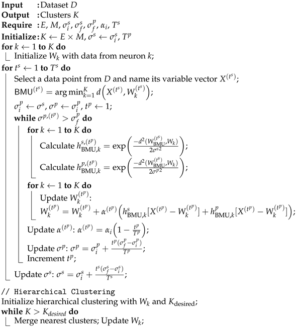
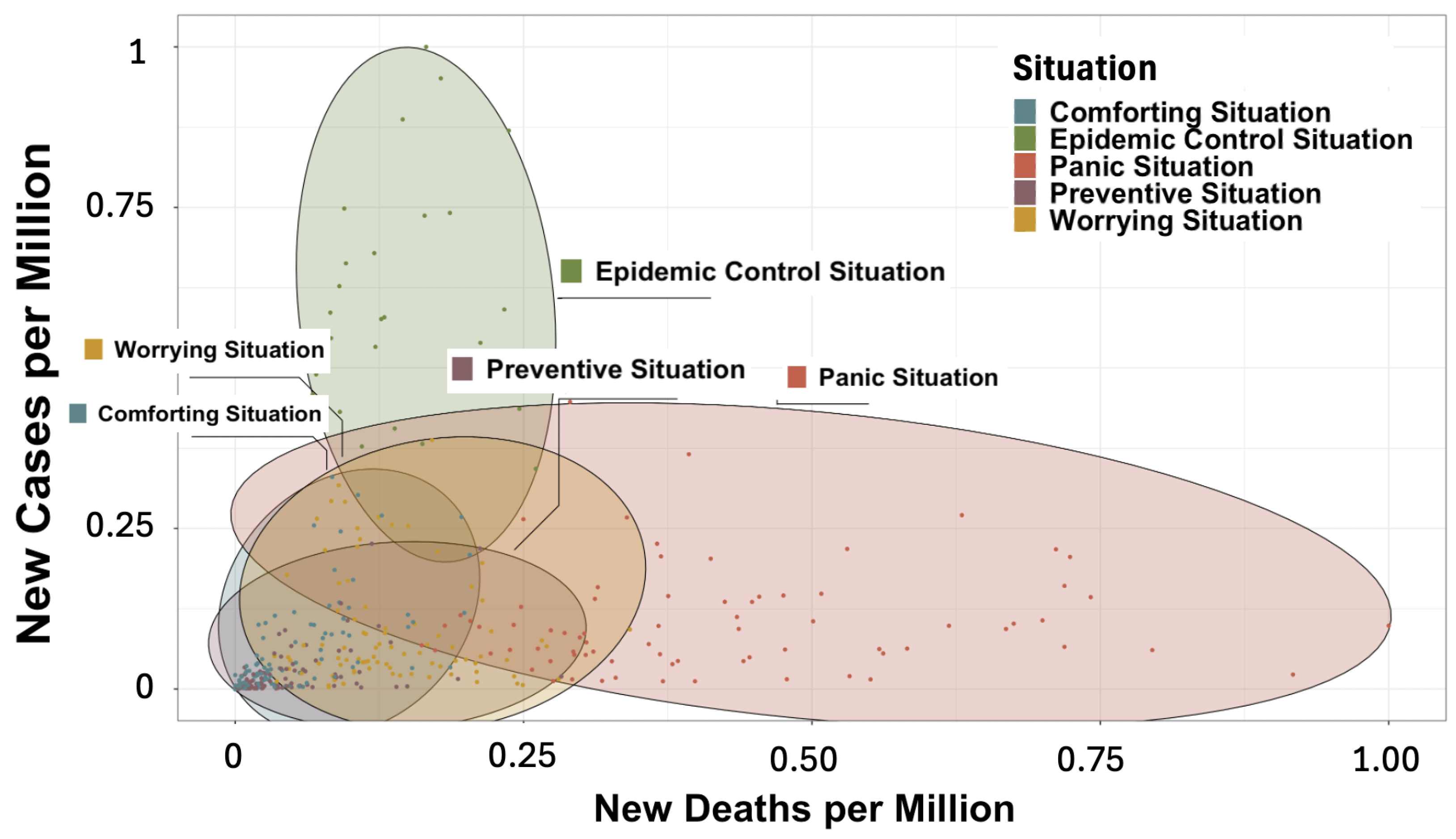
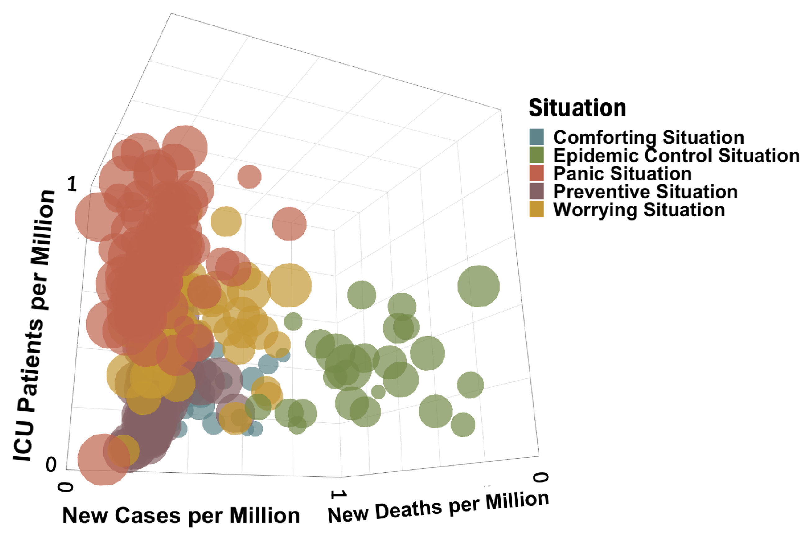
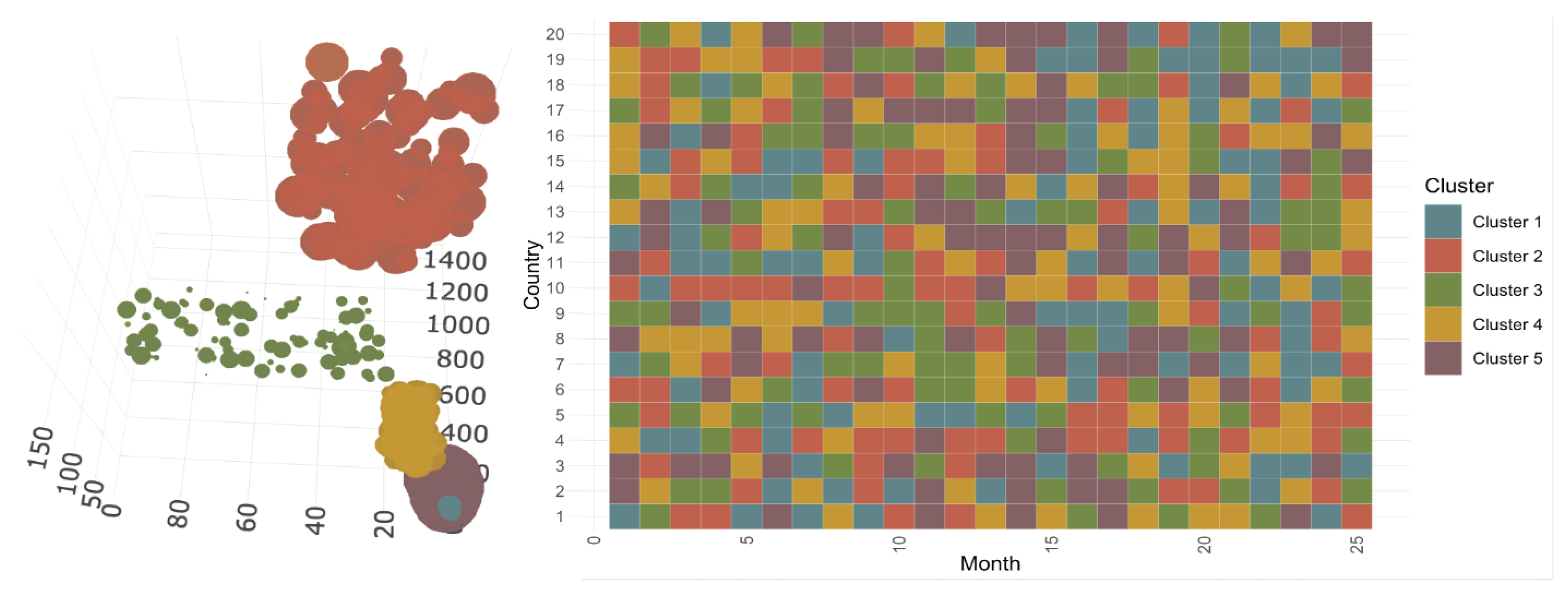
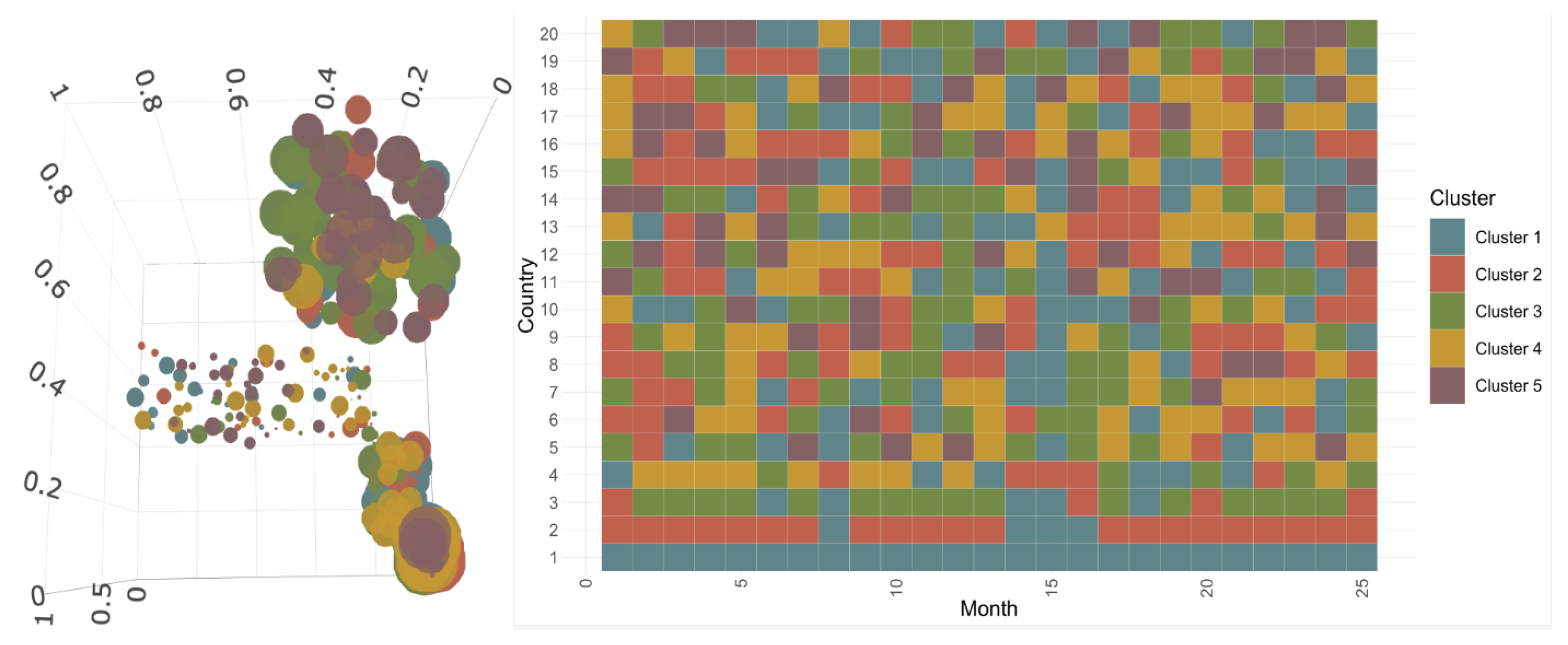
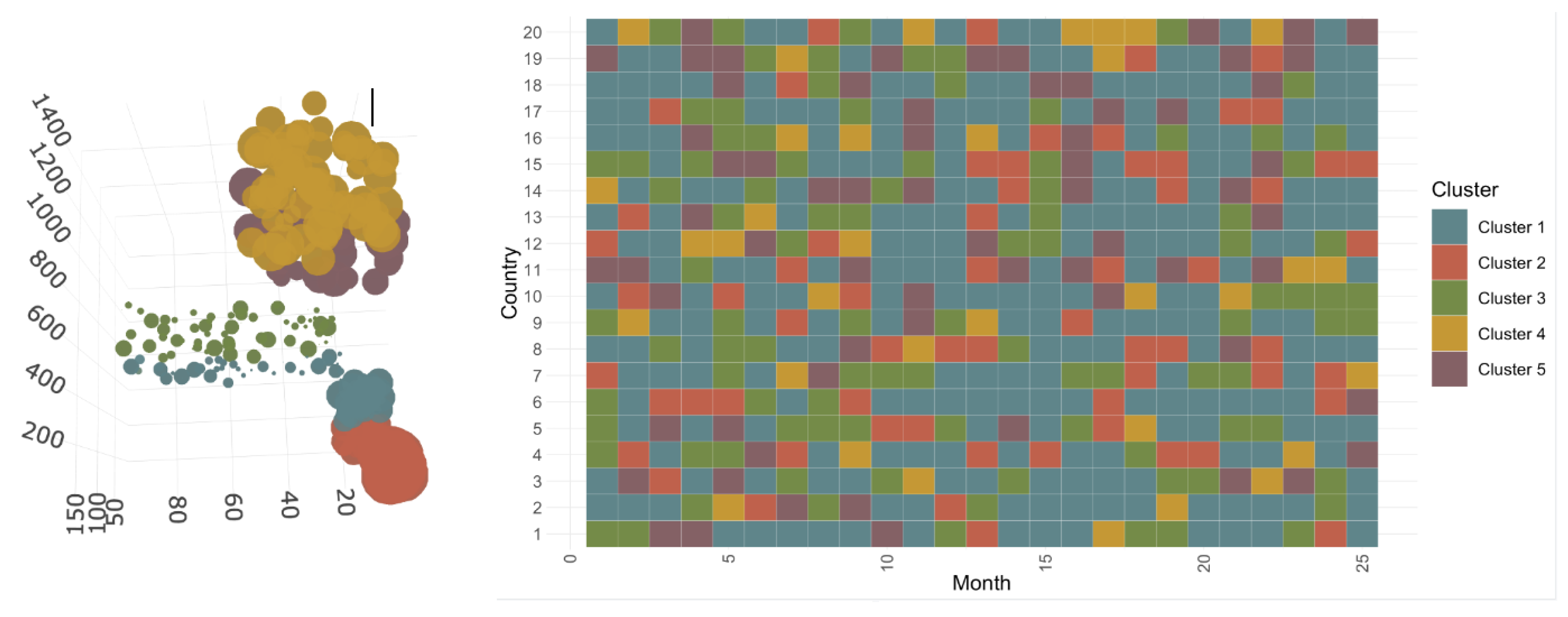
3.2.1. Construction and Composition of the Different Classes

After a meticulous refinement process through iterative adjustments, and following the application of the ascending hierarchical clustering method, the convergence of our algorithm allows us to identify five final superclasses. This convergence is of capital importance in ensuring the consistency of the algorithm and is guaranteed by the design of our parameters, which are configured to decrease over the iterations. The number of iterations needed for convergence was carefully selected by exploring different parameter setups and monitoring the graphic evolution of points, ensuring the choice of an optimal number for stable and meaningful superclasses.
Thus, the final five superclasses reveal a wide range of unique attributes and interrelationships within the dataset, offering significant perspectives on various aspects of the COVID-19 pandemic. To clarify the characteristics of these superclasses, we adopt a dual-view approach, as illustrated in Figure 1 and Figure 2. This method provides a detailed exploration of the complex patterns and relationships uncovered by our clustering analysis, aiming to deliver a comprehensive understanding of the underlying dynamics that shape each superclass.
Figure 1 and Figure 2 classify data points into different clusters, with each cluster represented by ellipses. While points in the same ellipse may appear to belong to the same cluster in 2D, actual cluster membership is determined by considering all variables in the higher-dimensional space. Each figure displays two variables to highlight specific cluster characteristics. While certain points may seem to belong to multiple ellipses, each point is assigned to only one cluster based on the complete set of variables. The color coding of the points provides the most accurate indication of cluster membership. Figure 1 shows the relationship between new cases per million and new deaths per million, while Figure 2 displays the relationship between ICU patients per million and the stringency index. The “Preventive Situation” has a high stringency index but low ICU patients, indicating strict measures despite controlled admissions. The “Panic Situation” is characterized by high ICU admissions and a high number of new deaths per million, reflecting a severe health crisis.
Because of the limitations in visualizing cluster characteristics in two dimensions, we decided to examine the classes in 3D space for a more comprehensive understanding. Figure 3 provides a 3D overview of cluster attributes, with points categorized by new cases per million, new deaths per million, and ICU patients per million. The colors correspond to the situational class, while the bubble size indicates the stringency index. The Panic Situation shows high new deaths and ICU patients, indicating severe outbreaks, while the Epidemic Control Situation shows higher new cases but fewer deaths and ICU admissions, suggesting effective management. The Comforting and Preventive Situations have lower values, indicating better control. Finally, the Worrying Situation highlights periods of concern.
Figure 4 presents a comparative analysis of COVID-19 means by class for new cases, deaths, ICU patients, and the stringency index. The Panic Situation has the highest means for new deaths and ICU patients, reflecting severe pandemic periods. The Epidemic Control Situation shows the highest mean of new cases, indicating effective testing and management. The Stringency Index has the highest means in the Panic and Preventive Situations, indicating strict measures. The Comforting Situation has the lowest mean values across all metrics, indicating effective control or no epidemic.
Based on the different representations observed in Figure 1, Figure 2, Figure 3 and Figure 4, which help to provide a solid interpretation of the characteristics of the different classes, we are able to identify five key categories that illustrate various aspects of the COVID-19 pandemic’s effects. First, the Comforting Situation (Cf1—blue) depicts a reassuring scenario with minimal new cases, deaths, and intensive care cases per million people alongside a low severity index. Second, the Epidemic Control Situation (Cf2—green) represents a state of epidemic control, characterized by a high incidence of new cases per million people while the number of deaths remains relatively low. Third, the Panic Situation (Cf3—red) signifies a scenario inducing panic, marked by a significant increase in deaths and intensive care cases relative to new cases. Next, the Preventive Situation (Cf4—purple) portrays a proactive approach to combating COVID-19, with low counts of new cases, deaths, and intensive care cases per million people despite a high severity index. Lastly, the Worrying Situation (Cf5—yellow) indicates a transition to concern, with a high number of deaths and intensive care cases relative to new cases despite the latter being low; the severity index is substantial, reflecting significant measures in place.
In Figure 5 and Figure 6, we present the results obtained by applying our proposed algorithm to the COVID-19 dataset. Each box on the graphs corresponds to the stringency index of a specific country at a particular point in time. The horizontal axis represents the timeline in months, spanning from February 2020 to April 2022. Meanwhile, the vertical axis displays the fifteen countries included in the study. In the context of studying the COVID-19 pandemic, “waves” refer to distinct and often recurring periods of increased COVID-19 cases, hospitalizations, and/or deaths within a given region or population. These waves characterize surges in the number of individuals testing positive for COVID-19 or experiencing severe illness, and may correspond to the rapid spread of new variants of the virus. The concept of waves describes the fluctuating patterns of COVID-19 transmission over time. Typically, a wave involves a significant increase in cases, reaches a peak, and then shows a decrease in cases. The reasons for these waves vary, and may include factors such as changes in public health measures (e.g., lockdowns, mask mandates), the emergence of new variants, vaccination campaigns, and public behavior. It is important to note that the terminology and criteria for defining COVID-19 waves vary between regions and among researchers. Waves are often analyzed to understand the dynamics of the pandemic, assess the effectiveness of public health interventions, and plan for healthcare system capacity. In summary, COVID-19 waves represent recurring surges in cases or outbreaks of the virus, playing a key role in shaping the trajectory and impact of the pandemic.
In our analysis of the COVID-19 pandemic, we focus in Figure 6 on identifying and observing distinct waves of the virus within the data. To do this effectively, we focus our attention on specific classes, namely, the “Worrying Situation”, “Epidemic Control Situation”, and “Panic Situation”. The rationale behind this approach lies in the unique characteristics and severity of these classes. These particular classes represent critical phases of the pandemic, where the impact of COVID-19 on a given country or region is most pronounced. In the “Worrying Situation” class, the population is deeply affected, either due to a substantial number of new deaths in proportion to new cases or due to a massive spread of the virus with effective control over the number of deaths. Similarly, the “Epidemic Control Situation” class indicates a situation where there is a significant number of new cases but relatively fewer deaths, signifying effective measures to mitigate the impact. The “Panic Situation” class reflects a scenario where there is a substantial number of deaths and patients in intensive care, often exceeding the number of new cases. This situation results from the time delay between COVID-19 infection and mortality, highlighting the urgency of addressing the pandemic’s impact. By focusing on these three classes over time, we are able to trace the trajectory of the pandemic’s waves. These classes encapsulate the periods when the COVID-19 situation was most critical and when waves, characterized by surges in cases and their consequences, are most evident. Our approach enables us to discern and analyze the dynamics of the COVID-19 pandemic with a sharper focus on these impactful phases, providing a clearer perspective on the behavior of the virus and its response to various factors such as public health measures, vaccination efforts, and emerging variants.
For the first wave, the countries divide into two groups: the yellow class and the red class, respectively representing situations of concern and panic where the number of new deaths is high compared to the number of new cases. Additionally, only a small number of countries considered in the study are deeply affected by this first wave, which lasts only about three months, from March 2020 to May 2020. Each of the countries that is part of this first wave stays there for up to two consecutive months, except Belgium and Sweden, which stay there for three months. It appears that during this wave, Switzerland and Luxembourg do not reach the more extreme Panic situation. It is noteworthy that Italy is the only country among the considered countries that is in the most critical class from the start and remains there for two months without transitioning through a Worrying Situation class. Moreover, despite being absent during the first three months of the COVID-19 wave, the United States experiences a later first wave during the months of July and August 2020, when all of the European countries considered here are in a rest period between the first and second waves.
In the second wave, the most common group is the red class, indicating the peak in terms of new COVID-19 deaths since the beginning of the crisis. This represents the most critical situation, as the number of new deaths is very high and often exceeds the number of new cases. This period spans approximately eight months, from October 2020 to May 2021. During this wave, all of the considered countries are affected over more or less similar periods, particularly during the first four months. In the United States, Spain, France, and Belgium, the second wave of COVID-19 begins with a number of new cases that is not yet very high. The majority of the countries in this then study move directly to a very large number of new deaths compared to new cases during November 2020 and December 2020, representing the Panic Situation class. Cyprus is the country least affected by this wave.
For the third and last wave observed on this graph, we observe the emergence of a new cluster, the green group, which is prevalent from January 2022 until March 2022 and indicates good control of deaths due to COVID-19. During this wave, the number of deaths remains considerably low despite a very high number of new cases. This situation results from the impact of vaccination against COVID-19, starting in January 2021, in addition to the possibility of acquisition of global immunity around the world. It is also possible that the variant of COVID-19 present at this time was less severe than the previous forms. During this wave, all of the considered countries are affected, and it is especially in January 2022 that the number of new cases peaks in all countries. This period follows the end-of-year celebrations, which could explain this observation. This last wave lasts about nine months, from August 2021 to April 2022. Though almost absent from the first and second waves of COVID-19 thus far, Cyprus now starts the third wave in July 2021. This wave spreads to Spain, France, and the United States in August 2021. Five months later, in January 2022, this wave of COVID-19 encompasses all of the considered countries without exception. An interesting point to note is that France and Spain are at the beginning of each wave and are consequently always among the first countries to feel the effect of a new wave of COVID-19. Another surprising observation is that while the measures taken during this wave were quite weak despite the explosion in the number of new cases, this did not affect the small number of deaths.
As for the other periods, we notice that the first period of calm between the first and second waves lasts about four months, from June 2020 to September 2020, while the second period of rest between the second and third waves lasts about one to two months. This situation results from the fact that during the first period of COVID-19, the measures taken concerning quarantine were quite severe, and at a certain point COVID-19 stopped spreading as fast as before. In contrast, especially after vaccination and control of the number of new deaths, there was a relaxation of the considered measures.

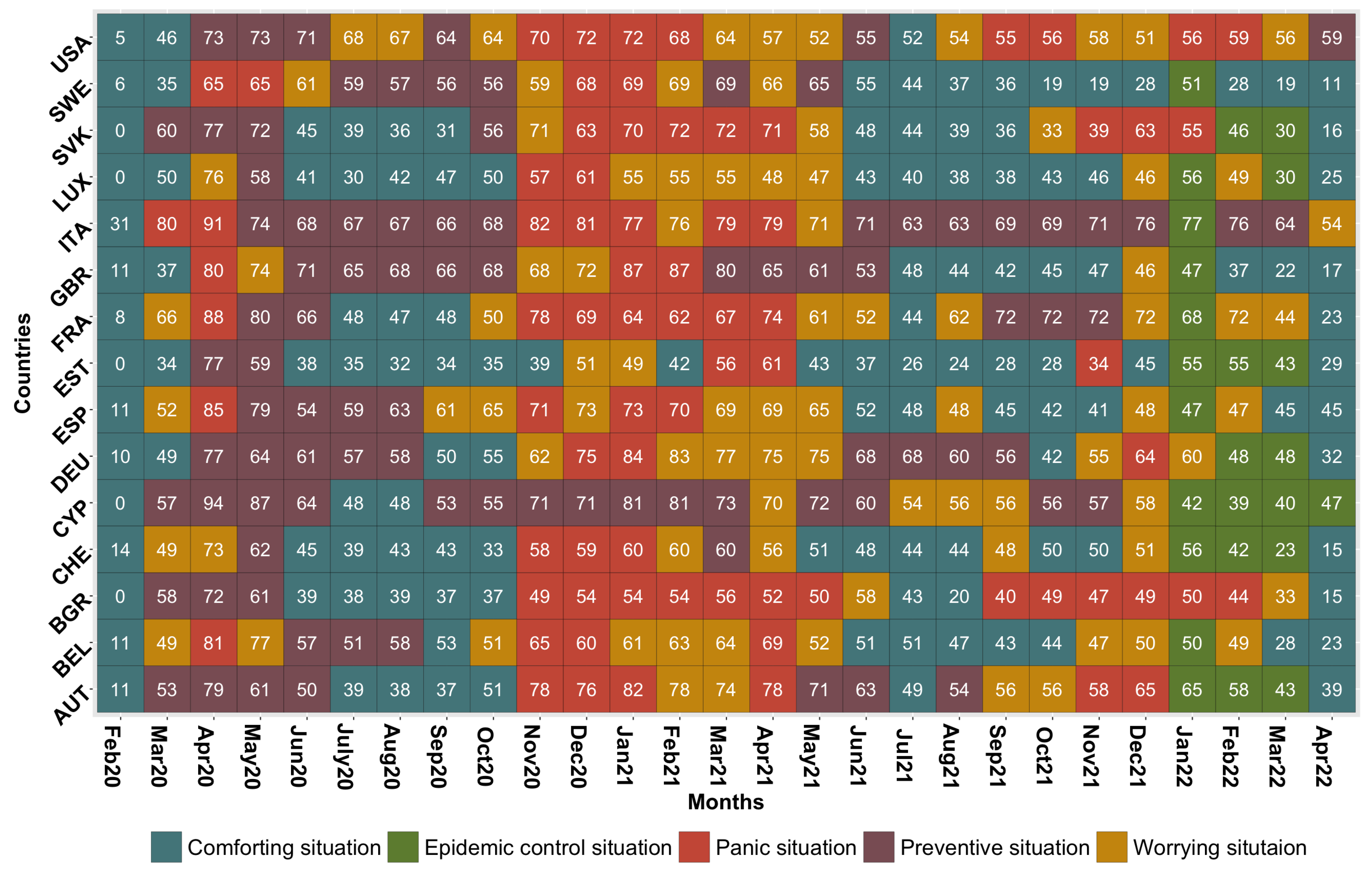
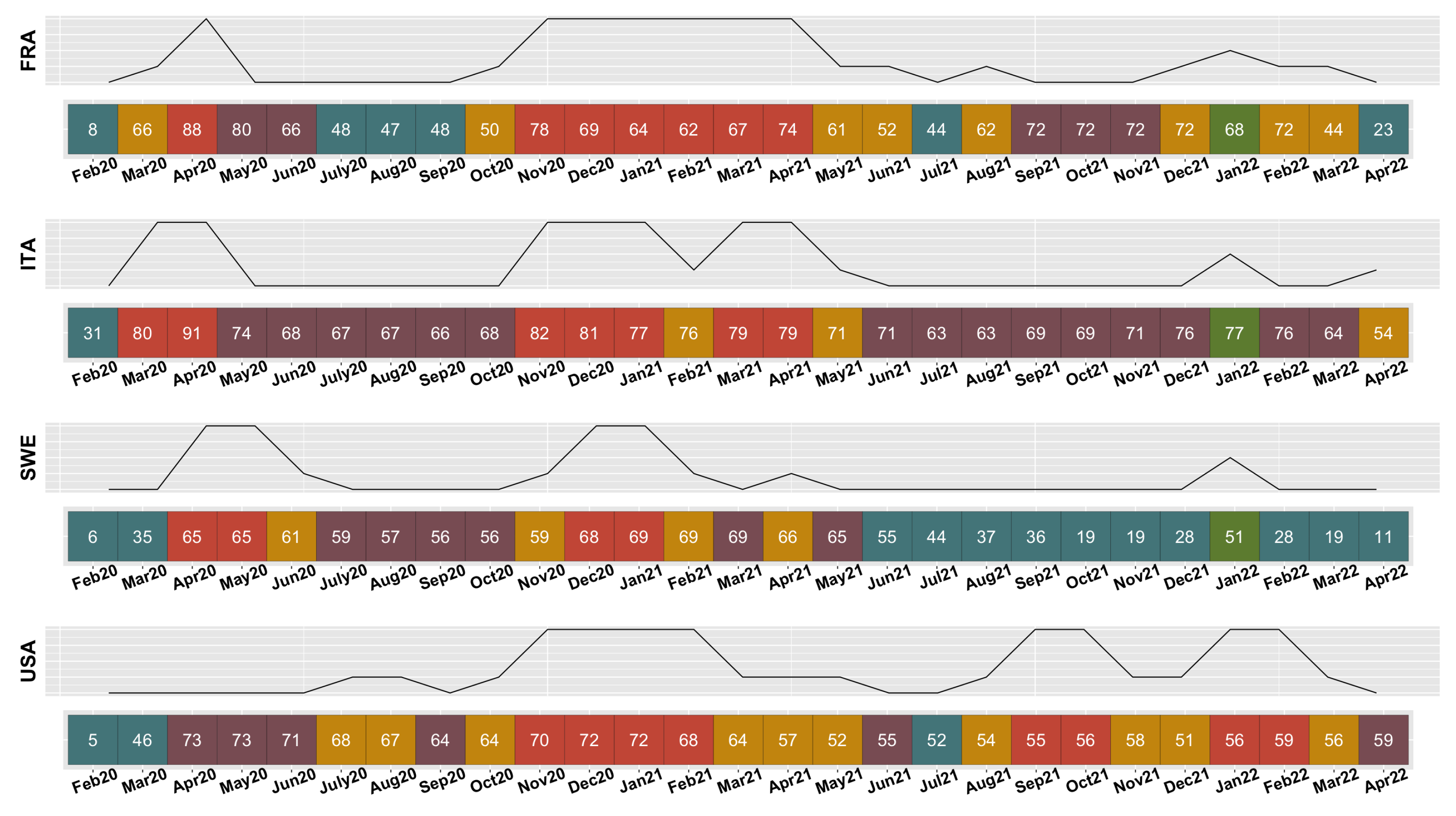
3.2.2. Evolution of COVID-19 in France, Italy, Sweden, and the United States

Thanks to the obtained results, we can follow the transition of countries from one cluster to another over time. From Figure 5 and Figure 6, it can be noticed that France often starts the waves, Italy is one of the first European countries to enter the worst COVID-19 situation, Sweden very rarely and almost never takes severe measures according to the values seen in the boxes, and the United States experiences a delay in its COVID-19 situation compared to Europe. For these reasons, we are interested in observing the evolution of the COVID-19 situations for France, Italy, and Sweden and comparing them with the United States. We examine the COVID-19 trajectories of these countries in Figure 7. The colors used in the figure represent the same clusters with the same characteristics mentioned earlier in this paper. The curve drawn above each list of colored boxes represents the wave of COVID-19 that the specific country is experiencing. It is drawn according to the following benchmark: if the country passes through a Comforting or Preventive situation (blue or purple), the curve takes a value of 0; if the country is in a Worrying situation (yellow), the curve takes the value 0.5; for a passage through an Epidemic Control situation (green), the curve takes the value 1; and for the Panic Situation (red), the curve takes a value of 2.
In the United States, the COVID-19 pandemic began in April 2020 with the country implementing preventive measures despite low new cases and deaths. By July 2020, the situation worsened significantly, with high new deaths but few new cases, remaining critical for two months. By November 2020, the country faced a panic situation with very high deaths, lasting until February 2021. The situation oscillated between worrying and preventive states until June 2021. From August 2021 to April 2022, the USA repeatedly faced high deaths, remaining critical. Overall, the crisis started significantly in July 2020, with few stable periods, and never reached a controlled state with limited deaths compared to cases.
In Sweden, the epidemic began in April 2020, quickly moving to the panic class with high new deaths exceeding new cases. By June 2020, the situation improved, transitioning to a preventive state with significant measures for four months. After this, Sweden spends only two more months in the most critical class (December 2020 and January 2021) and three more months in the worrying class (November 2020, February 2021, April 2021) with a high number of deaths. From June 2021 to April 2022, Sweden mainly remains in the blue class, indicating control over the epidemic and relaxation of measures; even with a high number of new cases in January 2022, new deaths remained low.
Italy saw the epidemic break out in March 2020, quickly entering the panic class with high new deaths and cases. By May 2020, Italy moved to a preventive state, staying there until October 2020. The situation mainly alternated between the panic and preventive states until January 2022, when Italy moved to a control state with very low new deaths compared to high new cases. By April 2022, the situation remained slightly worrying.
In France, the epidemic became visible in March 2020, transitioning gradually to a panic situation in April 2020. France controlled the situation and entered a preventive state by May 2020, mainly experiencing alternating periods of calm and panic until April 2021. The situation globally stabilized with preventive measures until April 2022, with France lifting conditions as soon as the health situation improved, unlike Italy, which remained vigilant throughout the pandemic.
By making a general comparison of the evolution of COVID-19 between the countries of Europe and the United States, it is observed that from April 2021 to April 2022 the three European countries considered above did not enter the panic situation (red) at all. This red cluster indicates the worst COVID-19 condition, with more new deaths than new cases. Italy and France managed to control the situation quickly even after entering the worrying yellow class. In contrast, the United States remained in the most serious panic situation for four months (September 2021, October 2021, January 2022, February 2022), often transitioning to the red panic group after a worrying yellow situation. The USA never reached the epidemic control situation in which the number of new deaths is well-managed compared to new cases. The lag of about three to four months between the pandemic’s onset in Europe and the United States may explain the prolonged serious conditions in the USA until April 2022.

4. Advantages and Utility of the Constructed Algorithm

In this section, we compare our constructed algorithm with existing clustering methods to highlight its advantages and usefulness. We use both practical examples and theoretical insights to show the unique features and performance of our algorithm, proving its importance and practical use in data analysis and clustering.

Theoretical Comparison of Clustering Methods

The constructed algorithm stands out from traditional clustering methods such as K-means and hierarchical clustering due to its enhanced flexibility and adaptability. Unlike these conventional methods, which often rely on predefined distance metrics or clustering criteria, our approach employs techniques for feature selection, dimensionality reduction, and algorithm customization. This flexibility enables it to perform well with various datasets and analytical scenarios and to effectively handle complex data structures.
It is important to note that neglecting temporal continuity when separately using conventional clustering methods such as K-means and Self-Organizing Map (SOM) for each fixed period presents certain limitations. This approach prevents the comparison of clusters obtained at different times, as clusters from different periods have distinct characteristics without any temporal connection. Conversely, applying traditional clustering methods directly to the entire dataset without considering temporal segmentation introduces bias, as historical events are considered of similar importance to current ones. Therefore, the developed algorithm allows for individual comparisons between each fixed period while incorporating the temporal dimension of the data. This ensures a thorough analysis and interpretation considering both temporal and spatial dimensions, leading to more accurate results.
To gain insights into the functionality of the developed algorithm, experiments using synthetic data were conducted. The synthetic data were generated by defining value ranges for each class (e.g., CF1, CF2, etc.) and randomly sampling within these ranges to create representative datasets. Each sample was associated with a specific class, defined by four variables. After the data were generated, they were shuffled to avoid bias and then divided into countries and months to create a temporal structure.
For clustering, an agglomerative hierarchical method was used. The data were first normalized to ensure a uniform scale across different variables, then a distance matrix was calculated, followed by applying the hierarchical clustering algorithm to group the data into meaningful clusters. The optimized final clusters, anticipated by any clustering method that does not account for the temporal aspect of the data, are illustrated in Figure 8.
Figure 9 shows the results obtained when applying the Self-Organizing Map (SOM) algorithm to the same synthetic dataset while considering the temporal dimension. This algorithm, inspired by the work of Aaron et al. [29,30], separates the points into five different classes for each fixed period while considering a chronological temporal sequence.
Figure 10 shows the results obtained with the constructed algorithm on the synthetic data. This algorithm takes into account both the spatial and temporal dimensions, assigning a certain weight to each dimension without constraining the time to be chronological. This provides a more comprehensive and precise analysis of the data, particularly when similar events occur in different populations with a time lag.
Upon examining the results, it is evident that the overall structure of the five classes aligns with expectations when temporal considerations are not taken into account. In this scenario, the classes can be easily differentiated visually, as seen in the left part of Figure 8. However, when the temporal dimension is introduced the visual differentiation between classes becomes less distinct, as observed in the left parts of Figure 9 and Figure 10. This occurs because the algorithm not only emphasizes the similarity between the data points’ variables but also considers the timing of these observations. Consequently, some data points cluster into unexpected classes, making the visual distinction between classes less clear. Therefore, it is necessary to represent the data points in an alternative visual format in which the data are organized month-by-month into rows in order to better capture the temporal dynamics and improve clarity. These visualizations are shown in the right-hand parts of Figure 8, Figure 9 and Figure 10.
Figure 8 illustrates the final clusters obtained when temporal considerations are not accounted for. In this case, the classes can be easily visually differentiated; however, this method presents significant limitations. Specifically, it does not allow for tracking the evolution of situations over time and does not consider the temporal influence on clustering. For example, a severe COVID-19 situation at the beginning of the pandemic would be treated the same as a severe situation at the end of the pandemic, which is unrealistic. In this case, the created classes do not have meaningful temporal context.
Figure 9 illustrates the results obtained with the SOM algorithm while integrating temporal chronology. This method compares data points at consecutive times, allowing the evolution of situations over time to be tracked. However, it also has limitations, particularly the difficulty of comparing similar situations occurring in different countries with a time lag. This approach limits comparisons of periods that are close to each other, as it does not consider that similar situations may arise with a longer time interval.
Figure 10 shows the results obtained with the constructed algorithm. This algorithm distinguishes itself from those presented in Aaron et al. [29,30] as well as other methods designed for spatiotemporal data that compare only consecutive time points. Our approach considers data points by assigning a different importance to both the temporal and spatial dimensions. If the variables show high similarity, then they are more likely to be grouped together even if they do not come from consecutive temporal periods. This concept is particularly relevant in studies where similar situations may occur in different populations with a time lag as opposed to during the same time period. Additionally, by considering the temporal dimension, this algorithm permits specific countries to stay in the same class for a longer period, which is pertinent for certain datasets where it is unrealistic to move from one situation to another in a single month. Thus, this method enables a more comprehensive and precise analysis of the data by integrating the temporal dimension in a more flexible and realistic manner.
Practical examples of this concept include tracking the spread of infectious diseases, where outbreaks may occur in different regions at different times; monitoring the impacts of climate change, where similar patterns emerge in distinct geographical locations with a delay; and analyzing market trends, where economic events influence various markets at different times. By incorporating both the temporal and spatial dimensions, the constructed algorithm provides a more comprehensive understanding of these phenomena, enabling more informed decision-making and better strategic planning.
In the following, we explore the performance of the constructed algorithm as well as the Self-Organizing Map (SOM) algorithm adapted to spatiotemporal data, as introduced in the work of Aaron et al. [29,30]. Before applying the agglomerative hierarchical clustering method, we used both approaches on a second set of synthetic data. This deliberate choice ensures that the integrity of the raw results produced by both algorithms is preserved while avoiding any risk of bias or alteration. After applying both methods, their performance was evaluated using two validity indices: the Calinski–Harabasz validity index, and the Silhouette validity index.
The Calinski–Harabasz validity index, also known as the Variance Ratio Criterion, evaluates the quality of clustering by considering the ratio of the sum of between-cluster dispersion to the sum of within-cluster dispersion. Higher values of the Calinski–Harabasz index indicate more well defined clusters, as they suggest greater separation between clusters and tighter cohesion within clusters [35]. The Silhouette validity index measures how similar an object is to its own cluster as compared to other clusters. The Silhouette value ranges from −1 to +1, with a high value indicating that the object is well matched to its own cluster and poorly matched to neighboring clusters. A Silhouette value close to 0 means that the object is on or very close to the decision boundary between two neighboring clusters, while a negative value indicates that the object might have been assigned to the wrong cluster [36].
The evaluation results for the SOM algorithm adapted to spatiotemporal data reveal a Calinski–Harabasz validity index of 32.146 and a Silhouette validity index of −0.58. In contrast, the constructed algorithm yields a Calinski–Harabasz validity index of 1977.545 and a Silhouette validity index of 0.279 before application of the agglomerative hierarchical clustering method.
This comparison highlights significant differences in the performances of the two approaches. The constructed algorithm demonstrates clear superiority in terms of both the Calinski–Harabasz and Silhouette validity indices compared to the SOM algorithm adapted to spatiotemporal data. It generates more compact and well separated clusters, suggesting a better ability to identify meaningful structures in the data. Its significant flexibility and adaptability to complex data structures make it suitable for a wide range of applications in data analysis and classification. These findings confirm the relevance and effectiveness of the constructed method in the context of spatiotemporal data analysis, and underscore the importance of selecting the appropriate classification method based on the specific objectives of the study and the characteristics of the analyzed data.

5. Time and Space Complexity Analysis

The algorithm was applied to the synthetic data considered in the previous section for a total of 6867 iterations, including 100 spatial iterations and 67 temporal iterations. The graph illustrating the evolution of time usage with iterations (Figure 11) shows a notable drop around 3300 iterations. Initially, the time usage is relatively high and fluctuating, reflecting the period when both σ s (the spatial radius) and σ p (the temporal radius) are non-zero. During this phase, the algorithm calculates the influence of the Best Matching Unit (BMU) on its neighboring neurons, which involves computing the neighborhood function and updating multiple neurons. This results in higher computational complexity and increased time per iteration.
Around the 3300 th iteration, a substantial reduction in time usage is observed, which remains stable until the end. This indicates that both σ s and σ p have reached zero, leading to a simplified update rule where only the BMU is updated. This decreases the computational load significantly, as the algorithm no longer needs to compute the neighborhood function for other neurons. This reduction in computational complexity in turn results in lower and more stable time usage per iteration. It is important to have some iterations with σ s and σ p equal to zero, as this allows the algorithm to focus solely on refining the positions of the BMUs without the added complexity of adjusting the positions of all neighboring neurons. This step ensures that the clusters become more precise, ultimately leading to better overall performance.
The space usage throughout the iterations remains consistent and stable at approximately around 22,025,280 bytes. This stability is due to the space complexity of the algorithm being primarily determined by the storage requirements for the neurons, the input data, and the neighborhood function matrices. These requirements do not change significantly during the iterations. Even though the update process changes when σ s and σ p reach zero, the amount of memory required to store the data and the model remains constant; therefore, the space usage remains stable across all iterations.

6. Conclusions

As highlighted by Gaber et al. (2010) [37], spatiotemporal data integrate spatial (geographic) and temporal (time-based) information, offering a comprehensive approach to analyzing patterns and trends over time and space. This combination enables more effective decision-making and planning across various domains. Clustering methods, a fundamental aspect of machine learning and data mining, are instrumental in revealing hidden structures within data, facilitating the identification of patterns that may not be immediately evident at the individual data point level. These methods enable the organization of large datasets into meaningful clusters based on inherent similarities [38].
In this paper, we introduce a novel clustering algorithm tailored for spatiotemporal data analysis. Unlike traditional methods, our approach offers enhanced flexibility, adaptability, and interpretability by integrating techniques for feature selection, dimensionality reduction, and algorithmic customization. Additionally, our algorithm allows for the assignment of weights to both temporal and spatial dimensions, enabling the prioritization of their importance in cluster formation and providing a more nuanced analysis.
The immediate application of our algorithm to COVID-19 data underlines its relevance in pandemic contexts. Analyzing COVID-19 data from various countries provides valuable perspectives on the progression of the pandemic, facilitating the identification of trends, patterns, and influential factors. This understanding is critical for evaluating the effectiveness of implemented strategies and informing future preparedness efforts for public health crises.
Understanding the evolution of COVID-19 in the European Union and the United States is of paramount importance due to the significant impact of the pandemic on these regions. By analyzing COVID-19 data from different countries within these regions, we can gain valuable understanding of the effectiveness of various containment measures, vaccination campaigns, and healthcare systems’ responses. Comparing trends and patterns between the European Union and the United States allows for the identification of successful strategies and best practices, fostering cross-border collaboration and learning; moreover, studying the evolution of the pandemic in these regions provides crucial information for evaluating the global response to COVID-19 and informing future preparedness efforts for similar public health crises. These findings reflect the complex interplay between public health infrastructure, governmental policy, and demographic factors in shaping the pandemic’s trajectory within each country. In addition, they highlight the importance of tailored public health strategies that consider the unique characteristics and capabilities of each country to effectively manage future health crises.
Future work will focus on refining the algorithm to address challenges related to variable correlation in clustering and streamlining implementation for scenarios with a large number of variables. Our algorithm’s adaptability extends its applicability to challenges beyond COVID-19, including public health, urban planning, and environmental monitoring.
In conclusion, our clustering algorithm represents a significant advancement in spatiotemporal data analysis. Its flexibility and interpretability make it a powerful tool for uncovering hidden structures and extracting practical information from complex datasets. By navigating the complexities of spatiotemporal data, our algorithm contributes to the informed decision-making processes essential for addressing current and future societal challenges.

Author Contributions

Conceptualization, N.B.S., G.M. and Y.S.; Data curation, N.B.S., G.M. and Y.S.; Formal analysis, N.B.S., G.M. and Y.S.; Funding acquisition, N.B.S., G.M. and Y.S.; Investigation, N.B.S., G.M. and Y.S.; Methodology, N.B.S., G.M. and Y.S.; Project administration, N.B.S., G.M. and Y.S.; Resources, N.B.S., G.M. and Y.S.; Software, N.B.S., G.M. and Y.S.; Supervision, G.M. and Y.S.; Validation, N.B.S., G.M. and Y.S.; Visualization, N.B.S., G.M. and Y.S.; Writing—original draft preparation, N.B.S.; Writing—review and editing, N.B.S., G.M. and Y.S. All authors have read and agreed to the published version of the manuscript.

Funding

The work of Y. Salhi was supported by the Joint Research Initiative on “Mortality Modeling and Surveillance” funded by AXA Research Fund as well as the CY Initiative of Excellence (grant “Investissements d’Avenir” ANR-16-IDEX-0008), Project “EcoDep” PSI-AAP2020–0000000013.

Institutional Review Board Statement

Not applicable.

Informed Consent Statement

Not applicable. The data used in this study were obtained from publicly available sources and did not involve direct interaction with human subjects or the collection of personal data.

Data Availability Statement

The data presented in this study are openly available from Our World in Data at https://ourworldindata.org/covid-cases (accessed on 15 May 2022).

Conflicts of Interest

The authors declare no conflicts of interest. The funders had no role in the design of the study, in the collection, analysis, or interpretation of data, in the writing of the manuscript, or in the decision to publish the results.

References

  1. Rios, R.A.; Nogueira, T.; Coimbra, D.B.; Lopes, T.J.S.; Abraham, A.; de Mello, R.F. Country Transition Index Based on Hierarchical Clustering to Predict Next COVID-19 Waves. Sci. Rep. 2021, 11, 15271. [Google Scholar] [CrossRef] [PubMed]
  2. Huang, Z. Spatiotemporal Evolution Patterns of the COVID-19 Pandemic Using Space-Time Aggregation and Spatial Statistics: A Global Perspective. ISPRS Int. J. Geo-Inf. 2021, 10, 519. [Google Scholar] [CrossRef]
  3. Spassiani, I.; Sebastiani, G.; Palù, G. Spatiotemporal Analysis of COVID-19 Incidence Data. Viruses 2021, 13, 463. [Google Scholar] [CrossRef]
  4. Yu, H.; Li, J.; Bardin, S.; Gu, H.; Fan, C. Spatiotemporal Dynamic of COVID-19 Diffusion in China: A Dynamic Spatial Autoregressive Model Analysis. ISPRS Int. J. Geo-Inf. 2021, 10, 510. [Google Scholar] [CrossRef]
  5. Signorelli, C.; Odone, A.; Gianfredi, V.; Bossi, E.; Bucci, D.; Oradini-Alacreu, A.; Frascella, B.; Capraro, M.; Chiappa, F.; Blandi, L.; et al. The Spread of COVID-19 in Six Western Metropolitan Regions: A False Myth on the Excess of Mortality in Lombardy and the Defense of the City of Milan. Acta Bio Med. Atenei Parm. 2020, 91, 23. [Google Scholar]
  6. Wieler, L.H.; Rexroth, U.; Gottschalk, R. Emerging COVID-19 Success Story: Germany’s Push to Maintain Progress. 2021. Available online: https://ourworldindata.org/covid-exemplar-germany (accessed on 3 July 2024).
  7. Usuelli, M. The Lombardy Region of Italy Launches the First Investigative COVID-19 Commission. Lancet 2020, 396, e86–e87. [Google Scholar] [CrossRef] [PubMed]
  8. Korhonen, J.; Granberg, B. Sweden Backcasting, Now?—Strategic Planning for COVID-19 Mitigation in a Liberal Democracy. Sustainability 2020, 12, 4138. [Google Scholar] [CrossRef]
  9. Rozanova, L.; Temerev, A.; Flahault, A. Comparing the Scope and Efficacy of COVID-19 Response Strategies in 16 Countries: An Overview. Int. J. Environ. Res. Public Health 2020, 17, 9421. [Google Scholar] [CrossRef] [PubMed]
  10. Centers for Disease Control and Prevention. COVID-19 Incidence, by Urban-Rural Classification—United States, January 22–October 31, 2020. Morb. Mortal. Wkly. Rep. 2020, 69, 1753–1757. [Google Scholar]
  11. Velicu, M.A.; Furlanetti, L.; Jung, J.; Ashkan, K. Epidemiological Trends in COVID-19 Pandemic: Prospective Critical Appraisal of Observations from Six Countries in Europe and the USA. BMJ Open 2021, 11, e045782. [Google Scholar] [CrossRef]
  12. Cascini, F.; Failla, G.; Gobbi, C.; Pallini, E.; Luxi, J.H.; Villani, L.; Quentin, W.; Boccia, S.; Ricciardi, W. A Cross-Country Comparison of COVID-19 Containment Measures and Their Effects on the Epidemic Curves. BMC Public Health 2022, 22, 1765. [Google Scholar] [CrossRef] [PubMed]
  13. Ndayishimiye, C.; Sowada, C.; Dyjach, P.; Stasiak, A.; Middleton, J.; Lopes, H.; Dubas-Jakóbczyk, K. Associations between the COVID-19 Pandemic and Hospital Infrastructure Adaptation and Planning—A Scoping Review. Int. J. Environ. Res. Public Health 2022, 19, 8195. [Google Scholar] [CrossRef] [PubMed]
  14. Ciulla, M.; Marinelli, L.; Di Biase, G.; Cacciatore, I.; Santoleri, F.; Costantini, A.; Dimmito, M.P.; Di Stefano, A. Healthcare Systems across Europe and the US: The Managed Entry Agreements Experience. Healthcare 2023, 11, 447. [Google Scholar] [CrossRef] [PubMed]
  15. Lau, Y.-Y.; Dulebenets, M.A.; Yip, H.-T.; Tang, Y.-M. Healthcare Supply Chain Management under COVID-19 Settings: The Existing Practices in Hong Kong and the United States. Healthcare 2022, 10, 1549. [Google Scholar] [CrossRef]
  16. Primc, K.; Slabe-Erker, R. The Success of Public Health Measures in Europe during the COVID-19 Pandemic. Sustainability 2020, 12, 4321. [Google Scholar] [CrossRef]
  17. Liu, S.; Ermolieva, T.; Cao, G.; Chen, G.; Zheng, X. Analyzing the Effectiveness of COVID-19 Lockdown Policies Using the Time-Dependent Reproduction Number and the Regression Discontinuity Framework: Comparison between Countries. Eng. Proc. 2021, 5, 8. [Google Scholar] [CrossRef]
  18. Wang, W.; Gurgone, A.; Martínez, H.; Góes, M.C.B.; Gallo, E.; Kerényi, Á.; Turco, E.M.; Coburger, C.; Andrade, P.D.S. COVID-19 Mortality and Economic Losses: The Role of Policies and Structural Conditions. J. Risk Financ. Manag. 2022, 15, 354. [Google Scholar] [CrossRef]
  19. Cheam, A.S.M.; Marbac, M.; McNicholas, P.D. Model-Based Clustering for Spatiotemporal Data on Air Quality Monitoring. Environmetrics 2017, 28, e2437. [Google Scholar] [CrossRef]
  20. Wu, X.; Zurita-Milla, R.; Kraak, M.-J.; Izquierdo-Verdiguier, E. Clustering-Based Approaches to the Exploration of Spatio-Temporal Data. Int. Arch. Photogramm. Remote Sens. Spat. Inf. Sci. 2017, 42, 1387–1391. [Google Scholar] [CrossRef]
  21. Deng, M.; Liu, Q.; Wang, J.; Shi, Y. A General Method of Spatio-Temporal Clustering Analysis. Sci. China Inf. Sci. 2013, 56, 1–14. [Google Scholar] [CrossRef]
  22. Izakian, H.; Pedrycz, W.; Jamal, I. Clustering Spatiotemporal Data: An Augmented Fuzzy C-Means. IEEE Trans. Fuzzy Syst. 2012, 21, 855–868. [Google Scholar] [CrossRef]
  23. Hoffman, F.M.; Hargrove, W.W.; Mills, R.T.; Mahajan, S.; Erickson, D.J.; Oglesby, R.J. Multivariate Spatio-Temporal Clustering (MSTC) as a Data Mining Tool for Environmental Applications. In Proceedings of the 4th International Congress on Environmental Modelling and Software, Barcelona, Spain, 7–10 July 2008. [Google Scholar]
  24. Hagenauer, J.; Helbich, M. Hierarchical Self-Organizing Maps for Clustering Spatiotemporal Data. Int. J. Geogr. Inf. Sci. 2013, 27, 2026–2042. [Google Scholar] [CrossRef]
  25. Win, K.N.; Chen, J.; Chen, Y.; Fournier-Viger, P. PCPD: A Parallel Crime Pattern Discovery System for Large-Scale Spatiotemporal Data Based on Fuzzy Clustering. Int. J. Fuzzy Syst. 2019, 21, 1961–1974. [Google Scholar] [CrossRef]
  26. Tuite, A.R.; Guthrie, J.L.; Alexander, D.C.; Whelan, M.S.; Lee, B.; Lam, K.; Ma, J.; Fisman, D.N.; Jamieson, F.B. Epidemiological Evaluation of Spatiotemporal and Genotypic Clustering of Mycobacterium Tuberculosis in Ontario, Canada. Int. J. Tuberc. Lung Dis. 2013, 17, 1322–1327. [Google Scholar] [CrossRef] [PubMed]
  27. Léger, A.-E.; Mazzuco, S. What Can We Learn from the Functional Clustering of Mortality Data? An Application to the Human Mortality Database. Eur. J. Popul. 2021, 37, 769–798. [Google Scholar] [CrossRef] [PubMed]
  28. Levantesi, S.; Nigri, A.; Piscopo, G. Clustering-Based Simultaneous Forecasting of Life Expectancy Time Series through Long-Short Term Memory Neural Networks. Int. J. Approx. Reason. 2022, 140, 282–297. [Google Scholar] [CrossRef]
  29. Aaron, C.; Perraudin, C.; Rynkiewicz, J. Curves Based Kohonen Map and Adaptative Classification: An Application to the Convergence of the European Union Countries. In Proceedings of the Conference WSOM, WSOM’03, Kyushu Institute of Technology, Kitakyushu, Japan, 11–14 September 2003; pp. 324–330. [Google Scholar]
  30. Aaron, C.; Perraudin, C.; Rynkiewicz, J. Adaptation de l’algorithme SOM à l’analyse de données temporelles et spatiales: Application à l’étude de l’évolution des performances en matière d’emploi. In Proceedings of the ASMDA 2005, Applied Stochastic Models and Data Analysis; A Conference of the Quantitative Methods in Business and Industry Society, Brest, France, 17–20 May 2005; pp. 480–488. [Google Scholar]
  31. Na, S.; Xumin, L.; Yong, G. Research on K-means Clustering Algorithm: An Improved K-means Clustering Algorithm. In Proceedings of the 2010 Third International Symposium on Intelligent Information Technology and Security Informatics, Ji’an, China, 2–4 April 2010; pp. 63–67. [Google Scholar]
  32. Miljković, D. Brief Review of Self-Organizing Maps. In Proceedings of the 2017 40th International Convention on Information and Communication Technology, Electronics and Microelectronics (MIPRO), Opatija, Croatia, 22–26 May 2017; pp. 1061–1066. [Google Scholar]
  33. Bullinaria, J.A. Self Organizing Maps: Fundamentals, Introduction to Neural Networks: Lecture 16. University of Birmingham, UK. Available online: https://www.cs.bham.ac.uk/~jxb/NN/l16.pdf (accessed on 3 July 2024).
  34. Natita, W.; Wiboonsak, W.; Dusadee, S. Appropriate Learning Rate and Neighborhood Function of Self-Organizing Map (SOM) for Specific Humidity Pattern Classification over Southern Thailand. Int. J. Model. Optim. 2016, 6, 61. [Google Scholar] [CrossRef]
  35. Caliński, T.; Harabasz, J. A Dendrite Method for Cluster Analysis. Commun. Stat. Theory Methods 1974, 3, 1–27. [Google Scholar] [CrossRef]
  36. Rousseeuw, P.J. Silhouettes: A Graphical Aid to the Interpretation and Validation of Cluster Analysis. J. Comput. Appl. Math. 1987, 20, 53–65. [Google Scholar] [CrossRef]
  37. Gaber, M.M.; Vatsavai, R.R.; Omitaomu, O.A.; Gama, J.; Chawla, N.V.; Ganguly, A.R. Knowledge Discovery from Sensor Data: Second International Workshop, Sensor-KDD 2008, Las Vegas, NV, USA, 24–27 August 2008, Revised Selected Papers; Springer: Berlin/Heidelberg, Germany, 2010; Volume 5840. [Google Scholar]
  38. Pitafi, S.; Anwar, T.; Sharif, Z. A Taxonomy of Machine Learning Clustering Algorithms, Challenges, and Future Realms. Appl. Sci. 2023, 13, 3529. [Google Scholar] [CrossRef]
Figure 1. Class characteristics based on COVID-19 cases and deaths per million.
Covid 04 00092 g001
Figure 2. Class characteristics based on ICU admissions and stringency index.
Covid 04 00092 g002
Figure 3. Overview of cluster attributes in COVID-19 data analysis.
Covid 04 00092 g003
Figure 4. Comparative analysis of COVID-19 means by class: cases, deaths, ICU admissions, and stringency index.
Covid 04 00092 g004
Figure 5. Pandemic progression timeline: comparative view of Europe and the United States (February 2020–April 2022).
Covid 04 00092 g005
Figure 6. COVID-19 pandemic waves: comparative analysis across Europe and the United States (February 2020–April 2022).
Covid 04 00092 g006
Figure 7. COVID-19 class transitions in France, Italy, Sweden, and the USA (February 2020–April 2022).
Covid 04 00092 g007
Figure 8. Final clusters when the temporal dimension is not considered—synthetic data.
Covid 04 00092 g008
Figure 9. Clusters obtained using the SOM algorithm, considering both spatial and temporal dimensions—synthetic data.
Covid 04 00092 g009
Figure 10. Clusters obtained using the constructed algorithm, considering both spatial and temporal dimensions—synthetic data.
Covid 04 00092 g010
Figure 11. Evolution of time usage with iterations.
Covid 04 00092 g011
Table 1. Parameter explanations.
ParameterExplanation
MNumber of study periods. Represents the number of distinct temporal periods considered in the analysis.
SNumber of populations. Represents the number of distinct populations (e.g., countries) considered in the analysis.
DData Set. Collection of N data objects characterized by ( s , m ) , where s denotes a population and m denotes a period.
XData Representation. Vector of variables associated with each data point in D, enabling comparisons and similarity calculations.
KDesired number of groups. Represents the desired final number of clusters or prototypes aimed to be formed within the data.
P f Ultimate Superclasses. Subset of P obtained using ascending hierarchical method, representing the final groups.
α Learning Rate. Percentage by which the algorithm learns during each iteration, influencing modification of prototype vectors.
h B M U , k p Temporal Neighborhood Function. Governs intensity with which neurons having different times than BMU approach a data point.
h B M U , k s Spatial Neighborhood Function. Determines intensity with which neurons with same period as BMU approach a data point.
σ p Temporal Radius. Defines extent of temporal influence, allowing adjustments in temporal neighborhood function.
σ s Spatial Radius. Controls spatial influence on clustering, impacting spatial neighborhood function.
T s Total Spatial Iterations. Represents total number of spatial iterations, influencing cluster evolution over space.
T p Total Temporal Iterations. Represents total temporal iterations within each spatial iteration, allowing exploration of temporal patterns.
K desired Clustering Target. Desired final number of clusters or prototypes aimed to be formed within the data.
σ i s Initial Spatial Radius. Initial spatial radius for neighborhood functions.
σ f s Final Spatial Radius. Final spatial radius for neighborhood functions.
σ i p Initial Temporal Radius. Initial temporal radius for neighborhood functions.
σ f p Final Temporal Radius. Final temporal radius for neighborhood functions.
ENumber of Randomly Selected Populations. Represents number of randomly selected populations from the dataset.
W k Prototype Vector. Serves as the prototype vector associated with neuron k, evolving during clustering to capture cluster characteristics.
BMUBest Matching Unit. Identifies the neuron with the prototype vector closest to the data point, pivotal in clustering.
Disclaimer/Publisher’s Note: The statements, opinions and data contained in all publications are solely those of the individual author(s) and contributor(s) and not of MDPI and/or the editor(s). MDPI and/or the editor(s) disclaim responsibility for any injury to people or property resulting from any ideas, methods, instructions or products referred to in the content.

