5.1. Statistical Analysis of Participant Responses
In total, 338 participants (mostly students of the University of Zagreb and the University of Dubrovnik) took part in the research. The gender and age of participants were not systematically assessed, as participants were selected based on their matriculation in Bachelor- and Master-level degree programs. As some participants did not answer all questions, we collected 4448 answers in total. First, we analyzed all participant responses (correct and incorrect). The distributions of response times of correct and incorrect answers are shown in
Figure 5. The results show that both distributions are positively skewed, and a disproportionate number of incorrect answers were answered in a time of less than 0.5 s.
Since the goal of the study was to investigate the impact of different user interfaces in tasks where accuracy is important, we excluded from the set all data where respondents did not choose the correct answer (17.18% of answers), whereupon 3684 correct answers remained in the set. In the remainder of the research, we processed only the data where respondents had answered correctly.
In the quiz, respondents were shown a new interface appearance with the first question of each series (1st, 6th, and 11th questions). The appearance and settings were different from the interfaces the respondent had seen before in the application. While answering the questions in a series, the respondent became accustomed to the new look of the interface. As a result, the average response time to the first question in each series is significantly longer than the average response time to the other questions in that series, as shown in
Figure 6. This phenomenon can be explained by the theory of universal design [
36]. Namely, the principle of universal design, which refers to simplicity and intuitiveness, posits that a design should be stable and predictable. This means that once a user gets used to a certain layout and interaction flow when working with the software, they should not experience unexpected design changes, as this leads to confusion. If changes are unavoidable, as in the case of online stores when the user is redirected to the payment pages, these changes should be announced in advance.
To eliminate the effects of the respondent’s adaptation to the new user interface, these questions were excluded from the training and testing set.
Since the questions are simple and the questionnaire was designed so that there is only one correct answer, when the respondent recognizes the correct answer, they do not have to read the other answers that are below it.
In this environment, the response time when the answer is in the first position could be much shorter than the response time when the correct answer is in the later positions; e.g., if the correct answer is in the last position, the respondent must read the question and all four answers to get to it. To eliminate the influence of the position of the correct answer on the response time, the response time was normalized using Equation (1).
The graph in
Figure 7 shows mean response times by position of correct answer after normalization.
During the normalization process, real response time was divided by the answer position increased by 1 (time to read the question). The assumption for such normalization was the fact that most people read text intensively when they need to answer a question [
37]. For example, to answer a question with the correct answer in position 2, they must read at least the question and two answers. This normalization did not completely eliminate the influence of the position of the correct answer on the response time, but the response time was significantly reduced (the difference between the largest and smallest average time before normalization was 3.39 s and after normalization was 1.04 s). Part of the difference that occurred when answering the last question could be due to the fact that some of the respondents who had not found an answer in the three previous positions chose the last answer without reading the text of that answer.
Further analysis revealed two problematic groups of response times. The first group included very short times, by which the respondent would not have been able to read the question and at least one answer. The second group included outliers in the form of very long times, for which we assumed that something prevented the respondent from answering or that the application or mobile device had performance problems while answering.
Such problematic responses accounted for about 2% of all responses. Since they could have a negative impact on the research, we decided to exclude from the set all responses for which the normalized times were shorter than 0.5 s and longer than 5 s. After this exclusion, 98% of the correct answers remained in the set, or 2632 answers in total.
Figure 8 shows mean response times by the three different criteria that formed different user interfaces in the application: layout, font, and color combination.
Figure 8a shows how efficient participants were in solving tasks using different layouts. From this graph, we can see that participants performed best with the myStyle1 layout, in which the question is at the top of the screen and the answers are arranged in a column below the question [
38]. The myStyle5 layout, in which the question is in the same place but the answers are arranged in two rows (zigzag layout) was second in terms of efficiency. We assume that in this layout, changing the reading direction of the answer from horizontal to vertical saved time in retrieving the information.
Furthermore, based on the effect of font on the task-solving efficiency, as shown in
Figure 8b, the dyslexic-friendly font had a positive effect.
The average reaction time of the participants by different color combinations is shown in
Figure 8c. The best results were obtained with high-contrast combinations (yellow–black, color01; black–white, color05; black–yellow, color09; blue–yellow, color10; green–black, color11; white–black, color13). Most of the efficient color combinations (color01, color09, color10, and color11) are combinations from the methodology created in a previous study on the use of efficient color and contrast combinations on the web [
39]. Apart from that, good results were obtained when using interfaces with high-contrast monochrome black and white (color5) and white and black (color13) combinations.
5.2. Evaluation of Effectiveness Using CNN Models
As described in the previous section, the process of data-cleaning and preparation resulted in the elimination of wrong answers, outliers, and answers resulting from user adaptation to the new interface. Normalization was also conducted to reduce the influence of the position (1)–(4) where the correct answer is found. Ultimately, the corrected dataset contained 2632 samples.
The available data were pseudo randomly divided into three datasets: 263 images (10%) were set aside as the test dataset, while the rest was divided into a training dataset of 2106 images (80%) and a validation dataset of 263 images (10%). The division was made in such a way that the exact same interface (taking all elements into account) was not represented in multiple datasets.
The performance of the proposed models was evaluated using mean absolute error (MAE) and root mean square error (RMSE) metrics, expressed by Equations (2) and (3) (
Table 2):
where
yi is the ground-truth value,
is the predicted data and
N is the number of testing samples.
It should be noted that in this case, some standard metrics were not suitable for the analysis of predictions. For example, the coefficient of determination R2 does not provide a comparison of different algorithms. The reason lies in the fact that for one interface, the entire response time range will be obtained (distributed mostly according to the normal distribution), and the prediction will actually be reduced to the mean value.
The results show that two proposed ensemble models achieved better performance than individual models. For the user interfaces represented in the test dataset, with the best model applied, the range of user response time values was between 1366 and 2011 ms.
It is important to note that the expected response time for a specific user interface, for example, of 1550 ms, does not mean that all users will achieve the same or a similar time. The actual response time will depend on many additional parameters, including the user’s cognitive abilities or their current mood. However, if the experiment is repeated a sufficient number of times, a mean response time close to the predicted value can be expected for a particular interface.
Thus, perhaps the main benefit of the proposed approach is the possibility of ranking interface proposals. An additional experiment was conducted in which additional interfaces were made with elements that were not used before. This refers to the arrangement of objects, used colors, fonts, etc.
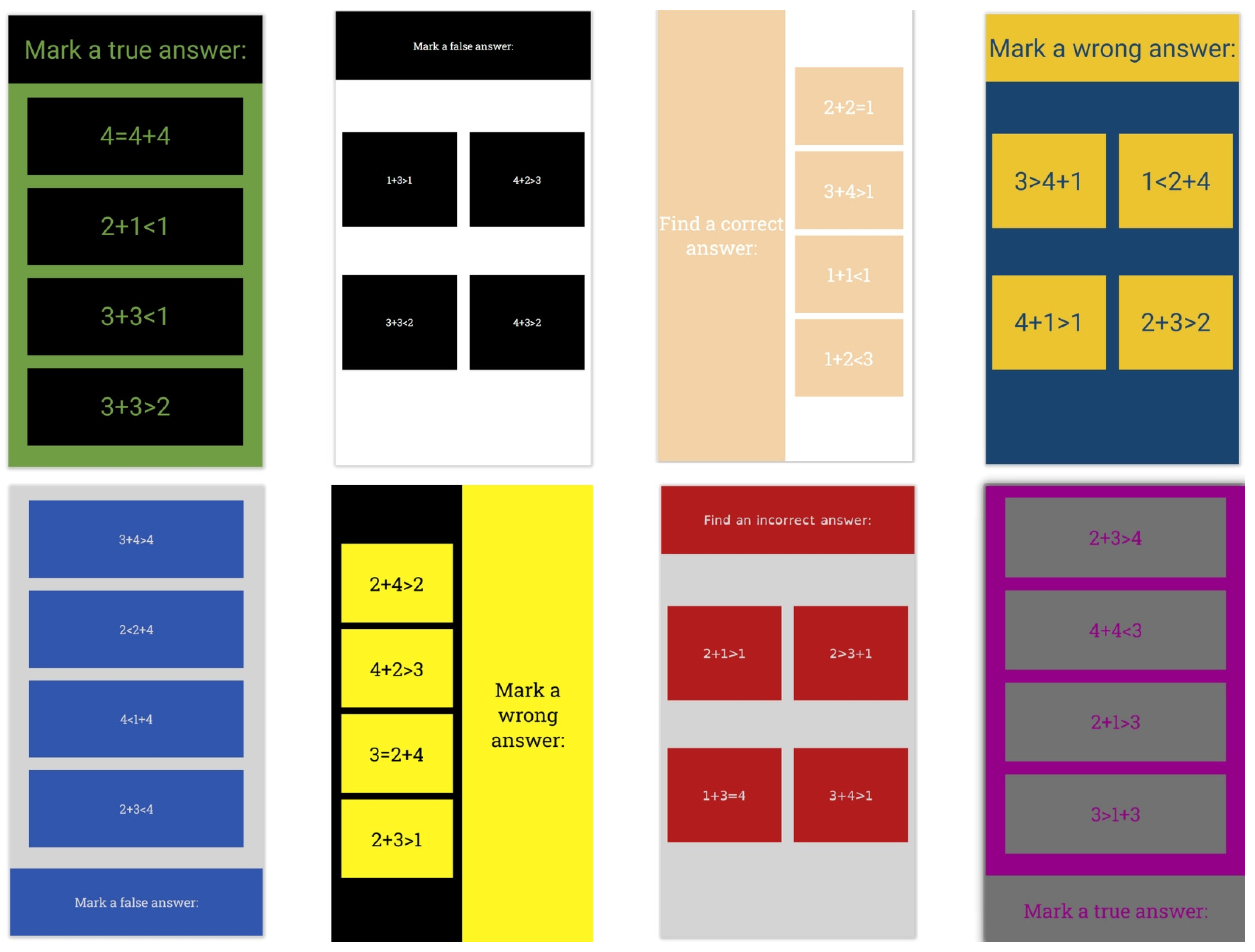
The best model was applied to the additional test data to rank the interfaces according to the expected mean response time. Examples of the best and worst-ranked interfaces are shown in
Figure 9 and
Figure 10. In
Figure 9, the images are ordered starting from the best response time, while in
Figure 10, the images are ordered starting from the worst response time.
Analysis of the ranked interfaces reveals that deep-learning models can recognize the essential attributes of an interface and their influence on its future efficiency.


