Abstract
Dyslexia-friendly typefaces for the Latin script have been proliferating during the past decade. The typefaces are designed to tackle the challenges faced in a dyslexic reading experience by manipulating their letter forms and typographic attributes; several studies reported a positive effect on the reading experience. To this date, no working dyslexia-friendly Arabic typefaces are available for the public. The present study is part of a larger practice-based research, where a novel dyslexia-friendly Arabic typeface is designed using a user-centred design approach. The current visual analysis marks the developmental phase, identifying the letterform features of dyslexia-friendly Latin typefaces that can be mapped to the Arabic script. This article explores the typographic features of dyslexia-friendly Latin typefaces by conducting a qualitative visual analysis; a proposed modified version of Leeuwen’s Typographic Distinctive Features Framework is employed. The results are discussed considering the Arabic script’s visual implications in a dyslexic reading experience. The findings of this study are used to create a list of design considerations for a dyslexia-friendly Arabic typeface.
1. Introduction
In the past decade, the understanding of disability has shifted notably in the West, moving away from the medical approach toward a focus on human rights. This change has been more rapid in Western societies compared to the Arab region’s pace in redefining disability [1]. Age and disability are commonly understood as aspects of the human experience that can be encountered by individuals at various stages of life [2]. This shift in perspective has quickly become a key instrument in sparking legislation and regulations that create a framework for a more inclusive and accessible society, and eventually trigger a change in design practice, where mainstream design is more focused on inclusivity and accessibility [3]. During the past decade, there has been a proliferation of typographical adjustments in design, using typography to improve the legibility of reading material, such as for children with low vision [4], beginner readers [5], and older readers [6]. Alongside this trend the use of dyslexia-friendly typefaces for the Latin script to improve accessibility has emerged. These dyslexia-friendly typefaces differ from mainstream typefaces because of their letterform characteristics, in which letters are designed and manipulated to alleviate the visual distortions experienced by individuals with dyslexia. However, to date, there are no accessible or dyslexia-friendly typefaces for the Arabic script that are available for public use, and, moreover, dyslexia is not legally recognised as a specific learning disability in some Arabic nations, so support for such learners is limited. This study is part of a larger practice-based research that seeks to design and publish a dyslexia-friendly Arabic typeface. The present study marks one of the developmental stages of the design; the objectives are to identify the letterform characteristics of dyslexia-friendly Latin typefaces and judiciously map them to the Arabic script. This study seeks to use empirical findings by conducting a qualitative visual analysis of the typographic features of dyslexia-friendly Latin typefaces and employ conclusions to create a list of design considerations to design an accessible Arabic typeface, specifically, a dyslexia-friendly one.
2. Literature Review
2.1. Dyslexia Characteristics and Typeface Solutions
The majority of researchers argue that the leading causes of dyslexia are differences in phonological processing skills [7,8,9,10] such as accurate and fluent word reading and spelling, difficulties in phonological awareness, verbal memory, and verbal processing speed [11]. However, it is reported that other characteristics are experienced by readers with dyslexia related to visual distortions. Several studies reported that the visual distortions experienced can range from an illusion of shape [12] to words moving around on the page and double vision [12,13,14]. Similarly, other studies concluded that participants with dyslexia experience visual crowding more than control group participants (average readers), which eventually leads to a slower reading speed [15,16,17,18,19,20,21,22]. In a dyslexic reading experience, visual crowding can be explained as impaired letter recognition, when letters are critically closer to each other [23]. Further research focusing on dyslexia in Semitic languages such as Hebrew and Arabic reported the same characteristics; it is well established from several studies that individuals with dyslexia faced challenges in letter position encoding and made errors in reading tasks such as the migration of middle letters within words [24,25].
Individuals with dyslexia experience visual distortions in the first stage of the reading cycle; therefore, it is imperative to underscore that dyslexia-friendly typefaces are designed as an assistive tool to help alleviate the visual distortions and eventually reduce the visual and cognitive load in a dyslexic reading experience [26]. The special letterform features of dyslexia-friendly Latin typefaces arguably create an enhanced reading experience for individuals with dyslexia, as confirmed by several academic studies [26,27,28,29,30,31,32,33,34,35,36,37,38]; the studies examined the legibility of the dyslexia-friendly typefaces via gross measures such as overall reading rate, word accuracy, and other methods such as eye movement measures. Although most studies agree on the positive impact dyslexia-friendly typefaces have on reading performance, several argue that a specified typeface designed for dyslexia has no impact and it is merely the typographic settings of text spacing that determine whether the typeface is dyslexia-friendly or not [39,40,41,42]. In relation to Arabic typefaces, only two projects, Arabolexia [43] and Moyasar [44], have addressed the intersection of the Arabic script and dyslexia. However, compared to their Latin counterparts, these projects fall short of filling the research gap. Both Arabolexia and Moyasar face limitations, as they are not available for public or licensed use to serve the shortage of accessible Arabic typefaces. Furthermore, neither typeface adequately accounts for the distinctions between the Latin and Arabic scripts, instead directly mapping the features of the Dyslexie typeface even if it does not correspond with the nature of the Arabic script. While Arabolexia shows promising results in reading tests [45], Moyasar remains unevaluated in any form.
2.2. The Potential of Cross-Script Letterform Mapping
Mapping letterform features of one script onto another script may seem unrealistic due to their visual and aesthetical differences and distinct complexities. However, we propose two arguments that suggest the opposite. The first is that cross-script research has been conducted which reported positive results on the reading experience. The research was conducted on the Japanese script, where the researchers mapped the letterform features of a Latin typeface to the Japanese script and designed a Japanese typeface for readers with dyslexia [46]. In a later stage, the dyslexia-friendly Japanese typeface was evaluated by testing legibility and readability, which resulted in a positive impact on the reading experience [47]. Although the Latin and Japanese scripts have noticeable distinct visual aesthetics, the researchers were able to sensibly map the features that were suitable for the nature of the Japanese script. The findings from the cross-script study indicate that a successful cross-script mapping of letterform features is achievable, whilst considering the inherent characteristics of the scripts involved inspired this study to explore similar avenues.
The second argument, also introduced in the previous cross-script study, presents the basis that all human beings have the same visual word form recognition area in the brain, as argued by Dehaene and Cohen [48]. This area is activated in all readers during the reading process regardless of the language being read or how reading was acquired [49]; to elucidate, this theory suggests that no matter what language is read, the process of capturing the visual shapes of the script is the same. Together with the fact that dyslexia visual characteristics are similarly rooted in languages of different scripts [50,51,52], this serves as a fundamental base for the present study to sensibly map the letterform characteristics of the Latin script to the Arabic script despite their distinct nature.
2.3. Arabic Typography Anatomy Considerations
The field of Arabic typography is relatively younger in comparison to its Latin counterpart [53]. This observation is corroborated by Almusallam [54] and Nemeth [55], who highlight the scarcity of comprehensive research addressing Arabic typography, especially concerning its fundamental aspects and intricate details, in contrast to the abundance available for Latin typography. Consequently, the absence of a standardised terminology framework for Arabic typography anatomy [56] poses a significant challenge. Without a formal system of terminology and an analysis framework, achieving a healthy typography system becomes problematic. Instead, various type designers rely on disparate references, occasionally borrowing terms from calligraphy terminologies. Hence, in our present study, we employ cross-script mapping to design an accessible Arabic font, wherein we systematically map letterform features from the well-established academic research of Latin fonts to address the complexities of Arabic typography.
Before moving to the practice part of the study, to design an Arabic typeface for readers with dyslexia, it is important to understand the visual differences between Arabic and Latin scripts and how they affect reading. Initially, the Latin and Arabic scripts may seem very distinct; however, they share similarities in the visual shapes of the letters regarding counters, apertures, ascenders, and descenders. The difference lies not only in the letters’ connectivity but also in the heights of the letters. Demonstrated in Figure 1 is an illustration proposed by type designer Pascal Zoghbi comparing Latin and Arabic letterform features [57]. While Latin has two letter heights, which are the cap height (representing the height of all the capital letters) and the x-height (representing the height for all the small letters) [58], Arabic has multiple letter medial heights that help to retain the fluidity of the Arabic script and can be categorised as loop height, eye height, and tooth height [54,56,59].
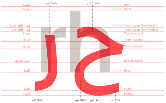
Figure 1.
Arabic letterform anatomy. Note: From right to left are Arabic letters “Hah” and “Reh” in red colour contrasted with Latin letterforms in grey colour. On the left side are anatomy descriptions in Red colour with translation on the right side.
In a dyslexic reading experience, the Arabic script is considered one of the most visually complex scripts in the world because of its inherent visual characteristics [60,61,62]. Three of the main visual implications are discussed in the light of this study.
2.3.1. Letter Connectivity in Words
Apart from its right-to-left writing direction, the Arabic script is known for its characteristic letter connectivity within words. However, this is only sometimes the case; depending on the order of letters in a word, words can exhibit full connectivity, partial connectivity, or remain entirely disconnected, as depicted in Figure 2. Several researchers have posited that this feature places a considerable visual load on readers, making the Arabic script one of the most challenging scripts to master [63,64,65], even in the context of designing an Arabic typeface.
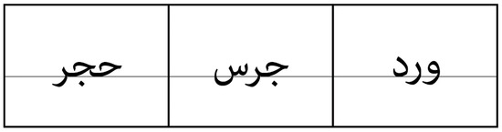
Figure 2.
An illustrative text showing letter connectivity variations. Note: From left to right, fully connected word, partially connected word, and disconnected word; the words translate as Rock, Bell, and Rose.
Conversely, some research studies have reported no adverse effects of letter connectivity on reading performance. A study conducted by Khateb et al. [66] assessed the impact of letter connectivity within words on the visual recognition process in Arabic, where a lexical-decision task test was administered to fifty-eight proficient readers and twenty readers with reading difficulties. The results concluded that there was no detrimental influence of letter connectivity within words on word recognition during reading. Another study by Taha et al. [67] reported a positive effect on reading performance; the findings suggested that instead of hindering reading speed, letter connectivity within words seemed to have a positive impact, particularly during the initial stages of word recognition. In support of these findings, a study comparing visual complexity between Hebrew and Arabic [68] found that letter detection for connected words was superior to non-connected words.
Consistent with these prior findings, a recent experimental study explored the influence of connected words on reading performance in individuals with dyslexia [69]. The results revealed that reading performance was better preserved for connected than non-connected words. While the connectivity of the Arabic script may appear to introduce visual complexity, legibility remains paramount in script connectivity.
2.3.2. Diacritical Marks
Diacritical marks, also known as vocalisation marks, are depicted above or below letters to denote the correct pronunciation, as shown in Figure 3. These diacritical marks are considered to increase the visual and cognitive load during the reading process. Nevertheless, their role is indispensable for precise pronunciation and meaning, particularly for beginner readers, as they aid in disambiguating homographs [70].
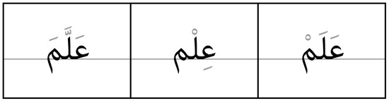
Figure 3.
An illustrative text demonstrating diacritical marks. Note: Reading from left to right, the words signify teach, knowledge, and flag. Although these three words share the same letter sequence (in black), their meanings differ due to the usage of diacritical marks (in grey).
In a study assessing the impact of diacritical marks on reading performance [71], sixty-eight participants were presented with vowelised and non-vowelised paragraphs and lists of words. The results indicated that diacritical marks facilitated word recognition in the Arabic language. Another study was conducted to measure the influence of diacritical marks on reading comprehension [72]; second- and sixth-grade participants were selected and exposed to vowelised and non-vowelised texts. The findings demonstrated that diacritical marks played a significant role in enhancing reading comprehension in both age groups. These prior findings concur that despite introducing visual complexity, diacritical marks are crucial facilitators for enhanced reading performance.
2.3.3. Letterform Variety: Letter Variations, Alternates, and Ligatures
The Arabic script presents visual complexity through diverse letter shapes and multi-letter combinations, classified into three categories: letter variations, alternates, and ligatures. The script inherently transforms letter shapes based on their position within a word, resulting in isolated, initial, medial, and final forms, named single-letter variations, as observed in Figure 4. A study by Friedmann and Haddad-Hanna [73] revealed that letterform variations influence reading errors in dyslexic readers, with migrations necessitating form changes having lower error rates. This finding suggests that the Arabic script’s visual complexity aids in reducing letter position errors during reading.
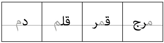
Figure 4.
An illustrative text depicting letter variations for the letter “Mim”. Note: From left to right, the words translate as blood, pen, moon, and meadow. The letter “Mim,” highlighted in grey, undergoes shape alterations depending on its position within the word, transitioning from isolated to final, medial, and initial forms.
The second category involves letter alternates, which contribute to calligraphic aesthetics. These alternates provide additional forms of a letter, chosen based on adjacent letters, as exemplified in Figure 5.
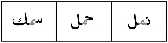
Figure 5.
Various shapes of the medial form of the letter “Mim”. Note: From left to right, words translate as fish, carry, and ants. The medial form of the letter “Mim” in grey colour has different shapes (alternates) depending on adjacent letters.
Ligatures, the third category, enhance calligraphic aesthetics by combining two specific letters into a singular form, as illustrated in Figure 6. While neither alternates nor ligatures are essential for legibility, a study by Chahine [74] found that excessive ligatures can impede legibility.
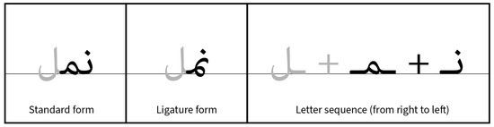
Figure 6.
An exemplary text comparing standard and ligature forms. Note: The word translates as “ants”, with the sequence displayed as follows: letters in standard form, a ligature used to replace initial and medial letters, and the original letter combination separated. The letters “Nun” and “Mim” are highlighted in black.
In summary, the visual implications of the Arabic script encompass letter connectivity in words, diacritical marks, and letterform variety, including variations, alternates, and ligatures. Understanding these aspects is crucial for a practice-based research approach, as they provide the foundation for discussing the results of the visual analysis to evaluate if the visual implication impedes the legibility of the Arabic script in a dyslexic reading experience and whether these aspects can be waived or are mandatory for the script to be legible. The results of the visual analysis generate design considerations for creating a dyslexia-friendly Arabic typeface.
3. The Experiment: A Visual Content Analysis
The main objective of conducting this visual analysis is to identify the letterform features of dyslexia-friendly Latin typefaces. The analysis findings are synthesised with the visual implications of the Arabic script to map the letterform features and ultimately design an Arabic typeface specialised for readers with dyslexia. The Leeuwen framework of typographic distinctive features [75] is used for this visual analysis; the framework consists of eight parameters to describe the visual characteristics of typography: weight, expansion, slope, curvature, connectivity, orientation, regularity, and non-distinctive features. While proposed through the lens of a multimodal theorist, the framework proves effective in describing and examining letterform characteristics within typefaces [76]. It helps in describing the visual elements in typographic designs including typefaces within defined parameters, allowing for a comprehensive analysis of letterform features. Originally developed for analyzing Latin-based typography, the framework’s application without modification in the present study may introduce a two-faced limitation by potentially neglecting nuances specific to legibility studies and cultural variations inherent in the Arabic script, as the current study endeavors to extend its findings to the Arabic context. This means that visual aspects important for legibility are not considered, and nuances specific to the Arabic script could be neglected, leading to an inaccurate mapping process as well as privileging a Western lens.
To address this limitation, this research integrates two supplementary parameters: one pertaining to legibility and the other to the exploration of Arabic as a means of mapping the findings. The first parameter, apertures and counters, draws inspiration from Robert Bringhurst’s work, ‘The Elements of Typographic Style’, where he characterizes aperture as “a gauge of grace or good fortune in typefaces” [77]. In typography, an aperture pertains to the partially enclosed space within letters, while a counter denotes the fully enclosed space within a letter. The rationale behind incorporating this parameter lies in the fact that legibility studies frequently encompass an evaluation of the degree of letterform openness, presented in apertures and counters, as an important variable [78,79,80].
The second parameter, tension and contrast, derives from Andreas Stötzner’s propositions regarding elements within graphic signs, as explained in his work ‘Signography’ [81]. In typography, tension pertains to the juncture where the thin stroke intersects with the thick stroke, while contrast refers to the pronounced disparity between the thinnest and thickest strokes. This parameter holds important relevance as it strongly predicts stroke dynamics, a characteristic prominently evident within the Arabic script. Also, it ensures that a Western lens is not privileged when synthesising the data to the Arabic script. Hence, its inclusion within our research is both imperative and inevitable whilst also presenting an extended Leeuwen framework for consideration and analysis.
3.1. Typeface Sample
Three specific dyslexia-friendly Latin typeface samples are deliberately selected for various reasons, with the primary objective being the introduction of visual diversity and the mitigation of potential bias. The initial typeface in this selection is the FS Me typeface, a typeface expertly crafted by Jason Smith of Typeface Smith Design Studio, a constituent of the Monotype Type Foundry [82]. This typeface, conceived in 2008, was specially commissioned by the learning difficulty charity Mencap. Notably, the foundry itself has hailed this typeface as a ‘benchmark in accessible typeface design’ [82]. The FS Me typeface emerged due to a research initiative by Mencap, drawing upon insights from specialists, design expertise, and rigorous testing with the intended audience [83]. The second typeface is the Sylexiad typeface, a typeface conceived as part of academic research by Hillier [33], an individual with dyslexia. Sylexiad is the product of a series of typeface legibility and readability studies undertaken by its creator. It has been available as an open-source typeface since 2019 [84]. The third typeface, Open Dyslexic, is an open-source and freely available typeface designed by Abelardo Gonzalez, created in 2012 [85]. Notably, this typeface has garnered notable attention in the academic literature, with several studies evaluating its effectiveness [27,30,41]. The selection of these sample typefaces, as shown in Figure 7, is thoughtfully made to encompass a diverse array of typefaces, including those commissioned or research-initiated and those designed by typography specialists or general designers and researchers, regardless of their dyslexia status.
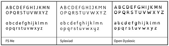
Figure 7.
Alphabet letters are displayed in the sample typefaces.
As the visual content analysis aims to identify the letterform visual features that make a typeface dyslexia-friendly, it is prudent to establish a benchmark to facilitate meaningful conclusions. Therefore, three widely used mainstream typefaces are utilised as benchmarks. These typefaces include Times New Roman (TNR), Courier, and Helvetica [86,87,88]. The choice of these benchmark typefaces is underpinned by their ability to represent a broad spectrum of physical attributes, as depicted in Figure 8; this approach mitigates any stylistic biases by offering a range of stylistic typeface perspectives. It is crucial to highlight that the benchmark typefaces were not selected based on their legibility performance; instead, they represent various stylistic approaches to typefaces for average readers. Specifically, TNR is a serif and a widely used typeface among average readers [89], Courier is a slab serif and monospaced, while Helvetica is sans serif. The benchmark typefaces used are not recommended by the British Dyslexia Association (BDA) for their readability for dyslexic readers because their letterform characteristics are designed for mainstream readers. BDA-recommended typefaces could provide invaluable data due to their visual similarities with the typefaces under investigation. However, this research uses commonly accepted typefaces among the general readership, as they are more likely to yield notable insights.
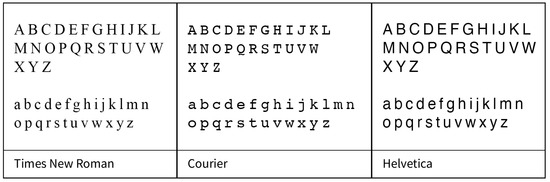
Figure 8.
Typeface samples used as benchmark.
3.2. Method
The modified Leeuwen framework proposed in this study is used for this analysis; a total of ten parameters are employed to systematically analyse the letterform characteristics inherent in dyslexia-friendly Latin typefaces, as visually represented in Figure 9: (1) weight, (2) expansion, (3) slope, (4) curvature, (5) connectivity, (6) orientation, (7) regularity, (8) non-distinctive features, (9) apertures and counters; and (10) tension and contrast.
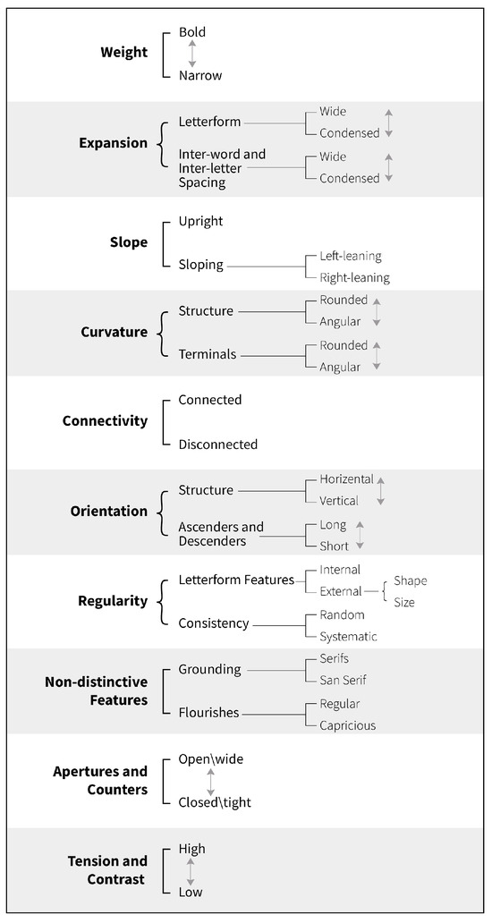
Figure 9.
The modified version of the Leeuwen framework for typography analysis. Note: Curly brackets denote ‘parallel systems’, indicating a ‘both...and’ rule, while square brackets signify binary systems, representing ‘either...or’ options. Double-headed arrows are utilised to indicate graded contrasts and continuums within the modified framework. The last two parameters are the novel additions.
3.3. Procedure
To facilitate a thorough examination of letterforms, the researchers employ Adobe Illustrator, a vector graphics editor program. This choice of software proves advantageous due to its array of tools that assist in the analysis process, including measurement tools, zoom capabilities, and type, character, and paragraph editing features. The sentence ‘The quick brown fox jumps over the lazy dog’ is a recognised pangram for typesetting; it contains all the letters of the alphabet and is presented in sentence case, which helps to improve word recognition and readability compared to all-capital text [90].
The framework’s parameters are carefully analysed to explore the nuances in the letterform features and understand how these features manifest. Each parameter label identifies ‘what’ is happening in the visual aspect of the letterforms, while the parameter description explains ‘how’ the design choices appear. To facilitate precise visual comparisons between typefaces, the x-height (the height for all the small letters [58]) is equated to 40 pt (all measurements are ratios measured to the equated x-height), which isolates other typographical attributes like letter shapes, stroke widths, and ascenders/descenders for evaluation [91]. This focused examination enables a comprehensive analysis of the unique characteristics of each typeface, allowing for accurate and objective evaluations of different typefaces.
3.4. Findings
3.4.1. Parameter (1): Weight
The weight parameter refers to the thickness of a typeface’s strokes, particularly the standing stems of letters such as b, d, f, h, I, k, and l. While typefaces may appear to have the same weight, close examination reveals subtle variations. To address this, our study focused on a select group of prominent letters with standing stems in each typeface to promote meaningful comparisons and reduce inconclusive data.
As depicted in Figure 10, TNR is the boldest typeface with the most substantial stroke width, while Sylexiad is the narrowest. FS Me is the second boldest, closely behind TNR. Helvetica and Courier have nearly identical stroke widths, with Courier being slightly narrower in two instances. The Open Dyslexic typeface has a unique visual structure that results in mid-range weight variations.
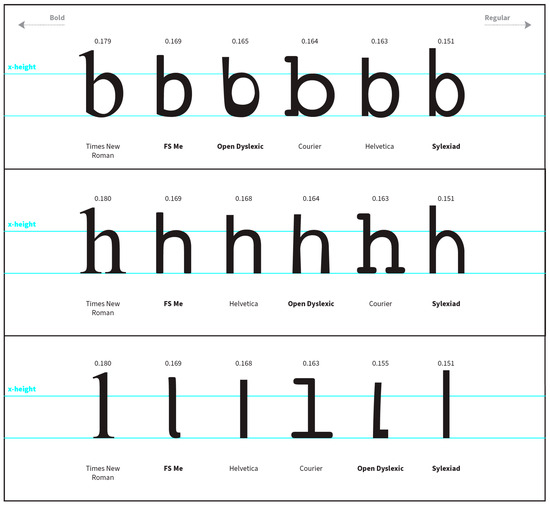
Figure 10.
Examination of weight for the letters ‘b’, ‘h’, and ‘l’. Note: The numbers depicted in the figure represent ratios measured to the equated x-height of 40 pt. The higher the ratio, the thicker the weight of the standing stem relative to the x-height.
3.4.2. Parameter (2): Expansion
The expansion parameter encompasses considerations related to both the width of the letterform and the broader concept of inter-word and inter-letter spacing in typography. In evaluating letterform width, this study focuses on three specific letter samples: ‘o’, ‘v’, and ‘z’, each presenting distinct visual constructions. These letters were deliberately chosen due to their varied visual elements, incorporating round, diagonal, and horizontal lines, thereby enabling a comprehensive exploration of diverse outcomes within this parameter.
Among the typefaces under examination, TNR and Courier exhibit the widest letterforms, consistently presenting the broadest letters across the ‘o’, ‘v’, and ‘z’ samples, encompassing round, diagonal, and horizontal letter structures. Conversely, the FS Me typeface consistently maintains the narrowest width across all letter samples. In contrast, Sylexiad, Open Dyslexic, and Helvetica demonstrate closely aligned letterform widths, with their measurements consistently falling within the mid-range when compared to one another, as visually represented in Figure 11.
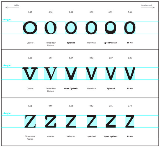
Figure 11.
Evaluation of letterform width for the letters ‘o’, ‘v’, and ‘z’. Note: The numbers depicted in the figure represent ratios measured to the equated x-height of 40 pt. The higher the ratio, the wider the letter relative to the x-height.
Upon initial observation, it becomes evident that the inter-word spacing within Courier and Open Dyslexic presents a notably wider appearance in contrast to TNR, which exhibits a more condensed spacing relative to the other typeface samples. Helvetica, following in the footsteps of TNR, displays an inter-word spacing of moderate width. In contrast, Sylexiad and FS Me fall within the category of wider spacing, as visually presented in Figure 12.
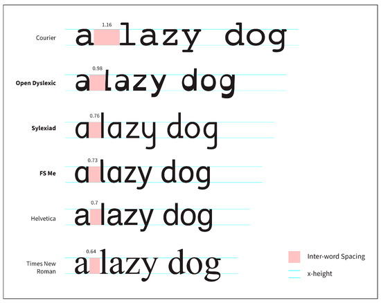
Figure 12.
Comparing the inter-word spacing. Note: The numbers depicted in the figure represent ratios measured to the equated x-height of 40 pt. The higher the ratio, the wider the space between words relative to the x-height.
Similarly, the inter-letter spacing closely mirrors the inter-word spacing, except for the wider spacing observed in Courier compared to Open Dyslexic, as indicated in Figure 13. TNR consistently maintains the most condensed spacing, even within inter-letter spacing. Helvetica, meanwhile, retains a spacing that falls within the moderate range. In contrast, Sylexiad and FS Me occupy the spectrum characterised by wider inter-letter spacing.
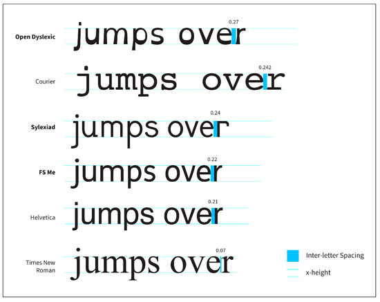
Figure 13.
Comparing the inter-letter spacing. Note: The numbers depicted in the figure represent ratios measured to the equated x-height of 40 pt. The higher the ratio, the wider the space between letters relative to the x-height.
3.4.3. Parameter (3): Slope
The parameter of slope refers to the tilt or angle of the typeface relative to the baseline. To ensure accurate comparisons, letters featuring standing stems, specifically ‘b’, ‘h’, and ‘l’, have been selected for this analysis. A preliminary examination reveals that all typeface samples, except for Open Dyslexic, feature upright standing letters. To verify this observation, measurements of the angles of the standing stems in relation to the baseline are undertaken, as depicted in Figure 14.
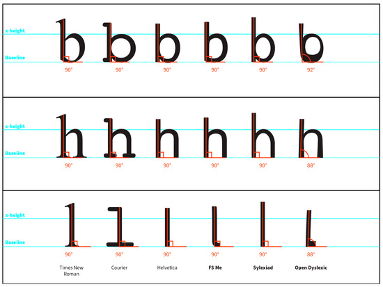
Figure 14.
Comparing the slope parameter of letters ‘b’, ‘h’, and ‘l’.
TNR, Courier, Helvetica, Sylexiad, and FS Me are typically upright typefaces, displaying no discernible slope and maintaining a right angle. In contrast, Open Dyslexic presents a distinctive rightward slope, except for the letter ‘b’, which slopes to the left.
3.4.4. Parameter (4): Curvature
Curvature pertains to the degree of roundness or angularity within letterforms, prominently influencing a typeface’s overall visual aesthetic and terminal design treatment. Upon examining the overall shapes of letterforms, as depicted in Figure 15, it becomes apparent that Open Dyslexic is notable for its emphasis on angularity. In contrast, FS Me prioritises curvature in its design.
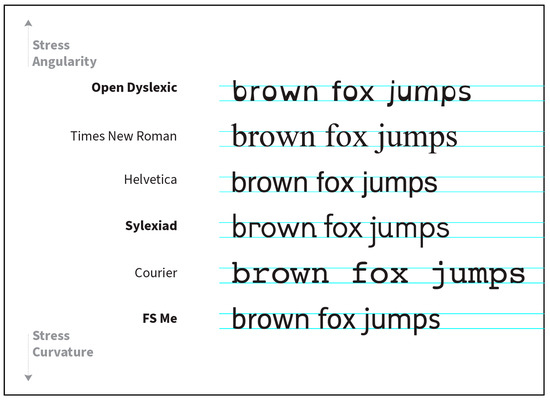
Figure 15.
Comparison of overall curvature.
A closer inspection of specific letters, such as ‘k’, ‘v’, and ‘w’, reveals distinct levels of curviness in various structural elements, as sequentially shown in Figure 16. Sylexiad and Helvetica maintain a moderate degree of curvature, with Helvetica leaning more towards angularity. In contrast, Courier adopts a general aesthetic that emphasises curvature and minimises angularity, mainly attributable to rounded serifs. This leads to a discussion of the second aspect of curvature, terminal treatment, in the subsequent paragraph.
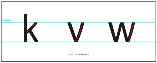
Figure 16.
Curved elements in letters ‘k’, ‘v’, and ‘w’ in the FS Me typeface.
Regarding the terminal treatment of ascenders, descenders, and letter tails, a representative sample encompassing the letters ‘a’, ‘c’, ‘j’, and ‘t’ is chosen to ensure equitable comparisons. Since TNR and Courier fall under the category of Serifed typefaces, the selected letters are the only ones featuring terminals that do not conclude with a serif. As observed in Figure 17, it becomes evident that only Courier and FS Me feature a rounded terminal design treatment, while the remaining typefaces exhibit an angular terminal design.
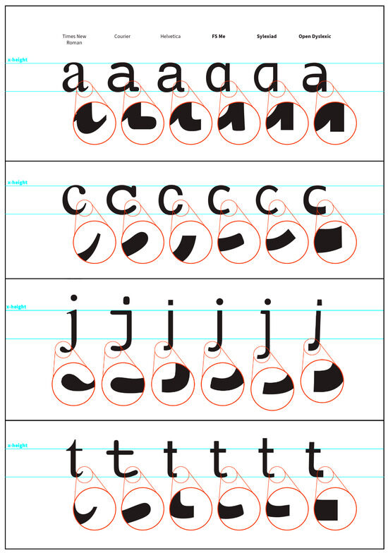
Figure 17.
Comparison of terminal design treatment in letters ‘a’, ‘c’, ‘j’, and ‘t’.
3.4.5. Parameter (5): Connectivity
The connectivity parameter concerns how letters and words are linked when the typeface is employed within a text block. As clearly illustrated in Figure 18, none of the sampled typefaces exhibit any form of connectivity. There is a conspicuous absence of letter-to-letter connectivity within words and word-to-word connectivity within sentences.
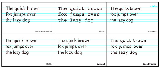
Figure 18.
Comparison of typeface connectivity.
3.4.6. Parameter (6): Orientation
Within this parameter, our examination of the selected typeface samples adopts a dual perspective on orientation. The initial perspective focuses on overall orientation, determining whether a typeface predominantly aligns horizontally (anchored to the baseline) or vertically (extending upward). As Figure 19 illustrates, Courier and Open Dyslexic, followed by Helvetica, notably demonstrate a horizontal overall orientation. In contrast, TNR and FS Me typefaces, along with Sylexiad to a lesser extent, tend to exhibit a more vertical overall orientation.
Figure 19.
Comparison of typeface orientation.
The second perspective examines the relative length of ascenders and descenders in relation to the x-height. As illustrated in Figure 20, we assess two letters with ascenders (‘d’ and ‘h’) and two letters with descenders (‘p’ and ‘y’) by utilising the ruler tool to ensure precision in our evaluation. A clear pattern emerges: FS Me, TNR, and Sylexiad feature ascenders and descenders of greater length, with Sylexiad showcasing the most elongated ascenders and descenders. Conversely, Courier, Open Dyslexic, and Helvetica exhibit shorter ascenders and descenders, with Helvetica representing the typeface with the most abbreviated ascenders and descenders.
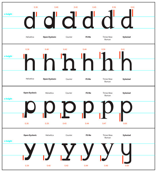
Figure 20.
Comparison of typeface orientation by examining ascenders and descenders of ‘d’, ‘h’, ‘p’, and ‘y’. Note: The numbers depicted in the figure represent ratios measured to the equated x-height of 40 pt. The higher the ratio, the longer the ascender\descender relative to the x-height.
3.4.7. Parameter (7): Regularity
Regularity in typeface design involves assessing patterns and irregularities from internal (e.g., stroke thickness) and external (e.g., size and shape). Initially, irregularities appeared in Open Dyslexic but were later found in Sylexiad and FS Me typefaces. Open Dyslexic displays uneven stroke thickness, following a consistent pattern, notably in ‘u’ and ‘i’. In contrast, Sylexiad, FS Me, Helvetica, Courier, and TNR maintain uniform stroke widths, as depicted in Figure 21.
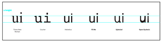
Figure 21.
Comparing internal features of letterforms.
Externally, all typefaces maintain consistent letter sizing but deviate in shape. Sylexiad introduces irregularities with slabbed serifs in ‘q’, ‘u’, ‘n’, and ‘d’, as illustrated in Figure 22, while Open Dyslexic adds distinctive elements to ‘q’ and ‘l’.
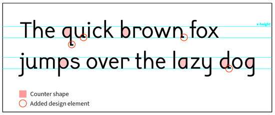
Figure 22.
Analysis of regularity of Sylexiad.
Likewise, Open Dyslexic also exhibits a proportionate number of irregularities. In addition to its internal regularity in stroke width, the letters ‘q’ and ‘l’ incorporate supplementary design elements that distinguish them from the remaining letters, as illustrated in Figure 23.
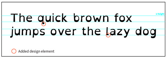
Figure 23.
Analysis of regularity of Open Dyslexic.
An additional observation emerges upon a more comprehensive analysis of each individual typeface sample and a cross-comparison of the various typeface samples. It is revealed that TNR, Courier, Helvetica, and Open Dyslexic use a double story ‘a’, while FS Me and Sylexiad opt for a single-story ‘a’ as shown in Figure 24.
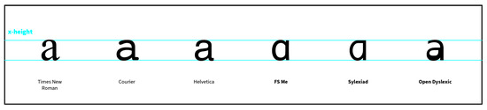
Figure 24.
The Use of different shapes of the letter ‘a’.
3.4.8. Parameter (8): Non-Distinctive Features
The parameter of non-distinctive features encompasses the classification of the typeface’s style, including attributes such as whether it adheres to a specific category like serif or sans-serif, or whether any decorative flourishes are incorporated, appearing capriciously or regularly. As demonstrated in Figure 25, the distinction is readily apparent: Open Dyslexic, FS Me, Sylexiad, and Helvetica are categorised as sans-serif typefaces. Conversely, TNR and Courier fall within the serif category. To be more specific, TNR features transitional serifs, while Courier adopts rounded slab serifs.
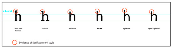
Figure 25.
Comparing the non-distinctive features.
3.4.9. Parameter (9): Apertures and Counters
This new parameter involves the assessment of letterform openness concerning apertures and counters. An aperture signifies the space between two strokes, as exemplified in the letter ‘c’, while a counter refers to the space enclosed by the strokes within a letter, as seen in the letter ‘o’. To avoid redundancy in data, a pair of letter samples is selected for both the aperture and counter aspects. Specifically, the letters ‘c’ and ‘e’ are chosen for aperture examination, while ‘o’ and ‘b’ are selected to assess counters. As depicted in Figure 26, a distinct pattern emerges where FS Me, Sylexiad, and Open Dyslexic exhibit typefaces with open apertures, which is particularly evident in the letter ‘c’. In contrast, TNR, Courier, and Helvetica tend to feature a more closed aperture range.
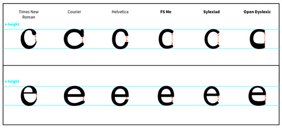
Figure 26.
Comparing letterform aperture of ‘c’ and ‘e’.
When considering the counter space aspect, it becomes apparent that there exists a relatively subtle disparity in counter space among typefaces falling within the middle range. Nevertheless, it is noteworthy that Open Dyslexic notably exhibits the tightest counter space, plausibly due to its inherent heavy bottom letter feature. Conversely, Courier displays the widest counter space, likely attributed to its monospaced characteristic, as highlighted in letters ‘o’ and ‘b’ in Figure 27. FS Me, TNR, Sylexiad, and Helvetica are situated within this middle range, with the latter boasting the most expansive counter space.
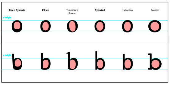
Figure 27.
Comparing letterform counter space of ‘o’ and ‘b’.
3.4.10. Parameter (10): Tension and Contrast
This further new parameter explores stroke attributes generated by the pen’s motion, including tension (the convergence of the thickest and thinnest strokes) and contrast (progression from boldest to finest stroke). The letter ‘v’ is the focus, exemplifying stroke movement dynamics. Its downward diagonal arm is the thickest stroke, while the opposing arm embodies the thinnest stroke, reflecting tension and contrast.
The examination reveals a notable difference: TNR displays the highest tension and stroke contrast, as depicted in Figure 28, while Helvetica, Courier, FS Me, Open Dyslexic, and Sylexiad exhibit minimal to negligible tension and contrast in their stroke dynamics.
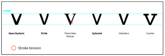
Figure 28.
Comparing tension and contrast.
4. Discussion
The visual analysis of dyslexia-friendly typefaces, including Open Dyslexic, Sylexiad, and FS Me, provides valuable insights into how these typefaces address the specific needs of individuals with dyslexia. This study successfully achieved its first objective by identifying the letterform features of these dyslexia-friendly Latin typefaces, as summarised in Table 1. However, it is essential to note that the findings did not reveal a consensus on visual similarities among the typefaces, given that different individuals with diverse perspectives and objectives created each typeface, as discussed in Section 3.1.

Table 1.
Letterform features of the sampled dyslexia-friendly typefaces.
Section 4 examines key findings and their implications, shedding light on how these typefaces cater to the challenges faced by dyslexic readers, as well as how the features map to the Arabic script.
4.1. Typeface Weight, Expansion, and Slope
Stroke variability and weight distribution are critical considerations in dyslexia-friendly typefaces. Open Dyslexic’s heavier bottom letters aim to reduce letter migration, a common issue for dyslexic readers [24,25]. However, the uneven stroke width within Open Dyslexic may pose readability challenges and may not appeal to a wider audience. In contrast, Sylexiad and FS Me opt for a more uniform stroke, creating a more straightforward and softer aesthetic that reduces visual and cognitive load. Additionally, all typefaces have upright letters (except for Open Dyslexic), arguably to decrease any visual disturbance by visually communicating the letters’ shape in a readable and straightforward style.
Although the present analysis did not find letter width a notable attribute for dyslexia-friendly typefaces, research suggests that broader letterforms may enhance letter recognition [92]. Although this inconsistency highlights the need for ongoing research in dyslexia-friendly typography, it posed no setbacks in this study. This is because the concept of letter width cannot correlate to the Arabic script due to its connected nature, making it irrelevant to the study’s objectives. However, it is essential to acknowledge that stroke aesthetics and variability are strong predictors in the Arabic script. Therefore, the proposed design approach should adopt a moderate to lighter stroke weight. With regard to the slope aspect, the Arabic script has minimal slope due to its calligraphic background. However, adopting a non-sloping design choice will not affect the script’s functionality or aesthetics.
4.2. Curvature, Connectivity, and Orientation
The results of the visual analysis shed light on aspects of letterform design crucial for dyslexic readers. All examined typefaces follow a sans-serif style, chosen for its simplicity. Measures to enhance readability include rounded shapes to accentuate curvature and making unconnected typefaces, unlike script typefaces. Long ascenders and descenders help recognise words and reduce crowding in Latin scripts [93,94]. However, this technique may not be as effective for the Arabic script due to its visually linear aesthetic and could disrupt the flow of eye movements along the string of connected letters.
4.3. Regularity and Non-Distinctive Features
Examining the regularity of letterform shapes emphasises the balance between consistent design principles and incorporating unique elements for visually similar letters. While the sampled typefaces generally adhere to the sans-serif style for minimalism, indicating a preference for simpler aesthetics, Sylexiad and Open Dyslexic intentionally add design elements to differentiate visually similar letterforms that highlight the importance of letter recognition in a dyslexic reading experience. However, it may not be feasible to add a design element to Arabic letters due to their expanded shape and variations, which would compromise the script’s consistent design aesthetic. Instead, a simplified Naskh style can enhance the reading experience as confirmed by Chahine [74]; a Naskh style in writing Arabic uses thin lines and round letters [95]. Also, incorporating larger dots for certain letters can offer visual cues in Arabic typography.
4.4. Aperture and Counter Design
The analysis of typeface openness through aperture and counter assessments reveals attributes that enhance readability for dyslexic readers. Typefaces with open apertures like FS Me and Sylexiad support better character recognition. This design choice aligns with prior research by Beier and Oderkerk [78], emphasising the readability benefits of open apertures in typefaces. Open counters also improve letter recognition. Furthermore, the analysis conducted on the Sylexiad typeface highlighted counters as a design attribute, whereas the FS Me typeface had moderately sized counters. In contrast, Open Dyslexic had the most closed counters due to its non-uniform stroke and weight distribution, which mainly existed in the bottom half of the letters. The analysis of counters revealed that the findings from Sylexiad and FS Me typefaces support the argument in the existing literature that open counters enhance letter recognition [78]. Therefore, both attributes will be mapped to the Arabic script by adopting open counters as well as apertures for the typeface prototype design.
4.5. Tension and Contrast in Stroke Movement
The analysis of stroke movement shows that dyslexia-friendly typefaces prioritise minimal tension and contrast to reduce visual and cognitive load. TNR is a typeface that has high contrast and tension, which gives it a distinctive style. However, for readers with dyslexia, it can be difficult to read. Typefaces like FS Me, Open Dyslexic, and Sylexiad are designed to have minimal tension and contrast, making them simpler to read and reducing visual and cognitive load for readers with dyslexia. However, tension and contrast are important in Arabic typography due to its calligraphic background; nevertheless, careful consideration is required to preserve the script’s calligraphic spirit and ensure readability.
4.6. The Visual Implications of the Arabic Script
The visual analysis of Latin typefaces informs the design of an Arabic dyslexia-friendly typeface. However, specific visual implications of Arabic, such as letter connectivity and diacritical marks, cannot be directly mapped from Latin typefaces. Diacritical marks serve a vital role in Arabic, clarifying pronunciations and meanings. The complexity of letter shape variations is addressed by simplifying letter variations while maintaining the main structure. The visual analysis of the Latin typefaces generally informs the visual aesthetics of the novel Arabic typeface. However, revisiting the visual implications discussed in the literature review is important. The three main implications discussed were letter connectivity, diacritical marks, and letter shape-shifting situations. The first implication highlights the inherently connected nature of the Arabic script, which is crucial for its functionality and readability. Consequently, the findings regarding connectivity from the visual analysis could not be directly applied to the Arabic script.
The second visual implication concerns the presence of diacritical marks and their potential to create visual complexity. In contrast to Latin dyslexia typefaces, which prioritise simplicity, diacritical marks play a crucial role in Arabic orthography. They enhance reading by clarifying word pronunciations and meanings, particularly due to the deep nature of the Arabic orthography. To simplify the visual aesthetics by not including the diacritical marks is considered unreasonable, specifically in a dyslexic reading experience. To design the Arabic typeface, diacritical marks are included in the design.
The third visual implication is the shapeshifting nature of the Arabic letters and their variations, alternates, and ligatures. While letter variations are necessary for the script to function, and the two other categories add aesthetic value to the text, only the letter variations are included in the prototype design. This is because the Arabic script is inherently connected, and it is inevitable that letters change shapes depending on their sequence in a word. Therefore, to maintain the main structure of the letter throughout the variations, a simplified version of the letter variation can be considered.
4.7. Proposed Letterform Features
The insights from the visual analysis of the three dyslexia-friendly typefaces (FS Me, Sylexiad, and Open Dyslexic) provide a valuable understanding of the letterform features in such typefaces. The variations in design attributes among these typefaces can be attributed to their different designers, backgrounds, and purposes. This underscores the diversity of design approaches to achieve the common goal of improving the reading experience for individuals with dyslexia. As seen in Figure 29, each typeface addresses issues like visual crowding, letter confusion, and disruption differently. Open Dyslexic focuses on stroke weight distribution to minimise letter disruption with heavier bottoms, while FS Me and Sylexiad prioritise open apertures and distinctive elements for improved readability. Various design treatments, such as open counters and apertures, longer ascenders and descenders, and a rounded design approach, are employed to combat letter crowding and confusion. It is essential to note that these design treatments are not strictly applied but balanced to enhance overall readability.
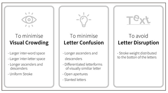
Figure 29.
Design strategies used to design dyslexia-friendly typefaces.
Furthermore, the discussion of visual analysis findings within the context of Arabic script implications provides a set of principles and references for designing a dyslexia-friendly Arabic typeface. The identified letterform features are summarised as follows and serve as a design brief for the typeface prototype, which is designed as part of the larger practice-based study. Figure 30 depicts an initial prototype of the typeface design, which provides an overview of the Arabic typeface structure and letterform feature; the prototype can serve as a design guideline for the design of accessible Arabic typefaces:
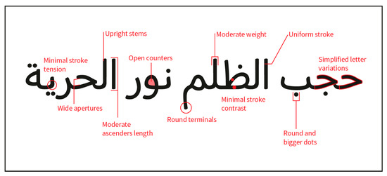
Figure 30.
Initial sketch of proposed letterform features. Note: The sentence translates as ‘injustice blocked the light of freedom’.
- Uniform and moderate stroke weight.
- Minimal stroke tension and contrast.
- Upright letters with open apertures and counters.
- Moderate length for ascenders and descenders to maintain text flow.
- Larger dots for visual cues and letter differentiation.
- Rounded overall aesthetic and terminals to reduce visual complexity.
- Simplified letter variations by retaining one main structure throughout.
5. Limitation of This Study
This study employed a visual content analysis methodology, a process prone to subjectivity and potentially yielding unreliable data, as suggested by previous researchers [96,97,98]. This inherent limitation stems from the interpretive nature of visual content analysis, where researchers’ sample selection, perceptions, and biases may influence the analysis process. To address this concern and enhance the credibility of our findings, we propose a successive study involving a focus group of participants with dyslexia. By presenting the recommendations generated from the initial analysis to this group, we aim to mitigate subjectivity and increase the reliability of our results. Engaging directly with individuals affected by dyslexia provides valuable insights, ensuring that our recommendations are informed by their perspectives and experiences, thus strengthening the robustness of our conclusions.
6. Conclusions
This study analysed dyslexia-friendly Latin typefaces to identify their letterform features and determine their applicability to Arabic script. The study provides design guidance for creating aesthetically appealing and accessible type designs for readers with dyslexia and other user groups with specific design needs. It also contributes to discussions on accessibility and inclusive design, emphasising the importance of accommodating diverse readers’ preferences and needs.
The present research is one of the developmental phases of designing an Arabic typeface for the dyslexic reader. The larger practice-based study sets out to design the Arabic typeface by mapping letterform characteristics of existing and academically validated dyslexia-friendly Latin typefaces. The findings of the analysis aid the researcher/designer in developing further design principles and considerations to create an Arabic dyslexia-friendly typeface, which will be evaluated through a series of reading tests with dyslexic readers.
7. Future Research
To advance our understanding, future research in this field should explore uncharted avenues, delving deeper into design requirements for typefaces serving individuals with low vision. Additionally, studies should incorporate larger and more diverse typeface samples, employing various research methodologies to identify accessible letterform features. These efforts will significantly contribute to the evolving knowledge in this field.
The next step in this study involves utilising the prototype typeface as a conversation facilitator in focus groups to gather design feedback to inform future development. The creation of this accessible Arabic typeface is a remarkable stride towards inclusivity and improved readability for individuals with dyslexia in the Arab region. It empowers those with dyslexia, raises awareness, and promotes accessible design practices, embracing a neglected area and fostering a more inclusive and equitable society.
Author Contributions
Conceptualization, M.M.H. and A.J.T.; methodology, M.M.H.; validation, M.M.H. and A.J.T.; formal analysis, M.M.H. and A.J.T.; writing—original draft preparation, M.M.H.; writing—review and editing, A.J.T.; visualization, M.M.H.; supervision, A.J.T.; project administration, M.M.H. and A.J.T. All authors have read and agreed to the published version of the manuscript.
Funding
This research received no external funding.
Institutional Review Board Statement
Not applicable.
Informed Consent Statement
Not applicable.
Data Availability Statement
Data is contained within the article.
Conflicts of Interest
The authors declare no conflict of interest.
References
- Lid, I.M. Universal Design and Disability: An Interdisciplinary Perspective. Disabil. Rehabil. 2014, 36, 1344–1349. [Google Scholar] [CrossRef] [PubMed]
- Clarkson, P.J.; Coleman, R.; Keates, S.; Lebbon, C. Inclusive Design: Design for the Whole Population, 2nd ed.; Springer Science & Business Media: London, UK, 2003. [Google Scholar] [CrossRef]
- Clarkson, P.J.; Coleman, R. History of Inclusive Design in the UK. Appl. Ergon. 2015, 46, 235–247. [Google Scholar] [CrossRef] [PubMed]
- Bessemans, A. Matilda: A Typeface for Children with Low Vision. In Digital Fonts and Reading; Dyson, M.C., Suen, C.Y., Eds.; World Scientific Publishing Co.: Singapore, 2016; pp. 19–36. [Google Scholar] [CrossRef]
- Sassoon, R. Computers and Typography 2; Intellect, Limited: Bristol, UK, 2013. [Google Scholar]
- Nini, P. Typography and the Aging Eye: Typeface Legibility for Older Viewers with Vision Problems. Medium. 2006. Available online: https://pjn123.medium.com/typography-and-the-aging-eye-typeface-legibility-for-older-viewers-with-vision-problems-5ba61ecee08b (accessed on 25 March 2024).
- Rack, J.P. Assessment of Phonological Skills and Their Role in The Development of Reading and Spelling Skills. In The Psychological Assessment of Reading; Beech, J., Singleton, C., Eds.; Routledge: London, UK, 1997; pp. 124–142. [Google Scholar]
- Nicolson, R.I.; Fawcett, A. Dyslexia, Learning, and the Brain, 1st ed.; MIT Press: Cambridge, MA, USA, 2010. [Google Scholar]
- Vellutino, F.R. Dyslexia: Theory and Research; MIT Press: Cambridge, UK, 1979. [Google Scholar]
- Shaywitz, S.E. Dyslexia. Sci. Am. 1996, 275, 98–104. [Google Scholar] [CrossRef] [PubMed]
- Rose, J. Identifying and Teaching Children and Young People with Dyslexia and Literacy Difficulties: An Independent Report; Department for Children, Schools and Families: London, UK, 2009. [Google Scholar]
- Singleton, C.; Henderson, L.M. Computerized Screening for Visual Stress in Children with Dyslexia. Dyslexia 2007, 13, 130–151. [Google Scholar] [CrossRef] [PubMed]
- Cornelissen, P.; Bradley, L.; Fowler, S.; Stein, J. What children see affects how they read. Dev. Med. Child Neurol. 1991, 33, 755–762. [Google Scholar] [CrossRef] [PubMed]
- Evans, B.J.W.; Patel, R.; Wilkins, A.J.; Lightstone, A.; Eperjesi, F.; Speedwell, L.; Duffy, J. A review of the management of 323 consecutive patients seen in a specific learning difficulties clinic. Ophthalmic Physiol. Opt. 1999, 19, 454–466. [Google Scholar] [CrossRef] [PubMed]
- Callens, M.; Whitney, C.; Tops, W.; Brysbaert, M. No deficiency in left-to-right processing of words in dyslexia but evidence for enhanced visual crowding. Q. J. Exp. Psychol. (2006) 2013, 66, 1803–1817. [Google Scholar] [CrossRef] [PubMed]
- Moll, K.; Jones, M. Naming fluency in dyslexic and nondyslexic readers: Differential effects of visual crowding in foveal, parafoveal, and peripheral vision. Q. J. Exp. Psychol. (2006) 2013, 66, 2085–2091. [Google Scholar] [CrossRef] [PubMed]
- Montani, V.; Facoetti, A.; Zorzi, M. The effect of decreased interletter spacing on orthographic processing. Psychon. Bull. Rev. 2014, 22, 824–832. [Google Scholar] [CrossRef]
- Moores, E.; Cassim, R.; Talcott, J.B. Adults with dyslexia exhibit large effects of crowding, increased dependence on cues, and detrimental effects of distractors in visual search tasks. Neuropsychologia 2011, 49, 3881–3890. [Google Scholar] [CrossRef][Green Version]
- Perea, M.; Panadero, V.; Moret-Tatay, C.; Gómez, P. The effects of inter-letter spacing in visual-word recognition: Evidence with young normal readers and developmental dyslexics. Learn. Instr. 2012, 22, 420–430. [Google Scholar] [CrossRef]
- Pernet, C.; Valdois, S.; Celsis, P.; Démonet, J.F. Lateral masking, levels of processing and stimulus category: A comparative study between normal and dyslexic readers. Neuropsychologia 2006, 44, 2374–2385. [Google Scholar] [CrossRef] [PubMed]
- Spinelli, D.; De Luca, M.; Judica, A.; Zoccolotti, P. Crowding Effects on Word Identification in Developmental Dyslexia. Cortex 2002, 38, 179–200. [Google Scholar] [CrossRef] [PubMed]
- Zorzi, M.; Barbiero, C.; Facoetti, A.; Lonciari, I.; Carrozzi, M.; Montico, M.; Bravar, L.; George, F.; Pech-Georgel, C.; Ziegler, J.C. Extra-large letter spacing improves reading in dyslexia. Proc. Natl. Acad. Sci. USA 2012, 109, 11455–11459. [Google Scholar] [CrossRef] [PubMed]
- Gori, S.; Facoetti, A. How the visual aspects can be crucial in reading acquisition: The intriguing case of crowding and developmental dyslexia. J. Vis. 2015, 15, 8. [Google Scholar] [CrossRef] [PubMed]
- Friedmann, N.; Gvion, A. Letter Position Dyslexia. Cogn. Neuropsychol. 2001, 18, 673–696. [Google Scholar] [CrossRef] [PubMed]
- Friedmann, N.; Haddad-Hanna, M. Types of Developmental Dyslexia in Arabic. In Handbook of Arabic Literacy: Insights and Perspectives, 9th ed.; Saiegh-Haddad, E., Joshi, R.M., Eds.; Springer: Dordrecht, The Netherlands, 2014; pp. 119–151. [Google Scholar] [CrossRef]
- Bachmann, C.; Mengheri, L. Dyslexia and Fonts: Is a Specific Font Useful? Brain Sci. 2018, 8, 89. [Google Scholar] [CrossRef] [PubMed]
- Böttger, H.; Dose, J.; Müller, T. Contrast and font affect reading speeds of adolescents with and without a need for language-based learning support. Train. Lang. Cult. 2017, 1, 39–55. [Google Scholar] [CrossRef]
- Leeuw, R.D. Special Font for Dyslexia? University of Twente: Enschede, The Netherlands, 2010. [Google Scholar]
- Pijpker, T. Reading Performance of Dyslexics with a Special Font and a Colored Background; University of Twente: Enschede, The Netherlands, 2013. [Google Scholar]
- Zikl, P.; Bartošová, I.K.; Víšková, K.J.; Havlíčková, K.; Kučírková, A.; Navrátilová, J.; Zetková, B. The Possibilities of ICT Use for Compensation of Difficulties with Reading in Pupils with Dyslexia. Procedia-Soc. Behav. Sci. 2015, 176, 915–922. [Google Scholar] [CrossRef]
- Laddusaw, S.; Brett, J. Dyslexia-friendly fonts: Using Open Dyslexic to increase exhibit access. Coll. Res. Libr. News 2019, 80, 33. [Google Scholar] [CrossRef]
- Brunswick, N.; McDougall, S.; de Mornay Davies, P. Reading and Dyslexia in Different Orthographies; Taylor & Francis Group: Hove, UK, 2010. [Google Scholar]
- Hillier, R. Sylexiad. A typeface for the adult dyslexic reader. J. Writ. Creat. Pract. 2008, 1, 275–291. [Google Scholar] [CrossRef] [PubMed]
- Franzen, L.; Stark, Z.; Johnson, A. The Dyslexia Font OpenDyslexic Facilitates Visual Processing of Text and Improves Reading Comprehension in Adult Dyslexia. Ann. Eye Sci. 2019, 4, AB004. [Google Scholar] [CrossRef]
- Bachmann, C. Can a Font Be Considered a Compensating Tool for Readers with Dyslexia? Dyslexia. Ital. J. Clin. Appl. Res. 2013, 2, 25–38. [Google Scholar]
- Mengoni, V.; Castagna, L.M. Comparison between Reading Performances of Children with Specific Learning Disabilities and Learning Difficulties by Using Times New Roman and EasyReading Writing Font. Dyslexia. Ital. J. Clin. Appl. Res. 2020, 1. [Google Scholar] [CrossRef]
- Meindertsma, J. The Power of Typefaces: Dyslexie; Academic Press Leiden, Elsevier: Amsterdam, The Netherlands, 2016; Volume 2016, pp. 56–59. [Google Scholar]
- Rello, L.; Baeza-Yates, R. Good Fonts for Dyslexia; Association for Computing Machinery: New York, NY, USA, 2013; pp. 1–8. [Google Scholar]
- Galliussi, J.; Perondi, L.; Chia, G.; Gerbino, W.; Bernardis, P. Inter-letter spacing, inter-word spacing, and font with dyslexia-friendly features: Testing text readability in people with and without dyslexia. Ann. Dyslexia 2020, 70, 141–152. [Google Scholar] [CrossRef] [PubMed]
- Marinus, E.; Mostard, M.; Segers, E.; Schubert, T.A.-O.; Madelaine, A.; Wheldall, K. A Special Font for People with Dyslexia: Does it Work and, if so, why? Dyslexia 2016, 22, 233–244. [Google Scholar] [CrossRef] [PubMed]
- Wery, J.J.; Diliberto, J.A. The effect of a specialized dyslexia font, OpenDyslexic, on reading rate and accuracy. Ann. Dyslexia 2017, 67, 114–127. [Google Scholar] [CrossRef]
- Kuster, S.M.; van Weerdenburg, M.; Gompel, M.; Bosman, A.M.T. Dyslexie font does not benefit reading in children with or without dyslexia. Ann. Dyslexia 2018, 68, 25–42. [Google Scholar] [CrossRef] [PubMed]
- Benmarrakchi, F.; El Kafi, J.; Elhore, A.; Haie, S. Exploring the use of the ICT in supporting dyslexic students’ preferred learning styles: A preliminary evaluation. Educ. Inf. Technol. 2017, 22, 2939–2957. [Google Scholar] [CrossRef]
- Alhazzaa, S. Arabic font for People with Dyslexia. Available online: https://www.behance.net/gallery/53149095/Arabic-font-for-People-with-Dyslexia (accessed on 7 September 2022).
- Benmarrakchi, F.; El Kafi, J. Investigating Reading Experience of Dyslexic Children Through Dyslexia-Friendly Online Learning Environment. Int. J. Inf. Commun. Technol. Educ. 2021, 17, 105–119. [Google Scholar] [CrossRef]
- Yamada, S.; Zhu, X. A Research on Readable Japanese Typography for Dyslexic Children and Students: Creating Japanese Typefaces for Dyslexic Readers. Bull. Cent. Adv. Sch. Educ. Evid. -Based Res. 2018, 3, 50–70. [Google Scholar]
- Zhu, X.; Kageura, K. Research on Japanese typefaces and typeface customisation system designed for readers with developmental dyslexia. In Design Revolutions: IASDR 2019 Conference Proceedings. Volume 4: Learning, Technology, Thinking. Manchester Metropolitan University; Evans, M., Shaw, A., Na, J., Eds.; Manchester Metropolitan University: Manchester, UK, 2020; ISBN 978-1-910029-62-6. [Google Scholar]
- Dehaene, S.; Cohen, L. The unique role of the visual word form area in reading. Trends Cogn. Sci. 2011, 15, 254–262. [Google Scholar] [CrossRef] [PubMed]
- Dehaene, S. Reading in the Brain: The New Science of How We Read; Penguin Publishing Group: East Rutherford, NJ, USA, 2009. [Google Scholar]
- Ziegler, J.; Perry, C.; Ma-Wyatt, A.; Ladner, D.; Schulte-Körne, G. Developmental Dyslexia in Different Languages: Language-specific or Universal? J. Exp. Child Psychol. 2003, 86, 169–193. [Google Scholar] [CrossRef] [PubMed]
- Ziegler, J.C.; Goswami, U. Reading Acquisition, Developmental Dyslexia, and Skilled Reading Across Languages: A Psycholinguistic Grain Size Theory. Psychol. Bull. 2005, 131, 3–29. [Google Scholar] [CrossRef] [PubMed]
- McCardle, P.; Miller, B.A.; Lee, J.R.; Tzeng, O. Dyslexia Across Languages: Orthography and the Brain-Gene-Behavior Link; Paul H. Brookes Publishing Company: Baltimore, MD, USA, 2011. [Google Scholar]
- Ajeenah, L. Arabic Type is My Type: A Question of Arabic Typography Education. Design Amid. 2014. Available online: http://www.designamid.com/magazine.php?pageno=324 (accessed on 30 July 2023).
- Almusallam, B. Developing an Arabic Typography Course for Visual Communication Design Students in the Middle East and North African Region. Master’s Thesis, Kent State University/OhioLINK, Kent, OH, USA, 2014. [Google Scholar]
- Nemeth, T. On Arabic Justification. J. Electron. Publ. 2020, 23. [Google Scholar] [CrossRef]
- AlGhasra, E. Arabic Typography Anatomy and Classification in Relation to Arabic Calligraphy; Bahrain Polytechnic: Isa Town, Bahrain, 2020. [Google Scholar]
- Leonidas, G.; Hudson, J.; Kshetrimayum, N.; Mansour, K.; Zoghbi, P. Beyond Latin. Eye Int. Rev. Graph. Des. 2015, 23, 80–93. [Google Scholar]
- Lupton, E. Thinking with Type: A Critical Guide for Designers, Writers, Editors, & Students, 2nd ed.; Princeton Architectural: New York, NY, USA, 2010. [Google Scholar]
- Smitshuijzen, E. Arabic Font Specimen Book, 1st ed.; Khatt Books: Amsterdam, The Netherlands, 2015. [Google Scholar]
- Najoua Essoukri Ben, A.; Bouslama, F. Classification of Arabic script using multiple sources of information: State of the art and perspectives: Special issue on multiple classifiers for document analysis applications. Int. J. Doc. Anal. Recognit. 2003, 5, 195–212. [Google Scholar]
- Pelli, D.G.; Burns, C.W.; Farell, B.; Moore-Page, D.C. Feature detection and letter identification. Vis. Res. 2006, 46, 4646–4674. [Google Scholar] [CrossRef] [PubMed]
- Ben Amara, N.; Bouslama, F. Classification of Arabic Script Using Multiple Sources of Information: State of the Art and Perspectives. Doc. Anal. Recognit. 2003, 5, 195–212. [Google Scholar] [CrossRef]
- Naz, S.; Razzak, M.I.; Hayat, K.; Anwar, M.W.; Khan, S.Z. Challenges in Baseline Detection of Arabic Script Based Languages. In Intelligent Systems for Science and Information: Extended and Selected Results from the Science and Information Conference 2013; Chen, L., Kapoor, S., Bhatia, R., Eds.; Springer International Publishing: Cham, Switzerland, 2014; pp. 181–196. [Google Scholar] [CrossRef]
- Fikri, A.; Muid, A.; Ilhami, R.; Norhidayah, N.; Ilmiani, A.M.; Ikhlas, M. Arabic Learning in industrial revolution 4.0: Problems, opportunities, and roles. Izdihar J. Arab. Lang. Teach. Linguist. Lit. 2021, 4, 165–178. [Google Scholar] [CrossRef]
- Bergman, E.M. Introducing Arabic: Meeting the challenges. J. Natl. Counc. Less Commonly Taught Lang. 2009, 62, 1–13. [Google Scholar]
- Khateb, A.; Taha, H.Y.; Elias, I.; Ibrahim, R. The effect of the internal orthographic connectivity of written Arabic words on the process of the visual recognition: A comparison between skilled and dyslexic readers. Writ. Syst. Res. 2013, 5, 214–233. [Google Scholar] [CrossRef]
- Taha, H.; Ibrahim, R.; Khateb, A. How Does Arabic Orthographic Connectivity Modulate Brain Activity During Visual Word Recognition: An ERP Study. Brain Topogr. 2013, 26, 292–302. [Google Scholar] [CrossRef] [PubMed]
- Abdelhadi, S.; Ibrahim, R.; Eviatar, Z. Perceptual load in the reading of Arabic: Effects of orthographic visual complexity on detection. Writ. Syst. Res. 2011, 3, 117–127. [Google Scholar] [CrossRef]
- Boumaraf, A.; Macoir, J. Orthographic connectivity in Arabic reading: A case study of an individual with deep dyslexia and letter-by-letter reading. Neurocase 2018, 24, 290–300. [Google Scholar] [CrossRef] [PubMed]
- Abu-Rabia, S. Reading in a root–based–morphology language: The case of Arabic. J. Res. Read. 2002, 25, 299–309. [Google Scholar] [CrossRef]
- Abu-Rabia, S. The role of vowels and context in the reading of highly skilled native Arabic readers. J. Psycholinguist. Res. 1996, 25, 629–641. [Google Scholar] [CrossRef]
- Abu-Rabia, S. The Effect of Arabic Vowels on the Reading Comprehension of Second- and Sixth-Grade Native Arab Children. J. Psycholinguist. Res. 1999, 28, 93–101. [Google Scholar] [CrossRef] [PubMed]
- Friedmann, N.; Haddad-Hanna, M. Letter position dyslexia in Arabic: From form to position. Behav. Neurol. 2012, 25, 193–203. [Google Scholar] [CrossRef]
- Chahine, N. Reading Arabic: Legibility Studies for the Arabic Script. Master’s Thesis, Leiden University, Leiden, The Netherlands, 2012. [Google Scholar]
- Leeuwen, T.V. Towards a semiotics of typography. Inf. Des. J. 2006, 14, 139–155. [Google Scholar] [CrossRef]
- Ledin, P.; Machin, D. Doing Visual Analysis: From Theory to Practice; SAGE: Los Angeles, CA, USA, 2018. [Google Scholar] [CrossRef]
- Bringhurst, R. The Elements of Typographic Style; Twentieth Anniversary; Version 4.2, 4th ed.; Hartley & Marks Publishers: Seattle, WA, USA, 2016. [Google Scholar]
- Beier, S.; Oderkerk, C.A.T. Closed Letter Counters Impair Recognition. Appl. Ergon. 2022, 101, 103709. [Google Scholar] [CrossRef] [PubMed]
- Cheng, K. Designing Type; Laurence King: London, UK, 2005. [Google Scholar]
- Milroy, C. Type design and dyslexics: An exercise in readibility. Aust. J. Dyslexia Other Learn. Disabil. 2006, 1, 3–6. [Google Scholar]
- Stötzner, A. Signography as a Subject in its Own Right. Vis. Commun. 2003, 2, 285–302. [Google Scholar] [CrossRef]
- Long, M. Why Designers Need to Consider Accessibility in Type. Design Week. 2021. Available online: https://www.designweek.co.uk/issues/7-13-june-2021/typographic-accessibility/ (accessed on 11 June 2022).
- Monotype. FS Me® Font Family. Available online: https://www.linotype.com/5963745/fs-me-family.html (accessed on 25 April 2023).
- Norwich University of the Arts. Research Impact: Selected Examples of the Impact of NUA Research on Society, Culture and the Economy. Available online: https://www.nua.ac.uk/study-at-nua/research/our-research/research-impact/ (accessed on 10 May 2023).
- Brandão, J.; Paulo, S.S. Inclusive Readability: Recommended Typographic Criteria for Improved Reading in Students with Learning Disabilities. In Proceedings of the International Conference on Applied Human Factors and Ergonomics, San Diego, CA, USA, 16–20 July 2020; pp. 224–230. [Google Scholar]
- Chaparro, B.S.; Shaikh, A.D.; Chaparro, A.; Merkle, E.C. Comparing the legibility of six ClearType typefaces to Verdana and Times New Roman. Inf. Des. J. 2010, 18, 36–49. [Google Scholar] [CrossRef]
- Li, Y.; Suen, C.Y. Typeface Personality Traits and Their Design Characteristics. In Proceedings of the 9th IAPR International Workshop on Document Analysis Systems, Boston, MA, USA, 9–11 June 2010; pp. 231–238. [Google Scholar]
- Xiong, Y.-Z.; Lorsung, E.A.; Mansfield, J.S.; Bigelow, C.; Legge, G.E. Fonts Designed for Macular Degeneration: Impact on Reading. Investig. Ophthalmol. Vis. Sci. 2018, 59, 4182–4189. [Google Scholar] [CrossRef] [PubMed]
- Bernard, M.; Lida, B.; Riley, S.; Hackler, T.; Janzen, K. A Comparison of Popular Online Fonts: Which Size and Type is Best? Usability News. 2022, 4. Available online: https://citeseerx.ist.psu.edu/document?repid=rep1&type=pdf&doi=21a32bc134881ef07726c0e45e3d01923418f14a (accessed on 20 January 2022).
- Schriver, K.A. Dynamics in Document Design: Creating Text for Readers; John Wiley & Sons, Inc.: New York, NY, USA, 1997; p. 559. [Google Scholar]
- Samara, T. Typography Workbook: A Real-World Guide to Using Type in Graphic Design; Rockport: Gloucester, MA, USA, 2006. [Google Scholar]
- Oderkerk, C.A.T.; Beier, S. Fonts of wider letter shapes improve letter recognition in parafovea and periphery. Ergonomics 2022, 65, 753–761. [Google Scholar] [CrossRef]
- Romano, C. EasyReading: The High-Legibility Font; Pixartprinting: Barking, UK, 2018; Volume 2022. [Google Scholar]
- King, S. “Sir! It works!” The Dyslexie Font. Sch. Libr. 2018, 66, 72–74. [Google Scholar]
- Adam, K.; Al-Maadeed, S.; Bouridane, A. Letter-based classification of Arabic scripts style in ancient Arabic manuscripts: Preliminary results. In Proceedings of the 2017 1st International Workshop on Arabic Script Analysis and Recognition (ASAR), Nancy, France, 3–5 April 2017; p. 95. [Google Scholar]
- Ahuvia, A. Traditional, Interpretive, and Reception Based Content Analyses: Improving the Ability of Content Analysis to Address Issues of Pragmatic and Theoretical Concern. Soc. Indic. Res. 2001, 54, 139–172. [Google Scholar] [CrossRef]
- Downe-Wamboldt, B. Content analysis: Method, applications, and issues. Health Care Women Int. 1992, 13, 313–321. [Google Scholar] [CrossRef]
- Lacy, S.; Watson, B.R.; Riffe, D.; Lovejoy, J. Issues and Best Practices in Content Analysis. J. Mass Commun. Q. 2015, 92, 791–811. [Google Scholar] [CrossRef]


Disclaimer/Publisher’s Note: The statements, opinions and data contained in all publications are solely those of the individual author(s) and contributor(s) and not of MDPI and/or the editor(s). MDPI and/or the editor(s) disclaim responsibility for any injury to people or property resulting from any ideas, methods, instructions or products referred to in the content. |
© 2024 by the authors. Licensee MDPI, Basel, Switzerland. This article is an open access article distributed under the terms and conditions of the Creative Commons Attribution (CC BY) license (https://creativecommons.org/licenses/by/4.0/).