
New Graphical Methods and Test Statistics for Testing Composite Normality

1
Department of Banking and Finance, University of Zurich, Plattenstrasse 14, 8032 Zurich, Switzerland
2
Swiss Finance Institute, Walchestrasse 9 CH-8006 Zurich, Switzerland
Econometrics 2015, 3(3), 532-560; https://doi.org/10.3390/econometrics3030532
Submission received: 28 January 2015
/
Revised: 29 June 2015
/
Accepted: 29 June 2015
/
Published: 15 July 2015
Abstract
:Several graphical methods for testing univariate composite normality from an i.i.d. sample are presented. They are endowed with correct simultaneous error bounds and yield size-correct tests. As all are based on the empirical CDF, they are also consistent for all alternatives. For one test, called the modified stabilized probability test, or MSP, a highly simplified computational method is derived, which delivers the test statistic and also a highly accurate p-value approximation, essentially instantaneously. The MSP test is demonstrated to have higher power against asymmetric alternatives than the well-known and powerful Jarque-Bera test. A further size-correct test, based on combining two test statistics, is shown to have yet higher power. The methodology employed is fully general and can be applied to any i.i.d. univariate continuous distribution setting.
Keywords:
calibration for simultaneity; combined tests; distribution testing; P-P plot; Q-Q plot; simultaneous null bandsJEL classifications:
C12; C521. Introduction
We consider testing the composite null hypothesis that an independent, identically distributed (i.i.d.) set of data comes from some normal distribution; the actual values of the location and scale terms, μ and σ, are not part of the null hypothesis. The method we propose can be applied to any univariate continuous distribution: we demonstrate it also for the composite Weibull, though we develop the procedure and simplify the calculations only for composite normality.
In light of the growing recognition of the ubiquity of non-Gaussian processes, particularly, but not only, in financial econometrics and quantitative risk management, it might seem that normality testing is becoming less relevant. This is, however, not the case: for any proposed model that results in a set of (approximately) i.i.d. data from a particular distribution, the fitted cumulative distribution function (CDF) can be applied to the data points, and then, the inverse CDF of the normal distribution can be applied, so that the tests herein can be used.
Particularly in the case of multivariate models with hundreds or thousands of financial assets, in which non-Gaussian generalized autoregressive conditional heteroskedasticity (GARCH) types of filters are applied for the location and time-varying scale of each return series, yielding approximate i.i.d. data, it is useful to have a size-correct test that delivers a p-value essentially instantaneously. After the aforementioned CDF transformations, the modified stabilized probability (MSP) test herein can be quickly applied, to each individual filtered asset return, and the resulting set of p-values can be inspected as, say, a boxplot. This can also be done through time in moving windows exercises, and a plot of a set of empirical quantiles of the p-values versus time can be delivered, thus showing the quality of the distributional assumption over time. Examples of where this method is directly applicable include the non-Gaussian multivariate models for financial asset returns in [1,2]; it is showcased in their respective extensions, [3] and [4].
Recall that a test of size α is unbiased (for sample sizes larger than N) if, for all values of (vector) parameter θ that index the distribution under the alternative hypothesis (and for all samplesizes ), the power is never less than α. Furthermore, a test of size α is consistent if, for all values of parameter θ that index the distribution under the alternative hypothesis, the power tends to one as the sample size tends to infinity. Our proposed tests are size-correct, unbiased and consistent.
The starting point is the determination of simultaneous null bands for the Q-Q plot. This problem is more generally known as calibration for simultaneity and embodies numerous applications; see [5] for an overview and general methodology and [6] for work in the multiple sample case. Since the availability of inexpensive computing, methods for their construction became available;see, e.g., [7] (p. 154), [8,9,10,11,12], as well as the references therein. Our method is clearly related to that of [8,9], though their computational method is different. Furthermore, those authors: (i) concentrate mostly on the case in which the full distribution is specified as opposed to the composite case; (ii) in the composite case, they compare different estimates for the two parameters of the normal distribution and then use them as part of the fully-specified distribution, as opposed to use of the simulation method considered herein to adjust for parameter estimation; (iii) require simulation (as does our method), but do not simplify the calculations (as we do), so that the graphic and test statistics (and, in our case, also a p-value) are delivered instantaneously, i.e., in our case, simulation is no longer required; and (iv) neither claim nor demonstrate that their resulting graphical test is size-correct in the composite null case. 1
In addition to detailing a method that is size-correct, our primary contribution is, first, the development of a new graphical method; second, its associated test statistic, denoted MSP, for which we drastically simplify the computation, such that it is computed essentially instantaneously; and third, the development of another new test statistic, based on a combination of tests, which yields higher power than its constituent elements. The resulting test exhibits higher power than numerous tests against asymmetric alternatives and also fairs well with respect to heavy-tailed alternatives. MATLAB code is available from the author upon request.
The rest of this paper is outlined as follows. Section 2 provides a brief overview of the main statistical objects that we will use throughout the paper. Section 3 details the proper construction of simultaneous null bands for the Q-Q plot and the resulting test statistic for composite normality. Section 4 discusses other, related, plots based on the empirical CDF, including the development of our new test, and how to render it computable almost instantaneously. Section 5 briefly outlines the Jarque-Bera, Ghosh and an information-theoretic-based test from [16] for composite normality. Section 6 details how to combine tests to form ones that are more powerful, summarizes the power results of 12 normality tests and looks at power envelopes. Section 7 provides some concluding remarks.
2. Review of Relevant Material
Consider an i.i.d. sample, , from a continuous distribution with cumulative distribution function (CDF) F. The usual approximation to is the empirical CDF, or ECDF,
where the indicator function is equal to one if and zero otherwise. The definition of the ECDF could be used for computing it for any given value of t, though it is more efficient to realize that, for a continuous distribution, if is the i-th order statistic of the data, , then is . To help account for the discreteness of the estimator in the continuous distributioncase, Blom [17] suggested to use , for some , ideally dependent on n and i, but as a compromise, either or , i.e., or .
Its counterpart is the CDF of F when using the fitted parameters of the distribution, denoted . When the assumed parametric model is wrong, there will, statistically speaking, be a discrepancy between the empirical and fitted CDFs. As such, the maximal distance between the two suggests itself as a test, this being the Kolmogorov-Smirnov distance, introduced by Kolmogorov in 1933. It is given by , where is the hypothesized true distribution function of X. For data from an underlying continuous distribution and with observed order statistics , it is calculated as .
It is reasonable to consider plotting versus , . When is on the x-axis and is on the y-axis, this is referred to as a probability-probability plot, or P-P plot. Note that, for each point , both the empirical and fitted CDF are estimating the true probability . If the fitted CDF is the correct one, then we expect the plotted points to lie “close” to a -line in the unit box. While such plots are indeed used, it is more popular to invert the empirical and fitted CDF to get the corresponding quantile functions and to plot these. This is the quantile-quantile plot, or Q-Q plot. In particular, instead of plotting versus , we plot on the x-axis, for , and the sorted data on the y-axis.
Related to the KDis the Anderson-Darling statistic [18,19], which is a weighted form of the KD statistic, given by:
Observe that it divides by a term proportional to (an estimate of) the standard deviation of and so arguably weights discrepancies more appropriately across the support of the distribution. As emphasized by Anderson and Darling [19] (p. 767), as approaches zero or one, the reciprocal of the weight function becomes large, and thus, this choice of weighting function weights the tails more heavily, increasing the sensitivity of the test in this area.
There are several other goodness-of-fit measures related to the KD statistic. These include the Cramér-von Mises and Watson’s statistics, given respectively by:
where refers to the parametrically-fitted CDF, are the order statistics and is the mean of the . Discussion of Watson’s statistic, and the original references, can be foundin [20]. We will use these and other tests in the comparison studies in Section 4.5 and Section 6.2 below.
We will extensively detail power against two alternatives to the normal for assessing the power and use a third alternative also as a demonstration. The first is Student’s t distribution, which is fat-tailed, but symmetric. The second is the Azzalini [21] skew-normal. Its location-zero, scale-one probability density function (PDF) is:
where ϕ and Φ are the standard normal PDF and CDF, respectively. Note that it is asymmetric, but not fat-tailed. When , reduces to the standard normal density; otherwise, it is skewed. Skew-normal realizations can be generated from the method given in [21] (p. 172).
Figure 1 shows the power of the KD, AD, and tests against these two alternatives, as a function of the respective distribution parameter.
Figure 1.
(Top) Power of the KD test for normality, using size , for three different sample sizes, and the Student’s t alternative (left) and skew normal alternative (right), based on one million replications. (Middle) The same, but for the AD test. (Bottom) The same, but power of the (lines without circles) and (lines with circles) test for normality. The and power curves for the Student’s t alternative are graphically indistinguishable.


A third alternative we consider is the mixed normal. This can be challenging to differentiate from normality when the component means are equal, in which case it is symmetric. In addition, such equal-means mixtures (in the non-degenerate case, i.e., the variances are not the same) always have kurtosis larger than three [22], but are still thin-tailed distributions, as opposed to Student’s t.
3. Null Bands
Inspection of a Q-Q plot to determine the appropriateness of the conjectured distribution is meaningless without appropriate error bounds. It is well-known that, with , the order statistics of i.i.d. sample , each with PDF and CDF and , respectively, as ,
For a fixed n, this asymptotic approximation tends to be relatively accurate for the center order statistics, but suffers as p in (2) approaches zero or one. Moreover, in applications for which data are generated from power-tail distributions, e.g., Pareto, Student’s t, stable Paretian, Weibull, etc., this asymptotic result is not useful for reasonable sample sizes.
Section 3.1 shows how to correctly map pointwise and simultaneous significance levels pertaining to a Q-Q plot, while Section 3.2 develops the resulting test methodology and shows power curves.
3.1. Mapping Pointwise and Simultaneous Significance Levels
Consider how simulation can be used to obtain the bounds. A seemingly natural starting point would be to construct pointwise confidence intervals for each , , where, again, . Based on the true parameter (in this case, for the normal distribution), we generate a large number, say normal random samples of length n with parameters μ and σ, sort each and store them (in an matrix). Then, for , the 0.05 and 0.95 sample quantiles are computed from the set of s simulated i-th order statistics. Next, the usual Q-Q plot is made, along with the bands corresponding to the obtained 0.05 and 0.95 quantiles. This results in 90% pointwise null bands. For each , , this gives a range, such that it contains the i-th sorted data value, on average, 90% of the time. We will now investigate the consequences of simply replacing θ with .
Figure 2 shows the results for demonstration. Notice that both Q-Q plots refer to the same dataset. The first one uses the estimated values of μ and σ from the data; these are , . The second plot uses the true values of and . In the first plot, there is only one point of the 50 that exceeds the 90% band and none that exceed the 95% band. If the plotted points were independent (they are not; they are order statistics), then we would expect about 10% of the points, or five in this case, to exceed the 90% bounds, and two or three points to exceed the 95% bounds. Of course, perhaps we “just got lucky” with this dataset, but repeating the exercise shows that, more often than not, very few points exceed the bounds when we use the estimated parameters. Looking at the top right Q-Q plot in Figure 2, which uses the same dataset, but the true parameter values, we see that there are several points that exceed the bounds. Thus, it appears that, by fitting the parameters and drawing the pointwise null bands, we get a false sense of the goodness of fit. Indeed, this makes sense: by fitting the parameters, we alter the shape of the parametric distribution we are entertaining in such a way that it best accommodates the observed data. In practice, we naturally do not know the true parameters and will need to estimate them. Therefore, we need a way of accounting for this statistical artifact.This is done next.
In addition to addressing the problem of having to use estimated parameter values, we also wish to design simultaneous null bands, where α is, say, 0.10, 0.05 or 0.01. This means that, when using, say, 90% simultaneous null bands, if we were to repeatedly conduct the experiment, then in 90% of the cases, the Q-Q plot will be such that no points fall outside the null bands. It is not at all obvious how such a region can be optimally constructed, in the sense of having the smallest area while still possessing the correct desired simultaneous significance level. The problem can be made feasible and still maintain the latter constraint by restricting the search to pointwise null bands on the , , such that each has the same significance level. More formally, let denote the open unit interval. Then, we wish to construct a mapping, say , such that, for a pointwise significance level and a sample size , is the simultaneous significance level. For fixed p and n, s can be determined by simulation; and if this is done for a suitably chosen grid of p and n points, say G, then interpolation can be used to approximate s for any p and n contained in the range spanned by G. This can then be used to get what we are actually interested in, namely . That is, given a desired simultaneous significance level and fixed sample size n, we want that value of p, such that .
Figure 2.
Q-Q plot for a random sample of size with 10% and 5% pointwise null bands obtained via simulation (top panels), using the estimated parameters (left) and the true parameters (right) of the data. The bottom ones are similar, but based on the asymptotic distribution in (2).
Figure 2.
Q-Q plot for a random sample of size with 10% and 5% pointwise null bands obtained via simulation (top panels), using the estimated parameters (left) and the true parameters (right) of the data. The bottom ones are similar, but based on the asymptotic distribution in (2).

Note that this method used to obtain the mapping s is simple to implement. However, it is quite slow, because it involves nested simulation. Worse, for each simulated dataset in the outer loop, we have to estimate the parameters of the model. For the normal, this is not expensive, because the estimators are closed-form; but for other models, such as the beta, gamma, Weibull, Student’s t, stable Paretian, etc., numerical methods are required to compute the MLE, rendering this procedure evenmore time consuming.
We conducted this for , 20, 50, 100 and 500, each using a different vector of pointwise significance levels p to best capture the range of interest for the simultaneous levels. The results are plotted in the left panel of Figure 3 (we used and , but the results are invariant to these values). Then, we can compute to be , i.e., to achieve a simultaneous significance level of for sample size , we would use a pointwise value of . Similarly, for , 20 and 10, we would use 0.01375, 0.0330 and 0.0750, respectively.
As is evident from envisioning a line in the plot, we see that, perhaps somewhat unexpectedly, can be both less than or greater than p, depending on both p and n. Our intuition would suggest that we would need to take p, the pointwise significance level, to be very close to zero (meaning the null bands are very wide), in order to get the simultaneous significance level s to be a typical value, say 0.05. That is, we expect . This is indeed the case as n gets larger, but for small n, it is just the opposite: we should use rather narrow pointwise intervals in order to get a simultaneous level of, say, 0.05. What appears to be a paradox (or a mistake) is easily resolved, recalling that the parameters are estimated. In particular, in small samples, they will be relatively inaccurate, reflecting the random characteristics of the small sample and, thus, giving rise to a spuriously better-fitting Q-Q plot, as in the left panels of Figure 2.
Figure 3.
The mapping between pointwise and simultaneous significance levels, for normal data (left) and Weibull data (right) using sample size n.
Figure 3.
The mapping between pointwise and simultaneous significance levels, for normal data (left) and Weibull data (right) using sample size n.

As mentioned in the Introduction, the methodology can be applied to any continuous univariate distribution. To illustrate, a similar exercise was repeated, but using random samples of Weibull data, with typical PDF . The location parameter was fixed at zero, but a scale parameter, σ, was introduced, so that there are two unknown parameters to be estimated, β and σ. Simulations were done using and three different values of β; 0.5, 1 and 2. For each, the two sample sizes and were used. The results are shown in the right panel of Figure 3. As with the normal case, the s-curves corresponding to the larger sample size lie above those for . For , the value of β makes a small, but noticeable difference in the function , whereas for , the difference is no longer discernible. This again reflects the fact that, for small sample sizes, the effect of having to estimate unknown parameters is more acute.
3.2. Q-Q Test
Once we have the mapping from pointwise to simultaneous significance levels for a given sample size n and a particular parametric distribution, we can use it for testing if the data are in accordance with that distribution. In particular, we would reject the null hypothesis of, say, normality at significance level α, if any points in the normal Q-Q plot exceed their pointwise null band, where p, the pointwise significance level, is chosen, such that . We will refer to this as the Q-Q test of size α. Furthermore, via simulation, we can obtain the power of this test for a specified alternative.
As discussed above, is obtained via interpolation to be about 0.03816. For the power against a Student’s t alternative with and size , we would simulate, say times, a random sample of Student’s t data of length n, with v degrees of freedom, sort it and, for each of these datasets, compute its mean and variance, then simulate, say times, a normal random sample of length n with that mean and variance, sort it and store it. From those sorted series, compute the empirical and quantiles. Then, we record if any of the n sorted Student’s t data points exceeds its pointwise bound. This is repeated times, and the mean of these Bernoulli random variables is the (approximate) power.
As a check on the size, we confirm the test has the correct significance level; that is, for , and and using and , the power is . Plotting the power as a function of v gives the power curve, as shown in the left panel of Figure 4. Overlaid are also the power curves corresponding to and . The right panel of Figure 4 is similar, but uses the skew normal distribution (1) as the alternative, indexed by its asymmetry parameter λ. For , the power coincides with the size; otherwise, the power is greater. The power also increases with sample size, for a given . The Q-Q test for normality is thus, for these alternatives, unbiased, and it is necessarily consistent, because of the Glivenko-Cantelli theorem, i.e., the ECDF is such that converges almost surely to uniformly i.e., as , and the fact that F embodies all information about the random variable.
Comparison with the power of the KD and AD statistics (using size 0.05) reveals that the Q-Q test is almost as powerful as the AD test for Student’s t and more powerful than the KD test for the skew normal alternatives.
Figure 4.
Power of Q-Q test for normality, for three different sample sizes, and the Student’s t alternative (left) and skew normal alternative (right), based on simulation with 1000 replications.
Figure 4.
Power of Q-Q test for normality, for three different sample sizes, and the Student’s t alternative (left) and skew normal alternative (right), based on simulation with 1000 replications.

4. Further P-P and Q-Q Type Plots
We discuss two less well-known variations of P-P and Q-Q plots, which are arguably more useful as graphical devices for indicating potential deviation from normality. Moreover, we augment them in such a way as to yield tests that are vastly simpler to compute than the Q-Q test, have the correct size and turn out to have impressive power properties against relevant alternatives. As Thode [23] (p. 1) remarks, “Although formal testing procedures allow an objective judgment of normality, ... they do not generally signal the reason for rejecting a null hypothesis, nor do they have the ability to compensate for masking effects within the data which may cause acceptance of a null hypothesis.”
4.1. (Horizontal) Stabilized P-P Plots
Consider the P-P plot; Michael [14] proposed a simple and effective transformation that renders the variance of nearly uniform over the support of X. He termed this the stabilized probability plot, which we abbreviate as the S-P plot. It plots (on the x-axis) versus , where:
To see why this works, let and . Then, recalling the trigonometric identity ,
dubbed the sine distribution by Michael [14]. The range of s follows because, for , , so for . Some integration by parts reveals that and . Now, consider its i-th order statistic out of n. The PDF works out to:
Algebraically expressing and appears difficult, so we use simulation to investigate as n grows. Indeed, as claimed (but not proven) in [14], approaches for all i. It should be noted that the use of the arcsin as a variance-stabilizing transformation has a long history in statistics; see, for example, the discussion in [24] for references, analysis and extensions that can improve its performance in small samples.
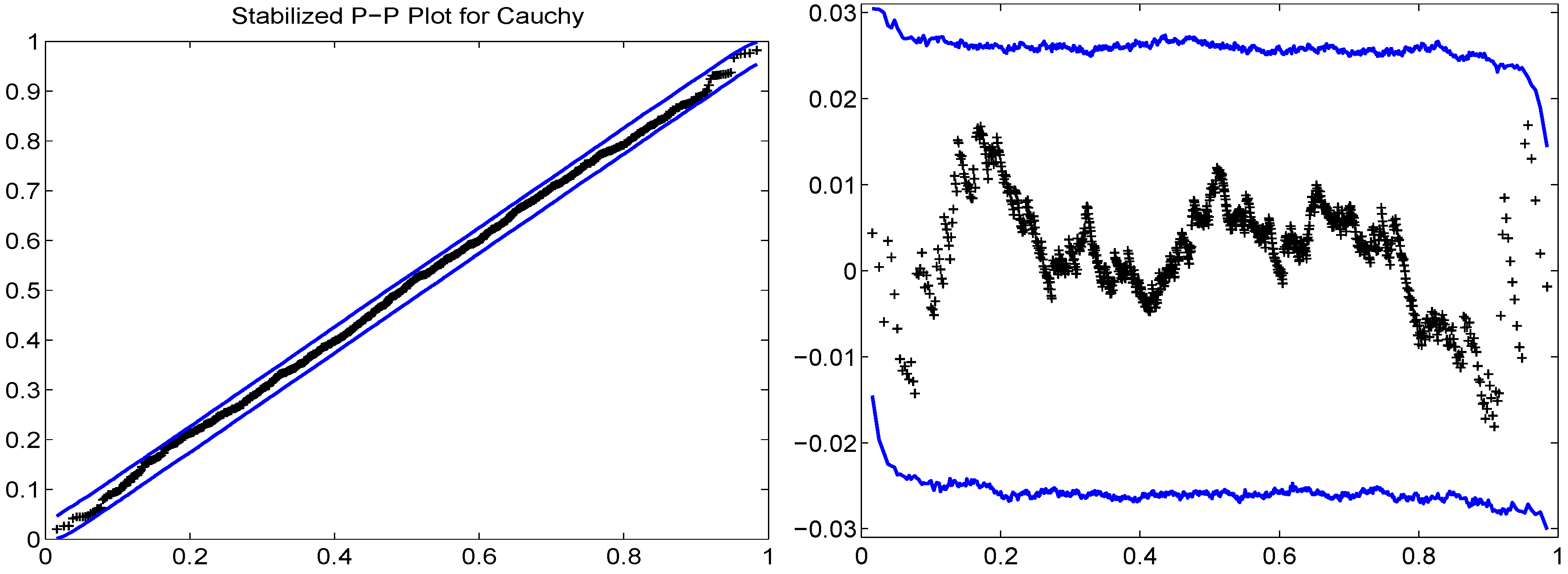
Pointwise null bands are formed via simulation in an analogous way as done for Q-Q plots. As a striking example of the effect of the transformation, the left panel of Figure 5 shows the S-P plot applied to Cauchy data. Noticing that, with 1000 data points, (i) the S-P plot has a large amount of “wasted space”, (ii) that it is somewhat difficult to see the outliers and (iii) that it is very difficult to see any curvature in the null bands, one is behooved to plot the points on a straight line. This is simply accomplished by plotting versus (and also the null bands, minus ) and is shown in the right panel of Figure 5. We deem this the horizontal S-Pplot. Now, among other things, we can see that the null bands are close to, but not of equal width, especially in the tails.
The top panels in Figure 6 show the horizontal S-P plot, using the same normal data sample as was used in the Q-Q plots of Figure 2, with size 0.10 and 0.05 pointwise null bands obtained via simulation. Comparison with the top panels in Figure 2 shows that the informational content of the Q-Q and S-P plots are identical, in the sense that the location of each of the 50 points is the same with respect to the null bands, either inside or outside. This holds for the case when we estimate the parameters and when we use the true parameters.
Figure 5.
S-P plot for i.i.d. Cauchy data of sample size 1000, with null bands, obtained via simulation, using a pointwise significance level of 0.01. The right panel is the same, but using the horizontal format.
Figure 5.
S-P plot for i.i.d. Cauchy data of sample size 1000, with null bands, obtained via simulation, using a pointwise significance level of 0.01. The right panel is the same, but using the horizontal format.

Figure 6.
(Top) Horizontal S-P plot using same random sample of size as used in Figure 2 with 10% and 5% pointwise null bands obtained via simulation, using the estimated parameters (left) and the true parameters (right) of the data. (Bottom) The same as the top, but with constant width null bands.
Figure 6.
(Top) Horizontal S-P plot using same random sample of size as used in Figure 2 with 10% and 5% pointwise null bands obtained via simulation, using the estimated parameters (left) and the true parameters (right) of the data. (Bottom) The same as the top, but with constant width null bands.

4.2. Modified S-P (MSP) Plots
For a given class of distributions, a specific parameter vector θ, a sample size n and a pointwise significance level p, the null bands of the Q-Q plot could be computed once via simulation and stored as two vectors in a lookup-table, but doing this for a variety of sample sizes and significance levels would result in a massive amount of required storage. With S-P plots, if we are willing to assume that the width of the band is constant over (it is not; see Figure 5 and Figure 6; we deal with the consequences of this below), then all we need to store is a single number. That is, for a given p, n and θ, we would calculate the null bands and record only, say, the median of the n widths depicted in the plot; call this . To illustrate its use, the bottom panels in Figure 6 use these constant-width null bands.
Once is obtained, we no longer have to simulate to get the null bands, but instead just generate them simply as:
where w is a function of p. It should be clear that, for location-scale families, the values of the location and scale parameters do not change the widths. As such, in the subsequent development for approximating w, we can omit the mention of θ.
The left panel of Figure 7 shows the width as a function of p for the normal distribution and three sample sizes, computed using 50,000 replications and using a tight grid of value of p from to . We could store all of these plotted points in a lookup table, but there is an even better way. Some trial and error show that each curve is virtually perfectly fit (with a regression of over 0.9999) using the function of the pointwise significance level p given by:
where the coefficients depend on the sample size n and are given in Table 1.

| n \ coef | ||||
|---|---|---|---|---|
| 20 | ||||
| 50 | ||||
| 100 |
Thus, for each sample size, only four numbers need to be stored to get the null bands corresponding to any pointwise significance level in the range from to . We can do this for numerous sample sizes and store the values. However, there is an even better way. If each of the the resulting coefficients, , as a function of n, is “smooth enough”, then we can fit each one as a function of n. This turns out to be the case, and so, they can be used to give the coefficients for any n in the chosen range, for which we used a grid of values from to . Even more conveniently, each can be well modeled with the same set of regressors, and we get the following result:
These are then used in (5) to get the width.
Observe that there are two levels of approximation, (5) and (6). To confirm that the method works, overlaid in the left panel of Figure 7 are the approximate widths obtained from using both (5) and (6). There is no optical difference. Use of this approximation allows us to instantly compute the S-P plot for normal data (with sample size between 10 and 500) and with any null bands with any pointwise significance level in .
We coin the horizontal S-P plot with constant-width null bands computed using the outlined approximation method the modified S-P plot, or MSP plot. One seeming caveat of the method is that it assumes the validity of using a constant width for the null bands, which, from Figure 6, is clearly not fully justified. This fact, however, becomes irrelevant if we wish to construct the mapping to simultaneous coverage, because, through the simulation to get , the actual simultaneous coverage corresponding to a chosen value of p is elicited, even if this value of p would be slightly different if we were to use the correct pointwise null bands. Looked at in another way, once is computed using the (approximation via (5) and (6) to the) constant width null bands, for a given , we recover that value , such that, when used for the pointwise null bands with constant width, we get the desired simultaneous coverage. It is irrelevant that is not precisely the true pointwise significance level for each of the n points; remember, we just use some pointwise null bands to get what we want: correct simultaneous coverage. However, while the simultaneous coverage will indeed be correct, the power of the resulting test will perhaps not be as high as having used the actual, non-constant null bands. As an extreme case, imagine using the Q-Q test with constant null bands; the power would presumably be abysmal.
The benefit of using this method is that the inner loop of the nested simulation is replaced by an instantaneous calculation, so that the determination of for a vector of p and fixed n takes less than a minute, from which we obtain the pointwise value from linear interpolation. The results for three sample sizes are shown in the right panel of Figure 7. For example, for , we should use a pointwise significance level of to get a simultaneous one of 0.05. Not shown is the graph for ; we would use 0.02322.
Figure 7.
(Left) The solid, dashed and dash-dot lines are the widths for the pointwise null bands of the normal MSP plot, as a function of the pointwise significance level p, computed using simulation with 50,000 replications. The overlaid dotted curves are the same, but having used the instantaneously-computed approximation from (5) and (6). There is no optical difference between the simulated and the approximation. (Right) For the normal MSP plot, the mapping between pointwise and simultaneous significance levels using sample size n.

4.3. MSP Test for Normality
Continuing the discussion in the preceding section, a test of size α for normality simply consists of rejecting the null hypothesis if any of the plotted points in the MSP plot lie outside the appropriate simultaneous null bands. We coin this the MSP test (for composite normality). While the calculation of the s function is indeed fast, there is, yet again, an even better way. For a fixed α, we compute the pointwise significance values corresponding to each sample size in a tight grid of n-values, using high precision (we used 500,000 replications), and then fit the resulting values as a linear function of various powers of n. For example, with , this yields (and requiring all of the significant digits shown):
This was also done for and . For values of α different than 0.01, 0.05 and 0.10, or sample sizes outside the range , simulation is used to get the correct value of .
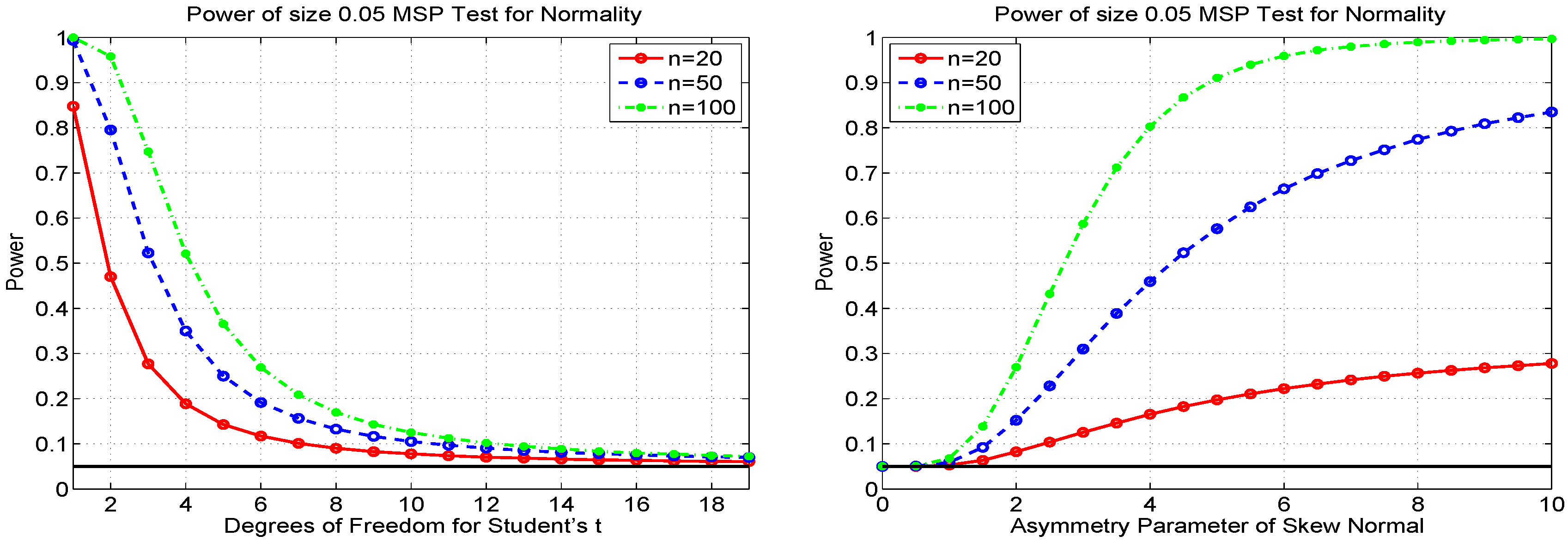
With the massive increase in speed for calculating the null bands, we can also perform the power calculations similar to those shown in Figure 4 for the Q-Q test, but now in a matter of seconds. Figure 8 shows the results based on a significance level of 0.05, as in Figure 4. From the plot, we immediately confirm that the MSP test has the correct size, confirming the discussion above regarding use of the (approximate) constant-width null bands and as a check on all of the approximations used to calculate . Comparing Figure 4 and Figure 8, we see that the Q-Q test has higher power against Student’s t, but the MSP test has higher power against the skew normal. In fact, the MSP test has even higher power than the JB test for normality (see Section 5.1 below) against this alternative for larger values of λ. For example, MSP has substantially higher power for and , as well as for and .
In addition to modeling as a function of n in order to obtain the correct widths to conduct a 0.10-, 0.05- and 0.01-level test, it is useful to also have (an approximation to) the p-value of the test; we will require it below in Section 6.1. One way of accomplishing this would be obtain not just for α levels 0.10, 0.05 and 0.01, but for a large grid of significance levels between zero and one, and take the p-value to be the smallest significance level, such that the null hypothesis of normality can be rejected. Unless the grid of α-values has a very high resolution (entailing quite some computation and storage), the resulting p-value will not be very accurate. Instead, we consider another way.
Recall that the MSP test rejects the null hypothesis if any of the plotted points in the MSP plot lie outside the appropriate simultaneous null bands (4). By construction, this is equivalent to rejecting if , where is the test statistic defined by:
and h and g are the vectors formed from values in (3).
Figure 8.
Power of the MSP test for normality, for three different sample sizes, and the Student’s t alternative (left) and skew normal alternative (right), based on one million replications.
Figure 8.
Power of the MSP test for normality, for three different sample sizes, and the Student’s t alternative (left) and skew normal alternative (right), based on one million replications.

For a given sample size n, we simulate a large number of test statistics, generated under the null. Then, for an actual dataset , its p-value is the fraction of those simulated test statistics that exceed . Doing this takes about 100 s with one million replications and, worse, will deliver a different p-value each time the method is used, with the same dataset X. Fortunately, there is a better way: Figure 9 shows the kernel density (solid line) of , for two sample sizes, and . Remarkably, and as an amusing coincidence, the distribution strongly resembles that of a location-scale skew normal. The dashed lines in the plots show the best fitted location-scale skew normal densities; the match is striking. In particular, using the MLE, we obtain asymmetry parameter , location parameter and scale parameter for and , and for . By using other sample sizes, up to , we confirm that the skew normal yields an extremely accurate approximation to the true distribution of under the null for all sample sizes between 10 and (at least) 500.
Figure 9.
Kernel density and fitted skew normal distribution of sample size n times the MSP test statistic (7), computed under the null, and based on one million replications.
Figure 9.
Kernel density and fitted skew normal distribution of sample size n times the MSP test statistic (7), computed under the null, and based on one million replications.

Thus, for a given sample size, all we would need is to store the three parameters. Then, for an actual dataset , the p-value is . As with the modeling of as a function of n, we can compress this information further by conducting this simulation for a range of sample sizes, obtaining the skew normal MLE for each and then fitting a polynomial model in n to each of the three parameters , and . This was successful, using the same regressors as were used for .
To assess the quality of the approximation, we simulate one million p-values, under the null of normality, based on . The resulting histogram is shown in the left panel of Figure 10. Having used so many replications, we are able to discern a pattern in the bars and, thus, a discrepancy with a uniform one, though the approximation is still clearly accurate, and certainly adequate for our purposes. The right panel of Figure 10 shows the resulting p-values when having used a Student’s t distribution with eight degrees of freedom instead of the normal one (and again ). Now, the p-values pile up closer to zero. The fraction that is less than 0.05, in this case , gives the power of the 5% test with this sample size and alternative.
Figure 10.
One million p-values from the MSP test with , under the null (left) and for a alternative (right).
Figure 10.
One million p-values from the MSP test with , under the null (left) and for a alternative (right).

Notice that, once we can approximate the distribution of (n times) the test statistic, its quantile, divided by n, is , and we could do away with the approximation for for , 0.05 and 0.01. However, while the skew normal approximation to is very good, it is not exact, and so, this method is not as accurate as using our initial method to get the correct and w for the three most common values of α. Thus, we use it only for values of α which are not equal to 0.01, 0.05 or 0.10.
4.4. Modified Percentile (Fowlkes-MP) Plots
Fowlkes [13] pointed out that the normal Q-Q plot is not particularly sensitive to a mixture of (two) normal distributions when the means of the components are not well separated. To address this, he suggested plotting the standardized order statistics versus , , where Φ is the standard normal CDF. Observe how the are quantiles, while and are probabilities, so in a sense, this is a cross between a P-P and a Q-Q plot. We call this (differing from Fowlkes [13], but in line with Roeder [25] (p. 488)) the (normal) Fowlkes modified percentile plot or just the (normal) Fowlkes-MP plot. As with all such goodness of fit plots, their utility is questionable without having sensible null bands. No such procedure was suggested by Fowlkes [13] to remedy this.
Observe that, unlike the P-P, Q-Q and MSP plots, the quantities on the x-axis of the Fowlkes-MP plot are functions of the (and not just n), so that the usual method we used for simulating to get the null bands would result in a band not for a (as in P-P) or (as in Q-Q), but rather for an order statistic, , whose x-coordinate changes with each sample. The resulting null bands are extremely wide and of little value. A feasible alternative is to compute lower and upper horizontal lines, like with the MSP plot, which have the desired simultaneous significance level.
This idea was used to approximate the widths of the null bands corresponding to simultaneous significance levels of 0.01, 0.05 and 0.10 as a function of the sample size, similar to what was done for the MSP test. Then, we can generate the Fowlkes-MP plot and return the result of the hypothesis test at the three usual levels, which we deem the Fowlkes-MP test for normality.
To illustrate, the top left panel of Figure 11 shows the Fowlkes-MP plot, with null bands, for a normal random sample with . The top right shows the MSP plot for the same data. The random sample of normal data was found with trial and error, such that the MSP normal test rejects at the 10% level, but not at the 5%. This can be seen from the MSP plot (top right), in which one data point exceeds the lower 10% line. In the corresponding Fowlkes-MP plot (top left) using the same data, there is one data point that is indeed very close to its lower 10% line.
The bottom two panels of Figure 11 are similar, but using 100 observations from a two-component mixed normal distribution, with , , , , and (these parameters being typical for daily financial returns data). We see that both plots are able to signal that the data are not normally distributed.
Figure 11.
Normal Fowlkes-MP (left) and normal MSP (right) plots, with simultaneous null bands, for normal data (top) and mixed normal data (bottom).
Figure 11.
Normal Fowlkes-MP (left) and normal MSP (right) plots, with simultaneous null bands, for normal data (top) and mixed normal data (bottom).

Now, turning to power comparisons, our usual two plots are given in Figure 12. With respect to the Student’s t alternative, the Fowlkes-MP test performs the same as the KD test, which was not particularly good. Against the skew normal, the Fowlkes-MP test again performs the same as the KD test, which was dominated by the , and MSP tests. Based on these alternatives, the Fowlkes-MP test is not impressive. In fact, its power must be identical to that of KD test, because it is based on precisely the fitted and empirical CDFs. In fact, the equality of their powers for Student’s t and skew normal cases provides confirmation that the Fowlkes-MP test was implemented correctly.
Figure 12.
Power of Fowlkes-MP test for normality, for three different sample sizes and the Student’s t alternative (left) and skew normal alternative (right), based onone million replications.
Figure 12.
Power of Fowlkes-MP test for normality, for three different sample sizes and the Student’s t alternative (left) and skew normal alternative (right), based onone million replications.

4.5. Power Comparisons Against Two-Component Mixed Normal Alternative
In light of Fowlkes [13] motivation for his goodness of fit plot, it remains to be seen how the normal Fowlkes-MP test (or, equivalently, the KD test) performs with mixed normal alternatives. We restrict attention to the two-component mixed normal, with three sets of parameters. The first, denoted No. 1, uses the parameters mentioned above, which are typical for financial returns data. Parameter set No. 2 takes , , , , and No. 3 takes , , . The results are shown in Table 2. We immediately confirm that the KD and Fowlkes-MP tests are identical. The test clearly dominates in Models 1 and 3, while JB (see Section 5.1 below) has the highest power for Model 2, though also performs well in this case.
With respect to the tests which derive from graphical methods, MSP and Fowlkes-MP have virtually equal power for No. 1, are very close for No. 2 and are mildly different for No. 3, with Fowlkes-MP being better. Thus, as a graphical tool, Fowlkes [13] method, augmented with correct error bounds, does have value for detecting the presence of mixtures. In terms of power, however, it is equivalent to the KD and is clearly dominated by . We also use the Pearson test: simulations were conducted to construct a with near-correct size and to find the optimal number of bins for power against Student’s t and, separately, the skew normal. When using this test, we find that it exhibits quite low power compared tothe other tests.
Table 2.
Comparison of power for various normal tests of size 0.05, using the two-component mixed normal distribution as the alternative, obtained via simulation with one million replications for each model and based on two sample sizes, and . Model No. 0 is the normal distribution, used to serve as a check on the size. The entry with the highest power for each alternative model and sample size n is marked in boldface. Entries with a power lower than the nominal/actual value of 0.05, indicating a biased test, are in italics.
| Model \ Test | n | KD | AD | MSP | F–MP | JB | |||
|---|---|---|---|---|---|---|---|---|---|
| No. 0 (Normal) | 100 | 0.050 | 0.050 | 0.050 | 0.050 | 0.050 | 0.050 | 0.050 | 0.050 |
| No. 1 (Finance) | 100 | 0.799 | 0.712 | 0.916 | 0.924 | 0.799 | 0.798 | 0.890 | 0.635 |
| No. 2 (Equal Means) | 100 | 0.198 | 0.322 | 0.298 | 0.309 | 0.216 | 0.197 | 0.417 | 0.127 |
| No. 3 (Equal Vars) | 100 | 0.303 | 0.001 | 0.400 | 0.439 | 0.250 | 0.302 | 0.039 | 0.191 |
| No. 0 (Normal) | 200 | 0.050 | 0.050 | 0.050 | 0.050 | 0.050 | 0.050 | 0.050 | 0.050 |
| No. 1 (Finance) | 200 | 0.983 | 0.881 | 0.997 | 0.998 | 0.973 | 0.983 | 0.994 | 0.940 |
| No. 2 (Equal Means) | 200 | 0.358 | 0.430 | 0.523 | 0.545 | 0.328 | 0.358 | 0.642 | 0.225 |
| No. 3 (Equal Vars) | 200 | 0.593 | 0.000 | 0.756 | 0.789 | 0.492 | 0.594 | 0.428 | 0.394 |
Finally, observe how, in Model No. 3 (different means, equal variances), the AD (for both sample sizes) and JB (just for ) tests have power lower than the size of the test; these are our first examples of biased tests. Their performance is justifiable: for the AD test, recall that it places more weight, relative to the KD statistic, onto the tails of the distribution and, therefore, less in the center, where the deviation from normality for this model is most pronounced. Indeed, the opposite effect holds under the fatter-tailed alternative No. 2, in which case AD has higher power than the KD. Similarly, the JB statistic relies on skewness and kurtosis, which are not features of this model.
5. Further Tests for Composite Normality
5.1. Jarque-Bera Test
We briefly discuss the popular Jarque and Bera [26] test for composite normality and show its power. The test statistic is given by:
where n is the sample size and skew and kurt are the usual sample counterparts of the theoretical skewness and kurtosis, respectively. The idea of using the sample skewness and kurtosis for testing normality goes back at least to [27,28]. Takemura et al. [29] provide theoretical insight into why this test performs well.
As , the test statistic has a distribution under the null hypothesis, but deviates from this in small samples, so that simulation is necessary to get the exact cutoff values. While these have been tabulated in the older literature for a set of sample sizes, a modern computing environment allows a far more accurate tabulation of such values, over finer grids, so that table lookup and linear interpolation can be used to get highly accurate cutoff values and also deliver an approximate p-value of the test. Unfortunately, MATLAB’s implementation only returns p-values, which are less than or equal to 0.5. While this is indeed adequate for the traditional application of applying the test to a particular dataset and then using the resulting p-value as a measure of evidence against the null (values above 0.5 being unequivocally in favor of not rejecting the null), we detail an application below in Section 6.1 that requires the correct p-value.
To obtain this, we can proceed as follows. For a particular sample size, say , simulate a big number, b, of JB test statistics under the null, . We take b to be 10 million. Then, for any given dataset of length and JB test statistic T, the approximate JB, the p-value is given by the fraction of the that exceeds T. While this works, computing the latter fraction is relatively slow, and so, a simulation study that uses this method takes a comparatively long time. Instead, we can attempt to fit a very flexible parametric density to the distribution of the , similar to having fit the skew normal to the MSP test statistic. For this, we use the generalized asymmetric t, or GAt, density:
, along with location u and scale c. This is noteworthy because limiting cases include the GED and hence the Laplace and normal, while Student’s t (and, thus, the Cauchy) distributions are special cases. For (), the distribution is skewed to the right (left), while for , it is symmetric. See [30] (p. 273) for further details, including expressions for the moments, expected shortfall and, as used here, the CDF.
The left panel of Figure 13 shows the kernel density estimate of the log of the 10 million values and a fitted (by MLE) GAt density, with estimated parameters , , , , . The fit appears excellent. To compare, the right panel of Figure 13 shows, along with the kernel density, a fitted asymmetric stable density and a fitted noncentral Student’s t. The GAt is clearly better. Moreover, unlike these and other competing fat-tailed distributions, the GAt has a closed-form expression for its CDF and is thus fast to evaluate. In particular, the p-value corresponding to a JB test statistic T of any dataset of length can be (virtually instantly) approximated as .
Figure 13.
Kernel density estimate (solid) of the log of the JB test statistic, under the null of normality and using a sample size of , based on 10 million replications (and having used MATLAB’s ksdensity function with 300 equally spaced points). (Left) The fitted generalized asymmetric t (GAt) density (dashed); (right) fitted noncentral t (dashed) and asymmetric stable (dash-dot).

To assess the quality of the approximation, the left panel of Figure 14 shows a histogram of one million p-values from the JB test under the null, based on and the GAt approximation. Similar to the histogram of the MSP p-values in Figure 10, having used this many replications, its deviation from uniformity is apparent. In this case, however, it is clearly not as accurate as the approximation for the MSP p-values. Fortunately, attaining more accuracy at little or no cost is easy: we can fit a mixture of two GAt distributions (this having 11 parameters). Its PDF and CDF are just weighted sums of GAt PDFs and CDFs, respectively, so that evaluation of the CDF is no more involved than that of the GAt. Conducting this and plotting the histogram yields the right panel of Figure 14, demonstrating that the fit of the two-component GAt mixture is much better than the single GAt.
We turn now to the power of the JB test with size 0.05 (note that, in our simulation, to compute the power, we do not require the method for computing approximate p-values; we only need to compare the JB test statistic to the appropriate cutoff value, which is already conveniently and accurately provided by MATLAB). Our customary power plots are given in Figure 15. Among all of the normality tests so far presented, the JB test has the highest power against the Student’s t alternative and fairs well against the skew normal, though it does not dominate the Q-Q, and MSP tests. See Section 6.2 below for an ordering of the tests in terms of power.
Figure 14.
Simulated p-values of the JB test statistic, based on one million replications, using the GAt approximation (left) and the two-component GAt mixture (right).
Figure 14.
Simulated p-values of the JB test statistic, based on one million replications, using the GAt approximation (left) and the two-component GAt mixture (right).

Figure 15.
Power of JB test for normality, for three different sample sizes, and Student’s t alternative (left) and skew normal alternative (right), based on 100,000 replications.
Figure 15.
Power of JB test for normality, for three different sample sizes, and Student’s t alternative (left) and skew normal alternative (right), based on 100,000 replications.

5.2. Ghosh Graphical Test
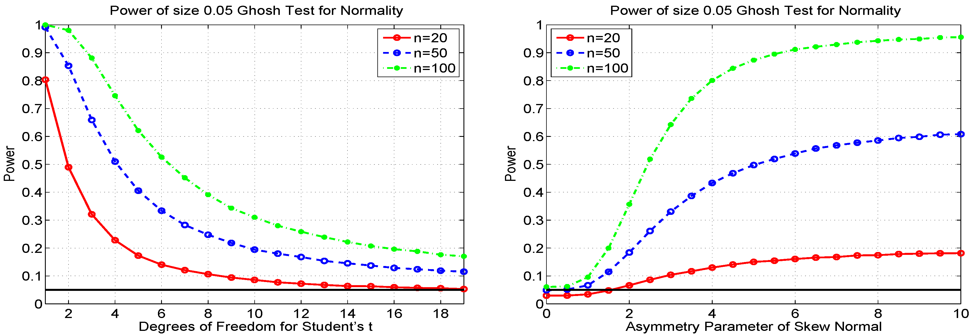
Another graphical method for i.i.d. normality, based on the (third derivative of the log of the empirical) moment generating function (MGF) was proposed and studied by Ghosh [15]. It also yields a test statistic and, as it is based on the MGF, will be consistent. The test is asymptotically size-correct, and simulation shows that the actual sizes of the 5% test are 0.030, 0.050 and 0.060, for sample sizes , 50 and 100, respectively. The associated power curves are given in Figure 16. Considering the case, as it has nearly the correct size, we see that the power is a bit lower compared to the JB test for the Student’s t alternative, while for the skew normal, the power is very close to that of JB. Compared to the MSP test, Ghosh has considerably more power against Student’s t and higher power for the skew normal for very small values of λ, though as λ increases, MSP dominates.
Figure 16.
Power of the test of [15] for normality, for three different sample sizes, and the Student’s t alternative (left) and skew normal alternative (right), based on 100,000 replications.
Figure 16.
Power of the test of [15] for normality, for three different sample sizes, and the Student’s t alternative (left) and skew normal alternative (right), based on 100,000 replications.

5.3. Information-Theoretic Distribution Test
Stengos and Wu [16] provide two, very easily computable, test statistics for normality, denoted KL1 and KL2, based on concepts from information theory, maximum entropy and Kullback-Leibler Information. The tests are size-correct asymptotically, and from the right panel of the power graphs in Figure 17 below, for , we can see that the actual size for KL1 is very close to the nominal. Their KL2 test had slightly lower power against Student’s t and virtually the same power against the skew normal. As such, we omit showing the graphs for KL2. With respect to power against Student’s t, KL1 and Ghosh perform very similarly, with neither completely dominating the other. For skew normal, while not fully dominating, KL1 overall performs better. Compared to the MSP test for the skew normal, we find that, for small λ, KL1 has slightly higher power, but as λ grows, MSP dominates.
Figure 17.
Power of the KL1 test for normality, for three different sample sizes, and the Student’s t alternative (left) and skew normal alternative (right), based on 100,000 replications.
Figure 17.
Power of the KL1 test for normality, for three different sample sizes, and the Student’s t alternative (left) and skew normal alternative (right), based on 100,000 replications.

6. Combining Tests and Power Envelopes
Tests with yet higher power can be constructed by appropriate combining of existing tests. Section 6.1 discusses the method for constructing a combined test, such that the two tests are not independent; the brief Section 6.2 states the results of a horse race of power comparisons for testing composite normality; and Section 6.3 examines power envelopes for the two alternatives that we consider.
6.1. Combining Tests
Once we have several tests at our disposal that are not perfectly correlated, we are naturally inclined to entertain ways of combining them, which yield tests of higher power than their constituent components.
Let us first assume we have independent tests of some null hypothesis. For a given dataset, they yield p-values of, say, and . While neither is below any of the traditional significance levels, the fact that two independent tests both have a relatively low p-value might still be evidence that the null hypothesis is questionable. Indeed, if we have k such independent tests, then, under the null, their p-values should be an i.i.d. sample of k values from a distribution. If they tend to cluster more towards zero, then this is certainly evidence that the null hypothesis may be false. One might be tempted to look at the maximum of , whose distribution is easily computed. However, this is throwing information away, as easily seen by considering the two cases , and , . A similar argument holds when considering just the minimum or the minimum and maximum. To incorporate all of the p-values, one idea would be to take their product, which, under the null, is their joint CDF. We use the log transformation (any monotonic transformation could be used), so we get the sum of logs of the p-values. A test based on this product, which we refer to as a joint test, would then deliver a p-value commensurate with the distribution of the log sum. It is well known and easy to show that times the sum of the log of the p-values follows a distribution. As we work with the negative of (two-times) this sum, we reject for large values. Our application unfortunately, but typically, involves tests that are not independent, so that the exact distribution of the sum of logs of the p-values is not .
With the ability to quickly and accurately approximate the p-values of the MSP and JB tests, we can easily determine the performance of the joint MSP + JB test. The first step is to compute , where the are i.i.d., each being the sum of the log of the MSP and JB p-values, computed for a normal sample of length , and B is a big number; we use 100,000. Once these are computed, we can calculate the power of the joint test as follows. For a particular dataset (of length 50) with MSP and JB p-values and , respectively, the p-value of the joint test, , is computed as the fraction of that is less than . This is conducted for numerous datasets, and the fraction of that is less than 0.05 is the power of the joint test.
Figure 18 shows the results of doing this, with 100,000 replications, for the Student’s t and skew normal alternatives. Overlaid in the plots are the powers of the MSP test and JB tests. The first thing to confirm is that the size of the joint test is correct. Regarding power, we see that the joint test has lower power than the JB for the Student’s t alternative, but much higher than MSP. For the skew normal alternative, the joint test has higher power than both MSP and JB tests, over the entire range of λ that we considered and substantially so in the “middle range” where MSP and JB have the same power. This clearly demonstrates that the method can result in a better test against some alternatives.
Figure 18.
Power of the MSP, JB and joint tests for composite normality, using and based on 100,000 replications.
Figure 18.
Power of the MSP, JB and joint tests for composite normality, using and based on 100,000 replications.

The Stengos and Wu [16] test also delivers a quickly-computed p-value, so that we can entertain combining it with the MSP and JB tests, in a similar way as described above, so that a total of three tests are used. Somewhat disappointingly, the resulting power for the skew normal was very close to that of the previous (two-factor) joint test, with only a very slight increase in power for smaller values of λ. For the power against Student’s t, the three-factor test indeed has higher power than the two-factor test for all degrees of freedom considered, but still has power less than the JB test. As such, we do not report the graphs.
Remark: An obvious way of generating several tests that are definitely independent under the null is to split the sample up into subsets and perform some (say, MSP) test on each of them. For example, with and equally-sized subsets, we get the two p-values, and , referring, respectively, to the first and second halves of the data. We reject the null at the 5% level if , where c is the 95% quantile of the distribution. With the fast approximation of the p-value of the MSP test for any sample size between 10 and 500, we can easily and quickly confirm that this test has the correct size. However, its power against a skew normal with is 0.40, whereas the power based on the test using the entire sample is 0.47. Similarly, with , the power is 0.32. Thus, it appears that we cannot extract more power out of the test by splitting the sample.
6.2. Power Comparisons for Testing Composite Normality
Having now seen several tests for the null hypothesis of composite normality, we can summarize their relative performance. Denote the Ghosh test as G, with obvious notation for the other tests. With respect to the Student’s t alternative, the various tests can be ordered in terms of power as:
where indicates that B has higher power than A; indicates that A and B have similar power, with one exceeding the other under some conditions (sample size and alternative), and vice versa; and means that the powers of A and Bare, or appear to be, theoretically equal. For the skew normal alternative, we have:
where Joint refers to the joint test MSP + JB, introduced in Section 6.1 above.
It is crucial to keep in mind that these results are based on having used just the three sample sizes , 50 and 100 and size , except the result for the Joint test, which only used and . The point here is not to make definitive comparisons, but rather to illustrate the enormous discrepancy between orderings (10) and (11), as well as those pertaining to the various two-component mixed normal alternatives from Table 2, emphasizing the important point that the power of a test can strongly depend on the alternative hypothesis.
6.3. Most Powerful Tests and Power Envelopes
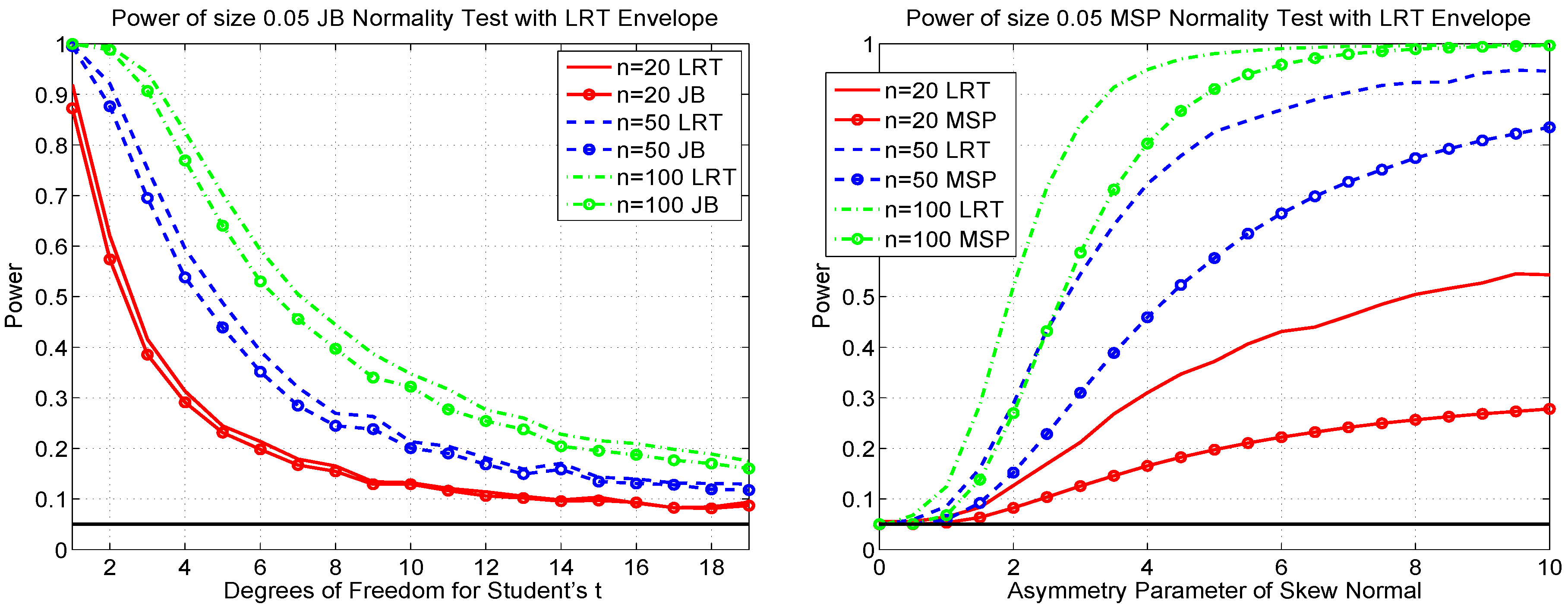
The fact that there is not a single test that dominates with respect to two alternatives implies that none of these tests is most powerful for testing composite normality. Note that, asymptotically, the maximum likelihood ratio test, or LRT, is most powerful against a specific alternative. This can be used for obtaining approximate power envelopes, i.e., the locus of points that gives, for a particular distribution indexed by parameter λ, the supremum of the power of all hypothesis tests for a given sample size n and test size α. We can then assess how close our considered tests, for that particular alternative, are to the envelope.
For a particular sample size, we obtain the correct 5% cutoff value for the LRT via simulation, for which we used 100,000 replications, and based on that cutoff value, 10,000 replications were used to determine the power under each alternative considered. The right panel of Figure 19 overlays the power of the MSP test for normality with the power envelope from the LRT with the skew normal as the specific alternative. We see that the LRT has blatantly higher power against the skew normal alternative. Upon looking at the large increase in power, one might be inclined to believe that this LRT (with its specific skew normal alternative) will still have high power as a general test for normality against a non-specific alternative. While this might hold for alternatives that are somehow “similar” to the skew normal, it will not be true in general. Indeed, as Thode [23] (p. 7) warns in this context: “Some tests, such as the likelihood ratio tests and most powerful location and scale invariant tests, were derived for detecting a specific alternative to normality. ... The disadvantages of these tests are that ... they may not be efficient as tests of normality if in fact neither the null nor the specified alternative hypotheses are correct.”
The left panel of Figure 19 shows the power of the JB test (8) against Student’s , with the corresponding power envelope based on the LRT using Student’s t as the specific alternative. In this case, particularly for smaller samples, the difference in power is not that great, indicating that the JB test is close to being the most powerful test of normality for Student’s t alternatives and probably among the most powerful tests for general fat-tailed alternatives.
Figure 19.
(Left) The power of the JB test (8) against the alternative of a Student’s (lines with circles; same power curves as given in the left panel of Figure 15), along with the power of the likelihood ratio test (using Student’s t as the specific alternative), based on 10,000 replications. (Right) The power of the MSP test for normality against the alternative of skew normal (lines with circles; same power curves as in the right panel of Figure 8), along with the power of the likelihood ratio test (using the skew normal as the specific alternative), based on 10,000 replications.

7. Conclusions
Testing for univariate (composite) normality is undoubtedly one of the cornerstone elements of statistical inference. Besides enjoying a long, illustrious history, research continues on the topic, as seen from the recent references contained herein. As discussed in the introduction, the methods might be even more relevant in light of applications with non-Gaussian data, particulary in finance, in which hundreds or thousands of univariate data sets are used to build up a multivariate model. In these models, a test for multivariate normality is not required; but rather, only univariate. With the appropriate scale filtering and transformations, tests for composite i.i.d. normality for the univariate series are applicable, and, given the large number of data sets, it becomes very useful if the test statistics and associated p-values can be nearly instantaneously computed. In this paper, we develop such a test, called MSP, which is also size-correct and more powerful than all considered competitors against skew-normal alternatives, as well as being reasonably powerful against fat-tailed alternatives. For testing against the latter, the JB test continues to be the most powerful test considered herein. As such, we also develop a method to accurately and instantaneously deliver its p-value. This was then used to form a new test which combine p values from MSP and JB to deliver a size-correct test which has yet higher power for asymmetric alternatives than the MSP.
Acknowledgments
Financial support by the Swiss National Science Foundation (SNSF) through Project No. 150277 is gratefully acknowledged. The author wishes to thank Rita Ghosh (the author of the Ghosh 1996 test for normality) for discussions, comments and ideas on this paper, as well as the two anonymous referees for the excellent points raised by them, all of which led to a significant improvement of this manuscript. Programs in MATLAB for computing the MSP graphic and test, and the combined test, are available from the author.
Conflicts of Interest
The author declares no conflict of interest.
References
- M.S. Paolella, and P. Polak. “ALRIGHT: Asymmetric LaRge-scale (I)GARCH with Hetero-Tails.” Int. Rev. Econ. Financ., 2015, in press. [Google Scholar] [CrossRef]
- M.S. Paolella, and P. Polak. “COMFORT: A Common Market Factor Non-Gaussian Returns Model.” J. Econ. 187 (2015): 593–605. [Google Scholar] [CrossRef]
- J. Krause, M.S. Paolella, P. Polak, and University of Zurich, Zurich, Switzerland. “SIMBACO: Simulation-Based Method for Portfolio Optimization for Copula Models.” 2015, to be submitted for publication. [Google Scholar]
- R.W. Butler, J. Näf, M.S. Paolella, P. Polak, and University of Zurich, Zurich, Switzerland. “Getting out of the COMFORT Zone: The MEXI Distribution for Asset Returns.” 2015, to be submitted for publication. [Google Scholar]
- A. Buja, and W. Rolke. Calibration for Simultaneity: (Re)Sampling Methods for Simultaneous Inference with Applications to Function Estimation and Functional Data. Philadelphia, PA, USA: The Wharton School, University of Pennsylvania, 2009. [Google Scholar]
- J.H.J. Einmahl, and I.W. McKeague. “Confidence Tubes for Multiple Quantile Plots via Empirical Likelihood.” Ann. Stat. 27 (1999): 1348–1367. [Google Scholar] [CrossRef]
- A.C. Davison, and D.V. Hinkley. Bootstrap Methods and Their Application. Cambridge, UK: Cambridge University Press, 1997. [Google Scholar]
- S. Aldor-Noiman, L.D. Brown, A. Buja, W. Rolke, and R.A. Stine. “The Power to See: A New Graphical Test of Normality.” Am. Stat. 67 (2013): 249–260. [Google Scholar] [CrossRef]
- S. Aldor-Noiman, L.D. Brown, A. Buja, W. Rolke, and R.A. Stine. “Correction to: The power to See: A New Graphical Test of Normality.” Am. Stat. 68 (2014): 318. [Google Scholar]
- L. Dümbgen, and J.A. Wellner. “Confidence Bands for a Distribution Function: A New Look at the Law of the Iterated Logarithm.” 2014. Available online: http://arxiv.org/abs/1402.2918 (accessed on 28 January 2015).
- W.A. Rosenkrantz. “Confidence Bands for Quantile Functions: A Parametric and Graphic Alternative for Testing Goodness of Fit.” Am. Stat. 54 (2000): 185–190. [Google Scholar]
- W.F. Webber. “Comment on Rosenkrantz (2000). In Letters to the Editor.” Am. Stat. 55 (2001): 171–172. [Google Scholar]
- E.B. Fowlkes. “Some Methods for Studying the Mixture of Two Normal (Lognormal) Distributions.” J. Am. Stat. Assoc. 74 (1979): 561–575. [Google Scholar] [CrossRef]
- J.R. Michael. “The Stabilized Probability Plot.” Biometrika 70 (1983): 11–17. [Google Scholar] [CrossRef]
- S. Ghosh. “A New Graphical Tool to Detect Non-Normality.” J. R. Stat. Soc. 58 (1996): 691–702. [Google Scholar]
- T. Stengos, and X. Wu. “Information-Theoretic Distribution Test with Application to Normality.” Econom. Rev. 29 (2010): 307–329. [Google Scholar] [CrossRef]
- G. Blom. Statistical Estimates and Transformed Beta Variables. New York, NY, USA: John Wiley & Sons, 1958. [Google Scholar]
- T. Anderson, and D. Darling. “Asymptotic Theory of Certain “Goodness of Fit” Criteria Based on Stochastic Processes.” Ann. Math. Stat. 23 (1952): 193–212. [Google Scholar] [CrossRef]
- T. Anderson, and D. Darling. “A Test of Goodness of Fit.” J. Am. Stat. Assoc. 49 (1954): 765–769. [Google Scholar] [CrossRef]
- J. Durbin. Distribution Theory for Tests Based on Sample Distribution Function. CBMS-NSF Regional Conference Series in Applied Mathematics; Philadelphia, PA, USA: Society for Industrial and Applied Mathematics, 1973. [Google Scholar]
- A. Azzalini. “A Class of Distributions Which Includes the Normal Ones.” Scand. J. Stat. 12 (1985): 171–178. [Google Scholar]
- N.T. Gridgeman. “A Comparison of Two Methods of Analysis of Mixtures of Normal Distributions.” Technometrics 12 (1970): 823–833. [Google Scholar] [CrossRef]
- H.C. Thode. Testing for Normality. New York, NY, USA: Marcel Dekker, 2002. [Google Scholar]
- L.D. Brown. “In-Season Prediction of Batting Averages: A Field Test of Empirical Bayes and Hierarchical Bayes Methodologies.” Ann. Appl. Stat. 2 (2008): 113–152. [Google Scholar] [CrossRef]
- K. Roeder. “A Graphical Technique for Determining the Number of Components in A Mixture of Normals.” J. Am. Stat. Assoc. 89 (1994): 487–495. [Google Scholar] [CrossRef]
- C.M. Jarque, and A.K. Bera. “Efficient Tests for Normality, Homoskedasticity and Serial Independence of Regression Residuals.” Econ. Lett. 6 (1980): 255–259. [Google Scholar] [CrossRef]
- R. D’Agostino, and E.S. Pearson. “Testing for Departures from Normality. Empirical Results for Distribution of b2 and .” Biometrika 60 (1973): 613–622. [Google Scholar]
- K.O. Bowman, and L.R. Shenton. “Omnibus Test Contours for Departures from Normality Based on and b2.” Biometrika 62 (1975): 243–250. [Google Scholar] [CrossRef]
- A. Takemura, M. Akimichi, and S. Kuriki. “Skewness and Kurtosis as Locally Best Invariant Tests of Normality.” 2006. Available online: http://arxiv.org/abs/math.ST/0608499 (accessed on 28 January 2015).
- M.S. Paolella. Intermediate Probability: A Computational Approach. New York, NY, USA: Wiley-Interscience, 2007. [Google Scholar]
© 2015 by the author; licensee MDPI, Basel, Switzerland. This article is an open access article distributed under the terms and conditions of the Creative Commons Attribution license ( http://creativecommons.org/licenses/by/4.0/).
Share and Cite
MDPI and ACS Style
Paolella, M.S. New Graphical Methods and Test Statistics for Testing Composite Normality. Econometrics 2015, 3, 532-560. https://doi.org/10.3390/econometrics3030532
AMA Style
Paolella MS. New Graphical Methods and Test Statistics for Testing Composite Normality. Econometrics. 2015; 3(3):532-560. https://doi.org/10.3390/econometrics3030532
Chicago/Turabian StylePaolella, Marc S. 2015. "New Graphical Methods and Test Statistics for Testing Composite Normality" Econometrics 3, no. 3: 532-560. https://doi.org/10.3390/econometrics3030532