Article

PERSEUS-HUB: Interactive and Collective Exploration of Large-Scale Graphs

Department of Computer Science and Engineering, University of Michigan, Ann Arbor, MI 48109, USA
*
Author to whom correspondence should be addressed.
These authors contributed equally to this work.
Informatics 2017, 4(3), 22; https://doi.org/10.3390/informatics4030022
Submission received: 19 June 2017 / Revised: 11 July 2017 / Accepted: 12 July 2017 / Published: 18 July 2017
(This article belongs to the Special Issue Scalable Interactive Visualization)

Abstract

:
Graphs emerge naturally in many domains, such as social science, neuroscience, transportation engineering, and more. In many cases, such graphs have millions or billions of nodes and edges, and their sizes increase daily at a fast pace. How can researchers from various domains explore large graphs interactively and efficiently to find out what is ‘important’? How can multiple researchers explore a new graph dataset collectively and “help” each other with their findings? In this article, we present Perseus-Hub, a large-scale graph mining tool that computes a set of graph properties in a distributed manner, performs ensemble, multi-view anomaly detection to highlight regions that are worth investigating, and provides users with uncluttered visualization and easy interaction with complex graph statistics. Perseus-Hub uses a Spark cluster to calculate various statistics of large-scale graphs efficiently, and aggregates the results in a summary on the master node to support interactive user exploration. In Perseus-Hub, the visualized distributions of graph statistics provide preliminary analysis to understand a graph. To perform a deeper analysis, users with little prior knowledge can leverage patterns (e.g., spikes in the power-law degree distribution) marked by other users or experts. Moreover, Perseus-Hub guides users to regions of interest by highlighting anomalous nodes and helps users establish a more comprehensive understanding about the graph at hand. We demonstrate our system through the case study on real, large-scale networks.

1. Introduction

The concept of big data has been deeply rooted among people in both academia and industry. Researchers and analysts from various domains require fast and efficient techniques to mine useful information from large-scale datasets. Among the different types of data, an important category is graphs or networks as they naturally represent entities in different domains and the relationships between them, such as compounds in chemistry [1,2], interactions between proteins in biology [3], symptom relations in healthcare [4], communication between people and behavioral patterns [5,6]. Accordingly, the problem of large-scale graph mining has attracted tremendous interest and efforts and, as a result, many large-scale mining techniques, tools, and systems have been developed.
Interactive visualization (or visual analytics) is commonly used to obtain an overview of the data at hand and to perform preliminary, exploratory analysis. Although such “rough” analysis is not always accurate and could be biased, it is a general technique to handle data from different domains before forming concrete questions about the data and seeking specific patterns in them. Unlike most distributed algorithms based on abstraction or sophisticated workflows to achieve efficiency, visualization can put the spotlight on the computed patterns to help the user understand both the data and the algorithm. This is particularly important in domains where a researcher or analyst may not have programming expertise. Moreover, beyond static visualization (e.g., plot of a graph statistics distribution which is often used to discover patterns and laws in the data), interaction provides users with the option of exploring patterns of interest with rich side information and discovering relations within the data.
There are many existing tools and systems that support the interactive exploration of graph data [7,8], yet most of them either assume the user has some prior knowledge and knows what she is looking for, or guide the user to patterns that are worth exploring based on predefined interestingness measures (e.g., low degree). Although such techniques could help users discover new knowledge in specific graphs, they cannot be readily used in different domains. For example, low-degree nodes are common in Twitter and other social networks, as most users have a limited number of followers/friends and few interactions. However, if a user applies the techniques designed for analyzing social networks to structural brain graphs, important information could be overlooked. This is because in brain graphs, low-degree nodes could represent neurons that are less active, and could be an indicator of mental diseases (e.g., Schizophrenia). A different system per type of input would avoid this problem, but, at the same time, it would be impractical and time-consuming. Therefore, a graph mining platform that allows users across different domains to collectively analyze datasets, guide the process of exploration, and share the outcomes with others, could help alleviate the above-mentioned shortcomings.
Motivated by this observation, we present Perseus-Hub, a general large-scale graph mining framework that computes a set of commonly explored graph properties in a distributed manner, performs ensemble, multi-view anomaly detection to highlight regions that are worth investigating, provides users with uncluttered interactive visualization, and supports collective analysis of data from multiple users. It builds and improves upon a simple, Hadoop-based graph mining framework, PERSEUS [9,10], in terms of speed, depth of analysis, system-guided anomaly detection, interactive features, and collective analysis. Our proposed framework provides tools that support both preliminary and in-depth analysis so that users from different domains can gain insights into their graph data.
Our system consists of three main components:
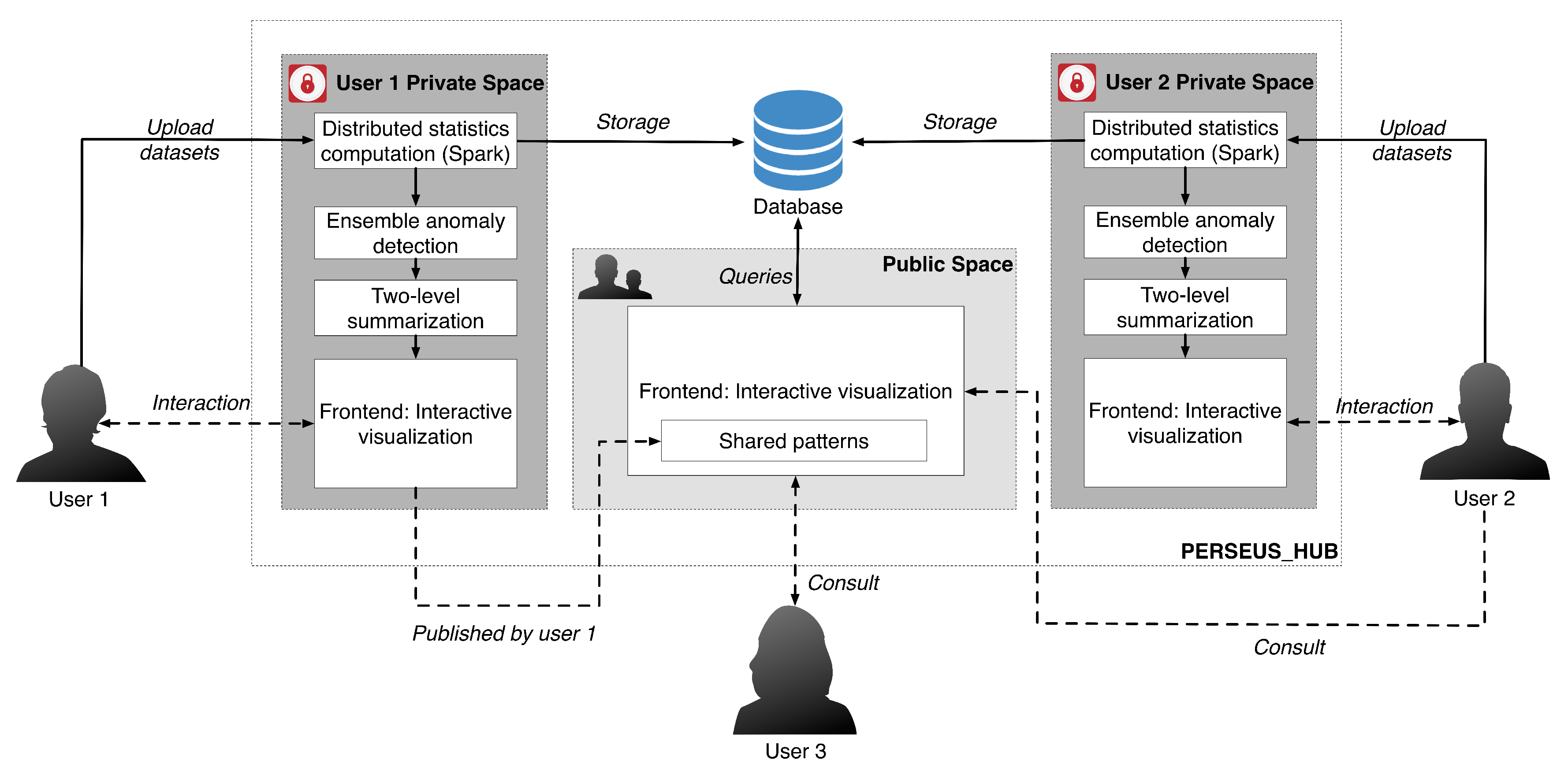
  • Two-Level Summarization Scheme: To summarize the input graph efficiently, Perseus-Hub interactively visualizes both aggregate and node-specific patterns. It summarizes the graph data in terms of univariate and bivariate distributions—such as the clustering coefficient distribution and the degree vs. PageRank distribution—to reveal different aspects of the input graph. The compliance to or deviation from common laws in the distributions (e.g., power-law pattern in social networks) can guide attention to specific nodes or graph regions. At the aggregate level, points that are close to each other in the plots are aggregated into ‘super-points’ to efficiently render, visualize, and support interaction with the distribution plots for graphs with even millions of nodes. At the node-specific level, detailed information can be obtained for fine-granularity analysis such as queries for per node statistics.
  • Collective Data Analysis: To make graph analysis effective and comprehensive for non-experts, Perseus-Hub supports publicly sharing processed data and discovered patterns to help other analysts with their exploration. The Perseus-Hub service runs on a public AWS (Amazon Web Service) EMR (Elastic MapReduce) Spark cluster and displays datasets and discovered patterns, enabling collective analysis and ‘shared’ knowledge. Especially non-experts can benefit from interacting with the discoveries of expert users, and this has potential to advance the knowledge in interdisciplinary domains.
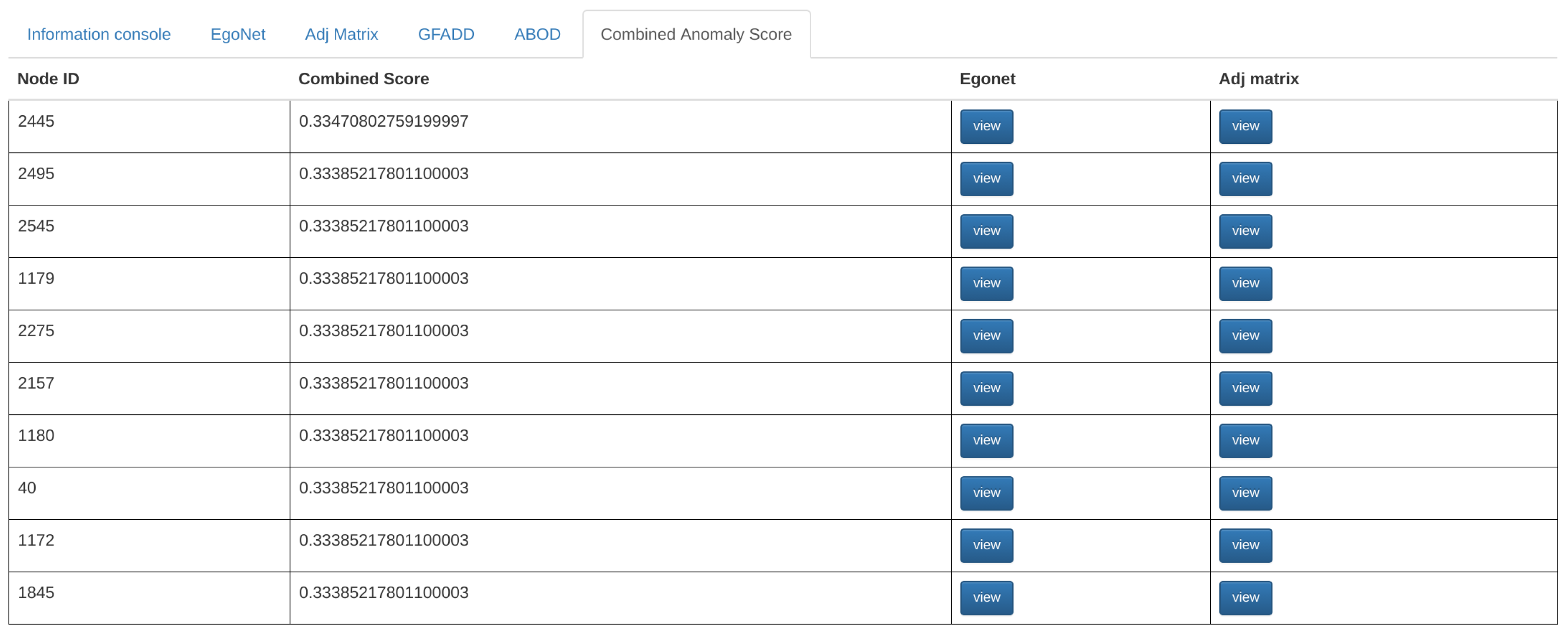
  • Ensemble Anomaly Detection: In addition to collective data analysis that can guide user attention to regions that are identified as interesting by other analysts or experts, Perseus-Hub runs multiple scalable anomaly detection algorithms on the summarized statistics distributions to identify outliers of various types in an ensemble manner. For this purpose, the system leverages algorithms such as G-FADD (Grid Fast Anomaly Detection algorithm given Duplicates [11]), a fast, density- based anomaly detection method to find local and global outliers in the distribution plots, as well as ABOD (Angle Based Outlier Detection [12]), an angle-based outlier detection method that is particularly suitable for analyzing highly dimensional data.
The rest of this paper is organized as follows: Section 2 describes the related work. Section 3 and Section 4 give the description of Perseus-Hub and its components, and an overview of the web application integration, respectively. We showcase the application of Perseus-Hub to interactively analyze large graph datasets in Section 5, and conclude with future directions in Section 6.

2. Related Work

Our work is related to graph visualization and interactive analytics, as well as anomaly detection.

2.1. Graph Visualization and Interactive Analytics

There exists a large variety of visualization systems, each of which tries to visualize different types of networks targeting various kinds of users. Refs. [7,13,14] take an exploratory search approach based on the assumption that users are non-experts and unfamiliar with their datasets. Therefore, they guide users to perform analysis by incrementally querying information or browsing through the various relationships in the datasets to discover any unexpected results. FACETS [13] allows users to adaptively explore large graphs by only showing their most interesting parts. The interestingness of a node is based on how surprising its neighbor’s data distributions are, as well as how well it matches what the user has chosen to explore. In this way, FACETS builds a user profile that customizes which nodes in a graph are explored. Similarly, Voyager 2 [14] is another graph visualization tool that combines manual and automatic chart specification in one system. More specifically, Voyager 2 allows users to manually vary or specify graph properties through the use of wildcards, which generate multiple charts in parallel for visualization, while the system also automatically recommends relevant visualization based on the user’s current focus.
May et al. [15] proposed a system that helps user navigation using signposts to indicate the direction of off-screen regions of the graph that the user would be interested to navigate to. The signposts are generated dynamically depending on the current visible nodes. This visualization system allows the representation of interesting regions of a graph with a small visual footprint. An interesting hybrid visualization system of networks is NodeTrix [16], which uses node-link diagrams to show the global structure of a network and uses adjacency matrices to provide a more detailed view of specific communities in the network. NodeTrix provides users with a large set of interaction techniques, which allows easy modification of network organization. PivotSlice [17] is an interactive visualization tool for faceted data exploration which allows the user to manage a collection of dynamic queries in a multi-focus and multi-scale tabular view. In this way, the user can explore a large dataset by efficiently subdividing it into several meaningful subsets with customized semantics. Refinery [18] is an interactive visualization system that supports bottom-up exploration of heterogeneous networks through associative browsing which allows the user to step iteratively from familiar to novel bits of information. By computing degree-of-interest scores for associated content using a random-walk algorithm, Refinery allows users to visualize sub-graphs of items relevant to their queries. Similarly, GLO-STIX [7] is a graph visualization system that allows a user to interactively explore a graph by applying Graph-Level Operations (GLOs). GLOs are encapsulated manipulations of a graph visualization that allow a user to incrementally modify a graph without committing to a specific graph type, giving the user the choice of fully customizing their visualization through a set of primitive graph-level operations.
In addition to providing the user with some exploratory approaches to interact with their network data, there are some visualization tools designed to help users find anomalies or malicious nodes. Apolo [8] is a graph tool used for attention routing. The user picks a few seed nodes, and Apolo interactively expands their vicinities, enabling sense-making. An anomaly detection system for large graphs, OPAvion [19], mines graph features using Pegasus [20] and spots anomalies by employing OddBall [21] and, lastly, interactively visualizes the anomalous nodes via Apolo. Perseus [9] is a Hadoop-based graph mining framework, which inspired the design of Perseus-Hub. Improving on that, Perseus-Hub supports faster analytics of a variety of graph statistics on Spark; fast and ensemble, multi-view anomaly detection; collective analysis of data and findings between users enabled by its deployment on AWS; and a wide range of interaction features in the frontend that make the interface easy-to-use. Other works on visualization tackle the issue of how to aggregate large-scale graphs while retaining important information. NetRay [22] focuses on informative visualizations of the spy plots, distribution plots, and correlation plots of web-scale graphs. Dunne and Shneiderman [23] introduce the idea of motif simplification in which common patterns of nodes and links are replaced with compact and meaningful glyphs that can portray relationships within a network more clearly while requiring less screen space to represent the network.
According to Nielsen [24], website response time of 0.1 s gives the feeling of instantaneous response; one second keeps the user’s flow of thought seamless, although it is a noticeable delay; and 10 s keeps the user’s attention, but faster response time is definitely desired. To support interaction and achieve very short response time, most approaches apply aggregation techniques, clustering, sketches, or other offline pre-processing algorithms which result in a significantly smaller view of the input data that is fast to query. Recent works in the database community that turned to interactive systems include query refinement with feedback [25]; query exploration for WHERE queries [26]; query steering in DBMS (Database Management System) [27]; query recommendations for interactive database exploration [28]; interactive exploration of interesting itemsets and association rules in transaction (supermarket) DB [29]; and visual analytics with data-driven recommendations that support simple aggregation-based queries of relational data [30,31]. In the area of graphs, most methods focus on interactively exploring the graph structure by starting from a set of user-selected nodes [32], and also the idea of community-within-community visualization via multi-resolution [33].
Unlike the above-mentioned systems, Perseus-Hub focuses on efficiently summarizing large graph data in terms of several distributions (or correlations) of properties instead of visualizing only the network structure or the vicinities of specific ‘interesting’ nodes. Moreover, unlike its precursor [9], it enables collective analysis of datasets from multiple users or experts. Table 1 gives a qualitative comparison of Perseus-Hub with existing graph visualization tools.

2.2. Anomaly Detection

Anomaly detection in static graphs has been studied using various data mining and statistical techniques [11,19,22,34]. Two surveys [35,36] describe various outlier detection methods for static and time-evolving graphs. Here we describe just a small set of approaches. Local outlier factor (LOF) [37] is a popular density-based anomaly detection method that compares the local density of each data point to the density of its neighbors by employing the k-nearest neighbor (kNN) technique to measure how isolated an object is with respect to its neighborhood. Grid-based FADD (G-FADD) [38] improves on the quadratic complexity of LOF by cleverly handling duplicate points and applying a grid on a multi-dimensional space so that only cells that satisfy density-specific criteria need investigation for outliers. AutoPart [39] is a graph clustering algorithm that detects anomalous edges based on the Minimum Description Language (MDL) encoding principle. In AutoPart, an edge whose removal significantly reduces the total encoding cost is considered to be an outlier. Thus, AutoPart finds the block of nodes where the removal of an edge leads to the maximum immediate reduction in cost. Since all edges within that block contribute equally to the cost, all of them are considered outliers. SCAN [40] detects clusters and outliers (vertices that are marginally connected to clusters) in networks by using the structure and connectivity as clustering criteria. SCAN finds the core nodes which share structural similarity with many neighbors and cluster them with their neighbors. Nodes that connect to one or zero clusters are determined as the outliers.
Perseus-Hub runs anomaly detection algorithms with and without ensembles in an offline manner and displays the generated results in an aggregate summarization panel. Perseus-Hub also provides detailed information about the anomalous nodes through node-specific interactive visualization.

3. Perseus-Hub: System Description

Perseus-Hub is an interactive, collective graph exploration system deployed in the public AWS EMR-Spark cluster that supports large-scale data analysis. Users can interactively explore their graph data in their own private space, and, if they choose, they can also publish (some of) their data and discoveries so that other experts or users can use them as a starting point and further investigate the data without duplicating the work.
The system overview of Perseus-Hub and the workflow of collective analysis is illustrated in Figure 1, while an instance of the ‘user view’ is given in Figure 2. In a nutshell, Perseus-Hub consists of three modules: (1) Distributed Statistics Computation, which computes various graph statistics for the input graph in a distributed manner (distribution and correlation plots of those statistics are shown in Figure 2); (2) Ensemble anomaly detection that discovers ‘outlier’ nodes in the graph by integrating multiple views (i.e., different statistic distributions) and multiple detection algorithms; and (3) Interactive visualization that provides both aggregated summarization and node-specific statistics to the users. In the following subsections, we describe each module of Perseus-Hub (Section 3.1, Section 3.2 and Section 3.3) and explain how we integrate them in a system in Section 4.

3.1. Module 1: Efficient Computation of Graph Statistics

Univariate and bivariate distributions of node statistics are crucial for graph analysis, and are traditionally used for anomaly or spam detection in networks [35,41]. For example, the degree and PageRank distributions are expected to follow a power law [42], while singular vectors exhibit the “EigenSpokes” pattern [43] that can be used to explore the community structures.
Building on these observations, Perseus-Hub computes both weighted and unweighted graph statistics in a distributed manner and visualizes their distributions as an overview for further investigation of the characteristics of an input graph. Specifically, the distributions computed include: degree distribution, PageRank distribution, degree vs. PageRank distribution, top-10 singular vectors, and clustering coefficient distribution. Perseus-Hub assumes the format of input file to be <source, destination> for the unweighted graphs and <source, destination, weight> for the weighted graphs. Users can easily upload the input file to Perseus-Hub by clicking the tab shown in the red box of Figure 2. In this subsection, we explain how these node properties are computed by using the Spark framework.

3.1.1. Degree Centralities and Degree Distribution

For a node in a graph G V , E , its degree centrality is defined as the number of its neighbors. The degree centrality of an arbitrary node v V in a weighted undirected graph is the sum of the weights of edges e u v , u V , u v incident upon this node. For an unweighted undirected graph, the weight of each edge is 1. For weighted directed graphs, the node degree centralities can be distinguished to in-degree, out-degree, and total degree. In-degree of a node v is defined as the total weights of edges e u v starting from some other node u pointing to v. Similarly, the out-degree of a node v is defined as the total weights of edges e v u starting from this node v pointing to some other node u. The total degree of a node is defined as the sum of in-degree and out-degree.
In Spark, degree centralities can be efficiently computed by ‘grouping’ the edges of the input graph data that are in the form of source-destination pairs, < v s r c , v d s t > , as key-value pairs. The in-degree (out-degree) centrality of an arbitrary node in the graph can be computed by grouping edges with the same destination (source) and then summing up weights of each edge. The total degree centrality can be similarly computed after a union operation being performed on every edge and its reverse.
The degree distribution, defined as the probability distribution of degree over all the nodes, can be obtained by calculating its histogram (i.e., the number of nodes per degree centrality).

3.1.2. PageRank Centralities and PageRank Distribution

PageRank is a way of measuring the importance of website pages introduced by Page et al. [44]. Without loss of generality, we present the definition of PageRank for a weighted graph G V , E , with weighted adjacency matrix W . To incorporate the weights of each edge into the calculation of PageRank, the weighted transition probability is normalized so that the total probability of leaving node u is one. Thus, the weighted PageRank of an arbitrary node in a graph can be defined as:
p r w ( v ) = 1 d N + d u M ( v ) w u v · p r w ( u ) C u w p r u v : contribution term ,
where u , v V are nodes in graph; p r w ( v ) denotes the weighted PageRank for node v; N represents the total number of nodes in G ; d is the damping factor; M ( v ) V are nodes pointing to v; w u v denotes the weight of the edge from u to v; C u = k w u k is the normalizing constant of node u. The contribution term, w p r u v , denotes the weighted PageRank (wpr) that node u contributes to node v. The unweighted graphs can be seen as a special case with w u v = 1 , u , v V ; C u = L ( u ) , u V , where L ( u ) is the number of edges of node u. Therefore, Equation (1) simplifies to:
p r ( v ) = 1 d N + d u M ( v ) p r ( u ) L ( u ) .
Algorithm 1 illustrates the Spark procedure for computing the weighted PageRank distribution. The input graph is an edge list organized into Resilient Distributed Dataset (RDD) structure in PySpark. To compute the PageRank of the nodes, we employ the power method, which relies on fast spare matrix-vector multiplication. To parallelize the computation of weighted PageRank in Spark, each iteration of the power method can be divided into two parts: (1) computation of the weighted PageRank contribution of node u to every other node k , k V in graph G through edge e u k ; (2) calculation of the total weighted PageRank of node v by summing up the weighted transition probability from every other node u V , u v . The correction term 1 d N is added last. The first step can be mapped for every node in the graph; the second step can also be computed in parallel given the result of the first step. The PageRank distribution is attained by computing its histogram after grouping the PageRank value into a number of bins (the default setting is 1000).
Algorithm 1 Weighted PageRank (wpr).
Input: weighted edges RDD D : <srcID, (dstID, w)>, total number of iteration: iter_max, dampling factor: d
Output: Weighted PageRank RDD, wpr : <nodeID, w p r >
 nodeID = { srcID } { dstID } // Set of all node IDs
N = max ( nodeID ) // Getting total number of nodes in the graph
wpr = < nodeID , 1 N // Initializing w p r for each node as 1 N
while iter ≤ iter_max do
  temp = group D by srcID (key),// Joining edges with wpr of srcID
    join with wpr by srcID (key)// temp: < srcID , ( [ < dstID 1 w 1 > , , < dstID k , w k > ] , w p r srcID ) >
  contribs = map temp to w p r u v in Equation (1)// calculating contribution term for each node
   wpr = reduce contribs by key,// adding up all contribution term, w p r u v
    multiply the sum by d and add (1-d)/N// update weighted PageRank for each node wpr
  iter + +
  end while
  return wpr

3.1.3. Clustering Coefficient

In Perseus-Hub, we use the local clustering coefficient to measure the extent to which nodes in the input graph tend to cluster together. This measure is widely used in social and other sciences to better understand the connectivity properties of a graph. For example, in connectomics, nodes with high clustering coefficients indicate neurons that have dense connections, which represent areas of the brain that are functionally correlated; in social science, nodes with high clustering coefficients could be an indicator of tightly connected communities that are anomalous.
The clustering coefficient for each node (i.e., Local Clustering Coefficient) in an undirected graph is defined as:
LCC ( v ) = 2 · | { e u k E | u , k Γ ( v ) } | d v · ( d v 1 ) ,
where Γ ( v ) is the neighborhood of node v: Γ ( v ) = { u V | e u v E } , and d v is the number of nodes in the neighborhood of node v. To measure the average clustering coefficient of an undirected graph, the concept of average clustering coefficient is introduced:
ACC ( G ) = v V LCC ( v ) N .
The Spark procedure, CCFinder [45], for computing the local clustering coefficient is given in Algorithm 2. Our implementation of local clustering coefficient uses the FONL (Filtered Ordered Neighbor List) data structure [45]. FONL is designed to increase the computation speed by efficiently storing necessary data and exploiting the parallel computing framework. Given < srcID , dstID > pairs, the input graph data is organized into < key , value > form: < v i , ( d v i , [ v i 1 , v i 2 , v i m ] ) > , where v i is the ID of node i; 1 k m , v i k Γ ( v i ) are neighbors of v i with a larger degree ( d v i k > d v i ) or having a greater node ID if their degrees are the same ( v i k > v i and d v i k = d v i ). Moreover, v i k are arranged by their degree in ascending order, i.e., d v i 1 d v i 2 d v i k . The degree of v i , d v i ,is appended after v i and will be used to calculate the denominator in Equation (3). For each node in the graph, a < key , value > pair with the above form is generated.
In Equation (3), the term | { e u k E | u , k Γ ( v ) } | denotes the number of edges linking neighbors of node v. Since every such edge indicates the existence of a triangle involving v, solving for | { e u k E | u , k Γ ( v ) } | is equivalent to counting the number of triangles in the neighborhood of v. Thus, to find triangles in a graph, we check whether the neighbors of v i , i.e., v i k have matching neighbors or not. Therefore, for each v i k , the FONL structure is organized into a candidate list of the form < v i k , ( v i , [ v i ( k + 1 ) , , v i m ] ) > , in which only nodes with a higher or equal degree than v i k are kept, i.e., v i l { v i ( k + 1 ) , , v i m } , d v i k d v i l . Next, a join operation is performed on FONL and the above candidate list. Taking the intersection of [ v i ( k + 1 ) , , v i m ] of v i k ’s candidate list and [ v ( i k ) 1 , v ( i k ) 2 , v ( i k ) m ] of v i k ’s FONL structure, we return the matching node ID together with their common neighbors, v i and v i k , identify the triangles in the graph. Due to the ascending ordering of degrees, every triangle in the graph can only be counted once, and thus counting duplicates is avoided. Now, the local clustering coefficient for each node v i can be computed using the number of triangles it involves in and its degree, d v i .
As in the case of PageRank, the distribution of local clustering coefficients can also be obtained by computing its histogram after appropriate binning.
Algorithm 2 CCFinder [45].
Input: edge_list: <srdID, dstID>
Output: Local Clustering Coefficient for every node, lccRdd: <nodeID, lcc>
 nodeID = { srcID } { dstID }
N = max ( nodeID ) // Getting the total number of nodes in the graph
 edge_list = <srdID, dstID> ∪ <dstID, srdID>// Getting reversed edges
 edge_list = group edge_list by nodeID (key),// Appending nbrDeg to <nodeID, [(nbrIDs)]>
   append neighbor degree after nbrID// <nodeID, [(nbrID, nbrDeg)]>
 fonlRdd = createFONL(edge_list)// Creating FONL Structure
 save fonlRdd both in memory and on disk
 candRdd = map fonlRdd to <nbrID, (nodeID, [(nbrIDs)])>// Creating Candidate List
    ∀ nbrIDi∈ [(nbrIDs)], nbrDegi≥ nbrDeg
 triRdd = join candRdd with fonlRdd by nodeID,// Counting the number of triangles
    compute triCounts = | fonlRdd.[(nbrIDs)] ∩ candRdd.[(nbrIDs)] |
    map to the form <nodeID, triCounts> and reduce by nodeID
 lccRdd = map triRdd to get local clustering coefficient using Equation (3)// Computing lccRdd
return lccRdd
function createFONL(edge_list)
  compute nodeDeg, ∀ nodeID ∈ edge_list
  [(nbrIDs)] = sort { ( nbrID , nbrDeg ) edge _ list : ( nbrDeg > nodeDeg ) or
       ( nbrID > nodeID and nbrDeg = nodeDeg ) } // Filtering and sorting edge_list
      by (nbrDeg and nbrID) in ascending order
return <nodeID, nodeDeg, [(nbrIDs)]>
end function

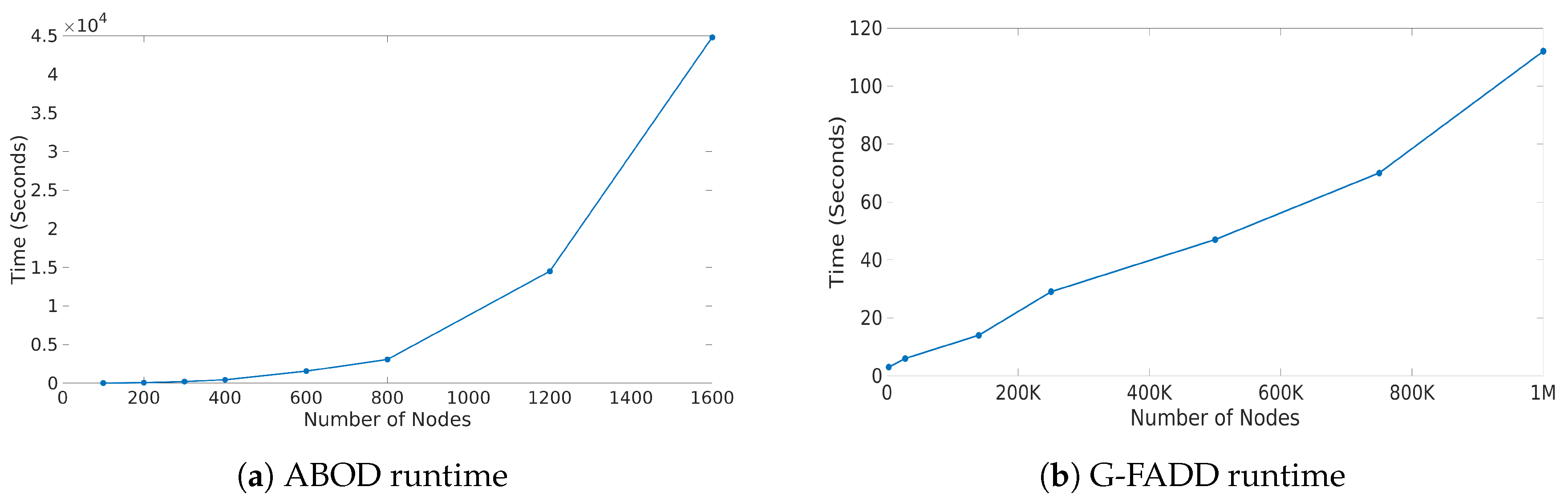
3.1.4. Execution Time Analysis

In this subsection, we provide runtime analysis of the graph statistics module. The AWS EMR-Spark cluster that Perseus-Hub runs on has one master node and two slave nodes, each of which is deployed on the general purpose m4.large instance (two CPU cores and 8 GB memory). We also measure the average response time by performing 1000 queries in the frontend. Specifically, we consider the two graphs used in Section 5, the size of which is briefly described in Table 2.
From Table 2, we find that the time for computing these two real-world graphs takes about 10 min on three machines. Using additional machines could help reduce the computation time further, and support the analysis of larger graphs at a relatively short time. We also note that the average response time in both cases is very short and less than 0.1 s, which, according to Nielsen [24] gives the feeling of instantaneous response.

3.2. Module 2: Multi-View, Ensemble Anomaly Detection

The second (offline) module of Perseus-Hub consists of a system-based detection of anomalous nodes in the input network, which can guide the exploration process by highlighting ‘abnormal’ node behaviors. Discovery and evaluation of outliers from a multi-dimensional set of points is a difficult task. Moreover, different anomaly detection algorithms calculate outlier scores under different criteria (e.g., distance from a trend-line [21] vs. density differences from surrounding points [37] vs. latent node properties), and thus their scores are vastly different. To benefit from various methods and detect outliers with higher confidence, Perseus-Hub uses a multi-view, ensemble approach: The approach is multi-view because outlier detection methods are applied on all the distribution plots, which capture different aspects and normality patterns of the input data. Moreover, it is also considered as an ensemble because it normalizes multi-dimensional outlier scores from different anomaly detection methods to form a unified combined score for each multi-dimensional point.

3.2.1. Multi-View, Ensemble Anomaly Detection: Approach

Given a set of plots that portray the relationship between different attributes of a multi-dimensional dataset (e.g., the distribution plots computed by the first module of Perseus-Hub), we apply an anomaly detection method to calculate the anomalousness score for each point (or node). Perseus-Hub leverages two anomaly detection methods (an angle- and a density-based). Specifically, we use:
  • ABOD (Angle Based Outlier Detection [12]), an anomaly detection method that assesses the variance in the angles between the different vectors of a point to other points. ABOD is particularly effective for high-dimensional data since effects from the “curse of dimensionality” are alleviated compared to purely distance-based approaches.
  • G-FADD (Grid-Based Fast Outlier Detection algorithm given Duplicates [38]), a density-based anomaly detection method that is remarkably fast in determining outliers from multi-dimensional points with a large number of (near-) duplicates (i.e., points that have almost the same coordinates). Specifically, by considering identical coordinates in an n-dimensional space as a super node with their duplicate count information, G-FADD can compute anomalousness scores much faster than other density-based approaches such as LOF [37] (Local Outlier Factor), which do not treat duplicate nodes specially, and are inefficient at handling real datasets with many near-duplicate points. The time complexity of LOF is near-quadratic with respect to the number of duplicates, whereas for G-FADD it is near-linear.
Although we used two anomaly detection methods, the methodology that we describe below can be applied to any number of approaches. Since the anomaly detection module is offline, its runtime does not burden the user significantly. Nevertheless, choosing fast methods that scale well with the size of the input dataset is important when handling large graph datasets.
Each method returns a list of real-valued anomalousness scores for all the nodes in each distribution plot computed by Module 1. However, scores computed by different methods and on different plots have widely varying scales, and combining them to get a uniform score is not straightforward. In our implementation, we compare the anomalousness scores of different methods by following the methodology in [46] and normalizing all the anomalousness scores into probabilistic scores that represent the probability that node v in a certain plot is anomalous according to a certain anomaly detection method. Such a probability can be calculated in the following way:
P ( v ) = m a x 0 , e r f S ( v ) μ S σ S · 2 ,
where S ( v ) is the anomalousness score of node v, e r f is the error function, and μ S and σ S are the mean and standard deviation of anomalousness score for the method within the plot of interest.
In our case, because we use ABOD where a high score for a node means a low probability of being an outlier, before normalizing the ABOD scores, we first need to invert them so that a high score for a node maps to a larger probability for being an outlier. To enhance the contrast between inliers and outliers, we use logarithmic inversion:
R e g S l o g i n v ( v ) = log ( S ( v ) / S m a x ) ,
where S ( v ) is the original unreguralized ABOD score and S m a x is the maximum ABOD score from all the ABOD scores in a given distribution plot. The inversion of ABOD scores allows the proper computation of probabilistic scores based on Equation (5).
At this point, for each method j and each node v in each plot p i , we have normalized the probability score, which we can denote as P p i j ( v ) . In our case, j = ABOD , G-FADD and p i ranges from p 1 to p 9 :
  • p 1 
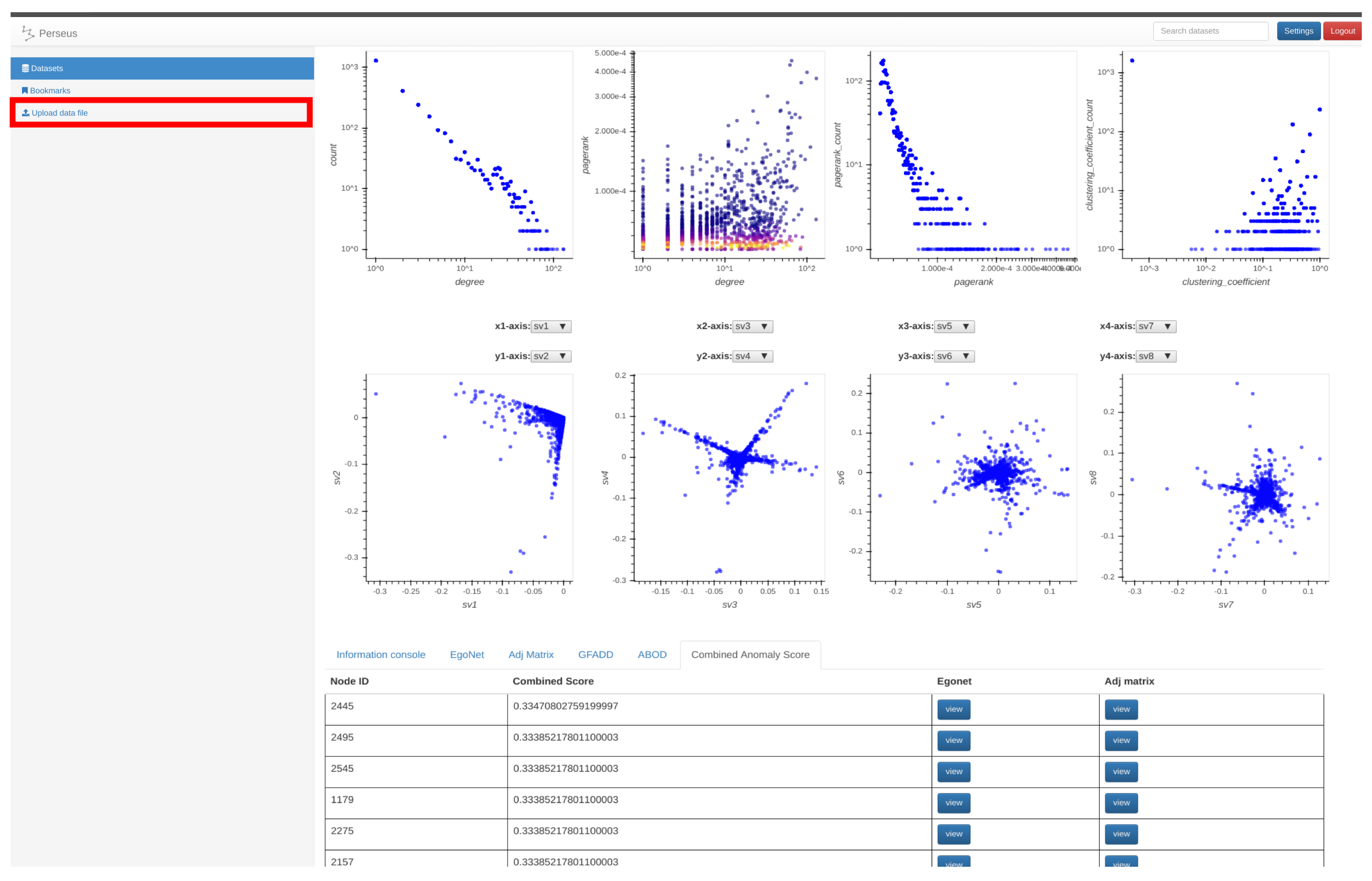
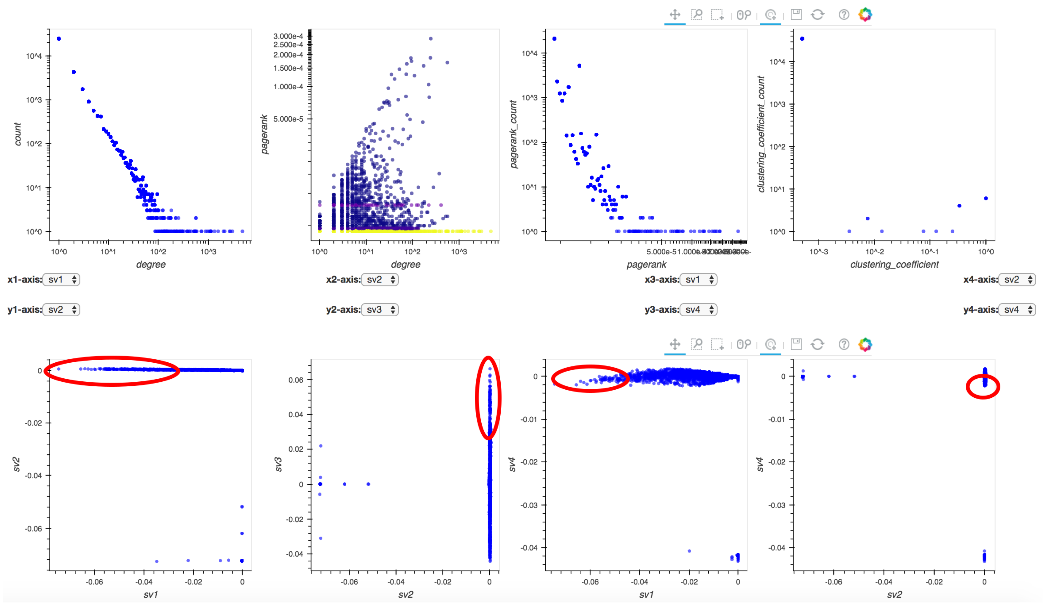
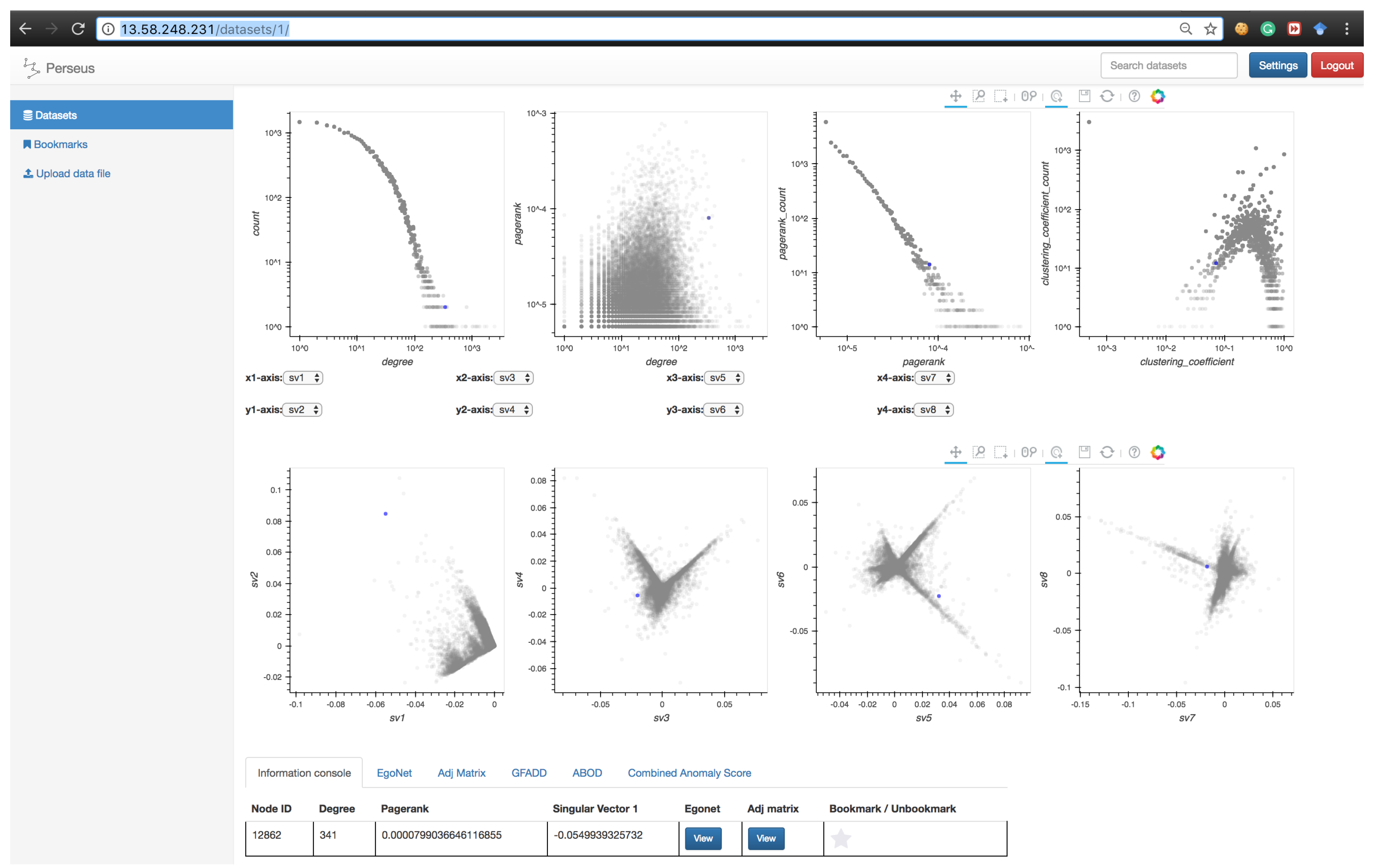
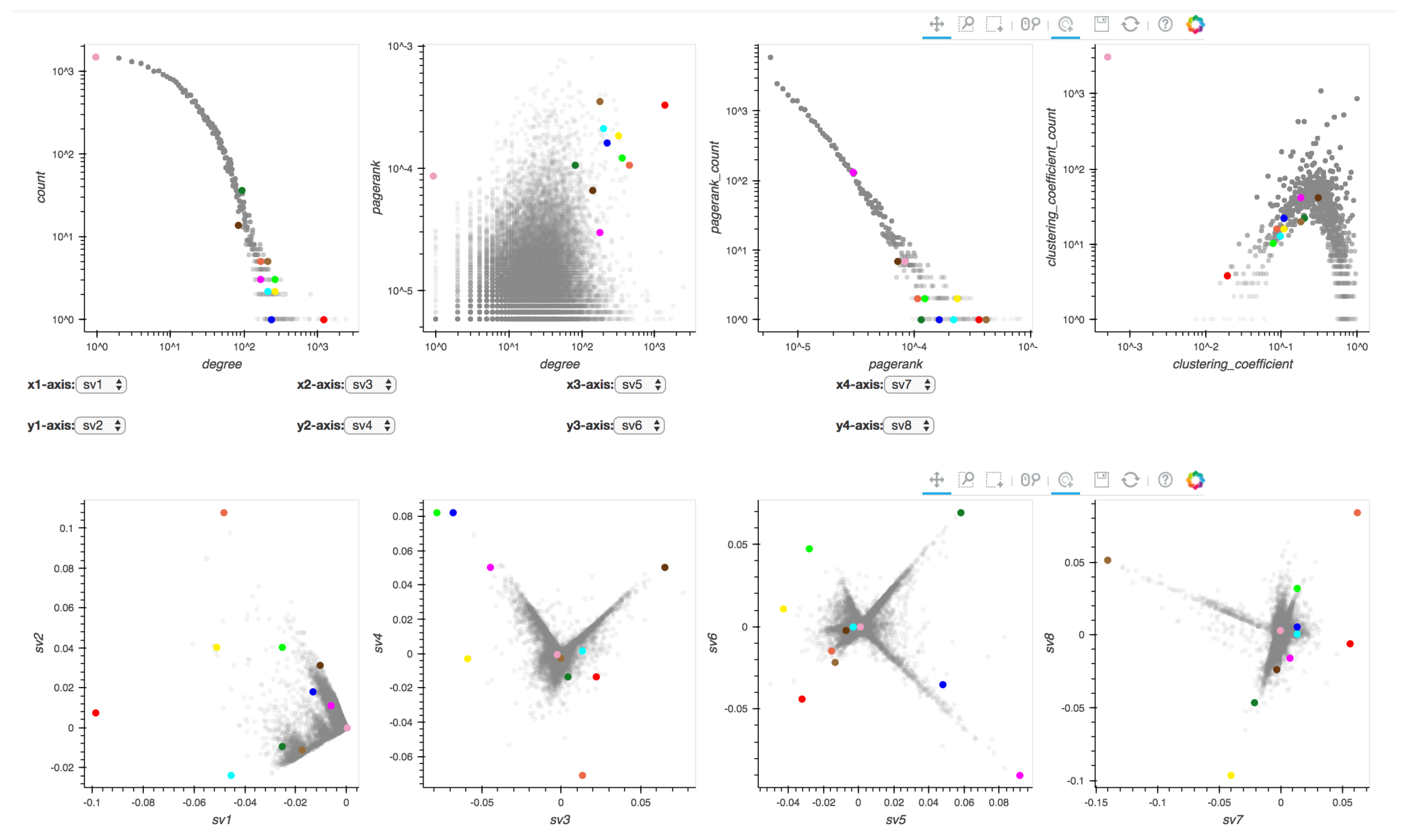
: Degree distribution plot,
  • p 2 : Two-dimensional distribution (or correlation plot) of degree vs. PageRank,
  • p 3 : PageRank distribution plot,
  • p 4 : Clustering coefficient distribution plot,
  • p 5 to p 9 : Five pairwise singular vector ( s v ) plots— s v 1 vs. s v 2 , s v 3 vs. s v 4 , s v 5 vs. s v 6 , s v 7 vs. s v 8 and s v 9 vs. s v 10 , respectively (where s v i is the i t h singular vector of a graph’s adjacency matrix). By default, the frontend shows the first four pairs of singular vectors. However, when Perseus-Hub computes the combined anomalousness scores, all plots are considered.
To obtain a combined anomalousness score, we compute a weighted combination of the normalized anomalousness scores from the various views (or distributions) of our data in the following way:
P ( v ) = i = 1 9 j w p i · P p i j ( v ) i = 1 9 j w p i , node v ,
where w p i is the contribution of plot p i to the total anomalousness score of each node. These weights can be modified as desired by the user based on domain knowledge. For example, in neuroscience, when studying connectomes of subjects with Alzheimer’s, a scientist may choose to set higher weight for the clustering coefficient distribution plot (based on research that has shown that the clustering coefficient is a discriminative feature for patients and control subjects [47]), and minimize the weight for the PageRank distribution. For simplicity, we provide default values of equal contribution per data aspect, where we consider four main aspects: degree, PageRank, clustering coefficient, and singular vector (i.e., w p i = 1 for i { 1 , 2 , 3 , 4 } and w p i = 1 5 for i { 5 , 6 , 7 , 8 , 9 } ). Additionally, the weights can be further customized if we introduce a w p i j notation so that different methods and plots can be weighted differently.

3.2.2. Scalability

To improve the performance of calculating the anomalousness scores using ABOD, parallelization was used. In particular, a separate process was used for the calculation of ABOD scores for each plot. The runtime of G-FADD and combining anomalousness scores is negligible when compared to the runtime of ABOD, and thus no further speedup was required.
To analyze the scalability of the two anomaly detection routines that are integrated in Perseus-Hub, we varied the number of nodes (or points) from a few hundreds to one million, and applied the methods of the PageRank vs. degree correlation plot. As seen from Figure 3, the runtime of ABOD grows quadratically as a function of the number of nodes, whereas G-FADD runs in near-linear time and is significantly faster even on datasets with millions of nodes. The outlier detection analysis is offline, and the precomputed results are stored and used for interactive visualization. For larger graphs, ABOD can be ‘disabled’ and G-FADD (in combination with other fast approaches) can be used for multi-view anomaly detection.

3.3. Module 3: Frontend Visualization

The frontend visualization consists of two parts: (1) aggregated summarization and (2) node-specific summarization. The former displays the linked statistics distributions, and the latter provides users with three components to analyze the node statistics and local connectivity with its neighbors.

3.3.1. Aggregated Summarization

Given a dataset, Perseus-Hub plots the distributions of the node-specific statistics (e.g., degree vs. PageRank, pairwise singular vector plots) and tracks specific nodes through linking and brushing. The layout of the ‘aggregated summarization’ is shown in Figure 4. In particular, the interactive visualization consists of eight linked distribution plots, where each point in the distributions is trackable: when the user clicks on it in one of the distributions, the corresponding point in other statistics distributions will be highlighted as well. The distribution plots p 1 to p 4 (described in Section 3.2.1) are aligned in the first row, and p 5 to p 8 in the second row. For p 5 to p 8 , users can change the axes of each of the four plots accordingly to portray the visualization they want.
Since the input graphs in Perseus-Hub may consist of thousands or millions of distinct nodes, directly plotting distributions of node-wise graph statistics—using identical amount of points to the number of nodes—is significantly memory-consuming and inefficient. To overcome such difficulties, in each distribution, Perseus-Hub reduces the amount of points required for plotting by dividing the plot into a k × k grid (e.g., k = 1000 by default) and using the center to represent points falling in each grid. To show the density of each grid, the number of points in each grid is marked with different colors: each non-empty grid is initialized as blue and becomes closer to red with more nodes.
The distribution plots are created using Bokeh, a Python visualization library that allows functionality such as linking, selecting, taping, and zooming. The Bokeh toolbar, which is illustrated in Figure 5, is given at the top-right of each row of plots and supports the following interactions starting from left to right:
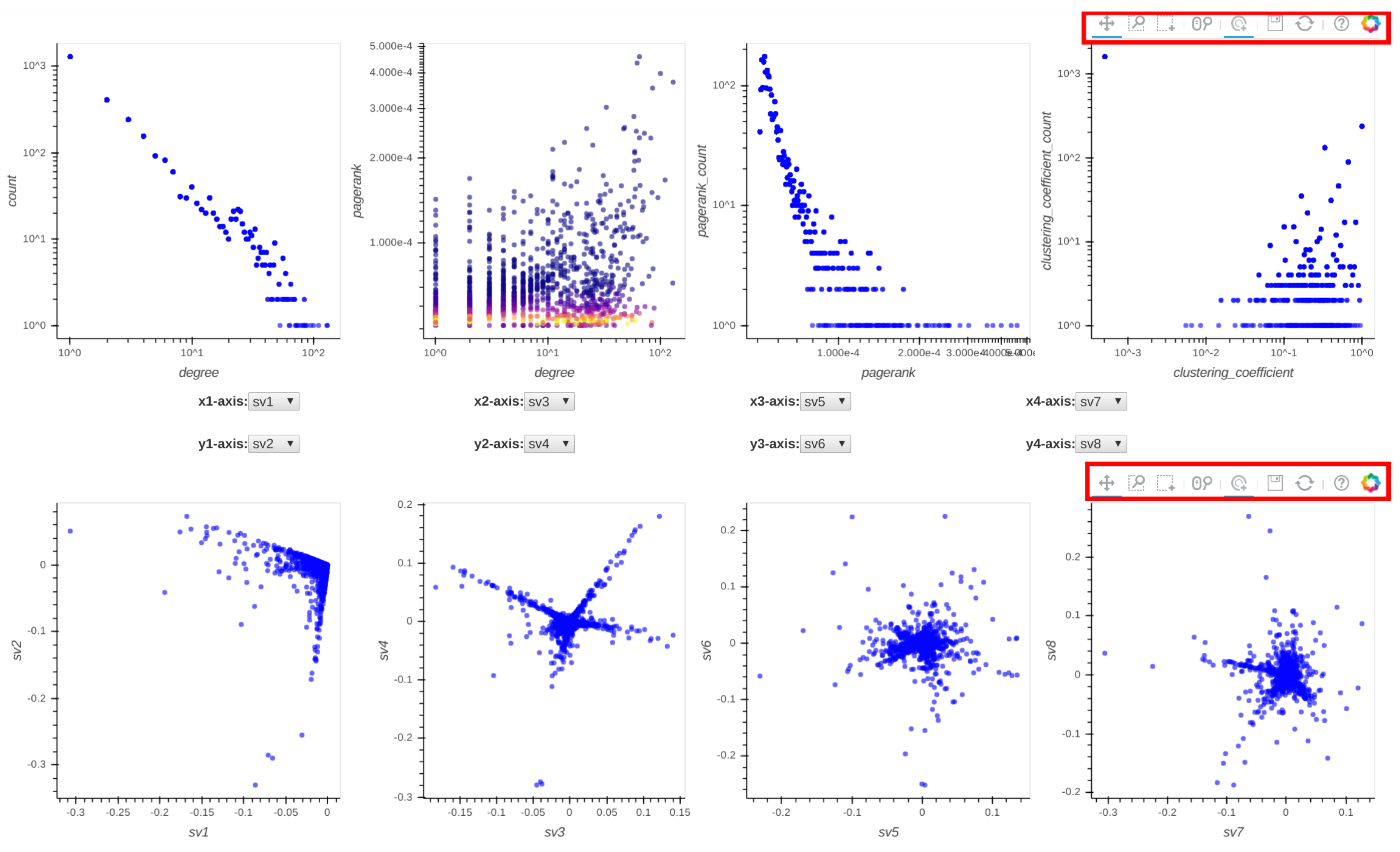
  • pan: When the pan tool is selected, the user can move the cloud of points in each distribution plot by holding the left mouse button and moving the cursor in the direction they want to move the graph.
  • box-zoom: When the box-zoom tool is selected, the user can box-select a region in the distribution plot they would like to zoom in.
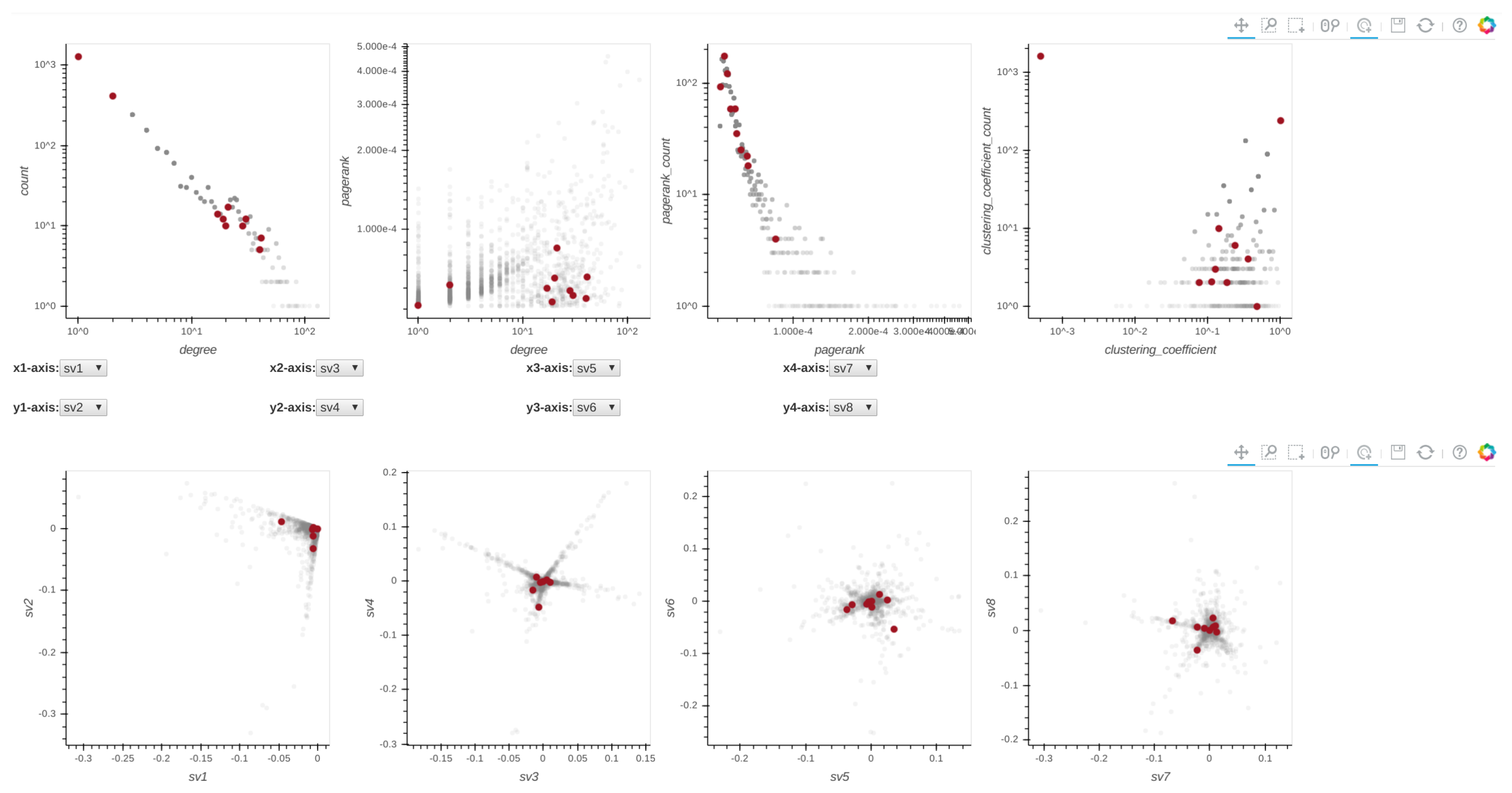
  • box-select: When the box-select tool is selected, the user can box-select and highlight a region of points in the selected distribution plot. Since all plots are linked, the corresponding points in the other plots are highlighted at the same time. This can be useful when a user wants to track micro-clusters of points across different ‘views’ (or graph properties).
  • wheel-zoom: When the wheel-zoom tool is selected, the user can scroll over a given distribution plot to zoom in or out.
  • tap: When the tap tool is selected, the user can left click on a specific single point. This is useful when the user wants to explore a single node (via the information console, egonet, or adjacency matrix) instead of using the box-select tool.
  • save: When the user clicks on the save button, the corresponding distribution plots are saved in png format.
  • reset: When the reset button is clicked, the distribution plots are re-positioned to their original setup and the previously selected points are unselected.

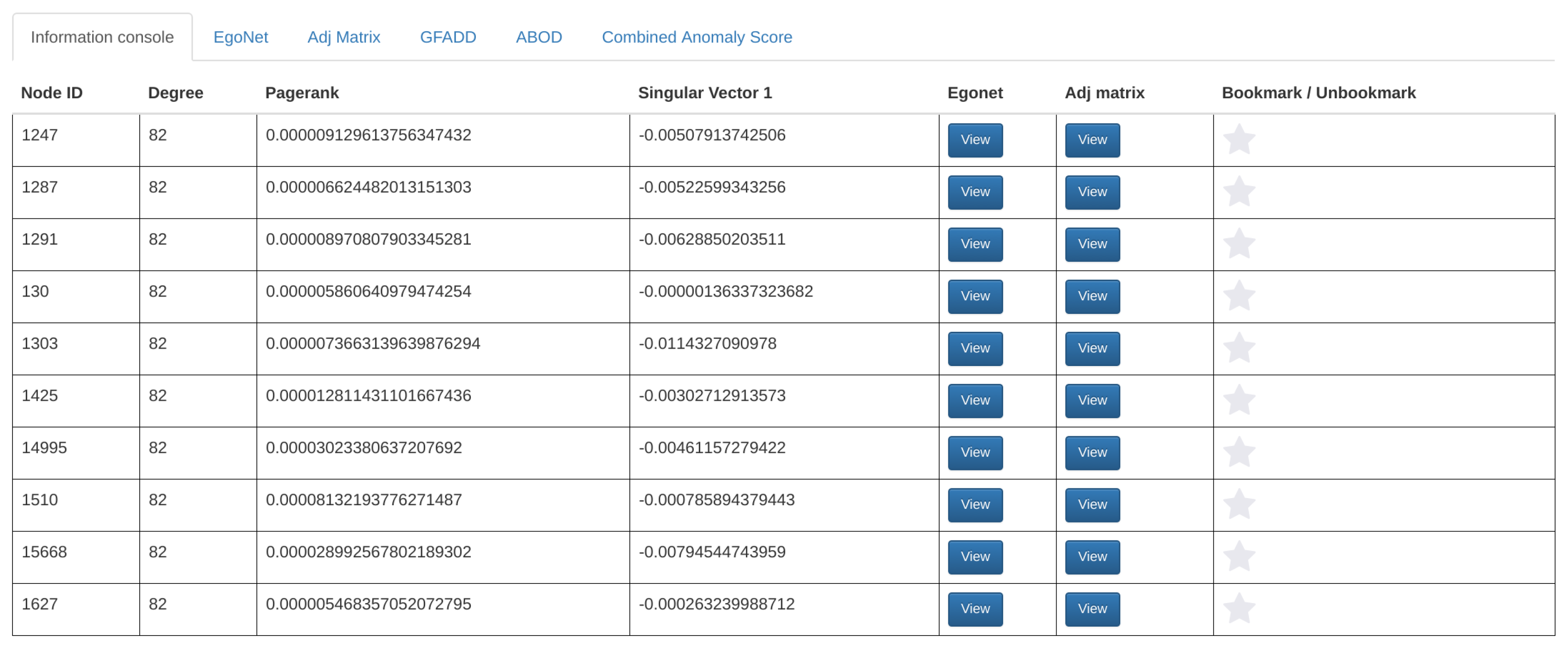
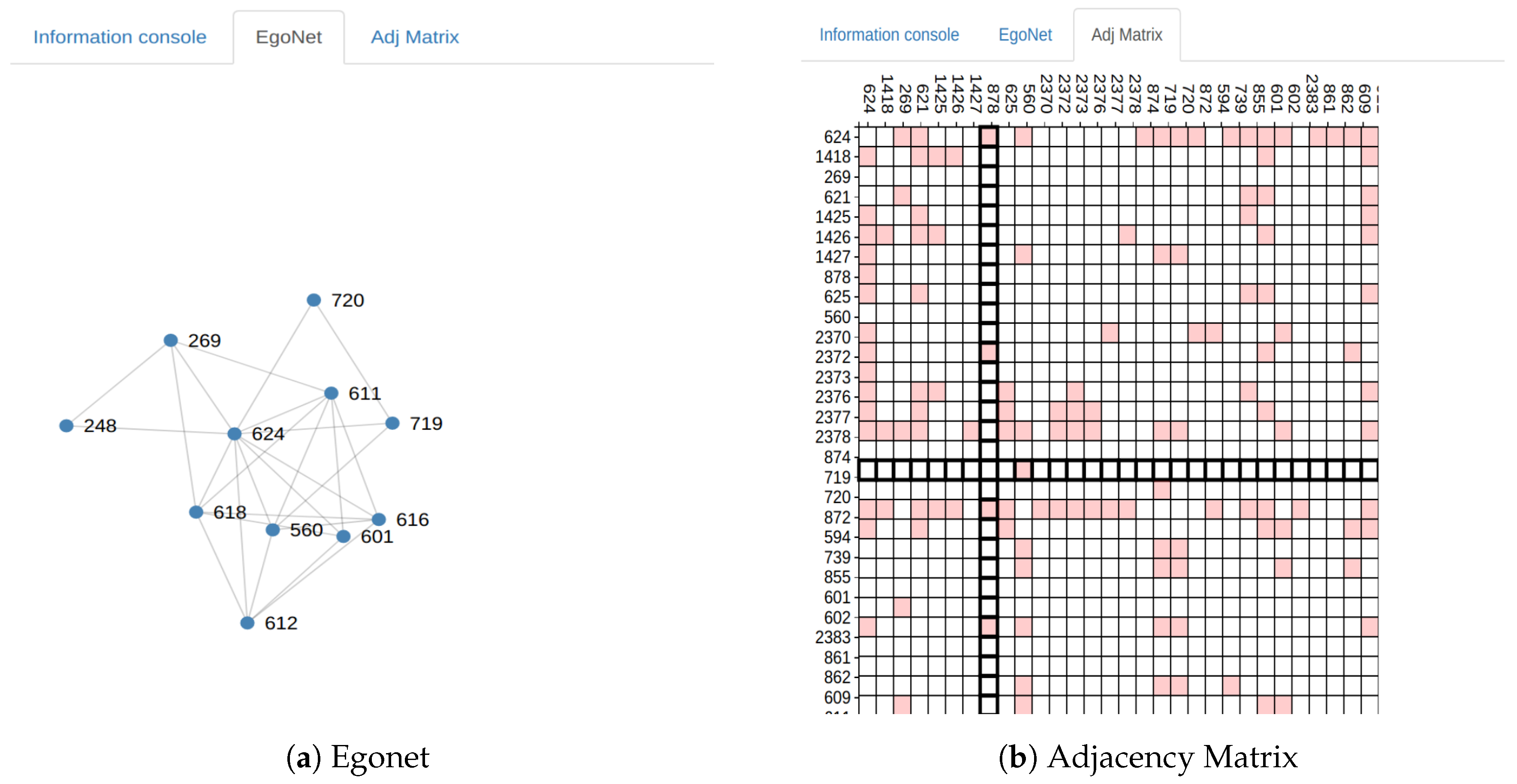
3.3.2. Node-Specific Summarization

Perseus-Hub provides three components to explore a specific point in a distribution (or correlation) plot: (1) an information console revealing the details of a collection of nodes that are similar to the a user-selected node in terms of at least one statistic (e.g., similar degree); (2) a dynamic egonet representation; and (3) an adjacency matrix centering a specific node. In addition, users who are interested in system-detected anomalies can explore the corresponding nodes using the provided anomaly detection methods.
Walk-through of a user interaction case. When a user selects a point in any of the plots, the point’s coordinates are sent to the backend server through an Ajax request. In the backend, the database is queried with the coordinates and attributes of the selected point and it returns at most 10 non-aggregate nodes that match the selected aggregate node. For example, if the user selects the point, degree = 130 and PageRank = 0.00037250011576710077 in the PageRank vs. degree graph, then the database will be queried so that it finds at most ten distinct nodes that have the same PageRank and degree values. Once all that information is retrieved, the backend will respond back and display the results in the information console as shown in Figure 6.
For each retrieved node in the information console, the user has the option to display the egonet and the adjacency matrix ( shown in Figure 7) of that node by clicking the appropriate button. Then, the user can navigate to the egonet and adjacency matrix tabs to view their respective interactive graphs. The egonet graph shows at most 10 other nodes adjacent to the selected node and all the connections between them. The user also has the ability to expand the egonet by clicking on any desired node from which they want to expand the network as well as deleting any desired node from the egonet. For efficiency, when a user clicks on a node, it expands to a random set of ten neighbors. However, this choice can be adjusted to better serve the exploration needs for different domains. The egonet (which is displayed using a force-directed layout) is interactive and can be re-positioned as desired by the user in order to provide a better visualization.
To explore nodes detected as anomalies, users can click on the G-FADD, ABOD, and Combined Anomaly Score buttons at the bottom of the screen to display the respective anomaly scores (Figure 8). Once the button is clicked, the top ten most anomalous nodes from the input graph will be presented in the table format ordered by their scores. Simultaneously, the top ten anomalous nodes are automatically highlighted in all the distribution plots to give the user a sense of the most anomalous nodes in their dataset (Figure 9). Node-specific interaction via egonet and adjacency matrix representation is supported for the anomalous nodes as well (through the tab for anomaly detection, as shown in Figure 8).

4. Perseus-Hub: Web Application Integration

In order to combine the above visualization features into one cohesive user interface, we wrap Perseus-Hub inside a web application interface, which is accessible universally within a browser. The application backend is hosted on Amazon Web Service (AWS), consisting of an Apache Spark cluster for processing user-uploaded raw datasets, an application architecture powered by an uWsgi server running Django, a Nginx reverse proxy server for IP resolution and static file serving, and a MySQL server for application data storage, while the frontend user interface is powered by the Bootstrap 3 framework.
The data visualization process is as follows: first, the application lets users upload raw datasets in the form of a text file from the upload page. The uploaded raw data is then passed to the master node of Apache Spark cluster to compute the graph statistics. Due to the potentially long time needed, the system is set to send the user an email when the processing is done, rather than providing an unresponsive interface which requires the user to wait.
After the raw dataset is processed, the computed node-specific statistics is stored in the MySQL table for dynamic querying. The dataset is then made available for viewing through a templated URL. When the templated dataset webpage is loaded, the dataset’s respective data files are loaded to plot statistics distributions with the Bokeh visualization library. One important goal of Perseus-Hub is to create a multi-user environment for sharing and analyzing a variety of user data sourced from the crowd. For this purpose, Perseus-Hub provides four user-related modules:
  • Authentication module: The web application includes a user registration and authentication module where new users can register and start processing and sharing their data immediately. This module is also the foundation of some other user-controlled features, which are elaborated on below.
  • Exploration module: The dashboard page of the web application is filled with a collection of recently added datasets. This data “feed” will be enhanced with suggestion algorithms in the future for better personalization.
  • Search module: When a user uploads her raw data, she is asked to enter a descriptive title for them. This piece of metadata provides a simple indexing method for the users to either search for a specific dataset or browse for datasets with a similar title.
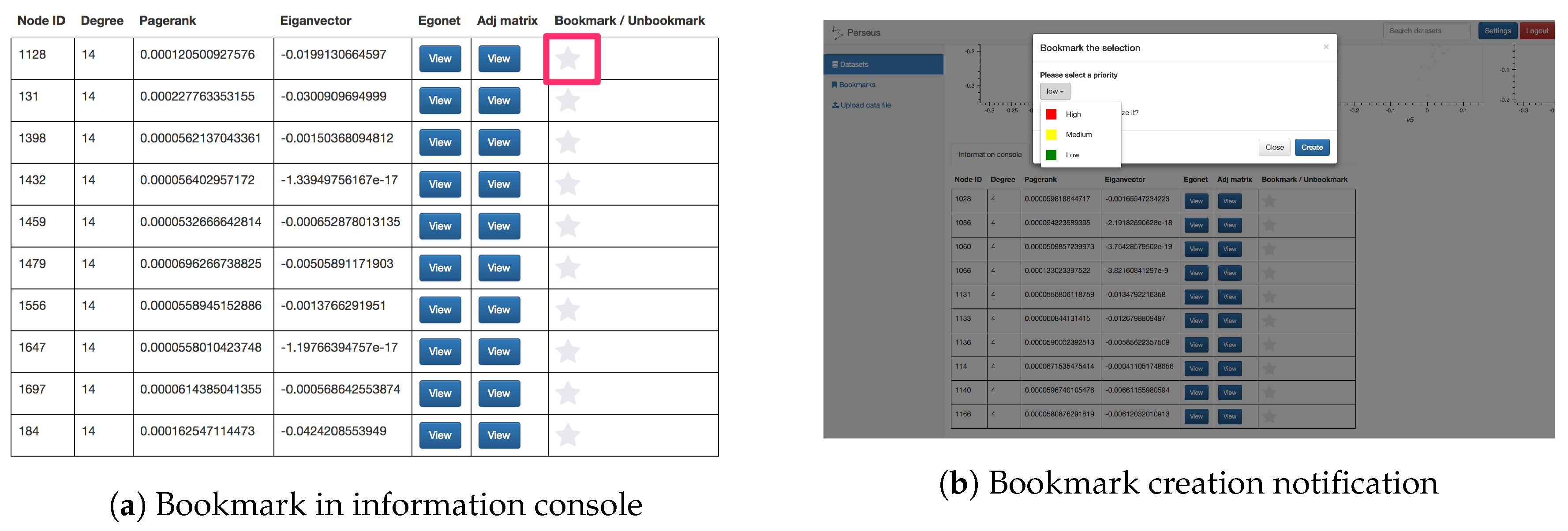
  • Bookmark module: The bookmark feature allows users to mark a specific node within a dataset by clicking on the “star” button next to the statistics in the information console. This feature gives users a finer-grained choice to mark their interest, e.g., a specific point in social networking datasets. Moreover, users can set a priority flag for their bookmarks, enabling better categorization and recognition for the creator. For collective analysis, users can choose to share their bookmarks publicly so that other analysts can incorporate these findings in their exploration process. Screenshots of the bookmark button and bookmark creation are shown in Figure 10.

5. Case Study

Perseus-Hub can be used to analyze various graph patterns, and in this section, we run Perseus-Hub on two real-world datasets from different domains to showcase how to analyze the spike patterns that appear in singular vector distributions.

5.1. The Citation Network

The first dataset we use is the Arxiv Hep-Th (high energy physics theory) citation graph [48] which contains 27,770 nodes and 352,807 edges. The frontend is shown in Figure 11. To analyze the spike patterns in the singular vector relationship plots, we study the points that locate at the ends of the spikes (extreme points). Specifically, we search for detailed information about the papers denoted by these points under the physics category in Arxiv (https://arxiv.org). The points explored are shown in Figure 12, and their detailed information is listed in Table 3.
Although singular vectors are known to capture structural information in graphs, there is no solid theory about what exact information is encoded and how to use it. By using the correspondence of extreme points in different singular vector relationships in Perseus-Hub, we find correlation between the paper topics and the structural information in the citation graph. Specifically, we make the following empirical observation: (1) in the citation graph, papers that are rarely cited or citing others are located at the “centers” of all singular vector relationship plots; (2) the similarity and difference between topics can be captured in different singular vector relationships; and (3) different spikes reflect different topics captured by the structural information in the citation graph.
To support our observation (1), we explored the point marked in light pink and found several papers that have only one total degree (degree distribution plot) in the dataset. In addition, according to the clustering coefficient distribution plot, the low value indicates that the corresponding papers are unlikely to be clustered with others, which demonstrates the fact that these papers are rarely cited by or citing other papers in this dataset. To support (2), we compare the paper titles of several extreme points. For example, the point marked in green and point marked in purple are located closely in the 3rd vs. 4th singular vector plot, but far away in the 5th vs. 6th singular vector plot. From the titles, we find that both green and purple discuss the topic of “field theory”, but, more specifically, one is about “quantum field theory” and the other is about “string field theory”. This explains why they are similar in terms of some singular vectors but different in terms of the others. Similarly, we observe this from the points marked in yellow and green. This similarity and difference in topic captured by the graph connectivity also demonstrates (3), since most papers discuss different specific areas in high energy physics theory. Nearby extreme points, such as the blue and green points in sv3 vs. sv4, show that papers about the same topic are likely to cite each other and share the same statistics.

5.2. The Social Network

The second dataset we use is a Twitter dataset, which contains 35,366 accounts and 78,058 retweet records, ranging from October 2015 to January 2016. Similar to the analysis in Section 5.1, we illustrate the frontend of Perseus-Hub in Figure 13 with patterns of interest marked in red ellipses.
In Figure 13, we manually tune the x- and y-axes of four singular vector relationship plots, which exhibit clear “EigenSpokes” patterns [43]. The spokes, or the straight lines that are aligned with the axes, represent the existence of groups of tightly connected nodes, and, in this case, accounts that often retweet or are being retweeted by other accounts. To further explore these suspicious groups of users (marked in red ellipses), we investigate their detailed screen names and their behaviors in Twitter. We find there are accounts that post tremendous amounts of advertising tweets such as “bmstores” (B&M online store), “@ProtecDirect” (UK supplier of personal protective equipment), “@CartridgeSave” (printer supplies) and so forth. On the other hand, there are accounts which mainly retweet those ads such as “@POY_UK” (product of the year) and “@harrisonsdirect” (product direct delivery). This finding explains why there are accounts with frequent retweet behaviors: Online sales are always trying to promote their products through either their official accounts (e.g., “@bmstores”) or proxies (e.g., “@POY_UK”). Similarly, we can run Perseus-Hub to detect bots in Twitter that spread rumors or fake news by evaluating the singular vector plots.
In a nutshell, we illustrate that Perseus-Hub provides analysts a way to distinguish normal users from bots or spam accounts, which further demonstrates the usage of Perseus-Hub in the domain of social networks.

6. Conclusions

In this paper, we introduce Perseus-Hub, an efficient large-scale graph mining tool with interactive visualization to support preliminary analysis of graph data. Perseus-Hub adopts a two-level summarization scheme that visualizes both aggregate and node-specific patterns. Our system also enables collective analysis of data from multiple users, as well as machine-driven, ensemble, multi-view outlier detection analysis that guides the data exploration process to anomalous patterns. We believe that Perseus-Hub provides a new way to analyze large, complex graphs that could be beneficial to users across various domains.
Most analysis performed in Perseus-Hub is based on the node-specific statistics of the input graph; therefore, a natural direction to consider as future work is the integration of side node information (e.g., node attributes). Another direction is to extend the anomaly detection functionality with the integration of more detection algorithms and the support of additional frontend options for the user (e.g., selection of weight contributions for various views to the ensemble scores). More importantly, for domain-specific summarization, it would be beneficial to devise efficient computational methods for ‘customized’ summarization of graph data by leveraging the domain knowledge, i.e., automatic selection of the ‘summarized’ statistics to be shown to the user, instead of providing a set of predefined statistics as in Perseus-Hub. At this stage, we consider our work to be the first step towards a ‘collaborative’ tool that supports large-scale graph analysis.

Acknowledgments

The authors would like to thank Christos Faloutsos, Yuanchi Ning, and Esther Wang for their feedback and contributions during the early steps of this project. This work is supported by the University of Michigan and AWS Cloud Credits for Research.

Author Contributions

Danai Koutra had the original idea for the system, which was further developed with Di Jin. Di Jin led the implementation of the system and managed a team of undergraduate and Masters students, who contributed to various parts of Perseus-Hub: Aristotelis Leventidis, Haoming Shen, Ruowang Zhang, and Junyue Wu. Di Jin performed the analysis of the case studies. Di Jin, Danai Koutra, Aristotelis Leventidis and Haoming Shen were involved in writing the paper.

Conflicts of Interest

The authors declare no conflict of interest.

References

  1. Kuramochi, M.; Karypis, G. Frequent Subgraph Discovery. In Proceedings of the 2001 1st IEEE International Conference on Data Mining (ICDM), San Jose, CA, USA, 29 November–2 December 2001; pp. 313–320. [Google Scholar]
  2. Leardi, R. Multi-way analysis with applications in the chemical sciences, age smilde, Rasmus Bro and Paul Geladi, Wiley, Chichester, 2004, ISBN 0-471-98691-7, 381 pp. J. Chemometr. 2005, 19, 119–120. [Google Scholar] [CrossRef]
  3. Tong, H.; Faloutsos, C. Center-piece subgraphs: Problem definition and fast solutions. In Proceedings of the 12th ACM SIGKDD International Conference on Knowledge Discovery and Data Mining (KDD ’06), New York, NY, USA, 20–23 August 2006; ACM: New York, NY, USA, 2006; pp. 404–413. [Google Scholar]
  4. Sondhi, P.; Sun, J.; Tong, H.; Zhai, C. SympGraph: A framework for mining clinical notes through symptom relation graphs. In Proceedings of the 18th ACM SIGKDD International Conference on Knowledge Discovery and Data Mining (KDD ’12), Beijing, China, 12–16 August 2012; pp. 1167–1175. [Google Scholar]
  5. Backstrom, L.; Kumar, R.; Marlow, C.; Novak, J.; Tomkins, A. Preferential behavior in online groups. In Proceedings of the International Conference on Web Search and Web Data Mining (WSDM ’08), New York, NY, USA, 11–12 February 2008; ACM: New York, NY, USA, 2008; pp. 117–128. [Google Scholar]
  6. Barabási, A.L.; Jeong, H.; Néda, Z.; Ravasz, E.; Schubert, A.; Vicsek, T. Evolution of the social network of scientific collaborations. Physica A 2002, 311, 590–614. [Google Scholar] [CrossRef]
  7. Stolper, C.D.; Kahng, M.; Lin, Z.; Foerster, F.; Goel, A.; Stasko, J.; Chau, D.H. Glo-stix: Graph-level operations for specifying techniques and interactive exploration. IEEE Trans. Vis. Comput. Graph. 2014, 20, 2320–2328. [Google Scholar] [CrossRef] [PubMed]
  8. Chau, D.H.; Kittur, A.; Hong, J.I.; Faloutsos, C. Apolo: Making Sense of Large Network Data by Combining Rich User Interaction and Machine Learning. In Proceedings of the 17th ACM International Conference on Knowledge Discovery and Data Mining (SIGKDD), San Diego, CA, USA, 21–24 August 2011. [Google Scholar]
  9. Koutra, D.; Jin, D.; Ning, Y.; Faloutsos, C. Perseus: An Interactive Large-Scale Graph Mining and Visualization Tool. Proc. VLDB Endow. 2015, 8, 1924–1927. [Google Scholar] [CrossRef]
  10. Jin, D.; Sethapakdi, T.; Koutra, D.; Faloutsos, C. PERSEUS3: Visualizing and Interactively Mining Large-Scale Graphs. In Proceedings of the WOODSTOCK ’97, El Paso, TX, USA, July 1997. [Google Scholar]
  11. Lee, J.Y.; Kang, U.; Koutra, D.; Faloutsos, C. Fast Anomaly Detection Despite the Duplicates. In Proceedings of the 22nd International Conference on World Wide Web (WWW Companion Volume), Rio de Janeiro, Brazil, 13–17 May 2013; pp. 195–196. [Google Scholar]
  12. Kriegel, H.P.; Zimek, A.; Hubert, M.S. Angle-based outlier detection in high-dimensional data. In Proceedings of the 14th ACM SIGKDD International Conference on Knowledge Discovery and Data Mining, Las Vegas, NV, USA, 24–27 August 2008; pp. 444–452. [Google Scholar]
  13. Pienta, R.; Kahng, M.; Lin, Z.; Vreeken, J.; Talukdar, P.; Abello, J.; Parameswaran, G.; Chau, D.H. FACETS: Adaptive Local Exploration of Large Graphs. In Proceedings of the 2017 SIAM International Conference on Data Mining. Society for Industrial and Applied Mathematics, Houston, TX, USA, 27–29 April 2017. [Google Scholar]
  14. Wongsuphasawat, K.; Qu, Z.; Moritz, D.; Chang, R.; Ouk, F.; Anand, A.; Mackinlay, J.; Howe, B.; Heer, J. Voyager 2: Augmenting Visual Analysis with Partial View Specifications. In Proceedings of the 2017 CHI Conference on Human Factors in Computing Systems, Denver, CO, USA, 6–11 May 2017; ACM: New York, NY, USA, 2017; pp. 2648–2659. [Google Scholar]
  15. May, T.; Steiger, M.; Davey, J.; Kohlhammer, J. Using signposts for navigation in large graphs. Comput. Gr. Forum 2012, 31, 985–994. [Google Scholar] [CrossRef]
  16. Henry, N.; Fekete, J.D.; McGuffin, M.J. NodeTrix: A hybrid visualization of social networks. IEEE Trans. Vis. Comput. Graph. 2007, 13, 1302–1309. [Google Scholar] [PubMed]
  17. Zhao, J.; Collins, C.; Chevalier, F.; Balakrishnan, R. Interactive exploration of implicit and explicit relations in faceted datasets. IEEE Trans. Vis. Comput. Graph. 2013, 19, 2080–2089. [Google Scholar] [PubMed]
  18. Kairam, S.; Riche, N.H.; Drucker, S.; Fernandez, R.; Heer, J. Refinery: Visual exploration of large, heterogeneous networks through associative browsing. Comput. Gr. Forum 2015, 34, 301–310. [Google Scholar] [CrossRef]
  19. Akoglu, L.; Chau, D.H.; Kang, U.; Koutra, D.; Faloutsos, C. OPAvion: Mining and Visualization in Large Graphs. In Proceedings of the 2012 ACM International Conference on Management of Data (SIGMOD), Scottsdale, AZ, USA, 20–24 May 2012; ACM: New York, NY, USA, 2012; pp. 717–720. [Google Scholar]
  20. Kang, U.; Tsourakakis, C.E.; Faloutsos, C. PEGASUS: A Peta-Scale Graph Mining System—Implementation and Observations. In Proceedings of the 9th IEEE International Conference on Data Mining (ICDM), Miami, FL, USA, 6–9 December 2009. [Google Scholar]
  21. Akoglu, L.; McGlohon, M.; Faloutsos, C. OddBall: Spotting Anomalies in Weighted Graphs. In Proceedings of the 14th Pacific-Asia Conference on Knowledge Discovery and Data Mining (PAKDD), Hyderabad, India, 21–24 June 2010. [Google Scholar]
  22. Kang, U.; Lee, J.Y.; Koutra, D.; Faloutsos, C. Net-Ray: Visualizing and Mining Web-Scale Graphs. In Proceedings of the 18th Pacific-Asia Conference on Knowledge Discovery and Data Mining (PAKDD), Tainan, Taiwan, 13–16 May 2014. [Google Scholar]
  23. Dunne, C.; Shneiderman, B. Motif Simplification: Improving Network Visualization Readability with Fan, Connector, and Clique Glyphs. In Proceedings of the SIGCHI Conference on Human Factors in Computing Systems (CHI), Paris, France, 27 April–2 May 2013; ACM: New York, NY, USA, 2013; pp. 3247–3256. [Google Scholar]
  24. Nielsen, J. Website Response Times. 21 June 2010. Available online: http://www.nngroup.com/articles/website-response-times/ (accessed on 17 November 2015).
  25. Mishra, C.; Koudas, N. Interactive query refinement. In Proceedings of the 12th International Conference on Extending Database Technology (EDBT 2009), Saint Petersburg, Russia, 24–26 March 2009; pp. 862–873. [Google Scholar]
  26. Jiang, L.; Nandi, A. SnapToQuery: Providing Interactive Feedback during Exploratory Query Specification. PVLDB 2015, 8, 1250–1261. [Google Scholar] [CrossRef]
  27. Çetintemel, U.; Cherniack, M.; DeBrabant, J.; Diao, Y.; Dimitriadou, K.; Kalinin, A.; Papaemmanouil, O.; Zdonik, S.B. Query Steering for Interactive Data Exploration. In Proceedings of the Sixth Biennial Conference on Innovative Data Systems Research (CIDR 2013), Asilomar, CA, USA, 6–9 January 2013. [Google Scholar]
  28. Chatzopoulou, G.; Eirinaki, M.; Polyzotis, N. Query Recommendations for Interactive Database Exploration. In Proceedings of the 21st International Conference on Scientific and Statistical Database Management (SSDBM 2009), New Orleans, LA, USA, 2–4 June 2009; Winslett, M., Ed.; Springer: New Orleans, LA, USA, 2009; Volume 5566, pp. 3–18. [Google Scholar]
  29. Goethals, B.; Moens, S.; Vreeken, J. MIME: A Framework for Interactive Visual Pattern Mining. In Proceedings of the 17th ACM International Conference on Knowledge Discovery and Data Mining (SIGKDD), San Diego, CA, USA, 21–24 August 2011; ACM: New York, NY, USA, 2011; pp. 757–760. [Google Scholar]
  30. Vartak, M.; Rahman, S.; Madden, S.; Parameswaran, A.; Polyzotis, N. SeeDB: Efficient Data-driven Visualization Recommendations to Support Visual Analytics. Proc. VLDB Endow. 2015, 8, 2182–2193. [Google Scholar] [CrossRef]
  31. Shahaf, D.; Yang, J.; Suen, C.; Jacobs, J.; Wang, H.; Leskovec, J. Information cartography: Creating zoomable, large-scale maps of information. In Proceedings of the 19th ACM SIGKDD International Conference on Knowledge Discovery and Data Mining (KDD 2013), Chicago, IL, USA, 11–14 August 2013; pp. 1097–1105. [Google Scholar]
  32. Chau, D.H.; Akoglu, L.; Vreeken, J.; Tong, H.; Faloutsos, C. TOURVIZ: Interactive Visualization of Connection Pathways in Large Graphs. In Proceedings of the 18th ACM International Conference on Knowledge Discovery and Data Mining (SIGKDD), Beijing, China, 12–16 August 2012; ACM: New York, NY, USA, 2012. [Google Scholar]
  33. Rodrigues, J.F., Jr.; Tong, H.; Traina, A.J.M.; Faloutsos, C.; Leskovec, J. GMine: A System for Scalable, Interactive Graph Visualization and Mining. In Proceedings of the 32nd International Conference on Very Large Data Bases, Seoul, Korea, 12–15 September 2006; pp. 1195–1198. [Google Scholar]
  34. Khoa, N.L.D.; Chawla, S. Robust Outlier Detection Using Commute Time and Eigenspace Embedding. In Proceedings of the 14th Pacific-Asia Conference on Knowledge Discovery and Data Mining (PAKDD), Hyderabad, India, 21–24 June 2010; Springer: Berlin, Germany; Volume 6119, pp. 422–434. [Google Scholar]
  35. Akoglu, L.; Tong, H.; Koutra, D. Graph-based Anomaly Detection and Description: A Survey. Data Min. Knowl. Discov. (DAMI) 2014, 29, 626–688. [Google Scholar] [CrossRef]
  36. Ranshous, S.; Shen, S.; Koutra, D.; Harenberg, S.; Faloutsos, C.; Samatova, N.F. Anomaly detection in dynamic networks: A survey. WIREs Comput. Statist. 2015, 7, 223–247. [Google Scholar] [CrossRef]
  37. Breunig, M.M.; Kriegel, H.P.; Ng, R.T.; Sander, J. LOF: Identifying density-based local outliers. In Proceedings of the ACM SIGMOD 2000 International Conference on Management of Data, Dalles, TX, USA, 15–18 May 2000; ACM: New York, NY, USA, 2000; Volume 29, pp. 93–104. [Google Scholar]
  38. Lee, J.Y.; Kang, U.; Koutra, D.; Faloutsos, C. Fast Outlier Detection Despite the Duplicates. In Proceedings of the WWW 2013 Companion, Rio de Janeiro, Brazil, 13–17 May 2013. [Google Scholar]
  39. Chakrabarti, D. Autopart: Parameter-free graph partitioning and outlier detection. In Proceedings of the 8th European Conference on Principles of Data Mining and Knowledge Discovery, Pisa, Italy, 20–24 September 2004; Springer: Berlin, Germany, 2004; pp. 112–124. [Google Scholar]
  40. Xu, X.; Yuruk, N.; Feng, Z.; Schweiger, T.A. Scan: A structural clustering algorithm for networks. In Proceedings of the 13th ACM SIGKDD International Conference on Knowledge Discovery and Data Mining, San Jose, CA, USA, 12–15 August 2007; ACM: New York, NY, USA, 2007; pp. 824–833. [Google Scholar]
  41. Jiang, M.; Cui, P.; Beutel, A.; Faloutsos, C.; Yang, S. Catchsync: catching synchronized behavior in large directed graphs. In Proceedings of the 20th ACM SIGKDD International Conference on Knowledge Discovery and Data Mining, New York, NY, USA, 24–27 August 2014; ACM: New York, NY, USA, 2014; pp. 941–950. [Google Scholar]
  42. Faloutsos, M.; Faloutsos, P.; Faloutsos, C. On power-law relationships of the internet topology. In ACM SIGCOMM Computer Communication Review; ACM: New York, NY, USA, 1999; Volume 29, pp. 251–262. [Google Scholar]
  43. Prakash, B.A.; Sridharan, A.; Seshadri, M.; Machiraju, S.; Faloutsos, C. EigenSpokes: Surprising Patterns and Scalable Community Chipping in Large Graphs. In Proceedings of the Pacific-Asia Conference on Knowledge Discovery and Data Mining (PAKDD), Hyderabad, India, 21–24 June 2010; pp. 435–448. [Google Scholar]
  44. Page, L.; Brin, S.; Motwani, R.; Winograd, T. The PageRank Citation Ranking: Bringing Order to the Web; Stanford Digital Library Technologies Project. In Proceedings of the 7th International World Wide Web Conference, Brisbane, Australia, 14–18 April 1998. [Google Scholar]
  45. Alemi, M.; Haghighi, H.; Shahrivari, S. CCFinder: Using Spark to find clustering coefficient in big graphs. J. Supercomput. 2017, 1–28. [Google Scholar] [CrossRef]
  46. Kriegel, H.P.; Kroger, P.; Schubert, E.; Zimek, A. Interpreting and unifying outlier scores. In Proceedings of the 2011 SIAM International Conference on Data Mining, Phoenix, AZ, USA, 28–30 April 2011. [Google Scholar]
  47. Wang, J.; Zuo, X.; Dai, Z.; Xia, M.; Zhao, Z.; Zhao, X.; Jia, J.; Han, Y.; He, Y. Disrupted functional brain connectome in individuals at risk for Alzheimer’s disease. Biol. Psychiatry 2013, 73, 472–481. [Google Scholar] [CrossRef] [PubMed]
  48. Leskovec, J. Stanford Large Network Dataset Collection. Available online: http://snap.stanford.edu/data/cit-HepTh.html (accessed on 17 November 2015).
Figure 1. Overview of Perseus-Hub. The solid arrows indicate the system behaviors and the dashed arrows indicate the user behaviors. In this example, User 1 uploads the dataset to analyze to the private working space, and publishes it with marked patterns that he thinks are worth exploration. Other users who are interested in the published graph (User 2 and User 3) may refer to the analysis by User 1 in the public working space, or perform analysis in their private working space (e.g., User 2).
Informatics 04 00022 g001
Figure 2. Perseus-Hub ‘user’ view: Node statistic distribution and correlation plots summarize the key structural properties of the input graph, and provide the user with an initial point for exploration and in-depth analysis. The red box annotation indicates the tab for uploading input graph files.
Informatics 04 00022 g002
Figure 3. Scalability of ABOD and G-FADD for varying graph size. x-axis: number of nodes; y-axis: runtime in seconds.
Informatics 04 00022 g003
Figure 4. Layout of the graphs displayed in the frontend. The plots in the first row are degree vs. count, degree vs. PageRank, PageRank vs. PageRank count and ClusteringCoefficient vs. ClusteringCoefficient count. The plots in the second row are singular vector (sv) relationships, specifically they are sv1 vs. sv2, sv3 vs. sv4, sv5 vs. sv6, sv7 vs. sv8. Note that each node in the degree vs. PageRank plot is colored according to the PageRank count value of each node, a high count is red and a low count is blue. The red box annotations indicate the Bohek toolbar.
Informatics 04 00022 g004
Figure 5. Bokeh Toolbar (the last two buttons at the rightmost end of the toolbar are just links for more information about Bokeh and they don’t serve any interaction purpose).
Informatics 04 00022 g005
Figure 6. Layout of the information console.
Informatics 04 00022 g006
Figure 7. Node-specific summarization: representation of the egonet and adjacency matrix of a selected node.
Informatics 04 00022 g007
Figure 8. Layout of the anomaly scores table.
Informatics 04 00022 g008
Figure 9. Top ten anomalous nodes are highlighted in red.
Informatics 04 00022 g009
Figure 10. Illustration of the bookmark functionality.
Informatics 04 00022 g010
Figure 11. Illustration of running Perseus-Hub on the cit-HepTh (citation in high energy physics theory) graph. To explore the spike patterns in the singular vector plots, extreme points on the spikes are selected and explored. Only one is shown in this case to obtain the node ID.
Informatics 04 00022 g011
Figure 12. Illustration of points explored, marked with different colors.
Informatics 04 00022 g012
Figure 13. Analysis of Twitter retweet network: suspicious patterns are marked in red ellipses.
Informatics 04 00022 g013
Table 1. Qualitative comparison of Perseus-Hub with alternative approaches. (i) Node analytics: Does the visualization framework provide node-specific statistics or analytics? (ii) Mixed Expertise: Can the visualization tool be used by users with varying levels of expertise (e.g., experts, beginners or users with limited familiarity with the graph data)? (iii) Automatic Pattern Detection: Does the visualization tool automatically detect specific patterns and guide users to them? (iv) Collective Analysis: Does the visualization tool support information sharing among users? (v) Scalability: Can users analyze large-scale, real-world graphs with the tool? (vi) Domain-independence: Does the tool support graphs from multiple domains (e.g., social networks, neural networks, etc.)?
Node AnalyticsMixed ExpertiseAuto DetectionCollective An.ScalabilityDomain-Ind.
GLO-STIX [7]?
FACETS [13]
Voyager 2 [14]
Signposts [15]
NodeTrix [16]
PivotSlice [17]
Refinery [18]
Apolo [8]
OPAvion [19]
NetRay [22]
Motif-Simp [23]
PERSEUS [9,10]
Perseus-Hub
Table 2. Execution time: computation of graph statistics.
Dataset# Nodes# EdgesStatistics Computation (s)Average Response (ms)
cit-HepTh27,770352,807790.0147.320
Twitter_retweet35,36678,058711.5928.311
Table 3. Detailed information of selected points in singular vector plots.
ColorPaper IDPaper title
Red9905111“Large N Field Theories, String Theory and Gravity”
Cyan0201253“Supersymmetric Gauge Theories and the AdS/CFT Correspondence”
Orange9710046“Black Holes and Solitons in String Theory”
Green0109162“Quantum Field Theory on Noncommutative Spaces”
Purple0102085“A Review on Tachyon Condensation in Open String Field Theories”
Dark green0302030“Brane World Dynamics and Conformal Bulk Fields”
Yellow0101126”M(atrix) Theory: Matrix Quantum Mechanics as a Fundamental Theory”
Blue0111208“Noncommutative Field Theories and (Super)String Field Theories”
Light brown211178“Supersymmetric D3 brane and N=4 SYM actions in plane wave backgrounds”
Brown9911022“Tests of M-Theory from N=2 Seiberg-Witten Theory”
Light pink0104127“Thermodynamic properties of the quantum vacuum”

