1. Introduction
The goal of genomic analysis should fully exploit the potential of state-of-the-art technologies that use multidimensional datasets and embrace the complexity of the data for personalised medicine [
1]. Patients with similar clinical presentation do not always respond to the same treatment strategies. By enabling clinicians’ access to complex genomics data in meaningful, but dynamic ways, it will lead them to better understanding of how an individual patient differs from others with similar diseases. This platform will allow the clinicians to tailor the treatment to the most efficacious for each individual. This requires integration of different genomics data from diverse sources to build up a complete and data-driven picture of each patient, allowing explorations of the information from the interactive visualisation.
The interrogation of the cancer genomes has yielded meaningful insights and identified exciting biological features amenable to targeted therapy. A thorough analysis of many genetic features is difficult, and this process is usually required for finding new insights in the personalised cancer treatment [
2]. Although biomarkers are potentially useful for targeted therapies, it is still unclear why biomarkers are considered good targets for treatment yet often fail to be clinically effective. Examining a single biomarker normally does not inform about the deeper biological mechanisms driving an individual’s disease [
2,
3]. It is essential to gain a more complex picture of tumour biology across the patient cohort so that a better treatment strategy can be made.
Among cancer genome studies, the analysis of gene expression profiling and patterns has been applied in various biological and biomedical studies, such as metabolic pathways [
4] and identifying genes of interest [
5,
6]. Most of the available studies aimed to bring the insight of the information of gene expression and microarrays, which are a series of probes located orderly on a fixed surface [
7]. Microarrays create complex data structures with over ten thousand probes and cross-referencing interconnections in each record. The use of statistics and basic visualisation [
8] may not be effective to handle such a large amount of information. Without effective interaction and the capabilities of data manipulation and the quality assurance of the results, the data mining process alone is often insufficient for large-scale data analysis.
This article proposes a novel visual analytics framework that looks for overarching patterns that emerge from a suitable selection of features in the datasets. It provides an interactive environment to analyse and explain these patterns. In order to apply this methodology to daily clinical use in assisting decision making by physicians, our work aims to produce meaningful visualisations for the clinicians at the bedside. This is enabled by the integration of domain knowledge into the development. The innovation lies in its capability to provide seamless analysis of complex genomics data using multiple processes and technologies, from similarity space construction, feature selection, automated analysis to a comprehensively interactive visualisation.
2. Related Work
Scientists and researchers have been generating a large amount of genomic, transcriptomic and epigenetic data when studying features of cancer disease in diagnostics, prognostics or even therapeutic applications. To make sense of the vast data, the functionality, quality and appropriateness of the visual analytical tools are critical in supporting the analysis, knowledge discovery, prediction or phrasing meaningful hypotheses for testing [
5]. The dialogue and interaction between experts from different domains, such as computational scientists, cancer biologists, biostatisticians and clinicians, and the fusion of their knowledge and skills are essential to achieving effective knowledge discovery process.
Genomics data usually contain a large number of attributes, which are required to be reduced to a manageable size. Data visualisation methods are only effectively applied on a small number of attributes. Popular dimensionality reduction methods include principal component analysis [
9], non-negative matrix factorization [
10], multidimensional scaling [
11] and local linear embedding [
12]. Dimensionality reduction methods in image classification [
13], image clustering [
14] and human poses [
15] can also be potentially applied to the high-dimensional genomics data. The choice of methods to apply depends to some extent on the nature of the information expected to be encoded in the dataset. Further discussion on dimensionality reduction in the automated analysis process is presented in
Section 4.2.
Early visualisation techniques for gene expression, such as those discussed in [
16] provided basic ways for analysing data, which overall did not contribute a comprehensive and effective purpose-built analysis mechanism. Recent visualisation tools, for example, those presented by [
17,
18,
19,
20], have made some purpose-built additions to the earlier basic sets. Caleydo et al. provide the interdependencies of genes by bringing gene expression in context with pathways by using multiple views in conjunction with a large 2.5D main view [
18]. Cvek et al. use dimension reduction methods and multi-dimensional data visualisations for analysing gene expression data [
17]. Although this is a good framework, it does not support the deep analysis of gene expression data and associated genomic and clinical data. Nguyen et al. present a novel interactive visualisation that combines domain knowledge for analysing Acute Lymphoblastic Leukaemia (ALL) [
19,
20].
This paper presents a framework that utilises in an integral way various technologies and techniques to support the visual analytics of the complex genomics data. We focus on the similarity space of the patient cohort based on one or more features. We provide a comprehensive extension of the methods used in the framework’s components, including data collection, feature selection and model building, as well as interactive visualisation. Two case studies are also presented in this latest work.
The framework integrates 2D and 3D visualisation methods for the purposes of the different analyses. 3D graphic engines can offer to the end users the interactive mode, dynamic features, flexibility and usability when creating various graph models for data analysis. Among those, game engines offer multi-user interactive scalable rendering. There is a variety of multi-platform game engines suitable for the purposes of this work. These include Unity3D, Unreal Engine, Cry Engine and Blender Game Engine. Unfortunately, there has been little research work conducted on utilising 3D graphic game engines to support smooth interactive visualisation for scientific purposes. The benefits of developing tools for scientific purposes used in the bioinformatics field could facilitate new discoveries and valuable insights by combining experimental data and modelling [
21]. Among the above mentioned game engines, Unity3D is well positioned for this work, taking in account its integration with personal virtual reality devices, including HTC Vive, Oculus Rift, and most recently, the mixed reality integration with Miscrosoft Hololens. The preliminary work on interactive visualisation 3D similarity space using Unity 3D [
22] shows an encouraging result for comparisons among patients’ medical profiles. This paper presents a methodology for visualising medical and genomics datasets in three-dimensional space to allow users to navigate and interact easily. The tool provides a visualisation and smooth interaction of large datasets with an overview and in a drill-down and reverse manner.
3. Personalised Medicines and Similarity Space
Personalised medicine is a vision for medical practice where treatment is individually tailored to be most effective for each patient. Logically, if a clinical decision is going to assist the individual patient, understanding of the biological features that are common to the disease type, as well as of unique to the individual need to coincide.
The genomes complexity marks a patient’s individuality whilst also underpinning the biological mechanisms of their disease. The genomic landscape of tumours bears out the complex nature of cancers and their individual development in patients, but often does not reflect a common process for the disease as a whole. It is an unfortunate truth that the underlying complexities of the disease are not reflected by the clinical presentation. Patients displaying similar clinical presentation for a particular cancer type do not always respond to the same treatment strategies.
For complex diseases, a large number of markers will show relevant variation, the activity of gene functioning within co-regulating ensembles where biological relevance is found in the small changes in the expression of a large number of genes rather than large changes of only a few. We have developed strategies for comparing multidimensional genomics data (Single Nucleotide Polymorphism (SNP) profiles, gene expression, methylation, miRNA) from childhood cancer patients within a ‘similarity space’; a graphical representation of data where the relative proximity of the items (i.e., patients) within that multi-dimensional space is a measure of the similarity of the features used to build the model.
To explore a patient cohort represented within a similarity space, visual analytic methodologies will allow us to see new relationships between individual patients within the integrated clinical and gene/genomic data from our cohort (see
Figure 2A). Rich graphical attributes are employed to provide the background (e.g., age, gender, social and medical background) and treatment properties (e.g., treatment history). The visual attributes can be interactively adjusted, filtered and re-mapped to suit the preferences and analysis. This provides a complete picture of the individual patient in the similarity space.
Conventional medicine operates in simple spaces, where patients are placed in a few well-defined clusters or along a single continuum built on a few features, such as severity. By contrast, we aim to compare our cohorts using larger, more diffuse similarity among patients, with clinical decisions being made using the characteristics of a subset of the patients who resemble the patient being considered. In other words, in the similarity space, neighbourhoods that represent the similarities of patient data are more important than clinical groupings.
The predictive potential of the complex genome is its ability to capture not just the similarities between individuals, but also the differences between them. Currently, the genome is inaccessible to clinicians making personalised patient management decisions. Yet, this information allows us to identify patients as individuals. When building a framework for the personalised treatment of disease, how do we capture all of the complexity in a meaningful way, such that it can be actioned upon within clinical decisions? No practical application for comparing the genomics data of patients within a cohort to identify patients in need of specific treatment has been developed. Therefore, to explore data within the similarity space, visual analytic methodologies are required to allow analysts to see new relationships within the integrated clinical and genomics data from the patient cohort not previously observed. The research framework presented here develops ways to compare individuals across a cohort, whilst benefitting from the higher dimensionality of the genomics data.
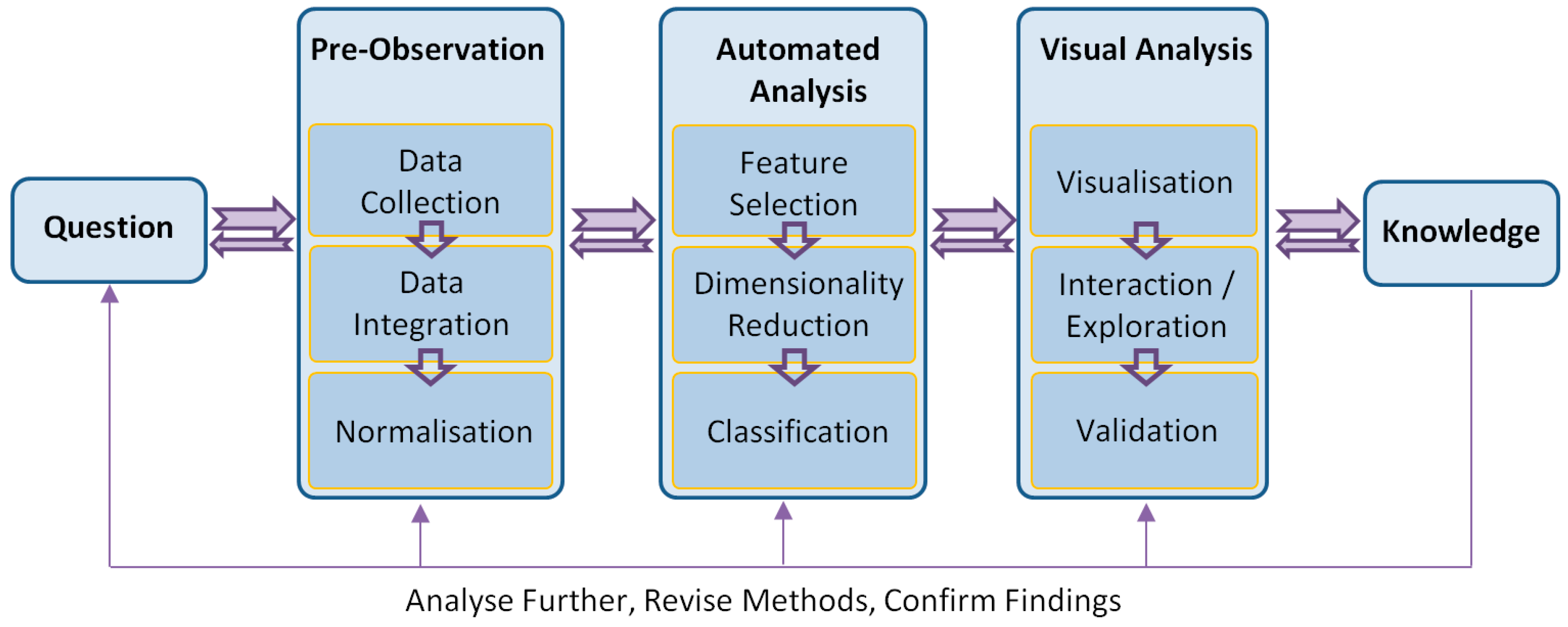
4. Visual Analytics Framework
A visual analytics framework consists of multiple components that reflect a complete analytic cycle (see
Figure 1). From the goal or question, the knowledge is gained through pre-observation, automated analysis and visual analysis processes. In addition, it is essential to validate a method by the outcomes in the discipline that the method is used. To do this, visual analytics techniques must adapt their visualisation and interface to the respective discipline and conform to the language and norms expected of that discipline. For example, the expression of identified significant genes is required to be validated by the domain experts when the analysis is undertaken in independent laboratories.
The presented work was developed with strong involvement from cancer researchers. The philosophy behind the work is that with this new way of looking at genetic and clinical details from the perspectives of domain knowledge and technologies, visual analytics can provide a medium for the discovery of genetic and clinical problems, potentially leading to improved treatment strategies.
4.1. Pre-Observation
Pre-observation is the first step to pre-analyse, as well as clean the data prior to other processes. Datasets are usually heterogeneous from different sources and formats. It is vital to develop effective data collection techniques that can retrieve suitable data and transform them into a uniform and readable format. Preliminary data processing methods, such as data integration and normalisation, are also applied to collections to produce the centralised datasets with minimal variations and errors.
4.1.1. Data Collection
Data collection involves collating the gene expression, genetic variation and clinical datasets involved in the study and linking with patient identifiers. Data are collected from different sources based on the analysis questions. For example, in the human genome, there are three billion nucleotides per sample with thousands of genes and thousands of protein variants/isoforms. This leads to analytics issues on the big genomics data due to the high dimensionality, imbalanced datasets and sparse cohorts.
4.1.2. Data Integration
Data integration involves combining the datasets into one large dataset ready for further processing. One of the main challenges at this step is dealing with data from different high-throughput technologies that measure slightly different quantities. For example, there is not a clear one-to-one mapping between transcript clusters and probe sets, although they both measure gene expression.
4.1.3. Normalisation
Normalisation of data is important because microarray experiments may have variation between genes within experiments and between experiments (i.e., patients). We use z-score normalisation as, well as loess normalisation [
23].
4.2. Automated Analysis
Genomics data for a clinical decision support system can come in various formats. Our approach takes data from microarrays, which are high throughput technologies able to measure the level of gene activity and/or genetic variation for tens of thousands of genes simultaneously [
24]. Gene activity measures the level of expression of genes using real values in tumour samples taken at patient diagnosis. We assume that gene activity measurement will include patterns indicative of some target of interest, for example tumour aggressiveness or potential for relapse. Genetic variation data measure differences in DNA between samples, in our case patients. In the case of our data, we measure SNP values for patients. These are variations in nucleotide sequence at specific positions of the genome that occur in >1% of the population. They are measured as either real values or an integer in [0, 2] representing the number of minor alleles present at the position for the individual.
Biomedical data analysed in our framework are characterised by high dimensionality (>20,000 attributes), low numbers of samples (in the order of hundreds), noise and an imbalance between the classes of interest (e.g., relatively few examples of patients who relapse or die compared to all patients in the dataset). For these reasons, it is vital to apply feature selection methods [
25] so as to avoid the curse of dimensionality and to be able to build classifiers able to generalise. Our current implementation uses the R statistical programming language.
4.2.1. Feature Selection
Feature selection is required to select genes most useful for the classification of patients, according to the biologist’s target of interest. Without the selection of the most important features, it is difficult to overcome the curse of dimensionality. We have found that the variable importance score derived as a part of the random forest classifier [
26] to be useful for this task. Recently, we developed other approaches based on random forest [
27].
4.2.2. Dimensionality Reduction
Dimensionality reduction is needed to generate new features for patients and to project them into a lower dimensional similarity space for visualisation. We carried out a comprehensive comparison of approaches for dimensionality reduction [
28], including the popular Principal Component Analysis (PCA), Laplacian Eigenmap (LE), Locally Linear Embedding (LLE), as well as the extended version of the Stochastic Neighbour Embedding (SNE) and Curvilinear Component Analysis, called the neighbour retrieval visualiser [
29]. The study showed that the neighbour retrieval visualiser has the best performance on the childhood acute lymphoblastic leukaemia dataset.
We have used various approaches for dimensionality reduction in combination with the above feature selection to handle high-dimensional genomics data. This provides biomedical analysts with flexibility when choosing the most suitable method for a particular dataset. The approaches range from the linear methods, including principal component analysis and singular value decomposition [
30], to nonlinear methods, including the neighbour retrieval visualiser [
29]. Other advanced dimensionality reduction methods will be adopted in our future development. The semi-structured text representation of the documented results of the evaluations and specifics in the application to these types of data will be utilised in the automated expert guidelines for biomedical data analysts.
4.2.3. Classification
Once relevant features are extracted, patients are classified. Established data mining strategies, such as random forest, are excellent approaches for classification. We have investigated various approaches for identifying the classes of interest, especially for cohorts that are imbalanced or particularly sparse, which characterises the situation for investigating rare disease, such as childhood cancer. We have adopted a swarm optimisation approach called artificial bee colony sampling [
31]. Braytee et al. 2015 [
31] showed that this method performed better on various data samples for classification than random undersampling [
32] and particle swarm optimization [
33]. The classification accuracy on a variety of datasets was reported in [
31].
4.3. Visual Analysis
It is vital to develop new visual analysis techniques that can present results from the above-automated analysis process in a clear and interpretable way, where they can be analysed further and easily amenable to clinicians at the bed side. From the visualisation, analysts should be able to interact and explore through different views to make further discovery of, and insights into, the data. They can obtain a better understanding of the data and their structures and contribute their domain expertise to the knowledge discovery process. From the discovery of new knowledge, the analysts can evaluate, refine, go beyond and ultimately confirm hypotheses built from previous iterations and automated analysis. A detailed description of those components is presented in the case studies.
4.3.1. Visualisation
The challenge presented to the construction of meaningful visualisation is to cover the range of visualisation of all of the data, but making only the relevant data available to the analyst when it is relevant to do so. We present various visualisation methods in this framework [
20], including: (1) a three-dimensional visualisation of the patient cohort in the similarity space; (2) filter, explore and manipulate the information; (3) interactively provide the details of both the original and processed data of each patient on demand; (4) an interactive gene comparison; and (5) remap the similarity space based on one or more features.
4.3.2. Interaction and Exploration
An appropriate visualisation helps the analyst to gain understanding of the data and construct knowledge through our powerful human visual perception and reasoning capabilities in an ordinary environment [
20] and gaming platform [
22]. Capturing these iterations ideally drives the system towards more focused and more adequate analytical techniques. Domain analysts should be able to interact and explore through different views to make further discovery of, and insight into, the data. They can obtain a better understanding of the data and its structures and contribute their domain expertise in the knowledge discovery process. From the discovery of new knowledge, the analyst can evaluate, refine, go beyond and ultimately confirm hypotheses built from previous iterations.
4.3.3. Validation
The final stage of the framework is validation, where the biological importance of identified genes is explored, as well as whether derived classifiers are able to generalise to unseen data. Due to the paucity of data and the imbalance between classes, classifier validation is challenging. This stage should involve domain experts and various groups of analysts to explore the acceptability and perceived utility of the knowledge and hypotheses.
5. Case Study 1: Acute Lymphoblastic Leukaemia
The goal of this study is to construct a similarity space that reflects the genetic similarity and differences between patients. Integrating the genetic activity captured in the tumour specimen with the genetic background of each patient will be used to build models of the complex interactions that potentially underlay treatment responses in cancer patients. Particularly, we aim to develop a predictive model of treatment outcome by identifying genes capable of differentiating patients that survived and those that did not. The knowledge gained from this study includes:
The ability to represent complex genomic and biological data in a manner that reflects the similarity in patient genetics and
Applications for understanding the biological differences within individual patients, which may influence clinical management decisions for those patients.
5.1. Data Collection
The dataset in this experiment was the expression and genomic SNP profiles of 100 paediatric B-cell ALL patients treated at The Children’s Hospital at Westmead, NSW, Australia that were generated using Affymetrix expression microarrays (U133A, U133A 2.0 and U133 Plus 2.0) and Illumina NS12 SNP microarrays, respectively. Affymetrix expression microarrays generate 22,277 attributes, while each Illumina SNP microarray 13,917 attributes for each patient sample. Each attribute was mapped to a probe of DNA (or a gene), and the value for each attribute corresponded to the expression levels or genotype for the gene. Expression microarrays were hybridised with diagnostic bone marrow samples, and genomic microarrays were hybridised with remission peripheral blood samples. The patients were treated following the Berlin-Frankfurt-Munich 95 (BFM95) protocol or the complimentary Australian and New Zealand Children’s Hematology and Oncology Group Study VIII (Study 8).
Data integration involved combining the datasets into one large dataset ready for further processing. One of the main challenges at this step is to deal with data from different high-throughput technologies that measure slightly different quantities. We finally normalised the values, as well as cleaned out the missing data items.
5.2. Feature Selection and Model Building
The gene expression and SNP microarray datasets were concatenated, and the patients were class labelled according to treatment outcome, particularly those that survived and those that did not. Because there was a very large number of genetic attributes, we applied an attribute deletion approach by identifying and removing genes that were not involved in a biological phenomenon and patient comparison based on their uniform presence across the cohort or because they were only extreme outliers in a few cases.
Multiple bootstraps were used to account for the effects of erroneously-labelled samples. For each of the nine bootstrap samples used, a random forest model [
26] was constructed. The feature importance ranking from each random forest was combined into a global list of feature importance. The 250 most important gene expressions and SNP markers were then used to build a 3D similarity space using a singular value decomposition matrix decomposition technique [
34]. The distances between patients in this space were indicative of genetic similarity.
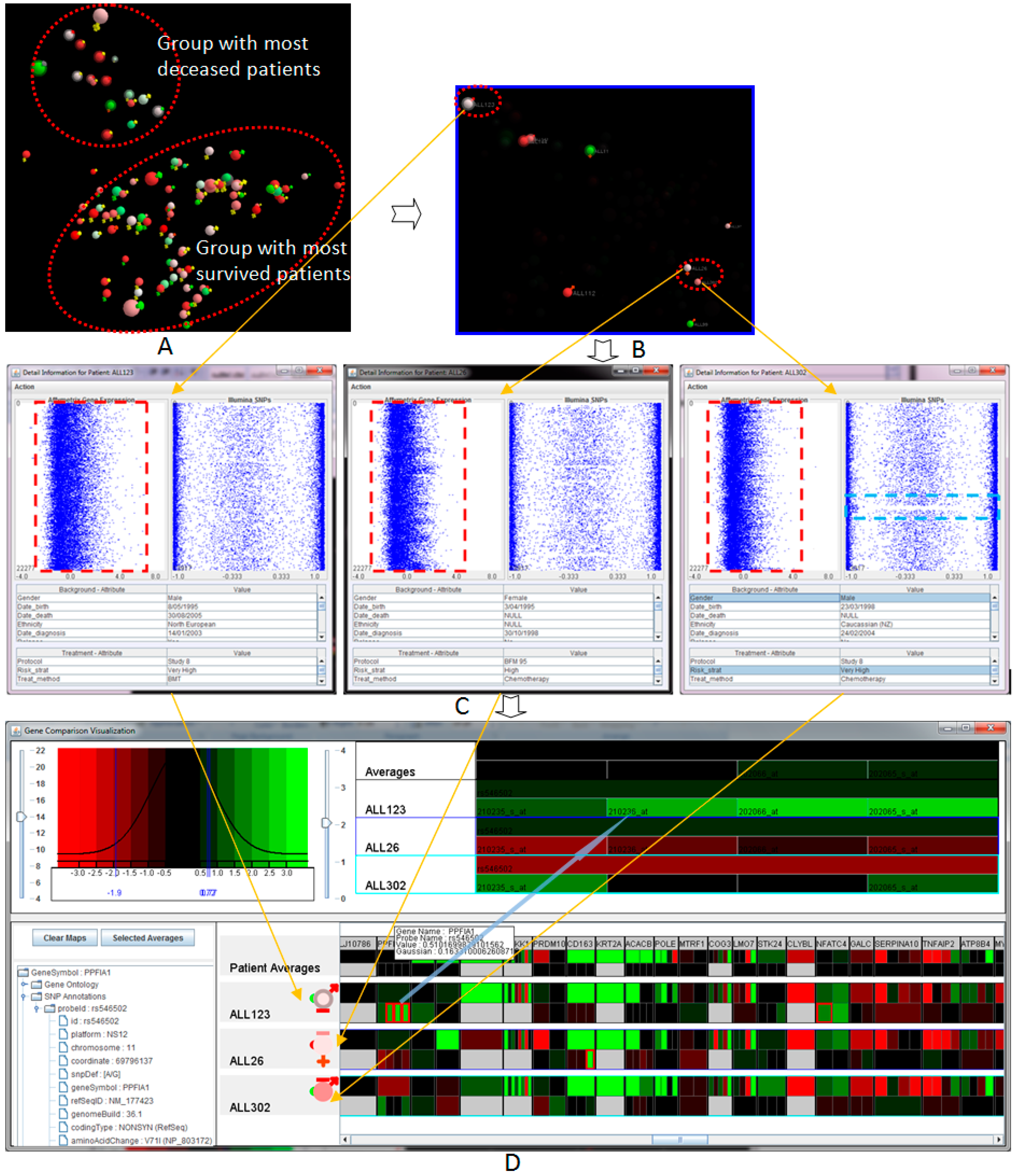
The resulting similarity space identified that patients are genetically similar (see
Figure 2A). This figure shows clearly a distinction between patients with different treatment outcomes. The patient separation found did not agree with clinical markers (e.g., white blood cell count cytogenetics) that were used for prognostication and risk stratification. In contrast, similarity spaces constructed with either the expression data or SNP data alone did not recover such a clear distinction. The result indicates that the more relevant data measuring different levels of biology available, the better our models performed.
5.3. Visual Analysis
From the 3D similarity space of feature selection and model building processes, we build an interactive visualisation that allows users to view and explore complex information. The visualisation platform was developed in the Java 3D environment.
Figure 2 illustrates a complete and seamless visual analysis process of the sample acute lymphoblastic leukaemia patients, supporting the analysis and manipulation of both treated and raw data. The visual analysis includes several components, including: (a) a flexible and changeable display of the patient population; (b) filtering, interaction and exploration of the information; and (c) patient-to-patient comparison view and comparison of the genes of interest.
The design goal of the visual analytics is to provide interactive visualisations of multiple attributes, which are the quality and appropriateness of the analytical platform and domain experts. We used diagrammatic visualisation [
35] for the presentation of multi-dimensional biomedical data, in relation to each individual patient. Rich graphical attributes, such as labels, axes, colours, size, shapes and visual bars, were also used to present clinical and background properties. The presentation can be adjusted by the users. Our work was developed with strong involvement from cancer researchers at the Children’s Hospital at Westmead, Sydney, Australia, through its development processes. The philosophy behind the work is that with this new way of looking at biomedical and genomic data in meaningful ways, it can provide a better and deep understand of the information to provide more certain and personalized treatment decisions.
5.3.1. Overview of the Patient Cohort in the Similarity Space
The visualisation of the entire patient population in the similarity space provides an overview of the genetic similarity of the patient cohort where the closer patients are hypothetically genetically similar (see
Figure 2A). By displaying the entire visual structure at once, it allows analysts to move rapidly to any location in the space, as well as indicates the position of new patients in the genetic similarity space. The innovation lies in the ability to provide an easy-to-use, yet effective way to view multidimensional data at different angles of overlaid clinical markers by mapping various attributes to different visual properties. The visualisation consists of multiple features enabling the analysis process, including automatic marks, customisable visualisation via interaction, controllable attributes and filtering. The visualisation and mapping property can be interactively adjusted or remapped to suit the preferences and new requirements. By interactively filtering out the unfocused information, it allows the analysts to extract and picture specific features and patients within the similarity space.
Figure 2A shows the 3D visualisation of the entire patient cohort in the similarity space at the navigational stage. The main colours (spheres) represent the year of birth (
→ lowest and
→ highest). Outer colours (signs) represent the risk stratifications (
→ very high risk,
→ high risk,
→ medium risk,
→ normal and
→ unknown). The outer-bound ring indicates whether the patients who have died, i.e., no outer-bound → survived. This figure indicates clearly two groups of patients, marked by the dashed-line ovals. The smaller group contains deceased patients, while the larger group contains patients that responded well to the treatment and survived the disease. The fact that the deceased and survived patients are located in two different groups may support the hypothesis that genetic properties are essential to determine whether a patient is likely to respond well in the context of the clinical treatment.
Figure 2B illustrated the visualisation when filtering was applied to show those very high risk of relapse patients (with
outer signs). In the scenario, there are three Patients Of Interest (POI) that need to be investigated further to the Genes Of Interest (GOI) visualisation. The patients are highlighted in the figure, including ALL123 (top-left, a deceased patient) and ALL26 and ALL302 (bottom-right, survival patients). These patients were classified as high risk, but had different treatment outcomes. The position of the patients in the similarity space indicates that the patient ALL123 should have different genetic properties in comparison to the two other patients ALL26 and ALL302 with similar genetic properties.
5.3.2. Patient-To-Patient Comparison
We provide an analytical view of both the genomic and biological data of selected patients (see
Figure 2C). The visualisation displays concurrently the total gene expression and SNP data generated for each patient. Each probe set in the gene is represented as a dot point on the horizontal axis while the vertical position shows the order of the gene sorted by chromosomal order. The table includes all of the biological data associated with the patient. From the overview of the entire genetic and biomedical information, the analysts can identify patterns and abnormality before exploring further. We also provide semantic zooming to enlarge the area of focus. The level of detail is updated automatically upon the information and available space.
Figure 2C shows the total gene expression, SNP profiles and patient-specific information of the three selected patients, ALL123, ALL26 and ALL302, placed from left to right respectively. As can be seen from the figure, the overall pattern gene expression of ALL123 appears quite differently to ALL26 and ALL302. This property allows for hypothesis generation around specific patients that may explain the differences in treatment outcome of the three patients despite the similar clinical presentation and treatment. With the SNPs view, we also see a globally-uniform distribution for the most part. However, areas of gross chromosomal rearrangements can be detected, such as a gap region in the SNP values (light blue rectangle) of the patient ALL302 due to the loss of heterozygosity.
5.3.3. Genes of Interest’s Visualisation
Although the patient-to-patient comparison provides a good overview of the genomic attributes, individual gene or SNP variation cannot be detected with this view. The visualisation of the Genes Of Interest (GOI) reduces the overhead of analysing a large quantity of individual genes and SNPs where the analysts can easily compare the GOI through a large number of patients. The analyst can drill down further into the genetics and treatment data of the POI identified as significant by the previous processes. By providing much greater detail of GOI through the interactive visualisation using a heat map, the similarity and differences of the GOIs between patients and groups of patients can be examined.
Figure 2D illustrates the interesting features of the three selected patients. This visualisation provides the detailed views of the expression values and SNP values, where
, black and
colours in the heat maps indicate low, middle and high values. This figure further confirms the hypothesis at the previous processes that the genetic property of the patient ALL123 is different from the other two patients. These genes were identified (highlighted by red-bound colour) for further analysis and verification.
5.4. Utilising Gaming Platform for Interactive Visualisation
The use of game technology and 3D game engine techniques for interactive visualisation is becoming increasingly popular in eHealth and health data analysis. Such works, for example, are an interactive environment for supporting the assessment, rehabilitation and prediction of dementia [
36] and virtual reality for assessing cognition in the elderly [
37].
We also utilise the gaming platform, the Unity3D game and visualisation engine, to provide a smooth and interactive visual presentation of the information, cross platforms and screen sizes and resolutions. Our motivation lies in the synergising of the power of commercial video game engines and 3D technology to provide better rendering, image quality, ergonomics and user experience where they can easily interact with and navigate the views. For big data analytics, this will be vital when the models move from 100 patients to 1000 or even 10,000. By utilising the capability of the game engines in terms of processing efficiency, fast model rendering and smooth interaction with the objects, we could potentially handle a very large number of patients. Last, but not least, with the advert of gamification in science education, (elements of) the visualisation gear developed in this project can be incorporated on-demand in the courseware in respective academic programs.
Proposed approach helps us to explore the new idea to deliver more suitable visualisation to non-specialists or inexperience clinicians, who are familiar with 3D gaming environments and interfaces. This use of the gaming platform does not aim to replace entirely the traditional 3D graphics platform.
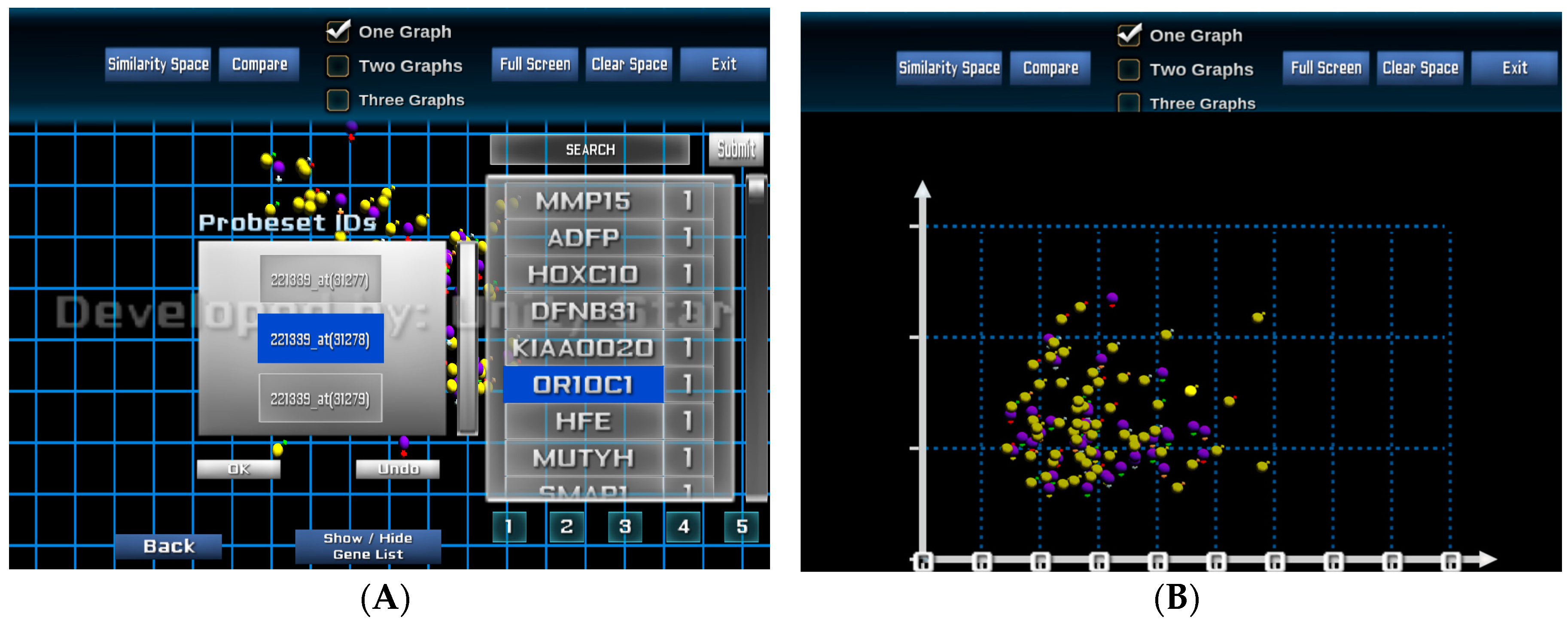
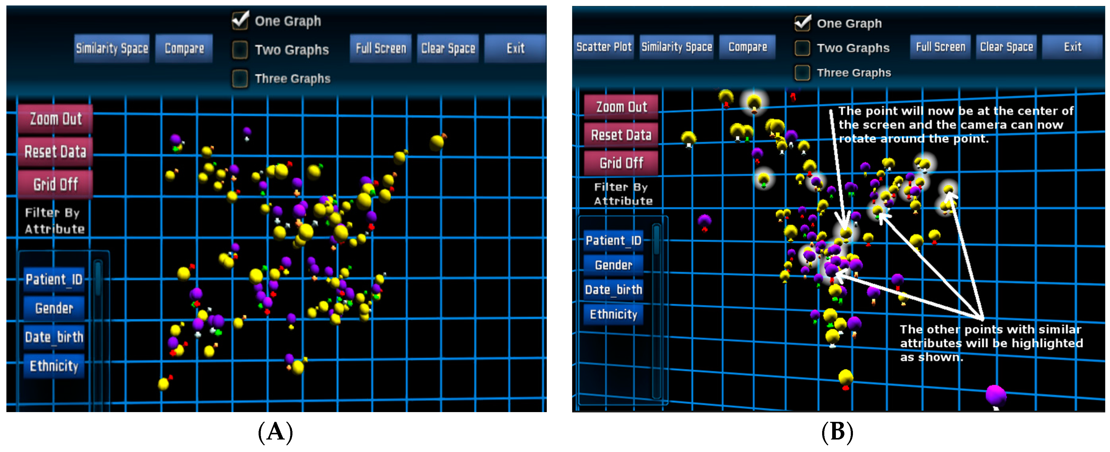
Figure 3 illustrates a 3D visualisation of the entire patient cohort in the similarity space in the Unity3D environment for the same 100 paediatric B-cell ALL patients. The main colours (spheres) represent gender (
→ female and
→ male), and outer colours (signs) represent risk stratifications as similar to the previous design.
Once the POI has been selected, evidenced by icon haloes (
Figure 3B), their specific genomics data can be extracted from the database and displayed for each individual patient.
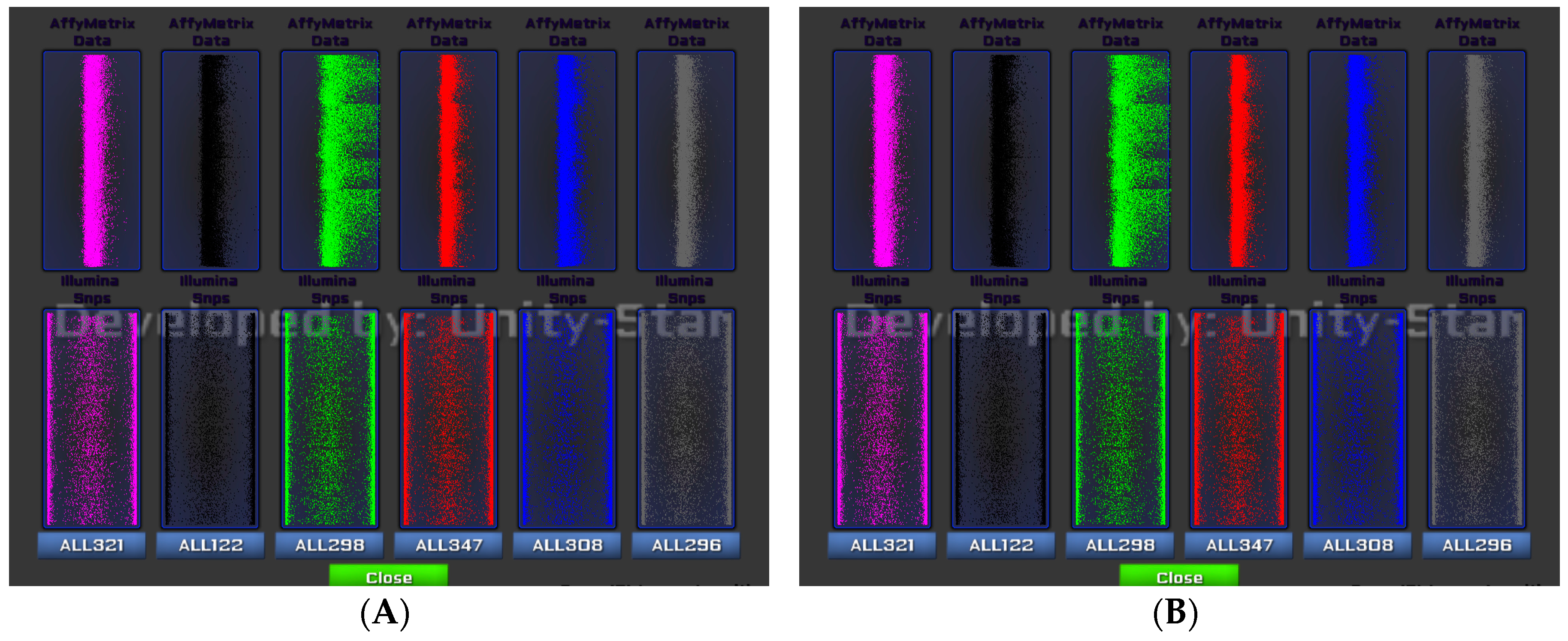
Figure 4 shows the gene expression and SNP data of six selected patients from
Figure 3B. Each patient is assigned with a colour for better distinguishing their genetic property. We provide an overlap analysis using a drag-and-drop option of any two or more patients (see
Figure 4B). This function allows analysts to identify the unmatched patterns of data points or probe sets for two or more patients from view allowing for a selection of GOI following a patient-to-patient comparison.
The visual analysis platform also provides the capability to rearrange the patient similarity space based on individual and selected patients and genes. From the POIs, the analyst can select one or more genes from the list of 250 genes of interest where each gene is ranked based on its significance or importance. The significant values are defined by the feature selection and model-building processes. These values can be updated interactively by the analyst at the visualisation interface.
Figure 5A shows a visualisation when genes and probe sets of the selected genes are selected for re-arranging the similarity space based on an individual or a group of genes.
Figure 5B presents the new visualisation of the entire patient cohort based on the similarity of the two selected probe sets 207727_s_at and 216661_x_at of the gene MUTYH.
6. Case Study 2: Rhabdomyosarcoma
The goal of this study is to get a better understanding of the biology that differentiates known subtypes of Rhabdomyosarcoma (RMS), a cancer made up of cells that normally would develop into skeletal muscle. The two major histological subtypes of RMS are Alveolar RMS (ARMS) and Embryonal RMS (ERMS). ERMS patients usually have a more positive prognosis in comparison to ARMS. The knowledge gained from this study includes:
6.1. Data Collection
The dataset that was acquired was a gene expression microarray dataset (E-TABM-1202) and the corresponding clinical data from the online public domain database ArrayExpress. This dataset consists of 101 RMS patients and 54,613 attributes (or probe sets) and was generated on Affymetrix U133 Plus 2.0 oligonucleotide chips.
6.2. Feature Selection and Model Building
We used a variation of the Random Forest (RF) algorithm, varSelRF [
39,
40], to perform feature selection. The algorithm is a recursive RF approach [
26] that eliminates the lowest ranked features after each iteration. First, we class-labelled the patients according to their histological subtype and performed feature selection with the varSelRF algorithm to find the optimal number of features to select after iterative eliminations. A large number of trees (100,000) were used to construct the initial forest to obtain a stable feature ranking while each subsequent forest was constructed with 10,000 trees.
We found that it took 258 of the most important features identified to be able to clearly differentiate ARMS from ERMS. Interestingly, of the top three ranking features, two encode for fibrillin 2 (FBN2-203184_at and 215717_s_at), previously identified as having some prognostic value for clinical RMS management [
41,
42]. The 258 features show chromosomal translocation-negative ARMS were more genetically more similar to ERMS than to chromosomal translocation-positive ARMS, despite. The result of the feature selection project was supported by the findings of a recent report [
38].
6.3. Visual Analysis
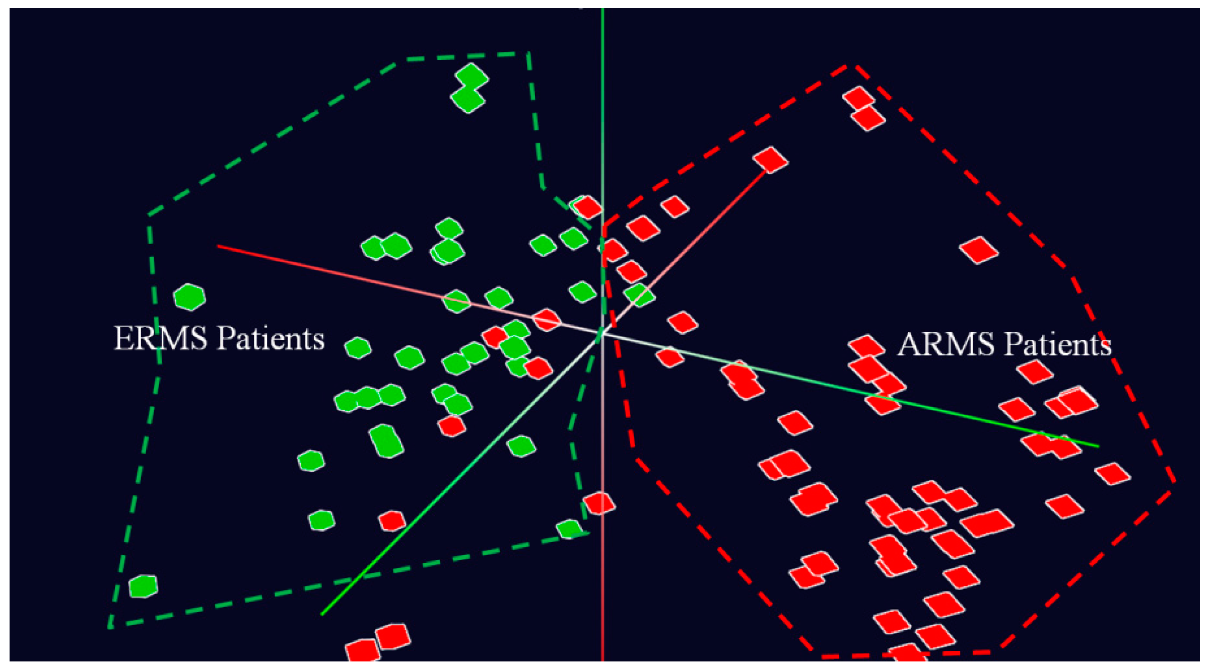
From the 258 features of interest, we performed principal component analysis to reduce the complex data to three dimensions representing the patient’s genetic similarity. We initially visualise the entire patient population in the 3D similarity space using Java 3D programming language. Two patients are close together if their genes are similar, and conversely, they are located far from each other if their genomic properties are different.
Figure 6 shows the overall view of the entire patient population captured in the dataset in 3D space at a navigational stage. This figure illustrates clearly two distinctive groups of patients, marked by two colours, including ARMS (
) and ERMS (
). The fact that the two groups of patients are closely located together supports the hypothesis that genetic properties are essential to determine the molecular distinction between ARMS and ERMS patients.
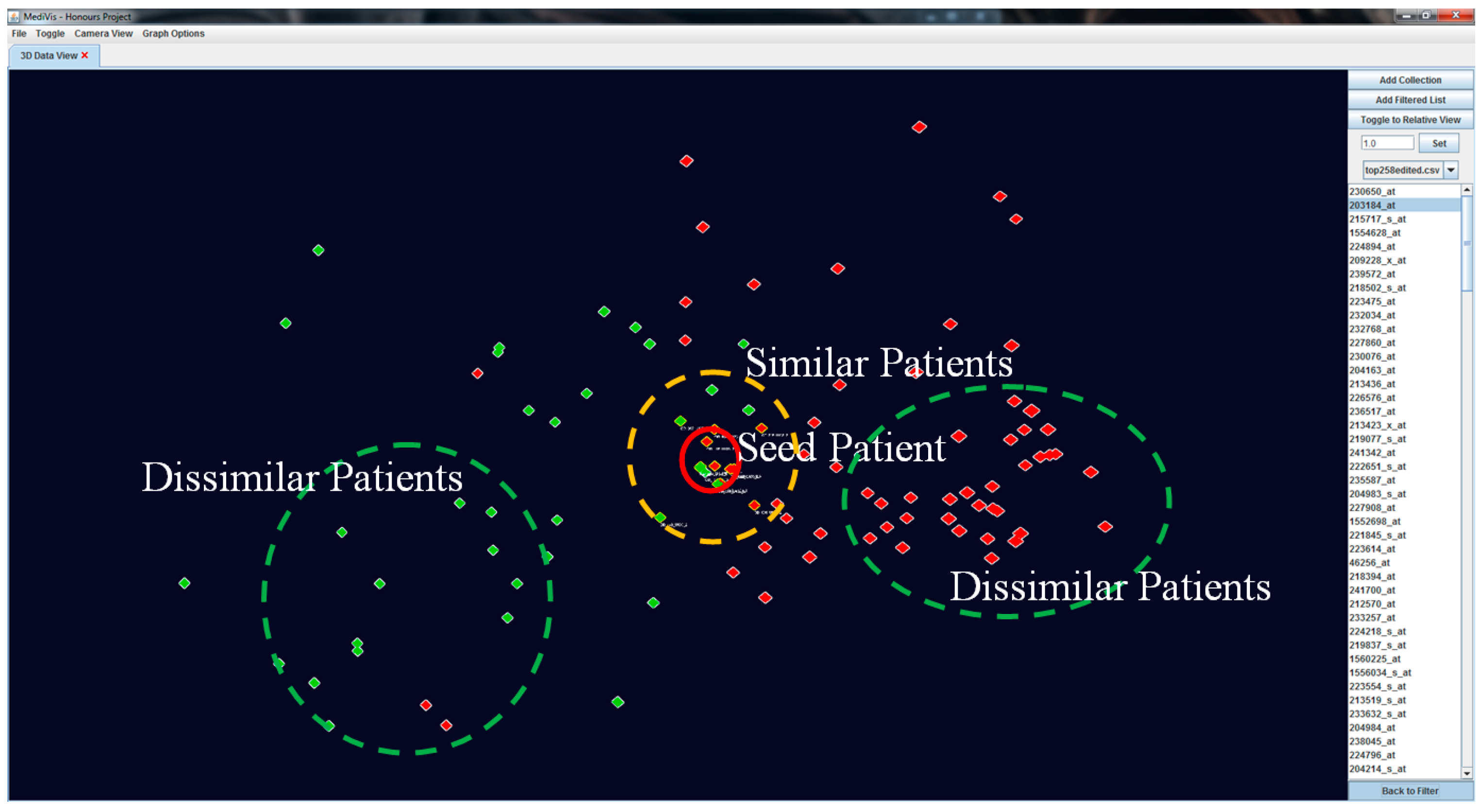
Our visualisation approach allows for the assessment of patient similarities based on individual based on individual features. When an object is selected as the POI, it is moved to the centre position while other objects rearrange their positions according to their genetic similarity with this seed POI. At this point, this becomes the centre point of rotation of the image. We also outline the similar patients and non-similar patients in
and
respectively (see
Figure 7).
To create a dynamic interaction with the data in this similarity space, we have developed a method to cluster similar patients by moving similar patients closer to the focus one and moving dissimilar patients further away (see
Figure 8). This visual transformation is calculated based on the patients’ current positions and polar distances away from the focus patient, where it becomes a temporary origin.
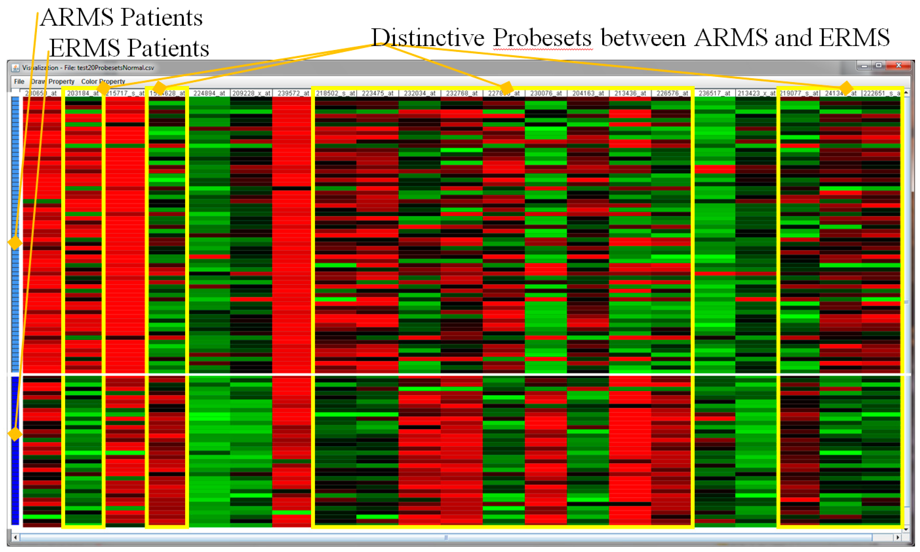
Further, an interactive heat map visualisation has been included in the visualisation as a complementary tool for the detailed analysis of microarray values in relation to the groups of patients, for the purpose of the validation of the above analytical results.
Figure 9 shows a heat map visualisation showing the 20 top ranked probe sets. This figure confirms that the feature selection project has produced highly accurate significant probe sets. Among the 20 probe sets, there are 14 probe sets that are quite distinctive among ARMS and ERMS patients, namely 203184_at, 1554628_at, 218502_s_at, 223475_at, 232034_at, 232768_at, 227860_at, 230076_at, 204163_at, 213436_at, 226576_at, 219077_s_at, 241342_at and 222651_s_at.
7. Conclusions and Future Work
We have presented a novel visual analytics framework and the development of supporting methods and technologies for analysing large and complex genomic and biomedical data. To capture the insight of the complexity of the genome in meaningful and actionable ways, we synergise multiple iterative components in the framework, including question, pre-observation, automated analysis, visual analytics and knowledge. Our interactive visualisation supports a seamless analysis from the overview of patients of interest in a similarity space to the detailed views of genes of interest and subsequent patient-to-patient comparison. We also utilised the Unity 3D game engine and visualisation platform to provide an interactive visual presentation of the information with the familiar game interface, cross platforms and devices. The case studies have demonstrated our visualisation framework’s potential in finding knowledge using big data derived from a cancer genome that will then raise the potential for this information to guide a physician’s decision making and guiding effective clinical management for childhood cancer patients.
We are going to validate the visual analytics platform by collecting qualitative feedback from the domain experts, including medical doctors, biologists and cancer researchers, as well as quantitative feedback from the public domain via a formal usability. We will evaluate the effectiveness of the system in terms of handling various biomedical and genomic datasets, efficient visualisation and supporting the knowledge discovery process with the visual presentation. The study also evaluates the effectiveness of the interactive visualisation using Unity 3D in comparison with the ordinary Java 3D platform.
We will also extend our current platform to a range of visualisation facilities, including a state-of-the-art 360-degree 3D immersive interactive data visualisation facility, mobile devices and interactive augmented reality. By investigating the supported technologies to enable the visualisation of large patient cohorts, we believe that this approach could potentially impact the large-scale data analytics where each environment will be suitable for each task, user and context.


 and
and 