A Visual Approach for the SARS (Severe Acute Respiratory Syndrome) Outbreak Data Analysis


Abstract
:1. Introduction
- H1: there are case features (such as similar peak period, prevention measures) in common in five areas.
- H2: detailed outbreak facts (such as mortality rate, outbreak duration) differ in five areas.
- H3: a visual approach can assist readers (not experts in relevant fields) in getting a big picture effectively.
- H4: it is possible to work out a good reference sample for SARS lifecycle analysis, as well as effective prevention measures.
2. Materials and Methods
2.1. Materials
2.1.1. Data Collection
- Case Data
- 2.
- Events Data
2.1.2. Data Processing
2.1.3. Graph Generation Tool
2.2. Methods
2.2.1. Feature Selection
- We apply the daily changing rate of infected case number to offer another angle of view on the virus spreading trends, such as how fast the outbreak is between every two continuous days.
- 2.
- We utilise the events timeline feature to bridge the virus outbreak and major events (events such as revision of the WHO’s list of areas with local transmission, quarantine measures applied, etc.); hence, we try to detect the impacts of applying prevention measures.
2.2.2. Procedure
- Collecting raw data from multiple sources.
- Data filtering and formatting, such as removing duplicated data, adding data entries on unreported days, then formatting and importing into data files.
- Comparing visual results via data values and observation.
- Concluding data for key nodes (values on particular days) and issues.
- Discussion.
3. Results
- If p > alpha: Accept the null hypothesis that the means are equal.
- If p ≤ alpha: Reject the null hypothesis that the means are equal.
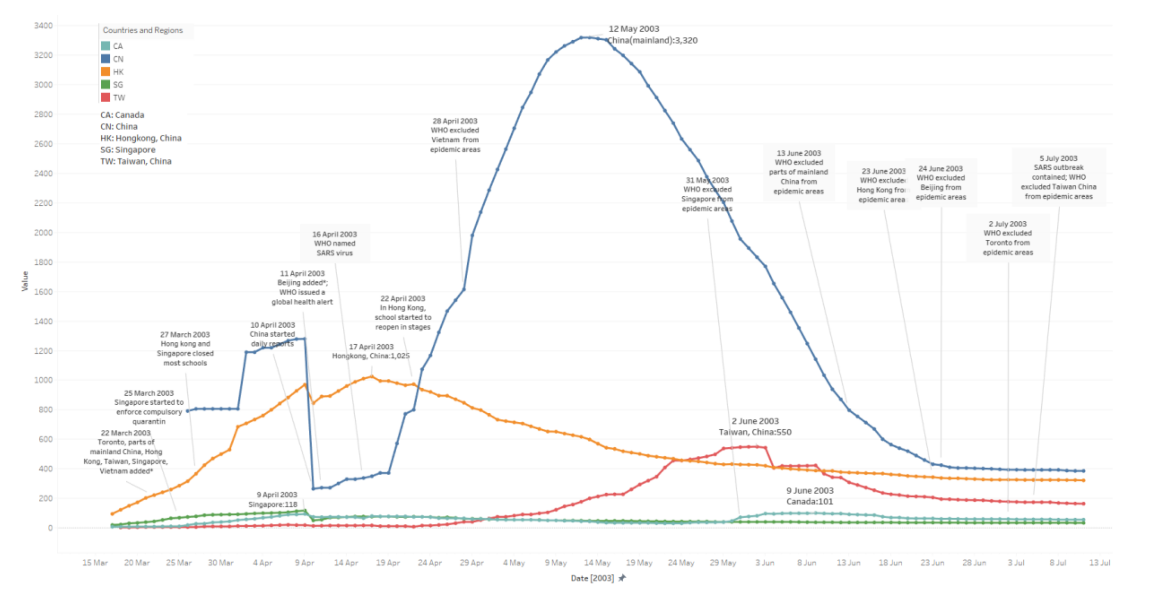
3.1. Daily Existing Infected Case Number
- China: The median value here is 1155. The peak period lasts 68 days, from 2 April to 08 June. It reaches a peak with 3320 cases on 12 May. From the very beginning, 26 March to 09 April, the trends in the figure are messy. Raw data is not accurate, which might be because potential patient details were not fully tested or reported, etc., until 10 April.
- Hong Kong: The median value here is 450. The peak period lasts 59 days, from 29 March to 26 May. It reaches a peak with 1025 cases on 17 April. Its symmetry before and after the peak appears better than for other areas via observation (before-peak period: 30 May–17 April; after-peak period: 17 April–04 May; Singapore and Canada are not included due to fewer cases).
- Taiwan: The median value here is 168. The peak period lasts 68 days from 12 May to 08 July. It reaches a peak with 550 cases on 02 June; the trend in the figure jumps several times. From digging into the raw data we collected, potential reasons may include misdiagnosis, etc.
- Singapore: The median value here is 45. The peak period lasts 60 days from 23 March to 21 May.
- Canada: The median value here is 60. The peak period lasts 91 days form 03 April to 02 July.
3.2. To-Date Mortality Rate
- China: The median value is 0.0549; mortality rates tend to be steady from 19 May.
- Hong Kong: The median value is 0.1337; mortality rates tend to be stabilizing from 14 May.
- Taiwan: The median value is 0.1198; mortality rates tend to be stable from 13 May.
- Singapore: The median value is 0.1366; mortality rates stabilise from 12 May.
- Canada: The median value is 0.1471; mortality rates remain steady from 02 May.
3.3. To-Date Cured Rate
- China: The median value is 0. 7074; cured rates tend to be steady from 05 June.
- Hong Kong: The median value is 0. 7393; cured rates tend to be stabilizing from 26 May.
- Taiwan: The median value is 0.3791; cured rates tend to be stable from 08 June.
- Singapore: The median value is 0.7913; cured rates stabilise from 23 May.
- Canada: The median value is 0.6507; cured rates remain steady from 17 June. (The cured rates drop a lot between 31 May to 16 June.)
3.4. Daily Changing Rate of Infected Case Number
- China: The median value is 0.00019; rates tend to be steady from 30 May.
- Hong Kong: The median value is 0.00236; rates tend to be stabilizing from 16 May.
- Taiwan: The median value is 0.00144; rates tend to be stable from 03 June.
- Singapore: The median value is 0; rates stabilise from 20 May.
- Canada: The median value is 0; rates remain steady from 11 July. (The rates go back and forth in June and July.)
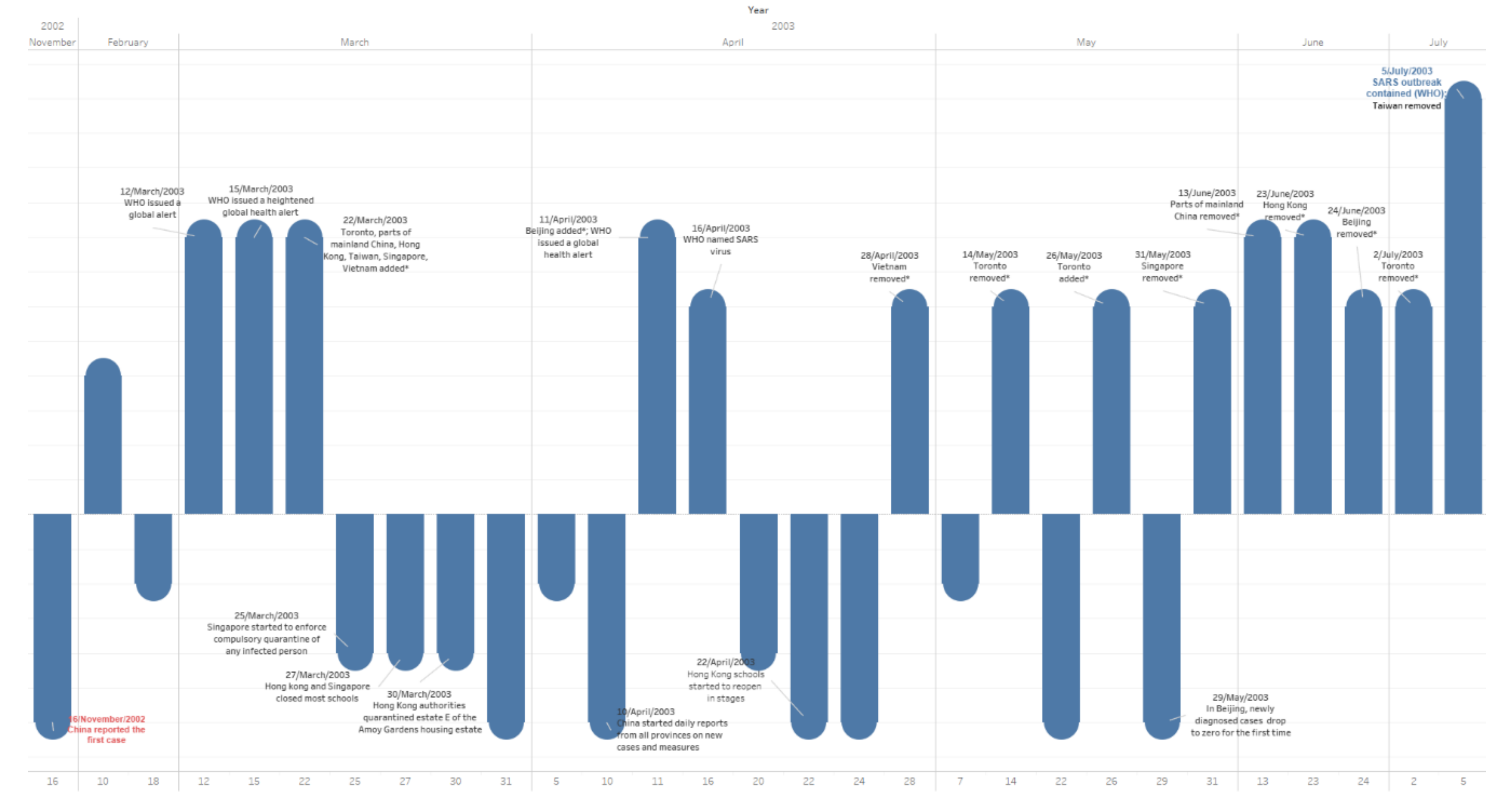
3.5. Events Timeline
- China was put on the list on 22 March; reached its peak on 12 May; and was removed from the list between 13 June and 24 June. (Schools in Beijing were closed on 24 April and reopened in stages on 22 May, but some were closed for another month [1]. Beijing was on the list between 11 April to 24 June; hence, there were 28 days school closure in Beijing. It was on the list for 74 days, but most areas in China were put on the list between 22 March and 13 June, for 83 days in total.)
- Hong Kong was put on the list on 22 March; schools were closed on 27 March; it reached the peak on 17 April; things were getting better from 22 April, when schools started to reopen in stages; it was removed from the list on 23 June; and there were 26 days school closure. It was on the list for 93 days.
- Taiwan was put on the list on 22 March; reached its peak on 02 June; and was removed from the list on 05 July. There was no school closure. It was on the list for 105 days.
- Singapore was put on the list on 22 March; relevant quarantine started on 25 March, schools were closed on 27 March; things were getting better from 09 April, when schools started to reopen in stages; it was removed from the list on 31 May; there was 13 days of school closure; and it was on the list for 70 days.
- Canada was put on the list on 22 March; it reached its peak on 09 June; it was removed from the list on 02 July; there was no school closure (several schools did close, yet no strict closure measures); and it was on the list for 102 days.
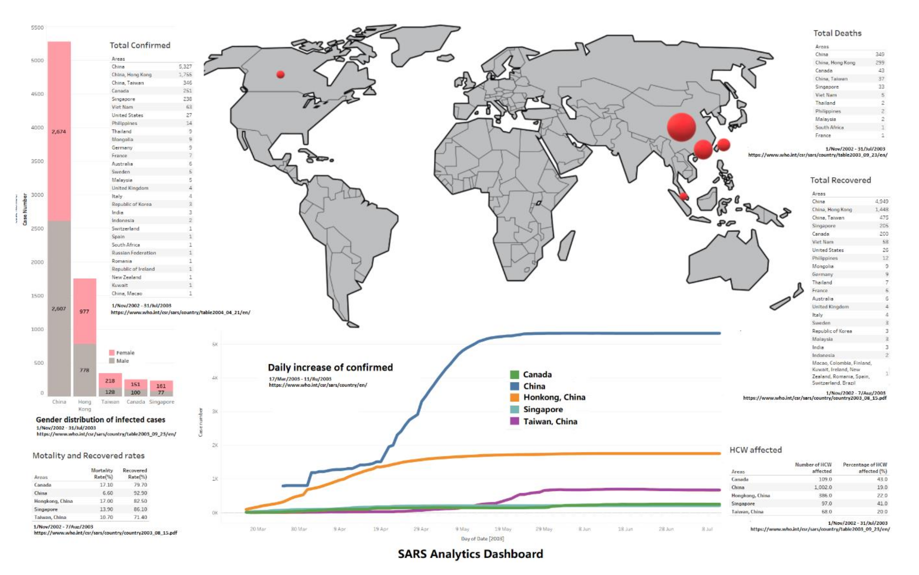
3.6. Overview Dashboard
- Females seem more likely to get infected compared to male patients in all five areas, the female/male ratios of case numbers are 1.0257 (China), 1.269 (Hong Kong), 1.690 (Taiwan), 1.610 (Canada) and 2.090 (Singapore) (data involved till 31 July); this has been discovered in existing work [6]. However, another interesting thing which needs to be addressed is that male patients have a worse outcome than females in all age groups in Hong Kong [7]; there is no further data on gender infection results from other areas at the WHO, so we cannot conclude if the Hong Kong case is in particular or not.
- China has the highest cured rate and lowest mortality rate, but the trends of daily existing infected case number, to-date cured rate and daily changing rate of infected case number jump up and down a lot, and take a longer time to stabilise compared to Hong Kong and Singapore; those facts conflict, and might be because data was not fully reported until 10 April. Other than China, Hong Kong and Singapore show better outcomes on cured rate and mortality rate.
- Regarding the HCW infected rate, Canada and Singapore both report more than 40%; hospitals were struggling during the SARS outbreak.
4. Discussion
- China has the most infected cases and deaths, yet the lowest mortality rate and HCW infected rate, since the first case was reported on 16 November/2002 in Guangdong, China, and continuous daily reporting started from 10 April/2003. Instead, there is a 145-day gap, leading to data integrity issues. Hence, the discussions related to China are estimated and not accurate. However, data integrity is a common issue for all data collected from all areas by the WHO, especially in the early stages of the SARS outbreak.
- There were no strict lockdown measures in 2003 in those five countries and regions. Major prevention measures include quarantine of infected patients and school closures, etc., yet school closures made very little difference to the prevention of SARS in Beijing [1]. However, it can be seen that Hong Kong and Singapore applied strict school closures; they did have fewer days in peak periods which were around 60 days during the SARS outbreak, and good cured rates as well; all other areas had more days instead in their peak periods, except Taiwan. Taiwan was on the WHO’s list of epidemic areas for the longest time, which was 105 days. Taiwan did not apply school social distancing measures (including closures) and reported the worse cured rate. There is a lack of data to show the impact of school closures in the SARS outbreak, however.
- Canada has the highest HCW infection rate, and the highest mortality rate as well. Toronto was put on the WHO epidemic areas list twice. Some related articles only compare mortality rates between countries and/or regions or mention limitations on access to medical services in Toronto; however, those works have not examined the underlying reasons [2,4,5].
- For H1, features such as peak period and prevention measures are compared in five areas. The peak periods are around 60 days in all countries and regions except Canada, who struggled in May and Jun; they all applied similar prevention measures such as quarantine, frequent hand washing, avoiding crowded places, non-essential activity, closure etc. However, implementation strictness is different, for example, Hong Kong and Singapore closed schools entirely, but Taiwan did not do the same thing at all. Several schools in Toronto with infection cases were closed.
- For H2, facts such as mortality rate, cured rate, outbreak days are compared in five areas. Results show that similar mortality rates occur in most areas except China, with cured rates varying between 70% and 80% and China at 92.2%. Areas with strict isolation measures tend to have higher cured rates, fewer peak periods and fewer days on the WHO’s list of areas with local transmission.
- For H3, authors are all in IT fields, far from the medical expert field, and those graphs do assist us in understanding the SARS outbreak and bringing fresh insights for us. Some interesting facts are discovered; for example, the quarantine’s impacts on cured rate and peak period, the struggling of Taiwan and Canada (which may be caused by misdiagnosis and/or less quarantine etc.), and that data presented conflict in different respects (e.g., case detail analysis in China, due to the data integrity issues). However, we have not conducted a relevant survey to provide data support on it yet.
- For H4, as discussed above, Hong Kong and Singapore could be used as a good reference for SARS lifecycle analysis as they provided complete datasets with less data integrity issues, as well as applied strict measures, and had better outcomes. Yet, at this stage, it is difficult to collect accurate data such as age, gender, household income, population density, ethnicity, commute, etc., back to 2003; hence, human behaviour is not considered in this study. Since Hong Kong has the most cases with more data, we suggest using Hong Kong’s pattern as a reference for future related research.
5. Conclusions
Author Contributions
Funding
Conflicts of Interest
References
- WHO. Coronavirus Disease 2019. 2020. Available online: https://www.who.int/emergencies/diseases/novel-coronavirus-2019 (accessed on 29 May 2020).
- WHO. Summary of Probable SARS Cases with Onset of Illness from 1 November 2002 to 31 July 2003. 2004. Available online: https://www.who.int/csr/sars/country/table2004_04_21/en/ (accessed on 15 April 2020).
- Zhou, P.; Yang, X.L.; Wang, X.G.; Hu, B.; Zhang, L.; Zhang, W.; Si, H.R.; Zhu, Y.; Li, B.; Huang, C.L.; et al. A Pneumonia Outbreak Associated with a New Coronavirus of Probable Bat Origin. Nature 2020, 579, 270–273. [Google Scholar] [CrossRef] [Green Version]
- Coronaviridae Study Group of the International Committee on Taxonomy of Viruses. The species Severe acute respiratory syndrome-related coronavirus: Classifying 2019-nCoV and naming it SARS-CoV-2. Nat. Microbiol. 2020, 5, 536–544. [Google Scholar] [CrossRef] [Green Version]
- Yeo, C.; Kaushal, S.; Yeo, D. Enteric involvement of coronaviruses: Is faecal—Oral transmission of SARS-CoV-2 possible? Lancet Gastroenterol. Hepatol. 2020, 5, 335–337. [Google Scholar] [CrossRef] [Green Version]
- Xu, J.; Zhao, S.; Teng, T.; Abdalla, A.E.; Zhu, W.; Xie, L.; Wang, Y.; Guo, X. Systematic comparison of two animal-to-human transmitted human coronaviruses: SARS-CoV-2 and SARS-CoV. Viruses 2020, 12, 244. [Google Scholar] [CrossRef] [PubMed] [Green Version]
- World Health Organization. Consensus Document on the Epidemiology of Severe Acute Respiratory Syndrome (SARS); World Health Organization: Geneva, Switzerland, 2003. [Google Scholar]
- Lau, E.H.; Hsiung, C.A.; Cowling, B.J.; Chen, C.H.; Ho, L.M.; Tsang, T.; Chang, C.W.; Donnelly, C.A.; Leung, G.M. A comparative epidemiologic analysis of SARS in Hong Kong, Beijing and Taiwan. BMC Infect. Dis. 2010, 10, 50. [Google Scholar] [CrossRef] [PubMed] [Green Version]
- Chen, K.T.; Twu, S.J.; Chang, H.L.; Wu, Y.C.; Chen, C.T.; Lin, T.H.; Olsen, S.J.; Dowell, S.F.; Su, I.J.; Team, T.S.R. SARS in Taiwan: An overview and lessons learned. Int. J. Infect. Dis. 2005, 9, 77–85. [Google Scholar] [CrossRef] [Green Version]
- Lau, J.T.F.; Yang, X.; Tsui, H.; Kim, J.H. Monitoring community responses to the SARS epidemic in Hong Kong: From day 10 to day 62. J. Epidemiol. Community Health 2003, 57, 864–870. [Google Scholar] [CrossRef] [PubMed]
- Liang, W.; Zhu, Z.; Guo, J.; Liu, Z.; He, X.; Zhou, W.; Chin, D.P.; Schuchat, A.; Beijing Joint SARS Expert Group. Severe acute respiratory syndrome, Beijing, 2003. Emerg. Infect. Dis. 2004, 10, 25–31. [Google Scholar] [CrossRef] [Green Version]
- Hung, L.S. The SARS epidemic in Hong Kong: What lessons have we learned? J. R. Soc. Med. 2003, 96, 374–378. [Google Scholar] [CrossRef]
- Leung, G.M.; Ho, L.M.; Lam, T.H.; Hedley, A.J. Epidemiology of SARS in the 2003 Hong Kong epidemic. Hong Kong Med. J. 2009, 15, 12–16. [Google Scholar]
- Viner, R.; Russell, S.; Croker, H.; Packer, J.; Ward, J.; Stansfield, C.; Mytton, O.; Booy, R. School Closure and Management Practices during Coronavirus Outbreaks including COVID-19: A Rapid Narrative Systematic Review. Available online: https://papers.ssrn.com/sol3/papers.cfm?abstract_id=3556648 (accessed on 3 June 2020).
- Leung, G.M.; Hedley, A.J.; Ho, L.M.; Chau, P.; Wong, I.O.; Thach, T.Q.; Ghani, A.C.; Donnelly, C.A.; Fraser, C.; Riley, S.; et al. The epidemiology of severe acute respiratory syndrome in the 2003 Hong Kong epidemic: An analysis of all 1755 patients. Ann. Intern. Med. 2004, 141, 662–673. [Google Scholar] [CrossRef] [PubMed]
- Hwang, S.W.; Cheung, A.M.; Moineddin, R.; Bell, C.M. Population mortality during the outbreak of Severe Acute Respiratory Syndrome in Toronto. BMC Public Health 2007, 7, 93. [Google Scholar] [CrossRef] [PubMed] [Green Version]
- Loeb, M. 34% mortality rate from SARS in critically ill patients at 28 days in Singapore. ACP J. Club 2004, 140, 21. [Google Scholar] [PubMed]
- Scott, R.D.; II, E.G.; Meltzer, M.I. Collecting data to assess SARS interventions. Emerg. Infect. Dis. 2004, 10, 1290. [Google Scholar] [CrossRef] [PubMed] [Green Version]
- Yu, P.L.H.; Chan, J.S.K.; Fung, W.K. Statistical exploration from SARS. Am. Stat. 2006, 60, 81–91. [Google Scholar] [CrossRef]
- Hua, J.; Huang, M.; Huang, C. Centrality Metrics’ Performance Comparisons on Stock Market Datasets. Symmetry 2019, 11, 916. [Google Scholar] [CrossRef] [Green Version]
- Bikakis, N.; Sellis, T. Exploration and Visualization in the Web of Big Linked Data: A Survey of the State of the Art. ArXiv 2016, arXiv:abs/1601.08059. [Google Scholar]
- Zhang, L.; Stoffel, A.; Behrisch, M.; Mittelstadt, S.; Schreck, T.; Pompl, R.; Weber, S.; Last, H.; Keim, D. Visual analytics for the big data era—A comparative review of state-of-the-art commercial systems. In Proceedings of the 2012 IEEE Conference on Visual Analytics Science and Technology (VAST), Seattle, WA, USA, 19 October 2012; pp. 173–182. [Google Scholar]
- Parsons, P.; Sedig, K.; Didandeh, A.; Khosravi, A. Interactivity in Visual Analytics: Use of Conceptual Frameworks to Support Human-Centered Design of a Decision-Support Tool. HICSS. 2015. Available online: https://ieeexplore.ieee.org/abstract/document/7069945/ (accessed on 23 April 2020).
- Hua, J.; Huang, M.L.; Zreika, M.; Wang, G. Applying data visualization techniques for stock relationship analysis. Filomat 2018, 32, 1931–1936. [Google Scholar] [CrossRef] [Green Version]
- Brandes, U.; Wagner, D. Analysis and visualisation of social networks. In Graph Drawing Software; Springer: Berlin/Heidelberg, Germany, 2004; pp. 1–20. [Google Scholar]
- Hua, J.; Huang, M.L.; Huang, W.; Zhao, C. Applying Graph Centrality Metrics in Visual Analytics of Scientific Standard Datasets. Symmetry 2019, 11, 30. [Google Scholar] [CrossRef] [Green Version]
- Lin, C.C.; Huang, W.; Liu, W.Y.; Wu, S.F. A novel centrality-based method for visual analytics of small-world networks. J. Vis. 2019, 22, 973–990. [Google Scholar] [CrossRef]
- Chen, W.; Guo, F.; Han, D.; Pan, J.; Nie, X.; Xia, J.; Zhang, X. Structure-based suggestive exploration: A new approach for effective exploration of large networks. IEEE Trans. Vis. Comput. Graph. 2018, 25, 555–565. [Google Scholar] [CrossRef] [PubMed]
- Chen, S.; Li, S.; Chen, S.; Yuan, X. R-Map: A Map Metaphor for Visualizing Information Reposting Process in Social Media. IEEE Trans. Vis. Comput. Graph. 2019, 26, 1204–1214. [Google Scholar] [CrossRef] [PubMed]
- Fung, W.K.; Philip, L.H. SARS case-fatality rates. Cmaj 2003, 169, 277–278. [Google Scholar] [PubMed]
- Theys, K.; Lemey, P.; Vandamme, A.M.; Baele, G. Advances in Visualization Tools for Phylogenomic and Phylodynamic Studies of Viral Diseases. Front. Public Health 2019, 7, 1–18. [Google Scholar] [CrossRef] [PubMed] [Green Version]
- Marcus, J.H.; Novembre, J. Visualizing the geography of genetic variants. Bioinformatics 2017, 33, 594–595. [Google Scholar] [CrossRef] [Green Version]
- Thöny, M.; Schnürer, R.; Sieber, R.; Hurni, L.; Pajarola, R. Storytelling in interactive 3D geographic visualization systems. ISPRS Int. J. Geo-Inf. 2018, 7, 123. [Google Scholar] [CrossRef] [Green Version]
- Blascheck, T.; Kurzhals, K.; Raschke, M.; Burch, M.; Weiskopf, D.; Ertl, T. Visualization of eye tracking data: A taxonomy and survey. 2017. Available online: https://onlinelibrary.wiley.com/doi/abs/10.1111/cgf.13079 (accessed on 3 June 2020).
- Blascheck, T.; Vermeulen, L.M.; Vermeulen, J.; Perin, C.; Willett, W.; Ertl, T.; Carpendale, S. Exploration strategies for discovery of interactivity in visualizations. IEEE Trans. Vis. Comput. Graph. 2018, 25, 1407–1420. [Google Scholar] [CrossRef] [Green Version]
- Latif, S.; Beck, F. VIS Author Profiles: Interactive descriptions of publication records combining text and visualization. IEEE Trans. Vis. Comput. Graph. 2018, 25, 152–161. [Google Scholar] [CrossRef]
- WHO. Cumulative Number of Reported Probable Cases of Severe Acute Respiratory Syndrome (SARS). Available online: https://www.who.int/csr/sars/country/en/ (accessed on 3 June 2020).
- WHO. Update 92 – Chronology of travel recommendations, areas with local transmission. Available online: https://www.who.int/csr/don/2003_07_01/en/ (accessed on 3 June 2020).
- Phased Reopening of Schools: Ministry of Education. Available online: https://www.nas.gov.sg/archivesonline/data/pdfdoc/2003040501.htm/ (accessed on 3 June 2020).
- Free Data Visualization Software | Tableau Public. Available online: https://public.tableau.com/ (accessed on 3 June 2020).
- Hamersky, S. Tableau desktop. Math. Comput. Educ. 2016, 50, 148. [Google Scholar]
- Datig, I.; Whiting, P. Telling your library story: Tableau public for data visualization. Libr. Hi Tech News 2018, 35, 6–8. [Google Scholar] [CrossRef]
- Ruxton, G.D. The unequal variance t-test is an underused alternative to Student’s t-test and the Mann–Whitney U test. Behav. Ecol. 2006, 17, 688–690. [Google Scholar] [CrossRef]
- Everitt, B.; Skrondal, A. The Cambridge Dictionary of Statistics., 4th ed.; Cambridge University Press: Cambridge, UK, 2010. [Google Scholar]
- Benjamin, D.J.; Berger, J.O.; Johannesson, M.; Nosek, B.A.; Wagenmakers, E.J.; Berk, R.; Bollen, K.A.; Brembs, B.; Brown, L.; Camerer, C.; et al. Redefine statistical significance. Nature Human Behaviour 2018, 2, 6. [Google Scholar] [CrossRef] [PubMed]
- Franceschelli, M.; Giua, A.; Pisano, A. Finite-time consensus on the median value with robustness properties. IEEE Trans. Autom. Control. 2016, 62, 1652–1667. [Google Scholar] [CrossRef] [Green Version]
- WHO. Cumulative Number of Reported Cases of Severe Acute Respiratory Syndrome (SARS) (from: 1 Nov 2002 to 7 Apr 2003). Available online: https://www.who.int/csr/sars/country/2003_04_07/en/ (accessed on 3 June 2020).
- WHO. Cumulative Number of Reported Cases of Severe Acute Respiratory Syndrome (SARS) (from: 1 Nov 2002 to 8 Apr 2003). Available online: https://www.who.int/csr/sars/country/2003_04_08/en/ (accessed on 3 June 2020).
- Roper, R.L.; Rehm, K.E. SARS vaccines: Where are we? Expert Rev. Vaccines 2009, 8, 887–898. [Google Scholar]


| Countries and Regions | Case Data Numbers | Events Data Numbers |
|---|---|---|
| China | 108 | 12 |
| Hong Kong | 117 | 8 |
| Taiwan | 116 | 3 |
| Singapore | 117 | 8 |
| Canada | 117 | 8 |
| Others | n/a | 10 |
| p-Value (Alpha = 0.05) | ||||||
|---|---|---|---|---|---|---|
| Area | China | Hong Kong | Taiwan | Singapore | Canada | |
| Area | ||||||
| China | 1.57035 × 10⁻¹⁶ | 5.96062 × 10−51 | 2.22093 × 10⁻³² | 7.25899 × 10−45 | ||
| Hong Kong | 1.57035 × 10⁻¹⁶ | 0.460370636 | 0.165184352 | 8.21687 × 10−43 | ||
| Taiwan | 5.96062 × 10−51 | 0.460370636 | 0.251680885 | 2.68275 × 10−41 | ||
| Singapore | 2.22093 × 10⁻³² | 0.165184352 | 0.251680885 | 1.60912 × 10−41 | ||
| Canada | 7.25899 × 10−45 | 8.21687 × 10−43 | 2.68275 × 10−41 | 1.60912 × 10−41 | ||
| p-Value (Alpha = 0.05) | ||||||
|---|---|---|---|---|---|---|
| Area | China | Hong Kong | Taiwan | Singapore | Canada | |
| Area | ||||||
| China | 0.50222527 | 1.69603 × 10⁻¹¹ | 0.000462712 | 0.249488481 | ||
| Hong Kong | 0.50222527 | 1.44916 × 10⁻¹⁰ | 4.65794 × 10⁻⁶ | 0.675979497 | ||
| Taiwan | 1.69603 × 10⁻¹¹ | 1.44916 × 10⁻¹⁰ | 5.09475 × 10⁻²⁷ | 1.09219 × 10⁻¹¹ | ||
| Singapore | 0.000462712 | 4.65794 × 10⁻⁶ | 5.09475 × 10⁻²⁷ | 3.64957 × 10⁻¹⁰ | ||
| Canada | 0.249488481 | 0.675979497 | 1.09219 × 10⁻¹¹ | 3.64957 × 10⁻¹⁰ | ||
| p-Value (Alpha = 0.05) | ||||||
|---|---|---|---|---|---|---|
| Area | China | Hong Kong | Taiwan | Singapore | Canada | |
| Area | ||||||
| China | 0.292897097 | 0.002374384 | 0.743646526 | 0.156640279 | ||
| Hong Kong | 0.292897097 | 0.017908235 | 0.440487983 | 0.509066914 | ||
| Taiwan | 0.002374384 | 0.017908235 | 0.003852951 | 0.135830414 | ||
| Singapore | 0.743646526 | 0.440487983 | 0.003852951 | 0.223632039 | ||
| Canada | 0.156640279 | 0.509066914 | 0.135830414 | 0.223632039 | ||
| Date | Event | Weight |
|---|---|---|
| 16 November 02 | China reported the first case | 3 |
| 10 February 03 | China notified the WHO | 2 |
| 18 February 03 | China CDC announced that the pathogen can be identified as chlamydia | 1 |
| 12 March 03 | WHO issued a global alert | 4 |
| 15 March 03 | WHO issued a heightened global health alert | 4 |
| 22 March 03 | Toronto, parts of mainland China, Hong Kong, Taiwan, Singapore, Vietnam added * | 4 |
| 25 March 03 | Singapore started to enforce compulsory quarantine of any infected person | 2 |
| 27 March 03 | Hong Kong and Singapore closed most schools | 2 |
| 30 March 03 | Hong Kong authorities quarantined estate E of the Amoy Gardens housing estate | 2 |
| 31 March 03 | China announced “Atypical pneumonia prevention and treatment technical plan” | 3 |
| 05 April 03 | Singapore announced that school closures would be extended | 1 |
| 10 April 03 | China started daily reports from all provinces on new cases and measures | 3 |
| 11 April 03 | Beijing added*; WHO issued a global health alert | 4 |
| 16 April 03 | WHO named SARS virus | 3 |
| 20 April 03 | SARS was listed as a legal infectious disease in China, the Minister of Health and the Deputy Secretary of the Beijing Municipal Committee were removed from office | 2 |
| 22 April 03 | In Hong Kong, the schools started to reopen in stages | 3 |
| 24 April 03 | In Beijing, elementary and middle schools were suspended for two weeks;Taipei Municipal Hospital Hoping branch was closed. | 3 |
| 28 April 03 | Vietnam removed * | 3 |
| 07 May 03 | China temporarily classified SARS as a Class B infectious disease | 1 |
| 14 May 03 | Toronto removed * | 3 |
| 22 May 03 | In Beijing, high school seniors resumed classes in stages | 3 |
| 26 May 03 | Toronto added * | 3 |
| 29 May 03 | In Beijing, newly diagnosed cases drop to zero for the first time | 3 |
| 31 May 03 | Singapore removed * | 3 |
| 13 June 03 | Parts of mainland China removed * | 4 |
| 23 June 03 | Hong Kong removed * | 4 |
| 24 June 03 | Beijing removed * | 3 |
| 02 July 03 | Toronto removed * | 3 |
| 05 July 03 | SARS outbreak contained (WHO); Taiwan removed * | 6 |
| Countries & Regions | Daily Existing Infected Case Number | To-Date Mortality Rate | To-Date Cured Rate | Daily Changing Rate of Infected Case Number |
|---|---|---|---|---|
| China | 2 April–08 June 68 days | 19 May | 05 Jun | 30 May |
| Hong Kong | 29 March–26 May 59 days | 14 May | 26 May | 16 May |
| Taiwan | 12 May–08 July 58 days | 13 May | 08 June | 03 June |
| Singapore | 23 March–21 May 60 days | 12 May | 23 May | 20 May |
| Canada | 03 March–21 July 91 days | 02 May | 17 June | 11 July |
| Countries & Regions | Peak Period | School Closures | Mortality Rate (%) | Cured Rate (%) | Total Infected /Death/Cured | HCW Infected (%) | Days on the List |
|---|---|---|---|---|---|---|---|
| China | 2 April-08 June 68 days | Beijing: 24 April-22 May 28 days | 6.6 | 92.9 | 5327/348/4951 | 19 | 83(most areas) 74(Beijing) |
| Hong Kong | 29 March-26 May 59 days | 27 March-22 April 26 days | 17 | 82.5 | 1755/298/1433 | 22 | 93 |
| Taiwan | 12 May-08 July 58 days | N/A | 10.7 | 71.4 | 671/84/507 | 20 | 105 |
| Singapore | 23 March-21 May 60 days | 27 March–09 April 13 days | 13.9 | 86.1 | 206/32/172 | 41 | 70 |
| Canada | 03 March-21 July 91 days | N/A (Several schools closed) | 17.1 | 79.7 | 250/38/194 | 43 | 102 |
© 2020 by the authors. Licensee MDPI, Basel, Switzerland. This article is an open access article distributed under the terms and conditions of the Creative Commons Attribution (CC BY) license (http://creativecommons.org/licenses/by/4.0/).
Share and Cite
Hua, J.; Wang, G.; Huang, M.; Hua, S.; Yang, S. A Visual Approach for the SARS (Severe Acute Respiratory Syndrome) Outbreak Data Analysis. Int. J. Environ. Res. Public Health 2020, 17, 3973. https://doi.org/10.3390/ijerph17113973
Hua J, Wang G, Huang M, Hua S, Yang S. A Visual Approach for the SARS (Severe Acute Respiratory Syndrome) Outbreak Data Analysis. International Journal of Environmental Research and Public Health. 2020; 17(11):3973. https://doi.org/10.3390/ijerph17113973
Chicago/Turabian StyleHua, Jie, Guohua Wang, Maolin Huang, Shuyang Hua, and Shuanghe Yang. 2020. "A Visual Approach for the SARS (Severe Acute Respiratory Syndrome) Outbreak Data Analysis" International Journal of Environmental Research and Public Health 17, no. 11: 3973. https://doi.org/10.3390/ijerph17113973
APA StyleHua, J., Wang, G., Huang, M., Hua, S., & Yang, S. (2020). A Visual Approach for the SARS (Severe Acute Respiratory Syndrome) Outbreak Data Analysis. International Journal of Environmental Research and Public Health, 17(11), 3973. https://doi.org/10.3390/ijerph17113973