3.1. The General Distribution Pattern of Contagions in Málaga City
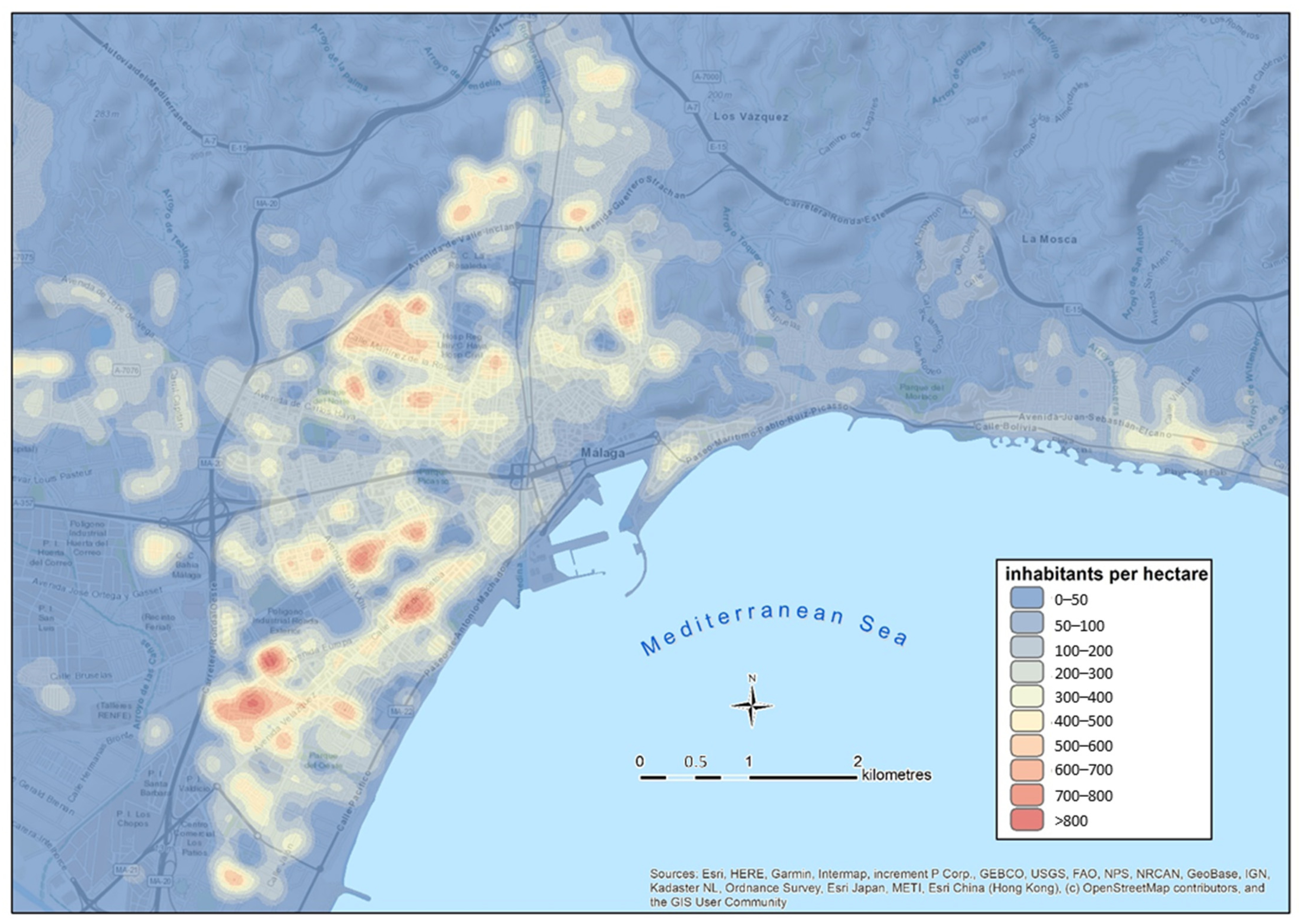
The results of the application of the R index (nearest neighbor average) shown in
Table 2 allow us to confirm that the spatial distribution of the contagion in Málaga presents a heterogeneous pattern. Sectors with different patterns are juxtaposed, together with areas that are prone to the concentration of cases. The
p-values in all the periods analyzed make it possible to discard the null hypothesis of random distribution, just as the R index values lower than 1 indicate the tendency to cluster the data with very high confidence values (Z lower than −12).
It can also be observed how the trend of the concentration index (R) loses intensity as the epidemic spreads through the city and it increases both the number of simultaneous cases in 14 days and the average density of infected people. The Pearson value of the inverse correlation between the number of cases and the value of R is 0.93. It could therefore be concluded that the concentration of cases is more intense in the initial phases, and it tends to homogenize and present a sparse patter in the expansion phase.
In other studies, authors such as De Cos et al. [
45], based on the analysis of microdata of infected people equivalent to those used in the present research, observe the same concentration pattern and the trend towards the spatial concentration of cases in Santander and Torrelavega (Spain). Other studies at the urban level, even using coarser data and spatial units, also show the uneven concentration of infected people in urban areas. The explanatory factors that explain this spatial pattern is not clear. The most usual argument relates the incidence of cases to population density. However, this hypothesis is being questioned by authors such as Lall and Wahba [
1]. These authors, based on estimates made in New York City, point out that density itself is not a determining factor in the concentration of infections, which are more related to socioeconomic conditions and the quality and access to public services and other facilities. The authors find a direct correlation between the concentration of cases and the dwelling useful area, a point that is also observed by De Cos et al. [
45] in Cantabria (Spain). In the analyzed cities, there is a link between the cluster of cases, the average income and the average dwelling size, which are correlated. Chang et al. [
2] insist on the great importance of becoming aware of the heterogeneous pattern of contagion in the city when proposing realistic and effective contagion control measures and emphasize the determinant role of areas where the population is concentrated in the transmission.
3.2. The Spatial Unit of Analysis. The Concept of Contagion Focus and Its Morphological Parameters
The proposal of the focus of contagion as a preferential spatial unit to express the natural pattern of contagion by COVID-19 in the city is based on the limitations observed in other scales of the spatial representation of contagion. The use of data grouped in administrative spatial units (census section, postal or health district, municipalities, etc.) distorts the natural spatial distribution of contagion and produces a standardization of the statistical results, which can lead to significant errors when diagnosing the epidemic and applying contagion mitigation measures. However, in most of the Spanish autonomous communities, it constitutes the spatial unit of cartographic representation of those infected.
As an alternative to this method, the possibilities of using a regular grid have been checked out to represent the density of the infected and the natural pattern of contagion at a detailed scale. Density maps of infected individuals have been prepared for this purpose by selecting grids of 1, 2 and 3 has. The results of these maps, especially those with the highest precision (1 and 2 has), set out that the small size of the reference unit causes disaggregation of the represented data, and the density per grid is very low. The application of the Moran autocorrelation index to the density data (
Table 3) highlights this issue.
As it can be seen in
Table 3, it is necessary to use a 3-has grid as a unit of reference to achieve an acceptable spatial autocorrelation and a level of aggregation good enough to represent the natural patter of contagion. However, this cartographic representation unit (number of infected per 3-has grid) has serious limitations in terms of accuracy, and it also introduces the so-called Modifiable Areal Unit Problem (MAUP) described by Openshaw [
41]. According to the MAUP, one variable presents unstable results depending on the scale of representation [
52]. Despite its limitations, the regular grid is being used as a unit of maximum accuracy to publish official maps of infected individuals (in many cases, misnamed as risk maps) in some Spanish autonomous communities, such as Catalonia.
Due to the limitations of artificial spatial units, a method that allows the contagion focus itself to be used as a spatial unit was designed. The search parameters used to detect contagion focuses was deduced from the morphometric characteristics observed in the cluster of cases. To do this, several density measurements and the R index were applied to the epidemiological scenarios of every period. The resulting parameters are collected in
Table 4.
The resulting parameters allow us to observe that as the number of cases in the period increases and the density of the infected people rises, the average distance that separates the closest infected decreases, as does the expected distance. These inverse correlations are confirmed by a Pearson index (0.91 and 0.85, respectively). It can also be observed that the mean separation between cases for all the periods is 151 m. However, this value only partially represents the global trend. On the one hand, the standard deviations of the mean distances observed in each period are high. This fact is related to the presence of a high proportion of 0 values (modal distance) in all the data series. This value corresponds to the cases detected in the same home (contagion of the family, in nursing homes, or in other type of communal houses). The high frequency of modal values leads to a bias of the mean towards low distances. In order to select a more realistic distance between cases, the average distance observed for each period was calculated. Thus, the modal values were deleted (0). A mean distance of 207.2 m was obtained, a value that can be considered as more representative. However, other authors [
45] obtained lower mean distances (17.9 m in Santander, and 17 m in Torrelavega). The explanation behind the difference between those results and ours is related to the fact that De Cos et al. [
45] used the total number of infected people throughout the period of analysis for the calculation. Thus, they considered people who may not have been simultaneously infected as infected neighbors. In our opinion, for observing the mean separation distance of infected people, it is better to only consider cases of simultaneously infected people (bi-weekly data periods). The accumulation of cases in periods of arbitrary duration draws the contagion pattern scenarios that are dependent on the number of accumulated cases and, therefore, it may be variable and not representative to typify the pattern.
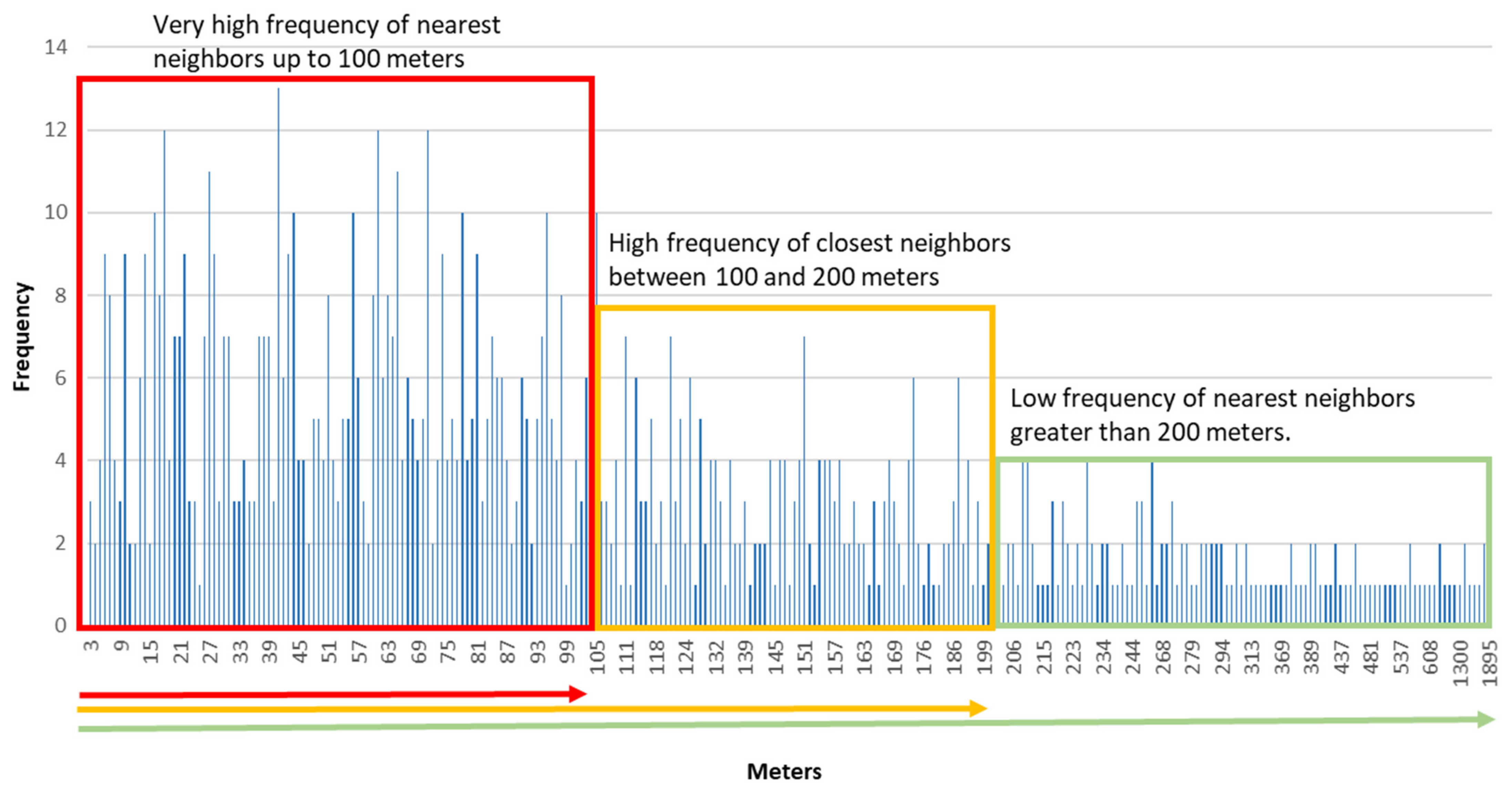
To confirm the representativeness of the distance around 200 m as the mean distance between cases within the focuses, a frequency histogram was prepared with the distances observed between cases in two successive bi-weekly periods in August, during the onset of the epidemic’s second wave in the city (
Figure 4).
The histogram provides an accurate orientation of the most frequent distance observed between cases, and of the distance in which there is a change in the morphology of the contagion pattern from a grouped model to a dispersed one. As it can be seen, the most frequent distance between cases is around 100 m, which generate a first level of concentration. At a second level, a change in the concentration is detected at around 200 m between infected people. This value coincides with the mean distance obtained for all the periods analyzed (207 m). The values that are greater than 200 m are much less frequent, and the transition towards a dispersed infected distribution model can be considered. The data obtained for Q1, Q2 and Q3 also confirm this distribution of the distances between the closest affected. As can be seen in
Table 4, the average median distance for the different periods is around 100 m (107 m), while Q3 is around 200 m (196 m).
In addition, the use of 200 m as a radius to delimit the most probable scope of transmission of contagion in the neighborhood area, matches with the hypothesis of the population daily mobility proposed in this study. It is based on the idea that people transmit the virus in their daily movements. Leaving aside the movements for working purposes, the population make a series of routes in their neighborhood related to their daily activities (e.g., shopping, walks, access to public services), which act as paths of transmission. In order to know the most likely limits of the contacts within the neighborhood, a standard scenario has been proposed. In this scenario, an individual carries out these activities on 10 min routes. If the estimated speed is 4 km/h, a radius of 600 m can be considered as the walking area. Considering the reduction that the sinuosity of the streets involves in the displacement, a reasonable equivalence between the estimated 600 m and a radial linear distance of 200 m can be proposed. The idea of using the route of those infected in a focus towards crowded places (e.g., commercial or leisure areas) as an orientation route for the spread of the contagions has been used by Chang et al. [
2] in their work of the main cities of the USA.
Based on all the proposed arguments, to the idea of establishing a double distance between the cases when detecting and delimiting neighborhood focuses of contagion has finally been considered.
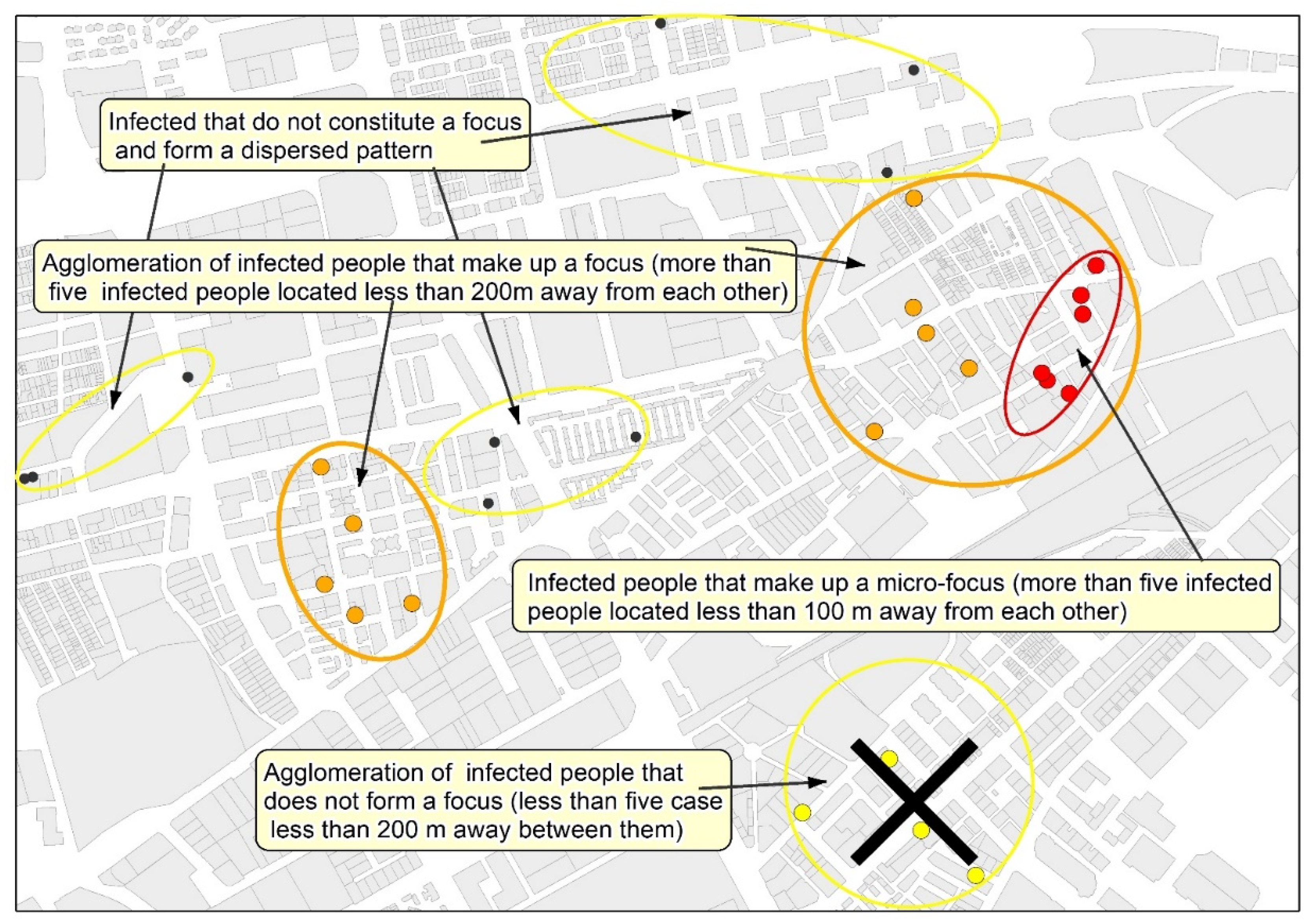
In epidemiological situations comparable to those observed (
Table 4) in the study case (contagion density = 8.9 infected/km² of urbanized area, and incidence rate in 14 days = 97.5 infected/100,000 inhabitants), it can be expected that in a focus, the average distance between infected people is around 100 m in the densest areas, and 200 m is the average distance that marks the limit between grouped cases and the areas of the city with a scattered contagion pattern. From these data, it is proposed that 200 m and 100 m are used as the maximum distance between cases to delimit, respectively, focuses and micro-focuses of neighborhood contagion. From the analysis of the results, the following proposal is presented: the neighborhood contagion focus is defined as the area with at least five infected individuals, separated by less than 200 m between them, whereas the micro-focus is the area that includes five infected individuals separated by less than 100 m.
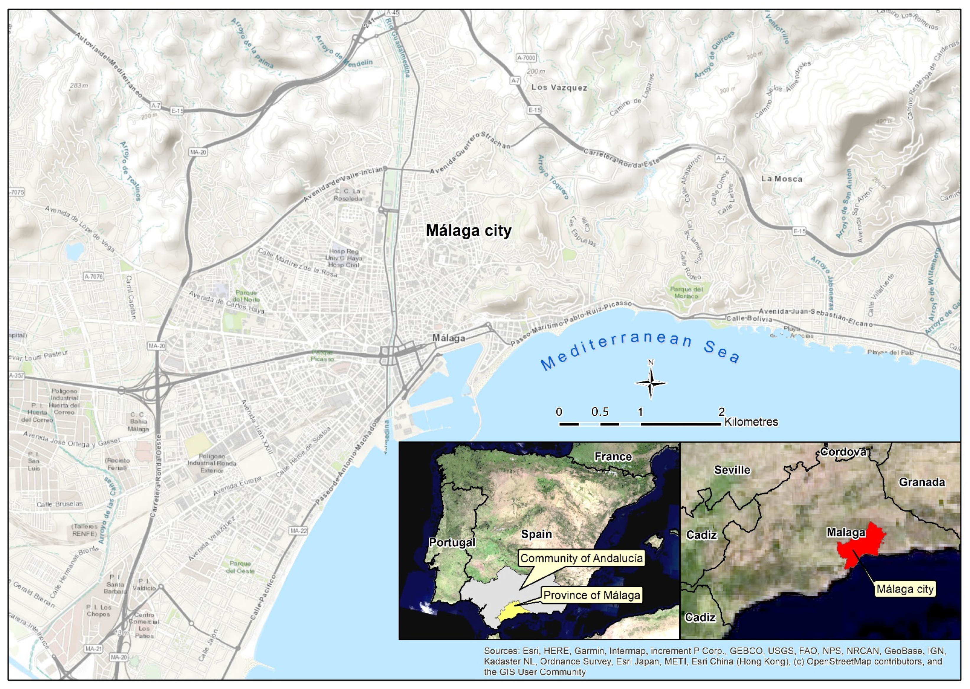
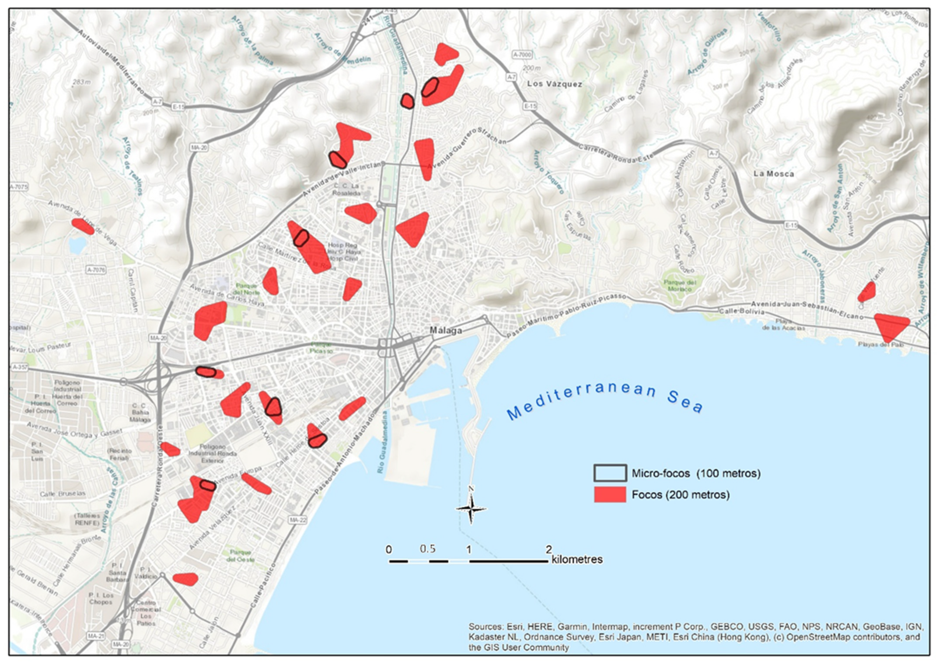
3.4. Detection and Mapping of the Neighborhood Contagion Focuses in Málaga
The application of the mapping of neighborhood contagion focuses in Málaga was carried out with representative data of the second wave of the pandemic (August 2020). As it can be seen in
Figure 7, the spatial distribution of those infected by COVID-19 during the first half of August is not homogeneous, but it rather confirms the initial hypothesis that proposes the existence of a concentrated and uneven model in the pattern of contagion in the city.
The focuses are located in the northern and western sectors of the city. They are less frequent in the northwest, and they are even hardly manifested in the eastern part, the area with lower population density and with higher socioeconomic level. It is noteworthy that the presence of focuses is considerably lower in the coastal area, a fact that can be even observed in the western part, despite the high number of focuses in that area. In relation to this, some authors such as Coccia [
53] or Zoran et al. [
54] have revealed the worst transmission of the virus in coastal environments, which are usually less polluted and more affected by coastal winds. On the other hand, as pointed out by De Cos et al. [
45], in Santander and in Torrelavega, no focuses of contagion are observed in the historic–commercial center of the city, where the residential uses are minor.
Table 5 shows the parameters of the epidemic in the sectors where the focus have been delimited compared to areas in which the contagion pattern is dispersed. As it can be seen, the values in both areas are significantly different.
The average density of infected people for the municipality is not representative of the reality observed, neither in the area classified as a focus of contagion, nor in the rest of the study area. The density of infected people in the focuses is 32 times greater, even if only the urbanized area of the municipality is considered (63.04 km2). The incidence rates per 100,000 inhabitants are also very unequal depending on if they are exclusively estimated for the population within the focuses. In that case, the rate is around 10 times higher. The contagion rate of the virus within the focuses is also significantly higher (4.31) than that observed in the sectors with dispersed transmission (1.21).
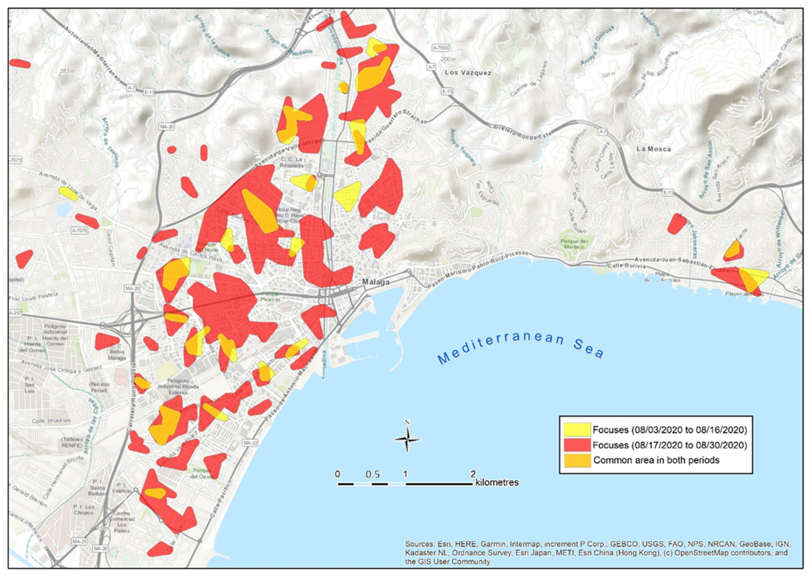
Once the spatial differences in the intensity of the contagion were clearly reported, it was examined whether those infected within a focus detected during the first period generate contagions in the same area during the second period. To do so, a map of focuses has been developed in two successive bi-weekly periods in August.
Figure 8 shows the focuses identified during the first and the second periods in August. Apart from the creation of new focuses in new locations during the second period, the focuses of the first period tend also to remain during the second period. Different models of the spread of contagion can be observed: some focuses from the first period remain active in the second period at the same location and their dimensions are similar. Other focuses not only remain in the same area, but instead they are also bigger during the second period. A third type of focus remain in a very close location, showing a slight displacement towards the neighboring areas. These facts seem to prove that a large part of the contagion in a focus is enhanced by the direct contact of the population with the neighbors infected during a previous period, since they coincide in common areas in the neighborhood. Those infected during the first period in a focus are responsible for the transmission of the virus during the second one. This fact gives real-time focus maps, which have a very powerful predictive dimension.
The quantified results of this diachronic spatial analysis of the evolution of contagion are shown in
Table 6.
As can be seen in
Table 6, there are 20 intersection areas among the focuses of the first and the second periods of August, which generate a common space of 135.5 has. Altogether, it is observed that 71% of the surface considered as a focus in the first period remain as a focus during the following phase; therefore, once 14 days have passed from the first contagion in the area, a focus is reproduced with new infected people in the same space. In another 22 points of the study area (494.3 hectares) it is also found that, in the second period, focuses have been generated less than 250 m away from the original focuses, which allow us to deduce that a transfer of the contagion to adjacent spaces is taking place. Only 27% of the area considered as focuses during the second period are not related to any focus of the first period. These results clearly confirm the robustness of the neighborhood focus as a spatial unit of transmission, and it shows its predictive capacity. Based on the analysis of concentric distances between the cases of the first and the second waves, De Cos et al. [
45] reach a similar conclusion about the spatio-temporal permanence of the contagion. Additionally, our results show that the 21.3% of the new positives during a 14-day period in the study case are located within a focus previously detected. This proportion reaches 58.2% if we include a 250 m radius area around those focuses. Therefore, the proportion of new positives is significantly lower in new focuses (30.8%) than in the surroundings of focuses already detected.
On the other hand, the expansion of the epidemic in the city during the second period of August (
Table 5) generated, in 14 days, an increase in the incidence in the municipality (from 68 to 182 infected per 100,000 inhabitants), and a similar increase in the number of focuses (from 22 to 51). Consequently, this was accompanied by an increase in the area occupied by focuses (
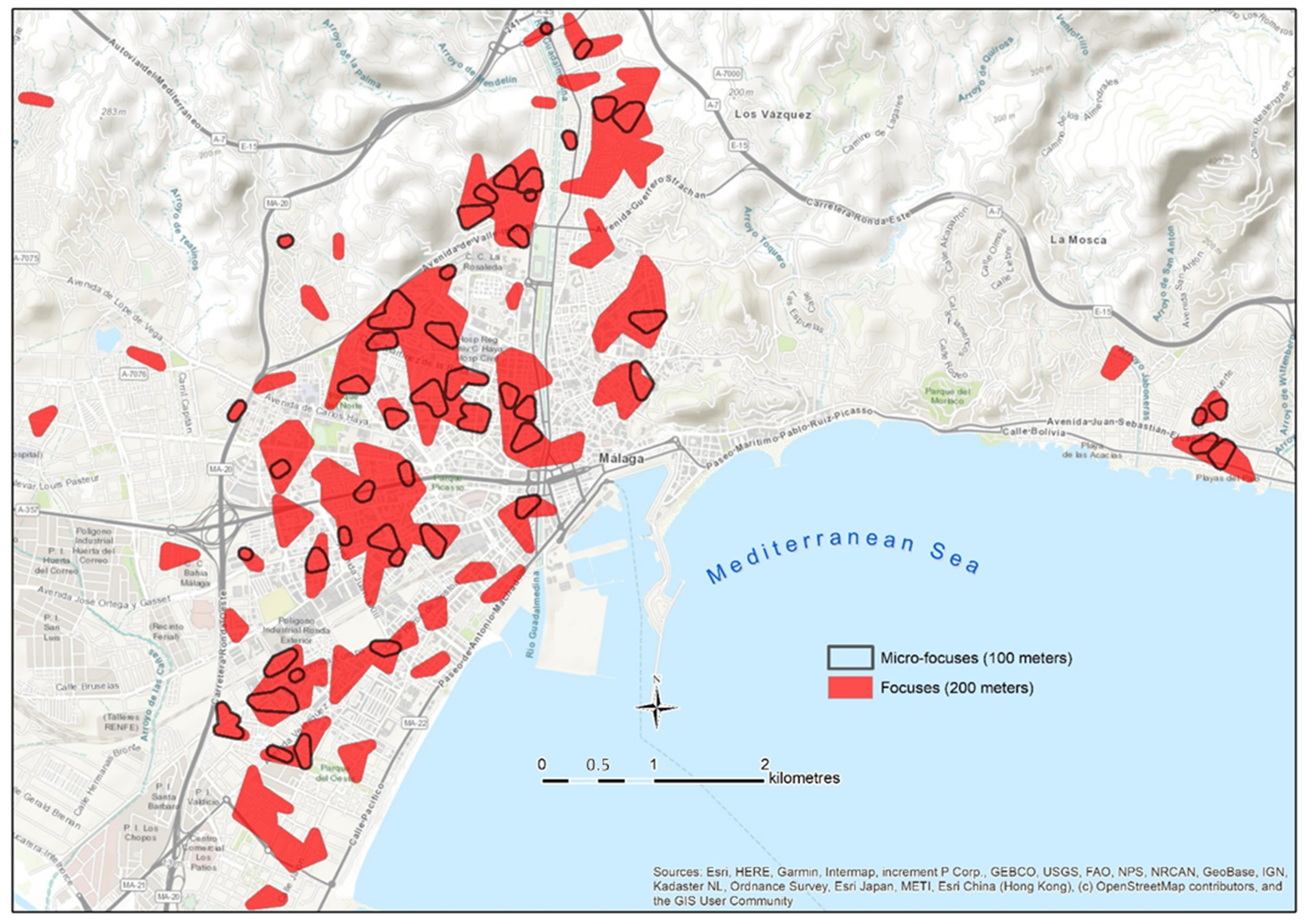
Table 6). In this situation of density increase, the spatial unit of the focus begins to lose spatial accuracy, which can be compensated by their combination with the micro-focuses (distances between cases less than 100 m).
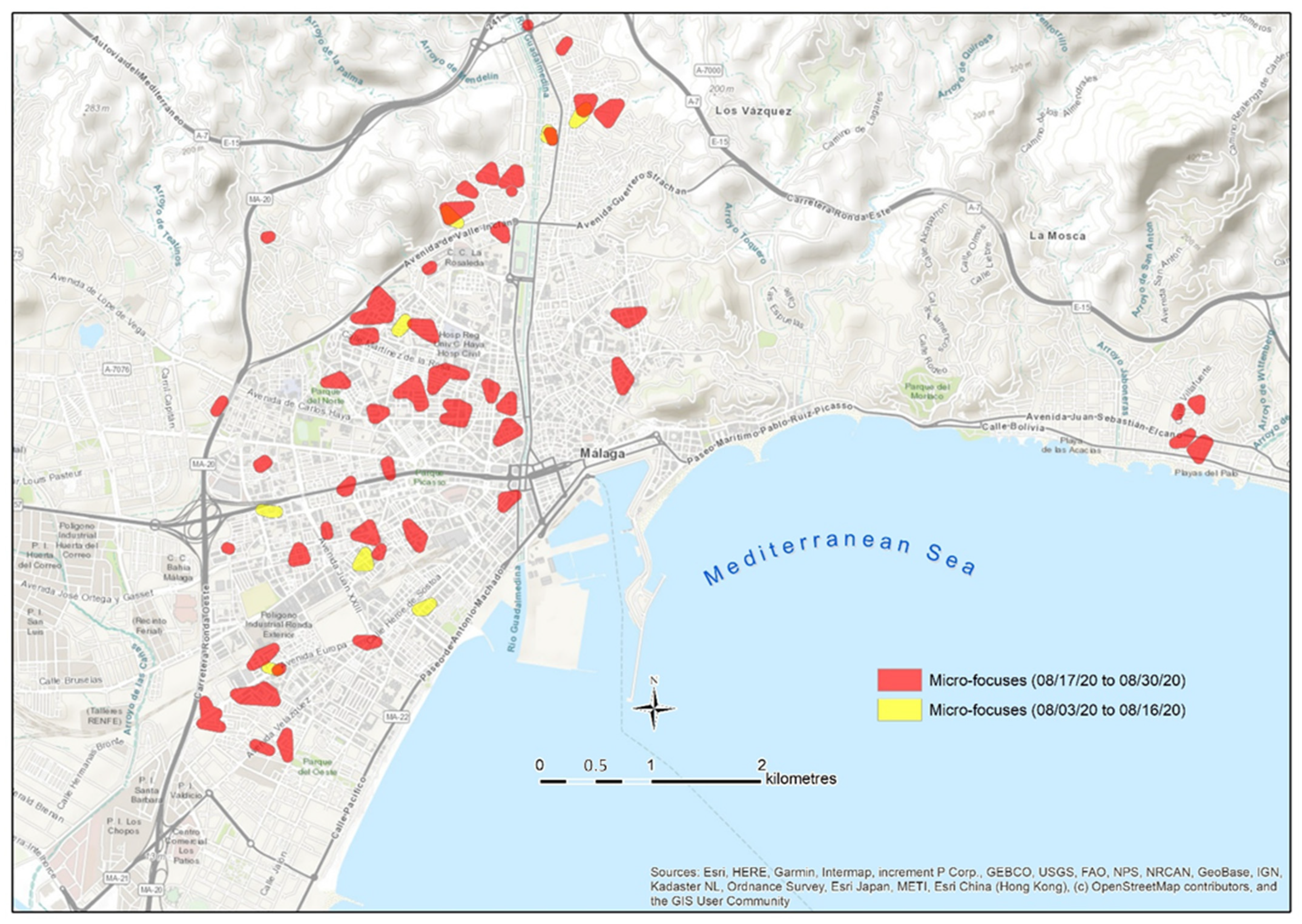
In
Figure 9, it can be seen how the micro-focuses delimit those spaces of greater incidence within the focuses, and their delimitation helps to classify the contagion with greater spatial accuracy.
However, when analyzing the duration of the micro-focuses in two successive periods, it can be observed that this micro-unit is more ephemeral. From the eight micro-focuses detected in the first period, only three still remain during the second one (
Figure 10). These results seem to indicate that the transmission does not always occur in the closest area of the neighborhood (closer than 100 m), but it rather expands to a buffer of 200 m, a zone that coincides with the daily walking average area proposed as the focus boundary.
However, the results obtained by De Cos et al. [
45] show how the mean distance between the cases of the first and second waves is less than 70 m in 75% of the cases. This distance between cases is smaller than ours, but it does not contradict our conclusions, since it is explained by the fact that De Cos et al. [
45] used the total amount of cases from the first and the second phase, so the pattern is denser and the expected average distance between neighbors is shortened. The diachronic analysis carried out in our work corroborates the validity of the morphological parameters estimated to size the contagion pattern and the concept of focus and micro-focus.
In addition, the use of the time sequences offers great possibilities to significantly improve the effectiveness of contagion control strategies. If the detection of a focus is carried out in real-time, the resulting cartography has a powerful value as a predictive tool to stop the transmission. Once the focus has been detected, there is a period of 10 to 15 days to carry out a screening campaign on the population within the focus, aiming at detecting asymptomatic positives in the early stages of the disease. Therefore, the chain of contagion can be stopped from its root, both in space and time. This mechanism for tracking groups with higher incidence, compared to other areas of the city, is a key tool to stop contagion more effectively. Chang et al. [
2] and De Cos et al. [
45] propose the free provision of epidemiological tests to the population of neighborhoods with a high risk of contagion as a way to stop transmission.
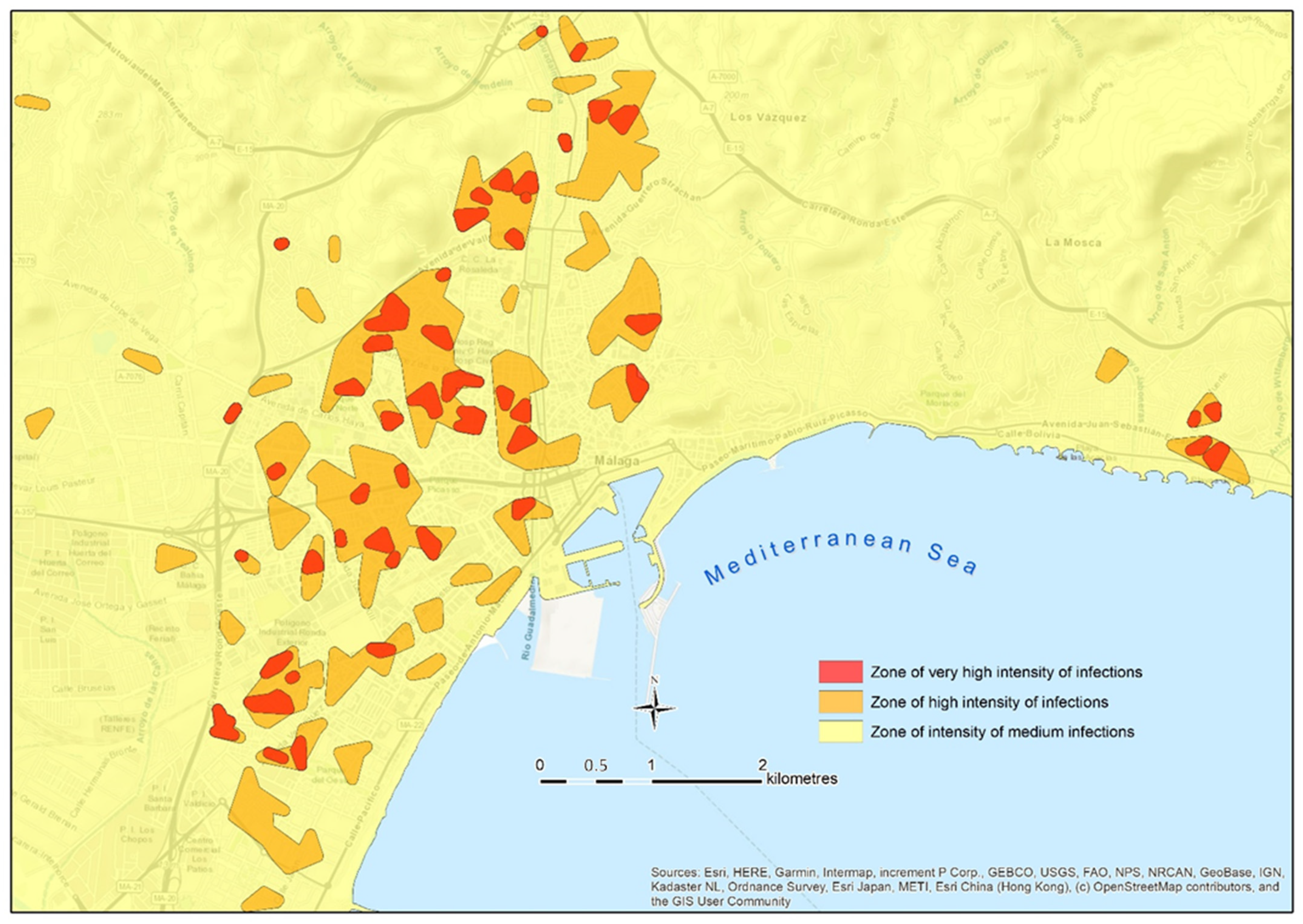
The possibility of mapping focuses in real-time is also a very powerful tool to guide mobility and to inform the population of several contagion areas of the city. The delimitation of areas with different contagion risk allows the creation of a cartography, such as the map shown in
Figure 11. That map displays the focuses and micro-focuses, and they are used to classify the intensity of the contagion in the city by zones. This allows one to know the number of people infected in each focus at that time, and so, to estimate the risk in their surrounding area and to adjust the level of alert, as well as to implement measures addressed to mitigate the severity of the situation, especially in crowded places (e.g., shops and public services).
We agree with Chang et al. [
2], who detailed that a spatial analysis allows for the application of accurate measures in the short-term, which can substantially influence infection rates (e.g., reducing the capacity in shopping centers at a certain moment, or the appropriate management of the population’s mobility in the most affected areas). Maps such as the one included in
Figure 11 uses the semiotics of a traffic light to show the number of contagion in each area, and its respective level of alert.


