Abstract
The construction of daily electricity consumption profiles is a common practice for user characterization and segmentation tasks. As in any data analysis project, to obtain these load profiles, a stage of data preparation is necessary. This article explores to what extent does the selection of the data preparation technique impacts load profiling. The techniques discussed are used in the following tasks: standardization, construction of data, dimensionality reduction and data enrichment. The analysis reveals a great incidence of the data preparation on the result. The need to make the data preparation process explicit in each report is identified. In particular, it is highlighted that the most usual default standardization process, column standardization, is not adequate in the preparation of energy consumption profiles.
1. Introduction
The study of electrical energy consumption is a prolific field. The need to predict demand has been its main driver throughout the history of power systems. However, in recent years other applications have appeared, that require new ways of analyzing consumption. The clearest example is in the Demand Management sector, where it is necessary a better understanding of the users behaviors in order to design strategies that modify those behaviors.
This fact, together with the availability of more precise and frequent measurements of consumption, has promoted the development of research and applications with the purpose of characterizing the user’s consumption, either for prediction or classification purposes. In the near future, in those Smart Grids that use the Internet of Things paradigm, it is expected that more sophisticated characterization tasks will be needed; demand response programs will be possible to offer not just to users but to sets of users at an appliance level [1].
Consumptions can be analyzed as data series on different time scales. Based on the sampling scale of the available measurements, measurements are sometimes grouped on hourly, daily, weekly, monthly or annual scales, depending on the type of analysis to be carried out. However, when we want to understand the behaviors that explain consumption, it is useful to get a daily visualization of such consumption. In other words, it is useful to study the variability of consumption throughout the 24 h of the day. To do this, the consumption of the same day is organized in load curves. Each curve is an ordered series of pairs of data (Time, Consumption) in a day.
From a procedural point of view, we start from a measurement record of the type that must be cleaned and processed to generate a data table such as Table 1, in which each row is a load curve. It is usual to use a time resolution of one hour, with 24 slots, although it is not mandatory. Table 1 can be represented by the array X:

Table 1.
Measurements organized by days and hours.
Load profiling can be understood as the search of similarities in a set of load curves. If the curves come from different users, load profiling is the search of groups of consumers with similar energy consumption patterns (similar load curves). If the curves come from the same user, load profiling is the search of groups of days in which the user has similar energy consumption patterns.
As in any data analysis project, to obtain the load profiles a stage of data preparation is necessary. Some of the usual tasks at this stage are record selection, data cleaning, missing data imputation, outliers detection, data standardization, data construction, and enrichment with other sources [2]. Data preparation and data visualization are two tasks that go hand in hand with one another. Visualization guides preparation and preparation allows visualization. However, most papers do not report the details of the data preparation stage, while subsequent stages are often well documented. In addition, there is a lack of information in the literature regarding the analysis of the effect that the application of one or another form of preprocessing can have on the final results.
This article addresses precisely that issue. Our research question has been stated as: to what extent does the selection of the data preparation technique impacts load profiling?
2. Literature Review
Load profiling was defined in [3] by the International Energy Agency (IEA) as “the study of the consumption habits of consumers to estimate the amount of power they use at various times of the day and for which they are billed”. It has been a key instrument in technical and economic analysis of power systems, distribution systems, electricity markets and demand response programs. However, this definition is not of practical use today, due to the changes that have been occurring in the last two decades. In fact, as stated in [4], we do not need to estimate the amount of power because we can measure it and consumers not just use energy but some of them also produce and storage it. Another interesting change is the appearance of small local energy markets in which the diversity of consumption habits are quit different than in large markets. According to [4], load profiling should follow nine principles that guide the procedure, some of them are related with the preparation of data and the others with the modeling itself.
To get an idea of the importance of load profiling, consider the eDream project of the European Commission (eDream—enabling new Demand REsponse Advanced, Market oriented and Secure technologies, solutions and business models). In [5], the authors describe “the techniques and methodologies for extracting load and generation profiles of prosumers and for dividing the prosumers portfolio in clusters”. This document is one of the deliverables of the project, because load profiling is conceived as a key component to enable effective demand response programs, a necessary condition to enable new energy markets.
A recent example of load profiling is found in [6], in which the consumption profiles of university buildings are studied by applying a decomposition with wavelets, to differentiate high and low frequency variations. In [7], the average load profiles for different months and years are analyzed, as a visualization strategy of the long-term dynamics of demand in Spain. Ref. [8] proposes a strategy that combines clustering by k-means and feature extraction by random forest to classify the consumption of residential users. Load profiling is not just useful to analyze energy consumptions, but also to study the grid itself; for example, in [9], the performance of a distributed energy management system is evaluated making a comparison of the load profile in some points of the network with and without the system. Some works use synthetic load profiles (i.e., not obtained from real data); in [10], a proposal of comparative measures is made, that are expected to indicate the representativeness or similarity between synthetic and measured electricity load profile data.
A systematic review about data preprocessing methods used in load profiling can be found in [11]. It is based on published documents between 2010 and 2021 and available in IEEE Xplore and ScienceDirect databases. The authors found that previous reviews focused on techniques used in collecting and applying smart meter data, but not in data preprocessing (for example, in [12,13]). Moreover, they found that many technical works of literature are silent about the techniques used in critical tasks as data cleaning. They decided to study three types of preprocessing tasks: (1) missing data treatment (2) outlier detection and (3) data normalization.
Only few studies make explicit reference to data preparation. For example, in [14], an empirical study is carried out on the effect of data preparation on wind energy forecasting; specifically, the effect of including or not including the available data that is outside the range of use of the searched model is studied, and it is concluded that the decision strongly affects the performance of the obtained model. In [15], a procedure for preparing data from municipal buildings is proposed; the main purpose is to make comparable data from buildings with different conditions of thermal suitability and meters that record monthly consumption of electricity, natural gas, heat, among others. Ref. [16] proposes a consumption prediction method that combines a data preparation stage with the use of the Long Short-Term Memory (LSTM) technique; as part of the data preparation process, features are standardized using a MaxMin scaler. The data are treated as time series data, without building daily consumption profiles. In [17], the effect of temperature and relative humidity on the peak load is analyzed, as well as the effect of some disturbances on load profiling; in the data preparation stage, the data of the public holidays are removed from the dataset.
It is well known that the selection of the data preparation techniques may impact the results in any data analysis project [18,19,20]. However, there is a gap in the literature regarding its impact on load profiling.
3. Methodology
To address our research question, we consider four data preparation tasks:
- standardization;
- construction of data;
- dimensionality reduction;
- data enrichment.
Each task can be performed with different techniques. We organized our experiments in two stages: in stage 1, we conducted similar experiments in order to compare the techniques of the same task; in stage 2, we compare all the techniques of all the tasks in a single experiment.
The experiments in stage 1 have the same procedure. Consider a specific task T that can be conducted using p different techniques over the raw dataset ; in such conditions, the steps in our experiments are the following:
- From the raw dataset , the daily load profile are constructed.
- We execute task T with all the techniques and obtain new datasets .
- We classify the data of every data set into three categories, using the k- algorithm ().
- We compare and visualize the classifications and discuss the results.
We use a classification problem to compare the techniques because load profiling is a classification of load curves problem. We use the k-means algorithm due to its popularity and simplicity. In total, five experiments have been developed in stage 1, because the data enrichment task was analyzed in two scenarios.
In stage 2 we conduct an experiment using all the classifications obtained in stage 1. We estimate the possible changes in the income of a utility when implementing a fee scheme of the type Time Of Use (TOU). As the estimation is based on the classification, this experiment allow us to see the data preparation effect on this specific application.
The rest of this article is organized as follows: Section 4, Section 5, Section 6 and Section 7 are dedicated to stage 1, Section 8 to stage 2 and Section 9 to the conclusions. All the experiments have been conducted using the standard libraries of python for data processing and visualization (pandas, numpy, matplotlib).
Dataset
We have used in this paper real measurements of the energy consumption of a university campus (Campus Bogotá, Universidad Nacional de Colombia). The data set has the hourly electricity consumption of the whole campus of 779 days between 2016 and 2019. Figure 1 shows the average profile (average power consumption for every hour) and the corresponding box plot.
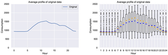
Figure 1.
Average profile and corresponding box plots in kWh. Blue: mean. Orange: median.
From the average profile we notice a low and almost flat behavior in the first 6 h, and a concave profile with a peak around midday. From the box plot we notice that dispersion changes throughout the day, and it is very high also around midday.
4. Task 1. Standardization
Standardization is a process that transform original numeric data in some equivalent data within a new interval. It is a change of scale, usually conducted in order to make two or more variables numerically comparable. The most popular techniques use affine transformations over every single variable with different effects:
- Standar scaling: the new data set has media = 0.0 and variance = 1.0
- MaxMin scaling: the new data set has min = 0.0 and max = 1.0
However, other techniques may be applied over matrix X of Equation (1). In this paper we use the following options, based on the MaxMin scaler:
- Matrix standarization: here we choose the extreme values of the whole matrix X to define the scaler. Every term in X is transformed into:
- Standardization by columns: every column has an independent standardization. For every column we chose their own extreme values to define the scaler. Every term in X is transformed into:
- Standardization by rows: remember that every column in X has the information of the energy consumption of every hour. Therefore, their sum is the daily consumption and we can obtain the fraction of the daily consumption for every hour:A more natural standardization can be obtained if we compare that fraction with the average consumption, in other words, with the fraction of a flat profile:Values of lie within the interval . It is very unusual to get the maximum value , because it is only possible for a singleton profile, a profile with all the consumptions equal to zero except in an hour. Even that it is not impossible, it is more usual that is around .In order to get a new set of values within the interval an additional standardization by columns is done:
- Extended standardization by rows: the standardization by rows allows the comparison of the shapes of the profiles. However, the information of the daily consumption is lost. If we need to keep this information, in order to compare low and high consumptions, we can add one column to X including the column vector that contains the daily consumption and their standardized version:whereThe new matrix being:
4.1. Experiment 1
We have applied the standardization explained in Section 4 to our dataset. Figure 2 shows the average profiles for the resulting dataset obtained with each technique. As the two standardization by rows (extended and not extended) are the same we have just plot one of them. It is clear that the techniques are not equivalent. To visualize the effect of the additional column of the extended standardization by rows, we have plotted in Figure 3 the histogram of the of daily consumption, before and after standardization.
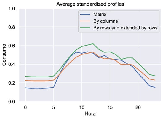
Figure 2.
Average profiles of the standardized records.
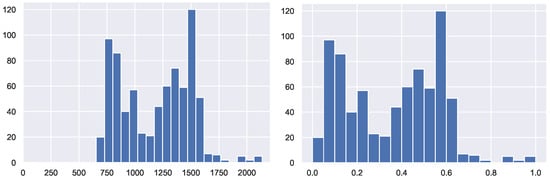
Figure 3.
Histogram of daily consumption, before and after the extended standardization by rows.
To illustrate the effect that standardizations can have on the classification process, the k-means clustering algorithm (with k = 3) has been applied to each of the normalized data sets. After performing the clustering, the prototype profiles of each cluster have been built in the original space. The result is shown in the Figure 4 where it is clear that each standardization leads to a different result.
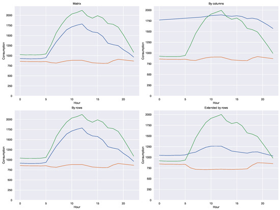
Figure 4.
Averege profiles for three different standardizations.
The effect is not only observed in the prototypes of the clusters, but also in the resulting classification. To quantify this impact, we have calculated how many classifications coincide in each standardization pair. With these values, the heatmap shown in Figure 5 has been built.
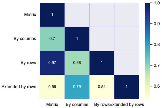
Figure 5.
Heatmap of classification coincidences for different standardizations.
The effect on the optimal number of groups for each standardization has also been explored. The Figure 6 shows the elbow curves taken to the interval with each case.
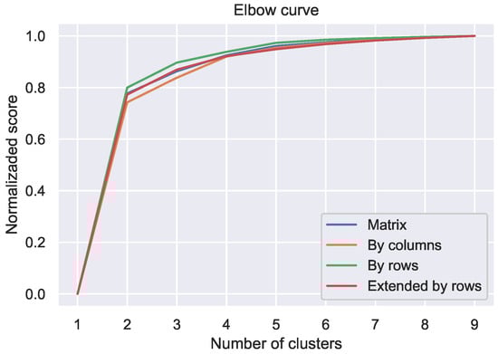
Figure 6.
Elbow curves for different standardizations.
4.2. Discussion
- Matrix standardization produces exactly the same classification results as applying k-means to the original data. This fact makes sense, because that standardization maps all the data with the same maximum and minimum values.
- Standardization by columns is problematic. By treating each column independently, it breaks the link between adjacent consumptions on the same day and therefore distorts the profiles. This fact is of special relevance because many machine learning tools use this technique by default. In general, the implementation of standardization routines has been carried out under the premise that each column of the dataset is an independent feature of the others and therefore it makes sense to make independent standardizations. This premise is not true in the case of a matrix such as X in the Equation (1) because they are consumptions of the same day.
- Standardization by rows preserves the shape of consumption profiles and is therefore suitable for those applications where the goal is to identify the shape of the profiles.
- In the heatmap of Figure 5 a high coincidence is observed between the classifications obtained between the matrix and by row standardizations. This fact suggests that both standardizations preserve very well the shape of the profiles.
- The effect on the prototypes of expanding the information on the standardization by rows with the information on the average consumption is very interesting. When comparing the three profiles of each of the two standardizations by rows, it is observed how the profile of lower consumption is better delineated, describing what can be a fundamentally nocturnal consumption (typical of public lighting, for example.)
- In Figure 6, it can be seen that the curve corresponding to the expanded standardization by rows is below the others and its shape suggests that the optimal number of groups is greater. This fact allows us to affirm that the extended standardization by rows seems to reveal more differences between the profiles, which is to be expected, since in addition to the shape of the profile it contains information on the volume of consumption.
5. Task 2. Construction of Data
Construction of data is the computation of new features that replace the original attributes [2]. This task is usually based on knowledge of the meaning of the original data as well as the new calculated data, and is guided by the application objectives. As some applications of the load profiling are related with the shape of the profiles, we propose here to calculate numerical indicators that describe geometric properties of each of them and build a new dataset with them. We use the following geometric indicators:
When using these indicators it is important to take into account some considerations:
- Sum and mean contain the same information and are therefore redundant.
- Peak value is especially useful in certain applications where it is important to study extreme behaviors; such is the case of network congestion analysis or transmission line overheating studies.
- Standard deviation and the kurtosis are two different indicators of the shape. is used to measure how different the profile is from that of a homogeneous (flat) consumption, while measures how much the values are concentrated around the same time.
- It is usual to use instead of , because the value of 3 corresponds to that of a normal distribution. In this way, the sign of allows us to tell if the profile is more or less concentrated than that of a normal curve.
These are not the only possible indicators, of course. The number of peaks, the center of gravity, and in general any shape parameter can also be used.
5.1. Experiment 2
For each of the daily profiles, the following indicators has been computed: (a) Mean (b) Peak (c) Standard deviation (d) Kurtosis.
Figure 7 shows the histogram of the indicators. To explore possible correlations between them, the paired point clouds shown in Figure 8.
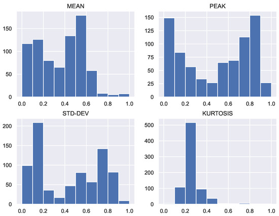
Figure 7.
Histograms of geometric indicators.
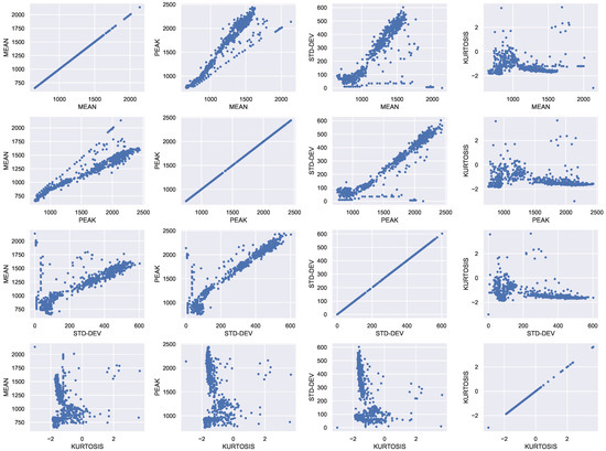
Figure 8.
Correlogram of geometric indicators.
The k-means algorithm has been applied with for each indicator separately and for each possible combination of 2, 3 or 4 indicators. The results are shown in the Figure 9. The heatmap of the Figure 10 has also been constructed, which shows the coincidences in the classification between each pair of cases. The elbow curve has also been constructed for each of the cases studied, as shown in the Figure 11.
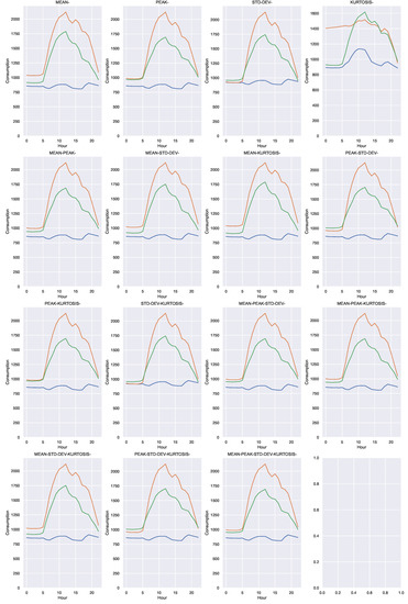
Figure 9.
Cluster prototypes for each combination of geometric indicators. Each color represents a single cluster.
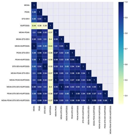
Figure 10.
Heatmap of classification coincidences between clustering of each combination of geometric indicators.
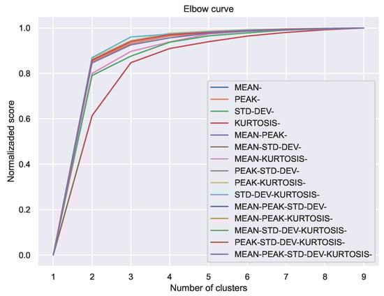
Figure 11.
Curvas de codo para clasificaciones con las combinaciones de indicadores geométricos.
5.2. Discussion
- The histograms in Figure 7 show that kurtosis is unimodal, while the other 3 indicators are bimodal. This fact suggests that kurtosis is an inadequate geometric indicator for the data studied. This statement is also supported by the heatmap in Figure 10, where a very different behavior of this indicator is observed, compared to the others. Kurtosis end skewness have been used as indicators in the analysis of electricity markets [21,22,23]. However, their descriptive power of load profile features remains as a research topic.
- The point clouds in the Figure 8 show that through the geometric indicators hidden structures can be discovered in the data. A pair of indicators, such as the mean and the standard deviation, allow you to visualize data clusters.
- The point clouds also reveal that the shape of the clusters is not simple, and therefore suggests that the clustering method used (k-means with the euclidean distance) is not the most appropriate. In this exercise we have decided not to change the method to keep the focus on the preparation and visualization of the data and not on its subsequent processing.
- It is important to consider the advantage of applying processing techniques on a space of dimension 2 or 3, instead of one of dimension 24. It is possible to identify, at least, two great advantages: (a) reduction of processing requirements and (b) reduction of the number of data required for a given statistical significance.
6. Task 2. Dimensionality Reduction (PCA)
Matrix X in Equation (1) is a set of points in a space of dimension 24. The use of geometric indicators allows to analyze the profiles in spaces of much smaller dimensions with good results. In this section we apply the well-known technique of Principal Component Analysis (PCA) with the same purpose of reducing the dimensionality of the problem. There are other energy consumption problems in which PCA has been successfully used; for example, to improve the performance of non-intrusive load monitoring methods [24].
6.1. Experiment 3
To explore the number of dimensions to which the original set could be reduced, we have plotted in Figure 12 the fraction of the variance explained as a function of the number of extracted components. It is observed that very few components (3, for example) manage to explain a large amount of the variance of the original data set.
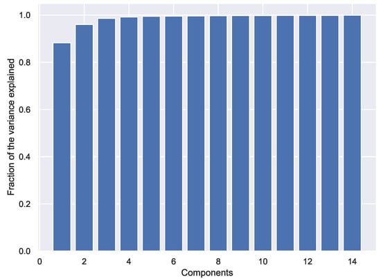
Figure 12.
Fraction of the variance explained with PCA.
We have applied PCA and applied k-means with sets of 1, 2, 3, 6, 9 and 12 components. Figure 13 shows the profiles of the obtained prototypes (in the original space). The heatmap of the Figure 14 has been constructed with the coincidences in the classifications obtained.
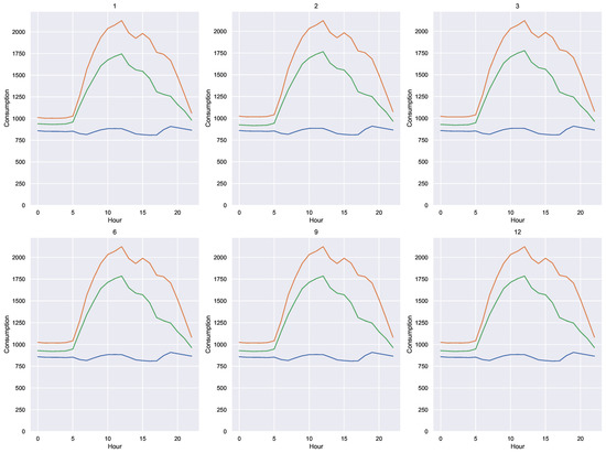
Figure 13.
Cluster prototypes for PCA. Each color represents a single cluster.
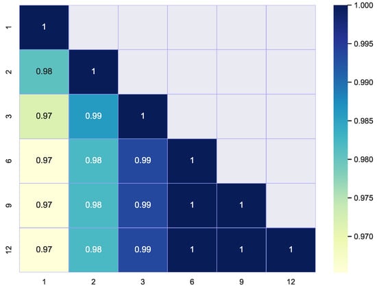
Figure 14.
Heatmap of classification coincidences for PCA.
6.2. Discussion
- The fact that it is feasible to reduce the information of the 24 time slots to very few dimensions gives mathematical meaning to the study of daily consumption profiles, instead of treating them as independent readings.
7. Task 4. Data Enrichment
Data enrichment is the integration of data that is not in our dataset but in other sources. It is usual for energy consumption measurements to be recorded with instruments that simultaneously measure other physical variables. In this section, we enrich our dataset with some of those variables and analyze the effect of incorporating them. To do this, we are going to assume two different scenarios, in a three-wire, three-phase system
- Scenario A: active, reactive and apparent power measurements are available.
- Scenario B: In addition to the above measurements, there are current and line voltage measurements.
7.1. Experiment 4. Scenario A
Denoting P, Q and S the measured three-phase active, reactive and apparent power; it is possible to calculate the three-phase power factor as:
Figure 15 shows the mean profile and the box plot for each of the variables P, Q, S and . It is observed that the apparent power follows a profile very similar to that of the active power (which is entirely expected in a system such as the one measured), while the power factor and the reactive power present a very different behavior.
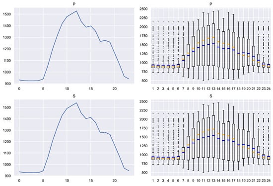
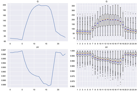
Figure 15.
Average profile and box plots of the extended variables in Scenario A. Blue: mean. Orange: median.
To explore the information of the four variables, the histograms (Figure 16) and the point clouds between each pair of variables (Figure 17) have been constructed. As the expansion of the information has been carried out on hourly readings, before constructing the Table 1, a color code has been used in the point clouds to indicate the hour of the day to which each corresponds. one of them.
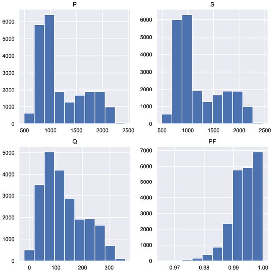
Figure 16.
Histograms of the extended variables in Scenario A.
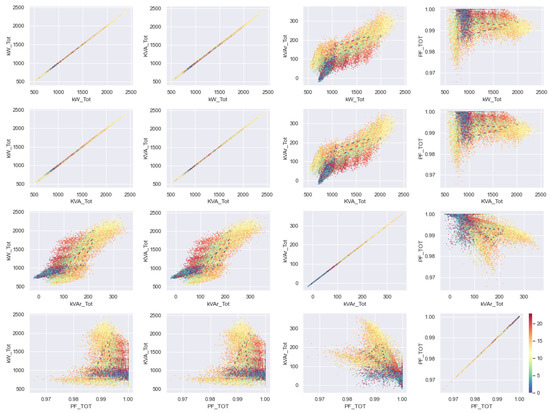
Figure 17.
Correlograms of the extended variables in Scenario A. Each color represents the hour of the day.
By applying k-means to each variable separately, the profiles shown in the Figure 18 have been obtained. To compare the effect of each of these variables, the labeling matches for each pair of variables have been computed. The result is displayed in Table 2. Due to the fact that when using k-means the resulting labeling order is random and that each workspace is different, what must be analyzed is how dispersed the data are in each matrix.
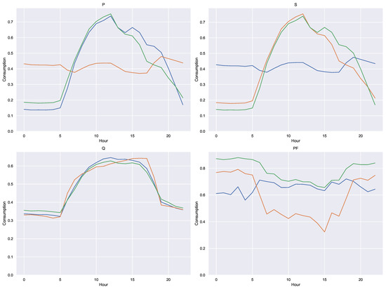
Figure 18.
Prototype clusters obtained with the extended variables in Scenario A. Each color represents a single cluster.
Table 2.
Coincidence table between classifications obtained with the extended variables in Scenario A.
Using a metric based on the number of zeros in each table, the information shown in the Table 3 has been constructed. What this table reflects is that when using each of the extended variables, different classifications are obtained; or what is the same, that each of the variables contains information that allows a different classification. The most similar variables are P and S, which makes sense since these are generally loads with a high power factor.
Table 3.
Dispersion table in the coincidences. Scenario A.
7.2. Experiment 5. Scenario B
Denoting
- , , the three measured line voltages
- , , the three measured line currents
It is possible to calculate the unbalance of voltages and currents as follows:
It is also possible to obtain the phasor values of the line currents and voltages and build a model of the consumer as an unbalanced three-phase load in Delta connection (see Appendix A). We denote these quantities as follows:
- Voltage line phasors: , , .
- Current line phasors: , , .
- Current phase phasors: , , .
- Phase impedance: , , .
Each of the 12 complex magnitudes in the previous list can be represented in rectangular form (real part and imaginary part) or in polar form (magnitude and angle). For that reason, it is possible to calculate 4 numerical values for each of the 12 magnitudes (48 in total).
In this experiment, it was decided to build a data table with the following variables:
- P: the measured three-phase active power;
- Q: the measured three-phase reactive power;
- : the voltage unbalance;
- : the current unbalance;
- : the average angle of phase impedances.
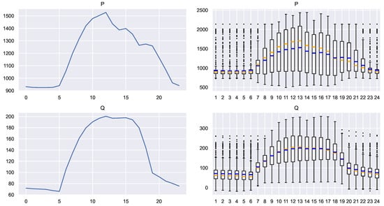
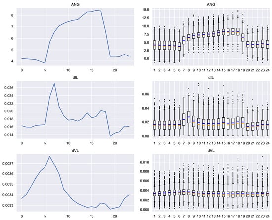
Figure 19.
Average profile and box plots of the extended variables in Scenario B. Blue: mean. Orange: median.
To explore the information of the five variables, the histograms (Figure 20) and the point clouds between each pair of variables (Figure 21) have been constructed. As in scenario A, a color code has also been used to indicate the time of day to which each point corresponds.
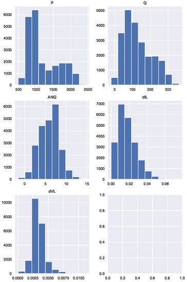
Figure 20.
Histograms of the extended variables in Scenario B.
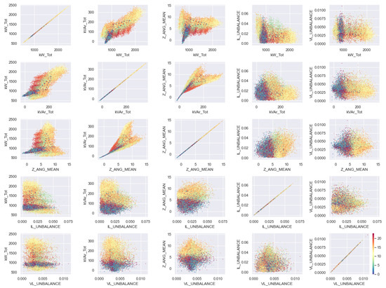
Figure 21.
Correlograms of the extended variables in Scenario B. Each color represents the hour of the day.
By applying k-means to each variable separately, the profiles shown in the Figure 22 were obtained. To compare the effect of each of these variables, the labeling matches for each pair of variables have been computed. The result is shown in the Table 4, as well as the measure of dispersion shown in the Table 5. We notice that variables of scenario B are even more independent of each other than those of scenario A.
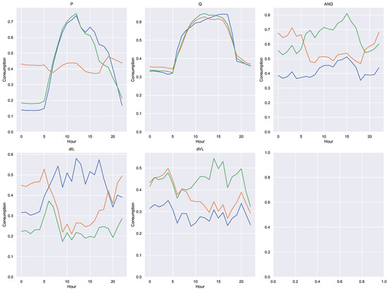
Figure 22.
Prototype clusters obtained with the extended variables in Scenario B. Each color represents a single cluster.
Table 4.
Coincidence table between classifications. Scenario B.
Table 5.
Dispersion table in the coincidences obtained with the extended variables in Scenario B.
7.3. Discussion
As expected, the incorporation of new information allow better analyzes of consumption. The purpose of this experiment has been to illustrate how the additional measurements that are often available along with consumption records can be used to enrich the profiles. However, the type of additional information that may be useful depends both on the type of problem addressed and the origin of the measurements. It is not the same if all the records correspond to the same user, as if they correspond to a set of them.
Some common examples that help describe the context in which the consumptions are made are
- For a single user: day of the week, day of the year, business day or holiday, and weather conditions. As an illustration, the Figure 23 shows the incidence of the day of the year and the day of the week in the daily energy consumption, for the dataset of this article.
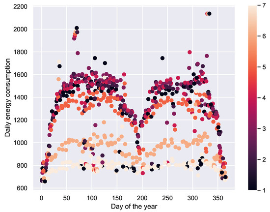 Figure 23. Incidence of the day of the year and the day of the week in energy consumption. 1 = Monday, 2 = Tuesday, etc.
 - For several users in the same geographic location: Economic activity, financial capacity.
- For several users in different places: climate and weather conditions.
Moreover, the importance of measurements other than energy consumption is underestimated. The unbalance of the grid and the harmonic distortion are easy to know with most of the common smart meters. It is well known that both phenomena, unbalance and distortion, have direct incidence over the grid energy efficiency [25,26,27]. The enrichment of the data set may be useful if we want to design, for example, investment incentives for users in order to solve power quality issues [28,29] or locate Distribution Static Compensators (DSTATCOM) [30].
8. Experiment 6. Analysis of a Fee Scheme
In order to assess the possible effect of each of the data preparation techniques studied, an application will be used to analyze a fee scheme of the type Time Of Use (TOU).
To do this, we are going to assume that each of the daily consumption records of the dataset corresponds to the average profile of a user of a certain company (a utility). The company is interested in analyzing the effects that a change from a flat-rate scheme to a TOU-type scheme could have on its income. To do this, perform the following procedure:
- The average consumption profile is obtained, that is, the profile shown on the left of the Figure 1.
- Based on the average profile, a TOU-type rate scheme is designed. The procedure is explained in the Section 8.1.
- The users are classified based on their profiles in two types:
- (a)
- A: Users with a variable consumption throughout the 24 h of the day.
- (b)
- B: Users with a constant consumption throughout the 24 h of the day.
- is calculated, the relative change that would happen in its collection if each user selects the fee scheme (Flat or TOU) that suits him best.
- is calculated, the relative change that would occur in its collection if each user is assigned the rate scheme according to the classification of the step 3.
The above analysis will depend on the results of the classification process of step 3 and this, in turn, will depend on the data preparation process. This analysis is performed in Section 8.2.
8.1. Design of the Fee Scheme
For the construction of the TOU fee scheme, we use the ideas formulated in [31] and that we reproduce below. The purpose is to obtain a fee scheme , where is the fee charged for energy consumption in the day slot i. In this exercise hourly slots are assumed, and therefore .
It is established as an additional condition that the daily cost of energy for a given consumption profile must be C, equal to what would correspond to a certain known flat rate, that is, for a consumption profile :
To do this, we start from a prototype fee scheme that defines the desired shape of f. The operation to obtain f from is an affine scaling:
where the subscripts max and min identify the maximum and minimum values of the schemes.
Under these conditions, it is shown in [31] that (12) is satisfied if and only if
with a design factor and
On the other hand, for the construction of the prototype scheme from the profile p, the following procedure was followed:
Using a flat fee of arbitrary value 100, a design factor , and the average profile of our dataset, the fee scheme obtained shown in Figure 24.
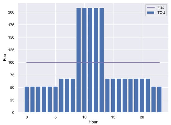
Figure 24.
Fee schemes.
8.2. Results and Analysis
To analyze the effect of data preparation, we have analyzed the following cases
- No preparation. The grouping has been conducted on the original dataset.
- The four standardization options presented in the Section 4.
- All the possible combinations of geometric indicators presented in the Section 5. In total there are 15 combinations.
- Dimensionality reduction by PCA, with 1, 2 and 3 components.
- Expanded information with each of the indicators presented in the Section 7.1 and Section 7.2.
The above listing generates 29 ways to prepare the data before performing the classification process of step 3.
The total income will be the sum of the individual incomes corresponding to the M users:
and will depend on the consumption of the individual k and the rate f that is applied
We define:
- : Income using a flat-fee for all the users.
- : Income using the fee that best fits for every user.
- : Income using the fee chosen according with the user classification.
The fee assignment for the calculation of has been carried out as follows:
- For type A users: TOU fee.
- For type B users: flat fee.
The relative changes y in steps 4 and 5 are obtained as:
Figure 25 shows the relative changes and for each of the analyzed cases. is independent of the classification process and is therefore useful as a reference value to compare the effect of different data preparation processes.
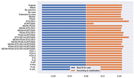
Figure 25.
Relative changes of the income.
In Figure 25, it can be seen that if the users are free to select the fee scheme, the total income would decrease (it is the value of the extreme left, for the data of the experiment). On the other hand, if the allocation of schemes is made according to the result of the classification, the income would increase. This higher value is what is expected to be an economic incentive for the user to modify their consumption patterns and allow for a flatter curve.
The incentive is strongly affected by the data preparation process. In particular, it is observed how the use of the geometric indicator DEV (Standard Deviation) achieves a better value, while KURTOSIS (Kurtosis) has the poorest performance. This is not surprising, because the Standard Deviation is a very good measure of ‘how flat’ the profile is, and therefore it is a very good indicator of the expected impact of the TOU fee scheme. Curiously, the simultaneous use of these two indicators (DEV-KURTOSIS) also has a very good performance.
9. Conclusions
It is evident that the preparation of the data affects the final result of the analysis. This is why the data preparation process should be made explicit in each report and not be ignored as a matter of little added value. It is particularly important to note that the most common default standardization process, standardization by columns, is not suitable for preparing energy consumption profiles, because it distorts the shape of load curves. We emphasize that there is a strong relation between columns.
Principal Component Analysis has been shown to be particularly efficient with our dataset and should always be considered. However, if some kind of interpretability of the intermediate results is required, some geometric characteristics such as the mean and standard deviation are a good alternative. These two options, when working in low-dimensional spaces, are attractive for the preparation of massive data.
On the other hand, the enrichment of the data with information from other measurements, or with external data that explains the context of these measurements, is an area of work that has yet to be standardized. An effort by the academic community that facilitates the comparability of the multiple investigations carried out would be convenient for the development of Energy Data Science.
Although in the experiment on the analysis of a fee scheme a good performance was obtained for a certain type of data preparation (the use of the standard deviation), this result does not imply that it is our suggestion of use: quite the contrary. What we are stating is that the best data preparation process will depend on each application, and possibly on each dataset; therefore, we want to emphasize the need to report it properly in each academic communication.
Author Contributions
Conceptualization, O.G.D. and M.d.C.P.; methodology, O.G.D.; software, O.G.D.; validation, J.A.R.; writing—review and editing, O.G.D. All authors have read and agreed to the published version of the manuscript.
Funding
This project has partial support from the Asociación Universitaria Iberoamericana de Posgrados (AUIP), mobility scholarship for postdoctoral stays at Andalusian universities, 2022 from the Ministerio de Ciencia e Innovación (Spain) (Research Project PID2020-112495RB-C21) and from the I+D+i FEDER 2020 project B-TIC-42-UGR20.
Data Availability Statement
All data used in this paper are available at https://github.com/ogduartev/energyDataScience/tree/main/data/campus.
Acknowledgments
The authors thank the engineer Alvaro Alfonso Zambrano, who provided the raw dataset.
Conflicts of Interest
The authors declare no conflict of interest.
Appendix A. Obtaining Phasors from Line Values in Three-Phase Delta Systems
Appendix A.1. Problem Statement
In the system of Figure A1 we have the following measurements:
- Line voltage magnitudes: , , .
- Line current magnitudes: , , .
- Total three-phase active power consumed by the load: .
- Total three-phase active repower consumed by the load: .
- Total three-phase active apparent consumed by the load: .
We need to compute:
- Line voltage phasors: , , .
- Line current phasors: , , .
- Phase current phasors: , , .
- Phase impedances: , , .

Figure A1.
Problem statement.
Figure A1.
Problem statement.

Appendix A.2. Angles in a Three-Phase System
The first two problems are similar. In both cases the magnitudes of a three-phase system of variables (albeit balanced) are known and the angles are ignored. Since the sum of the phasor variables is zero, the problem can be assimilated to a well-known trigonometry problem: how to obtain the angles of a triangle when its sides are known?

Figure A2.
Angles and sides of a triangle.
Figure A2.
Angles and sides of a triangle.

If the triangle is made up of three phasors, as in the Figure A3, the angles of interest are not the internal angles of the triangle, but the angles with respect to a reference. For convenience for the present analysis, we adopt as reference the direction of the phasor , that is, in radians:

Figure A3.
An unbalanced three-phase system.
Figure A3.
An unbalanced three-phase system.

A bit more general situation, if we know we can write:
Equation (A2) allows us to obtain the relative angles of the phasors of a three-phase system, from their measurements. They are relative to the angle of one of the phasors. Only when the angle of one of the phasors is known is it possible to obtain the absolute angles of the three phasors, using Equation (A3).
Appendix A.3. Phase Currents
Figure A4 shows the phase currents. We notice:
Substracting pairs of equations of Equation (A4) we get:
But the three phase currents ar a three-phase system and then:
and therefore

Figure A4.
Phase currents.
Figure A4.
Phase currents.

Appendix A.4. Phase Power
Three-phase complex power is the sum of the three per-phase complex power:
How does it changes when we add to the phase angles of the three currents? Suppose three phase currents:

The new three-phase complex power is:
Because the conjugate of a complex is another complex with the same magnitude and angle of opposite sign, the previous expression becomes:

The result of the parentheses in the Equation (A11) is the original triphasic complex power. Therefore, the relations between the two powers, their magnitudes and angles are as follows:

Appendix A.5. Summary
To solve the problem stated in Appendix A.1, the following procedure can be applied:
- Select as reference phasor. Therefore .
- Compute the angles and using Equation (A3) and the measurements , , .
- Built the line voltage phasors , , . Magnitudes are taken from the measurements, and angles fron the previous step.
- Obtain the relative angles of the line currents using Equation (A2) and the measurements , , .
- Built the line current out of phase phasors. Magnitudes are taken from the measurements, and angles fron the previous step. They are out of phase because at this step we do not know their phase from the refernce phasor .
- Obtain the out of phase phase currents using Equation (A7).
- Compute the out of phase three-phase complex power using Equation (A10).
- Compute the actual three-phase complex power using the measurements:
- Compute the angle using the angle Equation (A12).
- Built the actual phase current phasors, by substrating to each angle of the out of phase phasors.
- Compute the line current phasors using Equation (A4).
- Compute phase impedances using the phase voltage and current phasors:
References
- Goudarzi, A.; Ghayoor, F.; Waseem, M.; Fahad, S.; Traore, I. A Survey on IoT-Enabled Smart Grids: Emerging, Applications, Challenges, and Outlook. Energies 2022, 15, 6984. [Google Scholar] [CrossRef]
- Berthold, M.R.; Borgelt, C.; Höppner, F.; Klawonn, F.; Silipo, R. Guide to Intelligent Data Science: How to Intelligently Make Use of Real Data; Springer: Cham, Switzerland, 2020. [Google Scholar] [CrossRef]
- IEA. Competition in Electricity Markets; IEA: Paris, France, 2001. [Google Scholar]
- Chicco, G.; Mazza, A. Chapter 13—Load profiling revisited: Prosumer profiling for local energy markets. In Local Electricity Markets; Pinto, T., Vale, Z., Widergren, S., Eds.; Academic Press: Cambridge, MA, USA, 2021; pp. 215–242. [Google Scholar] [CrossRef]
- Stecchi, U.; Gomez, J.; Miguel, L.G.; Noula, A.; Ioannidis, D.; Bezas, N.; Cardellicchio, A.; Mastrandrea, G.; D’oriano, L.; Santori, F.; et al. Load Profile and Customer Clusters V1; Technical Report, European Commission; Project eDREAM; ATOS SPAIN S.A.: Madrid, Spain, 2019. [Google Scholar]
- Zhou, G.; Bai, M.; Zhao, X.; Li, J.; Li, Q.; Liu, J.; Yu, D. Study on the distribution characteristics and uncertainty of multiple energy load patterns for building group to enhance demand side management. Energy Build. 2022, 263, 112038. [Google Scholar] [CrossRef]
- Mohammadigohari, M. Energy Consumption Forecasting Using Machine Learning. Master’s Thesis, Rochester Institute of Technology, Rochester, NY, USA, 2021. [Google Scholar]
- Hu, X.; He, F.; Zhou, Z.; Zhu, K.; Zhang, D. A method for identifying abnormal building energy consumption using fuzzy model. In Proceedings of the 2021 International Conference on Control Science and Electric Power Systems (CSEPS), Shanghai, China, 28–30 May 2021; pp. 161–166. [Google Scholar] [CrossRef]
- Liu, G.; Ferrari, M.F.; Ollis, T.B.; Tomsovic, K. An MILP-Based Distributed Energy Management for Coordination of Networked Microgrids. Energies 2022, 15, 6971. [Google Scholar] [CrossRef]
- Köhler, S.; Rongstock, R.; Hein, M.; Eicker, U. Similarity measures and comparison methods for residential electricity load profiles. Energy Build. 2022, 271, 112327. [Google Scholar] [CrossRef]
- Dahunsi, F.M.; Olawumi, A.E.; Ale, D.T.; Sarumi, O.A. A systematic review of data pre-processing methods and unsupervised mining methods used in profiling smart meter data. AIMS Electron. Electr. Eng. 2021, 5, 284–314. [Google Scholar] [CrossRef]
- Wang, Y.; Chen, Q.; Kang, C.; Zhang, M.; Wang, K.; Zhao, Y. Load profiling and its application to demand response: A review. Tsinghua Sci. Technol. 2015, 20, 117–129. [Google Scholar] [CrossRef]
- Wang, Y.; Chen, Q.; Hong, T.; Kang, C. Review of Smart Meter Data Analytics: Applications, Methodologies, and Challenges. IEEE Trans. Smart Grid 2019, 10, 3125–3148. [Google Scholar] [CrossRef]
- Goretti, G.; Duffy, A. Evaluation of wind energy forecasts: The undervalued importance of data preparation. In Proceedings of the 2018 15th International Conference on the European Energy Market (EEM), Lodz, Poland, 27–29 June 2018; pp. 1–5. [Google Scholar]
- Perekrest, A.; Chornyi, O.; Mur, O.; Kuznetsov, V.; Kuznetsova, Y.; Nikolenko, A. Preparation and preliminary analysis of data on energy consumption by municipal buildings. East.-Eur. J. Enterp. Technol. 2018, 6, 32–42. [Google Scholar] [CrossRef]
- Ageng, D.; Huang, C.Y.; Cheng, R.G. A Short-Term Household Load Forecasting Framework Using LSTM and Data Preparation. IEEE Access 2021, 9, 167911–167919. [Google Scholar] [CrossRef]
- Lin, J.; Tso, S.; Ho, H.; Mak, C.; Yung, K.; Ho, Y. Study of climatic effects on peak load and regional similarity of load profiles following disturbances based on data mining. Int. J. Electr. Power Energy Syst. 2006, 28, 177–185. [Google Scholar] [CrossRef]
- Sechidis, K. Comparison of Different Preprocessing Techniques and Feature Selection Algorithms in Cancer Datasets; Technical Report; School of Computer Science, University of Manchester: Manchester, UK, 2022. [Google Scholar]
- Harasimowicz, A. Comparison of Data Preprocessing Methods and the Impact on Auto-Encoder’s Performance in Activity Recognition Domain; Technical Report; Gdansk University of Technology: Gdańsk, Poland, 2014. [Google Scholar]
- Gholizadeh, A.; Borůvka, L.; Saberioon, M.; Kozák, J.; Vašát, R.; Němeček, K. Comparing different data preprocessing methods for monitoring soil heavy metals based on soil spectral features. Soil Water Res. 2015, 10, 218–227. [Google Scholar] [CrossRef]
- Cayon, E.; Sarmiento, J. The Impact of Coskewness and Cokurtosis as Augmentation Factors in Modeling Colombian Electricity Price Returns. Energies 2022, 15, 6930. [Google Scholar] [CrossRef]
- Gianfreda, A.; Grossi, L. Zonal price analysis of the Italian wholesale electricity market. In Proceedings of the 2009 6th International Conference on the European Energy Market, Leuven, Belgium, 27–29 May 2009; pp. 1–6. [Google Scholar] [CrossRef]
- Ioannidis, F.; Kosmidou, K.; Savva, C.; Theodossiou, P. Electricity pricing using a periodic GARCH model with conditional skewness and kurtosis components. Energy Econ. 2021, 95, 105110. [Google Scholar] [CrossRef]
- Moradzadeh, A.; Sadeghian, O.; Pourhossein, K.; Mohammadi-Ivatloo, B.; Anvari-Moghaddam, A. Improving Residential Load Disaggregation for Sustainable Development of Energy via Principal Component Analysis. Sustainability 2020, 12, 3158. [Google Scholar] [CrossRef]
- Liao, Y.H.; Lin, Y.L. An Improved Down-Scale Evaluation System for Capacitors Utilized in High-Power Three-Phase Inverters under Balanced and Unbalanced Load Conditions. Energies 2022, 15, 6937. [Google Scholar] [CrossRef]
- Park, J.I.; Park, C.H. Harmonic Contribution Assessment Based on the Random Sample Consensus and Recursive Least Square Methods. Energies 2022, 15, 6448. [Google Scholar] [CrossRef]
- Xia, Y.; Tang, W. Study on Harmonic Impedance Estimation Based on Gaussian Mixture Regression Using Railway Power Supply Loads. Energies 2022, 15, 6952. [Google Scholar] [CrossRef]
- Chen, J.H.; Tan, K.H.; Lee, Y.D. Intelligent Controlled DSTATCOM for Power Quality Enhancement. Energies 2022, 15, 4017. [Google Scholar] [CrossRef]
- Chen, C.I.; Berutu, S.S.; Chen, Y.C.; Yang, H.C.; Chen, C.H. Regulated Two-Dimensional Deep Convolutional Neural Network-Based Power Quality Classifier for Microgrid. Energies 2022, 15, 2532. [Google Scholar] [CrossRef]
- Irfan, M.M.; Malaji, S.; Patsa, C.; Rangarajan, S.S.; Hussain, S.M.S. Control of DSTATCOM Using ANN-BP Algorithm for the Grid Connected Wind Energy System. Energies 2022, 15, 6988. [Google Scholar] [CrossRef]
- Téllez, S. Planteamiento de Estrategias para la Gestión de la Demanda desde el Usuario Activo en una Red Eléctrica Inteligente. Ph.D. Thesis, Universidad Nacional de Colombia, Bogotá, Colombia, 2022. [Google Scholar]


Publisher’s Note: MDPI stays neutral with regard to jurisdictional claims in published maps and institutional affiliations. |
© 2022 by the authors. Licensee MDPI, Basel, Switzerland. This article is an open access article distributed under the terms and conditions of the Creative Commons Attribution (CC BY) license (https://creativecommons.org/licenses/by/4.0/).