Article

Typology of Tactile Architectural Drawings Accessible for Blind and Partially Sighted People

by
Agnieszka Duniewicz
1 and
Monika Magdziak
2,*
1
Department of Urban and Spatial Planning, Institute of Architecture and Town Planning, Faculty of Architecture, Bialystok University of Technology, 15-351 Białystok, Poland
2
Department of Housing Architecture, Institute of Architecture and Town Planning, Faculty of Architecture, Bialystok University of Technology, 15-351 Białystok, Poland
*
Author to whom correspondence should be addressed.
Sustainability 2022, 14(13), 7847; https://doi.org/10.3390/su14137847
Submission received: 6 May 2022 / Revised: 8 June 2022 / Accepted: 24 June 2022 / Published: 27 June 2022
(This article belongs to the Section Sustainable Engineering and Science)

Abstract

:
The subject of this research is architectural typhlography—tactile drawings, dedicated to the blind and thematically related to architectural objects and spaces of various scales. This collection is very diverse and includes both representations of specific spaces as well as adaptations of ordinary (visually accessible) architectural drawings. The phenomenon of typhlographics has not yet found an appropriate scientific emplacement in the architectural discipline. Based on the collected research material, including Polish and foreign studies, the authors have made a multi-criterial division of the tactile drawings according to specific criteria. The result of the research is a pioneering typology of architectural typhlographs, made in seven categories. This publication, organizing the issues of architectural typhlographs and proposing a unified terminology of the phenomena and concepts studied, may be used by other researchers who explore the subject of the accessibility of architectural space for the blind.

1. Introduction

1.1. Context of the Discussion and Motivation of the Research Study

The essential sense that opens access to the rich and diverse world of architectural achievements is vision. The ability to see allows us to experience a space that is beyond the reach of our hands.
It allows us to discover distant panoramas, admire interesting architectural spaces, and carefully examine even distant tiny details. Thanks to visual perception and various substitutes for the eye and the image, man has also learned to keep—to impermanently stop in time—ephemeral architectural views. This process allows for the capturing of a wide form and space in a small photo window, film frame, or sketch, thanks to which we can freely, without physical presence, explore objects and places that interest us.
Visuality, which is an inherent tool of architecture as the art of creating space, is difficult to translate into other senses, and the spatial information it contains requires precise actions to convey it to visually impaired people. Due to cognitive deficits (the quantitative and qualitative lack of information about the external environment), blind and partially sighted people face numerous difficulties in shaping mental images of the environment and learning spatial orientation. Cognitive impairment results in significant motor and locomotor difficulties. Perceived fear, and often also some unpleasant physical experiences, can easily result in the development of a defensive attitude towards this sphere of cultural heritage, and even in the complete inability of blind people to independently explore and use the built environment. Such an attitude, which is a demonstration of helplessness and anger, may manifest itself in a lack of interest in architecture, as a field of art that is of no value to people who do not use eyesight [1] (p. 212).
However, architecture is the living space of every human being, without exception. “The places where we grow up, where we live and stay, become our world—also when we cannot admire their beauty with our eyes” [2] (pp. 9, 47). Works of architecture are part of the collective consciousness and an integral part of the achievements of civilization. The knowledge of facts and events in the field of architecture enriches the intellectual resources of man and shapes one’s social image, regardless of sensory conditions. The active use of architectural space creates opportunities for the participation of blind people in social life, eliminating interpersonal divisions and attitudes that have serious consequences, such as distance, social withdrawal, self-exclusion, discrimination, stigmatization, or rejection [3] (p. 50).
Learning the correct and satisfactory experience of architectural space (including learning about it, understanding it, and functioning within it) is an extremely important element of the comprehensive rehabilitation and revalidation of people with congenital and acquired vision dysfunctions. In shaping spatial knowledge and competencies, an invaluable role is played by various types of substituted representations of space by showing specific places and architectural objects in a sensory manner accessible to people with visual impairments. One of the leading groups of these kinds of supporting items, used as cognitive substitutes, is the so-called typhlographics (also referred to as tactile drawings and raised-line drawings), i.e., appropriately emphasized graphics adapted to haptic reception and other types of reception, which are also used in the field of architecture.
The issue of creating and using this kind of aid in practice, in the authors’ opinion, is an interesting phenomenon on the border of architecture and typhlology. The reason for researching the issue was the fact that the subject was much better known in the field of typhlological knowledge than in architecture. Filling this gap seems important, mainly due to the numerous practical values (typhlological utility and social values) that may result from the interdisciplinary cooperation of both research fields. The authors also notice high cognitive values resulting from the examination of typhlographs as a separate, specific form of architectural drawings.

1.2. The Subject, State, and Purpose of the Publication

The subject of the authors’ research is a group of architectural typhlographs—representations of a constructed space of various scales (urban, architectural, interior)—intentionally dedicated to the blind (tactile perception) or visually impaired (tactile-visual perception). The subject of graphic aids appeared as a separate scientific problem in the Polish typhlological literature in the sixties and seventies of the twentieth century, when it was associated primarily with the issue of spatial orientation. Works from this period reflect the desire to formulate universal principles of designing tactile plans and sketches that would be helpful for the movement of blind people. During this period, the term typhlographics was not used yet; instead, common names such as touch plans, sketches, and maps were used [4].
Over time, new discoveries of the useful applications of these types of cognitive supporting materials and their mass popularity (thanks to machine production) [5] (pp. 3–7) forced the need for further scientific research aimed at determining the principles of the proper design and preparation of such drawings. At the end of the first decade of the twenty-first century, an attempt was made by teachers from special centers, who (after several previous publications) developed a nationwide document that currently plays the role of the Polish National Standard for the Creation and Adaptation of Typhlographics [6] (pp. 7–13). This study is general and does not focus on architectural issues, although the authors present various views of space known from architectural design (maps, plans, projections, sections, and views). Due to the nature of the standard, this work is not an attempt to systematize a set of tactile drawings, although the issues have been divided into organized sections corresponding to various types of typhlographics (drawings of geometric figures, drawings of objects, illustrations in textbooks, charts, building plans, plans for movement, plans districts, parts of the city, maps of a larger area, geographical maps, historical maps, collections of illustrations, plans, and maps).
Similar information can be found in a more extensive and equally detailed publication published in 1992 by the American Foundation for the Blind, where we can find, in various sections, issues related to the presentation of architectural space in tactile drawings (architecture, city, perspective, furniture, details, color, scale, maps, and trees). Moreover, the author P. Edman formulates concise guidelines concerning architectural typhlographs, referring not to professional architectural drawings, but rather to a general simplified image of architectural space. Nevertheless, it is worth noting that even three decades ago, the author clearly emphasized the importance of architectural space as one of the main topics presented in tactile drawings [7].
Another study standardizing the process of planning, making, and sharing graphics on various topics for people with visual impairments was developed by the Braille Authority of North America and the Canadian Braille Authority. This document has been divided into parts related to both the manufacturing process (planning, editing, production and duplication methods, quality control, equipment, and suppliers) and the standardization of graphic symbols (Braille fonts, map key, texture palette, line styles, and sample graphics templates) and their formatting mainly for publication in book form. The principles presented in the document focus on the topic of creating didactic publications on various topics and adapted to groups of recipients of different ages (mathematical and scientific diagrams, graphics for early school grades, standardized tests, etc.). In this area, only the issues of orientation and mobility, as well as the principles of mapping, partially fit into a much wider area of architectural subject matter [8].
None of these standards covers the full spectrum of the forms in which typhlography can occur, nor does it consider all the disciplines that typhlography can represent (for example, the specificity of architectural typhlographics). Therefore, the recommendations contained in the standards are incomplete and they are usually general and abstract in nature. They do not specify the principles of creating correct typhlographics for individual thematic issues and ignore important variable factors that affect the cognitive value of typhlographics and their adequacy in specific situations (e.g., drawings for sightseeing, wayfinding, route planning, spatial recognition, learning, entertainment, etc., should be characterized by different features). In addition, the standards focus on the visual adaptation of flat drawings and do not contain the rules for representations of three-dimensional space in tactile drawings, which is an important aspect from the point of view of the architectural discipline. According to the authors, the lack of detailed guidelines on specific issues may contribute to incorrect solutions. Therefore, general research is necessary to organize the issues of typhlographics, including, above all:
-
a determination of the full spectrum of the typhlographic collection;
-
a grouping of the types and sub-types depending on various applications, graphic and material solutions, and method of use.
The need to develop a systematics of typhlographics was noticed by M. Jakubowski (a Polish typhlologist and publisher of numerous typhlographic studies), who in 2009 defined the concept of typhlographics as a graphical representation of reality using the scale, proportion, and generalization accessible by touch and sight to blind people and people with limited visual perception. He divided the drawings according to several criteria (such as a method of production, durability, reliability, repeatability, material, usefulness, correctness, place of production, type of recipient, cost of publishing, and amount of printing) [9] (pp. 36–40). This division is practical and organizes the issues selected by the author with respect to the creation, sharing, and use of typhlographs. In his research, the topic of typhlographics related to architecture appears many times, although the aforementioned systematics does not discuss them as a whole, nor as a separate type of drawings. The systematics presented by Jakubowski is multi-criterial (13 criteria), but not very extensive or detailed and focuses on the production process. Moreover, some of the criteria adopted by the author go beyond the objective description of the features of typhlographs and constitute an evaluation attempt. This goes beyond the intentions of this stage of research presented in this publication, which is aimed at logical ordering rather than valorization.
The lack of adequate concentration on architectural content, both in the standards and in the published attempts to organize the topic of tactile drawings, has contributed to the undertaking of this research on the issue of architectural typhlographics as an important separate thematic section of typhlographics, which requires further, detailed investigations. The authors of this study also noticed the growing popularity of tactile drawings with architectural content, which are more and more often observed in public spaces. The growing presence of architectural typhlographs and tactile maps in public spaces is the result of popularizing the idea of sustainable social development and accessibility for all.
At the same time, the issues of typhlographics have not been properly placed in the theory of architecture. This subject appears sporadically in publications in the field of universal design [10,11,12,13]. The issues of showing three-dimensional space on flat drawings, which are somehow the basis of an architectural drawing, appear in a few studies presenting analyses of spatial sketches made by blind people [14,15,16,17,18]. Most of the scientific publications dealing with the topic of typhlographics relating to architecture, painting, and graphics focus on the analysis of specific methods of the interpretation and production of tactile drawings [19,20]. Selected aspects concerning strictly architectural tactile drawings can be found in A. Kłopotowska’s publications on the so-called Brailleons (a special form of thermoformed typhlographs) used in the architectural education of blind students [21] (pp. 229–233), in a publication on the presentation of architectural details in typhlographs [22] (pp. 269–273), and in excerpts from the book on experiencing space and art under conditions of visual dysfunction [23].
In 2019, the authors of this article undertook focused team studies, devoted strictly to architectural typography. The result of the first stage of this research was the identification of current and potential areas of usefulness of architectural typhlography [24].
This publication is a continuation of these studies. Due to the complexity of the phenomenon and the variety of the observed typhlographic presentations, the research required ordering the issues of tactile graphics and the terminology describing them, as well as distinguishing criteria that will be used for the further valorization of the research material.
In addition, the developed typology may be useful for other researchers exploring the subject of universal design, including the creation of architectural space available to the visually impaired. Based on this typology tool, subsequent researchers will be able to accurately describe architectural typhlographies, group them, compile and compare them, study the relationships between variables (categories and subcategories) and cognitive values, evaluate individual solutions, and prepare appropriate standards for a specific category.

1.3. Materials and Methods of Research

The currently described studies were conducted on the foundations of the above-mentioned typhlological research, but with a strict focus on architectural drawings. The research material upon which the authors relied consisted of all personally known examples of architectural typhlographs (drawings known experimentally and also viewed virtually), including:
  • typhlographics presented in scientific publications;
  • products of Polish and foreign producers (including professional companies that mass-produce typhlographics, as well as companies that produce unique single-copy tactile graphics dedicated to specific places and purposes);
  • collections of educational centers and support organizations for the visually impaired, both available for use and stored in archives (including numerous works by anonymous authors and visually impaired people);
  • typhlographics available in public spaces (squares, streets, and transportation hubs), public facilities (tourist places and institutions of European cities), and cultural institutions (typhlographics made by artists or employees—both unique works and translations of art for tactile reception).
From the perspective of further research, the aim was to obtain a comprehensive typology showing the fullest spectrum of the phenomenon of creating and using typhlographs. The research team did not exclude any of the encountered examples, considering that even a feature observed only once is an integral part of the set of currently available solutions. Moreover, individual examples were often the most interesting research object due to their innovation or unusual nature that required further examination and comparison in the evaluative research based on the presented typology.
It is assumed that presented typology forms the basis for further evaluative research on the methods of creating typhlographics with architectural content. Therefore, different ways of representing complex information about three-dimensional space in a tactile drawing were important. Therefore, a natural point of reference for the authors were publications in the fields of:
  • creating and using traditional (visually available) architectural drawings [25,26,27];
  • applying the principles of geometry and creating perspective drawings [28,29,30];
  • mapping architectural space in historical drawings and paintings [31,32];
  • research and development of image analysis principles [33,34,35,36].
The initial recognition of tactile drawings showed the multiplicity and complexity of the phenomena that shape the heterogeneous character of the available collection. Due to the focus on architectural typhlographics as the main area of research interest, the features typical of architectural drawings have been included in the typology equally with the features typical of all typhlographics.
During the work on typology, the techniques of thematic analysis (TA) were used in the qualitative research on the collection of typhlographics. The inductive reasoning line (from detail to general) was used to organize a large group of the observed features and phenomena occurring in tactile drawings. The pre-distinguished criteria were selected in the process of grouping typhlographics with common features assigned to different thematic areas (accessibility, functionality, thematic content, method of exposure, and the implementation process). The thematic division, corresponding to the following questions, has become the key to the preliminary arrangement of the distinguished features of architectural typhlographs:
  • For whom ?—Who is the recipient of tactile graphics?
  • What for ?—What is the purpose and functional scope?
  • What ?—What is the content and its cognitive value ?
  • Where ?—What is the place and method of use ?
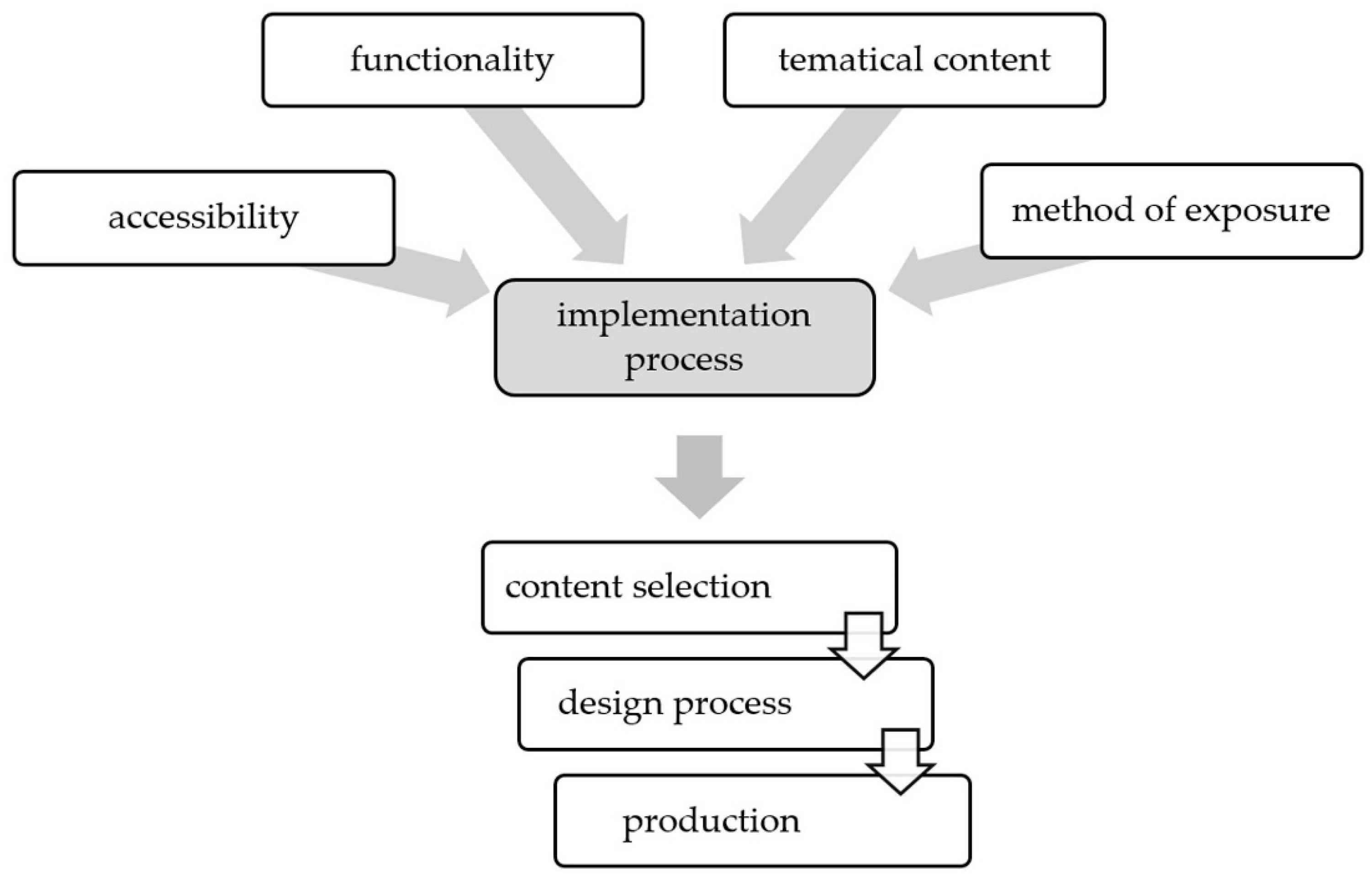
  • How ?—What is the scope, and what are the stages and possibilities of the implementation process?
Within these five thematic scopes, appropriate criteria were then searched for, which could become the basis for creating a typology. It has been noticed that four of the questions are in fact the determinants of the last, most complex question, which concerns the initial content selection, the design process, and the production stage.
The mentioned thematic areas considered during the development of typology are presented in the figure below (Figure 1).
Then, in the process of logical inference, the obtained division was revised based on data collected from the literature and standardization documents, as well as consultations with specialists working with typhlographics on a daily basis. The experts, in their interviews, indicated the differentiating features and paid attention to their utility consequences. They referred not only to the final morphological features of the typhlographs, but to several issues related to the broadly understood design and implementation process. This information led to a search for such criteria that would have a significant impact on the usable quality of typhlographs (their readability, the clarity of their message, and their functional comfort).
Based on the collected information, the authors of this work were looking for criteria that have a significant impact on the usable quality of typhlographs and that could simultaneously constitute the basis for the observation of the objective and measurable features of typhlographics, excluding criteria related to evaluation.
All the stages of typology development were aimed at showing the full spectrum of possibilities and the evolution of the constantly developing collection of architectural typography.
The obtained typology was developed as the basis for the further stage of research. It is planned to use this typology as a descriptive and classificatory tool to assign to groups and describe individual typhlographs. The subgroups can be used for comparative analyses and evaluative assessments. In addition, the selected criteria (based on their mutual correlation) will allow for a further evaluation of the collected research material to assess and define the determinants influencing the adoption of specific solutions (in the process of developing and producing architectural typhlographs) for various applications.

2. Research Results—Typology of Architectural Typhlographs

The results of the authors’ research presented in this work are a pioneering attempt at the scientific typology of typhlographs as an architectural phenomenon that has so far remained outside the field of interest of the architectural discipline. The obtained typology refers to many issues related to the design, the implementation, and access to architectural typhlographs.
Following the principles of logical division, the authors tried to obtain the minimum possible number of division criteria, enabling the examination of the entire collection of architectural typhlographs (that is, considering each individual architectural typhlography, without leaving any of them outside the study). The selected criteria correspond to groups and subgroups of the features that meet the principles of equality and inferiority, applied in a logical division. The presented typology shows the dependence of the distinguished features (which affect the quality and correctness of the information transfer) on the assigned classification criterion.
The final typology contains a list of 7 criteria (thematic categories), which according to the authors allow for a complete, holistic view of the full spectrum of the typhlographic phenomena. The following criteria have been distinguished:
  • sensory accessibility;
  • purposefulness (functionality);
  • the relation between drawings and the architectural reality;
  • content of the drawings;
  • method of presentation;
  • method of exposition;
  • methods of producing typhlographics.
The thematic division of the research area and the assignment of typological criteria to the specified issues is presented in the table below (Table 1).

2.1. The Criterion of Sensory Accessibility

The collection of typhlographs included in the research area presents solutions addressed to various groups of recipients. Therefore, the authors analyzed drawings in terms of their accessibility to specific human senses. It was examined whether a given drawing was designed exclusively with tactile perception in mind, or whether the solution considers the reception with the help of several senses (which are complementary or an alternative to haptic reception). The authors’ attention was also focused on how the information encoded in the drawing reaches the user.
The division of typhlographs depending on the sensory accessibility criterion is presented in the form of a diagram in Figure 2.
Due to the specialized nature of the supporting typhlological materials, which is closely related to the perceptual abilities of the recipient, all of the architectural typhlographic studies can be divided into two main groups:
  • Mono-sensory—tactile drawings—raised-line drawings intended for haptic use (in which visual elements do not constitute the essence of the message), designed mainly for completely blind people.
  • Multisensory—raised-line drawings intended for the sense of touch and at least one additional sense to support, complement, or replace the haptic perception, designed for a wider group of users, including visually impaired people. Due to the extended group of users, multisensory typhlographics are also referred to as universal supporting materials.
The following works can be distinguished in the group of multisensory typhlographs:
  • Haptic-visual—colored drawings with raised lines, engaging both the sense of sight and touch, intended for users with both or one of the senses mentioned. Therefore, this group of typhlographics can be included in a wider set of the so-called magnigraphy, that is, graphics designed for the visually impaired [37], as in Figure 3.
  • Haptic-auditory—raised-line drawings in which the visual elements are not significantly important, and the content is additionally supported by specially designed audio messages.
  • Haptic-visual-auditory—colored drawings with raised lines, in which the transmission of information is supplemented by sound messages.
Access to the audio layer can be achieved through the following solutions:
  • integrated—soundtrack permanently built-in and accessible via special buttons (e.g., multimedia board or terminal, “touch it” type, or multimedia devices);
  • complementary—sound recording available on a special player (e.g., a player with a headset) or played on the user’s devices (e.g., audio systems using Bluetooth, GPS, beacons, etc.).

2.2. The Criterion Regarding the Purposefulness (Functionality) of Typhlographics

The authors’ research focused on the aspect of the usefulness (possibility of practical use) of architectural typhlographs for various tasks related to the functioning of blind people in physical and social spaces. The research area was narrowed down to the currently used functional areas of typhlographics. The potential fields of possible application, for which the authors have not found adequate and realized examples so far, have not been included in this study. The research team also analyzed the diverse nature of the drawings, considering the aspect of their intentionality as a tool for appropriately transferring defined content. In other words, the practical significance a given type of drawing has for its recipient was investigated.
The division of the typhlographs in relation to the purposefulness criterion is illustrated in Figure 4.
Depending on the purpose of use, the collection of typhlographs can be divided into drawings for:
  • Spatial orientation and safe locomotion—drawings aimed at making it easier for the visually impaired to obtain a valuable and adequate mental image of urbanized space and to implement a planned route of movement or move according to specific rules (including e.g., evacuation).
  • Learning spatial orientation and movement—drawings supporting the acquisition of competencies allowing for the use of architectural space without using the sense of sight, including learning the principles of the structure and function of the urban environment. Such drawings introduce concepts and problems related to moving in urban space and familiarize the blind person with typical situations that will or may appear in real space.
  • General knowledge of the architectural space—including materials supporting general education and individual human development in the field of architectural concepts, the history of architecture, the architectural styles, the specific objects, the general construction of the architectural objects, architectural curiosities, etc.
  • For tourist purposes—supporting materials that facilitate visiting attractive architectural spaces, including historical and contemporary buildings,
  • Other purposes, e.g., advertising (the advertisement and promotion of the organization that implements or provides typhlography), commemoration (occasional editions, e.g., anniversary celebrations or the commemoration of an event related to architecture), decorative (graphics that decorate space, book pages, etc.), fun and relaxation (drawings created to make free time more enjoyable), etc.
Examples are shown in Figure 5.
Depending on the intention of the drawings on the various architectural aspects, the collection of architectural typhlographs can be divided into works of the following characters:
  • presentation—showing the principles of organization and the realistic features of spatial systems (including adaptations of flat graphics presenting architectural content);
  • information and warning—graphics communicating the presence of specific elements considered as important or dangerous;
  • preservation of information—drawings aimed at registering space to preserve the possibility of later recreating the existing spatial relations;
  • instruction—typhlographics giving practical tips on how to use a given space;
  • documentation—technical drawings and views constituting a mutual communication tool in the construction and architectural industry;
  • prototype—experimental drawings made to illustrate and verify specific architectural concepts [25].

2.3. Reference Criterion: Drawing versus the Presented Architectural Reality

The authors considered the relationship between the object of the typhlographic representation and the typhlographic representation itself, which may or may not refer to real architectural scenes. The typhlographics were tested for their compliance with a possible real prototype of architectural space. Attention was also paid to the imaginary potential of drawings that did not refer to images that exist or were not equivalent to typical architectural illustrations.
The division of the typhlographs with respect to the reference criterion is presented in Figure 6.
Considering the relationship between the image presented in the typhlographs and its prototypical architectural reality, we can divide architectural tactile drawings into:
  • direct representations of space—drawings referring to a specific, existing architectural space;
  • representations based on another representation—adaptations of “ordinary” drawings of architecture to a form readable by the sense of touch;
  • the representations that do not have a prototype in real space and are not adaptations of other visual graphics.
Due to the fidelity of the content of the image to its possible spatial prototype, we can distinguish drawings of the following character:
  • reconstructive (imitative)—drawings corresponding to a specific architectural reality (duplicating or imitating its features and principles of structure and function).
  • processed (modified or transformed)—drawings changed by introducing modifications to the space prototype while maintaining some of its features, or drawings transforming the features taken from many spatial images into one drawing (e.g., abstract drawings of space—an example, model, or typical images),
  • creative—drawings of a new concept of a non-existent space, in which we distinguish: imaginary drawings—depicting an invented architectural space, and conceptual design drawings—related to creating a future architectural space.
Examples of the typhlographs of different natures with respect to the criterion of reference to architectural reality are shown in Figure 7.
Due to the relationship of the proportional fidelity (identicality) to the original, we distinguish drawings made:
  • on a scale—drawings in which the typhlographic image is a faithful representation, or is a reduction or enlargement of the original (it can be made on an architectural scale or at any other scale);
  • in the so-called contaminated scale—drawings made in different scales for different directions of the presented space (which may be dictated by the desire for better tactile readability of the image);
  • off-scale—drawings that try to capture the overall impression, without attention to the relative proportions of the elements.

2.4. The Criterion of the Content of Tactile Architectural Drawings

The authors investigated which types of space and groups of objects are the subjects of typhlographic studies as well as which scales of space correspond to the given examples. When developing this part of the division, the research team referred to the rules of classification and terminology of drawings usually used for all architectural works. The study also identified the current areas using typhlographs to show specific issues in the field of architectural knowledge.
The division of the typhlographs in relation to the content criterion is presented in Figure 8.
Due to the size and scope of the area shown in the drawings, we can distinguish representations of internal and external spaces. According to the categories used for professional architectural works, these drawings can be defined as representations of spaces related to: spatial planning, landscape, urban planning, architectural, and interior design.
The theme of tactile representations may include entire cities or their fragments, landscape objects, larger urban layouts, individual buildings, and complexes of buildings, as well as their interiors, details (the details of urban spaces, buildings, interiors, construction solutions, etc.) [2] (pp. 9, 47), and other complementary elements (e.g., interior furnishings, costumes, decorations, emblems, etc.).
Examples of typhlographics in different scales depending on the thematic content are presented in Figure 9.
Typhlographics with architectural content can present various topics in the field of design as well as the theory and history of architecture. They may refer to historical buildings and the unpreserved cultural heritage, but also contemporary architecture. In addition, they can present projects that are only planned for implementation, as well as typical objects, model objects, and even purely theoretical ideas.
Apart from the general cognitive benefits common to a wide group of studies devoted to architecture [38], the authors noticed several specific informational values placed in drawings by using different types of cognitive elements that affect the quality of reception and the functionality of the presented information. These cognitive elements specifically corresponding to architectural drawings have been grouped and presented in Figure 10.
The basic scope of the information that can be obtained by viewing architectural typhlography may include cognitive elements describing the general appearance of the space, such as:
  • shape—the geometry of the architectural form;
  • proportions—the mutual distance and height relations of architectural objects;
  • tectonics—the morphological structure of forms and spaces;
  • composition—the arrangement of forms and spaces, and the order of the facade;
  • material—information on the construction and finishing materials;
  • texture—reflecting the features of the floor surface texture, wall surface, or other elements;
  • construction and technology—information on the construction methods and techniques;
  • color—information on colors.
The range of cognitive values may also include other specific graphical information that explains functional tasks (e.g., drawings for spatial orientation):
  • entrances—markings of doors, entrance openings, gates, etc.;
  • traffic directions—presentation of proposed, desired, or necessary routes of transport;
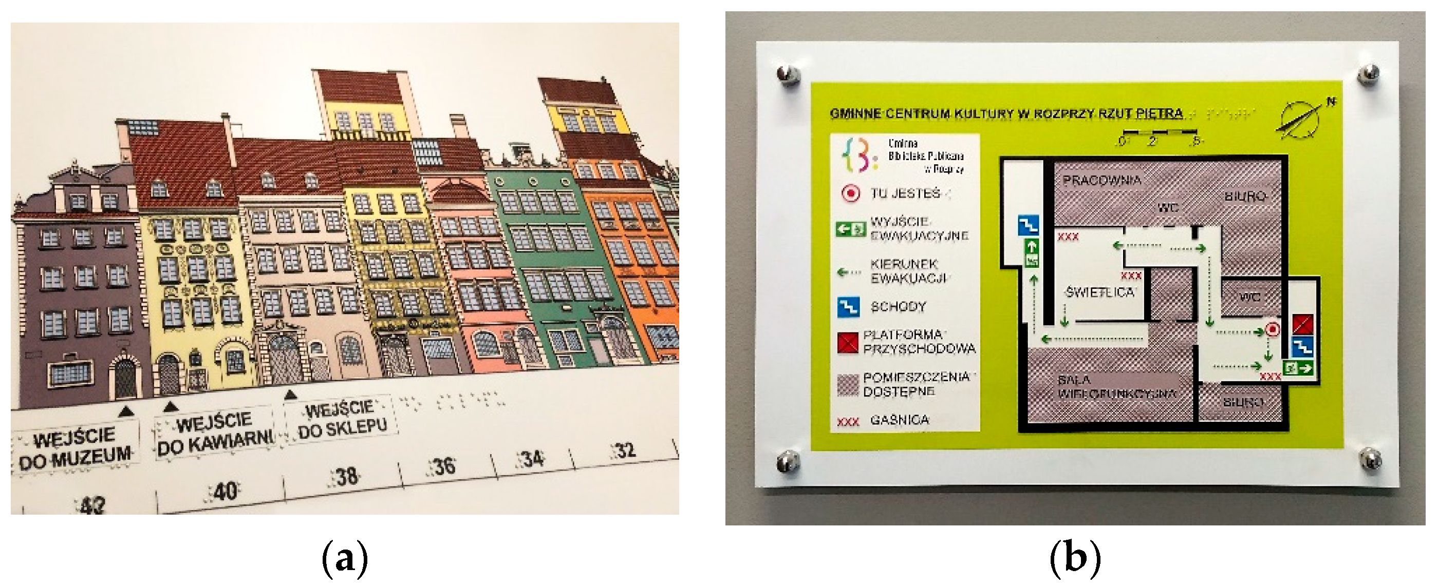
  • numbering—building address numbers, room order numbers—as in Figure 11a,
  • instructions for the use of space—information on the assumed function of the space or interior, as in Figure 11b;
  • essential elements and important areas—information on important zones or rooms;
  • friendly elements—the arrangement and marking of solutions supporting the use of the space or facility;
  • barriers and ways to avoid them—the arrangement and marking of unsafe elements and barriers, the creation of safety system elements, etc.
An integral element of many typhlographs is the presence of various types of graphic signs (constituting a component of the basic architectural image), such as:
  • an image orientation marker—a symbol supporting the orientation of the observer in the drawing space (usually represented by a triangle or a chamfer in the upper right corner of the graphic);
  • a spatial orientation marker—symbols facilitating orientation in physical space (e.g., a north arrow or a compass rose of the winds showing geographical directions);
  • a scale marker—symbols that enable an estimation of the size of the objects in the drawing (e.g., human silhouette, numerical scale, or graduation scale);
  • an observer position marker—a positioning point showing the current location of the observer (e.g., a raised pin or a human silhouette).
In the drawings, there are also various types of complementary elements (usually from outside the main image), improving the value of the cognitive content of the drawings, such as:
  • an ideogram—pictorial abbreviation, simplification, synthesis, or archetype of an architectural form;
  • the design process—stages of creative work, changes or transformations made within a space or object;
  • a logotype—an ancestral coat of arms, emblem, graphic sign of a space or project, or a logo of an organization;
  • labels—additional elements complementing or explaining the content of the drawing;
  • auxiliary lines—helping to read and understand the presented shapes of the object (e.g., auxiliary lines showing the invisible edges of the object shown in a three-dimensional view);
  • dimensions—dimension lines specifying the size and the estimated time needed to cover a given distance.
Sometimes, in tactile drawings, we also see elements found in real space, although they do not represent a greater informational value in the conditions of blindness, such as shadows (information on the shading of some elements in architectural scenes). It is also possible to add or explain the content through various symbols (graphic markings and pictograms) as well as text messages, descriptions, specifications, etc.

2.5. The Criterion of the Method of Presenting the Content of Drawings

In this part of the study, the typical methods of presenting architectural space on typhlographs were analyzed in relation to graphic representations commonly used in architecture and cartography. The authors’ attention was drawn to the various drawing conventions which were intentionally used to obtain the appropriate cognitive values of a drawing, depending on its purpose.
Another interesting and very complex research aspect comprised the various ways of presenting objects, e.g., tactile drawings may take the form of images with more or fewer raised lines, and they can also use special effects that present the image in a way more or less similar to the perception of the sighted person.
The systematization of typhlographs with respect to the criterion of the method of presenting the content is illustrated in Figure 12.
In the studied group of typhlographs, various images of space can be distinguished, relating to those known from cartography and architectural art, such as:
  • maps—cartographic studies of specific spatial systems and structures;
  • diagrams—simplified, strongly reduced space drawings;
  • plans—top view, two dimensional flat projections of urban spaces/buildings/rooms;
  • facades—front view, two dimensional flat projections of external walls of buildings;
  • interior elevations—vertical, two-dimensional drawings of internal walls;
  • sections—drawings showing a view of the spaces, buildings, and elements as though they had been sliced or cut inside along an imaginary plane;
  • silhouettes—outlines and external contours of a building or a group of buildings;
  • panoramas and street frontages—drawings showing larger fragments of the city landscape or building sequences;
  • views—drawings showing three-dimensional space, made from an axonometric view, perspective, or with elements of perspective;
  • details—additional drawings of selected fragments of urban and architectural spaces or elements of interior architecture;
  • additional complimentary drawings—representations of elements related to architecture, such as coats of arms, costumes, props for scenography, spatial installations, and paintings with genre scenes, as in Figure 13.
Depending on the purpose, typhlographics can be presented in the following conventions:
  • realistic—maintaining the highest possible reliability and truthfulness of the image when compared to the original;
  • technical—with the highest precision and accuracy possible;
  • geometrized—to simplify the objects and reduce them to simple solids and geometric shapes;
  • plastic—drawings made intentionally in an impressionable, intuitive way, ensuring aesthetic attractiveness.
Depending on the form of presentation, architectural typhlographics can be divided into:
  • Semi-flat—those in which the content is presented on a plane with raised lines, patterns, areas, symbols, etc.
  • Semi-spatial, also called 2.5D drawings—representations in which the content has been developed in the form of raised solid forms, reflecting the actual geometry and position of the objects, as well as their sphericality, curvature, and obliquity. Upon reception, they resemble models.
  • Sometimes, embossed solid forms are combined with raised lines, patterns, and symbols.
Depending on the character of the embossing (relief) method used in typhlographics, a picture can be presented as:
  • raised line tactile drawings (contour or texture);
  • embossed shape tactile drawings (raised surface or objects), with different characteristics: single level, multi-level embossed, rounded- (-domed) embossed, or sculpted-embossed;
  • mixed (e.g., embossed-textured drawing).
Due to the method of presenting the content in raised line typhlographics, they can be divided into:
  • contour and linear outline—showing the external outline of the object;
  • contour-textural—those in which the outer contour is filled with a tactile texture;
  • textural—drawings without contours, in which the areas are covered with tactile textures.
On the other hand, considering the criterion of presenting the spatial depth of the architectural scene, typhlographics can be divided into the following groups:
  • Without spatial depth—semi-flat drawings of spatial objects shown in the top view flat projection.
  • With a suggestion of spatial depth—semi-flat drawings of spatial objects captured with such effects as the mutual overlapping of the objects in the scene (showing objects partly hidden one behind another), reducing objects’ size or slightly elevating or side-shifting objects standing further away on the drawing plane, and drawings with shadows (according to the authors, the examined examples are most likely manufacturing mistakes, because these types of plasticizing effects are intended only for visual reception, while their use in typhlographics intended for the visually impaired may disturb the reception of the content and even mislead the recipient).
  • Including spatial depth graphic effects—semi-flat or semi-spatial drawings imitating the stereoscopic effects that a sighted person obtains when seeing architectural scenes, and tactile drawings transferring depth effects commonly used in visual graphics, like in painterly, atmospheric, and luminous perspective (where the intensity of the colors, light, and the contrast decreases with the distance of the objects).
Eidolic drawings that give the impression of depth and can be created based on the following views of space:
  • Primary views—raised-line, canonical images of three-dimensional objects presented in two dimensions, in the form of parallel projections on a plane, i.e., plans, elevations, sections, etc.
  • Perspective—views showing a three-dimensional effect, including a perspective based on the principles of geometry called linear (one-point, two-point, and three-point); a curvilinear perspective (four-or-above-point), which includes image distortions; and a multipoint perspective that shows objects positioned to each other at a different angle. In addition, there is also a reverse perspective (also called inverted, divergent, or Byzantine perspective), where the point of convergence of the perspective lines is in front of the image plane, and not behind it, as in a linear perspective. [39]
  • Semi-perspective—in typhlographs, this is a simplification of a one-point parallel perspective, where the primary view is combined with perspective elements by adding perspective side views.
  • Pseudo-perspective/empirical perspective—projections that differ significantly from the laws of vision and are not based on the principles of geometry. These are views that are a free drawing of space, often without preserving the three-dimensionality of objects and the principles of scaling them in space. Such representations can be found especially in pre-Renaissance visual works before the principles of the geometric perspective were learned. Examples of the pseudo-perspective appear in prehistoric cave paintings, Egyptian art, children’s art, and contemporary pseudo-primitive graphics. In these works, we find various spatial compositions that are used to provide the impression of space. Additionally, we can distinguish perspectives: overlapping composition (objects cover each other, creating an impression of depth), vertical perspective (more distant elements are placed higher), strip perspective (figures are grouped into a system of horizontal rows/stripes), topographic perspective (primary side views are freely arranged around the drawing of a plan, which resembles a map), or an intentional/hierarchical perspective (the most important object is presented on a larger scale than the surroundings) [40,41].
  • A “contaminated” or deformed perspective—completely arbitrary use of spatial effects, often used only on selected elements of the image to highlight depth, relief, or curvature, not reflecting the real geometry of the object.
  • Mixed projection perspective—a spatial drawing containing a compilation of various known variants of perspectives, often freely distributed in the drawing area.
  • Axonometric view—a type of parallel projection of space using the coordinate axes system, corresponding to three dimensions. Axonometric drawings are created according to specific geometric rules. Depending on the angle of inclination of the axis, many sub-types of axonometric views can be distinguished (including auxiliary multi-view projection; isometric, dimetric, trimetric, and oblique projection; and cabinet, cavalier, and military projections). This is a type of drawing in which the real dimensions of objects are preserved in at least one selected direction, which makes this type of space representation widely used in technical drawing and architecture.
  • Primary multi-view projection—a non-photorealistic multi-element drawing, created by showing views arranged next to each other obtained from carefully selected canonical observation points. The image of the object is projected onto the sides of a geometric cube located around the object. One can draw six different sides, but typically three views are used to represent a three-dimensional object (front, top, and end view) [42,43].
Examples of the various views of architectural space in the two-dimensional drawings are presented in Figure 14.
Due to the selection of the content to be shown on the typhlographs, the drawings can be divided into:
  • epitomic—presenting the most characteristic approach to a given architectural or urban space [44] (pp. 210–212);
  • faithful/precise—showing the object in a reliable way, systematized way, comprehensive way, correct way, and so on;
  • accenting—drawings that emphasize and highlight some elements and features and spatial phenomena for better visibility and understanding;
  • iconic—simplifying objects or spaces and synthesizing their most important features [45];
  • symbolic—drawings representing broader cognitive content in architecture;
  • conventional—in which the approach to space does not play a significant role.

2.6. The Criterion of the Method of Exposure

The authors’ analyses included a multitude of different forms of the typhlographs’ presentation, intended for viewing by a single recipient, a group of people, or for public or even mass use. The subject of the authors’ studies was the various ways of using typhlographics in architectural space, depending on the expected cognitive results.
The division of the typhlographs with respect to the criterion of the method of exposure is presented in Figure 15.
Due to the methods of use resulting from various utility purposes, architectural typhlographics can be divided into:
  • stationary—permanent displays, available only on-site and set in a strictly defined place (sometimes changed), often directly next to the presented space, as in Figure 16a–d;
  • portable—materials enabling easy transport from place to place, taking on the road or flexible positioning in different places, as in Figure 16e,f.
In the case of permanently installed typhlographs, one can distinguish various ways of presenting the image, such as in the form of vertical or horizontal exposure planes, or inclined at some angle, depending on the needs and preferences.
Architectural typhlographics can also be presented as:
  • self-functioning images;
  • drawings installed on various types of spatial displays (boards, tables, pedestals, stands, posts, poles, or pylons), as in Figure 16a–d;
  • surface images, made on the surfaces of planes and various objects (e.g., on planes of space—floors, walls; on elements of equipment—city furniture; elements of road infrastructure, etc.).
There are various forms of making architectural typhlographs available to the recipient, including:
  • separate single drawings—individual cards, sheets, signs, forms, boards, molds, engravings, and so on;
  • single drawings grouped into sets—folders, binders, and briefcases that can be freely expanded with new images or divided depending on the user’s needs (with the possibility of taking any set of drawings for a trip, for visiting the museum, etc.), as in Figure 16f;
  • fixed, permanently stapled sets—predefined, inseparable sets of tactile drawings, for example, book publications (manuals, guides, albums, atlases, playbooks, calendars, etc.);
  • series—sets of several publications forming a coherent whole (e.g., thematic series), as in Figure 16e.
The format of the studies can be standardized, e.g., A-4 or A-3 formats are popular due to the convenience of their use and production, but the size can also be set freely, taking into account the convenience of tactile perception.

2.7. The Criterion for Producing Tactile Drawings

In this research, the authors have explicated many different production methods, leading to different final effects and characterized by different economics of the production process. The following features were considered: the durability of the images, the spatial structure of the reliefs, and the number of copies produced, closely related to the manufacturing technology.
The division of typhlographs, depending on the production process, is shown in Figure 17.
Considering the production process, typhlographics can be divided into two main groups:
  • Handmade—(made by hand or with the use of some utensils) for example, drawn, painted, formed, sculpted, molded, glued, imprinted, pressed, stitched, embroidered, knitted, stretched, bent, stacked, poured, scratched, grooved, woven, cut, torn, etc., as shown in Figure 18a.
  • Mechanically manufactured—printed with a braille dot-printer, printed with 3D printers, printed on heat-sensitive capsule paper, using screen printing, using flock printing, formed with stamping machines or presses, thermoformed, layered, sprayed, varnished, cast, engraved, milled, etc., as shown examples in Figure 18b–d.
Several representative examples of typhlographics produced by various methods are presented in Figure 18.
The result of the manufacturing process may be durable or temporary (sometimes with adjustable images, e.g., drawing on the hand or projection from Braille displays). They can be made as monolithic (one-element) graphics or multi-element collages (mosaics using various materials).
In addition to the examples constituting a permanent, non-modifiable representation of an image, we also find modifiable examples consisting of movable or interchangeable elements (variable elements, e.g., fixed with a magnet or Velcro), which enable the active interaction of the user with the image. The method of production has a direct impact on the possibility of duplicating tactile graphics (determining the cost and time-consumption of the production process) and determining the quality of the features of the representations obtained using specific technology. As far as financial and time possibilities are concerned, a specific number of copies of a typhlological publication is defined. Tactile drawings can be single copies of architectural typhlographs or larger editions (from two or several copies, through a wider but limited edition, leading to unlimited possibilities for duplication).

3. Discussion

The reason for starting research on the typology of architectural tactile graphics was the fact that the authors noticed the enormous heterogeneity of the collection of such drawings. This collection is characterized by a vast variety of topics and approaches to the presentation of architectural space, a multitude of implementation techniques, and significant differences in the forms of presentation of such drawings.
During the research, the authors confirmed that the topic of designing, producing, and presenting architectural typhlographs has not been the subject of comprehensive, focused scientific research so far. Although the subjects of interest in the discipline of typhlology were selected types of architectural tactile drawings (especially plans and maps of spatial orientation), these analyses were most often performed by researchers who had no competence in the field of architectural design. Architectural typhlography has also not been sufficiently detailed and exhaustively described in the published standards for the creation and adaptation of illustrations and typhlographic materials. These are valuable and well-structured publications, but they lack precise terms and concepts derived from the architectural discipline.
During the research, the authors found many defective studies with low utility value. According to the authors, this is because architectural typhlographics are currently prepared according to insufficiently precise guidelines and are subject to free interpretation by people who prepare images for tactile perception. Professional architects rarely participate in the creation of architectural typhlographs. Even in the case of their inclusion in the design process, communications between the designer and the manufacturer, and the consultant and recipient are made difficult by the lack of a uniform nomenclature.
As a result of recognizing the topic and discovering its complexity, the authors decided to conduct extensive typological analyses, systematizing the subject of tactile architectural drawings, to create the basis for the further stages of their own research and research by other specialists, including scientists representing the architectural discipline.
Based on the collected research material, the authors made a multi-criteria division of architectural tactile drawings based on specific features (corresponding to various research areas), the appropriate selection of which may affect the effectiveness of the process of translating architectural content into haptic reception (this reflects the influence of the primary criteria on the criteria of the implementation process). The typology considers only the measurable and objective features of typhlographics. The developed typology presents a multi-level logical division into groups of features corresponding to the seven categories selected by the authors. The rich fragmentation of the presented typology showed the full complexity and great heterogeneity of architectural tactile drawings. The proposed division refers to the research already described in the professional literature, but it is a completely new, comprehensive approach to the issue of tactile architectural graphics.
As a result of the study, a new tool was obtained, allowing for:
  • a systematized, comprehensive overview of the full spectrum of solutions in the field of architectural typhlographics;
  • the unification of nomenclature concerning the features of architectural typhlographs;
  • the creation of a basis for conducting qualitative research in the field of architectural typhlographics (including constructing precise and systematized descriptions of any typhlography, conducting comparative and evaluative research, and testing the effectiveness of the given solutions depending on the adopted variables).
Considering the nature of architectural research, which is largely based on descriptive methods, it should be emphasized that thanks to the created typology, we have obtained a tool for further research through which any architectural typhlography (both existing and newly designed) can be classified using a set of criteria and then examined in groups and thematic subgroups. The stated features of a given tactile drawing can complement each other, creating a comprehensive, individual characteristic of such a typhlography, which is the basis for a systematized description.
Considering the intensive development of typhlographics and the international dimension of the field, the authors see, above all, an urgent need to develop and implement guidelines for the creation of appropriate architectural typhlographics, while considering examples of good practices. This study, showing the diversity of the studied collection of architectural typhlographs, may contribute to the creation of such a legislative document. The development and implementation of such a standard seems necessary for a reliable presentation of architectural information, which should be an element of the comprehensive rehabilitation of visually impaired people.
The presented results of this preliminary research show not only the functional nature of these types of drawings, but also their aesthetic value, thanks to which (in addition to presenting basic information about space) we can provide sensory stimulation to people with visual impairments as a result of their emotional contact with architectural art.
While working on this typology, the authors noticed important research topics that are planned to be undertaken in the next stages of the work. Among them, the issue of selecting a specific production technology as a determinant that allows for the acquirement of typhlographics with specific features and cognitive values seems to be quite important. An interesting and worth-investigating problem is also the use of different types of perspective drawing and principles of composition that suggest depth in a tactile image.

4. Conclusions

The research results presented in the form of a typology of typhlographs refer to specific topics in the field of architecture and urban design. They comprise a pioneering attempt to scientifically investigate the phenomenon of tactile architectural drawings, which until now have been beyond the field of interest of the architectural discipline. They cover architectural issues from the macro to the micro-scale. They also refer to the presentation of architectural content in tactile drawings, as materials supporting a movement or learning about cultural heritage and even learning the architectural profession. The developed typology illustrates a wide range of factors that should be considered in order to translate rich architectural content for visually impaired people, both during the design process and production as well as during the selection of the presentation method. Therefore, the proposed typology was developed based on common features corresponding to the criteria selected in the process of the thematic analysis. Seven basic criteria have been distinguished, including sensory accessibility, purposefulness (functionality), the relationship between the drawing and the presented architectural reality, the content of the drawings, the method of presenting the content, and the method of exposition and the production of typhlographs. The variety of currently available solutions (reflected in the several-level divisions of this typology) allows us to observe the heterogeneous, complex nature of the typhlographic phenomenon and its dependence on many variable factors. These include the diverse needs and preferences of users, the adaptation to specific functional goals and creative intentions, and the development of new technologies and implementation methods.
This study, which organizes the issue of architectural typhlographs, is a new, broad approach to the topic of presenting architectural content to people with visual impairments. It also shows how difficult and extensively demanding of knowledge and practice the activities aimed at ensuring the full equality of users in the architectural space are. This topic is extremely important and fits in with the idea of universal design and the postulates of sustainable social development. The general access to readable, comprehensible, and competent tactile information plays a fundamental role in eliminating the barriers of the visually impaired towards accessing architectural space. Properly developed tactile drawings can become an invaluable tool to compensate for transference of images and information related to the built environment. They can also become a chance for a rich and sensitive aesthetic experience of architecture as a layer of visual culture that is ever-present and all-encompassing. In addition, typhlographics located in various public places and public facilities often attract the attention of sighted people as well. Therefore, the universality and usefulness of tactile graphics may become an effective tool with a social impact, which supports appropriate attitudes towards disability.
The typology proposed by the authors (with a unified terminology and explanation of its concepts) was developed based on a scientific knowledge of both typhlology and architecture.
This research and its typology can be used for further theoretical and practical research in the field of the accessibility of architectural space for people with visual impairments. However, it should be noted that the presented publication reflects the state-of-the-art at the beginning of the third decade of the new millennium. Considering the intense, worldwide popularity of typhlographs, we can expect further transformations and the development of new trends in this type of architectural drawing. This requires the constant monitoring of the phenomenon and updating the typology with the scientific cooperation of representatives from both scientific disciplines: architecture and typhlology.

Author Contributions

Conceptualisation, A.K. and M.M.; methodology, A.K. and M.M.; validation, A.K. and M.M.; formal analysis, A.K. and M.M.; investigation, A.K. and M.M.; resources, A.K. and M.M.; data curation, A.K. and M.M.; writing—original draft preparation, A.K. and M.M.; writing—review and editing, A.K. and M.M.; supervision, A.K.; project administration, A.K.; funding acquisition, A.K. and M.M. All authors have read and agreed to the published version of the manuscript.

Funding

This research was carried out under works No: WZ/WA-IA/2/2020 and WZ/WA-IA/4/2020 at the Bialystok University of Technology and financed by a research subsidy provided by the Polish Ministry of Science and Higher Education.

Institutional Review Board Statement

Not applicable.

Informed Consent Statement

Not applicable.

Data Availability Statement

This article did not report any data.

Acknowledgments

We would like to thank: the Care Society for the Blind in Laski (Poland), Studio S2 PROJEKT Sp. z o. o. and Marek Jakubowski from Studio TYFLOGRAF, for providing valuable information, research materials, and permission to use illustrative materials for publication.

Conflicts of Interest

The authors declare no conflict of interest. The funders had no role in the design of the study; in the collection, analysis, or interpretation of data; or writing of the manuscript.

References

  1. Mashburn, A.J.; LoCasale-Crouch, J.; Pears, K.C. Kindergarten Transition and Readiness: Promoting Cognitive, Social-Emotional, and Self-Regulatory Development; Springer: Cham, Switzerland, 2018; p. 212. ISBN 9783319902005. [Google Scholar]
  2. Kłopotowska, A.; Kłopotowski, M. Dotykowe Modele Architektoniczne w Przestrzeniach Polskich Miast (Tactile Architectural Models in the Spaces of Polish Cities); Vol. I. Standardy; Oficyna Wydawnicza Politechniki Białostockiej: Białystok, Poland, 2018; pp. 9, 47. (In Polish) [Google Scholar]
  3. Vesely, D. Architecture in the Age of Divided Representation: The Question of Creativity in the Shadow of Production; MIT Press: Cambridge, MA, USA, 2004; p. 50. ISBN 9780262220675. [Google Scholar]
  4. Polski Związek Niewidomych. Wybrane Zagadnienia z Orientacji Przestrzennej Niewidomych (Selected Issues of Spatial Orientation of the Blind); Vol. I, Vol. II.; PZN: Warsaw, Poland, 1974. (In Polish) [Google Scholar]
  5. Jakubowski, M. Tyflografika-ksero dla niewidomych (Tyflografika-Photocopying for the Blind); Foundation Institute for Regional Development: Poland, Krakow, 2009; Volume 2, pp. 3–7. (In Polish) [Google Scholar]
  6. Więckowska, E. Zasady Redagowania Tyflografiki (Principles of Editing Typhlographics); Foundation Institute for Regional Development: Poland, Krakow, 2009; Volume 3, pp. 7–13. (In Polish) [Google Scholar]
  7. Edman, P. Tactile Graphics; AFB Press: New York, NY, USA, 1992; ISBN 9780891281948. [Google Scholar]
  8. Braille Authority of North America; Canadian Braille Authority L’Autorité Canadienne du Braille. Guidelines and Standards for Tactile Graphics; Web Version—February 2012; The Braille Authority of North America. 2010. Available online: https://www.brailleauthority.org/tg/web-manual/index.html (accessed on 1 April 2022).
  9. Jakubowski, M. Tyflografika-Historia i Współczesność, Metody i Technologie (Typhlographics-History and Modern Times, Methods and Technologies); Foundation Institute for Regional Development: Poland, Krakow, 2009; Volume 1, pp. 36–40. (In Polish) [Google Scholar]
  10. Wysocki, M. Projektowanie Otoczenia dla osób Niewidomych. Pozawzrokowa Percepcja Przestrzeni8 (Designing the Environment for the Blind. Non-Visual Perception of Space); Wydawnictwa Politechniki Gdańskiej: Gdansk, Poland, 2010. (In Polish) [Google Scholar]
  11. Steinfeld, E.; Maisel, J.L. Universal Design: Creating Inclusive Environments; John Wiley & Sons: Singapore, 2012; ISBN 9780470399132. [Google Scholar]
  12. Maisel, J.L.; Steinfeld, E.; Basnak, M.; Smith, K.; Tauke, M.B. Inclusive Design: Implementation and Evaluation; Routledge: London, UK, 2017; ISBN 9781317494928. [Google Scholar]
  13. Murugkar, K.; Mullick, A. Can touch substitute vision? An empirical study about how the visually impaired comprehend shapes. In Universal Design 2014: Three Days of Creativity and Diversity: Proceedings of the International Conference on Universal Design, UD 2014 Lund, Sweden, June 16–18, 2014; Caltenco, H.A., Hedvall, P.O., Larsson, A., Eds.; IOS Press: Amsterdam, Switzerland, 2014; pp. 35–43. ISBN 9781614994039. [Google Scholar]
  14. Kennedy, J.M. Drawing & the Blind: Pictures to Touch, 1st ed.; Yale University Press: New Haven, CT, USA, 1993; ISBN 300054904. [Google Scholar]
  15. Kennedy, J.M.; Juricevic, I. Foreshortening, Convergence and Drawings from a Blind Adult. Perception 2006, 35, 847–851. [Google Scholar] [CrossRef] [PubMed]
  16. Kennedy, J.M.; Juricevic, I. Blind Man Draws Using Diminution in Three Dimensions. Psychon. Bull. Rev. 2006, 13, 506–509. [Google Scholar] [CrossRef] [PubMed] [Green Version]
  17. Heller, M.A.; Kennedy, J.M.; Clark, A.; Mc Carthy, M.; Borgert, A.; Fulkerson, E.; Wemple, L.; Kaffel, N.; Duncan, A.; Riddle, T. Viewpoint and Orientation Influence Picture Recognition in the Blind. Perception 2006, 35, 1397–1420. [Google Scholar] [CrossRef] [PubMed] [Green Version]
  18. Kaneko, T.; Fujiyoshi, M.; Oouchi, S. Comprehending and Making Drawings of 3D Objects by Visually Impaired People: Research on Drawings of Geometric Shapes by Various Methods of Projection. In Computers Helping People with Special Needs; ICCHP 2010. Lecture Notes in Computer Science; Springer: Berlin/Heidelberg, Germany, 2010; Volume 6180. [Google Scholar] [CrossRef]
  19. Vanni, N.; Furferi, R.; Governi, L.; Volpe, Y. Tactile 3D bas-relief from single-point perspective paintings: A computer based method. J. Inf. Comput. Sci. 2014, 11, 5667–5680. [Google Scholar] [CrossRef] [Green Version]
  20. Reichinger, A.; Carrizosa, H.G.; Travnicek, C. Designing an Interactive Tactile Relief of the Meissen Table Fountain. In Computers Helping People with Special Needs; ICCHP 2018. Lecture Notes in Computer Science; Springer: Berlin/Heidelberg, Germany, 2018; Volume 10897. [Google Scholar] [CrossRef]
  21. Kłopotowska, A. Brajlon jako metoda zapisu przestrzeni architektonicznej w edukacji uczniów z dysfunkcją widzenia (Braille as a method of recording architectural space in the education of visually impaired students). In Definiowanie Przestrzeni Architektonicznej. Zapis Przestrzeni Architektonicznej (Defining the Architectural Space. Record of Architectural Space); Vol. II; Misiągiewicz, M., Kozłowski, D., Eds.; Politechnika Krakowska: Krakow, Poland, 2013; pp. 229–233. (In Polish) [Google Scholar]
  22. Kłopotowska, A. Detal Architektoniczny w Poznaniu Bezwzrokowym (Architectural Detail in Extravisual Cognition); Technical Transactions. Architecture; Cracow University of Technology: Cracow, Poland, 2012; pp. 269–273. [Google Scholar]
  23. Kłopotowska, A. Doświadczanie Przestrzeni w Rehabilitacji Osób z Dysfunkcja Wzroku. Sztuka a Tyflorehabilitacja (Experiencing Space in the Rehabilitation of Visually Impaired People. Art and Typhlo-Rehabilitation); Oficyna Wydawnicza PB: Bialystok, Poland, 2016. (In Polish) [Google Scholar]
  24. Kłopotowska, A.; Magdziak, M. Tactile Architectural Drawings—Practical Application and Potential of Architectural Typhlographics. Sustainability 2021, 13, 6216. [Google Scholar] [CrossRef]
  25. Misiągiewicz, M. O Prezentacji Idei Architektonicznej (about Presentation of an Architectural Idea); Politechnika Krakowska: Kraków, Poland, 1999. (In Polish) [Google Scholar]
  26. Schaller, T.W. The Art of Architectural Drawing: Imagination and Technique; John Wiley & Sons: Singapore, 1997; ISBN 9780471284659. [Google Scholar]
  27. Yee, R. Architectural Drawing: A Visual Compendium of Types and Methods; John Wiley & Sons: Singapore, 2012; ISBN 9781118012871. [Google Scholar]
  28. Ching, F.D.K. Architectural Graphics; John Wiley and Sons: Singapore, 2012; ISBN 9781118041499. [Google Scholar]
  29. Row, D.; Reid, T.J. Geometry, Perspective Drawing, and Mechanisms; World Scientific Publishing Company: Singapore, 2012; ISBN 9789814343824. [Google Scholar]
  30. D’Amelio, J. Perspective Drawing Handbook; Tudor Publishing Company: New York, NY, USA, 2013; ISBN 9780486317304. [Google Scholar]
  31. Dunning, W.V. Changing Images of Pictorial Space: A History of Spatial Illusion in Painting; Syracuse University Press: Syracuse, NY, USA, 1991; ISBN 9780815625087. [Google Scholar]
  32. Bouleau, C. The Painter’s Secret Geometry: A Study of Composition in Art; Dover Publications, Inc.: Mineola, NY, USA, 2014; ISBN 9780486780405. [Google Scholar]
  33. Willats, J. Art and Representation: New Principles in the Analysis of Pictures; Princeton University Press: Princeton, NJ, USA, 1997; ISBN 9780691087375. [Google Scholar]
  34. Kennedy, J.M. A Psychology of Picture Perception; Jossey-Bass Publishers: San Francisco, CA, USA, 1974. [Google Scholar]
  35. Jolley, R.P. Children and Pictures: Drawing and Understanding; John Wiley & Sons: Singapore, 2009; ISBN 9781405105439. [Google Scholar]
  36. Willats, J. Making Sense of Children’s Drawings; Psychology Press, Taylor & Francis Group: London, UK, 2006; ISBN 9781135624989. [Google Scholar]
  37. Kalbarczyk, A. Widzieć Dotykiem i Słuchem. Dźwięk, Tyflografika i Magnigrafika. Kompendium; (See by touch and hearing. Sound, Typhlographics and Magnigraphy. Compendium); Fundacja Szansa dla Niewidomych: Warsaw, Poland, 2008. (In Polish) [Google Scholar]
  38. Ammon, S.; Capdevila-Werning, R. The Active Image: Architecture and Engineering in the Age of Modeling; Springer: Cham, Switzerland, 2017; p. 75. ISBN 9783319564661. [Google Scholar]
  39. Raynaud, D. Optics and the Rise of Perspective; Bardwell Press: Oxford, UK, 2014; pp. 1–2. [Google Scholar]
  40. Caballero, R.; Díaz Vera, J.E. Sensuous Cognition: Explorations into Human Sentience: Imagination, (E)motion and Perception, Applications of Cognitive Linguistics [ACL]; Walter de Gruyter: Berlin, Germany, 2013; Volume 22, pp. 142–143. ISBN 9783110300772. [Google Scholar]
  41. Arnheim, R. Art and Visual Perception: A Psychology of the Creative Eye; University of California Press: Berkeley, CA, USA, 1965; pp. 88–96. [Google Scholar]
  42. Pipes, A. Foundations of Art and Design; Laurence King Publishing: London, UK, 2003; pp. 102–103. ISBN 9781856693752. [Google Scholar]
  43. Panotopoulou, A.; Zhang, X.; Qiu, T.; Yang, X.-D.; Whiting, E. Tactile Line Drawings for Improved Shape Understanding in Blind and Visually Impaired Users. ACM Trans. Graph. 2020, 39, 1–13. [Google Scholar] [CrossRef]
  44. Berry, J.W.; Poortinga, Y.H.; Segall, M.H.; Dasen, P.R. Cross-Cultural Psychology: Research and Applications; Cambridge University Press: Cambridge, UK, 2002; pp. 210–212. ISBN 9780521646178. [Google Scholar]
  45. Steiner, D. Images in Mind: Statues in Archaic and Classical Greek Literature and Thought; Princeton University Press: Princeton, NJ, USA, 2001; pp. 89–90. ISBN 9780691094885. [Google Scholar]
Figure 1. Thematic areas and their relations considered during the development of typology of architectural tactile drawings.
Sustainability 14 07847 g001
Figure 2. Division of typhlographs depending on the sensory accessibility criterion, Figure edited by Magdziak, M.
Sustainability 14 07847 g002
Figure 3. Sensory accessibility of typhlographics. (a) tactile drawing for the blind; (b) universal haptic-visual drawing. Photo by: (a,b) Kłopotowski, M.; Figures edited by Magdziak, M.
Sustainability 14 07847 g003
Figure 4. The division of typhlographs depending on the purposefulness criterion; Figure edited by Magdziak, M.
Sustainability 14 07847 g004
Figure 5. Typhlographics intended for various purposes: (a) spatial orientation; (b) supporting teaching materials; (c) materials for the development of architectural knowledge; (d) supporting tourism; Photo by: (a,b,d) Kłopotowski, M.; (c) Jakubowski, M.; Figures edited by Magdziak, M.
Sustainability 14 07847 g005
Figure 6. Division of typhlographics with respect to the criterion of reference to the presented architectural reality.
Sustainability 14 07847 g006
Figure 7. Examples of typhlographs of different natures with respect to the criterion of reference to architectural reality: (a) a creative drawing of an imaginary space; (b) tactile mockup of model space; (c) processed spatial image into drawings of typical, exemplary space. Photo: (a) Magdziak, M.; (b) Kłopotowski, M.; (c) Jakubowski, M.; Figures edited by Magdziak, M.
Sustainability 14 07847 g007
Figure 8. Classification of typhlographs depending on the content criterion.
Sustainability 14 07847 g008
Figure 9. Typhlographics showing different scales of space: (a) landscape scale; (b) urban planning scale; (c) architectural scale; (d) interior design scale. Photo by: (a,b,d) Kłopotowski, M.; (c) Jakubowski, M.; Figures edited by Magdziak, M.
Sustainability 14 07847 g009
Figure 10. Classification of typhlographs depending on the range of cognitive elements.
Sustainability 14 07847 g010
Figure 11. Typhlographics that explain functional tasks: (a) presentation of building entrances and address numbers; (b) presentation of important elements and barriers. Photo by: S2 PROJEKT Sp. z o. o.; Figures edited by Magdziak, M.
Sustainability 14 07847 g011
Figure 12. Division with respect to the criterion of the method of presenting the content.
Sustainability 14 07847 g012
Figure 13. Various types of images of architectural space on typhlographs: (a) facade and architectural detail; (b) a detail of the interior of the building; (c) additional drawing showing the props, costumes, and genre scene. Photo by: S2 PROJEKT Sp. z o. o.; Figures edited by Magdziak, M.
Sustainability 14 07847 g013
Figure 14. Various views of architectural space: (a) primary front view; (b) primary end view; (c) axonometry; (d) one-point front perspective; (e) reverse front perspective; (f) semi-perspective (one-point parallel perspective); (g) two-point perspective.
Sustainability 14 07847 g014
Figure 15. Classification of typhlographs with respect to the criterion of the exposure method.
Sustainability 14 07847 g015
Figure 16. Various ways of displaying typhlographs: (a) table display with a tactile image inclined at an angle; (b) a relief made on the floor; (c) a standing display panel; (d) a display hidden in a pylon; (e) typhlographics in the form of folders, segregators, books; (f) a typhlographic guide in the form of a shoulder bag. Photo by: (a,b,d,f) Kłopotowski, M.; (c,e) Jakubowski, M.; Figures edited by M. Magdziak.
Sustainability 14 07847 g016
Figure 17. Classification of typhlographs depending on the production process.
Sustainability 14 07847 g017
Figure 18. Various techniques and technologies used for making typhlographics: (a) handmade from glued cardboard and paper; (b) made using the method of dot printing on a braille printer; (c) made by thermoforming plastic sheets; (d) typhlographics made by the casting method. Photo by: (a) Hadamik B.B.; (b) Kłopotowski, M.; (c,d) Jakubowski, M.; Figures edited by Magdziak, M.
Sustainability 14 07847 g018
Table 1. The thematic division of the research area corresponding to typological criteria.
Initial Research Questions
For Whom ?What for ?What ?Where ?How ?
Various groups of recipientsPossibility of practical use Thematic content in the field of architectural knowledgeForms of presentation Precision and fidelity of information transferVarious drawing
conventions
Different production methods
Accessibility to specific human sensesFor various tasks related to the functioning of blind people in physical and social spacesTypes of space and objects including cognitive elements of drawingVarious ways of using and locating of typhlographs depending on the expected cognitive results and number of usersRelation to the original information
(relationship between the object of representation and tactile drawing)
Drawing conventions used intentionally to obtain the appropriate cognitive values of a drawing, supporting specific tasks Production methods leading to different final effects and characterized by different economics
PRIMARY CRITERIA → 1IMPLEMENTATION CRITERIA
Content
Selection 1
Design
Process 1
Production
Criterion of sensory
accessibility
Criterion of purposefulness (functionality)Criterion of the contentCriterion of the method
of exposure
Reference
criterion
Criterion of the method of presenting the contentCriterion for producing tactile
drawings
1 Arrow markings show the connection and influence of the primary criteria on the decision-making and the implementation process of tactile graphics.
Publisher’s Note: MDPI stays neutral with regard to jurisdictional claims in published maps and institutional affiliations.

