
Design Factors to Improve the Consistency and Sustainable User Experience of Responsive Interface Design

Abstract
:1. Introduction
1.1. Sustainable User Experience and Interface Design
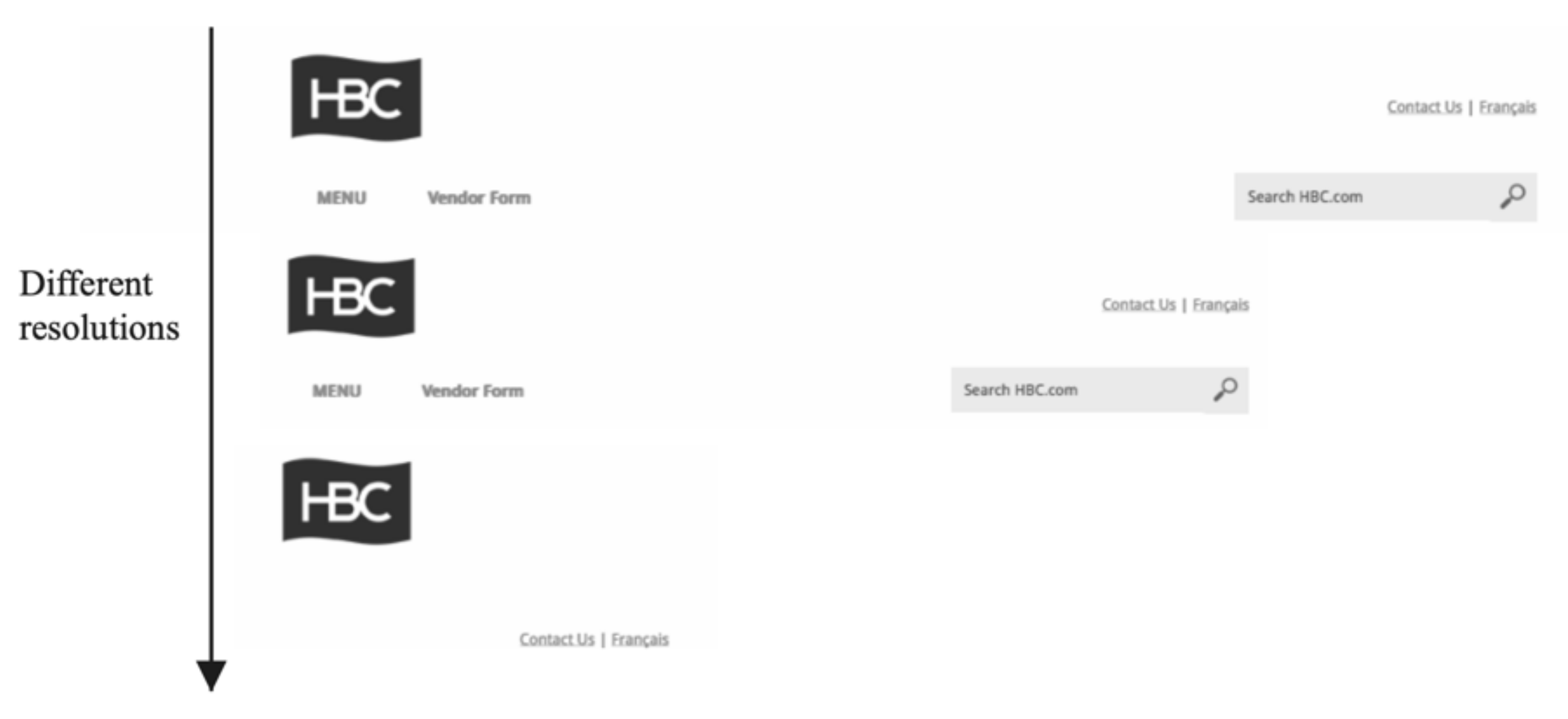
1.2. Multi-Terminal Product Design and Responsive Interface Design
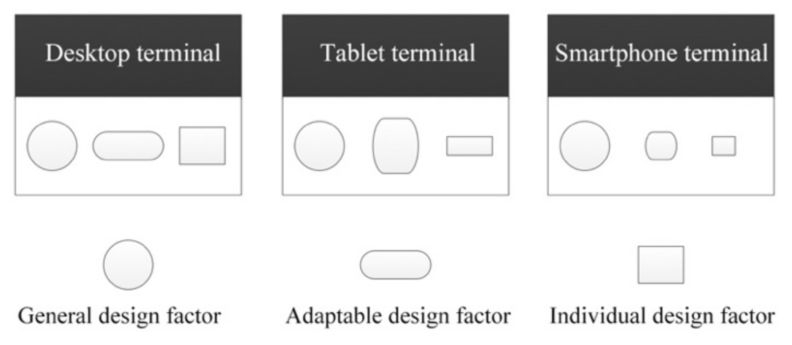
1.3. Interface Design Factors
- General Design Factor
- Adaptable Design Factor
- Individual Design Factor
1.4. Study Purpose and Content
2. Materials and Methods
2.1. Experimental 1: Identifying the Design Factors of a Web Interface Design
2.1.1. Subjects
2.1.2. Stimuli
2.1.3. Procedure
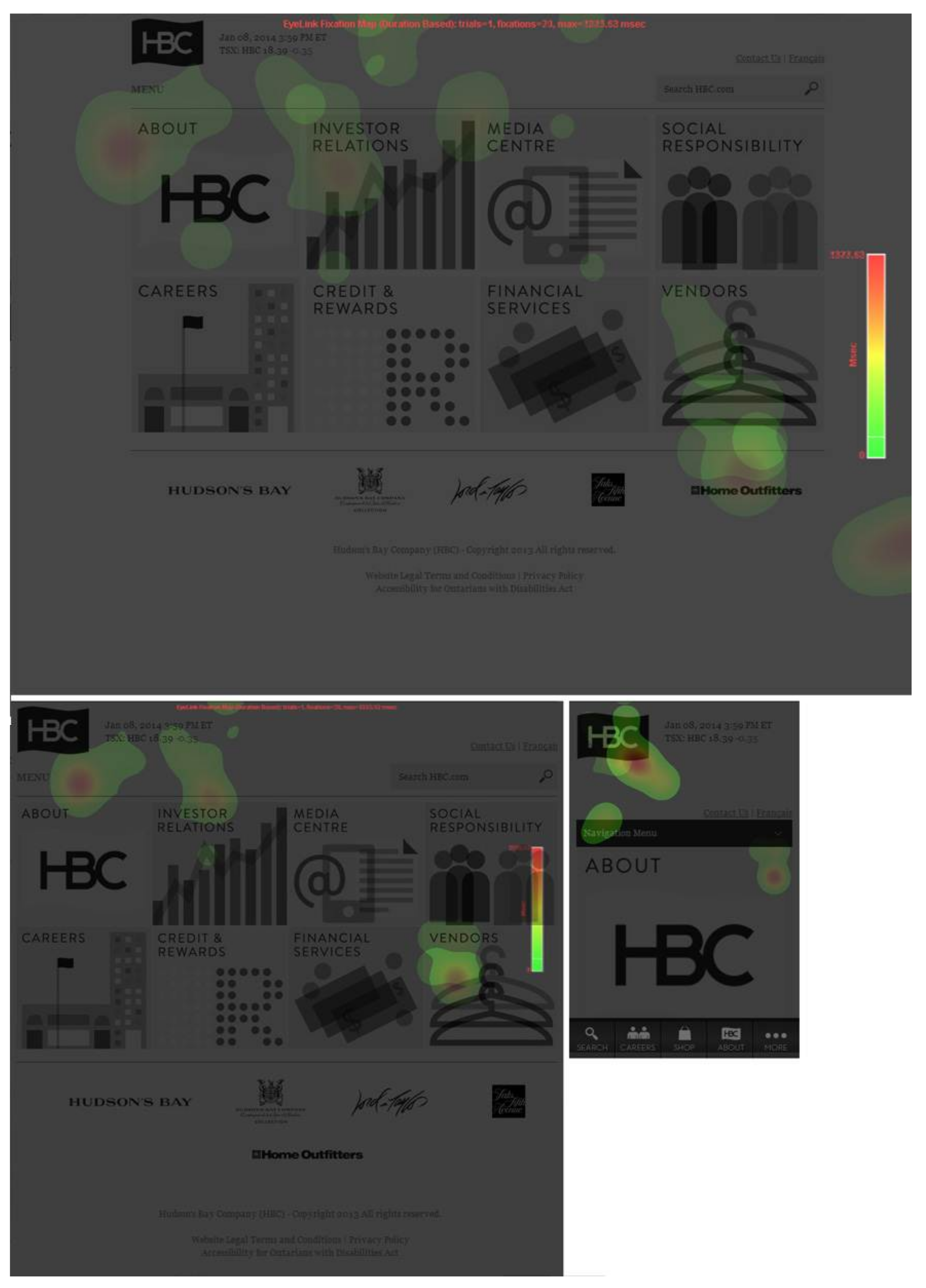
2.2. Experimental 2: Interface Research Based on the Eye-Tracking Experiment
- (1)
- Obtaining the functional components and interface elements important to subjects on the website interfaces from a relatively objective point of view by using eye-tracking data.
- (2)
- Combining with methods of verbal protocol, questionnaire survey, and perceptual evaluation to further obtain subjective perceptions and feelings of users regarding the interfaces and specific interface controls.
2.2.1. Experimental Materials
2.2.2. Subjects
2.2.3. Stimuli
2.2.4. Equipment
2.2.5. Procedure
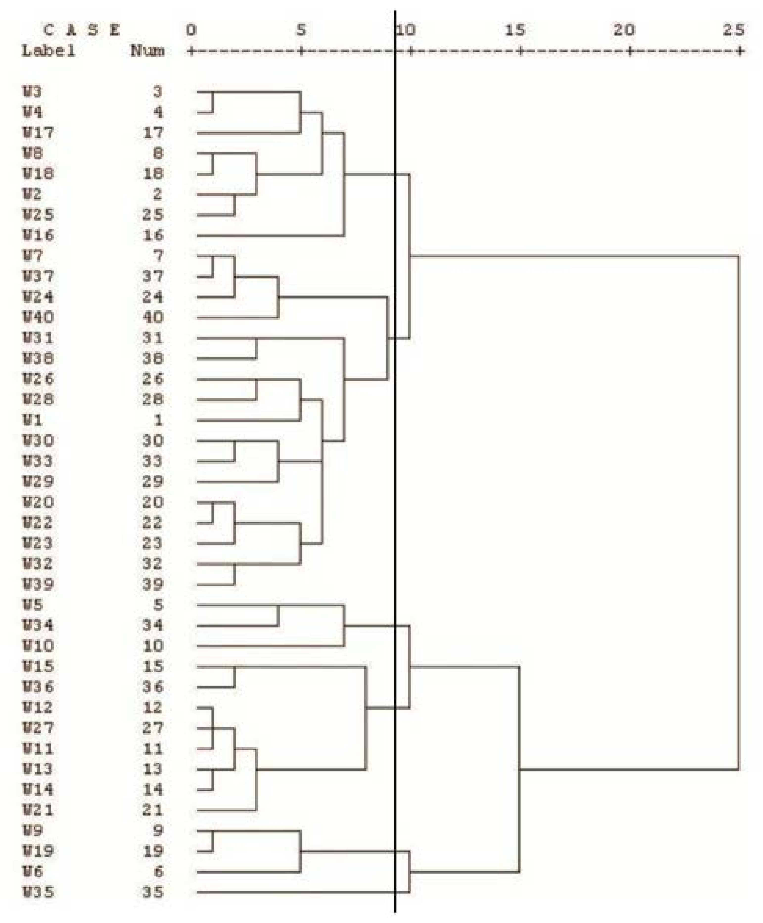
3. Results and Analysis
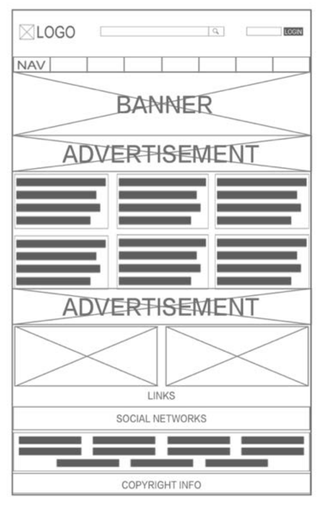
3.1. Identify Key Components of Interfaces
3.2. Extracting Responsive Interface Design Factors
3.2.1. General Design Factors
- Logo
- Copyright
3.2.2. Adaptive Design Factors
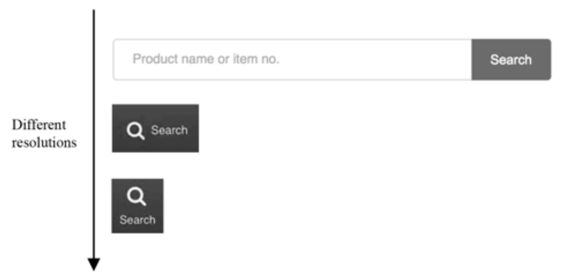
- Search tool
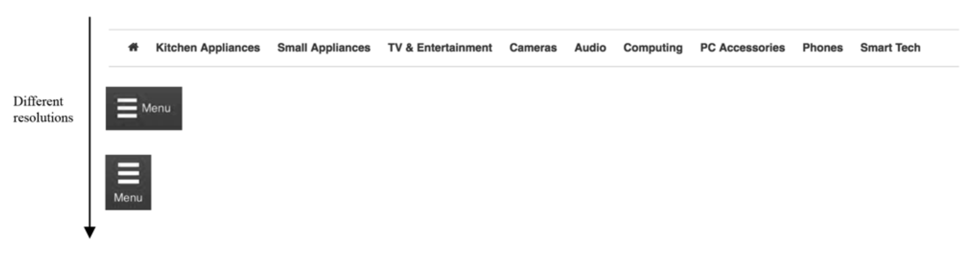
- Navigation bar
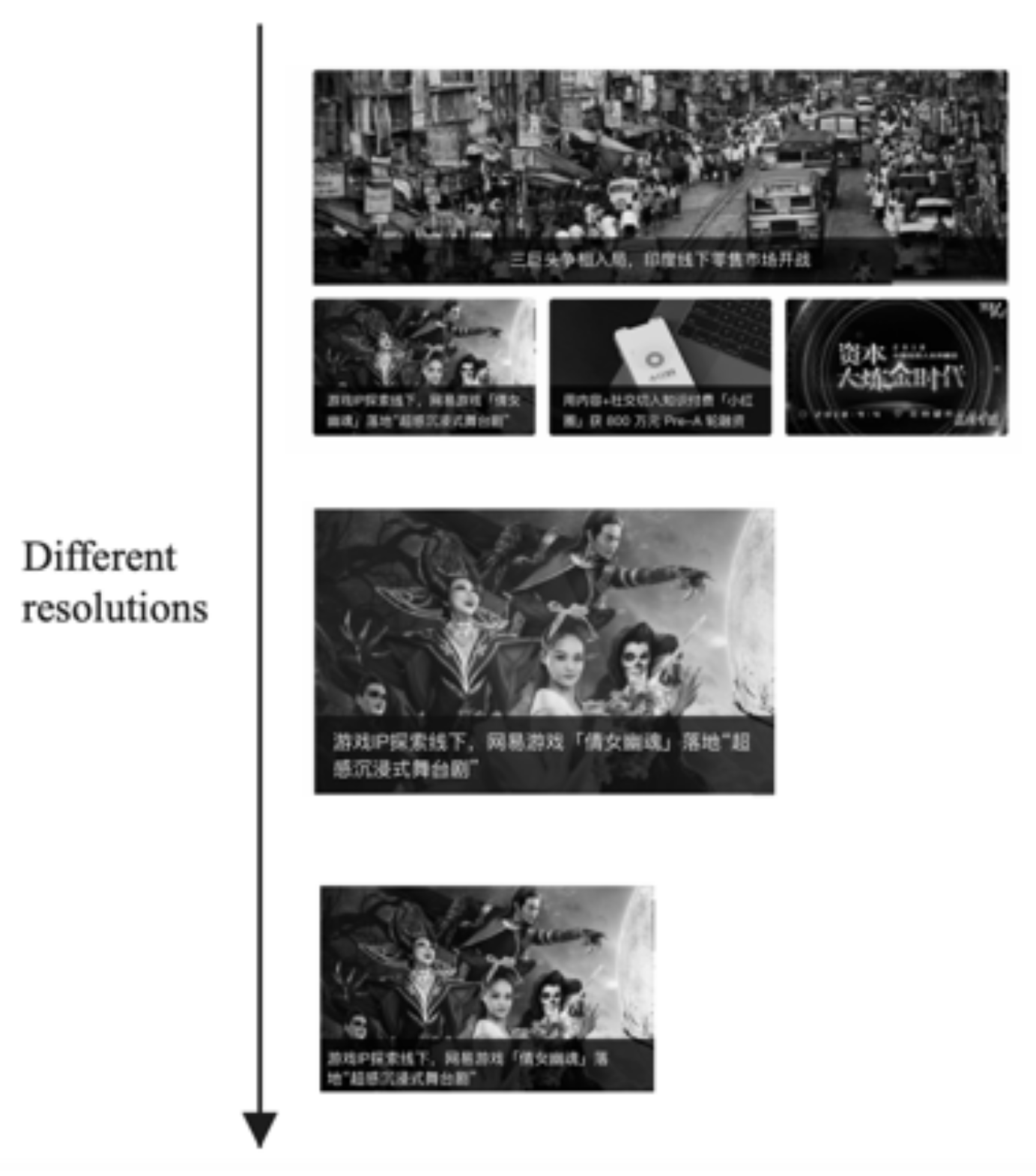
- Banner
3.2.3. Individual Design Factors
- Language bar
- Advertising block
- Social block
- Sensor function controls
3.3. Evaluation Dimension of Interface Design Factors
3.4. Expression of the Interface Design Factors
3.4.1. General Design Factors
3.4.2. Adaptive Design Factors
3.4.3. Individual Design Factors
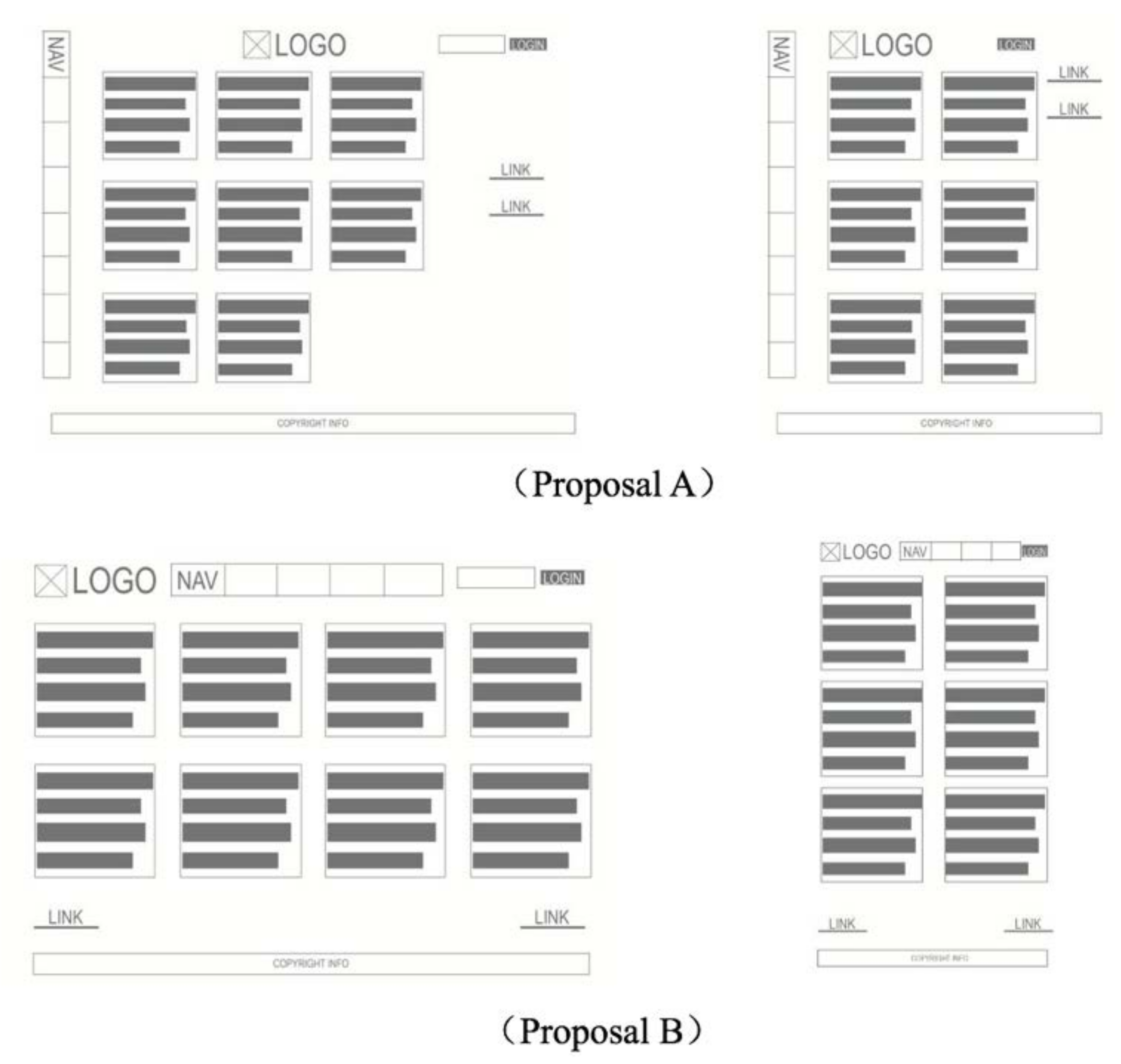
3.5. Expression of Complete Interface Design
4. Design Application
4.1. Function Tree (Homepage)
4.2. Interface Design Factors
- Browser (desktop computer)
- Tablet PC
- Smartphone
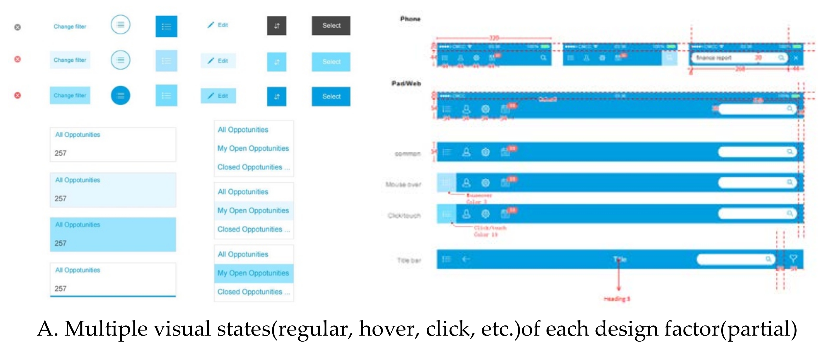
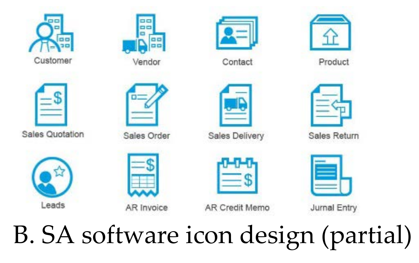
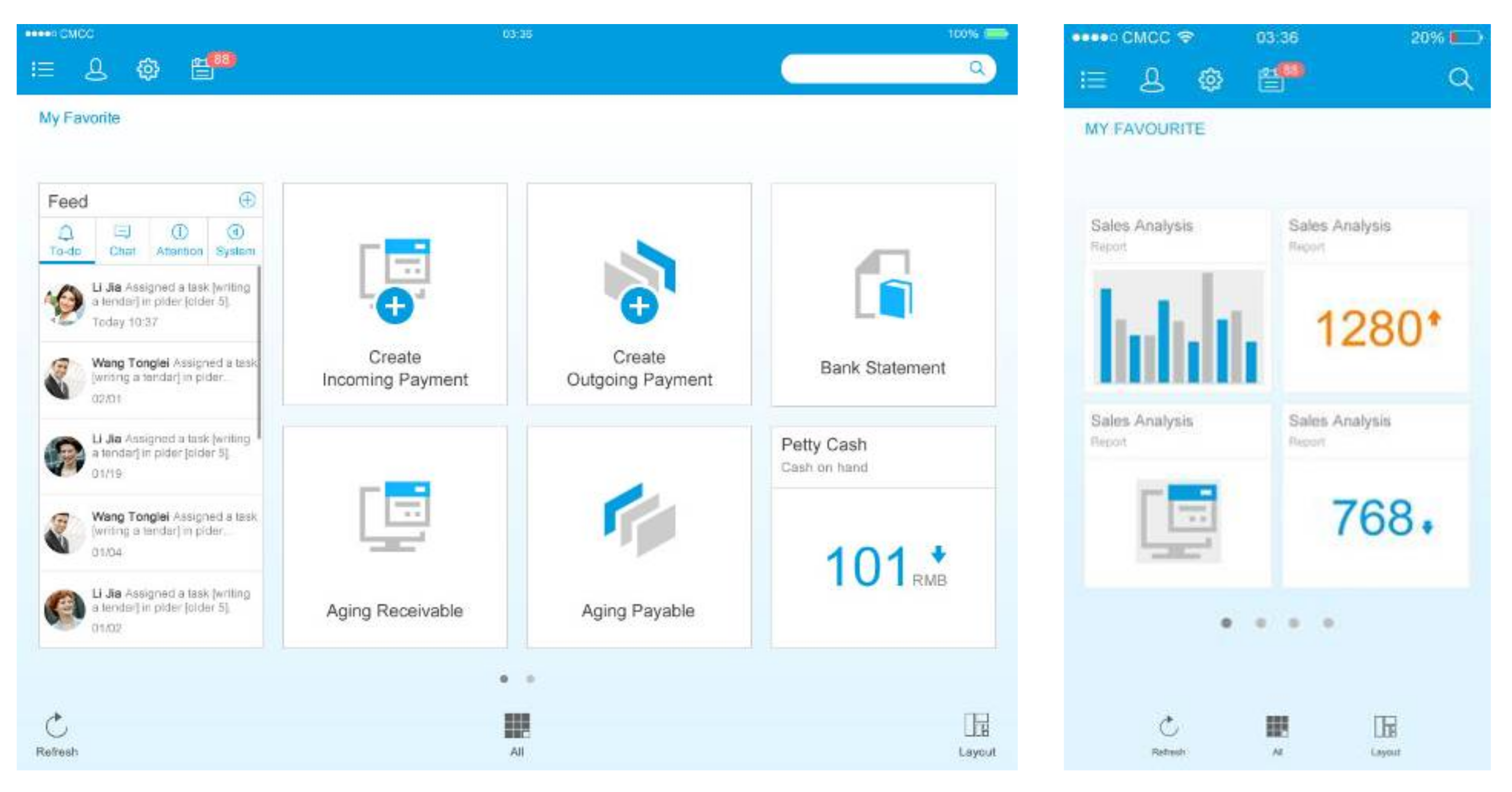
4.3. Visual Design Factors and Key Modules of the Homepage Interface
4.4. Multi-Terminal Responsive Interface Usability Testing and Results
4.4.1. Stimuli
4.4.2. Subjects
4.4.3. Procedure
4.4.4. Results and Analysis
5. Conclusions
Author Contributions
Funding
Institutional Review Board Statement
Informed Consent Statement
Conflicts of Interest
Appendix A

Appendix B
| Terminal | Task Description |
|---|---|
| PC | Adjust the homepage interface to a layout suitable for your personal use. |
| Search data you specify. | |
| View personal information. | |
| Tablet | Adjust the homepage interface to a layout suitable for your personal use. |
| Search data you specify. | |
| View personal information. | |
| Smartphone | Adjust the homepage interface to a layout suitable for your personal use. |
| Search data you specify. | |
| View personal information. |
References
- Ma, L. Sustainable Packaging Design. Package Eng. 2011, 32, 182–185. (In Chinese) [Google Scholar]
- Nunes, L.; Mont’Alvo, C. Sustainable interaction design: A concept under construction in human-computer interaction. Int. J. Des. Soc. 2018, 12, 35–50. [Google Scholar] [CrossRef]
- Radjiyev, A.; Qiu, H.; Xiong, S.; Nam, K.H. Ergonomics and sustainable development in the past two decades (1992–2011): Research trends and how ergonomics can contribute to sustainable development. Appl. Ergon. 2015, 46, 67–75. [Google Scholar] [CrossRef]
- Blevis, E. Sustainable Interaction Design: Invention & Disposal, Renewal & Reuse. In Proceedings of the 2007 Conference on Human Factors in Computing Systems, CHI 2007, San Jose, CA, USA, 28 April–3 May 2007. [Google Scholar]
- Blevis, E. Advancing sustainable interaction design: Two perspectives on material effects. Design Philosophy Papers. Des. Philos. Pap. 2006, 4, 209–230. [Google Scholar]
- Feng, L.; Wei, W.A. Combined Method of r-NPS and t-NPS Evaluations for Identification of Negative Triggers of Detractors’ Experience. Sustainability 2020, 12, 1652. [Google Scholar] [CrossRef] [Green Version]
- Kramer, K.L. User Experience in the Age of Sustainability; Morgan Kaufmann Publishers: Burlington, MA, USA, 2012. [Google Scholar]
- Chen, Z.; Wang, X.B.; Xu, K.Y. Research on Interactive Design of Art Museum based on User Sustainable Experience. Hunan Package 2022, 37, 105–108. (In Chinese) [Google Scholar]
- Qin, J.Y.; Li, Q. Research on the Sustainable Meaning of Interface Design. Package Eng. 2012, 33, 81–84. (In Chinese) [Google Scholar]
- Kaya, B.; Behravesh, E.; Abubakar, A.M.; Kaya, O.S.; Orús, C. The Moderating Role of Website Familiarity in the Relationships Between e-Service Quality, e-Satisfaction and e-Loyalty. J. Internet Commer. 2019, 18, 369–394. [Google Scholar] [CrossRef]
- Zlokazova, T.; Blinnikova, I.; Grigorovich, S.; Burmistrov, I. Search Results on Flight Booking Websites: Displaying Departure and Return Flights on a Single Page vs. Two Consecutive Pages. In Human-Computer Interaction 2019-INTERACT 2019; Springer International Publishing: Cham, Switzerland, 2019; Volume 11749, pp. 668–671. [Google Scholar]
- Beca, M.I.; Ichindelean, M. A study of banking marketers’ perception regarding the use of neuromarketing techniques in banking services. Ann. Univ. Apulensis Ser. Oeconomica 2019, 21, 73–82. [Google Scholar]
- Tichindelean, M.; Tichindelean, M.T.; Cetina, I.; Orzan, G. A Comparative Eye Tracking Study of Usability—Towards Sustainable Web Design. Sustainability 2021, 13, 10415. [Google Scholar] [CrossRef]
- Sakao, T.; Lindahl, M. Introduction to Product/Service-System Design; Springer: London, UK, 2009; pp. 32–33. [Google Scholar]
- Sassanelli, C.; Pezzotta, G.; Pirola, F.; Rossi, M.; Terzi, S. The PSS Design GuRu Methodology: Guidelines and Rules generation to enhance Product Service Systems (PSS) detailed design. J. Des. Res. 2019, 17, 125–162. [Google Scholar]
- Sassanelli, C.; Pezzotta, G.; Pirola, F.; Terzi, S.; Rossi, M. Design for Product Service Supportability (DfPSS) Approach: A State of the Art to Foster Product Service System (PSS) Design. Procedia CIRP 2016, 47, 192–197. [Google Scholar] [CrossRef] [Green Version]
- Sassanelli, C.; Pezzotta, G.; Pirola, F.; Sala, R.; Margarito, A.; Lazoi, M.; Corallo, A.; Rossi, M.; Terzi, S. Using design rules to guide the PSS design in an Engineering Platform based on the Product Service Lifecycle Management (PSLM) paradigms. Int. J. Prod. Lifecycle Manag. 2018, 11, 91–115. [Google Scholar] [CrossRef] [Green Version]
- Pezzotta, G.; Sassanelli, C.; Pirola, F.; Sala, R.; Rossi, M.; Fotia, S.; Koutoupes, A.; Terzi, S.; Mourtzis, D. The Product Service System Lean Design Methodology (PSSLDM): Integrating product and service components along the whole PSS Lifecycle. J. Manuf. Technol. Manag. 2018, 48, 1270–1295. [Google Scholar] [CrossRef] [Green Version]
- Song, Y.; Luximon, Y. The Face of Trust: The Effect of Robot Face Ratio on Consumer Preference. Comput. Hum. Behav. 2021, 116, 106620. [Google Scholar] [CrossRef]
- Song, Y.; Luximon, Y. The Effect of Facial Features on Facial Anthropomorphic Trustworthiness in Social Robots. Appl. Ergon. 2021, 94, 103420. [Google Scholar] [CrossRef]
- Song, Y. Building a ‘Deeper’ Trust: Mapping the Facial Anthropomorphic Trustworthiness in Social Robot Design through Multidisciplinary Approaches. Des. J. 2020, 23, 639–649. [Google Scholar] [CrossRef]
- Porter, M.E.; Heppelmann, J.E. How Smart, Connected Products Are Transforming Competition. Harv. Bus. Rev. 2014, 92, 64–89. [Google Scholar]
- Hussain, A.; Mkpojiogu, E.O.C. The effect of responsive web design on the user experience with laptop and smartphone devices. J. Teknol. 2015, 77, 41–47. [Google Scholar] [CrossRef] [Green Version]
- Shin, D.H. Cross-Platform Users’ Experiences Toward Designing Interusable Systems. Int. J. Hum.-Comput. Interact. 2017, 33, 76. [Google Scholar] [CrossRef]
- Hung, J.C.; Wang, C.C. Exploring the website object layout of responsive web design: Results of eye tracking evaluations. J. Supercomput. 2020, 77, 343–365. [Google Scholar] [CrossRef]
- Mintel. Online retailing. Available online: https://academic.mintel.com/display/716139/ (accessed on 10 May 2022).
- Marcotte, E. Responsive web design. Available online: http://www.alistapart.com/article/responsive-webdesign/ (accessed on 22 January 2022).
- Marcotte, E. Responsive Web design (No. 4); Editions Eyrolles: Paris, France, 2013. [Google Scholar]
- Parlakkili, A. Evaluating the effects of responsive design on the usability of academic websites in the pandemic. Educ. Inf. Technol. 2021, 27, 1307–1322. [Google Scholar] [CrossRef] [PubMed]
- Nogueira, T.D.; Ferreira, D.J.; de Carvalho, S.T.; Berretta, L.D.; Guntijo, M.R. Comparing sighted and blind users task performance in responsive and non-responsive web design. Knowl. Inf. Syst. 2019, 58, 319–339. [Google Scholar]
- Walsh, T.A.; Kapfhammer, G.M.; Mcminn, P. Automatically identifying potential regressions in the layout of responsive web pages. Software Testing, Verif. Reliab. 2020, 30, e1748. [Google Scholar] [CrossRef]
- Marcotte, E. Responsive Web Design; A Book Apart: New York, NY, USA, 2011; pp. 12, 16, 72. [Google Scholar]
- Lestari, D.M.; Hardianto, D.; Hidayanto, A.N. Analysis of user experience quality on responsive web design from its informative perspective. Int. J. Software Eng. Appl. 2014, 8, 53–62. [Google Scholar]
- Daki, P.; Koci, S.; Paspalj, D.; Popovi, M. Importance of responsive web design for education of students using faculty website. In Proceedings of the Sinteza 2016–International Scientific Conference on Ict And E-Business Related Research, Belgrade, Serbia, 22 April 2016. [Google Scholar]
- Groth, A.; Haslwanter, D. Perceived Usability, Attractiveness and Intuitiveness of Responsive Mobile Tourism Websites. A User Experience Study. In Information and Communication Technologies in Tourism 2015, Proceedings of the International ENTER 2015 Conference, Lugano, Switzerland, 3–6 February 2015; Springer: Berlin/Heidelberg, Germany, 2015; pp. 593–606. [Google Scholar]
- Almeida, F.; Monteiro, J. The role of responsive design in web development. Webology 2017, 14, 48–65. [Google Scholar]
- Boulton, J. 100 Ideas that Changed the Web, 1st ed.; Laurence King Publishing: London, UK, 2014. [Google Scholar]
- Nielsen, J.; Budiu, R. Mobile Usability, 1st ed.; New Riders: Berkeley, CA, USA, 2013; pp. 7–21. [Google Scholar]
- Gillenwater, Z.M. Flexible Web Design: Creating Liquid and Elastic Layouts with CSS; Peachpit Press: Berkeley, CA, USA, 2010. [Google Scholar]
- Voutilainen, J.P.; Salonen, J.; Mikkonen, T. On the Design of a Responsive User Interface for a Multi-device Web Service. In Proceedings of the 2015 2nd ACM International Conference on Mobile Software Engineering and Systems (MOBILESoft), ACM, Florence, Italy, 16–17 May 2015; pp. 60–63. [Google Scholar]
- Mikulszky, M.; Pocsova, J.; Mojzisova, A.; Podlubny, I. Responsive Graphical User Interface (ReGUI) and its Implementation in MATLAB. arXiv 2017, arXiv:1704.03521v1. [Google Scholar]
- West, S. Working with Style: Traditional and Modern Approaches to Layout and Typography; Watson-Guptill Publications: New York, NY, USA, 1990. [Google Scholar]
- Yadav, P.; Barwal, P.N. Designing Responsive Websites Using HTML And CSS. Int. J. Sci. Technol. Res. 2014, 3, 152–155. [Google Scholar]
- Casalánguida, H.; Durán, J.E. User Interface Design for Responsive Web Applications. In Proceedings of the 11th International Conference on Web Information Systems and Technologies (WEBIST-2015), Lisbon, Portugal, 20–22 May 2015; pp. 104–111. [Google Scholar]
- Baik, D.E. A comparative study on responsive web design interface of web magazine—Based on cases of women ‘s fashion web magazine. J. Digital Des. 2014, 14, 754–765. [Google Scholar]
- Kim, G.Y.; Min, K.S.; Eunryung, H. A study on user cognitive affordances based on design minimalism in Responsive web environment. Korea Soc. Sci., Art 2016, 25, 35–47. [Google Scholar] [CrossRef]
- Barakat, S. The Influence of Usability Requirements on the User Interface Design of Responsive Website Templates. Int. Multilingual Acad. J. 2016, 3, 72–78. [Google Scholar]
- Regal, A.; Widiasari, I.R. Perancangan dan Analisis Pengaruh User Interface E-Learnig Terhadap Minat Belajar Siswa SMA/SMK Menggunakan Heuristic of Responsive Web Design. J. Inf. Technol. Ampera 2020, 1, 88–105. [Google Scholar] [CrossRef]
- Majid, E.; Kamaruddin, N.; Mansor, Z. Adaptation of usability principles in responsive web design technique for e-commerce development. In Proceedings of the IEEE 5th International Conference on Electrical Engineering and Informatics, Bali, Indonesia, 10–11 August 2015; pp. 726–729. [Google Scholar]
- Fu, Y.T.; Luo, S.J. Style perception-oriented product family shape gene design. Comput. Integr. Manuf. Syst. 2012, 18, 449–457. (In Chinese) [Google Scholar]
- Li, W.J.; Luo, S.J. A Preliminary Consumer Preference Study on SUV Shape Design with Persona Method. In Proceedings of the Conference on Advanced Design Concepts and Practice, Hangzhou, China, 18–20 September 2015; pp. 192–203. [Google Scholar]
- Li, W.J. Research on SUV Product Shape Design Based on Female Consumer Preference. Doctoral Thesis, Zhejiang University, Hangzhou, China, 15 April 2019. (In Chinese). [Google Scholar]
- Mccormack, J.P.; Cagan, J.; Vogel, C.M. Speaking the buick language: Capturing, understanding, and exploring brand identity with shape grammars. Des. Stud. 2004, 25, 1–29. [Google Scholar] [CrossRef]
- Karjalainen, T.M. It looks like a toyota: Educational approaches to designing for visual brand recognition. Int. J. Des. 2007, 1, 67–81. [Google Scholar]
- Karjalainen, T.M.; Snelders, D. Designing visual recognition for the brand. J. Prod. Innov. Manage. 2010, 27, 6–22. [Google Scholar] [CrossRef]
- Troyer, O.M.F.D.; Leune, C.J. Wsdm: A user centered design method for web sites. Comput. Netw. ISDN Syst. 1998, 30, 85–94. [Google Scholar] [CrossRef]
- Rosen, D.E.; Purinton, E. Website design: Viewing the web as a cognitive landscape. J. Bus. Res. 2004, 57, 787–794. [Google Scholar] [CrossRef]
- Leavitt, M.O.; Shneiderman, B. Research-Based Web Design & Usability Guidelines; U.S. Department of Health and Human Services: Washington, DC, USA, 2006. [Google Scholar]
- Holmqvist, K.; Nystrom, M.; Andersson, R.; Dewhurst, R.; Jarodzka, H.; Weijer, J. Eye Tracking: A Comprehensive Guide to Methods and Measures; OUP: Oxford, UK, 2011. [Google Scholar]
- Huddleston, P.; Behe, B.K.; Minahan, S.; Fernandez, R.T. Seeking attention: An eye tracking study of in-store merchandise displays. Int. J. Retail Distrib. Manag. 2015, 43, 561–574. [Google Scholar] [CrossRef] [Green Version]
- Lindstrom, A.; Berg, H.; Hordfalt, J.; Roggeveen, A.L.; Grewal, D. Does the presence of a mannequin head change shopping behavior? J. Bus. Res. 2016, 69, 517–524. [Google Scholar] [CrossRef]
- Minahan, S.M.; Huddleston, P.; Behe, B.; Fernandez, R.T. Conducting field research in retail stores: A meandering path to a successful research project. Int. Rev. Retail Distrib. Consum. Res. 2013, 23, 189–203. [Google Scholar] [CrossRef]
- Wong, W.; Bartels, M.; Chrobot, N. Practical eye tracking of the Ecommerce website user experience. In Proceedings of the International Conference on Universal Access in Human–Computer Interaction, Crete, Greece, 22–27 June 2014; pp. 109–118. [Google Scholar]
- Ellis, S.H.; Candrea, R.; Misner, J.; Craig, C.S.; Lankford, C.P.; Hutchinson, T.E. Windows to the soul? What eye movements tell us about software usability. In Proceedings of the 7th Annual Conference of the Usability Professionals Association, Charlottesville, VA, USA, 24 August 1998; UPA Press: Washington, DC, USA, 1998; pp. 151–156. [Google Scholar]
- Frkjær, E.; Hertzum, M.; Hornbæk, K. Measuring usability: Are effectiveness, efficiency and satisfaction really correlated? In Proceedings of the CHI 2000 Human Factors in Computing Systems, Hague, Netherlands, 1–6 April 2000; ACM Press: New York, NY, USA, 2000; pp. 345–352. [Google Scholar]
- Loftus, G.R.; Mackworth, N.H. Cognitive determinants of fixation location during picture viewing. J. Exp. Psychol.-Hum. Percept. Perform. 1978, 4, 565–572. [Google Scholar] [CrossRef] [PubMed]
- Goldberg, J.H.; Kotval, X.P. Computer interface evaluation using eye movements: Methods and constructs. Int. J. Ind. Ergon. 1999, 24, 631–645. [Google Scholar] [CrossRef]
- Cheng, S.W.; Sun, S.Q. Eye Movement Model for Mobile User Interface Usability Evaluation. In Proceedings of the Joint Academic Conference on Harmonious Man-Machine Environment, Beijing, China; Tsinghua University Press: Beijing, China, 2008; pp. 380–385. (In Chinese). [Google Scholar]
- Manhartsberger, M.; Zellhofer, N. Eye tracking in usability research: What users really see? In Proceedings of the Empowering Software Quality: How can Usability Engineering reach these goals? 1st Usability Symposium, HCI&UE Workgroup, Vienna, Austria, 8 November 2005; OCG Publication: Vienna, Austria, 2005; pp. 141–152. [Google Scholar]
- Tzanidou, E.; Petre, M.; Minocha, S.; Grayson, A. Combining eye tracking and conventional techniques for indications of user-adaptability. In Proceedings of the Human-Computer Interaction—INTERACT 2005, IFIP TC13 International Conference, Rome, Italy, 12–16 September 2005; pp. 753–766. [Google Scholar]
- Chang, C.C. Factors influencing visual comfort appreciation of the product form of digital cameras. Int. J. Ind. Ergon. 2008, 38, 1007–1016. [Google Scholar] [CrossRef]
- Veen, J. The Art and Science of Web Design; Pearson Education: London, UK, 2000. [Google Scholar]
- Wolfe, J.M. Guided search 2.0: A revised model of visual search. Psychon. Bull. Rev. 1994, 1, 202–238. [Google Scholar] [CrossRef] [Green Version]
- Hassenzahl, M.; Roto, V. Being and doing: A perspective on user experience and its measurement. Interfaces 2007, 72, 10–12. [Google Scholar]
- Park, J.; Han, S.H.; Kim, H.K.; Cho, Y.; Park, W. Developing elements of user experience for mobile phones and services: Survey, interview, and observation approaches. Hum. Factors Ergon. Manuf. 2013, 23, 279–293. [Google Scholar] [CrossRef]
- Desmet, P.; Hekkert, P. Framework of product experience. Int. J. Des. 2007, 1, 57–66. [Google Scholar]


| I01 | I02 | I03 | I04 | … | I37 | I38 | I39 | I40 | |
|---|---|---|---|---|---|---|---|---|---|
| I01 | 1.00 | ||||||||
| I02 | 0.45 | 1.000 | |||||||
| I03 | 0.25 | 0.35 | 1.000 | ||||||
| … | … | ||||||||
| I38 | 0.40 | 0.35 | 0.30 | 0.30 | … | 0.35 | 1.000 | ||
| I39 | 0.35 | 0.40 | 0.40 | 0.20 | … | 0.25 | 0.30 | 1.000 | |
| I40 | 0.30 | 0.15 | 0.15 | 0.15 | … | 0.50 | 0.40 | 0.40 | 1.000 |
| ID | Sample Legend | ID | Sample Legend | ID | Sample Legend |
|---|---|---|---|---|---|
| T01 | 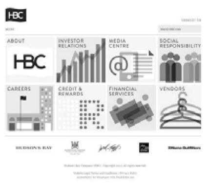 | T02 | 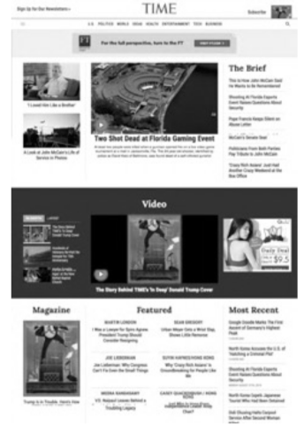 | T03 | 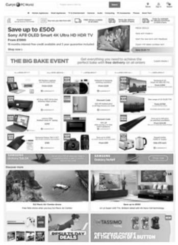 |
| http://www3.hbc.com/ | http://www.time.com/ | https://www.currys.co.uk/ | |||
| T04 | 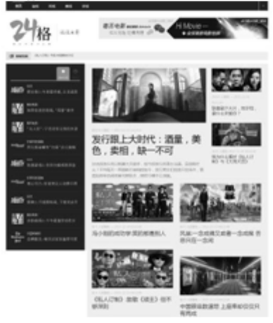 | T05 |  | T06 | 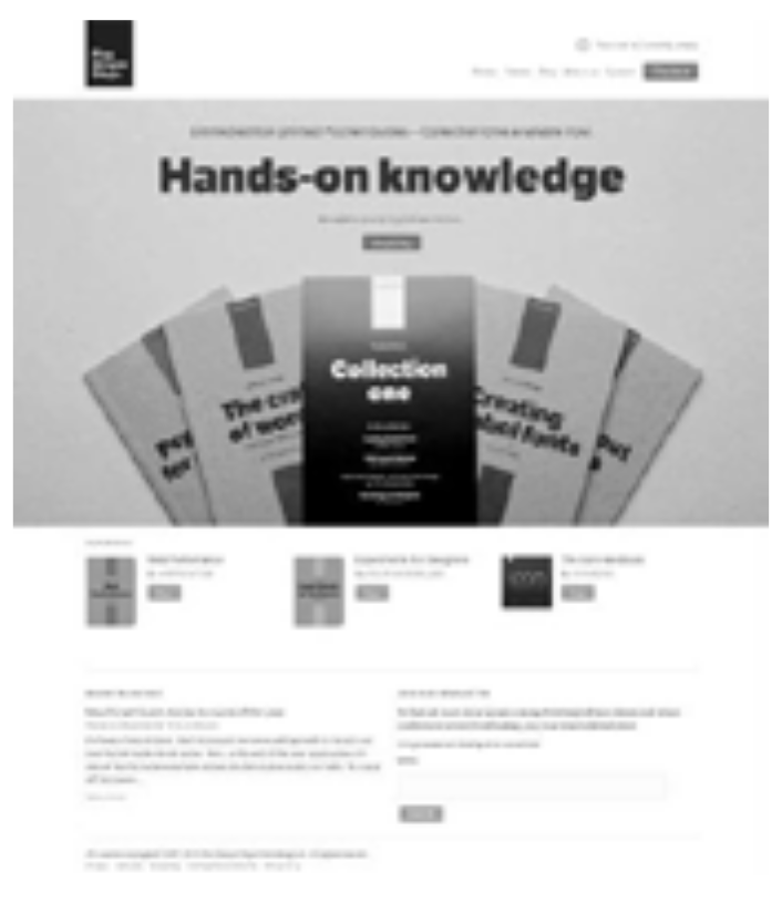 |
| http://www.24movie.cn/ | http://www.ucsd.edu/ | http://www.fivesimplesteps.com/ |
| ID | Task Description | ID | Task Description |
|---|---|---|---|
| T01 |
| T02 |
|
| T03 |
| T04 |
|
| T05 |
| T06 |
|
| Factors | Description | % | Factors | Description | % |
|---|---|---|---|---|---|
| Logo | Logo of the website, usually located at the top of the interface, as one of the identity elements of the enterprise or brand | 80 | Content Block | Display area, including text, pictures, video, and other multimedia content; is the specific embodiment of the website theme | 100 |
| Search tool | Usually located at the top or bottom of the interface, for searching specific content in the website | 60 | Ad block | Display advertising content | 70 |
| Language bar | Switch language type when the website has multi-language versions | 10 | Social block | Web links to other social media sites | 30 |
| Login tool | The entry of a user login for personal operation | 50 | Footer block | Usually located at the bottom of the interface, including “about us”, “web map”, “privacy clause”, and other information | 50 |
| Navigation bar | Display the main functional module of the website, and provide fast jumping | 100 | Quick navigation (link) | Provide links to other related sites, such as “blogroll”, “cooperative customers”, and so on | 30 |
| Banner | An image-based large area content display area | 100 | Copyright | Usually located at the bottom of the interface, web site copyright information | 0 |
| Modal tab | Display content in the form of a tab page | 20 | Interface layout | The macro-layout and overall segmentation of the website interface | 100 |
| Accordion panel | Click on a title to start a content block | 40 | Interface density | Density distribution of the content on the website interface | 70 |
| Resolution | 1280 × 960 | 768 × 1024 | 375 × 667 |
|---|---|---|---|
| Interface example | 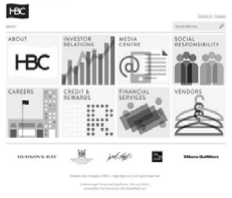 | 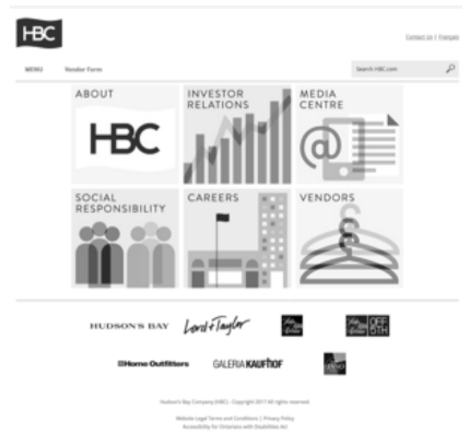 | 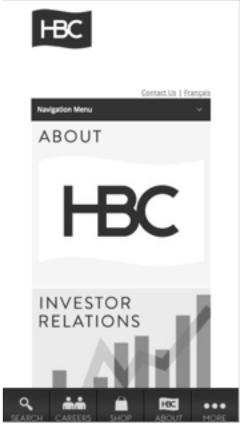 |
| General Design Factors | Adaptive Design Factors | Individual Design Factors |
|---|---|---|
| Logo | Banner | Language bar |
| Navigation bar | ||
| Content block | ||
| Interface layout | Sensor function control | |
| Copyright | Search tool | Social block |
| Login tool | Advertisement block | |
| Footer block | ||
| Interface density | ||
| Quick navigation |
| Importance | High | Medium | Low |
|---|---|---|---|
| Type | |||
| General | Logo | Copyright | |
| Adaptive | Banner | Search tool | Quick navigation |
| Navigation bar | Login tool | ||
| Content block | Footer block | ||
| Interface layout | Interface density | ||
| Individual | Language bar | Social block | |
| Sensor function control | Advertisement block |
| Name | Wireframe Prototype | Size (Horizontal) | ||
|---|---|---|---|---|
| Large (above 780 pt) | Medium (480–780 pt) | Small (320–480 pt) | ||
| Logo |  | ≥150 px | ≥150 px | ≥150 px |
| Copyright |  | 90% width | 90% width | 90% width |
| Controls | Wireframe Prototype | Size (Horizontal) | ||||||
|---|---|---|---|---|---|---|---|---|
| Large (Above 780 pt) | Medium (480–780 pt) | Small (320–480 pt) | ||||||
| Banner |  | 85% width | 85% width | 85% width | ||||
| Navigation bar |  | 90% width | 90% width | 90% width | ||||
| Content block |  | 2~3 column Based on design | 2 columns Based on design | 1 column 90% width | ||||
| Interface layout | ||||||||
| Search tool |  | 15~20% width | 15~20% width | Icon 24 px | ||||
| Login tool |  | 10% width | 10% width | Icon 24 px | ||||
| Footer block |  | 85% width | 85% width | 85% width | ||||
| Interface density | ||||||||
| Quick navigation |  | 85% width | 85% width | 85% width | ||||
| Controls | Wireframe Prototype | Size (Horizontal) | ||||||
|---|---|---|---|---|---|---|---|---|
| Large (Above 780 pt) | Medium (480–780 pt) | Small (320–480 pt) | ||||||
| Language bar |  | Below 10% width | Below 10% width | Icon 24 px | ||||
| Advertising block |  | Based on design | Based on design | Based on design | ||||
| Social block |  | 1 column width Based on design | 1 column width Based on design | 90% width | ||||
| Sensor function controls | ||||||||
| Subjective Evaluation Indicators | Description | Average Score (Proposal A) | Average Score (Proposal B) |
|---|---|---|---|
| Continuity of operation | During the switching operation of different terminal interfaces, the cost of learning and adaptation is low, and it has good consistency and continuity. | 6.00 | 6.14 |
| Visual consistency | The layout of page information of different terminal interfaces is more unified visually. | 6.43 | 6.57 |
| Rationality of information architecture | The layout of functional blocks is reasonable and easy to identify and operate. | 5.57 | 6.14 |
| Conciseness | Simplicity of interface design | 4.86 | 6.29 |
| Overall satisfaction | Overall satisfaction during use | 5.43 | 6.43 |
Publisher’s Note: MDPI stays neutral with regard to jurisdictional claims in published maps and institutional affiliations. |
© 2022 by the authors. Licensee MDPI, Basel, Switzerland. This article is an open access article distributed under the terms and conditions of the Creative Commons Attribution (CC BY) license (https://creativecommons.org/licenses/by/4.0/).
Share and Cite
Li, W.; Zhou, Y.; Luo, S.; Dong, Y. Design Factors to Improve the Consistency and Sustainable User Experience of Responsive Interface Design. Sustainability 2022, 14, 9131. https://doi.org/10.3390/su14159131
Li W, Zhou Y, Luo S, Dong Y. Design Factors to Improve the Consistency and Sustainable User Experience of Responsive Interface Design. Sustainability. 2022; 14(15):9131. https://doi.org/10.3390/su14159131
Chicago/Turabian StyleLi, Wenjie, Yuxiao Zhou, Shijian Luo, and Yenan Dong. 2022. "Design Factors to Improve the Consistency and Sustainable User Experience of Responsive Interface Design" Sustainability 14, no. 15: 9131. https://doi.org/10.3390/su14159131