Article

Creating Sustainable Development of the Destination with Tea Public Version Packaging Design by Obtaining Relational Space Concept

1
Graduate School of Design, National Yunlin University of Science & Technology, Yunlin 64002, Taiwan
2
Grad School & Department of Creative Design, National Yunlin University of Science & Technology, Yunlin 64002, Taiwan
*
Authors to whom correspondence should be addressed.
Sustainability 2022, 14(15), 9256; https://doi.org/10.3390/su14159256
Submission received: 19 June 2022 / Revised: 14 July 2022 / Accepted: 25 July 2022 / Published: 28 July 2022
(This article belongs to the Special Issue Advances in Tourism Image and Branding)

Abstract

:
Packaging is crucial for presenting the image of tea tourism destinations. The public version of tea packaging with images of tea sightseeing spots was pervasive, and builds the impression to tourists that they have visited a certain destination. However, with the rise of independent brand thinking and sensory stimulation consumption, the form of tea packaging in the public version has changed to be based on tourists’ purchasing preferences, leading to the diversity of the packaging style and pattern, and the public version of tea packaging gradually loses the function of promoting brand images. Based on the rooted land of oriental tea culture, this research has the following aims: (1) to construct the concept of “Relational Space for Sustainable Public Version of Tea Packaging and its Concept” through a literature review and field investigation; (2) to give contributions to the improvement of the visual aspect of the existing public packaging of tea; (3) to integrate the image of the destination and the private brand image of tea farmers with the public version of tea packaging to enhance the perception and attraction of tourists to the brand image of tea tourism destinations; (4) to design, operate, and test the concept discussed in this study by utilizing experimental design and questionnaire survey and propose application guidelines for this concept design. The results of the study are as follows: (1) The destination images and geographical symbols of the existing public packaging of tea are beneficial to the promotion of the destination image; however, the visual elements that make up these packages are not conducive to the cultural richness of the destination because of their single relational context, which leads to the solidification of the destination image. (2) The design application guidelines proposed in this study present the concept of destination branding and private branding as a complement to each other by adjusting the packaging layout to create a mutually beneficial partnership visually embodied in the public tea packaging design. Packaging accessories are central to the partnership between the destination and the local industry, and the public tea packaging design created by this concept creates a richness and specificity of the destination’s brand image. In this way, the destination’s industry and brand image will develop in a diverse and multifaceted way to achieve the sustainability of the destination’s industry.

1. Introduction

Taiwan tea is world-renowned, and the distribution of tea production areas closely overlaps with tourist destinations. Tea is a product with social and cultural connotations. Its production, consumption, and tourism industry are closely integrated, extending tea tourism activities [1,2,3]. Tea souvenirs are one of the must-buy options for tourists visiting tea tourism destinations, and it is a central thing that travelers take away with them as memories of the destination. Its packaging presents the brand image of the destination in multiple places with dynamic unpacking action and static vision, creating a temporal and spatial connection between tourists and the destination.
The 1989–2019 survey of packaging academic research papers in Chinese-speaking regions shows that the development of packaging design involves different disciplines and belongs to interdisciplinary integration. Packaging is an important target for the integration of internal consensus within the organization and the integration of related resources for the external sales of the organization [4,5]. Much of the sustainable packaging literature focuses on the overall mechanism from packaging design to recycling, evaluation of the impact of packaging production on the environment, and the consideration of transportation costs caused by product logistics [6]. It even extends to the impact of food freshness on consumers’ go-green decisions. In terms of packaging information transmission, it focuses on consumers’ perception and preference of go-green concepts in packaging and educates consumers’ way of thinking of green design [7,8]. Most sustainable packaging design stays on the material aspect of packaging design, and very few articles discuss the sustainable role of packaging on the destination. For example, research on the influence of product labeling on the target brand logo on tourism destinations [9].
According to the field investigation of this study, most tea farmers and retailers sell tea by using the packaging of the public version directly because of the small scale of their firms. The tea public packaging with images of Alishan can be seen everywhere, which builds the logo and impression of tourists who have visited Alishan. Although tea public packaging was based on the large quantity and low cost of the product in the past, the development of the version was fast and not limited by the pressure of money (B2-BV2-1-1), time, and space, and it has the advantage of sustainable application in product logistics in terms of the packaging structure. However, the visual layout of packaging is highly repetitive, which is not conducive to forming private brands for tea farmers (B2-BV2-4-6) (B2-BV2-4-2). The public version of tea packaging has changed to be based on tourists’ purchasing preferences, and the packaging styles have become more complicated. Tea growers are fighting alone and competing, and the public packaging of tea has gradually lost its function of promoting the brand image for the destination.
There are great differences in the culture and concept of tea in oriental and occidental countries. Occidental tea is brewed tea with different spices added within. As for the tea tasting, westerners usually taste the special flavor made of tea and various spices. Oriental tea is the original tea without other spices added, focusing on the tea grown in the climate, soil, and solar terms of the origin, with different tea-refining techniques. Oriental tea tasting is to taste the color, aroma, and flavor brought by single tea, and it can even be said that tea tasting is to taste the flavor brought by this land [10,11].
This study uses relational space theory to infer those things at the destination and the relationship between things that shape people’s perception and the meaning of that place. From people’s concept of space, it interprets people’s ownership, value, perception, identity, sense of belonging, and the prospect of place [12]. Souvenirs at a certain local place can be seen as the result of the local practice and the recognition from the participants of this study. Moreover, it can carry out the process of local formation, demarcation, and the creation of exclusive marking activities to construct the internal order of the space and create an important platform for unique time and space. The local souvenirs make the destination connect with the wider world through the packaging design, establish a communication link, and various abstract representations are used to reflect the perceived space, projecting the destination image and branding.
Based on the above, this study took stock of the sustainable conditions of tea public packaging itself, and the application guidelines for tea public version packaging design are constructed based on the relational space theory. That way, the design guidelines developed in this paper allow tea farmers in the destination to promote the richness and specificity of the destination image while promoting individual brands.

2. Literature Review

2.1. Brand Formation of Destination and Embodiment of Relational Space Concept

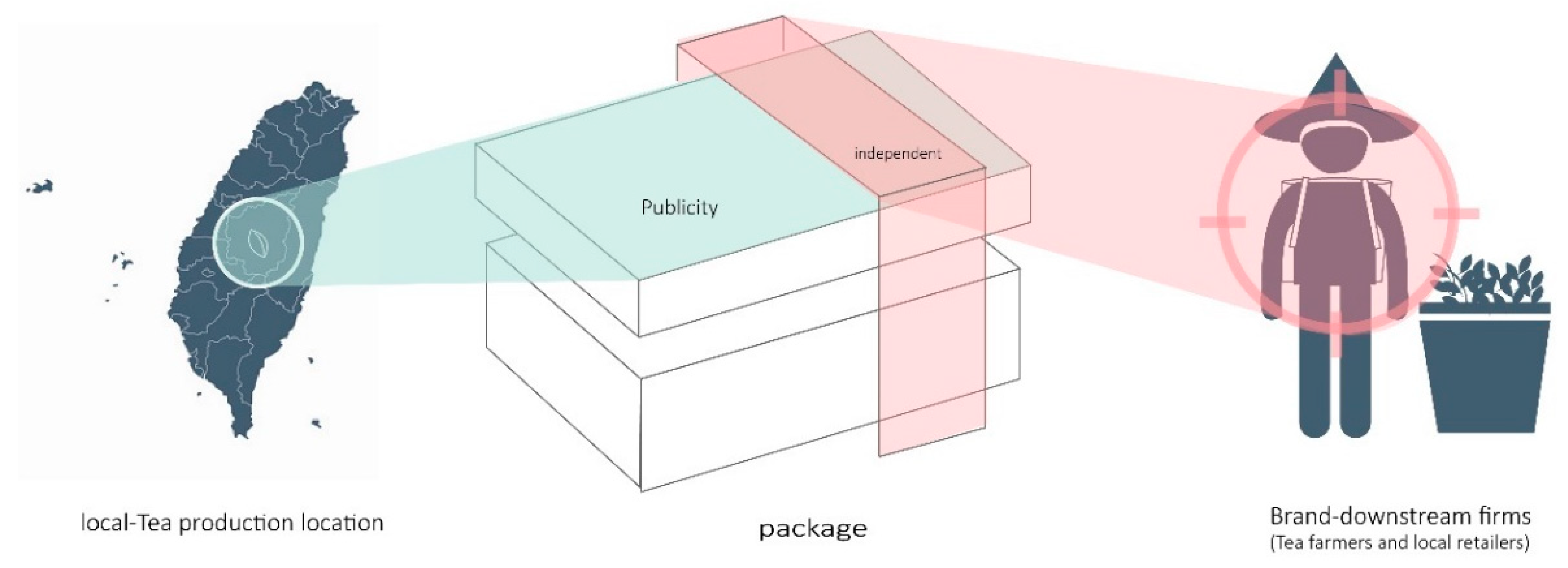
There are different forms of tea cultures for both Orientals and occidentals when it comes to their concept, perception, and production technology of tea. While Orientals focus on planting and roasting, and tea tasting is evaluated by the smell of a single tea species, occidentals focus on refining and blending, and use many spices or roasting methods to evaluate the quality of tea by blending techniques [10,11]. There is an important classical book about tea in ancient China called “The Classic of Tea”. This book starts with the soil on which tea trees grow and discusses tea sets, tea utensils, tea culture, and the description of tea produced in China based on the framework of the four seasons of the year [13]. Tea and the land are closely related geographically. Taiwanese tea has a history of 150 years and retains a complete tea culture and tea-making technology. There are quite a few places that are well-known for tea derived due to different types of tea, tea-growing environment, and tea production techniques in Taiwan. There is an article on “Taiwan Tea Origin Series Introduction” from the newspaper “Central Daily News” that introduced 20 kinds of famous teas from various regions, including Muzha Tieh-Kuan-Yin tea, Wenshen Paochong tea, Mingjian pine, cypress evergreen tea, and Lugu Tongding Oolong tea. The name of the tea is named after the place with the tea species and is divided by region, historical background, variety, and production method to construct the uniqueness of each producing area [14]. The tea culture of the Orientals is rooted in the land under their feet, and tea affects people’s emotions, memories, and skills to pursue the top flavors in their taste buds and extend the development of local industries and tourism, such as tea tourism, tea experience, and tea competition. Taiwan has held the “Taiwan International Tea Expo” from 2017 to the present, and the 40-year tea competition, including tea planting, refining, tea tasting, etc., has derived the tea tourism and cultural network in various places in Taiwan [15,16,17,18]. The distribution of tea cultivation in Taiwan closely overlaps with tourist destinations (Figure 1). Most of Taiwan’s tea industry is concentrated in mountainous areas, and different altitudes will form different styles of tea. Chiayi County and Nantou County are the two counties with the largest tea production in Taiwan [19]. Alishan, located in Chiayi County, is one of the important representatives of the overlapping of Taiwan’s tourist attractions and tea production areas. Orientals have a close impression of tea and the destination. Whenever tea is mentioned, it is associated with the land, or the tea is named after the place, reminding that this article is to grasp the relationship between tea and the destination in the presentation of the tea public version of packaging design.
In order to improve the problems presented by the tea public version packaging, it is first needed to establish a discussion on the relationship between tea and the destination for the packaging presentation and support the design of the subsequent tea public version packaging in this research.
In National, Natural and the Geography of Difference, David Harvey discusses the concept of space and relational space–time theory. Its general space concept is divided into absolute space, relative space, and correlation space. In the past, the exclusive space formed by people’s land, private property, and other bounded entities was also “absolute space”, which divided absolute geography and defined its individuality and uniqueness. Because the existence of distance protects places from fierce competition with each other, comparisons and associations between places are not so close. However, with changes in transportation modes and currency circulation, people judge the distance between places based on the time, cost, and energy spent, and the concept of “relative space” is generated. Under the compression of transportation and time consumption, travelers face the choice of travel destinations, and their focus is more on the special feelings brought by the destination. A tourist destination needs to build a brand and display its own uniqueness in order for it to be in a favorable state in the competitive relationship of the tourist destination. “Relational space” means that space and time lie in matter and process, and time and space merge into time and space. Today, the relationship of things defines space, which, in turn, has meaning for people. Modern people build impressions of the place through a variety of related events and objects. Therefore, destination brands need to pay more attention to “relationship” in addition to “uniqueness”. In addition to protecting the contents, the function of packaging needs to effectively carry out the brand promotion and marketing because the information it provides is diverse and rich. For tourist destinations, the presentation of tea packaging reflects the image of the destination. The existence of tea packaging reminds future travelers of the impression and emotional connection of the destination and evokes the imagination brought by the travelers in the past.
Alfred North Whitehead, a founder of “Process philosophy”, believes that a place is an entity that achieves relative stability in the delimitation and ordering of its internal processes in his relational space–time theory. This entity is called “Permanence”, and it is not fixed and everlasting. It is always subject to time, is in “continuous destruction”, and temporarily occupies a space. A place is a process of creating, maintaining, and dissociating its relational nature. The process of place formation to a place requires demarcation and the creation of exclusive marking activities, and that constructs the internal ordering of spatial relationships and creates a unique time and space. However, when making a place relating to the wider world, communication links are established to project the image of the group. The boundaries of places are not meant to exist, but to be shaped. Therefore, current scholars have deduced that the concept of “relational space” is used to construct the place where we are. The public version of tea packaging can be regarded as the group image of the destination brand image projected to the outside world. Its creation, manufacture, and sale constantly project the image of the destination to people and gradually shape the particularities of the destination. People are involved in a large number of local experiences, memories, and dreams accumulated directly or indirectly by reading, as well as various expectations and hopes about the future, and it is then that “identification” is generated [12]. Therefore, with the changes of time and market, the packaging constantly presents the meaning that the destination brand wants to convey to consumers and builds the identity and image of the destination for consumers.
People nowadays construct the image, imagery, and identity of the destination through the relationship of things. On the contrary, the content of the tea public version packaging design presented in the past reflects the relational spatial context of the destination and the imagery and practical results conveyed by the destination. Souvenirs create a relationship between places and the wider world through their own packaging design and use various abstract representations to reflect the perceived space, projecting the image of the destination brand. Through the imagery, abstract elements, and codes of existing packaging in the past, this research explores the relational spatial context of the destination brand in the past, which reflects the identity between the destination and the participants. Therefore, this study takes the significance of Fevre’s spatial trichotomy mentioned by David Harvey, which refers to human behavior and social practice, as the theoretical basis for the existing tea package analysis. The spatial trichotomy are: physical space, representations of space, and representational space. Physical space is the experience of inferring the nature of space through different senses and touching things and processes. Representation of space is the use of abstract repetition volumes (ARVs) such as words, patterns, maps, diagrams, drawings, geometry, or mathematics to reproduce the space we perceive. We deploy concepts, codes, and abstractions. The correspondence between the physical space of sensory perception and the representational spaces and the representational space is the physical, emotional, and emotional life of human beings in the surrounding space, focusing on the cultural and personal differences in how to experience space. Humans struggle with positioning, naming, and discursive representation to gain social development, control, and power. Struggles around meaning, representation, and identity abound, and naming power is power over others and things [20].

2.2. Public Version of Tea Packaging

The earliest packaging materials for tea were natural leather, leaves, gourds, bamboo tubes, and wood as containers, and later evolved into pottery, glass, and metal container. The evolution of packaging is inextricably linked to papermaking, printing, and the Industrial Revolution. There are similar evolutions in the East and the West, such as the red paper on the ancient Chinese wine urn, and the British used labels to identify packaging. In the early days, tea packaging in Taiwan was mostly in the form of bulk tea containers, therefore oil paper and wooden boxes were often used [21]. From 1800 to 1870, the birth of lithography and the invention of semi-automatic packaging made the packaging style more cumbersome, and most of them used decorative packaging labels [22,23]. At that time, Taiwan Paochong tea was exported overseas. They were all packaged in four or two packages. The trademarked pattern was printed on the raw edge paper and sold to Southeast Asian countries. It was not until the Japanese occupation period that the paper box was gradually replaced. As Taiwan opened the market for its international trade, transportation involves stacking and preservation. In addition to setting the standard weight of tea leaves, the packaging of tea was changed from multi-material to paper-based, and it was represented by a large number of visual images. Trademark printing became an important basis for the symbolic meaning of tea. During 1920–1930, merchants realized that packaging and advertising are equally as important as the main publicity medium when it comes to facing the export market and the advancement of packaging materials and technology. From 1950 to 1970, in response to the implementation of policies and the shelf-life requirements of transportation, the government actively intervened in packaging materials and technologies and formulated the “Taiwan Province Tea Industry Management Regulations”. Companies have developed “composite materials” to facilitate the presentation of goods on the label and to extend the shelf life of products [21]. The government joined the WTO from 1987 to 2011 and invited people from the mainland to visit Taiwan, which led to the development of tourism and the tea industry. The government has promoted many factory–farmer cooperation plans and coaching methods, moving tea products toward a refined and diversified production and sales model, and farmers need to produce and sell by themselves [24]. Entering the era of industrial mechanization and multinational trade, the concept of tea packaging design has also been influenced by foreign packaging styles. The style is cumbersome and has the function of symbolism. In the face of mass production and demand, tea packaging has officially entered the period of public version packaging. Reproducibility, time considerations, and sales costs for packaging are gradually considered, packaging materials become simplified and functional, and the appearance and materials are fixed. As a result, a large number of public packaging designs have been circulated in the modern market. In the past, those multiple natural materials were mostly used as embellishments on modern tea packaging, which were retro symbols [25].
Although the public version of the tea packaging is widely used, few scholars have conducted in-depth research on it and provided a definition of it. Therefore, this research discusses the general recognition and the market situation on the public version of packaging and private packaging through field investigation. The public version of tea packaging can be discussed from structural and visual aspects. In terms of structure, tea packaging can be divided into three parts: tea box, tea can, and inner bag. The size and structure of the packaging do not have a fixed format, but there is a customary layout. Most of the tea boxes are fixed paper boxes and folded paper boxes, and there are various types of paper materials. When paper is used for outer packaging, most of the inner wrapping will be made of plastic film layer or paper coated with moisture-proof paint to make packaging boxes. Most of the cartons are cut and folded in the factory and then delivered to the customer, and the packaging is shaped according to the customer’s choice [26]. The tea cans are mostly made of metal and paper. The metal has the function of isolating air and moisture and can achieve the effects of protection and impact resistance. The tea can cover is mainly designed with a single-layer cover and a double-layer cover. The round tea can and the single-layer cover are the most common combinations of tea cans on the market, which can achieve low cost and facilitate stacking and storage. The body of the paper tea can is mostly formed in one piece, and the tea can lids, made of paper or different materials, are respectively matched. The shape of the tea can is mainly square, cylindrical, and hexagonal. Ranking by the costs from the highest to the lowest would be hexagonal cans, square cans, and then round cans (B3-BV3-4-2). In order to avoid the problem that the paper is easily damped by water, most of the inner bags are equipped with compression bags to hold the tea leaves to improve the moisture resistance and pressure resistance. On the visual side, the visual layout of the tea public version packaging must be the same visual layout, and only the existing text can be modified if necessary. The tea public version packaging has the convenient characteristics of pre-ordering for a large number of stockpiles and batches without time constraints. In addition, public layout design companies in the market regularly develop visual design layouts (B2-BV2-1-1). As for the independent private version packaging, it belongs to the independent mold opening, entrusted by a private company, with design copyright and exclusive right, or the structural design if the packaging version has applied for a patent (B1-BV1-1-1) (B2-BV2-1-1) that others cannot use directly because the cost is high.
From the relationship between the current market situation of tea public packaging and the brand image of the place, we can know that the current ratio of tea packaging in public and private packaging is about 7:3 (B1-BV1-4-2). The market share of public packaging is much higher than that of independent private packaging. The reason for this is that the public version of tea packaging has the characteristics of fixed structure, low cost, and mass production in terms of structure. It has been continuously tested and revised by time, transportation space, and the consumer market (B2-BV2-1-1), with the advantages of low cost and low energy consumption. Most tea farmers and retailers use the public version of tea packaging directly because of the small scale of their firms and cannot afford the cost of sophisticated packaging design and the establishment of their brands. However, large-scale tea merchants have invested a lot of money to use independent and private packaging to enhance the uniqueness and value of their brands [21]. The public package of tea with a large number of uniform images maintains the tourist’s brand image of the place; however, the visual version of the packaging purchased by tea farmers is highly repetitive, which is not conducive to the shaping of their private tea brands (B2-BV2-4-6) (B2-BV2-4-2). Tea farmers have built their brands, and tea packaging has moved towards independent private packaging. Therefore, the share of tea public packaging in the market is gradually being replaced, leading to a situation in which tea farmers compete with each other in packaging. Moreover, driven by market competition, the visual design of tea public version packaging is gradually being based on tourists’ purchasing preferences, and various visual styles of tea public version packaging appear on the market.
Before tea packaging faced the development of industrialization, the readily available materials showed the combination of localization and natural materials. The packaging materials of tea packaging are diverse and consciously appear the concept of the brand logo. With the industrial revolution, on the one hand, machines could not produce tea in mass quantities, and on the other hand, labor costs increased. In order to comply with economic principles, tea production has been transformed by machines [27]. After machines replaced manual production, the overly complex packaging shapes and structures were gradually replaced. Tea public packaging has experienced the conscious application of labels through the trend of the times and market trials. Tea leaves are sold in units of four taels, and the appearance and material are optimized for testing. The tea public version packaging considers the protection of tea in terms of structure, the efficiency of production and transportation, and the convenience of selling in rows and stacking. Based on the concept of sustainability, this study selects tea public packaging as an important target for the brand image promotion of the place. In the past, images of tourist attractions were used to respond to the visual design of the tea public version packaging, and Orientals purchased tea according to local production areas; however, the visual design of tea packaging has changed over time. In this era of judging value and identity based on the relationship between things for place branding, the public version of tea packaging not only loses its function of promoting the brand image of the place and responding to the needs of oriental people to buy tea, but the change in its visual presentation also weakens the unified and strong image and memory on the brand of the place for travelers.

2.3. The Sustainable Orientation of the Tea Public Version Packaging Design Corresponds to the Brand Image of the Place

According to the 1989–2019 survey of packaging academic research papers in Chinese-speaking regions, the development of packaging design involves different disciplines. It is an interdisciplinary integration, including packaging research trends, perceptual engineering, modern logistics, packaging and environmental sustainability, packaging materials, and safety, etc. Research in this area has entered a mature and stable period, and it is more aimed at evaluating the environmental impact of the entire packaging design on the recycling mechanism at various stages [6]. In the past seller’s market era, the focus was on the foil, transportation, and protection of goods by packaging. Therefore, the part that affects the brand lies in the pros and cons of the product itself, and the packaging is mainly designed to meet the practical needs of consumers. After experiencing the trend of the times, cultural background, value changes, and social environment factors, it is the era of the buyer’s market today that focuses on the brand culture created by packaging and commodities [28]. This study reorganized the orientation of tea packaging based on the related literature on packaging sustainability and the development trend of tea packaging in recent years, such as product logistics, branding, consumer perception, and its extended function (Figure 2), to explore the role of the sustainability of tea public packaging on the development of place branding.
As the world pays attention to the issues related to the environment and ecology brought by packaging, modern packaging and product logistics are closely linked, which strengthens the discussion on the environmental sustainability of packaging protection products and transportation functions. In order to explore the relationship between logistics and sustainable packaging, Jesús (2017) put forward three aspects of sustainable packaging design research in recent years through a large number of literature collections. The three aspects are: reducing packaging waste, raw material consumption, and promoting packaging recyclability. Recycling and/or waste recycling, strengthening product protection, focusing more on improving the problems caused by improper packaging design, such as excessive packaging, cumbersome structure, complicated material processing, disposable consumables, energy consumption, etc., to increase the convenience of practical use and avoid losses in all aspects and to avoid further damage and imbalance of the ecological environment [29]. The protection of packaging materials for commodities affects consumers’ decision to buy eco-friendly products [7]. In addition to the development and application of sustainable packaging materials, the relationship between the size of the packaging box and the logistics packaging, and the number of products that can be loaded in the packaging of paper materials in the logistics supply chain are studied in detail in response to the popularity of online shopping and the development of the global market [30,31,32,33]. The packaging design planning needs to consider the preservation of product quality, the cost of storage and stacking space, and the logistics link of the overall transportation, which also affects the appearance and material use of the packaging. Therefore, the packaging materials tend to be diverse and sturdy, and the appearance tends to be geometrically box-shaped and foldable [34,35,36].
Brand value has evolved from consumer recognition to a highly interactive process. When consumers buy a product, they pay more attention to the inner meaning and inner feeling of the product. Brands communicate with consumers, integrate the viewpoints of participants, form value creation activities, create new brand meanings with value, and construct the value proposition of enterprises [37,38]. Sustainable design is developed by considering the complexities of multiple layers of development where self, culture, and nature intersect and is put into a subjective perspective, incorporating the relationship between self and nature; then, aesthetics, culture, and design are considered [39]. In today’s era of brand marketing, which focuses on the buyer’s market, the role of packaging is no longer external to the commodity. Rather, products and packaging are integrated into each other, helping each other to build a brand image together. In recent years, large enterprises have promoted packaging redesign through product transformation. Nike sneakers and pull-out shoe packaging emphasize the combination of fashion and environmental protection. The environmentally friendly materials and innovative weaving technology used in Nike sneakers strengthen the connection between sports brands and fashion impressions [40]. Starbucks’ coffee and paper straws, sustainable coffee cultivation, and straw-recyclable packaging contribute to an international brand image that conveys the spirit of humanity [41], and IKEA’s wood, which is sustainable and flat packaging, expresses kindness to the environment, as well as emphasizes the reduction of shipping time and money costs to achieve an environmentally sustainable and affordable home furnishing brand [42]. Sustainable packaging design not only drives the brand image and product marketing, but also improves the overall mechanism of product logistics, contributes to the sustainable environment, promotes the positive image of the brand to consumers, and educates consumers on their way of thinking of sustainability and eco-friendly design.

Literature Summary

The spatial concept relations compiled by David Harvey in the literature, Whitehead’s relational spatiotemporal theory, and Lefebvre’s spatial trichotomy, the target place is in the era of creating impressions and associations with things and constructing identity with the relationship between things. The place branding formation is similar to the local configuration, which is a multi-faceted and continuously accumulating practice. The visual aspect of tea packaging can convey imagery and perception through images, abstract elements, and codes to analyze the relationship between elements and the meaning of their representation and learn the relational spatial context of the brand of the place. It then reflects the identity of the brand image between the place and the participants. From the perspective of sustainable packaging design, tea public packaging originally had advantages in product logistics. However, there is a lack of consideration of brand building and consumer perception, therefore the current tea public version packaging cannot be applied to tea farmers, thus losing the function of promoting the image of the place. Therefore, the tea public version packaging should further integrate the internal organization, and use aesthetics, culture, and design in the visual presentation of the packaging to induce tourists to feel and understand the inner meaning of the place, and to build the value and proposition of the brand for the place.
From the designer’s point of view, to convey the sustainable concept of spiritual meaning and functional application, it is necessary to consider the aspects of scientific production technology, artistic aesthetics, and the cultural symbols of the place, and it needs to be integrated into the design thinking and design method of packaging. In terms of the design concept, tea public packaging needs to explore the cultural characteristics of the destination and combine the characteristics of tea farmers to increase the visual attractiveness and internal identity of tea public packaging to tourists, achieve the function of packaging to recognize and identify the brand image of the place, and achieve the benefits of delivering the brand culture of the place. The tea farmers are, in this place, presenting the characteristics of tea farmers in the tea public version packaging and, as a part of the reproduction of the place, therefore construct an imagined community through this design activity and improve mutual competition. Its conceptual goals should correspond to the Sustainable Development Goal (SDG) number 17.17, proposed by the United Nations to generate co-creation and development among industries through the recognition of destination tourism, industry partners, and tourists to the brand of the place. In terms of design performance, whether it is packaging structure, low energy consumption, low cost, or recyclability of materials, which bring functional convenience, or the aesthetics of colors, images and text composition on the visual layout of packaging all affect the sustainable concept and local identity conveyed by local brand image to tourists [43,44,45]. This will, in turn, echo the Sustainable Development Goal (SDG) targets 12.5 and 12.8, and means that tea public packaging can be achieved through prevention, reduction, recycling, and reuse, and significantly reducing process waste and making tea public packaging that builds the image of the destination through visual improvement.

3. Research Methods

This research proposes a “Relational Space for Sustainable Tea Public Packaging Concept” through literature research and fieldwork data collection and analysis. “Relational space for sustainable tea public packaging concept”: the sustainable development of tea tourism destinations focuses on local creation, and the tea public version packaging design is the product of the interaction and integration between the destination brand and the participants and is an important target for the development of the destination brand. In other words, the display of the destination brand image is based on the local formation process, and the presentation of the visual layout on the tea public version packaging needs to integrate the local image and the characteristics of the local tea industry to show the destination brand image.
In the design and application of “Relational Space for Sustainable Tea Packaging Concept”, this study proposes specific operation methods: the cover image of the tea public version packaging is regarded as a public page, presenting the brand image of the tea tourism destination, while the addition of tea public version accessories is regarded as a private page, presenting the private brand image and information on tea farmers (Figure 3). This method achieves the imagination of the coexistence of diversity and industries in the destination and projects the image of the destination brand group. Different tea farmers have different private brand characteristics. In this way, the richness and particularity of the destination brand image can be displayed, respectively.
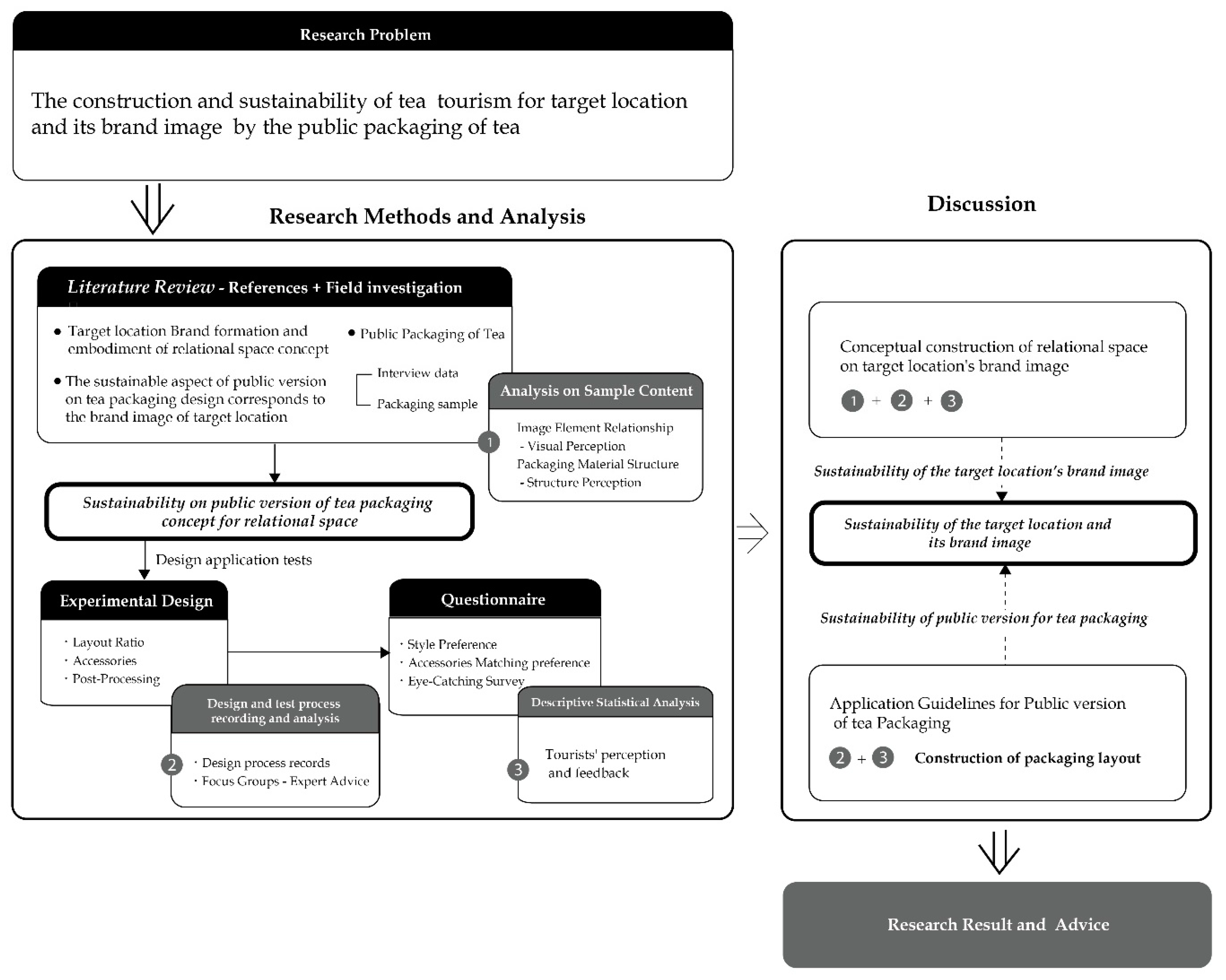
In this study, the research structure (Figure 4) corresponds to the process of the research method, research analysis, research stage purpose, etc. Based on the collection and analysis of literature research and fieldwork, this study proposes a “Relational Space for Sustainable Tea Public Packaging Concept”.
Based on the concept of relational space, the content of the existing tea public version packaging samples obtained during the field investigation was analyzed, and the relational spatial context displayed by the visual and structural aspects of the existing packaging samples was obtained. (No. 1 in Figure 4). The experimental design (No. 2 in Figure 4) is packaged with this concept (compare Figure 3) in this study. The redesigned sample of this experimental design is then provided to passengers for a questionnaire survey, and then the expert’s operation suggestions and design process records, as well as the passengers’ perception and feedback (number 3 in Figure 4), are integrated and analyzed.
The research and analysis are divided into two aspects. On the one hand (the upper right half of Figure 4), the relationship between the redesigned sample and the existing packaging sample and the difference in destination brand image perception are compared. On the other hand (the lower right half of Figure 4), the process records and materials of the experimental design and the descriptive statistics of the questionnaire survey were collected to compare the data, and the application guidelines for the tea public version packaging design were proposed. The following is a description of the role and implementation details of the research method used in this paper.

3.1. Field Investigation

The purpose of this study is used to explore the supply, sales methods, and industry status of tea public packaging. A field survey was conducted on the top three tea packaging material companies in Nantou County, Taiwan, and semi-structured, in-depth interviews were conducted. The interviewees were the main operators of the three manufacturers (identity codes BV1 to BV3). Two of them have been in business for 20 years and one has been in business for 30 years. They have considerable experience in the management and sales of tea public packaging. The interview time is about 2 h each, and the interview location is in the respective office of each manufacturer. The interview coding method is interview object–form–outline sequence–code (for example, the second material is field investigation, referring to the content of interview outline 2 → B2-BV2-1-1).
In order to further explore the brand image and local characteristics of the tea public packaging, 22 series and 36 sets of tea public version packaging samples sold by the three major tea packaging material stores in Nantou County, Taiwan, were collected. In this study, the existing packaging samples are classified according to the design style, which is conducive to the use of research methods in each stage of this study. There are five categories: sightseeing landscape composition, minimalist composition, ink dyeing composition, meticulous painting composition, and other categories. Excluding other categories, this study retains these four categories for discussion. Here, the sample content analysis is performed for the visual images, visual elements, packaging structure, relational spatial context, etc., of such samples.

3.2. Experimental Design

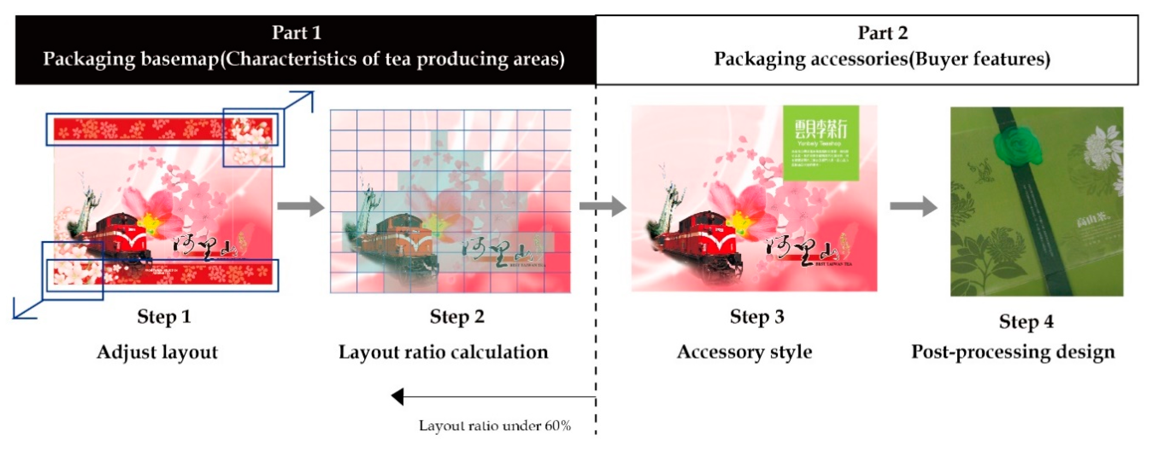
The purpose of this experimental design is to study the operation of the concept-to-design method and to propose a redesign sample of tea public packaging for the questionnaire survey. The operation of this experimental design can be roughly divided into two parts and four steps (as shown in Figure 5).
  • Application of design method: the designer proposes a redesign sample of tea public version packaging;
  • Inspection of samples: suggestions from experts of the focus group on screening of redesigned samples and post-processing of accessories.
Step 1. The designer conducts visual layout design for the existing tea public version packaging samples according to the above concepts and proposes experimental design samples.
Step 2: Experts from the focus group screen and discuss the experimental design samples.
Step 3: Post-processing simulation samples (with accessories and accessories for post-processing) are performed according to the redesigned samples after screening.
Step 4. Experts from the focus group conduct screening and design suggestions for the simulated samples produced in Step 3. After the whole design and modification process, the designer proposed the final redesign sample of the tea public version packaging.
The first part of the experimental design mainly considers that, when tea is displayed on the shelf at stores, the covers of most tea packaging often face the tourists upright. The presentation of the visual layout, the ratio of the layout to the blank space, the size of the elements, and the setting of the proportion will determine the quality of the overall layout and affect the viewer’s visual dynamics and inner feelings. Designers can create tension, depth, and movement through the use of widely varying image sizes, positions, and surrounding colors [47,48]. This research achieves the concept of visual subtraction design through the sensitive observation of the figure–ground relationship and the calculation and adjustment of the layout ratio. Layout ratio means the ratio of layout to white space. In other words, the constituent elements in the layout, such as text, graphics, etc., are the percentage of the entire layout area. The calculation formula is: layout ratio = (text area + drawing area)/overall layout area. The amount of layout ratio explores the viewer’s perception.
In order to ensure a more objective and accurate measurement of the correct position and proportion of the main packaging elements in the picture, this research focuses on the viewer’s perception. The base map corresponds to the destination brand image, and the accessories correspond to the presentation of the characteristics of the tea farmers (as shown in Figure 6). The layout ratio and calculation will involve the effect of the overall packaging. According to the research results of the perception of the layout rate in the “Image Evaluation and Visual Design Research of Layout Arrangement”, “the main vision is located in the center of the screen, the image is larger than the text, and the amount of white space is 40%~60%” as the experimental modification basis for the samples in the study [49]. In addition, the “ Rule of Thirds Table” [49] of “ A Study of Analyzing the Web Page Layout Design by the Rule of Thirds “ is used as an application tool for future arrangement experiments to accurately measure the layout rate of the packaging design cover, to implement the design concept and application proposed in this paper, and effectively balance the brand image of the destination and the design presentation of private brand characteristics.
The second part of the experimental design provides an effective reference for future tea farmers and designers. In this study, while adjusting the base map, the overall layout ratio was calculated; then, the styles and types of accessories were matched, such as seals, stickers, straps, and wax seals. Then, according to the shape, color, and text of the accessories and their interactive use (Figure 7), the experimental sample of redesigning the tea public version packaging is proposed. Two focus groups were used, each lasting two hours. The purpose of the two focus groups was to discuss, through the experience of experts, the selection of redesigned sample fittings and the recommendations for the subsequent processing and fitting of the screened samples.
The researcher is a visual communication designer with 6 years of experience in graphic design who can adjust the layout, types, and forms of accessories for the analysis of the layout ratio of the visual aspect.
The moderator of the focus group is a researcher (identity code F), with five members (identity code A to E), who are visual communication designers with more than 3 years of experience in graphic design and printing. There are two male designers and three female designers. The data coding methods of focus groups are focus group 1, member code-discussion target-number (for example shape of accessories discussed by member A→A-AS-1); focus group 2, category-discussion target-number (for example discussion about the shape of accessories for sightseeing composition → TM-AS-1).
The combination codes of sample accessories are named in sequence according to the accessories layout table (Table 1) of the experimental design operation. First of all, according to the English abbreviations of the four categories of “sightseeing landscape composition”, “minimalist composition”, “ink dye composition”, and “fine brushwork composition”, they are named TM, MM, CK, GI, respectively. Coding method: sample category-accessory method-accessory shape-accessory color-text. For example, the designer uses a representative sample (TM) of the composition of the sightseeing landscape, and the accessories can account for 0–15% of the layout. The accessories are stickers (SR), the shape of the accessories is square (S2), the color of the base image is high-contrast (C2), and the text is in a Sans-Serif font (T2). The code is TM-SR-S2-C2-T2. This experimental design produced a total of 416 redesigned samples, and 25 redesigned samples were screened in two stages. In this study, the content analysis of the samples of this design process and the coding and decoding analysis of the records of the interview process was carried out. Finally, the application guidelines for tea public version packaging design are put forward.

3.3. Questionnaire

In order to know the tourists’ perception and feedback on the local brand image presented in the redesigned sample, and the implementation of the “Sustainable Tea Public Version Packaging Concept of Relational Space” of this study to highlight the benefits of private tea brands. The content of this questionnaire is roughly divided into three parts: “Style Preference Survey”, “Accessory Matching Preference”, and “Attractiveness Survey”. At the same time as the physical questionnaire is distributed, a sample of the physical redesign packaging that has been reduced to 25% is given as a reference when filling out the questionnaire to achieve the authenticity of the packaging. This questionnaire survey adopts intentional sampling and selects the “Nantou Service Area” in the central area of Taiwan to issue the questionnaire. This service area is a place that must be passed to the tourist destination. There are tea shops in the service area. In this study, 80 questionnaires were distributed, and 78 valid questionnaires were distributed to travelers who took a rest nearby. Finally, descriptive statistics and analysis will be carried out on the collected questionnaires.

4. Research Analysis and Discussion

4.1. The Relational Spatial Context Displayed by the Visual and Structural Aspects of the Existing Packaging Samples

The existing packaging samples in this study are roughly divided into four categories: sightseeing landscape configuration, minimalist composition, ink dyeing composition, and meticulous painting composition. The sample sizes were 5, 7, 5, and 15, with a total of 32 copies. On the one hand, it can be known that the current visual layout of the tea public packaging in Taiwan presents a variety of visual styles of packaging. The style preferred by tourists is more inclined to the computer graphics style of fine line art composed of meticulous brushwork. On the other hand, the category of sightseeing landscape composition is mainly classified based on the composition of landscape images of tea tourist locations. The number of such samples accounted for 15% of the total sample size. Therefore, the method of composing a landscape image of a tea tourist destination is not popular in the current market. Therefore, this study explores the relationship between the visual images, visual elements, packaging structure, and other elements generated by various types of samples, as well as the representative meaning and the resulting perception. Exploring its relational spatial context reflects the identity of the location’s brand image between the location and the participants.
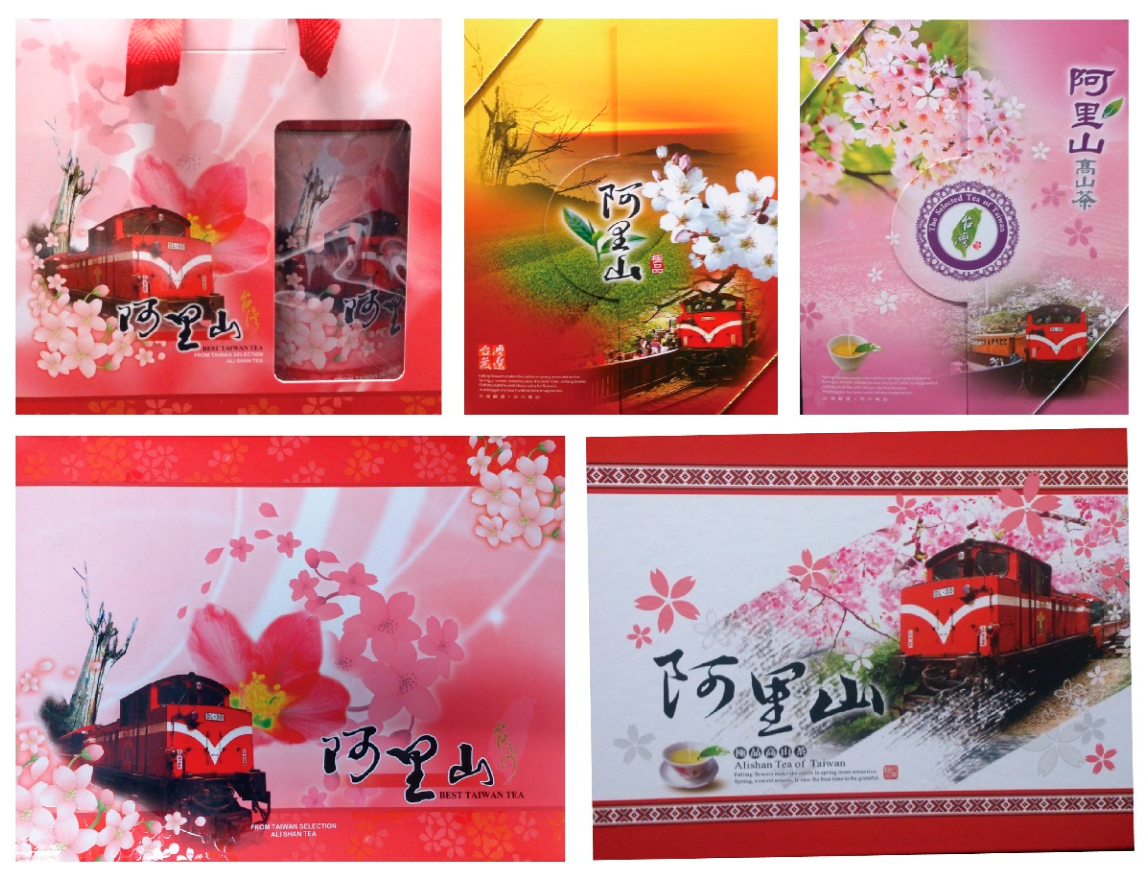
In terms of visual images, sightseeing landscape composition samples are mainly composed of photographic pictures, and the visual images of these samples are all pointing to the scenic photos of Alishan scenic spots (TM01-TM05). On the one hand, it confirms the argument of this study that tea packaging should conform to the fact that the oriental tea culture is rooted in the land. On the other hand, it means that other tea tourism locations have not promoted their brand image through such packaging design methods. This kind of sample uses Alishan small train, cherry blossoms, and Alishan sacred tree images. Covering these elements in a wafting pattern of cherry blossoms (Figure 8), only one sample differs slightly from the others with a striped Tsou pattern. This type of sample completely echoes the five wonders of Alishan, which have always been the sunrise, sea of clouds, sunset, forest, mountaineering forest, and railway as the demarcation of Alishan’s tourism image. Alishan’s small train takes tourists to face exclusive marking activities such as sunrise, the sea of clouds, and sunset at different times of the day [50]. The image of the small train in the composition is tilted at a 45-degree angle, creating a sense of space, and using this composition to evoke the traveler’s memories. The visual text is presented in the calligraphy of “Alishan”. Calligraphy has always been a Chinese style element. In addition to expressing oriental imagery, it is more important to express the geographical demarcation of the concept of “absolute space” brought by the text. From the above, it can be seen that this type of composition is closely linked with tea and tourism activities, and also generates the perception of tourism activities in the composition, but it can still be presented as packaging for tea sales without the elements of tea-related images. It verifies that the local activities drive the pulling force, and the locality is the basis for purchasing tea. In addition, the words “Alishan” appear on the packaging, which belongs to the application of the concept of naming power. Packaging with a GI protects the production of traditional tea and the soul of the destination, protecting the culture, traditions and customs, tourism assets, and cultural heritage of the place [51].
“Persistent” entities in the places described by Whitehead are in “continual destruction”, and the boundaries and boundaries lines of places are not established but must be shaped. The coexistence of the multiple spatialities in the place does not have a simple and unified local meaning. From this perspective, the composition sample of sightseeing scenery is as above, which creates the brand image of the place. However, all samples of this category are presented with the same elements and different arrangements. It can be seen that Alishan’s brand image is facing the stagnation of creation and is in a general and fixed state. As a result, this approach cannot allow travelers to have more perception and connection with the place, and cannot generate attention and attraction to it, which is not conducive to the long-term shaping of travelers’ presence of the local brand. The tea industry, forestry, Tsou culture, and forest tribes in Alishan are numerous and quite famous [52]. If the visual elements and composition of the tea public version design can be presented, and the landforms, scenery, and humanities of Alishan can be considered, it should be able to present the image of the place richly, activate the brand image of the location, and increase the perception of the place by tourists.
In terms of visual elements, in addition to the composition of sightseeing scenery, the three categories of minimalist composition, ink-dye composition, and meticulous painting composition are mainly based on computer graphics design and expression techniques (Figure 9). The minimalist composition class uses a single color as the base and uses partial images and drawings to present the appearance of tea leaves. The ink-dye composition category presents tea leaves, mountain scenery, and sights of people drinking tea with ink and wash techniques. The composition of the meticulous painting is based on a single color, and the elements depicted in the tea leaves, camellias, and tea trees are laid out as the base map in order to increase the richness of the cover. Many elements are combined with post-processing, which is the method used the most for post-processing, and only the aesthetic stitching in the stylized production form changes. The relationship between these three types of sample elements revolves around the appearance of tea leaves and the atmosphere of tea drinking. In terms of words, one-third of the samples are presented in Taiwan, and include local tea species (e.g., Taiwanese tea, Dayuling tea). The other two-thirds of the samples mainly created their own words related to tea, and some words have nothing to do with tea but are only homophonic (for example, Cha Yan Yue Sher). Although these three types of samples are diverse and rich in design techniques and aesthetics, the relationship between the entire compositional elements is limited to the aspect of tea, which shows the limitations of their relational context. The packaging text attempts to enhance the impression of tea among tourists through the names of the tea-producing areas but does not add images or related elements of the producing areas to echo it, and you can also see the contradictions in the composition design.
From the above analysis, we can respond to the influence of this study on the differences in tea culture between the East and the West, and on the packaging design of the tea public version. Taiwanese tea is sold and promoted using the original tea flavor, and only professionals can understand the differences in tea planting, tea making, and the color of tea. Visual design cannot respond to consumers’ perception of tea and attract them to buy. It is also impossible to use different elements such as spice images and colors to present the characteristics of tea as in Western countries. Due to the inability to establish rich correlations and associations between elements, the packaging design of the public version of Taiwan tea can only reproduce the form of tea with various design techniques to attract consumers’ attention.
According to the discussion on the packaging structure of the tea public version of the literature, this study analyzes and discusses the samples in three parts: the tea box, the tea can, and the inner bag. Most of the tea boxes are fixed paper boxes, which are book-back type, top-cover type, and drawer type. In addition, there is a way of combining the bag and the carton, which is a two-in-one type. From the 36 samples collected in this study, 21 were book-back type, 4 were cover type, 2 were drawer type, and 9 were two-in-one type. Among them, the book-back type can be divided into three types: the upper opening and closing method, the left and right opening and closing method, and the boxed rotating opening and closing method, and the material used in this structure is mostly thick paper, which has the largest number. “Two-in-one” is a carton that combines a carrying bag and a tea box. The material used in this structure is mostly thin cardboard, which is the second most-used type to the book-back type. The tea cans are mainly made of metal, and the number of tea cans is 31 sets of round iron cans, 4 sets of iron square cans, and 1 set of paper square cans. Each tea can is mainly sold in four taels, and a tea gift box has one to three cans of iron cans as the basic quantity. The inner bag is mostly vacuum-packed with aluminum foil, and the tea leaves are vacuum-packed in tea cans. In addition, a small number of samples were found to reveal the inner tea can through the hollow packaging technique (TM1, CK3, GI1). In addition to reducing the overcrowding of the layout, it even matches the relationship between Chinese style and tea with the hollowed-out shape of ancient Chinese window grilles (GI3).
From this, it can be seen that, first, the tea box has the largest number of fixed paper boxes with a book-back type. The tea box conveys the ritual feeling of opening the scroll through the ritual experience of travelers’ entire package opening and closing action and the sense of the weight of the thick paper. The gift box will be recognized and valued during the ritual experience, enhancing the image of tea and the collection of the destination. Second, the combination of a two-in-one carton with a carrying bag and a tea box and a large number of low-cost round iron cans for tea packaging reflects the convenience brought by travelers’ emphasis on the packaging. Third, the discovery of the hollowed-out packaging technique in the sample, in addition to aiding future research on reducing the use of materials and layout ratio, can also enhance the diversity and cultural imagery of tea public packaging through the shape and style of the hollowed-out packaging. In addition to the structure, the tea public version packaging can also present the atmosphere of the destination image and branding in the post-processing techniques. This current situation is undoubtedly a favorable condition for the sustainable application of tea public packaging. In the future, it will be more inclined to integrate the concept of internal structure.
In terms of packaging accessories, the study found that, among the existing packaging samples, a few samples used seals, stickers, straps, and even iron sheets as accessories. Except for the sightseeing landscape composition category, which uses straps to fix the outer packaging, other composition categories attempt to highlight the text theme of the sample. In terms of post-processing, the composition of sightseeing scenery is mainly based on photographic images, and the “partial glazing” method is used to emphasize the elements of tourist attractions. Minimalist composition is the simplicity of the balanced overall layout, it uses monochrome and unified lines and blocks to present the overall layout, and the text or images of some samples are stamped and varnished to highlight the outline of the elements. The ink-dye composition and the meticulous painting composition are rich in drawing elements and layout. Therefore, both of them use hot foil die-stamping or black text to highlight the theme. When the designer considers the packaging design of the tea public version, a more concise packaging structure is used to reflect the ritual feeling, and the complexity of the entire tea public version packaging manufacturing structure and recycling mechanism is reduced. Accessories and post-processing are important targets to increase its attention and richness.

4.2. Application Key Elements and Application Guidelines of Tea Public Version Packaging Design

The presentation of the tea public packaging in terms of style is not the focus of the main discussion. However, this study is redesigned with four types of style samples for two purposes. On the one hand, in the future, if various tourist attractions are used as tea public version packaging images or image conversions, the visual style will indeed affect the suitability of packaging and accessories. On the other hand, the proportion of layout needs to be considered when the four types of styles have their own accessories. The design operation process and results and the analysis of the preference degree of tourists’ feedback in the questionnaire survey will be presented on the same page as the destination brand and private brand in the future, which will serve as a reference. Therefore, this study proposes the analysis results of the layout ratio of various compositions and the adjustment suggestions for future applications.
The layout ratio of the existing tea public version packaging is high. When carrying out the packaging design operation, the subtraction design needs to be carried out first. The design experiment is based on “40~60%” of the overall layout white space. Based on the advice given by experts in focus groups and the preference survey of passenger questionnaires, the results show that the ratio of visual layout to accessories should be 3:1 and the layout ratio of the cover and base image should be about 40%. Except for the minimalist composition category, the layout ratio of accessories should be between 0 and 20%. The layout rate of “sightseeing landscape composition” is 60–80%. The packaging needs to be designed through the subtraction of the visual layout before packaging accessories and post-processing can be carried out. The layout rate of “minimalist composition” is only 20–40%. This type of layout design is composed of seals and stickers to highlight the overall packaging, which is similar to the design concept of the original concept of this study. However, due to the large-area monochrome base map, it is easy to produce a monotonous feeling, and the texture needs to be improved in the post-processing part. The layout rate of “ink dye composition” is 50–70%. Because of the use of the ink smudge effect, the boundary lines between elements are eliminated, and the picture will not be crowded. However, the text used in such original sample packaging is relatively large. If you want to use this style in the future, you need to pay special attention to the size of the text to avoid reducing the attention of the accessories text. The layout rate of “Meticulous Painting Composition” is 50–70%. This type of painting is mainly based on fine depiction through vector drawing. The packaging accessories and post-processing used need to be simplified to keep it simple, so that the picture can be balanced with each other.
According to the data collection of the experimental design and the analysis of the results of the questionnaire, this study puts forward the following suggestions: the design of accessories for seals and wax seals is limited by their operation and visual presentation, and the shapes of seal accessories, such as square, triangle, and circle, are not applicable. The size of the accessories of the wax seal should be configured with a visual cover of a size of 26.5 × 18 cm.
Due to the addition of accessories, color has become an element of special attention when designing. Regarding the distribution of the base color of the existing tea reference packaging samples, one-third is red and pink, one-third is green as the base color, and one-third is yellow and coffee. Similar colors are easier to match than accessories with high-contrast colors. In the results of the questionnaire survey, two-thirds of the redesign samples favored by tourists are based on red and pink base colors, while packaging accessories are mostly accessories of similar colors. Therefore, accessories with high contrast colors should not be placed on the cover of the red-toned tea box. In addition to the color of accessories, the analysis of the redesign samples that tourists liked can be known from the results of the questionnaire. The text font of four-fifths of the packaging accessories is mainly in “calligraphy”. It can be seen that even the text font on the base map is mainly in “calligraphy”. The text of the accessories adopts a unified font to achieve overall coordination. The composition is quite diverse due to the composition of different categories with various accessories. There are no uniform rules and fixed methods for the use of post-processing. Therefore, designers need to choose post-processing methods according to the key points. Post-processing is a need, not a necessary process.

4.3. The Partnership of Mutual Benefit and Symbiosis Is Visualized in the Tea Public Version Packaging Design

Layout ratio plays an important role and connotation transmission in this study, and the amount of layout ratio affects the viewer’s context-awareness. In this study, the concept of combining public and private layouts is proposed, and the overall layout margin is based on a design experiment of “40~60%”. The final redesign sample results show that the ratio of visual layout to accessories should be 3:1, and the layout ratio of the cover and base image should be about 40%. Except for the minimalist composition category, the layout ratio of accessories is between 0 and 20%. For the existing packaging samples, the composition samples of sightseeing scenery, minimalist composition, ink-dyeing composition, and meticulous painting composition, their layout rates are 60–80%, 20–40%, 50–70%, and 50–70% respectively. Except for the minimalist composition category, which has a low layout rate and is easy to feel distrustful to passengers, other compositions belong to a state of high layout rate, which is easy to express formal and stable feelings to tourists [48]. Designers need to consider the layout ratio, content format, and elements used by the destination brand and the tea grower brand. In addition to the correction of the layout ratio, more attention should be paid to the prominence of the relationship between elements. Therefore, most samples have to choose to remove or simplify the visual elements of the packaging base map. For the minimalist composition category, due to the low layout rate, it is necessary to increase the proportion of its layout in post-processing.
It can be seen that, under the construction of such a design concept, the destination brand needs to give a public page to the private brand to present the image, and the private brand needs to find a way of expressing and characterizing itself to display on the private page. In this way, the mutually beneficial and symbiotic partnership between the destination and the tea farmers is visually presented on the layout of the tea public package. The tea public version packaging presents the characteristics of the private brand of tea farmers with the destination image of the same public layout and the accessories of different private layouts. Through the connection between packaging, tourists can have a different understanding and perception of the destination and achieve a unified and uninterrupted brand image of the destination to present its richness and distinctiveness.
In this study, in addition to the questionnaire used to determine the tourists’ preference for tea packaging and accessories and collect the application elements of tea public version packaging, from the basic personal information and the question items of the eye-catching survey, it is known that the order of consideration for tourists to buy tea is as follows: “Type of tea” → “Origin” → “Price” → “Store” → “Package”. When most middle-aged people buy tea, the type of tea is the main consideration, the origin is the secondary consideration, and the packaging is the last consideration. The order of preference of tourists for adding accessories and post-processing on the cover of the tea public version package is (A) sightseeing landscape composition → (D) meticulous painting composition → (C) ink dye composition → (B) minimalist composition. Tourists still choose the composition of “sightseeing landscape composition” as their primary choice. This result corresponds to the above-mentioned various styles of the existing tea public package, which cannot correspond to the tea origin, which brings purchasing attractiveness to tourists. The current tea packaging design focuses too much on the presentation of aesthetics in form, ignoring the reference for tourists to purchase the tea packaging in the geographic name and destination design. When implementing the experimental design, this study virtualized the private brand “Yunbei Li” of tea farmers, and the words “Yunbei Li” were used on the accessories. The last question on the questionnaire asked travelers if they still remember the brand name of the tea grower. Among the tourists, 16 people chose “Ali Lang”, accounting for 20.51%; 53 people chose “Yunbei Li”, accounting for 67.95%; 6 people chose “Cha Yan Yue Sher”, accounting for 7.69%; 3 people chose “Kao Shan Ching”, accounting for 3.85%. It is confirmed that matching the design of accessories on the base map of the tea public package is beneficial to deepen the impression of tourists on the private brand of tea farmers and to form a positive brand promotion effect.

5. Conclusions

5.1. Brand Image Creation and Sustainable Development of Tea Tourism Destinations by Tea Public Packaging

Destinations are places of life and change and multi-dimensional and living entities, made up of the environment and local inhabitants, offering different experiences to different visitors [53]. Currently, people’s relational perception of the concept of time and space, the visual design of tea public version packaging, layout ratio, image elements, accessories, and their corresponding relationships will become the observation dimension and perception basis for people facing the destination. According to the research and exploration process and results, it can be known that: 1. The package vision of the tea public version uses the composition of the destination tourist attractions and the words of geographical indications to create the image of the destination. It does have promotional benefits, and it also reflects that the influence of geographical indications is important on tea sales and the tea tourism of destination branding. 2. The layout ratio of the tea public package is adjusted visually, which visually presents the concept that the destination brand and the private brand complement each other, and jointly construct the destination image and branding. 3. Remove the illusion that the tea packaging style tends to be complex, and the relational spatial context of the existing tea public packaging has only two aspects: there is very little difference between tourism activities and tea types, especially the composition elements of sightseeing. In addition to reflecting the fact that the image creation of the destination is stagnant and solidified, it also reminds designers that the image elements of the destination should reflect their relationship with the destination, and that packaging design is the continuous creation of the destination image and branding. In the tea public package design created through this concept, the image of the destination and the image of the tea farmer are mutually supportive, and both images are valued. In terms of tourism, it mobilizes the memories and impressions of tourists through the images, elements, and words of the destination it presents and connects the connection between tourists and the destination. Through the brand image of tea farmers added by it, it highlights the different characteristics of other destinations.
In terms of tea marketing, it not only directly echoes the motivation of consumers to buy tea but also lays the foundation for the role of tea farmers’ branding in promoting publicity through the image of the destination. This promotes the sustainable development of the image of the destination and increases the tourists’ understanding of the destination image and more to not only achieve the integration of resources related to the organization’s external sales of tea public packaging, but also SDG 12 (Responsible Consumption and Production) to promote a green economy and ensure a sustainable consumption and production model.

5.2. Tea Public Packaging Drives the Sustainable Development of Tourism Destination-Related Industries

Accessories are the key to achieving the simultaneous presentation of the public and private layouts of tea public packaging. It is a continuous behavior to continuously explore local characteristics and industrial interaction. In terms of the tea public version packaging accessories, the destination materials (for example Alishan cypress, bamboo, and other elements) or the private materials of the destination tea farmers (for example tea leaves) should be integrated. It can further highlight the image of the private brand of tea farmers and build a partnership of mutual benefit and symbiosis between the destination and the local tea industry. If there are natural materials used as packaging accessories in the place of application, they can be readily available, and, in the future, it can echo the relationship between tea and geography emphasized in this study more. The sustainable association of brands and events will be strengthened, and sustainable partnerships will be closer [52]. Corresponding to the SDG 17 (Partnerships for the Goals), which was proposed by the United Nations, it establishes multiple partnerships to jointly promote the sustainable vision. This design concept and application realizes the function of integrating the tea public package with the internal consensus of the destination and achieves a sustainable win–win between the tea tourism destination and the tea public package.

5.3. Study Limitations

The discussion of this study is based on the oriental concept that tea culture is rooted in the land. Therefore, the concept and application of sustainable tea public version packaging in relational space are only applicable to tea tourism destinations in oriental countries. While this study focuses on the generation of conceptual discourses, only the partial application testing of the design is performed. At present, this study only discusses the concept and application guidelines through the existing tea public version packaging at this stage. Subsequent studies can be extended more fundamentally: what elements and symbols should be used in the base map of the tea package to match the image of the destination to echo the relational spatial context of this destination? When designing packaging for tea farmers, designers use such application guidelines to give designers a tool to communicate with tea farmers. In the future, the role of overall marketing and the extended discussion of subsequent applications can be discussed.

Author Contributions

W.-T.L. and Y.-H.C.; methodology, W.-T.L. and Y.-H.C.; software, W.-T.L.; validation, W.-T.L. and Y.-H.C.; formal analysis, W.-T.L.; investigation, W.-T.L. and Y.-H.C.; resources, W.-T.L.; data curation, W.-T.L.; writing—original draft preparation, W.-T.L. and Y.-H.C. writing—review and editing, W.-T.L. and Y.-H.C.; visualization, W.-T.L. and Y.-H.C.; supervision, Y.-H.C.; project administration, W.-T.L. and Y.-H.C.; funding acquisition, Y.-H.C. All authors have read and agreed to the published version of the manuscript.

Funding

This study was funded by the Ministry of Science and Technology, Taiwan. (110-2410-H-224-023).

Institutional Review Board Statement

Not applicable.

Informed Consent Statement

Not applicable.

Data Availability Statement

Not applicable.

Conflicts of Interest

The authors declare no conflict of interest.

References

  1. Huang, P.C. Research the Transition of Tea Industry along the Alishan Provincial Highway. Master’s Thesis, National Chung Hsing University, Taichung, Taiwan, 2013. [Google Scholar]
  2. Hashimoto, A. Tea and Tourism: Tourists, Traditions, and Transformations; Channel View Publications: Bristol, UK, 2008; ISBN 978-1-84541-057-5. [Google Scholar]
  3. Su, M.M.; Wall, G.; Wang, Y. Integrating tea and tourism: A sustainable livelihoods approach. J. Sustain. Tour. 2019, 27, 1591–1608. [Google Scholar] [CrossRef]
  4. Zeng, T.; Durif, F. The influence of consumers’ perceived risks towards eco-design packaging upon the purchasing decision process:An exploratory study. Sustainability 2019, 1, 6131. [Google Scholar] [CrossRef] [Green Version]
  5. García-Arca, J.; Garrido, A.T.G.P.; Prado-Prado, J.C. “Sustainable packaging logistics”. The link between sustainability and competitiveness in supply chains. Sustainability 2017, 9, 1098. [Google Scholar] [CrossRef] [Green Version]
  6. Wang, R.L.; Hsu, T.F.; Hu, C.Z. A Bibliometric Study of Research Topics and Sustainability of Packaging in the Greater China Region. Sustainability 2021, 13, 5384. [Google Scholar] [CrossRef]
  7. Guillard, V.; Gaucel, S.; Fornaciari, C.; Angellier-Coussy, H.; Buche, P.; Gontard, N. The next generation of sustainable food packaging to preserve our environment in a circular economy context. Front. Nutr. 2018, 5, 121. [Google Scholar] [CrossRef] [PubMed] [Green Version]
  8. Choi, S.; Lee, S.; Friske, W. The effects of featured advertising and package labeling on sustainability of cause-related marketing (CRM) products. Sustainability 2018, 10, 3011. [Google Scholar] [CrossRef] [Green Version]
  9. Pamukçu, H.; Saraç, Ö.; Aytuğar, S.; Sandıkçı, M. The effects of local food and local products with geographical indication on the development of tourism gastronomy. Sustainability 2021, 13, 6692. [Google Scholar] [CrossRef]
  10. Wang, N. A comparison of Chinese and British tea culture. Asian Cult. Hist. 2011, 3, 13. [Google Scholar] [CrossRef] [Green Version]
  11. Luo, Q. A Comparative Study of Tea Culture and Its Connotation between Chinese and English—Based on the Matter, Behavior and Spirit. In Proceedings of the 3rd International Conference on Humanities Science, Nanjing, China, 8–10 June 2018; Atlantis Press: Dordrecht, The Netherlands, 2018; pp. 214–217. [Google Scholar]
  12. Harvey, D. Justice, Nature and the Geography of Difference; Blackwell Publishers: Cambridge, MA, USA, 1996; ISBN 155-7-866-805. [Google Scholar]
  13. Yu, L. The Saint of Tea: Sencha’s Tasty Is Meaningful; Shandong Pictorial Publishing House: Jinan, China, 2018; ISBN 978-7-5474-2611-1. [Google Scholar]
  14. Chen, Y.H. Taiwanese Tea: A Case of Monopoly Rent by Social Construction. Taiwan. J. Sociol. 2007, 39, 107–157. [Google Scholar]
  15. Lin, T. The Impact of Tea Competitions to the Development of Local Tea Business—A Case Study of Tea Competitions of the Lu-Gu Farmer”s Association. Master’s Thesis, National Chung Hsing University, Taichung, Taiwan, 2004. [Google Scholar]
  16. Liang, B.K. Exploration of Industry Development and Origin Certification of Lugu Dongding Wulong Tea. J. Taiwan Land Res. 2014, 17, 29–56. [Google Scholar]
  17. Chung, C.P.; Chen, C.C.; Lee, C.F. Effects of tea competitions on tea production and distribution under system dynamics perspective. Mingchi Inst. Technol. J. 2016, 44, 71–92. [Google Scholar]
  18. Chen, J.; Wei, S.Q.; Li, F. The Evolution Path and Network of Agricultural Clusters from the Perspective of “Co-Location Clusters”: A Case Study of the Zhangping Tea Industry in Fujian Province. Trop. Geogr. 2021, 41, 364–373. [Google Scholar]
  19. Council of Agriculture (COA). Executive Yuan, Taiwan. Taiwan Tea Knowledge. Available online: https://fae.coa.gov.tw/food_item.php?type=AS03&id=113 (accessed on 1 June 2022).
  20. Harvey, D. Cosmopolitanism and the Geographies of Freedom; Columbia University Press: New York, NY, USA, 2009; ISBN 023-114-8461. [Google Scholar]
  21. Chen, Y.C. The Effects of Elements of Non-Copyrighted Tea Packing Design on Tea Merchants’ Choices in Mingjian, Nantou. Master’s Thesis, Tunghai Unviersity, Taichung, Taiwan, 2010. [Google Scholar]
  22. Huang, R.H. The Research for Pattern Design of Commercial Pack; Great Social and Cultural Business Publishing House: Taichung, Taiwan, 1990. [Google Scholar]
  23. Jiang, I.C. The Influence of Interesting Snack Package Design on Consumers’ Behavior. Master’s Thesis, National Taiwan University of Arts, New Taipei City, Taiwan, 2010. [Google Scholar]
  24. Huang, Y.Y. Analysis of the Current Situation of Tea Industry in Taiwan and the Government’s Policy in Response: WTO and ECFA as Examples. Master’s Thesis, National Chung Cheng University, Chiayi, Taiwan, 2011. [Google Scholar]
  25. Huang, J.C.; Chen, L.N. Baozhuang Yishu Sheji; Chongqing University Press: Chungking, China, 2002; ISBN 978-7-5624-2625-7. [Google Scholar]
  26. Long, D.Y. Commercial Package Design; Lemon Yellow Cultural Business Company: Taipei, Taiwan, 1982. [Google Scholar]
  27. Shin, H.Y. Analysis of Tea Packaging Methods and It’s Influence upon Consumers-TEA Shops of Taipei Case Study. Master’s Thesis, National Taiwan University of Arts, New Taipei City, Taiwan, 2007. [Google Scholar]
  28. Lin, C.Y. Creation Study On The Development Trend Of Taiwan Tea Packaging Design: Case Of YI RI Tea Bags Design. Master’s Thesis, National University of Tainan, Tainan, Taiwan, 2015. [Google Scholar]
  29. Li, Y.J.; Yan, H.Q. Study on the relationship between economic development and environmental pollution in GUANGXI based on kuznets curve. Sustain. Dev. 2020, 10, 357–367. [Google Scholar] [CrossRef]
  30. Pereira, L.; Mafalda, R.; Marconcini, J.M.; Mantovani, G.L. The use of sugarcane bagasse-based green materials for sustainable packaging design. In ICoRD’15–Research into Design across Boundaries; Springer: New Delhi, India, 2015; Volume 2, pp. 113–123. [Google Scholar]
  31. Abdul Khalil, H.P.S.; Davoudpour, Y.; Saurabh, C.K.; Hossain, M.S.; Adnan, A.S.; Dungani, R.; Paridah, M.T.; Islam Sarker, M.Z.; Nurul Fazita, M.R.; Syakir, M.I.; et al. A review on nanocellulosic fibres as new material for sustainable packaging: Process and applications. Renew. Sustain. Energy Rev. 2016, 64, 823–836. [Google Scholar] [CrossRef]
  32. García-Arca, J.; Comesaña-Benavides, J.A.; González-Portela Garrido, A.T.; Prado-Prado, J.C. Rethinking the box for sustainable logistics. Sustainability 2020, 12, 1870. [Google Scholar] [CrossRef] [Green Version]
  33. Georgakoudis, E.D.; Tipi, N.S.; Bamford, C.G. Packaging redesign–benefits for the environment and the community. Int. J. Sustain. Eng. 2018, 11, 307–320. [Google Scholar] [CrossRef]
  34. Rodrigue, J.P.; Slack, B.; Comtois, C. Green logistics. In Handbook of Logistics and Supply-Chain Management; Emerald Group Publishing Limited: Amsterdam, The Netherlands, 2017. [Google Scholar]
  35. Mollenkopf, D.; Closs, D.; Twede, D.; Lee, S.; Burgess, G. Assessing the viability of reusable packaging: A relative cost approach. J. Bus. Logist. 2005, 26, 169–197. [Google Scholar] [CrossRef]
  36. Aronsson, H.; Brodin, M.H. The environmental impact of changing logistics structures. Int. J. Logist. Manag. 2006, 17, 394–415. [Google Scholar] [CrossRef]
  37. Merz, M.A.; He, Y.; Vargo, S.L. The evolving brand logic: A service-dominant logic perspective. J. Acad. Mark. Sci. 2009, 37, 328–344. [Google Scholar] [CrossRef]
  38. Verganti, R. Design-Driven Innovation: Changing the Rules of Competition by Radically Innovating What Things Mean; Harvard Business Press: Brighton, MA, USA, 2009; pp. 33–54. [Google Scholar]
  39. De Kay, M. Integral Sustainable Design: Transformative Perspectives; Bennett, S., Ed.; Earthscan from Routledge: New York, NY, USA, 2011; pp. 3–128. [Google Scholar]
  40. Dauvergne, P.; Lister, J. Eco-Business:A Big-Brand Takeover of Sustainability; The MIT Press: Cambridge, MA, USA, 2013; ISBN 978-0-262-01876-0. [Google Scholar]
  41. Voon, T.Y.; Yazdanifard, R. Green Marketing Strategies, Sustainable Development, Benefits and Challenges and Constraints. Center for Southern New Hamphire University (SNHU) Programs, HELP College of Art and Technology. 2014. Available online: https://www.researchgate.net/publication/264992117 (accessed on 25 June 2022).
  42. Ho, J.L.; Lee, C.L. Trends and Practices of Sustainable Development and Corporate Social Responsibility Report. Taiwan Account. Rev. 2017, 12, 359–366. [Google Scholar]
  43. Lu, X.; Tong, Y. Study on the Packing Design of Tourism Product of Intangible Cultural Heritage Based on Hui’an Women’s Dress. In 4th International Conference on Arts, Java, 14 November 2018; Atlantis Press: Dordrecht, The Netherlands, 2018; pp. 575–578. [Google Scholar]
  44. Zhihong, L.; Yu-ting, Z.H.A.N.G. Tourist Souvenirs of Eco-packaging Structure Optimization Design in Perspective of Lijiang River Culture. In 2012 National Conference on Information Technology and Computer Science, 16–18 November 2012; Atlantis Press: Dordrecht, The Netherlands, 2012; pp. 557–559. [Google Scholar]
  45. Jarossová, M.A.; Gordanová, J. Folk Motifs as a New trend in Foods and Beverages Packaging Design. Studia Commer. Bratisl. 2019, 12, 34–47. [Google Scholar] [CrossRef] [Green Version]
  46. Li, W.-T. A study on the public version of tea packaging design. Master’s Thesis, National Yunlin University of Science and Technology, Douliu, Taiwan, 2014. [Google Scholar]
  47. Lupton, E.; Phillips, J.C. Graphic Design the New Basics; Long Sea International Book: New Taipei City, Taiwan, 2008; ISBN 978-9-8670-2232-5. [Google Scholar]
  48. Jung, T. A Study on Imagery Evaluation and Visual Communication Design of Layout—A Case Study of Chinese Face Rate; Wu-Nan Book Inc.: Taipei, Taiwan, 2001. [Google Scholar]
  49. Cheng, Y.H.; Lan, Y.C. Research of Analyzing the Web Page Layout Design by the Rule of Thirds. J. Des. Sci. 2012, 15, 103–131. [Google Scholar]
  50. Ministry of Transportation and Communications (MOTC). Tourism Bureau, Taiwan. Alishan National Forest Recreation Area. Available online: https://www.taiwan.net.tw/m1.aspx?sNo=0001016&id=10949 (accessed on 1 April 2022).
  51. Murgado, E.M. Turning food into a gastronomic experience: Olive oil tourism. Options Mediterr. 2013, 106, 97–109. [Google Scholar]
  52. Gartner, W.C. Brand equity in a tourism destination. Place Branding Public Dipl. 2014, 10, 108–116. [Google Scholar] [CrossRef]
  53. Hsiung, T.F.; Cheng, Y.H.; Han, Z.X. Sustainable Partnership: Operational Condition Analysis for Brand Value Co-Creation. Sustainability 2021, 13, 6516. [Google Scholar] [CrossRef]
Figure 1. Map of Taiwan’s tea production areas and tourist attraction.
Sustainability 14 09256 g001
Figure 2. Shifts in packaging design capabilities.
Sustainability 14 09256 g002
Figure 3. Conceptual diagram of the reconstruction of the tea public version packaging design.
Sustainability 14 09256 g003
Figure 4. The structure of research.
Sustainability 14 09256 g004
Figure 5. The operation of the experimental design for public version of tea packaging [46].
Sustainability 14 09256 g005
Figure 6. Calculation diagram of the overall layout ratio of the packaging.
Sustainability 14 09256 g006
Figure 7. Flow chart of configuring accessories [46].
Sustainability 14 09256 g007
Figure 8. Sightseeing landscape composition—sample group.
Sustainability 14 09256 g008
Figure 9. Representative samples of minimalist composition, ink-dyeing composition, and meticulous painting composition.
Sustainability 14 09256 g009
Table 1. Flow chart of configuring accessories.
Processing Methods (Code)Seal (SL)Sticker (SR)Straps (BE)Wax Seal (WL)
Option on Changes (Code)
accessory Shape
(S)
rectangle (1)S1S1S1X
square (2)XS2S2X
triangle (3)XS3S3X
round shape (4)XS4S4S4
organic shape (5)S5S5S5X
Color
(C)
analogous color (1)C1C1C1C1
high contrast (2)C2C2C2C2
Letter
(T)
Serif (1)T1T1T1T1
Sans-serif (2)T2T2T2T2
Chinese calligraphy (3)T3T3T3T3
calligraphy (4) (self-designed)T4T4T4T4
Publisher’s Note: MDPI stays neutral with regard to jurisdictional claims in published maps and institutional affiliations.