Abstract
Although supervised machine learning classification techniques have been successfully applied to detect collapsed buildings, there is still a major problem that few publications have addressed. The success of supervised machine learning strongly depends on the availability of training samples. Unfortunately, in the aftermath of a large-scale disaster, training samples become available only after several weeks or even months. However, following a disaster, information on the damage situation is one of the most important necessities for rapid search-and-rescue efforts and relief distribution. In this paper, a modification of the supervised machine learning classification technique called logistic regression is presented. Here, the training samples are replaced with probabilistic information, which is calculated from the spatial distribution of the hazard under consideration and one or more fragility functions. Such damage probabilities can be collected almost in real time for specific disasters such as earthquakes and/or tsunamis. We present the application of the proposed method to the 2011 Great East Japan Earthquake and Tsunami for collapsed building detection. The results show good agreement with a field survey performed by the Ministry of Land, Infrastructure, Transport and Tourism, with an overall accuracy of over 80%. Thus, the proposed method can significantly contribute to a rapid estimation of the number and locations of collapsed buildings.
1. Introduction
With the recent advent of remote sensing technologies, the estimation of affected areas in the aftermath of a large-scale disaster has considerably improved [1,2,3,4,5]. Interest in the use of remote sensing in disaster management is well motivated because remote sensing products can cover a wide affected area; multiple sensors equipped on satellites are constantly recording the Earth’s surface; and active sensors function independently of the time and climate. Because of this robustness, several authors have addressed the problem of retrieving information on infrastructural damage with an acceptable accuracy.
The main challenge in damage extraction using remote sensing information is to establish a discriminant function of features extracted from satellite imagery with which to properly classify damaged and non-damaged buildings. Several features have been proposed for damage detection. Among them, the most common fundamental basis for analysis is related to the detection of changes between a pair of images acquired before and after a disaster [2,6]. However, efforts have also been made to extract features from post-event images only [7,8,9,10]. A common approach to the establishment of discriminant functions is through calibration using previous events recorded by specific sensors, such as X-band Synthetic Aperture Radar (SAR) imagery [2,11], L-band SAR imagery [12] and C-band SAR imagery [13]. However, it has been reported that such methods are subject to limitations regarding the transferability of the discriminant functions to imagery recorded by other sensors [14,15]. Furthermore, these discriminant functions are limited to a feature dataset of fixed dimensionality. Consequently, more robust and versatile calibration methods are needed. To this end, machine learning techniques have been successfully applied [16,17,18,19,20,21,22]. Calibration using supervised machine learning is performed based on training samples, that is a set of features for which the corresponding damage states are known in advance. The performance of machine learning techniques is strongly related to the number of training samples used. The more training samples there are, the better is the calibration of the discriminant function that can be achieved.
In the aftermath of a large-scale disaster, it is crucial to identify damaged buildings as early as possible to facilitate efficient search-and-rescue activities. The need for early response is related to the life expectancy of occupants trapped under collapsed buildings. For instance, after the 1995 Hyogoken-Nanbu earthquake in Japan, the life spans of the victims ranged from 5–6 min for suffocating occupants to several days for uninjured, but starving or dehydrated occupants [23]. It is therefore necessary to optimize all steps in the process of building damage detection. When machine learning techniques are employed for building damage classification, significant time is spent on retrieving training data. According to the experience of the authors, such training data are usually obtained from field surveys, which might require significant time to establish the logistics, conduct the survey and digitize the data. Another common approach is the visual interpretation of optical images, which may be influenced by the experience of the person performing the analysis. Official reports from the government provide some of the most reliable information that can be used as training data; however, such reports usually become available only after several weeks or months. To reduce the time required to retrieve training data, Wieland et al. [16] performed a quantitative evaluation of the influence of the number of training samples on the accuracy of damage classification using the support vector machine (SVM) technique, and these authors concluded that a minimum number of training samples from a small study area can be used to map building damage in a much wider region. Furthermore, remote sensing is defined as the acquisition of information about an object or phenomenon without making physical contact with that object or phenomenon. Thus, from this perspective, the fact that the leading state-of-the-art techniques for damage detection require field surveys is not completely satisfactory.
In the field of risk analysis, a probabilistic estimate of damage is expressed as a function of an engineering demand parameter (EDP) [24,25,26,27,28]. The EDP refers to a property of the hazard that is causing the damage of interest (e.g., the peak ground acceleration for an earthquake or the inundation depth for a tsunami). Unlike the use of remote sensing technologies, the application of probability theory for risk analysis emerged several decades ago [29]. Since then, outstanding progress has been achieved [30]. A fragility function is a well-known relationship between an EDP and the probability that a certain damage level is reached or exceeded [25]. In recent years, several frameworks for building damage mapping in terms of probabilities have been proposed [31,32,33,34,35]. Based on the probabilities of damage occurrence under a given hazard scenario and a geocoded building inventory, the numbers of damaged buildings within individual grid cells/blocks can be estimated. Such estimation is currently possible due to advances in hazard quantification. The spatial distributions of natural hazards, such as earthquakes and tsunamis, can be measured by device networks [36,37,38,39] and/or from theoretical models [26,40]. However, this approach provides only local aggregates, and thus, the allocation of damage states to buildings is not possible.
In this paper, we propose a new approach for the classification of collapsed buildings. This approach enables the allocation of damage states to buildings without any training samples. Therefore, it is able to overcome some of the difficulties encountered in the two approaches discussed above. Our proposed approach, called IHF, requires the following inputs: satellite imagery, the spatial distribution of the hazard and a set of fragility functions for the buildings to be evaluated. IHF is a hybrid method that combines traditional machine learning methods with probabilistic damage mapping. This manuscript presents a follow-up study to one previously published by Moya et al. [41]. That study introduced the fundamental basis of the approach. Now, after major modifications to the framework, a generalization of the approach and the development of the equations are presented. This paper is structured as follows: The next section introduces the mathematical formulations underlying the IHF method. Section 3 presents the application of the IHF method to the 2011 Great East Japan Earthquake and Tsunami. Finally, in Section 4, conclusions are drawn, and future research is discussed.
2. The IHF Classification Method
2.1. Fundamentals
The proposed method is a modification of the logistic regression method [42,43]. Here, we focus on the two-class problem, in which the two classes correspond to collapsed () and non-collapsed () buildings. For a given set of features , where ∈ and ∈ , represents the probability that belongs to . Thus, the probability that belongs to is . is a vector that contains the features used for classification. It is intended that will be calculated from satellite imagery, whereas will be calculated from the fragility functions and the hazard distribution. The main purpose is to find a discriminant function f such that any value of can be correctly classified as belonging to either or . A linear discriminant, where the decision surface is a hyperplane, can be represented as a linear combination of the elements of the input vector:
An input vector is assigned to class if and to class otherwise. The discriminant function can be vectorized as follows:
where and is redefined as . Thus, the decision boundary is defined by the relation . From the logistic function perspective, a threshold classifier () can be expressed as follows:
where belongs to if and to otherwise. The unknown vector is obtained by solving the following equation:
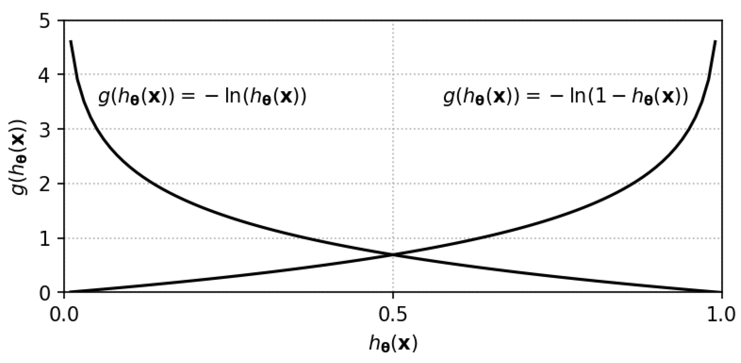
Each element of the summation in Equation (5) is the contribution of one sample feature and is composed of two weighted terms of the forms and , where is always a positive scalar with a value less than one. Figure 1 plots these terms when the factor of −1 in front of the summation is included. There are several numerical procedures for solving Equation (4). It has been proven elsewhere that Equation (5) is concave and hence has a unique minimum [43]. One of the simplest and best-known algorithms for this purpose is the gradient descent algorithm [42], in which the following expression is applied until convergence:
where denotes the iteration number and is a learning rate parameter. If is too small, the convergence may be slow, whereas an excessively large value may cause oscillations and even divergence. The gradient of the error function with respect to is given by:

Figure 1.
The functions and that contribute to the elements of the summation in Equation (5).
2.2. Discussion of the IHF Method
We begin by discussing the similarities and differences between the IHF method and the standard logistic regression method. To this end, let us quickly review the fundamentals of logistic regression. Consider a set of training samples , where if and if . Under the assumption that the class-conditional densities, , are normal, our estimator of is a logistic function [42]:
It is assumed that has a Bernoulli distribution. Then, the likelihood of given sample set Z is:
The vector is obtained by maximizing Equation (9), which is equivalent to minimizing . Then, after rearranging terms, the following expression is obtained:
Equations (5) and (10) are very similar. However, Equation (10) is calculated from training data, where is either one or zero. This means that for a sample with , the first term in the corresponding element of the sum cancels out, whereas when , the second term cancels out. In other words, the contribution of every training sample to Equation (10) is either or . A training sample never contributes in both terms. By contrast, Equation (5) is calculated from a set of samples whose classes are unknown. Equation (5) can be interpreted as follows: the contribution of each sample is a weighted combination of both and terms, where the weights, and , are estimated from the fragility curve.
To convince ourselves that solving Equation (4) will yield a consistent discriminant function, let us perform an exercise. For a feature vector whose probabilities of collapse and no collapse are 0.9 and 0.1, respectively, it is expected that a good discriminant function should classify the sample as collapsed. Now, let us consider two vector candidates: , which classifies as belonging to (collapsed), and , which classifies as belonging to (non-collapsed). The contributions of the sample to the sum in Equation (5), after the introduction of the factor −1, for both candidates are as follows:
Considering the assumption that and classify as collapsed and non-collapsed, respectively, the inequalities below must follow:
From Equations (13) and (14) and Figure 1, it is easy to conclude that , and therefore, the solution of Equation (4) will produce a discriminant function that will classify the majority of samples with a high probability of collapse as collapsed. Likewise, most samples with a low probability of collapse will be classified as non-collapsed.
3. Application of the IHF Method to the 2011 Great East Japan Earthquake and Tsunami
3.1. A Problem of Bi-Dimensional Dataset Features Using a Linear Threshold
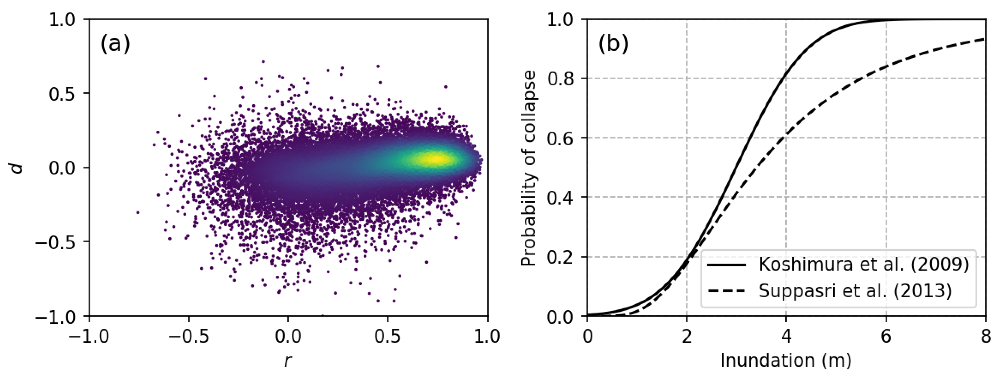
In this section, the proposed classification method is assessed by comparing its results with ground-truth data on damaged buildings provided by the Japanese Ministry of Land, Infrastructure, Transportation and Tourism (MLIT) [44]. The experiments were conducted on the same dataset used in [41]. The dataset was prepared from two TerraSAR-X images of the coastal area of Miyagi Prefecture (Figure 2b) and a geocoded building footprint inventory. The images were recorded on 12 October 2010 and 13 March 2011, and thus, this dataset can be used to extract infrastructural damage caused by the Great East Japan Earthquake and Tsunami, which occurred on 11 March 2011. The dataset contains 31,262 samples (N = 31,262), each representing a building located in the affected area, with two features per sample (). The first feature is the average difference in backscattering (d) between the two TerraSAR-X images within a rectangular box that contains the building’s footprint. To ensure the inclusion of layover and shadowing effects, a minimum distance of 5 m was established between the edges of the rectangular box and the building footprint. The second feature is the correlation coefficient (r) between the pixels of the two images located inside the same rectangular box. Thus, each vector sample has the form . Figure 3a shows a scatter plot of the bi-dimensional dataset, in which the colored marks represent the sample density.
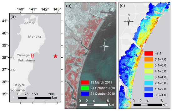
Figure 2.
Study area. (a) Location of the coastal area of Miyagi Prefecture (red rectangle) within the Tohoku region of Japan; (b) RGB color composite of the TerraSAR-X images acquired on 13 March 2011 (red) and 21 October 2010 (green and blue); (c) Inundation depth map of the Great East Japan Earthquake and Tsunami. The inundation values are given in units of meters.
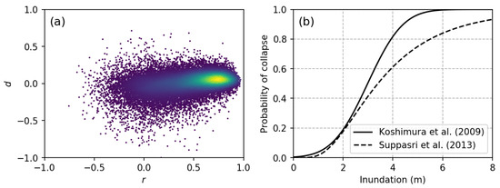
Figure 3.
(a) Scatter plot of the bi-dimensional dataset composed of r and d values. The colored marks denote the densities at the corresponding points; (b) Empirical fragility functions of buildings that collapse due to a tsunami event as proposed by Koshimura et al. [26] (solid line) and by Suppasri et al. [28] (dashed line).
For the estimation of the probability of collapse for each sample (), the spatial distribution of the hazard, i.e., the inundation depth (Figure 2c), and a fragility curve for building collapse (Figure 3b) were used. Two cases were analyzed in this study. In the first case, the fragility curve proposed by Koshimura et al. [26] was employed. In the second case, the fragility curve proposed by Suppasri et al. [28] was used. Based on the geolocation of each sample , its inundation depth was extracted from Figure 2c. Then, was calculated using one of the fragility functions (Figure 3b).
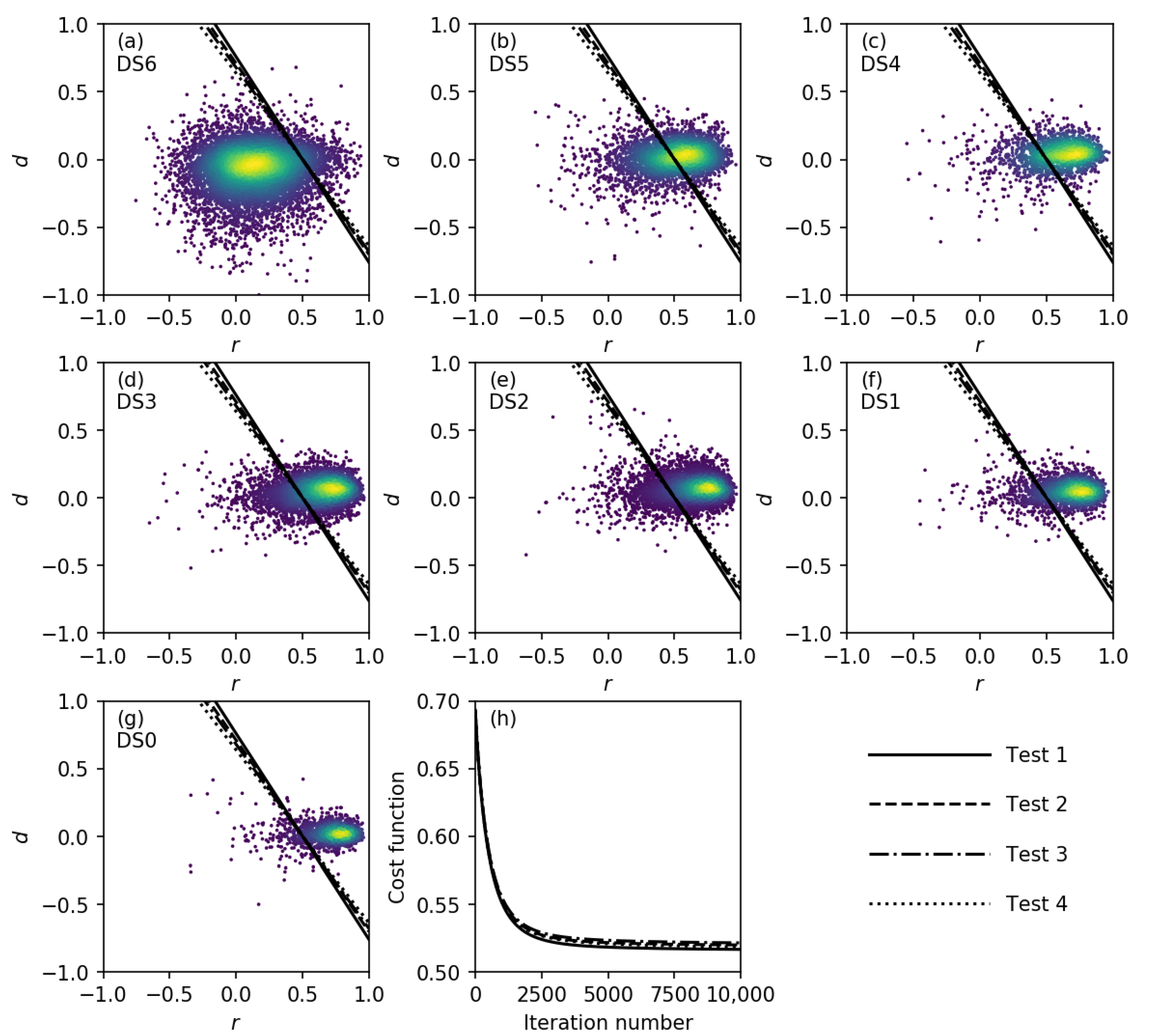
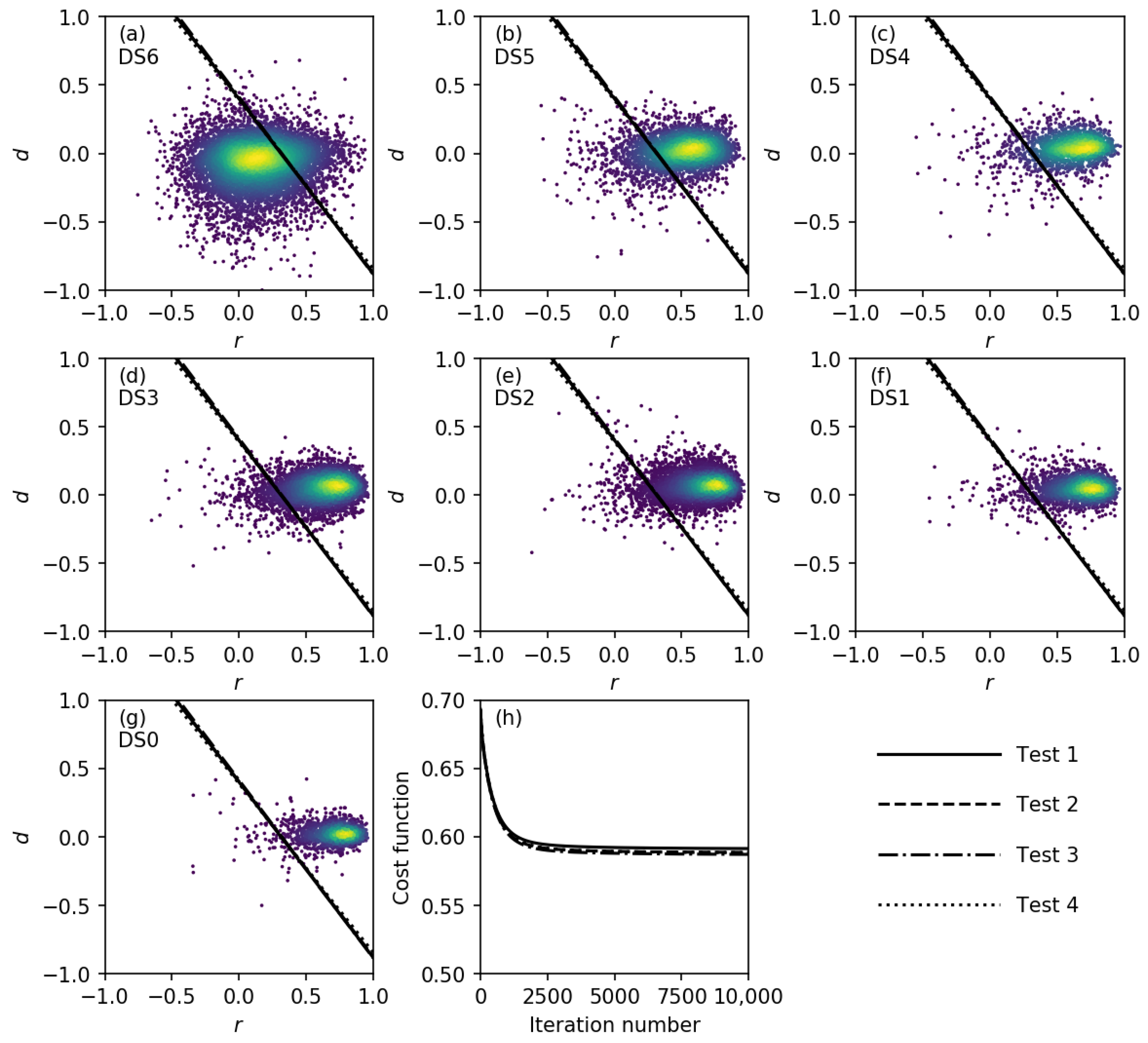
For the calibration of the discriminant function using the IHF classification method, it is necessary to use samples that exhibit a uniform distribution with respect to the hazard. Thus, the samples were grouped according to their inundation depth in ranges corresponding to multiples of 50 cm. Then, from each of the first 14 groups, 373 samples were randomly extracted. Thus, a total of 5222 samples was used for discriminant function calibration. The discriminant functions obtained for the first case (i.e., with the fragility function of Koshimura et al. [26]) are displayed in Figure 4. The entire dataset (31,262 samples) was grouped in accordance with the damage state as reported in the survey conducted by MLIT [44]. Seven damage state (DS) levels, from DS0 (undamaged) to DS6 (washed away), were defined in this field survey. Figure 4a–g show the scatter plots of the samples separated by DS together with the resulting discriminant functions. As previously, the colored marks denote the density of the samples. To investigate the effects of the random sampling, the IHF method was performed several times, and the differences among the results are barely noticeable, as seen from Figure 4a–g, where the discriminant functions from four different tests are shown. Thus, it was concluded that the effect of the random sampling was insignificant. The gradient descent algorithm was employed to solve Equation (4). A learning rate () of 0.05 was used. For every test, the initial vector was composed of zeros, that is, . Figure 4h shows the variations of throughout the successive iterations. Convergence was reached after approximately 3000 iterations. From a qualitative evaluation, it is evident that the discriminant function separates the majority of the DS6 samples from the rest. To provide a quantitative evaluation, Table 1 presents the confusion matrix. To calculate the overall accuracy (OA), all samples with damage states from DS0–DS5 were merged. The results indicate an OA of 82.2% and a Cohen’s kappa coefficient of 0.62. The producer accuracies (PAs) for samples with different DSs were also calculated. A high PA is observed for samples with damage states from DS0–DS3. By contrast, the lowest PAs are observed for samples of DS4–DS5.

Figure 4.
Discriminant functions obtained using the fragility function of Koshimura et al. [26]. (a–g) Scatter plots of the bi-dimensional dataset separated by damage state (DS), together with the obtained discriminant functions; (h) Variations of the cost function () throughout the iterative gradient descent algorithm.

Table 1.
Accuracy evaluation of the classification results for collapsed and non-collapsed buildings obtained using a linear discriminant function based on the fragility function of Koshimura et al. [26]. NC: non-collapsed; C: collapsed; DS: damage state; PA: producer accuracy; UA: user accuracy.
Similarly, the results obtained using the fragility function of Suppasri et al. [28] are displayed in Figure 5 and Table 2. The same parameters and original conditions as the previous case were employed here. Again, the effect of the random sampling was irrelevant. However, slightly faster convergence was observed. An OA of 87.5% and a Cohen’s kappa of 0.69 were achieved. In addition, high PA values with a minimum of 78.3% (for DS5) were achieved.
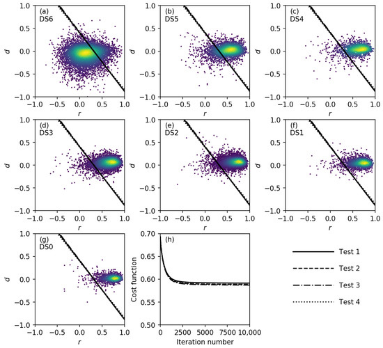
Figure 5.
Discriminant functions obtained using the fragility function of Suppasri et al. [28]. (a–g) Scatter plots of the bi-dimensional dataset separated by DS, together with the obtained discriminant functions; (h) Variations of the cost function () throughout the iterative gradient descent algorithm.
Table 2.
Accuracy evaluation of the classification results for collapsed and non-collapsed buildings obtained using a linear discriminant function based on the fragility function of Suppasri et al. [28].
3.2. Generalization of the Discriminant Function
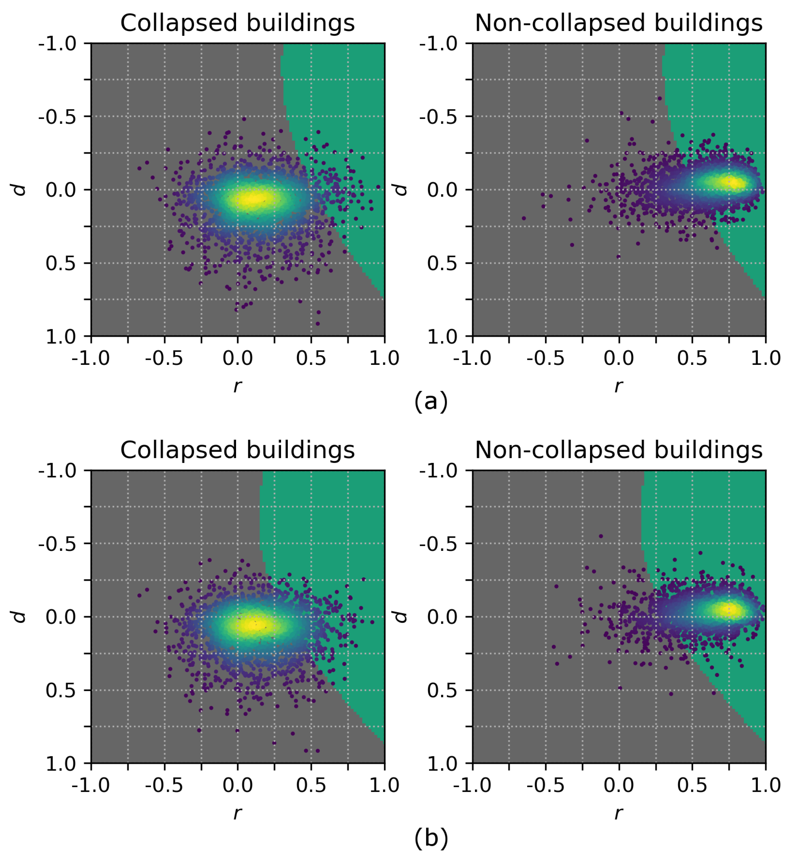
To prove that the IHF method retains the benefits of a traditional machine learning technique in terms of independence of dimensionality and discriminant function shape, two additional cases are presented. A modification of the discriminant function to consider non-linear terms can be easily implemented. For instance, let us add quadratic terms to our discriminant function (Equations (1) and (2)):
The resulting non-linear threshold is depicted in Figure 6, in which all samples with damage states from DS0–DS5 are presented as “non-collapsed buildings”. The confusion matrices are shown in Table 3 and Table 4, from which the same level of accuracy is observed as for the previous results.
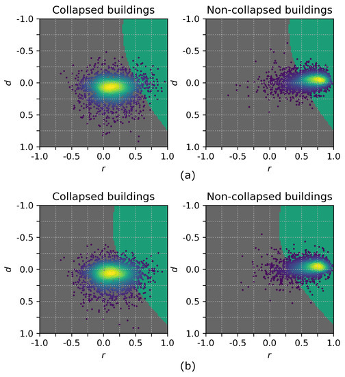
Figure 6.
Non-linear discriminant functions calculated from the fragility functions of (a) Koshimura et al. [26] and (b) Suppasri et al. [28].
Table 3.
Accuracy evaluation of the classification results for collapsed and non-collapsed buildings obtained using a non-linear discriminant function based on the fragility function of Koshimura et al. [26].
Table 4.
Accuracy evaluation of the classification results for collapsed and non-collapsed buildings obtained using a non-linear discriminant function based on the fragility function of Suppasri et al. [28].
In a similar way, the number of features considered can be increased. Figure 7 presents the parallel coordinate plot of a dataset composed of seven features: the correlation coefficient (r), the mean difference (d), the median difference, the mode of the differences, the standard deviation of the difference, the maximum value of the differences and the minimum value of the differences. The additional five features were calculated using the same TerraSAR-X images and the same rectangular boxes for the samples. With these features, the discriminant function is modified as follows:
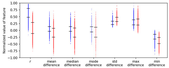
Figure 7.
Parallel coordinate plot of seven normalized features. Red and blue marks denote samples classified as collapsed and non-collapsed buildings, respectively. The black ticks delimit the range of for each normalized feature.
In Figure 7, the red marks correspond to the samples classified as collapsed buildings. Likewise, the blue marks denote the samples classified as non-collapsed buildings. Note that all features have been normalized with respect to the maximum absolute value. The confusion matrix is shown in Table 5.
Table 5.
Accuracy evaluation of the classification results for collapsed and non-collapsed buildings obtained from a 7-dimensional dataset using a non-linear discriminant function based on the fragility function of Suppasri et al. [28].
3.3. Discussion of the Case Study
In this section, additional comments regarding the results are addressed. In the experimental analysis, the effect of the fragility curve was observed by comparing the results obtained using the fragility curve of Koshimura et al. [26] and that of Suppasri et al. [28]. The reason why the fragility curve of Suppasri et al. [28] resulted in better performance is attributed to the fact that it was created specifically for Japanese buildings. By contrast, Koshimura et al. [26] proposed fragility curves for buildings in Indonesia. Thus, it can be seen that to achieve the best performance, it is necessary to use a fragility function designed for the specific target area. This issue might represent an important pitfall. However, at present, there is a significant number of publications concerning building damage functions for specific regions. For instance, tsunami fragility functions have been proposed for the building stocks in Sri Lanka [45], Chile [27], Thailand [46] and Samoa [47,48]. Likewise, earthquake fragility functions have been reported for Japan [24] and South America [49]. Another issue is the number of fragility functions used in the case study. According to the building inventory data within the affected area, 23,767 (89.7%) wooden buildings, 1753 (6.6%) steel-frame buildings and 975 (3.7%) reinforced concrete buildings were identified. Furthermore, buildings with less than two floors represent 99% of the total. Based on these aggregates, it was assumed that the majority of the affected buildings were wooden buildings. Therefore, only one fragility curve was employed in each test. However, in most possible applications, a large variety of building types might be found, and it is essential to point out that only one fragility function may be insufficient.
With respect to the calculation of the features, it was decided to use a bigger region than the building footprint in order to consider the shadowing and layover effects. As a secondary effect, some pixels of neighboring buildings were included, as well. However, the features r and d are aggregate values of the rectangular box used for their calculations. Thus, it should not affect the results significantly. This assumption is confirmed from Figure 4 and Figure 5, in which the collapsed and non-collapsed buildings are grouped in different regions.
Regarding the low accuracy observed for the samples classified as DS5 (Figure 4 and Figure 5 and Table 1, Table 2, Table 3, Table 4 and Table 5), according to MLIT, a building was classified as DS5 when its main structure had been compromised. Thus, it is very likely that the DS5 samples might include both collapsed and non-collapsed buildings. However, in the accuracy evaluation, all DS5 samples were assumed to be non-collapsed buildings. This assumption might be the reason for the low accuracy on the DS5 samples, which, in turn, was the main reason for the low user accuracy (UA). Another source of misclassification in the results is the presence of speckle noise in the SAR images. The speckle noise is associated with constructive and/or destructive interference of the reflected electromagnetic waves from different objects within a pixel. The TerraSAR-X images have been speckle filtered; however, it cannot be completely removed. Its effect is reflected in the features r and d, as can be shown in Figure 4, where some samples of collapsed and non-collapsed buildings are overlapped.
A comparison with classification methods based on supervised machine learning is desirable here. The results of Wieland et al. [16] and Bai et al. [22] were chosen for this purpose. Both research groups used the same TerraSAR-X images as in the present study. Moreover, the same information from MLIT was used to create the training data. However, the features (i.e., the elements of the vector ) were calculated following a different procedure. Thus, the comparison here should be considered only for reference. It cannot be concluded that one method is superior to the other. In addition to the images used in our case study, Wieland et al. [16] used three further SAR images: a TerraSAR-X image acquired on 19 June 2011 and two ALOS PALSAR images acquired on 5 October 2010 and 7 April 2011. Wieland et al. [16] performed several tests to assess the effects of the number of images, the number of features, etc. For the present comparison, the results they obtained using the same images as in our study are used. Table 6 shows the evaluation of the classification performance. Here, the user accuracy (UA), producer accuracy (PA) and a combination of both scores () are presented as accuracy measures [50]. The last row (Total) lists the average scores for the collapsed and non-collapsed samples. Our results show the same level of accuracy as the results of Wieland et al. [16]. Bai et al. [22] addressed a more challenging problem, namely the detection of damaged buildings based on post-event imagery only. Moreover, three classes were defined: washed-away buildings, collapsed buildings and slightly damaged buildings. Deep neural networks were used for classification. The training samples were based on tiles, to which class labels were allocated in accordance with the label of the majority of the buildings in each tile. An overall accuracy of 74.8% and a Cohen’s kappa coefficient of 0.60 were achieved. Once again, our results reach a comparable level of accuracy (Table 1, Table 2, Table 3, Table 4 and Table 5). Before concluding these comparisons, it is worthwhile to recall that the training data in both studies, those of Wieland et al. [16] and Bai et al. [22], were prepared using the information from the MLIT field survey [44], of which the first report was released on 23 August 2011, five months after the disaster event.
Table 6.
Performance comparison between the IHF method and that of Wieland et al. [16]. IHF, imagery, hazard and fragility.
Regarding run-time performance, the run-time strongly depends on the specific details of the hardware and compiler used for analysis. For this paper, the IHF method was implemented in the Python programming language, Version 2.7 [51], compiled with Microsoft Visual C++ 2008 for 32-bit systems. The Numerical Python (NumPy) library [52] was used to vectorize the calculations. The classifications reported in this case study were performed on an HP Z240 SFF Workstation (3.70 GHz). The calibration of the linear threshold function from the bi-dimensional dataset as presented in Section 3.1 took 8.98 s; the calibration of the non-linear threshold function from the bi-dimensional dataset (Section 3.2) took 9.05 s; and the calibration of the linear threshold function from the seven-dimensional dataset (Section 3.2) took 11.54 s. These observed run-times are negligible compared with the time required for the acquisition of the SAR imagery. However, the run-time can still be significantly reduced, and this will be addressed in a future publication. For instance, Python, being an interpreted language, exhibits lower performance than a compiled language, such as C++ or Fortran. Moreover, note that the run-times shown represent the time required for 10,000 iterations (Figure 4h and Figure 5h), which would not be necessary if the convergence were to be controlled in the algorithm. Furthermore, the gradient descent method for minimizing could be replaced with a more complex algorithm, in which, for instance, the learning rate ( in Equation (6)) could be manipulated during run-time to achieve faster convergence.
4. Conclusions and Prospects
A novel unsupervised building damage classification method called IHF has been defined and implemented. The IHF method is able to estimate which buildings have collapsed during a disaster event without any training samples and therefore can be used to achieve a quick response. The method is able to overcome the difficulties encountered when using supervised machine learning techniques while maintaining some of their advantages, such as the capacity to adapt to n-dimensional problems and the possibility of using non-linear discriminant functions. In our approach, training data are replaced with probabilistic information for each sample. The probability of collapse is estimated from the spatial distribution of the hazard under consideration and one or more fragility functions. The approach is based on a modification of the well-known logistic regression technique, a standard machine learning algorithm.
The IHF method was tested using data from the 2011 Great East Japan Earthquake and Tsunami. The features used in the analysis were collected from a pair of TerraSAR-X satellite images recorded before and after the event. The probability of collapse for each sample was calculated from the spatial distribution of the inundation depth and fragility curves for building collapse published in previous studies. The collapsed building estimates obtained using the calibrated discrimination function displayed good agreement with the results of a field survey performed by the Ministry of Land, Infrastructure, Transportation and Tourism. The overall accuracy and the Cohen’s kappa coefficient were greater than 81% and 0.61, respectively.
In principle, the IHF method can be embedded into a quick response framework for large-scale disasters. To this end, the calculation of the spatial distribution of the hazard must be implemented, as well. Currently, such hazard distributions can be calculated via instrumentation, numerical simulations or a combination of the two. Therefore, this requirement does not represent a limitation. Furthermore, a geocoded building database with a corresponding set of fragility functions must be available in advance and ready for use. It is intended that the IHF method must be performed for every new event. That is, the discriminant function calibrated in the case study cannot be used in other tsunami cases.
In future studies, several issues must be addressed. It will be necessary to prove the reliability of the IHF method in other scenarios, such as earthquakes. Moreover, it will be necessary to perform a sensitivity analysis to analyze the effects of uncertainties in the features, the fragility functions and the hazard distribution. Furthermore, the use of a more robust non-linear discriminant function using kernels will be investigated.
Acknowledgments
This research was supported by the Japan Science and Technology Agency (JST) through the SICORPproject “Increasing Urban Resilience to Large Scale Disaster: The Development of a Dynamic Integrated Model for Disaster Management and Socio-Economic Analysis (DIM2SEA)” and the JST (CREST) Project (Grant Number JP-MJCR1411).
Author Contributions
Luis Moya, Erick Mas and Bruno Adriano conceived and designed the methodology; Luis Moya and Luis R. Marval Perez contributed in the development of the equations; Fumio Yamazaki and Shunichi Koshimura supervised and guided this research troughout every stage. Luis Moya wrote the paper.
Conflicts of Interest
The authors declare no conflicts of interest.
References
- Maruyama, Y.; Yamazaki, F.; Matsuzaki, S.; Miura, H.; Estrada, M. Evaluation of Building Damage and Tsunami Inundation Based on Satellite Images and GIS Data Following the 2010 Chile Earthquake. Earthq. Spectra 2012, 28, S165–S178. [Google Scholar] [CrossRef]
- Liu, W.; Yamazaki, F.; Gokon, H.; Koshimura, S. Extraction of Tsunami-Flooded Areas and Damaged Buildings in the 2011 Tohoku-Oki Earthquake from TerraSAR-X Intensity Images. Earthq. Spectra 2013, 29, S183–S200. [Google Scholar] [CrossRef]
- Hashemi-Parast, S.O.; Yamazaki, F.; Liu, W. Monitoring and evaluation of the urban reconstruction process in Bam, Iran, after the 2003 M w 6.6 earthquake. Nat. Hazards 2017, 85, 197–213. [Google Scholar] [CrossRef]
- Nakmuenwai, P.; Yamazaki, F.; Liu, W. Automated Extraction of Inundated Areas from Multi-Temporal Dual-Polarization RADARSAT-2 Images of the 2011 Central Thailand Flood. Remote Sens. 2017, 9, 78. [Google Scholar] [CrossRef]
- Moya, L.; Yamazaki, F.; Liu, W.; Yamada, M. Detection of collapsed buildings due to the 2016 Kumamoto, Japan, earthquake from Lidar data. Nat. Hazards Earth Syst. Sci. Discuss. 2017, 2017, 1–20. [Google Scholar] [CrossRef]
- Dong, L.; Shan, J. A comprehensive review of earthquake-induced building damage detection with remote sensing techniques. ISPRS J. Photogramm. Remote Sens. 2013, 84, 85–99. [Google Scholar] [CrossRef]
- Balz, T.; Liao, M. Building-damage detection using post-seismic high-resolution SAR satellite data. Int. J. Remote Sens. 2010, 31, 3369–3391. [Google Scholar] [CrossRef]
- Chen, Q.; Li, L.; Jiang, P.; Liu, X. Building collapse extraction using modified freeman decomposition from post-disaster polarimetric SAR image. In Proceedings of the 2016 IEEE International Geoscience and Remote Sensing Symposium (IGARSS), Beijing, China, 10–15 July 2016; pp. 5769–5772. [Google Scholar]
- Dong, H.; Xu, X.; Gui, R.; Song, C.; Sui, H. Metric learning based collapsed building extraction from post-earthquake PolSAR imagery. In Proceedings of the 2016 IEEE International Geoscience and Remote Sensing Symposium (IGARSS), Beijing, China, 10–15 July 2016; pp. 4742–4745. [Google Scholar]
- Bai, Y.; Adriano, B.; Mas, E.; Gokon, H.; Koshimura, S. Object-based Building Damage Assessment Methodology Using Only Post Event ALOS-2/PALSAR-2 Dual Polarimetric SAR Intensity Images. J. Disaster Res. 2017, 12, 259–271. [Google Scholar] [CrossRef]
- Gokon, H.; Koshimura, S.; Matsuoka, M. Object-Based Method for Estimating Tsunami-Induced Damage Using TerraSAR-X Data. J. Disaster Res. 2016, 11, 225–235. [Google Scholar] [CrossRef]
- Matsuoka, M.; Nojima, N. Building Damage Estimation by Integration of Seismic Intensity Information and Satellite L-band SAR Imagery. Remote Sens. 2010, 2, 2111–2126. [Google Scholar] [CrossRef]
- Karimzadeh, S.; Mastuoka, M. Building Damage Assessment Using Multisensor Dual-Polarized Synthetic Aperture Radar Data for the 2016 M 6.2 Amatrice Earthquake, Italy. Remote Sens. 2017, 9, 330. [Google Scholar] [CrossRef]
- Gokon, H.; Koshimura, S.; Meguro, K. Verification of a Method for Estimating Building Damage in Extensive Tsunami Affected Areas Using L-Band SAR Data. J. Disaster Res. 2017, 12, 251–258. [Google Scholar] [CrossRef]
- Liu, W.; Yamazaki, F. Extraction of collapsed buildings in the 2016 Kumamoto earthquake using multi-temporal PALSAR-2 data. J. Disaster Res. 2017, 12, 241–250. [Google Scholar] [CrossRef]
- Wieland, M.; Liu, W.; Yamazaki, F. Learning Change from Synthetic Aperture Radar Images: Performance Evaluation of a Support Vector Machine to Detect Earthquake and Tsunami-Induced Changes. Remote Sens. 2016, 8, 792. [Google Scholar] [CrossRef]
- Gokon, H.; Post, J.; Stein, E.; Martinis, S.; Twele, A.; Mück, M.; Geiß, C.; Koshimura, S.; Matsuoka, M. A Method for Detecting Buildings Destroyed by the 2011 Tohoku Earthquake and Tsunami Using Multitemporal TerraSAR-X Data. IEEE Geosci. Remote Sens. Lett. 2015, 12, 1277–1281. [Google Scholar] [CrossRef]
- Jia, L.; Li, M.; Wu, Y.; Zhang, P.; Chen, H.; An, L. Semisupervised SAR Image Change Detection Using a Cluster-Neighborhood Kernel. IEEE Geosci. Remote Sens. Lett. 2014, 11, 1443–1447. [Google Scholar] [CrossRef]
- Frank, J.; Rebbapragada, U.; Bialas, J.; Oommen, T.; Havens, T.C. Effect of Label Noise on the Machine-Learned Classification of Earthquake Damage. Remote Sens. 2017, 9, 803. [Google Scholar] [CrossRef]
- Janalipour, M.; Mohammadzadeh, A. A Fuzzy-GA Based Decision Making System for Detecting Damaged Buildings from High-Spatial Resolution Optical Images. Remote Sens. 2017, 9, 349. [Google Scholar] [CrossRef]
- Bai, Y.; Adriano, B.; Mas, E.; Koshimura, S. Machine Learning Based Building Damage Mapping from ALOS-2/PALSAR-2 SAR Imagery: Case Study of 2016 Kumamoto Earthquake. J. Disaster Res. 2017, 12, 646–655. [Google Scholar] [CrossRef]
- Bai, Y.; Gao, C.; Singh, S.; Koch, M.; Adriano, B.; Mas, E.; Koshimura, S. A Framework of Rapid Regional Tsunami Damage Recognition from Post-event TerraSAR-X Imagery Using Deep Neural Networks. IEEE Geosci. Remote Sens. Lett. 2018, 15, 43–47. [Google Scholar] [CrossRef]
- Ohta, Y.; Murakami, H.; Watoh, Y.; Koyama, M. A Model for Evaluating Life Span Characteristics of Entrapped Occupants by an Earthquake. In Proceedings of the 13th World Conference on Earthquake Engineering, Vancouver, BC, Canada, 1–6 August 2004; p. 9. [Google Scholar]
- Yamazaki, F.; Murao, O. Vulnerability Functions for Japanese Buildings Based on Damage Data from the 1995 Kobe Earthquake. In Implications of Recent Earthquakes on Seismic Risk; Imperial College Press: London, UK, 2000; Volume 2, pp. 91–102. [Google Scholar]
- Porter, K.; Kennedy, R.; Bachman, R. Creating Fragility Functions for Performance-Based Earthquake Engineering. Earthq. Spectra 2007, 23, 471–489. [Google Scholar] [CrossRef]
- Koshimura, S.; Oie, T.; Yanagisawa, H.; Imamura, F. Developing Fragility Functions For Tsunami Damage Estimation Using Numerical Model And Post-Tsunami Data From Banda Aceh, Indonesia. Coast. Eng. J. 2009, 51, 243–273. [Google Scholar] [CrossRef]
- Mas, E.; Koshimura, S.; Suppasri, A.; Matsuoka, M.; Matsuyama, M.; Yoshii, T.; Jimenez, C.; Yamazaki, F.; Imamura, F. Developing Tsunami fragility curves using remote sensing and survey data of the 2010 Chilean Tsunami in Dichato. Nat. Hazards Earth Syst. Sci. 2012, 12, 2689–2697. [Google Scholar] [CrossRef]
- Suppasri, A.; Mas, E.; Charvet, I.; Gunasekera, R.; Imai, K.; Fukutani, Y.; Abe, Y.; Imamura, F. Building damage characteristics based on surveyed data and fragility curves of the 2011 Great East Japan tsunami. Nat. Hazards 2013, 66, 319–341. [Google Scholar] [CrossRef]
- Cornell, C.A. Engineering seismic risk analysis. Bull. Seismol. Soc. Am. 1968, 58, 1583–1606. [Google Scholar]
- McGuire, R. Seismic Hazard and Risk Analysis; Engineering Monographs on Miscellaneous Earthquake Engineering Topics; Earthquake Engineering Research Institute: Oakland, CA, USA, 2004. [Google Scholar]
- Martinelli, A.; Cifani, G.; Cialone, G.; Corazza, L.; Petracca, A.; Petrucci, G. Building vulnerability assessment and damage scenarios in Celano (Italy) using a quick survey data-based methodology. Soil Dyn. Earthq. Eng. 2008, 28, 875–889. [Google Scholar] [CrossRef]
- Zülfikar, A.C.; Fercan, N.Ö.Z.; Tunç, S.; Erdik, M. Real-time earthquake shake, damage, and loss mapping for Istanbul metropolitan area. Earth Planets Space 2017, 69, 9. [Google Scholar] [CrossRef]
- Karimzadeh, S.; Feizizadeh, B.; Matsuoka, M. From a GIS-based hybrid site condition map to an earthquake damage assessment in Iran: Methods and trends. Int. J. Disaster Risk Reduct. 2017, 22, 23–36. [Google Scholar] [CrossRef]
- Frolova, N.I.; Larionov, V.I.; Bonnin, J.; Sushchev, S.P.; Ugarov, A.N.; Kozlov, M.A. Seismic risk assessment and mapping at different levels. Nat. Hazards 2017, 88, 43–62. [Google Scholar] [CrossRef]
- Moya, L.; Mas, E.; Koshimura, S. Evaluation of tsunami fragility curves for building damage level allocation. Res. Rep. Tsunami Eng. 2017, 34, 33–41. [Google Scholar]
- Shabestari, K.T.; Yamazaki, F. Near-fault spatial variation in strong ground motion due to rupture directivity and hanging wall effects from the Chi-Chi, Taiwan earthquake. Earthq. Eng. Struct. Dyn. 2003, 32, 2197–2219. [Google Scholar] [CrossRef]
- Kato, T.; Terada, Y.; Nishimura, H.; Nagai, T.; Koshimura, S. Tsunami records due to the 2010 Chile Earthquake observed by GPS buoys established along the Pacific coast of Japan. Earth Planets Space 2011, 63, e5–e8. [Google Scholar] [CrossRef]
- Ozawa, S.; Nishimura, T.; Suito, H.; Kobayashi, T.; Tobita, M.; Imakiire, T. Coseismic and postseismic slip of the 2011 magnitude-9 Tohoku-Oki earthquake. Nature 2011, 471, 373–376. [Google Scholar] [CrossRef] [PubMed]
- Matsuoka, M.; Yamamoto, N. Web-based Quick Estimation System of Strong Ground Motion Maps Using Engineering Geomorphologic Classification Map and Observed Seismic Records. In Proceedings of the 15th World Conference on Earthquake Engineering, Lisbon, Portugal, 24–28 September 2012; p. 10. [Google Scholar]
- Irikura, K.; Miyakoshi, K.; Kamae, K.; Yoshida, K.; Somei, K.; Kurahashi, S.; Miyake, H. Applicability of source scaling relations for crustal earthquakes to estimation of the ground motions of the 2016 Kumamoto earthquake. Earth Planets Space 2017, 69, 10. [Google Scholar] [CrossRef]
- Moya, L.; Mas, E.; Adriano, B.; Koshimura, S.; Yamazaki, F.; Liu, W. An Integrated Method to Extract Collapsed Buildings from Satellite Imagery, Hazard Distribution and Fragility Curves. Int. J. Disaster Risk Reduct. 2018. submitted. [Google Scholar]
- Alpaydin, E. Introduction to Machine Learning, 3rd ed.; The MIT Press: Cambridge, MA, USA, 2014; Chapter 10. [Google Scholar]
- Bishop, C.M. Pattern Recognition and Machine Learning (Information Science and Statistics); Springer-Verlag New York, Inc.: Secaucus, NJ, USA, 2006. [Google Scholar]
- Ministry of Land, Infrastructure, Transport and Tourism (MLIT). Results of the Survey on Disaster Caused by the Great East Japan Earthquake (First Report). Available online: http://www.mlit.go.jp/report/press/city07_hh_000053.html (accessed on 22 December 2017).
- Murao, O.; Nakazato, H. Vulnerability functions for buildings based on damage survey data in Sri Lanka after the 2004 Indian Ocean Tsunami. In Proceedings of the International Conference on Sustainable Built Environment (ICSBE-2010), Kandy, Sri Lanka, 13–14 December 2010; pp. 371–378. [Google Scholar]
- Suppasri, A.; Koshimura, S.; Imamura, F. Developing tsunami fragility curves based on the satellite remote sensing and the numerical modeling of the 2004 Indian Ocean tsunami in Thailand. Nat. Hazards Earth Syst. Sci. 2011, 11, 173–189. [Google Scholar] [CrossRef]
- Reese, S.; Bradley, B.A.; Bind, J.; Smart, G.; Power, W.; Sturman, J. Empirical building fragilities from observed damage in the 2009 South Pacific tsunami. Earth-Sci. Rev. 2011, 107, 156–173. [Google Scholar] [CrossRef]
- Gokon, H.; Koshimura, S.; Imai, K.; Matsuoka, M.; Namegaya, Y.; Nishimura, Y. Developing fragility functions for the areas affected by the 2009 Samoa earthquake and tsunami. Nat. Hazards Earth Syst. Sci. 2014, 14, 3231–3241. [Google Scholar] [CrossRef]
- Villar-Vega, M.; Silva, V.; Crowley, H.; Yepes, C.; Tarque, N.; Acevedo, A.B.; Hube, M.A.; Gustavo, C.D.; María, H.S. Development of a Fragility Model for the Residential Building Stock in South America. Earthq. Spectra 2017, 33, 581–604. [Google Scholar] [CrossRef]
- Fawcett, T. An introduction to ROC analysis. Pattern Recognit. Lett. 2006, 27, 861–874. [Google Scholar] [CrossRef]
- Python Software Foundation. Python Language Reference, Version 2.7. Available online: https://www.python.org/ (accessed on 22 December 2017).
- Oliphant, T.E. Guide to NumPy, 2nd ed.; CreateSpace Independent Publishing Platform: Austin, TX, USA, 2015. [Google Scholar]


© 2018 by the authors. Licensee MDPI, Basel, Switzerland. This article is an open access article distributed under the terms and conditions of the Creative Commons Attribution (CC BY) license (http://creativecommons.org/licenses/by/4.0/).