Indicators of Electric Power Instability from Satellite Observed Nighttime Lights

 ,
, 


Abstract
:
1. Introduction
2. Previous Studies
3. Methods
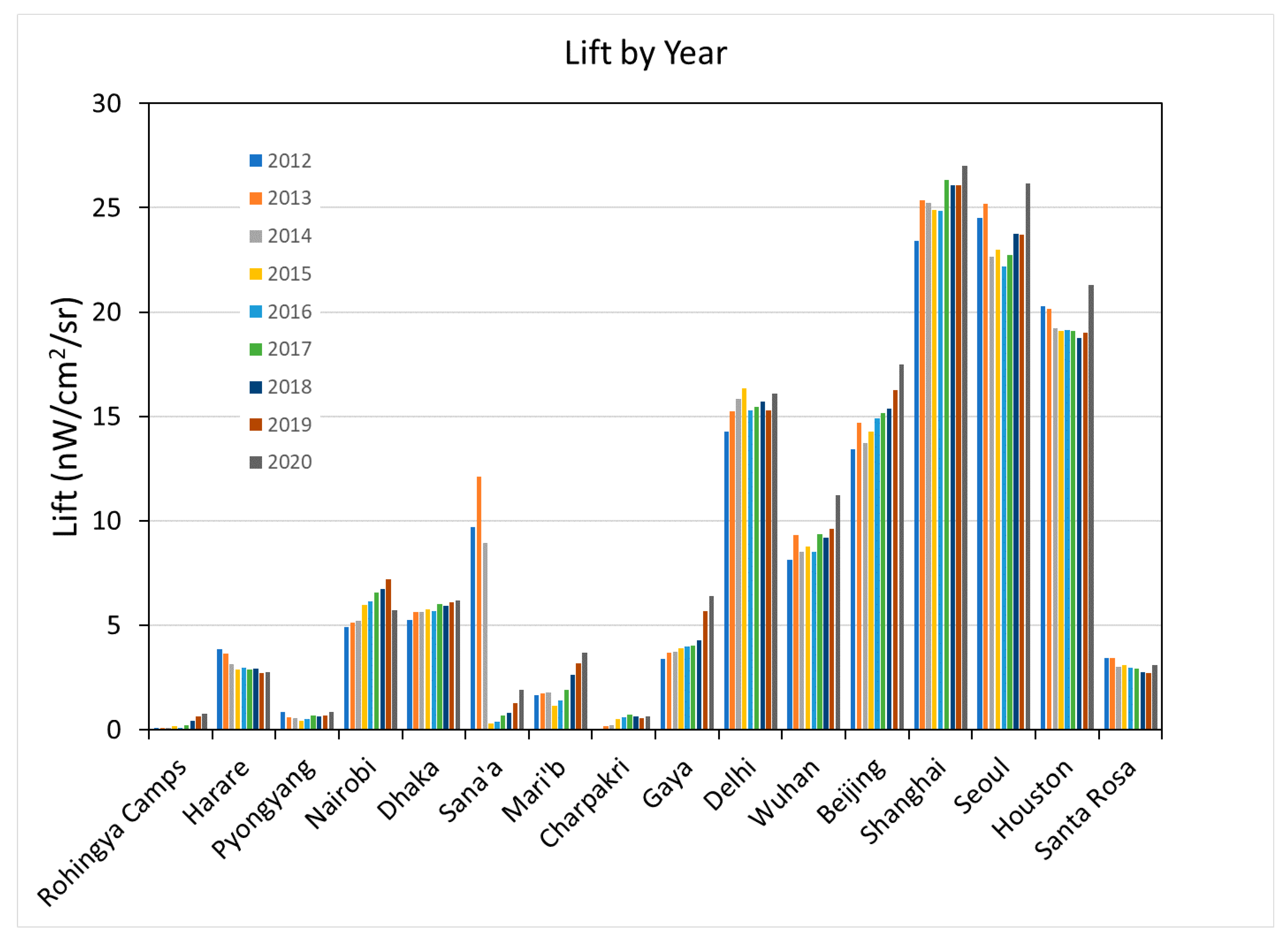
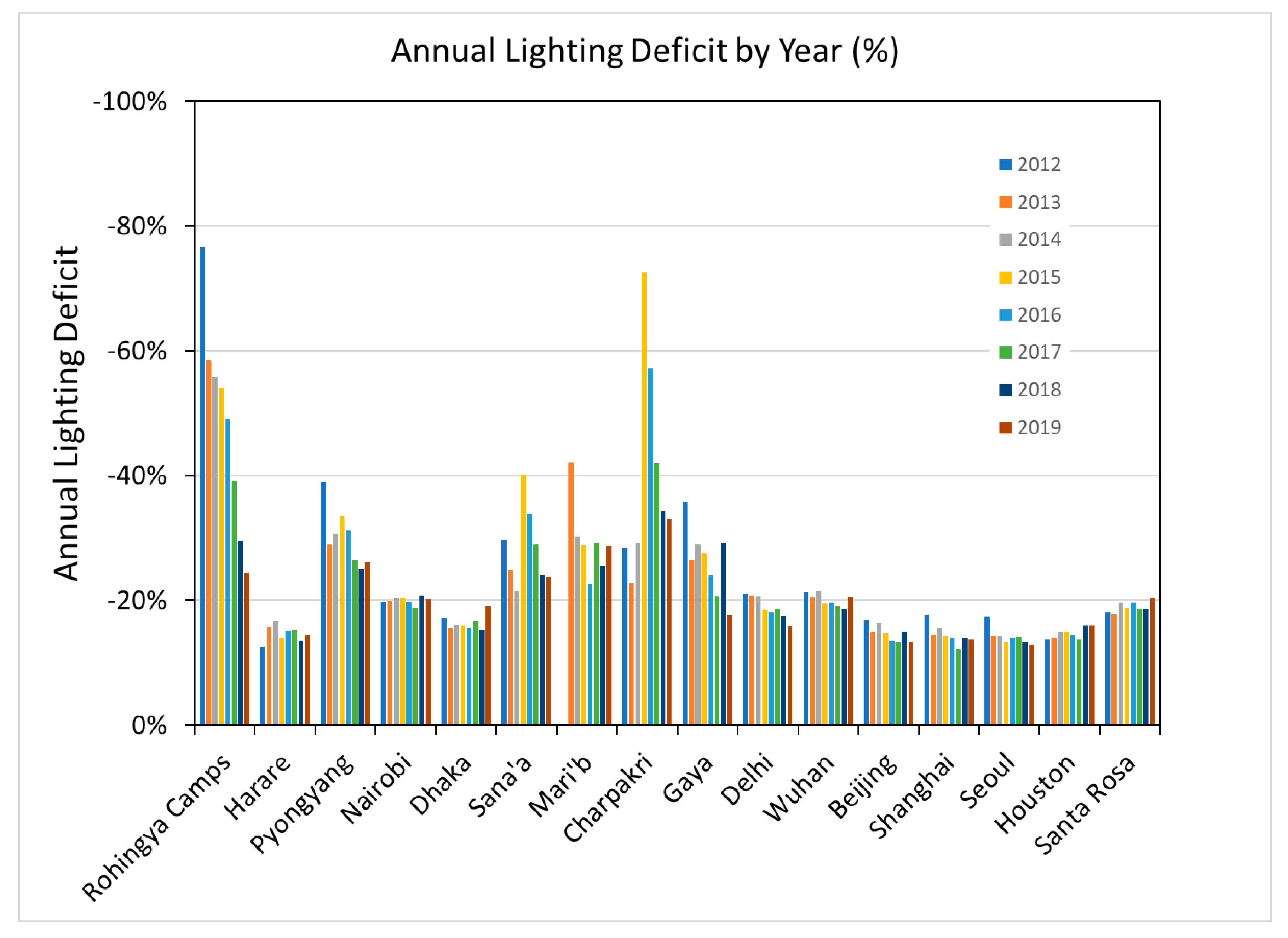
3.1. Study Sites and Data Extraction
3.2. Data Preprocessing
3.3. Overview of the Difference between Limited and Abundant Electric Power Supplies
3.4. Index Calculations
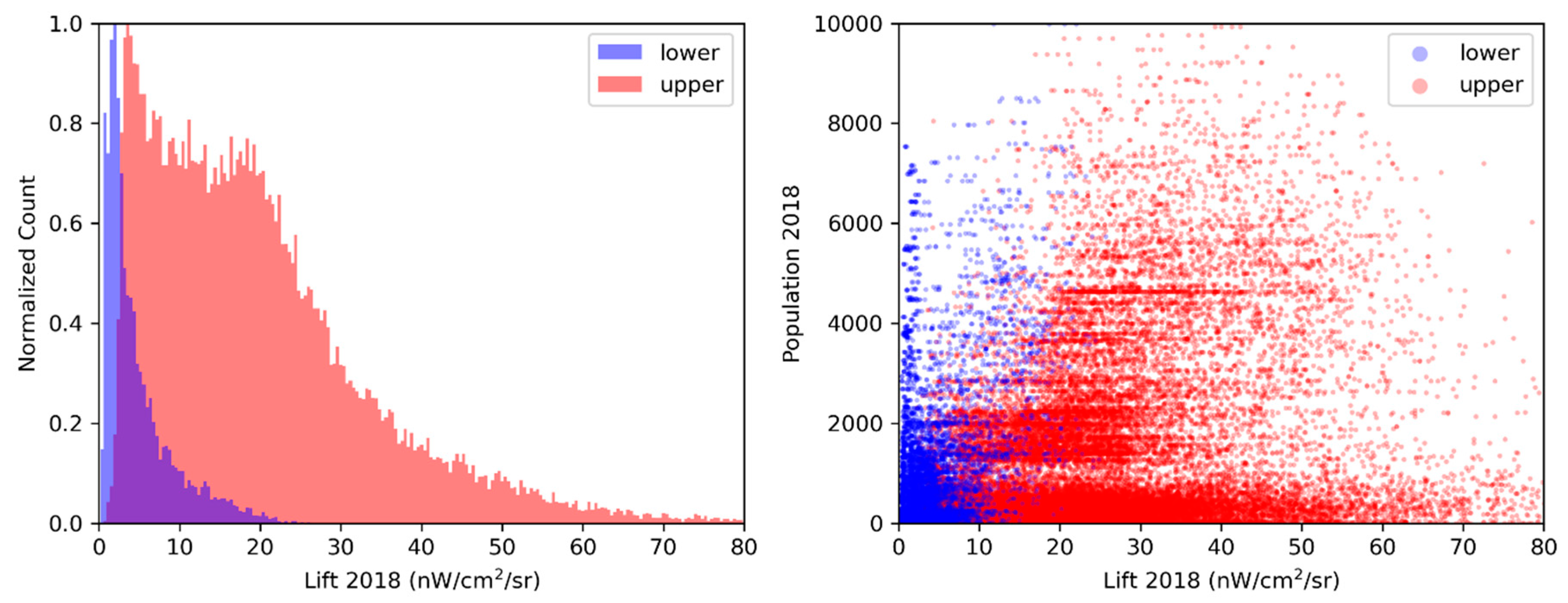
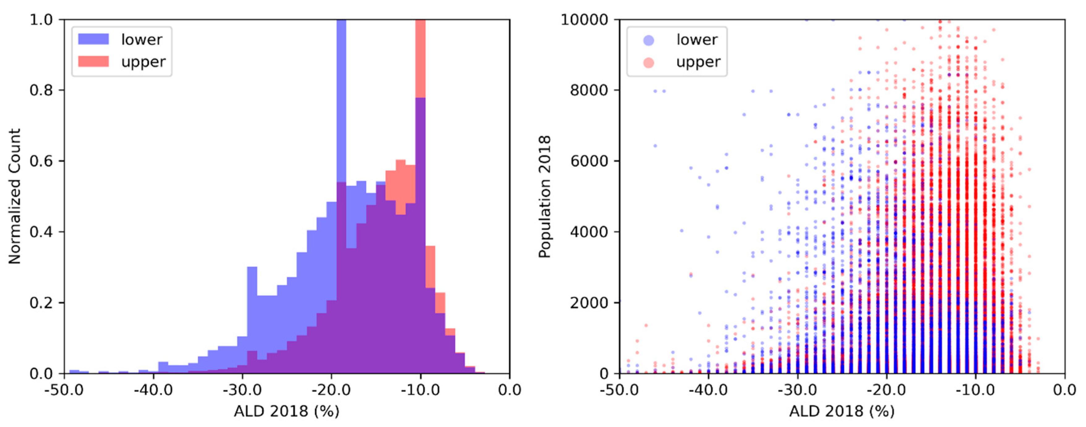
3.5. Data Analysis:
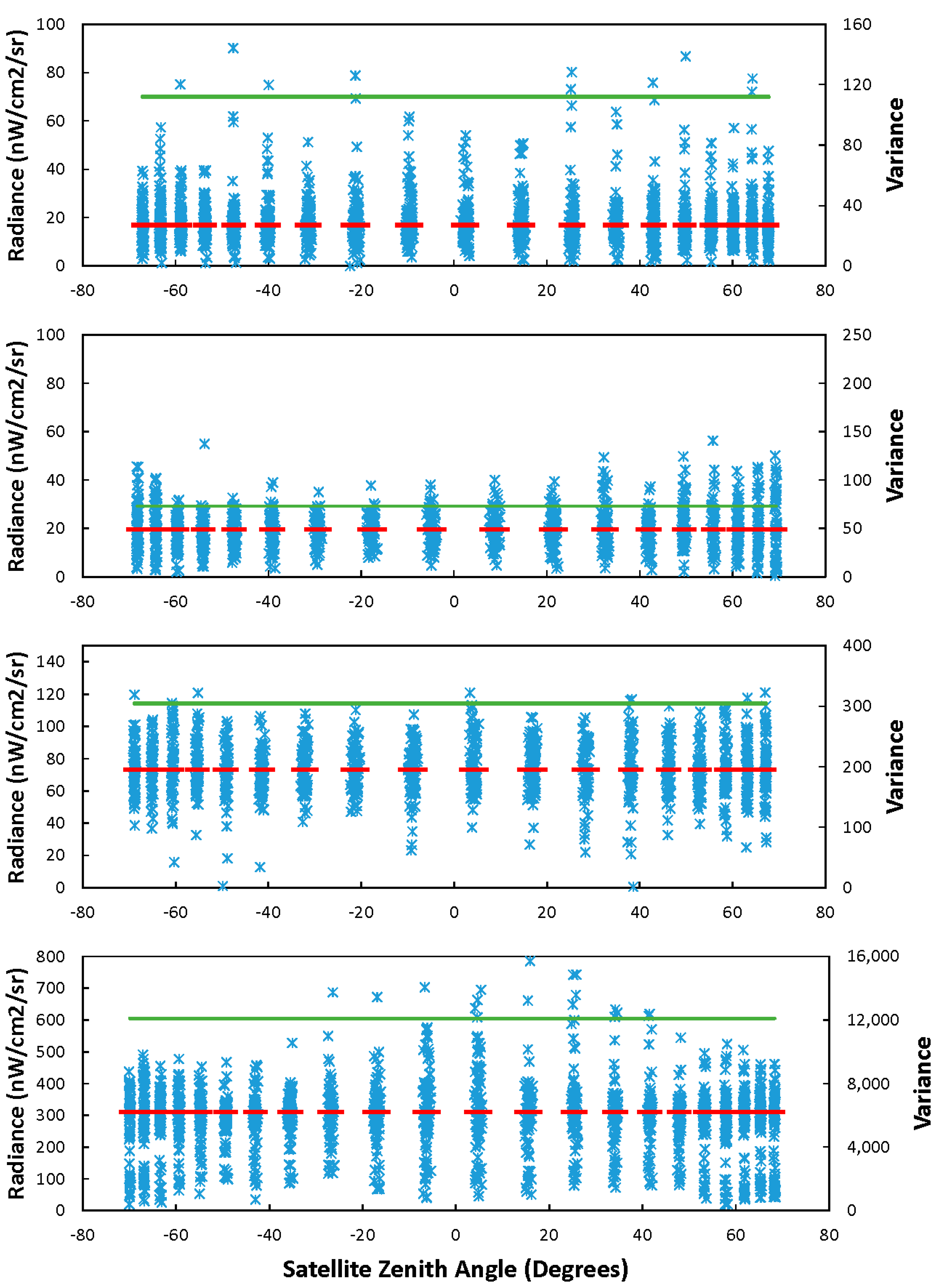
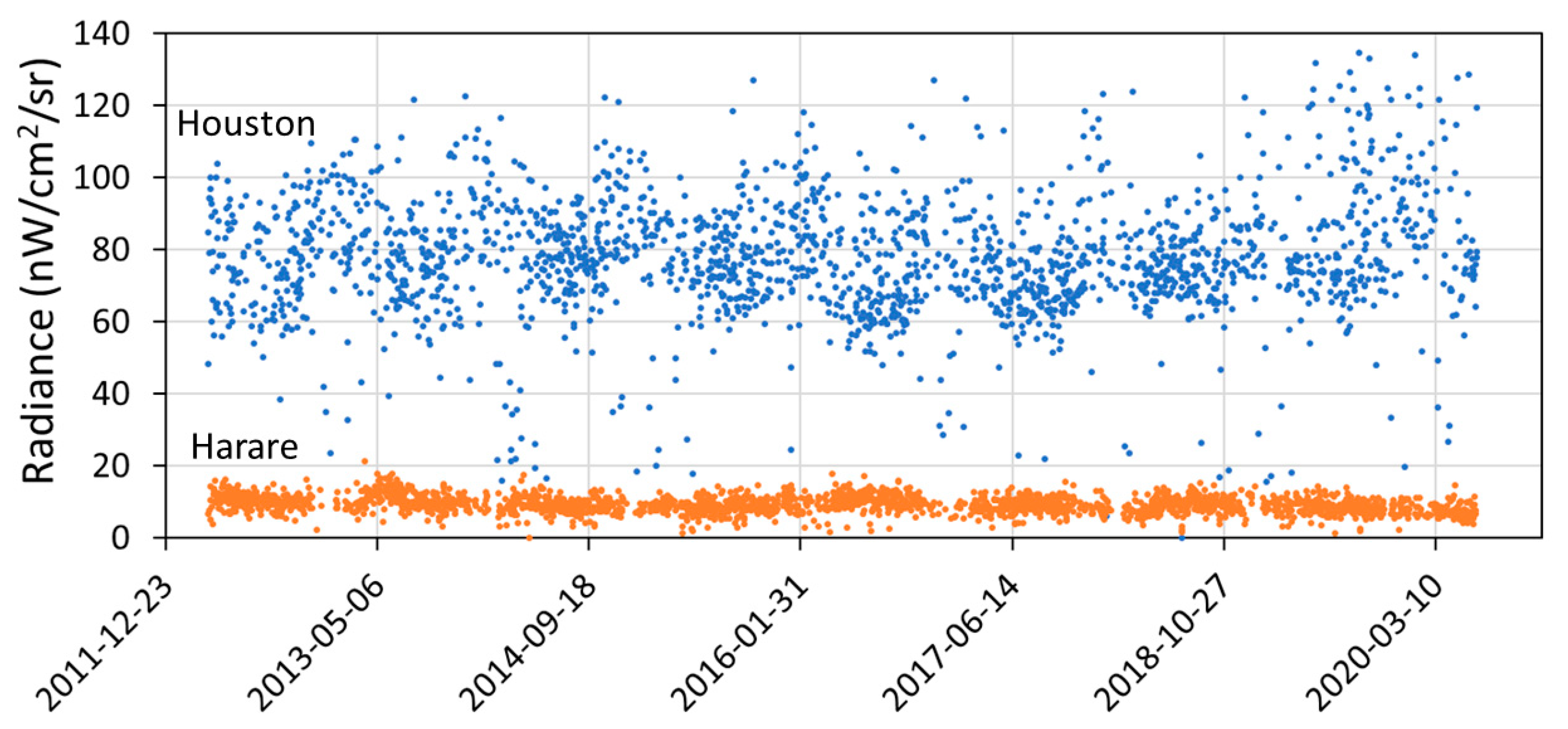
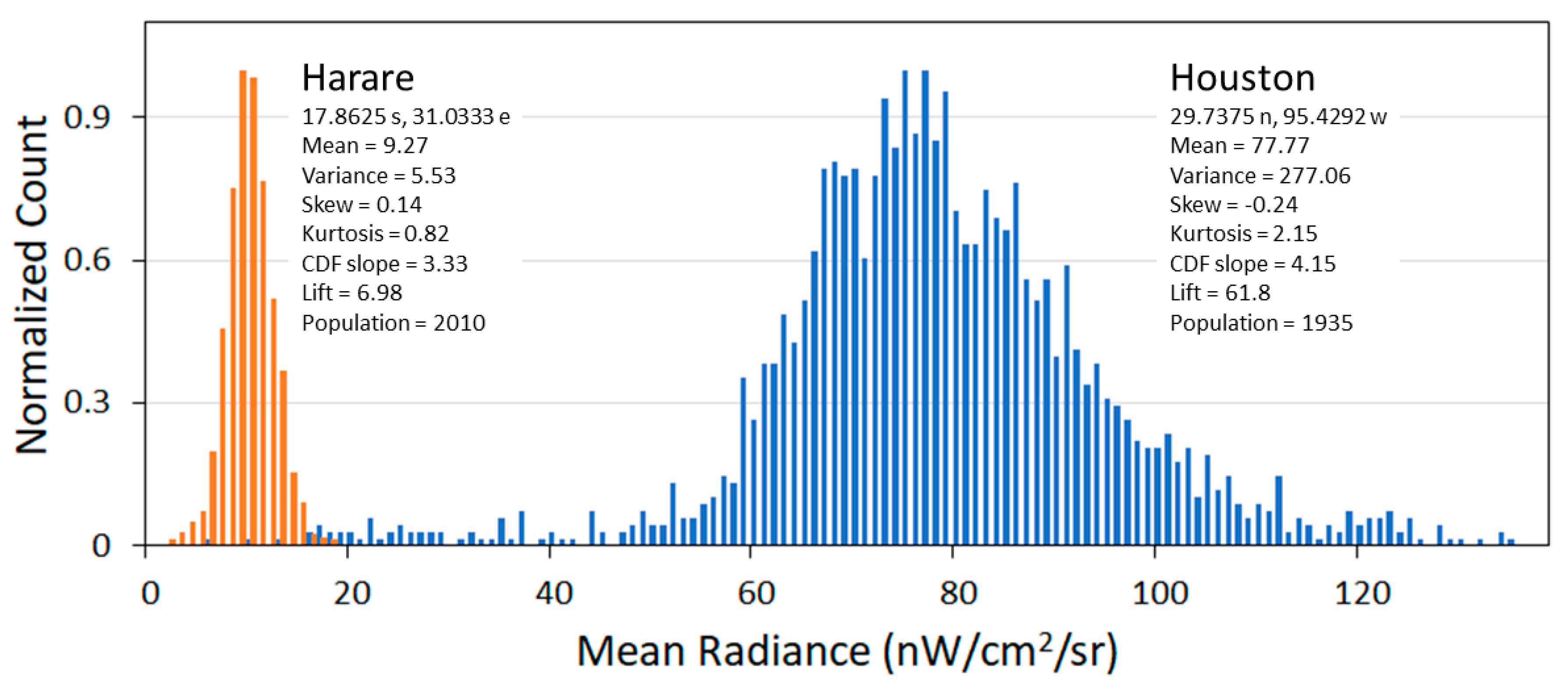
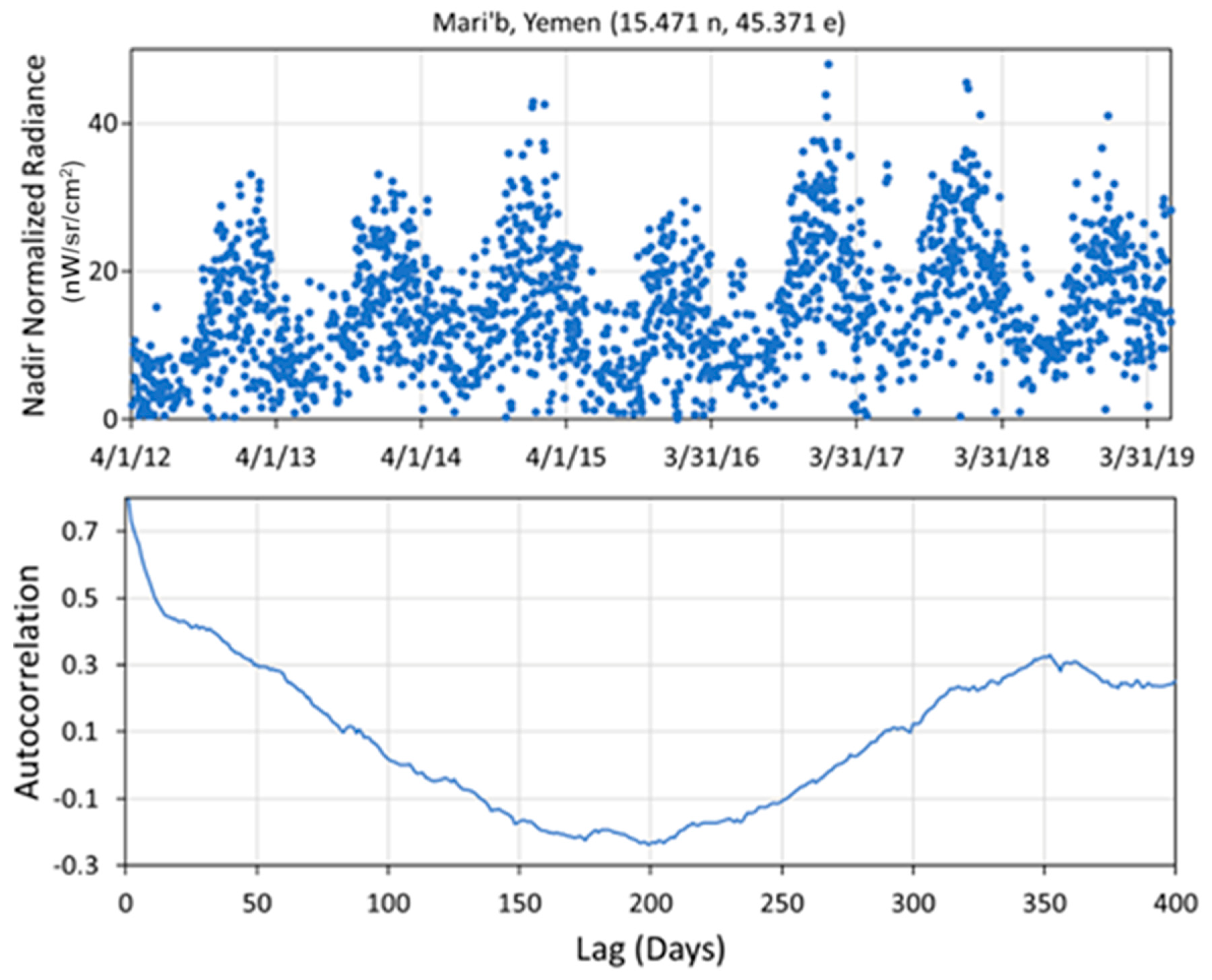
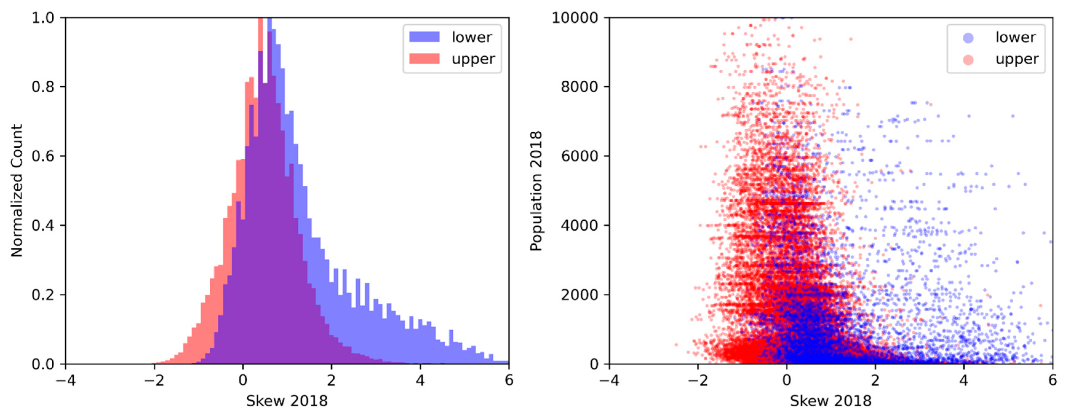
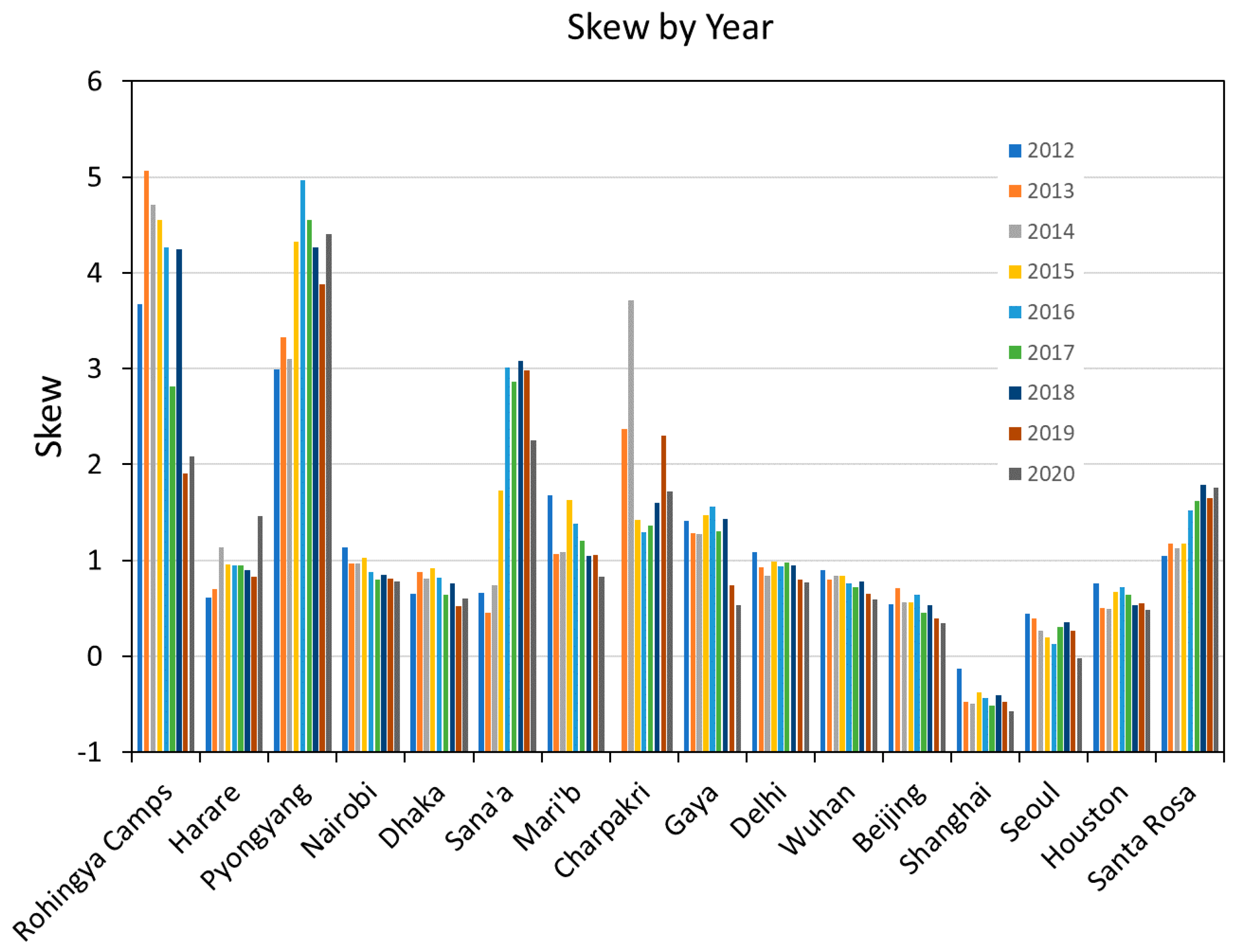
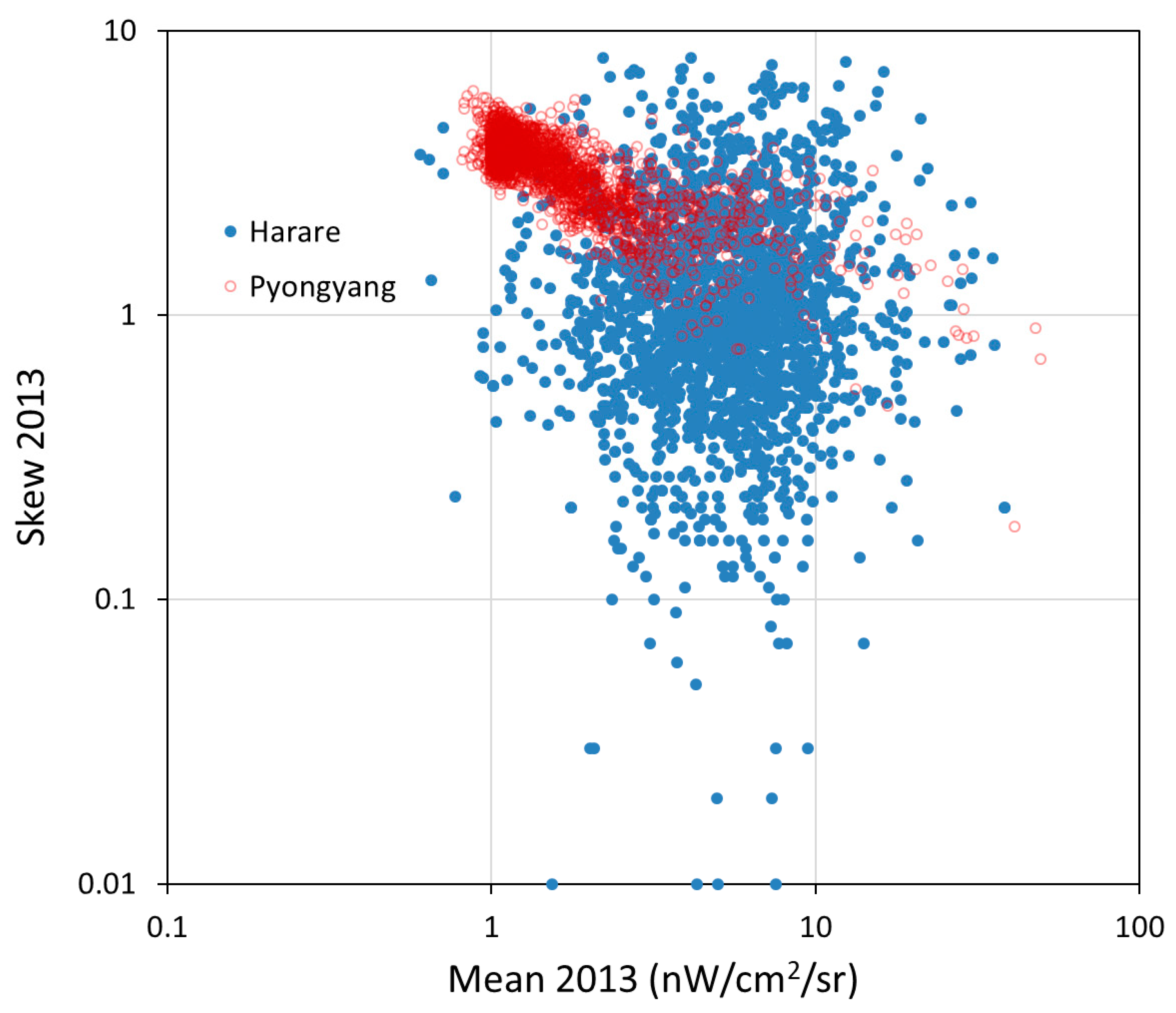
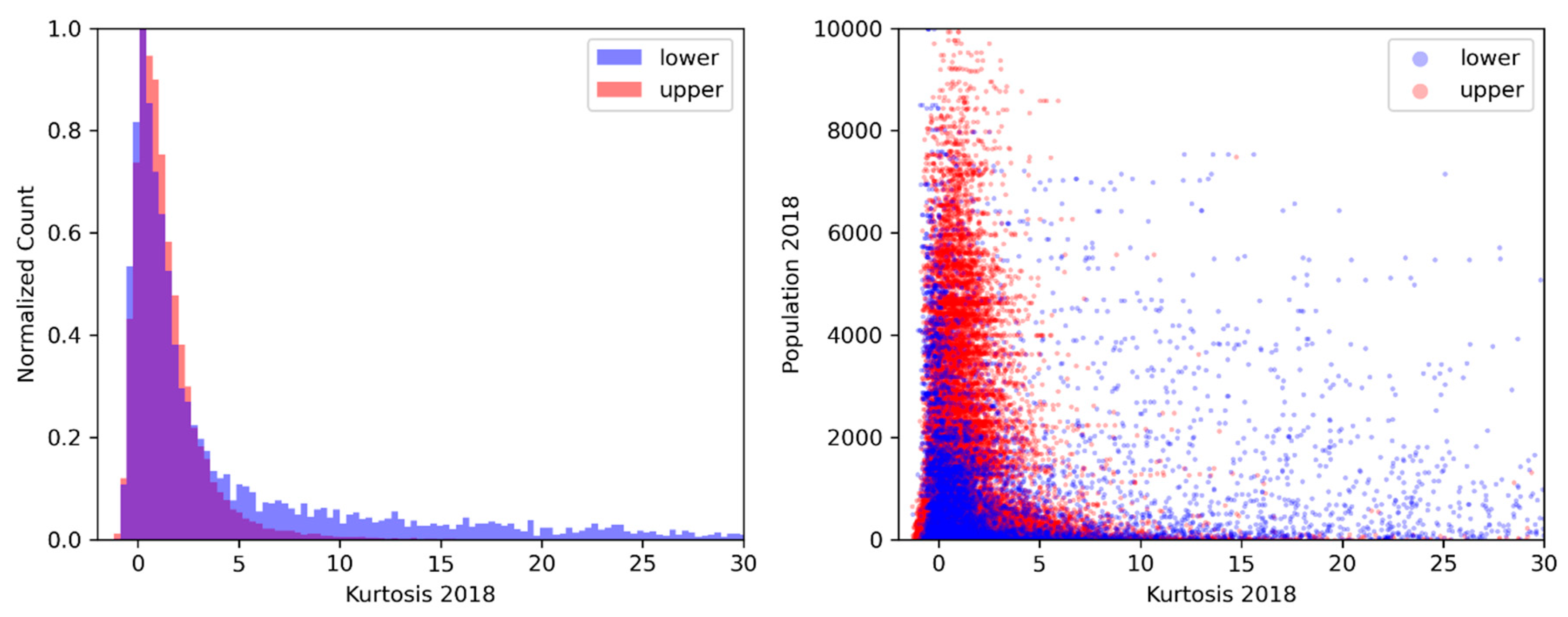
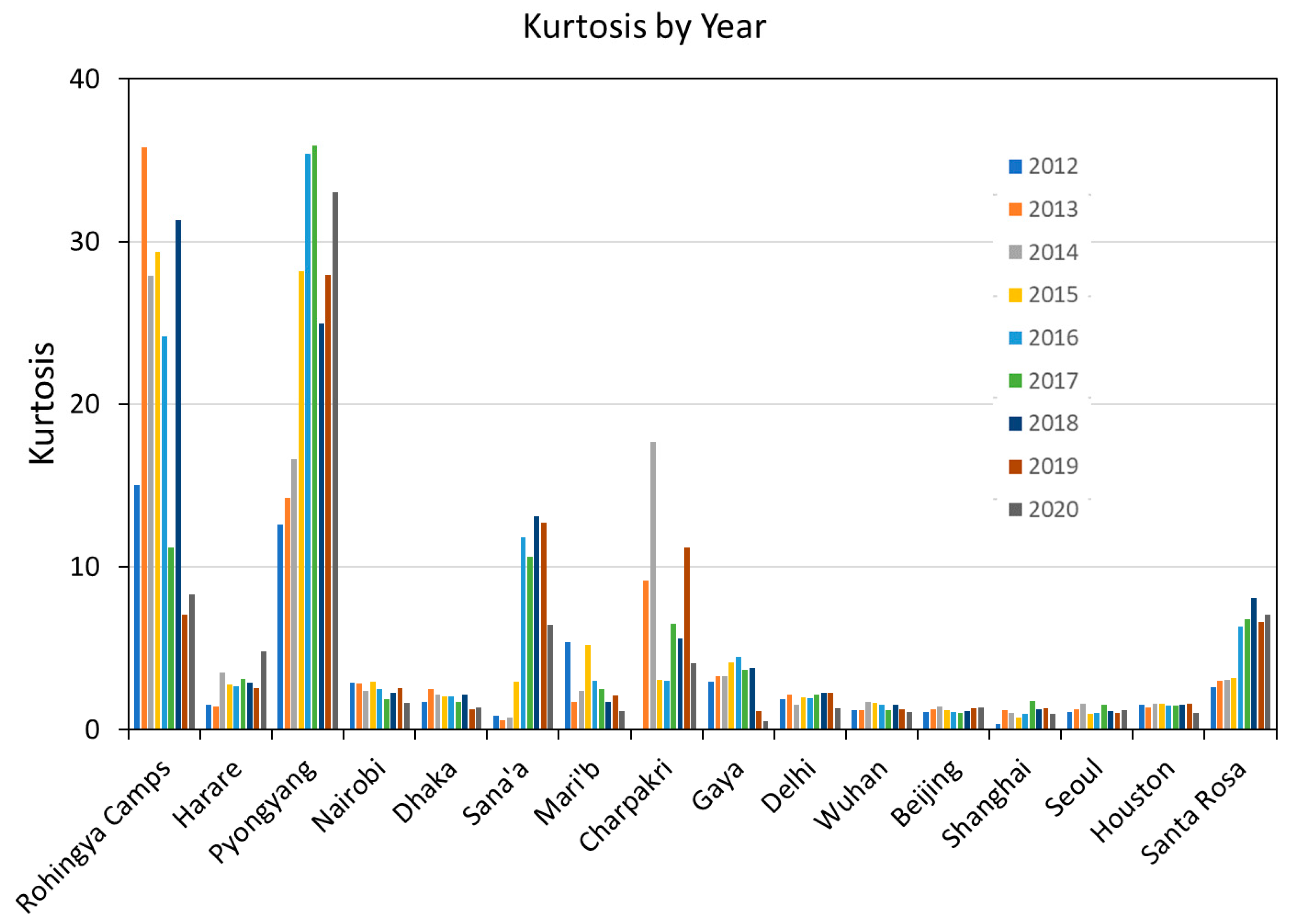
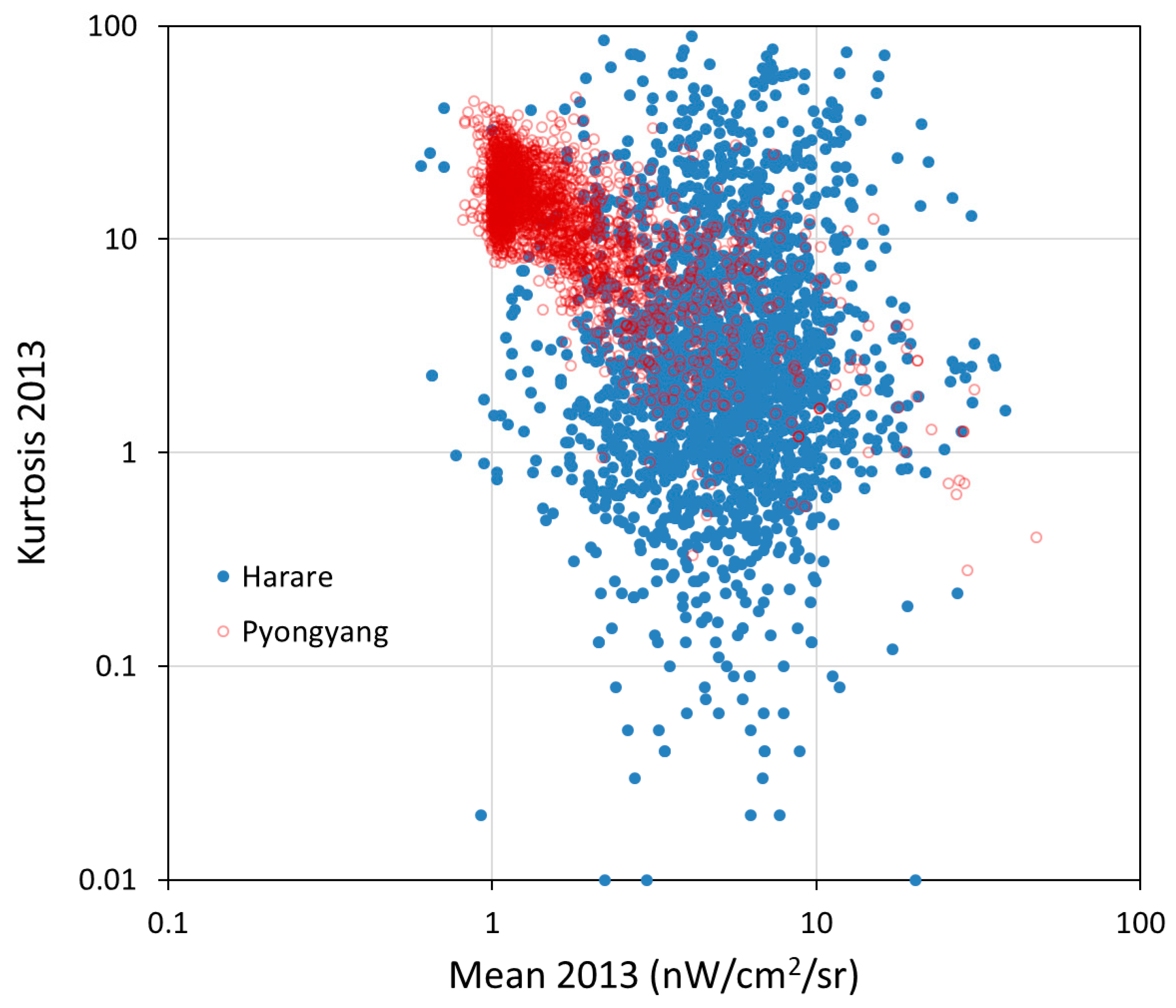
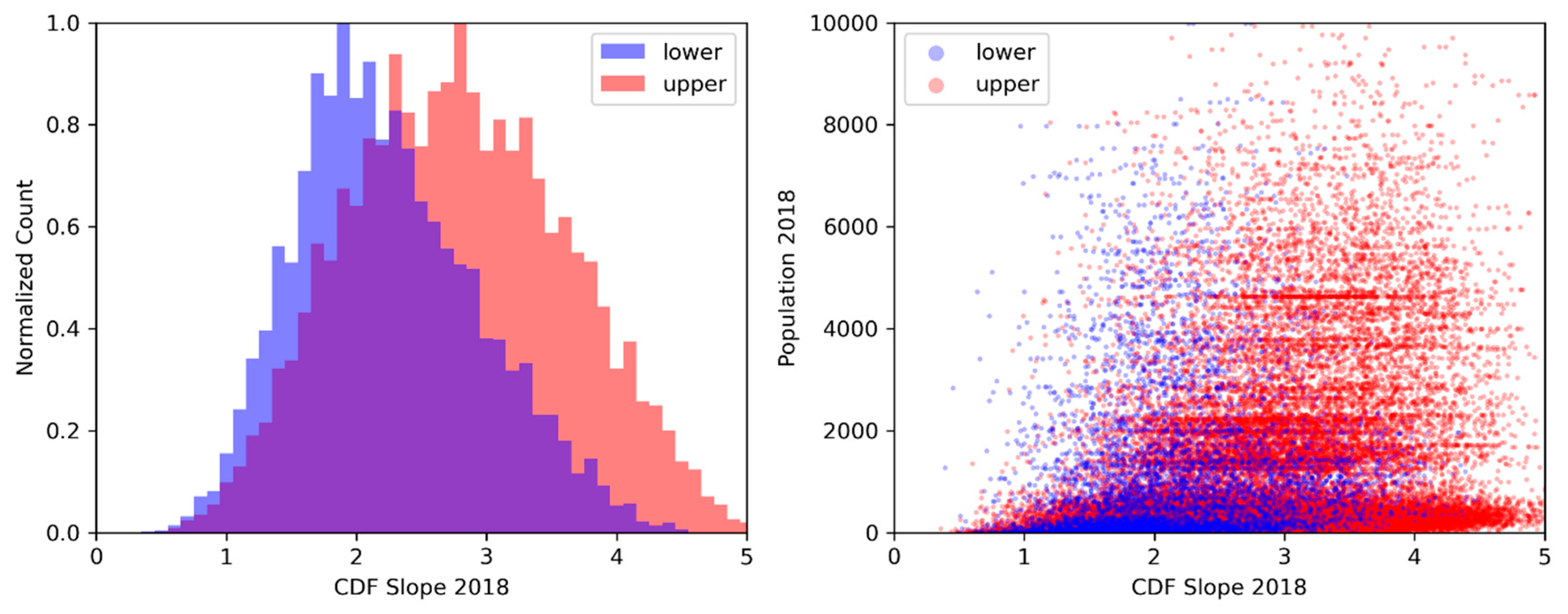
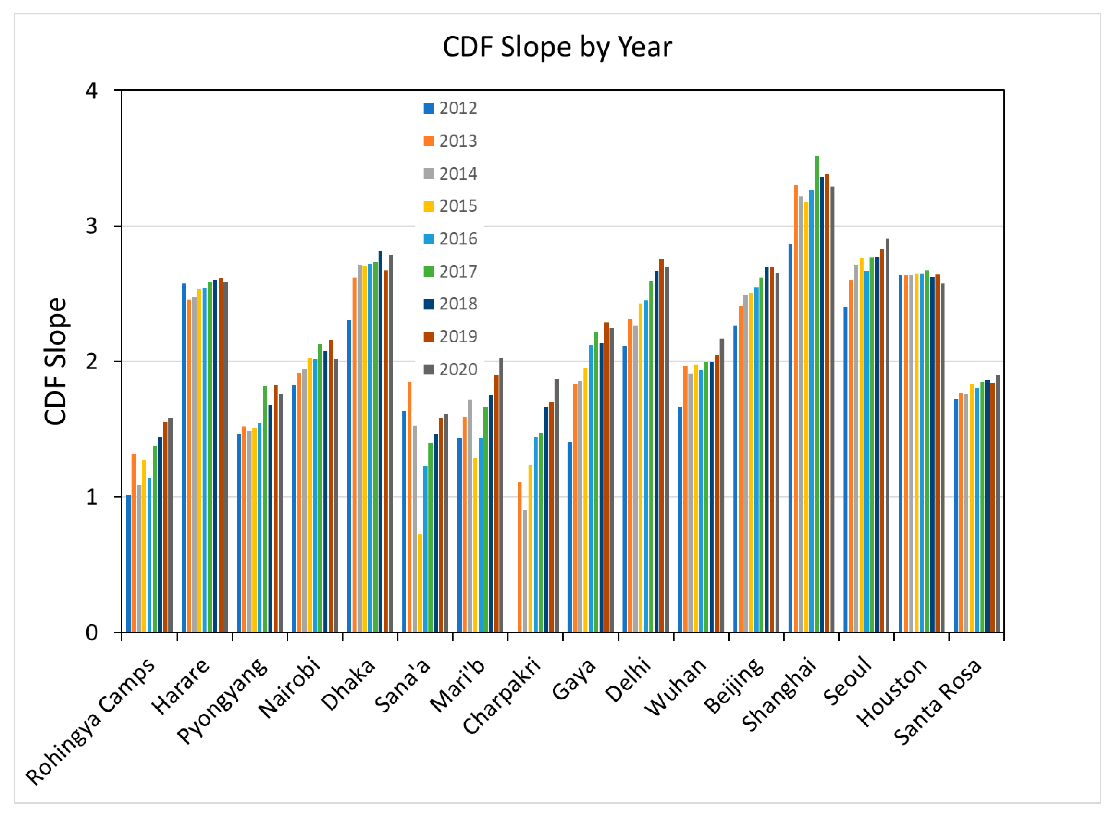
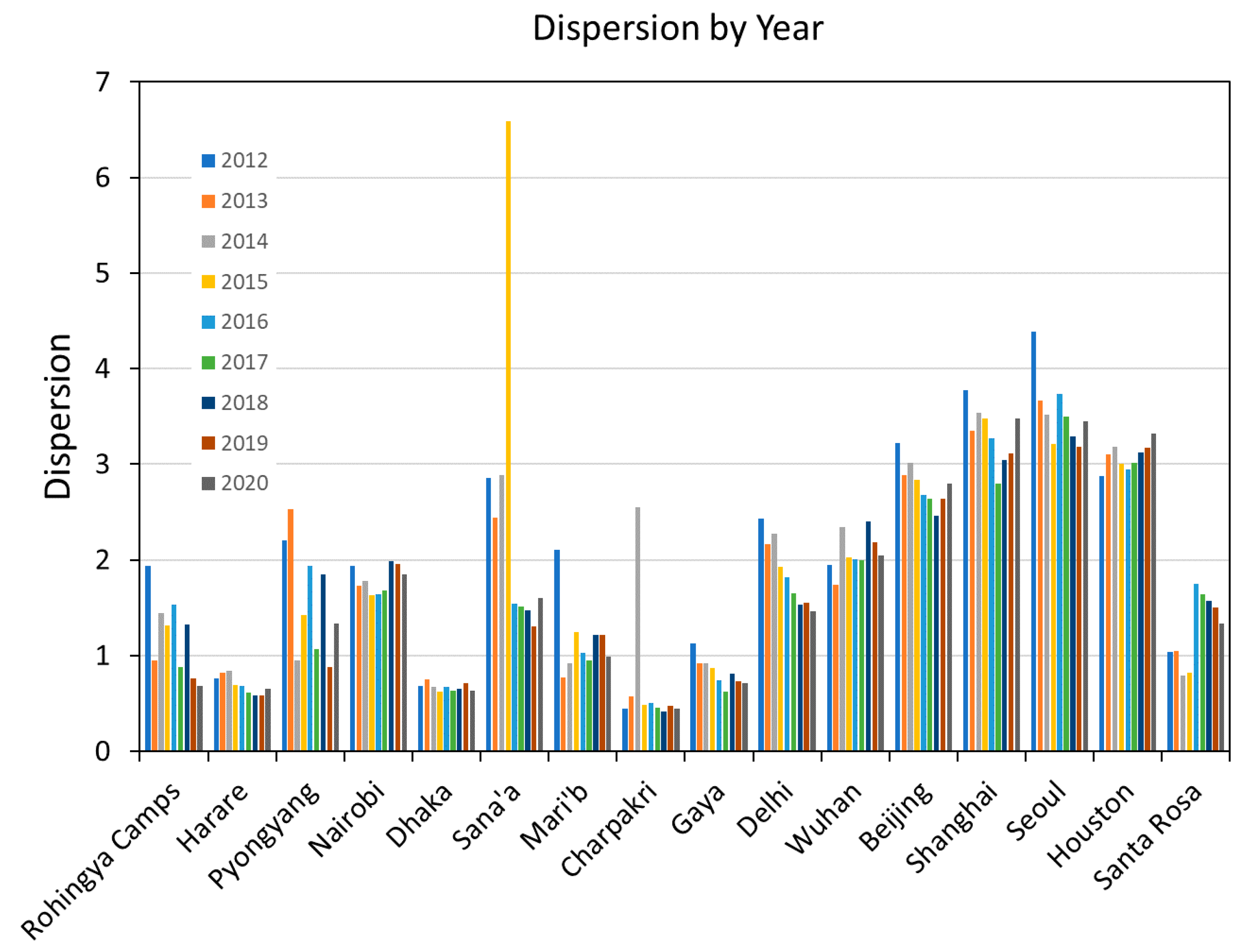
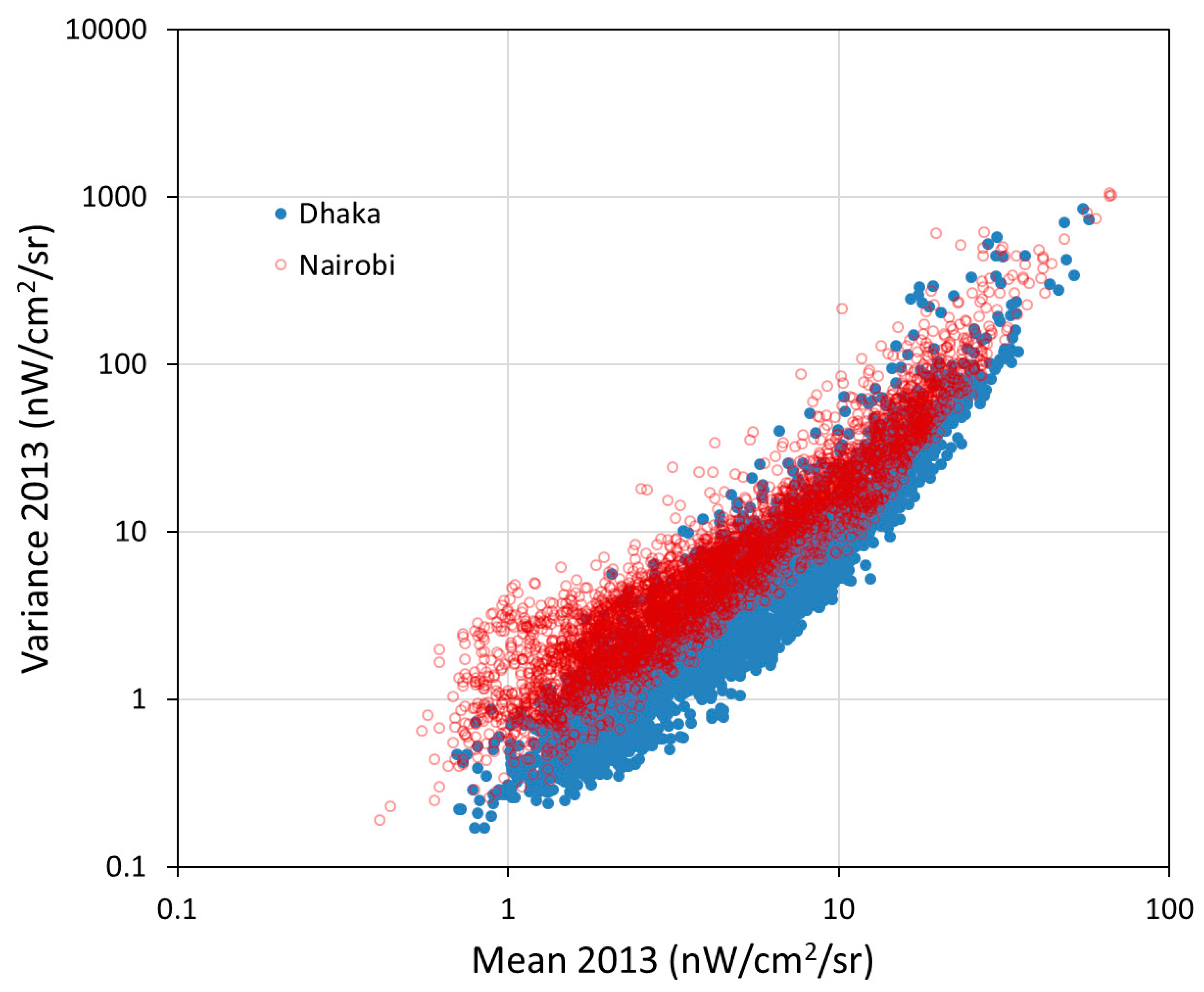
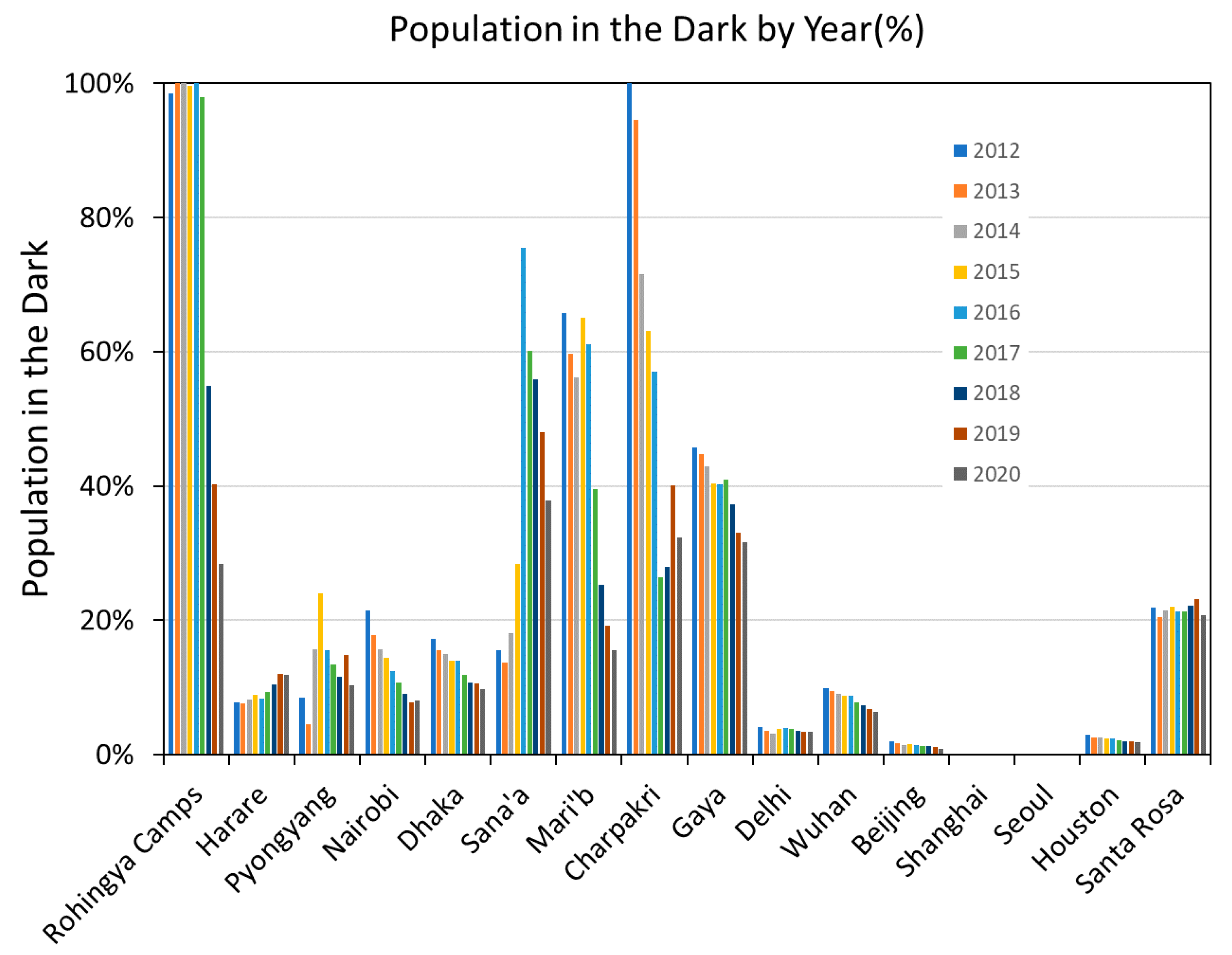
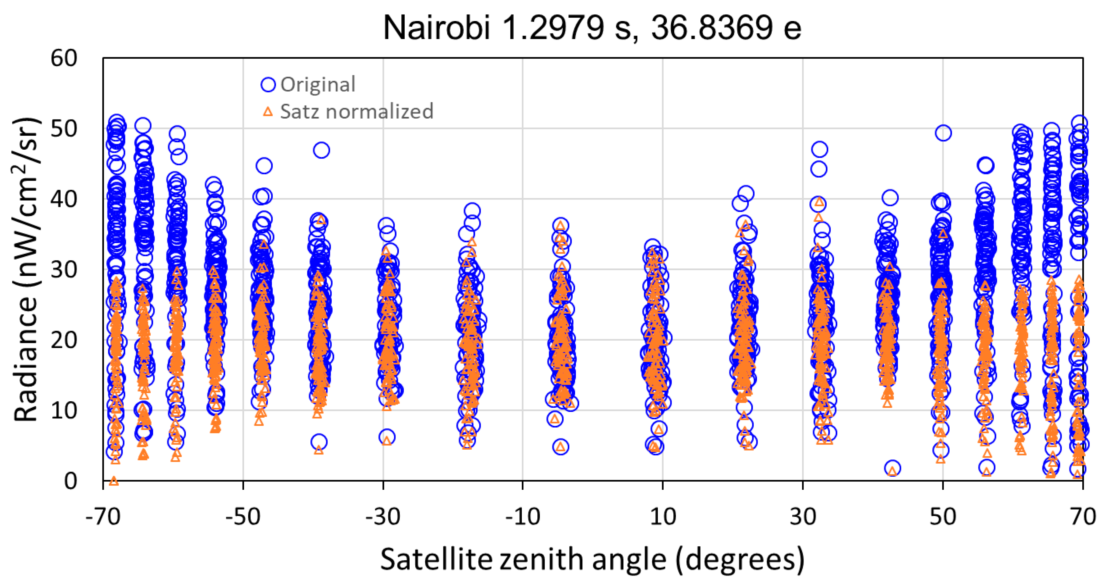
4. Results
5. Discussion
6. Conclusions
Author Contributions
Funding
Conflicts of Interest
References
- World Bank, Sustainable Energy for All. Available online: https://data.worldbank.org/indicator/eg.elc.accs.zs (accessed on 20 February 2019).
- John, A.; Morgan, B.; Jacob, K.; Todd, M. Measuring “Reasonably Reliable” access to electricity services. Electr. J. 2020, 33, 7. [Google Scholar]
- Andersen, T.B.; Dalgaard, C.J. Power outages and economic growth in Africa. Energy Econ. 2013, 38, 19–23. [Google Scholar] [CrossRef] [Green Version]
- Klinger, C.; Owen Landeg, V.M. Power outages, extreme events and health: A systematic review of the literature from 2011–2012. PLoS Curr. 2014, 6. [Google Scholar] [CrossRef] [PubMed]
- Farquharson, D.; Paulina, J.; Constantine, S. Sustainability implications of electricity outages in sub-Saharan Africa. Nat. Sustain. 2018, 1, 589–597. [Google Scholar] [CrossRef]
- IEA. Global Energy Review; IEA: Paris, France, 2020; Available online: https://www.iea.org/reports/global-energy-review-2020 (accessed on 15 August 2020).
- Croft, T.A. Nighttime images of the earth from space. Sci. Am. 1978, 239, 86–101. [Google Scholar] [CrossRef]
- IEA. Light’s Labour’s Lost: Policies for Energy-Efficient Lighting, Energy Efficiency Policy Profiles; OECD Publishing: Paris, France, 2006. [Google Scholar]
- Miller, S.D.; Straka, W., III; Mills, S.P.; Elvidge, C.D.; Lee, T.F.; Solbrig, J.E.; Walther, A.; Heidinger, A.K.; Weiss, S.C. Illuminating the capabilities of the Suomi National Polar-Orbiting Partnership (NPP) Visible Infrared Imaging Radiometer Suite (VIIRS) Day/Night Band. Remote Sens. 2013, 5, 6717–6766. [Google Scholar] [CrossRef] [Green Version]
- Elvidge, C.D.; Kimberly Baugh, M.; Zhizhin, F.; Chi, H.; Tilottama, G. VIIRS night-time lights. Int. J. Remote Sens. 2017, 38, 5860–5879. [Google Scholar] [CrossRef]
- Elvidge, C.D.; Baugh, K.; Zhizhin, M.; Hsu, F.-C.; Ghosh, T. Preliminary results on VIIRS detection of power outages in India. In Proceedings of the Asian Conference on Remote Sensing, New Delhi, India, 23–27 October 2017. [Google Scholar]
- Elvidge, C.D.; Baugh, K.E.; Hobson, V.R.; Kihn, E.A.; Kroehl, H.W. Detection of fires and power outages using DMSP-OLS data. Remote Sens. Chang. Detect. Environ. Monit. Methods Appl. 1998, 123–135. [Google Scholar]
- Amin, M. North America’s electricity infrastructure: Are we ready for more perfect storms? IEEE Secur. Priv. 2003, 99, 19–25. [Google Scholar] [CrossRef] [Green Version]
- Aubrecht, C.; Elvidge, C.D.; Ziskin, D.; Baugh, K.E.; Tuttle, B.; Erwin, E.; Kerle, N. Observing Power Blackouts from Space-A Disaster Related Study. EGU General Assembly: Geophysical Research Abstracts; European Geosciences Union: Vienna, Austria, 2009; pp. 1–2. [Google Scholar]
- Cao, C.; Shao, X.; Uprety, S. Detecting light outages after severe storms using the S-NPP/VIIRS day/night band radiances. IEEE Geosci. Remote Sens. Lett. 2013, 10, 1582–1586. [Google Scholar] [CrossRef]
- Kohiyama, M.; Hayashi, H.; Maki, N.; Higashida, M.; Kroehl, H.W.; Elvidge, C.D.; Hobson, V.R. Early damaged area estimation system using DMSP-OLS night-time imagery. Int. J. Remote Sens. 2004, 25, 2015–2036. [Google Scholar] [CrossRef]
- Witmer, F.D.; O’Loughlin, J. Detecting the effects of wars in the Caucasus regions of Russia and Georgia using radiometrically normalized DMSP-OLS nighttime lights imagery. GISci. Remote Sens. 2011, 48, 478–500. [Google Scholar] [CrossRef]
- Mann, M.; Eli, M.; Arun, M. Using VIIRS day/night band to measure electricity supply reliability: Preliminary results from Maharashtra, India. Remote Sens. 2016, 8, 711. [Google Scholar] [CrossRef] [Green Version]
- Min, B.; O’Keeffe, Z.; Zhang, F. Whose Power Gets Cut? Using High.-Frequency Satellite Images to Measure Power Supply Irregularity; Policy Research Working Paper; No. WPS 8131; World Bank Group: Washington, DC, USA, 2017; Available online: http://documents.worldbank.org/curated/en/125911498758273922/Whose-power-gets-cut-using-high-frequency-satellite-images-to-measure-power-supply-irregularity (accessed on 15 August 2020).
- Janiczek, P.M. Computer Program. for Sun and Moon Illuminance with Contingent Tables and Diagrams; No. 171; U.S. Naval Observatory Circular: Washington, DC, USA, 1987. [Google Scholar]
- Bright, E.A.; Rose, A.N.; Urban, M.L.; McKee, J. LandScan 2017 High-Resolution Global Population Data Set. In No. LandScan 2017 High-Resolution Global Population Da; 005854MLTPL00; Oak Ridge National Lab (ORNL): Oak Ridge, TN, USA, 2018. [Google Scholar]
- UNHCR. Rohingya Emergency. Available online: https://www.unhcr.org/en-us/rohingya-emergency.html (accessed on 25 August 2020).
- Talmadge, E. Options Limited, North Korea Lit by Flashlights, Creaky Grid; Associate Press: New York, NY, USA, 12 November 2018; Available online: https://apnews.com/f0a95a5b376b4152a25feb283bc0ce8e (accessed on 12 August 2020).
- Mutasa, H. Zimbabwe Experiences Worst Power Outages in Three Years; Aljazeera: Doha, Qatar, 5 July 2019; Available online: https://www.aljazeera.com/news/2019/07/zimbabwe-experiences-worst-power-outages-years-190705162434042.html (accessed on 12 August 2020).
- Hossain, E. Power Cuts Make Households, Industries Suffer in Bangladesh; New Age: Dhaka, Bangladesh, 11 March 2020; Available online: https://www.newagebd.net/article/101874/power-cuts-make-households-industries-suffer-in-bangladesh (accessed on 12 August 2020).
- UNHCR. Yemen Emergency. Available online: https://www.unhcr.org/en-us/yemen-emergency.html (accessed on 25 August 2020).
- Tongia, R. Embarrassment of Riches? The Rise of RE in India and Steps to Manage “Surplus” Electricity; Brookings Institution: Washington, DC, USA, 2018; Available online: https://www.brookings.edu/blog/planetpolicy/2018/06/15/embarrassment-of-riches-the-rise-of-re-in-india-and-steps-to-manage-surplus-electricity/ (accessed on 25 August 2020).
- Kopp, T.J.; William, T.; Andrew, K.; Heidinger, D.B.; Richard, A.; Frey, K.D.; Hutchison, B.D.; Iisager, K.B.; Bonnie, R. The VIIRS Cloud Mask: Progress in the first year of S-NPP toward a common cloud detection scheme. J. Geophys. Res. Atmos. 2014, 119, 2441–2456. [Google Scholar] [CrossRef]
- Cao, C.; Yan Bai, W.W.; Taeyoung, C. Radiometric Inter-Consistency of VIIRS DNB on Suomi NPP and NOAA-20 from Observations of Reflected Lunar Lights over Deep Convective Clouds. Remote Sens. 2019, 11, 934. [Google Scholar] [CrossRef] [Green Version]
- Uprety, S.; Changyong, C.; Yalong, G.; Xi, S. Improving the low light radiance calibration of S-NPP VIIRS Day/Night Band in the NOAA operations. In Proceedings of the 2017 IEEE International Geoscience and Remote Sensing Symposium (IGARSS), Fort Worth, TX, USA, 23–28 July 2017; IEEE: Piscataway, NJ, USA, 2017; pp. 4726–4729. [Google Scholar]
- Geis, J.; Florio, C.; Moyer, D.; Rausch, K.; De Luccia, F.J. VIIRS day-night band gain and offset determination and performance. In Earth Observing Systems XVII; International Society for Optics and Photonics: Washington, DC, USA, 2012; Volume 8510, p. 851012. [Google Scholar]
- Delignette, M.; Marie, L.; Christophe, D. Fitdistrplus: An R package for fitting distributions. J. Stat. Softw. 2015, 64, 1–34. [Google Scholar]
- Hu, F.; Alan, F. Smeaton, and Eamonn Newman. “Periodicity detection in lifelog data. In Proceedings of the 2014 IEEE International Conference on Bioinformatics and Biomedicine (BIBM), Belfast, UK, 2–5 November 2014; IEEE: Piscataway, NJ, USA, 2014; pp. 16–23. [Google Scholar]
- Lund, R.; Xiaolan, L.; Wang, Q.; Lu, Q.; Jaxk, R.; Colin, G.; Yang, F. Changepoint detection in periodic and autocorrelated time series. J. Clim. 2007, 20, 5178–5190. [Google Scholar] [CrossRef] [Green Version]
- Maini, R.; Himanshu, A. Study and comparison of various image edge detection techniques. Int. J. Image Process. 2009, 3, 1–11. [Google Scholar]
- Selby, B. The index of dispersion as a test statistic. Biometrika 1965, 52, 627–629. [Google Scholar] [CrossRef]
- Perry, J.N.; Mead, R. On the power of the index of dispersion test to detect spatial pattern. Biometrics 1979, 35, 613–622. [Google Scholar] [CrossRef]
- Stehman, S.V. Selecting and interpreting measures of thematic classification accuracy. Remote Sens. Environ. 1997, 62, 77–89. [Google Scholar] [CrossRef]
- Altman, N.S. An introduction to kernel and nearest-neighbor nonparametric regression. Am. Stat. 1992, 46, 175–185. [Google Scholar]
- Platt, J. Probabilistic outputs for support vector machines and comparisons to regularized likelihood methods. Adv. Large Margin Classif. 1999, 10, 61–74. [Google Scholar]
- Baker, N. Joint Polar Satellite System (JPPS) VIIRS Geolocation Algorithm Theoretical Basis Document (ATBD). NOAA NESDIS Center Satell. Appl. Res. 2011, 474-00053. Available online: https://lpdaac.usgs.gov/documents/135/VNP03_ATBD.pdf (accessed on 30 September 2020).
- Falchi, F.; Pierantonio, C.; Christopher, D.; Elvidge, D.; Keith, M.; Abraham, H. Limiting the impact of light pollution on human health, environment and stellar visibility. J. Environ. Manag. 2011, 92, 2714–2722. [Google Scholar] [CrossRef] [PubMed]


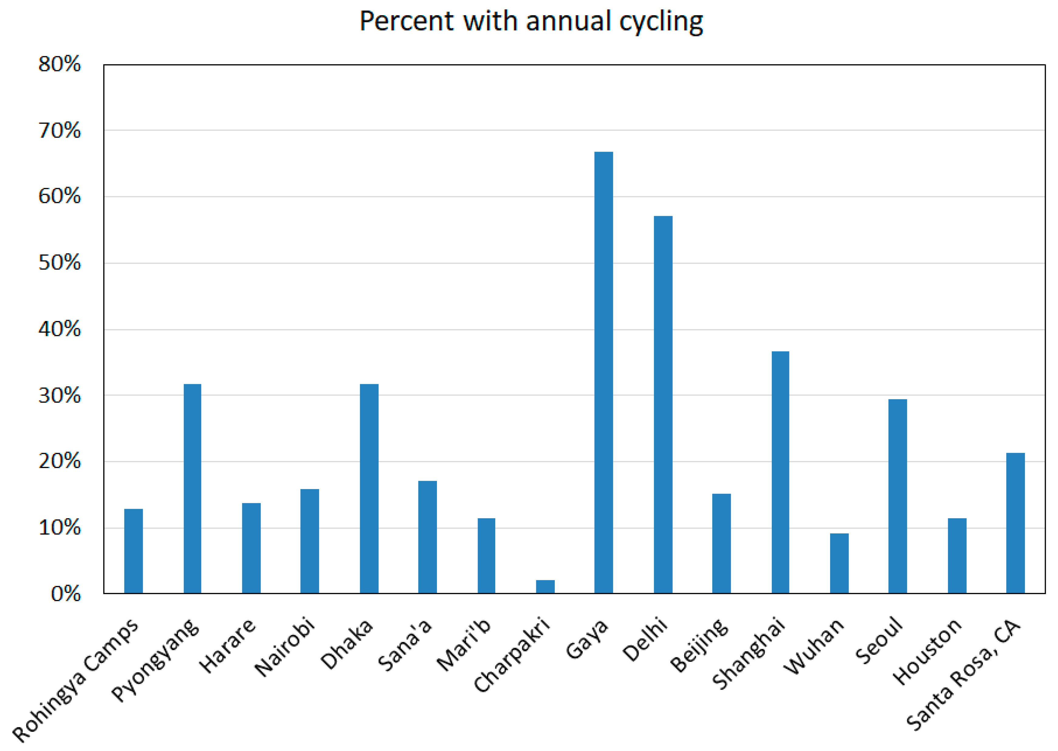
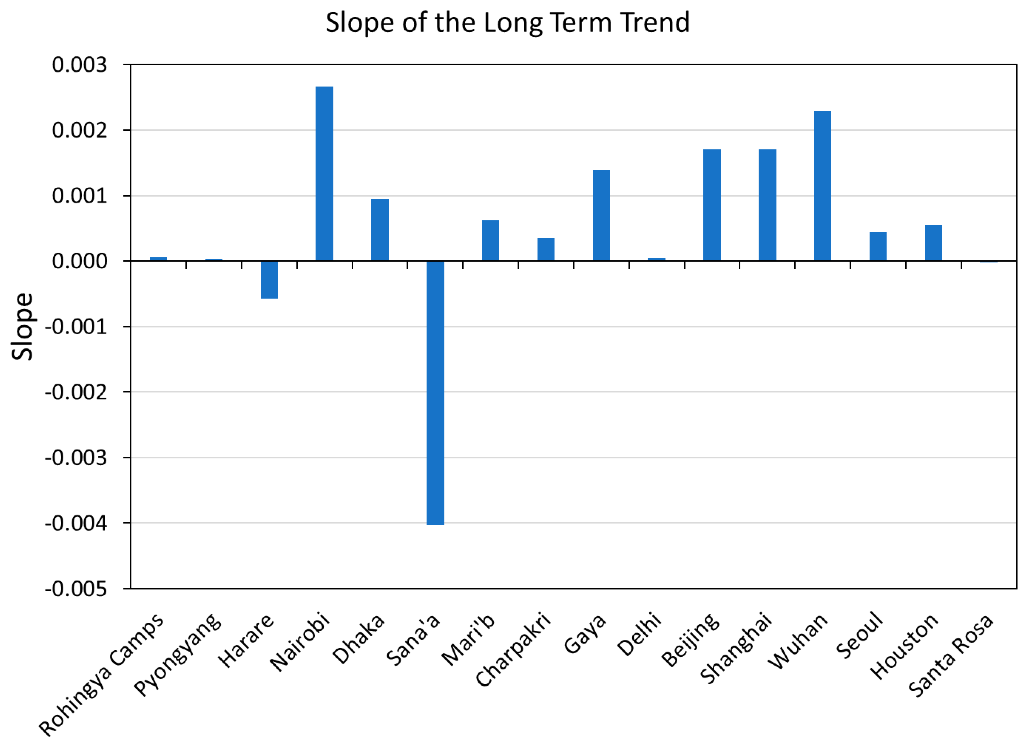
| Location | Country | Population Covered | Grid Size | Status |
|---|---|---|---|---|
| Rohingya Camps | Bangladesh | 1,070,436 | 36 × 75 | Developing |
| Pyongyang | North Korea | 2,353,190 | 75 × 40 | Developing |
| Harare | Zimbabwe | 1,631,405 | 50 × 50 | Developing |
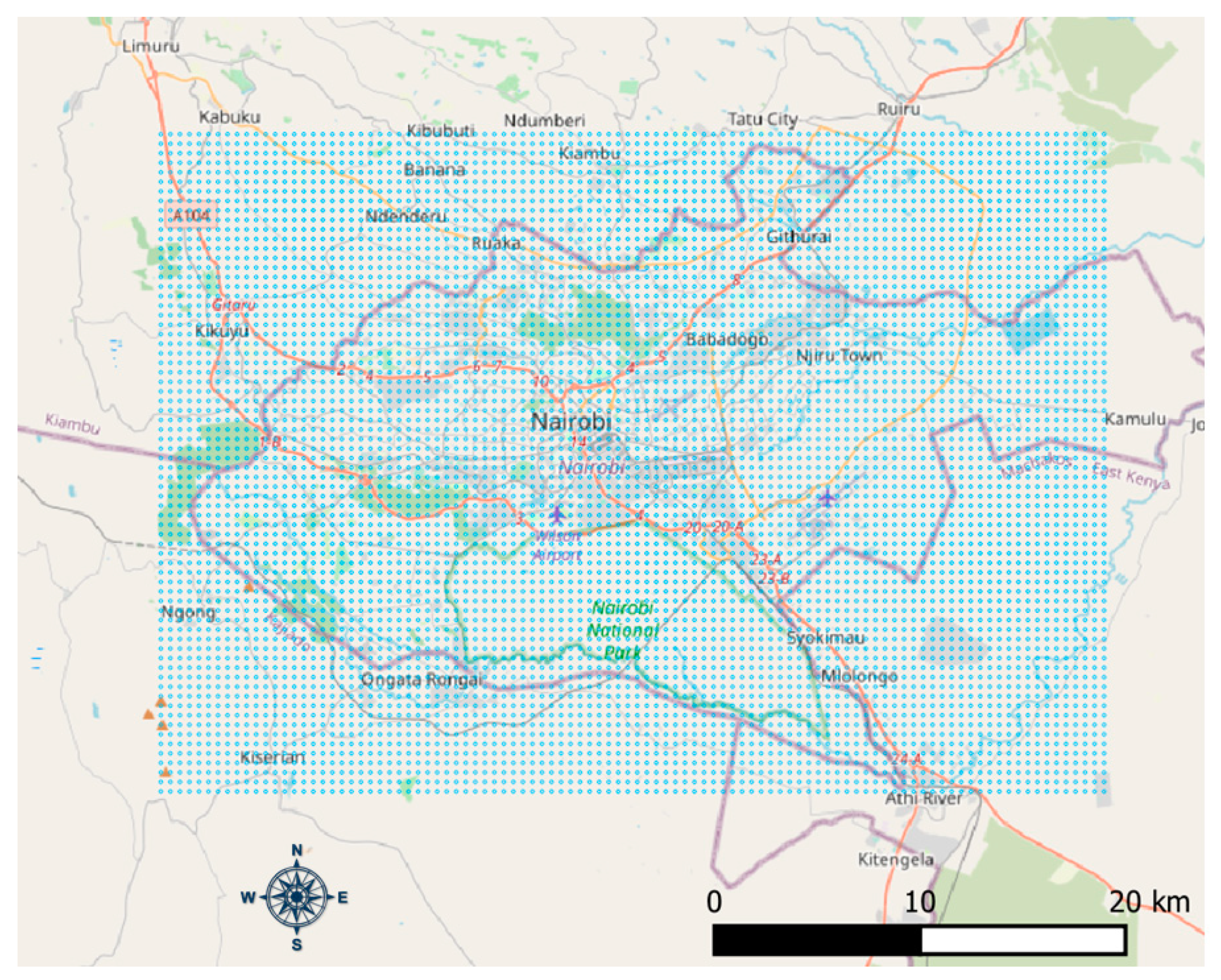
| Nairobi | Kenya | 5,129,731 | 100 × 70 | Developing |
| Dhaka | Bangladesh | 15,015,586 | 73 × 97 | Developing |
| Sana’a | Yemen | 1,615,498 | 45 × 73 | Developing |
| Mari’b | Yemen | 91,155 | 41 × 41 | Developing |
| Charpakri | India | 16,862 | 10 × 10 | Developing |
| Gaya | India | 727,277 | 31 × 31 | Developing |
| Delhi | India | 7,022,476 | 25 × 250 | Developing |
| Beijing | China | 12,451,668 | 100 × 100 | Developed |
| Shanghai | China | 11,264,168 | 60 × 60 | Developed |
| Wuhan | China | 7,048,797 | 120 × 120 | Developed |
| Seoul | South Korea | 13,011,839 | 105 × 69 | Developed |
| Houston | USA | 5,783,193 | 200 × 200 | Developed |
| Santa Rosa, CA | USA | 15,175 | 145 × 145 | Developed |
| Variable | Year | Accuracy Solo | Accuracy with Population |
|---|---|---|---|
| Mean | 2018 | 74% | 85% |
| Variance | 2018 | 68% | 84% |
| Skew | 2018 | 62% | 77% |
| Kurtosis | 2018 | 62% | 75% |
| Lift | 2018 | 70% | 86% |
| CDF slope | 2018 | 53% | 71% |
| ALD % | 2018 | 56% | 71% |
| Outage % | 2018 | 57% | 66% |
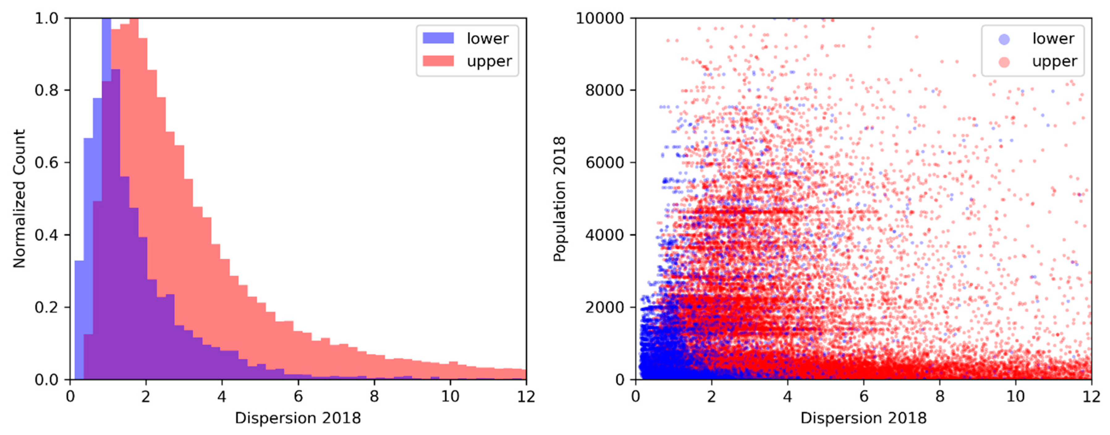
| Dispersion | 2108 | 58% | 75% |
| Primary ACF cycle | All | 69% | 73% |
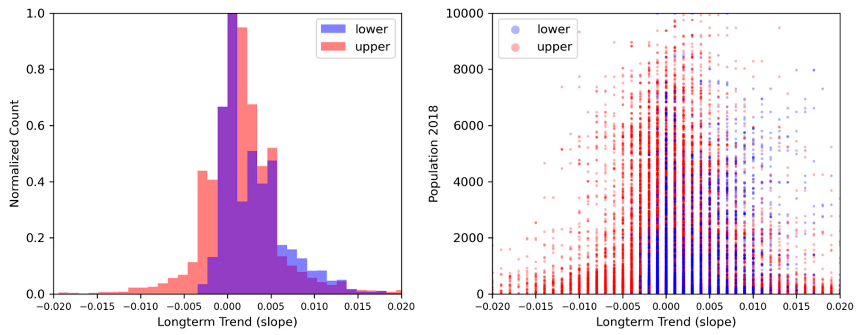
| Long term trend | All | 59% | 72% |
© 2020 by the authors. Licensee MDPI, Basel, Switzerland. This article is an open access article distributed under the terms and conditions of the Creative Commons Attribution (CC BY) license (http://creativecommons.org/licenses/by/4.0/).
Share and Cite
Elvidge, C.D.; Hsu, F.-C.; Zhizhin, M.; Ghosh, T.; Taneja, J.; Bazilian, M. Indicators of Electric Power Instability from Satellite Observed Nighttime Lights. Remote Sens. 2020, 12, 3194. https://doi.org/10.3390/rs12193194
Elvidge CD, Hsu F-C, Zhizhin M, Ghosh T, Taneja J, Bazilian M. Indicators of Electric Power Instability from Satellite Observed Nighttime Lights. Remote Sensing. 2020; 12(19):3194. https://doi.org/10.3390/rs12193194
Chicago/Turabian StyleElvidge, Christopher D., Feng-Chi Hsu, Mikhail Zhizhin, Tilottama Ghosh, Jay Taneja, and Morgan Bazilian. 2020. "Indicators of Electric Power Instability from Satellite Observed Nighttime Lights" Remote Sensing 12, no. 19: 3194. https://doi.org/10.3390/rs12193194
APA StyleElvidge, C. D., Hsu, F.-C., Zhizhin, M., Ghosh, T., Taneja, J., & Bazilian, M. (2020). Indicators of Electric Power Instability from Satellite Observed Nighttime Lights. Remote Sensing, 12(19), 3194. https://doi.org/10.3390/rs12193194