2. Materials and Methods
We selected January as a suitable representation of the austral summer. Multi-sensor January SST images for the period 2001–2020 were compiled to describe interannual climate variability in the WAP (
Figure 1). Sensors included the Moderate Resolution Imaging Spectrometers (MODIS) onboard the Terra (since 2001) and Aqua (since 2003) satellites and the Suomi-NPP Visible Infrared Imager Radiometer Suite (VIIRS) (since 2012). The L1 data were obtained from [
23], taking into account the quality-data flags set by reprocessing MODIST_R2019, MODISA_R2019, and VIIRS_v2016.1, respectively. These data were processed using standard SST algorithms with the SeaDAS 7.5 software package [
24,
25], resulting in 11–12 µm daytime SST images in local area coverage (LAC, 1 km resolution).
Daily data from each sensor were processed; scenes containing navigation errors or low-quality pixels (according to a set of Level-2 flags) were identified and discarded, leaving a total of 17,175 daily SST scenes. These data were used to construct average January SST multi-sensor composite scenes for the years 2001 to 2020, following the criteria proposed by Kahru et al. [
26,
27] using the software package WIM/WAM [
28]. The time series of January SST for the four study locations along the WAP were extracted (
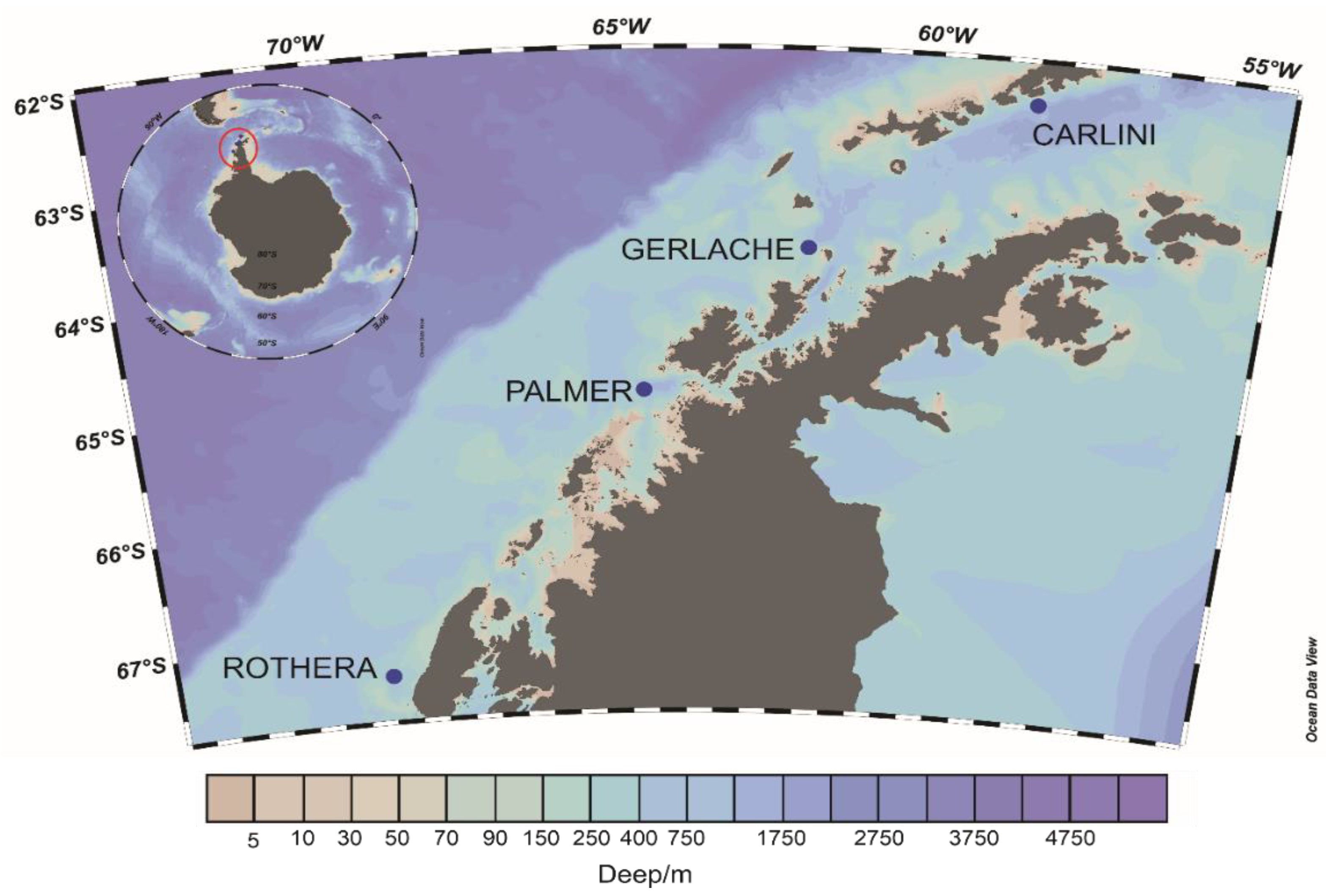
Figure 1) using the WIM-WAM routines.
The study locations are in the vicinity of the Carlini (Argentina), Palmer (USA), and Rothera (UK) Antarctic research stations. The fourth location, the Gerlache Strait (Gerlache), was selected based on the sampling grid used by the Third and Fourth Colombian Antarctic expeditions carried out in 2017 and 2018, respectively, which focused on this strait [
11].
Time series of standardized January thermal anomalies were constructed following the criteria proposed by Santamaria-del-Angel et al. [
29] using the Z transformation (Equation (1)):
where
is the standardized thermal anomaly for January of a given year at each of the four locations (
),
X is the SST on January of the given year,
is the average
SST over the entire series, and
SD is the standard deviation over the entire series.
For each locality and
, and following the criteria by Chen and Wu [
30], the power spectral density was estimated with the periodogram method. The statistical significance of the power peaks was derived by plotting the F-values for each spectrum following the criteria by Morales-Acuña et al. [
31] and Di Matteo et al. [
32].
To determine the similarity between locations based on
, we conducted a correlation analysis between time series using Pearson’s linear correlation coefficient. The data were displayed in a hierarchical dendrogram following the criteria by Schonlau [
33], with Pearson’s coefficient as a similarity function and the average linkage clustering method to create the clusters.
The clusters obtained were verified using a multiple-contrast approximation applied to the variance of non-standardized series, based on the F index and following the considerations of Jamshidian and Jalal [
34]. The null hypothesis was that both series had equal variances. Before running these multiple contrasts, we confirmed that each time series fitted a Gaussian distribution using the Q-Q test described by Liang et al. [
35].
Monthly data for the Southern Oscillation Index (SOI) [
36] (since 1876) and the Southern Annular Mode (SAM) [
37,
38,
39], also known as the Antarctic Oscillation [
40] (since 1957), were compiled in order to correlate temperature variability in the WAP with other phenomena. January data for each index’s entire time series were retrieved: SOI, January 1876 to January 2020; and SAM, January 1957 to January 2020. Standardized January anomalies for each index (
and
respectively) were computed using Equation (1); the mean and standard deviation of each index were computed over the entire data sets [
29].
Three approaches were tested to examine the relation between the thermal anomalies at the four locations (
) and the
and
values (
n = 20). First, Pearson’s and Spearman’s correlation coefficients between
and either
or
were calculated separately following the criteria of Santamaria-del-Angel et al. [
41]. The statistical significance of the indices was evaluated [
42], and the results were interpreted following the criteria of Mu et al. [
43]. Critical values tables were taken from [
44] for Pearson’s correlation coefficient and [
45] for Spearman’s correlation coefficient.
The second approach examined the joint variation in
,
, and
using a principal component analysis (PCA), following the criteria of Santamaria-del-Angel et al. [
46] and applying Kaiser’s rule, selecting only those components with eigenvalues higher than or equal to 1 [
47,
48,
49,
50,
51]. The PCA results were further examined by constructing a multidimensional vector plot derived from a factor analysis. In this plot, vectors having the same direction and magnitude indicate that the variables represented show identical behaviors. Variables are associated when the respective vectors form an angle either lower than 45° (positive association) or about 180° (±22.5°) (inverse association). This plot represents vectors in a hyperspace and, thus, no axes are drawn.
The third approach explored the agreement between variations in
and variations in
or
. For this purpose, the relative power index (
Prindex) (Equation (2)) described by Navarro-Fierro [
52] was calculated, following the criteria of Santamaria-del-Angel et al. [
53].
Based on the results from the first two approaches, this index was calculated for two different scenarios. The first scenario explored the relation between positive values of the indices and low temperatures. In this scenario, Equation (2) is interpreted as follows: a is the number of cases with a negative value of and positive values of or , c is the number of cases with negative and negative or , is the total number of cases with positive or , and is the total number of cases with negative or . The can adopt any value; in general, positive values indicate that positive or values coincide with negative thermal anomalies (i.e., cooling conditions) at the station. Negative values imply that positive values of or coincide with positive thermal anomalies (warming conditions). The higher the absolute value of , the stronger the relationship.
The second scenario explored the opposite relation versus scenario 1, that is, how negative values of the indices affect positive temperature values. In this scenario, Equation (2) is interpreted as follows: a is the number of cases with a positive value of and negative or , c is the number of cases with positive and positive or , is the total number of cases with negative or , and is the total number of cases with positive or . The can adopt any value; in general, positive values indicate that negative values of or coincide with positive thermal anomalies (i.e., warming conditions) at the station. Negative values imply that negative values of or coincide with negative thermal anomalies (cooling conditions). The higher the absolute value of , the stronger the relationship.
3. Results
The time series of SST at the WAP stations (
Figure 2) show warm peaks (typically lasting one summer) followed by cold episodes lasting four to five summers. The variability of a time series can be evaluated using both its standard deviation (SD) and its range, i.e., the difference between the maximum and the minimum values (
Table 1). Thus, a north-to-south variability gradient can be observed (
Table 1), with Carlini and Rothera as the least and most variable stations, respectively (
Figure 2a,d, respectively).
Figure 2 and
Table 1 show that the WAP can be divided into two zones: the northern zone, represented by Carlini and Gerlache (
Figure 2a,b), and the southern zone, represented by Palmer and Rothera (
Figure 2c,d). The northern zone shows a lower variability (SD = 0.330 and 0.400, respectively) versus the southern zone (SD = 0.722 and 0.826, respectively), as presented in
Table 1.
Comparing the four time series of SST, the correlation analysis and its dendrogram (
Figure 3) clearly show the two zones previously described.
As the time series of each locality shows a Gaussian distribution (
Table 2), the formation of the northern and southern zones just described were confirmed statistically through multiple comparisons of variances (
Table 3).
The result of the test described above (
Table 3) indicates that the stations Carlini and Gerlache had equal variances (first contrast) and Palmer and Rothera (last contrast) showed equal variances. The remaining contrasts were tested for homoscedasticity and showed different variances.
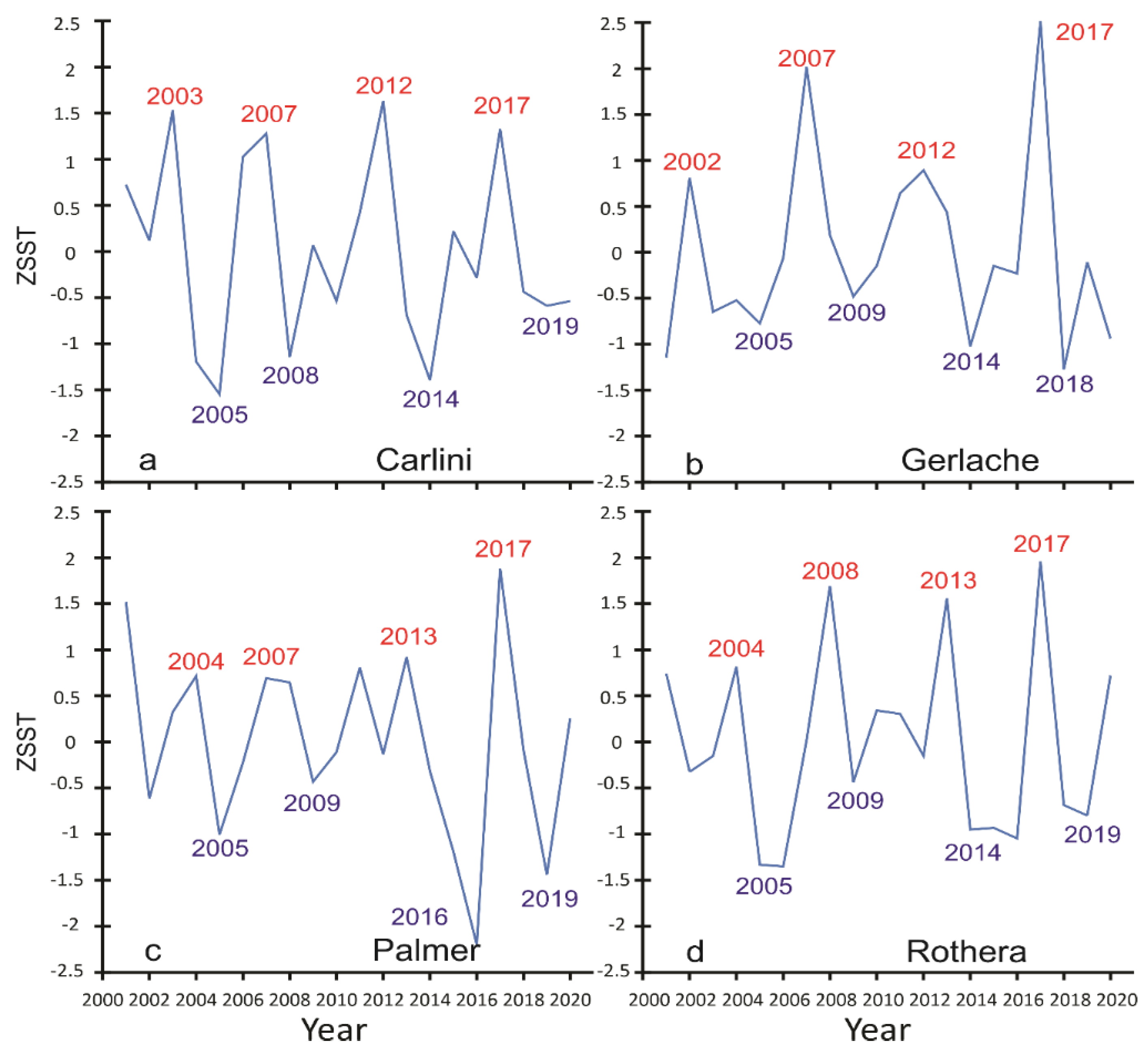
The standardized thermal anomalies for January at each station (
Figure 4) clearly show the warm episodes described above.
Except for Carlini, the summer of 2017 has been the warmest episode so far in the 21st century. This unusually warm year was followed by a markedly cold period (e.g., Gerlache (
Figure 4b) and Palmer (
Figure 4c) stations). Overall, the Carlini (
Figure 4a) and Gerlache (
Figure 4b) stations showed similar patterns of alternating warm and cold periods, different from those shown by the Palmer (
Figure 4c) and Rothera (
Figure 4d) stations, which were, in turn, similar to each other. This pattern further supports the idea of distinct northern and southern regions in the WAP.
The graphic analysis of power spectra for the standardized series (
Figure 5) considering the critical F value reveal that only Carlini (
Figure 5a) and Gerlache (
Figure 5b) showed a noticeable peak in the power spectrum, corresponding to a period of five years for both sites. On the other hand, the power spectra for Palmer (
Figure 5c) and Rothera (
Figure 5d) showed no marked peaks.
Figure 6 shows isotherm maps for the WAP. These maps clearly show the spatial distribution of warm waters (SST ≥ 0 °C) during the austral summer under warm (2002, 2007, 2012, and 2017) or cold (2005, 2009, 2014, and 2018) episodes.
The 0 °C isotherm (
Figure 6) represents the front between cold and warm waters along the WAP. During warm episodes, the warm-water front reaches the coastline of the peninsula (
Figure 6a,c,e,g), being particularly marked in 2007 (
Figure 6c), 2012 (
Figure 6e), and 2017 (
Figure 6g). In contrast, the front appears farther away from the coast of the peninsula during cold episodes (
Figure 6b,d,f,h). The lower the temperature during a cold episode, the farther away from the WAP the thermal front is located (e.g., in 2014 (
Figure 6f)).
Three approaches were tested to examine the relation between
and the
and
values. First, Pearson’s and Spearman’s correlation coefficients were calculated separately for each station (
Table 4). Only the Palmer station showed a significant (Pearson’s and Spearman’s) negative correlation with SAM (
Table 4), i.e., when SAM is high, the temperature is low.
Based on the correlation matrix of standardized variables (
Table 5), a second approach was used to examine the joint variation of
,
, and
by performing a PCA (
Table 6).
The results (
Table 6) showed that only the first three principal components were significant (eigenvalues equal to or greater than 1), jointly accounting for 78.8% of the total variation. The most outstanding finding is that
was the only variable related to the third principal component and showed no relation with
or
. The four thermal anomalies,
, were inversely associated with
on the first principal component (the one that accounts for the largest fraction of the total variance), indicating that high SAM values coincide with low temperatures at the four stations, and vice versa.
Although the time series of the four stations were associated with the first component, indicating that they covary, the Palmer and Rothera stations, located in the southern zone of the WAP, had higher loadings (−0.889 and −0.759, respectively) than the northern zone stations (Carlini, −0.561; Gerlache, −0.667).
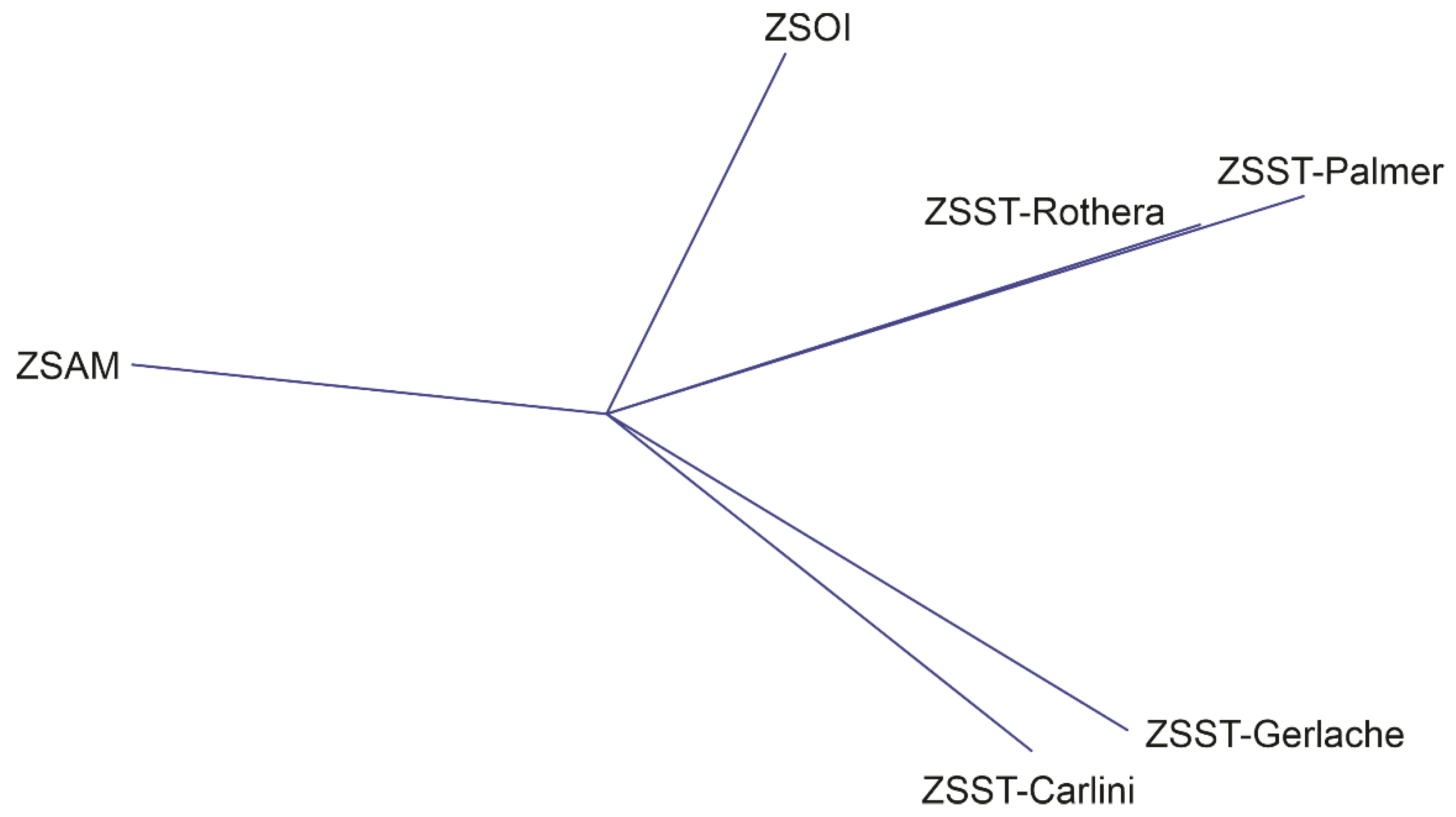
Figure 7 shows the plot of the factor analysis. This plot evidences the difference between the Palmer and Rhotera stations (southern zone of the WAP) and the Carlini and Gerlache stations in the northern zone and the inverse association between SAM and the SST anomalies at the stations. Once again, the SOI shows no relation with either SAM or the SST anomalies.
The third approach evaluated, in the first scenario, the extent to which positive values of the standardized SOI or SAM anomalies matched low temperatures (
Table 7); the second scenario evaluated the opposite condition, that is, the extent to which negative values of
or
were consistent with high temperatures (
Table 8). In the first scenario (
Table 7),
had positive values in all stations, indicating that high SAM values (positive
values) coincided with negative thermal anomalies in all the stations, denoting cooling episodes. The zero value recorded in the Carlni station shows that such a relationship does not hold therein. The two southern stations (Palmer and Rothera) denoted the same positive value, 0.428, meaning that 42.8% of the negative thermal anomalies (cold temperatures) recorded in these stations coincided with positive
values. Conditions of positive
values showed a clear split between the northern (Carlini and Gerlache stations, with negative values) and southern (Palmer and Rothera stations, with positive values) zones. The negative values for the northern zone indicate that positive
conditions coincided with warm waters; 90.9% of the positive SST anomalies recorded at the Carlini station coincided with high
conditions. In the southern zone, 31.8% of cold conditions were recorded under conditions of high
.
The second scenario evaluated the extent to which low index values coincided with high temperatures (
Table 8). This scenario revealed the same overall pattern described above (
Table 7) for
. The northern zone showed negative values, indicating the presence of cold waters during conditions of negative
. On the other hand, 38.8% of the warm events recorded in the southern zone coincided with negative
values. No coincidence was found between negative values of the
index and high temperatures at the Carlini station; in contrast, some of the high temperatures recorded at the other stations coincided with negative
values. The southern zone stations had identical values and responded more strongly to negative
values, whereas the northern zone (Gerlache) did so only moderately.
4. Discussion
SST variability in the WAP (
Figure 2,
Figure 4 and
Figure 5;
Table 1) shows a clear pattern, with a single warm peak (one summer) followed by a cold period (four to five summers). This five-year periodicity showed a significant signal for the Carlini (
Figure 5a) and Gerlache (
Figure 5b) sites. The apparent absence of this pattern in the Palmer (
Figure 5c) and Rothera (
Figure 5d) sites may be a consequence of coastal morphology, as well as the interactions between fjords and the dynamics of marine ice, all of which may produce greater variations in SST in these two locations (
Figure 2,
Table 1 and
Table 3), relative to the Carlini and Gerlache sites.
The maps of SST distribution show that warm waters (delimited by the 0 °C isotherm) reach the peninsula coastline during warm conditions (
Figure 6c,e,g) but not under cold conditions (
Figure 6b,d,f,h). During frigid periods (for example, the year 2014;
Figure 6f), the 0 °C thermal front is farther away from the WAP. The results by Turner et al. [
54] also support the idea of regular ingress of warm water to the WAP coasts.
Changes in ocean surface dynamics affect the ecology and physiology of marine organisms and of entire communities through ecological interactions in the food web [
7,
55]. Thus, the inflow of warm waters onto the WAP coast every five years or so likely affects food webs over the entire region. During the III Colombian Scientific Expedition to the Antarctic (Almirante Padilla; January 2017, a warm year;
Figure 6g), numerous large salps were observed on the water surface, while krill was absent from the zooplankton trawls carried out in the Gerlache Strait. The following year and across the same grid of sampling stations, the IV Colombian Scientific Expedition to the Antarctic (Almirante Tono; January 2018, a cold year;
Figure 6h) found that salps had disappeared, krill was present in zooplankton samples, and marine mammals were common in the region.
In the Antarctic, krill is associated with summer phytoplankton blooms, while salps are found in warmer, oligotrophic waters [
56]. The phytoplankton–krill relationship can affect higher trophic levels, including penguins [
9]. Thus, the seasonal succession of krill and salps in the Antarctic may serve as an indicator of environmental changes [
57], since the food web in this region is highly complex and involves multiple interactions [
58].
The inflow of warm waters onto the WAP coast might be driven by the strengthening or weakening of ocean currents that lead to the inflow of warm surface waters onto the WAP coasts. The major current in the region is the Antarctic Circumpolar Current, which flows eastward, surrounding the Antarctic [
59] and linking the main ocean basins along its trajectory. The Antarctic Circumpolar Current is, therefore, considered a vital component of the global climate system [
60]. It is the only current in the world that surrounds the polar axis, almost uninterrupted by continental masses, and is delimited by two fronts located along the polar circle: the Polar Front, which is closer to the Antarctic, and the Subantarctic Front, which is more distant from the continent [
61,
62]. The area north of the Subantarctic Front is the Subantarctic Zone, the area between the Polar Front and the Subantarctic Front is the South Polar Front Zone, and the area south of the Polar Front to the coast is the Antarctic Zone [
62]. Giglio and Johnson [
63] pointed out that these zones show distinctive temperature and salinity conditions; based on their locations, the Subantarctic Zone, South Polar Front Zone, and Antarctic Zone can be considered warm, lukewarm, and cold waters, respectively.
The only potential restriction along the Antarctic Circumpolar Current trajectory is the approximately 800 km wide bottleneck formed by the Drake Strait between Patagonia and the WAP (
Figure 1) [
61]. This zone is regarded as a critical area as it markedly influences the Antarctic Circumpolar Current flow [
60]. Various studies have sought to delimit the position and fluctuations of the Antarctic Circumpolar Current in this zone, which has proved a challenging task. Such studies have used models [
64,
65,
66,
67] constructed using satellite [
68,
69] or in situ recorded data [
62], showing that the zone close to the WAP is complex and inhomogeneous [
70], with more than two fronts delimited therein. Tarakanov and Gritsenko [
62] mentioned that by January 2010, the fine structure of the Antarctic Circumpolar Current was made up of 11 individual fronts, while 9 individual fronts were detected in October–November 2011. The same authors reported that these fronts were found in various combinations at the Drake Strait.
Since the South Polar Front Zone contains lukewarm waters and the Antarctic Zone cold waters, with the Polar Front marking the boundary between them, the warm waters that reach the WAP every four to five years might be driven by the intrusion of the South Polar Front Zone and the ensuing displacement of the Antarctic Zone during the warm events described in
Figure 6.
According to King et al. [
71], the WAP is the only part of the Antarctic continental shelf that is subject to intrusions of the Circumpolar Deep Water. The Circumpolar Deep Water is relatively warm and, if it emerges to the surface, would be evidenced by higher surface temperatures. The same authors mentioned that although the mechanisms driving the intrusion of Circumpolar Deep Water onto the WAP are not fully understood yet, these are likely related to the proximity of the Antarctic Circumpolar Current and the morphology of the continental shelf in this region. The Antarctic Circumpolar Current is mostly driven by the wind along its trajectory [
61]. Thus, wind fluctuations would influence the spatio-temporal variability of the Antarctic Circumpolar Current in the WAP [
71], which, together with the local topography, would produce a marked regional variability in the WAP [
72].
Due to this relationship with wind, White and Peterson [
59] hypothesized that there might be a teleconnection between the Antarctic Circumpolar Current and ENSO. It is currently known that SAM can strongly influence wind fields in the WAP, thus affecting air and sea-surface temperatures [
7,
19,
73]). Consequently, studies on the relationship between the magnitudes of SAM and ENSO and their influence on the WAP environment have raised significant interest in the scientific community [
54,
74,
75,
76]. Stammerjohn et al. [
77] outlined how the Antarctic Circumpolar Current can vary with fluctuations in SAM and ENSO, as warm waters reach the WAP at different times (
Figure 6).
We tested three approaches to examine ENSO’s relation (evaluated in terms of the SOI) and SAM and SST at each location. The first approach used Pearson’s and Spearman’s correlation coefficients for each station (
Table 4). It revealed a significant inverse association (with both coefficients) between SST and SAM only at the Palmer station. This association means that when SAM reaches high values, SST at Palmer station is low. However, although the correlation coefficients for this station were significant (Pearson’s = −0.476 and Spearman’s = −0.424), they showed a relatively weak association. No significant correlation was found between the SOI and SST at any station. These results are consistent with Barnes et al. [
72], Clem et al. [
78], and Kim et al. [
8], who reported null or weak associations. Fogt et al. [
79] pointed out that such correlation analyses may not always provide the best information on the variation of this teleconnection with ENSO. Particularly, correlation coefficients do not yield information on the magnitude of each event and may be strongly skewed by atypical values.
The PCA (
Table 6) showed that the SOI had a high loading on the third principal component (PC3) and had no relationship with either the SST at the stations (which had high loadings on PC1) or SAM. These results are evident in the vector graph from the factor analysis (
Figure 7). Previous studies have also found weak relationships between ENSO and SAM [
73,
75,
79,
80,
81] and various interpretations have been put forward: (a) these indices describe phenomena that are independent of each other (no relationship between them) [
80]; (b) both indices are governed by a common third factor [
81] that differently influences each of them; or (c) there are other independent factors, such as surface buoyancy forcing, that exert a more substantial influence on wind patterns in the Antarctic [
73]. The associations between variables summarized by the three significant principal components (
Table 6) account for 78.8% of the total variability. Using a similar approach based on Empirical Orthogonal Functions (EOF), Yeo and Kim [
82] found that SAM and the SOI account for only 30% of the total variability in SST.
SAM had a high loading on PC1 (
Table 6), accounting for 42.10% of the total variability by itself. For its part, the SOI had a high loading on PC3 but accounted for only 16.7% of the total variability. Our results from the PCA and factor analysis (
Table 6;
Figure 7) of the relationship between SAM and SST at the different locations showed that SAM was inversely correlated with the standardized SST time series in all the localities. This relation means that low temperatures occur when SAM reaches high values and vice versa. Overall, our results showed that SAM might be the primary driver of climate variability in the WAP, while ENSO would play a secondary role.
Previous studies [
7,
73,
76,
78] have highlighted the importance of these indices for describing climate variability in the Antarctic, giving an insight into the apparent relationship between ENSO and SAM. Taking each index separately, ENSO could drive climate variability in the WAP only under strong ENSO conditions [
83,
84]. During a strong ENSO event, a considerable Rossby wave train pattern is formed [
84], together with considerable wind anomalies [
79] that strengthen teleconnections; these, in turn, can be evident in surface waters at high latitudes. According to Yiu and Maycock [
85], under such conditions, the relationship between the index and environmental variables in the WAP could be described using more straightforward mathematical approaches (e.g., linear models) in both austral winter and summer conditions.
The statement that SAM is the main driver of climate variability in the WAP should be taken with caution, as this index has been reported to be linked with ozone over the Antarctic [
54,
76,
83,
86,
87]. Jones et al. [
76] reported that the recent positive trend in SAM is related to the increasing depletion of stratospheric ozone. Giglio and Johnson [
63] reported that the relation between SAM and atmospheric ozone levels shows neither a seasonal pattern nor a long-term trend.
SAM plays a central role in climate variability in the Antarctic, but the future trends in SAM are still uncertain. Therefore, it is essential that climate models adequately simulate temperature trends and their relationship with and regulation by SAM [
76]. These potential associations are likely to be described quantitatively and with more evident patterns three decades from now, when the ozone layer over the Antarctic stabilizes [
88], provided no other natural or anthropogenic factor stresses the ozone layer again.
The PCA thoroughly examined the relation of climate variability in the WAP with SAM and ENSO. To study such relations at each of the four locations, we tested the third approach for two contrasting scenarios. The first scenario examined the likelihood of finding low temperatures under high SAM or SOI conditions at each location (
Table 7). In contrast, the second scenario reviewed the likelihood of finding high temperatures when the indices had low values, also at each site (
Table 8). The results, shown in
Table 7, indicate that cold waters at the Carlini location (
= 0) had no relation with high SAM values. The results for the southern locations (Palmer and Rothera, both with
= 0.428) showed that 42.8% of cold temperatures occurred under conditions of high SAM. This result is consistent with the variability accounted for by PC1 (
Table 6) described above.
Regarding high SOI values, a clear difference was observed between the northern (Carlini and Gerlache locations, both with negative values) and southern (Palmer and Rothera, both with positive values) zones of the WAP. The negative values of the northern zone indicate that warm waters occur therein when the SOI has high values. About 90.9% of the positive SST anomalies recorded at Carlini occurred under high SOI conditions. Likewise, 31.8% of the cold temperatures recorded in the southern zone occurred under high SOI values.
The second scenario examined how the negative values of the indices affected high temperature values (
Table 8) and revealed the same patterns as those described in
Table 7. In other words, 38.8% of warm conditions were observed in the southern zone and 60% of cold conditions were observed in the northern zone under negative
values. Likewise, when
had negative values, Carlini did not respond to the index, while the other stations recorded high temperature values. The Palmer and Rothera stations, representing the southern zone, showed identical values and responded more strongly to the index’s negative values, whereas the northern zone (Gerlache) displayed a moderate response. This approach clearly showed that the WAP comprises two large zones with distinctive climate variability patterns and that these are differently related to SAM and SOI (
Table 7 and
Table 8). In general, the northern zone (Carlini and Gerlache locations;
Figure 2a,b,
Figure 3,
Figure 4a,b,
Figure 5a,b and
Figure 7) is less variable (
Table 1 and
Table 3) than the southern zone (Palmer and Rothera;
Figure 2c,d,
Figure 3,
Figure 4c,d,
Figure 5c,d and
Figure 7) (
Table 1 and
Table 6 and
Figure 7). Kim et al. [
8] reported similar patterns based on data recorded in situ.
These zones can be related to the marine ecoregions of the world [
89], specifically to the Scotia Sea province (province No. 60) of the Southern Ocean realm (
Figure 8). The northern zone of the WAP belongs to the South Shetland Islands ecoregion (ecoregion 222), while the southern zone belongs to the Antarctic Peninsula ecoregion (ecoregion 223). Carlini is located within ecoregion 222 and Palmer and Rothera in ecoregion 223. Palmer and Rothera showed similarly high values in the PCA (
Table 6), while Carlini and Gerlache showed similarly low values.
Figure 8 suggests that the Gerlache is located at the boundary between these two ecoregions but under greater influence from ecoregion 222, particularly if we consider that these borders are dynamic (refer to [
46]).
Suppose SST can be used as a proxy of turbulent kinetic energy, which could govern the short-term variability of phytoplankton biomass. In that case, the pattern described above is consistent with the one described by Kim et al. [
8]. These authors examined the time series of chlorophyll concentration data recorded in situ. They found that Carlini (northern zone) showed the lowest variability in summer, while Rothera and Palmer (southern zone) showed the most significant fluctuations, which is consistent with our results (
Table 1 and
Table 3 and
Figure 5). Due to the complex surface (10–20 m) oceanographic structure, the WAP exhibits a marked spatio-temporal variability [
72]. This pattern is consistent with the idea of Kim et al. [
8], who proposed that local drivers play a central role in the spatio-temporal variability of the WAP, which is the largest of the entire continent according to King [
6].
Clem et al. [
78] pointed out that when SAM attains high values in the summer, cooling conditions occur in the WAP, consistent with our results (
Table 7). However, these authors pointed out that the relationship between SAM and temperatures across the entire peninsula during the summer was weak and non-significant. Kim et al. [
7] also reported a low correlation (r < 0.25) under conditions of high SAM values.
Although some studies have reported that the total transport of the Antarctic Circumpolar Current may be strongly related to SAM and ENSO, Koening et al. [
91] pointed out that such relationships are intermittent and vary with the season of the year. Such relationships can also respond to other non-seasonal drivers [
63]. Thus, the Antarctic Circumpolar Current does not respond homogeneously along its entire trajectory; consequently, some regions differ in their Antarctic Circumpolar Current flow characteristics, such as the WAP and the Drake Strait.
The understanding of regional climatic variations in the WAP, and their relations with SAM and ENSO, is a hot topic. Although Fogt et al. [
79] pointed out almost a decade ago that much work remained to be done in this regard, this statement still holds today [
76] for the following reasons. First, the indices depend on external factors (such as the relation between SAM and the atmospheric ozone in the area) that introduce long-term variability. Second, there is significant local variability across the WAP.
One of the key aspects addressed in this work was the description of how and under what conditions an atmospheric phenomenon occurring at lower latitudes close to the equator influences the SST at higher latitudes, such as that of the WAP. The El Niño phenomenon is a complex mixture of environmental responses to the variability of a pressure center that affects wind direction and intensity in the equator. This pressure center is commonly over Asia, giving rise to Walker’s cell. The pressure center oscillates along the equator, so it can move to the middle of the Pacific Ocean, creating an anomalous Walker’s cell and weakening the winds coming from America to Asia. Occasionally, the pressure center may settle in America, causing a strong El Niño event.
Considering the above, a strong El Niño event causes marked environmental signs, such as positive temperature anomalies and negative nutrient and chlorophyll anomalies, which are distributed along the American coast, minimizing the effects of the California Current (in the northern hemisphere) and the Humboldt Current (in the southern hemisphere). The stronger the event, the higher the latitudes to which positive temperature anomalies can reach. In the case of the WAP, it would have to break or affect the Antarctic Circumpolar Current, which dominates the Drake Strait, in addition to overcoming the Humboldt Current.
For the above and to be able to discern the potential teleconnections between ENSO events and SST in the WAP, we looked for the simplest index representing the variations in the position of the pressure center located in the equator. Analyzing the candidate indices, the following ENSO indices can be mentioned:
The SOI [
40] is an index based on atmospheric pressure at sea level in Tahiti and Darwin, with a time series since January 1876.
The Oceanic Niño Index (ONI; El Niño 3–4) is listed as an index based on sea-surface temperature in the region 3-4 in the equator [
92] and has been calculated since 1950. One of the main weaknesses of this index is that it is calculated based on the Extended Reconstructed Sea-Surface Temperature (ERSST).
The Multivariate ENSO Index (MEI) [
93] combines oceanic and atmospheric variables using an orthogonal empirical function (OEF), encompassing the time period from 1979 to date.
The ONI is based on sea temperature; thus, if we use it, we would be attempting to associate equatorial SST and WAP SST. In other words, we would be seeking to associate two oceanographic responses at two different latitudes. One of the main weakness of this index lies in that it is calculated based on the Extended Reconstructed Sea-Surface Temperature (ERSST) [
93]. To note, given the resolution used in the ERSST (2 degrees), these can mask many signals, mostly local. If we seek to detect strong ENSO events, we should use this approach in zone 1–2.
On the other hand, the MEI combines other oceanographic variables evaluated in the equator on a bimonthly basis. Therefore, increasing the number of parameters for calculation with a variability typical of the equator, this may mask the relationships of this index with the SST at high latitudes.
Although this work does not attempt to identify the best index for representing ENSO events and their potential effects at high latitudes of the southern hemisphere, we believe the SOI may be a suitable proxy for ENSO to explore the possible effects on climate variability at these latitudes, based mainly on the length of the time series it covers, coupled with the simplicity of its approximation in terms of the calculation variables representing atmospheric variability.
It is important to mention that in such studies conducted at latitudes other than the equatorial Pacific, the full implications of the teleconnections involved in the event remain to be fully determined.
Some methodological aspects deserve further consideration, such as the interpretation and conceptualization of climate indices. There are several ENSO indices, including the El Niño 3–4, also known as the Oceanic Niño Index (ONI) [
75,
78,
79,
81,
82,
83,
94]; the SOI ([
79] and this work); and the Multivariate ENSO Index (MEI) [
8]). A major confounding factor is that negative SOI values indicate ENSO conditions, with more negative values indicating stronger events; in contrast, positive MEI values indicate an ENSO event and should be interpreted in the opposite way relative to the SOI. Another methodological aspect that deserves consideration is the mathematical approach used to identify the relation between climate variability and climate indices (SAM and ENSO).
These approaches range from linear correlations [
79] to EOF [
80,
95]. Fogt et al. [
79] concluded that the mathematical methods used do not always provide a clear description of teleconnections. For instance, correlation coefficients do not provide information on the magnitude of each event and can be influenced by extreme values. The same authors stress that the correlation between ENSO and SAM is non-stationary and relatively weak, suggesting that ENSO and SAM vary independently from each other. Hence, most studies on this topic probably did not include strong ENSO events and only examined low- to medium-intensity events, yielding unclear associations in many cases.
Many authors have used a combination of approaches to identify correlations between climate indices and environmental variables. These include coefficients of determination and correlation [
82], correlations and regressions [
96], correlations and PCA [
83], correlations and EOF [
81], and independence tests based on the chi-square distribution [
79]. Since each climate variable and index can exhibit short-, medium-, and long-term variations, the time series to be analyzed should be sufficiently long to allow detecting those relations. When only short time series are available (as in this study), the combination of various approaches can help identify correlations between SAM and SOI indices and SST and describe them in a comprehensive spatio-temporal manner.
It is worth noting that, although many works in the WAP mention a clear relationship between the SST variability and SAM and any other El Niño index, most works did not intend to determine the statistical significance of their analyses. Thus, we believe the statistical significance of these findings should be determined in order to detect associations based on a solid support.
Another methodological aspect worth considering is the sea temperature data used for analysis. Temperature data can be based on the ERSST or derived from satellite observations (as in this study). Different versions of the ERSST data have been used (version 3 by Fogt et al. [
79] and Yeo and Kim [
82]; version 4 by Clem et al. [
78] and Kim et al. [
75]; and a fifth version that is now available [
97]). However, all versions of this database have a 2° spatial resolution. Fogt and Bromwich [
83] pointed out that because of how ERSST data are constructed, this coarse resolution seriously limits the scope of the studies based on these data. Jones et al. [
76] explained that these limitations are particularly critical in the high southern latitudes due to the precision and temporal consistency of the data (especially considering the scarcity of pre-1979 data), leading to unreliable descriptions. We confirmed this issue when we attempted to use the time series (1854 to date) of version 4 and version 5 ERSST data to describe climate variability in the WAP (data and analyses not shown) and could not discern any spatio-temporal association pattern. The 2° spatial resolution of these data masks the local variability, which is highly relevant and characteristic of the WAP, as shown by our results. Although new, improved versions of these data are currently available (with improved quality flags), they may not be entirely suitable to describe climate variability in the WAP, as their spatial resolution has not increased.
The NOAA Optimum Interpolation (OI) SST v2 data have been used in order to address this limitation [
72]. However, the 1° spatial resolution of these data is still insufficient and continues obscuring local processes. We used infrared radiometric observations to improve the spatial resolution of the data to 1 km and better examine local variability. Using data from the AVHRR sensor, this approach yields a time series from 1980 to 2009, when this sensor ceased operating [
80,
98]. We contemplated including AVHRR data in the multi-sensor 1 km resolution composites used for this study and thus obtain time series covering from 1981 to 2020. However, we were unable to obtain 1 km resolution AVHRR data. Therefore, we decided to use 4 km resolution AVHRR scenes between 2000 and 2009, but the resulting series (data not shown) showed no temporal pattern.
Our failure to identify any discernible pattern in the AVHRR time series can be explained by the errors contained in these data. As pointed out by the National Snow & Ice Data Center (NSIDC [
99]), they do not distribute AVHRR data because of the several errors that have been reported. Such errors are described in the 4 km Pathfinder Version 5 User’s Guide [
100], which states that the use of these data, especially at high latitudes and low temperatures, requires the application of quality indicators and should include a “reality check” to identify and discard anomalous SST values. This caveat does not hold for mid and equatorial latitudes, where values below 0 °C can be readily detected as anomalous data. This is an important element to consider when using AVHRR data from the NASA or NOAA repositories of global coverage. Nevertheless, we can still explore the possibility of using AVHRR Polar Pathfinder (APP) and Extended AVHRR Polar Pathfinder (APP-x) to describe climate variability in the Antarctic and the Arctic.
Currently, and seeking to have continuous SST readings, the non-linear SST (NLSST) algorithm of Walton et al. [
24] has been modified. It is necessary, however, to pay attention to the pre-processing currently applied to SST images. The AVHRR Pathfinder SST and the first versions of MODIS SST, particularly the R2010 reprocessing (or 5 and 4 collections), were previously considered monthly sets of coefficients for two different atmospheric regimes based on spectral brightness temperature difference [
25,
101]. Given the marked latitudinal variability of SST, it was found that this approximation is unsuitable for high latitudes; consequently, from the R2014 reprocessing monthly coefficients were derived for different atmospheric regions based on latitudinal belts. This is when the calculation of SST in the polar regions started to raise attention. More specifically, the R2014 and R2016 reprocessing were based on six latitude belts at 20-degree intervals from the equator to 40°. A broad band was used for each of the poles, encompassing from 40° to the pole in each hemisphere. The works by [
102,
103,
104] para el Arctic zone show that the complexity of the polar atmosphere and all the atmospheric components may play a major role, as in the case of the effect of ice crystals on the orientation of aerosols. For the above, Kilpatrick et al. [
105] and Jia and Minnett [
106] state that R2019 (at least for MODIS) includes an additional band stretching from 60°N to the pole, which better represents the Arctic region. Although there are no published works considering a similar band for the Antarctic region (60°S to the pole), we believe this approach will soon be applied to the Antarctic and other sensors capable of recording SST, given the relevance of understanding climatic variability based on SST at high latitudes.
One of the challenges imposed by the WAP is the availability of valid data. Two contrasting conditions occur in these latitudes. On the one hand, circumpolar sensors make several passes per day, but atmospheric conditions do not allow collecting sufficient high-quality 1 km resolution daily data. These conditions are evident even when daily 4 km (Global Area Cover, GLO) composites from a single sensor are used. The image resolution is sometimes reduced to fill the gap to, for example, 6.5 km [
80]. Another common practice consists of performing seasonal studies, compiling austral summer (December-January-February) composites [
78,
83,
94].
The multi-sensor approach in our study, taking into account the extra quality flags that detect anomalous data, provided us with high-quality 1 km resolution data, which revealed local differences in the WAP and provided reliable information at least monthly. The best data for these purposes might be those recorded by the research stations located in the WAP. However, this would demand deploying enormous efforts, such as those carried out at the Palmer station [
107] across the full range of the WAP.

 ,
, 


