3.1. Quantitative Relationship between Urban Heat Islands and Land Cover Changes
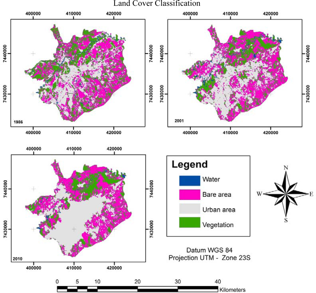
The RGB composition created by the NDVI, NDWI and NDBI was useful for identifying land cover types and allowed us to easily select training areas for the supervised maximum likelihood classification. Each composed image was ordered into 4 area classes: water, vegetation, urban and bare. Using the matricial algorithm, we could edit the urban and bare areas of high spectral confusion according to the information obtained by the photo-interpreter. The results of the classifications of land cover are found in
Figure 2.
The use of indices to generate the RGB composed image was useful for identifying land cover, and in particular, the difference between urban and bare areas. Compared to the typical RGB composition using the sensor bands of each channel, the indices-generated RGB composition could discern more classes of areas. The sensitivity of the indices-generated RGB composed images arises from the purpose of the indices, which was to enhance the response of a specific target to allow for more accurate land cover interpretation.
The indices-generated RGB composition could be useful for agriculture studies because it enhances the differences in vegetation because of the NDVI and NDWI indices. The NDWI index enhances the detection of water content within vegetation, which helps eliminate the spectral confusion between bare and urban areas. This result stems from the higher water content in bare areas compared with urbanized areas. Urban areas have reduced water content because of the increased amount of impervious surfaces over the soil. However, high NDWI values could indicate high levels of air humidity, which could saturate the composed image and spoil the classification.
The visual analyses of the classifications showed an expansion in 2001 and 2010 of urban areas, which is quite noticeable when compared to the urban areas in 1986. A decrease of vegetated areas was also found for the same time period. These two facts coincided with the growth of São José dos Campos’ population. According to the Brazilian Population Census of 2010 [
37], the population was 287,513 in the early 1980s, but 30 years later, the population had risen to 627,544, with 615,175 people living in urban areas.
According to Silva [
38], during the period between 1980 and 2000, 421 industries were introduced to the city, which was mainly due to São José dos Campos’ strategic geographic location at the center of a route of roads connecting the 3 main southeastern States of Brazil: São Paulo, Rio de Janeiro and Minas Gerais. Beyond its geographic characteristics, the city is also attractive to the scientific community because of its technological centers, institutes and universities. The city also provides a qualified labor force for industry.
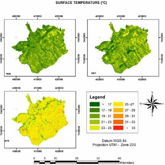
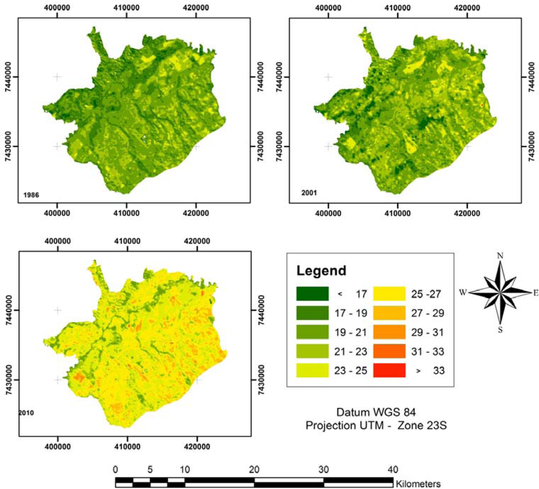
To analyze the relationship between land cover and SHIs, we extracted the LST from the TM/Landsat 5 thermal infrared band (band 6) (
Figure 3). For each analyzed year, an image was produced that provided a visual resource for analyzing the intensity and spatiality of SHIs.
The multi-temporal analyses of LSTs showed an enormous increase in the temperature of São José dos Campos during the period from 2001 to 2010. Although the images were acquired in the same season and month, the difference in temperature was acute. This fact led us to analyze the
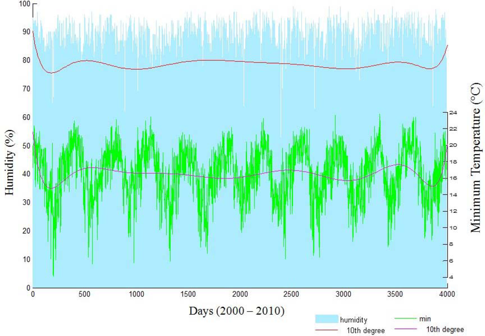
in situ data (
Figure 4) recorded at the INMET meteorological station of Mirante de São Paulo, in São Paulo.
According to the meteorological station of INMET, the temperature was 17.2 °C on 6 August 1986, 16.2 °C on 15 August 2001, and 20.4 °C on 24 August 2010. The low temperature in 2001 resulted from a La Niña climatic effect, which causes dry and cold weather in São Paulo State. These effects were easily recognized from the charts of temperature and humidity shown in
Figure 4.
In
Figure 4, we adjusted the minimum air temperature and mean air humidity to the period from 1 January 2000, to 31 December 2010. To easily analyze the variations, we also adjusted the curve for each parameter using a decic polynomial. The polynomial curve fitting allowed us to observe a decrease in the minimum temperature and humidity from 2000 to 2001 and 2009 to 2010 resulting from a La Niña event. However, the decreasing amplitude of the curves indicated that the lowest temperatures in the winter during the analyzed periods had increased.
The general increase of the minimum temperature over the analyzed period was most likely due to land cover changes. The size of urban and bare areas had increased, while the size of vegetated and aquatic areas had decreased. Furthermore, according to Maia
et al.[
39], the verticalization process within a city causes a decrease in wind speed, which promotes an increase in temperature. Thus, the urbanization process linked to the high emission of pollutants and the decrease of green areas over the last decade could be responsible for the abrupt increase in temperature.
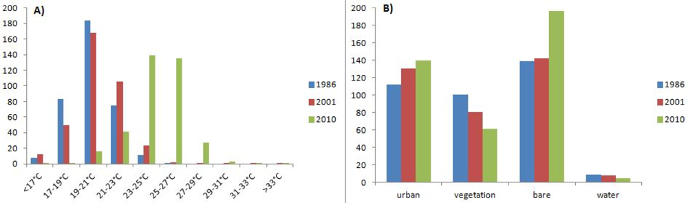
To quantify the land cover changes and relate them to the LST changes, we quantified the classes from our hybrid classification according to temperature and land cover area (km
2). The results, shown in
Figure 5, were used to validate our interpretation of land cover and LST changes. The analyses of the temperature for 1986 showed that the majority of the urban areas of São José dos Campos had temperatures between 19 and 21 °C. In 2001, the temperature was transitioning between 19 and 21 °C and 21 and 23 °C. In 2010, the majority of urban areas had LSTs distributed between 23 and 25 °C and 25 and 27 °C.
To show a quantitative relationship between land cover and temperature change, we used the Pearson Correlation [
35] to calculate the correlation matrix (
Table 1). We used the area size data extracted from the hybrid classification for each year using the R software environment for statistical computing [
34]. The highest positive correlations were found in the following ranges of temperatures: 23–25 °C, 25–27 °C, 27–29 °C, 29–31 °C and 31–33 °C. We also found the same positive correlations for temperatures <17 °C and between 21 and 23 °C. The highest negative correlations were found between the temperature range of 19–21 °C and the higher temperature ranges (23–25 °C, 25–27 °C, 27–29 °C, 29–31 °C and 31–33 °C). A high negative correlation was also found between the 19–21 °C temperature range and the size of bare areas. The highest positive correlation between land covers was found between areas of vegetation and water. The highest negative correlation was found between urban and vegetated areas.
To relate the land cover patterns to LSTs, we analyzed the correlations between the classes of land cover and LST. The best highest positive correlation was found between bare areas and temperatures between 23 °C and 33 °C. Other positive correlations were found between urban areas and temperatures above 23 °C. However, these correlations were not as high compared to what was found in bare areas.
The highest positive correlations with low temperatures were found in the classes of vegetation and water. Conversely, urban and bare areas had a high negative correlation with high temperatures.
These results showed the relationship between the land cover patterns and LST. As shown in
Figure 5 and
Table 1, changes in land cover patterns are highly correlated to changes in LSTs and the SHI effect.
We also found that urban and bare areas correlated positively with SHIs because the growth of urban and bare areas coincided with an increase in temperatures. Although these two land cover classes typically showed spectral confusion, the hybrid classification allowed their differentiation and showed that bare areas were most positively correlated with SHIs. Bare soil has a high reflectance intensity due to the presence of Fe
2O
3, sand and clay [
40,
41], which had a significant influence on the SHI.
3.2. Quantitative Relationship between Temperature and Index Values
Figure 3 shows the LSTs in the study area for the analyzed years, and qualitative changes in the intensity and spatial distribution of LSTs were found. However, we performed a quantitative analysis to identify independent changes in the LSTs between each year to determine if the changes were significant. The same procedure was performed to identify the significance of each index.
To show if the changes were relevant, we used the Monte Carlo Method (MCM) to simulate numerous values of mean temperature or mean index. The results were plotted in a probability density function to identify the independence of the values from each year. If the results were independent, a change would be evident.
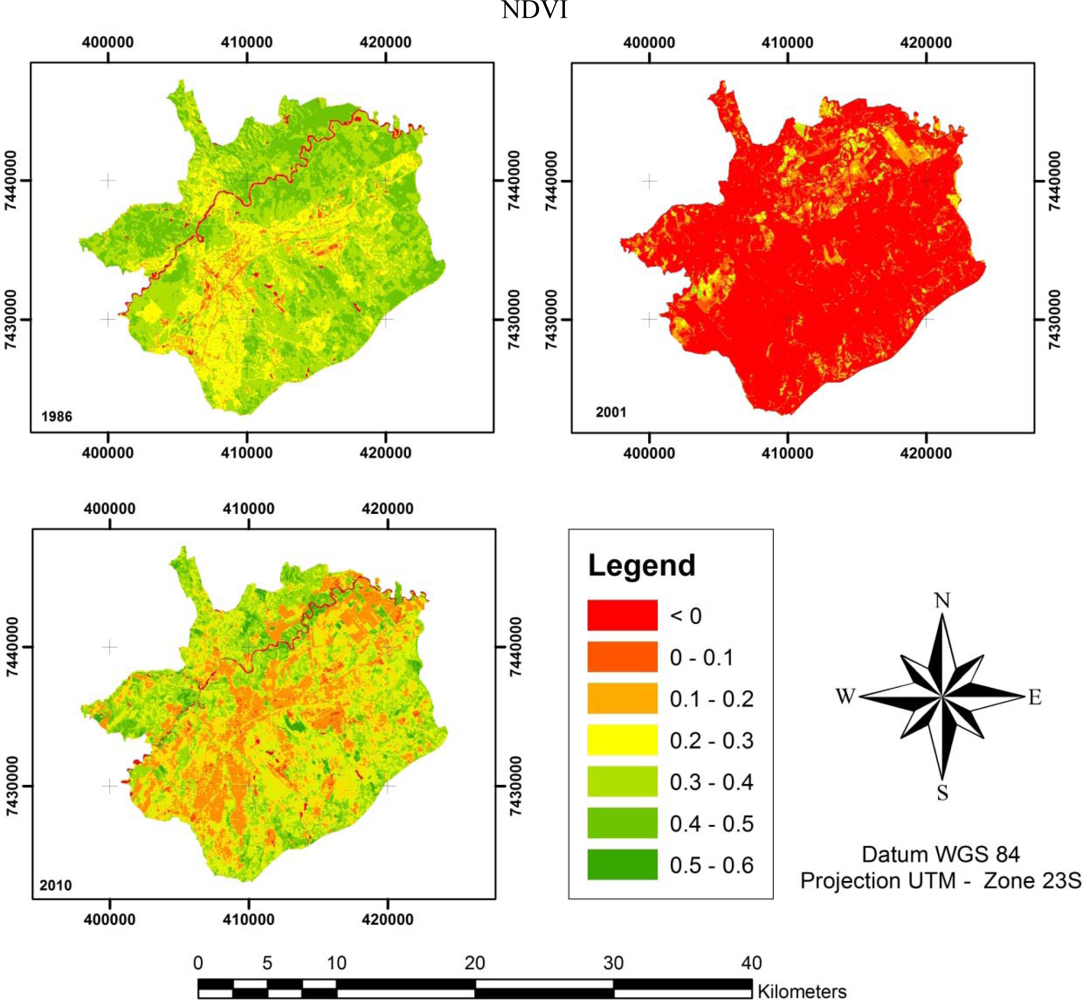
The NDVI (
Figure 6) was calculated according to
Equation (4) for each image. Visual inspection ascertained the differences of each NDVI. The highest degree of difference was in 2001 (
Figure 6), with a majority of NDVI values appearing to be below 0. As previously explained, in the period from June 2001 to February 2002, Brazil had experienced an atypical climatic period caused by the La Niña effect that produced very dry spring/summer seasons. During this period, most of the Brazilian States rationed electrical power because of low levels of water in hydroelectric plant reservoirs. The decreased water and dry weather were essential to the low values of the NDVI in 2001 because the index decreases as foliage comes under water stress [
42]. Comparing the NDVIs of 1986 and 2010, changes were identified. The 1986 NDVI was enhanced compared to 2010; however, there were few areas in which the 1986 NDVI showed a decrease compared to 2010. This result could be explained by the maintenance provided by environmental management programs started because of concern over global natural resources.
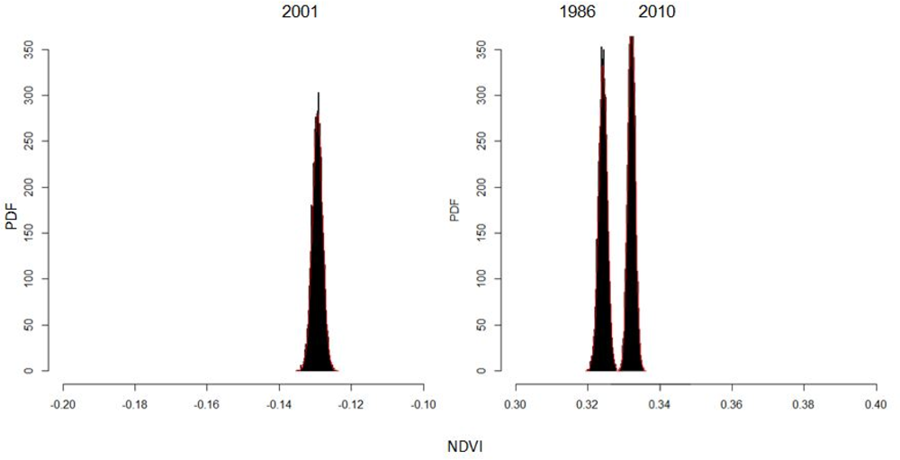
To analyze the independence of each NDVI, a MCM was performed with the R software environment for statistical computing [
34]. We calculated 10,000 times the mean value using 10,056 random points for each index. These values calculated the probability density function (PDF) (
Figure 7), which allowed us to analyze if changes occurred.
In the histogram shown in
Figure 7, 2001 is shown to be very atypical, with all mean values of the NDVI ranging between −0.14 and −0.12. In contrast, the majority of the NDVI mean values from 1986 and 2010 were between 0.32 and 0.34.
Although urban expansion is shown in
Figure 6, the quantitative results from
Figure 7 show that the mean NDVI values for 2010 are higher than for 1986. Potential explanations for the unexpected increase in vegetation were detailed by Moura
et al.[
43], who conducted a literature review and found that there was leaf flush at the top of the canopy, changes in leaf area index (LAI), modifications in canopy structure associated with tree mortality, diurnal variability in leaf water and clouds and aerosol effects.
The increasing concern for environmental preservation over the last decade has been influenced by environmental policy concerning global environmental changes. Thus, the size of urban green areas increased primarily because of the construction of urban parks, which have improved both environmental conservation efforts and the quality of human life.
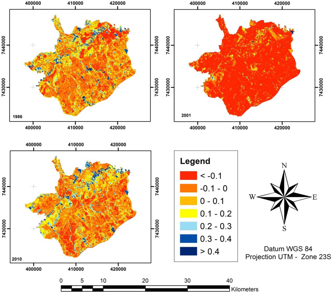
The NDWI (
Figure 8) behaved similarly to the NDVI, with most of the study area having low values in 2001 because of the hydric stress of the vegetation. In addition, 2001 also had low air humidity levels because of the La Niña effect. However, the increase of NDWI values for 2010 were caused by agricultural practices. Irrigation systems installed in agricultural areas decreased the impact of hydric stress on vegetation, and the effect was noticeable in the NDWI values north of the city. In 1986, the NDWI values were below −0.1, and in 2010, the values were approximately 0.1–0.2.
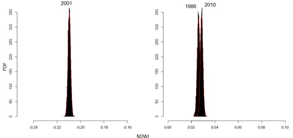
The PDF results (
Figure 9) of NDWI values show low values for the 2001 NDWI, which was in the range of −0.22 to −0.20 and indicated very low air humidity and water cover and a high hydric stress for the analyzed area. When the NDWI values for 1986 and 2010 were visually overlaid, the result accounted for approximately 6% of the spectral confusion over the two year period. Out of 10,000 differences computed by the MCM, 598 were meaningless. Therefore, almost 94% of the simulated changes for the 24 years between 1986 and 2010 were significant.
The NDBI (
Figure 10) for the three analyzed images were not influenced by the La Niña event in 2001 because the bands used for analysis are located on the NIR region of the electromagnetic spectrum where water content has a low influence on the processes of atmospheric absorption and scattering.
Figure 10 shows the evolution of urban expansion according to the values of the NDBI, which is shown by an increase of red areas. Analysis of the PDF results shows a quantitative discrepancy between the NDBI values between 2010 and 1986 and 2001 (
Figure 11). These results show that the 2010 NDBI mean values were between 0.32 and 0.34, while in 1986 and 2001, the NDBI means values were between 0.185 and 0.195, and 0.195 and 0.21, respectively.
The results did not show any spectral confusion and the changes between years were clearly visible, demonstrating the independence and representativeness of the index. The main result of this analysis, however, was that the quantification of the NDBI could show a relationship between changes in area size and land cover class.
Therefore, the NDBI was shown to be a good estimator of urban expansion for a specific region of interest, and this finding has created new avenues of future research into UHI effects [
13,
28,
32]. Currently, the NDBI has had difficulty differentiating between bare areas and built-up areas because of their similar reflectance in the TM/Landsat 5 bands, which is a problem that Chen
et al.[
28] tried to solve using the Normalized Difference Bareness Index (NDBaI).
The results of the PDF (
Figure 12) for the LSTs showed a similar behavior to that of the NDBI. The main similarity was in the distribution of the mean values of temperature, which followed the chronological order of the thermal images.
As shown in
Figure 12, all the mean values for the 2010 LSTs were in the range of 24.5 to 25 °C. These results were higher compared to 1986 and 2001, which were in the ranges 19.5 to 20 °C and 20 to 20.5 °C, respectively.
Finally, we compared the values from each land cover pattern with the mean yearly values for each index and LST using a correlation matrix (
Tables 2–
5). This procedure was performed to analyze the relationship between the indices and temperature for a specific land cover pattern.
Table 2 shows that for a water cover pattern, the values of the NDVI had a high positive correlation (r = 0.96) with the values of LST, a moderately positive correlation with the values of the NDWI and a low negative correlation with the values of the NDBI.
Table 3 shows that for a bare cover pattern, the values of the NDWI had a high positive correlation (r = 0.87) with the values of LST, a moderately positive correlation with the values of the NDVI and a low negative correlation with the values of the NDBI.
Table 4 shows that for a vegetation cover pattern, the values of the NDWI and the NDVI had a high positive correlation (r = 0.86 and 0.80) with the values of LST and a moderately negative correlation with the values of the NDBI.
Table 5 shows that for an urban land cover pattern, the values of the NDBI had a high positive correlation (r = 0.81) with the values of LST and the NDWI and the NDVI had moderately positive correlation (r = 0.46 and 0.52) with the values of LST.
The highest positive correlation was found between the NDVI and NDWI, which had an “r” of 1.00 for the urban pattern. The two indices also show a high positive correlation for the vegetation pattern (r = 0.99); however, their correlation for the water pattern was moderate (r = 0.74). It was interesting to note that in the urban pattern, the correlation between the NDVI and NDBI had an “r” of 0.92, which could be explained by the positive environmental actions promoted in the urban areas. The highest negative correlation was between the NDWI and NDBI for the water pattern, which had an “r” of −0.95.
In summary, these correlations showed the relationship between SHIs and the NDBI, and their relationship in the urban pattern has been well documented in previous studies [
1,
2,
4,
11]. However, the present study analyzed the use of indices as indicators of SHIs according to each land cover pattern. Although the correlation results between the indices and LSTs showed a moderate relationship, using indices as predictors could be an important tool for preliminary studies. New sensors from global observation programs can also improve the normalized indices within thin and specific spectral bands.
The results of the hybrid classification demonstrated that bare areas were the most positively correlated land cover pattern with SHIs. Bare areas have a high reflectance because of the soil components, as demonstrated by Price [
44]. Price found that predominantly bare soil locations experienced a wider variation in LSTs. Conversely, analysis showed that the NDBI was the most positively correlated index with SHIs in an urban land cover pattern. However, it is important to note that the NDBI has a high spectral confusion rate between bare and urban areas, which could interfere with the urban pattern reflectance. The NDBI accuracy should be investigated in future studies.
The methods used in this paper resulted in an important range of quantitative tools that can be applied to studies of the SHI effect. Some of methods we developed were used by others authors to analyze the influence of land cover patterns upon LSTs. Chen
et al.[
28] used the indices and a classification based on IKONOS images to analyze the relationship by a regression equation. Xiong
et al.[
13] also used the statistical correlation to identify relationships between land cover and LSTs and used a SPOT image to classify the land cover patterns. In addition to these methods, we tested the use of a hybrid classification for the same Landsat TM 5 image. We used these methods to infer LSTs, applied the Pearson correlation to show relationships between land cover patterns, indices and LSTs and analyzed the independence of each parameter through a Monte Carlo simulation. These approaches allowed us to not only quantify the relationship of the land cover patterns but also to analyze the use of normalized indices to evaluate the relationship between land cover and LST.
By this unique method of hybrid classification implemented by SPRING, we improved the accuracy of our land cover pattern mapping. However, this method required detailed information of the area for the photo-interpreter. The use of a computational simulation was an important advance towards improving the reliability of the analysis of index change and added a new approach for validating UHI studies.


