Abstract
Light-emitting diode (LED) destination indicators mounted on the front of buses enable pedestrians to quickly identify bus numbers. In this study, the factors affecting their legibility were investigated. We aimed to deduce the process of enhancing the legibility of LED destination indicators. Combinations of different text colors, text fonts and information display locations were investigated in this study. Significant differences were observed at the longest visual range when these combinations were used. The optimal information display was obtained using the New Johnston Medium typeface with yellow font color on a black background. For the glare distance, significant differences were observed when different information display locations were used. Superior results were obtained when information was centered. This study is of practical importance to people who depend on public transport, especially those in an emergency. In the future, these results can be used as a guide for designing LED destination indicators that are mounted on the front of public buses.
1. Introduction
The aim of light-emitting diode (LED) destination indicators on buses is to inform pedestrians about the bus number and destination. In peak traffic and low-lighting situations, it is difficult for pedestrians to accurately identify the bus number and destination in a short time. In particular, the ambient lighting condition changes at night. This increases the difficulty of identifying the number of a bus; thus, commuters may miss a bus or take the wrong one. Therefore, it is crucial to explore the design elements of LED destination indicators and conduct further studies on the factors that affect their legibility. Due to the current needs and lifestyles, high-efficiency, high-energy-conservation and long-life LED products are widely used for road lighting and transportation facilities [1,2]. The use of large-scale LED products is inevitable in the near future [3,4]. Thus, LEDs have transformed from being scarcely used devices to being widely used lighting devices. Compared with conventional light bulbs, LEDs conserve more energy, have a lower damage rate and have a longer service life [5,6]. LED traffic signals and information displays provide clear messages to the public [7,8,9]. No general rules have been established for the design of LED destination indicators mounted on the front of public buses in Taiwan. Some bus companies do not consider the visual factors for humans or legibility principles when designing the alphanumeric display panel on buses. In the field of design, text and numbers are two of the most crucial elements of visual communication. Thus, designing, revising and rearranging the structure of text and numbers yields better legibility, improved readability, ease of recognition, and improvement in visibility of text and numbers. Bus numbers are currently displayed in similar fonts and pedestrians can identify bus numbers and destinations by reading text on the LED destination indicators. Thus, they do not have sufficient time to make relevant decisions before the arrival of a bus. Eventually, the service quality of the buses can be improved through such enhancements. This study investigated the LED destination indicators on public buses to determine the maximum distance from which pedestrians can identify Arabic numerals in various fonts, colors and locations. The study objectives were as follows:
- To identify out whether different fonts, colors and locations influence the legibility of Arabic numerals;
- To determine the degree of glare caused by displaying Arabic numerals using LEDs;
- To examine the factors that influence LED displays on public buses to achieve the maximum visual range.
2. Related Works
2.1. Legibility
Legibility refers to the human ability to accurately read and understand the contents of a sign in a short time [10,11,12]. In emergency situations, people must be able to rapidly and accurately judge and understand the content of text in a limited time. The glyph structure is a crucial factor influencing visual recognition of text [13]. Legibility is related to evaluation indicators such as font, symbol and visibility, which may affect the visual search [14]. The characteristics of strokes, the thickness of strokes, the height of characters, the width–height ratio of characters, the contrast between numbers, and different lighting levels have been found to affect the recognition ability [15,16].
2.2. Visual Range
Visual ability affects a person’s visual performance. When viewing colors, people perceive subjective characteristics of contrasts related to brightness, color and hue contrasts [17,18,19]. Brightness contrast signifies that a color block placed before a darker background appears brighter than one placed before a lighter background. Color contrast denotes that a color placed before a colorless background appears more colorful than one placed before a more colorful background [20,21,22,23,24,25,26]. Visual ability refers to a person’s ability to recognize the details and contours of objects, and it includes the aspects of visual acuity, contrast sensitivity, visual rate, color vision and visual adaptability to brightness [27]. In the field of transportation, vision is crucial. Nomura [28] indicated that visual stimuli accounted for 87% of the external stimuli perceived by the five senses. Vision is the general term for visual ability [29]. The LED display screens on buses are 200 and 40 cm in length and height, respectively. In this study, the experimental conditions were set to be identical to the distances between pedestrians and buses when the commuters waited for the buses. To calculate the distance required to identify a number, we used the Arial font, which has the smallest spaces between adjacent numerals and the number “9” was selected. According to Taiwan’s scholar Wang M.S. [30], the number “9” is often mistaken to be the number “8” because the bottom half of the number can be easily misread. Therefore, the minimum detectable range and minimum separation between characters—two criteria to measure the vision or visual acuity of humans—were employed to calculate the minimum spacing required between numerals.
Wang also identified four features of the visual field:
- Minimum visible, perceptible: the range of visual identification ability of a human.
- Minimum separable: the range of visual perception of human eyes.
- Minimum distinguishable: the range of interpretation ability of human eyes.
- Minimum legible distance: the range of the human eyes’ ability to interpret the smallest parts of a figure.
A trial and error method was adopted onsite to measure the visual range to determine the longest visual range (120 m). We referred to the visual range of liquid crystal displays recommended by the University of Wisconsin Research Center [31] and considered the width of LED displays mounted on buses to obtain a visual range of 28 m. Moreover, the participants in this study were asked to complete an assessment questionnaire on the “degree of glare from far to near”, that is, when they were 28 and 120 m away from the buses.
2.3. Glare
Glare occurs when the brightness in the field of vision is greater than the eye can tolerate. Glare can cause visual irritation, discomfort and disturbance and loss of eyesight. Currently, there are no policies or regulations on the glare produced by LED billboards, traffic signs or vehicle lamps. Whether a person experiences glare is determined by factors including the intensity of the ambient light, the person’s physiological condition, the balance between the light source and the brightness of the surrounding environment, the angle between the direct and indirect light sources, the angle between the line of sight and the light source and the distance between the light source and the observer [32]. The major causes of glare include a high brightness contrast between the light source and the background, an extremely bright light source and a light source with a wide angle that is close to the observer [33].
2.4. Information Display Location of Arabic Numerals
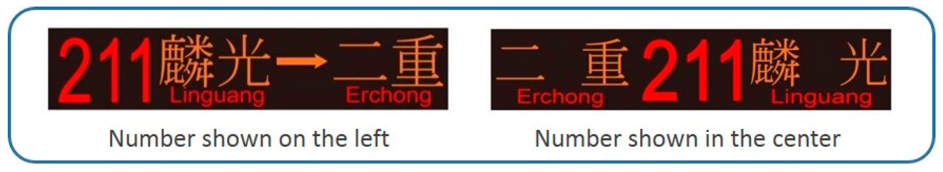
Based on a survey of buses in Taipei that was conducted in this study, we identified two information display locations of Arabic numerals—left and center. Thus, these two information display locations were used in the experimental design determine significant legible factors.
3. Methods
The legibility of LED displays mounted on public buses was examined in this study to select the optimal Arabic numeral font, LED color and display location for the longest visual range and the elimination of glare when viewed from close but without compromising the design aesthetics. Because illumination differs between day and night, the study was only conducted at nights.
3.1. Participants
Thirty participants, 13 males and 17 females, were selected for this study. The effects of sex and age were not investigated in this study. Before initiating the experiment, the participants underwent an examination to ensure that they had normal eyesight. The participants were aged between 21 and 25 years.
3.2. Experimental Procedure
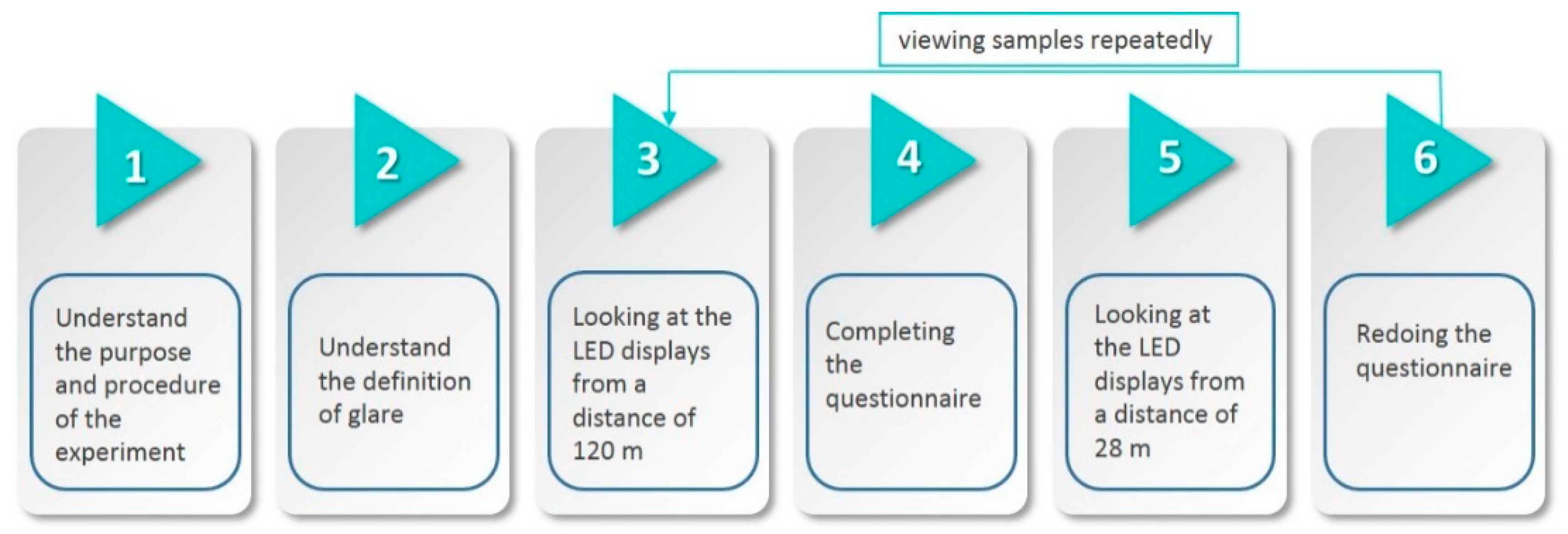
Figure 1 illustrates the first stage of the experiment. In this stage, the participants were asked to look at the LED displays from a distance of 120 m and complete the questionnaire. Subsequently, the participants were asked to view the LED displays from 28 m and reattempt the questionnaire. The test was repeated until 18 test samples were collected.
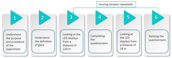
Figure 1.
First stage of the experimental procedure.
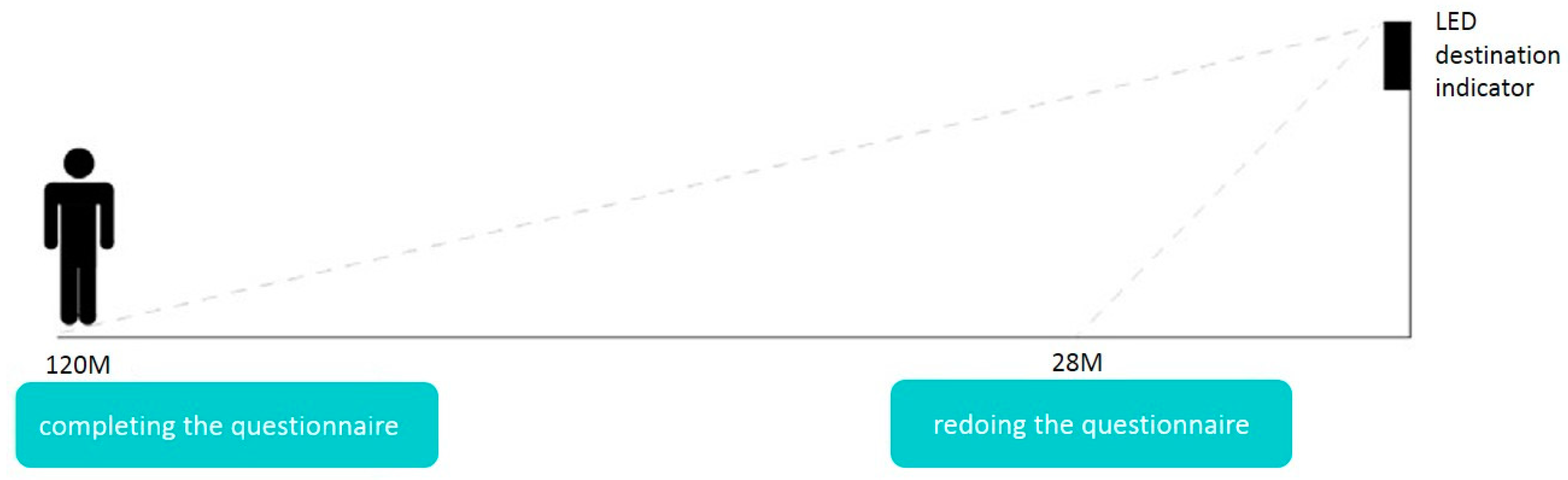
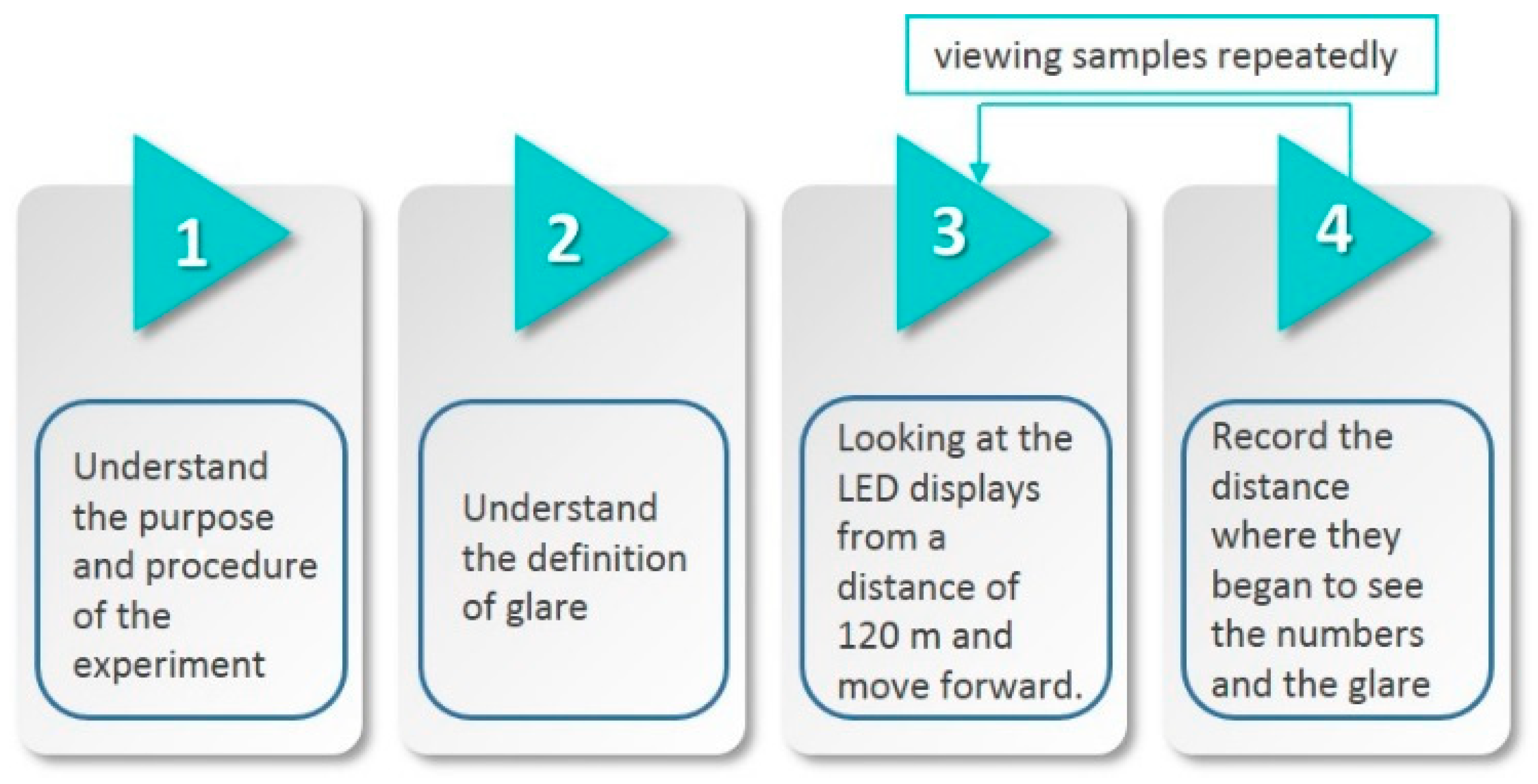
Figure 2 and Figure 3 present the second stage of the experiment, in which the participants started 120 m away from the LED displays and walked toward the LED displays. They were asked to move 1 m at a time and to record the distance at which they could see the numbers and the distance at which they experienced glare. The visual range and glare distance were rounded down to the next 1 m and next 5 m, respectively. To ensure the reliability of the data, the order of the experiment was varied for all the samples and the participants were asked twice about the visual range and glare distance. The visual range and glare distance were recorded only when the participants provided the same answer at both times.

Figure 2.
Schematic of the first stage of the experiment.
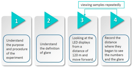
Figure 3.
Second stage of the experimental procedure.
3.3. Equipment and Samples of the Experiment
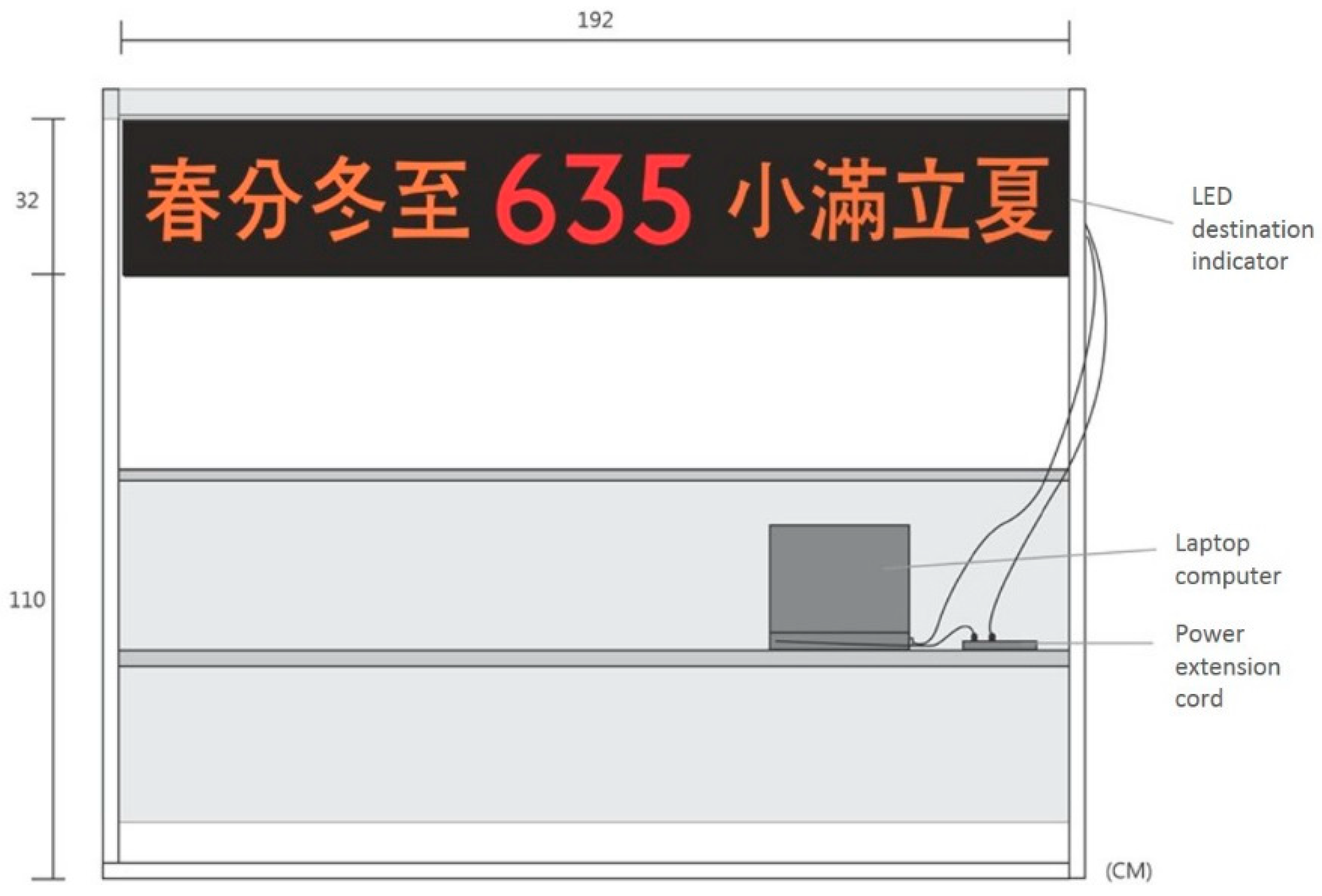
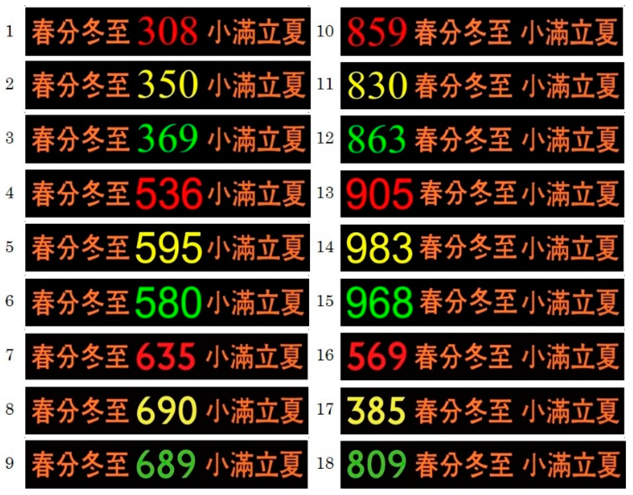
The experimental equipment architecture diagram of this study is presented in Figure 4. Figure 5 illustrates the experimental samples of Arabic numeral fonts and Figure 6 illustrates the experimental samples of Arabic numeral display locations. Table 1 outlines the design variation in the experimental samples and Figure 7 represents the design of all experimental samples. Table 2 outlines variable factors of sample numbers.

Figure 4.
Experimental equipment architecture diagram.
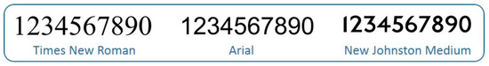
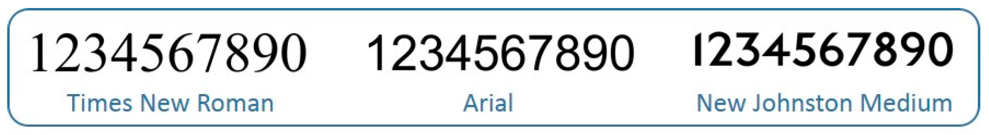
Figure 5.
Arabic numeral fonts.
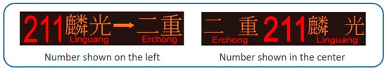
Figure 6.
Arabic numeral display location.

Table 1.
Design variation in experimental samples.
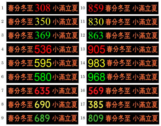
Figure 7.
Experimental sample design.
Table 2.
Variable factors of sample numbers.
3.4. Subjective Scale of Visual Fatigue
Heuer et al. [34] developed a subjective scale of visual fatigue with six items, as listed in Table 3. Each question was answered by a 10-point scale, from 1 (not at all) to 10 (very much). In this experiment, the subjective rating scale proposed by Heuer et al. was used but the scale was modified into a five-point Likert scale for individuals to express their agreement with the statements. The five responses were strongly disagree, disagree, undecided, agree and strongly agree (‘1’ = strongly disagree, ‘5’ = strongly agree).
Table 3.
Visual fatigue subjective assessment scale by Heuer et al.
4. Experimental Results and Analysis
Assessments conducted in this experiment were divided into two parts. In the first part of the assessment, the assessment questionnaire on the “degree of glare from far to near” was used. The questionnaire involved a five-point Likert scale and was used to record the participants’ scores. Subsequently, the mean score for each question was calculated on the basis of 30 samples. In the second part of the assessment, a distance record table was used. The participants were asked to record their visual range and glare distance in the table by referring to the meter marks written on the ground. On the basis of the descriptive statistical results, the descriptive statistics of the variables and the mean (M) and standard deviation (SD) of the participants’ line of sight were calculated. A multivariate analysis of variance (ANOVA) was performed to determine the glare, dizziness and visual range legibility differences between the LED displays when different factors were involved at same and different distances. A least significant difference test and a multiple comparison analysis were conducted to identify the key visual range and glare distance. To know the reliability of the subjective scale adopted in the test, the SPSS18 is used to analyze the reliability test. The reliability test method for Likert Scale adopts the Cronbach α coefficient, the reliability analysis results in this test is shown the Cronbach α value is 0.844, which shows that the subjective questionnaire adopted in the test has a uniformity and stability.
4.1. Analysis Results of the Degree of Glare
The within-subjects effects results of participants who experienced glare at 120 m are presented in Table 4 for the factors “color”, “font” and “information display location”. Only “color” exhibited a significant effect on glare, thus revealing that the colors red, yellow, and green had an interaction effect. The results revealed that the distance of 120 m was generally too far for the participants to clearly read the text on the LED displays. Thus, font and information display location had a nonsignificant effect on glare. The identification results of the three aforementioned colors from a distance of 120 m, according to the subjective rating scale proposed by Heuer et al., and the five responses were strongly disagree, disagree, undecided, agree and strongly agree. Yellow (mean = 3.472) was the most identifiable produced the least glare, followed by green (mean = 3.511) and red (mean = 3.878).
Table 4.
Within-subjects effects analysis of participants who experienced glare at 120 m.
According to the internal effect tests of participants who experienced a glare at 28 m, the factors color, font and information display location are listed in Table 5. Information display location did not demonstrate a significant effect on glare. The test results revealed that all participants could clearly read the information on the LED display that was 28 m away. This indicated that color and font affected information identifiability, whereas the information display location did not. The glare test revealed that at 28 m, the green (mean = 3.333) was the least glare color, followed by yellow (mean = 3.372) and red (mean = 3.850), the New Johnston Medium typeface produced the least glare (mean = 3.422), followed by Arial (mean = 3.539) and Times New Roman (mean = 3.594) typefaces. Times New Roman generated the highest glare, possibly because it contains serifs, which may impede participants’ vision. We determined that New Johnston Medium was the most identifiable and created the least glare, followed by Arial and Times New Roman (which contain serifs).
Table 5.
Within-subject effects for glare test at 28 m.
The internal effect tests of participants who experienced dizziness at 28 m, the factors color, font and information display location are listed in Table 6. According to questionnaire number 6: I feel dizzy looking at the screen and the five responses were strongly disagree, disagree, undecided, agree, and strongly agree. Only “color” exhibited a significant effect on dizziness. The test results at 28 m, yellow was excessively bright and caused visual discomfort to the participants and engendered the highest degree of dizziness (M = 2.700), followed by green (M = 2.644) and red (M = 2.239). By comparing the degree of glare and the degree of dizziness experienced by the participants at 28 m, green was identified as the optimal color, which was also unlikely to cause dizziness. This result was in line with the theory proposed by Hsu [29] that eyes are more sensitive to green light at high brightness levels. Consider of typefaces, because New Johnston Medium and Arial contain thick fonts and straight strokes, they are relatively more identifiable. Arial was identified as the optimal font and was also unlikely to cause dizziness. By contrast, Times New Roman was the most prone to cause dizziness and was the least recognizable. The most identifiable information display location was the center, which was unlikely to cause dizziness.
Table 6.
Within-subject effects for dizziness at 28 m.
4.2. Analysis Results of the Visual Range and Glare Distance
Table 7 reveals that the three factors (i.e., color, font and information display location) had a sum of squared deviation of 3708.352, a degree of freedom of 4, a mean square of 927.088, an F value of 53.076 and a p value of 0.000, thus indicating a significant interaction (p < 0.05). The color–font interaction had a p value of 0.000 (p < 0.05; indicating significant interaction) when the information display was within the visual range. These results may be because the two typefaces have long and thin strokes, thus making them more identifiable when within the visual distance. This result was in agreement with a result revealed by Wang [30], which referenced a study administered by Japanese scholar Ichihara, related to Arabic numeral thickness and readability. Wang revealed that Arabic numerals with thick strokes and straight lines are easier to read than those with arcs, especially when the font size is small. Table 8 reveals that, in the visual range, the optimal color was yellow (M = 89.89 m), followed by green (M = 84.73 m) and red (M = 81.26 m).Within the visual range, the optimal font was New Johnston Medium (M = 86.78 m), followed by Arial (M = 85.62 m) and Times New Roman (M = 83.48 m). Because New Johnston Medium has long and thin characters, it was easier to identify within the visual range. By contrast, Arial is a thick and roundish font and thus it was difficult to identify it in the visual range.
Table 7.
Three-factor multivariate analysis of the visual range.
Table 8.
Color and Font in the visual range.
Table 9 reveals that the three factors (i.e., color, font, and information display location) had a sum of squared deviation of 1225.007, a degree of freedom of 2.965, a mean square of 413.167, an F of 5.968, and a p value of 0.001, thus indicating a significant interaction (p < 0.05). The color–font interaction had a p value of 0.000 (p < 0.05; indicating significant interaction) when information display was within the visual range. For the glare distance, color and font were not significant and only information display had a p value of 0.000. And the color and font interaction presented a significant p value of 0.002 (p < 0.05). The interaction between font and information display location had a significant p value of 0.017 (p < 0.05). Also the interaction between color and information display location had a significant p value of 0.001 at the glare distance (p < 0.05). Thus, it was speculated that the glare distance of the result from the LED display is shorter and the visual task of participants was to search for the visibility of Arabic Numbers, information display was showing a significant, the information display located on the left or in the center which had great difference, and consistent with the research conclusion of Chong [32]. The information display location with Arabic numerals on the left was more vulnerable to glare than the center with Chinese characters on both sides because of the symmetry effect. Table 10 presents the information display location results. The center location was least susceptible to glare (M = 13.53 m) and glare was more easily observed when the display was located on the left (M = 16.16m).
Table 9.
Three-factor multivariate analysis of the glare distance.
Table 10.
Glare distance in terms of the information display location.
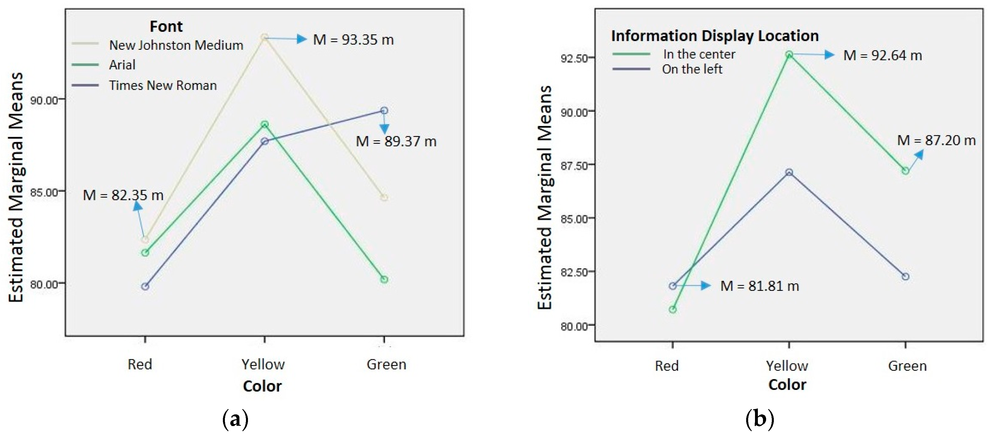
The visual range results presented in Figure 8a, when the information display was within the visual range and red color was used, the New Johnston Medium typeface provided the optimal result (M = 82.35 m). When yellow was used, New Johnston Medium yielded the optimal result (M = 93.35 m). Moreover, when green was used, Times New Roman generated the optimal result (M = 89.37 m). Which illustrate that yellow was the optimal color when the Arial and New Johnston Medium typefaces were used, whereas green was the ideal color when Times New Roman was used. The optimal information display location results presented in Figure 8b illustrated that the left (M = 81.81 m), center (M = 92.64 m) and center (M = 87.20 m) were ideal for red, yellow, and green colors, respectively. When the display was located at center, yellow was the optimal color, followed by green and red.
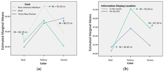
Figure 8.
(a) Estimated marginal means of the visual range of the color and font. (b) Estimated marginal means of visual range of the color and information display location.
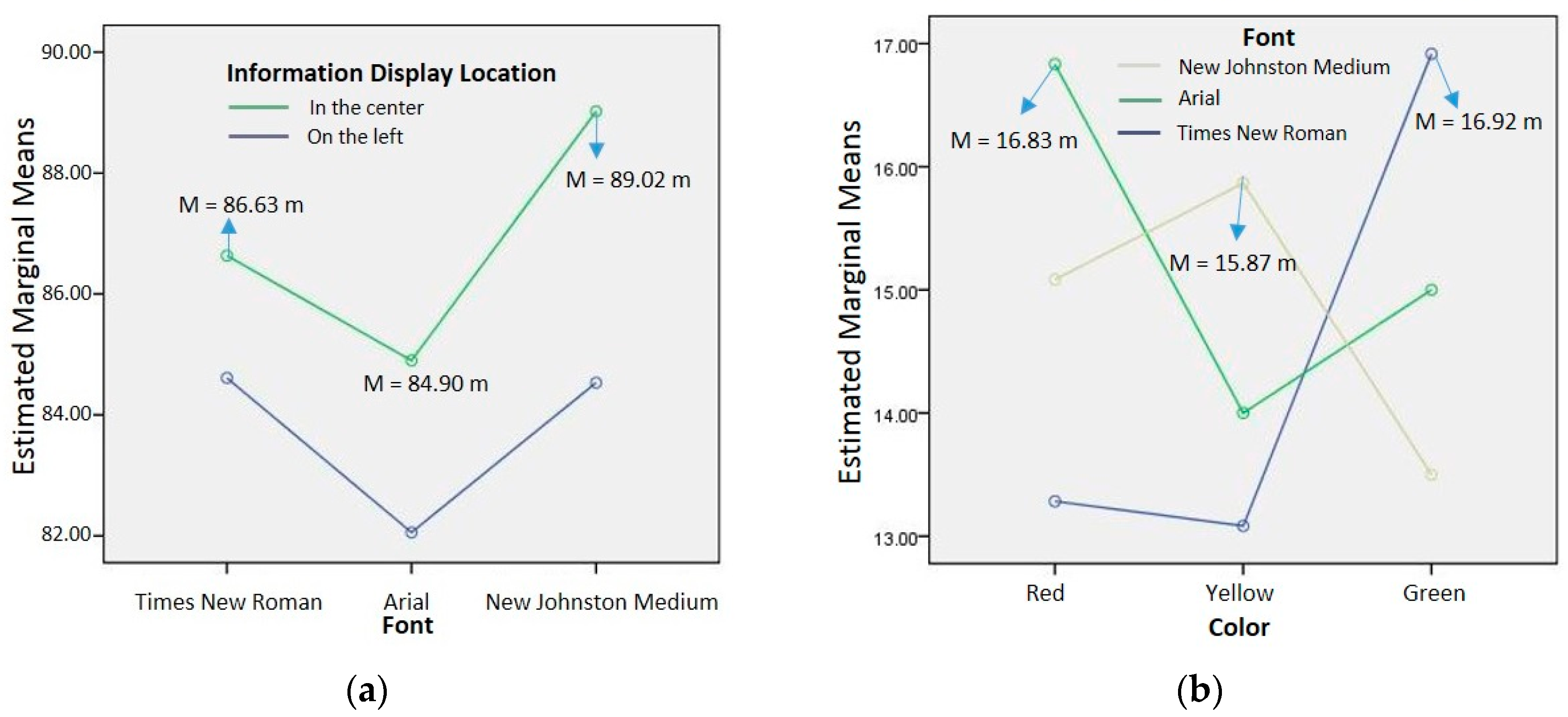
Figure 9a indicates that for Times New Roman, Arial, and New Johnston Medium, the optimal information display location was in the center (M = 86.63 m), in the center (M = 84.90 m), and in the center (M = 89.02 m), respectively. For the two information display locations, New Johnston Medium was the optimal typeface, followed by Times New Roman and Arial. Figure 9b Arial was the optimal typeface when red color was used (M = 16.83 m), New Johnston Medium was the optimal typeface when yellow was used (M = 15.87 m) and Times New Roman was the optimal typeface when green was used (M = 16.92 m).
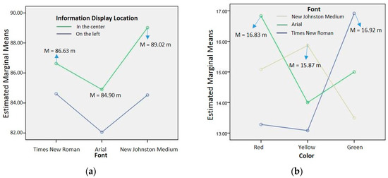
Figure 9.
(a) Estimated marginal means of the visual range for font and information display location. (b) Estimated marginal means of glare distance for color and font.
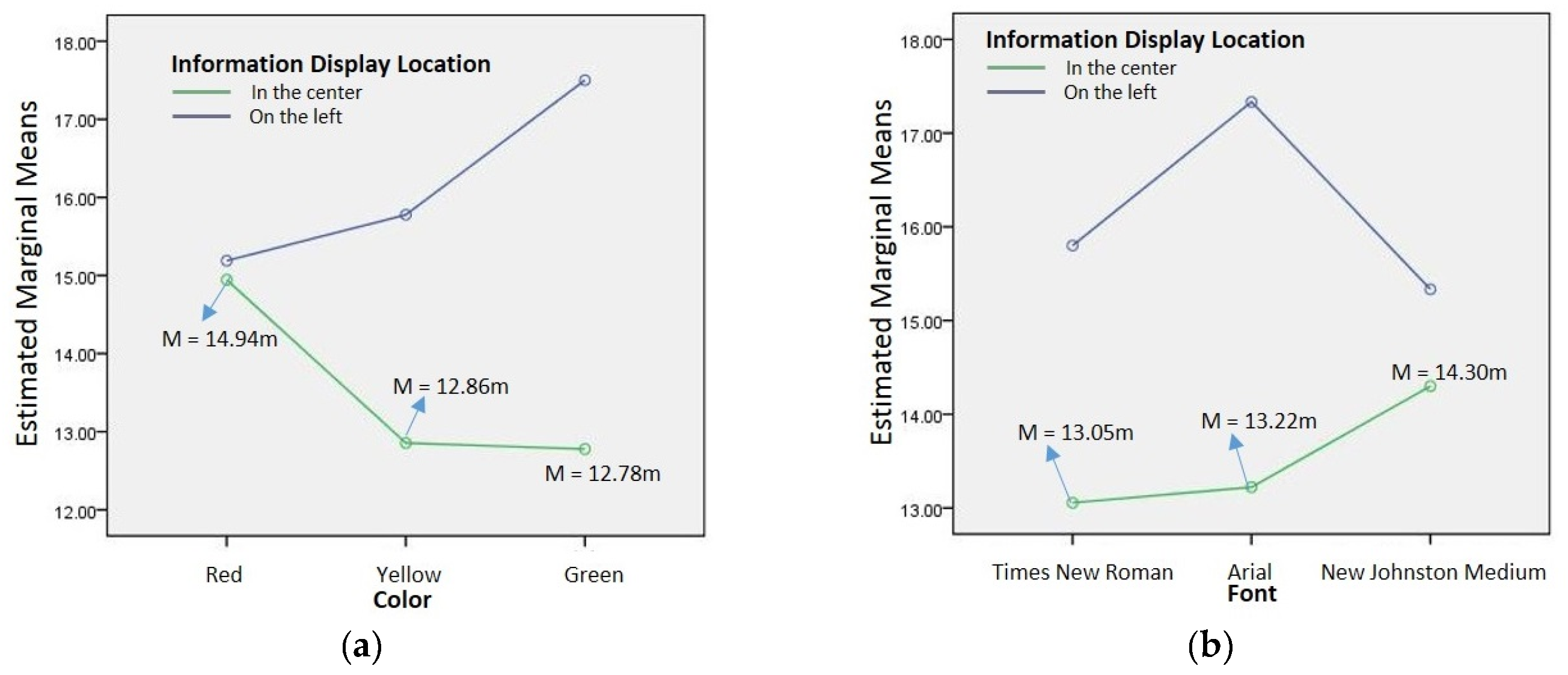
The interaction between color and information display location had a significant p value of 0.001 at the glare distance (p < 0.05). Figure 10a illustrates that the optimal information display location was in the center when the color was green (M = 12.78m), yellow (M = 12.86m) and red (M = 14.94m). Figure 10b illustrates that the optimal information display location was in the center when Times New Roman (M = 13.05m), Arial (M = 13.22m) and New Johnston Medium (M = 14.30m) were used.
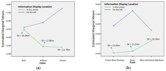
Figure 10.
(a) Estimated marginal means of the glare distance for color and information display location. (b) Estimated marginal means of the glare distance for font and information display location.
4.3. ANOVA and Post Hoc Analysis
The ANOVA results for the factors were compared and the color and font were tested. The statistical results were as follows.
4.3.1. Post Hoc Analysis of Color
Table 11 reveals that the mean square difference between the groups of visual range was 6785.604; degree of freedom was 2; mean square value was 3392.802; F value was 319.939; and p value was 0.000, which was significant (p < 0.05). The p value of the glare distance was 0.346, which was not significant (p > 0.05). Table 12 reveals an interaction between the two colors in the visual range (p < 0.05).
Table 11.
ANOVA of colors.
Table 12.
Multiple comparisons of colors.
4.3.2. Post Hoc Analysis of Font
Table 13 revealed that the mean square value between groups of the visual range was 1009.437; degree of freedom was 2; mean square value was 504.791; F value was 10.573; and p was 0.000, which was significant (p < 0.05). The p value of the glare distance was 0.750, which was not significant (p > 0.05). The LSD multiple comparisons of the font are presented in Table 14. The analysis results of the visual range revealed that the p value of Times New Roman and New Johnston Medium was not significant (p > 0.05). The p values of Times New Roman and Arial were significant (p < 0.05). The p values of New Johnston Medium and Arial were significant (p < 0.05) in the visual range.
Table 13.
ANOVA of fonts.
Table 14.
Multiple comparisons of fonts.
5. Conclusions
The factors affecting the legibility of LED destination indicators mounted on the front of a bus were investigated in this study. The major conclusions are as follows. First, by comparing the degree of glare experienced by the participants at 28 m, green (M = 3.333) and yellow (M = 3.372) colors were found to produce glare. Yellow (M = 2.700) and green (M = 2.644) caused the highest degree of dizziness. Because the difference between the means of these two colors was small, both colors caused dizziness. Times New Roman was the typeface that caused the most glare and dizziness, and it impeded identification ability because it contains serifs. Glare and dizziness was caused when the display was located on the left. Due to the symmetry effect, the optimal result was obtained when the display was mounted at the center and this location also reduced glare. Second, the results revealed significant differences in the visual range for the three colors. Yellow could be seen from far away, thus signifying that the human eyes have higher detection range for yellow–green lights. In the visual range, there were significant differences between the three fonts. There were no significant differences in the glare distance for the three fonts. Within the visual range, New Johnston Medium was the most identifiable font because it is sans serif, is thicker and has straighter lines. Third, there were significant differences in the visual range and glare distance for the two information display locations. For both visual range and glare distance, the information displayed in the center yielded the optimal results. The center was the optimal information display location because of the symmetry effect. In the future, we will explore the ambient illumination during daytime. Thus, we will investigate and compare the legibility of information displays during the day and night. The participants in this study were aged between 21 and 25 years. To consider the needs of an aging population, future studies can recruit seniors and older adults as participants to evaluate the legibility of LED destination indicators. These findings are of practical importance to people who depend on public transport, which provide an applicable guide for designing LED destination indicators in the future.
Author Contributions
C.-F.W. supervised the entire study and designed the experiments. W.-J.C. proposed the application, analyzed the method and wrote the manuscript. K.-C.L. and F.-Y.L. conducted experimental simulations and collected the results. All authors have read and approved the final version of the manuscript.
Funding
This research was funded by the Ministry of Science and Technology of Taiwan under the grant number MOST 103-2622-E-036-005-CC3.
Acknowledgments
The authors would like to thank the editor and reviewers for their constructive suggestions, which significantly improved this manuscript.
Conflicts of Interest
The authors declare no conflict of interest.
References
- Wu, C.C.; Wu, C.F.; Lien, P.W.; Lin, K.C. A Study of semantic analysis of LED illustrated traffic directional arrow in different style. Int. Sch. Sci. Res. Innov. 2014, 8, 2649–2657. [Google Scholar]
- Lai, C.J. Effects of color scheme and message lines of variable message signs on driver performance. Accid. Anal. Prev. 2010, 42, 1003–1008. [Google Scholar] [CrossRef] [PubMed]
- Gago-Calderón, A.; Fernández-Ramos, J.; Gago-Bohórquez, A. Visual quality evaluation of large LED displays based on subjective sensory perception. Displays 2013, 34, 359–370. [Google Scholar] [CrossRef]
- Czerwinski, M.; Czerwinski, M.; Smith, G.; Regan, T.; Meyers, B.; Robertson, G.G.; Starkweather, G.K. Toward Characterizing the Productivity Benefits of Very Large Displays. In Proceedings of the Human-Computer Interaction--INTERACT’03, Zurich, Switzerland, 1–5 September 2003; pp. 9–16. [Google Scholar]
- Zhan, X.; Zhang, J.; Wang, X.; Cheng, J. Progress on silicone packaging materials for power LED. Procedia Eng. 2012, 27, 687–692. [Google Scholar] [CrossRef]
- Vienot, F.; Coron, G.; Lavedrine, B. LEDs as a tool to enhance faded colours of museums artefacts. J. Cult. Herit. 2011, 12, 431–440. [Google Scholar] [CrossRef]
- Liu, Y.C. A simulated study on the effects of information volume on traffic signs, viewing strategies and sign familiarity upon driver’s visual search performance. Int. J. Ind. Ergon. 2005, 35, 1147–1158. [Google Scholar] [CrossRef]
- Nguyen, F. Challenges in the design of a RGB LED display for indoor applications. Syn. Metals. 2001, 122, 215–219. [Google Scholar] [CrossRef]
- Shinar, D.; Vogelzang, M. Comprehension of traffic signs with symbolic versus text displays. Transp. Res. Part. F Traffic Psychol. Behav. 2013, 18, 72–82. [Google Scholar] [CrossRef]
- Park, S.; Choi, D.; Yi, J.; Lee, S.; Lee, J.E.; Choi, B.; Kyung, G. Effects of display curvature, display zone and task duration on legibility and visual fatigue during visual search task. Appl. Ergon. 2017, 60, 183–193. [Google Scholar] [CrossRef]
- Hill, A.L.; Scharff, L.V. Readability of screen displays with various foreground/background color combinations, font styles and font types. In Proceedings of the Eleventh National Conference on Undergraduate Research, Austin, TX, USA, 24–26 April 1997; pp. 742–746. [Google Scholar]
- Dobres, J.; Chahine, N.; Reimer, B. Effects of ambient illumination, contrast polarity and letter size on text legibility under glance-like reading. Appl. Ergon. 2017, 60, 68–73. [Google Scholar] [CrossRef]
- Lin, H.; Wu, F.G.; Cheng, Y.Y. Legibility and visual fatigue affected by text direction, screen size and character size on color LCD e-reader. Displays 2013, 34, 49–58. [Google Scholar] [CrossRef]
- Easterby, R.S. Tasks, processes and display design, In Information Design: The Design and Evaluation of Signs and Printed Material; Easterby, R., Zwaga, H.J.G., Eds.; Wiley: New York, NY, USA, 1978. [Google Scholar]
- Bouma, H. Visual reading processes and the quality of text displays. In Ergonomic Aspects of Visual Display Terminals; Grandjean, E., Vigliani, E., Eds.; Taylor & Francis: London, UK, 1980; pp. 101–114. [Google Scholar]
- Nes Van, F.L. Space, colour and typography on visual display terminals. Behav. Inform. Technol. 1986, 5, 99–118. [Google Scholar] [CrossRef]
- Lin, C.C.; Huang, K.C. Effects of ambient illumination conditions and background color on visual performance with TFT-LCD screens. Displays 2013, 34, 276–282. [Google Scholar] [CrossRef]
- Sanders, M.S.; McCormick, E.J. Human Factors in Engineering and Design, 7th ed.; McGraw-Hill: New York, NY, USA, 1993. [Google Scholar]
- Bernard, M.L.; Chaparro, B.S.; Mills, M.M.; Halcomb, C.G. Comparing the effects of text size and format on the readability of computer-displayed Times New Roman and Arial text. Int. J. Hum. Comp. Stud. 2003, 59, 823–835. [Google Scholar] [CrossRef]
- Shi, X.W. Fundamentals of Interior Lighting Design; Shushin Publishing House: Taipei, Taiwan, 1996. [Google Scholar]
- Shieh, K.; Lin, C. Effects of screen type, ambient illumination and color combination on VDT visual performance and subjective preference. Int. J. Ind. Ergon. 2000, 26, 527–536. [Google Scholar] [CrossRef]
- Bruce, M.; Foster, J.J. The visibility of colored characters on colored backgrounds in viewdata displays. Vis. Lang. 1982, 16, 382–390. [Google Scholar]
- Hill, A.L.; Scharff, L.V. Legibility of computer displays as a function of colour, saturation and texture backgrounds. In Engineering Psychology and Cognitive Ergonomics; Harris, D., Ed.; Ashgate: Sydney, Australia, 1999; pp. 123–130. [Google Scholar]
- Radl, G.W. Experimental investigations for optimal presentation-mode and colors of symbols on the crt-screen. In Ergonomic Aspects of Visual Display Terminals; Grandjean, E., Vigliani, E., Eds.; Taylor & Francis: London, UK, 1980; pp. 127–136. [Google Scholar]
- Pace, B.J. Color combinations and contrast reversals on visual display units. In Proceedings of the Human Factors Society 28th Annual Meeting, Orlando, FL, USA, 22–26 October 1984; pp. 326–331. [Google Scholar]
- Hall, R.H.; Hanna, P. The impact of web page text-background colour combinations on readability, retention, aesthetics and behavioural intention. Behav. Inform. Technol. 2004, 23, 183–195. [Google Scholar] [CrossRef]
- Lin, C.C. Effects of contrast ratio and text color on visual performance with TFT-LCD. Int. J. Ind. Ergon. 2003, 31, 65–72. [Google Scholar] [CrossRef]
- Nomura, J. The Secrets Adding and Enriching Colors: An Introduction to Chromatics; Taipei, Taiwan, 1996. [Google Scholar]
- Hsu, S.H.; Peng, Y.; Wu, S.P. Human Factors and Ergonomics; Yang-Chih Book Co., Ltd.: Taipei, Taiwan, 1991. [Google Scholar]
- Wang, M.S. Visual response to road traffic signs. Ind. Des. Mag. 1984, 45, 39–43. [Google Scholar]
- University Facilities Research Center. Space for Audio-Visual Large Group Instruction; University of Wisconsin: Madison, WI, USA, 1963. [Google Scholar]
- Chung, W.C. A Study on Vision Ergonomic Assessment of LED Changeable Message Signs on Different Environment Illuminance. Master’s Thesis, Graduate School of Industrial Design, Tatung University, Taipei, Taiwan, 2011. [Google Scholar]
- Altomonte, S.; Kent, M.G.; Tregenza, P.R.; Wilson, R. Visual task difficulty and temporal influences in glare response. Build. Environ. 2016, 95, 209–226. [Google Scholar] [CrossRef]
- Heuer, H.; Hollendiek, G.; Kröger, H.; Römer, T. Die Ruhelage der Augen und ihr Einfluß auf Beobachtungsabatand und visuelle Ermüdung bei Bildschirmarbeit. Z. Exp. Angew. Psychol. 1989, 36, 538–566. [Google Scholar]
© 2019 by the authors. Licensee MDPI, Basel, Switzerland. This article is an open access article distributed under the terms and conditions of the Creative Commons Attribution (CC BY) license (http://creativecommons.org/licenses/by/4.0/).