Article

The Relationship of Symmetry, Complexity, and Shape in Mobile Interface Aesthetics, from an Emotional Perspective—A Case Study of the Smartwatch

1
The Graduate Institute of Design Science, Tatung University, Taipei 104, Taiwan
2
Jincheng College of Nanjing University of Aeronautics and Astronautics, Nanjing 210000, China
*
Authors to whom correspondence should be addressed.
Symmetry 2020, 12(9), 1403; https://doi.org/10.3390/sym12091403
Submission received: 7 July 2020 / Revised: 7 August 2020 / Accepted: 14 August 2020 / Published: 24 August 2020
(This article belongs to the Special Issue Empirical Aesthetics)

Abstract

:
Products with interactive interfaces can be seen everywhere, and product interface design aesthetics is a topic that has begun to receive wide attention. Consumers’ perceptions of product interfaces come from their own emotions, and emotion plays a significant role in product interface design aesthetics. In other words, it must meet the users’ emotional and aesthetic requirements. Therefore, we need to better understand the aesthetic design criteria and how they stimulate specific emotional responses. This study takes the dial interface of smartwatches as its experimental sample and explores how the interaction effects of the screen shape (square and round) and the symmetry type and the complexity type of the interface design influence the users’ emotional arousal and valence. In addition, it analyzes the effects of the symmetry type, the complexity type, and the screen shape on the users’ arousal and valence. The results show that the attributes of interface design aesthetics (symmetry-asymmetry, complexity-simplicity, and square-round) affect the users’ emotional responses. Moreover, the interface shape is one of the important factors in the emotional response to an interface design. This paper, based on previous research, provides vital theoretical support for the relevant literature on interface design aesthetics and the users’ emotional state. In addition, it may provide a reference for designers and developers who wish to develop and implement emotional user interfaces that are designed to more effectively appeal to their emotions.

1. Introduction

With the continued development of science and technology, an increasing number of products are being designed with touch interfaces. To succeed in the increasingly competitive market, the feelings of consumers shall be taken into account when designing these products. In other words, the product’s interface design aesthetics must meet the users’ preference and aesthetic requirements. In the context of Human–Computer Interaction (HCI), or interactive product design, user interface design aesthetics has become the main topic of concern. Such aesthetics are reflected, not only visually, but in the experience of users after using these excellent interface designs [1]. At present, empirical studies have identified various attributes of user interface designs that are closely related to aesthetics [2,3,4]. For example, Ngo and Byrne defined the aesthetic criteria of interface design as an objective, automatable metric of screen design, which can help designers to create attractive screens [5]. They have also developed the following 14 objective measures of screen aesthetics: balance, symmetry, equilibrium, unity, sequence, density, proportions, cohesion, simplicity, regularity, economy, homogeneity, rhythm, and order. Among them, symmetry can be used to ensure a balanced interface and to present a unified aesthetic appeal [6]. They also suggested that elements and dialog boxes should be sorted symmetrically in interface designs [2,6]. Later, Moshagen and Thielsch developed another measurement method, covering a wider aesthetic dimension of a perceptual interface [7]. Their measurements included 18 dimensions. For example, simplicity is an important aspect of user-centered aesthetic perception [7]. Cheng and Mugge found that visual complexity affects the consumers’ emotional response in different ways [8]. Various experimental studies have formulated experience-based design suggestions, and symmetry and complexity have been identified as the important aesthetic attributes that affect user interfaces [9]. In our study, therefore, symmetry and asymmetry, as well as complexity and simplicity, will be regarded as factors that affect the aesthetic cognition of the interface.
For a long time, people have believed that there are similar rules governing the relationship between the stimulation of perceived simplicity/complexity, the degree of arousal, and its valence [10]. Berlyne assumed that people prefer moderate arousal and he believed that complexity is related to arousal [11]. Simple stimulation hardly causes arousal, while complex stimulation causes higher arousal. Lang et al. proposed a two-dimensional emotional organization method [12]. The dimensions of emotional arousal and valence form the so-called emotional space. Arousal and valence are both crucial for describing emotional perception; that is, these two dimensions can adjust the way that people perceive emotions from images [13]. Moreover, they are the two main components of human emotion, and together, they capture most of the differences in self-reported mood ratings [14]. Therefore, through the evaluation of arousal and valence in emotion, we can understand symmetry and complexity in interface design aesthetics from an emotional perspective.
Symmetry and complexity are prominent features in interface design, but their influence on cognitive and emotional processing requires further research. At present, researchers mainly study the influence of symmetry and complexity on the design aesthetics of web pages or interfaces [3,9,15], while a few use empirical methods to analyze the emotional perception of symmetry and complexity in web pages or interfaces [10,14]. For example, Bertamini et al. adopted the Implicit Association Test (ITA) to test implicit associations with symmetry and positive valence, as well as high arousal and simplicity [10]. Bhandari et al. used Electrodermal Activity (EDA) to measure arousal and they used Facial Electromyography (fEMG) to measure emotional valence, in a bid to understand the emotional perception of the visual aesthetics of mobile applications (apps) [14]. However, this study has employed non-instrumental factors to understand symmetry and complexity in interface design aesthetics. In other words, it has adopted a subjective survey method.
Consumer researchers have made important progress in understanding the cognitive and emotional responses of consumers to product design and appearance [16]. Although the influence of symmetry and complexity on visual aesthetics has been pointed out in previous literature [3,
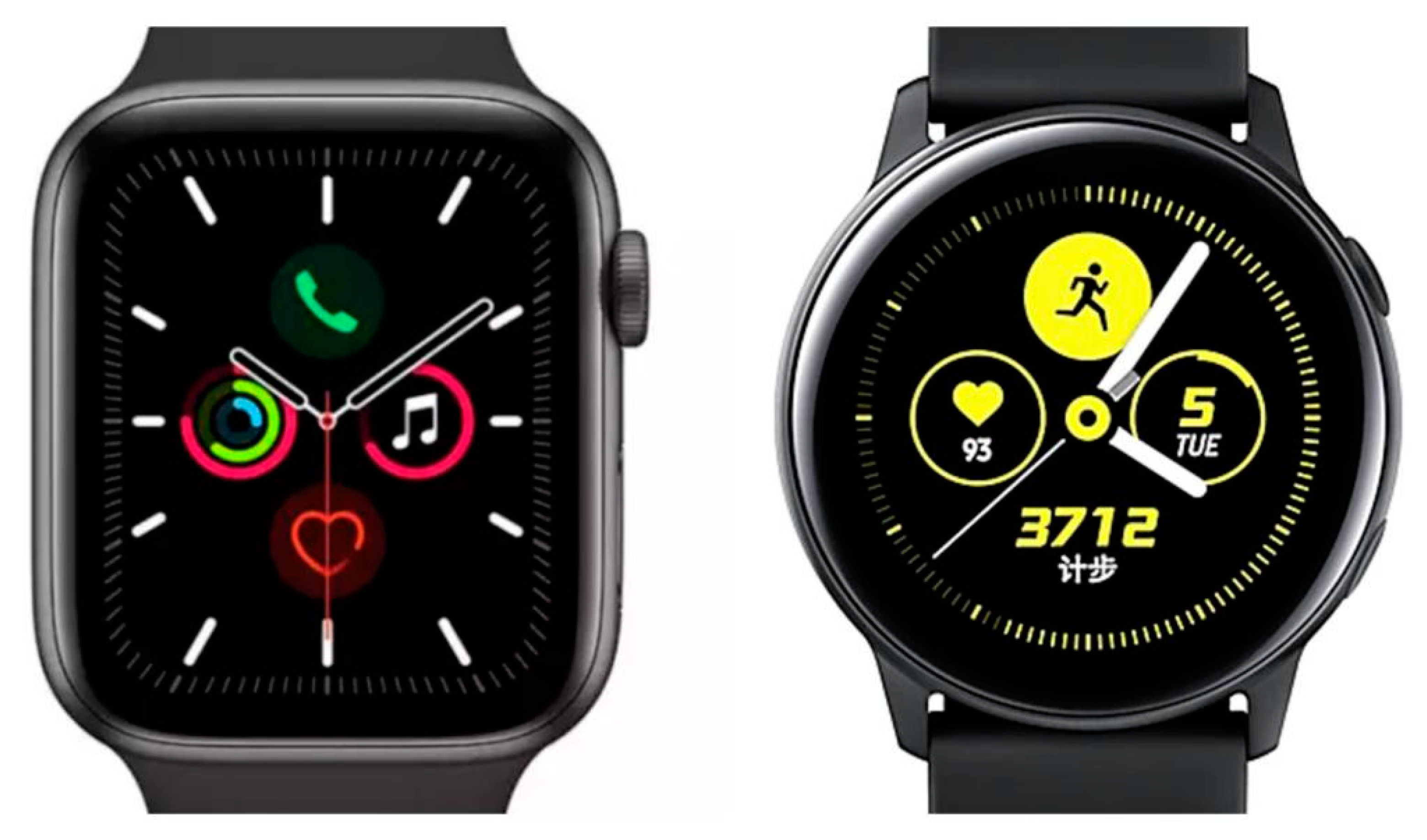
16], it has not yet been explained with respect to practical product applications. The subject of our study (the dial interface of a smartwatch) provides an interesting context. First of all, the screen of the dial interface of a smartwatch is small and there is little display space on the screen. Compared with other interfaces (e.g., computers and mobile phones), the effect of multiple overlapping windows cannot be displayed effectively on the screen. Secondly, in terms of the user environment, it is a type of mobile interface because people sometimes look at watches while moving. Movement brings about more external interference. Thirdly, regarding the user interaction model, the interaction period between the user and the interface is short and intense. In general, every small part of the screen space is valuable in design, which urges Graphical User Interface (GUI) designers to arrange as many elements as possible on a single screen. This increases the visual complexity of the interface. Besides, mobile users operate the screen interface by using their fingertips; therefore, they prefer well-structured visual configurations, shorter lists, and simpler menus [17].
Emotion plays an important role in the design of interfaces with complete functions and in the aesthetic appeal of the interface to users. Therefore, we need to better understand aesthetic design criteria and how they stimulate specific emotional responses. Will a design that is guided by symmetry-based design criteria make users feel more positive, or will a design guided by complexity-based criteria make them more excited and lead to positive arousal or valence? In addition, the screen shape has become one of the most salient features of the structure and modality cues of smartwatches [18]. When it comes to shapes, will the contour of the product interface also affect a user’s emotional response? Since the visual interface is the first thing that users make contact with, their emotional response to its design is a vital prediction point for future Human–Computer Interaction or interactive product design [14]. To make up for the aforementioned gaps, this study explores how the screen shape (square and round) and the interaction between the symmetry and the complexity in the screen interface affect emotional arousal and valence. This paper examines the symmetry, complexity, and screen shape of interface design aesthetics, from the perspective of emotion. Such information may facilitate an understanding of the effect of these attributes (symmetry-asymmetry, complexity-simplicity, and square-round) in the aesthetics of mobile interface design and provide a reference for developers and designers.
The remainder of this paper is organized as follows: Section 2 is the literature review on the screen shape of smartwatches, the symmetry and complexity in interface design aesthetics, and emotional arousal and valence, and it develops the research hypotheses about the influence of the symmetry type, complexity type, and screen shape on emotional arousal and valence further. Section 3 describes the experimental methods and steps, while Section 4 discusses the results, Section 5 presents a discussion on the research results, Section 6 offers the conclusions, and Section 7 proposes the research limitations and directions for future works.

2. Literature Review and Hypotheses

2.1. Symmetry and Complexity

Symmetry and complexity are the most basic principles in interface design aesthetics and are also powerful determinants of aesthetic judgement [3]. According to the existing literature, people usually prefer higher symmetry and moderate complexity, and they prefer specific proportions that vary from product to product [16]. Symmetry and asymmetry in the interface will affect the layout and perception of the design. For example, symmetric interfaces provide a sense of durability and stability, while asymmetries arouse people’s interest. In addition, symmetry promotes the adoption of a regular structure and meaningful form in the interface, maintains a sense of balance, and unifies the display elements into a cohesive whole, thus creating integrity and meaning [19]. Arnheim (1986) suggested that the dimension of symmetry/asymmetry has an underlying cognitive scale, which corresponds with simplicity/complexity [20]. Complexity is defined as the number of single elements that make up each stimulus. In HCI, this definition should include the perspective of human information processing [3]. In addition, the level of complexity may vary according to the physical or cognitive characteristics of each user [21]. Berlyne found that people prefer moderate visual complexity [11]. Based on his research, many researchers have explored the relationship between complexity and aesthetic perception further [21,22,23]. In addition, the complexity of the interface is judged based on the number of display elements and their aggregate structure [24]. Complexity in the interface design depends on many factors, including the type and number of the elements that are contained in the interface and their spatial layout [25]. It plays a vital role in the perception of visual stimuli. According to Berlyne’s aesthetic theory, audience pleasure is related to the arousal potential of such stimuli [26]. Many researchers have observed the relationship between visual complexity and pleasure [24,27,28]. Such a relationship uses an inverted-U shape curve to indicate pleasure, which presents the linear growth with the potential of stimuli [29,30]. Stimuli with a low complexity are often considered to be unattractive, and even boring [16]. However, as mentioned above, most research has focused on aesthetic perceptive preferences in static task domains [21,22,23,30], such as the complexity of web page interfaces. Few have tried to identify the factors that affect complexity during interactions with a dynamic task domain. According to research by Böhm, an emotional response will change with the environmental risks [31]. Therefore, is the relationship between complexity and pleasure still inverted-U shape curve in different task environments? The research subject of this study is a mobile interface, which is used to test this problem further.
Symmetry affects the perception of complexity. Some scholars have found that, compared with asymmetric shapes with the same number of sides, symmetric shapes have a lower complexity [32]. This may be attributed to the increase in information redundancy caused by the symmetry [23]. The reason why symmetric patterns are better than chaotic patterns is that, with the appearance of more axes of symmetry, the complexity is reduced [33]. Therefore, symmetry must be regarded as an important aspect of visual complexity. Pieters et al. held that asymmetry increases visual complexity because asymmetric stimuli sometimes contain more visual information than symmetric stimuli [34]. The most commonly-studied form of symmetry is vertical symmetry. For ordinary people, vertical symmetry is easier to detect and evaluate than other forms of symmetry (horizontal or tilted), and elements close to the axis of symmetry are more important than elements far away [3,4,35]. Therefore, this study focused on vertical symmetry, and the terms ‘vertical symmetry’ and ‘symmetry’ are used synonymously.

2.2. Effects of Screen Shape

In addition to the visual attributes of symmetry and complexity, other visual features (e.g., the shape and contour) will also affect the human emotional response. When it comes to shapes (e.g., the human face and body), symmetry has a great influence on people’s aesthetic preferences and emotional responses [36,37]. Bar and Neta proved that when presented with round and angular objects or figures, people always prefer stimuli with round contours [38]. Many round objects or figures are more symmetrical than angular objects or figures, such as a round dial and a rectangular dial. Circles are symmetrical on all possible axes, while rectangles are symmetrical only on horizontal and vertical axes. Therefore, people’s preference for roundedness may be due to the influence of symmetry [37]. Complexity involves diversity and a richness of visual information [15], and the number of sides of the shape will increase its complexity [37].
The theory explaining the psychological effect of shape is largely based on the Gestalt principle of visual perception [39]. From the perspective of design, different shapes cause different psychological responses in users. The design principles related to shape generally determine that circles represent emotion, comfort, harmony, warmth, and sensuality, while rectangles represent logic, order, homogeneity, and regularity [18]. Currently, there are two main screen shapes of smartwatches on the market, namely, round and square. For typical consumer electronic products, such as smartphones, tablet computers, and PC displays, there have been few empirical studies on the effect of the screen shape of consumer electronics products since the introduction of rectangular screens (different from the round screens of traditional watches). Therefore, this study included the screen shape of smartwatches as a research factor, with the aim of providing empirical support for the literature.

2.3. Emotions

Firstly, emotion needs to be defined to distinguish it from closely-related terms, such as affect and mood. There has been no consensus on how to define or distinguish these terms in the previous literature. In this study, emotion is described as “strong, temporary, usually with clear reasons and clear cognitive content”. Affect and mood are not as strong, but are more lasting [40]. This study paid close attention to the influence of symmetry and complexity on emotional responses.
The human emotional response can generally be distinguished into two factors, namely, arousal (how calming or exciting?) and valence (how negative or positive?) [41]. According to Russell and Russell and Barrett, emotions can be conceptualized as having two dimensions of arousal and valence, rather than being regarded as various dispersed emotions [42,43]. They are the core components of emotional states and are considered to be the key to prediction and selection [44]. Arousal is called a non-directional component of emotional responses, which reflects the intensity, rather than the quality, of the responses [15]. Moreover, arousal is considered to be orthogonal to valence. Valence refers to the direction in which emotion-related behaviors are activated, either towards appetitive motivation and pleasant emotions, or away, towards aversive motivation and unpleasant emotions [45]. Since it is found that arousal and valence can fully capture the appropriate emotional response range, for the purposes of this study, we regard the symmetry, the complexity, and the screen shape in interface design as the stimulus factors that trigger emotion.

2.4. Hypotheses

This study attempted to understand the influences of symmetry interface design, the complexity interface design, and the screen shape on users’ emotional responses towards GUI. Some research on interface design aesthetics has explored the influence of symmetry on interface judgements and the relationship between higher symmetry and basic graphic aesthetic appeal [46]. The results have shown that people prefer symmetrical rather than asymmetrical graphics. Further empirical aesthetic research has found that symmetrical visual stimulation is more positive than asymmetrical visual stimulation [3]. However, some research shows that asymmetrical visual stimulation can attract more attention than symmetrical stimulation [11,47]. According to the literature, symmetrical forms and meaningful patterns can enhance the aesthetic appeal of products and immediately arouse the consumers’ emotions [48]. Moreover, symmetry usually invokes specific feelings and associations, which is related to the influence of symmetry on arousal or valence. Specifically, symmetrical forms may give an impression of order and peace, while asymmetrical forms usually produce higher-level arousal and are related to excitement and uniqueness [35]. Therefore, we put forward H1a and H1b.
Hypothesis 1a (H1a).
An asymmetrical interface design is more likely to cause emotional arousal than a symmetrical interface design; and
Hypothesis 1b (H1b).
An asymmetrical interface design is more likely to cause emotional valence than a symmetrical interface design.
Some industry experts advocate designing a simple user interface to enhance the usability and ease of interface operations. A simple interface promotes clear perception and understanding by reducing the redundancy of information. In this way, users may achieve their goals more effectively and thus show higher satisfaction [4,32]. However, other researchers have found that although complex interfaces may delay users in performing their tasks, people prefer complex interface designs [49]. Jacobsen and Hofel used abstract graphics as stimuli and found that symmetry and complexity are the best predictors of aesthetic judgement [50,51].
Complexity has long been thought to be related to arousal. A high level of complexity provides a variety of informational clues, which require significant attention and time for observation and understanding. Therefore, as a source of stimulation and interest, it incites more energy mobilization and higher levels of arousal [15]. Marin et al. found that more complex patterns are more pleasant than less complex patterns, which is consistent with earlier studies [27,52]. In early studies, researchers found that more complex patterns would bring higher pleasantness and physiological arousal [11]. Deng and Poole found that the visual complexity of a web interface is positively correlated with the users’ arousal [15]. It is known that emotional arousal and valence affect selective attention and visual processing. Through a series of experiments, Madan et al. found that the ratings of visual complexity are related to emotional ratings [24]. For web interfaces, emotional valence is an important predictor of approach-avoidance behaviors. Positively-valenced emotions stimulate approach actions, while negatively-valenced emotions lead to avoidance behaviors [15]. This is because emotionally-aroused stimulation attracts attention and is prioritized [24]. In this way, the feelings become more vivid. Based on the above, this paper proposes H2a and H2b.
Hypothesis 2a (H2a).
A complex interface design is more likely to cause emotional arousal than a simple interface design; and
Hypothesis 2b (H2b).
A complex interface design is more likely to cause emotional valence than a simple interface design.
The relationship between non-symbolic graphic features and emotion has been studied from different angles. Parametric changes in the basic geometric features of abstract two-dimensional shapes (e.g., the contour, symmetry, and angles) cause a completely different emotional response of the subjects. Screen shapes usually have a positive impact on user perception in various cognitive and emotional fields. Research on the shape of visual presentation has developed rapidly in the field of psychology [18]. Turoman et al. suggested that specific forms of information may be indirectly linked to the influence on the observers through shapes (e.g., round and square), and that different shapes (e.g., round and square) may arouse different moods or emotional states [37]. According to evaluation theorists, emotions are discrete, and arousal and valence evaluation are the basic factors in human emotional processing [53,54]. Some stimulating features (i.e., something that is round) may be considered pleasant by nature. Pacheco et al. manipulated four non-abstract two-dimensional shapes and animations of geometric and kinematic features related to emotion and evaluated their specific effects on the emotional state of the subjects. The results showed that curved shapes aroused people’s positive emotions more than sharp shapes [55]. According to Kim’s research, a round screen is positively correlated with the hedonic quality of smartwatches, while a square screen is positively correlated with the practical quality of smartwatches [18]. Based on the above discussion, this study proposed H3a and H3b.
Hypothesis 3a (H3a).
A round screen interface is more likely to cause emotional arousal than a square screen interface; and
Hypothesis 3b (H3b).
A round screen interface is more likely to cause emotional valence than a square screen interface.

3. Methods

3.1. Stimuli

One of the main functions of a smartwatch is to monitor the health status of its user [56], and the stimuli on the smartwatch interface include relevant information, such as exercise type, exercise heart rate, exercise distance, and exercise time. According to Kim’s literature review and research, monitoring the health status of users is one of the most frequently-used functions [18]. Thus, this study chose the running mode interface of smartwatches as the target of manipulation. The combination of each interface went through the four stages of the routine task of running: starting from the main interface, entering the running training interface, moving to the running process interface, and finally, moving to the running end interface. In this way, the interface appears as the running application process of a regular smartwatch interface.
According to Wang and Hsu’s previous survey of smartwatch users [57], Apple and Samsung were the most highly-used smartwatch brands. The screen of the Apple watch is square and that of the Samsung Galaxy watch is round. Therefore, it is appropriate to select the Apple Watch Series 5 and the Samsung Galaxy watches as the experimental samples for this study. Figure 1 shows the actual commercial smartwatches. In order to ensure that the stimulus materials used were suitable for our research context, we formed a 10-member expert group to discuss the interface design aesthetics of smartwatches. The expert group consisted of design experts and industrial designers. Among them, the design experts included three university teachers of Visual Communication Design and three who taught Digital Media Design. Besides this, there were four interface designers who had been engaged in the interface design industry for at least five years. The expert group discussed the sample smartwatch interfaces, revealing the potential dimensions from the perspective of interface design aesthetics. Then, it manipulated elements in the interface, using the rapid prototyping tool, and collected opinions and further adjusted the interface, so that participants could fully understand these interfaces, which improved the test quality.
Specific manipulation: First, screenshots were taken of the dial interfaces of the Apple Watch Series 5 and Samsung Galaxy watches. We then redesigned the original interface from three aspects: the symmetrical type, the complex type, and the screen shape. Each type contained two dimensions, of which, the symmetry type contained symmetric and asymmetric, the complexity type contains complex and simple, and the screen shape contains square and round. To accurately test our research, based on the symmetry type, the complexity type, and the screen shape type, we created eight combinations of smartwatch mobile interfaces. Each combination contained four interfaces, for a total of 32 interfaces. All interface images had the same size and pixels. In the process of the interface design, we regarded color, icon, layout, and other elements as a whole design, and we did not subdivide them. In this way, we highlighted the key parameters of this study, namely, symmetry-asymmetry, complexity-simplicity, and square-round. Figure 2 shows some samples of the stimuli in the smartwatch interface.

3.2. Design of Experiment

The study used brands of the Apple and Samsung smartwatches as samples of the interface. The iPhone 11 (6.1 inches) and Samsung Galaxy S20 (6.1 inches) were used as the display devices. The two devices were used with indoor light sources in the same indoor environment. During the experiment, other interference factors were avoided in the indoor environment, and the two devices used the same brightness and display calibration. The brand logo was concealed to avoid the potential impact of the brand’s reputation or familiarity.
This study was conducted in a laboratory at a university in Nanjing, China. A 2 (symmetry type: symmetry and asymmetry) × 2 (complexity type: complex and simple) × 2 (screen shape: square and round) between-subject design was used in the experiment, and a total of eight treatments were carried out, as shown in Table 1. The eight treatment groups were randomly presented to the subjects in the experiment. The subjects watched all the interfaces and answered the questions. In order to avoid external interference factors during movement, the subjects saw these controlled interfaces on the equipment in front of them during the experiment. Each interface was displayed on the screen for 1500 milliseconds, without prolonged exposure. According to the literature of Deng and Poole and Bhandari et al., this duration is sufficient to record the emotional responses of the subjects [15,58]. Due to certain limitations in the cognitive process, such an operation offers the subjects a glimpse of the interface design and captures the initial visual processing of the subject and the emotion generated by the stimulus. After the demonstration of a set of interfaces was completed, an intermittent pause of 22 s was provided before the display of the next interface combination. During this period, the subjects scored the set of interfaces according to Bhandari et al.’s emotional arousal and valence of scales [58,59], who analyzed the influence of interface design factors on emotional arousal and valence in mobile applications [59]. Later, in research on mobile applications, Bhandari et al. went on to describe the relationship between aesthetic dimensions (classical and expressive) and emotional arousal and valence [58]. We used their existing scales and adjusted them, based on the subjective measurement of arousal and valence, because they have been proved to be sufficiently reliability or validity [58]. Moreover, according to the previous research results, the scale can meet our experimental needs. Please refer to Appendix A for details of the scales.

3.3. Subjects

Since the sample selected in this study is the running interface of smartwatches, young people show great enthusiasm for health exercise-related issues. Moreover, running is the most common form of exercise. According to Wang and Hsu’s previous survey of smartwatch users [57], we used Purposive Sampling method to select 160 college students (including undergraduate and graduate students) from a university in Nanjing, China, which included 80 males and 80 females aged between 18 and 30 years old, with an average age of (M = 23.4). All of them had normal or corrected eyesight. Purposive sampling was adopted to ensure that subjects had their own smartwatches. In addition, in order to improve the test quality, this study required them to spend some time operating the smartwatches of other brands, in order to increase their familiarity with different brands or shapes, before participating in the experiment (this study provided 20 smartwatches of various brands to facilitate their operation). After the experiment was completed, portable power sources were given to the participants as a reward, by means of a random draw.

4. Results and Analysis

4.1. Effects on Arousal

Three-way independent-sample ANOVAs were used to analyze the effects of the symmetry type, the complexity type, and the screen interface shape on arousal, as related to the smartwatch interface design. The analysis results of each variable are shown in Table 2. The results showed that the symmetry type had a significant effect on arousal. F (1, 159) = 24.476, p < 0.001, and η p 2 = 0.133. Moreover, the symmetry (M = 3.68, SD = 0.74) was significantly smaller than the asymmetry (M = 3.88, SD = 0.67), which indicates that an asymmetrical interface design is more likely to cause emotional arousal than a symmetrical interface design.
In addition, the complexity type also had a significant effect on arousal. F (1, 159) = 24.909, p < 0.001, and η p 2 = 0.135. Moreover, the complexity (M = 3.90, SD = 0.75) was significantly greater than the simplicity (M = 3.66, SD = 0.66), which indicated that a complex interface design was more likely to cause emotional arousal than a simple interface design.
The shape type (of the smartwatch dial interface) also had a significant effect on arousal. F (1, 159) = 5.890, p = 0.016, and η p 2 = 0.036. Moreover, the square (M = 3.74, SD = 0.76) was significantly smaller than the round (M = 3.81, SD = 0.66), which indicated that a round interfaces were more likely to cause emotional arousal than a square interfaces.

4.1.1. The Interaction of the Symmetry Type and the Complexity Type on Arousal

According to two-way interaction analysis, the symmetry type and the complexity type had a significant interaction effect on emotional arousal. F (1, 159) = 10.919, p = 0.001, and η p 2 = 0.064. Figure 3 shows mean arousal ratings for the two-way interaction between the symmetry type and the complexity type. Due to the significant interaction between them, a further simple main effect test was conducted, and the results are shown in Table 3. For complexity, the symmetry type has a significant simple main effect. F (1, 318) = 34.74, p < 0.001, and η p 2 = 0.099. Moreover, the symmetry and the complexity (M = 3.74, SD = 0.78) are significantly smaller than the asymmetry and the complexity (M = 4.06, SD = 0.67), which indicates that under the condition of complexity, an asymmetrical interface design is more likely to cause emotional arousal than a symmetrical interface design. However, for simplicity, F (1, 318) = 2.41, p = 0.122, which indicated that the symmetry type had no significant simple main effect.
In addition, for symmetry, the complexity type had a significantly simple main effect. F (1, 318) = 4.12, p = 0.043, and η p 2 = 0.013. Moreover, the symmetry and the complexity (M = 3.74, SD = 0.78) were significantly larger than the symmetry and the simplicity (M = 3.61, SD = 0.68), which indicated that under the condition of symmetry, a complex interface design was more likely to cause emotional arousal than a simple interface design. Furthermore, for asymmetry, the complexity type also had a significant simple main effect. F (1, 318) = 35.64, p < 0.001, and η p 2 = 0.101. Moreover, the asymmetry and the complexity (M = 4.06, SD = 0.67) are significantly larger than the asymmetry and the simplicity (M = 3.70, SD = 0.63), which indicates that, under the condition of asymmetry, a complex interface design was more likely to cause emotional arousal than a simple interface design.

4.1.2. The Interaction of the Symmetry Type and the Shape Type on Arousal

According to the two-factor interaction between the symmetry type and the shape type, F (1, 159) = 6.242, p = 0.013, and η p 2 = 0.038, which showed that they had a significant interaction effect on emotional arousal. Mean arousal ratings for the two-way interaction between the symmetry type and the shape type, as shown in Figure 4, was further tested by a simple main effect test due to their significant interaction, and the results are shown in Table 4. For square, the symmetry type had a significant simple main effect. F (1, 318) = 29.53, p < 0.001, and η p 2 = 0.085. Moreover, the symmetry and the square (M = 3.60, SD = 0.80) were significantly smaller than the asymmetry and the square (M = 3.89, SD = 0.70), which indicated that under the condition of a square screen, an asymmetrical interface design was more likely to cause emotional arousal than a symmetrical interface design. Interestingly, for round, the symmetry type also had a significant simple main effect. F (1, 318) = 5.39, p = 0.021, and η p 2 = 0.017. Moreover, the symmetry and the round (M = 3.75, SD = 0.66) were significantly smaller than the asymmetry and the round (M = 3.88, SD = 0.65), which indicated that, under the condition of a round screen, an asymmetrical interface design was more likely to cause emotional arousal than a symmetrical interface design.
In addition, for symmetry, the shape type had a significant simple main effect. F (1, 318) = 12.14, p < 0.001, and η p 2 = 0.037. Moreover, the symmetry and the square (M = 3.60, SD = 0.80) were significantly smaller than the symmetry and the round (M = 3.75, SD = 0.66), which indicated that, under the condition of symmetry, a round screen was more likely to cause emotional arousal than a square screen. However, for asymmetry, F (1, 318) = 0.07, p = 0.795, which indicated that the shape type had no significant simple main effect.
According to the above analysis results, we made the following summary:
  • An asymmetrical interface design is more likely to cause emotional arousal than a symmetrical interface design, which supports H1a;
  • A complex interface design is more likely to cause emotional arousal than a simple interface design, which supports H2a; and
  • A round screen interface is more likely to cause emotional arousal than a square screen interface, which supports H3a.

4.2. Effects on Valence

Three-way independent-sample ANOVAs were used to analyze the effects of the symmetry type, the complexity type, and the screen interface shape on valence in the smartwatch interface design. The analysis results of each variable are shown in Table 5.
The results showed that the symmetry type had no significant effect on valence. F (1, 159) = 0.796, p = 0.374. However, the complexity type did have a significant effect on valence. F (1, 159) = 29.522, p < 0.001, and η p 2 = 0.157. Moreover, the complexity (M = 4.38, SD = 1.00) was significantly greater than the simplicity (M = 4.12, SD = 0.89), which indicated that a complex interface was more likely to cause valence in emotion than a simple interface. In addition, the shape type had a significant effect on valence. F (1, 159) = 27.267, p < 0.001, and η p 2 = 0.146, and the square (M = 4.13, SD = 0.97) was significantly smaller than the round (M = 4.37, SD = 0.93), indicating that a round interfaces were more likely to cause emotional valence than a square interfaces.

The Interaction of the Symmetry Type and the Shape Type on Valence

According to the two-factor interaction between the symmetry type and the shape type, F (1, 159) = 5.170, p = 0.024, and η p 2 = 0.031, it shows that they had a significant interaction effect on emotional valence. Mean valence ratings for the two-way interaction between the symmetry type and the shape type, as shown in Figure 5, was further tested by a simple main effect test due to their significant interaction, and the results are shown in Table 6.
For square, F (1, 318) = 0.40, p = 0.529, which indicated that the symmetry type had no significant simple main effect. However, for round, the symmetry type had a significant simple main effect. F (1, 318) = 4.26, p = 0.004, and η p 2 = 0.013. Moreover, the symmetry and the round (M = 4.43, SD = 0.94) were significantly larger than the asymmetry and the round (M = 4.31, SD = 0.91), which indicated that a symmetrical interface design was more likely to cause emotional valence than an asymmetrical interface design under the condition of round screens.
Moreover, for symmetry, the shape type had a significantly simple main effect. F (1, 318) = 30.81, p < 0.001, and η p 2 = 0.088. The symmetry and the square (M = 4.11, SD = 1.05) were significantly smaller than the symmetry and the round (M = 4.43, SD = 0.94), which indicated that, under the condition of symmetry, a round screen was more likely to cause emotional valence than a square screen. Surprisingly, for asymmetry, the shape type also had a significantly simple main effect. F (1, 318) = 8.19, p < 0.005, and η p 2 = 0.025. The asymmetry and the square (M = 4.15, SD = 0.88) were significantly smaller than the asymmetry and the round (M = 4.31, SD = 0.91), which indicated that, under the condition of asymmetry, a round screen was more likely to cause emotional valence than a square screen.
According to the above analysis results, we made the following summary:
  • A symmetrical interface design is more likely to cause emotional valence than an asymmetrical interface design, which denies H1b;
  • A complex interface design is more likely to cause emotional valence than a simple interface design, which supports H2b; and
  • A round screen interface is more likely to cause emotional valence than a square screen interface, which supports H3b.

5. Discussion and Implications

5.1. General Discussion

The experimental results supported the research hypotheses, as shown in Table 7 and Table 8. Table 7 shows the effects of the symmetry type, the complexity type, and the screen shape type on arousal; Table 8 shows the effects of the symmetry type, the complexity type, and the screen shape type on valence. This study further supported previous research findings that under normal circumstances, asymmetric interface design produces stronger arousal than symmetric interface design. Leder et al. suggested that symmetry is not the universal law of beauty [60]. They also found that people with art-related backgrounds prefer asymmetry.
Conversely, Wu found that the elderly prefer symmetric forms, which make them feel stable and balanced [48]. Indeed, Schmitt and Simonson found in early studies that highly symmetric forms can visually convey a sense of order and relieve tension [61]. Therefore, symmetric forms are more likely to increase the positive emotional response of the elderly and arouse their emotions. In this study, the subjects were young people, thus when compared with Wu’s results [48], we found that different age groups have different emotional responses to the symmetry and the asymmetry.
Interestingly, when the symmetry type and the shape type interact, if the shape of the screen interface is square, the symmetric form does not have a significant main effect. However, if the shape of the screen interface is round, the symmetric form is more likely to cause positive emotional valence than the asymmetric form. This further proves that when presented with round or angular objects or figures, people prefer those stimuli with round contours. Our research results are consistent with that of Pacheco et al. on user interfaces [55]. The more symmetric shapes (e.g., rounds) are, the more positive emotions can be aroused. Similarly, Salgado-Montejo et al. proved that under the stimulation of visual shapes, rounds are considered pleasant, while angular shapes are considered unpleasant [62]. Round shapes may express a gentle, kind, and pleasant feeling; while angular shapes mean harshness, badness, and dangerousness [18,37]. Thus, we can infer that contour shape is one of the important influencing factors of emotional response in interface design.
Judging from the main effects and interaction effects of the complexity type, this study found that complex interface design produces stronger emotional arousal and valence than simple interface design. There has been controversy in past studies about the relationship between visual complexity and emotional response. Berlyne suggested that stimuli with moderate arousal potential are pleasant, while stimuli with low arousal potential are boring and stimuli with high arousal potential are unpleasant [26]. Later, Ochsner found that there is a negative correlation between visual complexity and emotional valence, while there is a positive correlation between visual complexity and emotional arousal [63]. Tuch et al.’s findings supported Ochsner’s view, but neither study had direct evidence to support Berlyne’s inverted-U shape curve [29,63]. Many researchers have tested Berlyne’s theory according to aesthetic preference and visual complexity, and some research results confirmed with Berlyne’s inverted-U shape curve [22,64]. However, some researchers have questioned Berlyne’s inverted-U shape curve view and even denied his view [29,65]. The results of this study can only partially support Berlyne’s inverted-U shape curve, while showing a negative linear relationship at the same time. Therefore, there is no consensus in the literature on visual complexity and Berlyne’s theory, and it is suggested that more research is needed in this field.
In addition, Tuch et al. found that subjects had performed better during search and recognition on startpages of the website with low visual complexity [29]. However, our research results opposed that of Tuch et al., and indicated that high-complexity interfaces stimulate the emotional response of subjects more than low-complexity interfaces. The reason may be that Tuch et al. focused on the startpage of the website [29], resulting in a limited scope of visual complexity. In our study, the experimental samples were a series of composite interfaces that go through four stages of a routine task, thus the scope of our study is relatively comprehensive. In addition, the size of a web interface is significantly larger than that of a smartwatch screen. A large amount of research has shown that screen size usually affects users’ perception in various cognitive and emotional fields [18,66,67]. Moreover, the smartwatch is a kind of mobile device. Due to objective factors such as portability, use environment, and interaction mode, the complexity of a mobile interface is higher than that of a web interface [17]. The complexity of the screen interface of smartwatches represents the hedonic and pragmatic qualities of advanced technologies, which can provide operative appeal to users and a more positive user experience [18]. An attractive user interface can also bring about a more positive emotional state (i.e., users will feel happier) [9]. Therefore, our research results demonstrate that for the screen interface of mobile devices such as smartwatches, complexity trigger users to have stronger emotional responses.
Judging from the main effects and interaction effects of the screen shape type, the round interfaces may cause stronger emotional arousal and valence than square interfaces. The consensus of shape psychology shows that circles and squares have “good” psychological strength. From a design point of view, different shapes can generate different emotional responses [18]. Moreover, users’ emotional responses to shapes will develop with age and experience. In the wearable device environment, the round dial of the smartwatch carries forward the shape of a traditional watch dial. The round screen of smartwatches is more easily recognized and accepted by users than the square screen. Theoretically, the round screen can be used as an aesthetic hint to trigger a coolness heuristic [18,57], which, as put forth by Leland, is more likely to support symbolic and identity-related goals [68]. A round screen gives people a cool feeling, which may make users feel unique and different, and allow them to show their identity through an attractive and cool wearable device. Therefore, the round screen interface of smartwatches will cause a more positive emotional response than the square screen interface.

5.2. Theoretical Implications

Past researchers have emphasized the need for new insights into symmetry and complexity in interface design [15,35,47,55]. Therefore, this study explored the influence of the symmetry type, the complexity type, and the interface shapes on users’ emotional state. By doing so, we gained the first impression from “long-term” judgement and found that emotional responses and cognitive responses are equally important. Our research work provides empirical evidence for the relationships between attributes and users’ emotional responses in interface design aesthetics. The contributions of this study include the attributes (symmetry-asymmetry, complexity-simplicity, and square-round) in interface design aesthetics. Moreover, from a broad view, the findings of this study have provided important theoretic support to studies on the influences of interface design aesthetics on users’ emotional responses. Our findings expand the existing literature and explore the influence of the symmetry type, the complexity type, and the interface shape type on users’ responses to mobile interface design from an emotional perspective. The results of this study indicate that the asymmetric interface design is more likely to cause emotional arousal than the symmetric interface design. The complex interfaces can stimulate stronger emotional responses in subjects than the simple interfaces. The round screens are more likely to cause emotional arousal and valence than the square screens. However, with the round screens, the symmetric interface design is more likely to cause emotional valence than the asymmetric interface design. In addition, the screen interface shape has significant interactions with both the symmetry type and the complexity type interface design. We can infer that contour shape is one of the important influencing factors of emotional response in interface design. Finally, in a comparison of this this study and Wu’s study [48], we inferred that different age groups have different emotional responses to symmetry and asymmetry.
In brief, this study established a clear connection between product interface design aesthetics and emotion. In fact, among a variety of products with touch interface, arousal and valence are important emotional dimensions, which should be well utilized. Moreover, we offered a new explanation for the following question: Why do some products with touch interfaces provide a better experience to consumers? Because the interface design aesthetics of these products conform to consumers’ aesthetic tastes and attract their attention.
Many studies in the GUI field have focused on the technical aspects of smartwatches and have neglected their aesthetic appearance and the aesthetic experience of users [69,70,71]. Our study supplemented related technical researches (e.g., the Technology Acceptance Model and the Unified Theory of Acceptance and Use of Technology) by incorporating a wider range of sensory or emotional factors related to the user experience of smartwatches.

5.3. Managerial Implications

At a more practical level, our research results shed light on best practices for product design management. First, research on the interface design aesthetics of smartwatches may help companies improve the interface attributes of new products, meet differentiated and segmented market demand, and attain more accurate market positioning and marketing strategies. Second, it provides useful information for managers in the smartwatch industry. In the design and development of product interfaces, it is necessary to fully consider the feelings and experiences of consumers. Designers and developers should seek to establish a deeper emotional relationship between products and consumers, so that consumers could develop greater attachment to and care for products. Third, our findings reveal the effect of attributes (symmetry type, complexity type, and interface shape) in interface design aesthetics on the feelings of consumers, facilitating understanding of the connection between interface design aesthetics and user emotions. They may be useful to designers and developers when designing user interfaces that offer more effectively appeal to users’ emotions.

6. Conclusions

In the context of human–computer interaction or interactive product design, this study discussed attributes (symmetry, complexity, and interface shape) of interface design aesthetics from the perspective of emotion. The results show that these attributes do affect the emotional response of users. The details are as follows:
  • Asymmetric interface design is more likely to cause emotional arousal than symmetric interface design, but it has the opposite effect on emotional valence.
  • Complex interface design is more likely to cause emotional arousal and valence than simple interface design.
  • Round screen interface is more likely to cause emotional arousal and valence than square screen interface.
This study expanded upon previous research, and provided important theoretical support for the relevant literature on interface design aesthetics and user emotional states. This research is of both theoretical and practical significance:
(1)
This research provided empirical evidence for the relationship between attributes and users’ emotional responses in interface design aesthetics. It has made contributions to the research stream on attributes (symmetry-asymmetry, complexity-simplicity, and square-round) in interface design aesthetics.
(2)
We compared our experimental results with Wu’s research findings [48], and inferred that different age groups have different emotional responses to symmetry and asymmetry.
(3)
This study filled the research gap in related technical fields by incorporating a wider range of sensory or emotional factors related to the user experience of smartwatches.
(4)
This study on the interface design aesthetics of smartwatches may help companies improve the interface attributes of new products, and provide useful information for managers and designers in the smartwatch industry. Moreover, through understanding of the relationship between interface design aesthetics and user emotion, this study may provide reference for designers and developers who wish to develop and implement user interfaces that are designed to more effectively appeal to users’ emotions.

7. Limitations and Future Research

First, there is a degree of limitation in the generalizability of our research results. The current experiment manipulated the running application interface of smartwatches. However, there are many applications in smartwatches, with a diversity of interface elements. The main dial interface can generally be customized according to the users’ preferences. In addition, the subjects in this experiment were young people, thereby limiting the generalizability of the research results. Moreover, the subjects had different levels of familiarity with smartwatches, which may affect the results of the experiment. Therefore, research in the future can involve more diversified interfaces and engage a wider range of subjects to ensure greater generalizability and explanatory power.
Second, this research adopted subjective survey methods to test users’ emotional responses. Subsequent research can also employ observational techniques to measure subjects’ emotional and behavioral responses, such as electro-dermal activity (EDA), facial electromyography (fEMG), and eye tracking. Subjective and objective methods may be combined to further discover the relationship between interface design aesthetics and emotional states. In addition, future research can be combined with qualitative observation technique to improve the accuracy of the research results.
Third, this study used static rather than dynamic interface stimuli. In an actual environment, users often do not look at the interface of the smartwatch when they are moving. In other words, our experiment excluded external interference factors that may in reality affect the emotional response of users.
Fourth, due to certain limitations of the functions of smartwatches, this study did not display the manipulated interface to subjects on the screen of smartwatches according to the requirements of experimental design. The display time setting of the interface or intermittent pause between interfaces could not be set on smartwatches.
Finally, the subjects all resided in China; considering the differences in cultures and lifestyles, the results may not be generalized to other countries. In addition, individual differences among subjects were not tested in this study. Future research can improve generalizability by taking gender, age, and region into account.
This study is the starting point of research on the influence of relevant attributes of smartwatch interface design aesthetics on users’ emotional responses. With the increasing popularity of human–computer interaction and interactive products in all aspects of people’s lives, researches on this topic are urgently needed.

Author Contributions

Conceptualization, J.W. and Y.H.; Data curation, J.W.; Formal analysis, J.W.; Investigation, J.W.; Methodology, J.W.; J.W. wrote the manuscript with the supervision from Y.H.; and Y.H. acted as a corresponding author. All authors have read and agreed to the published version of the manuscript.

Funding

This research was partially funded by “Qing Lan Project” of Universities and colleges of Jiangsu province.

Conflicts of Interest

The authors declare no conflict of interest.

Appendix A

Table A1. Post Experiment Questionnaire.
Arousal (−3 = significantly, −2 = quite, −1 = slightly, 0 = neither, 1 = slightly, 2 = quite, 3 = significantly)
1. The interface design makes me feel stimulated/relaxed. (r)
2. The interface design makes me feel calm/excited.
3. The interface design makes me feel frenzied/sluggish. (r).
4. The interface design makes me feel unaroused/aroused.
5. The interface design makes me feel jittery/dull. (r)
Valence (−3 = significantly, −2 = quite, −1 = slightly, 0 = neither, 1 = slightly, 2 = quite, 3 = significantly)
1. The interface design makes me feel happy/unhappy. (r).
2. The interface design makes me feel annoyed/pleased.
3. The interface design makes me feel satisfied/unsatisfied. (r)
4. The interface design makes me feel melancholic/contended.
5. The interface design makes me feel despairing/hopeful.
6. The interface design makes me feel uncomfortable/comfortable.

Appendix B

Table A2. Chinese explanations in the Figure 1 and Figure 2.
ChineseEnglishChineseEnglish
计步Pedometer总用时Total time
周四Thursday总距离Total distance
南京市Nanjing City天气Weather
局部多云Partly cloudy日期Date
最高10︒最低2︒High 10︒ Low 2︒锻炼Workout
体能训练Workout最近Recent
户外跑步Outdoor run跑步Running
开放式目标Open goal基础健身Basic fitness
室内步行Indoor walk其他Other
106次/分106 BPM (beat per minute)健走Walking
滚动配速公里Rolling KM (kilometre)步/分钟Step/minute
平均配速公里Average KM1分13秒1 min 13 s
公里Kilometre0.07千米0.07 KM
摘要Abstract3千卡3 KCAL (kilocalorie)

References

  1. Tuch, A.N.; Roth, S.P.; HornbæK, K.; Opwis, K.; Bargas-Avila, J.A. Is beautiful really usable? Toward understanding the relation between usability, aesthetics, and affect in HCI. Comput. Hum. Behav. 2012, 28, 1596–1607. [Google Scholar] [CrossRef]
  2. Bi, L.; Fan, X.; Liu, Y. Effects of symmetry and number of compositional elements on chinese users’ aesthetic ratings of interfaces: Experimental and modeling investigations. Intl. J. Hum. Comput. Interact. 2011, 27, 245–259. [Google Scholar]
  3. Tinio, P.P.; Leder, H. Just how stable are stable aesthetic features? Symmetry, complexity, and the jaws of massive familiarization. Acta Psychol. 2009, 130, 241–250. [Google Scholar] [CrossRef]
  4. Gartus, A.; Leder, H. Predicting perceived visual complexity of abstract patterns using computational measures: The influence of mirror symmetry on complexity perception. PLoS ONE 2017, 12, 1–29. [Google Scholar] [CrossRef] [Green Version]
  5. Ngo, D.C.L.; Byrne, J.G. Application of an aesthetic evaluation model to data entry screens. Comput. Hum. Behav. 2001, 17, 149–185. [Google Scholar] [CrossRef]
  6. Mullet, K.; Sano, D. Designing visual interfaces. ACM Sigchi Bull. 1996, 28, 82–83. [Google Scholar] [CrossRef]
  7. Moshagen, M.; Thielsch, M.T. Facets of visual aesthetics. Int. J. Hum. Comput. Stud. 2010, 68, 689–709. [Google Scholar] [CrossRef] [Green Version]
  8. Cheng, P.; Mugge, R. In Should product innovations look simple or complex? The effects of visual complexity on consumers’ comprehension of product innovations. In Proceedings of the IASDR 2015 Congress Interplay, Brisbane, Australia, 22 December 2015; pp. 1–17. [Google Scholar]
  9. Schmidt, T.; Wolff, C. The Influence of User Interface Attributes on Aesthetics. I-COM 2018, 17, 41–55. [Google Scholar] [CrossRef]
  10. Bertamini, M.; Makin, A.; Rampone, G. Implicit association of symmetry with positive valence, high arousal and simplicity. i-Perception 2013, 4, 317–327. [Google Scholar] [CrossRef]
  11. Berlyne, D.E. Aesthetics and Psychobiology; Appleton-Century-Crofts New York: New York, NY, USA, 1971; Volume 336. [Google Scholar]
  12. Lang, P.J.; Bradley, M.M.; Cuthbert, B.N. Emotion and motivation: Measuring affective perception. J. Clin. Neurophysiol. 1998, 15, 397–408. [Google Scholar] [CrossRef]
  13. Paulmann, S.; Bleichner, M.; Kotz, S.A. Valence, arousal, and task effects in emotional prosody processing. Front. Psychol. 2013, 4, 345. [Google Scholar] [CrossRef] [PubMed] [Green Version]
  14. Bhandari, U.; Neben, T.; Chang, K. Understanding Visual Appeal and Quality Perceptions of Mobile Apps: An Emotional Perspective. In International Conference on Human-Computer Interaction; Springer: Berlin/Heidelberg, Germany, 2015; pp. 451–459. [Google Scholar]
  15. Deng, L.; Poole, M.S. Affect in web interfaces: A study of the impacts of web page visual complexity and order. MIS Q. 2010, 34, 711–730. [Google Scholar] [CrossRef] [Green Version]
  16. Creusen, M.E.; Veryzer, R.W.; Schoormans, J.P. Product value importance and consumer preference for visual complexity and symmetry. Eur. J. Mark. 2010, 44, 1437–1452. [Google Scholar] [CrossRef]
  17. Miniukovich, A.; De Angeli, A. Visual Impressions of Mobile App Interfaces, Proceedings of the 8th Nordic Conference on Human-Computer Interaction: Fun, Fast, Foundational, Helsinki, Finland, 26–30 October 2014; ACM: New York, NY, USA, 2014; pp. 31–40. [Google Scholar]
  18. Kim, K.J. Shape and size matter for smartwatches: Effects of screen shape, screen size, and presentation mode in wearable communication. J. Comput. Mediat. Commun. 2017, 22, 124–140. [Google Scholar] [CrossRef]
  19. Bauerly, M.; Liu, Y. Effects of symmetry and number of compositional elements on interface and design aesthetics. Intl. J. Hum. Comput. Interact. 2008, 24, 275–287. [Google Scholar]
  20. Arnheim, R. New Essays on the Psychology of Art; Univ of California Press: Berkeley, CA, USA, 1986. [Google Scholar]
  21. Lee, S.C.; Hwangbo, H.; Ji, Y.G. Perceived visual complexity of in-vehicle information display and its effects on glance behavior and preferences. Int. J. Hum. Comput. Interact. 2016, 32, 654–664. [Google Scholar]
  22. Geissler, G.L.; Zinkhan, G.M.; Watson, R.T. The influence of home page complexity on consumer attention, attitudes, and purchase intent. J. Advert. 2006, 35, 69–80. [Google Scholar] [CrossRef]
  23. Tuch, A.N.; Bargas-Avila, J.A.; Opwis, K. Symmetry and aesthetics in website design: It’sa man’s business. Comput. Hum. Behav. 2010, 26, 1831–1837. [Google Scholar] [CrossRef]
  24. Madan, C.R.; Bayer, J.; Gamer, M.; Lonsdorf, T.B.; Sommer, T. Visual complexity and affect: Ratings reflect more than meets the eye. Front. Psychol. 2018, 8, 2368. [Google Scholar] [CrossRef] [Green Version]
  25. Palumbo, L.; Ogden, R.; Makin, A.D.; Bertamini, M. Examining visual complexity and its influence on perceived duration. J. Vis. 2014, 14, 3. [Google Scholar] [CrossRef] [Green Version]
  26. Berlyne, D.E. Studies in the New Experimental Aesthetics: Steps toward an Objective Psychology of Aesthetic Appreciation; Hemisphere: Washington, DC, USA, 1974. [Google Scholar]
  27. Marin, M.M.; Leder, H. Effects of presentation duration on measures of complexity in affective environmental scenes and representational paintings. Acta Psychol. 2016, 163, 38–58. [Google Scholar] [CrossRef] [PubMed]
  28. Machado, P.; Romero, J.; Nadal, M.; Santos, A.; Correia, J.; Carballal, A. Computerized measures of visual complexity. Acta Psychol. 2015, 160, 43–57. [Google Scholar] [CrossRef] [PubMed]
  29. Tuch, A.N.; Bargas-Avila, J.A.; Opwis, K.; Wilhelm, F.H. Visual complexity of websites: Effects on users’ experience, physiology, performance, and memory. Int. J. Hum. Comput. Stud. 2009, 67, 703–715. [Google Scholar] [CrossRef]
  30. Hsiu-Feng, W. Picture perfect: Girls’ and boys’ preferences towards visual complexity in children’s websites. Comput. Hum. Behav. 2014, 31, 551–557. [Google Scholar] [CrossRef]
  31. Böhm, G. Emotional reactions to environmental risks: Consequentialist versus ethical evaluation. J. Environ. Psychol. 2003, 23, 199–212. [Google Scholar] [CrossRef]
  32. Friedenberg, J.; Bertamini, M. Aesthetic preference for polygon shape. Empir. Stud. Arts 2015, 33, 144–160. [Google Scholar] [CrossRef]
  33. Chen, C.-C.; Wu, J.-H.; Wu, C.-C. Reduction of image complexity explains aesthetic preference for symmetry. Symmetry 2011, 3, 443–456. [Google Scholar] [CrossRef] [Green Version]
  34. Pieters, R.; Wedel, M.; Batra, R. The stopping power of advertising: Measures and effects of visual complexity. J. Mark. 2010, 74, 48–60. [Google Scholar] [CrossRef]
  35. Bettels, J.; Wiedmann, K.-P. Brand logo symmetry and product design: The spillover effects on consumer inferences. J. Bus. Res. 2019, 97, 1–9. [Google Scholar] [CrossRef]
  36. Jacobsen, T. Beauty and the brain: Culture, history and individual differences in aesthetic appreciation. J. Anat. 2010, 216, 184–191. [Google Scholar] [CrossRef]
  37. Turoman, N.; Velasco, C.; Chen, Y.-C.; Huang, P.-C.; Spence, C. Symmetry and its role in the crossmodal correspondence between shape and taste. Atten. Percept. Psychophys. 2018, 80, 738–751. [Google Scholar] [CrossRef] [PubMed]
  38. Bar, M.; Neta, M. Humans prefer curved visual objects. Psychol. Sci. 2006, 17, 645–648. [Google Scholar] [CrossRef] [PubMed]
  39. Rock, I.; Palmer, S. The legacy of Gestalt psychology. Sci. Am. 1990, 263, 84–91. [Google Scholar] [CrossRef]
  40. Tidikis, V.; Ash, I.K.; Collier, A.F. The interaction of emotional valence and arousal on attentional breadth and creative task performance. Creat. Res. J. 2017, 29, 313–330. [Google Scholar] [CrossRef]
  41. Kensinger, E.A. Remembering emotional experiences: The contribution of valence and arousal. Rev. Neurosci. 2004, 15, 241–252. [Google Scholar] [CrossRef] [PubMed]
  42. Russell, J.A. A circumplex model of affect. J. Personal. Soc. Psychol. 1980, 39, 1161–1178. [Google Scholar] [CrossRef]
  43. Russell, J.A.; Barrett, L.F. Core affect, prototypical emotional episodes, and other things called emotion: Dissecting the elephant. J. Personal. Soc. Psychol. 1999, 76, 805–819. [Google Scholar] [CrossRef]
  44. Bhandari, U.; Chang, K. Role of Emotions and Aesthetics in ICT Usage for Underserved Communities: A NeuroIS Investigation. In Proceedings of the Thirty Fifth International Conference on Information Systems, Auckland, New Zealand, 14–17 December 2014. [Google Scholar]
  45. Lane, R.D.; Chua, P.M.; Dolan, R.J. Common effects of emotional valence, arousal and attention on neural activation during visual processing of pictures. Neuropsychologia 1999, 37, 989–997. [Google Scholar] [CrossRef] [Green Version]
  46. Al-Rifaie, M.M.; Ursyn, A.; Zimmer, R.; Javid, M.A.J. On symmetry, aesthetics and quantifying symmetrical complexity. In International Conference on Evolutionary and Biologically Inspired Music and Art; Springer: Berlin/Heidelberg, Germany, 2017; pp. 17–32. [Google Scholar]
  47. Luffarelli, J.; Stamatogiannakis, A.; Yang, H. The visual asymmetry effect: An interplay of logo design and brand personality on brand equity. J. Mark. Res. 2019, 56, 89–103. [Google Scholar] [CrossRef]
  48. Wu, T.-Y. The Effect of Product Aesthetics on Older Consumers. In International Conference on Human-Computer Interaction; Springer: Berlin/Heidelberg, Germany, 2019; pp. 98–106. [Google Scholar]
  49. Eytam, E.; Tractinsky, N. The Paradox of Simplicity: Effects of User Interface Design on Perceptions and Preference of Interactive Systems. MCIS 2010, 2010, 30. [Google Scholar]
  50. Jacobsen, T.; Höfel, L. Aesthetic judgments of novel graphic patterns: Analyses of individual judgments. Percept. Mot. Ski. 2002, 95, 755–766. [Google Scholar] [CrossRef] [PubMed]
  51. Jacobsen, T.; Höfel, L. Descriptive and evaluative judgment processes: Behavioral and electrophysiological indices of processing symmetry and aesthetics. Cogn. Affect. Behav. Neurosci. 2003, 3, 289–299. [Google Scholar] [CrossRef] [PubMed]
  52. Marin, M.M.; Leder, H. Examining complexity across domains: Relating subjective and objective measures of affective environmental scenes, paintings and music. PLoS ONE 2013, 8, 1–35. [Google Scholar] [CrossRef] [PubMed] [Green Version]
  53. Scherer, K.R.; Schorr, A.; Johnstone, T. Appraisal Processes in Emotion: Theory, Methods, Research; Oxford University Press: Oxford, UK, 2001. [Google Scholar]
  54. Ellsworth, P.C.; Scherer, K.R. Appraisal processes in emotion. Handb. Affect. Sci. 2003, 572, V595. [Google Scholar]
  55. Pacheco, D.; Le Groux, S.; Verschure, P.F. Two Dimensional Shapes for Emotional Interfaces: Assessing the Influence of Angles, Curvature, Symmetry and Movement. In Proceedings of the Eighth International Conference on Advances in Computer-Human Interactions, ACHI 2015, Lisbon, Portugal, 22–27 February 2015. [Google Scholar]
  56. Blakeway, L. A growing role in health care for smartwatches. The New York Times 2014. Available online: http://www.nytimes.com/2014/01/21/fashion/a-growing-role-in-health-care-for-smartwatches.html (accessed on 1 July 2020).
  57. Wang, J.; Hsu, Y. Does Sustainable Perceived Value Play a Key Role in the Purchase Intention Driven by Product Aesthetics? Taking Smartwatch as an Example. Sustainability 2019, 11, 6806. [Google Scholar] [CrossRef] [Green Version]
  58. Bhandari, U.; Chang, K.; Neben, T. Understanding the impact of perceived visual aesthetics on user evaluations: An emotional perspective. Inf. Manag. 2019, 56, 85–93. [Google Scholar] [CrossRef]
  59. Bhandari, U.; Neben, T.; Chang, K.; Chua, W.Y. Effects of interface design factors on affective responses and quality evaluations in mobile applications. Comput. Hum. Behav. 2017, 72, 525–534. [Google Scholar] [CrossRef]
  60. Leder, H.; Tinio, P.P.; Brieber, D.; Kröner, T.; Jacobsen, T.; Rosenberg, R. Symmetry is not a universal law of beauty. Empir. Stud. Arts 2019, 37, 104–114. [Google Scholar] [CrossRef] [Green Version]
  61. Simonson, A.; Schmitt, B.H. Marketing Aesthetics: The Strategic Management of Brands, Identity, and Image; Simon and Schuster: New York, NY, USA, 1997. [Google Scholar]
  62. Salgado Montejo, A.; Alvarado, J.A.; Velasco, C.; Salgado, C.J.; Hasse, K.; Spence, C. The sweetest thing: The influence of angularity, symmetry, and the number of elements on shape-valence and shape-taste matches. Front. Psychol. 2015, 6, 1382. [Google Scholar] [CrossRef]
  63. Ochsner, K.N. Are affective events richly recollected or simply familiar? The experience and process of recognizing feelings past. J. Exp. Psychol. Gen. 2000, 129, 242. [Google Scholar] [CrossRef]
  64. Chassy, P.; Lindell, T.A.; Jones, J.A.; Paramei, G.V. A relationship between visual complexity and aesthetic appraisal of car front images: An eye-tracker study. Perception 2015, 44, 1085–1097. [Google Scholar] [CrossRef] [PubMed]
  65. Pandir, M.; Knight, J. Homepage aesthetics: The search for preference factors and the challenges of subjectivity. Interact. Comput. 2006, 18, 1351–1370. [Google Scholar] [CrossRef]
  66. Hou, J.; Nam, Y.; Peng, W.; Lee, K.M. Effects of screen size, viewing angle, and players’ immersion tendencies on game experience. Comput. Hum. Behav. 2012, 28, 617–623. [Google Scholar] [CrossRef]
  67. Kim, K.J.; Sundar, S.S. Mobile persuasion: Can screen size and presentation mode make a difference to trust? Hum. Commun. Res. 2016, 42, 45–70. [Google Scholar] [CrossRef]
  68. Leland, M.J. Hip: The History; Harper Collins: New York, NY, USA, 2009. [Google Scholar]
  69. Kim, K.J.; Shin, D.-H. An acceptance model for smart watches. Internet Res. 2015, 25, 527–541. [Google Scholar] [CrossRef]
  70. Chuah, S.H.-W.; Rauschnabel, P.A.; Krey, N.; Nguyen, B.; Ramayah, T.; Lade, S. Wearable technologies: The role of usefulness and visibility in smartwatch adoption. Comput. Hum. Behav. 2016, 65, 276–284. [Google Scholar] [CrossRef]
  71. Choi, J.; Kim, S. Is the smartwatch an IT product or a fashion product? A study on factors affecting the intention to use smartwatches. Comput. Hum. Behav. 2016, 63, 777–786. [Google Scholar] [CrossRef]
Figure 1. Apple Watch Series 5 and Samsung Galaxy Watch. Chinese explanations in the Appendix B.
Symmetry 12 01403 g001
Figure 2. Some stimuli in the smartwatch interface. Chinese explanations in the Appendix B.
Symmetry 12 01403 g002
Figure 3. Mean arousal ratings for the two-way interaction between the symmetry type and the complexity type.
Symmetry 12 01403 g003
Figure 4. Mean arousal ratings for the two-way interaction between the symmetry type and the shape type.
Symmetry 12 01403 g004
Figure 5. Mean valence ratings for the two-way interaction between the symmetry type and the shape type.
Symmetry 12 01403 g005
Table 1. Symmetry type, Complexity type and Screen shape type and Corresponding Interfaces.
Symmetry TypeComplexity TypeScreen Shape TypeNO.Interfaces
SymmetryComplexitySquare1Symmetry + Complexity + Square
Round2Symmetry + Complexity + Round
SimplicitySquare3Symmetry + Simplicity + Square
Round4Symmetry + Simplicity + Round
AsymmetryComplexitySquare5Asymmetry + Complexity + Square
Round6Asymmetry + Complexity + Round
SimplicitySquare7Asymmetry + Simplicity + Square
Round8Asymmetry + Simplicity + Round
Table 2. Three-Way Analysis on arousal.
EffectsSSdfMSFp η p 2
A. Symmetry type 13.613113.61324.476<0.001 ***0.133
Error 88.4281590.556
B. Complexity type19.110119.11024.904<0.001 ***0.135
Error122.0101590.767
C. Shape type1.62511.6255.8900.016 *0.036
Error43.8561590.276
A × B4.65614.65610.9190.001 **0.064
Error67.8041590.426
A × C2.17812.1786.2420.013 *0.038
Error55.4281590.349
B × C0.17110.1710.5840.4460.004
Error44.6091590.293
A × B × C0.52810.5281.7240.1910.011
Error48.7121590.306
* p-value < 0.05; ** p-value < 0.01; *** p-value < 0.001.
Table 3. Simple main effect analysis of the symmetry type and the complexity type on emotional arousal.
EffectsSSdfMSFp η p 2
Symmetry type
at Complexity17.06117.0634.74<0.001 ***0.099
at Simplicity1.1811.182.410.1220.008
Error156.143180.49
Complexity type
at Symmetry2.4612.464.120.043 *0.013
at Asymmetry21.26121.2635.64<0.001 ***0.101
Error189.693180.60
* p-value < 0.05; *** p-value < 0.001.
Table 4. Simple main effect analysis of the symmetry type and the shape type on emotional arousal.
EffectsSSdfMSFp η p 2
Symmetry type
at Square13.36113.3629.53<0.001 ***0.085
at Round2.2412.245.390.021 *0.017
Error143.903180.45
Shape type
at Symmetry3.7913.7912.14<0.001 ***0.037
at Asymmetry0.0210.020.070.795<0.001
Error99.383180.31
* p-value < 0.05; *** p-value < 0.001.
Table 5. Three-Way Analysis on valence.
EffectsSSdfMSFp η p 2
A. Symmetry type 0.55410.5540.7960.3740.005
Error 110.6551590.696
B. Complexity type22.938122.93829.522<0.001 ***0.157
Error123.5431590.777
C. Shape type19.078119.07827.267<0.001 ***0.146
Error111.251159
A × B0.13010.1300.2270.6350.001
Error91.3451590.574
A × C1.94811.9485.1700.024 *0.031
Error59.9001590.377
B × C0.13910.1390.2380.6270.001
Error92.8911590.584
A × B × C0.00110.0010.0030.960<0.001
Error67.4731590.424
* p-value < 0.05; *** p-value < 0.001.
Table 6. Simple main effect analysis of the symmetry type and the shape type on emotional valence.
EffectsSSdfMSFp η p 2
Symmetry type
at Square0.2110.210.40.5290.001
at Round2.2812.284.260.004 **0.013
Error143.903180.45
Shape type
at Symmetry16.59116.5930.81<0.001 ***0.088
at Asymmetry4.4114.418.190.005 **0.025
Error99.383180.31
** p-value < 0.01; *** p-value < 0.001.
Table 7. Effects on arousal.
EffectsStatistical SignificanceResult
A. Symmetry typeSignificantAsymmetry > Symmetry
B. Complexity typeSignificantComplexity > Simplicity
C. Shape typeSignificantRound > Square
A × B
at ComplexitySignificantAsymmetry > Symmetry
at SimplicityNo significantN/A
at SymmetrySignificantComplexity > Simplicity
at AsymmetrySignificantComplexity > Simplicity
A × C
at SquareSignificantAsymmetry > Symmetry
at RoundSignificantAsymmetry > Symmetry
at SymmetrySignificantRound > Square
at AsymmetryNo significantN/A
Table 8. Effects on valence.
EffectsStatistical SignificanceResult
A. Symmetry typeNo significantN/A
B. Complexity typeSignificantComplexity > Simplicity
C. Shape typeSignificantRound > Square
A × C
at SquareNo significantN/A
at RoundSignificantSymmetry > Asymmetry
at SymmetrySignificantRound > Square
at AsymmetrySignificantRound > Square

