Abstract
High-profile projects promoted by governments, local municipalities, and the media do not always meet program requirements or user expectations. The Riverside Museum in Glasgow by Zaha Hadid Architects, which has generated significant discussion in the media, is used to test this claim. A multimodal inquiry adopts three factors: criticism, performance evaluation, and habitability. Results from this method are then correlated with visual attention scans using software from 3M Corporation to map unconscious user engagement. A wide spectrum of tools is employed, including a walking tour assessment procedure, contemplation of selected settings, navigational mapping, and assessing user emotional experiences. Key aspects of the design and spatial qualities of this museum are compared with an analysis of critical writings on how the project was portrayed in the media. Further, we examine socio-spatial practices, selected behavioral phenomena, and the emotional experiences that ensue from users’ interaction with the building and its immediate context. The findings suggest design shortcomings and, more worrisome, that spatial qualities relevant to users’ experiences do not seem to have been met. In going beyond the usual method of analysis, we apply new techniques of eye-tracking simulations, which verify results obtained by more traditional means. An in-depth analysis suggests the need for better compatibility between the imagined design ideas and the actual spatial environments in use.
1. Introduction
1.1. The Building and Its Location
The Riverside Museum in Glasgow (RSM) is the result of an international competition that took place in 2004 and was awarded to Zaha Hadid Architects (ZHA). In addition, with the opening of its doors to the public in 2011, the new project was designed and built to rehouse the exhibits of the old Museum of Transportation. The RSM is a twisted metallic shed that lies at the meeting point of two rivers—the Kelvin and the Clyde. As described by Zaha Hadid Architects, it is “derived from its context where the design flows from the city to the river; symbolizing a dynamic relationship where the museum is the voice of both, connecting the city to the river and the transition from one to the other” [1]. Further, from this description, the RSM is positioned in its context with the intention of creating a building that actively encourages connectivity between the exhibits and the wider environment. In 2013, it won the European Museum of the Year Award. According to Andrea Klettner [2], the judging panel agreed unanimously that the museum satisfied the criterion of ‘public quality’ and that its design sustains Glasgow’s cultural and engineering traditions.
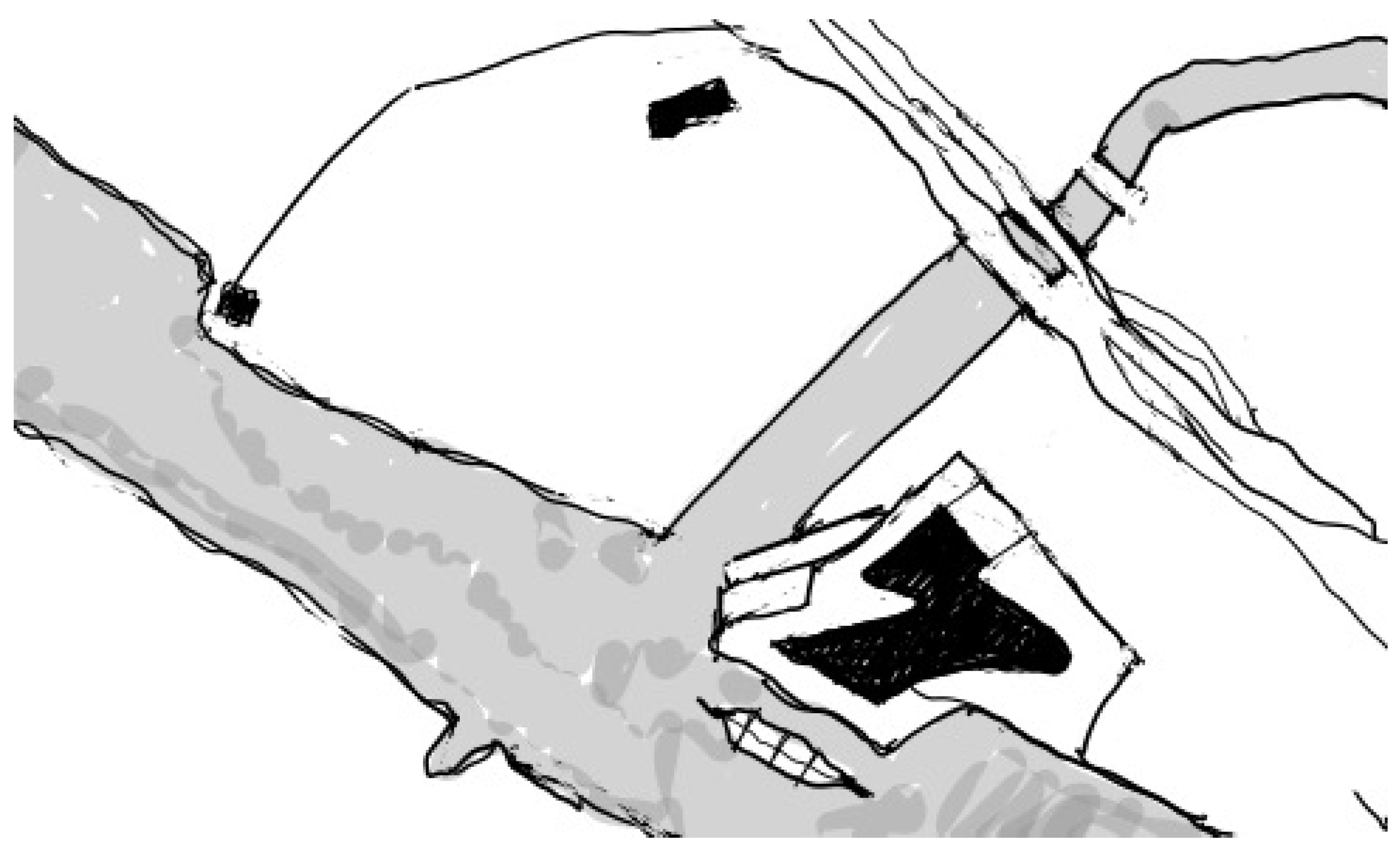
In addition, characterized by an unusual zigzagging, zinc-clad roof and a glazed frontage facing the River Clyde, the design program includes display spaces housing over 3000 exhibits, a café, retail, and learning spaces. The building has a tunnel-like configuration open at opposite ends. The design manifests a sectional extrusion along a diverted linear path. According to the architects, this cross-sectional form aims to encapsulate a series of ‘waves.’ The outer parts accommodate support services (Figure 1 and Figure 2). The main central space is open and displays the museum’s collection. The project is regarded by local authorities and the Glasgow City Council as an important landmark that defines an important legacy of the city and is viewed as a ‘catalyst for cultural sustainability.’
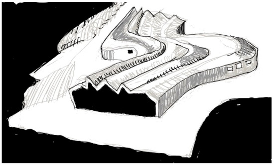
Figure 1.
Aerial view of Riverside Museum in Glasgow flanked by water on three sides (Drawing by N.A. Salingaros).

Figure 2.
Situation of Riverside Museum in Glasgow at the intersection of the rivers Clyde and Kelvin. Building footprint in black (bottom, right-of-center) surrounded by open spaces, parking, and bounded by highways at the top. (Drawing by N.A. Salingaros).
1.2. Research Motivation
There are trenchant problems in evaluating projects, often identified with ‘star architects.’ This paper postulates that projects promoted by national governments or local municipalities and covered heavily in the specialized or public media, and in most cases celebrated and praised, do not necessarily meet the simple human experience of the built environment. Since its introduction to the literature in the 1970s [3,4], this argument has been tested in earlier studies that examined influential architectural magazines.
In surveying the written and visual content of the AIA Journal, architectural record, and progressive architecture during the two decades of the 1970s and 1980s, it is revealed that such buildings are typically presented in a manner that emphasizes their formal and physical characteristics at the expense of adapting to human factors [5]. Similarly, the publications of the Museum of Modern Art (MOMA) have a direct impact on the profession, yet they tend to foster the image of architecture as pure art. This is evidenced by the way in which the formal aspects of the work of star architects are presented, where design is seen exclusively in abstract artistic and geometric terms.
1.3. Research Context and Background
Other recent studies juxtapose design intentions—as expressed in the statements made by architects—and users’ responses [6], and examine the relationship between media coverage of notable buildings and users’ actual reactions to those buildings [7]. The media often ignore the users’ behavior, expectations, feedback, or needs. The celebration, legitimization, and promotion of the works of architects has significant implications on the value and belief system within architectural education and practice.
Typical of projects by star architects, the Riverside Museum in Glasgow (RSM) has generated more than 50 articles and countless statements in the architectural media and within the global community, including coverage in the local press, tourist information packages, web portals, and architectural trade magazines offering critiques and mixed views. Such a coverage warrants testing whether the project has achieved its premises, especially from a user perspective.
The existing state of affairs is judged to be inadequate for properly evaluating a building, and especially an iconic one destined for public use. This paper introduces a multimodal inquiry based on three factors: criticism, performance evaluation, and habitability. The visual attention scans (using Visual Attention Software—VAS, from 3M Company, Saint Paul, Minnesota, USA), a novel diagnostic tool, help to correlate direct user evaluations to maps of unconscious user engagement. This brings together navigational mapping, user emotional experiences, and walking-tour assessments into a rubric for evaluation that goes far deeper than the usual press copy. Applying these tools to evaluate the Riverside Museum in Glasgow (RSM) offers an example to motivate the use of multimodal appraisal in general.
The merits and demerits of the project can be developed by contrasting how the RSM was portrayed in the media with how the building’s spatial qualities meet the needs of users and visitors. Assessing different aspects of the RSM from a user perspective reveals shortcomings. This investigation leads us to recommend general ways of improving building performance.
1.4. Paper Outline
In order to maintain an objective view while validating the argument, the present study clearly separates and then juxtaposes the imagined environment with the actual environment in use. A multimodal perspective investigates such a juxtaposition using: (1) architectural criticism represented by articles and media coverage of the project; and (2) performance evaluation and habitability studies measured by tools that reveal key aspects of the users’ experience of the museum’s spatial environment.
The method for analysis combines several complex issues and techniques. Section 2.1 summarizes the standard general approach to building criticism and evaluation. In addition, Section 2.2 recalls the data-based post-occupancy evaluation procedure (Building Performance Evaluation—BPE) and some of its historical background. Further, Section 2.3 outlines the analytic method of “habitability” as the degree of fit between people and their environment, both natural and human-made. As a result, many authors have commented on the contradictions among different approaches to evaluating buildings and emphasized the need for architects to think about interaction with the surrounding environment instead of treating a building as an isolated sculptural object.
Section 3 contains the distinct individual factors measured in the present study: a walking tour assessment known technically as PLANDES (Planning, Landscaping, and Designing) (Section 3.2); direct observation and behavioral mapping (Section 3.3); and emotional experience surveys based on personal construct theory (PCT) (Section 3.4). The data were collected on various aspects of the architectural and urban experience at numbered locations and presented on a 6-point Likert scale. The questionnaire used is reproduced in this section for reference.
Section 4 begins by collecting a number of press descriptions of the museum and differentiating between negative and positive assessments (Section 4.1 & Section 4.2). We then present the results of our own surveys: the walking tour, both indoors and outdoors (Section 4.3). Section 4.4 details the socio-spatial behavior of the users through observation, and the emotional experience in 12 chosen spots, both inside and outside (Section 4.5). We have listed them according to their negative/positive reaction.
Section 5 confirms the user survey results by using visual attention scans. This new tool uses software (Visual Attention Software—VAS by 3M Company) to map where the eye spends its time during the first 3 s of pre-attentive gaze. Since these fixations are unconscious, the eye-scanning heatmaps are an excellent indication of how a person engages with the visual surroundings. We restricted this analysis to the museum exterior because the exhibits would naturally draw all the visual interest and thus complicate an analysis of the structure itself.
The discussion in Section 6 lists a set of six conditions that we feel need to be satisfied by any important building, such as a public museum. These points focus on pedestrian accessibility, the emotional affordance of adjacent and surrounding public spaces, a clearly defined approach and entrance, the importance of emotional comfort coming from the structure independently of the exhibits, and design attention towards creating spaces that catalyze both user-exhibit attraction and spontaneous user-user interaction. Those requirements served to formulate the specific questions that were used to evaluate this building in the multimodal appraisal.
2. Constructing a Multimodal Framework
A comprehensive approach to inquiry is composed of three distinct factors that contribute to the understanding and analysis of buildings: architectural criticism, building performance evaluation, and habitability. This multimodal framework is established as a theoretical tenet for evaluation. Since this approach is very different from previous or similar methods of evaluation, we feel justified in calling it a “paradigm.” The combined focus, scope, and revealed results sharply distinguish this method from the other paradigm in place, which judges a building according to its architect’s press release. The coexistence of two distinct paradigms leads to confusion and contradictions that we attempt to resolve here.
2.1. Architectural Criticism and Its Ambiguities
Several definitions of criticism indicate that it is typically subjective and is meant for either a popular or specialist readership. Nevertheless, objectivity is crucial to successful critical work. According to Dennis Sharp, “… the importance of objectivity must be stressed. A lot is demanded of the critic in the judicious administration of this goal. It must be allied to good sense, clear judgment, sagacity, and it must be in the hands of someone who can hold their own against the spread of mediocre mass cultural values.” [8] (p. 11). Further, Sharp crystallizes the insight that architectural criticism brings to a work, an artifact, a building, or an idea [9] (p. 30).
Wayne Attoe stresses the importance and prevalence of criticism in the architectural press, especially as it influences the decision-making processes of bringing a building to completion [10]. Attoe notes problems with criticism: “Too often when criticism starts, excuses begin, and so defensiveness gets in the way of good, responsive work.” He calls for improving criticism “so that instead of threatening and intimidating, criticism can be used as a tool for generating better work” [11] (pp. 2–5). In essence, architectural criticism is a rational and appreciative examination of a building or a project within a kaleidoscope of historical and philosophical contexts and a spectrum of technological, social, and environmental influences.
More recently, several writings have clarified the relationship between criticism, the profession, and the public. Thomas Fisher argues that criticism is most useful when it “engages the broadest public possible in what our field has to say about the world’s most pressing problems” [12] (p. 14). Aaron Davis (2014) states: “If the critic of the 18th Century struggled with the poetics of beauty and universal truth in art, the critic of the early 20th Century shifted more towards the pragmatics of living in the new urban environs” [13] (p. 31). Particularly, the work of Lewis Mumford attempted to bridge the divide between the specialist knowledge of architects and planners and the general public. What characterized Mumford’s writing was that it popularized architecture and the built environment. This brought writing related to architecture to a public that might not have any exposure otherwise.
According to Davis [14], Mumford made the city and its buildings legible for the average citizen, who could then develop opinions and views from everyday experiences. Ada Louise Huxtable asserted that the critic must negotiate between the artist/architect and the user in an objective and fair manner and have a built-in skepticism toward dogma [15]. Following the same approach, Paul Goldberger promoted the idea that architecture cannot be reduced to an image [16]. Yet, in recent years, criticism seems to have departed from its relevance to the public.
2.2. Building Performance Evaluation (BPE)
Engrained in both in the United Kingdom and the United States in the 1960s, the origins of Building Performance Evaluation (BPE) started as systematic assessment of buildings after their occupancy or Post Occupancy Evaluation (POE). In the late 1960s, Sim van der Ryn (1967) of the University of California, Berkeley, and Victor Hsia (1967) of the University of Utah studied the performance of university dormitories from the users’ perspective [17,18]. Similarly, in the United Kingdom in 1967, the Building Performance Research Unit (BPRU), led by Thomas Markus, was set up at the University of Strathclyde to develop feedback on designed environments and bring together research on building performance.
In 1968, BPRU commenced a major project, sponsored by the Ministry of Public Building and Works, the RIBA, the Architects’ Journal, and twenty architectural and engineering practices. This focused on evaluating newly built comprehensive schools for children ages 11–18 [19]. The results were published in one of the early books on building performance [20]. Today, findings of performance evaluation studies conducted in the 1960s are still valid; for example, an obsession with reduced initial building cost; repeated mistakes and design errors; poor strategic fits between buildings and users; and single issues such as daylighting and ventilation dominating the design and impeding effective integration, whilst often not being achieved themselves.
In the mid-1990s, an integrative process model for building performance evaluation was developed [21,22]. Since then, building performance criteria have evolved to include factors involving building codes that help health, safety, and security, as well as other instruments for helping with functionality and the cultural, psychological, and social aspects of buildings [23,24]. Further efforts advocate the need for developing building performance assessment and simulation tools [25,26,27]. However, it is increasingly evident that performance evaluation studies have drifted from a focus on buildings in relation to users to a focus on the physical performance and material characteristics of buildings, including aspects of energy conservation and saving and low-carbon designs.
This divergence of aims has profound consequences. The psycho-physiological needs of the users are overlooked while all the attention of an evaluation is placed upon the physical and tectonic aspects of the building, together with energy performance, etc. Those are two entirely distinct sets of goals, and to amalgamate the two and forget the first set diminishes the professional conception of how buildings affect society.
The performance evaluation, as distinct from pre-design research (PDR), assesses both interior and exterior spaces [28]. It is a systematic process that is a branch of environmental-behavior studies. Sometimes, the method can solve problems that arise after occupation. Post-occupancy evaluations (POEs) can use documented performance successes and failures to help in renovations or modifications.
2.3. Habitability
Commencing in the 1960s, the US Navy, NASA, and US Army Corps of Engineers tried to improve the quality of environments and respective person-environment relationships, for example life on ships [29,30]. The word ‘habitability’ stems from the word ‘habitat’, an environment directly correlated to life [31].
A set of primary objectives underpins the design of built environments with adequate habitability. First, habitability defines the degree of fit between individuals or groups and their environment, both human-made and natural. Second, habitability is a relative concept that is interpreted variously by different cultures, different spatial typologies, and various conceptualizations by other disciplines. Third, habitability refers to the spatial ‘fitness’ of the interior volume as a habitat for human occupancy [32]. Fourth, habitability prioritizes an approach to designing built environments that evolves by considering equitable resource allocation and minimizing adverse impacts on the natural environment. Thus, habitability relates to sustainability in an essential manner [33,34,35].
The person-environment relationships are introduced to the physical environment as the whole building, key spaces or settings within the building, and the occupants’ engagement with these spaces and settings. According to Preiser et al., it is at the psychological comfort and satisfaction level of habitability that most concepts dealing with person-environment relationships can be identified, categorized, and applied [31]. Among other factors influencing psychological comfort, habitability studies examine spatial adjacencies, dimensions, orientation, and proportions. These elements serve to further what are known as sociopetality and sociofugality [36], which represent physical conditions that promote or discourage social interaction and engagement.
3. Operationalization of Multimodality into Tools of Inquiry
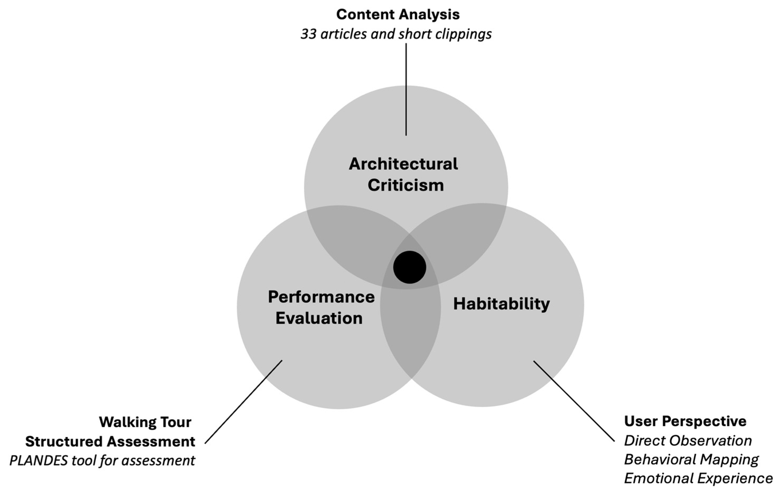
The multimodal investigation of the spatial environment of the Riverside Museum (RSM) involves a multitude of tools that include content analysis of the statements discussing various qualities of the building and a series of user-centered approaches that include a walking tour assessment procedure, direct observation and behavioral mapping, and assessing the emotional experience (Figure 3). Further, imbedded in this investigation is a juxtaposition of how the museum was covered in specialized and public media and how it performs from a spatial experience viewpoint.
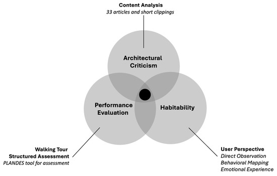
Figure 3.
Multimodal framework and tools for examining the Riverside Museum in Glasgow. (Figure by A. Salama).
3.1. Content Analysis
In addition, following an online search for the available literature on the RSM, 33 articles and short clippings reviewing the RSM were identified based on availability and various areas of focus within these articles, i.e., covering the entire range of views stemming from statements by the architect/design team, the client/Glasgow City Council, professional organizations, and architects and critics. A systematic, quantitative approach analyzed the content and meaning of communicative messages [37,38].
Furthermore, in utilizing content analysis, the procedure involved (i) identifying and establishing categories of concepts and their underlying meanings; (ii) determining the frequency of concepts or terms that represent essentially the same set of issues; and (iii) assigning numerical values to the occurrence of these categories of concepts. The analysis includes the museum/building’s role in the city of Glasgow; its position within the architectural community; the design metaphor and building form; the overall design quality; and cost-benefit dialectics.
3.2. Walking Tour Assessment (PLANDES)
In employing the techniques adopted by environment-behavior researchers [39], a structured walkthrough procedure was devised for assessing the museum. Additionally, by the name PLANDES (Planning, Landscaping, Designing), the tool was developed and implemented within a walkthrough procedure and involved three key categories or factors, each of which includes 11 attributes in the form of a checklist: a series of questions that are scored utilizing a 6-point Likert scale.
Although questionnaires are a standard modality for assessing design success, we have come up with a novel set of questions. Together, these create an innovative rubric for evaluation that emphasizes the user’s experience—emotional attachment and attraction—and distinguishes these factors from the very different formal design characteristics. We believe that this approach better represents the public’s experience of a building such as a prominent museum.
The choice of a 6-point Likert scale deliberately forces the subject to avoid the neutral option of a typical 5-point scale. (It has been found that unsure respondents tend to choose the neutral option [40,41]). PLANDES was developed to enable researchers to engage with the building and its context while attempting to assess it in a structured manner through a self-guided tour by focusing on key attributes (Table 1, below).
The factors comprised three categories: (a) planning and zoning, which focuses on how the building suits its surrounding environment and includes aspects such as orientation, access, views, and the relationship of the building with its enclosing context; (b) landscaping, which focuses on the functionality and aesthetics of the landscape surrounding the building and includes aspects such as landscape design, material choice, vegetation, outdoor furniture, and routes around the building; and (c) designing, which focuses on the spatial design of the indoor environment and includes aspects such as form and volume, acoustics, lighting, and ecological design techniques. Further, through a self-guided tour, a total of 25 postgraduate students participated in this assessment, from which the average scores were calculated.
3.3. Direct Observation and Behavioral Mapping
The behavioral mapping combined with direct observation represents an efficient means of documenting what visitors and users do in a particular space. In addition, valuable information can be obtained when the behavior on navigating the spatial environment is systematically recorded. However, the observations must be planned to avoid rediscovering what is already known or obvious [42]. Behavioral mapping involves structured observation of activities, settings or spaces, and timings.
The behavioral research demonstrates that behavioral mapping can be either place-based or individual-/user-based, depending on whether one is looking for spatial or temporal patterns [43,44]. Therefore, in examining the spatial environment of the museum, two approaches were adopted: the first is contemplating settings, and the second is navigational mapping. Both were conducted by the research team collectively. For contemplating settings, three indoor settings and one outdoor setting are identified following the initial walkthroughs to reflect on and demonstrate key behavioral phenomena that ensue from users’ recurrent experience in space.

Table 1.
Checklist utilized in the Walking Tour Assessment procedure: 33 questions were scored using a 6-point Likert scale. (Some aspects of the tool have been utilized in other publications by the authors [45,46,47]).
Table 1.
Checklist utilized in the Walking Tour Assessment procedure: 33 questions were scored using a 6-point Likert scale. (Some aspects of the tool have been utilized in other publications by the authors [45,46,47]).
| Category 1: PLANNING AND ZONING 1 = Ineffective to 6 = Effective | 1 | How does the building suit the most appropriate use of the surrounding area? |
| 2 | How does the building encourage visitors to respect the surrounding natural environment? | |
| 3 | How does the building encourage fostering and enhancing environmental education and awareness relevant to transportation? | |
| 4 | How does the project alter or change the site topography? | |
| 5 | How does the orientation of the building and its components fit well with the orientation of the site? (Consider north-south orientation, day lighting). | |
| 6 | Is there a buffer zone around the site, and if so, is it suitable for protecting any surrounding significant natural features? | |
| 7 | Does the access to the site fit well with the existing natural landscape (if any)? | |
| 8 | Do the pedestrian paths and their angles of vision correspond to the natural scenes (if any) around the site? | |
| 9 | Are the entry points sufficient, easily accessible, and suitable for building size, number of visitors, site area, and dimensions? (Consider school visits) | |
| 10 | Are the entry points appropriate for minimizing any negative impacts on the surrounding environment? | |
| 11 | Are the motorways around the site suitable for and respecting the surrounding environment; natural and built? (Consider width of motorways and speed limits, safety aspects, etc.). | |
| Average = Total/11 | ||
| Category 2: LANDSCAPING 1 = Ineffective to 6 = Effective | 1 | How effectively are the site features kept? (Consider levelling, excavations, and land filling). |
| 2 | Does the landscape design integrate the site with the surrounding environment? (Is the site surrounded by fences, if so, consider the materials used for fence treatments). | |
| 3 | How effectively does the design of landscape items avoid the use of synthetic materials? (Consider the materials used for walkways, and the asphalt pavements of the parking area) | |
| 4 | Does the project introduce soft-scape elements (natural plants and shrubs)? If so, how effective? (Consider their harmony with the existing natural environment) | |
| 5 | How effectively are the site furniture items (seats, pergolas, garbage boxes) installed in and distributed within the site? (Consider their use, location, materials, and manufacturing). | |
| 6 | How well are the routes around and within the site marked? Are the markings clear and easily understood? (Consider directional signs, their location, content, and material). | |
| 7 | Are there any signs for environmental education purposes? If so, how effectively do they convey messages about appropriate behavior? | |
| 8 | Are the pedestrian paths and other hard-scape elements made of natural or recycled materials? | |
| 9 | Does the site have a re-used water system (grey water)? If so, how effective is it? (Consider rainwater capturing and reuse for various purposes). | |
| 10 | How effectively does the project introduce native plants that require least amount of watering? | |
| 11 | Does the project introduce any damaging, polluting, or waste generating activities? | |
| Average = Total/11 | ||
| Category 2: DESIGNING 1= Ineffective to 6 = Effective | 1 | How effectively does the architectural program consider the appropriate activities and space requirements and standards required for accommodating these activities? (Consider the nature of visitors, integrating indoor learning and outdoor activities…etc.) |
| 2 | Is the architectural form designed in harmony with the natural landscape and the surrounding physical setting? | |
| 3 | Does the design of outdoor elements allow for interaction of visitors with nature and various types of displays? | |
| 4 | How effectively does the design provide visually appealing interior environment? (Consider spatial aspects in relation to views/size of displays, color, expression of materials, interior plantations, and day lighting). | |
| 5 | How effectively does the interior design consider aspects associated with human comfort? (Consider the degree of natural lighting, glare effect, etc.). | |
| 6 | How effectively does the design of the building allow for achieving acoustical quality? (Consider noise, spatial separation of activities…etc). | |
| 7 | How effectively does the design of the building consider aspects that pertain to indoor air quality? | |
| 8 | Does the design of the building employ ecological design techniques? (Consider orientation and aspects that pertain to solar energy, ventilation, openings, natural lighting). | |
| 9 | How does the design of the building allow for the most efficient natural lighting for interior space? | |
| 10 | How does the capacity of the building correspond to site features and the surrounding context? (Consider built up area, density, numbers of visitors and cars). | |
| 11 | Does the design allow for the ease of maintenance, cleaning, and repairing? If so, how effective are they? | |
| Average = Total/11 | ||
The observer has to put conceptual/mental effort in interpreting the setting and turn the abstract concepts of a behavioral phenomenon such as personal space or crowding or territorial behavior into a concrete understanding [48]. The contemplation involves reflections on the setting in answering this question: who is doing what, where, how, for how long, and with whom? This includes people, size and time characteristics, furniture items, and action patterns. The navigational mapping, on the other hand, is intended to verify key aspects of the settings contemplated as well as scrutinize the use of key locations, including entry points and other key areas in the display halls, during working hours on weekdays and weekends.
3.4. Examining Emotional Experience
In adopting Kelly’s personal construct theory (PCT) and examining the spatial experience of the RSM [49,50], a tool was developed as a form of impressionistic assessment. The PCT postulates that an individual’s personality is made up of mental lenses or frameworks through which we experience reality and focuses on the idea of mental structures called “constructs,” which are formed based on experiences that individuals use to interpret information and events. In addition, from an emotional perspective [51,52], participants were asked to react to sets of positive and negative comments as to whether they had a significant, some, or no effect on their experience.
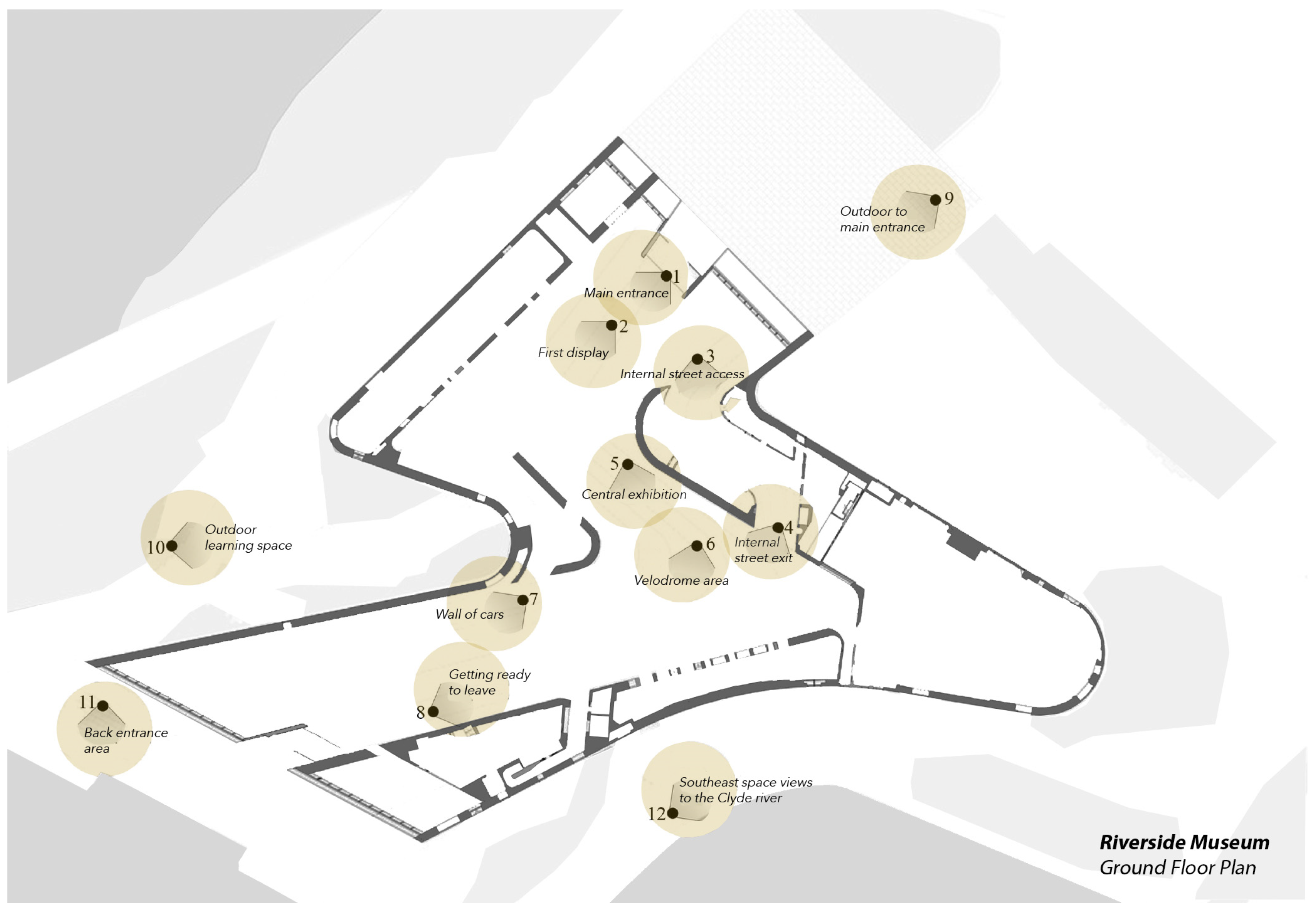
In addition, recent studies argue that although what are referred to as ‘emotions’ have been studied for several decades, there are no scientific, standardized criteria for categorizing different emotional states [53]. On the other hand, it is the emotional experience of a building that determines user satisfaction to a great extent and shapes the memory of that experience. A total of 12 locations/spots were identified (8 indoor and 4 outdoor) along the visitors’ path in the museum (Figure 4, below). The responses from 22 participants, the majority of whom are recent architecture graduates who have visited the Museum at least once, were solicited through 2-min video clips for each of the 12 locations. Those were shared electronically with the participants so they could state their impressions on record sheets (Table 2, below).
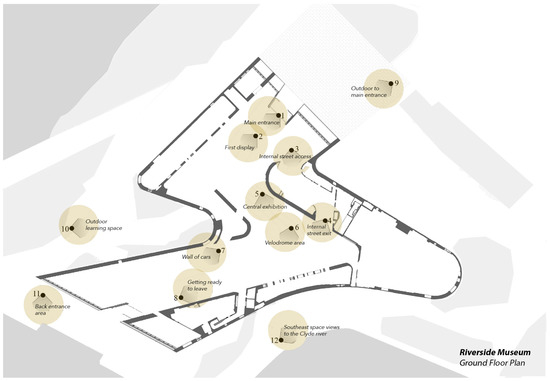
Figure 4.
RSM Floor Plan showing the 12 locations/spots examined in the emotional experience survey. (Floorplan by L. MacLean based on figure by ZHA published in ArchDaily).

Table 2.
Example of users’ emotional experience record sheet.
It helps to anticipate the disconnect between the two distinct paradigms for building appraisal being contrasted here. Explicitly asking for—and carefully recording—user emotions that arise from engaging with a structure is not a standard part of analyzing architecture. These questions go far beyond the much more practical assessments that are the typical components of post-occupancy evaluations. Moreover, they lie completely outside the current system of architectural training.
4. Results—Analysis and Narratives of Key Findings
4.1. Powerful and Compelling Titles Depicting the Riverside Museum
It is worth noting that before its completion, occupancy, and opening, the RSM was depicted in the media as an icon of cultural sustainability, an intervention that manifests and respects the culture and history of Glasgow and the River Clyde. In addition, the project was awarded the 2013 European Museum of the Year Award as Zaha Hadid’s first major building in Britain. However, the project was also criticized in the media; for example, its lack of practicality because of its unusual roof form, the initial costs of the building, as well as very high maintenance costs. Further, while the Royal Incorporation of Architects in Scotland (RIAS) criticized the project and the outcome of the competition, some local architects appear to have dismissed this criticism. The critics used powerful article titles such as: “attracting attention,” “catchy,” and “compelling” to describe the museum’s merits and also its demerits (Table 3 below).

Table 3.
Titles used in the press to describe the Riverside Museum in Glasgow.
4.2. The Riverside Museum between Praise and Criticism
In examining the articles and clippings reveals interesting frequencies: the role of the museum in Glasgow or its immediate context was covered 13 times; its position within the architectural community 12 times; the building form 10 times; its design quality 17 times; cost-benefit dialectics 12 times. These categories were presented neutrally, positively, or negatively.
In addition, under the role of the building in Glasgow or its cost, one finds opposing views: positive “The riverside is still the city’s most coveted prize: an icon designed by the world’s most famous architect, a still-valuable currency in the abstract league of world city rankings” [54], versus negative “City icon it may be, but Zaha Hadid’s Riverside transport museum is as removed from its Glasgow context as the cars and trains housed within its zinc-clad walls” [55]. Table 4 demonstrates the frequency of concepts, with one negative and one negative example for each.

Table 4.
Frequency of concepts and key ideas and examples of positive and negative statements on the Riverside Museum in Glasgow.
Many of these articles refer to several categories of concepts together. Furthermore, some articles have a positive title but actually present critical negative statements made by others on the project. However, we classified the categories based on the explicit expression of concepts.
4.3. PLANDES—Assessing Design Features and Spatial Qualities of the Riverside Museum
In examining various qualities of the RSM, the walking tour assessment procedure resulted in averaged scores under the three categories or factors, where the 25 participants utilized the 6-point Likert Scale (the scores are listed in Table 5 below). The averaged outcome reveals that the planning and zoning category received a 2.8, the landscaping category a 3.18, and the design category a 3.09 (Figure 5). These uniformly low results demonstrate significant shortcomings in various design qualities, as assessed by the participants, which do not align with the praise the museum has received in the media, while agreeing with the criticism of a few articles.

Table 5.
Example of averaged scores utilizing the 6-point Likert Scale in assessing the category/factor of planning and zoning in Riverside Museum. (Some aspects of the tool have been utilized in other publications by the authors.).

Figure 5.
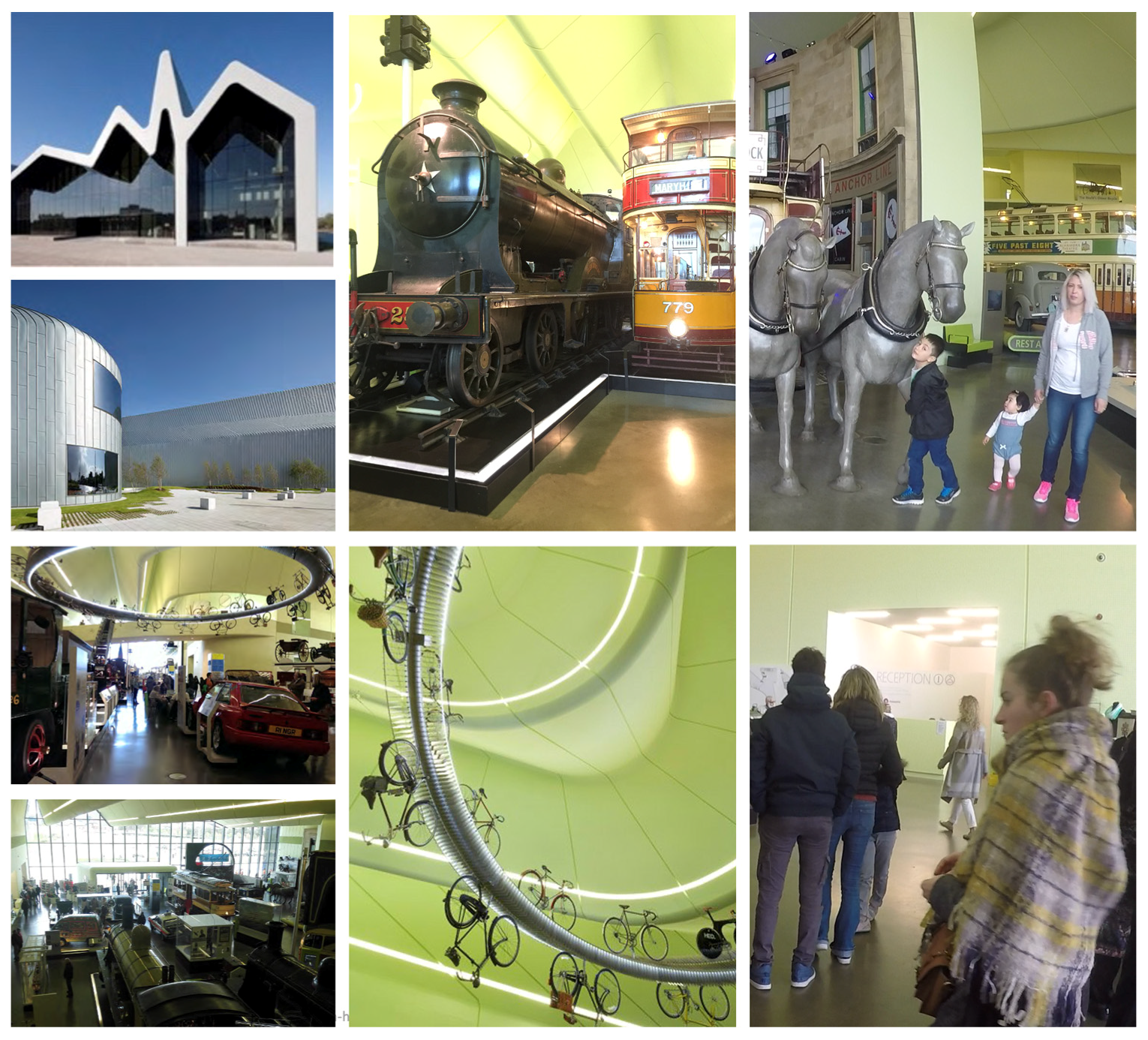
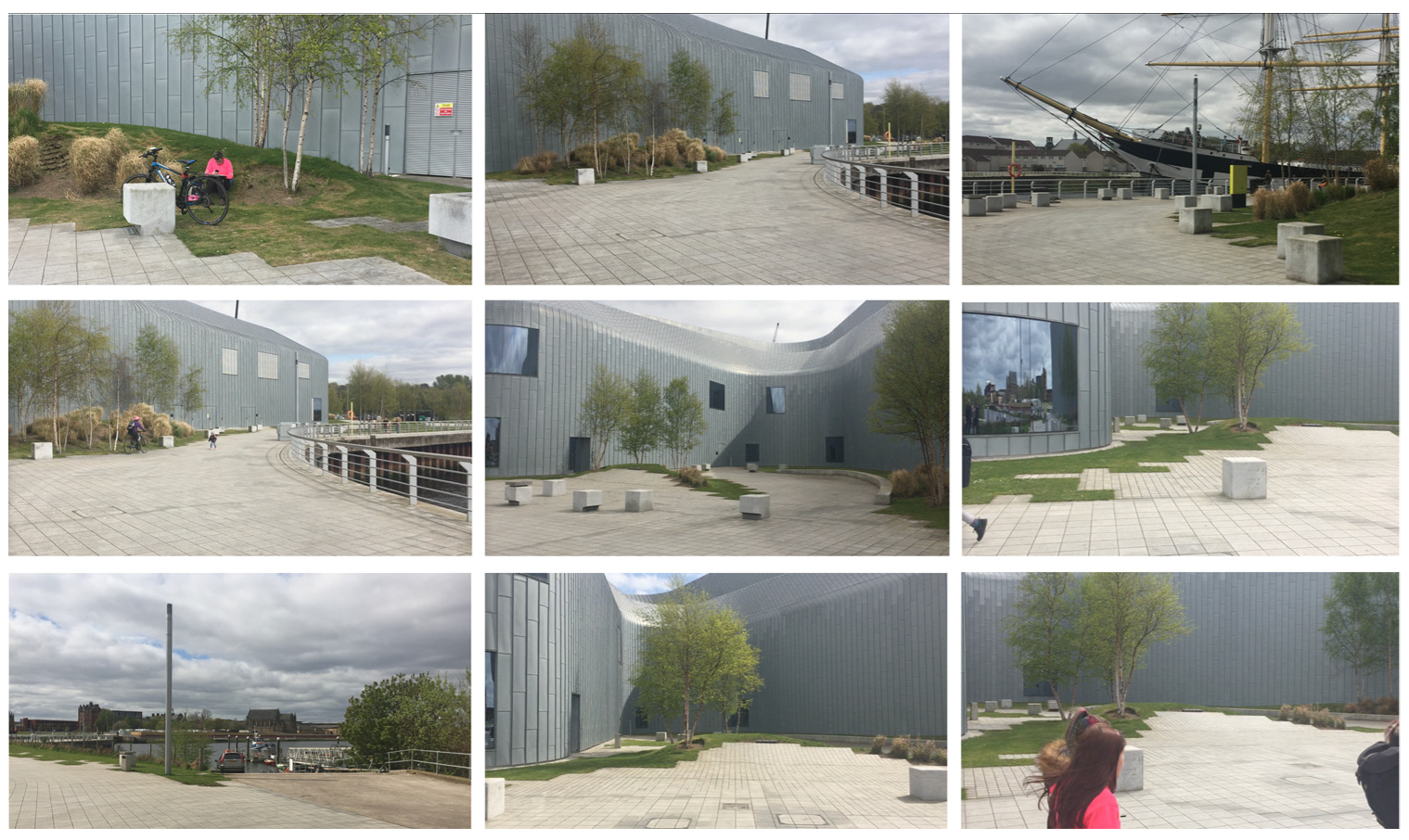
Representation of the spatial qualities of the Riverside Museum in Glasgow. (Photos by A. Salama).
In considering the category of planning and zoning, the average scores reveal that the overall scheme does not fit into the existing landscape. In addition, was this deliberate so as to allow the building to stand out in its surrounding landscape? If so, then the architects never revealed their intention, whereas their press releases imply the opposite. It was also felt that the contextual design does not encourage environmental education and awareness of transportation, resulting in a low average score of 2.0. Further, other averaged scores elucidate that the building sits within a contextless/placeless landscape in an open area where the two rivers meet. The site is neighbored by scenes of derelict landscape that present an unsatisfactory buffer zone and unpleasant views to the east and west, which are reflected in the low scores (Table 5). The access to the site, pedestrian pathways, angles of vision in relation to natural scenes, and entry points received a low average score of 2.0. Nevertheless, the attributes of reacting well to site topography and the orientation of the building in relation to the site received higher averaged scores of 5.0 and 4.0, respectively.
The landscape design (landscape) category, which places emphasis on attributes relevant to the functionality and aesthetics of the designed and natural landscape, was assessed as just average at 3.18. The ineffectiveness in several attributes is evident in the averaged scores of 2.0 because design does not help to integrate the project with its surroundings, and the soft landscape elements, furniture items, and signage for environmental education are ineffective. While scores show that the project introduces native plants that require minimal maintenance, such as shrubs and grass (4.0), and does not introduce polluting or waste-generating activities (4.0), the plants themselves are not in harmony with the existing natural environment and are in fact repellent. One of the main issues identified within the landscape is the lack of effective outdoor furniture. Further, uncomfortable concrete cubes are scattered across the landscape in a haphazard manner and at awkward distances apart, and consequently do not offer opportunities for small or large groups to use (Figure 6).
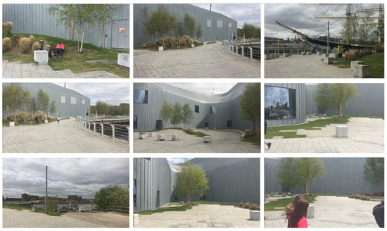
Figure 6.
Representation of various attributes of the site and landscape design of the Riverside Museum—collective averaged score of the 11 attributes (3.09 in the 6-point Likert Scale). (Photos by A. Salama).
The attributes underlying the design category received average scores of 3.09. As a result of their design, the outdoor elements do not encourage or even allow for visitors to interact with nature and various types of displays, thus receiving the lowest scores of all attributes (1.0), contrary to what was highlighted in the statements made by ZHA architects. While consideration of daylighting visitor density, crowding, and ease of regular maintenance and daily upkeep received low averaged scores of 2.0, the relationship between the architectural form and the natural landscape and employing technologies to reach satisfactory thermal comfort conditions received higher averaged scores of 4.0. Those elements that received high scores of 5.0 include acoustical quality, effective spatial separation of activities, and indoor air quality.
4.4. The Narrative of Socio-Spatial Practice and Behavioral Phenomena at the Riverside Museum
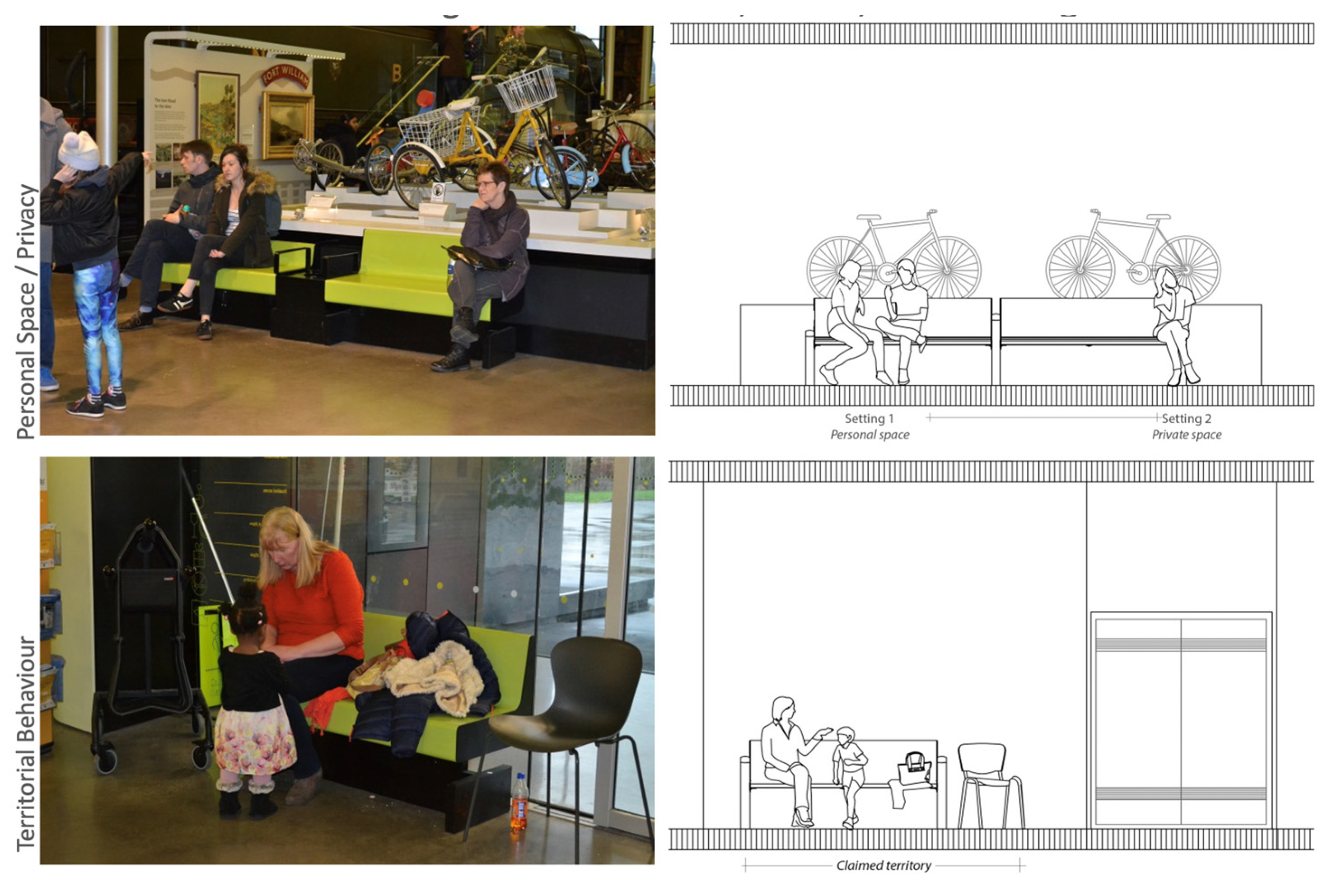
The observation of selected settings within the museum delineates key behavioral phenomena, including privacy and personal space, territorial behavior, and crowding. The setting showing the phenomenon of personal space (Figure 7, Top) demonstrates that the woman on the right is keeping as large a distance as possible between herself and the couple on the adjacent bench. The couple on the left appears to know each other well, as exemplified by their intimate distance. However, the woman on the right appears to be seeking solitude, which she is expressing through her body language. Additionally, by crossing her arms and legs, she is effectively conveying that she does not want to be disturbed. She has managed to claim her personal space without an identified physical boundary, using only body gestures. She has control over the setting, as it is unlikely that anyone will sit in the space between her and the couple until she leaves that space. This setting is likely temporal but recurrent, and the woman will not stay in this setting longer than perhaps 10–20 min while she watches/admires an item on display in the museum.
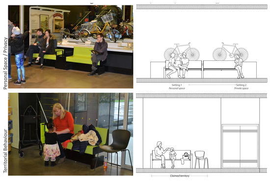
Figure 7.
Personal space/privacy and territorial behavior as observed in the two settings within the Riverside Museum. (Photos by A. Salama; drawing by L. MacLean).
In addition, another setting demonstrates a woman and child claiming the bench at the museum’s entrance foyer (Figure 7, Bottom). Although this bench is located within a social space and is made available to all visitors, the woman has claimed the full bench for herself and the child by spreading her coat and bag across the seat next to where she is sitting. This action gives her control over the setting, as it is evident that she does not wish others to be close to her; therefore, it is unlikely that anyone will try to use that setting until she has vacated it. Further, being at the entrance space, it can be assumed that visitors are either removing jackets to acclimatize to the indoor temperature or getting ready to leave the museum by putting their jackets back on. In either instance, this would imply a short use of this setting, no longer than 10 min.
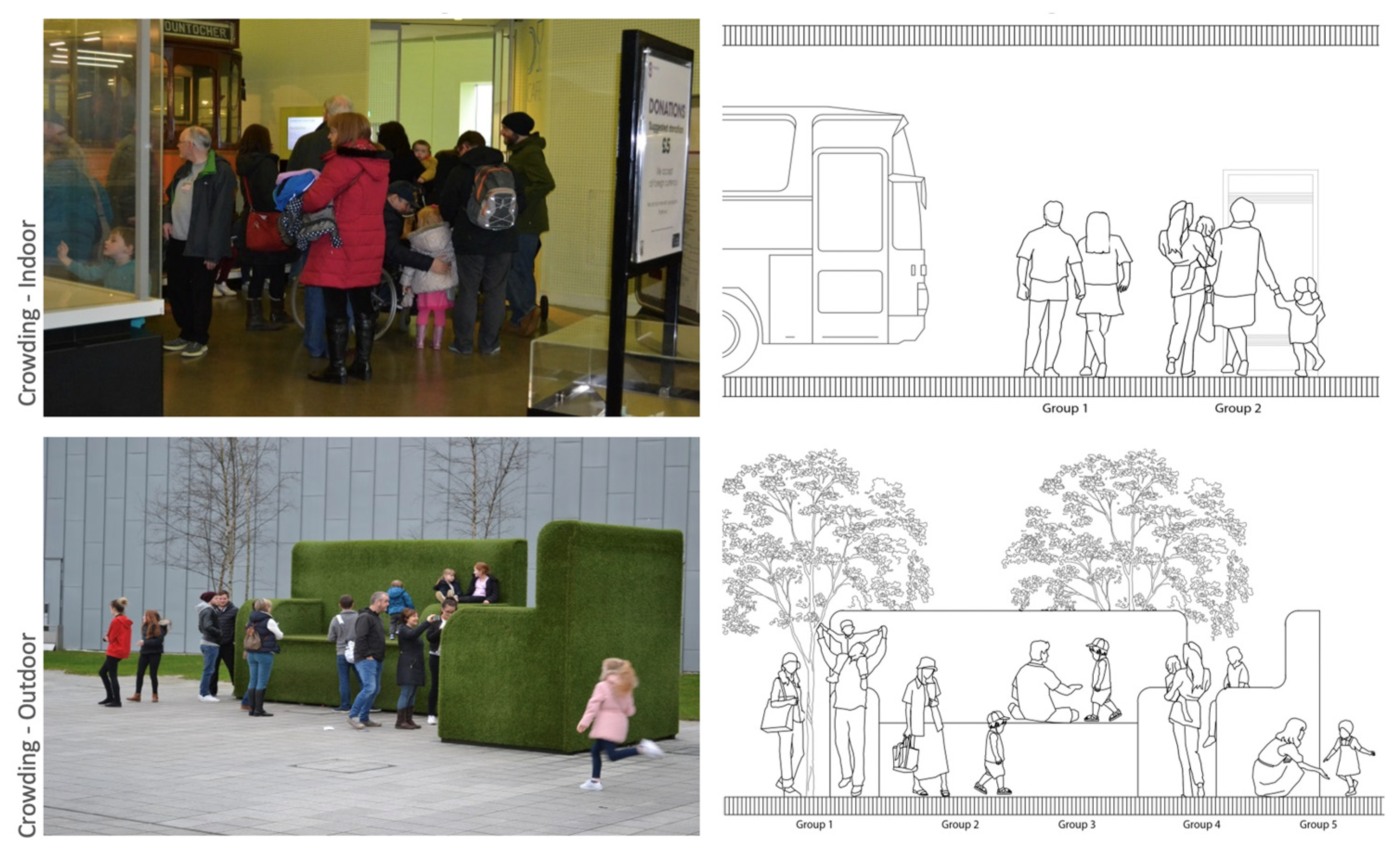
The crowding, both indoor and outdoor, was observed in two settings. The indoor crowding is noticeable at the entrance to the museum’s café. Due to the popularity of the café at peak times, visitors are asked to wait outside until a table is available for them. The space was not designed as a sociable spill-out space, as is evident by the small size of the setting and its lack of furniture. Furthermore, from the body language, it appears that the woman in the red jacket is not with the group in front of her, members of which are standing at a ‘personal’ distance from one another (Figure 8, Top).
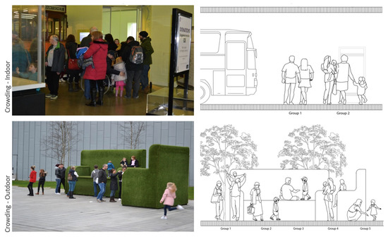
Figure 8.
Crowding behavior as observed in two settings inside and outside the Riverside Museum. (Photos by A. Salama; drawing by L. MacLean).
The outdoor crowding is a result of large temporary exhibition furniture items installed at weekends, which create a focal point that attracts the public as they are passing, from the parking lot to the museum after parking their vehicles. This is a sociable and lively public area within the museum premises where the public can interact on an informal basis, and in some cases, old cars are exhibited in the spaces adjacent to this setting. Visitors are primarily drawn to the space on impulse when passing, either when entering or exiting the museum. The crowd can be broken down into a number of smaller sub-groups, each of which looks like families with young children or teens (Figure 8, Bottom). In all cases, the children are playing on the furniture while the parents watch and take photographs. The time spent in this setting varies depending on the age of the children. It can be assumed that the space won’t draw visitors for much longer than 15/20 min at a time.
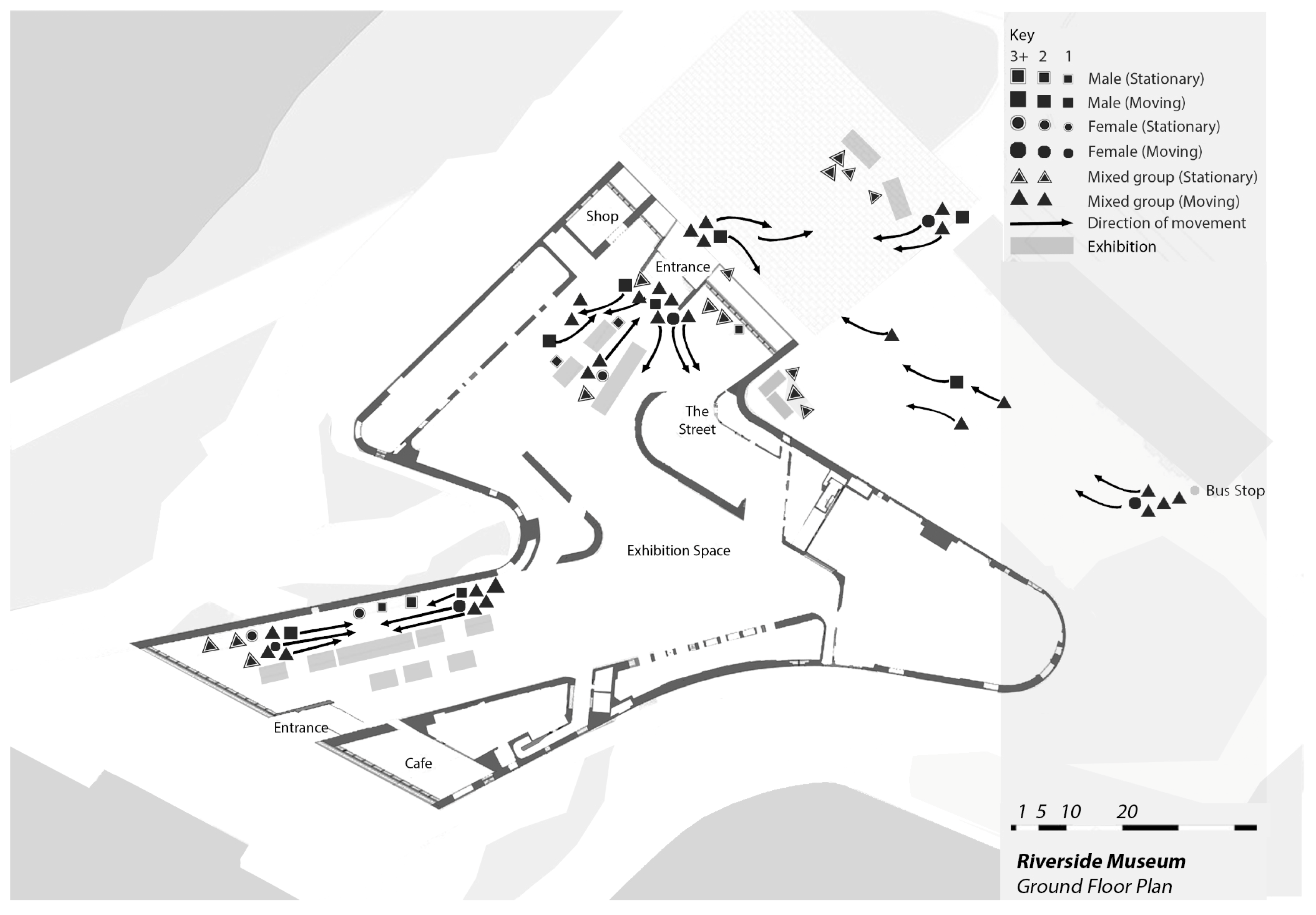
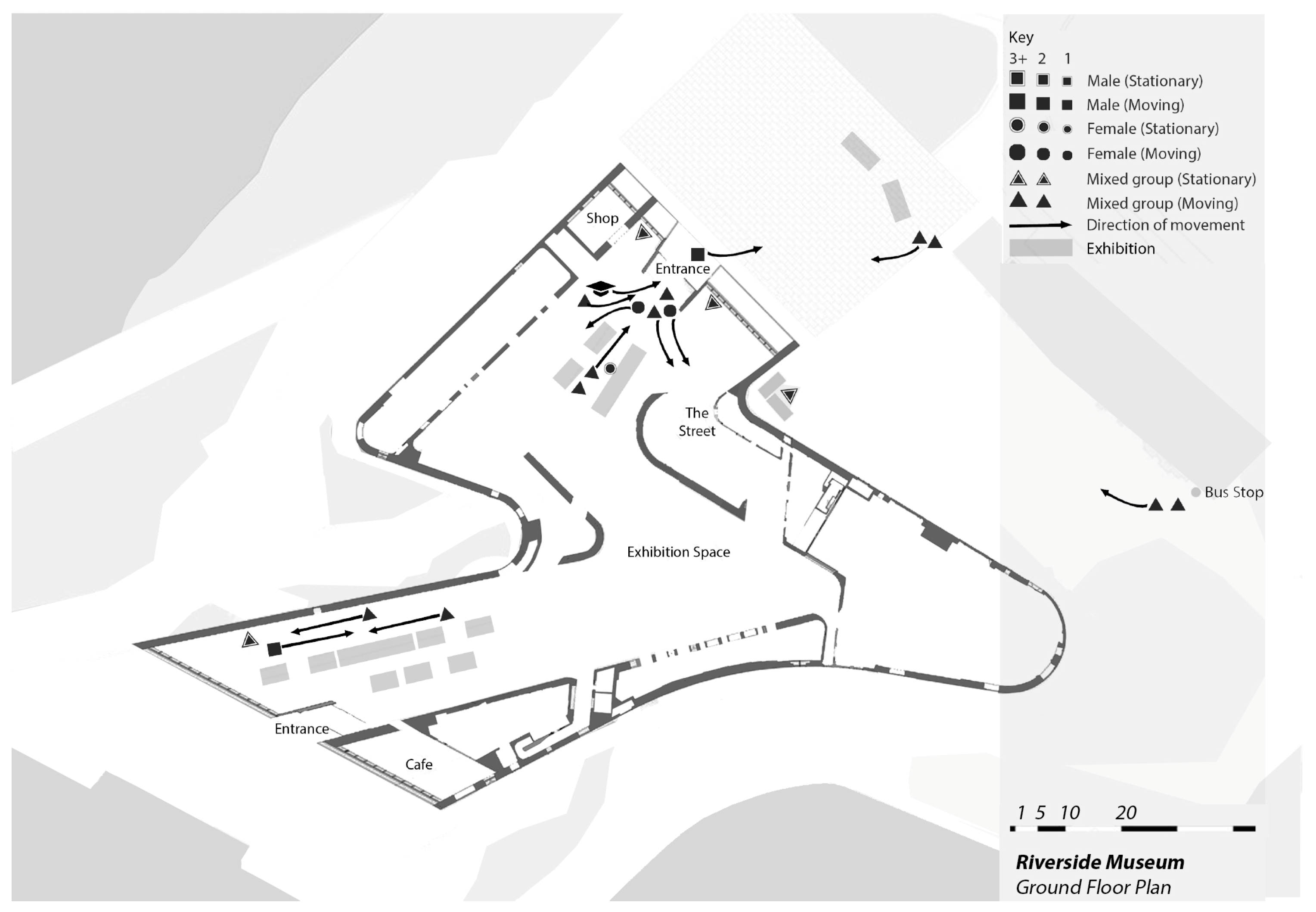
The outdoor space at the front is primarily used for pedestrian access, as evidenced by the small number of visitors who are stationary compared to those who are moving. The visitors have two main routes: one towards the bus stop on the far right, and the other towards the car park. The number of visitors crossing the grounds fluctuates depending on the timing of the bus service, resulting in a heavy flow of movement followed by a quiet spell. The car park provides a steady flow of visitors heading to and from their vehicles. Three or four mixed groups gather at the two external exhibition spaces, one of which is a food vendor (Figure 9).
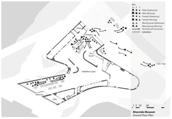
Figure 9.
A representative navigational map on midday Saturdays at the Riverside Museum. (Floorplan by L. MacLean based on figure by ZHA published in ArchDaily, annotations by A. Salama and L. MacLean).
Furthermore, when visitors enter the museum, a disorderly and slightly chaotic atmosphere takes place. This is attributable to the spatial design. Upon entry, visitors are greeted by a staff member who offers a leaflet that includes a plan of the building. However, there is insufficient break-out space available for visitors to stand and review their maps, and thus, visitors must immediately select an initial route for themselves. The map (Figure 9) shows the various entrance and exit routes that visitors take.
The back end of the museum, within the exhibition space, is less busy than the entrance; nonetheless, it continues to present a steady flow of walking traffic. Due to the lack of a clear directionality or route around the museum, some visitors are moving along the linear space while others are moving in the opposite direction. On the plan (Figure 9), it can be seen that many visitors stop to watch the displays on the walls, while others quickly pass through the space.
Navigational mapping at the RSM reveals that a weekday is significantly less busy than the weekend (Figure 10). However, the museum management takes advantage of these quieter times by inviting tours and groups to the museum to enjoy the collection safely. A primary school visit, containing approximately 25 schoolchildren accompanied by five teachers, makes the entrance foyer of the museum feel crowded yet vibrant.
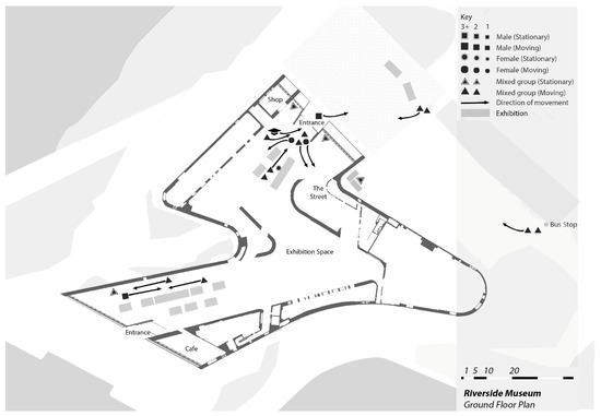
Figure 10.
A representative navigational map, on midday Mondays/Wednesdays at the Riverside Museum. (Floorplan by L. MacLean based on plan by ZHA published in ArchDaily, annotations by A. Salama and L. MacLean).
The function and use of the front external area as a pedestrian access route appears similar to that during the weekend. There are minimal objects to draw a visitor, further encouraging visitors to move directly to the entrance of the museum, emphasizing this area as only an access route and not a defined ‘place.’ Mostly, the external area is quiet, with only a small number of visitors crossing it. During the time of mapping, the external exhibition space was occupied by a young family that stayed in the space for around ten minutes, taking photographs of themselves with the displays.
4.5. Users’ Emotional Experience of the Riverside Museum
The 12 locations/spots were identified to analyze the users’ emotional experience holistically while offering more detailed discussion of two locations selected as examples. The emotional expressions vary across the respondents and the locations, and, more specifically, adapt to the informational conditions of the location, including colors, textures, lighting, position of display, ease of movement, containment, and distractions. Please refer to Figure 4 above for the location numbering.
Notably, a total of 6 locations/spots out of the 12 are viewed by most of the 22 respondents as offering a negative emotional experience (main entrance #18, front display #19, central exhibition #17, velodrome #18, outdoor learning area #16, and southeast outdoor area #15). On the other hand, four locations/spots are viewed as providing a positive emotional experience (entry #20 and exit #20 of indoor streets, getting ready to leave #16, and the back entrance #19). There are two locations/spots that are viewed as neutral (wall of cars #15 and outdoor to main entrance #15) (Table 6). Evidently, reasons for a negative emotional experience include not offering a sense of pleasant partial containment or a sense of belonging due to surrounding forms or a clear sense of direction; not providing attraction to linger in the spot without moving on; and distraction from visual goals in front. The negative factors also include a sense of unease because of built objects or surfaces and a sense of not being situated in this spot.

Table 6.
Record of 22 users’ emotional experiences in the 12 numbered locations identified for examination at the Riverside Museum. (Locations mapped in Figure 4).
The location/spot #1—the main entrance—offers a negative emotional experience, whereas the entry or access to the indoor street offers a positive emotional experience (Table 7). The main entrance was described as ‘crowded by objects and people’ leaving the visitor feeling uneasy and confused upon arrival. It does not offer a pleasant feeling in the entrance area of a museum of this scale. The route to follow is unclear, and there is no sense of direction, with a strong attraction to moving onto the next area. The key negative qualities as reported by the respondents include: (a) the space is too exposed (#20); (b) a sense of unease because of built objects or surfaces (#19); and (c) a sense of not being situated in this location (#20).

Table 7.
Examples of two locations at the Riverside Museum and the emotional experience each offers to the users. (Photos by A. Salama).
The entryway/access to the indoor street was described as attractive and interesting, drawing the visitor in. It creates a pleasant feeling of going back in time to a different world. The change in pavement allows the visitor to know that they are in a different space, helping to create a clear route. The key positive qualities as reported by the respondents include: (a) attraction to linger in that spot without moving on #21, (b) clear sense of direction indicated by the built form #20, (c) attraction from visual goals in front #20, (d) sense of pleasant partial containment #19, and (e) sense of belonging due to surrounding forms #18.
5. Confirmation Using Visual Attention Scans
Eye-tracking is a new technological tool that helps to evaluate a user’s informational engagement with buildings, spaces, and surfaces [56,57,58,59,60,61,62,63,64,65]. This interaction is strictly limited to the visual experience, yet, since the human neurological response is heavily weighted towards visual signals, it is very valuable to know this. We used the VAS Visual Attention Software by 3M Company, a very convenient diagnostic tool that approximates real eye-tracking experiments by simply scanning a visual image [66]. According to 3M, the simulation results are 92% accurate.
This powerful tool is akin to diagnostic imaging in medicine. The VAS heatmaps reveal what the eye cannot see, which is how the eye-brain sensory system works unconsciously to engage with the surroundings. The eye-tracking simulation software is one of several revolutionary diagnostic tools made possible by artificial intelligence. Those instruments are so far mostly unknown to architectural practitioners. (For the following VAS scans, we chose “other” as the best setting for processing images from among the nine possibilities offered by the software.)
A total of five exterior images of the Riverside Museum were scanned using the VAS software. The results appear as color-coded heatmaps indicating where the user looked during the first 3 s of gaze. The color red is the most intense region of unconscious interest; yellow shows medium intensity; and blue is low intensity. In addition, no color at all means that the eye was not drawn to that region. This mapping is important since it represents the unconscious, pre-attentive experience of the environment, showing how the body judges architecture independently of any acquired opinions or learned prejudices [67,68,69]. For example, a place may be experienced as unsettling, but the conscious brain imposes a ‘liking’ for it because it is supposed to be a ‘good design.’ However, the original, underlying negative response continues to affect the body negatively, building up stress.
The following analysis interprets five exterior settings of the museum. The results act as a very strong corroboration of the above findings while generating further findings. A similar analysis could have been undertaken for its interior spaces. Since this museum houses eye-catching artifacts, it would be more difficult to extract the effect of engagement due strictly to the building itself. Nevertheless, VAS reveals how the Museum’s structure is at odds with the exhibit designed as a traditional street with architectural detailing, preserving the past cultural legacy the city treasures.
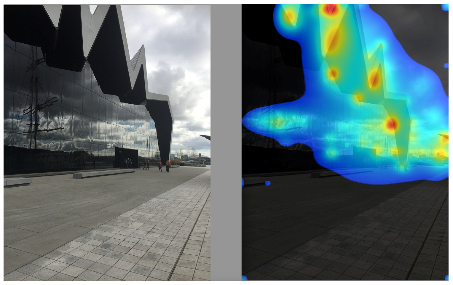
The jagged corners and edges of the museum’s roof attract all the attention of the viewer (Figure 11). This is a non-ideal situation because other architectural features primarily responsible for user engagement are designed in such a way that they are ignored. Those elements include the mirror-glass curtain-wall façade, the entry itself (where is one supposed to go in?), the ground in front of the museum entrance, and the fixed concrete benches. One could surmise that those essential building and urban space components are in effect “invisible,” since what little visual interest measured on the glass front is due not to any tectonics but to cloud reflections.
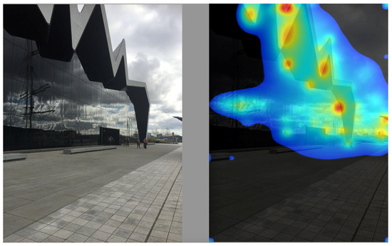
Figure 11.
Jagged roof canopy of the RSM front entrance. (Photo by A. Salama; VAS heatmap scan by N.A. Salingaros).
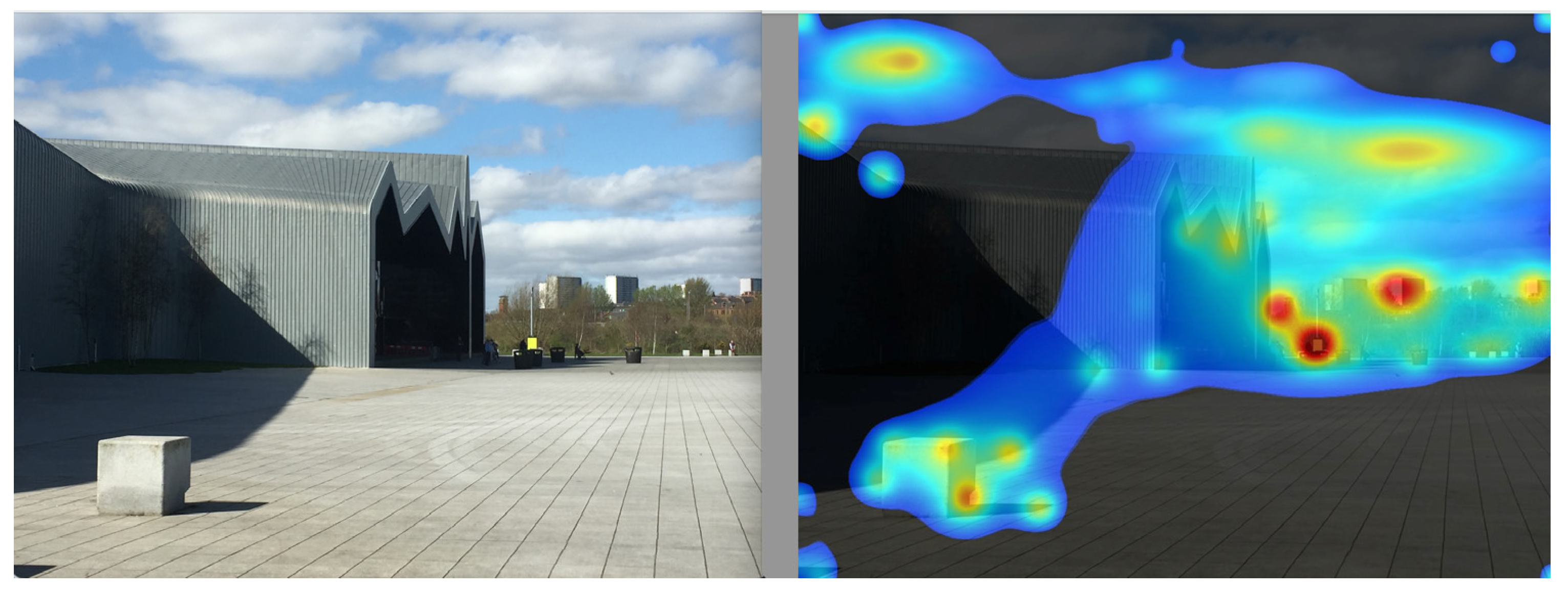
In Figure 12, the enveloping zinc-clad wall and roof are totally ignored (blank), while the entrance façade receives minimal attention. The eye is instead drawn to buildings and a pole in the distance and to the concrete cube in the foreground. The entire plaza fronting the museum is thus devoid of visual interest that would engage the visitor.
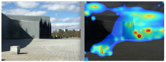
Figure 12.
RSM main entrance from a distance. (Photo by A. Salama; VAS heatmap scan by N.A. Salingaros).
In addition, the pedestrian plaza is totally ignored, while the eye is drawn mainly to the punched-hole windows (Figure 13). However, the window arrangement, deliberately lacking symmetries or any sort of hierarchical scaling, is by no means harmonious or interesting. As a result of its texture, the zinc-clad wall curving to form the roof attracts only minimal visual interest.
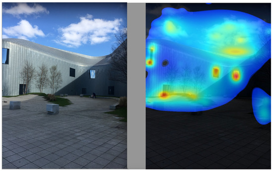
Figure 13.
RSM courtyard with some vegetation. (Photo by A. Salama; VAS heatmap scan by N.A. Salingaros).
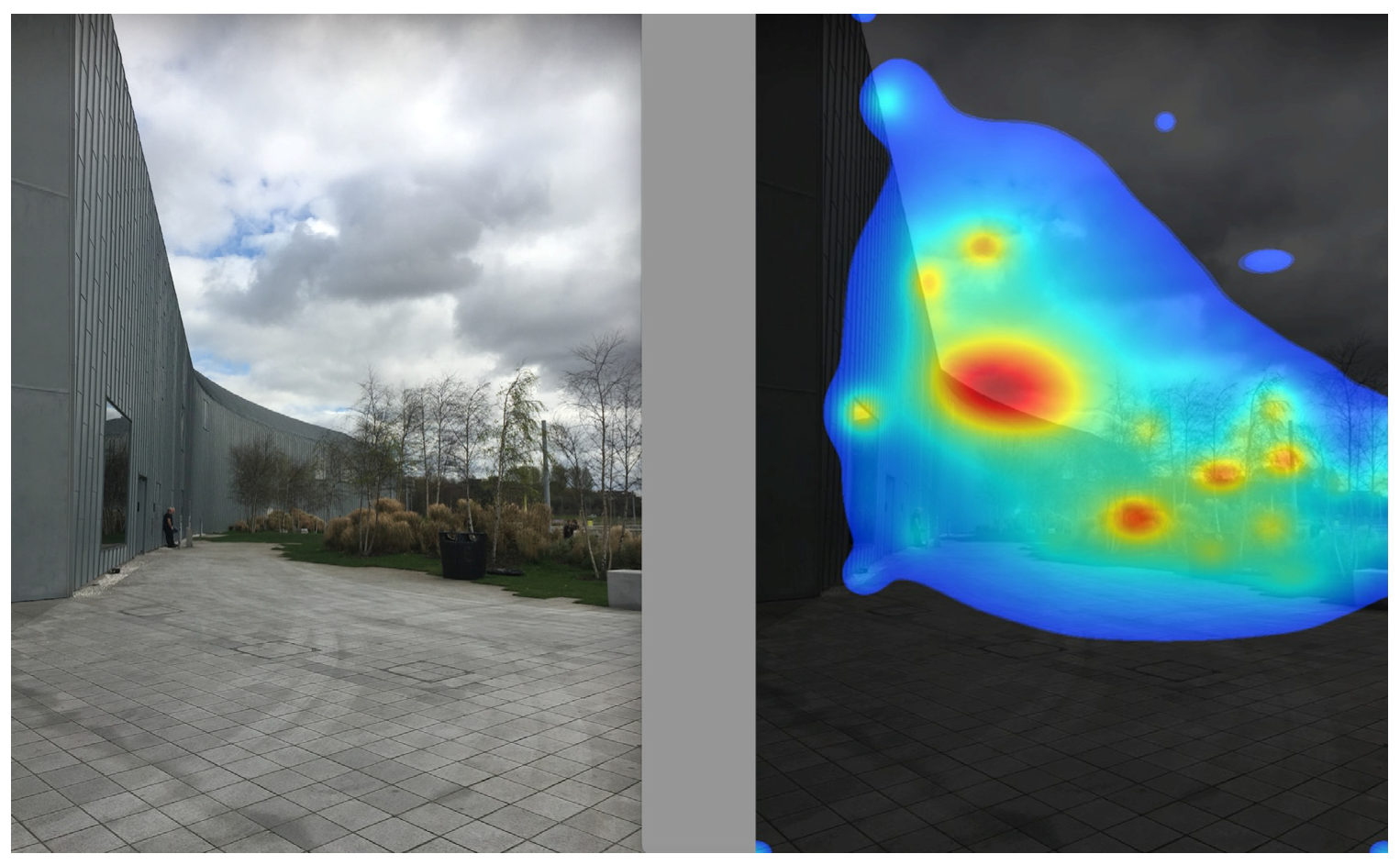
Further, both the plaza and main wall are ignored, with minor attention going to irrelevant features such as the re-entrant edges of the lawn (Figure 14). What really attracts the eye is the older building in the background and the cloud formation in the sky. A stronger architectural design would at least have competed with external visual elements for attention.
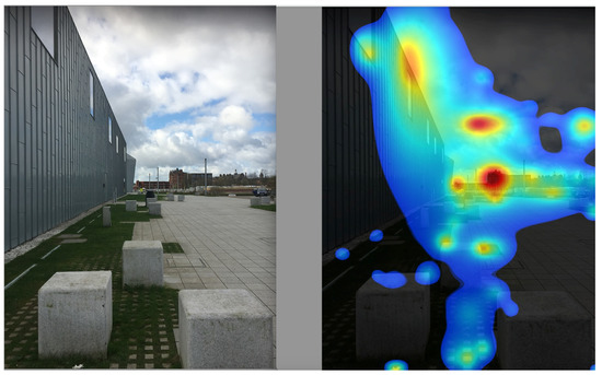
Figure 14.
RSM side wall with concrete bollards/seats, and plaza. (Photo by A. Salama; VAS heatmap scan by N.A. Salingaros).
This scan (Figure 15) is consistent with the previous ones in showing a lack of attention to the plaza and the museum wall. The focus is on the roof edge contrasting with the sky, which is not a feature that enhances the museum experience through architecture. Furthermore, the plantings intended to provide a more natural experience are not very successful for two reasons: (i) spots of attraction on the trees are still very weak; and (ii) there is no engaging unity between the vegetation and the museum building, which would show as an overlapping region in the heatmap.

Figure 15.
RSM wall and nearby vegetation. (Photo by A. Salama; VAS heatmap scan by N.A. Salingaros).
In summary, eye-tracking simulation heatmaps provide the necessary scientific support for how visitors react unconsciously without knowing why they like a place or not. Those feelings come out in questionnaires such as the ones described and documented above. Of course, other factors such as the perceptions of enclosure, texture, and proprioception also contribute to the emotional experience of a building, both inside and outside. But if the basic geometry and surfaces give a deficient signal, then this is enough to explain a lack of interest.
6. Discussion
Three factors for the understanding and analysis of buildings were utilized in a multimodal framework for an inquiry into Glasgow’s Riverside Museum (RSM). The criticism overlaps directly with performance evaluation and habitability. This approach opposes the common paradigm that involves either articles that judge the RSM based on a set of formal criteria or articles that simply state obvious but superficial observations. However, that type of architectural criticism, universally applied today, ignores what is possible through scientific assessment tools. Nonetheless, performance evaluation and habitability are increasingly valued as parts of the academic and professional realms.
We postulate a set of necessary but not sufficient conditions for an important building, such as a public museum, to satisfy. This list prompted the tools that we applied in the analysis presented here. A museum should fulfill at minimum the following architectural attributes:
- The building should be easily accessible, with the connecting pedestrian paths themselves providing a pleasant experience.
- The public open spaces around the building ought to create an inviting environment to both linger in and traverse.
- The museum’s approach and entrance should be easily discernible from a distance.
- The indoors/outdoors transition when entering the museum should provide a psychologically comfortable and uplifting experience.
- Successful museum spaces should themselves provide a pleasant user experience independently of any interest coming from the exhibits.
- The museum interior—through the design of its paths and spaces—should catalyze user interaction with the exhibits and also among the users themselves.
Furthermore, what criticism does entail and aims at, as viewed by researchers and critics, instigated an examination of what was written about the museum. We examined more than 50 articles (filtered into 33) for questioning. The articles written on the RSM seem to have focused on the building’s form and image, its role in the city, the views of professionals, design qualities from a material perspective, and cost-benefits matters. However, the media appear to have totally overlooked how the building could be used, in the case of articles written before its completion, or is actually used, in the case of articles written after the opening of the RSM for public use. The core messages conveyed to both the professional community and the public do not represent the reality of the building associated to the users’ experience.
In order to correct this mismatch, performance evaluation studies should be based on systematic documentation of users’ feedback as well as from a professional perspective. In this respect, the spatial environment can be viewed using a hierarchy of scales: (1) facility—a complex of buildings or components of a building, the surrounding landscape, or context; (2) building—an assembly of spaces and places; (3) room/space—activity settings that define where behavior takes place. Further, appraising selected design features and spatial qualities in the RSM with this hierarchical perspective, and through a diverse set of tools that address various scales, reveals poor performance and significant shortcomings in the three categories assessed. They are: planning and zoning, landscaping, and designing, as viewed collectively by 25 junior architects. The navigational mapping demonstrates critical issues with movement and crowding at important spaces, including the museum’s main entrance.
A few locations in the RSM seem to generate positive emotional experiences, including attraction to linger, a sense of pleasant partial containment, and a sense of belonging. Several key locations and spaces depicted and praised as important design qualities in what was written about the museum, however, generate negative emotions. These spots include the main entrance, the central exhibition, and the velodrome. Such inadequacies seem to be an outcome of not considering design aspects related to sense of direction, sense of unease resulting from crowded chaotic displays, or sense of not being situated in the space.
The analysis of user emotional and visual engagement with the building’s exterior using visual attention software (VAS) independently confirmed and complemented the results from the questionnaires. This new and powerful tool cuts through conventional assumptions about architectural aesthetics to reveal how the human body itself reacts unconsciously to spaces and surfaces [70]. The pre-attentive gaze cannot be controlled, and the VAS heatmaps show precisely what attracts the viewers’ attention. Further, the most highly praised architectural elements are inadequate if they fail to register visually through positive engagement. We were thus able to verify why the exterior spaces, walls, plantings, and urban furniture provide an inadequate experience.
The present appraisal of the RSM aligns with calls for conceiving architecture as a “performing” rather than a strictly visual art [71,72,73,74]. This represents an exemplary shift from thinking of a building as an aesthetic, sculptural object created by an architect toward an interrogation of how the building actually performs. How the building came to be, how many people engage with it, how they engage with it, what patterns of behavior and use are catalyzed by the architecture, how users attach to it emotionally, what kind of experience it offers, how it is maintained, and how both the building and the experience it provides to users change over time.
The celebration, legitimization, and promotion of the works of architects has significant implications on the value and belief system within architectural education and practice. The buildings, especially those that have been designed by star architects and praised in the media, must perform well in a manner that departs from the deficiencies witnessed in the above appraisal of the RSM. Having to perform means accommodating the needs of users and accomplishing fundamental tasks that reflect the brief and programmatic requirements, where the performance and movement of users must inform the space conceptualizations.
Furthermore, the architects who design buildings and the critics who write about them must also perform by meeting their professional obligations. Conventionally, a critic employs his/her expertise and substantiated knowledge to identify ‘better buildings,’ while in performance evaluation studies and habitability research, ‘better buildings’ must be viewed from the users’ perspective. It is now important to couple the two approaches. The present study emphasized that an evaluation that involves objective/subjective viewpoints is needed to verify arguments for improved practice.
The paradigm combining the three factors of criticism, performance evaluation, and habitability enables a comprehensive analysis of buildings and eventually contributes to defining ‘better buildings,’ even though each component addresses different elements and possibly a different audience. The need for multimodality when examining and assessing buildings initiates an effort to reveal a more comprehensive picture of experienced reality. Further, the performance evaluation and habitability should ideally influence decision makers, especially if those results contradict standard methods of architectural criticism.
7. Conclusions
The act of viewing architecture as a “performing art of building,” with performance and habitability at the core of designing, understanding, and analyzing it, entails valuing the work of everyone involved in the production of architecture as a collective effort, not just its concept generator. It is essential that all parties involved in the construction processes, decision-making, design, other design professions, and users be included. In addition, viewing architecture as an exclusively visual—but psychologically detached, non-interactive—art for many decades has led to celebrating the work of the design architect as abstract sculpture. This view persists today, while very little or almost no attention is paid to the large teams of professionals who design, detail, construct, furnish, and curate a building, and very little attention is paid to how the building performs after completion in terms of its use and operation.
In addition, a perceived contradiction among iconic building evaluations motivated the present investigation. The local municipalities and national governments approve and commission projects that are heavily promoted before and after completion by public and specialized media. However, those buildings do not necessarily meet measured user satisfaction, program requirements, or the human sensorial experience of the built spaces and surfaces. We are confronted with incompatible approaches to evaluating architecture. Furthermore, adopting a methodologically strong multimodal appraisal method that merges criticism, performance evaluation, and habitability helps to resolve this disconnect. The approach and methodology presented here should interest readers working in the associated field, while the conclusions derived from the study also offer some useful insights. As its primary professional responsibility, architecture must build up and share an open-ended body of knowledge solidly based on feedback, using data collected over time for the full spectrum of constituencies and stakeholders.
Author Contributions
Conceptualization, A.M.S., N.A.S. and L.M.; methodology, A.M.S., N.A.S. and L.M.; validation, A.M.S. and L.M.; formal analysis, A.M.S. and L.M.; investigation, A.M.S. and L.M.; Visual Attention Software scanning, N.A.S.; resources, A.M.S., N.A.S. and L.M.; data curation, A.M.S.; writing—original draft preparation, A.M.S.; writing—review and editing, N.A.S. and A.M.S.; visualization, L.M. All authors have read and agreed to the published version of the manuscript.
Funding
This research received no external funding.
Data Availability Statement
All data generated from the fieldwork are included in the body of this article.
Acknowledgments
Thanks are due to the students of the Master of Advanced Architectural Design (2018–2019) at the University of Strathclyde, Glasgow, United Kingdom, for contributing to the testing of the tools in advance of the field work conducted by the research team. N.A.S. thanks Kelly Canavan of the 3M Corporation for providing access to VAS Visual Attention Software.
Conflicts of Interest
The authors declare no conflict of interest.
References
- Zaha Hadid Architects, The Riverside Museum, Glasgow. Available online: https://www.zaha-hadid.com/architecture/glasgow-riverside-museum-of-transport/ (accessed on 14 October 2022).
- Klettner, A. Zaha Hadid’s Riverside Wins European Museum of the Year Award. Available online: https://www.bdonline.co.uk/zaha-hadids-riverside-wins-european-museum-of-the-year-award/5055020.article (accessed on 9 October 2022).
- Gans, H.J. Toward a Human Architecture: A Sociologist’s View of the Profession. J. Archit. Educ. 1978, 31, 26–31. [Google Scholar]
- Newman, O. Community of Interest. Society 1980, 18, 52–57. [Google Scholar] [CrossRef]
- Nasar, J.L. The Shaping of Design Values: Case Studies on the Trade Magazines. In Proceedings of the 17th Annual Conference of the Environmental Design Research Association—The Cost of Not Knowing, EDRA Publications, Atlanta, GA, USA, 9 April 1986. [Google Scholar]
- Salama, A.M. Design Intentions and Users Responses: Assessing Outdoor Spaces of Qatar University Campus. Open House Int. 2009, 34, 82–93. [Google Scholar] [CrossRef]
- Salama, A.M. Media coverage and users’ reactions: Al Azhar Park in Cairo re-examined. In Architecture Beyond Criticism: Expert Judgment and Performance Evaluation, 1st ed.; Preiser, W., Davis, A., Salama, A., Hardy, A., Eds.; Routledge: London, UK, 2014; pp. 91–103. [Google Scholar]
- Sharp, D. Criticism in Architecture. In Proceedings of the Regional Seminar in the Series Exploring Architecture in Islamic Cultures; Powell, R., Ed.; Concept Media: Singapore, 1989; pp. 8–15. [Google Scholar]
- Sharp, D. Architectural Criticism: History, Context and Role. In Architectural Criticism and Journalism: Global Perspectives; Al-Asad, M., Musa, M., Eds.; Aga Khan Award for Architecture: Kuwait City, Kuwait, 2005; pp. 30–34. [Google Scholar]
- Salama, A.M. Media Coverage and Users’ Reactions: Al Azhar Park in the Midst of Criticism and Post Occupancy Evaluation. METU J. Fac. Archit. 2008, 25, 105–125. [Google Scholar]
- Attoe, W. Architecture and Critical Imagination, 1st ed.; John Wiley and Sons Inc: New York, NY, USA, 1978; pp. 2–5. [Google Scholar]
- Fisher, T. Making Criticism More Critical. J. Archit. Educ. 2009, 62, 14–15. [Google Scholar] [CrossRef]
- Davis, A. Identity Crisis: Estrangement in the Evolution of Architectural Criticism. In Architecture Beyond Criticism: Expert Judgment and Performance Evaluation, 1st ed.; Preiser, W., Davis, A., Salama, A., Hardy, A., Eds.; Routledge: London, UK, 2014; pp. 21–36. [Google Scholar]
- Davis, A.T.; Preiser, W.F.E. Architectural Criticism in Practice: From Affective to Effective Experience. ArchNet-IJAR: Int. J. Archit. Res. 2012, 6, 24–42. [Google Scholar]
- Huxtable, A. On Architecture: Collected Reflections on a Century of Change, Reprint ed.; Walker and Company: New York, NY, USA, 2010. [Google Scholar]
- Goldberger, P. Why Architecture Matters; Yale University Press: New Haven, CT, USA, 2011. [Google Scholar]
- Preiser, W.; Nasar, J. Assessing Building Performance: Its Evolution from Post-Occupancy Evaluation. ArchNet-IJAR Int. J. Archit. Res. 2008, 2, 84–99. [Google Scholar]
- Preiser, W.; Hardy, A. Historical review of building performance evaluation. In Architecture Beyond Criticism: Expert Judgment and Performance Evaluation, 1st ed.; Preiser, W., Davis, A., Salama, A., Hardy, A., Eds.; Routledge: London, UK, 2014; pp. 147–159. [Google Scholar]
- Bordass, B.; Leaman, A. Building performance evaluation in the UK: So many false dawns. In Architecture Beyond Criticism: Expert Judgment and Performance Evaluation, 1st ed.; Preiser, W., Davis, A., Salama, A., Hardy, A., Eds.; Routledge: London, UK, 2014; pp. 160–170. [Google Scholar]
- Markus, T.; Whyman, P.; Morgan, J.; Whitton, D.; Maver, T.; Canter, D.; Fleming, J. Building Performance; Academic Science Publishers: London, UK, 1972. [Google Scholar]
- Preiser, W.; Vischer, J.C. Assessing Building Performance; Elsevier Butterworth-Heinemann: Oxford, UK, 2005. [Google Scholar]
- Mallory-Hill, S.; Preiser, W.; Watson, C. Enhancing Building Performance; Wiley-Blackwell: Oxford, UK, 2012. [Google Scholar]
- Preiser, W.; Hardy, A.; Schramm, U. Building Performance Evaluation: From Delivery Process to Life Cycle Phases, 2nd ed.; Springer International Publishing: Cham, Switzerland, 2018. [Google Scholar]
- RIBA. Post Occupancy Evaluation and Building Performance Evaluation; RIBA Publications: London, UK, 2016. [Google Scholar]
- Clarke, J. Why Tools for Buildings and Cities Performance Simulation Need to Evolve. Building and Cities. Available online: https://www.buildingsandcities.org/insights/commentaries/tools-for-buildngs-and-cities-performance.html (accessed on 14 October 2022).
- Dudhee, V.; Vukovic, V. Building Information Model Visualisation in Augmented Reality. Smart Sustain. Built Environ. 2021; ahead-of-print. [Google Scholar]
- Thanu, H.P.; Rajasekaren, C.; Deepak, M.D. Developing a Building Performance Score Model for Assessing the Sustainability of Buildings. Smart Sustain. Built Environ. 2020, 11, 143–161. [Google Scholar]
- Sanoff, H. Integrating Programming, Evaluation, and Participation in Design: A Theory Z Approach, 1st ed.; Routledge: London, UK, 1992. [Google Scholar]
- Shibley, R. Toward a Military Construction Model for Quality Architectural Design: A Long-Range Corps of Engineers Architectural Research Plan. J. Archit. Educ. 1974, 26, 86–89. [Google Scholar] [CrossRef]
- Harrison, A.A. Humanizing Outer Space: Architecture, Habitability, and Behavioral Health. Acta Astronaut. 2010, 66, 890–896. [Google Scholar] [CrossRef]
- Preiser, W.; Davis, A.; Salama, A.M.; Hardy, A. Architecture Beyond Criticism: Expert Judgment and Performance Evaluation, 1st ed.; Routledge: London, UK, 2014. [Google Scholar]
- Lantrip, D.B. Isokin: A Quantitative Model of the Kinesthetic Aspects of Spatial Habitability. Proc. Hum. Factors Ergon. Soc. Annu. Meet. 1986, 30, 33–37. [Google Scholar] [CrossRef]
- Cubillos-González, R.A. Testing Habitability for Sustainable Building Design. Teka Kom. Archit. Urban. I Stud. Kraj.–OL PAN 2015, 11, 117–125. [Google Scholar] [CrossRef]
- Casals-Tres, M.; Arcas Abella, J.; Cuchi Burgos, A.; Altes Arlandis, A. Habitability, the Scale of Sustainability. In Proceedings of the CISBAT 2009 International Conference: Renewables in Changing Climate, Lausanne, Switzerland, 2–3 September 2009; École Polytechnique Fédérale de Lausanne: Lausanne, Switzerland, 2019; pp. 409–414. [Google Scholar]
- Mahdavi, A. Steps to a General Theory of Habitability. Hum. Ecol. Rev. 1998, 5, 23–30. [Google Scholar]
- APA Online Dictionary of Psychology. Available online: https://dictionary.apa.org/sociofugal (accessed on 1 February 2022).
- Allen, M. The Sage Encyclopedia of Communication Research Methods; SAGE Publications Inc.: Thousand Oaks, CA, USA, 2017; p. 4. [Google Scholar]
- Patton, M.Q. Qualitative Research and Evaluation Methods, 3rd ed.; Sage Publications: Thousand Oaks, CA, USA, 2002. [Google Scholar]
- Salama, A.M.; Maclean, L. Integrating Appreciative Inquiry (AI) into Architectural Pedagogy: An Assessment Experiment of Three Retrofitted Buildings in the City of Glasgow. Front. Archit. Res. 2017, 6, 169–182. [Google Scholar] [CrossRef]
- Armstrong, R.L. The Midpoint on a Five-Point Likert-Type Scale. Perceptual Motor Skills. Sage J. 1987, 64, 359–362. [Google Scholar] [CrossRef]
- Allen, I.E.; Seaman, C.A. Likert Scales and Data Analyses. Qual. Prog. 2007, 40, 64–65. [Google Scholar]
- Sommer, R.; Sommer, B. A Practical Guide to Behavioral Research: Tools and Techniques, 5th ed.; Oxford Press: New York, NY, USA, 2002. [Google Scholar]
- Ng, C.F. Behavioral Mapping and Tracking. In Research Methods for Environmental Psychology; Gifford, R., Ed.; Wiley Online Library: Hoboken, NJ, USA, 2016; pp. 29–51. [Google Scholar] [CrossRef]
- Klein, C.; Kuhnen, A.; Felippe, M.L.; Silveira, B.B. Place-centered or Person-centered? Considerations about the Behavioral Mapping Approach. Trends Psychol. 2018, 26, 593–616. [Google Scholar] [CrossRef]
- Salama, A.M. PLADEW: A Tool for Teachers Awareness of School Building Sustainability the Case of Carmel School, Mathews, North Carolina. Glob. Built Environ. Rev. 2005, 5, 45–56. [Google Scholar]
- Salama, A.M. When Good Design Intentions Do Not Meet Users Expectations: Exploring Qatar University Campus, Outdoor Spaces. Archnet-IJAR: Int. J. Archit. Res. 2008, 2, 57–77. [Google Scholar]
- Salama, A.M. Evolving Sustainable Design Approaches in Architectural Practice and Education. In International Sustainable Tropical Environmental Design Conference 2013 (SusTED’13) Faculty of Design & Architecture; Universiti Putra Malaysia: Serdang, Selangor, Malaysia, 2013; pp. 8–15. [Google Scholar]
- Salama, A.M.; Gharib, R.Y. A Perceptual Approach for Investigating Urban Space Diversity in the City of Doha. Open House Int. 2012, 37, 24–32. [Google Scholar] [CrossRef]
- Kelly, G.A. A Brief Introduction to Personal Construct Theory. In International Handbook of Personal Construct Psychology; Fransella, F., Ed.; John Wiley & Sons: Chichester, UK, 2003; pp. 3–20. [Google Scholar]
- Karnaze, M.M. A Constructivist Approach to Defining Human Emotion: From George Kelly to Rue Cromwell. J. Constr. Psychol. 2013, 26, 194–201. [Google Scholar] [CrossRef]
- Chiari, G. Emotion in Personal Construct Theory: A Controversial Question. J. Constr. Psychol. 2013, 26, 249–261. [Google Scholar] [CrossRef]
- Sioe-Hao Tan, E. Entertainment is Emotion: The Functional Architecture of the Entertainment Experience. Media Psychol. 2008, 11, 28–51. [Google Scholar]
- Barrett, L.F. Solving the Emotion Paradox: Categorization and The Experience of Emotion. Personal. Soc. Psychol. Rev. 2006, 10, 20–46. [Google Scholar] [CrossRef]
- Hatherly, O. Riverside Museum, Glasgow, by Zaha Hadid Architects. Archit. J. Available online: https://www.architectsjournal.co.uk/archive/riverside-museum-glasgow-by-zaha-hadid-architects (accessed on 24 March 2019).
- Parnell, S. Zaha Hadid Architects’ Riverside Museum in Glasgow. Building Design Online. Available online: https://www.bdonline.co.uk/buildings/zaha-hadid-architects-riverside-museum-in-glasgow/5020256.article (accessed on 18 March 2019).
- Brielmann, A.; Buras, N.; Salingaros, N.; Taylor, R. What happens in your brain when you walk down the street? Implications of architectural proportions, biophilia, and fractal geometry for urban science. Urban Sci. 2022, 6, 3. [Google Scholar] [CrossRef]
- Hollander, J.B.; Sussman, A.; Purdy Levering, A.; Foster-Karim, C. Using eye-tracking to understand human responses to traditional neighborhood designs. Plan. Pract. Res. 2020, 35, 485–509. [Google Scholar] [CrossRef]
- Hollander, J.B.; Levering, A.P.; Lynch, L.; Foster, V.; Perlo, S.; Jacob, R.J.; Taylor, H.A.; Brunyé, T.T. Cognitive responses to urban environments: Behavioral responses in lab and field conditions. Urban Des. Int. 2020, 8, 1–6. [Google Scholar] [CrossRef]
- Hollander, J.B.; Anderson, E.C. The impact of urban façade quality on affective feelings. Archnet-IJAR Int. J. Archit. Res. 2020, 14, 219–232. [Google Scholar] [CrossRef]
- Krupina, A.A.; Bespalov, V.V.; Kovaleva, E.Y.; Bondarenko, E.A. Eye tracking in urban visual environment. Constr. Unique Build. Struct. 2017, 1, 47–56. [Google Scholar] [CrossRef]
- Hollander, J.B.; Purdy, A.; Wiley, A.; Foster, V.; Jacob, R.J.; Taylor, H.A.; Brunyé, T.T. Seeing the city: Using eye-tracking technology to explore cognitive responses to the built environment. J. Urban. Int. Res. Placemaking Urban Sustain. 2018, 12, 156–171. [Google Scholar] [CrossRef]
- Hollander, J.B.; Sussman, A. Urban Experience and Design: Contemporary Perspectives on Improving the Public Realm; Routledge: London, UK, 2020. [Google Scholar]
- Sussman, A.; Ward, J.M. How Biometric Software is Changing How We Understand Architecture—And Ourselves. Common Edge 2021. Available online: https://commonedge.org/how-biometric-software-is-changing-how-we-understand-architecture-and-ourselves (accessed on 5 January 2022).
- Sussman, A.; Hollander, J.B. Cognitive Architecture: Designing for How We Respond to the Built Environment, 2nd ed.; Routledge: New York, NY, USA, 2021. [Google Scholar]
- Sussman, A.; Ward, J.M. Eye-Tracking Boston City Hall to Better Understand Human Perception and the Architectural Experience. New Des. Ideas 2019, 3, 53–59. Available online: http://jomardpublishing.com/UploadFiles/Files/journals/NDI/V3N1/SussmanA%20WardJ.pdf (accessed on 3 July 2021).
- VAS Visual Attention Software. 3M VAS. Available online: https://vas.3m.com (accessed on 8 January 2023).
- Lavdas, A.; Salingaros, N.; Sussman, A. Visual Attention Software: A new tool for understanding the ‘subliminal’ experience of the built environment. Appl. Sci. 2021, 11, 6197. [Google Scholar] [CrossRef]
- Salingaros, N.; Sussman, A. Biometric pilot-studies reveal the arrangement and shape of windows on a traditional façade to be implicitly ‘engaging’, whereas contemporary façades are not. Urban Sci. 2020, 4, 26. [Google Scholar] [CrossRef]
- Schirpke, U.; Tasser, E.; Lavdas, A.A. Potential of eye-tracking simulation software for analyzing landscape preferences. PLoS ONE 2022, 17, e0273519. [Google Scholar] [CrossRef]
- Lavdas, A.A.; Salingaros, N.A. Architectural Beauty: Developing a Measurable and Objective Scale. Challenges 2022, 13, 56. [Google Scholar] [CrossRef]
- Andrews, J. Architecture, A Performing Art; Oxford University Press: Oxford, UK, 1991. [Google Scholar]
- Kolarevic, B.; Malkawi, A. Performative Architecture, Beyond Instrumentality; Routledge: New York, NY, USA, 2005. [Google Scholar]
- Salingaros, N.A. Anti-Architecture and Deconstruction, 4th ed.; Sustasis Press: Portland, OR, USA, 2014. [Google Scholar]
- Fisher, T. The Performance of Building, Architects, and Critics. In Architecture Beyond Criticism: Expert Judgment and Performance Evaluation, 1st ed.; Preiser, W., Davis, A., Salama, A., Hardy, A., Eds.; Routledge: London, UK, 2014; pp. 75–82. [Google Scholar]
Disclaimer/Publisher’s Note: The statements, opinions and data contained in all publications are solely those of the individual author(s) and contributor(s) and not of MDPI and/or the editor(s). MDPI and/or the editor(s) disclaim responsibility for any injury to people or property resulting from any ideas, methods, instructions or products referred to in the content. |
© 2023 by the authors. Licensee MDPI, Basel, Switzerland. This article is an open access article distributed under the terms and conditions of the Creative Commons Attribution (CC BY) license (https://creativecommons.org/licenses/by/4.0/).


