1. Introduction
In the United States, demographic data are released by the U.S. Census Bureau in the form of areal aggregates. Consequently, the overwhelming majority of maps illustrating Census data are choropleth maps. In such maps, a study area is divided into Census areal units (tracts, block groups, or blocks), and each unit is colored according to its value of a demographic variable. In racial demography, two variables are most often used: one is the percentage of people of a given race (a numerical variable), and the other is the diversity category that describes the character of a racial mix in a unit (a categorical variable). The first type of mapping requires several maps (one for each race) to communicate racial geography of the study area, whereas the second type communicates this racial geography in a single map. The second mapping method provides much more effective visualization of the overall racial character of the study area. Examples of maps showing racial diversity categories can be found in
Bader and Warkentien (
2016);
Fasenfest et al. (
2004);
Holloway et al. (
2012);
Wright et al. (
2014).
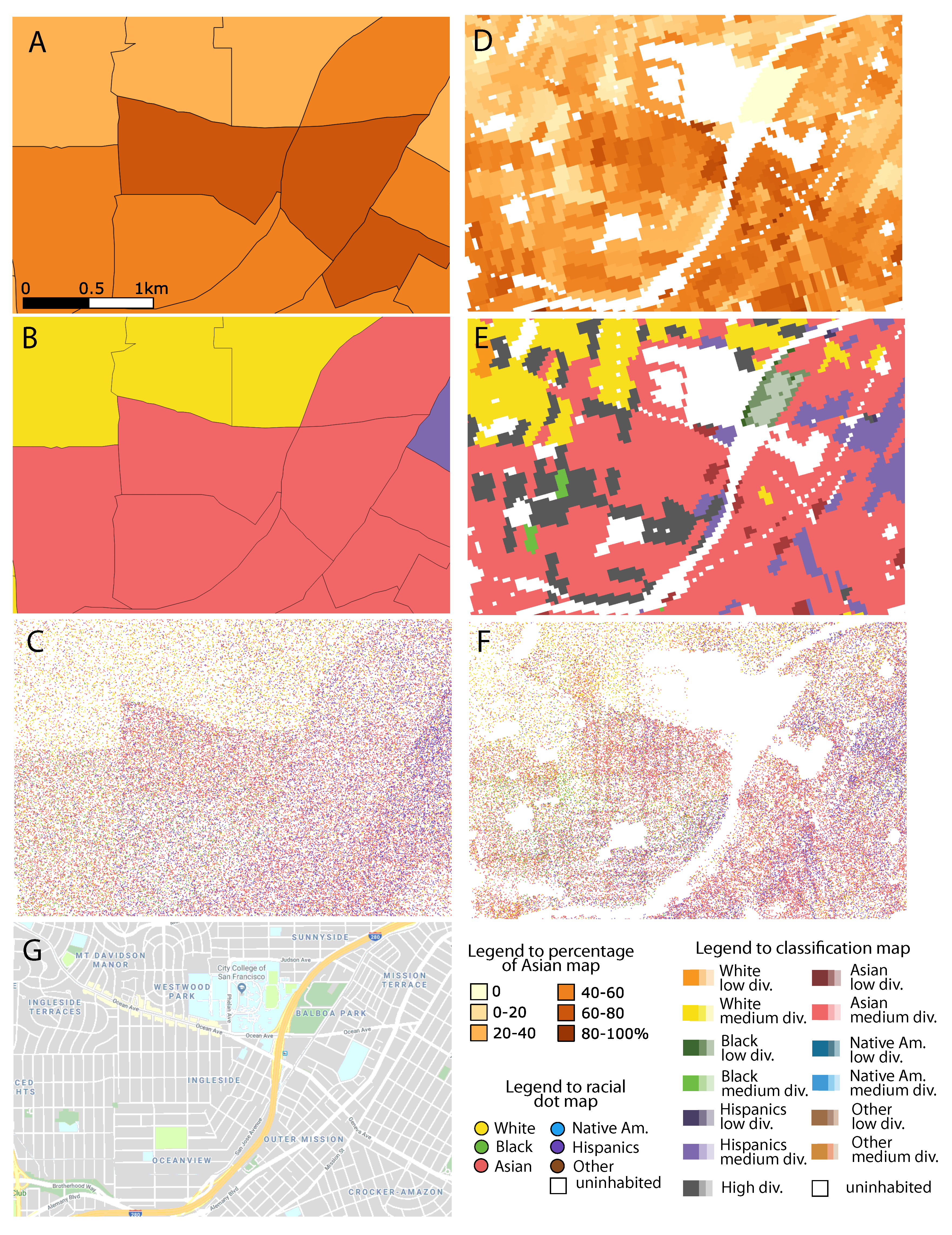
Figure 1 shows several adjoined Census tracts in the city of San Francisco centered around Balboa Park. Panel A shows the map of the percentage of Asian population (maps of the percentage of other races would be needed to complete the information about the racial character of this area). Three centrally-located tracts have a strong majority Asian population; tracts to the south of the center have a smaller majority Asian population; and tracts to the north have even a smaller, non-majority percentage of Asians. Panel B shows a diversity/top race classification map. This map, which does not concentrate on Asians alone, but takes into consideration all races, provides more general information. Central and southern tracts have a medium diversity population with Asians being the top contributor; the northern tracts have a medium diversity population with whites being the top contributor; and one eastern tract has a medium diversity population with Hispanics being the top contributor.
Figure 1C shows a racial dot map: a third type of map, that in recent years started to be used in segregation/diversity studies. Dot maps depict spatial distribution and density of discrete, labeled geographical objects (
Kimerling 2009;
Roth 2010). In segregation/diversity studies, the objects are people, and the labels are their races. In
Figure 1C, the number of dots in a tract corresponds to its people count. Dots are colored in proportion to the racial composition and placed in a random position within a tract. Such a map is arguably even a better visualization of racial geography than the diversity map (
Figure 1B) as it explicitly accounts for every person. Racial dot maps were popularized by two web applications enabling viewing such maps over the entire United States. The first map, from the University of Virginia (
https://demographics.virginia.edu/DotMap/) is based on Census block data, and another, from the New York Times (
https://www.nytimes.com/interactive/2015/07/08/us/Census-race-map.html), is based on Census tracts. Racial dot maps have been shown to be a preferred tool in teaching about residential segregation (
Seguin et al. 2017).
Notice that the maps in
Figure 1A–C exhibit artifacts due to the fact that all three are based on Census tracts. The maps show uniform properties (race percentage, diversity type, a pattern of dots) across the entire tract. In reality, tracts are not homogeneous. In addition to residential areas, they may contain uninhabited areas such as parks, highways, and industrial and other non-residential buildings. As can be seen on the Google Street Map (
Figure 1G), the site includes a park, a university, a high school, and the major highway, all of them unrecognized in Panels A, B, and C as residentially uninhabited. The same problem remains even if smaller Census units such as block groups or blocks are used instead of tracts. Another artifact is the abrupt change of racial character at the boundaries between tracts; this is especially noticeable in a dot map (Panel C). These artifacts (and other problems, like, for example, incompatibility of Census area boundaries between different years) transcend segregation/diversity studies and apply to all Census-based maps. They have been referred to by
Sperling (
2012) as “the tyranny of Census geography”.
To alleviate the “tyranny of Census geography” in segregation/diversity studies, we previously have developed (
Dmowska and Stepinski 2014,
2016,
2017a,
2017b;
Dmowska et al. 2017) high-resolution population grids for the entire conterminous United States. In such a grid, each grid’s cell contains the density of all racial sub-populations at its location. Constructing race percentage maps and racial diversity type maps (equivalents of
Figure 1A,B, respectively) from the grid is straightforward; such maps for our example area in San Francisco are shown in
Figure 1D,E. An advantage of using gridded data instead of Census-based data is immediately clear by comparing Panels A with D and Panels B with E. The artifacts discussed above are not present in the grid-based maps. Furthermore, the grid-based maps are more detailed, partially because they started from the Census-block data and partially because the grid was constructed using dasymetric modeling (see the next section for details).
The racial dot map constructed from the population grid has the same advantage over the dot map constructed from the Census tracts as the race percentage map and the racial diversity map do (see
Figure 1F). However, constructing a dot map from the high-resolution grid is not straightforward because the grid stores data as a population density rather than as a people count. The major contribution of this paper is to present a method of constructing a racial dot map from high-resolution gridded data, to develop and to make publicly available the R code for grid-based dot maps, and to calculate and to make publicly available grid-based racial dot maps for all counties in the conterminous United States. We also present a series of examples in support of our claim that grid-based dot maps are more spatially accurate than tract- or block-based dot maps. In these examples, all three types of dot maps are shown, and their spatial accuracy can be visually assessed by comparison to an image of the mapped area.
2. Methods
This section is divided into two subsections. In the first subsection, we provide background information on gridded data; detailed information on gridded data are given in
Dmowska and Stepinski (
2017a);
Dmowska et al. (
2017). In the second subsection, we describe the construction of a racial dot map from the grid.
2.1. Gridded Data
An input for our method of constructing grid-based racial dot maps consisted of the population and racial grids available online through the SocScape web application (
http://sil.uc.edu/webapps/socscape_usa/). They can also be downloaded by individual county and Metropolitan Statistical Area (MSA) from
http://sil.uc.edu. Details of grid construction and its accuracy were described in
Dmowska and Stepinski (
2017a), and the benefits of using gridded population data over Census aggregates were discussed in
Dmowska et al. (
2017).
The input data for grid construction were the U.S. Census Bureau block population data, the National Land Cover Dataset (NLCD), and the National Land Use Dataset (NLUD) (
Theobald 2014). The grid was constructed by redistribution of population in the block using dasymetric modeling (for a review of dasymetric modeling, see
Petrov (
2012)) with LCLU and NLUD as ancillary data. LCLU and NLUD data have a significantly higher resolution (30 m per cell) than the size of Census blocks and can be used to guide the redistribution of the within-block population due to the existence of a correlation between different categories of land cover/land use and different values of population density. This correlation and the derived dasymetric model were presented in
Dmowska and Stepinski (
2017a). The result is the grid of total population density (in units of people/900 m
2), with 900 m
2 being an area of a single (30 m × 30 m) grid cell. This resolution is dictated by the resolution of the LCLU and NLUD data. Note that a grid cell is not an aggregation unit; instead, it is a point in space for which a density of population is measured. Thus, 30 m × 30 m is a nominal resolution of the population data in the form of the grid, not the actual resolution with which the locations of residences are known.
The dasymetric model distributes unevenly the total population of the block into its constituted cells in proportion to the LCLU and NLUD categories of the cell. Thus, the cells having LCLU/NLUD categories associated with uninhabited areas will get no people; those associated with the low density of population will get a relatively small share of people; and those associated with the high density of population will get a relatively large share of people. The result is a sub-block spatial distribution of the population.
There is no high-resolution ancillary data that would correlate with the race of the population. Thus, to obtain population density for different races at a given cell, we used relative ratios inherited from the block to which the cell belongs. Thus, sub-populations are not independently redistributed within a block; instead, they are redistributed in the same way as the total population. This still results in improved informational content of a grid over the block as people of all races are kept away from uninhabited areas and the population density is not constant across the block. In addition, using Census blocks (which are much smaller than Census tracts) as an input to the dasymetric model minimizes the possibility of different spatial distributions for different sub-populations.
We divide the total population into the following sub-populations: non-Hispanic white, non-Hispanic black, non-Hispanic Asian, non-Hispanic American Indian, non-Hispanic Native Hawaiian and other Pacific Islander, non-Hispanic other race, and Hispanic. The names of these sub-populations follow from the fact that Census asks two different questions in its questionnaire, one about the race (white, black, Asian, Native Americans, Hawaiian/Pacific Islander, other) and another about ethnicity (Hispanic, non-Hispanic). For brevity, we will use the following categories, white, black, Hispanics, Asians, Native Americans, and other, where Hawaiian/Pacific Islanders were incorporated into the Asian sub-population; we refer to these categories as races.
2.2. Grid-Based Dot Map
To construct a dot map from gridded data, we need to decide how many dots to put within each cell of a grid. The major issue is that the grid carries fractional numbers corresponding to a density of people rather than integer numbers corresponding to a count of people. Consider a cell with the overall density , where are densities of different sub-populations present in the cell. We will describe the method for one person per dot map, but constructing a k-people per dot map is analogous except for starting with all densities divided by the same integer k.
Dots were assigned to the cell for each sub-population separately according to the procedure illustrated in
Figure 2. In this figure, only a small portion of the grid consisting of four adjacent cells is shown with the numbers in each cell showing values of density
for a given sub-population (say, for
, or the black sub-population). Next, the value of density in each cell was decomposed into an integer part and a fractional part. The number of dots corresponding to a black sub-population in a cell is given by the sum of the integer part plus the contribution from the fractional part that may be either one dot or zero dots. Whether it is one or zero is decided by a random number generator. A random number between 0 and 1 was generated. If the generated number was smaller than a fractional part, the contribution was one dot; otherwise, it was zero dots. Thus, the probability of contributing an additional dot was proportional to the value of the fractional part; larger values were more likely to result in contributing an additional dot. With such a procedure, the number of dots representing the black population in the entire Census block was guaranteed to be close to an actual block count of this sub-population.
The procedure described above was repeated for all other sub-populations. Next, all dots were assigned random coordinates within a cell and a label (color) indicating which race they represented. The dots were drawn randomly without consideration of their label and placed on the map. The random order of placement minimized the chances that dots representing a given race would be obscured by subsequently-placed dots representing a different race.
Our method was implemented in R language
R Core Team (
2014). R is a comprehensive computational environment that includes libraries to work with different types of spatial data. It allows building an efficient, flexible, and fully-automated computational environment to work with a large dataset. The R script for generating the racial dot map from gridded population data is available for download from
http://sil.uc.edu. In addition, we have also generated a grid-based racial dot map for each county in the conterminous United States using 2010 Census block data and the 2011 edition of NLCD. These maps are also available for download from
http://sil.uc.edu.
3. Examples
Just as using racial dot maps based on Census blocks instead of tracts reveals the sub-tract structure of segregation (
Fowler 2016), using racial dot maps based on grid cells reveals the sub-block structure. These structures are revealed because of the ability of the high-resolution LCLU/NLUD data to distinguish between inhabited and uninhabited areas, as well as between areas of different population densities. Thus, the advantage of the grid-based racial dot map manifests itself mostly at a small spatial scale. Here, we present three examples of how the grid-based dot map provides more information than a block-based dot map. Each example consists of a single Census tract. For each tract, we show an aerial image for visual reference, a tract-based dot map, a block-based dot map, and a grid-based dot map.
The first example is the tract 6727.01 located in Sugar Land in Fort Bend County, TX. This tract covers an urban environment. Nevertheless, an aerial image of this tract (
Figure 3A) indicates the presence of significant sub-block uninhabited areas. A dot map constructed on the basis of the entire tract data (
Figure 3B) indicated the presence of a highly-diverse population. However, a dot map constructed on the basis of individual block data (
Figure 3C) showed a high degree of racial segregation. The diversity at the tract level was the result of an arithmetic average of several racially-uniform blocks; in reality, people live in communities of low racial diversity. The grid-based map (
Figure 3D) did not change the conclusions drawn from the block-based map, but provided additional information about the spatial distribution of the population by relocating dots from uninhabited areas (compare
Figure 3D with
Figure 3A) to inhabited areas of blocks. In particular, whereas
Figure 3C suggests the presence of a large, low density, high diversity region occupying a large portion of the tract,
Figure 3D correctly shows that this region is uninhabited.
The second example is the tract 6615.02 in Brazoria County, TX. This tract covers a rural environment. Its aerial image (
Figure 4A) reveals the presence of croplands, with urban structures located only along a few roads. As none of that details were available in the tract-level Census data, the tract-based racial dot map of this tract (
Figure 4B) showed an evenly-distributed population dominated by whites, but with a noticeable presence of Hispanics. Dividing this tract into constituent blocks isolated some of the agricultural and uninhabited areas, but not all (
Figure 4C). The block-based dot map still incorrectly showed people to be uniformly distributed over blocks having nonzero populations. The grid-based dot map (
Figure 4D) showed the correct distribution of the population along several roads present in this tract. The between roads areas in blocks with a nonzero population are uninhabited agricultural lands.
The third example is the tract 008400 in Cincinnati, Hamilton County, OH. This tract is located in an urban environment, but is adjacent to a park, as is revealed by its aerial image (
Figure 5A), so only portions of the tract are inhabited. The tract-based dot map (
Figure 5B) indicated a uniform distribution of population dominated by black residents with some addition of white residents. The block-based map showed a more realistic distribution of population and spatial separation of black and white residents. However, because the block boundaries did not completely separate the uninhabited park from inhabited areas, people were still shown to live in what is in reality a park. The grid-based map (
Figure 5D) separated uninhabited and inhabited areas in agreement with the aerial map (
Figure 5A). It showed that the majority of the black population lived in the southern part of the tract. Northern parts of this tract were inhabited by a mixture of blacks and whites, whereas eastern parts of the tract were inhabited mostly by whites.
4. Discussion and Conclusions
In this paper, we described the construction of a grid-based racial dot map and demonstrated that such maps are more spatially accurate than racial dot maps currently in use. We also made available grid-based dot maps for all counties in the conterminous United States and released an R scripts for calculating dot maps from a grid. This adds to a set of tools that social scientists and others can use to visualize the geography of racial segregation and/or diversity. A racial dot map is a visualization tool that supplements analytical approaches to studying racial segregation and diversity of the population. Grid-based racial dot maps are especially useful for visualizing small areas, like, for example, individual tracts.
As we pointed out in the Introduction, a number of methods to visualize racial geography is already in use. They can be divided according to two characteristics: the form of the data used and the variable mapped. First, visualizations can be divided according to the form of data used: either the original Census data or gridded data. Using original Census data yields a choropleth map with a resolution corresponding to the size of selected Census units. In the United States, tracts are the most often used areal units, and blocks offer the highest spatial resolution. An average Census tract has a population size of 4000 people; however, the spatial size of Census tracts varies widely depending on population density. A Census block is the smallest geographic unit used by the U.S. Census Bureau. The population of Census blocks varies from zero to several hundred. On the other hand, the SocScape gridded data are the raster of individual cells, having a size of 30 m × 30 m, storing information about the local population density. Because in social science, the Census data are a recognized standard, the majority of the visualization of racial geography is based on tracts, and some are based on blocks. However, grids are freely available (at least for the United States), so there is no barrier for their use in visualizing racial geography where high spatial resolution is needed.
Second, visualizations can be divided according to a variable mapped. The percentage of people of a given race is a variable traditionally used to study racial geography. Web apps such as Census Data Mapper (
https://datamapper.geo.census.gov/map.html) or Social Explorer (
https://www.socialexplorer.com/) can be used to visualize a spatial distribution of a percentage of a given race at the resolution of Census units. The grid-based equivalent of such maps can be constructed using data available at
http://sil.uc.edu. Better visualization of racial geography is provided by maps that use diversity/dominant race categories. Samples of such maps are shown in
Figure 1B,E. Census tract-based racial classification maps can be explored on the Mixed Metro website (
http://mixedmetro.com/), and grid-based racial classification maps can be explored on the SocScape website (
http://sil.uc.edu/webapps/socscape_usa/).
Even better visualization of racial geography is provided by racial dot maps. The advantage of a dot map over the racial classification map is that it explicitly shows the racial mix, whereas presently-used categories concentrate on a level of diversity and indicate only a dominant race. Of course, adding more categories to a racial classification map could address this problem, but the map would become difficult to read. The disadvantage of a dot map is that it can only be used for visualization, whereas a classification map is a visualization and a dataset that can be used for quantitative analysis.
The significance of this work is that it presents a method of constructing racial dot maps from dasymmetrically-disaggregated data instead of aggregated data. This distinguishes the present method from all previous works and allows it to visualize more accurately the racial distribution within small areas, such as, for example, Census tracts. The advantage comes from using a dasymetric population data model, which utilizes additional data (land cover) to prevent placing people within uninhabited regions. An additional contribution is the use of the random order of placing dots regardless of their labels. This technique results in a more correct visualization of a racial mix in densely-populated areas.
To illustrate the importance of random order placing of dots,
Figure 6 shows a racial dot map of Tract Number 6607.01 (located in Brazoria County, TX) constructed three times. The first time, a map was constructed with random order placement of dots (
Figure 6A). The second time, a map was constructed by placing dots for different races in order as indicated in
Figure 6B. The third time, a map was constructed by placing dots in reverse order (
Figure 6C). In the densely-populated areas of the tract, a non-random placement order (Panels B and C) resulted in erroneous (and different from each other) interpretation of a racial mix. Zooming into a single block (right column in
Figure 6) reveals that ordered placement leading to the map in
Figure 6B indicates the dominance of Hispanics, whereas the reverse placement, leading to the map shown in
Figure 6C, indicates domination of whites. In reality, the population in this block was very diverse with no dominant race (see percentages of each race listed in
Figure 6). This actual mixture was well reflected by placing dots in random order regardless of the race they represented. This may seem like an obvious design element of any racial dot map, but many published dot maps (for example, the University of Virginia map) employ sequential placing and, thus, may not correctly reflect a true racial mix in densely-populated areas.
Visual analysis of dot maps vis-à-vis an aerial image in the examples given in
Section 3 clearly shows that in comparison to a block-based dot map, the grid-based map provides a more realistic depiction of the spatial distribution of the population while preserving information about racial diversity. Dot maps based on tracts should be avoided because they may lead to false conclusions about levels of racial segregation and/or diversity.

