
Map-in-Parallel-Coordinates Plot (MPCP): Field Trial Studies of High-Dimensional Geographical Data Analysis


Abstract
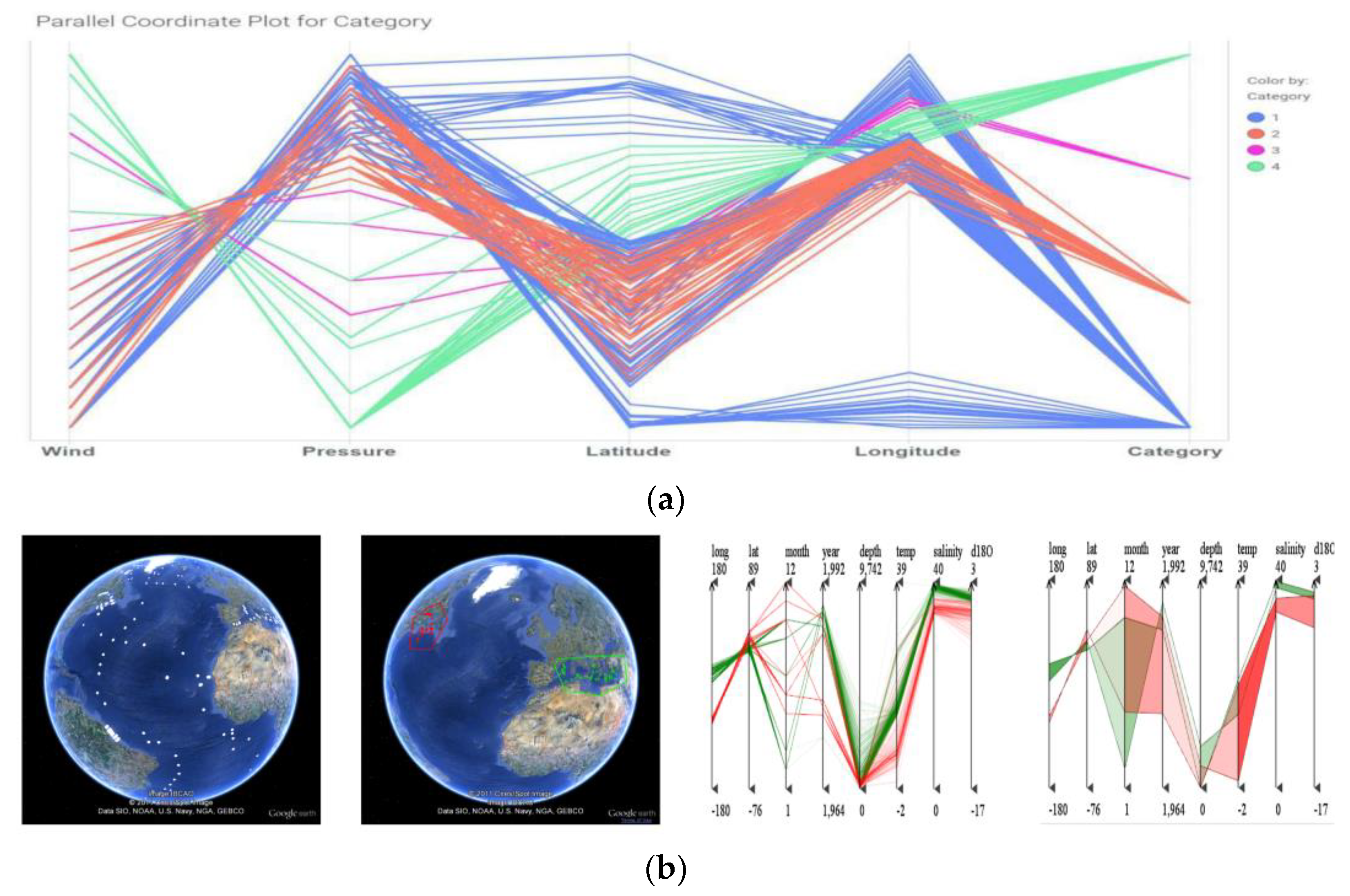
:1. Introduction
2. Related Works
2.1. High-Dimensional Data Visual Analysis
2.2. Geographical Locations Visual Analysis
3. Map-in-Parallel-Coordinates Plot
3.1. Parallel Coordinates Plot
3.2. Geovisualization
3.3. Data Inspection
4. Case Study
4.1. Basic Conditions of China Dataset
4.2. Basic Agriculture Conditions of China Dataset
4.3. Disscussion
5. Evaluation
5.1. Research Questions
5.2. Study Design
5.3. Settings
6. Results
6.1. Support for Data Exploration (Q1)
6.2. Support for In-Depth Data Analysis (Q2)
6.3. Overall Useful for Visual Analysis (Q3)
6.4. Overall Ease of Use (Q4)
6.5. Discussion
7. Conclusions
Author Contributions
Funding
Data Availability Statement
Conflicts of Interest
References
- Bhaduri, B.; Shankar, M.; Sorokine, A.; Ganguly, A. Spatio-Temporal Visualization for Environmental Decision Support. In GeoSpatial Visual Analytics; Springer: Berlin/Heidelberg, Germany, 2009; pp. 331–341. [Google Scholar] [CrossRef]
- Enguehard, R.A.; Hoeber, O.; Devillers, R. Interactive exploration of movement data: A case study of geovisual analytics for fishing vessel analysis. Inf. Vis. 2013, 12, 65–84. [Google Scholar] [CrossRef]
- Hamdi, A.; Shaban, K.; Erradi, A.; Mohamed, A.; Rumi, S.K.; Salim, F.D. Spatiotemporal data mining: A survey on challenges and open problems. Artif. Intell. Rev. 2022, 55, 1441–1488. [Google Scholar] [CrossRef] [PubMed]
- Lundblad, P.; Jern, M.; Forsell, C. Voyage analysis applied to geovisual analytics. In Proceedings of the 2008 12th International Conference Information Visualisation, London, UK, 9–11 July 2008; pp. 381–388. [Google Scholar]
- Zhong, C.; Wang, T.; Zeng, W.; Arisona, S.M. Spatiotemporal Visualisation: A Survey and Outlook. In Digital Urban Modeling and Simulation; Springer: Berlin/Heidelberg, Germany, 2012; pp. 299–317. [Google Scholar] [CrossRef]
- Ward, M.O.; Grinstein, G.; Keim, D. Interactive Data Visualization: Foundations, Techniques, and Applications; CRC Press: Boca Raton, FL, USA.
- Keim, D.; Andrienko, G.; Fekete, J.-D.; Görg, C.; Kohlhammer, J.; Melançon, G. Visual Analytics: Definition, Process, and Challenges. In Information Visualization; Springer: Berlin/Heidelberg, Germany, 2008; pp. 154–175. [Google Scholar] [CrossRef]
- O’driscoll, J.; Meredith, D.; Crowley, F.; Doran, J.; O’shaughnessy, M.; Zimmermann, J. The spatiotemporal dimension of population change in Ireland: Visualisation of growth and shrinkage in Irish Electoral Divisions (1986–2016). J. Maps 2022, 18, 551–557. [Google Scholar] [CrossRef]
- Syetiawan, A.; Harimurti, M.; Prihanto, Y. A spatiotemporal analysis of COVID-19 transmission in Jakarta, Indonesia for pandemic decision support. Geospat. Health 2022, 17, 1042. [Google Scholar] [CrossRef]
- Cui, W. Visual Analytics: A Comprehensive Overview. IEEE Access 2019, 7, 81555–81573. [Google Scholar] [CrossRef]
- Komenda, M.; Schwarz, D. Visual analytics in environmental research: A survey on challenges, methods and available tools. In Proceedings of the 10th IFIP WG 5.11 International Symposium, Neusiedl am See, Austria, 9–11 October 2013; International Symposium on Environmental Software Systems. Springer: Berlin/Heidelberg, Germany, 2013; pp. 618–629. [Google Scholar]
- Inselberg, A. The plane with parallel coordinates. Vis. Comput. 1985, 1, 69–91. [Google Scholar] [CrossRef]
- Inselberg, A. Parallel Coordinates: Visual Multidimensional Geometry and Its Applications. 233 Spring Street, New York, NY 10013; Springer: Dordrecht, The Netherlands; Heidelberg, Germany; London, UK; New York, NY, USA, 2008. [Google Scholar]
- Wegman, E.J. Hyperdimensional data analysis using parallel coordinates. J. Am. Stat. Assoc. 1990, 85, 664–675. [Google Scholar] [CrossRef]
- Leite, R.A.; Gschwandtner, T.; Miksch, S.; Kriglstein, S.; Pohl, M.; Gstrein, E.; Kuntner, J. Eva: Visual analytics to identify fraudulent events. IEEE Trans. Vis. Comput. Graph. 2017, 24, 330–339. [Google Scholar] [CrossRef]
- Wang, Z.; Haihong, E.; Song, M.; Ren, Z. Time-varying Data Visual Analysis method based on Parallel Coordinate System. In Proceedings of the 2019 IEEE 3rd Information Technology, Networking, Electronic and Automation Control Conference (ITNEC), Chengdu, China, 15–17 March 2019; pp. 1256–1260. [Google Scholar]
- Huang, M.L.; Lu, L.F.; Zhang, X. Using arced axes in parallel coordinates geometry for high dimensional BigData visual analytics in cloud computing. Computing 2015, 97, 425–437. [Google Scholar] [CrossRef]
- Choi, H.; Lee, H.; Kim, H. Fast detection and visualization of network attacks on parallel coordinates. Comput. Secur. 2009, 28, 276–288. [Google Scholar] [CrossRef]
- Mitku, A.A.; Zewotir, T.; North, D.; Naidoo, R.N. Exploratory Data Analysis of Adverse Birth Outcomes and Exposure to Oxides of Nitrogen Using Interactive Parallel Coordinates Plot Technique. Sci. Rep. 2020, 10, 7363. [Google Scholar] [CrossRef]
- Alminagorta, O.; Loewen, C.J.; de Kerckhove, D.T.; Jackson, D.A.; Chu, C. Exploratory analysis of multivariate data: Applications of parallel coordinates in ecology. Ecol. Inform. 2021, 64, 101361. [Google Scholar] [CrossRef]
- Rickman, J.M. Data analytics and parallel-coordinate materials property charts. Npj Comput. Mater. 2018, 4, 5. [Google Scholar] [CrossRef]
- Vanitha, N.; Rene Robin, C.R. A Spatial Temporal Classification Analysis and Visualization of Tropical Cyclone Tracks in Bay of Bengal Using GIS. 2021. [CrossRef]
- Zhang, Z.; Tong, X.; McDonnell, K.T.; Zelenyuk, A.; Imre, D.; Mueller, K. An interactive visual analytics framework for multi-field data in a geo-spatial context. Tsinghua Sci. Technol. 2013, 18, 111–124. [Google Scholar] [CrossRef]
- Hoeber, O.; Hasan, M.U. A geovisual analytics approach for analyzing event-based geospatial anomalies within movement data. Inf. Vis. 2018, 17, 91–107. [Google Scholar] [CrossRef]
- Robinson, A. Geovisual Analytics. In The Geographic Information Science & Technology Body of Knowledge, 3rd ed.; Wilson, J.P., Ed.; UCGIS: New Haven, CT, USA, 2017. [Google Scholar]
- Andrienko, N.; Andrienko, G.; Gatalsky, P. Exploratory spatio-temporal visualization: An analytical review. J. Vis. Lang. Comput. 2003, 14, 503–541. [Google Scholar] [CrossRef]
- Chen, Y.; Li, Q.; Karimian, H.; Chen, X.; Li, X. Spatio-temporal distribution characteristics and influencing factors of COVID-19 in China. Sci. Rep. 2021, 11, 3717. [Google Scholar] [CrossRef]
- Dudhat, S.; Pande, A.; Nair, A.; Mondal, I.; Srinivasan, M.; Sivakumar, K. Spatio-temporal analysis identifies marine mammal stranding hotspots along the Indian coastline. Sci. Rep. 2022, 12, 4128. [Google Scholar] [CrossRef]
- Buck, V.; Stäbler, F.; Mohrmann, J.; González, E.; Greinert, J. Visualising geospatial time series datasets in realtime with the Digital Earth Viewer. Comput. Graph. 2022, 103, 121–128. [Google Scholar] [CrossRef]
- Wang, Z.; Guo, H.; Yu, B.; Yuan, X. Interactive Visualization of 160 Years’ Global Hurricane Trajectory Data. In Proceedings of the IEEE Pacific Visualization Symposium (Poster), Hong Kong, China, 1–4 March 2011; pp. 37–38. [Google Scholar]
- Yuan, X.; Xiao, H.; Guo, H.; Guo, P.; Kendall, W.; Huang, J.; Zhang, Y. Scalable Multi-variate Analytics of Seismic and Satellite-based Observational Data. IEEE Trans. Vis. Comput. Graph. 2010, 16, 1413–1420. [Google Scholar] [CrossRef]
- Shneiderman, B. The Eyes Have It: A Task by Data Type Taxonomy for Information Visualizations. In The Craft of Information Visualization; Elsevier: Amsterdam, The Netherlands, 2003; pp. 364–371. [Google Scholar] [CrossRef]
- Dykes, J.A. Exploring spatial data representation with dynamic graphics. Comput. Geosci. 1997, 23, 345–370. [Google Scholar] [CrossRef]
- Maceachren, A.M.; Wachowicz, M.; Edsall, R.; Haug, D.; Masters, R. Constructing knowledge from multivariate spatiotemporal data: Integrating geographical visualization with knowledge discovery in database methods. Int. J. Geogr. Inf. Sci. 1999, 13, 311–334. [Google Scholar] [CrossRef]
- Andrienko, G.; Andrienko, N. Exploring spatial data with dominant attribute map and parallel coordinates. Comput. Environ. Urban Syst. 2001, 25, 5–15. [Google Scholar] [CrossRef]
- Edsall, R.M. The parallel coordinate plot in action: Design and use for geographic visualization. Comput. Stat. Data Anal. 2003, 43, 605–619. [Google Scholar] [CrossRef]
- Guo, D.; Gahegan, M.; MacEachren, A.M.; Zhou, B. Multivariate Analysis and Geovisualization with an Integrated Geographic Knowledge Discovery Approach. Cartogr. Geogr. Inf. Sci. 2005, 32, 113–132. [Google Scholar] [CrossRef]
- Ge, Y.; Li, S.; Lakhan, V.C.; Lucieer, A. Exploring uncertainty in remotely sensed data with parallel coordinate plots. Int. J. Appl. Earth Obs. Geoinf. 2009, 11, 413–422. [Google Scholar] [CrossRef]
- Opach, T.; Rød, J.K. Do choropleth maps linked with parallel coordinates facilitate an understanding of multivariate spatial characteristics? Cartogr. Geogr. Inf. Sci. 2014, 41, 413–429. [Google Scholar] [CrossRef]
- Bostock, M.; Ogievetsky, V.; Heer, J. D³ data-driven documents. IEEE Trans. Vis. Comput. Graph. 2011, 17, 2301–2309. [Google Scholar] [CrossRef]
- Heinrich, J.; Weiskopf, D. State of the Art of Parallel Coordinates. Eurographics (State Art Rep.) 2013, 95–116. [Google Scholar]
- Janetzko, H.; Stein, M.; Sacha, D.; Schreck, T. Enhancing Parallel Coordinates: Statistical Visualizations for Analyzing Soccer Data. Electron. Imaging 2016, 2016, 1–8. [Google Scholar] [CrossRef]
- Martin, A.R.; Ward, M.O. High-Dimensional Brushing for Interactive Exploration of Multivariate Data. Master’s Thesis, Worcester Polytechnic Institute, Worcester, MA, USA, 1995. [Google Scholar]
- Graham, M.; Kennedy, J. Using curves to enhance parallel coordinate visualisations. In Proceedings of the Seventh International Conference on Information Visualization, 2003. IV 2003, London, UK, 18 July 2003; pp. 10–16. [Google Scholar]
- Pande, A.K. jqWidgets Framework. In jQuery 2 Recipes; Springer: Berlin/Heidelberg, Germany, 2014; pp. 473–542. [Google Scholar]
- El Meseery, M.; Hoeber, O. Geo-Coordinated Parallel Coordinates (GCPC): Field trial studies of environmental data analysis. Vis. Inform. 2018, 2, 111–124. [Google Scholar] [CrossRef]
- Edsall, R.M.; Roedler, A.J. An enhanced gis environment for multivariate exploration: A linked parallel coordinate plot applied to urban greenway use survey data. In Proceedings of the CSISS Specialist Meeting on New Tools for Spatial Data Analysis, Santa Barbara, CA, USA, 10–11 May 2002. [Google Scholar]
- Lam, H.; Bertini, E.; Isenberg, P.; Plaisant, C.; Carpendale, S. Empirical Studies in Information Visualization: Seven Scenarios. IEEE Trans. Vis. Comput. Graph. 2011, 18, 1520–1536. [Google Scholar] [CrossRef]
- Mazza, R.; Berre, A. Focus group methodology for evaluating information visualization techniques and tools. In Proceedings of the 2007 11th International Conference Information Visualization (IV’07), Zurich, Switzerland, 4–6 July 2007; pp. 74–80. [Google Scholar]
- Venkatesh, V.; Davis, F.D. A Theoretical Extension of the Technology Acceptance Model: Four Longitudinal Field Studies. Manag. Sci. 2000, 46, 186–204. [Google Scholar] [CrossRef]
- Orooji, Y.; Ghasali, E.; Emami, N.; Noorisafa, F.; Razmjou, A. ANOVA Design for the Optimization of TiO2 Coating on Polyether Sulfone Membranes. Molecules 2019, 24, 2924. [Google Scholar] [CrossRef]
- Atia, N.; Benzaoui, A.; Jacques, S.; Hamiane, M.; El Kourd, K.; Bouakaz, A.; Ouahabi, A. Particle Swarm Optimization and Two-Way Fixed-Effects Analysis of Variance for Efficient Brain Tumor Segmentation. Cancers 2022, 14, 4399. [Google Scholar] [CrossRef]
- Lee, H.M.; Hua, Y.; Xie, J.; Lee, H.P. Parametric Optimization of Local Resonant Sonic Crystals Window on Noise Attenuation by Using Taguchi Method and ANOVA Analysis. Crystals 2022, 12, 160. [Google Scholar] [CrossRef]
- Blanca, M.J.; Arnau, J.; García-Castro, F.J.; Alarcón, R.; Bono, R. Non-normal Data in Repeated Measures ANOVA: Impact on Type I Error and Power. Psicothema 2023, 35, 21–29. [Google Scholar]
- Naganaidu, D.; Khalid, Z.M. ANOVA Assisted Variable Selection in High-dimensional Multicategory Response Data. Math. Stat. 2023, 11, 92–100. [Google Scholar] [CrossRef]
- Makwana, H.; Tanwani, S.; Jain, S. Axes Re-Ordering in Parallel Coordinate for Pattern Optimization. Int. J. Comput. Appl. 2012, 40, 42–47. [Google Scholar] [CrossRef]
- Wong, P.C.; Bergeron, R.D. 30 years of multidimensional multivariate visualization. Sci. Vis. 1994, 2, 3–33. [Google Scholar]


| Variable Name | Variable Value | Sample Size | Mean Value | Standard Deviation | F | p |
|---|---|---|---|---|---|---|
| Response time | PCP | 43 | 11 | 1.988 | 82.093 | 0.000 *** |
| GCPC | 43 | 9.558 | 1.677 | |||
| MPCP | 43 | 6.442 | 1.328 | |||
| Total | 129 | 9 | 2.539 |
| Variable Name | Variable Value | Sample Size | Mean Value | Standard Deviation | F | p |
|---|---|---|---|---|---|---|
| Error rate | PCP | 43 | 0.052 | 0.008 | 578.301 | 0.000 *** |
| GCPC | 43 | 0.039 | 0.006 | |||
| MPCP | 43 | 0.009 | 0.003 | |||
| Total | 129 | 0.033 | 0.019 |
Disclaimer/Publisher’s Note: The statements, opinions and data contained in all publications are solely those of the individual author(s) and contributor(s) and not of MDPI and/or the editor(s). MDPI and/or the editor(s) disclaim responsibility for any injury to people or property resulting from any ideas, methods, instructions or products referred to in the content. |
© 2023 by the authors. Licensee MDPI, Basel, Switzerland. This article is an open access article distributed under the terms and conditions of the Creative Commons Attribution (CC BY) license (https://creativecommons.org/licenses/by/4.0/).
Share and Cite
Liu, J.; Wan, G.; Jia, Y.; Liu, W.; Xie, Z.; Su, Z.; Li, C.; Peng, S. Map-in-Parallel-Coordinates Plot (MPCP): Field Trial Studies of High-Dimensional Geographical Data Analysis. Electronics 2023, 12, 2062. https://doi.org/10.3390/electronics12092062
Liu J, Wan G, Jia Y, Liu W, Xie Z, Su Z, Li C, Peng S. Map-in-Parallel-Coordinates Plot (MPCP): Field Trial Studies of High-Dimensional Geographical Data Analysis. Electronics. 2023; 12(9):2062. https://doi.org/10.3390/electronics12092062
Chicago/Turabian StyleLiu, Jia, Gang Wan, Yutong Jia, Wei Liu, Zhuli Xie, Zhijuan Su, Chu Li, and Siqing Peng. 2023. "Map-in-Parallel-Coordinates Plot (MPCP): Field Trial Studies of High-Dimensional Geographical Data Analysis" Electronics 12, no. 9: 2062. https://doi.org/10.3390/electronics12092062
APA StyleLiu, J., Wan, G., Jia, Y., Liu, W., Xie, Z., Su, Z., Li, C., & Peng, S. (2023). Map-in-Parallel-Coordinates Plot (MPCP): Field Trial Studies of High-Dimensional Geographical Data Analysis. Electronics, 12(9), 2062. https://doi.org/10.3390/electronics12092062