1. Introduction
Vast amounts of different types of data are currently being collected about the Earth. These data must be efficiently processed, analysed and visualized in order to realize their latent potential. The volume, scale and size of these geospatial data require novel methods to process and visualize them in the context of the Earth. In research and industry, globe-based digital earth systems are becoming more prevalent as they provide less distortion in comparison with the map-based approaches [
1,
2,
3,
4]. Discrete Global Grid Systems (DGGS) is a promising approach for creating globe-based digital Earth systems [
1,
5]. It is important to develop new interactive visualizations that can seamlessly operate within this 3D environment and to evaluate their effectiveness at disseminating information in comparison to traditional methods.
In this paper, we combine MacTavish et al.’s novel visualization, perspective charts [
6], with the novel Focus+ Context [
7] to provide an interactive visualization of geospatially scattered data in the context of a globe. We conduct a user study to evaluate the effectiveness of the perspective charts against traditional bar charts within the same setting and discuss the effectiveness of both within the context of a globe. We chose the Disdyakis Triacontahedron DGGS [
8] to take advantage of its functionalities in encoding data, basic globe-based visualization and interaction methods.
In the first months of 2020, as the COVID-19 outbreak spread and eventually reached pandemic status, large amounts of data were collected about case numbers, rate of spread, demographics of affected populations, recovery vs. death rates, and more. During this period, data visualizations of large amounts of Earth data reached unprecedented importance for the average person. The geospatial component of these data was important because it helped to provide context about the spread of the virus and inform predictions of future trends in case statistics.
In this work, we design a globe-based visualization of data related to the COVID-19 pandemic. The resulting system is a web-based application for general audiences that allows the user to interact with a virtual globe (instead of flat maps) and dynamically display various datasets related to the pandemic. In this work, we construct two-dimensional visualizations shown when a user selects a specific region on the globe. In this system, it is important to be able to present large amounts of data in a way that is not overwhelming for the user. This includes the ability to compare spread between provinces or countries, and to visualize the change in case numbers over time. Using the concept of size constancy in human perception, we are naturally capable of estimating the size of distant objects in perspective scenes. Therefore, we hypothesize that perspective chart visualizations will be effective for this system, given their impactful design and ability to visualize data with important variations at multiple scales [
6].
2. Background & Related Work
2.1. Chart Visualization
Since our application is designed for general audiences, as opposed to visualization experts, we choose a modification of bar charts for the design of our system. Bar charts are an easily recognizable visualization, so users should be easily able to retrieve data from the system [
9]. When comparing COVID-19 case data across time or between regions, some compared datasets may have very large differences in the range of their data. One example is the difference in case numbers between Canada and the United States. In this case, some amount of compression is applied to the smaller dataset in order to represent all data within one chart. This can reduce the readability of smaller data points.
This problem can be addressed by modifying the design of a traditional bar chart. Many existing methods for this use case involve truncating the y-axis of the chart in some way. Hlawatsch et al.’s scale-stack bar charts visualize a single dataset repeatedly across four different scales [
10]. Du Bois wrapped bar charts wrap bars past a certain threshold around the y-axis of a bar chart [
11]; a similar wrapping technique is used in Reijner’s horizon graphs [
12]. However, truncating the y-axis of a chart negatively affects the perception of scale in the visualization [
13].
Charts scaled with a logarithmic function are also sometimes used to represent datasets with a large range. However, this type of scale is not typically used in bar charts, as it may be difficult to interpret given that it is non-linear [
10].
Perspective charts apply a nonlinear scaling factor to bar charts using perspective projection—however, the concept of size constancy results in a more intuitive scaling than a logarithmic function [
14].
2.2. Geospatial Visualization
The use of three-dimensional elements is common in geospatial visualization. “Geospatial visualization” describes the representation of datasets that are tied to specific locations. Examples include population data, pollution data, and recently and notably, data related to the spread of COVID-19. When data are tied to locations, it makes sense to use a map to help represent them. Geospatial data visualizations can be as simple as coloured 2D maps. However, due to the potential distortion present on 2D maps, more complex systems that involve 3D globes, such as Google Earth, are also increasingly common.
There are several works that use a combination of both two-dimensional and three-dimensional views in geospatial visualization design. Bleisch and Nebiker use adjacent displays of the same data in a 3D globe view, as well as a 2D bar chart, and allow for cross-interaction between the displays to highlight information [
15]. Sherlock et al. use a multifocal interface to visualize small regions of the earth in subwindows, based on a larger globe view [
7]. This system is shown in
Figure 1. These subwindows can display a variety of information, including two-dimensional maps with various data overlays. These are just two examples of a hybrid visualization environment that is particularly common in geospatial visualization.
Digital Earth
The history of Geographic Information Systems (GIS) goes back to the 1960s when competing projects explored various ideas for how to process geospatial data [
1]. Although most GIS systems are based on flat map representations and globe-based systems have been explored for decades [
16], there are many ways to construct a globe-based Digital Earth, but one of the most promising methods is called Discrete Global Grid Systems (DGGS) [
2]. Techniques for visualizing data in a globe-based system include the overlaying of data on the globe’s surface, as three-dimensional extrusions or bars on the globe, or as pop-out windows displaying associated data of the selected regions [
15]. The screen size limitation is a challenge when multiple pop-up windows are used on the globe. This challenge especially becomes more prominent when the associated data represent an extensive range of values (e.g., COVID-19 numbers). To address this challenge, we introduce a visualization method that uses perspective charts within the focus+context visualization when multiple pop-up windows are situated for various regions. To implement the proposed visualization, we use the recent Disdyakis Triacontahedron DGGS [
8] to store and access data due to its efficient operations and low distortion.
3. Materials and Methods
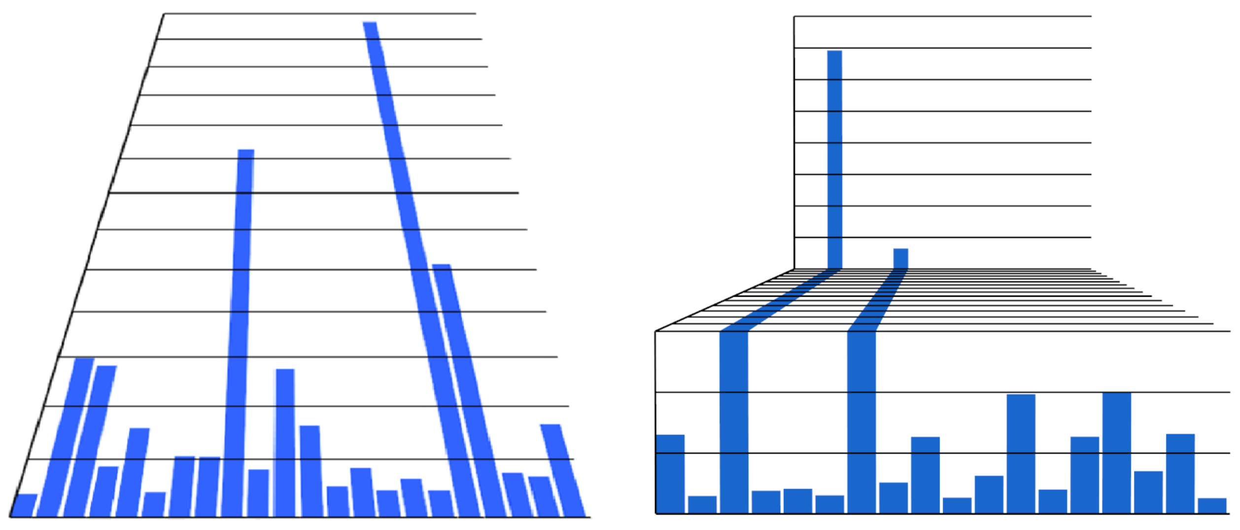
3.1. Perspective Charts
Our system uses MacTavish et al.’s perspective chart visualizations. Perspective charts are designed to better represent datasets that have important variations at multiple scales. This aspect of perspective chart designs means that small values can be represented effectively without negatively distorting the perception of scale on the dataset as a whole. We use the slanted and stepped perspective charts in the Digital Earth System; these chart types are shown in
Figure 2.
MacTavish et al. perform an evaluation of perspective charts that use static visualizations. The results of their evaluation suggest that the use of perspective projection did not negatively affect the perception of scale in datasets, while the chart types were more easily readable than existing state-of-the-art visualizations meant to address similar use cases.
Since the use cases for perspective charts have a clear geospatial component, we wish to extend existing research of these chart types by integrating them into a geospatial application and expanding them to include interactive tools. Interactive methods for the slanted and stepped perspective charts are included in this system; the user can dynamically adjust the slant angle of the chart, or toggle the number of steps in the data.
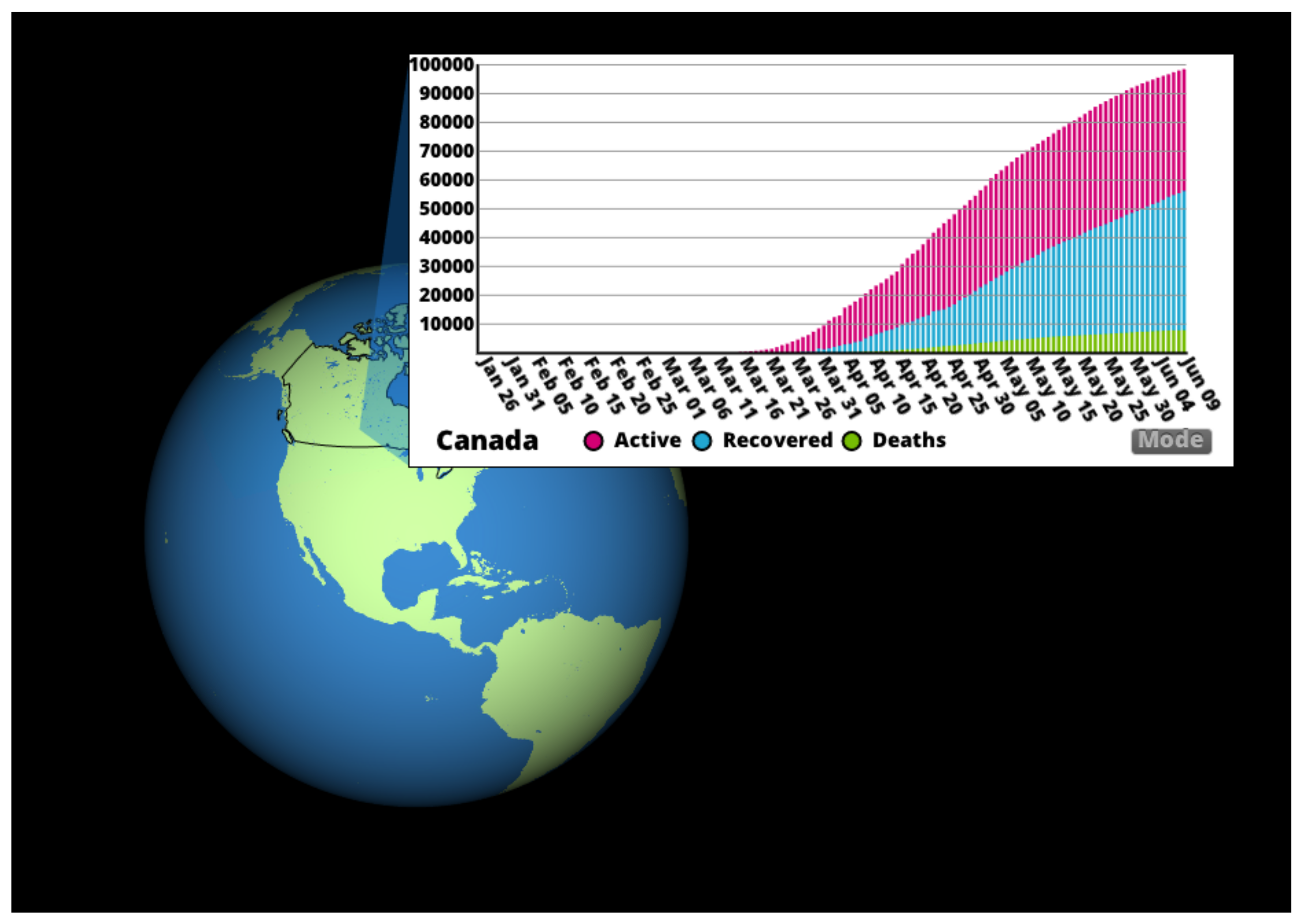
3.2. Digital Earth System
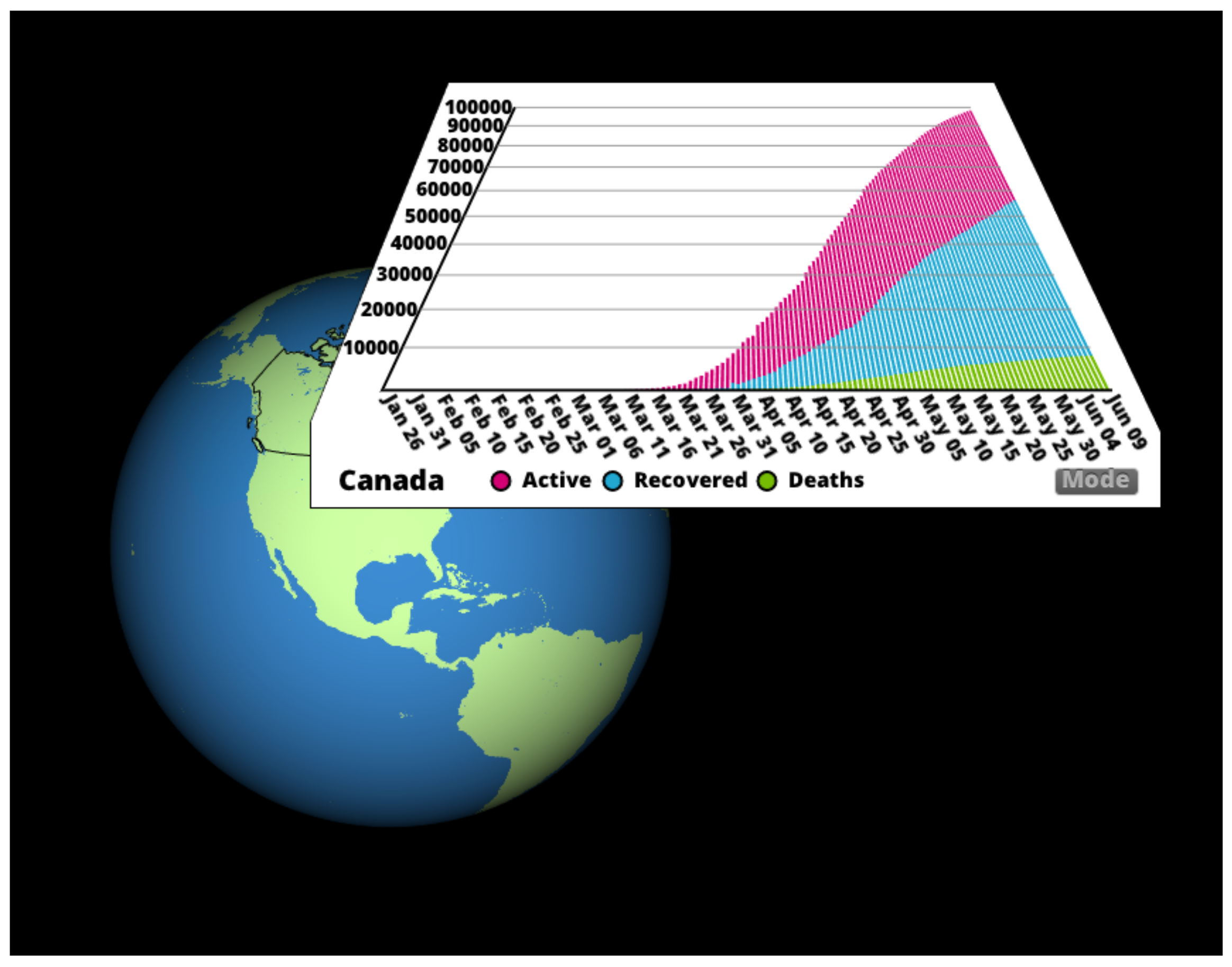
Figure 3 shows the basic design of the application. The user is presented with an interactive view of the Earth which can be rotated or zoomed using the mouse. When the user clicks on a region, a subwindow is opened in the scene showing COVID-19 data for that region. Depending on the mode of interaction, this region was either a country or province of Canada. Furthermore, the data are shown in either a regular bar chart or the
slanted perspective chart depending on the mode being used (
Figure 4). In the Digital Earth System, each subwindow is treated as its own graphics context, which allows for different visualizations to be easily plugged in to the system.
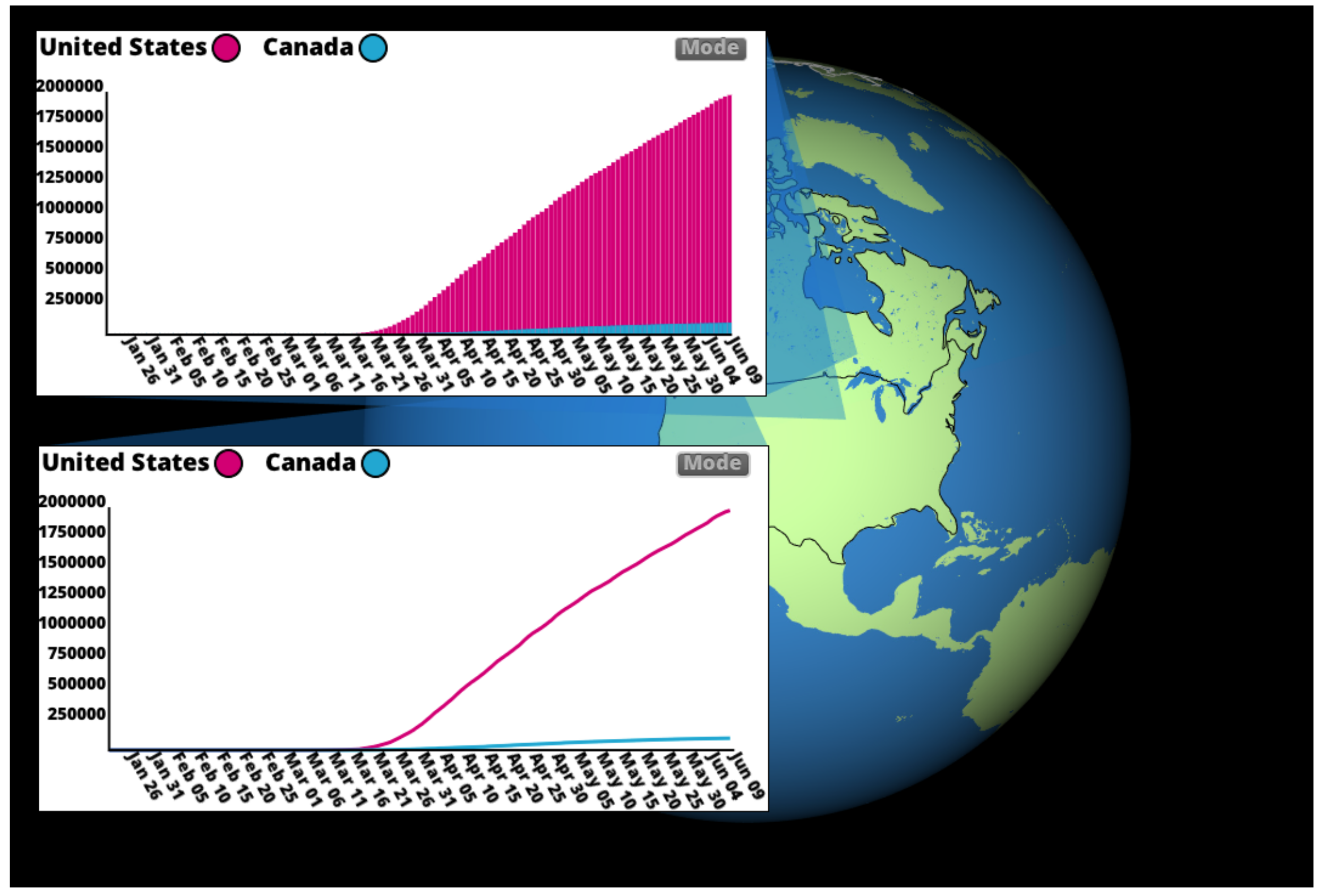
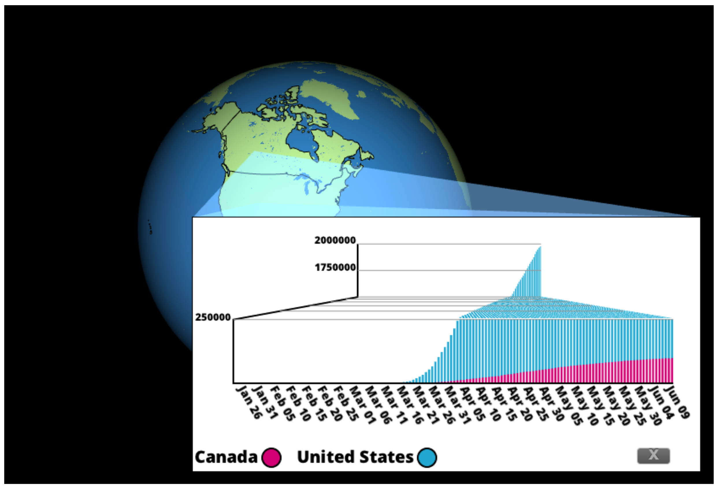
In addition to viewing a single region, the user may also select multiple regions to display in one subwindow as a multivariate dataset. Two or more datasets can be combined with the scale automatically adjusting to accommodate all datasets. In this mode, multivariate datasets can be represented in either a traditional bar chart or a
stepped perspective chart depending on the mode used. An example of multivariate charts in our system using traditional bar charts is shown in
Figure 5, and with the
stepped perspective chart in
Figure 6. In the system, the
stepped perspective charts are constructed such that the smaller dataset’s values fall only below the transitive region of the chart, as in
Figure 6. In cases where this is not possible for the given datasets, the data are shown in a multivariate version of the
slanted perspective chart instead.
Elements of the 3D graphics environment, such as camera orientation, are precomputed in our system and not modifiable by the end user.
4. Evaluation
In order to compare our application with existing geospatial COVID-19 data visualizations, we performed a between-subjects evaluation using Amazon’s Mechanical Turk system. To evaluate the viability of perspective charts in particular, we chose to evaluate two different versions of the GIV group’s COVID-19 Visualization—one using regular bar charts and one using perspective charts. We then compare the two to determine how perspective charts perform as a geospatial visualization tool.
MacTavish et al. performed an evaluation of
perspective charts that used static visualizations [
6]. The focus of our evaluation is on interactive methods in perspective charts in a larger geospatial application. Features such as panning and zooming were added to both modes. Additionally, the interactive functionality that allows for the visualization of multivariate charts, as well as dynamic adjustment of the slant angle and number of steps present in a chart, were added to the perspective charts.
4.1. Methods
4.1.1. Crowdsourced Evaluation Using Amazon’s Mechanical Turk
Due to the COVID-19 pandemic, it was not possible at the time to run an in-person evaluation. As a result, we explored other possibilities for performing a relatively simple evaluation exclusively online. We immediately began exploring Amazon’s Mechanical Turk system. Mechanical Turk began as a tool for businesses to outsource small tedious tasks; however, it has become increasingly common as a method of performing crowdsourced research [
17]. This system allows researchers to distribute small tasks, called Human Intelligence Tasks (HITs), to workers that are enrolled in the Mechanical Turk system. Workers freely choose from a list of thousands of HITs, which are designed to be completed in a short period of time. Workers are paid a small amount, typically less than
$1, for each completed HIT. We use Mechanical Turk for this evaluation because its system makes it easy to create and deploy tasks at a low cost.
The evaluation was structured as four different HITs in the Mechanical Turk system. The general structure was the same across each HIT: the Mechanical Turk worker completing the task is given a link to a web version of the interactive COVID-19 visualization and asked three quantitative questions as well as three qualitative questions. Each participant was paid $0.75 upon completion of the evaluation.
Our evaluation included a simple “screening question”, used to omit responses where the participant did not understand the task or did not exert the appropriate amount of effort; this type of exclusion method is common in crowdsourced evaluations [
18]. Based on the results of a pilot study, described in further detail below, the evaluation was performed with 56 participants. Fourteen participants were recruited for each HIT for the total of 56 participants. Two participants failed the screening question, so their submissions were rejected and the two HITs were re-run with different participants.
4.1.2. Study Setup
Evaluation participants were split into four separate groups. The exact countries that participants were asked to use to answer quantitative tasks varied between the four groups, in order to reduce potential bias. Two of the four groups used the COVID-19 visualization with standard bar charts, and two used the version of the application with perspective charts.
Participants were given three quantitative questions during the evaluation. The questions are as follows, where “country 1”, “country 2” and so forth are replaced with a country name that varied between the four groups, as described above:
“How many total coronavirus cases were there in country 1 as of 31 March 2020?”
“What was the difference in the total number of coronavirus cases between country 2 and country 3 as of 25 May 2020?”
“Which country had more coronavirus cases as of 1 April 2020?” (Users were given the choice between “United States” and “Canada”.)
Questions one and two align with the Retrieve Value and Determine Magnitude Difference taxonomies, respectively. The third question was a simple screening question.
The three qualitative questions that we asked participants were consistent across all four groups. The questions asked were as follows:
“Did you interact with the charts while you were collecting data? (Zooming in on parts of the chart, etc). If yes, how easy or difficult did you find this system to use, and why?”
“Did you use the system to create a chart that showed data for more than one country at a time? If yes, how easy or difficult did you find this system to use, and why?”
“In general, how easy or difficult did you find this system to use, and why?”
These questions were chosen in order to collect feedback specifically on the interactive elements of the application, as this is the main feature that is unique to this evaluation.
All responses were collected using Mechanical Turk’s built-in survey response form, where participants entered responses in text fields. This system also records each participant’s completion time. We compared the error rate of participants’ numerical answers, task completion time, and written responses to qualitative questions between groups in order to obtain the results reported in this section.
4.2. Procedure
We compared task completion time and percentage of error between sets of tasks. The Shapiro–Wilk test indicated that our data did not follow a normal distribution. Therefore, we compared methods using a Mann–Whitney U test, which examines the median error rate for each task as opposed to the mean. For each test we report effect sizes (r) and p-values. Reported p-values have been corrected to account for multiple comparisons.
4.3. Pilot Study
In order to determine an appropriate sample size for the study, a pilot study was performed with ten participants through the Mechanical Turk system using the same study setup as the full evaluation. Each participant was asked to use the system to determine the difference in COVID-19 case numbers between two different countries. This was done to encourage participants to use the multivariate interactive features of the system.
The pilot study showed that the group using perspective charts had a mean task error rate of 20.4%, while the comparison technique, standard bar charts, had a mean error rate of 14.3%. The common standard deviation for results from both groups was 8.5%. A power analysis calculation on these values, with a desired p-value of less than 0.05 and a power of at least 80%, revealed that our total sample size should be at least 50 participants in order to have a sufficient likelihood of statistically significant results. Our power analysis was performed with GPower 3.1.
In addition to the power analysis, feedback from participants indicated that some users had difficulty with certain interactive controls in the system. Closing a subwindow for a specific region, for example, was previously done by holding a key on the keyboard and clicking on the window. Some participants indicated that they could not determine how to close the window, so we added a button to the window itself that closed it. Various other small adjustments to controls were made, and instructions for participants were also clarified before running the full evaluation.
5. Results
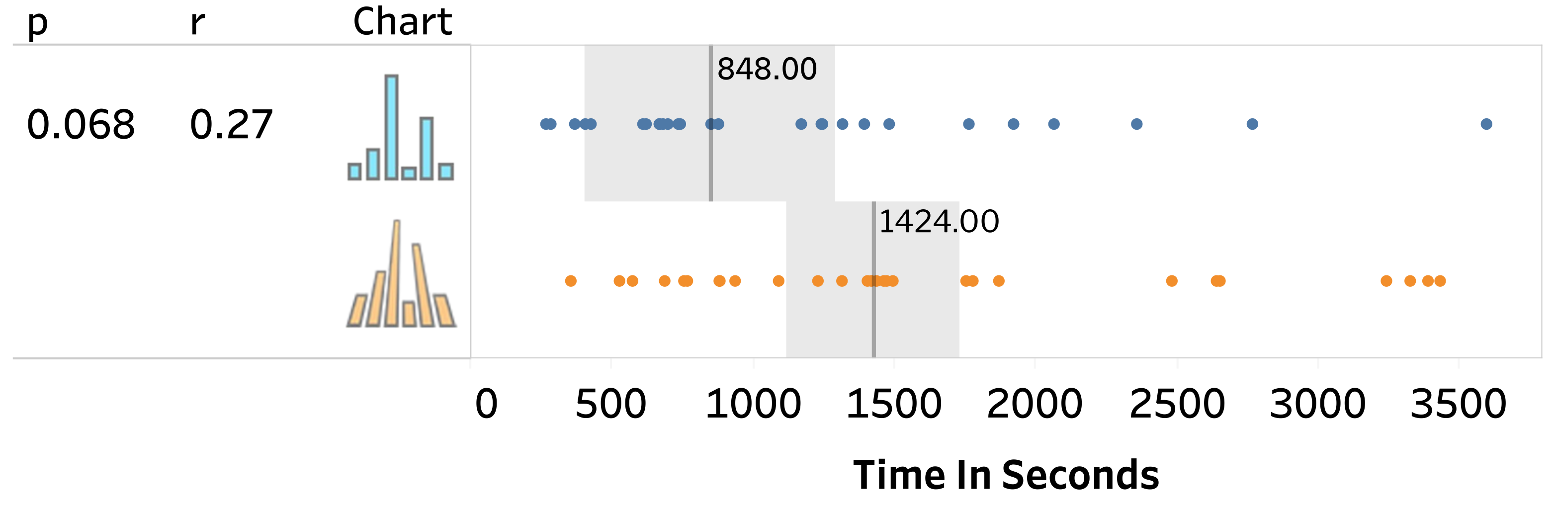
5.1. Time
Mechanical Turk records the number of seconds that a worker spends performing an HIT; these data are what we used for our time analysis. This data are compared between traditional methods and perspective charts, and results are shown in
Figure 7.
After adjusting p-values to account for multiple comparisons, we did not observe a significant difference in task completion time (, ) between the slanted perspective chart (median = 1424 s) and a traditional bar chart (median = 848 s).
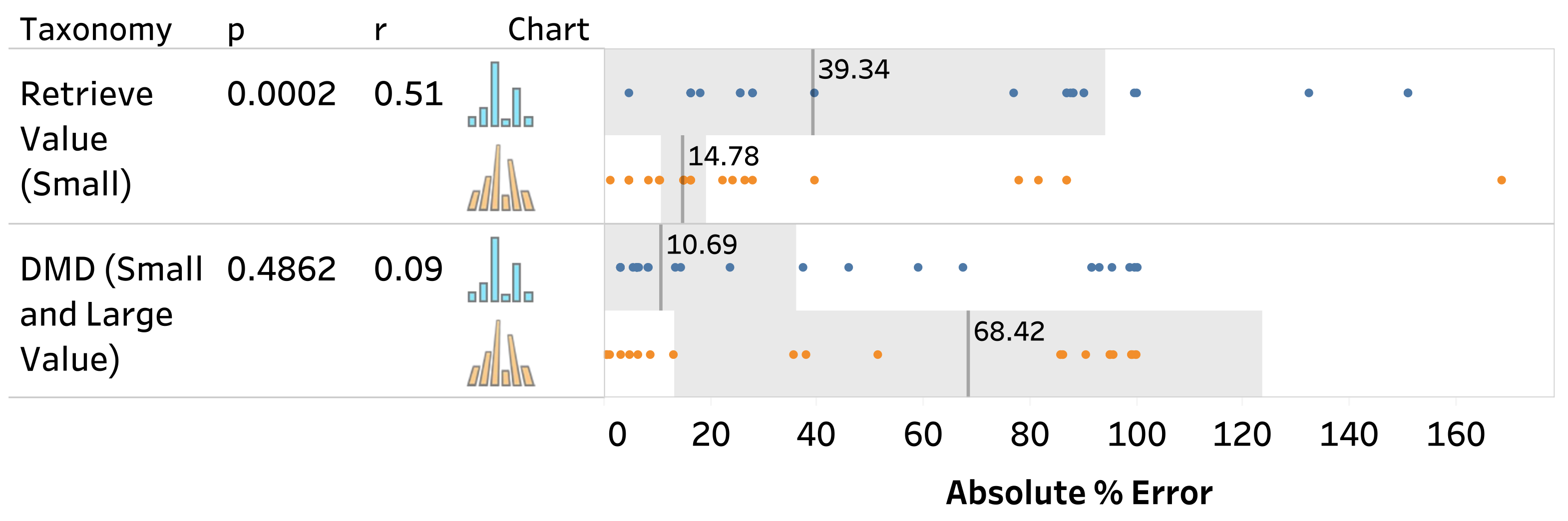
5.2. Accuracy
Each task performed in this evaluation required participants to enter a numerical answer, which was compared against the true value to compute the error rate. We did not observe a significant trend in the directionality of error for either task. Median results for both tasks are shown in
Figure 8.
For the first task, retrieving a small value from a chart, we observed a significantly lower median error rate for the slanted perspective chart (median = 14.78%) compared to a traditional bar chart (median = 39.34%) (, ). We did not observe a significant difference for the tasks related to determining magnitude difference between values.
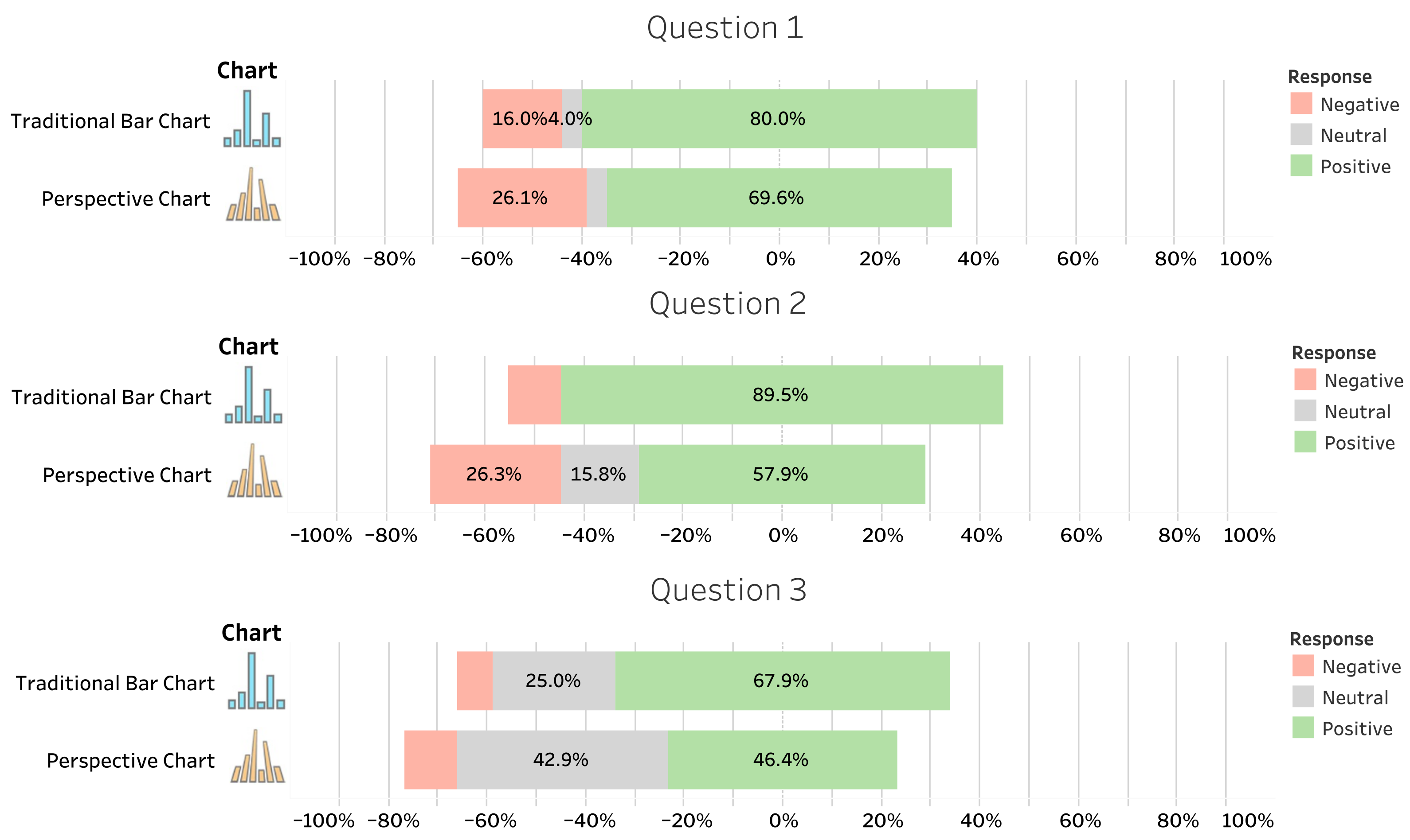
5.3. Qualitative Feedback
Written comments that participants gave for each of the three qualitative questions were analyzed and grouped into categories. The first two questions start by asking if a participant used a particular feature of the COVID-Visualization, and if so, what their opinion was of that feature. The first question was related to interactive tools such as zooming, and the second question asked about multivariate chart creation. For these questions, participants who indicated they did use these tools had their responses grouped based on whether they indicated a positive, negative, or neutral experience with that aspect of the system, or if they did not use that tool during their interaction with the system. The final question asked for overall impressions of the system, so responses for this question were tagged as either positive, negative, or neutral, with no fourth grouping since every participant interacted with the system as a whole.
In general, participants gave slightly more positive responses when using the traditional bar chart system as opposed to the perspective charts system. This is to be expected, as participants are more likely to favorably rank familiar visualizations [
19]. Detailed information about response groupings is shown in
Figure 9.
6. Discussion
Given the results of the original
perspective charts evaluation in [
6], it is rather unsurprising that there was no statistically significant difference between techniques for task completion time and for tasks about determining magnitude difference between values. However, for tasks related to retrieving small values, our technique had a significantly lower median error rate with a medium effect size. This suggests that the use of perspective charts allowed participants to perceive smaller values more easily. This comes without having a significant impact on the ability to read larger values, as demonstrated by the statistically similar error rates between techniques for magnitude difference tasks.
It is interesting that this significant result was demonstrated in the evaluation we performed for COVID-19 geospatial visualization, and not for the evaluation performed by MacTavish et al. in [
6]. The addition of interactive elements may have been enough of an aid for participants to account for this difference, and is worth examining further in future work.
7. Conclusions
Our application has several possible extensions for future work—the use of interactive tools in our visualizations warrants further evaluation. Our evaluation shows that users could more easily retrieve small data values from the system that uses our designs, compared to the system that uses traditional bar charts. Since the results of this evaluation suggest that interactive techniques aided participants’ use of perspective charts, we wish to further examine what aspects of interactivity were useful to participants.
The
circular perspective chart described in [
6] has properties that make it appropriate for glyph-based geospatial visualizations. Glyphs using
perspective charts could be integrated into the Digital Earth System, to provide an at-a-glance summary of case information for any region visible on the globe.
Author Contributions
Conceptualization, Mia MacTavish, Lakin Wecker, and Faramarz Samavati; methodology, Mia MacTavish and Lakin Wecker; software, Mia MacTavish and Lakin Wecker; formal analysis, Mia MacTavish; writing—original draft preparation, Mia MacTavish; visualization, Mia MacTavish; supervision, Faramarz Samavati; project administration, Lakin Wecker, Faramarz Samavati. All authors have read and agreed to the published version of the manuscript.
Funding
This research was partially funded by the Natural Sciences and Engineering Research Council of Canada (NSERC).
Institutional Review Board Statement
The study was conducted according to the guidelines of the Tri-Council Policy Statement: Ethical Conduct for Research Involving Humans (TCPS 2), and approved by the Conjoint Faculties Research Ethics Board of the University of Calgary (Ethics ID REB16-2147_REN4, approved 19 January 2017).
Informed Consent Statement
Informed consent was obtained from all subjects involved in the study.
Data Availability Statement
Acknowledgments
The authors wish to acknowledge John Hall, Benjamin Ulmer, Amirhossein Mirtabatabaehpour, and Meysam Kazemi for their contributions to the functionality of the GIV Group’s Digital Earth System.
Conflicts of Interest
The authors declare no conflict of interest.
Abbreviations
The following abbreviations are used in this manuscript:
| GIV | Graphics, information and visualization |
| DGGS | Discrete global grid system |
| HIT | Human Intelligence Task |
| DMD | Determine magnitude difference |
References
- Goodchild, M.F. Reimagining the History of GIS. Ann. GIS 2018, 24, 1–8. [Google Scholar]
- Mahdavi-Amiri, A.; Alderson, T.; Samavati, F. A Survey of Digital Earth. Comput. Graph. 2015, 53, 95–117. [Google Scholar]
- Google Earth. Available online: https://earth.google.com/web/ (accessed on 23 March 2022).
- Cesium. Available online: https://cesium.com/platform/cesiumjs/ (accessed on 23 March 2022).
- Alderson, T.; Purss, M.; Xiaoping, D.; Mahdavi-Amiriand, A.; Samavati, F. Manual of Digital Earth, Chapter on Digital Earth Platforms; Springer: Singapore, 2019; pp. 25–54. Available online: https://link.springer.com/book/10.1007/978-981-32-9915-3 (accessed on 23 March 2022).
- MacTavish, M.; Etemad, K.; Samavati, F.; Willett, W. Perspective Charts. In Proceedings of the Graphics Interface 2021, Montreal, QC, Canada, 17–19 May 2021. [Google Scholar]
- Sherlock, M.J.; Hasan, M.; Samavati, F.F. Interactive data styling and multifocal visualization for a multigrid web-based Digital Earth. Int. J. Digit. Earth 2021, 14, 288–310. [Google Scholar] [CrossRef]
- Hall, J.; Wecker, L.; Ulmer, B.; Samavati, F. Disdyakis Triacontahedron DGGS. ISPRS Int. J. Geo-Inf. 2020, 9, 315. [Google Scholar] [CrossRef]
- Ware, C. Information Visualization: Perception for Design; Elsevier: Amsterdam, The Netherlands, 2012. [Google Scholar]
- Hlawatsch, M.; Sadlo, F.; Burch, M.; Weiskopf, D. Scale-Stack Bar Charts. Comput. Graph. Forum 2013, 32, 181–190. [Google Scholar]
- Karduni, A.; Wesslen, R.; Cho, I.S.; Dou, W. Du Bois Wrapped Bar Chart: Visualizing categorical data with disproportionate values. In Proceedings of the 2020 CHI Conference on Human Factors in Computing Systems (CHI ’20), Honolulu, HI, USA, 25–30 April 2020; Association for Computing Machinery: New York, NY, USA, 2020. [Google Scholar]
- Reijner, H. The Development of the Horizon Graph. In Electronic Proceedings of the VisWeek Workshop from Theory to Practice: Design, Vision and Visualization; Citeseer: Princeton, NJ, USA, 2008. [Google Scholar]
- Correll, M.; Bertini, E.; Franconeri, S.L. Truncating the Y-Axis: Threat or Menace? In Proceedings of the 2020 CHI Conference on Human Factors in Computing Systems (CHI’20), Honolulu, HI, USA, 25–30 April 2020; Association for Computing Machinery: New York, NY, USA, 2020. [Google Scholar]
- Carlson, N. Psychology: The Science Behaviour, 4th ed.; Pearson Canada Inc.: North York, ON, Canada, 2010; p. 188. [Google Scholar]
- Bleisch, S.; Nebiker, S. Connected 2D and 3D visualizations for the interactive exploration of spatial information. In Proceedings of the 21st ISPRS Congress, Beijing, China, 3–11 July 2008; pp. 1037–1042. [Google Scholar]
- Goodchild, M.F.; Shiren, Y. A hierarchical spatial data structure for global geographic information systems. CVGIP Graph. Model. Image Process. 1992, 54, 31–44. [Google Scholar]
- Hitlin, P. Researching in the Crowdsourcing Age, a Case Study. 2016. Available online: https://www.pewresearch.org/internet/2016/07/11/research-in-the-crowdsourcing-age-a-case-study/ (accessed on 15 December 2021).
- Thomas, K.A.; Clifford, S. Validity and Mechanical Turk: An assessment of exclusion methods and interactive experiments. Comput. Hum. Behav. 2017, 77, 184–197. [Google Scholar] [CrossRef]
- Lee, S.; Kim, S.H.; Hung, Y.H.; Lam, H.; Kang, Y.A.; Yi, J.S. How do People Make Sense of Unfamiliar Visualizations? A Grounded Model of Novice’s Information Visualization Sensemaking. IEEE Trans. Vis. Comput. Graph. 2016, 22, 499–508. [Google Scholar] [CrossRef] [PubMed]
| Publisher’s Note: MDPI stays neutral with regard to jurisdictional claims in published maps and institutional affiliations. |
© 2022 by the authors. Licensee MDPI, Basel, Switzerland. This article is an open access article distributed under the terms and conditions of the Creative Commons Attribution (CC BY) license (https://creativecommons.org/licenses/by/4.0/).


