Article

A Vector Field Visualization Method for Trajectory Big Data

1
School of Geomatics and Urban Spatial Informatics, Beijing University of Civil Engineering and Architecture, Beijing 100044, China
2
School of Science, Beijing University of Civil Engineering and Architecture, Beijing 102616, China
3
School of Architecture and Urban Planning, Beijing University of Civil Engineering and Architecture, Beijing 100044, China
*
Author to whom correspondence should be addressed.
These authors contributed equally to this work.
ISPRS Int. J. Geo-Inf. 2023, 12(10), 398; https://doi.org/10.3390/ijgi12100398
Submission received: 28 June 2023 / Revised: 9 August 2023 / Accepted: 24 September 2023 / Published: 28 September 2023

Abstract

:
With the rapid growth of trajectory big data, there is a need for more efficient methods to extract, analyze, and visualize these data. However, existing research on trajectory big data visualization mainly focuses on displaying trajectories for a specific period or showing spatial distribution characteristics of trajectory points in a single time slice using clustering, filtering, and other techniques. Therefore, this paper proposes a vector field visualization model for trajectory big data, aiming to effectively represent the inherent movement trends in the data and provide a more intuitive visualization of urban traffic congestion trends. The model utilizes the motion information of vehicles to create a travel vector grid and employs WebGL technology for vector field visualization rendering. The vector field effects are effectively displayed by generating many particles and simulating their movements. Furthermore, this research also designs and implements congestion trend point identification and hotspot congestion analysis, thus validating the practicality and effectiveness of trajectory big data vector field visualization. The results indicate that compared to traditional visualization methods, the vector field visualization method can demonstrate the direction and density changes in traffic flow and predict future traffic congestion. This work provides valuable data references and decision support for urban traffic management and planning.

1. Introduction

With the widespread adoption of mobile devices and the Internet, the scale and complexity of trajectory data have been increasing. Trajectory data consists of information such as time, geographic locations, speed, direction, and travel routes, and the variations in data collection intervals and data quality further contribute to the complexity of processing and analysis [1,2,3]. The non-structured storage structure of taxi trajectory data contains a significant amount of untapped information, and the demands for processing temporal and spatial information within this data are steadily increasing [4]. To fully extract valuable information from trajectory data, it is necessary to employ various data processing techniques and methods to improve the quality and accuracy of the data. Additionally, data visualization is crucial [5] to enable users to understand and analyze trajectory data [6] intuitively. Mining, analyzing, and visualizing the spatiotemporal aspects of trajectory data can help professionals in urban planning, intelligent transportation, and related fields to understand the movement patterns and activity trends of objects or individuals in trajectory data [7,8,9], thus assisting them in making informed decisions.
In existing research on the visualization of trajectory big data, most approaches focus on displaying the spatial distribution characteristics of trajectory data for a specific period or a time slice through techniques such as clustering [10,11,12] and filtering. However, the demand for travel analysis extends beyond understanding the current moment’s spatial distribution of trajectories; it also requires real-time monitoring of travel dynamics and insights into related traffic congestion conditions. Despite the demonstrated applicability of trajectory data visualization in travel analysis, several challenges persist. Firstly, current spatial clustering analysis methods often suffer from limitations imposed by data attribute features, leading to difficulties in ensuring the accuracy of clustering algorithms in practical applications. Secondly, past research has employed various specialized visualization methods, such as parallel coordinate plots [13], chord diagrams [14], radar charts [15], and vector fields [16], to optimize rendering and comprehensively present the multi-dimensional attributes of GPS trajectory data, there still exists a relatively limited intuitive visualization approach for conveying the mobility trend information inherent in large trajectory datasets. Thirdly, when faced with intricate spatiotemporal relationships, there need to be more effective visualization methods capable of simultaneously displaying trajectory spatial distribution characteristics and possessing the ability to forecast future traffic congestion scenarios.
This study proposes an innovative vector field visualization method for trajectory big data to cope with the above problems. The proposed workflow encompasses three pivotal stages. Initially, vectorization and projection computations are applied to the motion directions and velocities of trajectory points. Subsequently, an abundance of particles is generated within the viewing window, and their motion is employed to simulate the presentation of vectors, thereby accomplishing the visualization rendering of the vector field. Lastly, the study devises and implements the recognition of congestion trend points and analysis of congested hotspot regions. The primary contributions of this study are outlined as follows:
1.
Construction of a travel vector grid model: Through model construction, the expression of vehicle motion’s states, behavioral preferences, and geographical regions is augmented, thereby aiding in uncovering latent hotspot areas. This approach fosters a more comprehensive understanding of the characteristics inherent in extensive trajectory data.
2.
WebGL-based vector field visualization rendering: This effectively showcases the vector field effect of vehicle motion. Compared to conventional visualization methods, this intuitive and dynamic rendering approach facilitates travelers’ rapid perception of the surrounding trajectory data’s mobility trends.
3.
Validation of the practicality and effectiveness of the vector field visualization method in congestion analysis is further substantiated by designing an analysis method for congested hotspot regions.
4.
Applying the vector field visualization concept to the domain of large trajectory data visualization has facilitated the successful realization of map-based visualization for traffic flow directions and density variations. Furthermore, this approach can forecast future traffic congestion scenarios, offering urban traffic management a more precise data reference and decision support.
The structure of this paper is as follows: The next section reviews relevant research on the visualization of trajectory big data, providing the theoretical background for this study. Section three elaborates on the study area and data sources employed in this research. Section four introduces the vector field-based visualization method. Section five presents the experimental results and their analysis. The final section summarizes the research findings and explores future research directions.

2. Related Work

Trajectory data visualization is a technique and methodology that presents trajectory data in a visual manner [17]. Its primary objective is to graphically represent the motion paths, trends, and other attributes of trajectory data, enabling users to analyze and interpret the data more intuitively and comprehensibly. In existing research on trajectory data visualization, common approaches include visualization methods based on statistical information, such as spatiotemporal density clustering and high-dimensional data dimensionality reduction. These methods combine various clustering criteria and employ visualization analysis views to detect and analyze different hotspot regions. Commonly used analysis views encompass heat maps [18,19,20], trajectory flow maps [21], space-time cubes [22,23], trajectory wall charts [24], and OD flow direction maps [25], among others. Among these methods, OD flow direction maps are the most intuitive, albeit limited to displaying flow direction information. Despite their role in aiding the comprehension and analysis of trajectory data, these methods can be constrained by data attribute features, resulting in challenges to ensure the accuracy of clustering algorithms in practical applications. To optimize rendering and comprehensively depict the multi-dimensional attributes of GPS trajectory data, prior research has employed diverse specialized visualization methods, such as parallel coordinate plots [13], chord diagrams [14], and radar charts [15]. Guo [26] introduced a vector-constrained OD flow clustering algorithm, which utilizes OD flow event points and vectors to express the high-dimensional characteristics of OD flows, achieving pattern mining of OD data inflow space through a two-step clustering approach. However, the resulting visualizations can become intricate due to their higher complexity. Furthermore, these visualization methods based on high-dimensional data reduction are prone to data distortion and information loss. In addition to visualization methods grounded in statistical information, those founded on semantic information substantially enhance recognition accuracy by considering more enriched details. For instance, Zeng [27] incorporated urban road network constraints into edge bundling, proposing the route-aware edge bunding method (RAEB). Yan [28] introduced a novel OD bundling technique, OD Morphing, aimed at enhancing the geographical realism of actual trajectories while maintaining visual simplicity in representing OD patterns. Nevertheless, these studies have not achieved the dynamic and intuitive visualization of mobility trend information inherent in extensive trajectory data. For instance, merging density, motion direction, motion speed, and trajectory data trend variations onto a single map to realize dynamic trajectory visualization while intuitively showcasing traffic congestion trends.
Vector field visualization [29,30] is a technique that portrays and presents vector data intuitively and understandably. Mathematically, a vector field is a mathematical concept that assigns a vector to each point in space, representing the direction and magnitude of a physical quantity at that point. In visualization, vector fields are commonly employed to describe physical phenomena such as fluid flow, electric fields, or magnetic fields [31,32], finding extensive applications in domains including medicine, meteorology, and oceanography. Liu [33] proposed selecting different visualization methods based on the characteristics of the two-dimensional flow field. Work relevant to this paper primarily focuses on particle-based visualization methods. Particle systems simulate fuzzy and abstract objects by modeling many particles’ motion and attribute changes, offering new perspectives for vector field visualization [34]. Hin and Post [35] decomposed turbulence into convective motion and turbulent motion through Reynolds decomposition, establishing a physical relationship between perturbation and eddy diffusion coefficients, and achieved excellent flow visualization results through the collective behavior of numerous particles. A. E. Kaufman et al. [36] utilized volume rendering and information visualization techniques to generate large particle trajectory datasets from high-energy physics experiments. Liu [37] proposed a real-time fluid simulation method based on the Smoothed Particle Hydrodynamics (SPH) principle and simplified the dynamic visualization of ocean current vector field data. Fu [38] proposed a data structure design approach for a particle system to visualize global surface flow fields. By rendering particles within the current view frustum, they significantly reduced the computational load associated with particle visualization. Wang [39] proposed using PDM distance as a similarity metric for streamlining clustering. Building upon endpoint clustering, they further conducted refined streamline clustering, effectively addressing the issue of inaccurate endpoint clustering results and enhancing the accuracy of streamline clustering. In the domain of extensive trajectory data, Liu et al. [29,30] proposed a population-based vector field approach for visualizing and representing spatiotemporal travel vectors, which are derived from the product of scalar travel density and vector travel velocity. This method utilizes vector kernel density estimated from observed trajectory samples to construct the field. On the other hand, Wang et al. [40] introduced an innovative microscopic model for traffic flow vector fields capable of converting vehicle motion states (speed and acceleration) into vector form to accurately predict surrounding vehicles and the environment, thereby obtaining more precise macroscopic data. However, these research methods primarily focus on establishing microscopic models to study the operational characteristics of trajectories, to some extent lacking intuitiveness and visual effectiveness. Consequently, the application of these methods is constrained in specific traffic decision scenarios.
The vector field visualization method integrates the advantages of trajectory data visualization techniques, such as OD flow maps and OD matrix maps. By subdividing the spatial region into a series of non-overlapping uniform grids, it effectively showcases macroscopic distribution attributes like flow and direction. In contrast to conventional visualization approaches, the introduction of vector fields proficiently captures the temporal features of multi-dimensional attributes, meeting the requirement for real-time monitoring and intuitive presentation of current trajectory trends. However, the existing vector field visualization models need more support when applied to large-scale trajectory data. Therefore, developing a vector field visualization method tailored for large-scale trajectory data becomes imperative. This method aims to provide more accurate data references and decision-making support for urban traffic management, planning, and related domains.

3. Materials

3.1. Study Area

This study takes Beijing, the capital city of China, located at 116°20′ E and 39°56′ N, as an example. As of the end of 2022, Beijing has 16 districts with a total area of 16,410.54 square kilometers. The permanent population of Beijing at the end of 2022 was 21.843 million, within which the population in urban areas was 10.988 million, with a density of 27,747 people per square kilometer. The complex urban environment of Beijing and its high daily travel demand make it an ideal research area for testing feasibility [41,42].

3.2. Dataset

The dataset for this study primarily consists of two parts: (1) GPS trajectory data collected from taxis equipped with GPS terminal devices. It covers a period of 7 days, from 24 January to 31 January 2018, in Beijing. The dataset includes trajectory points from 11,875 taxis. The data were collected at a frequency of every 5 min and stored on a daily basis. (2) Web crawling data obtained through web crawling techniques from the Amap API, including various types of area of interest (AOI) data, road network data, and district boundary data within Beijing. The basic information of the data is presented in Table 1.

4. Methods

To further explore and visually represent the mobile trend information embedded in trajectory big data, this study proposes a vector field visualization method for trajectory big data, as illustrated in Figure 1. The overall technical approach consists of three main steps: travel vector grid construction, particle system-based vector field visualization rendering, and hotspot congestion analysis. Based on vector data of Beijing and taxi GPS trajectory data, the travel vector grid is constructed by initializing grids and projecting vectors, where the grid centers contain information about the location, velocity, and direction of trajectory points. Subsequently, a large number of particles are generated within the travel vector grid to simulate the changes in the vector field through particle movements, and the vector field is visualized and rendered accordingly. Finally, the visualization results of the vector field are evaluated and validated through hotspot congestion analysis.

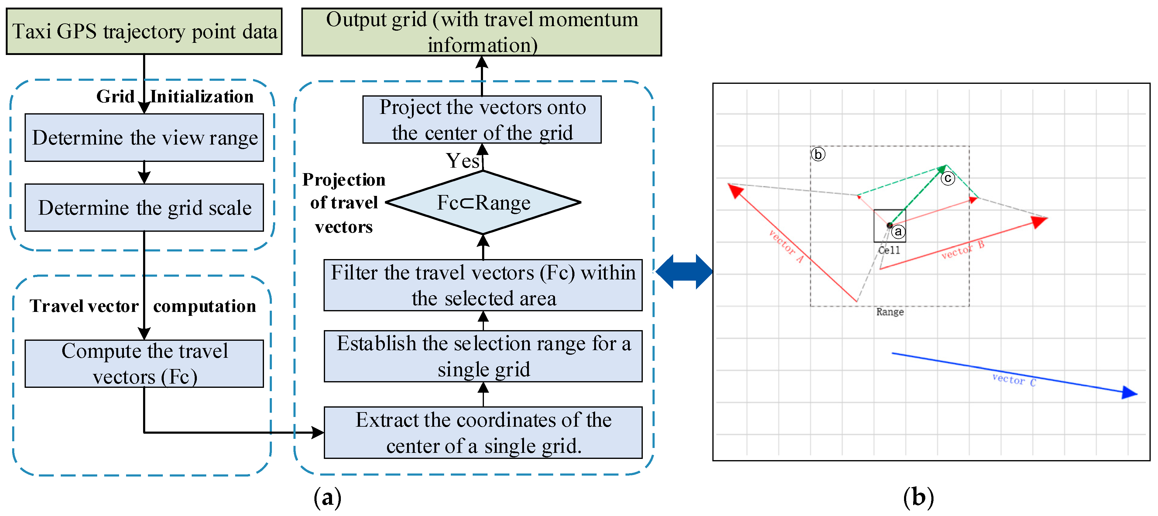
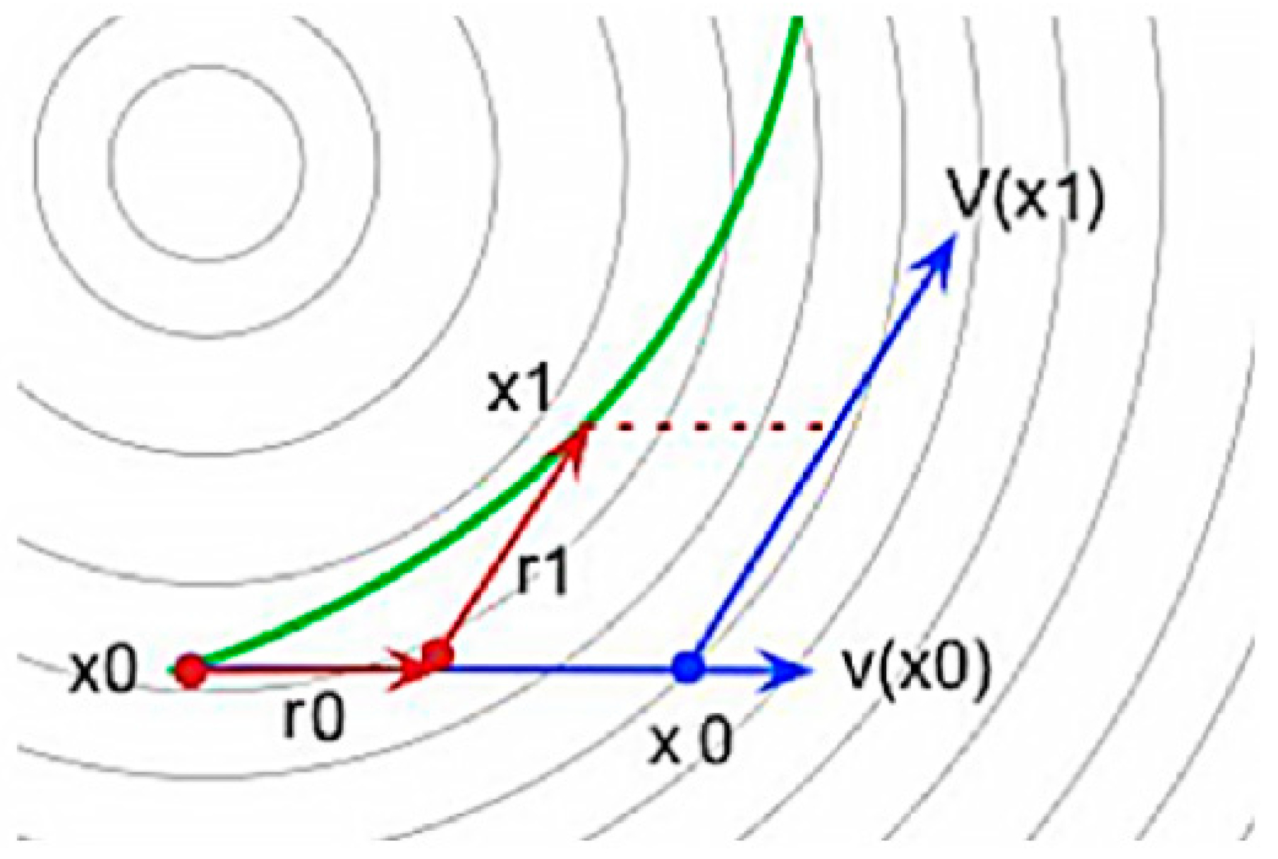
4.1. Construction of Travel Vector Grid

Utilizing the characteristics of grid cells for visualization is an effective strategy when dealing with large-scale trajectory data [43]. This approach improves computational efficiency, simplifies data processing procedures, and enhances the spatial understanding of trajectory data, providing strong support for trajectory data analysis and research. In this study, spatial grids are constructed by utilizing travel vectors. Specifically, based on vector data of Beijing and taxi GPS trajectory data, the grids are initialized, and travel vectors are extracted, followed by the projection of calculated travel vectors onto the corresponding grids. The process of grid construction is illustrated in Figure 2. More details regarding grid initialization, travel vector computation, and travel vector projection will be presented in Section 4.1.1, Section 4.1.2, and Section 4.1.3, respectively.

4.1.1. Grid Initialization

Common types of grids include regular grids, rectangular grids, unstructured grids, scattered points, and Cartesian grids [44]. In this study, a regular grid type was chosen due to its advantages of low computational cost and distinct visualization features. The window range for initializing the grid was determined based on the farthest reachable positions from the taxi trajectory data. The selection of grid scale significantly impacts the grid partitioning results. While more minor grid scales can improve computational accuracy, they also increase the computational burden. Therefore, it is crucial to determine an appropriate grid scale. In order to ensure that taxis can traverse the grid within a time interval of 5 min under normal driving conditions, this study took into account the speed limits specified for major transportation roads in Beijing and the average instantaneous speed of the experimental trajectory data. This comprehensive analysis was conducted to determine the appropriate grid scale.

4.1.2. Travel Vector Computation

The travel vector F c of taxi c consists of the travel distance L c (Equation (1)) and the travel velocity v c (Equation (2)), expressed as F c = L c , v c . The data model for the travel vector F c is shown in Table 2, where the latitude and longitude fields represent the starting point location of the travel vector, the velocity represents the average speed within a time interval of 5 min, and the latitude and longitude changes represent the positional changes in the vehicle within a time interval of 5 min.
L c = t 0 t n v d t = i = 0 n 1 v c i t i + 1 t i 2
v c = L c t n t 0
where v is the velocity curve function, n is the number of GPS trajectory data points for taxi c within a single time interval, v c o ~ v c n are the instantaneous velocity sequences of taxi c within that time interval, t 0 ~ t n are the time sequences for taxi c within that time interval, L c is the travel distance of taxi c , and v c is the travel velocity of taxi c .

4.1.3. Projection of Travel Vectors

The core idea of constructing the travel vector grid is based on the distance-weighted inverse proportion interpolation method [45] for vector projection. The illustration of projecting travel vectors onto the grid center is shown in Figure 2b. The computation steps are as follows:
Step 1: Extract the coordinates of individual grid centers in the initialization grid (Section 4.1.1).
Step 2: Establish a selection area with a single grid center as the center (labeled as ⓐ in Figure 2b), typically a rectangular region of 5 × 5 (labeled as ⓑ in Figure 2b).
Step 3: Filtering and projection calculation of travel vector data within the selected range: For each departure vector data origin, assess whether its latitude and longitude coordinates fall within the scope determined in Step 2. If affirmative, conduct projection calculation using the distance-weighted inverse proportional interpolation method and project it onto the grid center according to its corresponding weight (labeled as ⓒ in Figure 2b).
Step 4: Iterate through all the grid centers and perform Steps 2 and 3 sequentially to generate the travel vector grid.
Through the steps above, we can construct a regular grid with travel vector data, where each grid center’s travel vector represents the overall travel pattern of that region. Distance-weighted inverse proportion interpolation is a commonly used grid projection method. It interpolates trajectory points onto grid nodes by considering the distance relationship and weights between discrete points and grid points, thereby achieving a grid representation of the trajectory points. In this method, the density of travel vectors during the projection process is highest at the central coordinate. It gradually decreases with increasing distance from the line, reaching zero at the boundary of the selected area. Finally, by summing all the vectors according to the weight λ (Equation (3)), we obtain the travel vector F r of grid Cellr, as shown in Equation (4).
λ r i = R l n g c l n g o i 2 + l a t c l a t o i 2 R
F r = i = 0 n F c i * λ r i
where R is the maximum distance from the center point, i represents the index of all travel vectors within the selection range, l n g c and l a t c are the longitude and latitude coordinates of the center point, l n g o i and l a t o i are the starting point coordinates of travel vector i , λ r i is the weight of travel vector i projected onto grid Cellr, F c i represents the travel vector with index i within the selection range, and F r is the travel vector of grid Cellr.

4.2. Vector Field Visualization Rendering

Visualizing vector field data aims to present the characteristics and variations of the data through methods such as direction, magnitude, color mapping, animation effects, density, and distribution. In geometric visualization, researchers have been devoted to providing simple, intuitive, and continuous methods widely applied in engineering practice [46]. Visualization methods include particle systems [47], vector lines, and vector surfaces.
The particle system method is a technique for simulating changes in a vector field by simulating the movement trajectories of particles, thereby visualizing the variations in the vector field [48]. However, current research primarily focuses on improving the placement methods of seed points to optimize visualization effects, often overlooking the influence of dynamic trajectory changes on the uniform distribution of particles. In this study, we employ a lifecycle-based streamline rendering method to address the issue of faster-moving regions having denser particle distribution than slower-moving regions over time. The specific procedure is as follows: many particles are randomly generated within the valid area of the initialized grid, and particle attributes, including position, velocity, lifecycle, and color, are initialized. By employing bilinear interpolation, we address data gaps and ensure data integrity. Each particle undergoes integration calculations to determine the particle’s position in the next frame, allowing us to simulate the variations of the local vector field through the movement of individual particles and model the overall vector field variations through the collective motion of numerous particles. Lastly, each particle is assigned a lifecycle, and particles expire once their lifecycle is exceeded. The flowchart illustrating the vector field visualization is shown in Figure 3.

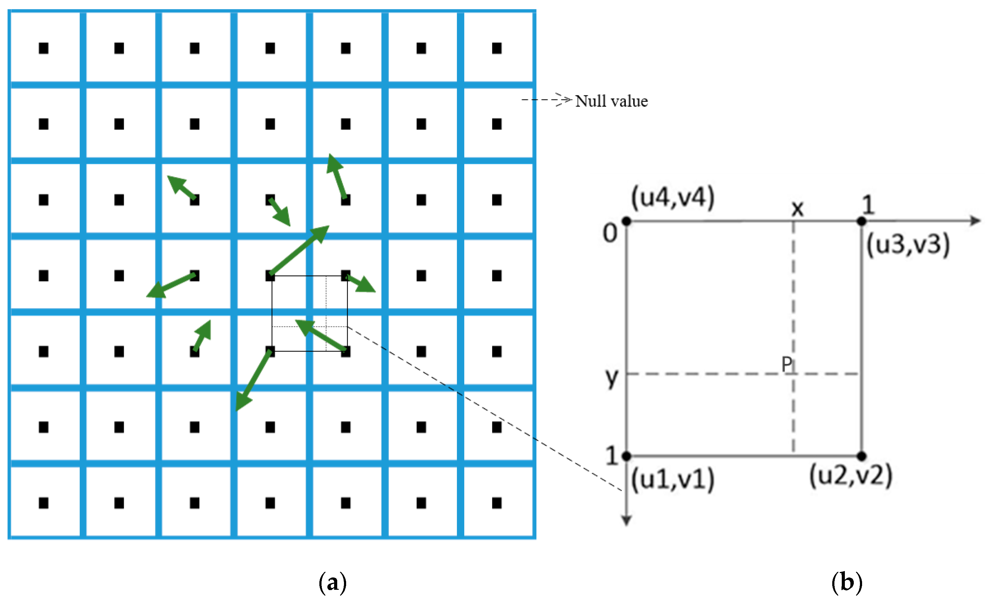
4.2.1. Particle Generation

During the particle generation process, it is necessary to determine the position and lifecycle of each particle. In this study’s vector field data visualization, particles are randomly generated within the viewport range that the trajectories can reach, as shown in Equations (5) and (6), and their position and lifespan (Equation (7)) are randomly controlled.
x = r a n d o m B e t w e e n ( m i n _ x , m a x _ x )
y = r a n d o m B e t w e e n ( m i n _ y , m a x _ y )
a g e = r a n d ( ) % 100
where r a n d o m B e t w e e n ( a , b ) is a random function that generates a value randomly between a and b, (min_x, min_y) and (max_x, max_y) represent the two-dimensional viewport range, and age denotes the lifecycle.
Since this study uses WebGL visualization, the iteration and update of particle positions occur within the GPU. On the CPU side, the initially generated particle positions are mapped using RGBA encoding and transmitted to the WebGL buffer. This process can be described through the RGBA encoding procedure illustrated in Figure 4.

4.2.2. Particle Initialization

Due to the large number of particles involved, careful design of particle attributes is necessary during initialization to meet the requirements of trajectory-based big data vector field visualization while avoiding unnecessary attribute waste of storage space and computation time. Essential attributes include the initial position, size, velocity, lifecycle, color, and other properties of the particles.
1.
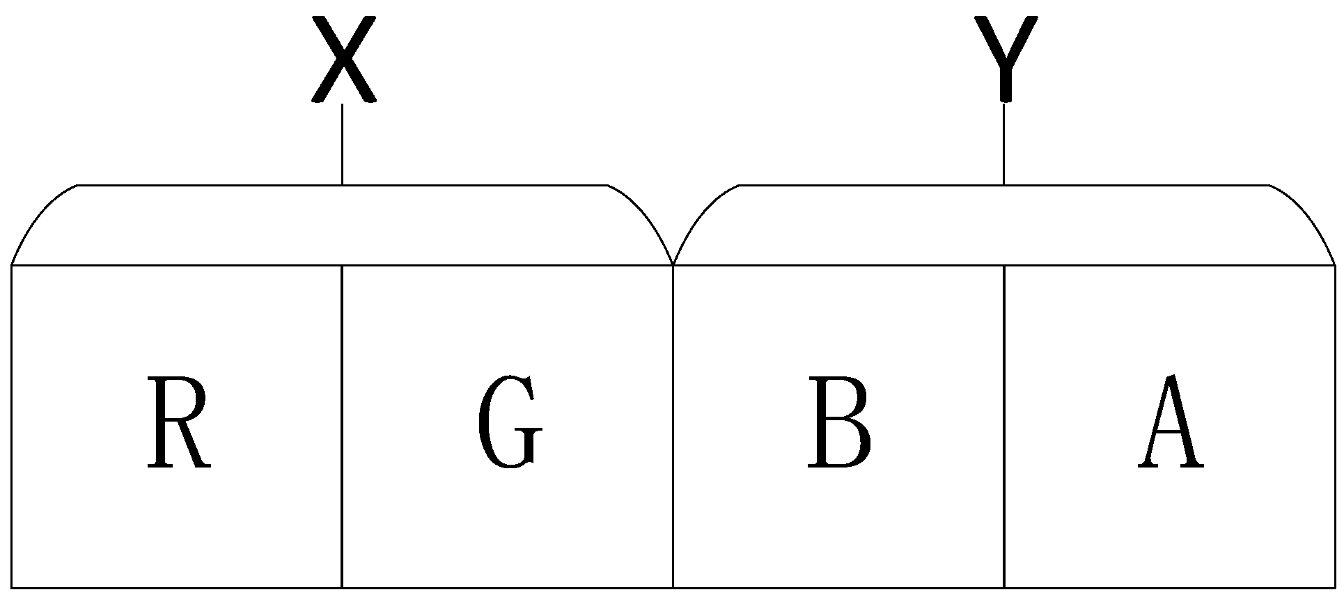
Particle size and color: Due to the vector field data visualization based on WebGL in this study, particle size depends on the chosen primitives. Particle shapes can include points, lines, polygons, and spheres. In this study, point particles are selected to represent trajectory characteristics, allowing easy particle size adjustment. Additionally, the color of particle trajectories can reflect their velocity variations, which can be adjusted by setting RGBA values.
2.
The initial positions of particles are randomly set, as described in Section 4.2.1 above. The next frame’s position of each particle is determined based on its current position and velocity.
3.
The initial velocity of particles is determined by their initial position, with two components: horizontal (u) and vertical (v). Moreover, the magnitude of these components also determines the direction of particle motion. The generation process of the velocity texture is similar to that of the position texture, where the velocity is mapped into the texture using RGBA encoding. RG and BA components store the horizontal and vertical components, respectively. The velocity magnitude corresponding to a particle’s position is obtained from the velocity texture.
4.
Particle lifecycle: The lifecycle of a particle determines its lifespan. In this study, the relationship between particle velocity and lifecycle addresses the uneven distribution of trajectory lines caused by fixed lifecycles.

4.2.3. Particle Motion

The movement of particles is manifested in their positions changing over time. The current frame position of each particle depends on its previous frame position, particle velocity, and the time interval per frame. The particle trajectory tracking method is the particle system’s key aspect. Integration calculations are performed based on the particle’s position and velocity, dynamically reflecting changes in the vector field through variations in attributes such as position, color, and opacity. The visualization-driven particle tracking algorithm is shown in Table 3.
In the algorithm presented in Table 3, several computational and transformation steps are involved, including precise calculation of particle position, particle velocity, and details of particle extinction.
1.
Calculation of particle velocities
In the travel vector grid, areas other than the center points of the grid have no predefined travel vector values; i.e., they are empty, as shown in Figure 5a. New particles are randomly generated on the grid. For particles that are not generated at grid points, interpolation is required to calculate the corresponding velocity at a given position P. The choice of interpolation method impacts the accuracy of particle streamline. Commonly used methods include nearest neighbor interpolation, linear interpolation, and inverse distance weighting interpolation. In this study, the bilinear interpolation algorithm (Equation (8)) is selected based on the characteristics of the data structure. The basic principle of this algorithm is illustrated in Figure 5b.
( 1 x ) ( 1 y ) u 1 + ( 1 x ) y u 4 + x ( 1 y ) u 2 + x y u 3 = 0 ( 1 x ) ( 1 y ) v 1 + ( 1 x ) y v 4 + x ( 1 y ) v 2 + x y v 3 = 0
2.
Accurate calculation of particle positions
Choosing an appropriate integration algorithm is crucial for constructing particle streamline plots. The first-order Euler, second-order Euler, and fourth-order Runge–Kutta methods can achieve this goal [49]. However, they differ in error accuracy, computational complexity, and the number of intermediate points used. Therefore, the optimal integration algorithm should be chosen based on specific circumstances when constructing streamlined plots. The fourth-order Runge–Kutta method offers high accuracy, but it also requires a high computational complexity. In this study, the second-order Euler method was selected to prioritize computational efficiency. The basic principle is illustrated in Figure 6, and the computational process is shown in Equations (9) and (10).
d μ ( τ ) d τ = v ( μ ( τ ) )
μ ( τ + τ ) = μ ( τ ) + τ τ + τ v ( μ ( τ ) ) d τ
where μ(τ) represents the particle position, τ is the time, Δτ is the time step, and v(μ(τ)) represents the direction of the streamline at that point.
In Figure 6, x0 represents the current point of the generated particle streamline, x1 represents the next point of the generated streamline, and the instantaneous velocities at x0 and x1 are v(x0) and v(x1), respectively. The coordinate accumulation process is denoted by r0 and r1.
3.
Particle Extinction
Particle extinction can occur in two scenarios. The first scenario is when a particle exceeds the current viewport or the valid region within the viewport. In such cases, the particle’s lifespan is set to 0, indicating its extinction. The second scenario involves gradually reducing a particle’s lifespan as it moves, eventually reaching 0, which signifies its extinction.

4.3. Congestion Analysis of Hotspots Areas

As one of China’s most widely used map services, Amap (also known as Gaode Map) provides professional and extensively applied data services that accurately reflect geographic features. According to Amap’s official statement, the static map data is updated weekly. In contrast, dynamic data such as road traffic congestion areas is updated every 5 min (source: https://lbs.amap.com/product/map/, accessed on 28 January 2018), ensuring the accuracy and reliability of the data [50]. The team from Gaode Company [51] calculated the average actual travel time and average free-flow travel time of taxi trips by analyzing the taxi trajectory samples within the region. They obtained the region’s traffic congestion delay index, εp, by calculating the ratio between these two values, as shown in Equation (11).
ε p = l i m l 0 l v p l i m l 0 l v z
where l represents the instantaneous travel distance, v p is the actual travel speed, v z is the free-flow speed of the road, and ε p is the traffic congestion delay index.
Based on this study’s constructed travel vector grid, the travel volume F p of the grid in the map study area can be obtained. From the travel volume F p , the travel speed v p within the grid and the overall travel distance L p can be derived, enabling the calculation of the traffic congestion delay index ε p for the study area. Therefore, this study identifies traffic congestion trend points based on the results of vector field visualization and calculates the congestion index within the area of interest (AOI) where they are located. The congestion index obtained from this method is compared with the traditional road-matching congestion index calculation method [51] to validate the effectiveness and practicality of the vector field visualization approach for trajectory big data. The classification criteria for urban regional congestion levels are presented in Table 4.

5. Results and Discussion

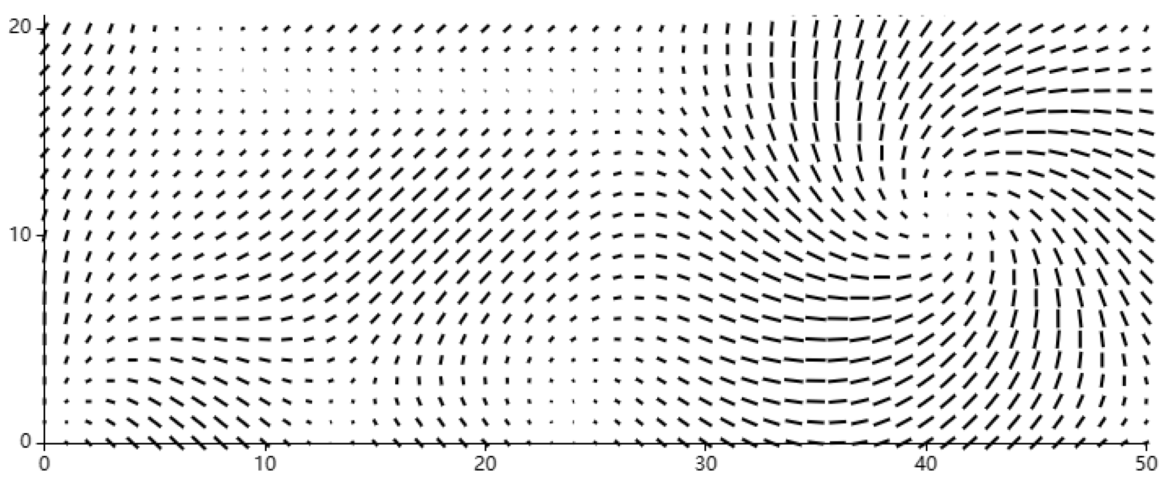
5.1. Construction of Travel Vector Grid

In order to ensure that taxis can traverse the grid within a time interval of 5 min under normal driving conditions, this study utilizes Beijing’s road network data, considering the length of each road segment and the prescribed speed limits on major traffic arteries within the city. These speed limits include 70 km/h on Chang’an Street, Liangguang Avenue, Ping’an Avenue, and Qiansanmen Street, 50 to 80 km/h on various ring roads, 60 to 100 km/h on expressways, and a maximum speed of 120 km/h on highways with a minimum speed not lower than 60 km/h. Based on this information, the average taxi speed in Beijing is calculated to be 60 km/h. Consequently, the grid threshold is set to 5 km. Additionally, considering experimental data showing the average instantaneous speed of taxis to be 26.7 km/h, the grid threshold is further adjusted to 2.225 km. Combining both factors determines the final grid scale to be 0.2 km. Figure 7 depicts the results of constructing the travel vector grid, wherein each grid center within the study area is associated with a superimposed travel vector that includes magnitude and direction. These vectors record the position of trajectory points, the current instantaneous speed of the points, and the latitude and longitude direction changes in taxi trajectories within a 5 min time interval, providing the necessary data support for subsequent vector field visualization.

5.2. Visualization of Vector Fields

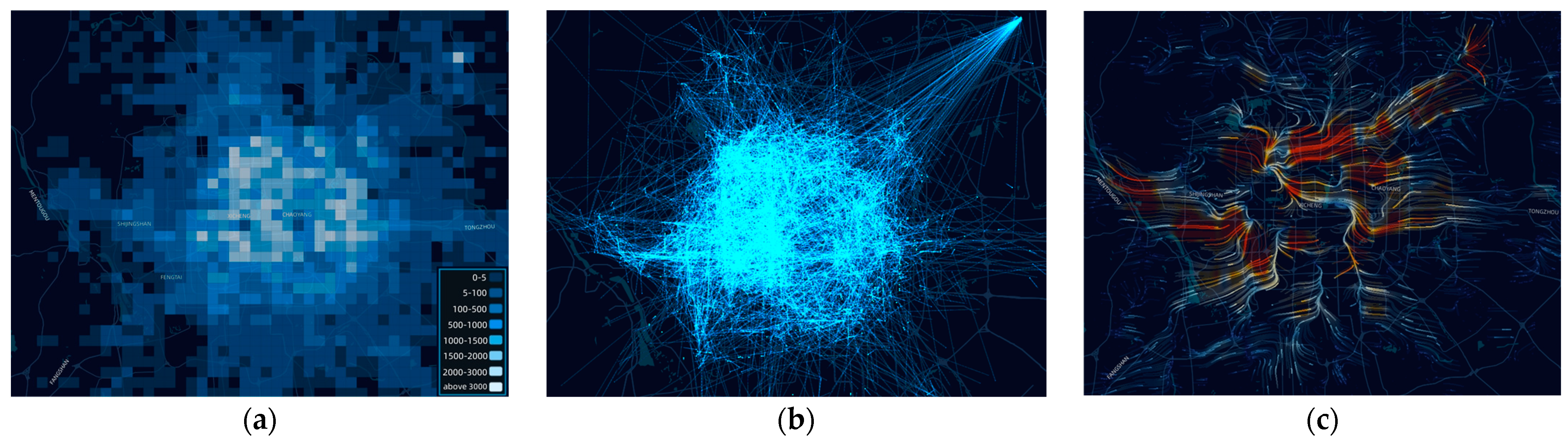
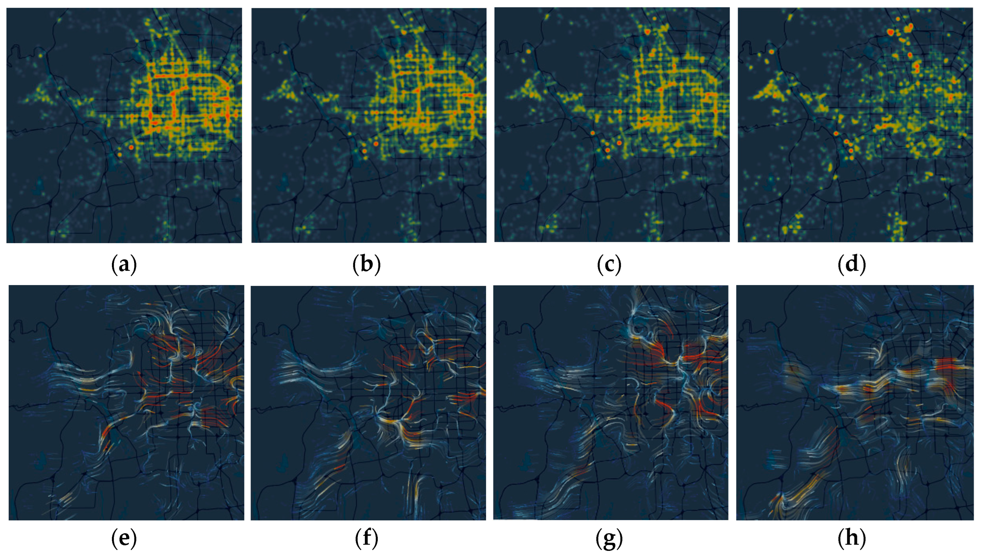
5.2.1. Results of Vector Field Visualization

Visualization of taxi trajectory vector fields utilizes travel vectors to express the distribution and flow of taxi trajectories through attributes such as particle size, direction, density, color mapping, lifecycle, and distribution. Compared to conventional trajectory data visualization methods, such as heat maps, OD grid maps, and OD flow direction maps, this approach allows users to intuitively evaluate the evolution of overall taxi travel vectors at different time points, enabling more sensitive detection of anomalies in exploration. This study conducted experiments using front-end development technologies, including JavaScript, HTML5, CSS, and WebGL. In the process of vector field visualization, particle densities were adjusted to 32, 64, and 128 for comparative analysis, evaluating the visualization effects and operational fluidity under different parameters. The numerical units 32, 64, and 128 represent “particles per pixel,” indicating the corresponding quantity of discrete travel vector lines within each visual pixel area, thereby creating the visualization effect of a trajectory vector field, as illustrated in Figure 8. In Figure 8a–c, colors depict the magnitude of taxi density, vector flow direction demonstrates the direction of taxi travel vectors, and vector flow velocity and opacity indicate taxi speed. In the circular plots of Figure 8d–f, the central section represents the total browser rendering time; Scripting denotes the time consumed by JavaScript code execution, Rendering signifies the time spent on graphic style calculation and layout, and painting reflects the time required for repainting. From Figure 8, it can be observed that samples with a particle density of 32 exhibit the fastest computational speed, yet the visualization quality is suboptimal and fails to capture the fundamental characteristics of the trajectory data. On the other hand, samples with a particle density of 128 experience the slowest computational speed, resulting in visual lag. Consequently, considering both visualization quality and computational cost, this study selects a particle density of 64.

5.2.2. Comparative Analysis of Vector Field Visualization

A snapshot of taxi GPS trajectory data visualization at 12:00, including OD grid map, OD streamline map, and vector field map, is presented in Figure 9. In Figure 9a, grid units of equal area are utilized to represent the distribution of OD data in different regions, with high-density areas indicating denser taxi distribution. The legend displays the number of taxis within each grid unit, providing an intuitive depiction of taxi density distribution and specific numerical information. However, this visualization method solely presents spatial distribution, omitting the temporal dimension. Temporal data is paramount for analyzing the dynamic allocation and mobility of taxis. Figure 9b depicts OD characteristics through streamlined maps, with animated points along the streamlines indicating OD directions. This method vividly illustrates the dynamic changes in taxi distribution and orientation, showcasing flow paths and trends. Nevertheless, due to its increased complexity, it may lead to visual clutter. To address the shared limitations of OD grid and streamline maps, we introduce Figure 9c, employing a vector field map to display vehicle movement direction, speed, and trajectory density in the form of vectors on the map. This visualization approach enables users to understand vehicle congestion levels and movement trends across different regions. Unlike the previous two methods, Figure 9c presents historical data and dynamically and intuitively conveys the mobile trend information inherent in the vast trajectory data.
The heatmaps and vector field snapshots of taxi GPS trajectory data at 21:00, 22:00, 23:00, and 00:00 are shown in Figure 10. Only the current spatial distribution characteristics of taxi trajectories can be observed when observing the individual time slices of the heatmaps (Figure 10a–d). The changing spatial density distribution can be determined only by comparing the four-time slices. For example, the number of taxis within the fourth ring road gradually decreases, while there is a slight increase in the number of taxis outside the ring road. Conversely, when examining the individual time slices of the vector field (Figure 10e–h), the current travel state changes and spatial distribution characteristics of taxi trajectories become apparent. At 21:00, 22:00, and 23:00, taxis exhibit a higher density within the urban area, with a general trend of expanding outward from the city center. At 00:00, the outward expansion trend becomes more pronounced.
Based on the analysis of congestion trends using vector field maps and heatmaps, this study conducted an in-depth investigation using Beijing’s Fengtai District as an example. Figure 11 shows that at 12:00, the green box region in vector field map Figure 11a exhibited a clear congestion trend. However, in the heatmap of the same moment, as shown in Figure 11b, there was no apparent congestion aggregation, indicating that the vector field map can more accurately capture congestion trends. In contrast, the performance of the heatmap is relatively weaker. Further expanding the analysis, we observed that the green box region clearly showed congestion aggregation in the heatmap Figure 11b 15 min later. This observation is consistent with the results obtained from the vector field map, further validating the superiority of the vector field map in congestion trend analysis. Therefore, it is evident that the visual rendering of vector field maps can provide a more intuitive representation of road congestion and deliver more precise congestion trend information.
In conclusion, the visualization method of heatmaps solely focuses on the attributes and spatial positions of traffic objects at a specific moment, essentially providing a snapshot that summarizes the past. However, users need to not only observe the current situation but also make predictions about the future. While heatmaps excel in displaying density in a specific area, they are unable to intuitively depict dynamic information such as traffic flow direction and speed. Therefore, in comparison to heatmaps, vector field maps offer a more experiential and comprehensive understanding of travel patterns, enabling timely detection of congestion trends and proactive responses.
In summary, the OD grid map, OD streamline map, and heatmap visualization methods focus solely on transportation entities’ attributes and spatial positions at a specific moment. This describes a snapshot of the research subject, constituting a summation of past occurrences. However, the users’ requirements extend beyond merely observing the present state; they also necessitate predictions for the future. While heatmaps and OD grid maps excel in depicting area density compared to vector field maps, they need to be more accurate in accurately representing information such as traffic flow direction and speed. Although OD streamline maps capture the dynamic changes in taxi distribution and law, they often lead to visual clutter. In contrast, the vector field map offers a more intuitive insight into travel patterns and promptly identifies trends in congestion, enabling proactive responses. Consequently, the vector field map is a superior visualization approach, vividly portraying dynamic information such as taxi movement direction, speed, and density. This approach gives users a more comprehensive understanding of traffic flow characteristics, enabling effective decision making.

5.3. Congestion Analysis of Hotspots Areas

This study identifies congestion points within the region based on the vector field. The classification of spatiotemporal heterogeneous feature scenarios is presented in Table 5. Category 1 represents normal flow trends, the main spatiotemporal flow patterns observed in the vector field. Category 2 indicates regional congestion trends commonly observed in transportation hubs, tourist attractions, commercial centers, and key intersections. Category 3 represents segment congestion trends, often occurring in congested urban road segments, particularly during peak hours. The following results are obtained by filtering heterogeneous spatiotemporal features for categories 2 and 3 at frequent locations:
1.
Transportation hubs: Development Zone Bus Station, Changling Bus Station, Beijing West Railway Station, Capital Airport.
2.
Major intersections: intersection of West Third Ring North Road and auxiliary road, intersection of Jingkai West Road, intersection of Cangshang Street, and S201.
3.
Commercial centers: Xidan Joy City, Financial and Business Street, Beijing State Mall, and Beijing CBD.
4.
Tourist attractions: Fragrant Hills Park and Nanluoguxiang.
5.
Congestion-prone road segments: from Madian Bridge to Deshengmen North Bridge, from Guomao Bridge to Jianguomen Bridge, from Yixing North Road to West Third Ring North Road, and from Dahuangtang Second Bridge to Longtanwan Bridge.
In the identification results of traffic congestion trend points in this study, it was observed that the Xidan commercial area exhibits high passenger flow and a more pronounced congestion trend. Therefore, this area was chosen for the quantitative evaluation of congestion. The calculation range for the congestion index in the area is illustrated in Figure 12.
First, the vector boundary range (indicated by the black dashed line in the figure) and the free-flow velocity v z of the roads in the Xidan commercial area are determined. The intersecting range grid is obtained based on the intersection rule (shown in the red-shaded area in the figure). We simultaneously apply the traditional congestion index algorithm and the vector field-based regional congestion calculation method to calculate the congestion index of the Xidan commercial area. The experimental results for 08:00–20:00 are presented in Table 6, with the passenger flow index data sourced from the Baidu Traffic Travel Big Data platform. Based on the experimental results and the congestion level division criteria for urban areas in Table 4, the congestion status during 10, 11, 12, 13, and 20 h is classified as unobstructed traffic flow. In contrast, the congestion status during 08, 09, 14, 15, 16, 17, and 19 h is categorized as jogging traffic flow, and the congestion status during 18 h is labeled congested, without severe congestion. The operating hours of the Xidan commercial center are from 10:00 to 22:00. There is a slight congestion phenomenon during 10:00, which may be influenced by the opening time, but it is not significant. The peak period occurs from 15:00 to 19:00, with the peak congestion observed at 18:00. The congestion eases at 20:00.
Users traveling at a specific time can quickly obtain the regional congestion status of their destination using this method, thereby determining their travel mode or itinerary. Based on this evaluation result, relevant departments can adopt management, operational, and maintenance measures for parking lots within the commercial area and surrounding traffic. Compared to the traditional method as the benchmark, the average error based on the vector field calculation is 0.016. This result further validates the scientific nature of the proposed vector field visualization method in this paper.

6. Conclusions

This study introduces a vector field visualization approach tailored to trajectory data to unearth the intrinsic value of trajectory big data. Its effectiveness is substantiated through empirical validation, utilizing experimental data derived from taxi trajectory big data in Beijing. The practical outcomes illustrate that the proposed approach can more accurately elucidate variations in traffic flow direction and density compared to conventional visualization methods. Furthermore, the congestion trend points generated by this method also can prognosticate short-term traffic congestion shortly, a pivotal capacity of utmost significance for urban traffic management decisions. Moreover, this research augments the vector field visualization model by incorporating a congestion analysis of hotspot areas. This analysis significantly heightens computational efficiency by calculating congestion indices without necessitating road matching or trajectory filtering. This comprehensive analysis further corroborates the feasibility and effectiveness of the vector field visualization method for trajectory big data in practical applications.
Due to the mechanism of its projection algorithm, the vector field visualization model introduced in this paper may result in notable data computation deviations under scenarios characterized by partial information loss. To address this, future research endeavors will emphasize integrating the distinct features of trajectory data, optimizing the projection algorithm, and rendering the effects of the vector field visualization model. This strategic enhancement seeks to elevate the model’s reliability within the domain of traffic data visualization. Additionally, the integration of machine learning and visualization techniques to realize the detection and prediction of congestion hotspots will emerge as a prominent avenue for future exploration. We have outlined plans to embark on an in-depth investigation in this direction.

Author Contributions

Conceptualization, Aidi Li, Zhijie Xu, and Jianqin Zhang; data curation, Aidi Li; formal analysis, Aidi Li and Zhijie Xu; funding acquisition, Jianqin Zhang; investigation, Aidi Li, Zhijie Xu, and Jianqin Zhang; methodology, Aidi Li; project administration, Jianqin Zhang; resources, Jianqin Zhang, Zhijie Xu, Xinyue Cheng and Chaonan Hu; software, Aidi Li and Taizeng Li; supervision, Taizeng Li, Xinyue Cheng, and Chaonan Hu; validation, Aidi Li; visualization, Aidi Li; writing—original draft, Aidi Li; writing—review and editing, Jianqin Zhang, Aidi Li, Zhijie Xu, Taizeng Li, Xinyue Cheng and Chaonan Hu. All authors have read and agreed to the published version of the manuscript.

Funding

This research was funded by the National Natural Science Foundation of China (grant No. 42371416), and the Beijing University of Civil Engineering and Architecture 2023 Doctoral Postgraduate Research Ability Improvement Program (grand No. DG2023017 and DG2023018).

Data Availability Statement

Data sharing is not applicable to this article.

Acknowledgments

The authors thank the anonymous reviewers for their valuable comments.

Conflicts of Interest

The authors declare no conflict of interest.

References

  1. Jing, C.; Zhou, W.; Qian, Y.; Zheng, Z.; Wang, J.; Yu, W. Trajectory big data reveals spatial disparity of healthcare accessibility at the residential neighborhood scale. Cities 2023, 133, 104127. [Google Scholar] [CrossRef]
  2. Qu, Z.; Wang, X.; Song, X.; Pan, Z.; Li, H. Location Optimization for Urban Taxi Stands Based on Taxi GPS Trajectory Big Data. IEEE Access 2019, 7, 62273–62283. [Google Scholar] [CrossRef]
  3. Zheng, Y. Trajectory Data Mining: An Overview. ACM Trans. Intell. Syst. Technol. 2015, 6, 29. [Google Scholar] [CrossRef]
  4. Zhu, L.; Yu, F.R.; Wang, Y.; Ning, B.; Tang, T. Big Data Analytics in Intelligent Transportation Systems: A Survey. IEEE Trans. Intell. Transp. Syst. 2019, 20, 383–398. [Google Scholar] [CrossRef]
  5. Li, W.; Zhu, J.; Fu, L.; Zhu, Q.; Xie, Y.; Hu, Y. An augmented representation method of debris flow scenes to improve public perception. Int. J. Geogr. Inf. Sci. 2021, 35, 1521–1544. [Google Scholar] [CrossRef]
  6. Zhang, W.; Xu, C. Exploring App-Based Taxi Movement Patterns from Large-Scale Geolocation Data. ISPRS Int. J. Geo-Inf. 2021, 10, 751. [Google Scholar] [CrossRef]
  7. Liu, C.K.; Qin, K.; Chen, K.; Ma, R. Uncovering the Aggregation Pattern of Gps Trajectory Based on Spatiotemporal Clustering and 3D Visualization. ISPRS—Int. Arch. Photogramm. Remote Sens. Spat. Inf. Sci. 2020, 42, 255–260. [Google Scholar] [CrossRef]
  8. Liu, H.; Chen, X.; Wang, Y.; Zhang, B.; Chen, Y.; Zhao, Y.; Zhou, F. Visualization and visual analysis of vessel trajectory data: A survey. Vis. Inform. 2021, 5, 1–10. [Google Scholar] [CrossRef]
  9. He, J.; Chen, H.; Chen, Y.; Tang, X.; Zou, Y. Variable-Based Spatiotemporal Trajectory Data Visualization Illustrated. IEEE Access 2019, 7, 143646–143672. [Google Scholar] [CrossRef]
  10. Chu, X.; Tan, X.; Zeng, W. A Clustering Ensemble Method of Aircraft Trajectory Based on the Similarity Matrix. Aerospace 2022, 9, 269. [Google Scholar] [CrossRef]
  11. Bai, X.; Xie, Z.; Xu, X.; Xiao, Y. An adaptive threshold fast DBSCAN algorithm with preserved trajectory feature points for vessel trajectory clustering. Ocean Eng. 2023, 280, 114930. [Google Scholar] [CrossRef]
  12. Hussain, S.A.; Hassan, M.U.; Nasar, W.; Ghorashi, S.; Jamjoom, M.M.; Abdel-Aty, A.H.; Parveen, A.; Hameed, I.A. Efficient Trajectory Clustering with Road Network Constraints Based on Spatiotemporal Buffering. ISPRS Int. J. Geo-Inf. 2023, 12, 117. [Google Scholar] [CrossRef]
  13. Gruendl, H.; Riehmann, P.; Pausch, Y.; Froehlich, B. Time-Series Plots Integrated in Parallel-Coordinates Displays. Comput. Graph. Forum 2016, 35, 321–330. [Google Scholar] [CrossRef]
  14. Zeng, W.; Fu, C.W.; Arisona, S.M.; Qu, H. Visualizing Interchange Patterns in Massive Movement Data. Comput. Graph. Forum 2013, 32, 271–280. [Google Scholar] [CrossRef]
  15. Pu, J.; Liu, S.; Ding, Y.; Qu, H.; Ni, L. T-Watcher: A New Visual Analytic System for Effective Traffic Surveillance. In Proceedings of the 2013 IEEE 14th International Conference on Mobile Data Management, Milan, Italy, 3–6 June 2013; pp. 127–136. [Google Scholar]
  16. Choi, Y.D.; Yun, H.J. Visualizing Electromagnetic Vector Fields in Matter using MATHEMATICA. Appl. Sci. Converg. Technol. 2019, 28, 66–78. [Google Scholar] [CrossRef]
  17. Zhu, M.; Wang, X.; Yao, L.; Luo, F.; Pang, X. A Survey of Visualization Methods for Urban Spatial Hot Spots Analysis. J. Comput. -Aided Des. Comput. Graph. 2020, 32, 551–567. [Google Scholar]
  18. Jain, R.; Garg, S.; Gangal, S.; Thakur, M.K. TaxiScan: A scan statistics approach for detecting Taxi demand hotspots. In Proceedings of the 2019 Twelfth International Conference on Contemporary Computing (IC3), Noida, India, 8–10 August 2019; pp. 1–6. [Google Scholar]
  19. Zhou, B.; Ma, L.; Hu, J.; Wu, S.; He, G. Extraction of Urban Hotspots and Analysis of Spatial interaction Based on Trajectory Data Field: A Case Study of Shenzhen City. Trop. Geogr. 2019, 39, 117–124. [Google Scholar] [CrossRef]
  20. Zhang, H.; Zhang, J.; Guo, X.; Lu, J.; Lu, H. Cloud storage and heatmap generation method of trajectory big data. Bull. Surv. Mapp. 2021, 10, 146–149. [Google Scholar] [CrossRef]
  21. Lu, M.; Lai, C.; Ye, T.; Liang, J.; Yuan, X. Visual Analysis of Multiple Route Choices Based on General GPS Trajectories. IEEE Trans. Big Data 2017, 3, 234–247. [Google Scholar] [CrossRef]
  22. Tominski, C.; Schumann, H.; Andrienko, G.; Andrienko, N. Stacking-Based Visualization of Trajectory Attribute Data. IEEE Trans. Vis. Comput. Graph. 2012, 18, 2565–2574. [Google Scholar] [CrossRef]
  23. Pahins, C.A.L.; Ferreira, N.; Comba, J.L. Real-Time Exploration of Large Spatiotemporal Datasets Based on Order Statistics. IEEE Trans. Vis. Comput. Graph. 2020, 26, 3314–3326. [Google Scholar] [CrossRef]
  24. Itoh, M.; Yokoyama, D.; Toyoda, M.; Tomita, Y.; Kawamura, S.; Kitsuregawa, M. Visual Exploration of Changes in Passenger Flows and Tweets on Mega-City Metro Network. IEEE Trans. Big Data 2016, 2, 85–99. [Google Scholar] [CrossRef]
  25. Guo, D.; Zhu, X. Origin-Destination Flow Data Smoothing and Mapping. IEEE Trans. Vis. Comput. Graph. 2014, 20, 2043–2052. [Google Scholar] [CrossRef] [PubMed]
  26. Guo, X.; Xu, Z.; Zhang, J.; Lu, J.; Zhang, H. An OD Flow Clustering Method Based on Vector Constraints: A Case Study for Beijing Taxi Origin-Destination Data. ISPRS Int. J. Geo-Inf. 2020, 9, 128. [Google Scholar] [CrossRef]
  27. Zeng, W.; Shen, Q.; Jiang, Y.; Alexandru, T. Route-aware edge bundling for visualizing origin-destination trails in urban traffic. In Computer Graphics Forum; Wiley-Blackwell: Hoboken, NJ, USA, 2019; pp. 581–593. [Google Scholar]
  28. Yan, L.; Liu, X.; Chen, H.; Mangal, A.; Liu, K.; Chen, C.; Lim, B. OD Morphing: Balancing Simplicity with Faithfulness for OD Bundling. IEEE Comput. Soc. 2020, 26, 811–821. [Google Scholar]
  29. Liu, X.; Gong, L.; Gong, Y.; Liu, Y. Revealing travel patterns and city structure with taxi trip data. J. Transp. Geogr. 2015, 43, 78–90. [Google Scholar] [CrossRef]
  30. Liu, X.; Chow, J.Y.J.; Li, S. Online monitoring of local taxi travel momentum and congestion effects using projections of taxi GPS-based vector fields. J. Geogr. Syst. 2018, 20, 253–274. [Google Scholar] [CrossRef]
  31. Qin, X.; Fang, X.; Chen, L.; Zheng, H.; Ma, J.; Zhang, M. A Line Integral Convolution Method With Dynamically Determining Step Size and Interpolation Mode for Vector Field Visualization. IEEE Access 2019, 7, 19414–19422. [Google Scholar] [CrossRef]
  32. Tang, B.; Shi, H. Intelligent vector field visualization based on line integral convolution. Cogn. Syst. Res. 2018, 52, 828–842. [Google Scholar] [CrossRef]
  33. Liu, Z.; Cai, S.; Swan, J.E.; Moorhead, R.J.; Martin, J.P.; Jankun-Kelly, T.J. A 2D flow visualization user study using explicit flow synthesis and implicit task design. IEEE Trans. Vis. Comput. Graph. 2012, 18, 783–796. [Google Scholar] [CrossRef]
  34. Chu, L.; Ai, B.; Wen, Y.; Shi, Q.; Ma, H.; Feng, W. A Spatio-Temporal Dynamic Visualization Method of Time-Varying Wind Fields Based on Particle System. ISPRS Int. J. Geo-Inf. 2023, 12, 146. [Google Scholar] [CrossRef]
  35. Hin, A.J.S.; Post, F.H. Visualization of turbulent flow with particles. In Proceedings of the Proceedings Visualization ‘93, San Jose, CA, USA, 25–29 October 1993; pp. 46–52. [Google Scholar]
  36. Wei, X.; Kaufman, A.E.; Hallman, T.J. Case study: Visualization of particle track data. In Proceedings of the Visualization, VIS ’01, San Diego, CA, USA, 21–26 October 2001; pp. 465–590. [Google Scholar]
  37. Liu, H.; Fan, X.; Liu, J.; Liu, S. Smoothed Particle Hydrodynamics Fluid Simulation Method Based on Webgl. J. Chin. Comput. Syst. 2017, 38, 2406–2411. [Google Scholar]
  38. Fu, S.; Ai, B. Data Structure Design of Particle System for Global Surface Flow Visualization. Mar. Inf. 2019, 34, 19–22. [Google Scholar] [CrossRef]
  39. Wang, Z.; Yang, Z.; Gao, S.; Zhang, L. Visualization of Ocean Data Vector Field Based on Streamline Distance Clustering. Comput. Sci. 2023, 50, 865–871. [Google Scholar]
  40. Wang, H.; Wu, T. New vector field microcosmic model for traffic flow. China J. Highw. T Ransport 2003, 16, 100–103. [Google Scholar] [CrossRef]
  41. Ma, W. Study on Characteristics and Improvement Measures of Traffic Congestion in Beijing. J. Munic. Technol. 2021, 39, 26–29. [Google Scholar] [CrossRef]
  42. Zhang, J.; Qiu, P.; Duan, Y.; Du, M.; Lu, F. A space-time visualization analysis method for taxi operation in Beijing. J. Vis. Lang. Comput. 2015, 31, 1–8. [Google Scholar]
  43. Fu, C.E.; Cheng, Q. Hierarchical Grid Division to Realize Cluster and Scatter Visualization of Massive Map Markers. Comput. Eng. Appl. 2023, 59, 245–251. [Google Scholar]
  44. Wang, S.; Jiang, Y.; Xu, X.; Bao, X. Grid division method of substation area based on clustering multi-dimensional data crossing and integration. Eng. J. Wuhan Univ. 2023, 56, 226–232. [Google Scholar] [CrossRef]
  45. Chen, H.; Li, X.; Ding, W. Twelve Kinds of Gridding Methods of Surfer 8.0 in Isoline Drawing. Chin. J. Eng. Geophys. 2007, 4, 52–57. [Google Scholar]
  46. Wang, S.; Li, W. Capturing the dance of the earth: PolarGlobe: Real-time scientific visualization of vector field data to support climate science. Comput. Environ. Urban Syst. 2019, 77, 101352. [Google Scholar] [CrossRef]
  47. Wang, S.; Chen, Y.; Wang, G. Vector Field Visualization of Digital Ocean System. J. Comput.-Aided Des. Comput. Graph. 2016, 28, 2114–2119. [Google Scholar]
  48. Huang, J.; Wang, Y.; Liu, J.; Ke, S. A Vector Field Trajectory Drawing Method Based on WebGL. Mod. Inf. Technol. 2023, 7, 92–95. [Google Scholar] [CrossRef]
  49. Ge, Y.; Lu, D. A survey on texture-based visualization methods for flow fields. J. Qufu Norm. Univ. Nat. Sci. 2020, 46, 77–84. [Google Scholar]
  50. Jing, C.; Zhang, H.; Xu, S.; Wang, M.; Zhuo, F.; Liu, S. A hierarchical spatial unit partitioning approach for fine-grained urban functional region identification. Trans. GIS 2022, 26, 2691–2715. [Google Scholar] [CrossRef]
  51. Dong, Z.; Zhou, Q.; Chen, S.; Hu, R.; Wang, Y.; Wu, Y. Evaluation Method of Urban Traffic Congestion Based on Trace. In Proceedings of the 9th Annual China Intelligent Transportation Conference 2014, Guangzhou, China, 8–11 October 2014; pp. 285–291. [Google Scholar]
Figure 1. Overall technical roadmap.
Ijgi 12 00398 g001
Figure 2. Construction of the travel vector grid: (a) workflow; (b) diagram. (In (b), the green vector in the center represents the vector at the grid center, obtained by summing the surrounding red vectors. ⓐ Grid center; ⓑ Selection range in the center of the grid; ⓒ Superposition result of row vectors in the selection area).
Ijgi 12 00398 g002
Figure 3. Flowchart for vector field visualization.
Ijgi 12 00398 g003
Figure 4. RGBA encoding process.
Ijgi 12 00398 g004
Figure 5. Bilinear interpolation calculation. (a) Travel vector grid, (b) bilinear interpolation algorithm principle.
Ijgi 12 00398 g005
Figure 6. Second-order Euler method. (The green line represents the particle streamline; the red line represents the process of coordinate accumulation; the blue line represents the instantaneous velocity).
Ijgi 12 00398 g006
Figure 7. Results of travel vector grid construction.
Ijgi 12 00398 g007
Figure 8. Vector field visualization effect. (ac) Visualization effect under different particle densities. (df) Rendering speed under different particle densities.
Ijgi 12 00398 g008
Figure 9. Visual maps of GPS trajectory data. (a) OD grid map; (b) OD streamline map; (c) vector field map.
Ijgi 12 00398 g009
Figure 10. Snapshot of the heatmap and vector field map of GPS trajectory data. (ad) present the heatmap snapshots of taxi trajectory data at 21:00, 22:00, 23:00, and 00:00; on the other hand, (eh) depict the heatmap snapshots of taxi trajectory data at 21:00, 22:00, 23:00, and 00:00.
Ijgi 12 00398 g010
Figure 11. Congestion trend analysis in Fengtai District. (a) Vector field diagram; (b) heat map. (The red boxes represent the areas analyzed for congestion trends; the green boxes represent congestion at different moments in time).
Ijgi 12 00398 g011
Figure 12. Calculation range for congestion index in the study area.
Ijgi 12 00398 g012
Table 1. Basic data information.
Data TypeData FormatData VolumeData Description
Field NameField Meaning
Taxi Trajectory Datatxt10.5 GCIDVehicle ID
TIMETime
LOGLongitude
LATLatitude
SPEEDInstantaneous velocity
DIRECTInstantaneous direction
AOI Boundary Data shp25.6 MAOI_IDArea of interest ID
AOI_LOCCoordinates the location of the AOI
AOI_NAMEName of the AOI
Road Network Datashp20.5 MLENGRoad length
NAMERoad Name
Boundary Data of Different Districtsshp7.51 MAREA_LOCRegional Location
AREA_NAMERegion Name
Table 2. The data model for travel vector F c .
IndexField NameDescriptionExample
1CIDVehicle ID13301104001
2LOGLongitude116.3576202
3LATLatitude39.85883331
4VSpeed56.2
5DXLongitude Change0.0065
6DYLatitude Change−0.3064
Table 3. Visualization-driven particle tracking algorithm.
Input: The data model for the travel vector grid.
Output: Particle motion trajectories.
1Particle Generation
 Randomly generate a large number of particles within the range of the vector grid area. Use interpolation to calculate the velocity at the current position.
Particle Update
 Based on the particle’s current velocity and time step, the particle’s next position is computed through integration.
 The particle’s velocity is calculated using interpolation based on the particle’s position.
 The particle’s visualization attributes, such as color and opacity, are updated based on changes in the particle’s position, velocity, and other properties.
Particle Trajectory Recording
 Record the position information of the particles to form their trajectories, visualizing the particle’s motion as a series of connected line segments.
Iterative Process
 Repeat steps 2 and 3 until the particle reaches the end of its lifecycle.
2
3
4
5
6
7
8
9
10
11
12
13
14
15
Table 4. Classification criteria for urban regional congestion levels.
Congestion IndexCongestion Level
1.00~1.50Unobstructed
1.50~1.80Jogging
1.80~2.00Congestion
greater than 2.00Severe congestion
Table 5. Classification of spatiotemporal heterogeneous features based on vector field analysis.
CategoryCategory Phenomenon DescriptionFrequent LocationsFeature Trends
1Normal flow trendRoad segments with normal traffic flowIjgi 12 00398 i001
2Congestion trend in the regionTransportation hubs, tourist attractions, business centers, key intersectionsIjgi 12 00398 i002
3Congestion trend on road segmentsCongested urban road sectionsIjgi 12 00398 i003
Table 6. Congestion index results of Xidan shopping area.
TimeVector Field Congestion IndexTraditional Congestion IndexPassenger Flow IndexPercentage Difference
08:001.5291.4979.20−0.0213
09:001.5211.4829.24−0.0263
10:001.4701.5078.65+0.0245
11:001.4381.4778.58+0.0264
12:001.2921.2657.14−0.0213
13:001.3791.3567.67−0.0169
14:001.5101.5079.14−0.0019
15:001.5271.4888.02−0.0262
16:001.6361.63410.1−0.0012
17:001.7321.73111.8−0.0005
18:001.9821.95312.48−0.0148
19:001.5821.62110.6+0.0241
20:001.3871.3988.48+0.0078
Disclaimer/Publisher’s Note: The statements, opinions and data contained in all publications are solely those of the individual author(s) and contributor(s) and not of MDPI and/or the editor(s). MDPI and/or the editor(s) disclaim responsibility for any injury to people or property resulting from any ideas, methods, instructions or products referred to in the content.

