Article

POI Symbol Design in Web Cartography—A Comparative Study

by
Eirini Nektaria Konstantinou
,
Andriani Skopeliti
* and
Byron Nakos
Cartography Laboratory, School of Rural, Surveying and Geoinformatics Engineering, National Technical University of Athens, 15780 Athens, Greece
*
Author to whom correspondence should be addressed.
ISPRS Int. J. Geo-Inf. 2023, 12(7), 254; https://doi.org/10.3390/ijgi12070254
Submission received: 30 March 2023 / Revised: 13 June 2023 / Accepted: 15 June 2023 / Published: 22 June 2023

Abstract

:
This paper studies the design of point symbols on widely used online maps and apps that portray tourist points of interest (POIs). Tourist maps are among the most commonly used types of maps nowadays. The ease of travel leads to an ever-increasing demand for tourist maps. Therefore, appropriate map design, content and technical means are necessary for better information transfer and communication between the map and the user. Online maps and apps were selected according to specific criteria (e.g., language, geographic area, pictographic symbols, interactivity). Pictographic point symbols for POIs related to tourism activities were collected and described by variables. The frame and the pictogram of the point symbols were the two main directions for choosing the descriptive variables. Description is based on the cognitive scheme for interpretation of cartographic symbols with some improvements. The study reveals the characteristics of the point symbols and constitutes a documentation of the applied practices. The main trends prevalent in the design of these symbols are highlighted and commented on in relation to traditional cartographic practices and guidelines for the design of point symbols.

1. Introduction

Nowadays, tourist maps are an integral part of travels all over the world. They offer geographical and tourist information and are essential for tourists exploring relevant destinations [1]. They constitute a special type of map and the most complex area to work with in cartographic concepts and processes [2]. Special attention was paid to tourist maps in the 1970s and 1980s when scientific conferences addressed symbol standardization, map legends, content representation and interpretation, maps in travel guides, cartography contribution to tourism development, etc. [3]. In recent years, their use seems to have increased, as the emergence of the Internet, combined with easier access to short trips and unknown destinations, has encouraged the use of web maps and map applications. People’s lifestyle today favors short trips and the need to visit unfamiliar destinations. As the demand increases, optimizing the design of tourist maps becomes an important issue of map effectiveness.
The main challenge in designing a tourist map is that it must serve different purposes and users [2]. With an effective map design, tourist maps can encourage tourists to experience more than just the key urban landmark attractions [4]. There is a link between cartography and tourism, a scientific discipline and a practical field, as both are concerned with the development, production and use of maps [5]. A well-designed map provides tourists with explicit orientation and is easy to use; a poor design, on the other hand, might waste users’ time and even mislead them [6]. Nowadays, a number of maps suffer from poor design [7]. Travel map design deserves scientific attention for several reasons: scale, appropriateness of cartographic symbolism and text, the effectiveness of graphic language, layout, the inclusion of insets and photographs, depiction of transportation and tourism infrastructure and illustration of parks and recreation areas [8]. Symbol design is crucial for reading tourist maps. Point symbols are particularly significant on tourist maps because they usually carry the thematic content, indicating points of interest (POIs) that should attract the attention of the user; thus, the adoption of an original graphic design can make them attractive for the users [9].
Point symbol design is discussed at length in the cartographic literature [10]. Forrest and Castner (1985) [11] designed and performed an experiment on the perception of point symbols for tourist maps for the first time and concluded that pictorial symbols are the most effective, and framed symbols are visually clearer and held out when a background color is applied as well. Clarke (1989) [12] argues that cartographic symbols are effective if they are easily and accurately understood by users and favors symbols that are already in usage, introducing the aspect of symbol familiarity. In addition, the degree of internal complexity is linked with symbol size [12,13]. Appropriate size may shorten the time required to find a pictorial symbols on a touch screen in the context of tourist maps [14], although rapidity is also impacted by familiarity [13]. Finally, graphic content clarity and simplicity are also important [15,16]. All point symbols for a map should be designed as an entire set to have consistent visual complexity [17]. In addition to symbol design, symbol interpretation is influenced by map content and nearby symbols [15]. Finally, the link of symbol design with standards is raised by Gerber et al. (1990) [15].
From another perspective, point symbols must be straightforward to facilitate understanding of their meanings [18]. Gerber et al. (1990) [15] introduce the resemblance to the referent. Clarke (2013) [12] investigated through questionnaires on two comparable published tourist maps and concluded that point symbols, i.e., abstract, geometric or pictorial symbols, can be inefficient if they bear a poor resemblance to the object they depict. This statement is in accordance with i. Ratajski’s (1973) [10,19] principle of forms isomorphism, e.g., shapes are similar to objects or the objects attributes; ii. MacEachren’s [20] suggestion that the best recognizable cartographic symbols directly represent a specific object or refer to associations relating to it and iii. the imitation-based design described by Keates (1996) [21]. Pictographic symbols can be categorized further on the basis of how the symbol (i.e., the visual representation) is linked to its meaning (i.e., the referent) [22]. Nakamura and Zeng-Treitler (2012) [23] provided a taxonomy of the representation strategies of pictographic symbols: arbitrary convention (e.g., a cross for a hospital), visual similarity (e.g., a building with a cross for a church) and semantic association (e.g., cutlery for a restaurant).
From the above, one can understand that the success of the pictorial symbols is related to pictogram (icon) selection. Icon characteristics include concreteness, complexity, meaningfulness, familiarity, semantic distance, distinctiveness and aesthetic appeal [24,25,26]. The abovementioned icon characteristics can be grouped as graphic (simplicity, clarity, visibility, consistency, distinctiveness, aesthetic appeal) and semantic (concreteness, semantic closeness, familiarity and acceptability) [22]. These qualities are documented in cartographic but also in the behavioral literature through research [27]. However, the assessment of the applied basic geometric and graphic variables, visibility, concreteness and symbol dimensions can be accurately measured, but other conditions, such as the assessment of simplicity, familiarity and semantic closeness of cartographic symbols, depend on the subjective impression, background and abilities of the observer [27].
Pictographic symbols are considered the best option for tourist maps [11,13,28] since they are more eye-catching than traditional topographic symbols [29]. Moreover, image-related symbols should be used whenever possible because their comprehension is less dependent on the cultural context [30]. They can be identified without a legend, but the symbols must be correctly interpreted before claiming this benefit [31]. Some researchers have proposed practical guidelines for pictorial symbol design, such as using a frame and a background [11]. Notable design decisions in GeoVista mobile map symbols include [17]: a square frame that provides space to increase the icon size and therefore legibility, a light icon within a dark frame that provides a high figure–ground contrast with base maps which are typically light in color, a strong semantic relationship with objects being depicted and a slight shadow that promotes figure–ground relationships and helps to separate the symbols from the base map with a raised appearance. In another study [9], guidelines to ensure consistency include a frame of consistent width and signs as filled figures that occupy a similar area and have geometric or irregular forms. More precisely, a square black frame of 0.2 mm is proposed, a 5–7 mm diameter and a black sign on a yellow background.
This paper aims to study the point symbols on web maps and applications that portray tourist information. Symbol description is based on the cognitive scheme for interpreting cartographic symbols by Bertin [32] and MacEachren [20]. The main trends prevalent in the design of these symbols are highlighted and commented on in relation to traditional cartographic practices and guidelines for the design of point symbols.
The rest of the paper is organized as follows. Section 2 describes the criteria for the selection of online tourist and general maps and the methodology for describing the point symbols. Section 3 presents the symbols of tourism POIs collected from the maps and symbol description based on the proposed variables. Section 4 presents the results of the data analysis at global, map and POI level. Finally, results are commented on and conclusions are presented in Section 5. In Appendix A, POI symbols are presented, and in Appendix B the calculated percentages of the variables for the symbol description are given.

2. Methodology

2.1. Data Acquisition

The aim of this study was to investigate point symbols for tourist information on online maps and apps that use the English language and portray the European continent. The first step was to select a number of maps on which the study was based. The criteria adopted for the map selection were:
  • Pictographic symbols: Maps should include point symbols that portray tourist information, e.g., a restaurant, an airport, a castle or simply a sight view. This research focuses only on pictographic symbols; consequently, maps that symbolize the points with geometric symbols (e.g., circles) were not included. Pictographic symbols constitute the best choice for tourist maps, as they produce less uncertainty than geometric symbols, and their meaning can be intuitively grasped by those who are inexperienced in reading maps and even without a legend.
  • Type of access: Nowadays, tourists may use maps in websites or in applications.
  • Free and easy access: Easy-to-access web maps and free apps tend to be the ones most used by tourists.
  • Popularity: The more frequently users use a map, the more that map seems to meet their needs. Unique visitors per month can measure popularity. Popularity data were collected from “Similar Web” [33] for March 2023. Popularity is an important criterion but not a reason for excluding a map from the survey.
  • High cartographic quality: Some internet maps are characterized as “low quality” as they do not meet esthetical and cognitive aspects as well as aspects of communication assured by graphical design [34]. Cartographic quality is also supported by symbol qualities such as visibility, simplicity and clarity of the symbols [22].
  • Interactivity: Maps should have basic navigation tools that appear in slippy maps such as “pan” and “zoom”. Additionally, information on the geographic entity portrayed by the point symbol should be provided especially when the legend is missing (e.g., Google Maps).
  • Map Type: Tourist maps on the web are provided by Travel Companies and National Tourism Organizations. However, general-purpose online maps (e.g., Bing Maps) also have a leading position in travel planning [35].
After a survey in the web for maps and apps that can be used by tourists, 23 maps were assessed (Google Maps, Bing Maps, MapQuest, Open Street Map, Map.Naver, 2gis.ru, Map.baidu.com, Maps.me, Sygic Travel Maps, Offline Map and Travel Guide, Roadtrippers, Visit a City, Use-It Travel, Orange Smile, Here We Go, Search.ch, Mytouristmaps.com, Visit Norway, Visit Estonia, Esmadrid, Germany.travel, France.fr, Welcome to Warsaw (Missouri) (accessed on 30 March 2023)). Based on the above criteria, 13 were selected. Considering that the study area is Europe, “MapQuest”, “Welcome to Warsaw” and “Map.Naver.com” were rejected since they do not cover this area. The “2gis.ru” map is not provided in the English language, as is also the case for “Map.baidu.com”. “Visit a City” and “Germany.travel” were rejected because they do not use pictographic symbols but geometric. Finally, “Use-It Travel”, “Mytouristmaps.com” and “EsMadrid.com” do not have pan and zoom functions. The selected maps (Table 1) are both general maps by map companies or VGI initiatives and tourist maps provided by National Tourism Organizations or commercial tourist companies. A number of them are applications and other websites. They constitute a representative sample of maps providing tourist information on the web.
After the map selection, maps were reviewed to find the most common POIs related to tourism that are portrayed. A number of tourist POIs were assessed for the study (35). At a second stage, all POIs were classified in relation to their thematic content, e.g., “hotel”, “motel” and “hostel” are three different POIs which belong to the category “accommodation”. Therefore, some general content categories, e.g., “accommodation” are created to classify the tourist POIs (e.g., hotel, hostel, motel). The criteria to select and classify the tourist POIs are the available material in map sources, the content of today’s tourist maps and existing studies [13,36]. Finally, the 35 tourist POIs were grouped into eight categories (Table 2).

2.2. Methodology for Symbol Analysis

The study of symbols used in maps to portray POIs must be based on a description in cartographic terms, e.g., visual variables, and in a systematic way that will permit data analysis. The term visual variable is commonly used to describe the various perceived differences in map symbols that are used to represent geographic phenomena [37]. The concept of visual variables was introduced by Bertin [33] and subsequently modified by others [21,38,39]. Bertin [32] considered the viewing of these visual variables as a pre-attentive process [40]. They create a mental image or communicate meaning before the map viewer’s internal image schemata are brought into play [41]. Visual variables also play an essential role in the design of cartographic symbols for augmented reality (AR) applications on smartphone-type mobile devices [42] and video games [43]. Our work considers visual variables for static maps, i.e., size, shape, orientation, color hue, color value and pattern.
MacEachren [20] proposed a cognitive schema for interpreting point symbols on the National Park Service map. This schema can be used as a framework for point symbol analysis. The symbol is divided into the “frame” indicating the position and the “interior” related to the activity or facility. Both elements can be described by visual variables such as color, shape and size. This idea is further elaborated [44] for the interpretation of symbols on crisis maps: the “interior” is replaced by the “pictogram”, and an outline is added to the frame description. While adapting this schema to the symbol description in this study, the list of visual variables was enriched with basic hue, frame pinned and frame background. The final variable list [45] consists of the basic hue and symbol size, elements for frame description, i.e., frame outline, frame outline color, frame shape, frame pinned, frame background, frame background color and elements for pictogram description, i.e., pictogram shape and pictogram color.
Color is the most important visual variable for expressing spatial information in cartographic visualizations. Proper use of color can clearly highlight the content of a map and improve its readability and comprehensibility. For these reasons, basic hue was introduced as a symbol’s dominant color, capturing the color’s visual impact to the user. The size of a symbol refers to the horizontal dimension and expresses the desktop or the mobile size depending on the map source. Frame outline, the third variable, distinguishes the symbol from the map background, and it is therefore a critical design factor. A closed form of the area of interest is one of the graphic design principles for a successful figure–ground organization [46]. The frame outline color refers to the color, and the frame shape refers to the shape, which is usually a simple and compact form such as a circle or a rectangle. The frame outline color and the frame shape can communicate higher-level categories of point symbols [47]. The frame pinned variable is related to the existence or not of an anchor point in the frame outline (e.g., the circle is not a frame-pinned scheme). The frame background refers to the existence or not of a background behind the pictogram and the frame background color to the color. The frame background color is essential since it can attract the user’s attention. A high contrast between the pictogram and the background color (e.g., a black symbol on a white background) facilitates search and avoids confusion between the figure and its background [48], while a low contrast (e.g., a black symbol on a dark gray background) leads to poorer results. The pictogram color is a prominent dimension in defining targets for search, being more proficient than shape, size or alphanumeric characters in defining targets [49]. The pictogram shape refers to the form of the icon. It is considered the most common visual variable that map icons use to differentiate between referents [50]. It can be regarded as pictorial or mimetic, abstract or associative. Based on the collected symbols, pictograms are classified into abstract design, e.g., star with border; alphabet letters, e.g., H for hospital; and pictorial icons. Pictorial icons are anthropocentric and refer to items used in daily life, buildings, human activities or the natural environment. They have a great degree of concreteness, which refers to the extent to which the symbol depicts real objects, materials or people [24]. Additionally, semantic closeness, that is the measure of the distance between the map symbol and what it is intended to represent [22,24], or iconicity, that is the degree to which a sign vehicle represents its referent [32], is highly desirable. Pictogram shapes are semantically classified into six groups, i.e., items, edible items, transportation, buildings, activities and nature. Finally, pictogram color refers to the color of the pictogram. The selected variables, the values and a short explanation are presented in Table 3. An example of a point symbol description based on the above variables can be found in Figure 1.
Based on this methodology, the point symbols can be described objectively and comprehensively. Most of the variables are in nominal scale, and are coded with alphanumeric characters, i.e., “yes”/“no”, color names and specific content types (buildings, animals, etc.). Only the size variable holds numerical values (ratio scale). Data analysis of symbols across maps is based on calculating frequencies and percentages for the variables.

3. Material

Each map contains many point pictographic symbols that differ in style and design characteristics (Figure 2). A complete list of the 390 collected symbols can be found in Figure A1 and Figure A2 in Appendix A. Some of the selected tourist POIs may not be portrayed in all maps (Table 4). Most maps include at least 80% of the studied POIs, and three have a substantial percentage of 60%. Results can be considered representative of the symbol design for the studied maps due to these percentages. Based on the adopted method for symbol description, all symbols can be described with the selected variables and were analyzed in the subsequent stages. For example, in Table 5, one can see the description of the “Camping” symbol for a number of maps participating in the case study.

4. Data Analysis—Results

Analysis of the variable values that describe the symbols was performed with the statistical software Jamovi v.2.3.28 [51]. Initially, the general analysis examined each variable (e.g., basic hue, size) for all maps to investigate the point symbol design. Finally, a special analysis was applied for the use of pictograms.

4.1. General Data Analysis

The first stage of the data analysis examined the behavior of each variable for all symbols (390) in all the maps. The most popular basic hue is blue (26.4%), and the least popular is yellow (1.3%) (Figure 3, Table A1).
The majority of symbols (63%) use a frame outline (Table A2). The most popular frame outline colors are white (24.1%) and green (17.1%) (Figure 4, Table A3). Gray is the least used color (0.8%). White can be easily distinguished from the map background and is considered an effective boundary color even when overlaps exist [52]. The circle is the most common frame shape (65%) (Figure 5, Table A4). Most symbols (62.1%) do not have a pinned frame (Table A5).
The vast majority (77.2%) have a frame background (Table A6), a clear way to separate the symbol from the map background. The existence of a frame background is unrelated to the presence of a border, although the frame background is schematically limited. Regarding the background color, only the symbols with a background are evaluated. The most common background color is blue (30.6%) (Figure 6, Table A7), the second is green (15.3%) and the least common is yellow (1.7%).
The pictogram color with the highest percentage is white (60.5%), black is the second most common (18.5%), while the least common is orange (2.6%) (Figure 7, Table A8). Regarding the pictogram shape, the “item” category is the most populous (61.8%) (Figure 8), the second most popular category is “buildings” (10.8%) and the third most popular category is “transportation” (10.2%) (Figure 8, Table A9). According to the semantic taxonomy of pictograms [23], most symbols exhibit a visual similarity (i.e., items, edible items, activities, nature and transportation) followed by semantic association (i.e., buildings) and an arbitrary convention (i.e., abstract design and letter).
In summary, some general trends in point symbol design are observed. Blue is the most common basic hue (26.4%) and frame background color (30.6%). At the same time, most symbols contain a frame outline (63%) which is white (24.1%). Furthermore, most symbols have a circular frame shape (65%), and most symbols are not frame pinned (62.1%). White is mainly used as a pictogram color (60.5%), and the pictogram shape (61.8%) is mostly an item.

4.2. Data Analysis per Map

The variables were analyzed for each map in the second stage. Some maps use only one basic hue for all symbols (i.e., “Visit Estonia”, “Visit France” and “Visit Norway”), while others use more than one. Most maps use more than four different hues in the symbols. Blue is the most popular basic hue only for five out of thirteen maps (Figure 9, Table A10). Seven out of thirteen maps use a frame outline for all the symbols, and three do not at all. However, three maps use a frame outline only for some symbols.
Three out of thirteen maps use a single color for their frame outline (Figure 10, Table A11). Thus, it seems that the frame outline color depends each time on the map and not on the content of each symbol. More specifically, the white color is the only frame outline color (Figure 11, Table A12) for “Maps.me” and “Roadtrippers”, while the black color is used for “Visit France”.
Four maps use only the circle as a frame shape (4 out of 13 maps) (Figure 12, Table A13). Google Maps and Here We Go almost exclusively use the pin, while Orange Smile uses exclusively the speech bubble. The square shape is also used several times but with low percentages and never exclusively. Since most symbols use the circle, they are not frame pinned. The maps that most often contain frame-pinned symbols are the following: Google Maps, Here We Go and Orange Smile (Figure 13, Table A14). Most maps (nine out of thirteen) have a frame background for all their symbols. The only map that does not use at all one is Visit Norway’. Offline Map contains only seven symbols and Open Street Map only three symbols with one, while Roadtrippers has only one symbol without (Figure 14, Table A15). Blue is the most frequent frame background color (Figure 15, Table A16).
Four maps (Figure 16, Table A17) use only white as pictogram color i.e., “Google Maps”, “Bing Maps”, “Maps.me”, and “Here We Go”, while “Visit Norway” and “Visit France” use only the black color. The rest of them use more than two colors. Item is the most popular pictogram shape for all maps (Figure 17, Table A18). It is worth noting that this percentage is almost 50% or more for all maps.
Size depends on the visualization system. Thus, symbols on a desktop screen are larger than those on a mobile screen, so there is a broader range of values. It seems that the larger symbols are in “France.fr”, “Google Maps” and “Orange Smile“ for desktop screens. The largest size can be found in the “France.fr” map for mobile screens. In contrast, symbols with the smallest size can be found in “Roadtrippers” and “Open Street Maps” maps for desktop screens, while for mobile screens, they can be found in “Open Street Map” and “Orange Smile” maps (Figure 18 and Figure 19, Table A19 and Table A20). There seems to be no correlation or general rule that applies to the size of the symbols depending on the visualization system. Most maps (8 out of 13) have a specific symbol size. On the contrary, different symbol sizes in the same map, i.e., OSM, Bing Maps, Visit Norway, Here We Go, Visit Norway and Visit Estonia, create the impression that some symbols are more important than others. This is not an effective cartographic practice, and it should be avoided.
In summary, some trends in point symbol design at the map level are observed. Concerning the variable basic hue, maps either use one color (e.g., Visit Estonia), or use many different colors (e.g., Bing Maps). Blue is the color that is used the most. At the same time, most maps (seven out of thirteen maps) use a frame outline in all symbols. Regarding the frame outline color, three out of ten maps (containing Frame outline) use only one color in all their symbols. Five out of thirteen use only one shape for the variable frame shape (circle (four) or speech bubble (one)). Equally, eight out of thirteen maps either use (one) or do not use (seven) frame-pinned symbols.
Furthermore, nine of thirteen maps contain a frame background, indicating the need to differentiate from the map background. Regarding the frame background color, only one map applies a single color for all its symbols. Almost half of the maps (six out of thirteen maps) use a single pictogram color (black (two) or white (five)).

4.3. Data Analysis of the Pictogram Shape

A third brief analysis was conducted, examining the pictogram shape at the map, thematic category and POI levels. At first, it was checked whether unique pictograms were used to represent each POI. In Table 6, one can see the percentage of unique pictograms on each map. Only Open Street Map uses unique pictograms, while Sygic Travel Maps, Offline Map and Travel Guide and Orange Smile exhibit a high percentage; for other maps, half of the pictograms are unique, such as Bing Maps, and also maps with smaller percentages exist. In maps that use the same pictogram for more than one symbol, these POIs tend to have similar semantic characteristics. For example, Google Maps uses the same pictogram, i.e., a bed for the symbols of guest accommodation, hostel, hotel and motel. The repeated use of the same pictogram reveals the lack of a clear POI classification. This lack leads to a deficient map as users cannot search and correctly understand the identity of points that are of interest to them. For example, if the same pictogram is used for all lodging symbols, and if the user is only interested in hotels, he cannot locate this type of accommodation when there are also hostels, motels, etc. In conclusion, it seems that using unique pictograms or not depends on the map and that most maps partially succeed in ensuring distinctiveness in point symbols.
The same analysis is applied at the thematic category level, and the calculated percentages provide more explicit results for the uniqueness of the pictograms (Table 7) and distinctiveness. The healthcare category contains only one symbol (hospital) and therefore does not allow us to draw conclusions. The low percentage of the accommodation and shops categories, which, despite the popularity on a tourist map, do not provide distinction to the different POIs and use the same pictogram, is also noteworthy. On the contrary, the transportation, culture and leisure–recreation categories are characterized by a very high percentage of unique pictograms, which is justified by the high difference in data semantics. For example, it would be crucial if the user saw the same pictogram for the airport and the bus stop on the map. In summary, there seems to be a tendency to use unique pictograms for symbols that belong in the same thematic category.
It was also examined whether a specific POI tends to be represented by a particular pictogram across maps. For example, whether for the hospital symbol the cross or the letter “H” is applied more often. In Table 8, for each POI, the most popular pictogram shape, the corresponding percentage and an example are presented.
POIs represented with only one pictogram are the motel (bed), the restaurant (cutlery) and the bus Stop (bus). Additionally, values greater than 80% are observed for camping (tent), guest accommodation, hostel and motel (bed), pub (glass), airport (airplane), gas station train station and ferry. Symbols that use pictograms with large percentages across maps are characterized by familiarity and acceptability, as these pictograms are generally well known and accepted by users. In most cases, these specific pictograms are also used in tourist signs [53] or road signs [54] and are thus self-explanatory to users. On the other hand, the symbol with the lowest percentage is water park, which can be considered a relatively rare POI in the maps. The more significant percentages are observed for the more popular POIs on a tourist map (e.g., accommodation category). It seems that an atypical standardization exists for popular tourist POIs. However, a tendency towards a particular pictogram does not necessarily mean that it is the most effective in terms of semantic closeness. A typical example is the gift shop symbol, which is mainly represented as a “shopping bag”, although a “gift wrapped” symbol, which is also used in some maps (e.g., OSM, Maps.me), would be more appropriate. Regarding pictogram semantic taxonomy [23], most symbols (30) exhibit a visual similarity (e.g., bed, cutlery), four a semantic association (i.e., building, church, monument, castle) and only one is an arbitrary convention (i.e., cross). Qualities such as concreteness and semantic closeness are observed.
In conclusion, using a unique pictogram per symbol depends on the map and the popularity of the category it belongs to. The frequent portrayal of a POI also seems to influence the pictogram shape. In the mind of the cartographer and the map user, a hotel is much more established as a bed than a grocery shop as a shopping cart.

5. Discussion and Conclusions

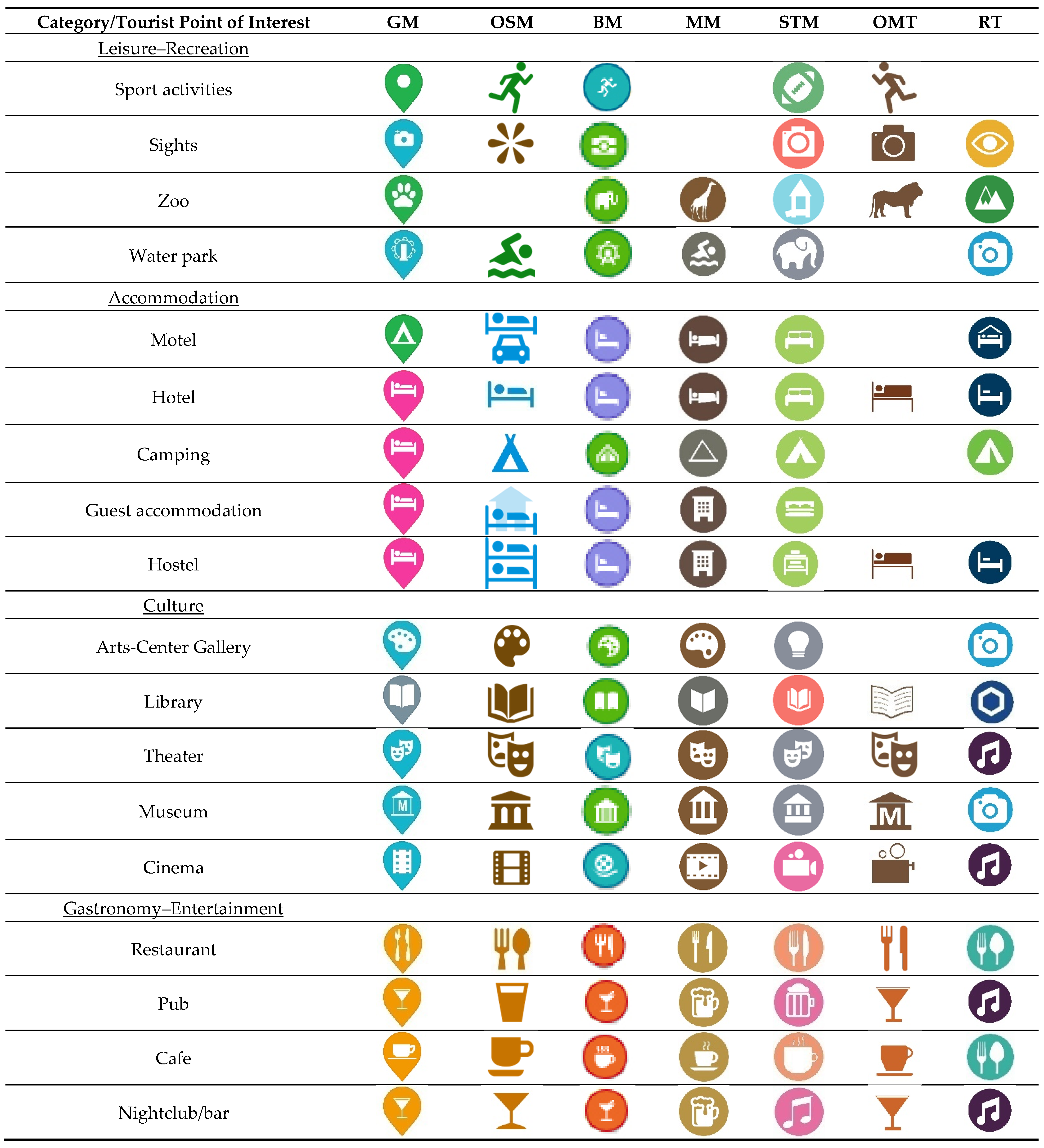
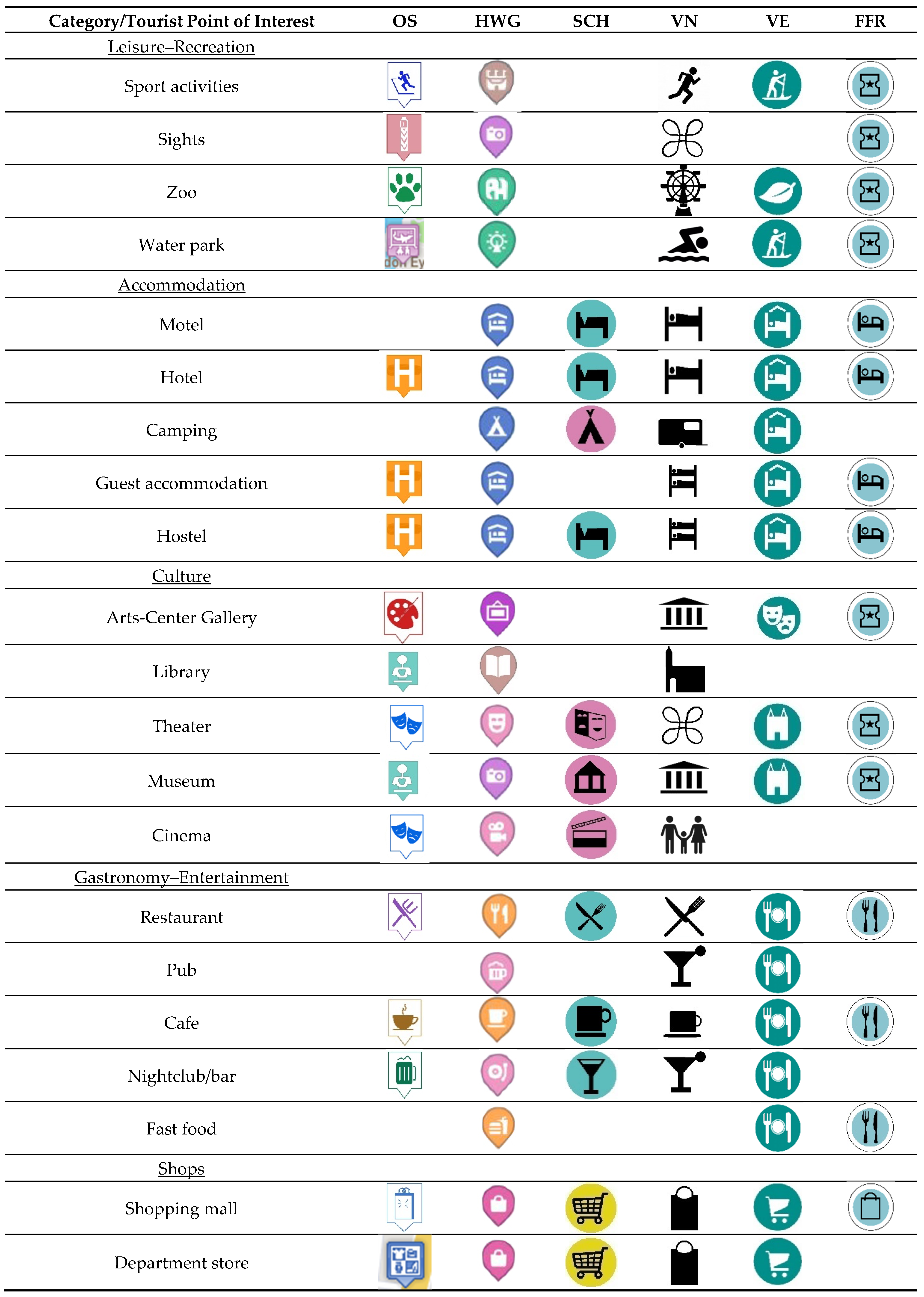
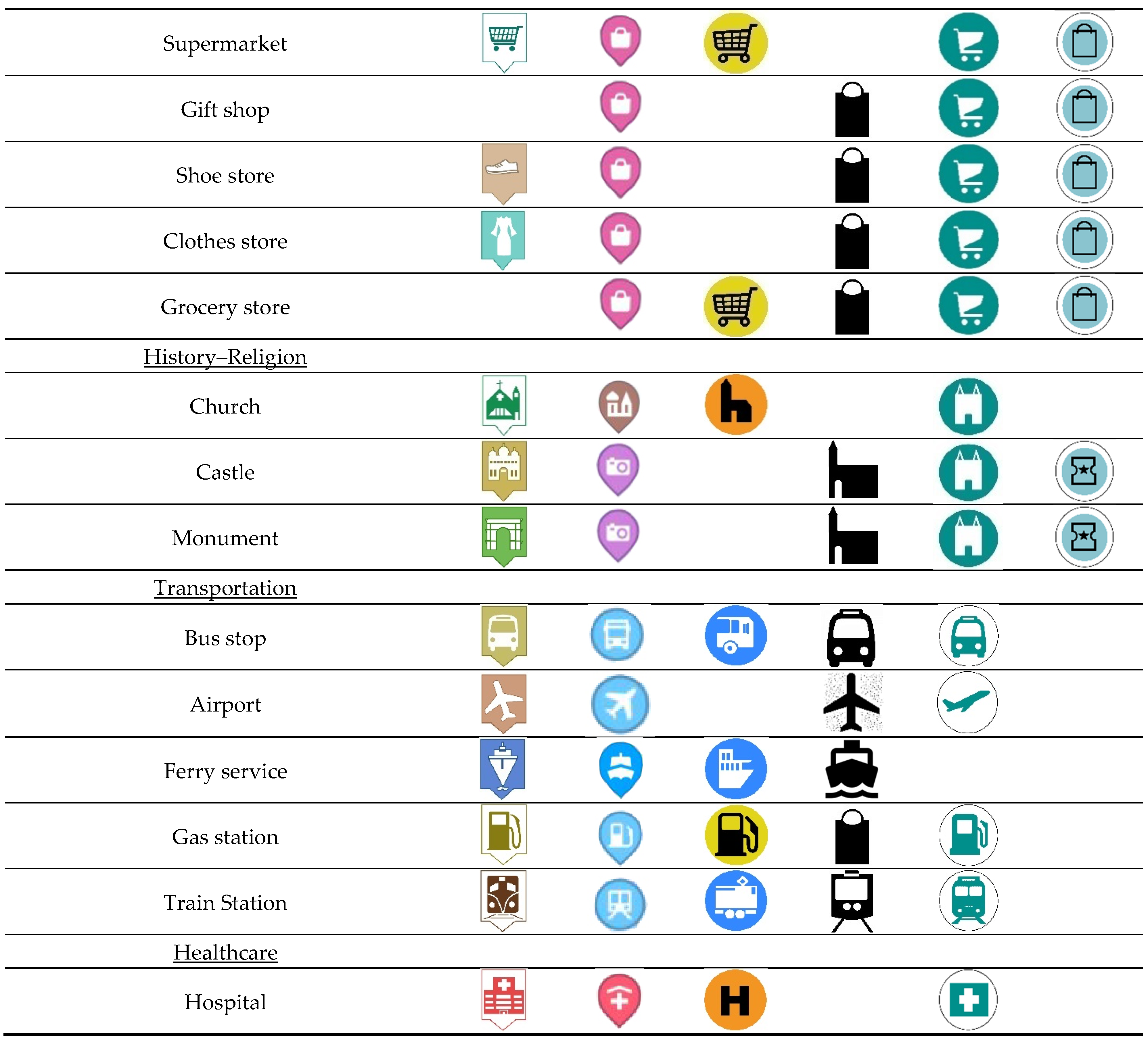
This research studied the design of tourist point symbols on web maps and apps. The aim was to investigate whether common cartographic practices are applied and whether the symbol is influenced by the POI it represents and/or by global design practices adopted by each provider. Symbols are described with a number of variables [45] (Table 3).
The first stage concerns the global analysis of symbols regardless of the map source. The sizes of symbols assure visibility and may support rapidity and ease in symbol spotting in websites and apps. Both qualities are considered important according to the bibliography [14]. Basic hue and frame background color are mainly blue. Although the blue color in traditional cartography mainly represents water bodies [55], it is also considered outside of cartography to be a strong but calm color that expands the space around it [56]. Color preference studies have also proven that the blue color is appealing [37]. In contrast, warm colors such as red, pink and yellow that exhibit small percentages are more efficient at communicating danger [57]. This is consistent with people’s preference studies that implied that yellow is the least preferred [58]. However, yellow is proposed by Medynska-Gulij as a frame background color [9]. Most symbols have a frame outline (62.8%) which is white (24.1%). This tactic provides a clear boundary and distinguishes the symbol from the map background. The white color stands out clearly and is considered an effective boundary color. Most symbols have a circular frame shape (65.1%) which is considered compact and visually stable. Circles use map space efficiently, are easy to construct and are preferred by users over other shapes. Moreover, they are compact and stable, as the eye does not wander too much over them [59]. Most symbols are not pinned (62.1%). The famous pin symbol introduced by Google Maps is only adopted by Here We Go. The use of a frame outline is also advised for the design of pictographic map symbols by a number of cartographers [9,11,14,17], but a square frame is preferred. Most symbols have a frame background (77.2%), which is also advised to help symbols pop up [11], and white is the dominant value for pictogram color (60.5%), which provides a good figure–ground relationship [17] with most background colors. Regarding the pictogram shape, the category “item” is the most frequent (61.8%). Items have high concreteness [17,22] and are therefore understandable, familiar and easy to locate on the map. Most visual variables are applied to symbol design in accordance with cartographic practices. This is consistent with a review of online map services from a cartographic perspective, which found that online map services generally conform to cartographic principles and traditional practices [60].
Some tendencies in symbol design have been noted, but it is worth investigating whether they are followed at the map level as well. Therefore, variable values are also examined for each map. The majority of the maps adopt the general tendencies in point symbol design. Blue is the most frequent basic hue in five of thirteen maps. Seven of thirteen maps use a frame outline in their symbols exclusively. Three of seven maps that exclusively use a frame outline adopt a white or black one. Four maps use mainly the circle as a frame shape. Nine out of thirteen maps have a frame background. Regarding the pictogram color, six maps use only one color for all the symbols, i.e., black for “Visit France” and “Visit Norway” and white for “Google Maps”, ”Bing Maps”, “Maps.me”, and “Here We Go”. Finally, “item” is the most popular pictogram shape. Four maps use two colors in pictograms, mostly white or black and one more.
The use of the frame outline (Table A11), the frame background (Table A15) and a specific frame shape (
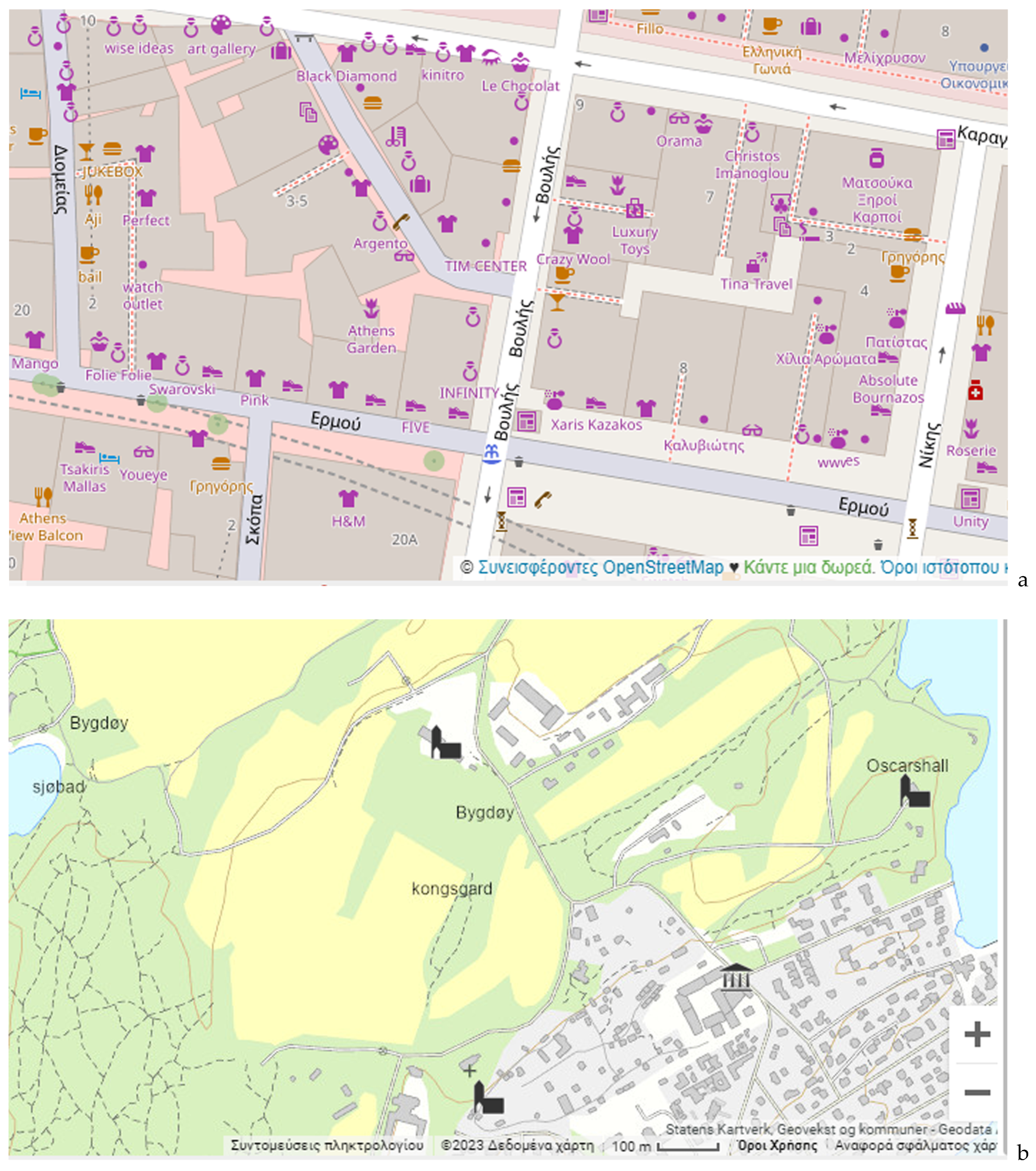
Table A13) is characterized by consistency and homogeneity for all maps exhibiting values close to 100%. Pictogram color is also consistent in 6 out of 13 maps. Multicolor pictograms are used with no frame background in OSM and Offline Map and in Orange Smile with a frame background. However, color is well applied only in OSM as colors group pictograms in clusters that almost follow POI classification in categories (Figure A1). The rest of the variables are applied differently for each symbol and do not support data representation. The lack of homogeneity is due to the fact that symbols are not designed as an entire set [17]. Ten maps (10/13), e.g., Bing Maps, Google Maps, Orange Smile, Here We Go and Visit Estonia, use more than one color for the frame outline. The variable symbol size in some maps questions the equal importance of all POIs (Table A19 and Table A20). Most maps (12/13) use a variety of frame background colors. In some maps, one color is used for one category (i.e., Google Maps: orange in gastronomy–entertainment, Bing Maps: red in gastronomy–entertainment, Maps.me: brown in gastronomy–entertainment and purple in shops, Sygic Travel Maps: green in accommodation and orange in shops), but this is not systematic. In most cases, colors are used randomly, are unrelated to the thematic categories and only confuse the reader. The only consistent choice is the use of red for the hospital symbol in all maps except Visit Estonia, which has a two-color symbol set (green and white). A specific frame background color or a frame outline color could be used in portraying POI categories.
A general study of symbols, even at the map level, is not sufficient since the semantics of symbols often influence their design. For example, accommodation is usually depicted with a bed, while a bag may also represent a shopping mall or grocery store. The third analysis addresses such issues, focusing on the pictogram shape. Only Open Street Map uses unique pictograms for all symbols and provides distinctiveness in the symbol set [22]. In contrast, France.fr uses all the pictograms more than once. If a tourist map aims to be detailed and clear, using unique pictograms in the symbols is more effective. Especially if the symbols belong to the same thematic category, e.g., for accommodation, the user should be able to distinguish the hotel from the hostel. At the thematic categories (e.g., leisure–recreation, accommodation, culture) level, the uniqueness of the symbols may diminish, as the POIs become similar. Characteristic examples are the accommodation category with a low share of 27% (hotel, hostel, motel etc.) and the leisure category with a high share of 80% (water park, zoo symbols, etc.). Finally, specific pictograms dominate in most popular symbols that exhibit a visual similarity such as bed for motel, cutlery for restaurant and bus for bus stop. In contrast, the less common POIs in the maps do not share a common pictogram in their symbols.
Two maps, both from National Tourism Organizations, i.e., “France.fr” and “Visit Norway”, have a specific symbol design strategy (e.g., standard pictogram color, frame shape, frame outline, frame background color and size) that makes their symbols homogeneous and recognizable. However, “Visit Norway” lags in figure–ground contrast due to the frame background absence and “France.fr” in pictogram uniqueness (0%) as four pictograms are used multiple times. As a result, it becomes obvious that one cannot judge symbol design without taking into account the pictograms’ uniqueness and representativity. On the contrary, OSM scores best in pictogram uniqueness (100%) and use of color in grouping symbols to thematic categories. It can thus be considered as the best in information transmission. As a side note, OSM is the only map that has a legend and a detailed documentation of the map features represented by symbols [61]. It can be concluded that a good symbol design requires the existence of a cartographic data ontology.
To sum up, it seems that basic hue, frame outline, frame outline color, frame shape, frame pinned and pictogram color are considered as global decisions in symbol design, while, on the contrary, the pictogram shape depends more on the symbol semantics as expected. At the same time, it should be noted that in the present study, the frame background color generally seems to vary to a greater extent than the frame shape or the frame outline’s presence, proving the importance of color in the visualization of point symbols in tourist maps. However, except OSM, the color in frame background, frame outline or in the pictogram is not used to represent qualitative aspects such as thematic categories or POI identity. In the studied maps, symbol design better addresses general map design issues such as symbol figure–ground, legibility and visual contrast that can be decided for all point symbols at a global level. In contrast, decisions at symbol level such as the shape of the pictogram in terms of uniqueness and semantics and the frame background color are less successful. POI classification in categories is highly neglected information in symbol representation.
Appropriate use, recognition and interpretation of symbols will strengthen online tourist maps in an era when travel to unfamiliar places is easier and more frequent than ever before. After all, maps are essential, and planning a trip without a tourist map is like building a house without drawings [62]. Symbol standardization in tourist maps as in topographic maps can be considered as solution [9,15]. First Ratajski (1971) [19] has proposed a standardized set of symbols for economic maps and school atlases. Standardization is also related to familiarity, which is also a decisive factor [12]. Standardization can be implemented through an iterative collaboration process [63]. Nowadays, symbol standardization is a topical issue in crisis maps [27,64]. However, in the case of tourist maps, it is the original graphic design that makes them attractive for the users [9]. A possible solution is the creation of templates or tools that can guide the cartographer in designing symbols for a tourist map that fully express semantics with visual variables and are in accordance with cartographic best practices and guidelines. This guidance would support symbol design without excluding creativity and innovation. In the future, research on pictorial point symbol design for tourist maps should focus on the user aspect. Information on how map users interpret and best understand symbols [65,66] is essential to improving symbol design, especially user’s preferences of pictograms.

Author Contributions

Conceptualization, Eirini Nektaria Konstantinou, Andriani Skopeliti and Byron Nakos; Formal analysis, Eirini Nektaria Konstantinou; Methodology, Eirini Nektaria Konstantinou, Andriani Skopeliti and Byron Nakos; Supervision, Andriani Skopeliti and Byron Nakos; Writing—original draft, Eirini Nektaria Konstantinou, Andriani Skopeliti and Byron Nakos; Writing—review and editing, Eirini Nektaria Konstantinou, Andriani Skopeliti and Byron Nakos. All authors have read and agreed to the published version of the manuscript.

Funding

Eirini Nektaria Konstantinou is funded with a Doctoral fellowship by the Research Committee of the National Technical University of Athens, Greece (grant number 65219100).

Data Availability Statement

Data is contained within the article in Figure A1 and Figure A2.

Conflicts of Interest

The authors declare no conflict of interest.

Appendix A

Figure A1. Maps, tourist POIs and symbols.
Ijgi 12 00254 g0a1aIjgi 12 00254 g0a1b
Figure A2. Maps, tourist POIs and symbols.
Ijgi 12 00254 g0a2aIjgi 12 00254 g0a2b

Appendix B

Table A1. Frequencies and percentages (%) of basic hue.
FrequencyPercentage (%)
Black (BL)338.5
Blue (BL)10326.4
Brown (BR)5313.6
Green (GR)5714.6
Gray (GY)123.1
Orange (OR)4411.3
Pink (PK)266.7
Purple (PR)4210.8
Red (RD)153.8
Yellow (YL)51.3
Table A2. Frequencies and percentages (%) of frame outline.
FrequencyPercentage (%)
YES24562.8
NO14537.2
Table A3. Frequencies and percentages (%) of frame outline color.
FrequencyPercentage (%)
Black (BL)3012.2
Blue (BL)3715.1
Brown (BR)104.1
Green (GR)4217.1
Gray (GY)20.8
Orange (OR)114.5
Pink (PK)197.8
Purple (PR)134.9
Red (RD)145.7
White (WH)5924.1
Table A4. Frequencies and percentages (%) of frame shape.
FrequencyPercentage (%)
Speech bubble299.6
Circle19665.1
Pin6421.3
Square124
Table A5. And percentages (%) of frame pinned.
FrequencyPercentage (%)
YES11437.9
NO18762.1
Table A6. Frequencies and percentages (%) of frame background.
FrequencyPercentage (%)
YES30177.2
NO8922.8
Table A7. Frequencies and percentages (%) of frame background color.
FrequencyPercentage (%)
Blue (BL)9230.6
Brown (BR)227.3
Green (GR)4615.3
Gray (GY)124
Orange (OR)3411.3
Pink (PK)268.6
Purple (PR)3110.3
Red (RD)144.7
White (WH)196.3
Yellow (YL)51.7
Table A8. Frequencies and percentages (%) of pictogram color.
FrequencyPercentage (%)
Black (BK)7218.5
Blue (BL)153.8
Brown (BR)317.9
Green (GR)123.1
Purple (PR)122.9
Red (RD)20.5
White (WH)23660.5
Orange (OR)102.6
Table A9. Frequencies and percentages (%) of pictogram shape.
FrequencyPercentage (%)
Abstract design (ABST)348.7
Activities (ACTIV)112.8
Building (BUILD)4210.8
Edible items (EDBL)71.8
Item (ITEM)24161.8
Alphabet letters (LETR)61.5
Nature (NTR)92.3
Transportation (TRSP)4010.2
Table A10. Percentages (%) of basic hue for each map.
MapBlackBlueBrownGreenGrayOrangePinkPurpleRedYellow
GM0530961512330
OSM02225601602830
BM02102332602600
MM01248015002130
STM6170171128901125
OMT0116800180300
RT0500808015190
OS03124170107370
HWG0148308372930
SCH04500010200025
VN100000000000
VE000100000000
FFR010000000000
Table A11. Percentages (%) of frame outline for each map.
MapYESNO
GM1000
OSM397
BM946
MM1000
STM694
OMT0100
RT1000
OS1000
HWG1000
SCH0100
VN0100
VE1000
FFR1000
Table A12. Percentages (%) of frame outline color for each map.
MapBlackBlueBrownGreenGrayOrangePinkPurpleRedWhite
GM0530961512330
OSM0000000030
BM31502400026260
MM000000000100
STM6000000000
OMT0000000000
RT000000000100
OS03124170107370
HWG0149009372930
SCH0000000000
VN0000000000
VE160084000000
FFR100000000000
Table A13. Percentages (%) frame shape for each map.
MapSpeech BubbleCirclePinSquare
GM00946
OSM0300
BM088012
MM088012
STM010000
OMT0007
RT09600
OS100000
HWG09910
SCH010000
VN0000
VE010000
FFR010000
Table A14. Percentages (%) of frame pinned for each map.
MapYESNO
GM946
OSM00
BM0100
MM0100
STM0100
OMT00
RT0100
OS1000
HWG919
SCH0100
VN00
VE0100
FFR0100
Table A15. Percentages (%) of frame background for each map.
MapYESNO
GM1000
OSM397
BM1000
MM1000
STM1000
OMT793
RT991
OS1000
HWG1000
SCH1000
VN0100
VE1000
FFR1000
Table A16. Percentages (%) of frame background color for each map.
MapBlueBrownGreenGrayOrangePinkPurpleRedWhiteYellow
GM5309615123300
OSM0000000300
BM20023326026000
MM12490150021300
STM170171129901160
OMT7000000000
RT4607080151900
OS28147010703310
HWG1490093729300
SCH45000102000025
VN0000000000
VE008400000190
FFR100000000000
Table A17. Percentages (%) of pictogram color for each map.
MapBlackBlueBrownGreenGrayPinkPurpleRedWhiteOrange
GM000000001000
OSM02225600280316
BM000000001000
MM000000001000
STM60000000940
OMT0116800040018
RT04000000960
OS01414170077410
HWG000000001000
SCH850000000150
VN100000000000
VE000160000840
FFR100000000000
Table A18. Percentages (%) of pictogram shape for each map.
MapABSTACTIVBUILDEDBLITEMLETRNTRTRSP
GM6012068339
OSM969663006
BM0390713312
MM63156550312
STM60143630311
OMT7444680411
RT3500058044
OS331704810314
HWG3093710311
SCH00100705015
VN610190480016
VE36160610310
FFR4100059000
Table A19. Percentages (%) of mobile size (mm) for each map.
Map23456
GM0001000
OSM1684000
BM309700
MM0100000
STM0100000
OMT1000000
RT0100000
OS1000000
HWG0109000
SCH0010000
VN0484840
VE039700
FFR0000100
Table A20. Percentages (%) of desktop size (mm) for each map.
Map3455.56789
GM0000000100
OSM1684000000
BM306910000
MM0120066000
STM0010000000
OMT00000000
RT1000000000
OS0000000100
HWG00000000
SCH0010000000
VN019290421000
VE0000100000
FFR0000000100

References

  1. Yan, L.; Lee, M.Y. Are tourists satisfied with the map at hand? Curr. Issues Tour. 2015, 18, 1048–1058. [Google Scholar] [CrossRef]
  2. McCleary, G.F., Jr. Confronting the tourist map: Divergent purposes and disparate users. In Proceedings of the International Cartographic Conference, Santiago, Chile, 15–21 December 2009. [Google Scholar]
  3. Kajoch, A. Problemy szaty graficznej map turystycznych. In Problemy Kartografii Turystycznej; Trafas, K., Ed.; Materiały Ogólnopolskich Konferencji Kartograficznych, T. 2: Krakow, Poland, 1973; pp. 67–69. [Google Scholar]
  4. Dodds, R.; Joppe, M. Promoting urban green tourism: The development of the other map of Toronto. J. Vacat. Mark. 2001, 7, 261–267. [Google Scholar] [CrossRef]
  5. Pasławski, J. Wprowadzenie do Kartografii i Topografii; Wrocław Nowa Era: Warsaw, Poland, 2010. [Google Scholar]
  6. Guan, S.S.; Hsieh, Y.J. Evaluation of the signs on travel map. J. Des. 2000, 5, 63–74. [Google Scholar]
  7. Bailey, H.; Smaldone, D.; Elmes, G.; Burns, R. Geointerpretation: The interpretive potential of maps. J. Interpret. Res. 2007, 12, 45–59. [Google Scholar] [CrossRef]
  8. Grant, L.A.; Keller, C.P. Content and design of Canadian provincial travel maps. Cartogr. Int. J. Geogr. Inf. Geovisualization 1999, 36, 51–62. [Google Scholar] [CrossRef]
  9. Medynska-Gulij, B. Point Symbols: Investigating Principles and Originality in Cartographic Design. Cartogr. J. 2008, 45, 62–67. [Google Scholar] [CrossRef]
  10. Halik, L.; Medyńska-Gulij, B. The Differentiation of Point Symbols using Selected Visual Variables in the Mobile Augmented Reality System. Cartogr. J. 2017, 54, 147–156. [Google Scholar] [CrossRef]
  11. Forest, D.; Castner, H.W. The design and perception of point symbols for touristic maps. Cartogr. J. 1985, 22, 11–19. [Google Scholar] [CrossRef]
  12. Clarke, L.M. An experimental investigation of the communicative efficiency of point symbols on tourist maps. Cartogr. J. 1989, 26, 105–110. [Google Scholar] [CrossRef]
  13. Leung, L.F.; Li, Z. Experimental Evaluation of the Effectiveness of Graphic Symbols on Tourist Maps. Cartography 2002, 31, 11–20. [Google Scholar] [CrossRef]
  14. Morrison, C.; Forrest, D. A study of point symbol design for computer based large scale tourist mapping. Cartogr. J. 1995, 32, 126–136. [Google Scholar] [CrossRef]
  15. Gerber, R.; Burden, P.; Stanton, G. Development of public information symbols for tourism and recreational mapping. Cartogr. J. 1990, 27, 92–103. [Google Scholar] [CrossRef]
  16. Castaldini, D.; Valdati, J.; Ilies, D.C.; Chiriac, C.; Bertogna, I. Geo-tourist map of the natural reserve of Salse di Nirano (Modena Apennines, northern Italy). Ital. J. Quat. Sci. 2005, 18, 245–255. [Google Scholar]
  17. Stevens, J.E.; Robinson, A.C.; MacEachren, A.M. Designing Map Symbols for Mobile Devices: Challenges, Best Practices, and the Utilization of Skeuomorphism. In Proceedings of the 26th International Cartographic Conference, Dresden, Germany, 25–30 August 2013. [Google Scholar]
  18. Dos Santos Pires, M.I.; Sluter, C.R.; Veiga, L.A.K.; Garcia, L.S. Analysis of the cartographic symbols of a pocket PC tourist map. In Proceedings of the IADIS International Conference on WWW/Internet, Vila Real, Portugal, 5–8 October 2007. [Google Scholar]
  19. Ratajski, L. Metodyka Kartografii Społeczno-Gospodarczej; Polskie Przedsiębiorstwo Wydawnictw Kartograficznych: Warszawa, Poland, 1973. [Google Scholar]
  20. MacEachren, A.M. How Maps Work: Representation, Visualization and Design; Guilford Press: New York, NY, USA, 1995. [Google Scholar]
  21. Keates, J.S. Understanding Maps, 2nd ed.; Longman: London, UK, 1996. [Google Scholar]
  22. Korpi, H.J.; Ahonen-Rainio, P. Design Guidelines for Pictographic Symbols -Evidence from Symbols Designed by Students. In Proceedings of the Conference Paper Eurocarto, Vienna, Austria, 10–12 November 2015. [Google Scholar]
  23. Nakamura, C.; Zeng-Treitler, Q. A Taxonomy of Representation Strategies in Iconic Communication. Int. J. Hum.-Comput. Stud. 2012, 70, 535–551. [Google Scholar] [CrossRef] [Green Version]
  24. McDougall, S.J.P.; Curry, M.B.; de Bruijn, O. Measuring symbol and icon characteristics: Norms for concreteness, complexity, meaningfulness, familiarity, and semantic distance for 239 symbols. Behav. Res. Methods Instrum. Comput. 1999, 31, 487. [Google Scholar] [CrossRef] [Green Version]
  25. McDougall, S.; de Bruijn, O.; Curry, M. Exploring the effects of icon characteristics on user performance: The role of concreteness, complexity and distinctiveness. J. Exp. Psychol. Appl. 2000, 6, 291–306. [Google Scholar] [CrossRef]
  26. Reppa, I.; McDougall, S. When the going gets tough the beautiful get going: Aesthetic appeal facilitates task performance. Psychon. Bull. Rev. 2015, 22, 1243–1254. [Google Scholar] [CrossRef] [Green Version]
  27. Divjak, A.K.; Apo, A.; Pribievi, B. Cartographic Symbology for Crisis Mapping: A Comparative Study. ISPRS Int. J. Geo Inf. 2020, 9, 142. [Google Scholar] [CrossRef] [Green Version]
  28. Wolff, J.S.; Wogalter, M.S. Comprehension of pictorial symbols: Effects of context and test method. J. Hum. Factors Ergon. Soc. 1998, 40, 173–186. [Google Scholar] [CrossRef] [Green Version]
  29. Medynska-Gulij, B. The Effect of Cartographic Content on Tourist Map Users. Cartography 2003, 3, 49–54. [Google Scholar] [CrossRef]
  30. Korpi, J.; Ahonen-Rainio, P. Cultural Constraints in the Design of Pictographic Symbols. Cartogr. J. 2010, 47, 351–359. [Google Scholar] [CrossRef]
  31. Korpi, J. Design Guidelines for Map Mashups Visualizing Point Data. Ph.D. Thesis, School of Engineering Department of Real Estate, Planning and Geoinformatics, Aalto University, Espoo, Finland, 2015. [Google Scholar]
  32. Bertin, J. Semiology of Graphics: Diagrams, Networks, Maps; University of Wisconsin Press: Madison, WI, USA, 1967/1983. [Google Scholar]
  33. Similar Web. Available online: https://www.similarweb.com/ (accessed on 29 May 2023).
  34. Gartner, G. About the Quality of Maps. Cartogr. Perspect. 1998, 30, 38–46. [Google Scholar] [CrossRef]
  35. Law, R. Internet and Tourism–Part XXIX: Google Maps. J. Travel Tour. Mark. 2010, 27, 645–647. [Google Scholar] [CrossRef]
  36. Stanton, G. Public Information Symbol Library For Tourism and Recreational Mapping.Brisbane: Australian Key For Land Information Studies; Queensland University Of Technology: Brisbane, Australia, 1989. [Google Scholar]
  37. Slocum, T.A.; McMaster, R.B.; Kessler, F.C.; Howard, H.H. Thematic Cartography and Geovisualization, 3rd ed.; Pearson Education LTD.: London, UK, 2010. [Google Scholar]
  38. Morrison, J.L. A theoretical framework for cartographic generalization with the emphasis on the process of symbolization. Int. Yearb. Cartogr. 1974, 14, 115–127. [Google Scholar]
  39. DiBiase, D.; MacEachren, A.M.; Krygier, J.B.; Reeves, C. Animation and the role of map design in scientific visualization. Cartogr. Geogr. Inf. Syst. 1992, 19, 201–214. [Google Scholar] [CrossRef]
  40. Treisman, A. Preattentive processing in vision. Comput. Vis. Graph. Image Process. 1985, 31, 156–177. [Google Scholar] [CrossRef]
  41. Sluter, R.S. New theoretical research trends in cartography. Rev. Bras. Cartogr. 2001, 53, 29–37. [Google Scholar] [CrossRef]
  42. Halik, Ł. The analysis of visual variables for use in the cartographic design of point symbols for mobile Augmented Reality applications. Geod. Cartogr. 2012, 61, 19–30. [Google Scholar] [CrossRef] [Green Version]
  43. Horbiński, T.; Zagata, K. Map Symbols in Video Games: The Example of “Valheim”. Cartogr. Geogr. Inf. 2021, 71, 269–283. [Google Scholar] [CrossRef]
  44. Divjak, K.A.; Pribičević, B.; Đapo, A. Comparative Analysis of Taxonomy, Standardisation, and Availability of Cartographic Symbol sets for Crisis Mapping. In Proceeding of the International Archives of the Photogrammetry, Remote Sensing and Spatial Information Sciences, Prague, Czech Republic, 3–6 September 2019. [Google Scholar]
  45. Konstantinou, E.N.; Skopeliti, A.; Nakos, B. Analysis of Point Symbols used in Online General Purpose and Tourist Maps. In Proceedings of the EuroCarto, Vienna, Austria, 19–21 September 2022. [Google Scholar]
  46. Buckley, A. Design Principles for Cartography. ArcGIS Resources Blog. Available online: https://www.esri.com/arcgis-blog/products/arcgis-pro/mapping/design-principles-for-cartography/ (accessed on 28 March 2023).
  47. Bell, S. Map Icon Design. In The Geographic Information Science & Technology Body of Knowledge, 1st Quarter 2020 Edition; Wilson, J.P., Ed.; University Consortium for Geographic Information Science: New Haven, CT, USA, 2020. [Google Scholar]
  48. AlHosani, N.M. The Perceptual Interaction of Simple and Complex Point Symbol Shapes and Background Textures in Visual Search on Tourist Maps. Ph.D. Thesis, University of Kansas, Lawrence, KS, USA, 2009. [Google Scholar]
  49. Christ, R.E. Review and Analysis of Color Coding Research for Visual Displays. Hum. Factors J. Hum. Factors Ergon. Soc. 1975, 17, 542–570. [Google Scholar] [CrossRef]
  50. Michaelidou, E.; Filippakopoulou, V.; Nakos, B.; Petropoulou, A. Designing Point Map Symbols: The effect of preattentive attributes of shape. In Proceedings of the International Cartographic Conference, A Coruña, Spain, 16 July 2005. [Google Scholar]
  51. Jamovi. Available online: https://www.jamovi.org/ (accessed on 28 March 2023).
  52. Brown, A.; Emmer, Ν.; van den Worm, J. Cartographic Design and Production in the Internet Era: The Example of Tourist Web Maps. Cartogr. J. 2001, 38, 61–72. [Google Scholar] [CrossRef]
  53. Tourist Signs. Available online: https://en.wikipedia.org/wiki/Tourist_sign (accessed on 29 May 2023).
  54. Road Signs. Available online: https://mutcd.fhwa.dot.gov/services/publications/fhwaop02084/index.htm (accessed on 29 May 2023).
  55. Robinson, A.H.; Morrison, J.L.; Muehrcke, P.C.; Kimerling, A.J.; Guptill, S.C. Elements of Cartography; John Wiley& Sons: New York, NY, USA, 1995. [Google Scholar]
  56. Blue Color Meaning: The Color Blue Symbolizes Trust and Loyalty. Available online: https://www.color-meanings.com/blue-color-meaning-the-color-blue/ (accessed on 26 March 2023).
  57. Engeset, R.V.; Pfuhl, G.; Orten, C.; Hendrikx, J.; Hetland, A. Colours and maps for communicating natural hazards to users with and without colour vision deficiency. Int. J. Disaster Risk Reduct. 2022, 76, 103034. [Google Scholar] [CrossRef]
  58. McManus, I.C.; Jones, A.L.; Cottrell, J. The aesthetics of colour. Perception 1981, 10, 651–666. [Google Scholar] [CrossRef]
  59. Meihoefer, H.J. The utility of the circle as an effective cartographic symbol. Can. Cartogr. 1969, 6, 105–117. [Google Scholar] [CrossRef]
  60. Skopeliti, A.; Stamou, L. Online Map Services: Contemporary Cartography or a New Cartographic Culture? ISPRS Int. J. Geo-Inf. 2019, 8, 215. [Google Scholar] [CrossRef] [Green Version]
  61. OSM Features. Available online: https://wiki.openstreetmap.org/wiki/Map_features (accessed on 29 May 2023).
  62. Jenkins, M. The Hard Way: Stories of Danger, Survival, and the Soul of Adventure; Simon & Schuster: New York, NY, USA, 2003; p. 13. [Google Scholar]
  63. Robinson, A.C.; Roth, R.E.; Blanford, J.; Pezanowski, S.; MacEachren, A.M. Developing map symbol standards through an iterative collaboration process. Environ. Plan. B Plan. Des. 2012, 39, 1034–1048. [Google Scholar] [CrossRef]
  64. Kostelnick, J.C.; Hoeniges, L.C. Map symbols for crisis mapping: Challenges and prospects. Cartogr. J. 2019, 56, 59–72. [Google Scholar] [CrossRef]
  65. Nivala, A.-M.; Sarjakoski, L.T. Adapting map symbols for mobile users. In Proceedings of the International Cartographic Conference, A Coruña, Spain, 16 July 2005; pp. 9–16. [Google Scholar]
  66. Keskin, M.; Krassanakis, V.; Çöltekin, A. Visual Attention and Recognition Differences Based on Expertise in a Map Reading and Memorability Study. ISPRS Int. J. Geo-Inf. 2023, 12, 21. [Google Scholar] [CrossRef]
Figure 1. Analysis of the point symbol “castle” from Here We Go map.
Ijgi 12 00254 g001
Figure 2. Examples of maps used in the study: (a) OSM, (b) Visit Norway.
Ijgi 12 00254 g002
Figure 3. Percentages (%) of basic hue.
Ijgi 12 00254 g003
Figure 4. Percentages (%) of frame outline color.
Ijgi 12 00254 g004
Figure 5. Percentages (%) of frame shape.
Ijgi 12 00254 g005
Figure 6. Percentages (%) of frame background color.
Ijgi 12 00254 g006
Figure 7. Percentages (%) of pictogram color.
Ijgi 12 00254 g007
Figure 8. Percentages (%) of pictogram shape.
Ijgi 12 00254 g008
Figure 9. Percentages (%) of basic hue for each map.
Ijgi 12 00254 g009
Figure 10. Percentages (%) of frame outline for each map.
Ijgi 12 00254 g010
Figure 11. Percentages (%) of frame outline color for each map.
Ijgi 12 00254 g011
Figure 12. Percentages (%) of frame shape for each map.
Ijgi 12 00254 g012
Figure 13. Percentages (%) of frame pinned for each map.
Ijgi 12 00254 g013
Figure 14. Percentages (%) of frame background for each map.
Ijgi 12 00254 g014
Figure 15. Percentages (%) of frame background color for each map.
Ijgi 12 00254 g015
Figure 16. Percentages (%) of pictogram color for each map.
Ijgi 12 00254 g016
Figure 17. Percentages (%) of pictogram shape for each map.
Ijgi 12 00254 g017
Figure 18. Percentages (%) of mobile size.
Ijgi 12 00254 g018
Figure 19. Percentages (%) of desktop size.
Ijgi 12 00254 g019
Table 1. Selected maps.
MapTechnologyProviderType
Google Maps (GM)WebsitesMap companies or VGI initiativesGeneral
Open Street Map (OSM)
Bing Maps (BM)
Maps.me (MM)ApplicationsCompanies for travel and tourismTourist
Sygic Travel Maps (STM)
Offline Map and Travel Guide (OMT)
Roadtrippers (RT)
Orange Smile (OS)WebsitesCompanies for travel and tourismTourist
Here We Go (HWG)
Search.ch (SCH)
Visit Norway (VN)
Visit Estonia (VE)
France.fr (FFR)
WebsitesNational Tourism
Organizations
Tourist
Table 2. Categories and tourist POIs.
CategoryTourist POI
Leisure–Recreation
  • Sport activities
  • Water park
  • Sights
  • Zoo
Accommodation
5.
Camping
6.
Guest accommodation
7.
Hostel
8.
Hotel
9.
Motel
Culture
10.
Arts-center gallery
11.
Cinema
12.
Theater
13.
Library
14.
Museum
Gastronomy–Entertainment
15.
Café
16.
Fast food
17.
Bar
18.
Pub
19.
Restaurant
Shops
20.
Clothing store
21.
Department store
22.
Gift shop
23.
Grocery store
24.
Shoe store
25.
Shopping mall
26.
Supermarket
History–Religion
27.
Castle
28.
Church
29.
Monument
Transportation
30.
Airport
31.
Bus stop
32.
Ferry service
33.
Gas station
34.
Train station
Healthcare
35.
Hospital
Table 3. Point symbol description: variables, values and a short explanation.
VariableValuesExplanation
Basic HueBlack (BK), blue (BL), brown (BR), green (GR), gray (GY),
orange (OR), pink (PK), purple (PR), red (RD), yellow (YL)
The dominant color of the symbol
Size2–9 mmDesktop or mobile size depending on map source
Frame OutlineYes (1)/no (0)The closed contour of the symbol (exists or not)
Frame Outline ColorBlack (BK), blue (BL), brown (BR), green (GR), Gray (GY),
orange (OR), pink (PK), purple (PR), red (RD), yellow (YL)
The color of the closed contour
Frame ShapePin, circle, square, speech bubbleThe shape of the closed contour
Frame PinnedYes (1)/no (0)Whether the closed contour has an anchor point or not
Frame BackgroundYes (1)/no (0)Whether a background exists or not behind the pictogram
Frame Background ColorBlack (BK), blue (BL), brown (BR), green (GR), gray (GY), orange (OR), pink (PK), purple (PR), red (RD), yellow (YL)The color of the background
Pictogram ShapeAbstract design (ABST), alphabet letters (LETR), nature (NTR), building (BUILD), item (ITEM), activities (ACTIV), transportation (TRSP), edible items (EDBL)The form of the icon that exists within the frame
Pictogram ColorBlack (BK), blue (BL), brown (BR), green (GR), gray (GY),
orange (OR), pink (PK), purple (PR), red (RD), yellow (YL)
The color of the icon
Table 4. Tourist POIs and Maps.
MapPercentage of Tourist POIsNumber of Tourist POIs
Google Maps (GM)97% 34
Open Street Map (OSM)91%32
Bing Maps (BM)97%34
Maps.me (MM)94%33
Sygic Travel Maps (STM)100%35
Offline Map and Travel Guide (OMT)83%28
Roadtrippers (RT)69%26
Orange Smile (OS)83%29
Visit Norway (VN)89%31
Visit Estonia (VE)89%31
Here We Go (HWG)100%35
France.fr (FFR)66%22
Search.ch (SCH)60% 20
Table 5. Description of the “Camping” symbol for all maps.
Maps
GMOSMBMMMSTMRDVNVEHWGSCH
VariableIjgi 12 00254 i001Ijgi 12 00254 i002Ijgi 12 00254 i003Ijgi 12 00254 i004Ijgi 12 00254 i005Ijgi 12 00254 i006Ijgi 12 00254 i007Ijgi 12 00254 i008Ijgi 12 00254 i009Ijgi 12 00254 i010
Basic
Hue
GRBLGRGYGRGRBKGRBLPK
Desktop Size
(cm)
945.565346104
Mobile Size
(cm)
5343333491
Frame
Outline
YesNoYesYesNoYesNoNoYesNo
Frame
Outline
Color
GR-GRWH WH--PR-
Frame
Shape
Pin-CircleCircleCircleCircle-CirclePinCircle
Frame
Pinned
Yes-NoNoNoNo-NoYesNo
Frame
Background
YesNoYesYesYesYesNoYesYesYes
Frame
Background Color
GR-GRBRGRGR-BLPRPR
Pictogram ShapeItemItemItemItemItemItemTrspItemItemItem
Pictogram ColorWHBLWHWHWHWHBKWHWHBK
Table 6. Percentages (%) of unique pictograms for each map.
MapPercentage of Unique Pictograms (%)
Open Street Map100
Sygic Travel Maps89
Offline Map and Travel Guide82
Orange Smile76
Maps.me73
Search.ch59
Here We Go57
Google Maps56
Bing Maps50
Visit Norway29
Visit Estonia23
Roadtrippers11
Visit France0
Table 7. Percentages (%) of unique pictograms for each category.
General CategoryPercentage of Unique Pictograms (%)
Healthcare100
Transportation96
Leisure–Recreation80
Culture73
History–Religion70
Gastronomy–Entertainment57
Accommodation27
Shops21
Table 8. Percentages (%) of the most popular pictogram for each POI.
CategoryTourist Point of InterestMost Popular PictogramPercentage (%)Example of Pictogram
Leisure–RecreationSport activities Man doing activity64Ijgi 12 00254 i011
SightsCamera45Ijgi 12 00254 i012
ZooAnimal45Ijgi 12 00254 i013
Water park Man doing activity36Ijgi 12 00254 i014
AccommodationMotelBed100Ijgi 12 00254 i015
HotelBed96Ijgi 12 00254 i016
Camping Tent82Ijgi 12 00254 i017
Guest accommodationBed82Ijgi 12 00254 i018
HostelBed79Ijgi 12 00254 i019
CultureLibraryBook70Ijgi 12 00254 i020
TheaterTheater mask64Ijgi 12 00254 i021
MuseumBuilding 69Ijgi 12 00254 i022
CinemaFilm 33Ijgi 12 00254 i023
Gastronomy–EntertainmentRestaurantCutlery100Ijgi 12 00254 i024
PubGlass80Ijgi 12 00254 i025
CafeCup71Ijgi 12 00254 i026
Nightclub/barGlass57Ijgi 12 00254 i027
Fast foodCutlery54Ijgi 12 00254 i028
ShopsShopping mallShopping bag77Ijgi 12 00254 i029
Department storeShopping bag75Ijgi 12 00254 i030
SupermarketSupermarket trolley69Ijgi 12 00254 i031
Gift shopShopping bag50Ijgi 12 00254 i032
Shoe storeShoe 42Ijgi 12 00254 i033
Clothes storeClothes/Shopping bag 38Ijgi 12 00254 i034
Grocery storeSupermarket trolley38Ijgi 12 00254 i035
History–ReligionChurchChurch70Ijgi 12 00254 i036
CastleCastle60Ijgi 12 00254 i037
MonumentMonument40Ijgi 12 00254 i038
TransportationBus stopBus100Ijgi 12 00254 i039
AirportAirplane91Ijgi 12 00254 i040
Train stationTrain91Ijgi 12 00254 i041
Gas stationGasoline pump83Ijgi 12 00254 i042
Ferry serviceBoat73Ijgi 12 00254 i043
HealthcareHospitalCross58Ijgi 12 00254 i044
Disclaimer/Publisher’s Note: The statements, opinions and data contained in all publications are solely those of the individual author(s) and contributor(s) and not of MDPI and/or the editor(s). MDPI and/or the editor(s) disclaim responsibility for any injury to people or property resulting from any ideas, methods, instructions or products referred to in the content.

