Article

Online Map Services: Contemporary Cartography or a New Cartographic Culture?

Cartography Laboratory, School of Rural and Surveying Engineering, National Technical University of Athens, 9 Iroon Polytechniou, 15780 Zografou, Greece
*
Author to whom correspondence should be addressed.
ISPRS Int. J. Geo-Inf. 2019, 8(5), 215; https://doi.org/10.3390/ijgi8050215
Submission received: 28 March 2019 / Revised: 30 April 2019 / Accepted: 2 May 2019 / Published: 7 May 2019

Abstract

:
In this paper, online map services are reviewed from a cartographic point of view. The most popular online map services are selected based on worldwide website traffic data, provided by specialized sites, such as Similarweb, in terms of global coverage and popularity among users. Online map services are commented based on cartographic principles, conventions and traditional practices addressing topics, such as: Cartographic projection, orientation, scale, marginalia, content (thematic layers), symbology, generalization, annotation, color use and overall map design. Color schemes utilized in web maps are discussed in more detail, since based on studies concerning the selection of the preferable map by experts and laymen, color is undisputedly the most frequently mentioned factor. It can be stated that online map services generally adopt well-known cartographic practices, which are not always applied as expected. Moreover, suggestions for the improvement of online map services are made regarding cartographic projection, legend, content, symbolization, color, etc.

Graphical Abstract

1. Introduction

Nowadays, maps and geospatial data are used by the average web user on a daily basis. Web maps are published by National Mapping Agencies in geoportals (e.g., IGN—France), companies (e.g., Google), crowd sourcing initiatives (e.g., OpenStreetMap), etc. Online map services are widely used for locating places of interest, navigation, travel planning, real-time traffic information, education, etc., and even as base maps in map making. They provide worldwide coverage and are entrusted by people all around the world.
Online map services, which present to millions of web users a realistic view of the world, have immense influence. The way each provider collects, processes and presents geographic data to users, creates a competition between them and results in their continuous improvement. The ubiquity of online map services is related to the globalization of cartography: Never before in history have the same maps been utilized by people all around the world on a daily basis and for many different uses. The massive use of these maps raises a number of questions: “Are cartographic principles and traditional practices applied to online map services?”, “If not, do online map services create a new cartographic culture that will influence the way users read a map or what they expect from a map and as a result what will be the future of cartography?”, “Are the most popular online map services, in harmony with the maps based on cartographic principles?”. In order to answer these questions, the most popular online map services are selected, with respect to their popularity among users from around the world.
In the past, a number of studies have evaluated the usability of online map services [1,2,3]. A number of usability problems were identified [1] based on expert evaluations and user tests. It was concluded that maps were looking like they were designed to appear as paper maps. In addition to this, the fact that the scale bar showed only miles and the absence of a legend was commented. Concerning map visualization [1,3,4] a number of generalizations, color harmony, text placement and symbolization problems were detected. In this paper, the most popular online map services are reviewed from a cartographic point of view. Online map services are reviewed based on cartographic principles, conventions and traditional practices addressing topics, such as: Cartographic projection, orientation, scale, marginalia, content (thematic layers), symbology, generalization, annotation, color use and overall map design. Issues of interactivity and usability are out of the scope of this paper.
The remainder of this paper is organized into five sections. In Section 2, online map services and the ones that will be reviewed are presented. Section 3 reviews online map services based on important map elements and characteristics. Section 4 is devoted to the use of color which is dominant in web map design. Section 5 discusses the overall map design based on the online map services elements and characteristics analyzed in Section 3 and Section 4. Finally, in Section 6 conclusions from the review are summarized and improvements for online map services are proposed.

2. Popular Online Map Services

Online map services are nowadays the most popular source of geographic information for the average web user. They are also embedded in other websites to provide spatial information. Online map services publish maps with vector or raster data in conjunction with satellite images and provide a number of tools and utilities that support interactivity, such as change of scale (zoom level), area of interest selection (pan), information retrieval, navigation tools, etc. Online map services can have worldwide coverage, such as Google Maps, Here, Bing maps, MapQuest, OpenStreetMap, ViaMichelin, WikiMapia, Bhuvan, Yahoo! Maps, etc., or a partial coverage, such as Baidu Maps (China), 2gis.ru (Russia), Mapy.cz (Czech Republic), etc. Based on web traffic data provided by Similarweb (www.similarweb.com) under the category “reference maps”, one can be informed about the most popular online map services. Taking a closer look into traffic analysis for each one of them, it is evident that certain online map services, e.g., map.badu.com although they have a high ranking, they attract users from a specific country, e.g., China. Probably this is due to the fact that this country hosts the service. In order to ensure, that the online map services under review have worldwide popularity, those with a high ranking, global coverage and users from around the world are selected. A 40% threshold of visitors from a single country is set. According to web traffic data (as of November 2018), online map services that satisfy the above criteria and are reviewed in this paper are: Google maps, OpenStreetMap, Here maps and Wikimapia (Table 1).
A short description for each one of them follows:
  • Google Maps (https://www.google.com/maps): Google Maps are developed by Google. They offer satellite imagery, maps, 360° panoramic views of streets, real-time traffic conditions and route planning for traveling on foot, by car or public transportation. They appear in most smart phones as the default mapping application.
  • OpenStreetMap—OSM (https://www.openstreetmap.org): OpenStreetMap is a collaborative project that aims to create a free editable map of the world. The creation and growth of OSM have been motivated by high cost, restrictions on use or availability of geographic information across the world, and the advent of inexpensive portable satellite navigation devices. OSM is considered a prominent example of Volunteered Geographic Information (VGI). Furthermore, it provides the vector geographic data to create custom maps from scratch.
  • HERE Maps (https://wego.here.com): HERE is developed by HERE Technologies. Its roots date back to Navteq, which was acquired by Nokia. HERE Technologies sells or licenses mapping content along with navigation services and location solutions to Alpine, Garmin, BMW, Oracle and Amazon.com, etc. It provides location services for GIS and government clients and other providers, such as Microsoft Bing, Facebook and Yahoo! Maps.
  • Wikimapia (www.wikimapia.org): Wikimapia is a privatelyowned internet company that provides an open-content collaborative mapping project. Wikimapia implements an interactive web map aiming to mark and describe all geographical objects in the world.
Numerous third-party web maps are based on the above online map services. Based on them, users can easily integrate a map with their own features. According to Simiralweb traffic analysis, OpenStreetMap has raised two positions in ranking, which proves that the users trust VGI. HERE is the oldest service, initiated 25 years ago; Google Maps was founded 13 years later, whereas OSM and Wikimapia appeared in the early 2000s signaling the start of the VGI era. Google maps are the undisputable leader in the users’ choices. However, OSM is also a direct choice. Social networks are the main source for HERE. Google is mostly used in mobile devices, HERE in desktop computers and OSM and Wikimapia in both platforms.

3. Online Map Services Review

Despite recent advances in visualization, the map is still the most elegant and compact medium for displaying spatial data. The main role of the map is to communicate spatial information to the user, such as location, size, shape, pattern, distribution and relationships among spatial objects [5]. Designing a map is a complicated process. Initially, any map as an abstract representation of reality has a number of characteristics, such as spatial data to be portrayed, projection and datum, scale, generalization, annotation and symbolization that contribute to the result. Moreover, and according to good cartographic practices, in addition to the area portrayed, a map usually contains the following map elements [6]: Title and subtitle, legend, scale, frame (border) and neat line, orientation/graticule, data sources, credits and insets. After all, a map is judged by its overall appearance in terms of design, visual balance and graphic communication characteristics. As a result, when it comes to map reviews, all the above issues should be taken into consideration.
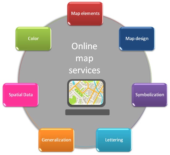
In this study, online map services review is divided into several parts. In the first part, map elements that are apparent to the map user are reviewed, such as geographic coverage, projection and datum, scale, marginalia, etc. Then, map characteristics, such as spatial data content, generalization, annotation and symbolization are reviewed in detail in separate subsections. Use of color, being a complex and dominant factor in map appearance, is discussed separately in Section 4. Finally, map design in terms of controlling factors and design principles is addressed in Section 5.
Maps provided by online map services can be considered as general reference maps. General reference maps are simple maps that portray important natural and man–made features. They are usually easy to read and understand. Wall maps, most maps found in atlases and road maps belong to this category. Medium scale general reference maps of land area that portray terrain with contour lines are called topographic maps. Therefore, criteria for topographic map design can be identified as a basis for the review and adjusted to online map services specific characteristics.
A cohesive list of quality rating criteria for multi scale topographic map design has been used to examine and evaluate maps onscreen at six scales from 1:24,000 to 1:1,000,000 [7]. Consequently, these criteria can be used for reviewing online map services that cover a similar range of scales and are displayed on the screen. These criteria [7] address the following issues: Consistency (vertical integration between layers), labeling (appearance, readability, positioning and generalization), symbolization (point, line and area symbol appearance, terrain appearance) and generalization (point, line and area feature generalization, terrain generalization). These criteria are compatible with the map characteristics, chosen for review in the first paragraph of this section. Furthermore, the spatial data and content completeness issue are also added, due to online map services particularities. The topographic map content is well defined, but this is not true for online map services.
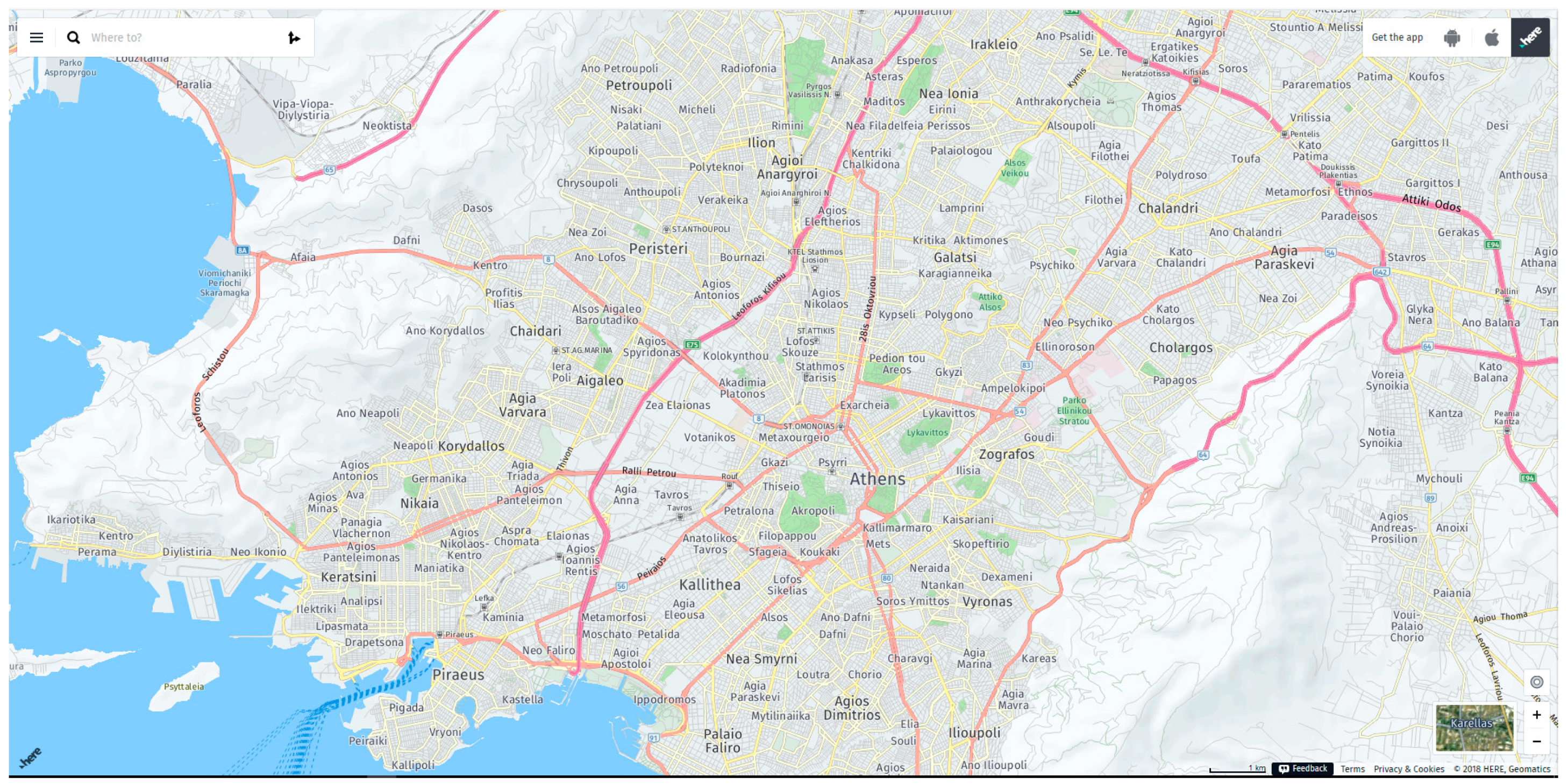
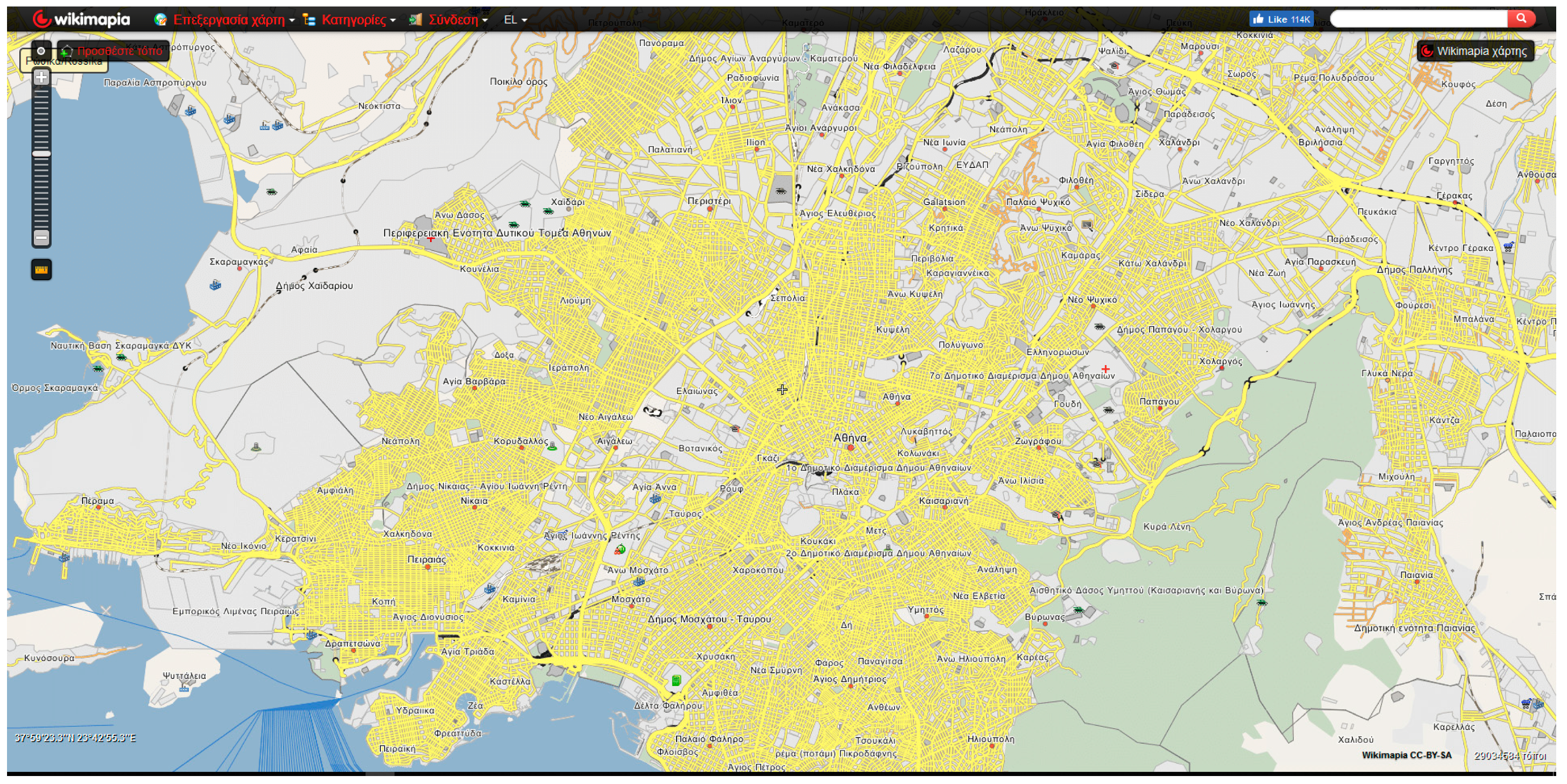
A study area around the city of Athens (Greece) (Figure A1, Figure A2, Figure A3, and Figure A4) was selected because it has specific properties that make it a representative case. It includes a variety of different areas that are portrayed on maps, such as rural and urban areas, mainland and islands, mountains and planes and the majority of the thematic layers that appear on general reference maps.

3.1. Map Elements

In this subsection, web map elements are discussed. Map elements include the geographic area covered, cartographic projection and datum, frame and neatline, orientation, scale, legend, title and subtitle, insets, credits and the resulting map layout.
Geographic area: On online map services, the user may select an area of interest and acquire a map. They provide global earth coverage with some restrictions explained in the next paragraph. As the map area varies upon user choice, it cannot be emphasized in the visual hierarchy.
Cartographic projection and datum: The coordinate reference system used by online map services is the WGS84 ellipsoid and a new version of the Mercator projection introduced by Google maps, called "Web Mercator". WGS84 is the right choice for global earth coverage and warrants compatibility to GNSS receivers. The Web Mercator projection causes significant area and distance deformations to the areas away from the Equator, so the Earth’s portrayal can be implemented up to 85° North. The use of a sphere instead of the ellipsoid and the spherical equations while the geographical coordinates refer to the ellipsoid, have a negative influence on conformality. This deformation is not noticeable in small scales but becomes apparent at larger scales. According to the National Geospatial–Intelligence Agency (NGA), an unacceptable risk to global safety of navigation activities and operations that require accurate and precise positioning and navigation information [8] is possible. While the Web Mercator is "good enough" for most web-based mapping tasks, it is not necessarily advantageous for the appropriate display of different geographic areas as one zooms in and out of a web map or changes map area [9]. These concerns were addressed, and the Adaptive Composite Map Projection was developed and suggested as an alternative to Web Mercator [10].
At the smallest scale supported, HERE and Wikimapia display a world map (zoom level 3) and OSM displays an annoying repetition of the world map in order to fill the screen (zoom level 0). Recently (2018), Google came up with a new update, which is only available on the desktop interface. At smaller scales, the Earth is displayed as a virtual globe which can be rotated and zoomed and the arctic regions that were not visible so far are displayed. It looks like a perspective projection is used, e.g., orthographic; however, to the authors’ knowledge there is no official documentation of the projection. Google virtual globe cannot be really entrusted without specific reference to the projection used for each zoom level.
Frame (border) and neatline: No neatline, bounding the detail of the map and separating it from marginal information, is shown. The frame (border) and the neatline coincide with the window of the browser. In paper maps, the border adds stability to map design as it separates the map elements from the rest of the page and constrains the map user’s attention. This role is now assigned to the window border with questionable results. Due to the lack of neatline, no information about the geographical coordinates of the mapped area borders is provided.
Orientation: Traditionally, a grid is shown at large, and medium scale maps and a graticule appears at small scale maps, providing orientation and positional information. Most maps, that do not use a grid or a graticule as those provided by online map services, offer some indication of orientation through a North arrow. If no indication is provided, North is assumed to be at the top of the map which is true when the Web Mercator projection is applied.
In case that the map reader is not familiar with the names shown on the map, the lack of graticule at small scale maps in conjunction with the absence of title and neatline, make it difficult if not impossible to perceive the geographic context of the map. A solution may be the reporting of the geographical coordinates of the map cursor. In Wikimapia, the geographical coordinates of the map center appear in the lower right part of the map. Since there is no reference to the map projection and the position of the cursor is reported in geographical coordinates, the novice user may consider that geographical coordinates can be portrayed on a plane (e.g., the screen) as such. Geographical coordinates of the map center are provided with one decimal digit in seconds. This means that the position is reported with precision which is not compatible with all Wikimapia map scales.
Scale: Online map services publish maps at a number of scales resulting from the zoom level selected by the user. The user is informed about the map scale through the graphical scale in Google, OSM and HERE. Graphical scale design is very poor. The scale appears on the lower part of the map and the user may not notice it, especially if the map background is vivid. The graphical scale is utilized traditionally only on large scale paper maps. On online map services, it is generally utilized, in order to assure that scale information adjusts to screen size and analysis and to depict projection deformation. The user is implicitly informed about the deformation caused by Web Mercator as he/she moves away from the Equator, since the graphic scale for the same zoom level changes as the latitude increases. Wikimapia does not provide a graphical scale but the zoom level information is descriptive, e.g., house, road, city, etc. This practice excludes any metric value from the map. On the contrary, although a distance measure tool is provided in Wikimapia and Google maps, distance measurements do not always correspond to true distances, due to great deformations away from the Equator.
The zoom level on web maps is an integer number from 0 (smallest scale) to 18 or greater (large scale). Each zoom level change alters the map scale by a factor of 2. Map scale depends on web map tiles, a hierarchical structure that relates the zoom level to the number of tiles utilized to portray an area. For example, for a 96 dpi screen resolution and tiles with 256 pixels, the scale ranges from 1:2257 on the Equator at zoom level 18 (zoom level—road) to 1: 591 658 710 at zoom level 0 (zoom level—world). Scales resulting from zoom levels and tiles do not comply with nominal map scales adopted in traditional cartography which are rather round numbers, e.g., 1: 2.500, 1:5.000, 1:50.000, etc., (especially in the metric system).
Legend: Previous studies have reported the absence of a legend on online map services [1]. Legends or keys are indispensable to most maps since they carry the symbols explanations and any map symbol that is not self—explanatory should be included [11]. Google, HERE and Wikimapia maps do not provide any legend. As a result, these maps can be used only for a general overview. Although some symbols are fairly intuitive and easy to understand, the information extracted about the descriptive attributes of the depicted features is inferential based on the users’ general knowledge and cannot be verified. Symbol meaning becomes more difficult when they express different categories of a certain feature type (e.g., Do types of roads at a nominal scale correspond to the motorway, dual carriageway, etc., or urban, rural, etc.? Do types of roads at an ordinal scale correspond to primary, secondary, tertiary, etc.?). Sometimes the user can acquire a brief description of a location or feature, but this functionality cannot replace the need for a clear map symbol explanation provided by a well-designed legend.
A map key is provided by OSM that adjusts to the map content in relation to the zoom level. However, the symbols included in the legend do not appear exactly as they look on the map, e.g., the width of road symbols is different (Figure 1a) and some symbols included in the legend do not appear in the specific map area (Figure 1b).
The lack of legend may question map credibility. It might make one think that the meaning of map symbols is intentionally left intuitive in order to escape liability issues. Traditionally, the map-using community expects cartographers to conduct their business in a professional manner. Errors, due to wrong symbol interpretation, may at best cause inconvenience to map users and in extreme cases contribute to false decisions, e.g., the wrong interpretation of road category can lead to a car accident because of speed.
Title—Subtitle and Inset: There is no title or subtitle and no insets are used. Map title [11] reveals the map theme and/or the area covered by the map. Although the lack of title may be justified for a general-purpose map, at the same time, it hides information about the area covered by the map. Inset maps are used to add areas that are far away from the main geographical area of the map or to enlarge a portion of the map. However, it is advised to use them cautiously and, if possible, try to avoid them. However, in cases of countries like France or Portugal, overseas areas traditionally appear in insets. Due to the lack of insets on online map services, it is impossible to portray the country and the overseas areas without adopting a scale smaller than the one needed for the mainland.
Credits: Online map services utilize their own data sources. Therefore, the provider is the map publisher. As a result, the selection of an online map provider corresponds to the selection of a specific geographic database and a specific “view” of the world since there are no specifications to be followed as in traditional cartography. For example, topographic maps produced by NMA all around the world have many similarities in terms of content, layout and symbolization. Additionally, the data collection date is reported on paper maps but not on online map services. However, geographic data portrayed on online map services are continuously updated and thus it can be considered as always up-to-date. No information about the cartographic projection or the geographic reference system is given as in printed maps. As a result, only the expert user is aware of this information or may look for it on the web. Information that appears on online map services includes copyright information (Google, OSM, HERE, Wikimapia), terms of usage (Google, HERE), communication/feedback (HERE, Google). A reference in regional settings in Google maps (e.g., country name) may confuse the map reader who may assume that this is the geographic area displayed on the map.
Map layout: The map body captures most part of the browser window. Credits always appear on the lower part of the map as footer. Other interactive tools that enhance the map user experience appear on the upper part of the browser window as a header, covering the whole window extend as in OSM (Figure A2) and Wikimapia (Figure A4) or part of it as in Google (Figure A1) and HERE (Figure A3). Additionally, navigation tools, such as zoom in, zoom out, pan, etc. are included. These tools are placed within the map area in a corner. Marginalia placement within the map frame is a common practice for thematic maps as well.
All the above, create a specific template that is applied in all maps published by an online map service. This is similar to the use of a specific layout by a map series and the adoption of its own cartographic style. Map series are usually produced by NMAs, e.g., topographic maps. They are used when an area, e.g., a country must be portrayed at a specific scale and thus must be spread over several sheets. These maps have the same scale, cover the same geographic extend, use the same database, the same symbols, etc., but they can also be used independently, as they have full marginalia. Maps by online map services can be considered as map series for a fixed zoom level as the geographic extent covered is also fixed for a specific device.
Practices followed by online map services regarding map elements are summarized and presented in comparison with traditional practices for paper maps in Table 2, along with the consequences of certain choices. It seems that online map services generally comply with traditional cartographic best practices and in the case where erroneous decisions are made, e.g., cartographic projection, legend inclusion, etc., it is possible to adopt the appropriate tactic. On the other hand, online map services interactivity and accessibility create a valuable cartographic application.

3.2. Spatial Data

General purpose maps portray both natural and man-made features, such as coastlines, lakes, rivers, boundaries, settlements, roads, rail lines and others. In this context, thematic layers that appear on online map services are discussed. Indicatively, zoom levels 13 and 14, which are comparable to scale 1:50.000 of a printed map, are considered. Scale 1:50.000 is the basic scale for NMAs and thus provides comprehensive data coverage. Additionally, medium scale maps constitute the more complicated case, as large-scale maps provide enough space to facilitate map design whereas small scale maps design is simplified by the severe generalization degree.
Thematic layers of each online map service are presented in Table 3. They all have more or less the same content. Differences appear in the portrayal of terrain and land use. Heterogeneous coverage is observed in Wikimapia, since thematic content in different areas at the same scale is not constant. Several areas are rather empty, due to deficient volunteer contribution and incompatibility is evident.
In order to comment on thematic layers completeness, the content of 1:50.000 scale topographic maps series was utilized. Compared to them, the majority of thematic layers are also portrayed on online map services (Table 3). However, there is a lack of a number of point layers, which are traditionally portrayed on topographic maps, such as elevation spots, springs/fountains/wells, churches/convents/chapels etc. Online map services give emphasis to the portrayal of information that is more helpful to the citizen or the tourist in location discovery, e.g., points of interest, such as museums, parks, touristic attractions, castles, art galleries, etc., transportation information, e.g., metro/bus/tram stops and stations or the map users special interests (e.g., Google My places). As a result, it can be concluded that online map services content is as rich as that of a topographic map and capable to serve the role of general reference maps.
Online map services should reconsider the portrayal of terrain, land use and sea area. The terrain is portrayed with shading in Google (upon user selection “Terrain” or at smaller scales) and HERE maps. Spot heights are depicted in OSM and no terrain information appears in Wikimapia. As a result, in Google and HERE, the user is generally informed about the terrain as needed. Especially for OSM, partial terrain portrayal (only with spot heights) is acceptable for maps of urban areas at large scale but the addition of shading would be most welcome for rural area maps or at smaller scale maps. Land use is portrayed with more categories in OSM, whereas Google, HERE and Wikimapia just indicate green areas. The problem is evident in Google maps where empty areas appear due to the lack of terrain portrayal. Regarding sea area, the depiction of sea routes completes the transportation networks information portrayed on the land. The enhancement of web maps with the coloring of bathymetric zones may be considered.
Another very important aspect of a map, which influences map reliability, is map consistency. According to “Vertical integration between layers” criteria [7], maps in Google, HERE and OSM generally exhibit map consistency. However, only a thorough review of different geographic areas and scales can verify this statement. On the contrary, a number of obvious inconsistencies are observed in Wikimapia, e.g., roads and settlements in sea area, etc. Online map services are open to users’ complaints about the map content and thus consistency errors are usually spotted and edited.

3.3. Generalization

The objective of generalization is to portray spatial data to a content and detail level corresponding to the information necessary for correct geographical reasoning. The proper degree of generalization is related to map scale and purpose. Since online map services encompass dynamic scale change, a number of different scale maps are provided for the same geographic area. Ιf maps of the same geographical area are compared across online map services, it becomes evident that they differ in generalization degree and information density. OSM presents the highest information density and diversity compared to Google and HERE. OSM also offers a very dense map that does not permit the portrayal of additional layers, such as POI as on other maps like Google. However, at larger scales the depiction of POI in OSM is very detailed. Generally, data are very scarce in Wikimapia.
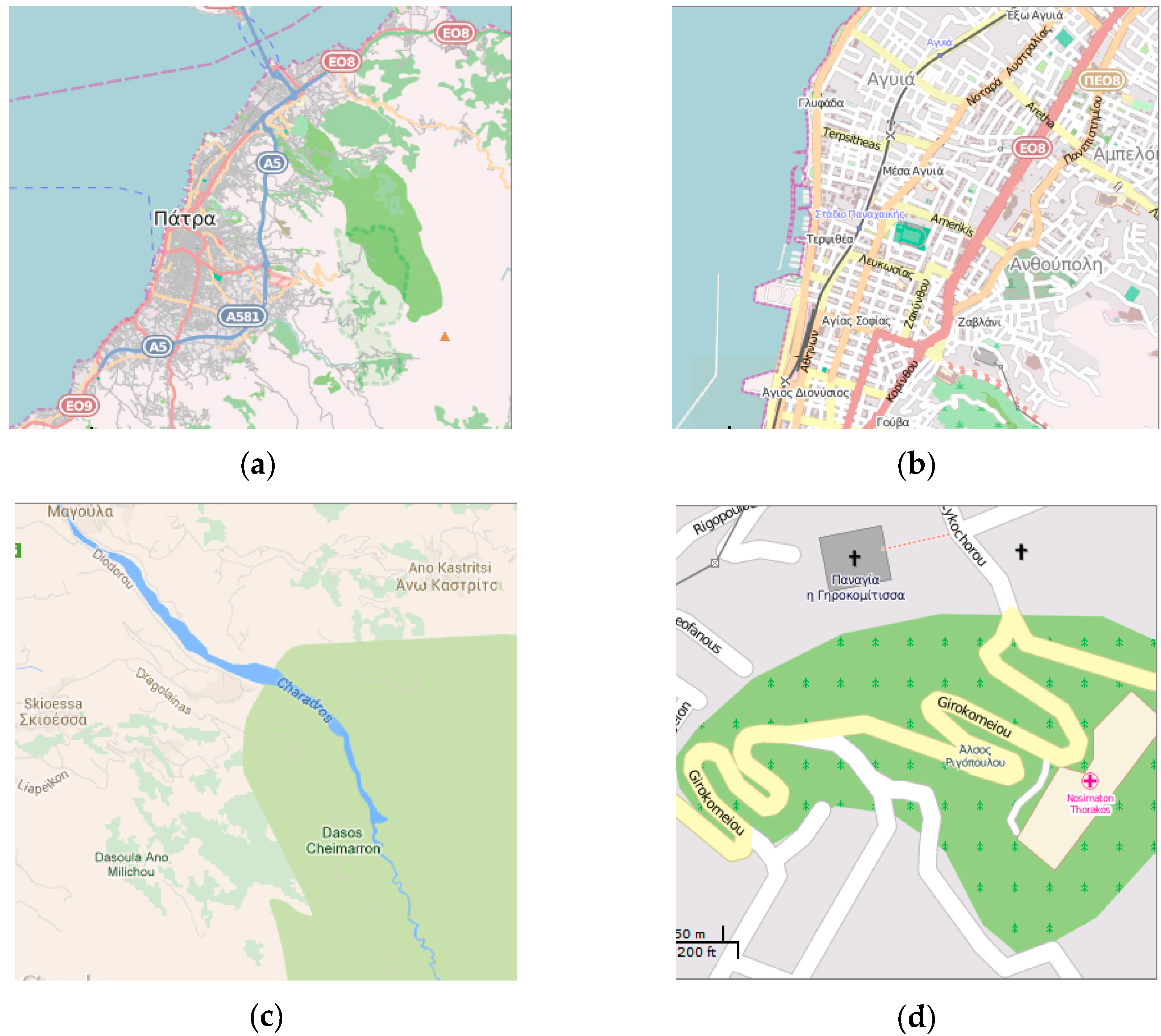
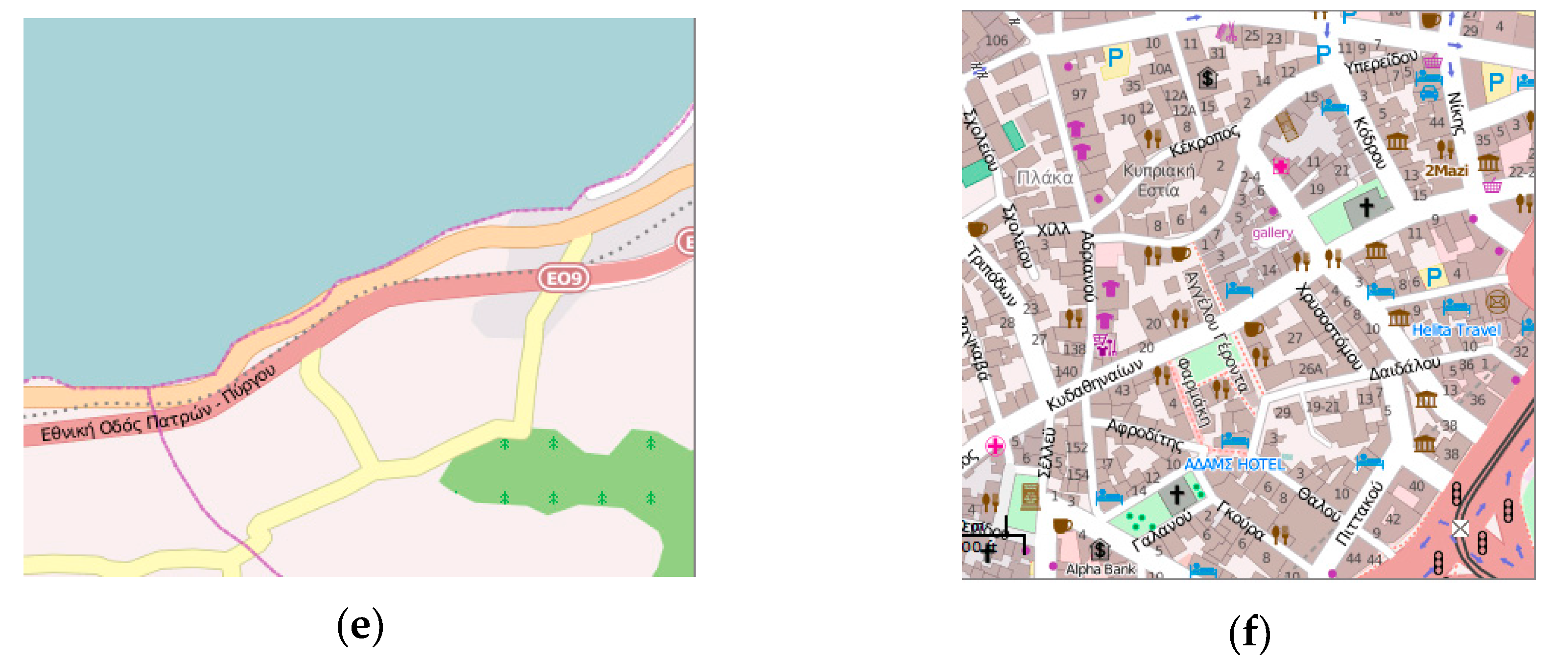
At first glance, a number of problems regarding generalization are detected in online map services. The degree of detail is often excessive in relation to the scale level (Figure 2a road network into town, Figure 2b very small buildings are portrayed). Problems are observed between layers, due to a different degree of generalization, e.g., river network in comparison with land use (Figure 2c) and onthe same layer, e.g., between different land use types (Figure 2c). In certain cases, overlay problems between layers are observed because of lack of generalization or erroneous degree of generalization, e.g., road, land, sea (Figure 2e), road, urban area, park (Figure 2d). On the contrary, there may be a lack of detail for several layers, e.g., the road network (Figure 2d) that does not have the detail required at this scale. Often there is no homogeneity in the degree of detail of the portrayed entities. This is due to the lack of design scope of the map and as a result information hierarchy cannot be established (Figure 2f).
A more systematic review across web mapping services for the zoom levels 13–14, which have also been reviewed for content, based on the review criteria for “Generalization” [7] is performed. A number of problems, such as “Line shapes too complex (or too simple)”, “Areas too small to suit scale (outline closes in area fill)” and “Area shapes too complex (or too simple or unrealistic)” exist. Due to the absence of legend for online map services, categories or hierarchy of geographic features are not clear. As a result, it is difficult to see whether the type and the number of categories are appropriate to the scale.
With respect to terrain generalization, it is noted that terrain is balanced as hill shade is neither too jagged nor terraced. However, HERE hill shading seems more realistic and Google (option “Terrain”) is extremely enhanced.

3.4. Lettering

The utility of general reference maps as those provided by online map services depends mainly on the characteristics of the type and it’s positioning [11]. Based on traditional cartographic principles, legibility of lettering is determined by the type’s style, form, size, color, etc., and by names positioning. A review of lettering on online map services is presented in Table 4. A Sans Serif font, which is appropriate for on-screen maps, is used in web mapping services. However, the same font is used for all features and as a result type style is not fully exploited. In cartography, different styles of lettering are conventionally used for different categories of geographical features. Web mapping services use color to show nominal differences. Specific use of color in the text is described in Table 4. Text size is used to show ordinal distinctions, e.g., importance of neighborhoods. The text sizes are generally well selected. Based on the review criteria for “Label appearance and readability” [7], problems referring to text appearance are not identified. Text becomes more legible with the use of a white mask. However, in Wikimapia the size of the mask is quite large and hides the map background. Regarding positioning, guidelines for point, linear and areal features are generally applied except in Wikimapia where all texts follow a horizontal guideline. The rule that names should be either entirely on land or on the sea is not applied, which sometimes results in difficultly in relating text with the location of the respective feature. Regarding generalization, labels for neighborhoods are too dense in HERE and Wikimapia and as a result it is difficult to understand the location of the named feature. Text Hierarchy in Neighborhoods names is handled with the use of size and form (simple—bold) in Google resulting in a 4-level hierarchy, whereas the only size is used in OSM and HERE for a 3-level hierarchy. No hierarchy is evident in Wikimapia as the same font size and universal use of bold font form are utilized for all geographical names.

3.5. Symbolization

Map symbolization is one of the most interesting and challenging aspects of cartography. Clearly, symbolization is critical to any map’s success and to online map services as well. In Table 5, symbolization is analyzed for each thematic layer and the visual variable applied is noted. Generally, symbolization in on-line map services is in accordance with the cartographic practice. Absence of legend for Google, HERE and Wikimapia does not permit a detailed symbology review as the attributes to be portrayed are not evident and consequently the use of visual variables cannot be commented. It is observed that areal and linear symbols cover most of the map area, whereas point symbols are rare at the scale examined (zoom levels 13–14). Color is the predominant visual variable utilized in order to portray differences at the nominal scale. For a detailed review of color see Section 4. Symbol sizes are well selected to support legibility.
At larger scales, Points of Interest portrayal utilizes pictorial point symbols based on shape and color. Pictorial symbols are suitable as they are easy to understand. All point symbols in Google maps use the well-known Google Maps pin as a background and a pictorial symbol on top. The Google Maps pin is the inverted-drop-shaped icon that marks locations on Google Maps. It is protected under a U.S. design patent as “teardrop-shaped marker icon including a shadow” and it is considered as “a product of pure function that has evolved into a cultural phenomenon” [12]. Google maps popularity has probably appointed this symbol as the most well-known map symbol and as a result the users’ default selection for their own maps. This symbol has never been used on maps before Google maps advent and never before have people utilized massively and internationally the same symbol, without adopting a standard, except maybe for the north arrow symbol. This uniformity of Google map symbols, which are always based on the pin marker, results in an immediate recognition of the map provider and a sense of familiarity for the user. Pictorial symbols in the other on-line mapping services are more in agreement with the ones used on general reference maps.
The coastline symbolization is also very important as it bounds the land area. Coastline is not portrayed with a linear symbol in online map services and in OSM it coincides with an administrative line symbol. Road symbolization on web maps should be revised taking into account the category they belong to, provided that this information would be available through the legend.
At large scales, settlements are portrayed without symbol and their position is implied by their name. Only Wikimapia utilizes a point symbol for settlements. At smaller scales Google, HERE and Wikimapia utilize point symbols for settlements. In traditional cartography, it is possible to use geographical names to denote a feature and this is the case for capes, gulfs, seas, mountains, etc.
The use of color in symbols will be discussed in detail in Section 4. Regarding the review criteria for “Symbol appearance (point, line, area)” [7], rendering is performed correctly and no point form, line form or area casing is jagged. Problems referring to point symbol appearance are not observed. Concerning the “Poor multilayer point combination (e.g., outline, shape within shape)” issue all Google point symbols use an opaque background symbol layer and do not face this problem. However, OpenStreetMap, HERE and Wikimapia point symbols can be enhanced with the addition of an opaque background layer. With respect to line symbols no issues are observed in Google maps and HERE. In OpenStreetMap, due to generalization issues sometimes roads are too narrow and thus difficult to read at medium scales. In addition, OSM line symbols for roads with casing are not always fully drawn. Line symbols for roads in Wikimapia are poorly designed. Too thin lines are depicted, the only color is used for the symbols, different categories are not distinctive, the width is too wide resulting in overlays and road network information becomes illegible. As for area symbols and although only hue and value are utilized in Google, HERE and Wikimapia, symbols are distinguishable. Even though no symbols are too similar to other area symbols as the number of categories is small, one may notice poor pattern choice and multilayer pattern combination. Administrative area symbolization with a continuous line border in Wikimapia, creates confusion problems in map composition. The portrayal of administrative areas at middle scales in not justified for a reference map. OpenStreetMap has more area symbols as land use portrayal is more detailed and thus comprehensive. In this case, both hue and pattern are utilized successfully, symbols are distinguishable, patterns choice and multilayer pattern combination are performed correctly.
Terrain portrayal in Google maps and HERE is based on shading and no contours are shown. Hillshade colors are appropriate and logically positioned. Hillshade or contours should be included in OSM and Wikimapia as well. In Google maps, the terrain is displayed upon user’s selection “Terrain”. This causes a change in some other symbols as well, e.g., roads and new land use areas appear as well. At large scales in Google maps, the terrain is portrayed inside a building block, which is very misleading.

4. Color in Online Map Services

The analysis and evaluation of color schemes of each online map service are deemed necessary, due to the fact that color plays an important—if not a crucial—role in cartographic communication. The general principles of color selection in the cartographic design are related to cartographic symbolization and its application. The limitations and characteristics of the normal vision mechanism of color perception and the psychological reactions to it, both in connotative and in subjective level, should be taken into account [13]. Three out the six primary visual variables are related to color [14], implying the importance of color in cartographic design. In addition to its self-evident contribution in map reading, Arthur Robinson [15] notes that color has such an aesthetic impact, that any map user, regardless of experience or familiarity with color use on maps, feels that he/she has the right to express his/her personal preferences or personal aversion for the chosen colors.
Color is a subject of study in physics, chemistry, and psychology, as well as in neurobiology. Neurobiologists’ experimental research proves that three basic properties of a visual scene, color, motion and form are not perceived at the same time. The order of perception is color—form—motion and specifically, the perception of color is preceded by 0.06-0.08 sec of motion perception [16].
It is noteworthy that color is the most popular item for commenting on the structural elements of the map [15]. According to the results of a research [17] among map users—experts and non-experts—color is the first element that the user chooses among the graphical elements and characteristics of the map for the valuation of its beauty. It is followed by legibility, the rendering of the relief in terms of the three-dimensional representation, the fonts, the contrast, the overall impression, content, linear symbols, realistic and natural effect and, finally brightness [17]. The elegant layout of colors is not only pleasant, but also productive in terms of information communication, as it involves the application of different kinds of contrast to achieve the required distinction of symbols and individual components of the cartographic composition. It defines the foreground in relation to the background by highlighting the thematic information of the map, differentiates the entities from each other, bears the content of the symbols, bears the information of quantity, association or diversity and forms the sense of depth by assembling reading levels. Furthermore, it defines the order of activation of the user’s attention [13].
ColorSchemer Studio 2 (www.colorschemer.com) is used to identify the colors utilized on online map services, and in particular:
  • Colors of areal and linear symbols were detected by a manual procedure
  • Color palette samples were recorded as image files and
  • The HEX and RGB color coordinates were recorded in an HTML file
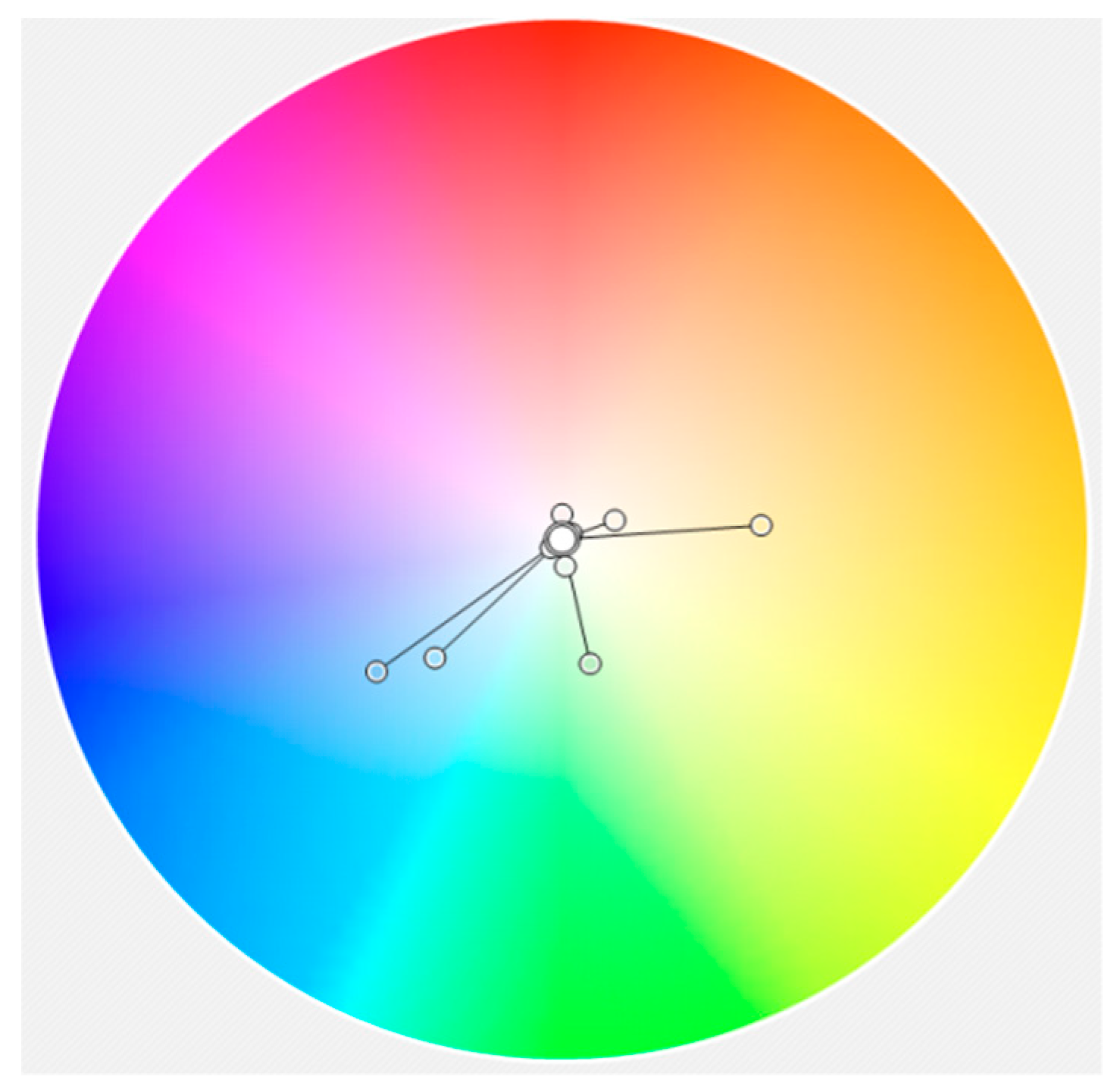
Subsequently, the color samples were plotted in the color wheel using the RGB primaries and examined on a case-by-case basis for their perceptional attributes (hue, brightness, saturation), the relationships between them and whether or not harmonies could be established [13]. One of the objectives of color theory is to determine the color combinations that would be functional or harmonious. Johannes Itten’s basic idea of "color harmony is based on the ‘balance and symmetry of forces’ [18]. Harmonic colors are considered the opposite or complementary colors, the analogous and the split complementary ones. Harmonic color schemes can also be created using the color wheel and the geometric shapes registered: Equilateral or isosceles triangles, quadrants, rectangles, pentagons, etc., the vertices of which indicate harmonic color combinations. Harmonic combinations in general are composed of colors that have "color" relationships.

4.1. Color Review

4.1.1. Google Map

The Google Map color scheme (Figure 3) is mostly composed of low-saturation areal symbols and high brightness linear symbols. These colors occupy almost 40% of the color wheel (Figure 4), from yellowish orange to blue, through green, establishing a hue transition color scheme [19]. Saturation varies from 0 (white) to 44 (blue) and brightness from 87 (gray) to 100 (yellow and light blue). The color scheme of this map is based on adjacent colors in the color wheel (analogous colors). The utilization of beige and light pink with the corresponding greens; contribute to the color balance of this map, despite the absence of reddish hues or tones, the use of which would enhance the color harmony. For example, as white and yellow portray road network categories, extending the color scheme with the use of orange, for some road categories, would contribute to the color harmony. Color coordinates are presented in Table A1 (Appendix B).

4.1.2. OpenStreetMap

OpenStreetMap utilizes a color scheme (Figure 5) which occupies the entire color wheel, although most of the colors are gathered between yellow and blue through green (Figure 6). Saturation varies from 0 (white and grays) to 43 (blue-purple) and Brightness from 67 (dark gray) to 100 (white).
Although the visual result is rather pleasant, there are some issues to be discussed. The selected blue for sea transportation lines is visually (and numerically) related to purple. By increasing the saturation from 43 to 75 (or 80) it becomes a more genuine blue hue, which is a more suitable choice, as the use of blue for water related entities is one of the oldest rules in cartographic symbolization. As for the road network symbolization (Figure 7), two visual variables have been utilized: Size and hue (see Table 5) instead of one, e.g., size or hue or brightness or saturation. Ideally for this map scale and according to the concept of the visual variables’ implementation in cartographic symbolization, the road network’s symbols should be formed only by the change of size, having a single warm hue, chosen from the current color scheme. The utilized color scheme is sequential, based on the transition from yellow to dark pink. These colors really pop-up because they have high values of brightness (91 and 98) but low values of saturation (24, 35 and 37). In order to develop a harmonic color sequence, the specific color scheme could become analogous, using the same saturation and brightness values (35 and 98 correspondingly), as shown in Figure 8a or adopt monochromatic color schemes, as shown in Figure 8b,c. The suggested color schemes’ (a, b, c) plots in the color wheel are shown in Figure 9.
Another issue is the utilized five (5) hues of green (Figure 10 left). They have various saturation and brightness values and thus, they form an unbalanced color scheme. An analogous color sequence would improve the visual balance, so two more balanced color schemes are suggested: They both use five (5) greenish different hue values, combined with two alternatives for saturation (20 and 24) but keeping constant the brightness (84) (Figure 10a,b). For the suggested coordinates, see Table A2 (Appendix B).

4.1.3. HERE Maps

The HERE Maps map service utilizes a color scheme (Figure 11) which occupies the entire color wheel, from red to blue through yellow, thus a warm one. Saturation varies from 2 (very light gray) to 67 (blue linear symbols) while brightness extends from 86 (dark coral—pink) to 100 (yellow, salmon and light blue) (Figure 12). The terrain is portrayed by shades of gray (from white to medium gray). It is necessary to be noted that these gray tones are not neutral, but they slightly tend to bluish, so the first improvement should be the neutralization of the grays. The road network color scheme consists of four different hues (gray, yellow, salmon and dark pink) which are not chromatically related (e.g., yellow, orange, red) instead of using either the visual variable of size or an analogous color scheme or a monochromatic one based on the variation of brightness or saturation. The yellow-salmon-dark pink triad could be easily harmonized to become an analogous color scheme, by making small changes to hue-brightness-saturation values. The major problem of this scheme is the use of gray—which is inherited from the block boundaries which form the edges of the roads. Again, as previously mentioned in OpenStreetMap review, ideally for this map scale and according to the concept of the visual variables’ implementation in cartographic symbolization, the road network’s symbols should be formed only by the change of size, having a single warm hue, chosen from the current color scheme (either salmon or dark pink).
Alternatively, the road network’s color scheme (Figure 13 top) could be replaced by monochromatic color sequences, based either on salmon or in dark pink (Figure 13a–d). The (a) and (b) color schemes are based on constant values for Hue and Brightness, 10 and 100 respectively. Saturation varies from 19 to 75 by equal increments for the color scheme (a) and from 9 to 39 by equal increments for the color scheme (b). The (c) and (d) color schemes are based on constant values for Hue and Brightness, 339 and 86 respectively. Saturation varies from 19 to 75 by equal increments for the color scheme (c) and from 12 to 47 by equal increments for the color scheme (d). Color coordinates are presented in Table A3 (Appendix B).

4.1.4. Wikimapia

The Wikimapia map utilizes a color scheme (Figure 14), which occupies three quarters (3/4) of the color wheel, from red to blue through yellow (Figure 15). Brightness varies from 74 (gray) to 98 (yellow) and the saturation from 0 (light gray) to 77 (red-orange). Light gray is used to portray the land surface. This color scheme’s characteristic is the use of an extremely bright yellow for road network symbols, which proves to be the dominant color, giving prominence to the road network. The yellow’s almost maximum brightness affects the figure-ground organization of the display and determines the perceptual impression of ‘figure’. The viewer’s eyes focus on the extremely bright symbols of the road network which is, thus, elevated to the highest hierarchical visual level. Red-orange and green are used for point symbols, in order to pop-up above yellow. As mentioned above, the use of such a vivid yellow hue by Wikimapia creates a highly unbalanced result. For the improvement of the visual impression, the current yellow hue (HEX: #FBF879; RGB: 251,248,121; HBS 59-52-98) should be changed either by hue value or by saturation and/or brightness (e.g., HEX: #F2F1BF; RGB: 242,241,191; HBS 48-21-98 or HEX: #FAEFC5; RGB: 250,239,197; HBS 59-21-98; see Figure 16a,b). Color coordinates are presented in Table A4 (Appendix B).

4.2. General Comments

It is particularly remarkable that the cartographic conventions in color use concerning the distinction of qualitative features have generally been respected and this is an important issue. Although detailed analysis reveals issues about the selected hues, all the reviewed color schemes (Figure 17), utilize green for vegetated areas, blue for water bodies, neutral colors for land surfaces, warm colors for road networks. On the contrary, the distinction of quantitative data is not always compliant both for visual variables in cartographic symbols and the selected colors. Some changes are suggested for optimizing the visual result.
Τhe Google map color scheme results in a “quiet”, but rather indifferent, outcome. There is no visually disturbing element, but nothing is attractive as well. This may be due to the absence of reddish hues.
The OSM has the broadest color scheme of all. Both this and the HERE Maps color scheme, initially create a positive and rather attractive visual impression. This probably happens due to the contrast of warm colors of the road network on top of the neutral background colors. After all, in both OSM and HERE Map, the road network portrayal is the prominent feature of the display. Further examination though, reveals some problems due to the weak color harmony of these parts of the corresponding color schemes.
Wikimapia on the other hand, creates a very unpleasant visual impression due to the dominance of vivid yellow, leaving no space for further comments.
Because of the numerous users of these services, another issue that could be considered is the adaptation of color schemes for people with color perception deficiencies.

5. Discussion of Map Design

The difference between an ordinary map and one that is influential and interesting depends on the efficiency of map design. Map design is controlled by a number of factors, such as reality, available data, map scale, audience, conditions of use and technical limits. Map design must be compliant with the principles of design and graphic communication, such as legibility, visual contrast, visual balance, figure-ground organization and hierarchical organization [11].
Maps are considered a means of communication and when designed properly by a cartographer aim to transmit a specific message. An isolated area from an online map service does not constitute an autonomous map, because it cannot communicate a specific message. It provides general information and aims to address as many users as possible. Due to the characteristics of online map services, map design review should adapt the criteria used for traditional maps to the new environment.
Regarding map design factors in online map services, reality, audience, conditions of use and purpose are highly unpredictable, map scale varies, and technical limits are homogeneous for all services whereas available data depending on the provider. As a result, all design choices are as general as possible in order to cover all cases. Online map services constitute a massive initiative of global cartography and any cartographic rule that is applied cannot cover every case that may require special handling. Although, rules are not always successful, for every map produced by an online map service, an acceptable product must be published. This is achieved as it is verified by the high popularity of online map services.
Visual balance depends on the relative position and visual importance of the basic parts of the map. Marginalia, e.g., graphical scale, menus, etc., influence the map visual balance, as there are cases where they might get into the first level of the user attention. Their placement in a fixed position, regardless of the mapped area characteristics, does not contribute to the map visual balance. As a result, no balance between geographic area, marginalia, and map’s visual and geometric center can be achieved.
Web maps layout is mostly the result of a computer interface design, limited by technological capabilities and the physical and technical characteristics of various types of screens. The main concerns are human-computer interaction and usability. On the contrary, map layout is the process of arriving at a proper balance [11] which is not highly considered in online map services layout design.
Principles of map design can be applied only to symbols, as map layout is fixed. In general reference maps, as is the case, all data should have the same level of importance and for this reason a balanced symbology is very critical. Symbolization, legibility and contrast have been already analyzed in previous sections. Generally, Google, OSM and HERE map have good visual contrast whereas vivid contrast in Wikimapia is unpleasant. The symbolization of the road network, as the dominant thematic layer on online map services in terms of information density and importance, is crucial for the aesthetic quality of the map. The use of a vivid yellow hue by Wikimapia creates a highly unbalanced result. Despite the amount of information in OSM, a balanced result is created, due to symbolization choices. A figure-ground organization is best succeeded in HERE maps and in Google maps, due to good symbol selection. However, in Google maps figure-ground organization is also helped by the moderate information density.
A hierarchical organization creates levels of relative importance in maps. On general reference maps, like online map services, strong visual layering introduced by a stereogramic organization is not suitable. An extensional organization has been achieved in online map services by symbolization and specifically with the visual variables size and brightness or saturation. The suggestions made for the reviewed color schemes will enhance the establishment of a successful hierarchical organization.

6. General Discussion and Conclusions

In the previous sections, online map services are reviewed from a cartographic point of view. Major aspects are discussed, such as map design, the use of color, basic map characteristics and map elements. Concerning the questions raised in Section 1, it is concluded that they generally comply with cartographic principles and traditional practices. They offer to millions of users’ maps, that are in harmony with traditional maps and, enhanced with state of the art technology. However, there are several characteristics that should be improved:
  • Information on cartographic projection and datum, e.g., Web Mercator (WGS84) should be clearly stated, otherwise people could believe that geographic coordinates can be portrayed as such on a plane.
  • Report error in distance measurements, due to map projection deformation and point out the existence of area deformation. Geometry matters.
  • Since Web Mercator is of mediocre cartometric value, the use of the Adaptive Composite Map Projections [10] seems to be the best alternative.
  • A legend that clearly explains symbols should be included. Otherwise, the map loses its liability and users take wrong decisions, due to wrong symbol interpretation. It may be displayed upon users’ choice as in OSM and positioned so as to help visual balance. Alternatively, a TOC (Table of contents) on web maps provides an overview of thematic layers [20]. Consequently, a TOC enhanced with symbols could also work as a legend.
  • Users should be informed about the location of the area they are viewing with the inclusion of the geographical coordinates of the cursor or the map area limits. This information is already known based on map tiles. An alternative solution is the inclusion of the name of the country or geographic area that covers most part of the screen. The HTML Title element (<title>) which defines the document’s title shown in a browser’s title bar or a page’s tab can be used for Title or Subtitle on online maps.
  • The need for insets can be solved with the existence of multiple map views in the same browser window.
  • Graphical scale design should be improved.
  • Content enhancement with the inclusion of terrain in OSM and Wikipedia, the upgrade of land use by adding more categories and the sea area enhancement with bathymetric information.
  • Improve generalization in terms of information density, homogeneity in vector detail and consistency between layers. Additionally, generalization could be improved by the inclusion of the TOC that helps the user to manage the display (on/off) and thus limit the number of layers portrayed.
  • Enhance lettering with the use of more than one font and/or form.
  • Symbolization is generally formed according to cartographic practice. However, as online maps do not carry a legend, it is impossible to really comment on symbolization when the identity of the portrayed features is unknown.
  • Color usage is basically compliant with main cartographic principles in color use but color theory about visual balance, colors relationships and color harmony have not been widely exploited. Due to the numerous users of these services, the adaptation of color schemes for people with color perception deficiencies should be considered.
  • Map design cannot be developed through a cartographic perspective, due to the fixed layout limitations. Symbolization is the only creative field which might be used to support the aesthetic scope and the successful communication with the user. Consequently, the synthesis of symbolization is of high importance. Appearance matters.
Despite some issues that can be easily upgraded, online map services due to easy access, remain the most popular map sources for users. They constitute a cartographic product of acceptable quality available to everyone. They support the inclusion of spatial data on every web page and boost the spatial dimension of everyday life. Due to its popularity and easiness of use, millions of users become accustomed to the use of web maps and gain familiarity with tools, such as zoom in/out, pan, navigation, data retrieval by clicking, etc. Users would not settle for less than those provided by online map services. As a result, they strengthen users’ ability to use interactive maps and set a number of standards for contemporary mapping. Furthermore, the way the map scale is stated has changed. In addition to the representative fraction, the verbal statement and the graphic scale [11], a perhaps more comprehensible and user-friendly statement of scale is now used: The zoom level either in numeric or descriptive terms. Several characteristics of these maps becoming “de facto” standards or best practices, such as the Web Mercator projection, the Google inverted-drop symbol, scale statement as zoom level, the layout, the interactivity, etc. These choices should neither obscure correct cartographic practices nor limit cartographers’ creativity, e.g., the use of the Google symbol on every map.
Online map services are a newborn cartographic product in comparison with paper maps and the long history of cartography. Maps have evolved through a lengthy process as the outcome of the scientific research and technological developments of cartography. They have gone through many stages and have come across many forms, reaching high levels of design, as well as scientific interest based on geometry, geodesy, geography, computer science, psychology, optics, perception, neurobiology, semiotics, art, etc. This invaluable heritage must be capitalized in online map services in the most emphatic way. Never before were maps so immediately accessible to the user and integral parts of everyday life. This is a huge achievement. Map as a medium is experiencing enormous proliferation in society. It is the most consolidated means for simultaneous representation of location, descriptive and textual information. The enthusiasm that springs from online map services ubiquity should not become a self-referential narrow boundary, but it should be brought to adulthood with mature choices, utilizing the knowledge and inheritance of cartography. Should developers become cartographers or cartographers should be turned into developers? Cooperation is the answer.

Author Contributions

All authors have contributed equally to the paper.

Funding

This research received no external funding.

Conflicts of Interest

The authors declare no conflict of interest.

Appendix A

Appendix B

Table A1. Google map color coordinates.
Color NameCurrent ValuesSuggested Values
HEXRGBRGB
Light blue#AADAFF170,218,255
Blue#89BCF3137,188,243
Light gray#EDEBE8237,235,232
Gray#D7DADD215,218,221
Green#C3ECB2195,236,178
Light Pink#F9EDED249,237,237
Beige#FDF4E2253,244,226
Light green#ECF7EA236,247,234
White#FFFFFF255,255,255
Yellow#FFE99E255,233,158
Orange 242,157,41
Table A2. The OpenStreetMap color coordinates.
Color NameCurrent ValuesSuggested Values
HEXRGBRGB (a)RGB (b)RGB (c)
Light blue#AAD3DF170,211,223
Blue(purple)#899DEF137,157,23960,96,240
Green1#C8D7AB200,215,171200,215,171173,209,158
Green2#ADD19E173,209,158214,215,171203,209,159
Green3#AACBAF170,203,175209,215,171194,209,159
Lilac#EBDBE8235,219,232
Pink#F3E3DD243,227,221
White#FFFFFF255,255,255
Light gray#D6D5D5214,213,213
Dark gray#AAAAAA170,170,170
Green4#C8FACC200,250,204183,215,171159,209,163
Green5#B2E4CC178,228,204171,215,177159,209,193
Yellow#F7FABF247,250,191244,250,162250,228,232250,219,224
Light Coral#FBD6A4251,214,164250,219,162250,206,214250,187,199
Salmon#F9B29C249,178,156250,183,162250,184,196250,156,174
Dark pink#E892A2232,146,162250,162,178250,162,178250,125,148
Table A3. HERE Maps colors coordinates.
Color NameCurrent ValuesSuggested Values
HEXRGBRGB (a)RGB (b)RGB (c)RGB (d)
Very light gray#F9FCFD249,252,253249,249,249
Light gray#ECF1F4236,241,244236,236,236
Medium gray#E0E6E9224,230,233224,224,224
Light blue#99CDFE153,205,254
Blue#4A93DF74,147,223
Gray#CED0D0206,208,208255,215,207254,234,230219,178,196219,193,205
Yellow#FEFBA8254,251,168255,175,160254,213,206219,137,173219,168,190
Pink#FEAD9D254,173,157255,136,112254,193,181219,96,149219,142,176
Coral#DB74A1219,116,161255,96,64254,173,157219,55,126219,116,161
Green#BEE7B0190,231,176
Light green#DDEADF221,234,223
Table A4. Wikimapia colors coordinates.
Color NameCurrent ValuesSuggested Values
HEXRGBRGB (a)RGB (b)
Light blue#97B1CA151,177,202
Blue#517EC581,126,197
Yellow#FBF879251,248,121242,241,191250,239,197
Red-orange#F3B465243,180,101
Light gray#C9D8C2201,216,194
Medium gray#BDBDBD189,189,189
Very light gray#E6E6E6230,230,230
Red#F15437241,84,55
Green#7BC85E123,200,94

References

  1. Nivala, A.M.; Brewster, S.; Sarjakoski, T.L. Usability evaluation of web mapping sites. Cartogr. J. 2008, 45, 129–138. [Google Scholar] [CrossRef]
  2. Wang, C. Usability evaluation of public web mapping sites. Int. Arch. Photogramm. Remote Sens. Spat. Inf. Sci. 2014, 40, 285. [Google Scholar] [CrossRef]
  3. Stehlíková, J.; Řezníková, H.; Kočová, H.; Stachoň, Z. Visualization Problems in Worldwide Map Portals. In Modern Trends in Cartography; Brus, J., Vondrakova, A., Vozenilek, V., Eds.; Springer: Cham, Germany, 2015; pp. 213–225. [Google Scholar]
  4. Stamou, L.; Skopeliti, A. Web maps: Common cartographic practices and cartographic innovations. In Proceedings of the 13th National Cartographic Conference, Hellenic Cartographic Society, Patra, Greece, 22–24 October 2014. [Google Scholar]
  5. Heywood, D.I.; Cornelius, S.; Carver, S. Chapter 8 Output: From new maps to enhanced decisions. In An Introduction to Geographical Information Systems, 3rd ed.; Pearson Education Limited: Essex, UK, 2006; p. 254. [Google Scholar]
  6. Slocum, T.A.; McMaster, R.M.; Kessler, F.C.; Howard, H.H.; Mc Master, R.B. Thematic Cartography and Geographic Visualization, 3rd ed.; Prentice Hall: New Jersey, NJ, USA, 2008. [Google Scholar]
  7. Brewer, C.A.; Hanchett, C.L.; Buttenfield, B.P.; Usery, E.L. Performance of map symbol and label design with format and display resolution options through scale for The National Map. In Proceedings of the Special joint symposium of ISPRS Technical Commission IV & AutoCarto in conjunction with ASPRS/CaGIS, Orlando, FL, USA, 15–19 November 2010. [Google Scholar]
  8. National Geospatial Intelligence Agency, Implementation Practice Web Mercator Map Projection. Available online: http://earth-info.nga.mil/GandG/wgs84/web_mercator/%28U%29%20NGA_SIG_0011_1.0.0_WEBMERC.pdf (accessed on 14 March 2019).
  9. Battersby, S.E.; Finn, M.P.; Usery, E.L.; Yamamoto, K.H. Implications of Web Mercator and its use in onlinemapping. Cartographica 2014, 49, 85–101. [Google Scholar] [CrossRef]
  10. Jenny, B.; Šavrič, B. Enhancing adaptive composite map projections: Wagner transformation between the Lambert azimuthal and the transverse cylindrical equal-area projections. Cartogr. Geogr. Inf. Sci. 2018, 45, 456–463. [Google Scholar] [CrossRef]
  11. Robinson, A.H.; Morrison, J.L.; Muehrcke, P.C.; Guptill, S.C. Elements of Cartography, 6th ed.; John Wiley and Sons Inc.: New York, NY, USA, 1995. [Google Scholar]
  12. Google Maps Pin. Available online: https://en.wikipedia.org/wiki/Google_Maps_pin (accessed on 14 March 2019).
  13. Stamou, L. Maps and Art: Color as a Critical Parameter. Ph.D. Thesis, National Technical University of Athens, Athens, Greece, 2019. [Google Scholar]
  14. Bertin, J. Sémiologie Graphique—Les Diagrammes, les Réseaux, les Cartes; Gauthier-Villars: Paris, France, 1967. [Google Scholar]
  15. Robinson, A. The Look of Maps; University of Wisconsin Press: Madison, WI, USA, 1952. [Google Scholar]
  16. Zekki, S. Inner Vision: An Exploration of Art and the Brain, 1st ed.; Crete University Press: Heraklion, Crete, Greece, 2002. [Google Scholar]
  17. Ortag, F. Variables of Aesthetics in Maps. In Cartography and Art; Springer: Berlin/Heidelberg, Germany, 2009; pp. 123–131. [Google Scholar]
  18. Itten, J. The Art of Color: The Subjective Experience and Objective Rationale of Color; Van Nostrand Reinhold Company: New York, NY, USA, 1973. [Google Scholar]
  19. Brewer, C. Chapter 7 Color Use Guidelines for Mapping and Visualization. In Visualization in Modern Cartography; Elsevier Science: Tarrytown, NY, USA, 1994; pp. 123–147. [Google Scholar]
  20. Netek, R.; Vozenilek, V.; Vondrakova, A. WebGIS 2.0 as approach for flexible web-based map application. In Proceedings of the International Conference on Geoinformatics and Data Analysis, ACM, Prague, Czech Republic, 20–22 April 2018. [Google Scholar]
Figure 1. OpenStreetMap (OSM) maps and map key (a,b).
Ijgi 08 00215 g001
Figure 2. Generalization issues: (a) excessive detail in relation to the scale level in the road network; (b) very small buildings are portrayed; (c) different degree of generalization in the river network and the land use; (d) overlay problems between layers e.g. road network, urban area, park and lack of detail in layers e.g. the road network; (e) overlay problems between layers e.g. road network, land and sea; (f) problems in establishing information hierarchy.
Ijgi 08 00215 g002aIjgi 08 00215 g002b
Figure 3. The Google Map color scheme.
Ijgi 08 00215 g003
Figure 4. The Google map color analysis.
Ijgi 08 00215 g004
Figure 5. The OpenStreetMap color scheme.
Ijgi 08 00215 g005
Figure 6. The OpenStreetMap color analysis.
Ijgi 08 00215 g006
Figure 7. The OpenStreetMap road network color scheme.
Ijgi 08 00215 g007
Figure 8. The OpenStreetMap road network symbols color scheme (left) and suggestions: (a) for analogous color scheme; (b,c) alternatives for monochromatic color schemes.
Ijgi 08 00215 g008
Figure 9. OpenStreetMap road network colors suggestions plotted in the color wheel: (a) for analogous color scheme; (b,c) alternatives for monochromatic color schemes.
Ijgi 08 00215 g009
Figure 10. OSM greens’ color scheme (left) and suggested color schemes: (a) greens with Saturation 20, Brightness 84; (b) greens with Saturation 24, Brightness 84.
Ijgi 08 00215 g010
Figure 11. The HERE Maps color scheme.
Ijgi 08 00215 g011
Figure 12. The HERE Maps color analysis.
Ijgi 08 00215 g012
Figure 13. The HERE Maps road network color scheme (top) and replacement suggestions: (a) monochromatic color scheme Hue 10, Brightness 100, Saturation from 19 to 75; (b) monochromatic color scheme Hue 10, Brightness 100, Saturation from 9 to 39; (c) monochromatic color scheme Hue 339, Brightness 86, Saturation from19 to 75; (d) monochromatic color scheme Hue 339, Brightness 86, Saturation from 12 to 47.
Ijgi 08 00215 g013
Figure 14. The Wikimapia color scheme.
Ijgi 08 00215 g014
Figure 15. The Wikimapia color analysis.
Ijgi 08 00215 g015
Figure 16. Wikimapia current yellow (left: HBS 59-52-98) and replacement suggestions: (a) HBS 48-21-98; (b) HBS 59-21-98.
Ijgi 08 00215 g016
Figure 17. Color schemes overview.
Ijgi 08 00215 g017
Table 1. Website traffic data for online map services (Similarweb—last visited November 2018).
Online Map ServicesMonthly Visits (Millions) (August 2018–October 2018)Percentage of Visits from the Country with Greatest PopularityYear FoundedMain Traffic Source on DesktopRank in Reference
Maps
Global RankPlatform Used by the Majority
Google Maps108USA (30.04%)1998Direct1691Mobile
OpenStreetMap10Germany (14.72%)2004Direct61819Mobile/Desktop
HERE Maps16USA (19.23%)1985Social82021Desktop
Wikimapia9Russia (36.76)2006Search102692Mobile/Desktop
Table 2. Online map services elements in comparison with paper maps.
Online Map ServicesPaper MapsConsequences
Geographic areaUpon user choice Global coverage
(up to 85° N except for Google maps that cover the whole earth)
FixedVisual hierarchy
CreditsWeb map providerReported in map marginaliaLack of information, such as projection, map area, etc.
Cartographic projectionWeb Mercator (except Google maps that use a perspective projection in smaller scales).Fixed
Selected upon map area, scale and scope in order to minimize distortions.
Severe area deformation.
Error in length measurements in small scales
Frame (border) and NeatlineN/AYesVisual hierarchy
Lack of geographic context
OrientationN/AGrid and/or graticule
An orientation indicator (e.g., north arrow)
North orientation implied
Lack of geographic context
ScaleZoom level
Graphic scale
or zoom level description
Fixed scale
Representative fraction
Title/Subtitle/InsetN/AYesLack of theme/geographic context
LegendOnly in OSMYesIntuitive explanation of symbols
Liability issues
Map layoutFixedDesigned for each map, but also fixed in map seriesQuestionable visual balance
InteractivityYesN/AEnhanced cartographic application
Table 3. Online map services and topographic map content.
Thematic LayersGoogle MapsOpenStreetMapHEREWikimapiaTopographic Map
1:50 000
CoastlineNoYesNoNoYes
TerrainUpon user selection or in smaller scales (shading)NoYesNoYes
Spot elevationNoYesNoNoYes
Land UsePartialYesPartialPartialPartial
LakesYesYesYesYesYes
RiversYesYesYesYesYes
Administrative bordersNoYesYesYesYes
Road NetworkYesYesYesYesYes
Railway NetworkYesYesYesYesYes
Settlements/
Neighborhoods
YesYesYesYesYes
City BlocksYesYesYesYesYes
Ship routeYesYesYesYesNo
Other layersTram, Stations,
Points of Interest, etc.
Metro Stations, etc.Points of Interest, etc.Points of Interest, etc.No
Table 4. Lettering.
Table 4. Lettering.
Google MapsOpenStreetMapHEREWikimapia
Layers with textNeighborhoods (no symbol)
POI
Roads
Green Areas
Sea routes
Neighborhoods (no symbol)
Roads
Green Areas
Spot heights
Sea routes
Neighborhoods (no symbol)
Roads
Green Areas
Metro stations
Neighborhoods Landmarks
Administrative areas
Style (Font)sans serifsans serifsans serifsans serif
Formsimple/bolduniformuniformuniform
SizeDifferent visible sizesDifferent visible sizesDifferent visible sizesDifferent visible sizes
Color (hue and value)Neighborhoods: (black)
POI: Text color is the same with the point symbol color, e.g., entertainment/leisure (blue), civil services (gray), outdoor (green)
Road names (black)
Neighborhoods: (black)
Landmarks (brown, green)
Sea names (blue)
Transportation (magenta)
Road names (black)
Spot elevation (brown)
Neighborhoods (black)
Landmarks (green)
Road names (black)
Neighborhoods (black)
MaskWhiteWhiteWhiteWhite
too wide
Positioning
Guidelines
Point horizontal Linear along the features
Areal sometimes along features most of the times horizontal
Point horizontal
Linear along the features
Areal horizontal
Point horizontal
Linear along the features
Areal horizontal
All horizontal
Text Overlay with symbolsYesYesYesYes
LanguageDouble (English and local language, e.g., Greek)Local languageEnglishLocal language
CompletenessScarcity of sea namesScarcity of sea namesComplete lack of sea namesComplete lack of sea names
Text Hierarchy (variable used)
Number of Levels
Neighborhoods
Yes (size—form (simple—bold))
4 levels
Neighborhoods
Yes (size)
3 levels
Neighborhoods
Yes (size)
3 levels
Neighborhoods
Yes (size, all bold)
2 levels
Table 5. Visual variables applied in map symbols for each thematic layer.
Thematic LayerGoogle MapOSM HEREWikimapia
CoastlineNo symbolAdministrative border symbolNo symbolColor
Road
Network
Color (2 hues)
Size
Color (4 hues)
Size
Color (4 hues)
Size
Color (1 hue)
Size
Railway NetworkColorShapeShapeShape
BlocksColorColorColorColor
Populated area SettlementsNameNameNameName
Land useColorColor and patternColorColor
SeaColorColorColorColor
TerrainShading (gray scale) in smaller scalesSpot elevation (color, shape)Shading (gray scale)No
Points of interestPictorial symbols in the well-known Google location symbol, different colorsPictorial symbols in different colors with no border or backgroundPictorial symbols in different colors with no border or background-
Other layersTram station (pictorial symbols) Train station (pictorial symbols)