1. Introduction
Epidemiology is the study of the distribution and determinants of health-related events, along with the application of this study to disease control [
1]. Epidemiological research can be divided into two branches: descriptive studies, which include surveillance carried out to analyze the distribution of a disease, and analytical studies, which are carried out to confirm the determining factors of that disease. However, the application of modern technologies to the field of health has resulted in the production of massive amounts of data originating from various sources with different types and qualities. In addition to this, it is well known that human beings’ perceptual and cognitive capacities limit the use and exploitation of all available data. Computational applications must provide solutions to present and interact with said data, thus enabling experts in the field to analyze and evaluate them appropriately [
2]. One example is the case of the coronavirus disease of 2019 (COVID-19) outbreak. In this unprecedented scenario with several large databases, various approaches have been used for data processing and visualization, though we still lack a clear and widespread use of them.
The objective of the information visualization area is to reduce the complexity of research and facilitate the understanding of information for humans through the design of visual representations of data [
3]. In the field of health, information visualization and visual analytics aim to support exploration; monitoring; insight discovery; collaboration; and explanation to patients, clinicians, policymakers, and the general public [
4]. Health datasets are inherently spatial and temporal; thus, the exploration of these data and the correlation between datasets to derive insights remains a challenge [
4]. This has consequently led to the development of tools for synthesizing data from different and heterogeneous sources, where space and time play an important role, particularly in the field of epidemiology. Both geospatial and temporal dimensions, as well as network information, are primordial when analyzing the distribution of a disease and devising control strategies, as is evident in the pandemic resulting from COVID-19. Visualization systems coupled with models of disease spread can help predict the future course of an epidemic and evaluate strategies to control it [
4].
The use of visual representations to study data regarding epidemics helps to better understand the current state of public health at both population (e.g., the number of cases or case counts, incidence, and prevalence) and individual (e.g., contacts, movement, and start of disease) levels [
5]. It is therefore necessary to communicate the spatial and temporal aspects of these data through visualizations to both experts, to enable them to take measures, and the population, to raise awareness.
The relevant literature contains several reviews regarding visualization in the human healthcare domain. Bucalon et al. [
6] conducted a scoping review to analyze the literature on dashboards that support the reflective task of clinicians based on routinely collected clinical indicator data. Carroll et al. [
7] carried out an analysis of visualization tools for representing infectious diseases published between 1980 and mid-2013, and this focused principally on GIS, molecular epidemiology, and social network analysis. Crisan et al. [
8] conducted a general categorization study of the geographic visualization techniques used to visualize outbreak data and risk patterns for public health professionals. Chishtie et al. [
9] synthesized the literature concerning the use of visual analysis tools, techniques, and frameworks regarding population health and health services research, focusing on the years between 2005 and early 2019. Although these reviews provide helpful information on visualization research, very little attention is paid to the analysis of the spatial–temporal visualization of epidemiological data. In this work, we address this gap, providing a specific analysis of the techniques and tools available in the most recent scientific literature.
Our main objective is to answer the following research question: how has epidemiological data been represented through the use of spatial–temporal visualization? We seek to examine the scientific literature on visualization techniques applied to epidemics, focusing on the epidemiological measures adopted and how they are represented, the geospatial and temporal visualization techniques used and how they are combined, the most common target population, and the identification of the principal tools adopted to implement visualization.
2. Methods
2.1. Research Questions
This scoping review was conducted in accordance with the Preferred Reporting Items for Systematic Reviews and Meta-Analysis extension for Scoping Reviews (PRISMA-ScR) guidelines [
10]. We further used the PRISMA-ScR checklist to guide this review, which is shown in
Table S1. This scoping review aims to present the state of the art of the most recent spatial–temporal visualization techniques employed to represent measures of epidemiological data. The data extracted from the articles will give insight into 3 main fields of interest: (A) the use of medical and epidemiological data, (B) the application of visualization techniques, and (C) applicable methodologies. Thus, we defined 9 research questions to guide this study:
Q1. What are the most commonly visually represented measures of an epidemic, and what are the visualization purposes? We analyzed the epidemic data represented in each paper to identify general trends in the representation of the measures, the information involved, and the final use of the visualization techniques.
Q2. Which techniques are most frequently used to visualize epidemiological spatial information? We classified the papers based on what type of visualization they used to represent the spatial component of epidemiological data. The classification types were (1) maps, if they used a geographical representation; (2) buildings, if the visualization represented the inside of a building structure; and (3) none, if the visualization technique was conceptual.
Q3. Which techniques are most frequently used to visualize epidemiological temporal data? We studied the current trend in the visualizations used to represent the temporal component of epidemiological information and whether this took place through the use of time series, temporal granularity (e.g., week, month, and year), or interactive filters.
Q4. Which combinations of spatial–temporal visualizations are most frequently used to represent epidemiological data? We studied how the papers represented both the spatial and temporal information concerning an epidemic, and whether they used just one technique or a set of several techniques.
Q5. Do the existing visualizations use individual-level data or aggregated data? We analyzed whether it is common practice to work with individual data or with population-level data.
Q6. Are there any visualizations of patients who became infected in a hospital? We analyzed how many papers carried out a study of hospital-acquired infections.
Q7. What software tools are used? We explored the software used in the implementation of the study (e.g., programming languages and data management tools).
Q8. What datasets and evaluation methods are used? We analyzed which datasets were most frequently used for the development and evaluation of each study, and what methods were used to evaluate them.
Q9. Is the dataset open-access? It was of interest to determine how many of the papers presented open-access datasets.
These questions correspond to the mentioned fields of study as follows: (A) is answered using questions Q1 and Q6; (B) is investigated through questions Q2 to Q5; and (C) is looked into through questions Q7 to Q9.
2.2. Data Sources
As this review focused on visualization techniques and epidemiological data, we carried out the search in databases that would allow us to find one computational application over another. We therefore based our search criteria on preliminary research and recommendations obtained from existing systematic reviews [
11,
12] contained in the literature, and, consequently, we selected IEEE Xplore, PubMed, Scopus, Google Scholar, and ACM Digital Library. We restricted our search to journal articles from the last twenty-four years (from January 2000 to January 2024) and only those written in English. We performed 6 rounds of searching, and the last one was performed on 24 January 2024.
2.3. Search Strategy
We first searched for titles and abstracts using a selected catalog of search strings, after which we screened the titles and abstracts by employing inclusion and exclusion criteria. Finally, we screened the full text of each paper to ensure that it met the inclusion criteria.
2.3.1. Search Strings
After some rounds of trialing and refining the search terms, we chose the following terms in order to make the searches as wide-ranging as possible within the scope of our theme: “epidemic”, “epidemiological”, or “epidemiology”, with “visual analysis”, “temporal visualization”, “spatial visualization”, or “geographic visualization”. We also searched for works that might include the term “inpatients”, but only one database (i.e., IEEE Xplore) showed different essential results when adding this term. We then performed a search of medical subject heading (MeSH) terms for PubMed, which returned the following keywords: “epidemics”, “disease outbreaks”, and “pandemics”.
These search terms had to be adjusted for each database in order to attain the best possible results. Details of the search strings employed for each database are shown in
Table 1.
2.3.2. Search Process
We adopted a two-step search strategy, carrying out an exhaustive and systematic search in the digital libraries, followed by a manual search, where we checked the references of the included papers, and we also included other papers that were of interest for our scoping review but that were not retrieved by the automatic search. For example, we searched in the Computer Graphics Forum journal due to its importance in the field of visualization. This measure was adopted to reduce the bias of the automatic search.
2.4. Study Selection
All 1312 results were imported to a reference management tool (Zotero library) to automatically delete duplicates. This strategy allowed us to identify 415 duplicated papers. The remaining papers were exported to a spreadsheet containing essential information for screening: database key, item type (journal article, conference paper, etc.), publication year, list of authors, title, DOI, and URL.
We then screened the titles and abstracts of the remaining papers. The studies were screened by two reviewers. When in doubt as to whether to include a work, a discussion took place between the four reviewers until an agreement was reached. The exclusion criteria employed were as follows: (1) papers that were not written in English; (2) studies whose approach was the modeling of epidemic data but did not make use of spatial–temporal visualization techniques; (3) studies whose target group was not people (e.g., animal or plant infections); (4) papers for which only the abstract was available; and (5) papers not categorized as original journal articles, as we consider the latter to be the most complete and reliable sources.
The inclusion criteria were as follows: (IC1) studies carried out between 2000 and 2024 presenting a spatial or temporal visualization of epidemic data; (IC2) studies whose target group was individual persons or populations; (IC3) studies that indicated the tool or tools used for visualization implementation; and (IC4) in the case of duplication, the most recent and complete paper. For a paper to be included, it was mandatory for it to meet criterion IC1 and at least one of the other inclusion criteria, and it could not meet any exclusion criterion.
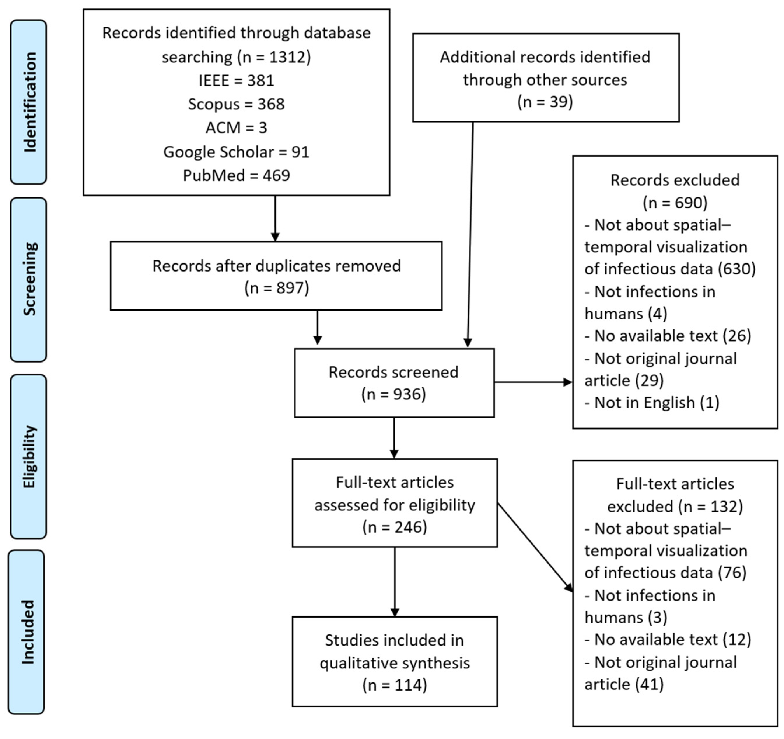
This screening led to the removal of 690 papers, and 246 were eventually chosen for the analysis of the body of the manuscript. We classified these studies based on the terms of interest for our scoping review, since this classification would help us decide the level of importance of each paper in answering our research questions. We arranged the papers that were chosen for reading in a table that would allow us to see and compare the terms of interest that they addressed at a glance. These terms were spatial visualization, temporal visualization, visual analysis, interactive simulation, 3D/AR, epidemic, GIS techniques, geographic visualization, contacts, outbreaks, individual patients, population, infectious disease, bacterial disease, incidence, prevalence, and indoor.
The next step consisted of screening the full text of the papers chosen. We excluded 132 more papers because they met at least one of the aforementioned exclusion criteria or because they did not meet the mandatory inclusion criterion (IC1). Including the papers that we found manually, a total of 114 papers remained. This process is outlined in
Figure 1.
2.5. Charting the Data
We developed a data-charting form to focus on the information that we wanted to extract from each article. This data-charting form contained the following variables: (1) meta-information, including title, year of publication, database, and type of publication (journal article, conference paper, etc.); (2) visualization techniques; (3) analyzed epidemiological data; (4) studied population; (5) target place and population; (6) data accessibility; (7) evaluation methods; and (8) tools used. The form was iteratively updated to meet the scope of the research questions.
In the section on visualization techniques, we analyzed which visualization techniques were applied to represent the spatial aspect, the temporal aspect, and, where appropriate, combinations of the spatial–temporal aspects. Within the spatial aspect, we classified the employed techniques as to whether they were geographic maps, representations of building structures, or statistical methods. In addition to this, we classified each article depending on the objective of the tool, whether it was real-time data presentation, real-time data detection, post-analysis, or trend prediction.
In the section on analyzed epidemiological data, we examined which epidemiological indicators were preferred for the analysis of the population and at what level of temporal and spatial granularity they were studied. For example, this may include the number of cases by country, contacts, mortality, and incidence, among others.
In the section on studied population, we wanted to know at what level the study was conducted, that is, whether it was at the individual or population level. In the section on target place and population, we analyzed whether the study was carried out in a hospital structure and whether the studied population was patients.
In the section on data accessibility, we analyzed what datasets were used and whether they are accessible. In evaluation methods, we listed the methods used in each article to validate the visualization techniques. And, in the section on tools, we enumerated the software tools used for the implementation or application of said visualizations.
2.6. Synthesis
We grouped the studies focusing on answering the research questions. This resulted in (1) an overview of the epidemic measures studied; (2) an overview of the types of temporal and spatial visualizations applied to represent those measures; (3) the classification of the target population in the studies; and (4) an overview of the tools and evaluation methods applied.
4. Discussion
This scoping review aimed to summarize and analyze the current state of the literature on the development and research of spatial–temporal visualization techniques applied to epidemiological data. This scoping review, along with its results, contributes to the literature in several ways. First, it provides a mapping between the study of epidemiological events, the visualization techniques used, and their applications. Second, it analyzes the trends in the development and use of these techniques and their purposes in recent years. Third, it explores studies conducted at local and individual scales, with a focus on the search for studies within hospitals. The latter is particularly relevant in the context of the pandemic situation due to COVID-19. Finally, it summarizes the methodologies used in this field, including the tools, evaluation methods for visualizations, and datasets employed. In this section, we discuss the results obtained for the main research questions.
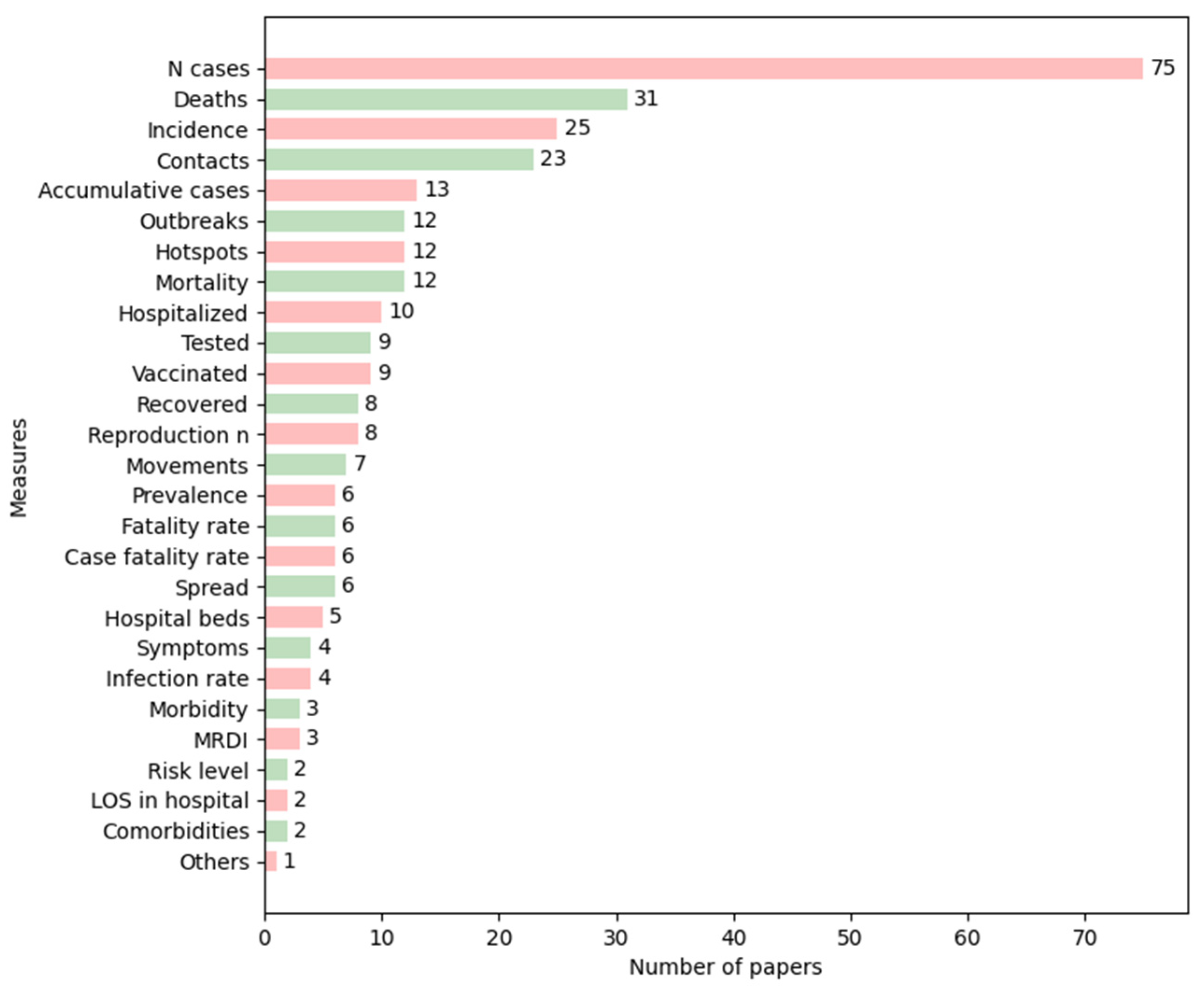
The most relevant tasks in epidemiology for visual representation have, to date, been the visualization of the number of health-related events (e.g., the number of cases of a disease in a population) and the recognition of the occurrences of these events concerning time and space to detect both temporal (at the level of year, season, week, etc.) and spatial patterns (geographic variations, urban and rural differences, etc.) [
13]. Most of the studies reviewed focused on representing aggregate data, such as the number of cases, deaths, and incidence (
Figure 3), which are investigations at a population level. We could see that the most frequently used measures peaked in recent years, except for prevalence, which was applied more in the early 2000s than recently. Regarding the other measures, we could not identify any trend in the papers that met the inclusion criteria defined.
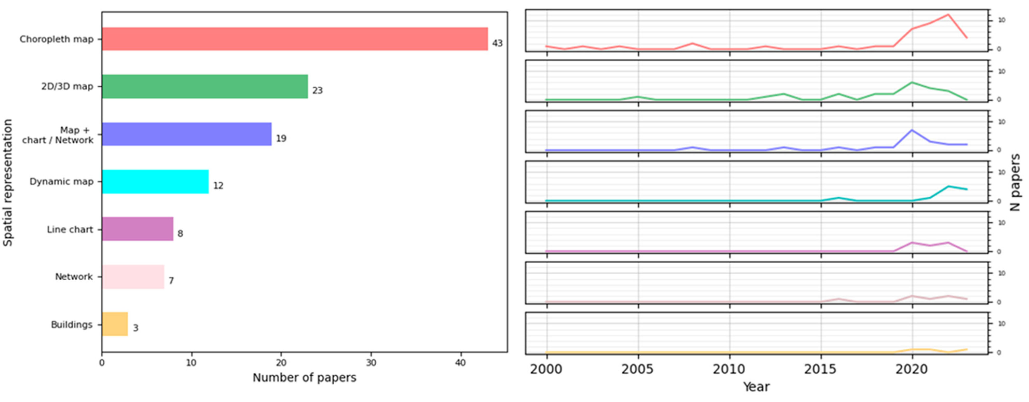
Regarding the spatial visualization of the epidemiological events, the techniques most frequently employed were maps or GIS technologies often combined with widely used charts, such as bar charts, pie charts, and networks. These allow for the representation of movement and the comparison of the same measure in different locations, among other functions. We highlighted the increasing use of choropleth maps in recent years. This kind of representation is a great option to provide a comprehensive view of a situation and facilitates pattern recognition at a glance. However, choropleth maps have some features that need to be taken care of: they are more effective with relative data rather than absolute values when comparing regions. For instance, comparing the number of cases in different places using a choropleth map without considering population size might not provide useful insights; for these cases, alternative approaches may be more suitable, such as symbol maps. It is also important to consider the size of regions when making the comparison, as it can alter the perception of the colored areas. This issue can be addressed by incorporating interactions and text or by replacing the choropleth map with a symbol map or a cartogram, though the latter depends on the user’s knowledge of the geography.
We analyzed the main practical objectives of each presented application and identified four big groups: data presentation, real-time data detection, post-analysis, and trend prediction. Some papers only focused on one objective, while others covered many of them (
Table 2). In the first place, the most common purpose was analytical, primarily for the subsequent study of epidemic situations. The next one was the informative purpose, achieved through data presentation. From
Table 2 and
Table 3, we could infer that there is a trend towards the creation of more complex tools, since, in recent years, there has been an increase in works covering many or all of these objectives. Besides this, there has been a rise in real-time presentation and real-time detection applications, reflecting the growing need for better monitoring and the development of new technologies.
Following this, we found that many papers focused on the analysis and prediction of trends, which is logical given the large number of studies that have emerged to help explain and understand the global situation during the COVID-19 pandemic. In this context, network-based methods can be very useful, as they can be integrated with powerful analytics, such as graph algorithms or arc prediction using Deep Learning. Through an effective layout, networks enable insights into data and facilitate the discovery of trends, outliers, and behavior patterns in complex datasets.
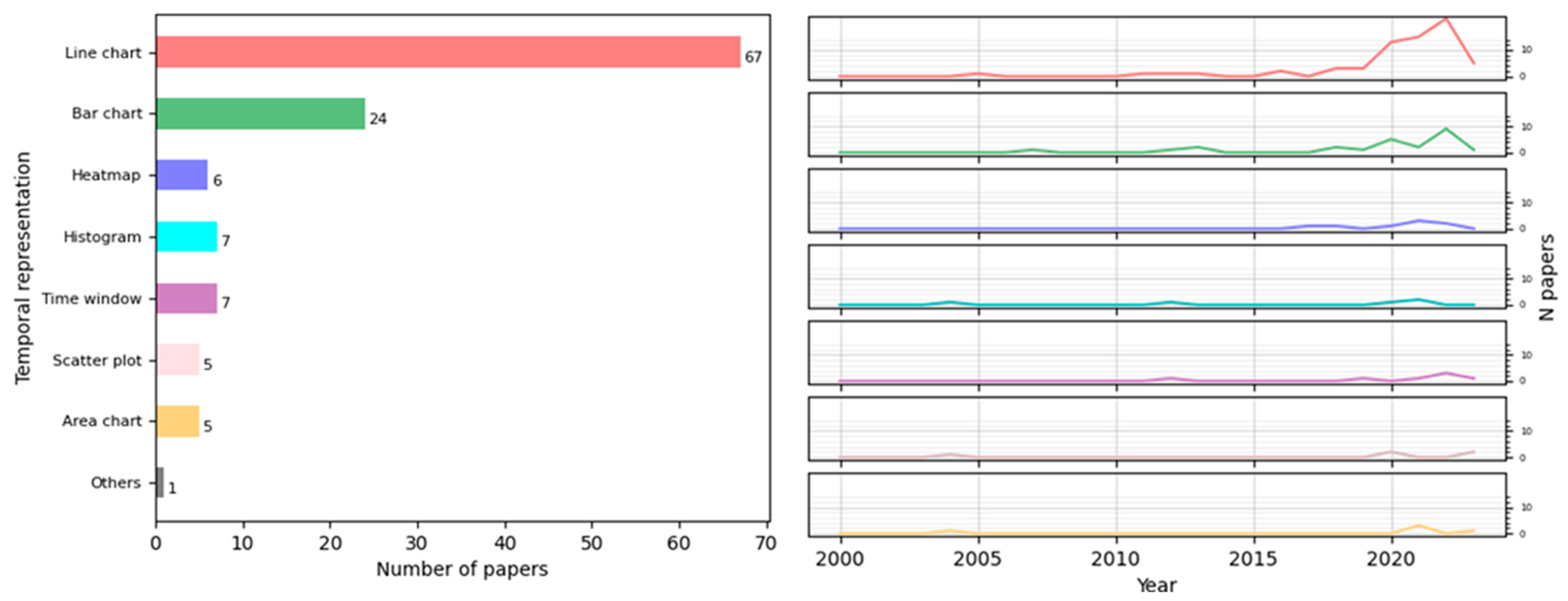
The detection of temporal patterns is essential for studying an epidemic. The most widely used visualization techniques for this were line charts and bar charts, which, along with heatmaps, have seen an increased use recently. Line charts are mainly employed to represent the evolution of a given measure, while bar charts enable the comparison of a measure across different levels of temporal granularity to detect any temporal breakdown that could influence disease appearance. The intuitive and extended nature of these visual representations makes them the preferred options over more specialized techniques [
128].
With regard to spatial–temporal visualizations, most of the papers reviewed sought to capture the epidemic situation of a population or area. The most commonly employed techniques were line charts, maps (either alone or in combination with other techniques), and combinations of charts, such as line, bar, and pie charts, followed by graphs. For real-time data detection, studies mainly used maps with other techniques and heatmaps with graphs. In the post-analysis of data, maps (alone or with other techniques), combinations of charts, line charts with heatmaps, and bar charts with several techniques were utilized. Finally, for trend predictions and estimations, line charts were predominantly used, followed by maps, combinations of statistical charts, and the application of heatmaps and graphs. Thus, the current state of the art involves the combination of maps with animations, which, being dynamic representations, are suitable means to express the general development and the main trends in the data analyzed [
128]. Additionally, a modern application should include, along with maps, interactive time filters or range sliders, allowing the user to choose a temporal granularity or a range of temporal granules (days or weeks, depending on the application), with the map displaying the situation at that moment.
There are currently many tools, programming language packages, and other resources that increasingly facilitate the development of maps and geographic displays. A wide range of tools were used for this purpose, and there appears to be a trend towards the development of web applications. This trend is likely because most of the programs are for informational purposes: the objective is to offer the population easy access to updated information at any time. This also justifies the choice of datasets for these programs, as most of the repeated datasets consist of open sources with information on COVID-19.
Contrary to this, we verified that there has been very little development in the scientific literature regarding programs aimed at facilitating decision-making at the hospital level to mitigate the spread of infectious diseases or epidemics. Only a small number of papers studied the transmission of diseases among patients in hospitals, with just three papers focusing on the spread of an epidemic within a building. Despite the low number of these, all of them were published in recent years, suggesting a potentially emerging trend to represent these data at a more local scale, and we expect more publications of this kind. Although this type of representation is not very extensive, it has several advantages that are more valued nowadays, such as enabling cost-effective studies of the efficacy of mitigation strategies in controlled environments or facilitating monitoring at a local scale, which can reveal patterns and aid in the decision-making process.
Another field of interest for us was the methodology employed in these studies. To this end, we analyzed the developed tools, the chosen evaluation methods, and the datasets. One of the main principles of information visualization is that the tool must be interactive, as it enhances cognition. This means that it must help us better understand the information or solve a problem more effectively. Furthermore, validation is a crucial step in the development of a visualization. Not all visual encodings can solve all tasks, so assessing the quality of a visualization for its specific objectives is essential. Despite this, our study shows that many tools were not interactive but rather static statistical presentations of data, and not all the tools were validated in the papers. However, most of the tools that were validated belong to recent years. This, together with the increasing accessibility of data, suggests a move towards greater transparency and reproducibility in development methodologies.
The papers analyzed did not adopt a single methodology to validate the visualization techniques and tools, but rather different approaches were employed. This coincides with the observation made by Chittaro [
3], who noted the lack of established guidelines and disciplined methodologies for creating information visualizations. Moreover, in some fields such as healthcare, time constraints and other factors (such as work overload and a lack of resources for investigation) do not play in favor of the development of new technologies, including the fulfillment of a valid and formal evaluation. Evaluating visualizations requires a specific analysis of how well they achieve their intended objectives. However, we lack a more rigorous and formal method to validate visualization work in general, as was also pointed out in [
129], since the evaluation of visualization techniques is a key issue in human interaction research.
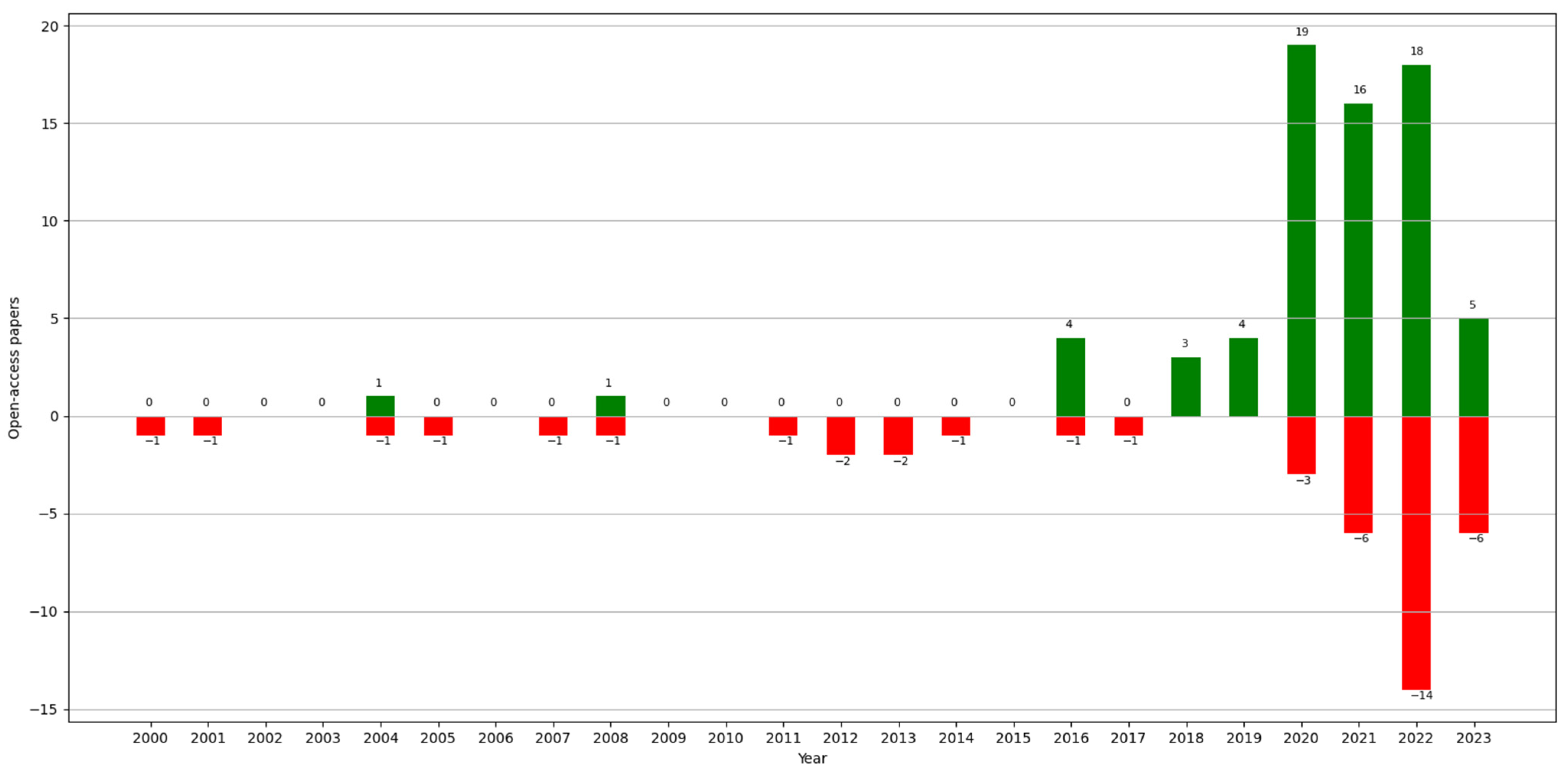
Finally, regarding data accessibility, this is an increasingly important issue concerning the reliability of a paper. Since the “reproducibility crisis”, studied by a survey in 2016 [
130], more and more works in the area of Computer Science are allowing access to the data that they use (unless it compromises privacy) or making the code available for reproducibility. For easier access, the open-access datasets found in the analyzed papers are listed and referenced in
Table A1. Most of these datasets contain information published by governments on websites. In some cases, we found data collected by universities also available on websites or public repositories (e.g., GitHub). Even though there is a growing trend towards open-access data, these continue to be aggregated information, and, sometimes, the computations used are not indicated. Despite the importance at the health and control levels of studying contact between individuals to detect potential risk points or to analyze the transmission of a disease, along with the availability of hospital resources at critical moments of an epidemic, their study is not as extensive as with aggregate data. One potential solution to this issue could be the use of synthetic clinical data, which do not compromise patients’ privacy.
This scoping review has some limitations. First, it is possible that we overlooked relevant works during the search process despite our efforts to make it as extensive as possible through several rounds of searching. Second, we included only papers written in English, so there is a possibility that we missed out interesting works written in other languages, even though the search was conducted at a worldwide scale. Third, this study considered only journal articles to guarantee the study of solid research results. However, this might be considered a potential source of bias in some exceptional cases.
The literature contains several reviews involving data visualization and the human healthcare domain. Here, we analyze and compare our scoping review using two reviews that are the closest to ours in terms of subject matter: a systematic review conducted by Lauren Carroll et al. in 2014 [
7] and a scoping review conducted by Jawad A Chishtie et al. in 2020 [
9].
In the first case, the study carried out by Carroll had several objectives: (1) to identify public health user needs and preferences for infectious disease visualization tools; (2) to identify existing infectious disease information visualization tools; (3) to identify commonalities among approaches applied to different data types; and (4) to describe tool usability evaluation efforts and barriers to the adoption of such tools. It consisted of a systematic review that also followed the PRISMA (Preferred Reporting Items for Systematic Reviews and Meta-Analyses) guidelines, choosing papers written in English between 1980 and mid-2013, of which the authors eventually studied 88. Of all the results attained, it is worth highlighting the analysis of the architecture of existing tools: this term refers to how the systems were created in the sense of software design. The authors sought to study the structure of each system as a whole, whereas we focused on what software tool was used for each part (for the management of data, web implementation, the incorporation of maps, etc.). They then focused on three types of tools: GIS, molecular epidemiology, and social network analysis. Concerning GIS, they detailed what GIS functionalities they found, whereas we indicated only whether or not the programs used GIS technology. In addition to this, they indicated that the systems that combined GIS with time did so using animations and time windows, which coincides with our results. Within molecular epidemiology, they sought to understand the clustering distribution of different molecular groupings of pathogens. In the social network analysis, they studied networks of social contact or exposure to disease that they found in the literature and concluded that there were no visualization methods that would help the user understand network structures at a more aggregate level. Regarding the usability study and evaluation, they discussed the latter at the level of utility and usability and, like us, analyzed the evaluation methods that were repeated in the literature. Finally, unlike our inferences, their conclusions were focused more on the user and the implementation and adoption of visualization tools.
In the second case, the objective of the scoping review conducted by Chishtie [
9] was to summarize the use of visual analytics tools, techniques, and frameworks in interrelated areas of population health and health services research. This review was based on the PRISMA-ScR methodology [
10], and the authors chose articles published in English between 2005 and early 2019 and obtained a final total of 55 articles. With regard to the results, it should be noted that, although they analyzed the software programs used for the programming of applications, as we did, they focused on their analytic capacities. Regarding the characteristics of data and datasets, they distinguished whether the studies used single dataset sources, multiple, or both, and they categorized said sources depending on whether they were simulation data, social network or web data, EMR or EHR data, and national or administrative survey data, unlike us, as we were more interested in discovering the data sources that were used in the papers and that were accessible. In the results concerning analytics and visualization engines, they, like us, indicated the main development tools, but they dedicated only a small paragraph to the visualization techniques most frequently employed. Finally, regarding the availability of tools, they studied the percentage of investigations that were open-source or available, and they indicated the main evaluation methods found, attaining similar conclusions to ours in this respect.


