
Clustering and Forecasting Urban Bus Passenger Demand with a Combination of Time Series Models


Abstract
:1. Introduction
2. Study Area
Descriptive Data Analysis
3. Methodology
- Holt–Winters seasonal exponential smoothing. Holt [26] and Winters [27] extended Holt’s method to capture seasonality. The Holt–Winters seasonal method comprises the forecast equation and three smoothing equations and is used for forecasting time series data that exhibits both a trend and a seasonal variation. The unknown parameters are determined by minimising the squared prediction error. More details can be found, for example, in [28,29,30].
- The Arima model or Box–Jenkins method. Introduced by Box et al. [31], this method focuses on the autocorrelation between the observations, describing each value as a linear function of previous data and errors due to chance, being able to include a cyclical or seasonal component. The acronym ARIMA stands for auto-regressive integrated moving average and its a generalisation of an auto-regressive moving average (ARMA) model.
- The K-nearest Neighbours (KNN) method. KNN is a very popular algorithm used in classification and regression. This algorithm stores a collection of examples. Each example consists of a vector of features that describe the example and, in our case, its numeric value (for prediction). Given a new example, KNN finds its k most similar examples, called nearest neighbours, according to a distance metric and predicts its value as an aggregation of the target values associated with its nearest neighbours. The multiple input multiple output (MIMO) strategy to forecast multiple steps ahead, commonly applied with KNN, with , is used.
- Autoregressive neural networks (ARNN). This method is based on a combination of the multilayer perceptron method with an autoregressive linear model. For time series data the lagged (autoregressive) values of the time series are used as inputs to a neural network. The objective is then to determine how many lags to include in the input layer and how many neurons to include in the hidden layer to produce a forecast that minimises the error. The ARNN is trained to make use of the R Package developed by Velásquez et al. [32].
- Support vector machines (SVM) are a type of neural network that can be used for prediction in time series. Parameter estimation is done by minimising a risk function where the empirical error between the model and the data and a regularisation component that depends only on the weights is measured. In this work, a modification of the SVM procedure is presented, in which explanatory variables are incorporated to contribute to the accuracy of both the fit and the prediction. Without this modification, the SVM model does not capture the temporal dynamics of the data (hours, days, weeks, ....). First, variables to represent the hour and the day of the week are constructed by means of indicator variables (dummies). In addition, autoregressive variables and lags smoothed by means of a moving average are included to capture the dynamics of the series more accurately.
- Exponential smoothing state space model with Box–Cox transformation, ARMA errors, trend and seasonal components (TBATS). TBATS is an acronym for key features of the model: T: trigonometric seasonality; B: Box–Cox transformation; A: ARIMA errors; T: trend; S: seasonal components. The main aim of this model is to forecast time series with complex seasonal patterns using exponential smoothing. The trigonometric seasonality expression can significantly reduce model parameters at high seasonality frequencies and at the same time offer the model plasticity to compromise with complex seasonality [33].
4. Results
4.1. Clustering Analysis
4.2. Forecasting Ridership Patterns
4.2.1. Predictions and Combinations by Cluster
Cluster 1
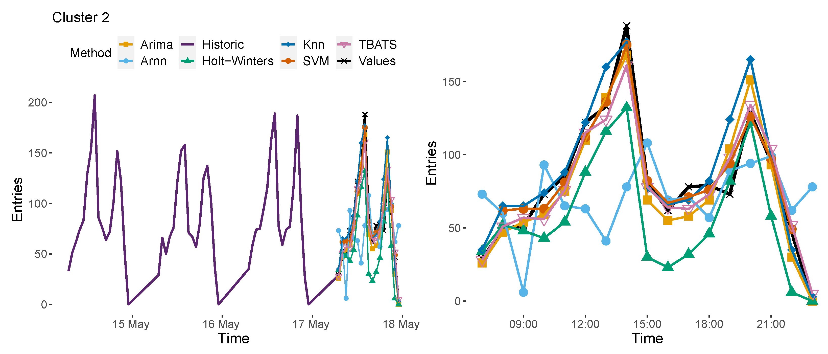
Cluster 2
Cluster 3
Cluster 4
4.3. Cointegration Study
5. Conclusions
Author Contributions
Funding
Acknowledgments
Conflicts of Interest
References
- Shirkhorshidi, A.S.; Aghabozorgi, S.; Wah, T.Y.; Herawan, T. Big Data Clustering: A Review. In Proceedings of the 14th International Conference on Computational Science and Its Applications—ICCSA 2014, Guimarães, Portugal, 30 June–3 July 2014; Springer: Berlin/Heidelberg, Germany, 2014; Volume 8583. [Google Scholar]
- Maharaj, E.A.; D’Urso, P.; Caiado, J. Time Series Clustering and Classification; Chapman and Hall/CRC: Boca Raton, FL, USA, 2019. [Google Scholar]
- De Menezes, L.M.; Bunn, D.W.; Taylor, J.W. Review of guidelines for the use of combined forecasts. Eur. J. Oper. Res. 2000, 120, 190–204. [Google Scholar] [CrossRef]
- Briand, A.S.; Côme, E.; Trépanier, M.; Oukhellou, L. Analyzing year-to-year changes in public transport passenger behaviour using smart card data. Transp. Res. Part C Emerg. Technol. 2017, 79, 274–289. [Google Scholar] [CrossRef]
- Chen, C.; Chen, J.; Barry, J. Diurnal pattern of transit ridership: A case study of the New York City subway system. J. Transp. Geogr. 2009, 17, 176–186. [Google Scholar] [CrossRef]
- El Mahrsi, M.K.; Come, E.; Oukhellou, L.; Verleysen, M. Clustering Smart Card Data for Urban Mobility Analysis. IEEE Trans. Intell. Transp. Syst. 2017, 18, 712–728. [Google Scholar] [CrossRef]
- Wang, W.; Lo, S.; Liu, S. Aggregated metro trip patterns in urban areas of Hong Kong: Evidence from automatic fare collection records. J. Urban Plan. Dev. 2015, 141, 05014018. [Google Scholar] [CrossRef]
- Kim, M.K.; Kim, S.P.; Heo, J.; Sohn, H.G. Ridership patterns at subway stations of Seoul capital area and characteristics of station influence area. KSCE J. Civ. Eng. 2017, 21, 964–975. [Google Scholar] [CrossRef]
- Ding, C.; Cao, X.; Liu, C. How does the station-area built environment influence Metrorail ridership? Using gradient boosting decision trees to identify non-linear thresholds. J. Transp. Geogr. 2019, 77, 70–78. [Google Scholar] [CrossRef]
- Mariñas-Collado, I.; Frutos-Bernal, E.; Santos-Martin, M.T.; del Rey, A.M.; Casado-Vara, R.; Gil-González, A.B. A Mathematical Study of Barcelona Metro Network. Electronics 2021, 10, 557. [Google Scholar] [CrossRef]
- Frutos-Bernal, E.; Martín del Rey, Á.; Mariñas-Collado, I.; Santos-Martín, M.T. An Analysis of Travel Patterns in Barcelona Metro Using Tucker3 Decomposition. Mathematics 2022, 10, 1122. [Google Scholar] [CrossRef]
- Cyril, A.; Mulangi, R.H.; George, V. Modelling and forecasting bus passenger demand using time series method. In Proceedings of the 2018 7th International Conference on Reliability, Infocom Technologies and Optimization (Trends and Future Directions) (ICRITO), Noida, India, 29–31 August 2018; IEEE: New York, NY, USA, 2018; pp. 460–466. [Google Scholar]
- Zhai, H.; Tian, R.; Cui, L.; Xu, X.; Zhang, W. A novel hierarchical hybrid model for short-term bus passenger flow forecasting. J. Adv. Transp. 2020, 2020, 7917353. [Google Scholar] [CrossRef]
- Comi, A.; Polimeni, A. Bus Travel Time: Experimental Evidence and Forecasting. Forecasting 2020, 2, 309–322. [Google Scholar] [CrossRef]
- Ye, Y.; Liu, R.; Xue, F. Application of time series method to the passenger flow prediction in the intelligent bus transportation system with big data. In Sensor Networks and Signal Processing; Springer: Berlin/Heidelberg, Germany, 2021; pp. 497–520. [Google Scholar]
- Gummadi, R.; Edara, S.R. Prediction of passenger flow of transit buses over a period of time using artificial neural network. In Proceedings of the Third International Congress on Information and Communication Technology, London, UK, 15–16 November 2018; Springer: Singapore, 2019; pp. 963–971. [Google Scholar]
- Engle, R.F.; Granger, C.W. Cointegration and error correction: Representation, estimation, and testing. Econom. J. Econom. Soc. 1987, 55, 251–276. [Google Scholar]
- Abdallah, K.B.; Belloumi, M.; De Wolf, D. Indicators for sustainable energy development: A multivariate cointegration and causality analysis from Tunisian road transport sector. Renew. Sustain. Energy Rev. 2013, 25, 34–43. [Google Scholar] [CrossRef]
- Wen, X.; Yang, T.; Guo, X.; Hu, Y. An Analysis of Cointegration Relationship between Public Transportation and Air Quality of Healthy Cities. In Proceedings of the 20th COTA International Conference of Transportation Professionals (CICTP 2020), Xi’an, China, 14–16 August 2020; pp. 2892–2903. [Google Scholar]
- Lin, J.; Li, Y. Finding structural similarity in time series data using bag-of-patterns representation. In Proceedings of the International Conference on Scientific and Statistical Database Management, New Orleans, LA, USA, 2–4 June 2009; Springer: Berlin/Heidelberg, Germany, 2009; pp. 461–477. [Google Scholar]
- Corduas, M. Mining time series data: A selective survey. In Data Analysis and Classification; Springer: Berlin/Heidelberg, Germany, 2010; pp. 355–362. [Google Scholar]
- Peña, D.; Galeano, P. Multivariate analysis in vector time series. In DES—Working Papers. Statistics and Econometrics. WS; Universidad Carlos III de Madrid: Getafe, Spain, 2001. [Google Scholar]
- Caiado, J.; Crato, N.; Peña, D. A periodogram-based metric for time series classification. Comput. Stat. Data Anal. 2006, 50, 2668–2684. [Google Scholar] [CrossRef] [Green Version]
- D’Urso, P.; Maharaj, E.A. Autocorrelation-based fuzzy clustering of time series. Fuzzy Sets Syst. 2009, 160, 3565–3589. [Google Scholar] [CrossRef]
- Charrad, M.; Ghazzali, N.; Boiteau, V.; Niknafs, A. Determining the Best Number of Clusters in a Data Set. 2015. Available online: https://cran.rproject.org/web/packages/NbClust/NbClust.pdf (accessed on 1 November 2021).
- Holt, C.C. Forecasting seasonals and trends by exponentially weighted moving averages. ONR Memo. 1957, 52, 5–10. [Google Scholar]
- Winters, P.R. Forecasting sales by exponentially weighted moving averages. Manag. Sci. 1960, 6, 324–342. [Google Scholar] [CrossRef]
- Holt, C.C. Forecasting seasonals and trends by exponentially weighted moving averages. Int. J. Forecast. 2004, 20, 5–10. [Google Scholar] [CrossRef]
- Gardner, E.S., Jr. Exponential smoothing: The state of the art—Part II. Int. J. Forecast. 2006, 22, 637–666. [Google Scholar] [CrossRef]
- Hyndman, R.J.; Athanasopoulos, G. Forecasting: Principles and Practice. 2013. Available online: https://www.otexts.org/fpp (accessed on 15 February 2018).
- Box, G.E.; Jenkins, G.M.; Reinsel, G.C.; Ljung, G.M. Time Series Analysis: Forecasting and Control; John Wiley & Sons: Hoboken, NJ, USA, 2015. [Google Scholar]
- Velásquez, J.D.; Zambrano, C.; Vélez, L. ARNN: Un paquete para la predicción de series de tiempo usando redes neuronales autorregresivas. Rev. Av. Sist. Inf. 2011, 8, 177–181. [Google Scholar]
- Karabiber, O.A.; Xydis, G. Electricity price forecasting in the Danish day-ahead market using the TBATS, ANN and ARIMA methods. Energies 2019, 12, 928. [Google Scholar] [CrossRef] [Green Version]
- Timmermann, A. Forecast combinations. Handb. Econ. Forecast. 2006, 1, 135–196. [Google Scholar]
- Bates, J.; Granger, C. The combination of forecasts. J. Oper. Res. Soc. 1969, 20, 451–468. [Google Scholar] [CrossRef]
- Granger, C.W.; Ramanathan, R. Improved methods of combining forecasts. J. Forecast. 1984, 3, 197–204. [Google Scholar] [CrossRef]
- Johansen, S. Estimation and hypothesis testing of cointegration vectors in Gaussian vector autoregressive models. Econom. J. Econom. Soc. 1991, 59, 1551–1580. [Google Scholar] [CrossRef]
- Johansen, S. Likelihood-Based Inference in Cointegrated Vector Autoregressive Models; Oxford University Press on Demand: New York, NY, USA, 1995. [Google Scholar]
- R Core Team. R: A Language and Environment for Statistical Computing; R Foundation for Statistical Computing: Vienna, Austria, 2021. [Google Scholar]
- IHS Global Inc. EViews 10 for Windows; IHS Global Inc.: Englewood, CO, USA, 2017. [Google Scholar]
- IBM Corp. IBM SPSS Statistics for Windows; IBM Corp.: Armonk, NY, USA, 2019. [Google Scholar]


| ARIMA | H–W | KNN | ARNN | SVM | TBATS | ||
|---|---|---|---|---|---|---|---|
| CLUSTER 1 | MAE | 7.77 | 5.73 | 7.83 | 8.51 | 4.85 | 5.34 |
| MSE | 98.90 | 62.18 | 100.30 | 117.22 | 42.68 | 49.23 | |
| CLUSTER 2 | MAE | 32.02 | 35.34 | 39.39 | 42.54 | 17.21 | 25.02 |
| MSE | 2047.28 | 2325.61 | 3303.37 | 3365.08 | 475.58 | 1190.70 | |
| CLUSTER 3 | MAE | 14.46 | 15 | 18.68 | 24.18 | 9.72 | 13.58 |
| MSE | 882.53 | 1019.44 | 1213.24 | 1749.24 | 167.32 | 598.37 | |
| CLUSTER 4 | MAE | 9.29 | 8.71 | 11.46 | 14.11 | 5.81 | 8.57 |
| MSE | 267.34 | 240.89 | 364.13 | 424.30 | 50.99 | 182.10 |
| Models | ARIMA | H-W | KNN | ARNN | SVM | TBATS |
| MAE | 5.47 | 4.12 | 6.29 | 10.88 | 3.33 | 4.41 |
| MSE | 57.24 | 38.59 | 70.65 | 206.29 | 22.80 | 41.47 |
| Best 3 Comb. | AM | B&G | CLS | |||
| MAE | 3.33 | 3.13 | 3.33 | |||
| MSE | 30.40 | 28.20 | 22.80 |
| Models | ARIMA | H-W | KNN | ARNN | SVM | TBATS |
| MAE | 11.24 | 26.12 | 12.06 | 30.47 | 7.13 | 9 |
| MSE | 197 | 1006 | 325.12 | 1694 | 81.67 | 136.53 |
| Best 3 Comb. | AM | B&G | CLS | |||
| MAE | 8.53 | 7.86 | 7.13 | |||
| MSE | 122.53 | 103.07 | 81.67 |
| Models | ARIMA | H-W | KNN | ARNN | SVM | TBATS |
| MAE | 8.47 | 6.65 | 11.54 | 21.76 | 3.60 | 7.41 |
| MSE | 122.47 | 67.83 | 358.59 | 1693.18 | 31.20 | 137.29 |
| Best 3 Comb. | AM | B&G | CLS | |||
| MAE | 4.07 | 3.60 | 3.87 | |||
| MSE | 28.87 | 24.87 | 23.47 |
| Models | ARIMA | H-W | KNN | ARNN | SVM | TBATS |
| MAE | 6.06 | 5.12 | 7.71 | 14.47 | 5.40 | 5.76 |
| MSE | 51.47 | 40.06 | 168.65 | 486.35 | 36.87 | 62 |
| Best 3 Comb. | AM | B&G | CLS | |||
| MAE | 5.46 | 5.26 | 5.40 | |||
| MSE | 43.87 | 40.06 | 38.70 |
| Cointegration Equation | ||
|---|---|---|
| CLUSTER 1 | Stop(73) = 13.48 + 1.54 | 0.8354 |
| Stop(268) = 6.76 + 1.55 | 0.8619 | |
| CLUSTER 2 | Stop(128) = 4 + 0.94 | 0.7434 |
| Stop(91) = 1.46 + 0.36 | 0.8821 | |
| CLUSTER 3 | Stop(101) = −0.64 + 0.05 | 0.8854 |
| Stop(138) = −1.84 + 0.19 | 0.9123 | |
| CLUSTER 4 | Stop(116) = 2.47 + 0.46 | 0.7000 |
| Stop(136) = 1.11 + 0.39 | 0.7718 |
Publisher’s Note: MDPI stays neutral with regard to jurisdictional claims in published maps and institutional affiliations. |
© 2022 by the authors. Licensee MDPI, Basel, Switzerland. This article is an open access article distributed under the terms and conditions of the Creative Commons Attribution (CC BY) license (https://creativecommons.org/licenses/by/4.0/).
Share and Cite
Mariñas-Collado, I.; Sipols, A.E.; Santos-Martín, M.T.; Frutos-Bernal, E. Clustering and Forecasting Urban Bus Passenger Demand with a Combination of Time Series Models. Mathematics 2022, 10, 2670. https://doi.org/10.3390/math10152670
Mariñas-Collado I, Sipols AE, Santos-Martín MT, Frutos-Bernal E. Clustering and Forecasting Urban Bus Passenger Demand with a Combination of Time Series Models. Mathematics. 2022; 10(15):2670. https://doi.org/10.3390/math10152670
Chicago/Turabian StyleMariñas-Collado, Irene, Ana E. Sipols, M. Teresa Santos-Martín, and Elisa Frutos-Bernal. 2022. "Clustering and Forecasting Urban Bus Passenger Demand with a Combination of Time Series Models" Mathematics 10, no. 15: 2670. https://doi.org/10.3390/math10152670
APA StyleMariñas-Collado, I., Sipols, A. E., Santos-Martín, M. T., & Frutos-Bernal, E. (2022). Clustering and Forecasting Urban Bus Passenger Demand with a Combination of Time Series Models. Mathematics, 10(15), 2670. https://doi.org/10.3390/math10152670