Article

Secondary School Students’ Construction and Interpretation of Statistical Tables

by
Jocelyn D. Pallauta
,
Pedro Arteaga
* and
José A. Garzón-Guerrero
Department of Mathematics Education, University of Granada, 18071 Granada, Spain
*
Author to whom correspondence should be addressed.
Mathematics 2021, 9(24), 3197; https://doi.org/10.3390/math9243197
Submission received: 25 November 2021 / Revised: 9 December 2021 / Accepted: 9 December 2021 / Published: 11 December 2021
(This article belongs to the Special Issue Statistics Education: An Immediate Need in a Changing World)

Abstract

:
Understanding statistical tables is a main component of statistical literacy, although related research dealing with secondary school students is scarce. The purpose of this study was to investigate secondary school students’ performance when translating graphs to tables and then interpreting the resulting table. Using content analysis of the responses to a questionnaire given to a sample of Spanish students, we analysed the correctness of the constructed table, the semiotic conflicts that appeared in their construction, the interpretation of the table elements, the ability to argue on the basis of the information in the table, and the reading level exhibited by the student in this task. Most students correctly translated a pictogram to a frequency table, and a half of them a double bar graph to a two-way table. The main semiotic conflicts were misinterpretation of the icon in the pictogram and incorrect computation of marginal frequencies. About 40% of the sample correctly justified a statement using the data in the graph and then reached the upper reading level of the graph and table, but only a minority achieved that level when the question required knowledge of the context. The findings of the study suggested points to reinforce the teaching of statistical graphs and tables.

1. Introduction

Statistical tables are widely used to summarize and communicate information in the media and professional work [1,2], as well as in science and technology, and will be one of the most common representation of data in the coming years [3]. In the study of science and social sciences, these representations are used to construct and communicate abstract concepts, as well as to bridge the gap between experiential data and scientific formalizations. Thus, they help to visualise abstract concepts and relationships that are difficult for students to understand [4]. It is therefore necessary for the student to be able to represent data in a table, as this process will allow them to generalize concepts and thus establish better conclusions [5]. Consequently, the ability to read, interpret, and build statistical tables is a component of statistical literacy that all citizens need to successfully face the information society [6,7,8,9]. This need for statistical literacy has become even more evident in the current crisis caused by COVID-19, in which the lack of statistical literacy of citizens caused many of them to misunderstand the situation and not to accept the restrictions imposed by the authorities [10].
Taking into account that the school must provide such statistical literacy [11], the Spanish curricular documents [12] propose working with statistical tables throughout primary education (6 to 11-year-olds) to record and classify qualitative and quantitative data, as well as to build absolute and relative frequencies tables. In the 1st and 2nd grades of secondary education [13], students are asked to organise data obtained from a population of qualitative or quantitative variables into tables, compute their absolute and relative frequencies, and represent them graphically, as well as to carry out the opposite process of translating graphs into tables. This work continues in 3rd grade, where cumulative frequencies are introduced.
Although statistical tables are considered easy by teachers, due to their wide use [14] and their high presence in textbooks [15], research shows the need to reinforce their teaching, given the cognitive skills involved in their understanding and construction [16,17,18], which have also been described in other mathematical topics [19].
While there is previous research related to statistical tables, most of it focuses on the analysis of the way in which these tables are presented in textbooks, e.g., [20,21,22]. The scarce research on students’ understanding of statistical tables is centred on primary school students, with very few investigations carried out with secondary school students. Moreover, practically all these papers analyse either the construction or the reading of tables without attention to the translation between graphs and tables.
In order to complement this previous research, the aim of this paper was to study the different components of the process required when translating statistical graphs into tables and then interpreting the table produced in a sample of Spanish secondary education students. Specifically, we intended to reply the following research questions: (1) Are the tables constructed by the students correct?; (2) Which are the semiotic conflicts that appear in the table construction?; (3) Are the students able to read the table elements?; (4) Do the students show ability to argue based on the information in the table?; and (5) Which are the reading level exhibited by the student in the tasks?
In the following, the study rationale, the methodology used, and the results obtained are presented, concluding with a discussion of the main findings and some recommendations for the teaching of the subject.

2. Foundations

2.1. Classification of Statistical Tables

There is a wide variety of types of statistical tables, which were classified into three main groups by Lahanier-Reuter [23]: data table, table of one-variable distribution, and contingency table. Each one has specific functions that contribute to make sense of them, and are analysed below.
  • Data tables are the first way to organize a data set. They are displayed as a matrix that contains, for each individual in the sample, the values of one or several variables. In this representation, the ideas of variable and value appear, but not that of frequency associated with each variable modality; therefore, the concepts of distribution or statistical variable do not emerge.
  • One-variable distribution tables describe the distribution of a variable, since they associate each modality of the variable with the number of individuals in the sample (frequency) that present this modality. These tables involve the concepts of frequency and distribution, in addition to those of the variable and its values.
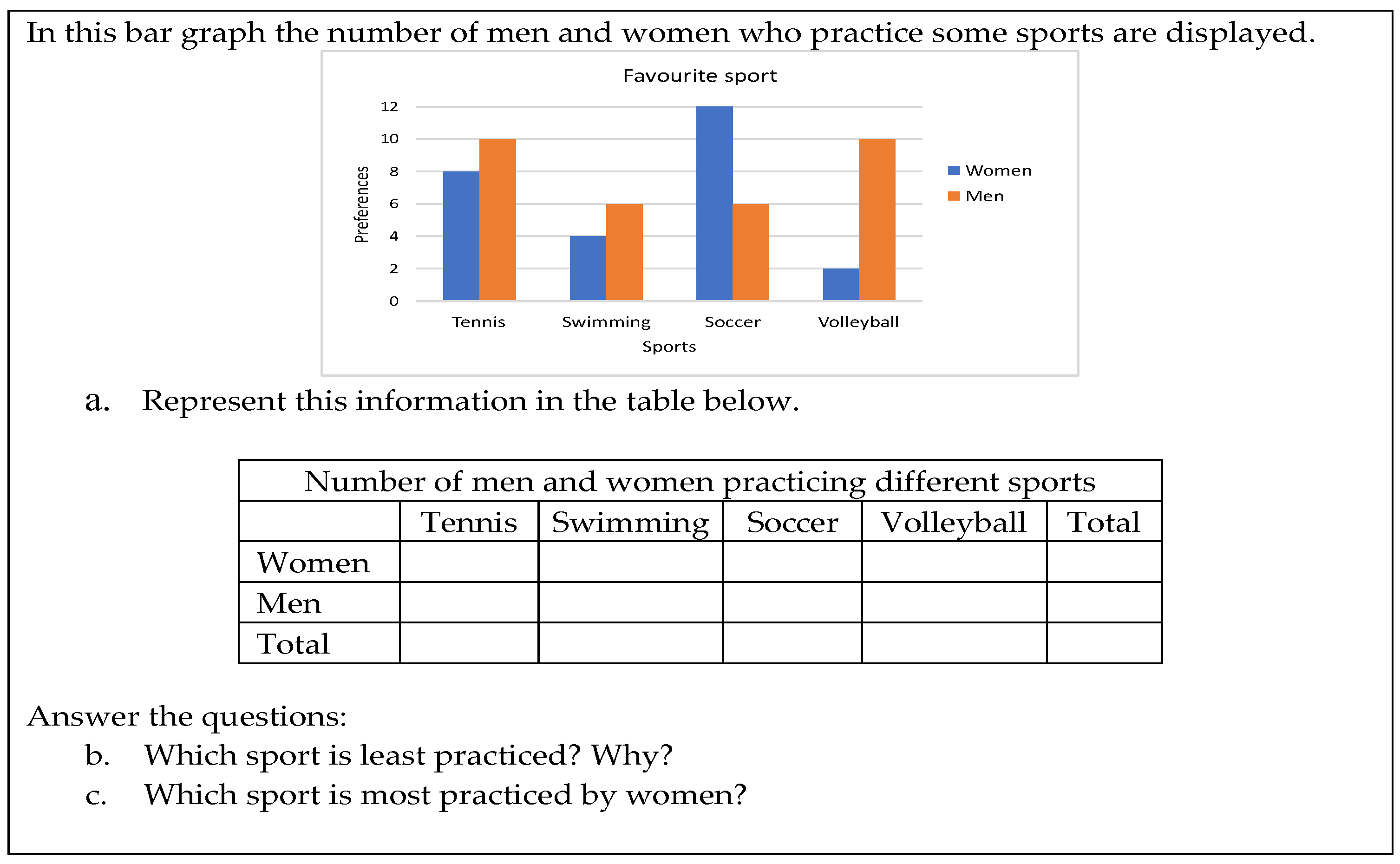
  • A two-way or contingency table represents the data obtained when crossing two statistical variables. In the upper part of the table (first row), the modalities of one of the variables are indicated, while the modalities of the second variable are included in the first column. The body of the table is formed by the joint frequencies corresponding to the modality of the row for the first variable and the column for the second variable. Other concepts linked to these tables are those of marginal and conditional frequencies, as well as association between the variables.

2.2. Reading Levels of Tables and Graphs

When considering the different questions that can be asked from a table, or statistical graph, it is possible to consider their increasing difficulty, so that different authors have defined reading levels. In our work, we used the hierarchy of reading statistical graphs established by Curcio [24], and extended by Shaughnessy et al. [25] with a fourth level, which was finally integrated by Friel et al. [26]. This hierarchy is also valid for statistical tables:
  • Reading the data. At this level, the questions only involve a literal reading of information that is explicit on the table or graph, and therefore no calculations or other operations are required to be performed on the data represented. An example would be asking the learner the frequency of a given value of the variable.
  • Reading between the data. At this level, the question involves not only literal reading, but also comparison of data represented in the table, or calculations. This level is required, for example, to determine the mean of a distribution or to compare the frequencies of two particular values.
  • Reading beyond the data. These are questions that involve a greater ability to read the statistical graph or table, as they request to infer unrepresented information that cannot be extracted arithmetically. An example is interpolating or extrapolating a value in a series of ordered data over time.
  • Reading behind the data. This is the most advanced level, involving not only reading the graph or table, but being able to make a critical appraisal of its content, the sources from which the information has been extracted, or statements made about its content.

2.3. Mathematical Activity and Semiotic Conflicts

In the paper, we also used some ideas taken from the onto-semiotic approach [27,28]. In this theoretical framework, the meaning of mathematical objects is supposed to emerge from the mathematical practices carried out to solve problems related to the object. These researchers took the idea of “semiotic function” from Eco [29] as a correspondence between an expression (initial object or sign) and a content (the final object; what is represented), which is fixed by a rule of correspondence that relates the expression to the content. The authors suggested that any possible mathematical object (concept, property, argument, procedure, etc.) may play both the role of expression and content in a semiotic function. The authors defined semiotic conflicts as the students’ interpretation of mathematical expressions that do not agree with what is accepted as correct by the teacher or the researcher. These semiotic conflicts produce errors by the students that are not due to the students’ lack of knowledge, but to the fact that students established an incorrect correspondence between the two terms in a semiotic function. Semiotic conflicts can be classified as conceptual, when the misinterpretation refers to a mathematical concept, procedural if there is a misunderstanding of a procedure, and notational if the confusion is related to mathematical language (symbols, mathematical terms, graphs, or another mathematical language).

2.4. Reading Tables by Students

Research analysing the students’ performance with statistical tables is scarce, despite that this type of representation is widely used in the classroom [30].
Some of these authors have analysed the achievement of students when replying questions of different difficulty using the data displayed in a statistical table. Thus, Díaz-Levicoy et al. [31] analysed the understanding of tables by 79 students in the 3rd grade of primary education in Chile. They posed different questions concerning the two first reading levels defined by Friel et al. [26] (L1, reading the data and L2, reading between the data) for data tables and simple frequency tables, and found that the majority of children reached level L1, and many of them also reached level L2. The authors did not investigate the children’s ability to answer questions at higher level of reading.
In another study, and starting from [26] graph-reading levels, Gabucio et al. [16] developed the following four levels to describe how students read tables: (a) tabular structure comprehension, or understanding of the different elements of the table; (b) direct data reading (reading data explicitly displayed in the table, equivalent to level L1, reading the data, in Friel et al.,’s [26] model); (c) data inference, finding data not directly represented in the table, which combines levels L2 and L3 in Friel et al.,’s [26] classification; and (d) global interpretation, equivalent to level L4, reading behind the data level in Friel et al. [26]. To test the level achieved by students in their model, they proposed a questionnaire with 12 multiple-choice items related to a two-way table to 112 Spanish 5th and 6th graders (11–12-year-olds) and 88 secondary education 1st and 2nd graders (13–14-year-olds). The authors reported that the questions requiring data inference were more difficult than those requiring direct reading. One of these questions required to justify a statement based on the data table, but the possible answers were pre-established as distractors in the item. The authors reported a level of 13% of correct responses in the whole sample. The percentage of success in the items responding to direct reading ranged from 80.5% to 89.5% and those corresponding to data inference between 29% and 47%. There was a very small improvement in the number of correct answers to their questionnaire with grade.
This study was replicated by Castellaro and Roselli [32], who conducted a comparative study with 90 Argentinean 6th and 7th graders (average age 12.3 years), and they compared responses of students that solved the questionnaire [16] individually and in pairs. The results revealed no progress in the questions requiring data inference, and working in pairs did not improve the results obtained individually.

2.5. Construction of Tables and Transnumeration Processes

Other authors have been interested in the construction of tables from data presented verbally or in a graph. Such activities, according to Chick [33], are examples of transnumeration processes [34], which consist of changing the data representation to produce new understanding of the data or to answer questions from the data. According to Chick [33], the construction of tables involves some of the following transnumeration processes: ordering and classification of data, grouping the data, and calculation of frequencies, which implies high cognitive demand, especially for primary school students [35]. For example, Pfannkuch and Rubick [36] pointed out that students were not aware of the need to summarize information, and it was complex for them to establish classification criteria when they analysed a large list of data. In this sense, Marti et al. [37] suggested that the construction of tables requires segmentation processes along with deciding the variables to be represented, the frequencies to be computed, and adjusting such information in the spatial structure that characterizes the table.
Research on primary school students confirmed these difficulties, as it was not easy for them to translate graphs to frequency tables [38], or find criteria to organize data in tables [30]. Using data from the school context, Estrella and Estrella [30] analysed the tables constructed by 56 Chilean primary school grade 3 students (7 to 9 years old) when asked to organize the data on the snacks consumed by the students the previous day. The results showed that most students constructed data tables (77%) or described the data verbally (20%), while only a low percentage of them elaborated frequency tables (3%).
Marti et al. [37] proposed, using a sample of 153 Spanish students, from primary school grades 5 and 6 (10–12 years of age) and secondary education grades 1 and 2 (13–14 years of age), the construction of a two-way table with data grouped in intervals from a list of data (name, surname, age, and height) of a group of people. The students were expected to organize a table crossing the variables height and sex. The authors found that the main difficulties consisted of defining the variables and categories, computing the joint frequencies, and distributing the data in the table. The best results were achieved in the 2nd grade of secondary school (58% correct tables), while in the 5th grade of primary school, there were only 26% correct responses. However, 6th graders in primary school obtained better results (51%) than 1st graders in secondary school (33%).
As regards adolescents, Álvarez et al. [39] conducted an investigation with 65 Colombian students aged 15 to 18 years to analyse their difficulties in constructing frequency tables with grouped data. The main difficulties in the tasks were confusion of different types of frequencies with the value of the variable, and arithmetic errors in the calculation of different types of frequencies or in the table total.
In an investigation of the comprehension of statistical graphs, Díaz-Levicoy [38] included a task in which the students had to translate a pictogram into a data table, and found 74.5% of correctly constructed tables by 6th graders and 76.4% by 7th graders. He also found that 92% of students achieved the reading level L2, reading between the data in Friel et al.,’s [26] model. A second task required the students to discuss the trueness of a statement using the information provided in another pictogram, but did not include the translation from the graph to a table. The author found 61% correct responses by the 6th graders and 64% by the 7th graders. Regarding the reading level, the majority of students succeeded at level L2 (55.4%) or L1 (37.3%), with only 5.6% of children reaching the maximum level L4 in the first questions posed and 11.1% in the second. Finally, in a third item, students were requested to translate a double bar graph into a two-way table, although the participants were not asked to read the table afterwards. The percentages of correct responses were only 3.7% by 6th graders and 2.7% by 7th graders, although 35.3% of 6th graders and 36.7% of 7th graders built correct tables, except for minor details.
In summary, there is scarce research on secondary school students’ understanding of statistical tables, and almost all of it has focused on two-way tables. Moreover, research dealing with primary school students that investigated the translation of graphs to tables did not enquire about the critical reading of the table. Finally, none of these studies interpreted the students’ difficulties in the construction of the table in terms of semiotic conflicts.
Consequently, our research contributes new knowledge about secondary school students’ abilities when translating a graph to a unidimensional frequency table and a two-way table, reading different frequencies in a two-way table, the ability to argue on the basis of the information in the table, and the reading level exhibited by the student in this task.

3. Materials and Methods

The study involved 277 Spanish students of compulsory secondary education from two public schools in the same region, 149 of them in grade 1 (14–15 years old) and 128 in grade 3 (15–16 years old). The sample was intentional, and all the students in the same grade in each school took part in the evaluation. Permission to collect the data was granted by the school directors and the teachers of the children. All the data collection was respectful with ethical considerations, and the activity was also intended to reinforce the students’ learning of statistics.
The students were given two tasks that were part of a larger questionnaire, whose construction was based on a previous analysis of Spanish compulsory secondary education textbooks [15,21]. To ensure content validity, the items were selected by expert judgment [40], whereby 11 statistics education researchers independently assessed three possible versions of each questionnaire task. For each task, we selected the version with the best mean score and the lowest standard deviation. The reliability of the whole questionnaire was measured by the Cronbach’s alpha coefficient, A = 0.787.
The first task, adapted from a grade 5 primary school textbook [41], is displayed in Figure 1. Its resolution required translating a pictogram into a frequency table (Task 1a). To produce the table, the student had to comprehensively read the pictogram, which used as an icon a mark representing two units. Then, they had to calculate the frequency associated with each modality of the variable type of sport.
The student then had to answer two questions that required the highest level of reading, L4, reading behind the data [26], as it was necessary to take a critical stance on the veracity of the statements presented, using the data provided in the table. In the first question, the correct answer depended on the translation made in the first instance, while the second question required interpretation of the context of the situation and of the data provided. The student was required to provide an argument to decide if the statement was true or false, then reasoning at the maximum reading level, L4, reading behind the data [26].
Figure 2 presents the second task, adapted from an activity in a school textbook aimed at 6th graders [42]. In Task 2a, a bar chart had to be translated into a contingency table. In tasks 2b and 2c, two questions needed to be answered that required an L2 reading level, reading within the data [24,26], as it was necessary to perform some calculations to complete the marginal frequencies of the table, as well as to compare them (Task 2b) and to compare different conditional frequencies (Task 2c).
This was a qualitative research based on content analysis [43]. The primary unit of analysis was each response to each item. A priori categories were developed from previous studies that were adapted when analysing the responses, and changes were made when necessary. To assess the reliability of the procedure, 15% of responses were independently coded by another researcher, and in case of disagreement, were discussed until a consensus was obtained.

4. Results

4.1. Translating Graphs to Tables

In this section, the correctness of the tables constructed by the students when translating the graphs, as well as the semiotic conflicts that appeared in this process, are analysed.

4.1.1. Translating a Pictogram to a Frequency Table

We first analysed the translation of the pictogram to a frequency table requested in Task 1a. The tables produced by the students were classified into correct, partially correct, and incorrect.
Correct table. In these tables, the student correctly translated the pictogram by properly identifying each modality of the variable and its frequency, as in the example displayed in Figure 3.
Partially correct table. These were basically correct tables, with some punctuation errors in the calculated frequencies. For example, in Figure 4, student S57 added the frequency corresponding to the icon shown in the legend to the frequency of students who prefer tennis.
Incorrect table. In these tables, a large portion of the values recorded in the cells were incorrect, thus showing an inadequate interpretation of the graph. For example, in Figure 5, student S42 counted each icon as one unit, thus omitting the information presented in the scale, which indicated that each icon represented two units.
In Table 1, we report the results obtained in the construction of the table, according to educational level. Most of the students solved the task correctly, while incorrect tables appeared in a much lower percentage, and there were only a few partially correct or blank answers. The percentage of correctly constructed tables coincided with that obtained by Díaz-Levicoy [38] in the item consisting of translating a pictogram into a data table, although the author obtained a higher percentage of partially correct answers (18.5%). When comparing both educational levels, a slightly higher percentage of 3rd graders constructed the table correctly than 1st graders, while incorrect constructions were more common by 1st graders. However, the difference of correct responses proportions test yielded a non-statistically significant result (Z = −1.053, p = 0.15).

4.1.2. Translating a Bar Graph into a Two-Way Table

The tables produced by the students in Task 2a were classified into correct, partially correct, and incorrect.
Correct table. The joint frequencies were correctly identified in the double bar graph and were located in the corresponding cells of the table (see example in Figure 6).
Partially correct table. Most of the table produced was correct, although there were some wide or incorrect cells, or totals were not computed.
Incorrect table. The translation into the table did not collect all the information displayed in the graph. For example, as shown in Figure 7, S10 exchanged the frequencies corresponding to men and women, while S19 assigned decimal numbers to some absolute frequencies.
In Table 2, we summarise the results obtained in the translation into a two-way table, in which most of the students performed the translation from the graph correctly or partially correctly, while incorrect or missing translations appeared in a lower percentage. Our results were stronger than those obtained by Díaz-Levicoy [38] on a similar item (39.2% correct answers and 19.7% partially correct answers). The author reported a high number of missing answers (35.4%). Since our 1st grade students were similar in age to those in that research, the difference might lie in the fact that the structure and labels of the table were not provided in that study.
Comparison of the results by educational level showed a slightly higher percentage of correct answers in grade 1 than in grade 3, and a very similar percentage of partially correct answers, with incorrect tables and blank answers being more frequent in grade 3. However, the difference in the correct table proportions test yielded a non-statistically significant result (Z = −0.93, p = 0.82).

4.1.3. Semiotic Conflicts in Constructing the Tables

In the partially correct and incorrect tables, different types of semiotic conflicts were identified in the construction of the tables, which are described below. We denoted the notational semiotic by N1, N2, etc.; the conceptual conflicts as C1, C2; and the procedural conflicts as P1, etc.
N1. Conflict in the interpretation of the icon in the pictogram in Task 1a. These students incorrectly interpreted the legend, in which it was written that each icon was equivalent to two units. We subdivided this notational conflict into two types:
  • N1.1. Literal translation from the graph to the table in which each icon in the pictogram was replaced by a unit. An example is the response by S42 shown in Figure 5. This conflict also appeared in [38].
  • N1.2. Interpreting the icon displayed on the pictogram label as part of the frequencies corresponding to one modality (an example is provided in Figure 4). This conflict has not been reported in previous research.
N2. Failure to reach the minimum reading level of the data. This was when the frequencies recorded in the table cells did not match the information presented in the graph. This notational conflict was manifested in the incorrect reading of a particular data item in the graph, or of the graph as a whole. For example, student S125, as shown in Figure 8 in Task 1a, copied the icons from the graph to the table verbatim.
Another example is S57, shown in Figure 9, who, in his response to Task 2a, recorded frequencies that did not match the information presented in the graph.
N3. Incorrect interpretation of the labels in Task 2a. This was when the student misinterpreted or exchanged the modalities in a variable. An example was exchanging the frequencies that corresponded to men and women in Task 2. This conflict has not been previously reported.
C1. Confusing absolute frequencies and percentages in Task 2a. This is a conceptual conflict that appeared in Task 2, and was observed in the response of student S33 (Figure 10), who was unaware of the existence of different types of percentages for each joint absolute frequency: percentage with respect to the sample total, row, or column percentage. Álvarez et al. [39] also found confusion between different types of frequencies.
P1. Incorrect calculation of totals in Task 2a. This is a procedural conflict that was observed when the marginal frequencies in the last row or column of the table were incorrect or left empty because the students were not sure which values should be counted in these totals. This conflict has been detected by other authors [16,39].
The distribution of the different semiotic conflicts encountered in the translation from a graph into a table is summarised in Table 3. The most frequent conflict was the procedural conflict P1, related to the incorrect calculation or absence of totals (marginal frequencies) in Task 2a, which was more frequent than in [16], who reported only 13%, although they provided the correct responses in one of the item distractors. The second conflict in order of percentage was the incorrect interpretation of the value of the icon in Task 1a, by assuming the icon represented only a unit (6.9%), which also was reported in [38]. At a general level, the notational conflict N1.2, as well as the conceptual conflict C1 (1.1%), were very scarce.
When comparing by grade, the highest percentages of P1 and N3 were found in Grade 3, which suggested a loss in skills associated with reading and interpreting tables and graphs as the educational level advanced.

4.2. Reading Tables

In this section, we analyse how students read the table after its construction. In this reading, the students could also use the graph provided in the task.

4.2.1. Reading a Marginal Frequency in a Two-Way Table

In Task 2b, the minimum value of the marginal frequency for the variable sport had to be determined, which required, first of all, reading the marginal frequencies that were calculated as totals in the table. Since the task involved comparing values from the table, an L2 reading level of reading within the data [24,26] was needed to solve it. The students’ responses were classified as follows.
Correct answer. When stating that the modality with the lowest frequency corresponded to swimming, after having correctly identified the minimum marginal frequency in the table, as reported by S1.
S1: Swimming, because only 10 practice swimming.
Partially correct answer. When the least practised sport was specified, but the answer denoted confusion between the marginal and conditional frequencies, as was the case with S75, who differentiated between the least practised sport by women and men, but did not report the least practiced sport at the global level.
S75: Women: volleyball; men: football and swimming.
Incorrect answer. When the student focused only on the table cell or the bar of the graph with the lowest double frequency, which involved confusion between marginal and joint frequency, as was the case with S37. Both this and the previous response indicated an inadequate understanding of the question or a lack of ability to interpret the information presented in the two-way tables [44].
S37: Volleyball because the data shows that volleyball is the least practised.
This question was answered correctly by the majority of students, with few partially correct, incorrect, or blank answers, as reported in Table 4. The 3rd graders obtained a higher percentage of correct answers than the 1st graders, who outperformed them in incorrect responses, partially correct responses, and no answers. Students in [16] obtained 87% of correct responses when asked for a marginal frequency. However, our question required the comparison of several marginal frequencies to obtain the minimum, and our task was open-ended, as opposed to a multiple-choice item used by Gabucio et al. [16]. The authors did not request the justification of answers, and the table was given to the students. The difference of correct responses proportions test yielded a statistically significant result (Z = −1.74, p = 0.04).
Students’ justifications in Task 2b were also analysed and have been classified as follows:
Relying on the tabular representation. These students explicitly (e.g., S31) pointed out that they obtained the marginal frequency from the statistical table, because the table provided them with the totals.
S31: Swimming because, although it is very even in the graph, if we look at the table in the total part, it is the one that fewer people practice.
Using the graphical representation. When the student explicitly indicated the observation of the height of the bars in the graph to obtain the answer (see example of S105).
S105: Swimming, because the bars are lower.
Personal criteria. This category included justifications in which personal reasons or preferences were expressed in order to decide the answer, without considering the table or the graph. This type of response has been reported by Sharma [45,46], and suggested a lack of competence in reading the data, together with an inadequate interpretation of the question posed, as in the following examples.
S80: Swimming because almost nobody likes to practice it, especially in the winter.
S88: Swimming, because not everyone has a swimming pool.
Table 5 summarises the distribution of the different types of justifications reported in the students’ answers. It is clear that most of the students based their answers on the reading of the table, where it was easier to interpret the marginal frequencies than on the graph. A large group did not justify their answers, and about 10% of them used the graph or based their answers on personal criteria. The difference of correct responses proportions test yielded a statistically significant result (Z = −1.08, p = 0.03).
Justifications from the table and graph were more common in Grade 3, while students in Grade 1 either tended to use their personal criteria or did not justify at all. In this sense, Rosenshine et al. [46] suggested that these types of responses may be discussed with the students to promote their understanding of the context in which the data is presented, and to mobilise their higher-level cognitive functions.

4.2.2. Reading a Conditional Frequency in a Two-Way Table

Task 2c demanded the identification of the mode in the conditional distribution of sport practised by women. The task required comparing the frequency of sports practice restricted to women, which implied a reading within the data level [24,26]. The evaluation of the responses is framed in the following categories.
Correct response. When the type of sport with the highest conditional frequency in females was correctly identified.
S9: Football with 12 women.
Partially correct answer. The most common modalities were specified, such as student S78, who correctly read the table by pointing out that tennis and football were mostly practised by women, without taking into account that one of them had a higher frequency.
S78: Tennis and football.
Incorrect answer. Generally, this type of answer was the result of an inadequate translation from the graph into the table, or an incorrect interpretation of the question.
S10: Tennis and volleyball.
The results obtained for this item are summarised in Table 6, where we can see that a large number of students gave correct answers, while partially correct, incorrect, and blank answers were rare. In this task, more students in grade 1 provided correct answers, and more students in grade 3 responded incorrectly. In several items, Gabucio et al. [16] asked the student to find cumulative conditional frequencies, and obtained 41.5%, 47%, and 29% correct responses (the correct response was provided as a distractor in each item), and consequently, our results based on open-ended questions were superior to those in that research, although our question was to obtain the mode of the conditional distribution. The difference most likely was in the difficulty of cumulative frequencies, in which computation the students had to use their knowledge of inequalities. However, the difference of correct responses in the proportions test yielded a non-statistically significant result (Z = −0.84, p = 0.80).

4.2.3. Arguments Based on the Data

In Tasks 1b and 1c, students were asked to discuss the truth or falsehood of two statements, using data from the table. This question aimed to assess the students’ critical ability to evaluate a statement based on the information presented, and was therefore framed at the maximum reading behind the data level [25,26]. The students’ responses were classified into three categories as follows.
Correct answer, adequately justified, by stating in Task 1b that, although football was the favourite sport for the majority, it was preferred by 10 students and not by 5, as each icon in the graph was equivalent to 2 units, as reported by student S54. In Task 2b, students pointed out that the statement did not match the information provided in the table, as was the case with S3,
S54: No, because there are 10 students and not 5 (Task 1b).
S3: I disagree for two reasons: (a) Not being the favourite sport does not mean that students do not like tennis; (b) Not all students prefer other sports, as there are 2 students who prefer tennis (Task 1c).
Partially correct answer. When the answer was correct, but the justification was incomplete. For example, in Task 1b, student S58 expressed disagreement that each icon was equivalent to two units, but failed to develop his response by stating the number of preferences for football. In Task 1c, S98 indicated her disagreement, because there were two students who liked tennis.
S58: No, because each mark means two students (Task 1b).
S98: No, because 2 people do like tennis (Task 1c).
Incorrect answer. When suggesting that the statement was correct, which implied an incorrect interpretation of the information provided, or an incomplete reading of the question posed. For example, in Task 1b, student S55 considered that the statement was true; this student performed an incorrect translation from the graph into the table, which led to an incorrect answer. In Task 1c, student S205 made a personal interpretation, without using the data from the table.
S55: Yes, because 5 students have chosen football and is the most voted.
S205: Yes, I don’t like tennis either; it is not a very good sport. This is my opinion.
Table 7 summarises the results obtained, which show that in Task 1b, which only implied correct reading of the graph, most students answered correctly, while in Task 1c, which also requires knowledge of context, they responded incorrectly. These results are lower, when compared to those obtained by Díaz-Levicoy [38] in a similar item, since he obtained a higher percentage of correct answers (63.4%), which could be explained, in the first instance, by the fact that in such analysis he only considered whether the answer was correct or not, without taking into account the partially correct replies.
There were few differences between both educational levels, with more correct responses in grade 1 in Task 1b and more incorrect solutions in Task 1c. Consequently, arguing from the data was difficult for the students in our sample. However, the difference of correct responses proportions test yielded a non-statistically significant result (Z = 1.21, p = 0.88 in Task 1b and Z = −1.58, p = 0.06 in Task 1c).

4.2.4. Reading Levels in Tasks 1b and 1c

Results from the two tasks analysed in the previous section indicated that the students did not attain the highest level of critical reading of data in the hierarchy proposed by Curcio and collaborators [24,25,26]. For this reason, we were interested in finding out the highest level of reading achieved by the students in this classification. These levels are described below.
L0. Not reading the data. This level was added by Díaz-Levicoy [38] to the classification of Curcio and his collaborators [24,25,26]. It includes the students offering an incoherent answer to the question posed, or not answering the question. In both cases, the student does not even reach a literal reading of the table. For example, in Task 1b, the student S99 ignored the information provided, when suggesting that the number of people who choose other sports was unknown, although this information was given in the graph. In the same vein, the response offered by student S143 in Task 1c obeyed personal judgment or experience, rather than using the information provided, as reported by other authors [46].
S99: No, because she doesn’t know how many students prefer other sports (Task 1b).
S143: Maria is not right because she is not choosing the sport she likes, but the one the majority prefer, because Maria lacks a personality of her own (Task 1c).
L1. Reading the data. When the student’s response denoted a literal reading of the pictogram or table, and was equivalent to direct data reading in Gabucio et al.,’s [16] model. The students’ answers were classified in this level when they were based on the number of icons linked to each variable modality, without taking into account that the icon represented two units:
S86: Yes, because five students voted for it (Task 1b).
S42: Yes, because only one liked it (Task 1c).
L2. Reading between the data. Requires the comparison or computation from data in the table and includes part of data inference level in Gabucio et al.,’s [16] model. The answer denoted a correct reading of the table, constructed from the pictogram, as the student pointed out that the statement was incorrect, but the justification was insufficient or incomplete. Thus, in Task 1b, student S78 agreed with the statement, and indicated that there were 10 students who preferred football, so he was able to read the graph correctly and to perform operations to determine the number 10. In Task 1c, student S10 justified the answer on the basis of the data table, which the student read and operated on, but ignored the fact that he was asked about the favourite sport and not about the sport the students liked.
S78: Yes, because 10 students play it; this is their favourite sport (Task 1b).
S10: Yes, because only 2 people have chosen it (Task 1c).
L3. Reading beyond the data. This level was not taken into account, as there were not related questions in our questionnaire, nor in that of Gabucio et al. [16].
L4. Reading behind the data. This is the highest level of reading, and it is reached when the student, in addition to performing a correct reading, is able to question the information presented [25]. It is equivalent to global inference in Gabucio et al.,’s [16] hierarchy. In Task 1b, the response would fall into this level when showing disagreement with the statement that football was indeed the favourite sport of the majority, but adding that there was a miscalculation, because 10 students preferred football rather than 5, as each icon was equivalent to two units (see example by student S3).
In Task 1c, the student noted that the statement raised did not fit the information provided, since the question asked to the respondents referred to their favourite sport, and therefore it was not possible to affirm that the students disliked the least voted sport.
S3: You are right that football was the favourite sport, but with a number of 10 students, and not 5, as each cue is 2 students (Task 1b).
S48: No, I disagree with the statement because the students have chosen their favourite sport. Therefore, this does not mean that they do not like tennis. Moreover, even if only a minority have chosen it as their favourite, this number of students counts (Task 1c).
The distribution of reading levels achieved by students in Tasks 1b and 1c is displayed in Table 8. Overall, a significant percentage of students reached the maximum reading behind the data level in Task 1b, while fewer attained the maximum reading level in Task 1c. The proportion of students reaching the L2 level was substantial, and increased in Task 1c. Paradoxically, more grade 1 learners achieved the maximum level in Task 1b. These results differed from those of Díaz-Levicoy [38], since in our study, a higher percentage of students were located at the maximum reading level (L4), and in his analysis, most of the participants were situated at level L2, reading within the data (55.4%), followed by L1, reading the data (37.3%). The association between reading level and grade was statistically significant in the Chi-square test in both tasks (Chi = 7.42. d.g. = 3, p = 0.025 in Task 1b; and Chi = 6.89. d.g. = 3, p = 0.032 in Task 1c).

5. Discussion and Teaching Implications

The results obtained with our sample of secondary school students in the tasks proposed to them showed that the translation from a graph into a table was not a simple matter for some of these students. Despite the fact that the pictogram was used from the first grades of primary education onwards, and despite the participants’ age, the difficulty observed with primary school children by Díaz-Levicoy [38] in taking into account correctly the value of each icon was also found in around 25% of the students in our sample.
The translation from the double bar graph to a two-way table was correctly performed by 53.8% of the students, although 27.8% of them built an almost correct table. In this task our results outperformed those by Díaz-Levicoy [38] with primary school students. The main difficulty in this task was the computation of the marginal frequencies with respect to rows and columns. Some students also confused the variable labels or showed difficulty in identifying the joint frequencies linked to both variables [18,44].
The interpretation of the information based on tabular or graphical representations revealed that it was easy for the students to perform a literal reading of the data, while a critical reading was more complex. More specifically, students were able to read a marginal frequency in a percentage similar to that reported by Gabucio et al. [16] in a multiple-choice item of similar content. The results in finding the mode of a conditional distribution were superior than those of Gabucio et al. [16] in several multiple-choice items dealing with conditional frequencies.
On the contrary, it was difficult for our students to argue from the data, a task requiring a level of L4, reading beyond the data [25], equivalent to the level of global inference in Gabucio et al.,’s [16] hierarchy, and for which only 10.8% of the students succeeded. In Task 1b, which only implied a correct reading of the graph, most students answered correctly; while in Task 1c, which also required knowledge of context, they responded incorrectly.
The assessment of the reading levels achieved by the students in this task revealed that the majority of students reached level L4 in Task 1b, which only implied correct reading of the graph. These results were better than those of Díaz-Levicoy [38] in a similar task, as in his analysis, most of the participants were situated at level L2, reading within the data (55.4%), followed by L1, reading the data (37.3%). However, in Task 1c, which also required knowledge of context, only 9% of students achieved level L4 [24,25,26]. Neither Díaz-Levicoy [38] nor Gabucio et al. [16] posed a similar question to their students.
Consequently, our research added new knowledge about secondary school students’ competence when translating graphs into tables and reading the statistical tables produced afterwards, a topic with scarce previous research, and which should receive more attention from statistics education [14].
These findings also set some consequences for the teaching of statistical tables, the main goal of which is the need to raise in the classroom questions of critical reading of data similar to those posed in our research, hence the need to raise issues such as those in Tasks 1b and 1c, as citizens are often unaware that data can be used to make biased assertions [45]. The discussion with the students of these types of questions will help them develop their statistical literacy [6,7], which should be reinforced in the school, according to Watson [11].
It is also important to pay attention to the different components and types of frequencies of the frequency tables and two-way tables, and to the tasks required along the transnumeration processes of changing from different representations of statistical data [34].
Finally, we recognise that these results had a limited generalizability, given the sample size and the local seating. For this reason, we point to the need to continue this research with larger samples of students and new types of tasks that will help to overcome possible limitations of our conclusions.

Author Contributions

Data collection and analysis, J.D.P.; validation; J.D.P., P.A. and J.A.G.-G.; writing—original draft, J.D.P., P.A. and J.A.G.-G. All authors have read and agreed to the published version of the manuscript.

Funding

Research project PID2019-105601GB-I00/AEI/10.13039/501100011033 (Ministerio de Ciencia e Innovación) research group FQM-126 (Junta de Andalucía, Spain), and scholarship ANID Number: 72190280.

Institutional Review Board Statement

Not applicable.

Informed Consent Statement

Informed consent was obtained from all subjects involved in the study.

Data Availability Statement

Data are available from J.D.P. upon request.

Conflicts of Interest

The authors declare no conflict of interest.

References

  1. Estrella, S. El formato tabular: Una revisión de literatura. Actual. Investig. Educ. 2014, 14, 449–478. [Google Scholar]
  2. Estrella, S.; Mena-Lorca, A.; Olfos-Ayarza, R. Naturaleza del objeto matemático Tabla. MAGIS Rev. Int. Investig. Educ. 2017, 10, 105–122. [Google Scholar] [CrossRef] [Green Version]
  3. Feinberg, R.A.; Wainer, H. Extracting sunbeams from cucumbers. J. Comput. Graph. Stat. 2011, 20, 793–810. [Google Scholar] [CrossRef] [Green Version]
  4. Postigo, Y.; Pozo, J.I. Cuando una gráfica vale más que 1000 datos: La interpretación de gráficas por alumnos adolescentes. Infanc. Aprendiz. 2000, 90, 89–110. [Google Scholar] [CrossRef] [Green Version]
  5. Burgess, T. Investigating the “data sense” of preservice teachers. In Proceedings of the 6th International Conference on Teaching Statistics, Cape Town, South Africa, 7–12 July 2002; Phillips, B., Ed.; International Association for Statistics Education: Cape Town, South Africa, 2002. [Google Scholar]
  6. Gal, I. Adults’ statistical literacy: Meanings, components, responsibilities. Int. Stat. Rev. 2002, 70, 1–25. [Google Scholar] [CrossRef]
  7. Gal, I. Understanding statistical literacy: About knowledge of contexts and models. In Actas del Tercer Congreso Internacional Virtual de Educación Estadística; Contreras, J.M., Gea, M.M., López-Martín, M.M., Molina-Portillo, E., Eds.; Universidad de Granada: Granada, Spain, 2019. [Google Scholar]
  8. Gould, R. Data literacy is statistical literacy. Stat. Educ. Res. J. 2017, 16, 22–25. [Google Scholar] [CrossRef]
  9. Sharma, S. Definitions and models of statistical literacy: A literature review. Open Rev. Educ. Res. 2017, 4, 118–133. [Google Scholar] [CrossRef] [Green Version]
  10. Rodríguez-Muñiz, L.J.; Muñiz-Rodríguez, L.; Vásquez, C.; Alsina, Á. ¿Cómo promover la alfabetización estadística y de datos en contexto? Estrategias y recursos a partir de la COVID-19 para Educación Secundaria. Números 2020, 104, 217–238. [Google Scholar]
  11. Watson, J.M. Statistical Literacy at School: Growth and Goals; Routledge: London, UK, 2013. [Google Scholar] [CrossRef]
  12. MECD. Real Decreto 126/2014, de 28 de Febrero, Por el que se Establece el Currículo Básico de la Educación Primaria; Ministerio de Educación, Cultura y Deportes: Madrid, Spain, 2014. [Google Scholar]
  13. MECD. Real Decreto 1105/2014, de 26 de Diciembre, Por el que se Establece el Currículo Básico de la Educación Secundaria Obligatoria y del Bachillerato; Ministerio de Educación, Cultura y Deportes: Madrid, Spain, 2015. [Google Scholar]
  14. Koschat, M.A. A case for simple tables. Am. Stat. 2005, 59, 31–40. [Google Scholar] [CrossRef]
  15. Pallauta, J.; Arteaga, P.; Begué, N.; Gea, M. Análisis de la complejidad semiótica y el contexto de las tablas estadísticas en los libros de texto españoles de secundaria. Educ. Matemática Pesqui. 2021, 23, 193–220. [Google Scholar] [CrossRef]
  16. Gabucio, F.; Martí, E.; Enfedaque, J.; Gilabert, S.; Konstantinidou, A. Niveles de comprensión de las tablas en alumnos de primaria y secundaria. Cult. Educ. 2010, 22, 183–197. [Google Scholar] [CrossRef]
  17. Garcia-Mila, M.; Marti, E.; Gilabert, S.; Catells, M. Fifth through eighth grade students’ difficulties in constructing bar graphs: Data organisation, data aggregation, and integration of a second variable. Math. Think. Learn. 2015, 16, 201–233. [Google Scholar] [CrossRef] [Green Version]
  18. Martí, E. Tables as cognitive tools in primary education. In Representational Systems and Practices as Learning Tools in Different Fields of Learning; Andersen, C., Scheuer, N., Echeverría, M.P.P., Teubal, E., Eds.; Sense: Rotterdam, The Netherland, 2009; pp. 133–148. [Google Scholar] [CrossRef]
  19. Brizuela, B.; Lara-Roth, S. Additive relations and function tables. J. Math. Behav. 2002, 20, 309–319. [Google Scholar] [CrossRef]
  20. García-García, J.; Díaz-Levicoy, D.; Vidal, H.; Arredondo, E. Las tablas estadísticas en libros de texto de educación primaria en México. Paradigma 2019, 40, 153–175. [Google Scholar]
  21. Pallauta, J.D.; Gea, M.; Arteaga, P. Caracterización de las tareas propuestas sobre tablas estadísticas en libros de texto chilenos de educación básica. Paradigma 2021, 42, 32–60. [Google Scholar] [CrossRef]
  22. Pallauta, J.D.; Batanero, C.; Gea, M.M. Complejidad semiótica de las tablas estadísticas en textos escolares chilenos y españoles de educación primaria. Teia Rev. Educ. Matemática Tecnol. Iberoam. 2021, 12, 36–60. [Google Scholar] [CrossRef]
  23. Lahanier-Reuter, D. Différents types de tableaux dans l’enseignement des statistiques. Spirale 2003, 32, 143–154. [Google Scholar] [CrossRef]
  24. Curcio, F.R. Developing Graph Comprehension; N.C.T.M.: Reston, VA, USA, 1989. [Google Scholar]
  25. Shaughnessy, J.; Garfield, J.; Greer, B. Data handling. In International Handbook of Mathematics Education; Bishop, A., Clements, K., Keitel, C., Kilpatrick, J., Laborde, C., Eds.; Springer: Dordrecht, The Netherlands, 1996; pp. 205–237. [Google Scholar]
  26. Friel, S.; Curcio, F.; Bright, G. Making sense of graphs: Critical factors influencing comprehension and instructional implications. J. Res. Math. Educ. 2001, 32, 124–158. [Google Scholar] [CrossRef] [Green Version]
  27. Godino, J.D.; Batanero, C.; Font, V. The onto-semiotic approach to research in mathematics education. ZDM. Int. J. Math. Educ. 2007, 39, 127–135. [Google Scholar] [CrossRef] [Green Version]
  28. Godino, J.D.; Batanero, C.; Font, V. The onto-semiotic approach: Implications for the prescriptive character of didactics. Learn. Math. 2019, 39, 37–42. [Google Scholar]
  29. Eco, U. Tratado de Semiótica General; Lumen: Barcelona, Spain, 1995. [Google Scholar]
  30. Estrella, S.; Estrella, P. Representaciones de datos en estadística: De listas a tablas. Rev. Chil. Educ. Matemática 2020, 12, 21–34. [Google Scholar] [CrossRef]
  31. Díaz-Levicoy, D.; Morales, R.; Arteaga, P.; López-Martín, M.M. Conocimiento sobre tablas estadísticas por estudiantes chilenos de tercer año de Educación Primaria. Educ. Matemática 2020, 32, 247–277. [Google Scholar] [CrossRef]
  32. Castellaro, M.; Roselli, N. Comprensión individual y diádica de tablas de frecuencias en alumnos de escolaridad primaria. Pensam. Psicológico 2020, 18, 57–70. [Google Scholar] [CrossRef]
  33. Chick, H. Tools for transnumeration: Early stages in the art of data representation. In Proceedings of the 26th Annual Conference of the Mathematics Education Research Group of Australasia, Geelong, Australia, 6–10 July 2003; Bragg, L., Campbell, C., Herbert, G., Mousley, J., Eds.; MERGA: Sydney, NSW, Australia, 2003; pp. 207–214. [Google Scholar]
  34. Pfannkuch, M.; Wild, C. Towards an understanding of statistical thinking. In The Challenge of Developing Statistical Literacy, Reasoning and Thinking; Ben-Zvi, D., Garfield, J., Eds.; Springer: Berlin/Heidelberg, Germany, 2004; pp. 17–46. [Google Scholar] [CrossRef]
  35. Nisbet, S.; Jones, G.; Thornton, C.; Langrall, C.; Mooney, E. Children’s representation and organisation of data. Math. Educ. Res. J. 2003, 15, 42–58. [Google Scholar] [CrossRef]
  36. Pfannkuch, M.; Rubick, A. An exploration of students’ statistical thinking with given data. Stat. Educ. Res. J. 2002, 1, 4–21. [Google Scholar]
  37. Martí, E.; Garcia-Mila, M.; Gabucio, F.; Konstantinidou, K. The construction of a double-entry table: A study of primary and secondary school students’ difficulties. Eur. J. Psychol. Educ. 2011, 26, 215–234. [Google Scholar] [CrossRef] [Green Version]
  38. Díaz-Levicoy, D. Comprensión de Gráficos Estadísticos por Alumnos Chilenos de Educación Primaria. Ph.D. Thesis, Universidad de Granada, Granada, Spain, 2018. [Google Scholar]
  39. Álvarez, I.; Guerrero, Y.; Torres, Y.D.T. Taxonomía de errores y dificultades en la construcción e interpretación de tablas de frecuencia. Zetetike 2020, 28, e020012. [Google Scholar] [CrossRef]
  40. Wang, Z.; Osterlind, S.J. Classical test theory. In Handbook of Quantitative Methods for Educational Research; Teo, T., Ed.; Sense Publishers: Rotterdam, The Netherland, 2013; pp. 31–44. [Google Scholar]
  41. Kheong, F.; Soon, G.; Ramakrishnan, C. Matemática 5° Básico. Texto del Estudiante; Marshall Cavendish Education: Santiago, Chile, 2017. [Google Scholar]
  42. Castro, C. Cuaderno de Ejercicios Matemática 6° Básico; Santillana: Santiago, Chile, 2017. [Google Scholar]
  43. Drisko, J.W.; Maschi, T. Content Analysis; Oxford University Press: Oxford, UK, 2016. [Google Scholar]
  44. Batanero, C.; Cañadas, G.; Contreras, J.; Gea, M. Understanding of contingency tables: A synthesis of educational research. Boletín Estadística Investig. Oper. 2015, 31, 299–315. [Google Scholar]
  45. Sharma, S. Assessing students’ understanding of tables and graphs: Implications for teaching and research. Int. J. Educ. Res. Technol. 2013, 4, 61–69. [Google Scholar]
  46. Rosenshine, B.; Meister, C.; Chapman, S. Teaching students to generate questions: A review of the intervention studies. Rev. Educ. Res. 1996, 66, 181–221. [Google Scholar] [CrossRef]
Figure 1. Task 1: translating a pictogram to a frequency table.
Mathematics 09 03197 g001
Figure 2. Task 2: translating a bar graph to a two-way table.
Mathematics 09 03197 g002
Figure 3. Correct table built by S1.
Mathematics 09 03197 g003
Figure 4. Partially correct table built by S57.
Mathematics 09 03197 g004
Figure 5. Incorrect table produced by S42.
Mathematics 09 03197 g005
Figure 6. Correct table built by S1.
Mathematics 09 03197 g006
Figure 7. Examples of incorrect tables.
Mathematics 09 03197 g007
Figure 8. Incorrect response to Task 1 by S125. √ = 2 students.
Mathematics 09 03197 g008
Figure 9. Example of semiotic conflict N2 in the response from S57.
Mathematics 09 03197 g009
Figure 10. Example of semiotic conflict C1 in the response from S33.
Mathematics 09 03197 g010
Table 1. Percentage of responses to Task 1a according to educational level.
ResponseGrade 1 (n = 149)Grade 3 (n = 128)Total (n = 277)
Correct table71.877.374.3
Partly correct table0.71.61.1
Incorrect table25.519.522.7
Did not complete2.01.61.8
Table 2. Percentage of responses to Task 2a according to educational level.
ResponseGrade 1 (n = 149)Grade 3 (n = 128)Total (n = 277)
Correct table56.450.853.8
Partially correct table27.528.127.8
Incorrect table9.414.111.6
Did not complete the table6.77.06.9
Table 3. Percentage of semiotic conflicts according to educational level.
Semiotic ConflictGrade 1
(n = 149)
Grade 3
(n = 128)
Total
(n = 277)
Notational conflicts
N1.1. Incorrect interpretation of icon22.818.820.9
N1.2. Interpreting the icon as frequency of a modality2.76.34.3
N2. Unable to read the graph11.56.39.0
N3. Misinterpreting labels7.410.99.0
Conceptual conflicts
C1. Confunsing frequencies and percentages1.30.81.1
Procedimental conflicts
P1. Incorrect computation of totals37.643.840.4
Table 4. Percentage of responses to Task 2b according to educational level.
ResponseGrade 1 (n = 149)Grade 3 (n = 128)Total (n = 277)
Correct77.985.981.6
Partially correct2.01.61.8
Incorrect11.45.58.7
No response8.77.07.9
Table 5. Percentage of justifications for Task 2b according to educational level.
Type of JustificationGrade 1 (n = 149)Grade 3 (n = 128)Total (n = 277)
Use the table51.061.756.0
Use the graph9.410.29.7
Personal criteria14.13.99.4
Did not justify 25.524.224.9
Table 6. Percentage of responses to Task 2c according to educational level.
ResponseGrade 1 (n = 149)Grade 3 (n = 128)Total (n = 277)
Correct87.283.685.6
Partially correct0.7 0.4
Incorrect4.09.46.5
No response 8.17.07.6
Table 7. Percentage of arguments in Tasks 1b and 1c according to educational level.
ResponseTask 1bTask 1c
Grade 1
(n = 149)
Grade 3
(n = 128)
Total
(n = 277)
Grade 1
(n = 149)
Grade 3
(n = 128)
Total
(n = 277)
Correct46.339.143.08.114.110.8
Partially correct12.114.113.016.815.616.2
Incorrect36.243.839.766.465.666.1
No response5.43.14.38.74.76.9
Table 8. Percentage of reading levels achieved in Tasks 1b and 1c by educational level.
Reading LevelsTask 1bTask 1c
Grade 1 (n = 149)Grade 3 (n = 128)Total (n = 277)Grade 1 (n = 149)Grade 3 (n = 128)Total (n = 277)
L018.810.915.222.811.717.7
L18.110.99.413.411.712.6
L226.839.132.556.465.660.6
L446.339.143.07.410.99.0
Publisher’s Note: MDPI stays neutral with regard to jurisdictional claims in published maps and institutional affiliations.

