
Leveraging Visualization and Machine Learning Techniques in Education: A Case Study of K-12 State Assessment Data


Abstract
1. Introduction
- Goal #1: To quantify the factors in the K-12 education dataset and showcase the visualization of the results that are understandable, lacking misrepresentation, and effective in modeling the desired perspectives;
- Goal #2: To leverage ML models to showcase the utility in the educational data and understand the intent of usage of the data and their impact.
- We provide a proof of concept for the real-time visualization of educational data that are interpretable, lacking misrepresentation, and effective in gaining insights from them and improving data-driven decision making.
- We provide a proof of concept that demonstrates how an institution can implement solutions internally for cost-effectiveness.
- We leverage machine learning to predict the students’ scores and provide the utility of it in educational assessment data.
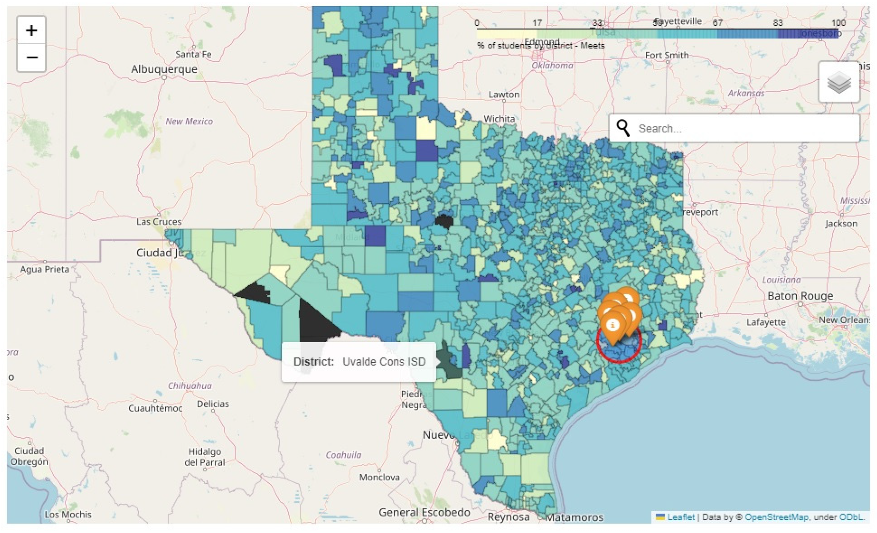
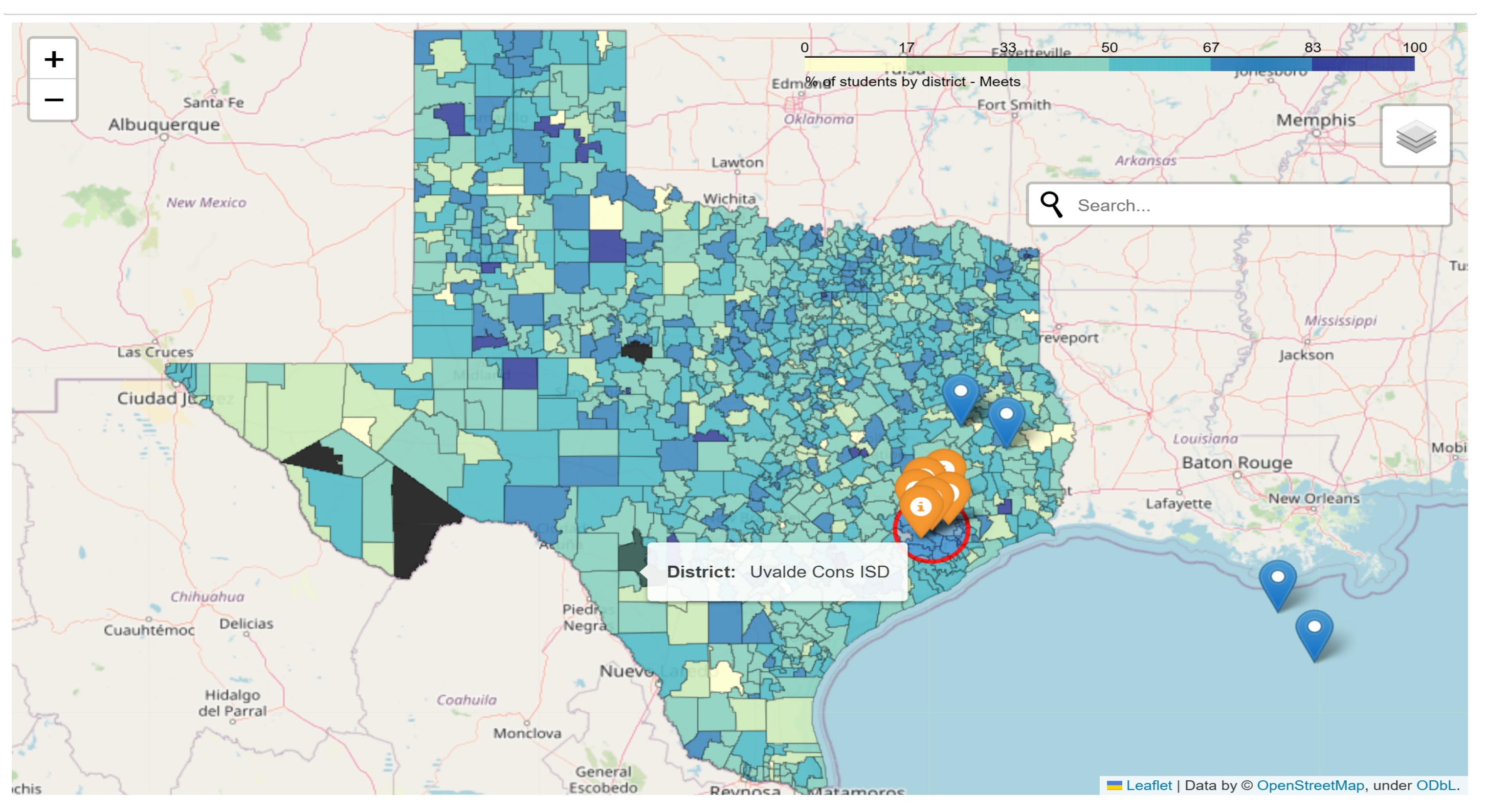
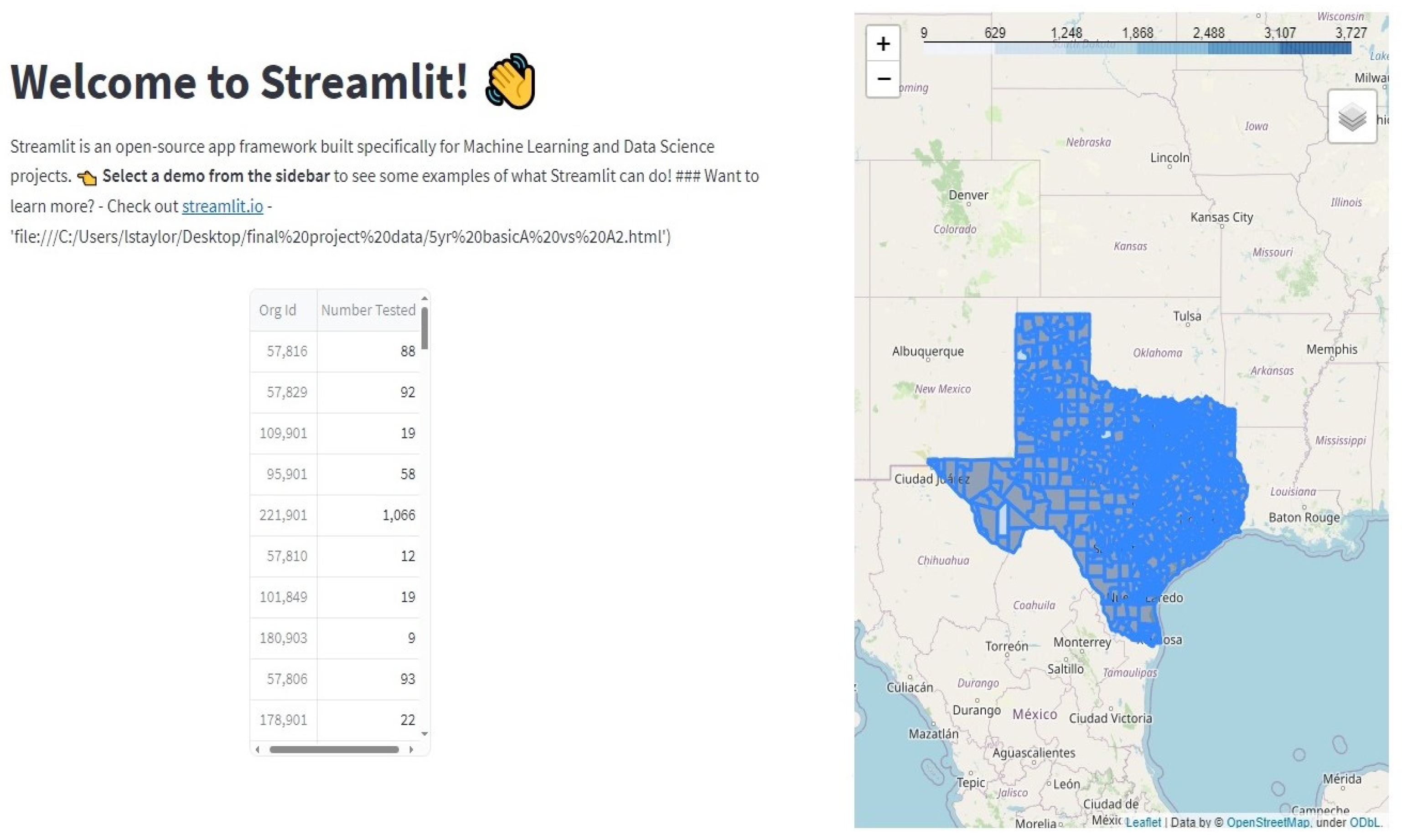
- We leverage maps to showcase educational assessment data for all districts of Texas and Louisiana to improve the understanding of school-level data.
2. Related Work
3. Methods
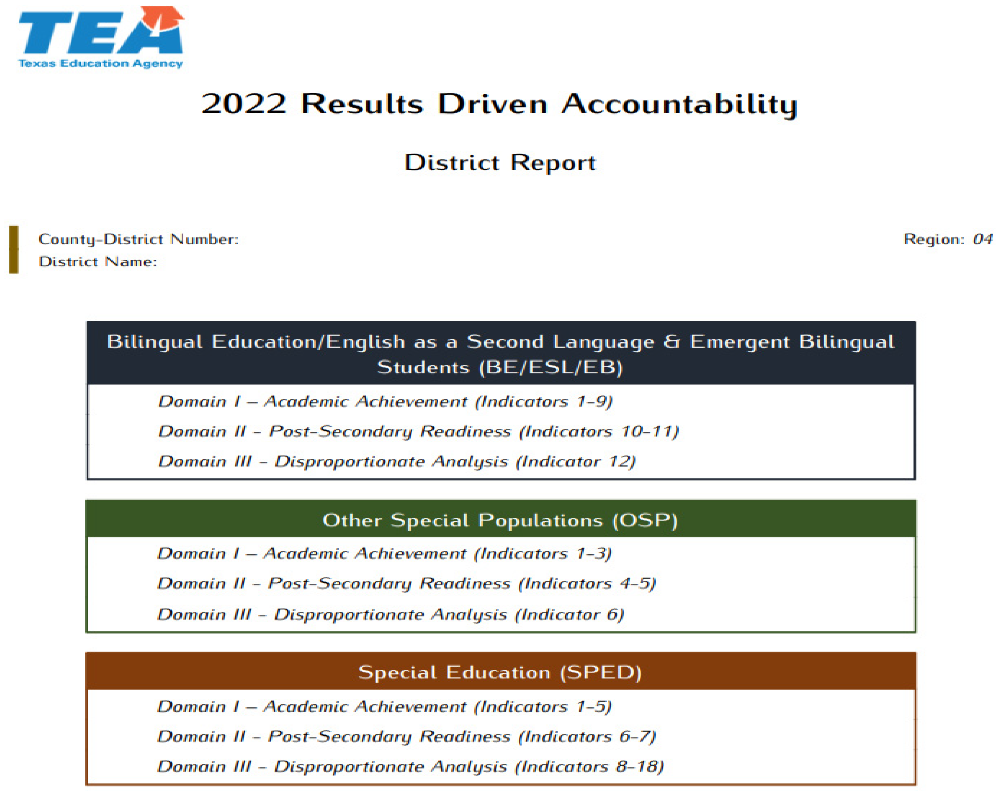
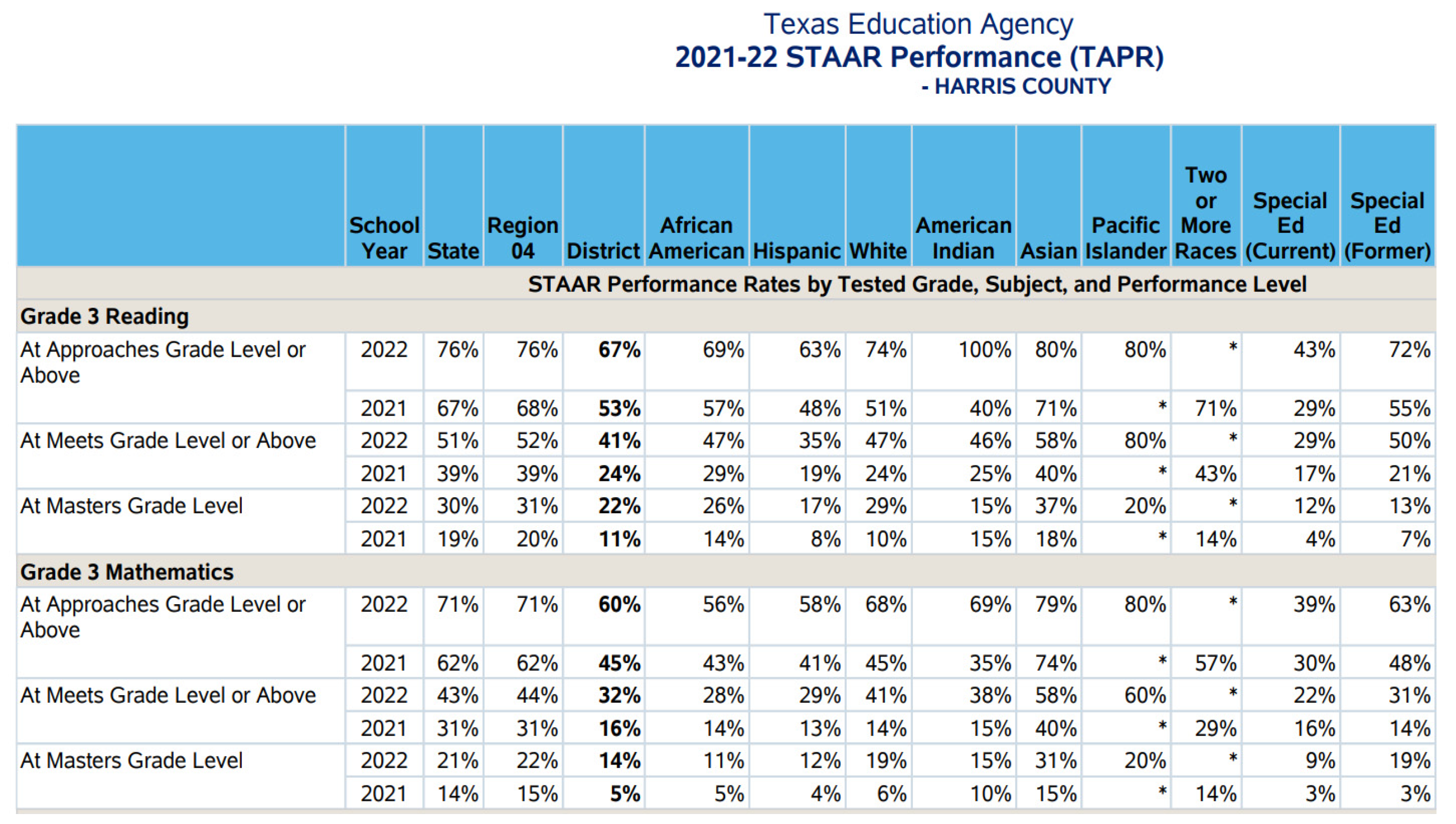
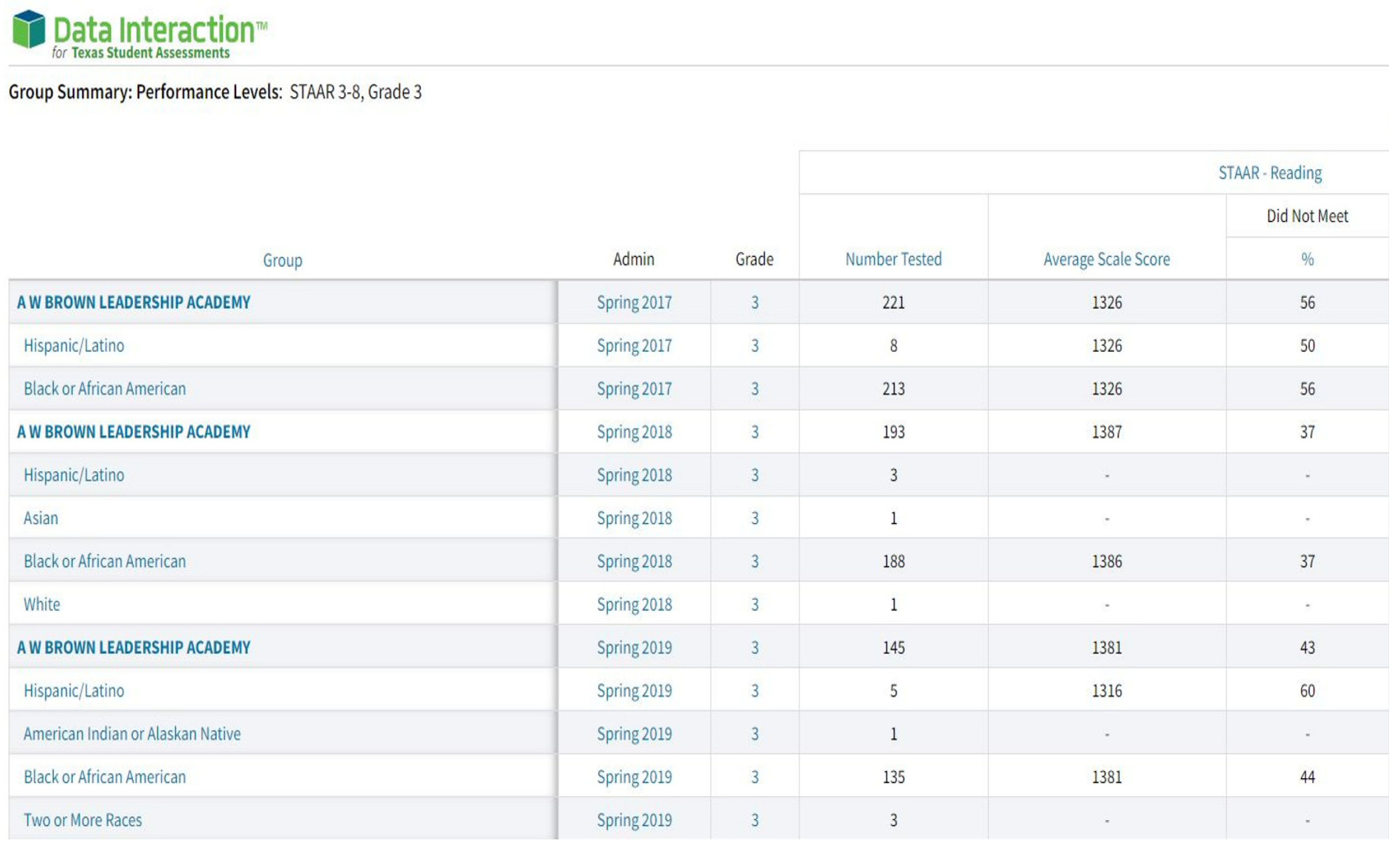
3.1. Dataset
3.2. Extraction, Transformation, and Loading
- Number of students tested;
- Percentage of students meeting the proficiency level;
- Dates of assessment;
- Location.
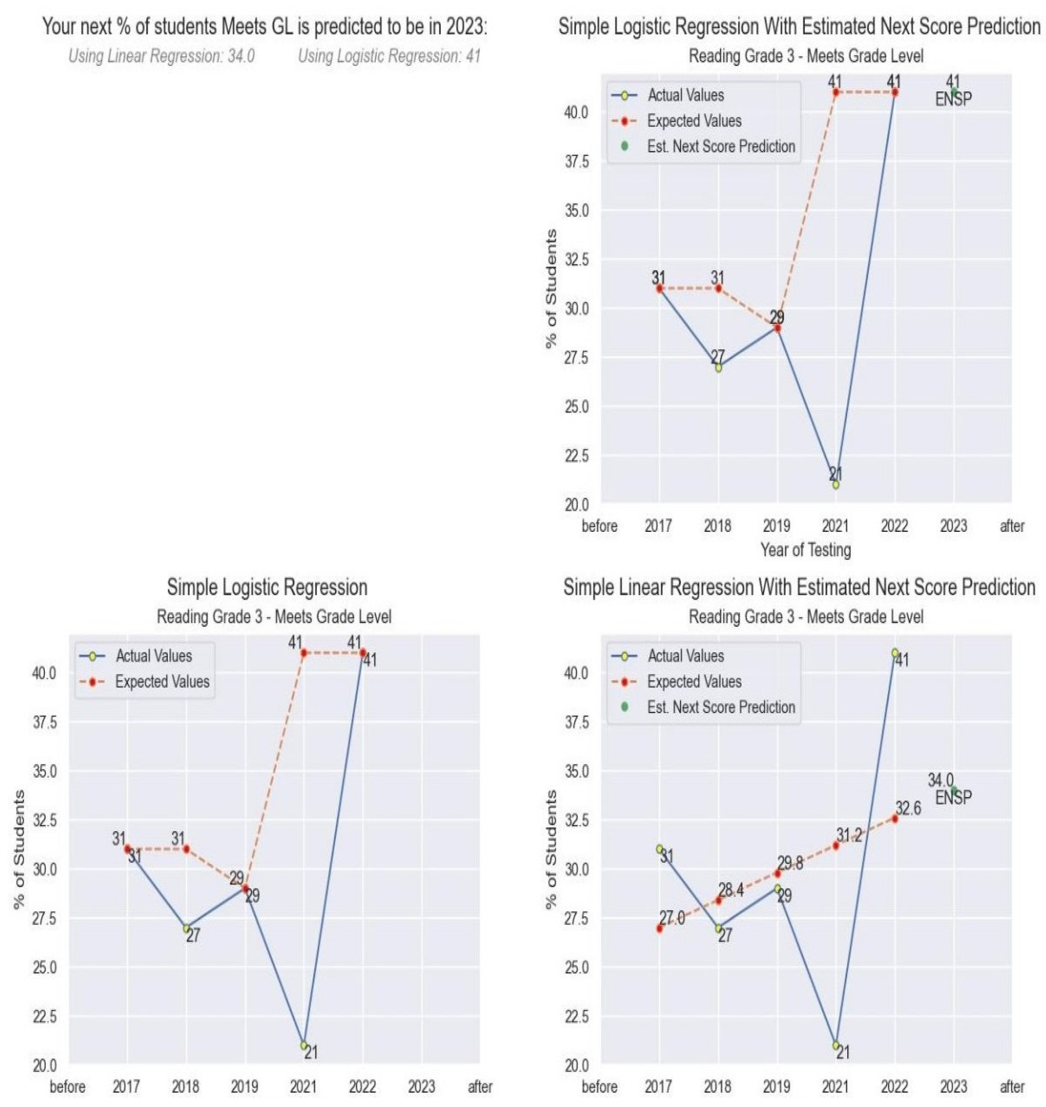
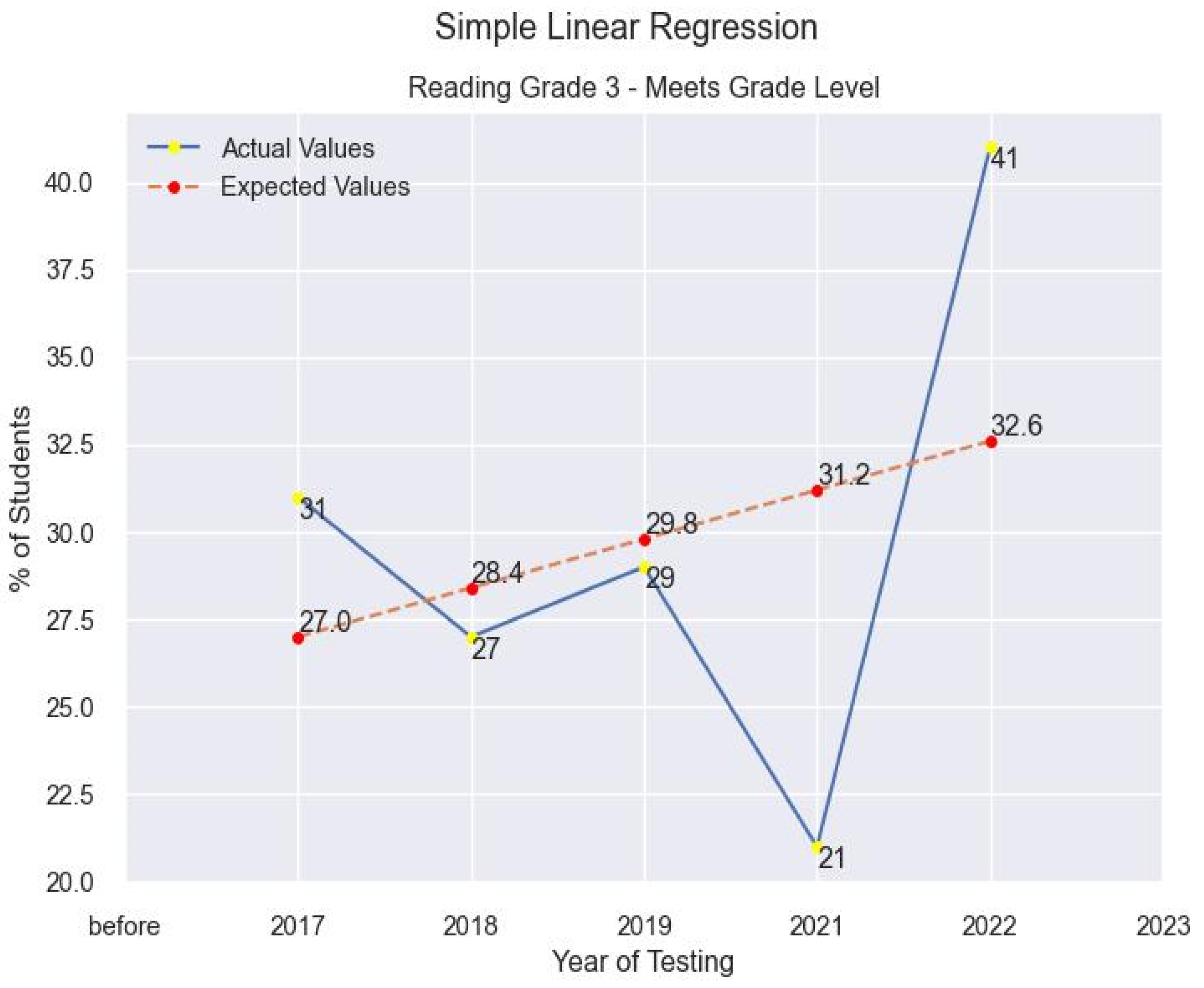
3.3. Learning Models
Expected Results
- Financial Benefits
- Result #1: Reduce expenditure of funds on resources to generate products;
- Result #2: Inexpensive data evaluation to interested entities.
- Technical Benefits
- Result #1: Computerized modeling of data and correlations;
- Result #2: Additional hands-on usage of data visualization;
- Result #3: Evidentiary support/background research used as preliminary for future work.
- Other Benefits
- These benefits are those that are specific to the stakeholders:
- • Result #1: Increased stakeholder investment and satisfaction;
- • Result #2: Opportunity to be used in conferences and research presentations.
4. Experiments and Results
4.1. Experimental Setup
4.2. Evaluation Metrics
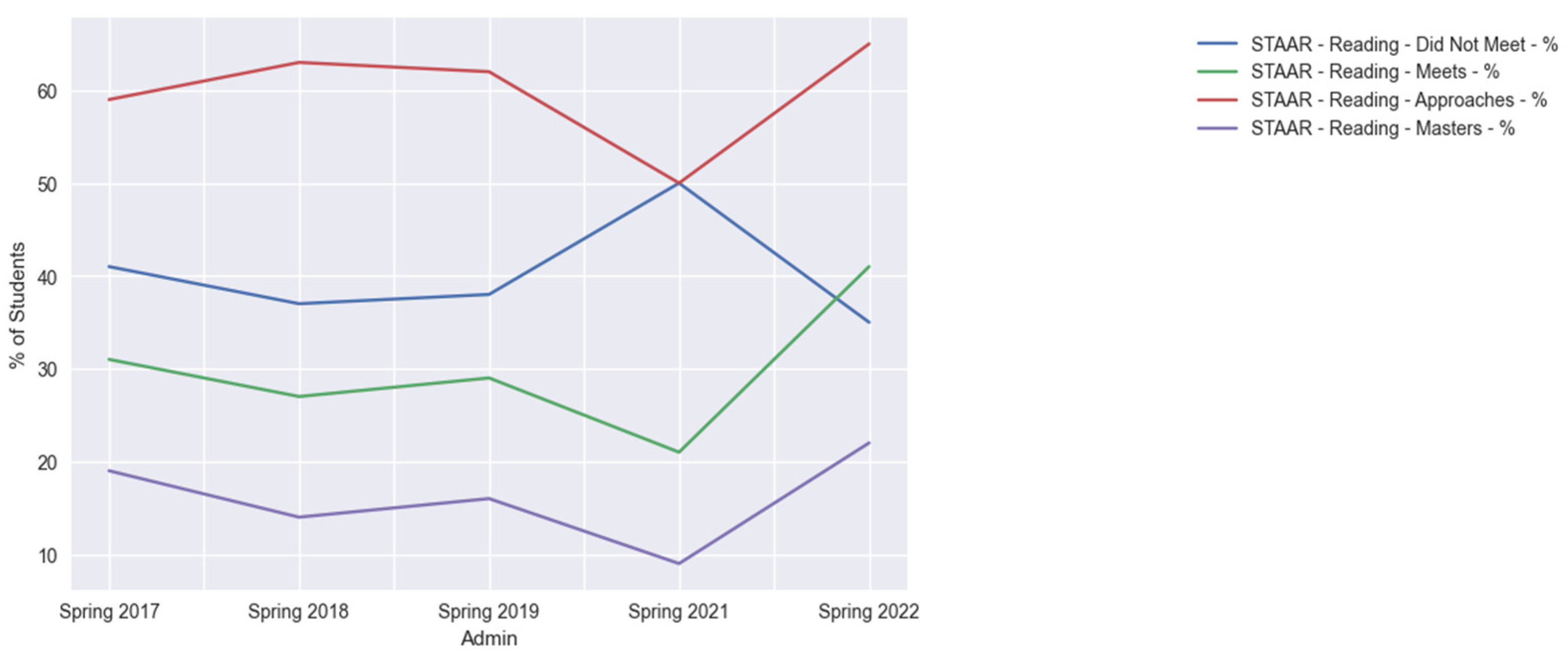
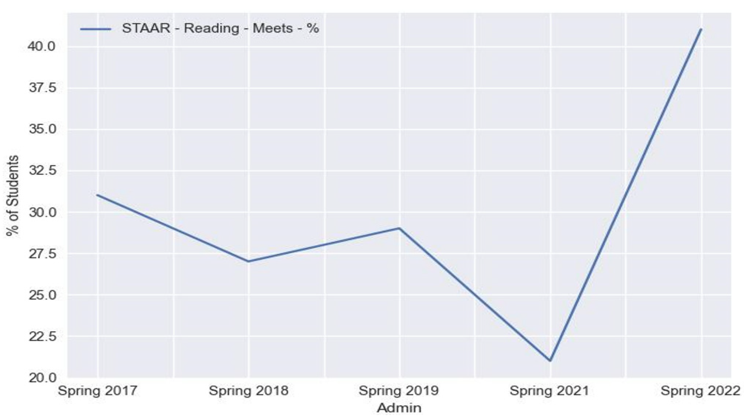
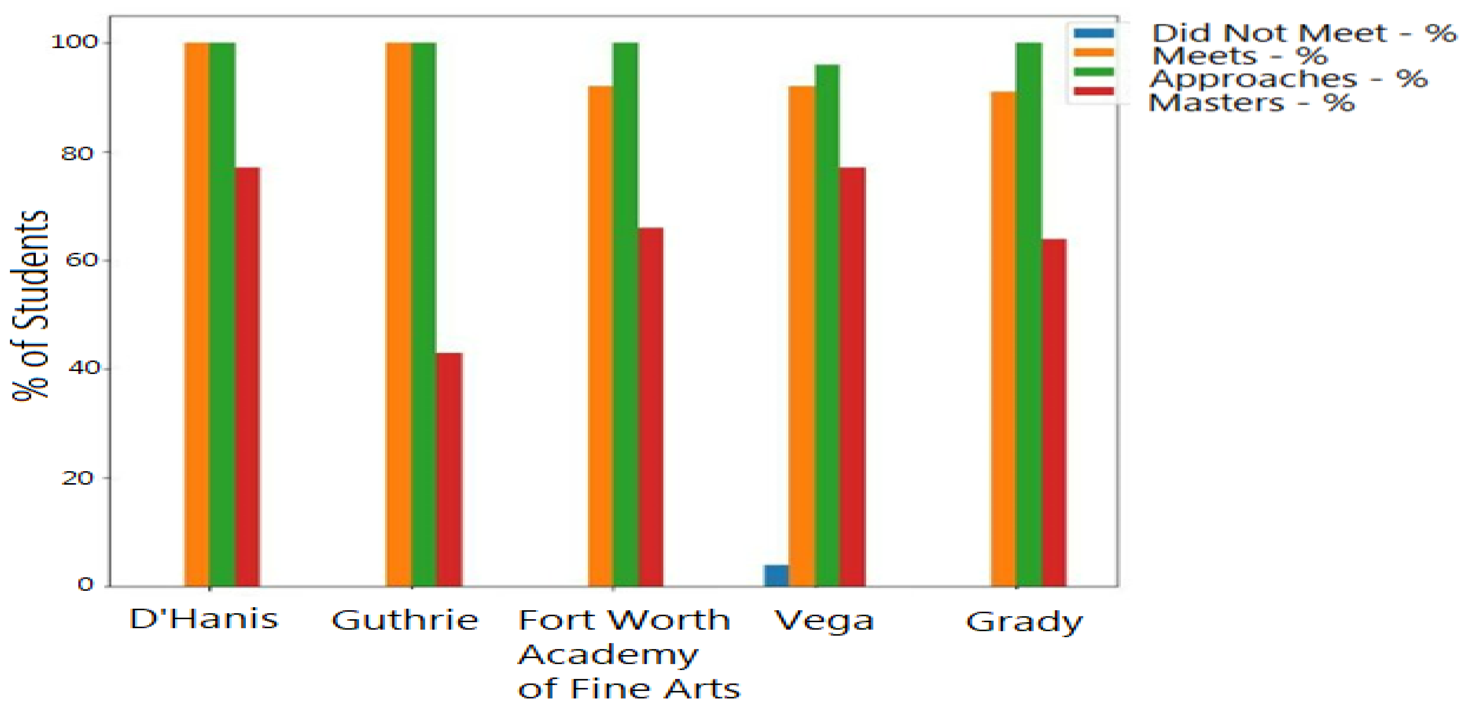
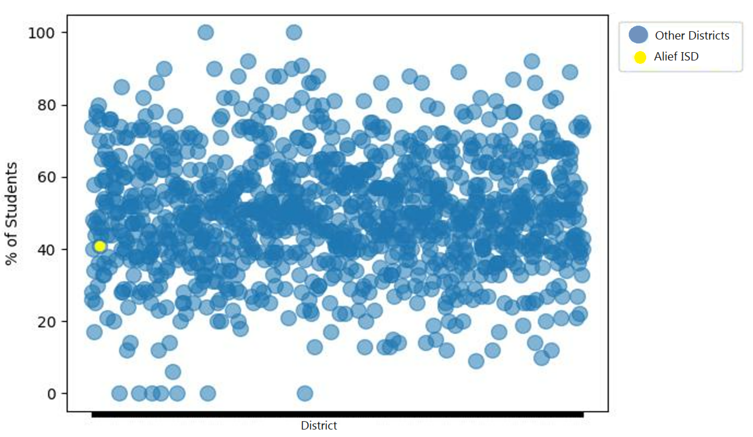
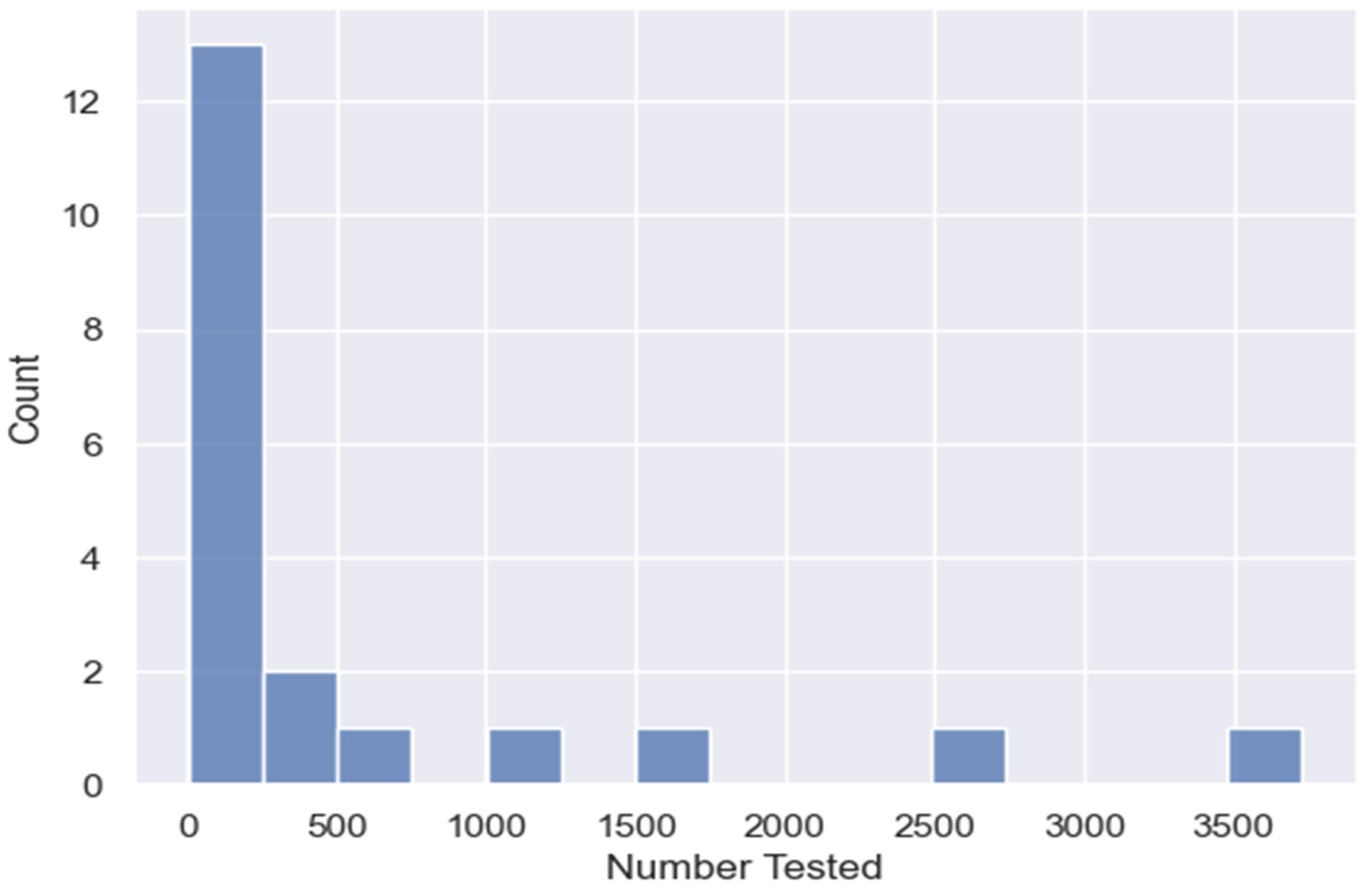
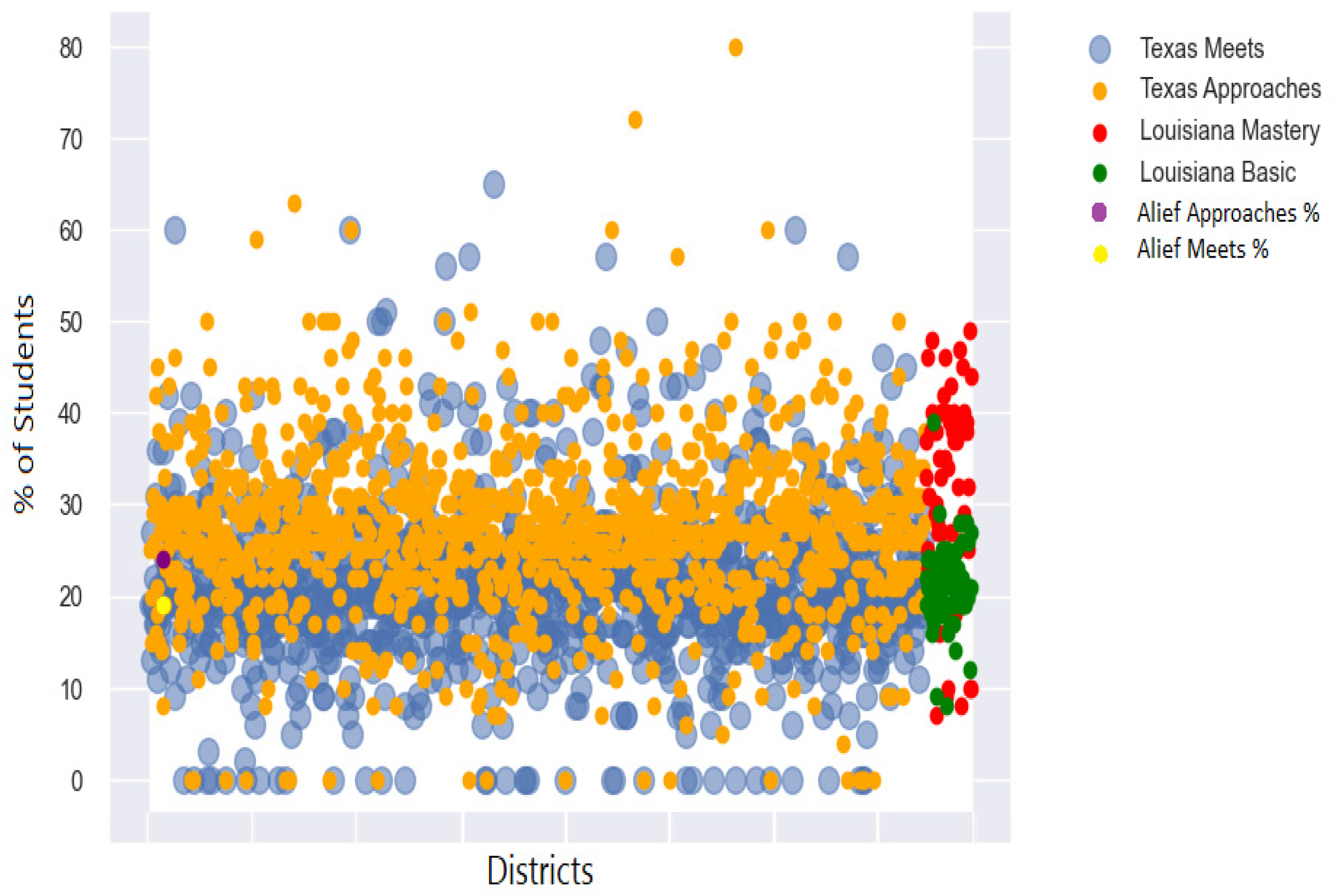
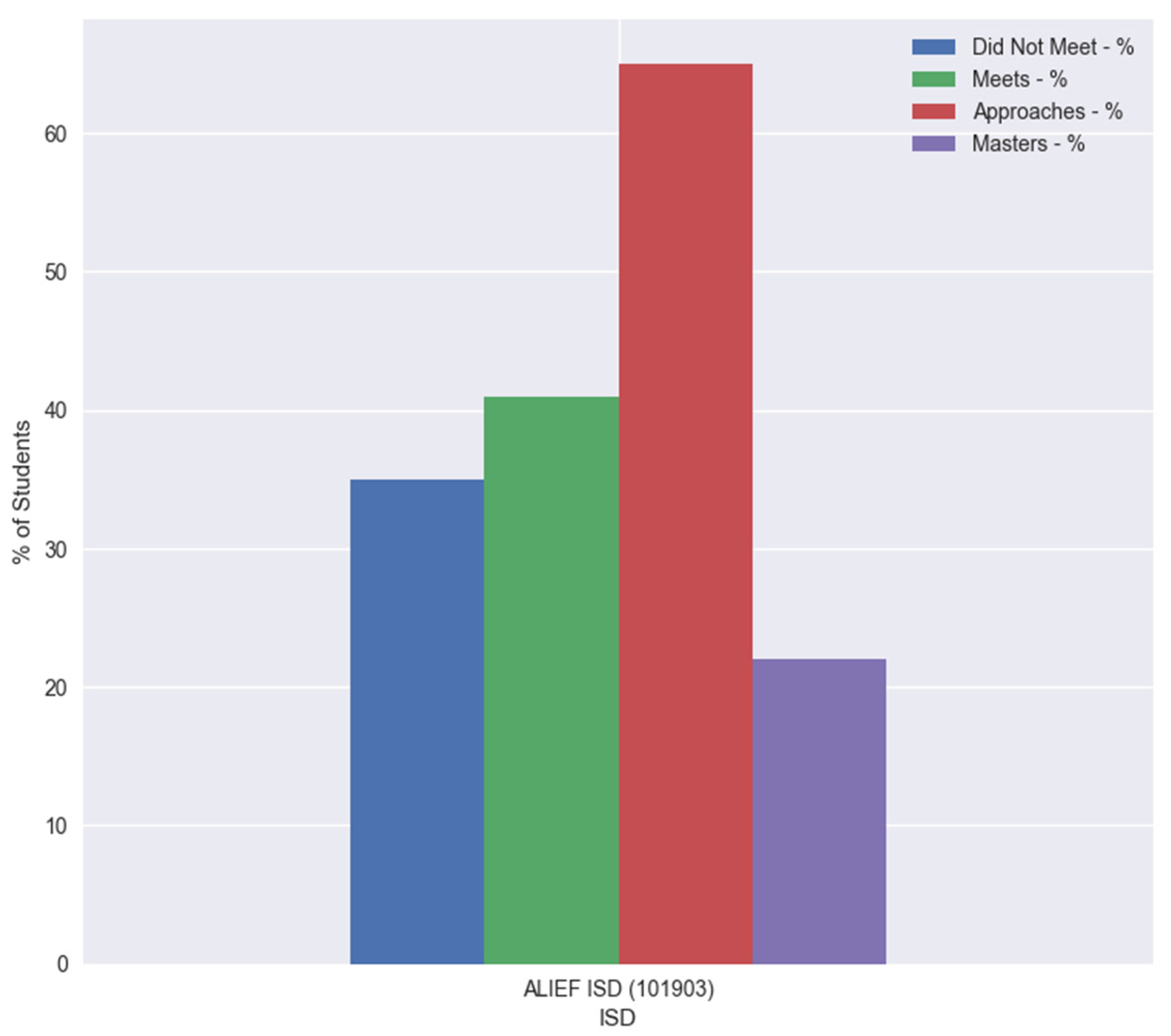
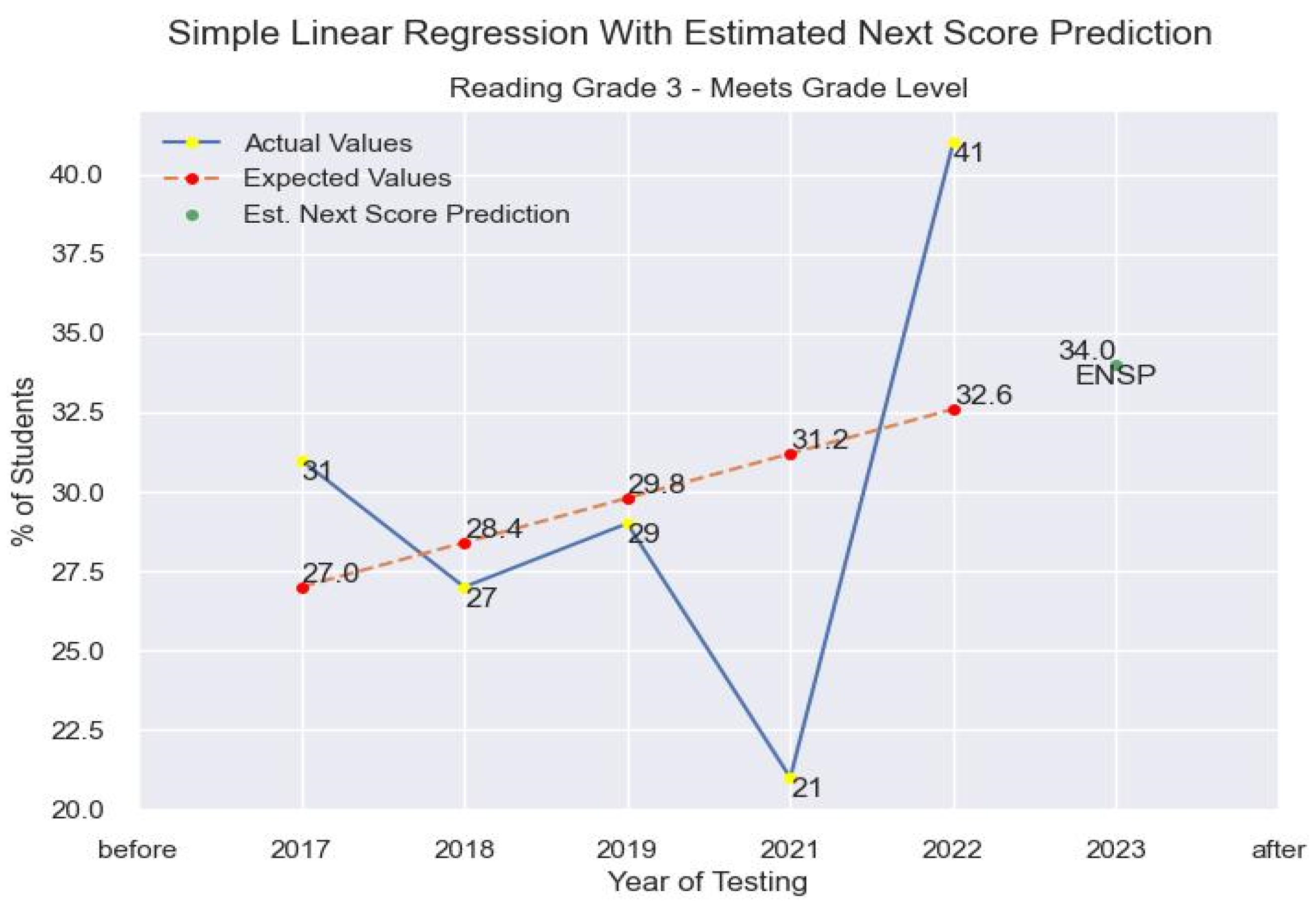
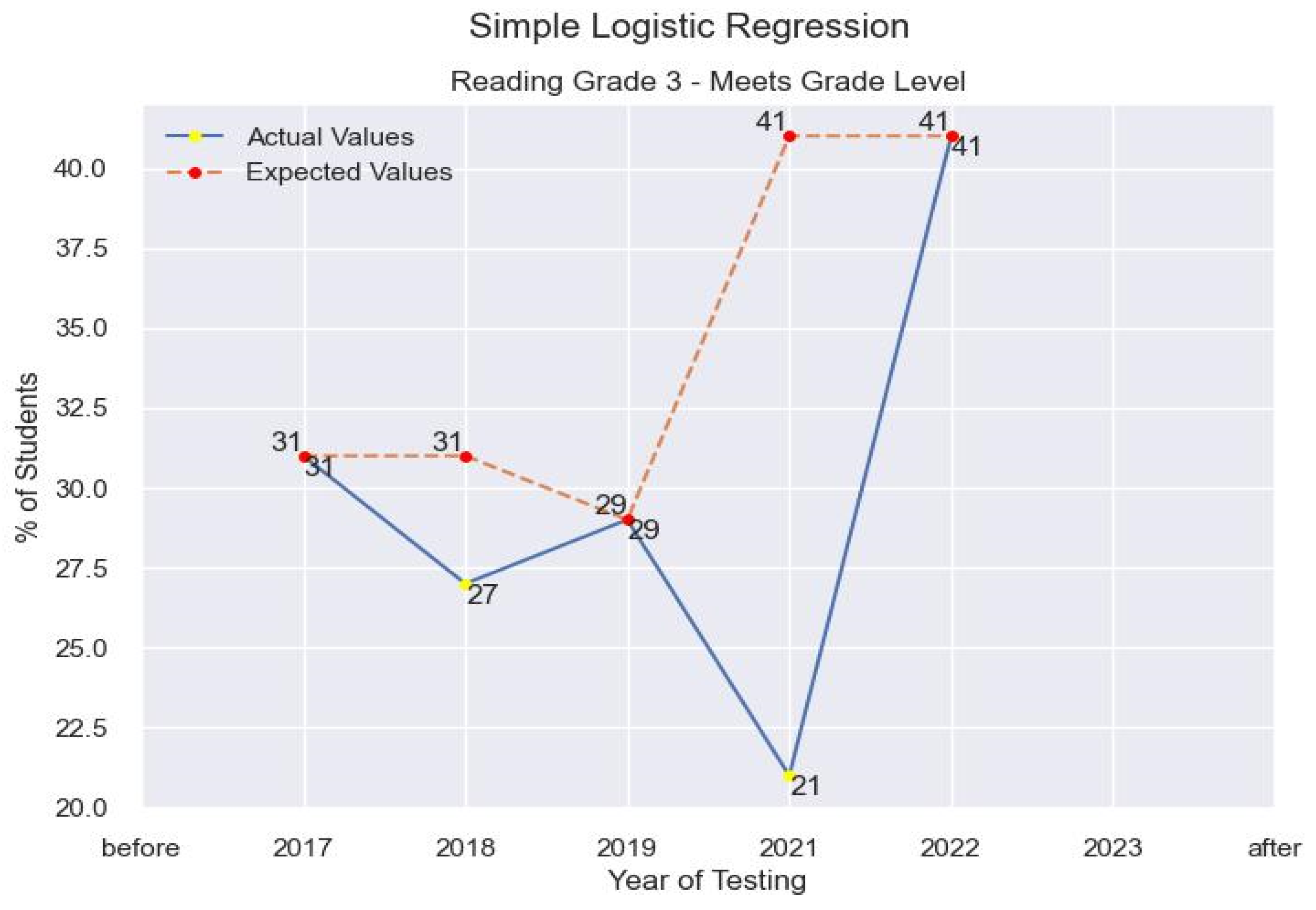
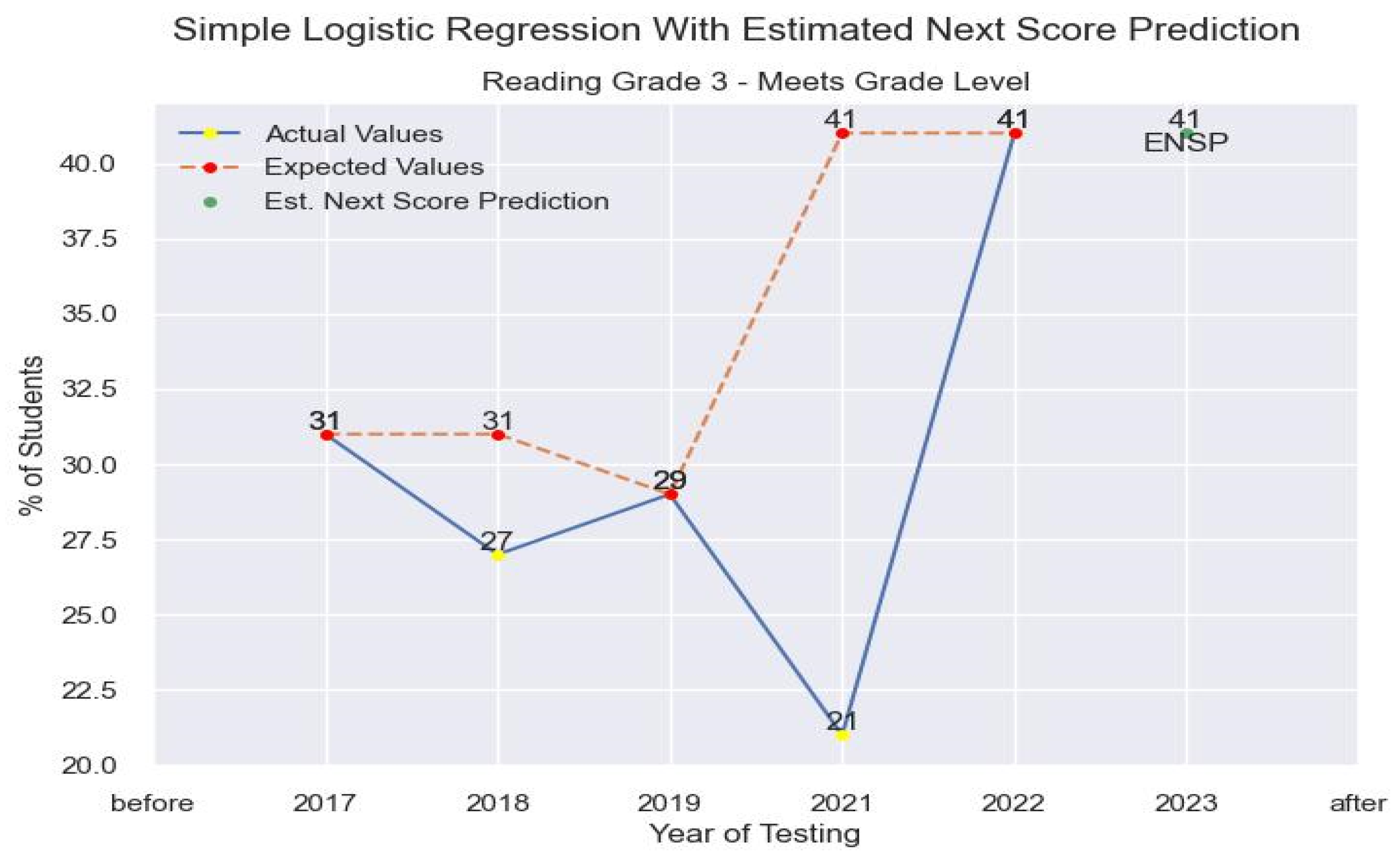
4.3. Results
“At any given time, a school district will make attempts to evaluate their institutional effectiveness. At times, that can include evaluating themselves against other districts; either in their surrounding area that may be competitors for enrollment or across a geographic area that has similar distributions of demographics within their population(s) served.”
5. Discussion
6. Conclusions
Author Contributions
Funding
Institutional Review Board Statement
Informed Consent Statement
Data Availability Statement
Conflicts of Interest
References
- Tang, N.; Wu, E.; Li, G. Towards Democratizing Relational Data Visualization. In Proceedings of the 2019 International Conference on Management of Data (SIGMOD’19), Amsterdam, The Netherlands, 30 June–5 July 2019; ACM: New York, NY, USA, 2019; p. 6. [Google Scholar] [CrossRef]
- U.S. Department of Education, Office of Educational Technology. Artificial Intelligence and Future of Teaching and Learning; Insights and Recommendations: Washington, DC, USA, 2023. [Google Scholar]
- Ocheja, P.; Flanagan, B.; Oyelere, S.; Ogata, H. Visualization of education blockchain data: Trends and challenges. Interact. Learn. Environ. 2022, 31, 5970–5994. [Google Scholar] [CrossRef]
- Pella, S. What should count as data for data driven instruction? Toward contextualized data-inquiry models for teacher education and professional development. Middle Grades Res. J. 2012, 7, 57–75. [Google Scholar]
- Marshall, K. What Data-Driven Instruction Should Really Look Like. 2009. Available online: https://www.teachermagazine.org (accessed on 28 January 2024).
- Texas Education Agency. Results Driven Accountability Data and Reports. Available online: https://tea.texas.gov/reports-and-data/school-performance/results-driven-accountability-data-and-reports (accessed on 28 January 2024).
- Dayana, B.D.; Samanta, A.; Ranganathan, N.; Venkatachalam, K.; Jain, N. A comprehensive approach to visualize industrial data set to meet business intelligence requirements using statistical models and big data analytics. Int. J. Recent Technol. Eng. 2019, 7, 1437–1443. [Google Scholar]
- Moss, G. The Rise of Data in Education Systems: Collection, visualization and use. Lond. Rev. Educ. 2014, 12, 154–155. [Google Scholar] [CrossRef]
- Zheng, Y.; Zhao, Y.; Bai, X.; Fu, Q. Survey of Big Data Visualization in Education. J. Front. Comput. Sci. Technol. 2021, 15, 403. [Google Scholar] [CrossRef]
- Chai, C.P. The Importance of Data Cleaning: Three Visualization Examples. Chance 2020, 33, 4–9. [Google Scholar] [CrossRef]
- Zhai, X.; Chu, X.; Chai, C.S.; Jong, M.S.Y.; Istenic, A.; Spector, M.; Liu, J.-B.; Yuan, J.; Li, Y. A Review of Artificial Intelligence (AI) in Education from 2010 to 2020. Complexity 2021, 2021, 8812542. [Google Scholar] [CrossRef]
- Uyan Dur, B. Data Visualization and Infographics in Visual Communication Design Education at the Age of Information. J. Arts Humanit. 2014, 3, 39–50. [Google Scholar]
- Rui, Z.; Badarch, T. Research on Applications of Artificial Intelligence in Education. Am. J. Comput. Sci. Technol. 2022, 5, 72–79. [Google Scholar] [CrossRef]
- Jones, M. Applications of Artificial Intelligence within Education. 1985. Available online: https://core.ac.uk/reader/82436036 (accessed on 1 June 2023).
- Beck, J.; Stern, M.; Haugsjaa, E. Applications of AI in education. XRDS 1996, 3, 11–15. [Google Scholar] [CrossRef]
- Wang, P.; Zhao, P.; Li, Y. Design of Education Information Platform on Education Big Data Visualization. Wirel. Commun. Mob. Comput. 2022, 2022, 6779105. [Google Scholar] [CrossRef]
- Llaha, O.; Aliu, A. Application of Data Visualization and Machine Learning Algorithms for Better Decision Making; RTA-CSIT: Tirana, Albania, 2023. [Google Scholar]
- Williamson, B. Digital education governance: Data visualization, predictive analytics, and ‘real-time’ policy instruments. J. Educ. Policy 2016, 31, 123–141. [Google Scholar] [CrossRef]
- Borenstein, J.; Howard, A. Emerging Challenges in AI and the Need for AI Ethics Education. AI Ethics 2020, 1, 61–65. [Google Scholar] [CrossRef]
- Akgun, S.; Greenhow, C. Artificial intelligence in education: Addressing ethical challenges in K-12 settings. AI Ethics 2022, 2, 431–440. [Google Scholar] [CrossRef] [PubMed]
- Data Interaction for Texas Student Assessments. Group Summary: Performance Levels: STAAR 3-8, Grade 3. 2023. Available online: https://txreports.emetric.net/ (accessed on 10 December 2023).
- Louisiana Department of Education. STATEWIDE RESULTS. 2023. Available online: https://www.louisianabelieves.com/resources/library/data-center/Statewide-Results (accessed on 10 December 2023).
- Louisiana Department of Education. Elementary & Middle School Performance. 2023. Available online: https://www.louisianabelieves.com/resources/library/elementary-and-middle-school-performance (accessed on 10 December 2023).
- National Center for Education Statistics. Data & Tools. 2023. Available online: https://nces.ed.gov/ (accessed on 10 December 2023).
- Texas Education Agency. Texas Academic Performance Reports. 2023. Available online: https://tea.texas.gov/texas-schools/accountability/academic-accountability/performance-reporting/texas-academic-performance-reports (accessed on 10 December 2023).
- Texas Education Agency. Texas Assessment Research Portal. Available online: https://txresearchportal.com/ (accessed on 10 December 2023).
- Linear Regression. Available online: https://www.cs.toronto.edu/~rgrosse/courses/csc321_2018/readings/L02%20Linear%20Regression.pdf/ (accessed on 10 January 2024).
- Logistic Regression. Available online: https://web.stanford.edu/~jurafsky/slp3/5.pdf (accessed on 10 January 2024).
- Neuman, S.B. Code Red: The Danger of Data-Driven Instruction. Educ. Leadersh. 2016, 74, 24–29. [Google Scholar]
- Seo, K.; Tang, J.; Roll, I.; Fels, S.; Yoon, D. The impact of artificial intelligence on learner–instructor interaction in online learning. Int. J. Educ. Technol. High. Educ. 2021, 18, 54. [Google Scholar] [CrossRef]
- Perrotta, C.; Selwyn, N. Deep learning goes to school: Toward a relational understanding of AI in education. Learn. Media Technol. 2019, 45, 251–269. [Google Scholar] [CrossRef]
- Van der Vorst, T.; Jelicic, N. Artificial Intelligence in Education: Can AI bring the full potential of personalized learning to education? In Proceedings of the 30th European Conference of the International Telecommunications Society (ITS): “Towards a Connected and Automated Society”, Helsinki, Finland, 16–19 June 2019; International Telecommunications Society (ITS): Calgary, AB, Canada, 2019. Available online: http://hdl.handle.net/10419/205222 (accessed on 10 December 2023).
- Hershkovitz, A. Towards data-driven instruction. Teach. Instr. Cogn. Learn. 2015, 10, 1–4. [Google Scholar]
- Williamson, B. New Centers of Data Visualization in Education; DMLcentral.net: Bayville, NJ, USA, 2014. [Google Scholar]
- Vincent-Lancrin, S.; van der Vlies, R. “Trustworthy artificial intelligence (AI) in education: Promises and challenges”. In OECD Education Working Papers; OECD Publishing: Paris, French, 2022. [Google Scholar] [CrossRef]
- Firat Elif, E.; Laramee, R. Towards a Survey of Interactive Visualization for Education. CGVC 2018, 2018, 91–101. [Google Scholar]


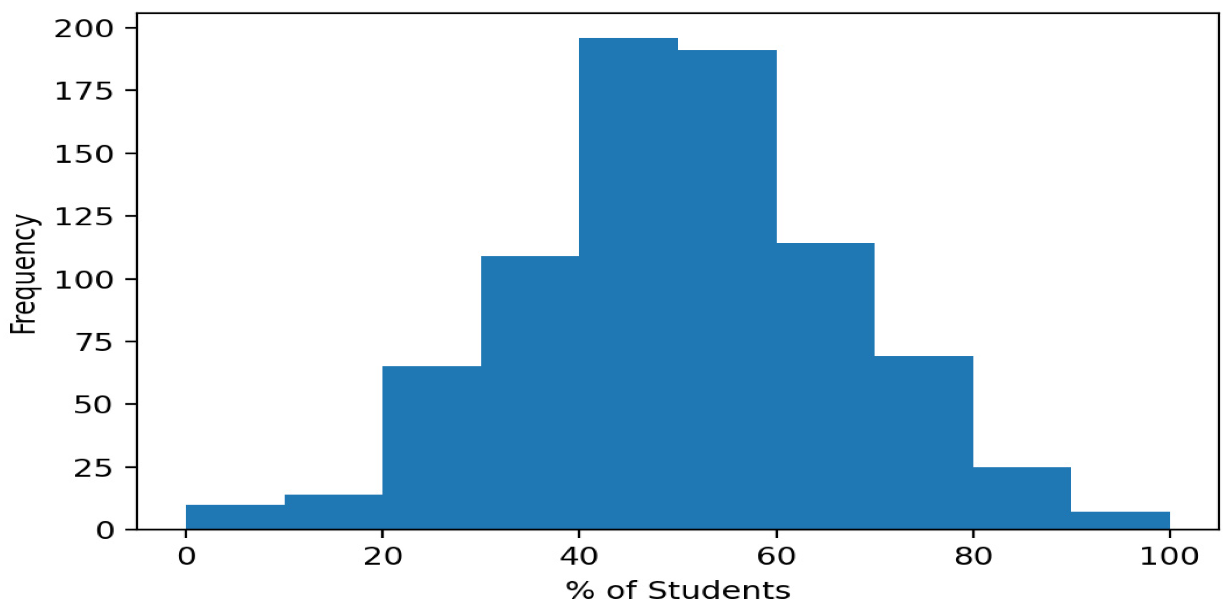
| Type | Grade Level | % of Students Did Not Meet | % of Students Approaches | % of Students Meets | % of Students Masters |
|---|---|---|---|---|---|
| Mean | 3 | 22.39 | 77.18 | 49.80 | 28.23 |
| Sd | 0 | 13.48 | 14.34 | 16.18 | 12.9 |
| Min | 3 | 0 | 0 | 0 | 0 |
| 25% | 3 | 13 | 70 | 40 | 20 |
| 50% | 3 | 21 | 79 | 50 | 27 |
| 75% | 3 | 30 | 87 | 60 | 35 |
| Max | 3 | 90 | 100 | 100 | 77 |
| Steps | Tasks |
|---|---|
| Step 1: | Determine the data used in the implementation. |
| Step 2: | Create the Python code to generate the desired data analysis. |
| Step 3: | Save the Python code in a specified location and make note of the file path. |
| Step 4: | Create a batch script file to execute the data to the web browser of choice through StreamLit. Use the file path of the saved Python file for the run command. |
| Step 5: | Save the batch script preferably in an easy-to-manage location for instant access or deployment. |
| Step 6: | Assign an image icon to the batch script. |
Disclaimer/Publisher’s Note: The statements, opinions and data contained in all publications are solely those of the individual author(s) and contributor(s) and not of MDPI and/or the editor(s). MDPI and/or the editor(s) disclaim responsibility for any injury to people or property resulting from any ideas, methods, instructions or products referred to in the content. |
© 2024 by the authors. Licensee MDPI, Basel, Switzerland. This article is an open access article distributed under the terms and conditions of the Creative Commons Attribution (CC BY) license (https://creativecommons.org/licenses/by/4.0/).
Share and Cite
Taylor, L.; Gupta, V.; Jung, K. Leveraging Visualization and Machine Learning Techniques in Education: A Case Study of K-12 State Assessment Data. Multimodal Technol. Interact. 2024, 8, 28. https://doi.org/10.3390/mti8040028
Taylor L, Gupta V, Jung K. Leveraging Visualization and Machine Learning Techniques in Education: A Case Study of K-12 State Assessment Data. Multimodal Technologies and Interaction. 2024; 8(4):28. https://doi.org/10.3390/mti8040028
Chicago/Turabian StyleTaylor, Loni, Vibhuti Gupta, and Kwanghee Jung. 2024. "Leveraging Visualization and Machine Learning Techniques in Education: A Case Study of K-12 State Assessment Data" Multimodal Technologies and Interaction 8, no. 4: 28. https://doi.org/10.3390/mti8040028
APA StyleTaylor, L., Gupta, V., & Jung, K. (2024). Leveraging Visualization and Machine Learning Techniques in Education: A Case Study of K-12 State Assessment Data. Multimodal Technologies and Interaction, 8(4), 28. https://doi.org/10.3390/mti8040028