Abstract
Graduated colour maps, created through the mathematical classification of quantitative variables, are frequently used in archaeology. A Python script for implementing a classification method based on geometric intervals in QGIS is presented here. This method is more suitable than the standard methods in case the quantitative attribute to be classified follows a right-skewed distribution, which is common among archaeological data. After an overview of the main classification methods, this paper focuses on the benefits of the geometric interval subdivision scheme, describes the technical features of the script and demonstrates how it works. A final thought on the advantages of using FLOSS is proposed.
1. Introduction
The authors of one of the most famous GIS manuals for archaeologists dedicated a paragraph to the topic of “data classification” [1] (pp. 135–148). The standard classification schemes were described in detail (equal interval, quantile, natural breaks, etc.; see below) and a more specific method, based on geometric progression, was introduced. This latter classification scheme seemed to be the best option in several of the archaeological case studies I tackled; unfortunately, it was added into ArcGIS with the release of version 9.2 [2], but it was never implemented in QGIS. Therefore, some years ago, I decided to develop a geometric interval classification function for QGIS on my own, using the opportunities provided by FLOSS (open code, community mailing list, etc.) and the effectiveness of Python programming language. I publicly presented my script for the first time in a programming session during a previous ArcheoFOSS workshop (Verona, 2014 [3]). Thereafter, I claimed its use in several archaeological works [4] (p. 133: the author states that he used geometric intervals, although the published maps seem to be created by using the equal interval method) and adapted the code to the subsequent QGIS versions; nonetheless, this script has never been fully published until now (it has only appeared in an archaeological blog post [5]).
This short paper focuses on the peculiarities of the geometric interval classification, in comparison to other standard methods, and on the technical features of the latest version of my script (v. 0.3, based on Python 5 and compatible with the latest QGIS versions). The aims are to stress the importance of understanding classification methods in order to choose the right one, to highlight how the geometric classification scheme may be useful for archaeologists (and others), and to show how FLOSS can support us in producing work tools on our own when they are lacking.
2. Classification Methods: An Overview
The visual representation of a quantitative variable by means of graduated (or discrete) colour charts is a common tool in archaeology. Choropleth maps and survey grids, as well as sampling point distribution charts (where regions, cells or points are filled with different colours, according –for example- to the amount of Roman sites, gathered sherds or a specific chemical component), are widespread in the archaeological literature. The different colours are the result of a mathematical process: the classification of a quantitative variable.
In order to develop a classification, the quantitative variable is divided into n classes (or intervals)—specific methods (or schemes) define the boundaries of each class. The most common classification methods are “equal interval”, “quantile”, “standard deviation” and “natural breaks”. Each of these methods applies different calculation procedures and yields different outcomes; it follows that the information that is perceived from the map, as well as the interpretation of the original data, will change depending on the outcome we consider. For this reason, it is essential to understand the features and aims of each classification method, and to choose the most suitable method, according to data and purposes.
The choice of the classification scheme mainly depends upon two factors: the statistical distribution of the variable values and the purpose of the map to be produced. Different methods must be used depending on whether the data values follow a uniform (rectangular), normal (or near to normal) or a bimodal distribution. If the goal is to define classes with the same number of observations, the quantile method must be chosen; if we want to show how much the attribute values deviate from the average value, the best choice is the standard deviation method.
Classification theory is discussed in several cartography manuals and websites (for example: [6] (pp. 138–160), [7,8]); here, we have tried to summarize this well-known argument in Table 1.

Table 1.
Standard classification methods: brief description and conditions of use.
Nonetheless, many natural and archaeological phenomena follow other data distributions and require different forms of representation; in these cases, more suitable classification methods are required, such as the method that is based on geometric intervals.
3. Geometric Interval Classification
Many quantitative archaeological data distributions are extremely skewed, particularly right skewed, approximating in turn exponential, gamma, geometric or J-shaped [9] probability distributions. When plotting a histogram, we may see the initial bins that contain the highest frequencies, and the succeeding bars in the right part of the plot, becoming increasingly smaller. This shape appears when the majority of the attribute values the are the lowest values (the same low value is often duplicated many times) and the high values are rarer. A typical example in archaeology may be a survey grid, in which the number of cells with a small amount of finds is much higher than the number of cells including abundant materials. In these cases, it is important to subdivide the values, in order to highlight the minimal variations in the data with the lowest values (being the majority). Most of the classification methods that are suitable for normal or uniform distributions are not fit for this purpose; a solution is offered by the geometric interval classification. This is based on a geometric progression that fits the shape of skewed distribution curves very well.
As an example, I present a grid in which each cell is linked to a number that corresponds to the weight of the finds collected inside. The distribution of the weight values is clearly right skewed (Figure 1).
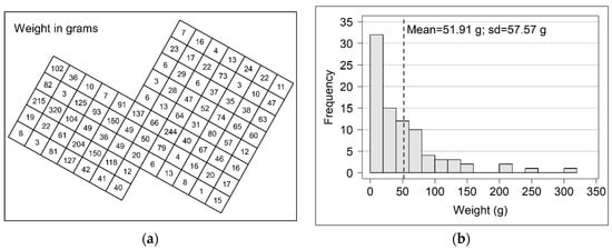
Figure 1.
Example grid: (a) excavation grid with cells containing the weight values of finds in grams; (b) histogram of the data value distribution.
Data are drawn from an actual archaeological case study. Nonetheless, it was preferred to extract the data from their own context (and to partially modify them), in order to generalize the example. This grid might represent an excavation grid as well as a survey grid; the values inside the cells might represent the weight of the pottery sherds, the percentage of phosphate in the soil, etc.
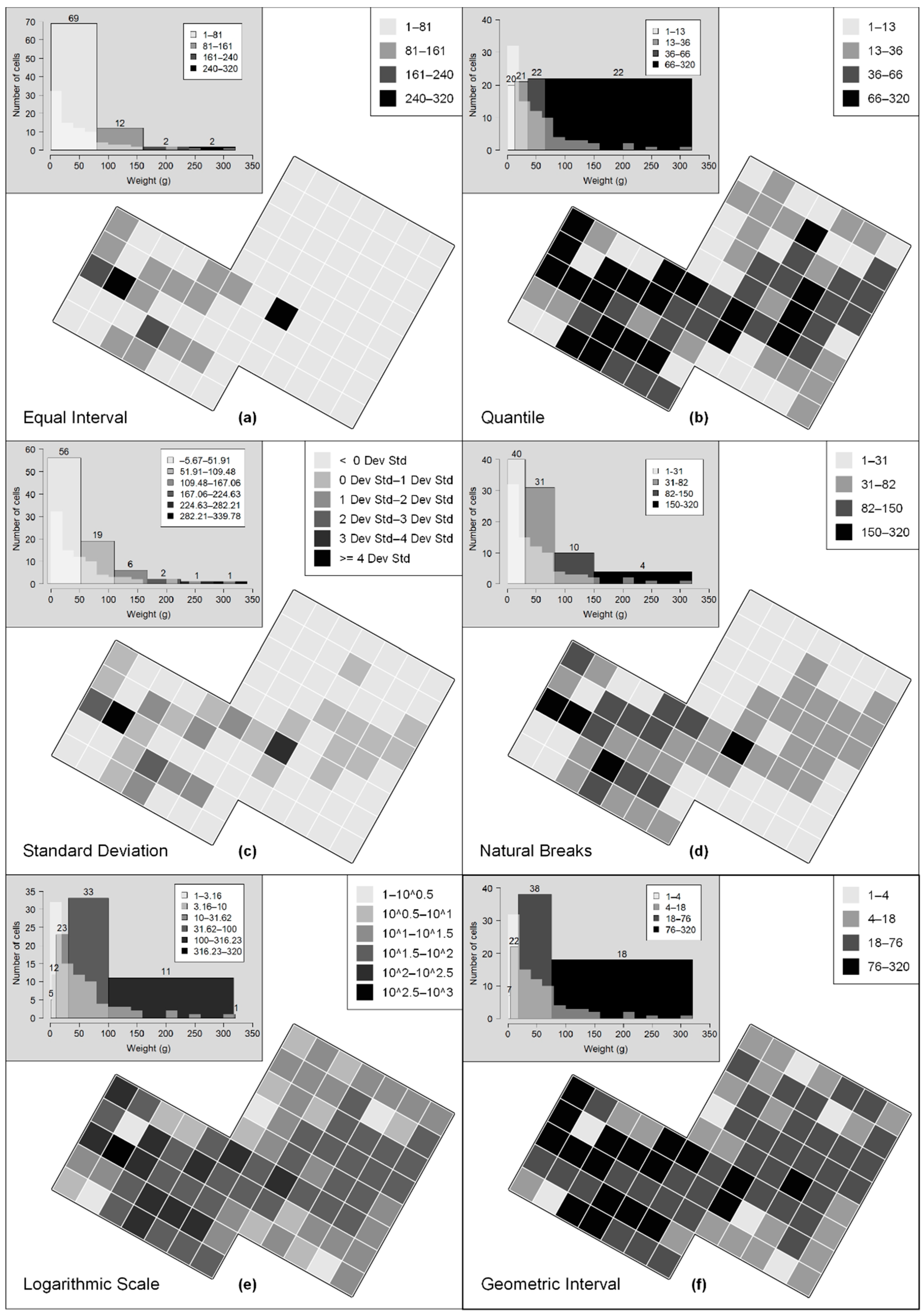
I attempted to classify this dataset by applying all of the classification methods that are implemented in QGIS: equal interval, quantile, standard deviation, natural breaks and the more recent method that is based on a logarithmic scale (available from QGIS version 3.10). I did not consider the “pretty breaks” scheme, which is also available in QGIS, because it is simply a “rounded version” of the equal interval method. I chose the same number of classes (four) when it was possible; the standard deviation and logarithmic methods required a different number of intervals to produce a correct or readable outcome. Finally, I compared the spatial patterns that were achieved with these methods with those that were obtained using the geometric classification scheme. Figure 2 shows the results.
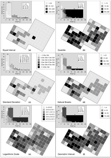
Figure 2.
Different spatial patterns in the sample grid using QGIS standard classification methods (a–e) and the geometric interval classification method (f).
Classifications based on equal intervals tend to obscure spatial patterning because the lowest values (being the majority) are lumped into a single class with a wide range: 1–81 g. The subdivision appears to be slightly better when using the standard deviation and natural breaks schemes, although the values that are lower than 82 g (= the first class of equal interval), amounting to 82% of values, are concentrated in two classes: 1–51 and 51–109 g for standard deviation and 1–31 and 31–82 g for natural breaks.
On the other hand, the quantile method shows a completely different picture; however, is it more reliable? As the aim of this classification scheme is to divide the values into equally sized intervals, each class contains almost the same amount of data and the classes with the highest values tend to be overestimated.
Increasing the number of classes may help to correct these distortions. However, it is not recommended to use too many intervals, in order to avoid compromising the readability of the map (mainly, whether it is in grey scale); the optimum number of classes is between four and seven [9] (p. 100).
Geometric interval classification yields a more realistic data representation using fewer classes. In fact, “by mimicking the actual distribution curve” [1] (p. 145), this method separates the lower classes in more detail, and it does not overestimate the highest intervals. In other words, each class is correctly weighted within a right-skewed distribution.
The map that is produced using the logarithmic scale method is very similar to the map that is based on geometric intervals, and it may be a good alternative in some cases. However, this method has some disadvantages. For example, it is less flexible than the other methods, because it is anchored to the standard logarithm with base 10. This reduces the number of possible classes (3, 6 or 11 in our example) and produces very wide intervals, mainly for the highest classes. In addition, the logarithmic scale is unfamiliar to most archaeologists. This method is useful for variables with a wide range of values and a great difference between the classes with the highest frequencies and those with the lowest occurrences.
Now, let us imagine that our grid is the survey grid of a rural area where a highway must be built. Observing the maps that are produced by the equal interval, standard deviation or natural breaks methods, a political decision maker could think that the right half of the grid is almost free from archaeological evidence, and he will direct the new road there. However, other maps show different pictures in particular, those that are classified according to logarithmic and geometric progressions. These maps could lead our decision maker to make different choices or, at least, to investigate the context in more detail, before building the new highway. This is purely an example; however, it is useful for understanding the importance of the geometric interval classification. Even QGIS users must be offered the possibility to classify data following a skewed distribution by means of this classification method.
4. Python Script
In order to implement the geometric interval classification scheme in QGIS, a script was written in Python. The starting point was a simple code to apply the graduated render in QGIS, posted by Kelly Thomas in 2013, on a famous question and answer website for cartographers, geographers and GIS professionals [10]. On this basis, I added new code lines that were influenced by a script for managing classification methods in QGIS, written by Carson Farmer in 2010 [11]. Finally, I modified these two sources in order to insert the geometric interval classification algorithm.
The mathematical formula to define the classes’ upper limits is that described by B.D. Dent [6] (pp. 146, 406) and taken up by J. Conolly and M. Lake, with slight changes [1] (p. 143):
where L is the lowest value of the dataset, n is the number of desired classes, X is the multiplier, calculated with Formula (2).
L × X1, L × X2, L × X3, …, L × Xn
Since the release of QGIS 3.0, I have updated the code in order to port the Python, Qt and PyQt libraries from version 2 to 3 (Python) and 4 to 5 (Qt and PyQt). Clearly, this script has been written by an archaeologist, not by a mathematician or a computer scientist, and for personal purposes. It is likely that it is neither clean nor completely correct code; however, it works. The most recent version (0.3), which is compatible with QGIS 3.18, together with the previous versions, is available on the GitHub platform [12].
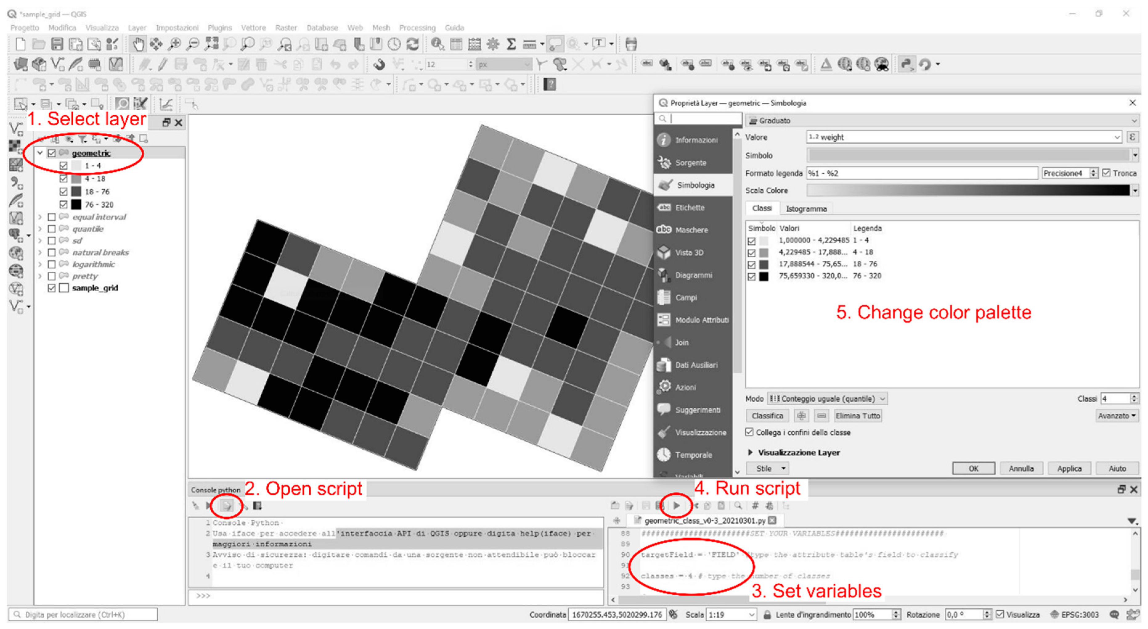
On GitHub, a Readme file containing the usage instructions is also available. Here, I will summarize how the script works in few points and with an image (Figure 3). Before running this script, as well as before applying any classification methods, the user must know his/her purpose and the distribution of the dataset that he/she aims to classify and visualize. For this latter aim, plotting a histogram of the dataset is enough. A simple spreadsheet or the use of statistical software (like R) are valid alternatives, although QGIS provides useful tools as well. For instance, the Histogram tab in Layer Properties–Symbology–Graduated Symbol quickly produces a clear histogram, ready to be interpreted. Once the shape of the data distribution (normal, uniform, skewed, etc.) is established, and we know what we want to visualize on our map, these are the following steps:

Figure 3.
Usage of the script in QGIS, step by step.
- Upload and/or select the vector layer to be classified;
- Open the geometric interval classification script in the Python console;
- Set the variables: name of the attribute field to classify and number of classes;
- Run the Python script;
- Change colour palette and legend items in the Layer Properties dialog as you like.
One last suggestion: it is convenient to test the results of every available classification method. Observing the differences, and investigating the reasons for them, may be a useful exercise for better understanding every possible pattern in the data.
5. Conclusions
The main result of this scripting work is to fill a gap in the QGIS classification schemes by introducing the geometric interval method. As we have seen, this is very useful when we are dealing with quantitative data following a right-skewed curve, a statistical distribution that is very common in many archaeological case studies.
In addition, this work (although simple, and a little “rough”, for the finest programmers) testifies the power of FLOSS once again. Open source code, and a wide community of users that share their works and suggestions, allow us to create the tools we need on our own, similar to an ancient craftsman building his working tools [13]. In this way, we can understand how the software functions work, and we can use them correctly, moving from an “unaware click” to an “aware click”.
Institutional Review Board Statement
Not applicable.
Informed Consent Statement
Not applicable.
Data Availability Statement
All the data I used are mine.
Acknowledgments
I wish to thank G. Furlan for having reviewed the English version of this paper. All errors are my own.
Conflicts of Interest
The author declares no conflict of interest.
References
- Conolly, J.; Lake, M. Geographical Information Systems in Archaeology, 1st ed.; Cambridge University Press: Cambridge, UK, 2006. [Google Scholar]
- ArcGIS 9.2 Desktop Help. Available online: http://webhelp.esri.com/arcgisdesktop/9.2/index.cfm?topicname=geometrical_interval (accessed on 17 March 2021).
- Per un uso Consapevole del Software in Archeologia. Sviluppo di un Metodo di Classificazione Geometrica per la Simbologia Graduata di QGIS. Available online: https://www.academia.edu/7561001/Per_un_uso_consapevole_del_software_in_archeologia_Sviluppo_di_un_metodo_di_classificazione_geometrica_per_la_simbologia_graduata_di_QGIS (accessed on 17 March 2021).
- Bernardi, L. La fucina romana di Montebelluna, località Posmon (Treviso). Studio dei micro-residui di forgiatura del ferro. Archeologia Veneta 2016, XXXIX, 122–151. [Google Scholar]
- Geometric Classification Method in QGIS. Available online: http://arc-team-open-research.blogspot.com/2014/07/geometric-classification-method-in-qgis.html (accessed on 19 March 2021).
- Dent, B.D. Cartography. Thematic Map Design, 5th ed.; WCB/McGraw-Hill: London, UK, 1999. [Google Scholar]
- Classification. Available online: http://wiki.gis.com/wiki/index.php/Classification (accessed on 19 March 2021).
- Classification of data. Available online: http://www.gitta.info/Statistics/en/html/StandClass_learningObject2.html (accessed on 19 March 2021).
- Evans, I.S. The selection of class intervals. Trans. Inst. Br. Geogr. 1977, 2, 98–124. [Google Scholar] [CrossRef]
- Applying Graduated Renderer in PyQGIS? Available online: https://gis.stackexchange.com/questions/48613/applying-graduated-renderer-in-pyqgis/48719#48719 (accessed on 19 March 2021).
- Playing around with Classification Algorithms: Python and QGIS. Available online: https://carsonfarmer.com/2010/09/playing-around-with-classification-algorithms-python-and-qgis/ (accessed on 19 March 2021).
- GitHub—GeomClass. Available online: https://github.com/df79/GeomClass/ (accessed on 19 March 2021).
- Francisci, D. Archaeosection: Uno strumento “artigianale” per il rilievo delle sezioni archeologiche. In Proceedings of the ARCHEOFOSS Free, Libre and Open Source Software e Open Format nei Processi di Ricerca Archeologica, Atti del VII Workshop, Roma, Italy, 11–13 June 2012; Serlorenzi, M., Ed.; All’Insegna del Giglio: Firenze, Italy, 2013. [Google Scholar]

Publisher’s Note: MDPI stays neutral with regard to jurisdictional claims in published maps and institutional affiliations. |
© 2021 by the author. Licensee MDPI, Basel, Switzerland. This article is an open access article distributed under the terms and conditions of the Creative Commons Attribution (CC BY) license (https://creativecommons.org/licenses/by/4.0/).