Abstract
Three-dimensional information visualizations are widely used in various fields for their aesthetic appeal. However, using them can sometimes lead to occlusion and distortion, which raises questions about when and why to use them. In this study, we aimed to investigate the effects of three-dimensional visualizations on human gaze and user understanding and analyze the perception process in detail. Our empirical research consisted of a two-part experimental study that involved both subjective and objective evaluation. We specifically focused on bar charts as they are among the most frequently used types of information visualizations. The results suggest that, for bar chart visualizations with varying gap dimensions, there is no statistically significant difference in user understanding between the two-dimensional and three-dimensional versions. Our findings indicate that, in general, three-dimensional bar chart visualizations are as comprehensible as their two-dimensional counterparts for the gap dimensions examined in this research. This study provides empirical insights demonstrating that both 3D and 2D bar charts are equally understandable, particularly when a specific gap depth is used in 3D visualizations. These findings contribute to the ongoing discussion about the effective use of three-dimensional visualizations and highlight areas for further research.
1. Introduction
Information visualizations allow users to easily analyze large amounts of data. They are intended to not only convey predefined messages but also serve as a tool for users to draw their own conclusions [1]. This is precisely where the complexity of data visualization is manifested. On the one hand, there is the designer who designs the visualization, making it as objective and clear as possible; on the other hand, there are users who use the visualization (static or dynamic) and draw their conclusions. When discussing visualizations, there are different types, ranging from line graphs and scatter plots to three-dimensional (3D) visualizations and complex interactive systems [2]. Three-dimensional information visualizations are interesting displays that are often used for aesthetic purposes. It is very important to know why and when to use them and how the human mind perceives them. In this research, we wanted to examine the user’s understanding of 3D bar chart visualizations and analyze the process of the human visual system when perceiving such representations. In this paper, we will define the characteristics of 3D visualizations, define the information visualization process, and present the results of our research. Through empirical research, we evaluated the effects of depth cues in 3D bar chart visualizations on human gaze and user understanding in two-part experimental research. This paper covers multiple aspects of HCI and computer graphics, particularly focusing on the cognitive and creative aspects of interactive computing. Positioned within the broader scope of human–computer interaction, visualization, graphics, and computer vision, this work integrates these interconnected areas. Through this contribution, we aim to enhance the dialogue within these specialized domains, ultimately enriching the discourse on the relationship between gap dimensions, human gaze, and user understanding in 3D visualizations.
Three-dimensional visualizations have been used since the late 1980s in fields such as architecture, industrial design, and animation, and they began to appear in the field of information visualization in the 1990s [3]. Examples of 3D information visualizations can be found in the literature dating back to an earlier period [3,4]. Following the increase in the use of computer graphics, the use of data visualizations also increased after the first information visualization conference in 1995 [5,6]. The fields in which 3D technologies are most often used today are geology, hydrology, meteorology, urban planning, traffic planning, and noise mapping [7,8]. There are also predictions that as virtual reality (VR) technology progresses, information visualizations are more likely to be implemented in those environments [9]. Some of the applications of 3D are inherently three-dimensional (like 3D models of certain objects), while others are more complex and represent abstract data (information visualization). Often, a third dimension is added to two-dimensional (2D) graphs that do not have an inherent three-dimensionality. Our research specifically focuses on these types of representations. Three-dimensional visualization is conceptually defined as 2D geometry that is positioned and aligned with the 3D display plane [10].
Visualizations inherently possess features such as an added dimension for encoding position and length, mesh and surface, as well as light and separation [3]. Usability stands out as a critical facet of these visualizations, aiming to consider users’ reasoning, workload, constraints, and strain [11]. Hence, it is imperative to keep the usability aspect at the forefront when working with visualizations. Noteworthy research in this domain includes Hughes’ exploration [12] of just noticeable differences in 2D and 3D bar charts, which highlights a distinct advantage in accuracy for 2D charts. Hughes [12] argues that larger differences are required in 3D charts to differentiate closely related bars. Furthermore, Hughes [12] underscores the need to delve deeper into the accuracy of charts conveying abstract values, comparing them with those conveying real-world values. Burch’s study [13] revealed a preference for 3D pie charts in terms of aesthetic appeal. In contrast, Schnurer et al.’s research [14] found no significant differences in participants’ response accuracy or time between 3D pie charts and 2D pie and bar charts for tasks related to the highest magnitude and proportion. However, participants demonstrated higher accuracy and speed in spatial tasks favoring 2D charts. With regard to complexity, it slows down graph comprehension and applies to irrelevant depth cues, which should be avoided if possible [15]. Zacks’ [16] study showed that the addition of 3D perspective depth cues lowers accuracy, that nearby elements can also affect viewers’ perception, and that distortion occurs due to neighboring elements. One study showed that participants were equally fast and accurate for both 2D and 3D visualizations [10], while Bleisch et al. [17] concluded there were significant differences between the 2D and 3D terms of accuracy and task completion times when comparing bars.
The most important characteristics of 3D visualizations are depth cues that are used to design the 3D view. Some of the most used are occlusion, linear perspective, relative size to known objects, shading models, surface textures, and stereoscopic depth. Occlusion is a powerful tool for rendering perspective, but when used in 3D visualizations, it can lead to the hiding of important information. Therefore, it should be used carefully. When occlusion is necessary, it is necessary to ensure that critical information remains displayed [18]. Another often-used cue is linear perspective, which has been known since the Renaissance and is very useful in painting and related fields. However, when we talk about visualizing abstract data, perspective can make data interpretation difficult. Linear perspective is the projection of parallel lines converging on the display [18]. It is used to estimate the layout of 3D objects by creating a ruler that defines the size of the objects [18]. When using linear perspective, distant objects appear smaller and such a display can lead to data distortion in 3D information visualization. Another frequently used depth cue is relative size to known objects, which refers to estimating the size of objects. Objects of known size provide a reference for evaluating other objects [18]. If the displayed data are abstract, this cue is not usable and does not contribute to perception.
Shading depth cues communicate the depth and structure of 3D information [19]. Shadows provide information about the volume, shape, and position of an object. In 3D information visualizations, it can lead to the wrong interpretation of the color of the objects, so it is important to use them carefully [19]. Ware [20] highlights the use of surface textures to detect the shape of surfaces. When using textures, it is necessary that the texturing be of low contrast so as not to interfere with the shading information [20]. Another sign is stereoscopic depth. Stereoscopic depth comes from the disparity between images created from two viewpoints (like our eyes) and refers to the ability to extract distance information [10,19]. Stereoscopic depth is not displayed in visualizations but derives from our visual system. All presented depth cues are elements through which perspective is achieved and they are the basis on which 3D representations are formed. However, when we use 3D information visualizations, these very features can lead to incorrect interpretation of data or distortion and hiding of information. Therefore, when designing 3D visualizations, it is necessary to selectively use depth cues to support the design goals [18].
Some types of data, such as molecular surfaces and architectural structures, have an inherent 3D shape and, in this case, 3D can provide important contextual information [2]. Even in these cases, 3D turned out to be imperfect, given that from one point of view, we can only see half of a 3D shape [2]. With effective interaction, the limitations of 3D information visualization can be overcome. One of these limitations are occlusion because with the interaction, we get the ability to view the object from different angles. By applying natural interaction techniques, interactive visualizations of information become tangible and engaging [21]. Interactivity can be performed through various operations, such as modifying the visual mapping, conditional filtering of data, or overall change of visual representations [22]. In almost all cases, a 3D view with interactive viewpoint navigation will allow the user to construct a useful mental model of the structure of the dataset faster than axis-aligned 2D views [19].
Three-dimensional representations are useful for form understanding because they integrate all three dimensions into one representation, are receptive to additional depth cues, and enable the display of features of an object that would be hidden in a 2D representation [23]. With the 3D view, you can see features of the object that would not be visible in the 2D view, but it is necessary to keep in mind that even in the 3D view, data can be unintentionally hidden. If the content to be visualized has inherent 3D spatial features, then it is recommended to use 3D information visualizations [18]. Most often, instead of choosing to use visual coding with 3D for the spatial position, visual coding with two dimensions is better [19]. We can thus conclude that in the case when the third dimension does not contain additional information, it is better not to use it because it can lead to occlusion and data distortion. Nevertheless, it is still widely used, and this is what we examined in our research.
Wilke [24] points out that the problem with such representations is that they require two separate successive data transformations. The first transformation maps the data from the data space to the 3D visualization space in the context of the position scale, and the second maps the data from the 3D visualization space to the 2D space of the final shape [24]. Our visual system then attempts to invert the 3D to 2D transformation, but this procedure is error-prone and dependent on appropriate display cues to depict three-dimensionality [24]. In this case, Wilke [24] recommends direct mapping to 2D space so that there is no double transformation of the data, one of which is non-invertible. Within a 3D view, it is more difficult to estimate the height, depth, or size of certain objects because the data are distorted due to the use of perspective [2,19]. When combined with the effective use of other 3D elements, such as navigation, legible fonts, and clear lighting, 3D information visualization can be successful [3]. Tools that can be used to design 3D visualizations of information are MatLab, Tableau, ImageJ, Plotly, Microsoft Excel, and others.
The information visualization design process can be divided into four activities [25]: understanding, ideation, design, and delivery. Understanding refers to the understanding of the problem domain and the target group; ideation refers to the generation of ideas that support the outcomes of understanding; creation refers to the concretization of ideas into tangible prototypes; and delivery refers to the placement of prototypes in the real world to achieve the user’s goals [25]. For visualizations to be properly designed, they need to follow the principles of data visualization and be designed to achieve excellence. Thus, Cairo [26] points out five qualities of excellent visualizations: truthfulness, functionality, aesthetics, insight, and enlightenment. Truthfulness refers to thorough research, and functionality refers to the accurate representation of data in a way that users can perform meaningful actions. Aesthetics refers to attractiveness and comfort for the audience, insight refers to the discovery of information that we would otherwise not notice, and enlightenment refers to the fact that if we accept new information, it can change our opinion and view of the world [26]. Visual interpretation is complex, and it requires attention and using the human visual system [27].
Norman [28] emphasizes discovery and understanding as the most important characteristics of a good design. Discovery refers to detecting which actions are possible and how they can be performed, while understanding refers to the meaning of what is shown [29]. All the above must be considered when designing information visualizations. The more accurately the information is visually decoded the greater the chances of correctly understanding the patterns and behavior of the data [6].
The perception of information visualization has been the focus of attention for many researchers. Eye-tracking technology was found to be a particularly useful tool for understanding visual perception and information processing in response to information visualization. Using this type of technology, researchers can capture subtle cognitive processing phases that may be difficult to detect in standard visualization evaluation studies [30]. With the technology being employed on a larger scale, there is a growing body of research on the efficacy of eye-tracking data in understanding the processes underlying people’s interpretation of different kinds of graphical visualizations [31]. The eye-tracking data offer objective directly measured insights into how [31] information can be processed as a function of the graph format [32].
An example is a study by Bylinskii et al. [33] in which analysis of eye movements enabled the investigation of the cognitive processes involved in the perception and comprehension of information visualizations used as stimuli. Additional eye-tracking evidence on the link between information perception and graph interpretation was found in a study by Woller-Carter et al. [34], which showed that poorly designed visualizations in the form of graphs can be associated with significant errors in information comprehension. Goldberg and Helfman [35] aimed to determine whether differences in effectiveness among graph types can be linked to differences in eye movement responses, and they also used the eye-tracking technique as a robust method for evaluating the efficacy of visual representations.
Eye-tracking techniques enable a researcher to record visual scanning patterns, which can be more insightful than traditional time and accuracy results. A study by Goldberg and Helfman [36] that investigated the differences in perception between different types of graphs serves as a good example. Similar to our research interests, the authors employed eye-tracking data to identify the most effective graphs for facilitating comprehension of relative comparisons among multiple dimensions. The recognition of relations between several visual elements was also the focus of an eye-tracking study by Strobel et al. [37] whose goal was to assess the graph type that supports the highest degree of efficacy in resolving a particular task. Since the previous works consistently demonstrated the effectiveness of the eye-tracking method in analyzing the perception of size relationships, it was identified as a solid rationale for its inclusion in our study.
Despite the substantial body of research presented in the previous paragraphs surrounding 3D visualizations, there remains a gap concerning the effects of 3D visualizations on user understanding based on the empirical data. Previous studies have emphasized the challenges and drawbacks associated with 3D representations, yet few of them have systematically examined their impact on user comprehension compared with 2D. This study seeks to address this gap by evaluating how 3D depth cues affect the human gaze and user understanding, specifically for bar charts. By focusing on this area, our research aims to contribute insights to the ongoing debate about the efficacy of 3D bar chart visualizations and add to the discourse on best practices.
For this purpose, we conducted empirical research through two experiments. We assessed the effects on human gaze during the first part of the experiment and the effects on user understanding during the second. The research was conducted in June 2022, and the first experiment was in the form of a questionnaire, while the second experiment was conducted using an eye-tracking method. Both experiments followed the same general structure with variations described in later chapters. In both experiments, the independent variables were the types of display (2D and 3D). We formulated hypotheses that were tested in the two parts of the study:
H1.
There is an association between the type of graph (2D or 3D) and the accuracy of the responses for bar charts. (Experiment 1).
H2.
There is a difference in visual information processing between 2D and 3D bar charts that affects the perception of the size relationships shown in information visualization. (Experiment 2).
2. Materials and Methods
2.1. Online Survey Design (Experiment 1)
In the first part of the study, we conducted empirical research through a questionnaire to examine the effects of depth cues of 3D on understanding information in bar charts. The assumption was that there is an association between the two types of graphs (2D and 3D) and the accuracy of responses for bar charts (H1). For the study, we designed six visualizations in two variants: 2D (control) and 3D (experimental) (Figure 1). The types of graphs we used in the samples were bar charts, grouped bar charts, and pie charts. We used these types because they are the most commonly used charts [14]. The independent variables were the type of display (2D or 3D display) and the type of graph (bar chart, grouped bar chart, or pie chart). The dependent variable was the degree of accuracy. We used a 3D display where the gap depth and width were 80% on all bar charts, 150% on the combined bar chart, 30° Y rotation, and 15° perspective on the pie chart. The visualizations were designed in Microsoft Excel. Also, some of the participants used a desktop, while others used a mobile phone; therefore, the visualizations were responsive to the screen size. We wanted to include both desktop and mobile views since visualizations are usually displayed on both. We used simple charts that are understandable to the public. The differences in gap dimensions may become relevant when more complex charts are designed, as stated by Hughes [12].
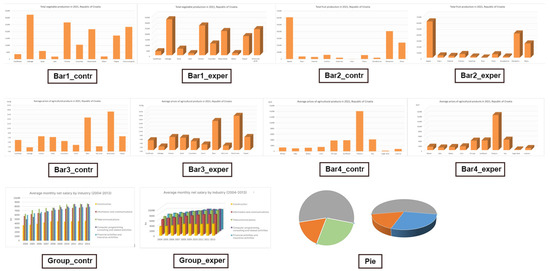
Figure 1.
Visualizations designed for Experiment 1 (Bar1_contr, Bar1_exper, Bar2_contr, Bar2_exper, Bar3_contr, Bar3_exper, Bar4_contr, Bar4_exper, Group_contr, Group_exper, Pie), with eleven visualizations each in 2D and 3D variants: the first two rows are bar charts and the third row displays grouped bar charts and pie charts.
In this experiment, a survey questionnaire consisting of two parts was used. In the first part of the questionnaire, participants were asked to compare the data presented in six visualizations, while in the second part, they filled out their demographic information. We designed two surveys that differed in the control and experimental samples. Participants were divided into two groups where the experimental group was exposed to 3D visualizations, and the control group was exposed to 2D visualizations. The test segment consisted of six multiple-choice questions with three possible answers, of which only one was correct. The questions and answer options were the same for both groups of participants. Bar charts were different for both groups according to the type of display, while for the combined bar and pie chart, participants had the same visualizations displayed simultaneously. This way, both groups had the same display for these two graphs. The questions were based on the tasks of comparison from the typology of abstract visualization tasks by Brehmer and Munzner [38]. According to their typology, the participants’ activity is divided into three categories (identification, comparison, and summarization). The comparison involves determining the relative value or finding differences between a small set of points. This is precisely what we based the questions on because we wanted to test whether there is a difference in perception of the relationship based on the type of display (2D and 3D). The questions were designed in a way so that participants compared two values.
The data used in the visualizations were obtained from the publicly available website of the Croatian Bureau of Statistics. When selecting statistical data, we made sure that they were clear to the public and that the topic was understandable, avoiding overly specific data related to a particular domain. In this way, we reduced the possibility of errors due to a lack of expertise in a particular area and imprecise interpretation of the data. The survey was conducted through Microsoft Forms.
A total of 76 respondents participated in the study, of which 30 completed Survey 1 (2D) and 46 completed Survey 2 (3D). The study was conducted anonymously via the online tool, Microsoft Forms, remotely. The questionnaire was completely anonymous, which means that the answers cannot be linked to the respondents individually. Answers were analyzed at the group level. Out of the total number of respondents, 19 (25%) were male, while 57 (75%) were female. The largest number of respondents (37%) were in the age range of 19 to 21 years, with 28 (37%) respondents being 19 years old, 26 (34%) respondents being 20 years old, and 12 (16%) respondents being 21 years old. The remaining 10 respondents were between the ages of 23 and 39, with 4 (5%) being 22 years old, 3 (4%) being 23 years old, and three (1%) respondents each being 25, 38, or 39 years old, respectively. As for education, 55 (73%) respondents completed vocational high school, 20 (26%) had higher education, and one (1%) respondent had elementary education. When it comes to using technology to complete the survey, 45 (59%) respondents used mobile devices, while the remaining 31 (41%) respondents completed the survey using a computer. In response to the question “Were you able to complete the survey continuously without any interruptions?”, 68 (89%) respondents answered YES, while 8 (11%) respondents answered NO.
2.2. Eye Tracking Methodology (Experiment 2)
In the second part of the study, we conducted eye-tracking testing to examine the effects of depth cues on human gaze and information processing to obtain more detailed insights. We decided to combine the subjective evaluation (online survey) with the objective evaluation (eye tracking) to yield a comprehensive understanding of the participants’ cognitive processes and behaviors. The combination of these methods enables us to obtain a comprehensive picture of how participants perceive information during task execution. Eye tracking gives us additional information such as attention allocation and visual processing patterns, which allows us to examine the connection between subjective and objective evaluations. We wanted to investigate how information processing differed between 2D and 3D bar charts.
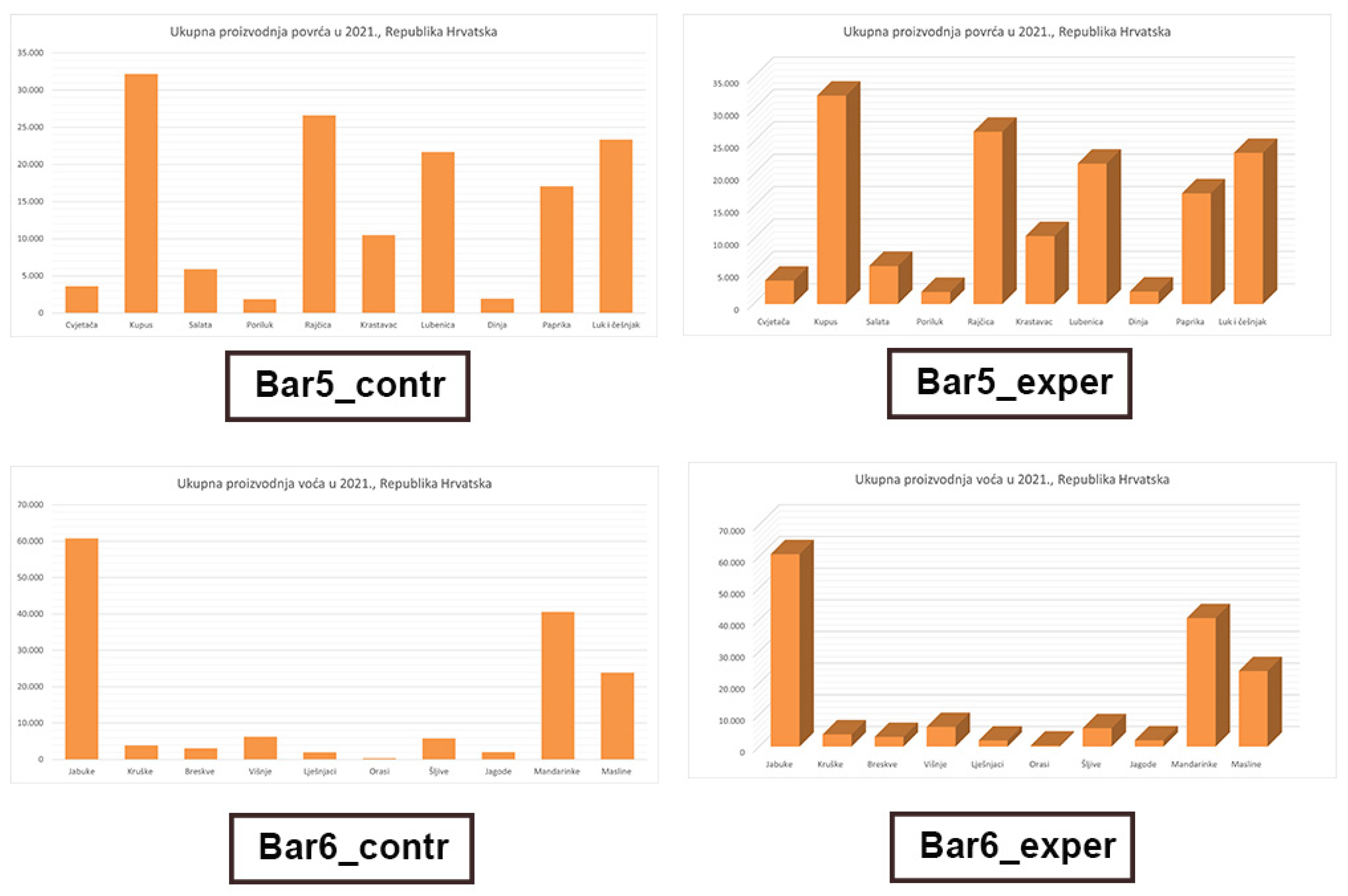
The hypothesis was that there is a difference and that the type of graph affects the perception of size relationships displayed in the information visualization (H2). We prepared two visualizations in two variants, following the same method as in Experiment 1 (Bar5_contr, Bar5_exper, Bar6_contr, Bar6_exper) (Figure 2). The independent variable was the type of display (2D and 3D), and we changed the numerical data for each of the topics. Different values were assigned to each topic, with larger values assigned to one and smaller values assigned to the other. Although the numerical values varied across the graphs’ topics, it was ensured that all the graphs had an equal number of columns. The graphs were intentionally designed with a high degree of uniformity, except for the elements that served as independent variables. The visualizations were designed using Microsoft Excel.
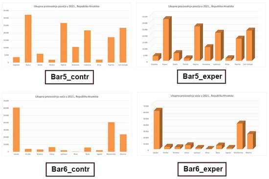
Figure 2.
Visualizations designed for Experiment 2: graphs with small and large columns in control and experimental variants (Bar5_contr, Bar5_exper, Bar6_contr, Bar6_exper); four bar charts, with the top two showing the same graph but with different dimensions, 2D (left) and 3D (right), and the bottom two showing the same graph but with different dimensions, 2D (left) and 3D (right).
A total of 54 Croatian adults (mean age = 26.20, SD = 9.71) took part in the eye-tracking experiment: 38 were female and 16 were male. All had reported normal or corrected-to-normal vision. They participated voluntarily and gave written informed consent before the experiment.
The eye-tracking device used in the experiment was Tobii Eye Tracker X60 with a tracking frequency of 60 Hz and an accuracy of 0.5 degrees. The Tobii Studio 3.2.1. software was used to present the graphs and to record the eye-tracking data. The resolution of the computer screen (DELL U2412M monitor) was 1920 × 1200 pixels.
The experiment was carried out in a quiet laboratory room with controlled lighting conditions. Each participant was seated at 60 cm from the screen. In the beginning, the eye tracker was calibrated using a 5-point calibration for each participant. The experiment started with a warming-up task in which the participants had to detect a symbol presented on an image. Then, the experiment began with the following instructions displayed on the screen: “You are going to see a graph displaying the quantity of food produced in Croatia during the previous year. Please answer the question using the graph”. The participants were asked to determine the difference between the values of two columns by selecting one of the three predefined answers, of which only one was correct. There was no time limitation. After the task was finished, the answer was recorded, and the same procedure was repeated for another graph. Each participant viewed two graphs, one 2D graph and one 3D graph, with each graph corresponding to a different topic. For one topic, the question was “What is the difference in the amount of produced cabbage and watermelon”, and for the other, the question was “What is the difference in the number of produced pears and plums?”. The order of presentation for the two graph variants was counterbalanced among the participants. In total, there were two groups of participants, each viewing a different combination of topic and graph type to control for potential confounding effects of the topic on participants’ responses. After completing the eye-tracking experiment, the participants’ demographic information was recorded using an additional short questionnaire. The average total duration of the experimental procedures (including verbal instructions, calibration, warm-up, main tasks, questionnaire, and debriefing) was approximately 12 min per participant.
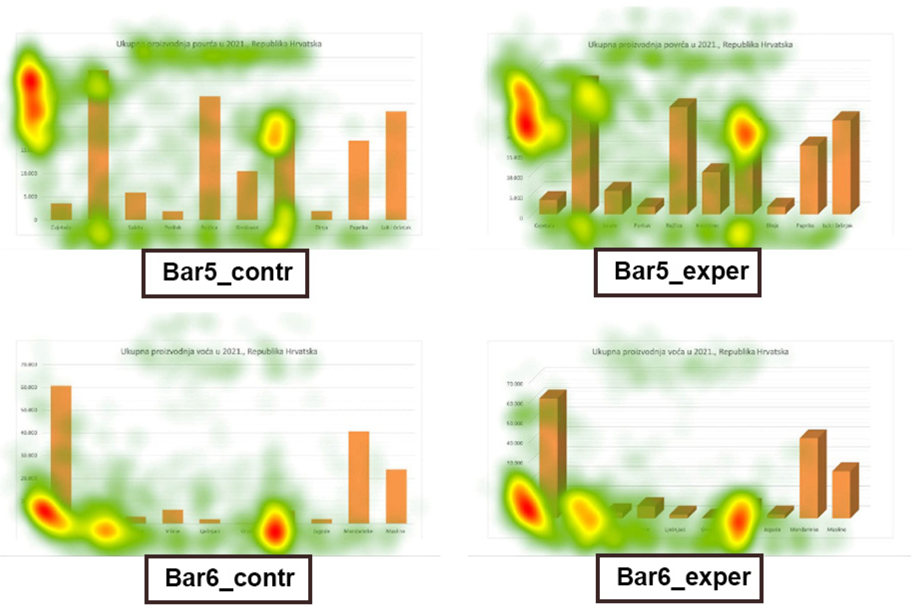
The following eye-tracking metrics for each participant were analyzed: fixation count (FC) on the area of interest (AOI) and the total fixation duration (TFD). The rectangular area covered with all graph elements was defined as the area of interest. The size and the position of the area of interest were the same across the conditions. The total fixation duration was defined as the duration of all fixations within the area of interest and was measured in milliseconds. Fixation count was defined as the number of times a participant fixated on the area of interest. The overall distribution of the participants’ visual attention was presented by count heat maps (Figure 3). The count heat maps are color-coded representations of the number of fixations. Red indicates areas with high numbers of fixations, and green indicates low numbers of fixations. Colorless areas indicate that the viewer did not fixate on the area [39].
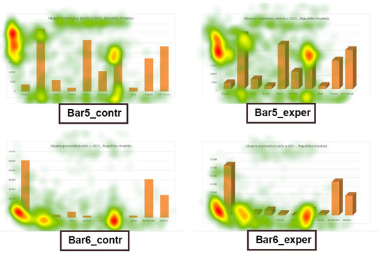
Figure 3.
Count heat maps: four bar charts showing eye-tracking heat maps, with the top two showing the same graph but with different dimensions, 2D (left) and 3D (right), and the bottom two showing the same graph but with different dimensions, 2D (left) and 3D (right).
Additionally, the comprehension of the graphs was measured by using a categorical variable based on the participant’s responses to questions. The correct answer was categorized as 1, and the incorrect answer as 0.
3. Results
3.1. Results of the Online Survey (Experiment 1)
Since the answers were categorical (nominal data), for analysis of the results, we used parameters that are applied for the analysis of such types of responses, which are frequency (N), standard error (SE), and accuracy (ACC). We used the standard error as an indicator of the precision of the answers to multiple-choice questions, with a lower standard error indicating higher precision. To determine the relationship between the type of display and answer accuracy, we conducted a chi-square test. Since the data were nominal, we decided to use the chi-square test for independence to test for the presence of an association between the accuracy of responses and the type of display.
The collected data were quantitatively analyzed using statistical programs IBM SPSS 26 and Microsoft Excel. We analyzed the data according to the type of graph (bar, grouped bar, or pie chart). Thus, from the results for bar charts (Table 1), it is evident that users with the highest percentage of answer accuracy responded to Bar3_contr (ACC = 96.70%), followed by Bar1_exper (ACC = 93.50%), Bar1_contr (ACC = 93.30%), and Bar3_exper (ACC = 91.30%). Since the control variants were in 2D format and the experimental ones in 3D format, we can conclude, based on this, that both variants for Bar and Bar3 were equally understandable to users. However, the answer accuracy was the lowest for Bar4_exper (ACC = 56.50%) and, to a lesser extent, for Bar2_contr (ACC = 76.70%), Bar2_exper (ACC = 87.00%), and Bar4_contr (87.70%). Based on all the above, we cannot say that the 3D variant of bar charts was less understandable to users but that both variants were equally understandable.

Table 1.
Answers related to bar charts (Bar1, Bar2, Bar3, Bar4); percentage of correct answers and error rate; N = number of responses; SE = standard error; ACC = accuracy.
The results mentioned are also visible in the distribution of correct and incorrect answers (Figure 4). We can see that the only difference (between 2D and 3D) in answer accuracy appears for Bar4, which is not enough to conclude that a difference exists.
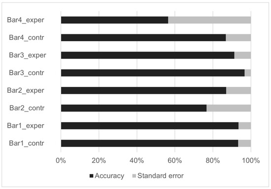
Figure 4.
Distribution of correct and incorrect answers (accuracy and standard error) across conditions for bar charts (Bar1, Bar2, Bar3, and Bar4), with eight 100% stack bar graphs showing the distribution of answers.
In the question with a grouped bar chart display, participants were able to choose which display was clearer to them and use it to answer the question. Both groups had the same question and the same displays (both visualizations). We can see that participants overwhelmingly chose the 2D display to answer the question, with 62 of them (93%) choosing it and a smaller number choosing the 3D display, with 5 of them (7%) (Table 2). However, it is interesting to note that the percentage of accuracy and error rates were the same in both cases. We can conclude that users prefer the 2D display for reading values, but even when presented with a 3D display, they can still read the values with a high level of accuracy. In a comparison of 2D and 3D displays of a pie chart, participants were asked to compare the relationships between values in the chart. Both groups had the same question and the same displays (both visualizations). Participants answered correctly to a great extent (ACC = 88.20%) (Table 2).

Table 2.
Answers related to grouped bar chart (Group) and pie chart (Pie); percentage of correct answers and error rate; N = number of responses; SE = standard error; ACC = accuracy.
Since the data were nominal, we decided to use the chi-square test for independence to test for the presence of an association between the accuracy of responses and the type of display. We conducted the chi-square test for bar charts (Bar1, Bar2, Bar3, and Bar4). Based on the analysis of the results obtained through the chi-square test and Fisher’s exact test, we can observe that there is no statistically significant association between visualization display (2D and 3D) and the accuracy of the responses (Table 3). In two cases (Bar1 and Bar3), the assumptions for the chi-square test were not met; therefore, we conducted Fisher’s exact test to test the significance of differences between two categorical variables with small samples. The only question with a statistically significant difference was for Bar4 where there was a statistically significant difference (p = 0.006) and moderate strength of association (φ = 0.317). However, this is not enough to conclude that there is an association between the type of graph (2D or 3D) and the accuracy of the responses (H1); therefore, we reject the first hypothesis.

Table 3.
Chi-square test; significance level is 0.050; N = number of responses; E = expected value; χ2 = chi-square; Df = degree of freedom; p = p-value; φ = Phi value.
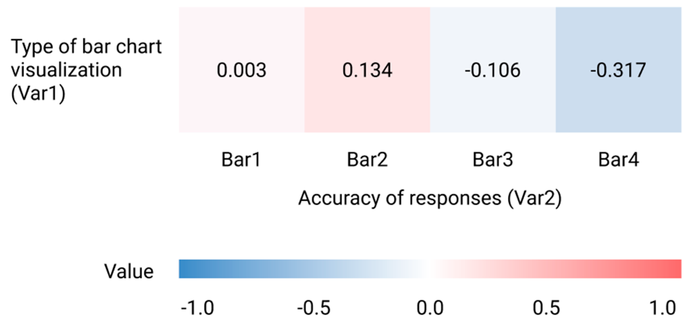
We calculated the Spearman correlation coefficients to investigate the relationship between the type of visualization (2D or 3D) used in bar charts and the accuracy of responses. Given that our data were ordinal, the Spearman correlation was appropriate for this analysis. The results revealed no statistically significant correlations between the type of bar chart visualization with the accuracy of responses for Bar1 (ρ = 0.003), Bar2 (ρ = 0.134), and Bar3 (ρ = −0.106) (Table 4). These results indicate very weak correlations, suggesting that the type of bar chart visualization does not impact the accuracy of responses. For the Bar4, we identified a statistically significant correlation (ρ = −0.317), which is considered a weak correlation. It suggests a negative relationship between the type of bar chart and response accuracy. Overall, these results suggest that the type of visualization did not affect the accuracy of responses for the bar charts, as demonstrated in Figure 5.

Table 4.
Correlation analysis of the relationship between the type of bar chart visualization and accuracy of answers; ρ = Spearman coefficient; p = p-value; N = number of responses.
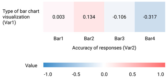
Figure 5.
Correlation heat map that displays a visual representation of the Spearman coefficients indicating the relationship between the type of bar chart visualization and the accuracy of answers; the color scale represents a positive correlation which is shown in red (ρ = 1.0) and a negative correlation is shown in blue (ρ = −1.0).
3.2. Results of the Eye Tracking (Experiment 2)
Eye-tracking metrics were statistically analyzed with IBM SPSS 23. The data were not normally distributed, so nonparametric tests were used, with an alpha level of 0.05. A Mann–Whitney U test showed a significant difference in the fixation count between the graphs with different column sizes (Bar5 and Bar6), U = 1049.50, p < 0.05, indicating that the participants fixated more on the graphs with large columns (Bar5) (median = 54.50, range 13–168) than on the graphs with small columns (Bar6) (median = 45.50, range 5–155). In contrast, there was no statistically significant difference in the fixation count between the 2D (control variant) and 3D graphs (experimental variant), p = 0.87. There was also no statistically significant influence of depth (p = 0.89) and column size (p = 0.13) on the total fixation duration.
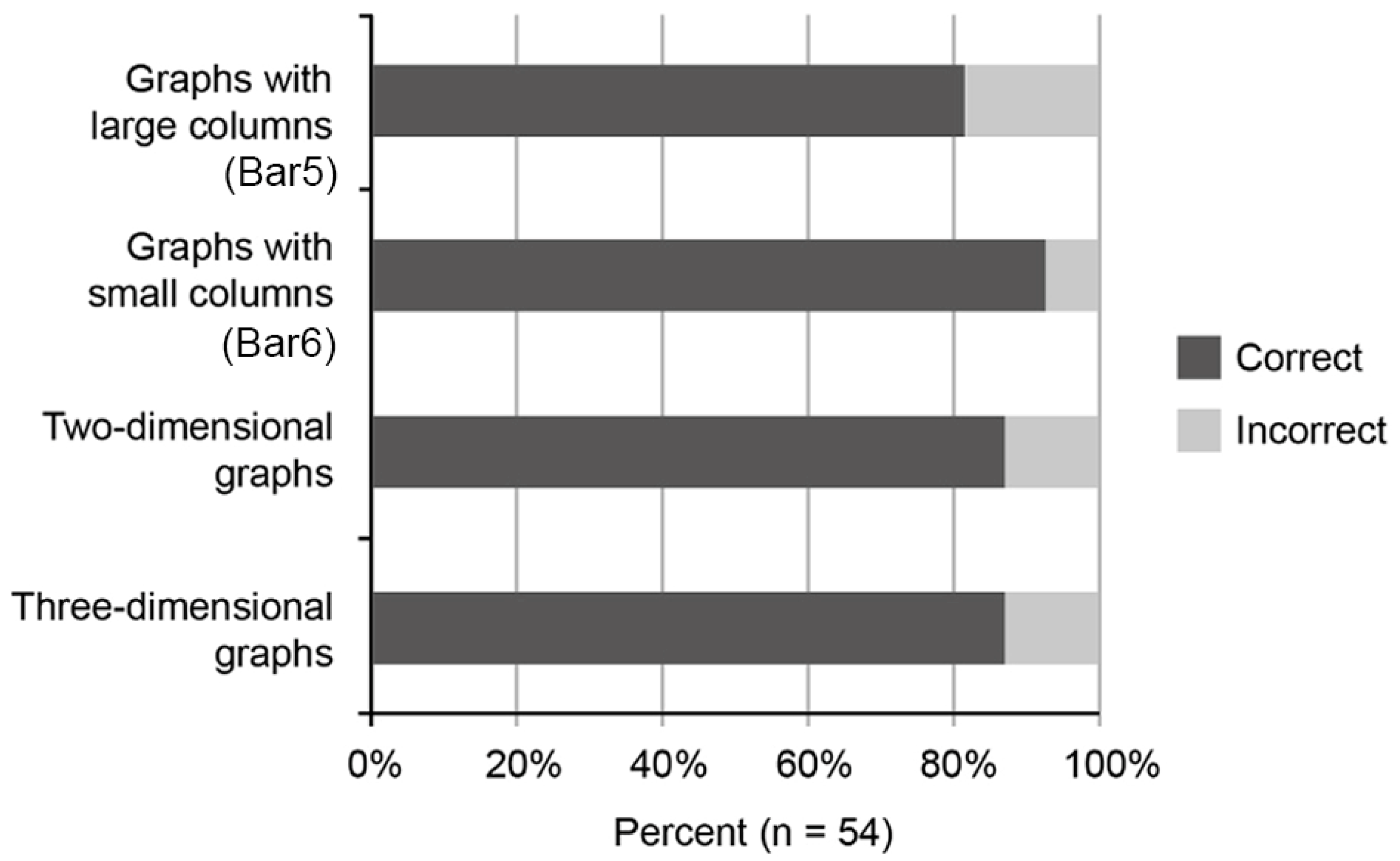
Figure 6 shows the results of the analysis of the participants’ correct answers across the conditions. Mann–Whitney U tests were performed to examine the influence of depth and column size on the accuracy of the answers, but no statistically significant differences were found (p = 1.00 between the 2D and 3D graphs, p = 0.09 between the graphs with small and large columns).
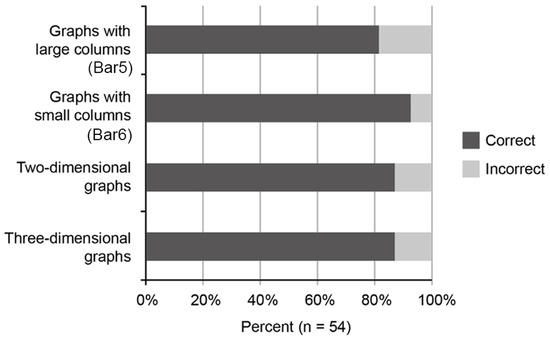
Figure 6.
Distribution of correct and incorrect answers across conditions, with four 100% stack bar graphs showing the distribution of answers.
Additionally, we wanted to investigate the differences in fixations between the participants who comprehended the graphs differently. Therefore, the eye-tracking data were split into two groups: a group of the participants who answered correctly and a group of the participants who answered incorrectly. The total fixation duration for the graphs with large columns was significantly longer for the participants who answered correctly (median = 12.24, range 3.08–42.07) compared with those who answered incorrectly (median = 4.69, range 1.53–12.30), U = 44.00, p < 0.05. In contrast, there was no statistically significant difference in the total fixation duration for the graphs with small columns between the participants who answered correctly and those who answered incorrectly (p = 0.98). No statistically significant difference was found in the total fixation duration for both 2D and 3D graphs between the participants who answered correctly and those who answered incorrectly (p2D = 0.21, p3D = 0.24). Also, no statistically significant difference was found in the fixation count for the graphs with small and large columns between the two groups of participants (psmall = 0.51, plarge = 0.05), and neither between the 2D and 3D graphs (p2D = 0.54, p3D = 0.35).
4. Discussion
The paper aimed to evaluate the effects of 3D display depth cues on human gaze and user understanding, specifically for bar charts. Although many authors and studies highlight issues related to 3D visualizations and advise against their use, based on the results of our two-part research, we have not found a statistically significant difference in the understanding of bar charts between 2D and 3D visualizations. We summarize our findings as follows:
- There is no association between the type of graph (2D or 3D) and the accuracy of responses for bar charts, refuting our first hypothesis (H1).
- Our results indicate that there is no difference in visual information processing between 2D and 3D bar charts that impacts the perception of the size relationships represented in the visualizations, refuting our second hypothesis (H2).
- While users expressed a preference for the 2D bar chart display when reading values, they demonstrated a high level of accuracy in interpreting values from the 3D bar chart displays as well.
Previous research suggests that poorly designed graphs can result in errors in their comprehension [34]. However, in the present study, this effect was not observed in the context of both 2D and 3D bar chart representations. Since we examined specific types of visualizations (bar, grouped bar, and pie charts) with a focus on bar charts, we can conclude that our results apply to bar charts. Although the previous studies showed that bar charts can be less effective than line and spider graphs for comparison between dimensions within a graph [36], our results show that bar charts can still be a useful tool for visualizing data. The results of the two experiments showed that there is no association between the type of bar chart (2D or 3D) and the accuracy of the responses for the specific gap dimensions we used in our experiment. Still, our additional analysis revealed that the duration of a fixation on a graph varied between the participants who provided correct and incorrect responses. Particularly, the total fixation duration was shorter for those who answered incorrectly in some cases. However, a lack of interest may not necessarily be the cause of such errors, as suggested by previous research. For example, a study by Vila and Gomez [30] on extracting business information from graphs found that people providing wrong answers spend more time in graph scanning compared with those who answer the question properly. Furthermore, our results showed no difference in information processing between 2D and 3D bar charts that affects the perception of the size relationships shown in information visualization. Of course, we can only claim this for certain parameters, namely, for bar charts, where the gap depth and width were 80%, combined bar charts where the gap depth and width were 150%, and pie charts where Y rotation was 30° and 15° perspective. These are interesting conclusions and the first steps toward defining to what extent and in what way 3D affects perception. Interestingly, participants chose the 2D display when they had the option to choose although there is no statistically significant difference between the accuracy of answers for 2D and 3D bar chart displays. This suggests that users prefer 2D displays, but this is a question and topic for further research. We can conclude that the combination of a survey questionnaire and the eye-tracking method proved to be a good combination of different metrics. By providing direct measurements and objectivity in the evaluation, eye tracking allowed us to further confirm and validate the results obtained from the first part of the research.
5. Conclusions
Despite the conclusions of many authors who recommend avoiding the use of 3D visualizations because they disrupt the quality of understanding, the results of our research show that 3D bar chart visualizations are equally understandable as 2D within the context of the specific gap dimensions examined. However, it is important to note that these results should not be generalized to all 3D visualizations as different contexts and visual types may yield varying outcomes. This study has limitations, including a small sample size and a limited variety of visualizations tested. To address these limitations, future research should involve a larger sample size and a broader range of visualizations beyond bar charts, such as line charts and pie charts. We also propose varying the gap depth and width parameters as the fixed settings used in this study may restrict the user understanding. Different parameter settings could introduce potential perceptual variations. In addition to examining understanding (accuracy), we recommend exploring other dimensions of visualization, such as memorability, readability, and visual appeal, as well as different visualization tasks, such as identification and summarization. This study only explored a limited set of potential combinations. Overall, the results of this study provide a deeper insight into the effects of 3D bar chart visualizations on user understanding compared with their 2D counterparts, contributing to a broader discussion related to 3D visualizations.
Author Contributions
Conceptualization, A.S.; methodology, A.S., D.B. and D.K.; validation, D.B.; formal analysis, A.S. and D.B.; investigation, D.K.; resources, D.B. and D.K.; data curation, A.S. and D.K.; writing—original draft preparation, A.S.; writing—review and editing, A.S. and D.K.; visualization, A.S.; supervision, D.B. and D.K.; project administration, D.B. All authors have read and agreed to the published version of the manuscript.
Funding
This research received no external funding.
Informed Consent Statement
Informed consent was obtained from all subjects involved in the study.
Data Availability Statement
The datasets generated by the survey research during and/or analyzed during the current study are available in the Figshare repository, https://doi.org/10.6084/m9.figshare.25180337, accessed on 31 October, 2024. Individual eye-tracking results from the second part of the study have not been publicly shared to uphold participant privacy and confidentiality. Interested parties may request access to these data from the corresponding author.
Conflicts of Interest
The authors declare no conflicts of interest.
References
- Cairo, A. How Charts Lie; W. W. Norton & Company: New York, NY, USA, 2019. [Google Scholar]
- Szafir, D.A. The Good, the Bad, and the Biased: Five Ways Visualizations Can Mislead (and How to Fix Them). Interactions 2018, 25, 26–33. [Google Scholar] [CrossRef]
- Brath, R. 3D InfoVis is here to stay: Deal with it. In Proceedings of the 2014 IEEE VIS International Workshop on 3DVis (3DVis), Paris, France, 9 November 2014; pp. 25–31. [Google Scholar] [CrossRef]
- Brinton, W.C. Graphic Methods for Presenting Facts; The Engineering Magazine Company: Delhi, India, 1914. [Google Scholar]
- Cleveland, W.S.; McGill, R. An experiment in graphical perception. Int. J. Man-Mach. Stud. 1986, 25, 491–500. [Google Scholar] [CrossRef]
- McNabb, L.; Laramee, R.S. Survey of Surveys (SoS)—Mapping the Landscape of Survey Papers in Information Visualization. Comput. Graph. Forum 2017, 36, 589–617. [Google Scholar] [CrossRef]
- Juřík, V.; Herman, L.; Šašinka, Č.; Stachoň, Z.; Chmelík, J. When the display matters: A multifaceted perspective on 3D geovisualizations. Open Geosci. 2017, 1, 89–100. [Google Scholar] [CrossRef]
- Sieber, R.; Schnürer, R.; Eichenberger, R.; Hurni, L. The Power of 3D Real-Time Visualization in Atlases—Concepts, Techniques, and Implementation. In Proceedings of the International Cartographic Conference, Dresden, Germany, 25–30 August 2013. [Google Scholar]
- Watson, D.; Fitzmaurice, G.; Matejka, J. How Tall is that Bar Chart? Virtual Reality, Distance Compression and Visualizations. In Proceedings of the Graphics Interface, Virtual Event, 27–28 May 2021; pp. 256–264. [Google Scholar] [CrossRef]
- Seipel, S.; Carvalho, L. Solving Combined Geospatial Tasks Using 2D and 3D Bar Charts. In Proceedings of the 16th International Conference on Information Visualisation, Montpellier, France, 11–13 July 2012; pp. 157–163. [Google Scholar] [CrossRef]
- Bedjaoui, M.; Elouali, N.; Benslimane, S.M.; Şengel, E. Suggestion pattern on online social networks: Between intensity, effectiveness and user’s satisfaction. Vis. Comput. 2022, 38, 1331–1343. [Google Scholar] [CrossRef]
- Hughes, B.M. Just noticeable differences in 2D and 3D bar charts: A psychophysical analysis of chart readability. Percept. Mot. Ski. 2001, 92, 495–503. [Google Scholar] [CrossRef] [PubMed]
- Burch, M. The Aesthetics of Diagrams. In Proceedings of the 6th International Conference on Information Visualization Theory and Applications (VISIGRAPP 2015)—IVAPP, Berlin, Germany, 11–14 March 2015; SciTePress: Setubal, Portugal, 2015; pp. 262–267. [Google Scholar] [CrossRef]
- Schnürer, R.; Ritzi, M.; Çöltekin, A.; Sieber, R. An empirical evaluation of three-dimensional pie charts with individually extruded sectors in a geovisualization context. Inf. Vis. 2020, 19, 183–206. [Google Scholar] [CrossRef]
- Fischer, M.H. Do irrelevant depth cues affect the comprehension of bar graphs? Appl. Cogn. Psych. 2000, 14, 151–162. [Google Scholar] [CrossRef]
- Zacks, J.; Levy, E.; Tversky, B.; Schiano, D.J. Reading bar graphs: Effects of extraneous depth cues and graphical context. J. Exp. Psychol. Appl. 1998, 4, 119–138. [Google Scholar] [CrossRef]
- Bleisch, S.; Dykes, J.; Nebiker, S. Evaluating the Effectiveness of Representing Numeric Information Through Abstract Graphics in 3D Desktop Virtual Environments. J. Cartogr. 2008, 45, 216–226. [Google Scholar] [CrossRef]
- Ware, C. Visual Thinking for Design; Morgan Kaufmann: Cambridge, UK, 2008. [Google Scholar]
- Munzner, T. Visualization Analysis and Design; CRC Press: Boca Raton, FL, USA, 2014. [Google Scholar]
- Ware, C. Information Visualization: Perception for Design; Elsevier: Amsterdam, The Netherlands, 2020. [Google Scholar]
- Büschel, W.; Reipschläger, P.; Langner, R.; Dachselt, R. Investigating the Use of Spatial Interaction for 3D Data Visualization on Mobile Devices. In Proceedings of the 2017 ACM International Conference on Interactive Surfaces and Spaces, Brighton, UK, 17–20 October 2017; Association for Computing Machinery: New York, NY, USA, 2017; pp. 62–71. [Google Scholar] [CrossRef]
- Saket, B.; Endert, A. Demonstrational Interaction for Data Visualization. IEEE Comput. Graph. Appl. 2019, 39, 67–72. [Google Scholar] [CrossRef] [PubMed]
- St. John, M.; Cowen, M.B.; Smallman, H.S.; Oonk, H.M. The Use of 2D and 3D Displays for Shape-Understanding versus Relative-Position Tasks. Hum. Factors 2001, 43, 79–98. [Google Scholar] [CrossRef] [PubMed]
- Wilke, C.O. Fundamentals of Data Visualization: A Primer on Making Informative and Compelling Figures; O’Reilly Media: Sebastopol, CA, USA, 2019. [Google Scholar]
- McKenna, S.; Mazur, D.; Agutter, J.; Meyer, M. Design Activity Framework for Visualization Design. IEEE Trans. Vis. Comput. Graph. 2014, 20, 2191–2200. [Google Scholar] [CrossRef] [PubMed]
- Cairo, A. The Truthful Art; New Riders: Indianapolis, IN, USA, 2016. [Google Scholar]
- An, H.; Kim, J.; Sheng, B.; Li, P.; Jung, Y. A transfer function optimization using visual saliency for region of interest-based direct volume rendering. Displays 2023, 80, 102531. [Google Scholar] [CrossRef]
- Norman, D. The Design of Everyday Things: Revised and Expanded; Basic Books: New York, NY, USA, 2013. [Google Scholar]
- Norman, D. Some Observations on Mental Models. In Mental Models; Gentner, D., Stevens, A.L., Eds.; Psychology Press: New York, NY, USA, 1983; pp. 7–14. [Google Scholar] [CrossRef]
- Vila, J.; Gomez, Y. Extracting business information from graphs: An eye tracking experiment. J. Bus. Res. 2016, 69, 1741–1746. [Google Scholar] [CrossRef]
- Okan, Y.; Galesic, M.; Garcia-Retamero, R. How People with Low and High Graph Literacy Process Health Graphs: Evidence from Eye-tracking. J. Behav. Decis. Mak. 2015, 29, 271–294. [Google Scholar] [CrossRef]
- Poirier, M.W.; Decker, C.; Spertus, J.A.; McDowd, J.M. What eye-tracking methods can reveal about the role of information format in decision-aid processing: An exploratory study. Patient. Educ. Couns. 2019, 102, 1977–1984. [Google Scholar] [CrossRef] [PubMed]
- Bylinskii, Z.; Borkin, M.A.; Kim, N.W.; Pfister, H.; Oliva, A. Eye Fixation Metrics for Large Scale Evaluation and Comparison of Information Visualizations. In Eye Tracking and Visualization; Burch, M., Chuang, L., Fisher, B., Schmidt, A., Weiskopf, D., Eds.; Springer: Cham, Switzerland, 2017; pp. 235–255. [Google Scholar] [CrossRef]
- Woller-Carter, M.M.; Okan, Y.; Cokely, E.T.; Garcia-Retamero, R. Communicating and Distorting Risks with Graphs: An Eye-Tracking Study. In Proceedings of the Human Factors and Ergonomics Society Annual Meeting, Canberra, Australia, 11–14 November 2012; pp. 1723–1727. [Google Scholar] [CrossRef]
- Goldberg, J.; Helfman, J. Eye tracking for visualization evaluation: Reading values on linear versus radial graphs. Inf. Vis. 2011, 10, 182–195. [Google Scholar] [CrossRef]
- Goldberg, J.H.; Helfman, J.I. Comparing information graphics: A critical look at eye tracking. In Proceedings of the 3rd BELIV’10 Workshop: BEyond Time and Errors: Novel Evaluation Methods for Information Visualization, Atlanta, Georgia, 10–11 April 2010; Association for Computing Machinery: New York, NY, USA, 2010; pp. 71–78. [Google Scholar] [CrossRef]
- Strobel, B.; Saß, S.; Lindner, M.A.; Köller, O. Do Graph Readers Prefer the Graph Type Most Suited to a Given Task? Insights from Eye Tracking. J. Eye Mov. Res. 2016, 9, 1–15. [Google Scholar] [CrossRef]
- Brehmer, M.; Munzner, T. A multi-level typology of abstract visualization tasks. IEEE Trans. Vis. Comput. Graph. 2013, 19, 2376–2385. [Google Scholar] [CrossRef] [PubMed]
- Barry, C.; Hogan, M.; Lang, M. Heat Maps from Decision Flaps—What We See and What We Think. In Advances in Information Systems Development; Insfran, E., Gonzales, F., Abrahao, S., Fernandez, M., Barry, C., Lang, M., Linger, H., Schneider, C., Eds.; Springer: Cham, Switzerland, 2022; pp. 127–142. [Google Scholar] [CrossRef]
Disclaimer/Publisher’s Note: The statements, opinions and data contained in all publications are solely those of the individual author(s) and contributor(s) and not of MDPI and/or the editor(s). MDPI and/or the editor(s) disclaim responsibility for any injury to people or property resulting from any ideas, methods, instructions or products referred to in the content. |
© 2024 by the authors. Licensee MDPI, Basel, Switzerland. This article is an open access article distributed under the terms and conditions of the Creative Commons Attribution (CC BY) license (https://creativecommons.org/licenses/by/4.0/).


