An Improved Study of Multilevel Semantic Network Visualization for Analyzing Sentiment Word of Movie Review Data


1
Lifemedia Interdisciplinary Program, Ajou University, Suwon 16499, Korea
2
Science of Language, MoDyCo UMR 7114 CNRS, University Paris Nanterre, 92000 Nanterre, France
3
Department of Digital Media, Ajou University, Suwon 16499, Korea
*
Author to whom correspondence should be addressed.
Appl. Sci. 2019, 9(12), 2419; https://doi.org/10.3390/app9122419
Submission received: 30 April 2019
/
Revised: 31 May 2019
/
Accepted: 31 May 2019
/
Published: 13 June 2019
(This article belongs to the Special Issue Sentiment Analysis for Social Media)
Abstract
:This paper suggests a method for refining a massive amount of collective intelligence data and visualizing it with a multilevel sentiment network in order to understand the relevant information in an intuitive and semantic way. This semantic interpretation method minimizes network learning in the system as a fixed network topology only exists as a guideline to help users understand. Furthermore, it does not need to discover every single node to understand the characteristics of each clustering within the network. After extracting and analyzing the sentiment words from the movie review data, we designed a movie network based on the similarities between the words. The network formed in this way will appear as a multilevel sentiment network visualization after the following three steps: (1) design a heatmap visualization to effectively discover the main emotions on each movie review; (2) create a two-dimensional multidimensional scaling (MDS) map of semantic word data to facilitate semantic understanding of network and then fix the movie network topology on the map; (3) create an asterism graphic with emotions to allow users to easily interpret node groups with similar sentiment words. The research also presents a virtual scenario about how our network visualization can be used as a movie recommendation system. We next evaluated our progress to determine whether it would improve user cognition for multilevel analysis experience compared to the existing network system. Results showed that our method provided improved user experience in terms of cognition. Thus, it is appropriate as an alternative method for semantic understanding.
1. Introduction
1.1. Background and Purpose of Research
At present, we are faced with an enormous amount of information every day due to the vast growth of information and communications technology. Thus, there is increased interest in effective data processing and analysis. In particular, big data is playing an increasingly important role since it is suitable for refined and semantic processing, even if the amount of data is considerable or if its structure is complex [1]. Big data has also attracted great attention in the field of data visualization primarily for the design of efficient processing and semantic analysis. Data visualization is a redesigned concept of data analysis with better readability, offering distinct insights that cannot be grasped from a table or graph [2]. Network visualization is a visual tool to semantically analyze data if there is a massive amount or if the structure is complex [3]. Therefore, this study aims to demonstrate massive collective intelligence data through network visualization. This study also proposes an intuitive and semantic analysis method by designing multilevel sentiment network visualization based upon emotion words [4]. Social network analysis plays a significant role in understanding and finding solutions for society-functional problems by examining the original structure and relationships of the network. Therefore, network visualization is applied in a wide variety of fields, including network analysis based on data similarity, network analysis about social-scientific situations, graph theory, and recommendation systems.
Force-directed graph drawing algorithm is a standard layout algorithm for designing a network graph. It is considered to be highly useful since it allows related nodes to form a cluster [5]. However, the location of the node varies each time the graph is formed if a force-directed graph drawing algorithm is used because the entry value of the node’s location is random and the eventual position is determined by relative connections between nodes. Therefore, users must repeat the learning of the system if in a force-directed network, since the absolute location information is not fixed (Figure 1). This is a notable drawback. Such difficulties can become great obstacles when interpreting the network if it consists of a considerable amount of data. Furthermore, the collective intelligence can deliver the wrong data if it is visualized based on a force-directed layout since locations of nodes may vary.
Following a preliminary study of ours [6,7,8] which introduced the sentiment network visualization approaches that are the basis of this work, we designed a multilevel sentiment network visualization so as to facilitate intuitive understanding of the complex collective intelligence data. Also, we present an approach to find solutions for those difficulties of a force-directed layout. Specifically, the primary contributions of our work are:
- More complete description of the sentiment movie network developing process: we present the explanation of flock algorithm method. Even if nodes increase in large scale, with this method, nodes won’t be overlapped making bigger sentiment network configuration possible with improved delivery.
- Considering more diversity visual metaphorical graphic model, and conducting a survey about selection of graphic to better support interaction with the sentiment movie network.
- An evaluation for comparing the awareness level on network location.
- An evaluation for comparing between its final visualization map (Network + MDS+ Constellation Metaphor) and our previous visualization map [8].
1.2. Research Process
After targeting “movie review data” among examples of collective intelligence, we selected 36 sentiment words that generally appeared in movie reviews. These were classified into seven clustering characteristics through principal component analysis. These keywords were also analyzed through multidimensional scaling (MDS) to discover any correlations, such as similarities and differences. A two-dimensional distribution map was designed in the next step according to these correlations. We then designed a sentiment-based movie similarity network based on this two-dimensional distribution map through three steps. First, assuming that each node contains one piece of information about a movie, edges were created to match with each other if the nodes shared the most similar emotion characteristics. This eventually led to a network of 678 movie nodes. Heatmap visualization was also applied to allow us to more easily grasp the frequency of sentiment words of each movie [9]. A two-dimensional distribution map with sentiment words related to the movie review was created accordingly to distribute nodes in semantic positions. As each node was influenced by the semantic point depending on its attribute value, absolute positions of nodes were designed to reflect attributes of nodes [10]. Thus, nodes representing each movie formed a network layout which attracted nodes to where sentiment words were spread on the two-dimensional distribution map according to its frequency. The whole structure was referred to as the sentiment-movie network. Third, we applied a constellation visualization to label the characteristics of each cluster when nodes in a network structure showed clustering on a two-dimensional keyword distribution map. An asterism graphic consisted of objects representing traits of each clustering formed by nodes and edges of a network clustering structure. We next suggested a virtual scenario in the general public’s view in order to determine how this network visualization could be applied in the actual movie recommendation process. Assuming that a random user enjoyed a certain movie, we demonstrated the process which the user went through in order to find a movie with similar emotions. Finally, three kinds of evaluations were conducted to verify whether the visualization method that we proposed could be linked to cognition improvement for users’ multilevel analysis experience. The first test was designed to verify whether users would show a satisfactory understanding of the meaning of the location structure of nodes in a movie network visualization. The next test compared the two groups provided with or without heatmap visualization to see how well they could adopt sentiment words data when discovering the network. The last test was designed to determine which visualization case worked the most effectively for subject groups to conduct a semantic analysis among the following three cases: (1) the first visualization with network nodes; (2) the second visualization that involved fusing the first visualization with the two-dimensional sentiment word map indicating locations of the sentiments; and (3) the third visualization which superimposed the constellation metaphor over the second visualization. Figure 2 illustrates three processes for the sentiment analysis, data visualizing, and the evaluation workflow.
2. Materials and Methods
2.1. Sentiment Analysis and Visualization
Sentiment word analysis is a fundamental process in numerous applications of opinion and emotion mining, such as review crawling, data refining, and SNS classification [11]. In order to contribute to sentiment analysis and data visualization research fields, there is an abundance of studies that applied sentiment words and sentiment visualization system.
MyungKyu et al. [12] was used to deal with sentiment words shown in online postings and social media blogs. JoungYeon et al. [13] was used to illustrate adjectives used to describe the texture of haptic and indicated relations between adjectives on multi-dimensional scaling.
Ali et al. [14] provided a clear and logical taxonomy of sentiment analysis work. This taxonomy was made up of two main subcategories in this field: opinion mining and emotion mining. Also, they present a set of significant resources, including lexicons and datasets that researchers need for a polarity classification task. This would allow them to study the sentiment of any topic and determine the polarity of said topic, be it either positive or negative.
Kostiantyn et al. [15] suggest the state of the art sentiment visualization techniques and trends by providing the 132 cases of “sentimentvis” interactive survey browser. In this research, all the cases are classified based on the categorization standards. This categorization consists of the data domain, data source, data properties, analytic tasks, visualization tasks, visual variable, and visual representation. Also, the collected data indicates the growing multidisciplinary insight for visualization of sentiment with regard to multiple data domains and tasks.
2.2. Movie Recommendation
Studies on movie recommendation methods have mainly focused on “content-based recommendation systems utilizing information filtering technology” and “corporative recommendation system.” According to Oard et al. [16], a content-based recommendation system was used to extract the characteristics from individual information and its following preference.
Movie recommendation systems based on corporative filtering have been analyzed by Sarwar et al. [17] and Li et al. [18]. They were used to recommend options selected by the group that shared similar information with individual users.
While these previous studies made recommendations based on individual information of users, we further managed user’s experience data as in “emotional review data felt during the movie watching,” thus enriching emotional attributes that fit the purpose of movie recommendation.
Recently, Ziani et al. [19] suggest a recommendation algorithm based on sentiment analysis to help users decide on products, restaurants, movies, and other services using online product reviews. The main goal of this study is to combine both the recommendation system and sentiment analysis in order to generate the most accurate recommendations for users.
However, this work has a limitation that did not present a user-centered recommendation system and focused on developing the automatic recommendation algorithm based on semi-supervised support vector machines (S3VM). Meanwhile, our system provides user-centered recommendation experience through using the network visualization and metaphorical sentiment graphic, which is easy to analyze.
2.3. Network Visualization and Layouts
A number of studies have been conducted on network visualization methods, including several recent studies on user’s perception. For example, Cody Dunne et al. [20] have introduced a technique called motif simplification, in which common patterns of nodes and links are replaced with compact and meaningful glyphs, allowing users to analyze network visualization easily.
While this method identifies the maximal motif more accurately, even enabling the estimation of size through glyph and interaction, it has several difficulties for ordinary users. For example, users must put considerable effort toward learning concepts of motif and interpreting glyph. In addition, they have difficulty in discovering the optimal set of motifs.
Another study by Giorgio et al. [21] presented a tool called “Knot” with a focus on the analysis of multi-dimensional and heterogeneous data to achieve interface design and information visualization in a multidisciplinary research context.
Furthermore, Nathalie et al. [22] suggested methods to solve clustering ambiguity and increase readability in network visualization. That paper states that major challenges facing social network visualization and analysis include the lack of readability of resulting large graphs and the ambiguous assignment of actors shared among multiple communities to a single community.
They proposed using actor duplication in social networks in order to assign actors to multiple communities without substantially affecting the readability. Duplications significantly improve community-related tasks but can interfere with other graph readability tasks.
Their research provided meaningful insights as to how central actors could bridge the community. However, it also left confusions when distinguishing duplicated nodes and analyzing visualizations that exceeded a certain size since node duplications could artificially distort visualization.
Gloria et al. [23] present a novel method that uses semantic network analysis as an efficient way to analyze vaccine sentiment. This study enhanced understanding of the scope and variability of attitudes and beliefs toward vaccination by using the Gephi network layout.
These four studies mentioned above all aimed to improve network visualization from the perspective of users, with a particular focus on settling challenges of visualization distortion and existing network through users’ learning of new technologies. However, network layouts used in previous studies could not handle overlapping of nodes when faced with increasing amounts of data.
In addition, the user may have to repeat the system since the location may vary. Furthermore, these network layouts were inefficient in that users had to check each node one by one in order to identify characteristics of a cluster.
Our research is consistent with previous studies in that it will fix the network data based upon sentiment words. It was designed to minimize users’ learning and prevent distorted interpretation by applying a metaphor based on the characteristics of nodes in the network.
While previous studies made recommendations based on user’s individual information, we further managed user’s experience data as in “emotional review data felt during the movie watching,” thus enriching emotional attributes that fit the purpose of movie recommendation.
3. Sentiment Analysis Data Processing
Sentiment analysis is the field of study that analyzes people’s opinions, sentiment, attitudes, evaluations, survey, and emotions towards entities such as issues, events, topics, and their attributes. For sentiment analysis, we performed three data processes as follows.
3.1. Sentiment Words Collection
We selected 100 sentiment words filtered from 834 sentiment words based on the research conducted by DougWoong et al. [24] in order to create a sentiment word distribution map. A further survey of 30 subjects aged from 20 to 29 years determined the most frequently used words among these 100 sentiment words. Following basic instruction on the concept of sentiment words during movies, we investigated to what degree the emotion represented in each sentiment word could be drawn from watching some movies.
The survey began with the question “Describe how much you feel as in each sentiment words after watching the movies with the following genres, based on your previous experience.” The questionnaire used a 7-point Likert Scale to evaluate responses ranging from “Strongly irrelevant” to “Strongly relevant.” After eliminating 32 sentiment words that scored below the average, 68 sentiment words were finally selected [9].
3.2. Sentiment Words Refinement
In order to select the final sentiment words used for a two-dimensional distribution map among 68 sentiment words from the user survey, we collected and compared sentiment word data in existing movie reviews, eliminating words that were rarely used. This procedure consisted of three phases as shown below.
Crawling: Movie review data used in this research were collected from movie information service NAVER [25], a web portal site with the largest number of users in Korea. We designed a web crawler to automate sentiment word collection from movie reviews. This crawler covered three stages: (1) collecting unrefined movie reviews and tags in the NAVER movie web page, (2) refining collected data suitable for this research, and (3) extracting sentiment words based on analysis of refined data. As a result, we obtained 4,107,605 reviews of 2289 movies from 2004 to 2015.
Establishing sentiment word dictionary: We divided text data into morphemes collected through the crawling process using a mecab-ko-lucene-analyzer [26] and further extracted sentiment morphemes. A total of 133 morpheme clusters were selected through several text mining processes. A morpheme is the smallest grammatical unit in a language. In other words, it is the smallest meaningful unit of a language [27].
Each emotion morpheme selected was classified according to 68 kinds of detailed sentiment word categories. A sentiment word dictionary classified by the chosen sentiment word was then established. Extracting emotion morphemes and classifying them by category were conducted in consultation with Korean linguists.
To produce more accurate results, we eliminated less influential sentiment word clusters after matching them with actual movie review data. We calculated Term (w) Frequency (tf: Term Frequency) of each sentiment word cluster (t) suggested by the following formula.
j = number of words in sentimental group t
The number of times that term t occurs in document d
The number of times that term t occurs in document d
Then, inverse document frequency (idf) was also drawn from this formula to lower the weight of the general sentiment word group. The inverse document frequency (idf) is “the logarithmically scaled inverse fraction of the documents that contain the word” [28]. It reduces the number of terms with a high incidence across documents.
N = total number of documents in the corpus N = |D|
D = document set
D = document set
TF-IDF score of sentiment word clusters on each movie was calculated using the following formula:
We next considered the maximum TF-IDF score that might appear from each sentiment word in order to decrease the number of sentiment words. For example, the word “Aghast” showed a TF-IDF score of no more than 0.8% in every movie, whereas “Sweet” scored 42% for at least one movie. We eliminated sentiment words with TF-IDF scores under 10%. Eventually, we selected 36 sentiment words. These sentiment word clusters were broadly divided into “Happy,” “Surprise,” “Boring,” “Sad,” “Anger,” “Disgust,” and “Fear” as shown in Table 1.
3.3. Movie Data Collection
Movie samples used in network visualization were also collected from NAVER movie service in the same way as movie review data [25]. Based on 2289 movie samples from 2004 to 2015 registered in the NAVER movie service, movies with more than 1000 emotion morphemes were used to filter the emotion level. As a result, 678 movie samples were ultimately selected and used as network sample data.
4. Visualization Proposal
We proposed three methods to solve problems of the existing social network visualization layouts as follows.
4.1. Heatmap Visualization
Heatmap visualization is a method consisting of rectangular tiling shaded in scaled color [29,30]. It is used to search for anomalous patterns of data metrics as outlined in previous research [31]. To comprehend convergences, the method described by Young-Sik et al. [32] was used. A recent study proposed 100 cases of IT fractures, visualized and analyzed using the 2D parametric fracture probability heatmap [33]. The proposed map projection technique can project the high dimensional proximal femur fracture information onto a single 2D plane. Also, they applied heatmap in order to present the level of risk.
In this research, we showed TF-IDF size frequency of sentiment words in a heatmap, utilizing coordinate space in 2-dimensional distribution map of each sentiment word in order to visualize a sentimental distribution graphic for each movie node. The detailed research process is shown below. First, we measured space among the selected 36 sentiment words and analyzed correlations in order to design a two-dimensional sentiment word distribution map. We then conducted multi-dimensional scaling (MDS). We conducted a survey on the semantic distance among 36 sentiment words by enrolling 20 college students majoring in Digital Media Technology. These 36 sentiment words were placed on both axes (36 × 36) and the distance between words was scored in a range of plus/minus 3 points by considering their emotional distance. We used UNICET to facilitate a variety of network analysis methods based on data obtained from the 20 survey participants [10]. We also created Metric MDS as shown in Figure 3 based on the semantic distance among movie review semantic words. As a result, positive emotions such as “Happy” and “Surprise” were distributed on the right side of the X-axis while negative feelings such as “Anger” and “Disgust” were distributed on the left side. Active emotions that were generally exaggerated gestures such as “Fear” and “Surprise” were distributed on the top of the Y-axis while static emotions such as “Sad” and “Boring” were on the bottom. Furthermore, each type of sentiment words was clustered concretely based on particular characteristics such as “Happy,” “Surprise,” “Boring,” “Sad,” “Anger,” “Disgust,” and “Fear” on the two-dimensional distribution map. Results showed that cluster characteristic “Surprise” could be divided into “Happy” and “Fear” clusters. This implies that both overflowing joy and sudden fright are dominant in particular movies [10].
Heatmap visualization was then designed based on a two-dimensional sentiment word distribution map as well as frequencies of these 36 sentiment words, which consisted of a two-dimensional distribution map. One optional movie was needed to design the heatmap. We measured frequencies of sentiment words on each movie by contrasting sentiment words in the movie review data obtained through the data construction process and sentiment words in the morphological dictionary. In addition, we measured numerical values by calculating the TF-IDF score to lower the weight of particular sentiment words that frequently emerged regardless of the typical characteristics of the movie. Therefore, TF-IDF score on each sentiment word could be interpreted as a numerical value reflected on the heat map visualization graph for target movies. The final heatmap graph consisted of a two-dimensional distribution map with sentiment words and tiny triangular cells. Every cell was initialized at numerical value, 0. The value then increased depending on the TF-IDF score of the sentiment word located in the pertinent cell. As the numerical value of the cell increased, the color of the cell changed, making it easier to discover the value of TF-IDF score of a pertinent sentiment word. Furthermore, as high-valued cells influenced the values of surrounding cells, the heatmap graph became gradually significant.
Figure 4b is a heatmap graph representing the distribution map of sentiment words from movie reviews written by viewers about the movie “Snowpiercer.” This graph shows high frequencies of emotions such as “Pitiful and boring” as well as “Funny and great.” Some reviews noted “Not so impressive, below expectation. It was pitiful and boring.” “It was crueler than I thought, and it lasts pretty long in my head.” and “The movie was pretty pitiful, probably because my expectations were too high.” As shown in these reviews, there were various spectators with different emotions about this movie, including disappointment.
Therefore, a heatmap showing movie sentiment words can be divided into two cases. Thus, there are two types of heatmaps [7,8]. The first one is a type including movies with a single frequent sentiment word. The table shown above presented a ranking of sentiment words in a movie called “Don’t cry mommy” (Figure 4a), while the table shown below is its actual movie reviews. Since the movie describes a sexual crime, emotions related to “Furious” and “Outraged” are prominent. Such parts are shown in red in the heatmap. The second is a type with various frequent sentiment words. For instance, the word frequency table and reviews on the movie “Snowpiercer” (Figure 4b) revealed different sentiment words such as “Boring, Cruel, Funny, and Pitiful.” Thus, its heatmap suggests patterns based on such information. Furthermore, heatmap visualization helps us easily understand the types of emotions that viewers have experienced in a movie by reflecting the frequency of each sentiment word in the movie.
4.2. Sentiment Movie Network
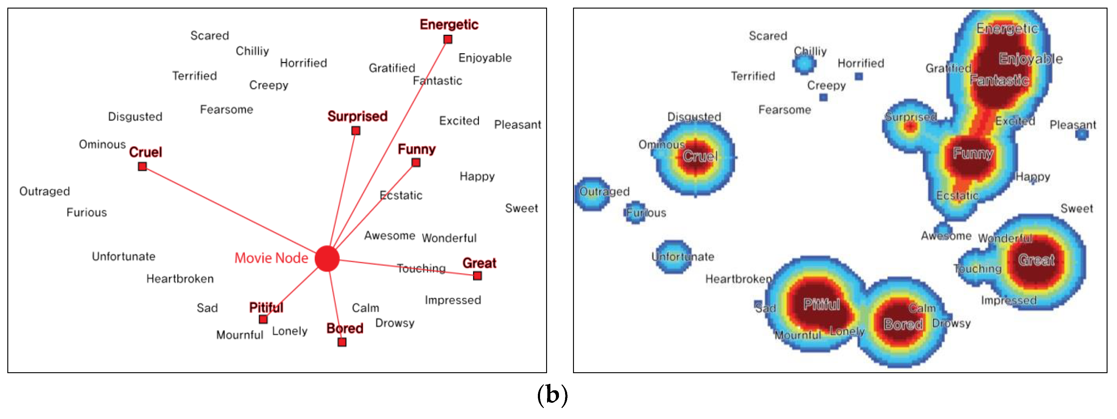
In this session, we aim to describe the basic structures of suggested graphs and examples. Locations of nodes can be altered depending on the main sentiment word from the movie review. The suggested graph is similar to the artifact actor network, a type of multi-layered social network. the artifact actor network connects between the artifact network and social network using the semantic connection. Thus, it expresses the semantic relation between two networks [34]. In our proposed graph, we connected sentiment words on the 2-dimensional scaling map with movie network. In this paper, we referred to this network as the sentiment-movie network. Figure 5 shows the basic structure of the sentiment movie network [6].
As shown in Figure 5, the suggested graph is comprised of two layers. The first layer is called the semantic layer. It consists of semantic points based on the 36 sentiment words. The semantic point of the sentiment word is located at an initially set value. It is immovable. The second layer is called the network layer, which includes nodes comprising the movie network. Each movie node forms the edge of other movie nodes based on similarities. It also forms imaginary edges with the sentiment word in the two-dimensional distribution map based on the sentiment word connoted by the pertinent node. Nodes connected by edges have both attractive force and repulsive forces based on a force-directed algorithm. By contrast, semantic points of sentiment words are immovable, leaving only attractive force. For edge composition between nodes, we calculated cosine similarity between movies based on TF-IDF scores of the 36 sentiment words. The similarity between movie A and movie B or SIM (A, B) is shown as follows.
The edge between each node and the semantic point sets up a fixed threshold value and generates an edge by designating a sentiment word with a value that is greater than a threshold value as semantic feature. Figure 6a,b show an example that the location of a node on the graph can be altered depending on the frequency of sentiment word indicated in the Heatmap Visualization [7,8].
Figure 6a shows that the node is located in the space of the sentiment word with overwhelmingly high frequency. If a movie has more than two frequent sentiment words, its nodes will be located in the way, as shown in Figure 6b. If shown in the heatmap visualization of Figure 6b, nodes in “Snowpiercer” are influenced by keywords such as Pitiful, Bored, Energetic, Great, and Cruel. In addition, nodes are particularly influenced by locations of “pitiful” and “bored” since those two are the strongest that they affect nodes to be placed around the negative y-axis. As such, frequent sentiment words will place nodes.
To show users a host of nodes in a meaningful position without overlapping, flock algorithm has been applied. Flock algorithm consists of separation, alignment, and cohesion [35]. We composed nodes applying separation method because nodes of developed visualization do not move and have no direction.
Solution: One node compares all nodes to each other’s positions and moves in opposite directions if overlaid.
| Algorithm 1. Separate nodes–avoid crowding neighbors | |
| Input: nodes→Node objects to be displayed on the screen. Output: Node objects whose locations have been recalculated so that they are distributed without overlap. Method | |
| 1: | Initialize SEPARATION_DISTANCE |
| 2: | WHILE true |
| 3: | change = false |
| 4: | FOR src in nodes |
| 5: | FOR dst in nodes |
| 6: | IF src == dst |
| 7: | continue |
| 8: | ELSE |
| 9: | dist = src.position − dst.poisiton |
| 10: | IF dist.size < SEPARATION_DISTANCE |
| 11: | change = true |
| 12: | src.position += 1/dist * dist.direction |
| 13: | dst.position −= 1/dist * dist.direction |
| 14: | END IF |
| 15: | END IF |
| 16: | END FOR |
| 17: | END FOR |
| 18: | IF change == false |
| 19: | break |
| 20: | END WHILE |
Even if nodes increase in large scale or similar nodes are added, with this method, nodes will not be overlapped making bigger network configuration possible with improved delivery.
As every node connected by the network made of suggested methods is located in the graph, clustering is formed by combining similar movies in the space of sentiment word with high frequency considering connections between movies as well as connections between related sentiment word. Figure 7 shows an extreme position of a node and a cluster [8]. This network allows users to easily understand the network structure even if the number of nodes is changed by fixating the topology of movie networks based on the sentiment word distribution map of movie reviews. Finally, k-means clustering operation using cosine similarity value for classifying cluster characteristics of each node was conducted. The number of clusters considered ranged from 9 to 12. The final cluster number was chosen to be 11 as the node number of each cluster was evenly distributed and various characteristics were well clustered. Furthermore, each node was colored to classify each node group based on these 11 clusters.
4.3. Constellation Visualization
This session facilitates a cognitive understanding of the process used to design constellation image visualization based on specific nodes and edges with significant sentiment word frequency in order to clarify semantic parts of each clustering. Metaphorical visualizations can map characteristics of certain well-understood visual images/patterns to a more poorly understood data source so that aspects of the target can be more understandable.
Recently, Information graphics and the field of information visualization apply a variety of metaphorical devices to make large size, complex, abstract, or otherwise difficult-to-comprehend information understandable in graphical terms [36,37].
We created an asterism graphic of each cluster network by considering the significant sentiment words, information on movies, and synopses in each cluster. Our research makes it easy to understand the sentiment data system to the general public by using the visual metaphor graphics.
In order to realize asterism images, we referred to the labeling data of the 11 different clusters yielded from k-means clustering, the most dominant categories of sentiment words in each cluster, and their following information on movies and synopsis. In order to select a pool of constellation graphics, experts with academic backgrounds in graphic design and movie scenario professionals were consulted, ultimately narrowing down options to 2~3 graphics per sentiment cluster. Table 2 below contains the lists of image options corresponding to each of these 11 clusters.
For the next phase, 30 students majoring in design and visual media were surveyed to choose the final constellation graphics for representing sentiment words around each cluster. The survey incorporated statements that described relations between sentiment words shown in clusters as well as the choice of images in a 5-point Likert scale. For instance, when a statement of “An image of a dynamite bears relation with the feeling of surprise” is presented, the test subject was supposed to mark an answer from a range of “not at all (1 point) ~ very much (5 points)” and evaluate the strength of the link between the sentiment word and the graphic. Table 2 presents the average drawn from these 30 students’ data. The graphics with the highest average was chosen as the final constellation to represent the relevant cluster.
Table 3 below shows the main emotions and movie examples contained in each cluster as well as motives for choosing each asterism name [6]. This constellation visualization helped us naturally perceive characteristics of a node without having to individually review parts of the network.
Constellation visualization helped us naturally perceive characteristics of a node without having to review parts of the network individually. A comprehensive network map based on information presented in this table is shown in Figure 8. We call this movie data network based on three proposals “CosMovis.” Figure 8 also indicates that it is substantially easier to semantically analyze network visualization using overlapping asterism images on each sentiment word and symbolic nodes with connection structure of edges.
5. CosMovis Network Analysis Scenario
Our research fixed the network data based upon sentiment words MDS map and was designed to minimize users’ learning and prevent distorted interpretation, by applying a metaphor based on the sentiment keyword characteristics of the nodes in the network. In order to show that the user’s target can be applied widely, this section presents an ideal scenario about how our sentiment network visualization is used as a movie recommendation and how it affects a general public’s decision-making process [8]. The scenario is shown as follows.
Scenario: Getting a movie recommendation from the cluster with similar emotions based on previous movies that the general public has watched previously.
This scenario describes a situation of obtaining a movie recommendation from clusters that share similar emotions based on sentiment words implied by users’ previous movie preferences. Assume that the user watched “Star Trek” and was satisfied with the emotions provided by the movie. The user will then search for a new movie from the network. He/she will first find nodes of “Star Trek” in the network and then look for movies closely located to “Star Trek.” As a result, the user will be able to find three other movie nodes based on “Star Trek” as shown in red in Figure 9.
Next, the user will focus on the heatmap to understand what kinds of emotions those three movies contain. Figure 10 on the right shows heatmaps of movie nodes A, B, and C as well as their sentiment word distribution table. Node A is for the movie “Avatar” and Node B is for the movie “Ironman 3.” One can see that heatmaps of these two nodes are very similar to “Star Trek.” Thus, if the user wants to have a similar emotional experience, one could watch Avatar or Ironman 3. Node C is for the movie “Masquerade.” According to its heatmap, this movie also contains “touching” aspects in addition to other emotions present in “Star Trek.” Therefore, if one wants a movie more emotional than “Star Trek,” the user could pick this movie.
We can also note that node C is for a historical genre movie, “Masquerade,” unlike “Star Trek,” “Avatar,” or “Ironman 3”. This implies that sentiment-based movie similarity network can also recommend movies in different genres as long as they contain similar sentiments. Likewise, users can make more effective decisions if they want to obtain movie recommendations based on movies they have watched by understanding the network structure, selecting candidate movies among ones similar to his/her previously enjoyed movies, and analyzing sentiment word frequency of each candidate node.
6. Evaluation
The scenario is as follows. Using an experimental method, we will explore whether the network visualization put forth by this research can improve user cognition. For the purpose of verification, three evaluations were conducted as follows. All evaluations were designed based on social science and statistics in accordance with the International Review Board regulations.
6.1. Evaluation 1: User Awareness Level Test on Network Location
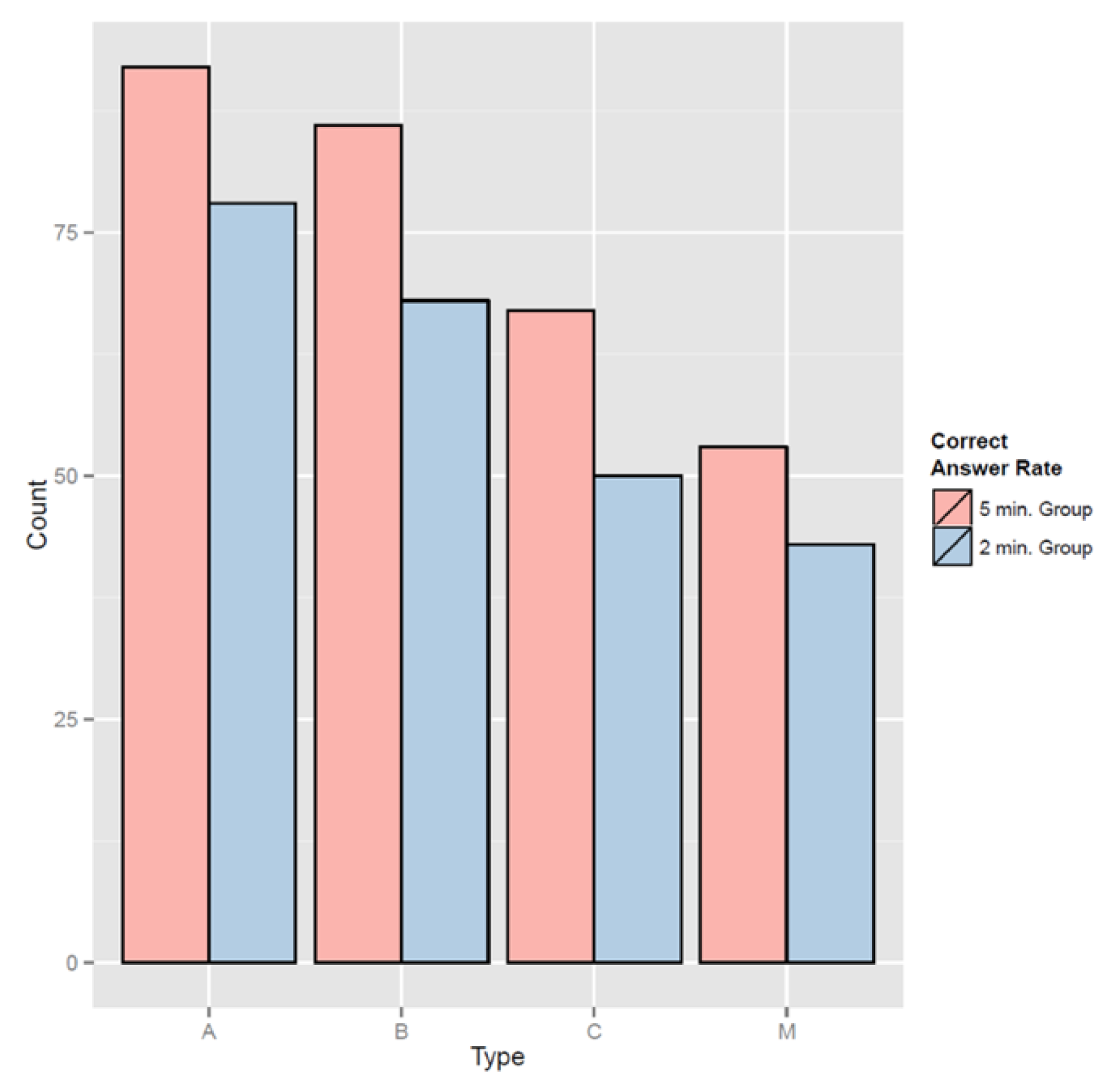
Purpose and Method of Cognition Evaluation: To gauge the users’ awareness level of the network structure created through this research, an evaluation involving 40 participants was designed. The participants were divided into two groups of 20, with one group given a simple explanation regarding the visualization for two minutes while the other group was provided with a deeper explanation for five minutes. After a single movie node was selected from the network and the corresponding heatmap shown, participants were asked to perform a series of tasks such as “Choose the heatmap located adjacent to (or across from) the selected node.” The movie network was verified through three axes, as illustrated below (Figure 11). The survey contained a total of 20 questions, including five questions per axis along with an additional five questions pertaining to the node in the center of the network.
Comparison of group average: For the purpose of average comparison, an independent t-test was conducted. An independent t-test was also used to verify whether a difference in population means existed between two groups that followed normal distribution N () and N () The two groups were assumed to be independent of each other [38]. For this research, in order to discover the difference in awareness levels between the two groups given either a simple or a detailed explanation on the network structure, a survey asked participants to find the heatmap that represented a particular node on the visualization map. We recruited 40 participants (20 in each group) who were majoring in related fields with an understanding of visualization. We also assumed a normal distribution in accordance with the central limit theorem. Three results on these two groups regarding network structure are presented in Table 4.
Independent t-test results between the more-informed group and the less-informed group showed that P-values for questions in the three axes (excluding the middle area) were smaller than the alpha-value (0.05), which was the critical value of a 95% confidence level, or (0.1), which was the critical value of a 90% confidence level. This indicated a significant difference between the two groups that were more-instructed and less-instructed about the network. Table 5 and Figure 12 present details regarding the two groups compared through independent t-tests.
Details on the two test groups indicated that, in terms of the rate of providing correct answers for questions on all axes, the well-informed group outperformed the less-informed group in terms of network structure. For the A-axis, after being provided a further explanation about the network structure, the percentage of getting correct answers increased by 0.7. Similarly, for B-Axis, C-Axis, and center node, percentages of getting correct answers increased by 0.9, 0.85, and 0.5, respectively. Accuracy improvement was most pronounced for the A-Axis, whereas questions regarding the center node produced the lowest enhancement in performance. Thus, we can infer that explaining the network structure in advance of relevant visualization use can help raise the level of user awareness on visualization. To further boost awareness regarding the center node, along with an explanation on the network structure, a supplementary method may be required. Nevertheless, with the correct answer rate for the less-informed group hovering around 50% on average, we can conclude that user awareness of visualization is considered high in general.
6.2. Evaluation 2: Test on Usability Impact of the Heatmap Function
Purpose and Method of Usability Measurement Experiment: The first part of this research concluded that explaining the network structure prior to visualization usage could enhance user awareness [8]. To further improve the awareness level on center nodes, an additional prop up measure was required. As one possible method for boosting user awareness on center nodes, this study introduced a new function, through which dragging the mouse over to a particular center node would offer heatmap visualization. The second test was thus designed to confirm whether a difference in visualization usability existed between group 1 (provided with the heatmap function) and group 2 (not provided such a function). The usability was measured through a survey comprised of five questionnaires regarding learnability, efficiency, understandability, feature functionality, and accuracy measured with a Likert scale of 7. Forty college students (two groups of 20) who were currently studying data visualization with knowledge of the visualization field were selected as samples.
Reliability Analysis: Before analyzing the data gathered, a reliability analysis of the above survey was carried out in order to verify its reliability. Reliability analysis measures internal consistency among questions/statements employed in the survey based on Cronbach’s α. Cronbach’s α has a value of between 0 and 1. The closer the value is to 1, the higher the question’s reliability. Generally, a Cronbach’s α of 0.6 or higher is considered to be reliable. This single index can be used for all questions to yield a comprehensive analysis. Results of reliability analysis performed on the final data set are presented in Table 6.
Comparing maximal values of Cronbach’s α after eliminating a certain item indicated that the number was the highest (0.742) after eliminating Accuracy if the heatmap was provided while it had the maximal value of 0.827 after eliminating Learnability if the heatmap was not provided. In addition, the Cronbach’s α value exceeded 0.6, suggesting the absence of unreliability per each statement as well as a high level of internal consistency across the survey. Thus, it can be concluded that the survey is highly reliable.
Average Comparison per Group: In order to compare averages, an independent t-test was conducted. An independent t-test was also used to verify whether there was a difference in population means between two groups that followed a normal distribution N () and N (). The two groups are assumed to be independent of each other [39]. This research, through further data distillation, examined 30 sets of survey data in accordance with the central limit theorem. The two groups were assumed to follow a normal distribution and be independent of each other in comparing averages. Results of average comparison analysis of the two groups are shown in Table 7.
After conducting an independent t-test on the two groups to which heatmap function was either available or not available, it revealed significant differences between the two. Table 8 below presents details of statements along with the alternative hypothesis.
For all statements that rejected the null hypothesis (providing heatmap function does not produce a significant difference between the two groups) and adopted the alternative hypothesis (providing heatmap function produces a significant difference between the two groups), it was confirmed that the average value of the group provided with the heatmap function was higher than that of the control group. Thus, we could conclude that a valid difference existed between the two groups based on whether or not heatmap function was provided. We could further conclude that providing the heatmap function reinforced the usability of the visualization map. It was also effective in enhancing the awareness level of middle area nodes, which required an additional measure to be understood better based on the first part of this research.
6.3. Evaluation 3: Reaction Time Test on Adding Constellation Visualization Function
Purpose and Method of Measuring Reaction Time: This research proceeds with a comparison between its final visualization map and previous visualization maps [6,7,8]. The final visualization in this study was formed by combining clustered (colored) nodes based on sentiment words, the sentiment word MDS map indicating locations of sentiments, and the constellation metaphor applied to sentiment words. This comparison test was designed to determine whether there was any difference in reaction time spent when selecting the node for each visualization. Visualizations applied in this test consisted of three different types: visualizations 1 to 3. Table 9, Table 10 and Figure 13 present further details of these types. Test subjects were divided into three groups, one for each version of the visualization. In this study, visualization scenes were divided into four quadrants. Subjects were given 30 s to observe each quadrant of the visualization. Thus, the total observation time was 120 s. Meanwhile, subjects were allowed to discover the content and structure of “CosMovis” freely. They were asked questions (e.g., on which part of the map is the movie cluster that stirs touching and sad feelings located?) on complex sentiments included in six polygons. Reaction time for recognizing the location of the complex sentiment was then measured. College students currently studying data visualization with knowledge of the visualization field were selected as samples. A total of 45 participants were tested (15 participants for each visualization group) [40].
ANOVA per group: To analyze the variance of data pertaining to multiple groups, this study conducted two-way ANOVA. Two-way ANOVA can be used when a data set is comprised of two independent variables and one dependent variable in order to verify the existence of a significant difference in variance among different groups caused by changes in an independent variable [41]. This study collected data through a closed testing method in which a series of 1:1 individual tests were undertaken. We used questionnaires and measured reaction times of the three groups that were given different versions of visualization for accurately locating the complex sentiment suggested by the six polygons. Results of two-way ANOVA are presented in Table 11.
We reviewed the difference in reaction time among groups given different versions of visualization maps and six kinds of polygon questions. The visualization map-based test result revealed an F-Value of 278.387 and a P-Value of 2 × 10⁻¹⁶ lower than alpha value of 0.05, leading us to discard the null hypothesis (no difference exists in reaction time to different polygon questions among groups) and adopt the alternative hypothesis (a difference exists in reaction time to different polygon questions among groups). In the polygon-based test, two-way ANOVA yielded an F-Value of 37.74 and a P-Value of 2.16 × 10⁻⁹, lower than the threshold alpha value of 0.05. Therefore, we replaced the null hypothesis (no difference exists in reaction time among groups given different versions of polygon-based visualization) with the alternative hypothesis (a difference exists in reaction time among groups given different versions of polygon-based visualization). Finally, we analyzed the difference in reaction time among nested groups with different polygon-visualization and obtained an F-Value of 0.056 and a P-Value of 0.814, both of which were larger than the alpha value of 0.05. Thus, we accepted the null hypothesis (a difference exists in reaction time among nested groups given different versions of polygon-visualization), forgoing the alternative hypothesis (no difference exists in reaction time among nested groups given different versions of polygon-visualization).
Based on ANOVA test results, we concluded that a significant difference satisfying the 95% confidence level existed among the groups provided with different versions of the visualization and among different questions of the test. In order to further delve into the makeup of such differences, a post-hoc analysis was conducted using a Boxplot. Results are shown in Figure 14.
The post-hoc analysis using boxplot revealed that the first group’s (given the first version of the visualization) reaction time in solving questions to find complex sentiment clusters was the longest. They spent an average of 12.01 s to complete the task. The second group (given the second version of the visualization) took 10.41 s on average to locate the sentiment cluster, showing a reduction of 1.6 s compared to the first group. The third group (given the third version of the visualization) had the shortest reaction time in problem-solving recording, with an average of 8.8 s. Based on these results, it can be concluded that using the final visualization form which combines clustered (colored) nodes, the sentiment word MDS map, and the constellation metaphor can help users better understand the visualization relative to the first two versions while minimizing the reaction time, thereby facilitating the use of visualization.
7. Conclusions
This study proposed three different methods for intuitive and semantic analysis based on the multilevel sentiment network visualization that we created from movie review data to serve as collective intelligence. These three methods were: (1) heatmap visualization that indicated semantic word characteristics of each node; (2) a method that described network nodes based upon a two-dimensional sentiment word map; and (3) a method using an asterism graphic for semantic interpretation of clustering followed by an evaluation to verify the suggestions.
Our system presents the insight which makes it easy to understand for users by using the three methods mentioned above.
The first evaluation revealed that participants understood the relations between locations of the nodes and the heatmap relatively well. However, their levels of awareness dropped significantly when considering nodes in the middle area of the network, which was the lowest even when subjects had been informed of relevant content. From the second evaluation, we concluded that providing heatmap visualization reinforced the understanding of emotions in each movie since it delivered emotion characteristics. The final evaluation led to the conclusion that the emotion word guideline of nodes, as well as the asterism metaphor, allowed users to understand the semantic network better than being exposed to the network solely with nodes.
Results of these three methods signify that a heatmap visualization is a useful tool for identifying subtle differences in sentiment word distribution among nodes placed in adjacent locations. This sentiment-movie network allows users to promptly understand the characteristics of the nodes since it assigns nodes based on sentiment words of each movie. Moreover, a two-dimensional distribution map showing sentiment words facilitates the understanding of the main emotion of movie nodes. Likewise, it is expected that these three methods can help users understand semantic and effective multilevel sentiment analysis in different ways.
Our results also imply that the general public could efficiently select a movie by proposing a virtual scenario for obtaining a movie recommendation using our network visualization, heatmap, and asterism graphic. This indicates that “CosMovis” could be adopted to create a novel movie recommendation algorithm that provides new contents with emotional patterns. However, this would only be possible after further improvements regarding nodes in the middle area since its awareness level needs to be enhanced according to our second evaluation.
Our research can also be applied to any numerical sentiment data (or other factors that might work as collective intelligence) as long as it can be formed within a network structure in addition to movie review data which has been covered so far. For instance, analyzing a trending issue in Twitter can help us deduce a direct and intuitive outcome if a certain issue is placed as a node in the network such as “CosMovis” by examining relations between the emotion pattern of a certain topic and those of other topics. Future research is needed to analyze data in ontology structure as well as sentiment analysis so that multilevel semantic visualization can be adopted in order to better clarify the criteria or meanings of the ontology structure data. In addition, we will conduct additional evaluation to select visual metaphorical graphics for the general public. Through this evaluation, we will select appropriate graphics which can make the general public empathize with sentiment information. Also, we will perform the three evaluations that dealt with at session 6 again in order to prove the user effectiveness considering the general public.
Author Contributions
Conceptualization, H.H.; Methodology, H.H., J.L. and K.L.; Software, H.H.; Validation, S.M.; Formal Analysis, H.H. and J.L.; Investigation, S.M.; Data Curation, H.H.; Writing—Original Draft Preparation, H.H.; Writing—Review & Editing, H.H., S.B. and K.L.; Visualization, H.H., H.H. and S.B.; Supervision, K.L.
Funding
This research was funded by [the Ministry of Education of the Republic of Korea and the National Research Foundation of Korea] grant number [NRF-2018S1A5B6075104] And [Brain Korea 21 Plus Digital Therapy Research Team] grant number [NRF31Z20130012946].
Conflicts of Interest
The authors declare no conflict of interest.
References
- Hwansoo, L.; Dongwon, L.; Hangjung, Z. Personal Information Overload and User Resistance in the Big Data Age. J. Intell. Inf. Syst. 2013, 19, 125–139. [Google Scholar] [Green Version]
- Fayyad, U.M.; Wierse, A.; Grinstein, G.G. Information Visualization in Data Mining and Knowledge Discovery; Morgan Kaufmann: Burlington, MA, USA, 2002. [Google Scholar]
- Shneiderman, B.; Aris, A. Network Visualization by Semantic Substrates. IEEE Trans. Vis. Comput. Graph. 2006, 12, 733–740. [Google Scholar] [CrossRef] [PubMed]
- Hao, M.; Rohrdantz, C.; Janetzko, H.; Dayal, U.; Keim, D.; Haug, L.E.; Hsu, M.C. Visual sentiment analysis on twitter data streams. In Proceedings of the Visual Analytics Science and Technology (VAST), Providence, RI, USA, 23–28 October 2011. [Google Scholar]
- Thomas, M.J.; Edward, M. Graph Drawing by Force-direct Placement. Softw. Pract. Exp. 1991, 21, 1129–1164. [Google Scholar]
- Hyoji, H.; Wonjoo, H.; Sungyun, B.; Hanmin, C.; Hyunwoo, H.; Gi-nam, K.; Kyungwon, L. CosMovis: Semantic Network Visualization by Using Sentiment Words of Movie Review Data. In Proceedings of the 19th International Conference on Information Visualisation (IV 2015), Barcelona, Spain, 21 July–24 July 2015. [Google Scholar]
- Hyoji, H.; Gi-nam, K.; Wonjoo, H.; Hanmin, C.; Kyungwon, L. CosMovis: Analyzing semantic network of sentiment words in movie reviews. In Proceedings of the IEEE 4th Symposium on Large Data Analysis and Visualization (LDAV 2014), Paris, France, 9–10 November 2014. [Google Scholar]
- Hyoji, H.; Hyunwoo, H.; Seongmin, M.S.; Sungyun, B.; Jihye, L.; Kyungwon, L. Visualization of movie recommendation system using the sentimental vocabulary distribution map. J. Korea Soc. Comput. Inf. 2016, 21, 19–29. [Google Scholar]
- Doi, K.; Park, H.; Junekyu, S.; Sunyeong, P.; Kyungwon, L. Visualization of Movie Recommender System using Distribution Maps. In Proceedings of the IEEE Pacific Visualization Symposium (PacificVis 2012), Songdo, Korea, 28 February–2 March 2012. [Google Scholar]
- Hyoji, H.; Gi-nam, K.; Kyungwon, L. A Study on Analysis of Sentiment Words in Movie Reviews and the Situation of Watching Movies. Soc. Des. Converg. 2013, 43, 17–32. [Google Scholar]
- Deng, Z.H.; Yu, H.; Yang, Y. Identifying sentiment words using an optimization model with l1 regularization. In Thirtieth AAAI Conference on Artificial Intelligence; AAAI Press: Menlo Park, CA, USA, 2016. [Google Scholar]
- MyungKyu, K.; JungHo, K.; MyungHoon, C.; Soo-Hoan, C. An Emotion Scanning System on Text Documents. Korean J. Sci. Emot. 2009, 12, 433–442. [Google Scholar]
- JoungYeon, S.; KwangSu, C. The Perceived Lexical Space for Haptic Adjective based on Visual Texture aroused form Need for Touch. Soc. Des. Converg. 2013, 38, 117–128. [Google Scholar]
- Yadollahi, A.; Shahraki, A.G.; Zaiane, O.R. Current state of text sentiment analysis from opinion to emotion mining. ACM Comput. Surv. CSUR 2017, 50, 25. [Google Scholar] [CrossRef]
- Kucher, K.; Paradis, C.; Kerren, A. The state of the art in sentiment visualization. Comput. Graph. Forum 2018, 37, 71–96. [Google Scholar] [CrossRef]
- Oard, D.W.; Marchionini, G. A Conceptual Framework for Text Filtering; DRUM: College Park, MD, USA, 1996; pp. 1–6. [Google Scholar]
- Sarwar, B.; Karypis, G.; Konstan, J.; Riedl, J. Item-based Collaborative Filtering Recommendation Algorithms. In Proceedings of the 10th International World Wide Web Conference, HongKong, China, 1–5 May 2001; pp. 285–295. [Google Scholar]
- Li, P.; Yamada, S. A Movie Recommender System Based on Inductive Learning. In Proceedings of the 2004 IEEE Conference on Cybernetics and Intelligent Systems, Singapore, 1–3 December 2004; pp. 318–323. [Google Scholar]
- Ziani, A.; Azizi, N.; Schwab, D.; Aldwairi, M.; Chekkai, N.; Zenakhra, D.; Cheriguene, S. Recommender System Through Sentiment Analysis. In Proceedings of the 2nd International Conference on Automatic Control, Telecommunications and Signals, Annaba, Algeria, 11–12 December 2017. [Google Scholar]
- Cody, D.; Ben, S. Motif simplification: Improving network visualization readability with fan, connector, and clique glyphs. In Proceedings of the SIGCHI Conference on Human Factors in Computing Systems (CHI ’13); ACM: New York, NY, USA, 2013; pp. 3247–3256. [Google Scholar]
- Uboldi, G.; Caviglia, G.; Coleman, N.; Heymann, S.; Mantegari, G.; Ciuccarelli, P. Knot: an interface for the study of social networks in the humanities. In Proceedings of the Biannual Conference of the Italian Chapter of SIGCHI (CHItaly ’13); ACM: New York, NY, USA, 2013; Volume 15, pp. 1–9. [Google Scholar]
- Henry, N.; Bezerianos, A.; Fekete, J. Improving the Readability of Clustered Social Networks using Node Duplication. IEEE Vis. Comput. Graph. 2008, 14, 1317–1324. [Google Scholar] [CrossRef] [PubMed] [Green Version]
- Kang, G.J.; Ewing-Nelson, S.R.; Mackey, L.; Schlitt, J.T.; Marathe, A.; Abbas, K.M.; Swarup, S. Semantic network analysis of vaccine sentiment in online social media. Vaccine 2017, 35, 3621–3638. [Google Scholar] [CrossRef] [PubMed]
- DougWoong, H.; HyeJa, K. Appropriateness and Frequency of Emotion Terms in Korea. Korean J. Psychol. Gen. 2000, 19, 78–98. [Google Scholar]
- NAVER Movie. Available online: https://movie.naver.com/ (accessed on 1 February 2019).
- Mecab-ko-lucene-analyzer. Available online: http://eunjeon.blogspot.kr (accessed on 15 February 2018).
- Morpheme. Available online: https://en.wikipedia.org/wiki/Morpheme (accessed on 15 February 2018).
- Srinivasa-Desikan, B. Natural Language Processing and Computational Linguistics: A Practical Guide to Text Analysis with Python, Gensim, SpaCy, and Keras; Packt Publishing Ltd.: Birmingham, UK, 2018. [Google Scholar]
- Wilkinson, L.; Frendly, M. The History of the Cluster Heat Map. Am. Stat. 2009, 63, 179–184. [Google Scholar] [CrossRef] [Green Version]
- Van Eck, N.J.; Waltman, L.; Den Berg, J.; Kaymak, U. Visualizing the computational intelligence field. IEEE Comput. Intell. Mag. 2006, 1, 6–10. [Google Scholar] [CrossRef]
- Robert, G.; Nick, G.; Rose, K.; Emre, S.; Awalin, S.; Cody, D.; Ben, S. Meirav Taieb-Maimon NetVisia: Heat Map, Matrix Visualization of Dynamic Social Network Statistics & Content. In Proceedings of the Third IEEE International Conference on Social Computing (the SocialCom 2011), Boston, MA, USA, 9–11 October 2011. [Google Scholar]
- Young-Sik, J.; Chung, Y.J.; Jae Hyo, P. Visualisation of efficiency coverage and energy consumption of sensors in wireless sensor networks using heat map. IET Commun. 2011, 5, 1129–1137. [Google Scholar]
- Fu, Y.; Liu, R.; Liu, Y.; Lu, J. Intertrochanteric fracture visualization and analysis using a map projection technique. Med. Biol. Eng. Comput. 2019, 57, 633–642. [Google Scholar] [CrossRef]
- Reinhardt, W.; Moi, M.; Varlem, T. Artefact-Actor-Networks as tie between social networks and artefact networks. In Proceedings of the 5th International Conference on Collaborative Computing: Networking, Applications and Worksharing, Washington, DC, USA, 11–14 November 2009. [Google Scholar]
- Flocking Algorithms. Available online: https://en.wikipedia.org/wiki/Flocking_(behavior) (accessed on 15 February 2018).
- Risch, J.S. On the role of metaphor in information visualization. arXiv 2008, arXiv:0809.0884. [Google Scholar]
- Hiniker, A.; Hong, S.; Kim, Y.S.; Chen, N.C.; West, J.D.; Aragon, C. Toward the operationalization of visual metaphor. J. Assoc. Inf. Sci. Technol. 2017, 68, 2338–2349. [Google Scholar] [CrossRef]
- Wiebe, K.L.; Bortolotti, G.R. Variation in carotenoid-based color in northern flickers in a hybrid zone. Wilson J. Ornithol. 2002, 114, 393–401. [Google Scholar] [CrossRef]
- Edgell, S.E.; Stephen, E.; Noon, S.M.; Sheila, M. Effect of violation of normality on the t test of the correlation coefficient. Psychol. Bull. 1984, 95, 579. [Google Scholar] [CrossRef]
- Clinch, J.J.; Keselman, H.J. Parametric alternatives to the analysis of variance. J. Educ. Stat. 1982, 7, 207–214. [Google Scholar] [CrossRef]
- Fujikoshi, Y. Two-way ANOVA models with unbalanced data. Discret. Math. 1993, 116, 315–334. [Google Scholar] [CrossRef] [Green Version]
Figure 1.
Force-directed layout network (left: 300 nodes; right: 400 nodes). Locations of nodes continue to change whenever data is added or modified. Reproduced with permission from [6]; published by [IEEE], 2015.
Figure 1.
Force-directed layout network (left: 300 nodes; right: 400 nodes). Locations of nodes continue to change whenever data is added or modified. Reproduced with permission from [6]; published by [IEEE], 2015.

Figure 2.
Research framework.

Figure 3.
36 sentiment words multidimensional scaling (MDS) map. Reproduced with permission from [6]; published by [IEEE], 2015.
Figure 3.
36 sentiment words multidimensional scaling (MDS) map. Reproduced with permission from [6]; published by [IEEE], 2015.

Figure 4.
(a) Heatmap of “Don’t Cry Mommy” showing single emotions (Furious, Outraged). (b) Heatmap of “Snowpiercer” that shows various emotions (Cruel, Pitiful, Lonely, Bored, Funny, Great, and Energetic). Reproduced with permission from [6]; published by [IEEE], 2015.
Figure 4.
(a) Heatmap of “Don’t Cry Mommy” showing single emotions (Furious, Outraged). (b) Heatmap of “Snowpiercer” that shows various emotions (Cruel, Pitiful, Lonely, Bored, Funny, Great, and Energetic). Reproduced with permission from [6]; published by [IEEE], 2015.

Figure 5.
The multilevel structure of the sentiment movie network. Reproduced with permission from [6]; published by [IEEE], 2015.
Figure 5.
The multilevel structure of the sentiment movie network. Reproduced with permission from [6]; published by [IEEE], 2015.

Figure 6.
(a) Heatmap visualization and positioning on the sentiment-movie network. (one point position) in the case of “Don’t Cry Mommy.” (b) Heatmap visualization and positioning on the sentiment-movie network. (more than two point positions) in the case of “Snowpiercer.” Reproduced with permission from [8]; published by [Journal of The Korea Society of Computer and Information], 2016.


Figure 7.
Sentiment movie network (678 Movie nodes). Reproduced with permission from [6]; published by [IEEE], 2015.
Figure 7.
Sentiment movie network (678 Movie nodes). Reproduced with permission from [6]; published by [IEEE], 2015.

Figure 8.
Comprehensive “CosMovis” constellation map of sentiment word-based movies. (Demo Site URL: https://hyunwoo.io/cosmovis/). Reproduced with permission from [7]; published by [IEEE], 2014.
Figure 8.
Comprehensive “CosMovis” constellation map of sentiment word-based movies. (Demo Site URL: https://hyunwoo.io/cosmovis/). Reproduced with permission from [7]; published by [IEEE], 2014.

Figure 9.
(upper) Movie “Star Trek” Poster and TF-IDF size frequency of sentiment words. (middle) “Star Trek” heatmap visualization. (lower) After selecting the movie “Star Trek (blue node),” three movies A, B, and C (red nodes) that are located closely within the same cluster are discovered. Reproduced with permission from [8]; published by [Journal of The Korea Society of Computer and Information], 2016.

Figure 10.
(upper) Movie “Avatar” TF-IDF size frequency of sentiment words and heatmap visualization. (middle) Movie “Ironman3,” (lower) movie “Masquerade.”
Figure 10.
(upper) Movie “Avatar” TF-IDF size frequency of sentiment words and heatmap visualization. (middle) Movie “Ironman3,” (lower) movie “Masquerade.”

Figure 11.
Three axis and sentiment word directional guide for verifying the network structure.

Figure 12.
Comparison of correct answer rate between test groups.

Figure 13.
(upper) First visualization: network; (middle) second visualization: network + MDS (lower) third visualization: network + MDS + constellation metaphor.
Figure 13.
(upper) First visualization: network; (middle) second visualization: network + MDS (lower) third visualization: network + MDS + constellation metaphor.


Figure 14.
Post-hoc analysis for the question*group.


Table 1.
Final sentiment words. Reproduced with permission from [6]; published by [IEEE], 2015.
Table 1.
Final sentiment words. Reproduced with permission from [6]; published by [IEEE], 2015.
| Clustering Characteristics | Sentiment Words |
|---|---|
| Happy | Happy, Sweet, Funny, Excited, Pleasant, Fantastic, Gratified, Enjoyable, Energetic |
| Surprise | Surprised, Ecstatic, Awesome, Wonderful, Great, Touched, Impressed |
| Boring | Calm, Drowsy, Bored |
| Sad | Pitiful, Lonely, Mournful, Sad, Heartbroken, Unfortunate |
| Anger | Outraged, Furious |
| Disgust | Ominous, Cruel, Disgusted |
| Fear | Scared, Chilly, Horrified, Terrified, Creepy, Fearsome |
Table 2.
List of candidate graphics linked to a cluster of sentiment words.
| Cluster Name | List of Candidate Graphics |
|---|---|
| Cruel and dreadful | Red pyramid (4.7), Piranha (4.1), Jigsaw (3.3) |
| Dramatic Emotional | Comet (2.1), Ballerinas (3.5), Whale (4.1) |
| Dynamic mood change | Chameleon (3.3), Persona mask (4.3) |
| Thrilling and horrifying | Alien (3.8), Jaws (3.0) |
| Surprising | A surprised face mask (1.7), Dynamite (3.4), Jack in the box (4.2) |
| Pleasing and exciting | Firecracker (3.3), Gambit (3.7), Party hat (3.2) |
| Authentic fear | Reaper (4.5), Scream Mask (4.1), Dracula (2.3) |
| Generally Monotonous | Sloth (3.0), Snail (2.1), Yawner (2.3) |
| Fun and cheerful | Wine Glass (4.3), Heart (3.2), A diamond ring (3.5) |
| Cute | Gingerbread Cookie (3.5), Kitty (3.0) |
| Sad and touching | Mermaid (4.2), Teardrop (2.8) |
Table 3.
Definition of constellation visualization. Reproduced with permission from [6]; published by [IEEE], 2015.
Table 3.
Definition of constellation visualization. Reproduced with permission from [6]; published by [IEEE], 2015.
| Cluster Name | Movie Examples | Asterism Name | Motives for Each Name |
|---|---|---|---|
| Cruel and dreadful | Final Destination 3, Piranha 3D | Red pyramid | Symbolized the cruelly murdering character in a movie <Silent Hill> |
| Dramatic Emotional | Pride & Prejudice, The Notebook | Whale | Inspired from the scene when grampus appears in a movie <Life of Pi>, which aroused dramatic and emotional image simultaneously |
| Dynamic mood change | Snowpiercer, Transformers | Persona mask | Persona masks are supposed to express various emotions, which is similar to movies with dynamic mood changes |
| Thrilling and horrifying | Resident Evil, War Of The Worlds | Alien | Aliens arouse fear and suspense in unrealistic situations |
| Surprising | Saw, A Perfect Getaway | Jack in the Box | Symbolized an object popping out of the box to express surprising moments |
| Pleasing and exciting | Iron Man, Avatar | Gambit | Relevant to the magician character of a movie <X-men>, who is fun and surprising |
| Authentic fear | Paranormal Activity, The Conjuring | Reaper | Symbolized as a reaper to show the authentic and intrinsic fear |
| Generally Monotonous | 127 Hours, Changeling | Sloth | Originated from the idea that sloths are boring and mundane |
| Fun and cheerful | Hairspray, The Spy: Undercover Operation | Wine Glass | Wine glass is a symbol of romantic and festive atmosphere |
| Cute | Despicable Me, Puss In Boots | Gingerbread Cookie | Gingerbread men cookies represent cute and sweet sensations |
| Sad and touching | Million Dollar Baby, Man on fire | Mermaid | The story of little mermaid shows touching, magical and sad ambience at the same time |
Table 4.
Results of independent t-test analysis.
| Question | P-Value | Equal Variance Assumption | T-Value | P-Value | P-Value/Alternative Hypothesis Adoption |
|---|---|---|---|---|---|
| b_A~a_A | 0.01079 ** | Heteroscedasticity ** | −2.1963 | 0.03612 ** | Adopt ** |
| b_B~a_B | 0.8118 | Equal variance | −2.5591 | 0.01461 ** | Adopt ** |
| b_C~a_C | 0.3576 | Equal variance | −1.9321 | 0.06117 * | Adopt * |
| b_M~b_M | 0.6122 | Equal variance | −1.3635 | 0.1809 | Dismissal |
* 90% Confidence level, ** 95% Confidence level (A: A-axis/B: B-axis/C: C-axis/M: Middle area)/ (a: 2 min—Group/b: 5 min—Group)/ (Left~Right: Compare Left and Right).
Table 5.
Details regarding the two test groups.
| Question | 95% Confidence | Before | After |
|---|---|---|---|
| b_A~a_A | −1.351534< μ <−0.048465 | 3.9 | 4.6 |
| b_B~a_B | −1.612026< μ <−0.187974 | 3.4 | 4.3 |
| b_C~a_C | −1.741933< μ <−0.041933 | 2.5 | 3.35 |
| b_M~a_M | −1.242694< μ <0.242694 | 2.15 | 2.65 |
Table 6.
Results of reliability analysis. Reproduced with permission from [8]; published by [Journal of The Korea Society of Computer and Information], 2016.
Table 6.
Results of reliability analysis. Reproduced with permission from [8]; published by [Journal of The Korea Society of Computer and Information], 2016.
| Categories | Statements | Cronbach’s α (Provide) | Cronbach’s α (Non-Provide) | Total Cronbach’s α |
|---|---|---|---|---|
| Learnability | 1. It is easy to select a movie based on the sentiment words. | 0.698 | 0.827 | 0.666 |
| Efficiency | 2. It is efficient to select the node based on the sentiment of the movie. | 0.698 | 0.826 | |
| Understandability | 3. It is easy to understand the sentiment distribution depending on varying node locations. | 0.661 | 0.747 | |
| Feature Functionality | 4. It provides an adequate function to help user choose a movie based on certain sentiment words. | 0.663 | 0.749 | |
| Accuracy | 5. The selected movie and the sentiment distribution predicted from the movie’s map coordinate matches. | 0.742 | 0.725 |
Table 7.
Results of the independent t-test analysis. Reproduced with permission from [8]; published by [Journal of The Korea Society of Computer and Information], 2016.
Table 7.
Results of the independent t-test analysis. Reproduced with permission from [8]; published by [Journal of The Korea Society of Computer and Information], 2016.
| Question | P-Value | Equal Variance Assumption | T-Value | P-Value | P-Value/Alternative Hypothesis Adoption |
|---|---|---|---|---|---|
| 1_1~1_2 | 0.08203 | Heteroscedasticity | 4.8295 | 0.00003 ** | Adopt ** |
| 2_1~2_2 | 0.5064 | Heteroscedasticity | 7.2038 | 0.00000001 ** | Adopt ** |
| 3_1~3_2 | 0.2327 | Heteroscedasticity | 4.7609 | 0.000032 ** | Adopt ** |
| 4_1~4_2 | 0.07771 | Heteroscedasticity | 4.3814 | 0.00011 ** | Adopt ** |
| 5_1~5_2 | 0.0026 | Equal variance | 4.9205 | 0.000036 ** | Adopt * |
* 90% Confidence level, ** 95% Confidence level (a: Heatmap group/b: No heatmap group)/ (Left~Right: Compare Left and Right).
Table 8.
Details of statements with alternative hypothesis. Reproduced with permission from [8]; published by [Journal of The Korea Society of Computer and Information], 2016.
Table 8.
Details of statements with alternative hypothesis. Reproduced with permission from [8]; published by [Journal of The Korea Society of Computer and Information], 2016.
| Question | 95% Confidence | Provide | Non-Provide |
|---|---|---|---|
| 1_1~1_2 | 1.128555< μ <2.771445 | 5.45 | 3.5 |
| 2_1~2_2 | 1.86879< μ <3.33121 | 5.95 | 3.35 |
| 3_1~3_2 | 1.118809< μ <2.781191 | 5.8 | 3.85 |
| 4_1~4_2 | 0.9908482< μ <2.7091518 | 5.65 | 3.8 |
| 5_1~5_2 | 1.254113< μ <3.045887 | 5.75 | 3.6 |
(Left~Right: Compare Left and Right).
Table 9.
The basic structure of visualization (1 to 3).
| Visualization Type | Basic Structure |
|---|---|
| Visualization 1 (Network) | Visualization on clustered (colored) nodes from sentiment words |
| Visualization 2 (Network + MDS) | Combined visualization on clustered nodes and MDS map which shows the location of sentiments |
| Visualization 3 (Network + MDS + Constellation Metaphor) | Combined visualization on clustered nodes, MDS map which shows the location of sentiments, and constellation metaphors based on sentiment words |
Table 10.
Polygon-related questions.
| Polygon | Polygon Name (Sentiment Words) | Equal Variance Assumption |
|---|---|---|
 | Mermaid (Sad, Touching) | 1. Where are the movies that stir up touching and sad feelings clustered around? |
 | Wine Glass (Funny, Sweet, Cheerful) | 2. Where are the movies that arouse fun, sweet and pleasing emotions clustered around? |
 | Jack in the box (Surprising) | 3. Where are the movies that trigger feelings of surprise clustered around? |
 | Red-Pyramid (Cruel, Dreadful) | 4. Where are the movies that induce cruel and dreadful emotions clustered around? |
 | Reaper (Authentic fear) | 5. Where are the movies that set off genuine fear clustered around? |
 | Whale (Dramatic Emotional) | 6. Where are the movies that elicit dramatic sentiments clustered around? |
Table 11.
Results of the two-way ANOVA.
| DF | Sum Sq | Mean Sq | F-Value | Pr(>F) | |
|---|---|---|---|---|---|
| Group | 1 | 618.5 | 618.5 | 278.387 | 2 × 10⁻¹⁶ ** |
| Question | 1 | 83.8 | 83.8 | 37.74 | 2.16 × 10⁻⁹ ** |
| Question: Group | 1 | 0.1 | 0.1 | 0.056 | 0.814 |
| Residuals | 356 | 790.9 | 2.2 |
* 90% Confidence level, ** 95% Confidence level.
© 2019 by the authors. Licensee MDPI, Basel, Switzerland. This article is an open access article distributed under the terms and conditions of the Creative Commons Attribution (CC BY) license (http://creativecommons.org/licenses/by/4.0/).
Share and Cite
MDPI and ACS Style
Ha, H.; Han, H.; Mun, S.; Bae, S.; Lee, J.; Lee, K. An Improved Study of Multilevel Semantic Network Visualization for Analyzing Sentiment Word of Movie Review Data. Appl. Sci. 2019, 9, 2419. https://doi.org/10.3390/app9122419
AMA Style
Ha H, Han H, Mun S, Bae S, Lee J, Lee K. An Improved Study of Multilevel Semantic Network Visualization for Analyzing Sentiment Word of Movie Review Data. Applied Sciences. 2019; 9(12):2419. https://doi.org/10.3390/app9122419
Chicago/Turabian StyleHa, Hyoji, Hyunwoo Han, Seongmin Mun, Sungyun Bae, Jihye Lee, and Kyungwon Lee. 2019. "An Improved Study of Multilevel Semantic Network Visualization for Analyzing Sentiment Word of Movie Review Data" Applied Sciences 9, no. 12: 2419. https://doi.org/10.3390/app9122419
Note that from the first issue of 2016, this journal uses article numbers instead of page numbers. See further details here.