Article

Designing a Situational Awareness Information Display: Adopting an Affordance-Based Framework to Amplify User Experience in Environmental Interaction Design

by
Yingjie Victor Chen
1,*,
Zhenyu Cheryl Qian
2 and
Weiran Tyki Lei
2
1
Department of Computer Graphics Technology, Purdue University, 401 N. Grant Street, West Lafayette, IN 47907, USA
2
Department of Art and Design, Purdue University, 552 W. Wood Street, West Lafayette, IN 47907, USA
*
Author to whom correspondence should be addressed.
Informatics 2016, 3(2), 6; https://doi.org/10.3390/informatics3020006
Submission received: 1 December 2015 / Revised: 21 April 2016 / Accepted: 2 June 2016 / Published: 9 June 2016
(This article belongs to the Special Issue Human–Information Interaction)

Abstract

:
User experience remains a crucial consideration when assessing the successfulness of information visualization systems. The theory of affordances provides a robust framework for user experience design. In this article, we demonstrate a design case that employs an affordance-based framework and evaluate the information visualization display design. SolarWheels is an interactive information visualization designed for large display walls in computer network control rooms to help cybersecurity analysts become aware of network status and emerging issues. Given the critical nature of this context, the status and performance of a computer network must be precisely monitored and remedied in real time. In this study, we consider various aspects of affordances in order to amplify the user experience via visualization and interaction design. SolarWheels visualizes the multilayer multidimensional computer network issues with a series of integrated circular visualizations inspired by the metaphor of the solar system. To amplify user interaction and experience, the system provides a three-zone physical interaction that allows multiple users to interact with the system. Users can read details at different levels depending on their distance from the display. An expert evaluation study, based on a four-layer affordance framework, was conducted to assess and improve the interactive visualization design.

Graphical Abstract

1. Introduction

Since the emergence of the internet, cyberattacks by hostile organizations have been on the rise; these attacks threaten governments, corporations, and individuals by attempting to extract financial, technical, and strategic security information. Ensuring the security of a computer network requires the timely discovery or, more ideally, the prediction and prevention of abnormal events that may compromise information or infrastructure. For a medium-to-large-scale computer network that contains thousands to millions of computers, a control room with large screens is essential to monitor the entire network and prevent cyberattacks. Given this context, researchers focus on enhancing situational awareness (SA) to communicate and respond to security alerts efficiently and effectively [1]. SA involves an awareness of what is happening with the networks, and how information, events, and actions of individuals affect collective goals and objectives, both immediately and in the near future [2].
Although rule-based techniques can assist in detecting instances of malicious activity, the fundamental premise of visual analytics is that human analysts are, by necessity, part of the discovery, resolution, and response processes, especially when the situation is too complex for computers alone. Data visualizations utilize the broad visual perception pathways of humans, their outstanding pattern recognition capabilities provide analysts with the means to see and identify hard-to-detect patterns, features, and issues. Many Visual Analytics (VA) system approaches have been applied to help cybersecurity analysts take proactive measures via data visualization [3,4,5]. The 2013 IEEE Visual Analytics Science and Technology (VAST) competition committee challenged visual analytics researchers to create an innovative control room visualization display to enhance situational awareness of cyberattacks [6,7]. Our solution, SolarWheels, won VAST’s Outstanding Creative Design Award.
The development of SolarWheels adopted a user-centered approach to improve Cybersecurity analysts’ user experience while achieving situational awareness. A large display or television wall is usually installed in a control room to present a real-time overview and related data. During a prolonged working session, analysts need to regularly but not constantly examine the data overview. A focus on user experience in this case is crucial, as it allows human analysts to work efficiently and comfortably in a stressful environment for a prolonged time with minimum cognitive burden, while remaining alert and efficient. A system that is aesthetically pleasing with intuitive interactions may help to improve such user experience issues.
In this research project, we introduced an “affordance” perspective to evaluate the information visualization (InfoVis) and interaction design so that the user can more naturally engage with the system. According to product design literature [8,9], the concept of “affordance” focuses on designing from a user’s perceptive and considering the cognitive processes involved in adopting a product. Involved in these processes, of course, is the design of the product, its environment, and other related indications. An information display is set up in a particular environment that can provide behavior possibilities to satisfy a user’s expectations and potential needs. If the display is successful, its operation will be simple, convenient, and efficient. Pousman et al. [10] mentioned that an environmentally integrated approach to information display has intuitive appeal. Interaction is always considered an essential part of InfoVis. While modern InfoVis systems seek to combine design and technology to allow people see and analyze data in more efficient and intuitive ways, interaction design links a user’s perception, cognition, decision-making, and action with the data and context of use. Proper affordances provided by an InfoVis system will enhance the user experience with visualizations and their underlying data. When designing an InfoVis system, we should consider affordances from the perspectives of a system’s visual appearance, users’ interaction expectations, and the system’s reactions. SolarWheels focuses on direct interaction in a multiuser control room. Its design is a layered computer network coupled with communication zones. Driven by the intention of examining details from a certain point of interest, the user may wish to take a “closer” look and step forward, which will trigger the system to respond by showing more detailed point of interest (POI) information. Our integration of visualization design and interaction design aims to weave affordances into the cybersecurity awareness display system design.
In this paper, we introduce evolving definitions of affordance and incorporate them into the new context of a cybersecurity control room display design. We begin by reviewing the previous theories and research attempts to employ InfoVis in cyber SA and discuss how to weave affordance into InfoVis and interaction design. After introducing the design and development of SolarWheels, we discuss the process of developing an affordance-based framework to evaluate and identify its strengths and weaknesses.

2. Literature Review

2.1. Information Visualization for Enhancing Cyber Situational Awareness

Situational awareness (SA) in dynamic environments was defined by Mica Endsley as “the perception of elements of the environment within a volume of time and space, the comprehension of their meaning, and the projection of their status in the near future” [2]. Barford et al. [1] employed the term in the cybersecurity research context to support cyber defense. The field of InfoVis, the use of computer-supported visual data representations to amplify cognition [11], has emerged as a solution to the problems associated with large data sets.
Current InfoVis design frameworks [12,13,14] mostly come from a data-centric perspective, focusing on scientific and engineering solutions. InfoVis design studies are driven by empirical user cases that offer solutions to specific user problems and their situational contexts. The resulting InfoVis systems, typically built by software engineers to support experts on specific analytics tasks, are successful at compressing large data sets, but tend to be insufficient in terms of providing a good user experience [15]. Their aesthetic quality and cognitive-perceptual experience are generally not viewed as important [16], which may sacrifice data comprehension and system usability.
A growing cybersecurity research interest is in developing design frameworks for InfoVis solutions [17]. Sedlmair et al. [18] argued for mixing problem-driven and technique-driven approaches, with the goal of developing new and better techniques without a strong connection to a particular documented user. Outside the scope of intensive data analysis and techniques, the InfoVis field has seen significant creativity and experimentation during the past decades. Digital art, interaction design, and cognitive and visual sciences are joining the conversation and proposing new approaches for InfoVis design [16,19,20]. Overall, there remains a need for user-centered design decisions that account for users’ aesthetic and cognitive-perceptual sensibilities as well as their increasingly collaborative work environments.

2.2. Evolving Definitions of Affordance

James Gibson [21] coined the term “affordance” to refer to action possibilities in an environment. Related to an actor’s capacity for decision-making, the concept of affordance offers an innovative lens. Focusing on people’s capacity for action, Gibson describes affordances as environmental properties indicating action possibilities in relation to actors within the environment. These facts are independent from the actor’s experience, knowledge, or ability to perceive.
Donald Norman [9] brought the concept into the product design field and showed how it can be applied to explain the phenomena of perceived properties of an artifact in comparison with its actual properties. According to Norman, affordances provide strong indications of how an individual should use an object. Unlike Gibson, Norman tends to link the actor and action properties and considers affordance as people’s perception of the properties of the object; however, he claimed later [22] that affordance is a form of communication that depends on the experience, knowledge, and users’ cultural backgrounds.
Based on Norman’s model, Rex Harteson [23] claimed that, in the context of interaction design, a user performs cognitive, physical, and sensory actions that require affordances to support one another. He defined affordance as “an instrument for focusing on links in design among the user, the actions, and the artifacts” [23], and the concept of affordance is divided into four complementary varieties: cognitive affordance, sensory affordance, physical affordance, and functional affordance. A sensory affordance enables the user to sense (e.g., see, hear, or feel) something. A cognitive affordance supports thinking about or knowledge of something. A physical affordance enhances physical access to functionality. As an extension of physical affordance, functional affordance emphasizes design that promotes purposeful actions [23].
In regard to architecture design, Maier et al. [24] considered affordance on a conceptual basis with a unifying framework of architectural theory, design, and practice. Maier’s framework aims to build up the relationship between person and environment. The proposed affordance-based design approach can be used as an evaluation tool to explore the design objectives, how the artifact is actually used, and the potential for avoiding various common design failures.
Among design engineers, affordance-based design has also been recognized as a formal design approach to be compared with the traditional function-based approach [23,24]. The latter is appropriate for the design of the transformative technical character of an artifact. An affordance-based approach is more appropriate for general design activity.

2.3. Environment as the Mediator of Affordance

Any given activity occurs within an environment. Human actors’ perceptions will change and adopt different actions to fit the contextual stimulations of their environment. Diverse explanations of the existence of these stimulations are derived from the term “affordance.” Affordance has been referred to as a spur that users unconsciously gain from the environment that subtly guides interaction. Affordances are independent of people’s perception, although whether or not affordances activate recognition depends on how they are perceived [25].
When investigating the influence of affordance, Fukasawa’s On Affordance clarifies his findings as follows: “… our environment offers us countless circumstantial values, which we continually pick up on, situation by situation…we are virtually unaware of their actions. Given that people’s behavior varies with the environment, it follows that shaping that environment through design can potentially change how people behave” [26]. He argues that the behaviors provoked by an environment match the usages of that certain situation, which indicates that people’s mental models and environment shape their behaviors [26]. Users work with the information displayed in an environment, including the room, space arrangement, and even the social context. The environment gives users space and a wide variety of choices based on different methods of interaction. Accordingly, we interpret an environment as a mediator of affordance. In order to design interactions that are intuitive and easy for the user to adopt, environmental design improvement is crucial to construct improved affordances.

3. The System

When designing information visualization or visual analytics systems, visualization and interaction are equally important considerations. In our SolarWheels information display system design, it is essential to let users perceive overall information when the user is situated at a considerable distance from the display screen. However, the user may want to see more detailed information by getting closer to the display [25,26]. Schmidt et al. argued that context (event settings, circumstances, and related information) is the communication mediator. Communication and interaction between humans takes place in a specific situation and environment that determines a number of user behaviors related to the communication [27].
In summary, visual representation helps to clarify with the media depicting the information refined, specialized and simplified, while the context-aware interaction emphasizes on enhancing the user experience to improve the display system functionality. In what follows, we will address how a context-awareness approach to information display can change and impact our project, SolarWheels, an interactive situation awareness visual display for monitoring large-scale computer networks.

3.1. The Task and the Data

The 2013 VAST Mini-Challenge 2 (MC2) task was to create an innovative visualization for a situational awareness display that shows the status of a large-scale computer network [6]. The visual display should be installed in the operations control room and used by network administrators. To help the network administrators maintain a constant and clear understanding of network activities, recognize events and changes, and respond quickly and effectively, the display should provide:
(1)
An accurate portrayal of the network, such as an internal model, map, or architecture.
(2)
Clear, accurate communication and knowledge of the network’s current situation.
A large computer network may contain hundreds, thousands, or even millions of computers. It may connect millions of external computers with internal computers daily. Large cooperation companies usually have headquarters and data centers in different locations. Computers in the network may have three types of issues, each with four status conditions. The three types of issues are:
(1)
Health: if all computers operate normally with necessary patches applied;
(2)
Security: if any computer is under cyber-attack or affected by a virus;
(3)
Performance: if the network speed is smooth and quick.
Each type may have the following four conditions:
(1)
Normal—everything operates as expected.
(2)
Routine issues—common problems with well understood solutions.
(3)
Non-routine issues—new or infrequent problems. An appropriate response has been established.
(4)
Crises—severe issues with unclear clue of cause.
Aside from the general descriptions above, the challenge did not provide additional guidelines or data. We adopted the cybersecurity data with detailed computer logs that was provided in the IEEE VAST Challenge 2012 Mini-Challenge 1 [7]. In this challenge, there was a large computer network of about 1 million computers located in 4000 offices around the globe. Using monitoring software, computers report their current statuses to a central database every five minutes. The statuses are in a similar format to that described above. The computers also reported the number of concurrent network connections and connection speeds. The whole network is comprised of a hierarchical structure with subnetwork layers. There is one central headquarters, several regional headquarters with data centers, and 4000 offices in 25 regions. Each office could be viewed as a small computer network. The data sets are strictly hierarchical.

3.2. Framework

Our design outcome, SolarWheels, incorporates a large interactive screen and three communication zones—Ambient, Notification, and Interaction—to communicate different levels of information. It was set up in a collaborative environment that supports multiple-user interaction. Situated in a control room, network analysts can interact with SolarWheels either by stepping into different communication zones or touching the display. Determined by the user-display distance (detected by motion or proximity sensors), SolarWheels expands or collapses to show corresponding hierarchical layers of information: from informal to direct, implicit to explicit, and peripheral to focused attention.

3.3. Cognitive and Sensory Affordance to Drive Visualization Design

To understand the setup and work flow of a typical network control room, we conducted a series of interviews with network security analysts, including two analysts and one manager. The open-ended interviews were conducted in their offices, where they were most comfortable. All three conversations were audio-recorded. The main purpose of the interviews was to understand their current strategies of network operation and their expectations of the situational awareness display. We did not focus on how they perform cybersecurity analysis with their current system, as that discussion might have unnecessarily constrained our design process. Instead, we motivated them to discuss their current frustrations and what they would prefer. From the interviews and network security data collected from many sources (e.g., the VAST challenge), we learned that internet-based computer networks are of a hierarchical and layered information structure. One of the biggest challenges that these analysts face is that they must remain alert to emergent issues when huge amounts of data are flowing in. Visualizing all the detailed information of a global network status is impossible. Accordingly, we chose a multilayered system to represent this information structure. Situational awareness displays are mostly integrated into a geographic map in order to represent physical distributions. Attending to the tedious yet crucial data is central to the network analyst’s responsibilities. Nevertheless, a need exists for simple and elegant approaches to visualize this complicated geographic map, multilevel structure, and abstract data.
Aiming to explore a new approach to support the complex structure, we brainstormed both individually and in the group for several rounds to search for unique possibilities. How to enrich the information display design and provide users something fresh without confusion were big challenges for the visualization ideation stage. In order to innovate the traditional visualization methods, such as bar charts, pie charts, and network graphs, we looked into inspirations from the natural world to engender innovative design thinking. The structures of plants, sound waves, and galaxies also show signs of hierarchy (Figure 1).
While synthesizing ideas to decide on our final design direction, we found that the circular prototype, inspired by the Solar system, with its hierarchical structure and nested rings, has the potential to scale to extreme large computer networks. Additionally, the circular layout is potentially aesthetically pleasing. We continued to develop the prototype and featured the planetary hierarchy as the main visual element for this worldwide network status system.
Figure 2 shows the development of the circular prototype idea. In a three-step procedure, we not only considered the layered hierarchy structure, but we also incorporated interaction approaches such as slicing the wheel or pop-up windows to display subinformation. Apart from creating interactions that can be adopted by analysts in this large control room environment, we used volumes and colors to reflect instant changes in network status and prioritize the issues with slice pieces in a circular prototype. Here it is noted that a circular prototype can contain interlinked dimensions of information while expanding to a substructured information platform, so we decided to use this changeable motion to connect to the user’s perception and action.
The final visualization design of a single SolarWheel (Figure 3) maintains consistent aesthetics and dark and light blue elements to construct a solar system background atmosphere. The whole display may contain many SolarWheels. Based on the requirements of this challenge [6], we decided that one SolarWheel should visualize the information dimensions of region, security status, health status, and network traffic.
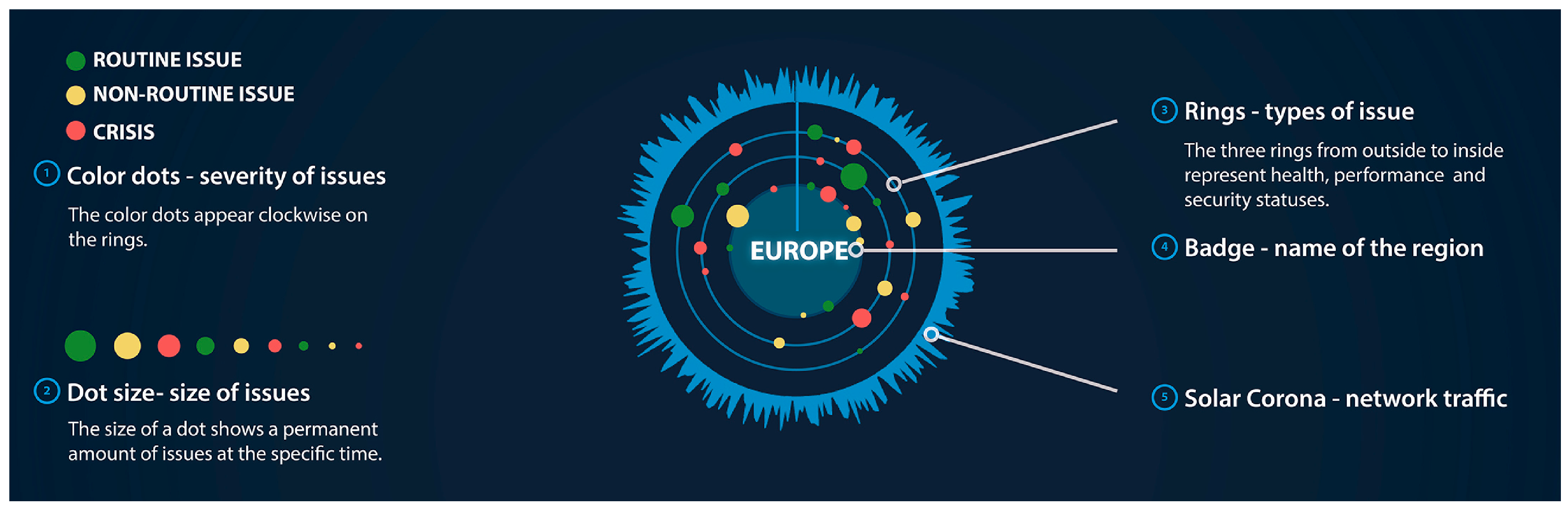
  • Center: The network’s region is represented by the wheel position in the overall display, and the name of the region is attached on a badge in the wheel’s center.
  • Rings: Three rings surround each wheel show statuses of security, health, and performance. Based on the priority of different statuses, we adjust the security, health, and performance from inner rings to the outer ring.
  • Dots: Dots on different rings represent the issues at different status types. To differentiate the severity and volume of issues, we used green, yellow, and red to label routine issues, non-routine issues, and crises, respectively. Different radii show the volume of issues on a ring with a particular severity (e.g., the number of networks/computers affected) [28]. Furthermore, a dot will change to half-transparent if the issue has been assigned to an analyst and is under investigation.
  • Corona: The outside corona curve of the wheel corresponds to network traffic. Longer rays signify higher volumes of traffic.
To show the real-time network status, all issue dots rotate slowly along the wheel in a clockwise direction. As time goes on, new dots appear and old dots fade out. The full circle represents a one day period or other length unit. This enables the analyst to see both the current status and the history record.
SolarWheels uses different sizes to show the network size of a region or subregion (Figure 4). At the overview level, each region is represented by one SolarWheel with the same color and motion but of different sizes and positions. One SolarWheel may be split into several smaller SolarWheels to represent its subregions. The SolarWheel graph makes use of the aforementioned metaphors while continuously and logically presenting the network data overview. Nevertheless, as we can see from the layout of the display screen, detailed information such as date, time, main analyst, number of resolved issues, and number of unresolved issues are placed at the top of the display to attract the user’s attention. Overall, the current design realized the design intents by helping users efficiently sense, read, understand, and interpret the network status data.

3.4. Interaction Design Inspired by Physical and Functional Affordances

In our normal daily lives, we can regularly observe people taking a “close look” at a point of interest. An analyst sees the overview of the entire scope when s/he is situated at a distance from the display screen. When s/he is interested and wants to read more detailed information, the analyst will move closer to the display. As early as 1998, Ishii et al. [29] envisioned that the physical architectural space we inhabit is a new form of interface between humans and digital information. When an analyst is working in a control room, the working environment should facilitate the connection of human perception and intended interaction, which links up the control room with the task of cybersecurity investigation. To interact with a large display screen, we referred to what previous researchers have proposed [30] as zones of communication: Ambient, Notification, and Interaction zones. They allow analysts to layer their context-aware interactions by walking closer to the display screen on the axes of informal to direct, implicit to explicit, and peripheral to focused attention. With such physical interactions in a multiuser workspace, the analyst can read details in a focused spot, while other analysts can still see the overview status.
The action of “walking closer” is identified based on distance-dependent semantics in the interactive space; a system reacts per the surrounding spatial conditions [30]. Here this means the distance between the display system and the users. As a design project, we did not focus on technological solutions. However, the designed interactions can be realized through technologies such as depth sensing, gesture recognition, and eye-gaze detection by incorporating Microsoft Kinect sensor(s) (each supports recognition of up to six people within 8 meters of distance), a RFID™ reader (capable of identifying exactly who is accessing the system), and eye-tracking module(s) (e.g., NUIA™ eyeCharm compatible with Kinect).
The design details of each zone are as follows:
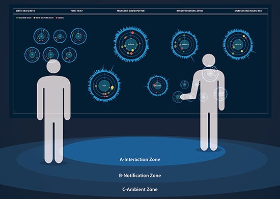
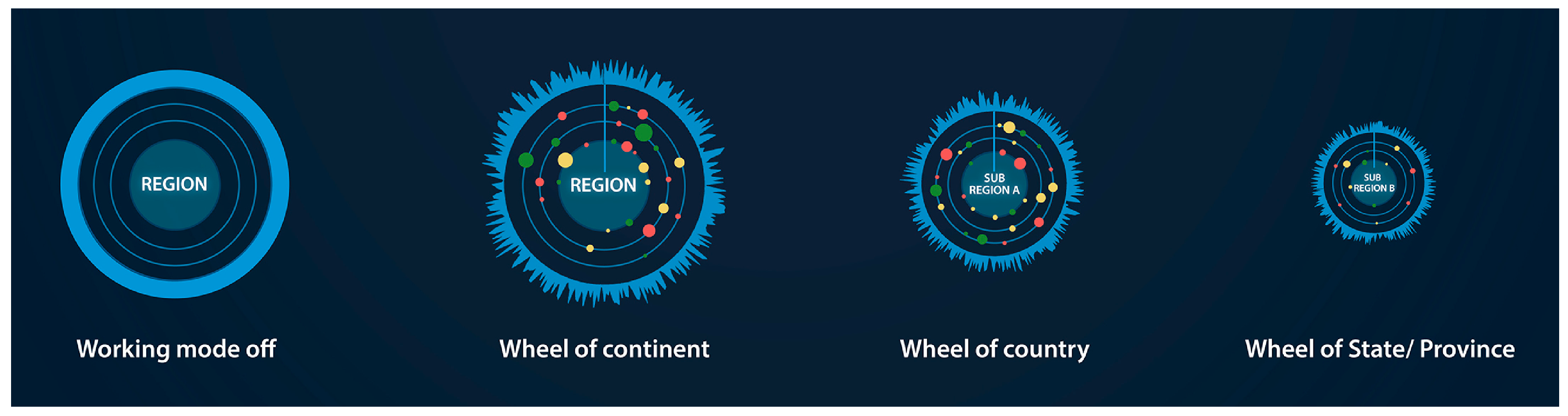
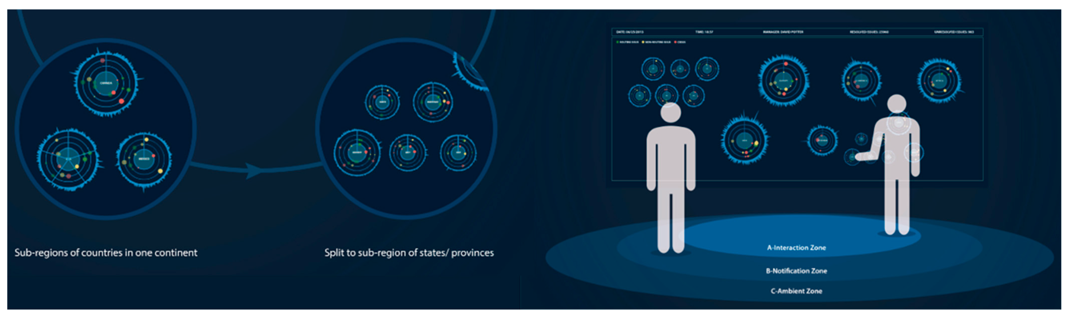
  • Ambient Zone (beyond 5 m): When an analyst is standing in this zone, s/he has an overview of the entire computer network from the highest level of a hierarchy: the network status of six continents and one headquarter (Figure 5). Even if the screen has enough space to show more detail, it is not useful for users because the human eye has limited visual acuity to measure spatial resolution. With normal vision, a person can distinguish objects that are 1.75 mm apart within a distance of 6 m. In a large control room, it is ineffective to display highly detailed information for audiences at a distance greater than 6 m. Additionally, although human binocular vision can see about 120°, the visual angle of reading detailed information is limited by the fovea, which covers only 5° of the field of vision [27]. Therefore, at a distance of 5 m, the optimum size of one SolarWheel is around 0.43 m. One large SolarWheel should be able to instantly and effectively communicate to the users.
  • Notification Zone (1 to 5 m): When the analyst steps into this zone, a two-step transition will take place on the SolarWheel to which the analyst is attending. A Microsoft Kinect can easily detect the analyst’s distance and walking/facing angle to the screen. When the user first touches the boundary, the attended SolarWheel will split into several slices representing its subregions, for example, Canada, United States, and Mexico in North America (Figure 6, left image). This transition provides a clear hint to the user that walking will cause the display to change. As the user continues to walk toward the screen, the three sectors expand into three smaller wheels to show the detailed network status for all subregions (Figure 6, right image). A similar two-step transition will occur when the analyst steps closer (moving toward the interaction zone) to the display driven by the intention to investigate a certain issue, for example, in the United States (Figure 7, left image). Its SolarWheel will first split into the following sectors: Midwest, Northeast, South, East, and West. Once he completely enters the Interaction Zone, the expanded five slices will split into five smaller wheels, showing the relevant network status and preparing for the analyst’s investigation or examination via direct interaction (Figure 7, right image).
  • Interaction Zone (within touch distance to the display): In this zone, the analyst can directly interact with the wheels and get more detailed information about a certain issue by touching the display screen. If one analyst is working on one issue, the dot will become half-transparent. Other analysts can still see the issue, but they need not pay attention since they are aware that another analyst is attending to it. This design enables social translucence [31] by making analyst activities visible to others. To maintain situational awareness, analysts’ activities should be transparent among an analytics staff. Once the issue has been addressed, the dot becomes a ring. Thus, other analysts will know that there was an issue under investigation that has been mitigated. A touch on the dot will cause a figure to narrate detailed descriptions (Figure 8). To assign and solve the issue, the analyst touches the “message” icon to send a request to the corresponding personnel.
When the analyst moves away from the screen, the split SolarWheels will merge into the parent region as one wheel. The analyst may choose to monitor one specific subregion if something is important enough to review or investigate. The analyst can lock the wheel by pinning it when he is in the interaction zone. The locked region(s) will be continuously monitored without collapsing to the parent SolarWheel. However, the other subregions will merge normally. Among the ten adjustable properties of visual representations that can improve the cognitive interaction process [32], the property “fragmentation” is closely related to the physical interaction design of SolarWheels. Fragmentation describes the degree to which information items are broken up, discretized, and encoded into non-continuous areas [32]. Allowing users to adjust visualization fragmentation during the interaction can facilitate the information interpretation [33]. In the context of SolarWheels, there are three levels of information “fragmentation,” and an analyst adjusts the level with natural physical movements to pay attention, read closely, and investigate more details.
The display supports concurrent, multiple-user investigation. As depicted in Figure 7, multiple users can interact with different SolarWheels in any zone. One analyst could assign an issue for Canada in the Interaction Zone, while another enters the Notification Zone to view six split Headquater SolarWheels. If two analysts are paying attention to the same SolarWheel, priority is given to the analyst closest to the display.
With the proposed visualization and interaction features, SolarWheels not only visualize hierarchical computer networks, but also integrate analysts’ natural behaviors as interactions in a multiuser environment to enhance user experience in the physical cybersecurity control room environment.

4. Evaluation and Discussion

There has been a growing interest in evaluating an information visualization technique by measuring its usability and user experience [34,35]. Among the large variety of usability evaluation approaches, it is difficult to determine which is the most effective, and in what ways and for what purposes [36]. Zuk et al. [37] suggested that one major benefit of heuristic evaluation is that it helps designers find important classes of problems that are not always found with user testing. In the absence of a fully functioning system, heuristic evaluation is helpful and efficient for demonstrating and improving the designed system’s capability. In a heuristic evaluation, expert evaluators examine the interface and interaction flow, and then judge its compliance with recognized usability principles. The recruitment of experienced evaluators and the selection of related design principles are crucial [38]. Our evaluation was inspired by heuristic evaluation and aims to gain expert advice along with a set of user experience guidelines.
We were fortunate to have a group of domain-specific experts to provide heuristic evaluation data to assess SolarWheels’ design. In the VAST 2013 Challenge, each submission received review feedback from six expert reviewers (identified as R1–R6) organized by the challenge committee, which provided a great source of expert critique and evaluation. Five of the reviewers had Ph.D. degrees in InfoVis, visual analytics, or cybersecurity visualization. Among them, two were university professors and three were senior scientists from national laboratories. The other reviewer was a professor in Visual Communication Design with a Master of Fine Arts (MFA) degree (the terminal degree in the design field). All of the reviewers had extensive experience in evaluating InfoVis applications. They examined the submissions for approximately two and a half weeks. For each submission, they analyzed the entire system design based on three specific criteria (scalability, effectiveness, and creativity) and one overall criterion. The reviewers gave a score (poor, average, good, or excellent) for each criterion and wrote detailed feedback notes on each criterion to explain their evaluation. The committee identified award winners based on reviewer comments and scores. The review reports (over 3800 words in length) have been highly valuable to us. Using these reports, we tried to seek new perspectives from related theories and explorations. We integrated Nielsen’s heuristics and other related design principles to develop a new evaluation framework to assess the interaction design, visual design, and in particular the user experience aspect of this information display.
While some principles, such as information capacity, representational fidelity, aesthetic emphasis, and comprehension are commonly used in evaluating visualization systems, these principles can only partially assess interaction design and user experience. In order to select proper principles for evaluating the information display design, we reviewed the research literature, especially in the areas of ambient information design and interactive displays. Pousman and Stasko [10] identified four design dimensions of ambient systems: information capacity, notification level, representational fidelity, and aesthetic emphasis [10]. Vogel et al. [39] discussed eight principles for conceptualizing a system for public ambient display interaction: calm aesthetics, comprehension, notification, short-duration fluid interaction, immediate usability, shared use, combining public and personal information, and privacy [39]. The SolarWheels system received high scores on the three specific criteria of scalability, effectiveness, and creativity. To assess the interaction design and user experience aspects of the system, we chose a different assessment dimension. Based on Hartson’s structure of four-layer affordance [23]—sensory, cognitive, physical, and functional affordance—we grouped principles from Pousman and Stasko [10] and Vogel et al. [39] to construct a new user-experience affordance evaluation framework. After coding reviewer comments multiple times, we highlighted, grouped, and reported the strengths and weaknesses of SolarWheels as follows.

4.1. Sensory Affordance: Aesthetic Emphasis and Representational Fidelity

Sensory affordance focuses on enabling the user in sensing a stimulus [23]. In an information design system like SolarWheels, the sensory affordance enables the user to see and distinguish different visual elements for the represented information, such as issues and anomalies of various priority levels. The aesthetics of visual design should be appealing, and the visual representations should allow analysts to efficiently read the data. SolarWheels’ simple and clear solar metaphor, composed of concentric rings with running dots in different colors, creates a visually appealing and memorable design with good sensory affordance.
Strength: According to R1 and R3, the concept of SolarWheels is “very creative using a familiar metaphor” and “visually striking and quite memorable.” R6 concurred that the design quality was “beautifully done and the paradigm was extremely creative and achieved the spirit of this challenge.”
Weakness: R2 pointed out that “the design provides very limited awareness of the network and sends the operation center with few cues that enable them to motivate actions.” R6 suggested scaling up circular histograms since the current resolution could be poor.

4.2. Cognitive Affordance: Notification Level and Information Capacity

Cognitive affordance is a design feature that “helps, aids, supports, facilitates, or enables thinking and/or knowing about something” [23]. SolarWheels’ cognitive affordance should support analysts’ awareness of the overall network status. On the one hand, the visualization should be capable of representing a very high volume of information. On the other hand, the user should have minimum cognitive burden to read and interpret the information. SolarWheels employs cognitive affordances through a clear separation of network status data with different colors and screen locations, including concentric rings, various colors, and sizes. Therefore, the encoded information of graphical elements is unambiguous.
Strength: R3 wrote that “…it should be fairly easy for most people to understand and use even if they did not have an extensive network security background.” R1 specifically mentioned that “the wrapping of a network activity chart as a “corona” around a circular network issue display is especially effective. R5 considered that the design concept balances the size of the network with a complexity of represented events. Larger networks and more-complex event scenarios should be judged less strictly than smaller networks with simpler complex event scenarios. The system is able to “differentiate between events, which require normal maintenance and events that are critical threats.” R6 mentioned that SolarWheels can also “support the understanding of connections between events and their locations within the computer network.”
Weakness: Noted by R2, “this approach creates potentially artificial barriers to understanding the operations of the networks…, the only nouns on the main display are geographic areas, terms that may have little value in a global distributed network.” We agree that there requires a learning process for the analysts to be familiar with the network operations, but we believe that proper geographic tags are necessary because they serve as the “contextual information.”

4.3. Physical Affordance: Physical Movement and Immediate Feedback

Physical affordance “helps, aids, supports, facilitates, or enables physically doing something” [23]. In SolarWheels, we translated user movements toward the screen into an intention to display further details. The display’s immediate response to users’ movements provides physical affordance to the user.
Strength: According to R5, SolarWheels affords “levels of zoom,” allowing users to gain more information when needed. R1, R4, and R6 are very excited by this innovative interaction approach and commented that “it is very nicely done.” R1 and R5 stated that linking the visual display to an interactive approach from the ambient displays continuity, and using the notification-ambient zones, is a creative and divergent approach to big-display utilization. According to R3, the design emphasized “interactive analysis and nicely demonstrated how it could be used for situational awareness in multiple scenarios and contexts.”
Weakness: R3 pointed out that SolarWheels’ auto-layout dependence on viewer distance may be problematic. “An analyst may in fact want to address issues pertinent to full regions, but the display carries the assumption that this is not so.” Users may be inclined not to get too close to avoid having the display explode into sub-galaxies. This would affect the ability to perform an effective analysis. A persistent base layout may be necessary for the practical reason of predicting results when trying to use the display with multiple users.

4.4. Functional Affordance: Learn by Exploration, Shared Use, and Fluid Interaction

Function affordance aims to aid “the user in doing something” [23]. It gives users the ability to access functionalities, which denotes high-level user enablement. The design provides multiple users the convenience to stand together in front of the display to explore, discuss, and assign tasks. The levels of zoom help users to operate on information in detail.
Strength: R1 indicated that the design scales well for situational awareness. R2 and R5 stated that the size of the network is sufficiently large, and the event represented in the network—in terms of diversity or interaction—is sufficiently complex. The minimalist abstraction approach can be successfully incorporated into the visual grammar of network operations center designs; R2 said that one can “imagine a great outcome” after multiple design iterations.
Weakness: R2 claimed that “It doesn’t capitalize on a large surface to bring a larger volume of decision-critical information to the surface… Critical events such as Distributed Denial-of-service (DDOS) attacks are not named or prioritized.” R4 said: “This is a great virtue when very large networks are being observed, but this approach does not offer any new insight into the representation of high-scale networks.” R3 thinks that “…the system cannot show connections between events and fails to tag suspicious malicious activities.” R4 believes that the system still lacks a temporal dimension because, in the system, solved issues would disappear once solved.” To address R4’s comment, the system can house all the issues—current, under investigation, and solved—for a period of time that depends on the length of time represented by a full circle.

5. Conclusions

SolarWheels’ was presented at the VIS 2013 Conference and was awarded the “Outstanding Creative Design” recognition by the VAST 2013 Challenge Committee [28]. To design the information visualization, we did not only consider visual representations; we also took into account the specific physical environment and possible user actions within the environment. The visualization design conveys simultaneous relationships among numerous elements. The context-aware interaction can enhance user experience by making use of the natural human desire to “take a closer look”.
Domain experts have comprehensively assessed our design. To further improve the system and theory, we will need to conduct an empirical user-study to fully understand users’ behaviors and the consequences of the system’s response in a complex, multi-user control room. For example, will one person’s forward motion potentially disrupt the overview preferred by other analysts? How does the system handle multiple users looking at the same spot but from different distance? A user-study would provide evidence to address these research objectives.
The SolarWheels visualization concept and ambient interaction metaphor received both acclaims and critiques. How are we to label the crisis issue dots properly? How do we visualize the causality among events? How much history do we want to provide in the display design? Which features a more interactive drilling down: auto-layout or persistent base layout? Do we want to incorporate the capacity for a group of analysts to stand in front of the display together and discuss? Many directions for future research were suggested by VAST’s 2013 Challenge review process.
The objective behind SolarWheels was to find an effective method to inspire and evaluate information visualization designs, especially in terms of interaction. Based on the affordance definitions reviewed from the design literature, we synthesized a four-layer affordance-based framework. This framework guided the design of innovative user experiences in SolarWheels and served as a useful evaluation framework for situational awareness information displays. There are two directions in which to conduct future research. From the system design perspective, we will implement the system prototype with cybersecurity datasets and evaluate the interaction design based on the affordance layers. As for theory development, a future extension of this framework is desirable to develop comprehensive details from the cognitive perspective and clear design guidelines to be adopted in other InfoVis and Visual Analytics system designs.

Acknowledgments

The project is supported by the Department of Computer Graphics Technology and the Department of Art and Design at Purdue University, USA. Special thanks to Jack Shen-kuen Chang, Shuang Wei, Marlen Promann, and Yue Ma, who participated in SolarWheels’ design and development. Our sincere thanks also to the six reviewers from the IEEE 2013 VAST challenge committee, who provided us with detailed, helpful comments on our project.

Author Contributions

Yingjie Victor Chen led this design project, contributed key ideas, and implemented the prototype of SolarWheels. Zhenyu Cheryl Qian led the interface and interaction design, and conducted the evaluation data analysis. Weiran Tyki Lei designed the details of interface and interaction, and participated in the manuscript drafting.

Conflicts of Interest

The authors declare no conflict of interest.

References

  1. Barford, P.; Dacier, M.; Dietterich, T.G.; Fredrikson, M.; Giffin, J.; Jajodia, S.; Jha, S.; Li, J.; Liu, P.; Ning, P.; et al. Cyber SA: Situational awareness for cyber defense. In Cyber Situational Awareness: Issues and Research; Jajodia, S., Liu, P., Swarup, V., Wang, C., Eds.; Springer: New York, NY, USA, 2010; pp. 3–13. [Google Scholar]
  2. Endsley, M.R. Toward a theory of situation awareness in dynamic systems. Hum. Factors J. Hum. Factors Ergon. Soc. 1995, 37, 32–64. [Google Scholar] [CrossRef]
  3. Best, D.M.; Bohn, S.; Love, D.; Wynne, A.; Pike, W.A. Real-time visualization of network behaviors for situational awareness. In Proceedings of the Seventh International Symposium on Visualization for Cyber Security, New York, NY, USA, 14 September 2010; pp. 79–90.
  4. Stockman, N.; Vamvoudakis, K.G.; Devendorf, L.; Höllerer, T.; Kemmerer, R.; Hespanha, J.P. A Mission-centric Visualization Tool for Cybersecurity Situation Awareness; U.S. Army Research Office: Research Triangle Park, NC, USA, 2012. [Google Scholar]
  5. Matuszak, W.J.; DiPippo, L.; Sun, Y.L. CyberSAVe: Situational awareness visualization for cybersecurity of smart grid systems. In Proceedings of the Tenth Workshop on Visualization for Cyber Security, Atlanta, GA, USA, 14 October 2013; pp. 25–32.
  6. VAST Challenge 2013: Mini-Challenge 2: Situation Awareness Display Design. Available online: http://vacommunity.org/VAST+Challenge+2013%3A+Mini-Challenge+2 (accessed on 1 November 2015).
  7. Cook, K.A.; Grinstein, G.; Whiting, M.; Cooper, M.; Havig, M.; Liggett, K.; Nebesh, B.; Paul, C.L. VAST challenge 2012: Visual analytics for big data. In Proceedings of the IEEE Conference on Visual Analytics Science and Technology, Seattle, WA, USA, 14–19 October 2012; pp. 151–155.
  8. Fukasawa, N. Naoto Fukasawa; Phaidon: London, UK, 2007. [Google Scholar]
  9. Norman, D.A. The Psychology of Everyday Things; Basic Books: New York, NY, USA, 1988. [Google Scholar]
  10. Pousman, Z.; Stasko, J. A taxonomy of ambient information systems: Four patterns of design. In Proceedings of the Working Conference on Advanced Visual Interfaces, Venezia, Italy, 23–26 May 2006; pp. 67–74.
  11. Card, S.K.; Mackinlay, J.; Shneiderman, B. Readings in Information Visualization: Using Vision to Think; Morgan Kaufmann: San Francisco, CA, USA, 1999. [Google Scholar]
  12. Doerr, C.U.; Kuester, F. CGLX: A Scalable, high-performance visualization framework for networked display environments. IEEE Trans. Visual. Comput. Graph. 2011, 17, 320–332. [Google Scholar] [CrossRef] [PubMed]
  13. Auber, D.; Archambault, D.; Bourqui, R.; Lambert, A.; Mathiaut, M.; Mary, P.; Delest, M.; Dubois, J.; Mélançon, G. The Tulip 3 Framework: A Scalable Software Library for Information Visualization Applications based on Relational Data; Research Report, RR-7860; Institut National de Recherche en Informatique et en Automatique (INRIA): Rocquencourt, France, 2012. [Google Scholar]
  14. Wu, Y.; Liu, X.; Liu, S.; Ma, K.L. ViSizer: A Visualization Resizing Framework. IEEE Trans. Visual. Comput. Graph. 2013, 19, 278–290. [Google Scholar]
  15. Faisal, S.; Craft, B.; Cairns, P.; Blandford, A. Internalization, qualitative methods, and evaluation. In Proceedings of the 2008 Workshop on Beyond Time and Errors: Novel Evaluation Methods for Information Visualization, Florence, Italy, 5–10 April 2008; p. 5.
  16. Pousman, Z.; Stasko, J.T.; Mateas, M. Casual Information Visualization: Depictions of Data in Everyday Life. IEEE Trans. Visual. Comput. Graph. 2007, 13, 1145–1152. [Google Scholar] [CrossRef] [PubMed]
  17. Liu, S.; Cui, W.; Wu, Y.; Liu, M. A Survey on Information Visualization: Recent Advances and Challenges. Visual Comput. 2014, 30, 1–21. [Google Scholar] [CrossRef]
  18. Sedlmair, M.; Meyer, M.; Munzner, T. Design Study Methodology: Reflections from the Trenches and the Stacks. IEEE Trans. Visual. Comput. Graph. 2012, 18, 2431–2440. [Google Scholar] [CrossRef] [PubMed]
  19. Pike, W.A.; Stasko, J.; Chang, R.; O’Connell, T.A. The Science of Interaction. Inform. Visual. 2009, 8, 263–274. [Google Scholar] [CrossRef]
  20. Ursyn, A. Aesthetic Expectations for Information Visualization. Int. J. Creat. Interfaces Comput. Graph. 2010, 1, 19–39. [Google Scholar] [CrossRef]
  21. Gibson, J.J. The concept of affordances. In Perceiving, Acting, and Knowing: Toward an Ecological Psychology; Bransford, J.D., Ed.; Lawrence Erlbaum Associate: Hillsdale, NJ, USA, 1977; pp. 67–82. [Google Scholar]
  22. Norman, D.A. The Design of Future Things; Basic Books: New York, NY, USA, 2009. [Google Scholar]
  23. Hartson, R. Cognitive, Physical, Sensory, and Functional Affordances in Interaction Design. Behav. Inform. Technol. 2003, 22, 315–338. [Google Scholar] [CrossRef]
  24. Maier, J.R.; Fadel, G.M.; Battisto, D.G. An Affordance-based Approach to Architectural Theory, Design, and Practice. Des. Stud. 2009, 30, 393–414. [Google Scholar] [CrossRef]
  25. Müller, J.; Walter, R.; Bailly, G.; Nischt, M.; Alt, F. Looking glass: A field study on noticing interactivity of a shop window. In Proceedings of the ACM SIGCHI Conference on Human Factors in Computing Systems, Austin, TX, USA, 5–10 May 2012; pp. 297–306.
  26. Fukasawa, N. On “Affordance”: Looking at Naoto Fukasawa’s Chair. Available online: http://www.vitra.com/en-us/magazine/details/on-affordance (accessed on 17 March 2014).
  27. Schmidt, A. Interactive Context-aware Systems Interacting with Ambient Intelligence. In Ambient Intelligence; Riva, G., Vatalaro, F., Davide, F., Alcañiz, M., Eds.; IOS Press: Amsterdam, The Netherlands, 2005; pp. 159–178. [Google Scholar]
  28. Chang, J.S.; Lei, W.T.; Wei, S.; Promann, M.; Ma, Y.A.; Chen, Y.V.; Qian, Z.C. SolarWheels: An Interactive Situation Awareness Visual Display for Large-Scale Computer Networks. In Proceedings of IEEE Conference on Visual Analytics Science and Technology, Atlanta, GA, 13–18 October 2013.
  29. Ishii, H.; Wisneski, C.; Brave, S.; Dahley, A.; Gorbet, M.; Ullmer, B.; Yarin, P. ambientROOM: Integrating ambient media with architectural space. In Proceedings of CHI’ 98 Conference Summary on Human Factors in Computing Systems, Los Angeles, CA, USA, 18–23 April 1998; pp. 173–174.
  30. Streitz, N.A.; Röcker, C.; Prante, T.; Stenzel, R.; van Alphen, D. Situated Interaction with Ambient Information: Facilitating Awareness and Communication in Ubiquitous Work Environments. In Human-Centred Computing: Cognitive, Social, and Ergonomic Aspects; Harris, D., Duffy, V., Smith, M., Stephanidis, C., Eds.; Lawrence Erlbaum Associate: Hillsdale, NJ, USA, 2003; pp. 133–137. [Google Scholar]
  31. Erickson, T.; Kellogg, W.A. Social translucence: An approach to designing systems that support social processes. ACM Trans. Comput. Hum. Interact. 2000, 7, 59–83. [Google Scholar] [CrossRef]
  32. Parsons, P.; Sedig, K. Adjustable Properties of Visual Representations: Improving the Quality of Human–Information Interaction. J. Ass. Inform. Sci. Technol. 2014, 65, 455–482. [Google Scholar] [CrossRef]
  33. Olive, J. Computer Tools for Interactive Mathematical Activity in the Elementary School. Int. J. Comput. Math. Learn. 2000, 5, 241–262. [Google Scholar] [CrossRef]
  34. Cawthon, N.; Moere, A.V. A conceptual model for evaluating aesthetic effect within the user experience of information visualization. In Proceedings of Tenth International Conference on Information Visualisation, London, UK, 5–7 July 2006; pp. 374–382.
  35. Freitas, C.M.D.S.; Pimenta, M.S.; Scapin, D.L. User-Centered Evaluation of Information Visualization Techniques: Making the HCI-InfoVis Connection Explicit. In Handbook of Human Centric Visualization; Huang, W., Ed.; Springer: New York, NY, USA, 2014; pp. 315–336. [Google Scholar]
  36. Plaisant, C. The challenge of information visualization evaluation. In Proceedings of the Working Conference on Advanced Visual Interfaces, Gallipoli, Italy, 25–28 May 2004; pp. 109–116.
  37. Zuk, T.; Schlesier, L.; Neumann, P.; Hancock, M.S.; Carpendale, S. Heuristics for information visualization evaluation. In Proceedings of the 2006 AVI Workshop on Beyond Time and Errors: Novel Evaluation Methods for Information Visualization, Venezia, Italy, 23–26 May 2006; pp. 1–6.
  38. Nielsen, J.; Molich, R. Heuristic evaluation of user interfaces. In Proceedings of the SIGCHI Conference on Human Factors in Computing Systems, Seattle, WA, USA, 1–5 April 1990; pp. 249–256.
  39. Vogel, D.; Balakrishnan, R. Interactive public ambient displays: Transitioning from implicit to explicit, public to personal, interaction with multiple users. In Proceedings of the 17th Annual ACM Symposium on User Interface Software and Technology, Santa Fe, NM, USA, 24–27 October 2004; pp. 137–146.
Figure 1. Brainstorming visualization design ideas.
Informatics 03 00006 g001
Figure 2. Design iterations of the circular prototype.
Informatics 03 00006 g002
Figure 3. Single SolarWheel visualization.
Informatics 03 00006 g003
Figure 4. SolarWheels of different hierarchical scales.
Informatics 03 00006 g004
Figure 5. The analyst stands in the ambient zone.
Informatics 03 00006 g005
Figure 6. Physical movement and visualization transformation from the Ambient Zone to the Notification Zone.
Informatics 03 00006 g006
Figure 7. Physical movement and visualization transformation from the Notification Zone to the Interaction Zone.
Informatics 03 00006 g007
Figure 8. Investigation of an issue through direct interaction.
Informatics 03 00006 g008

