The Influence of Typography on Algorithms that Predict the Speed and Comfort of Reading


Abstract
1. Introduction
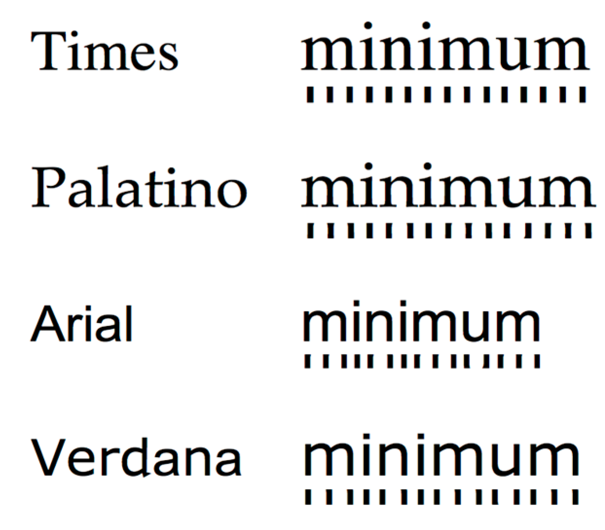
2. Horizontal Spatial Periodicity
3. Study 1
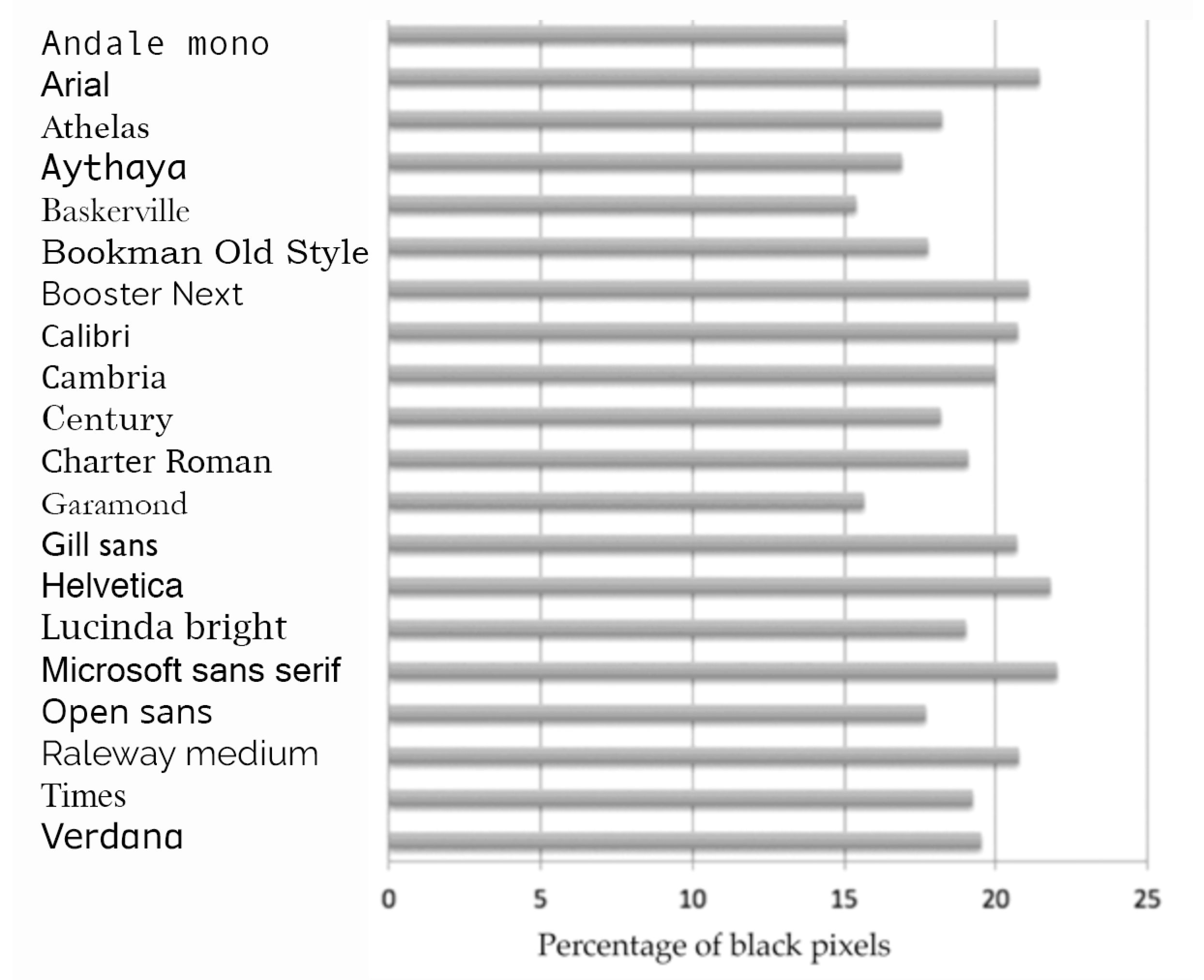
3.1. Comparison of 20 Fonts
3.1.1. Procedure
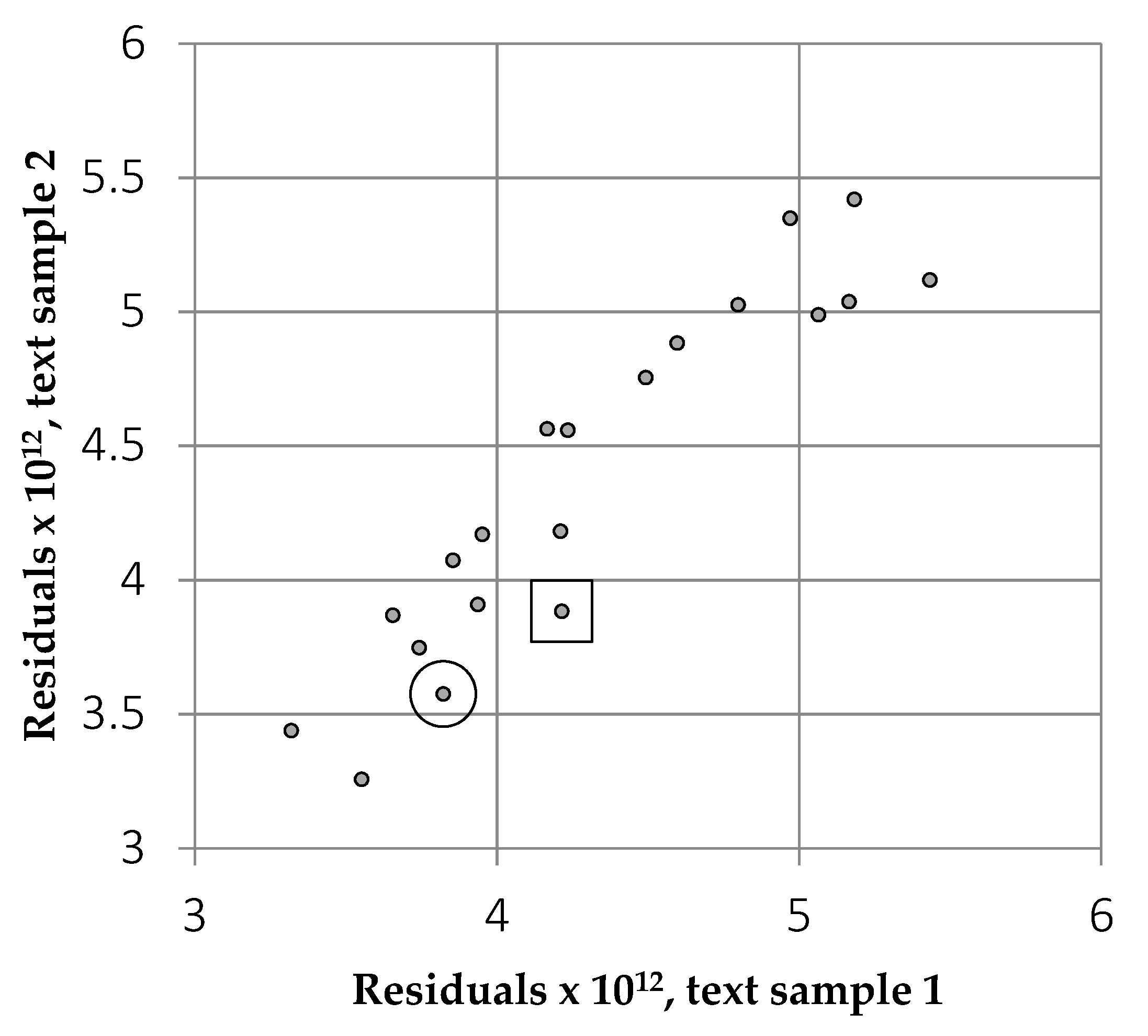
3.1.2. Results
3.1.3. Discussion
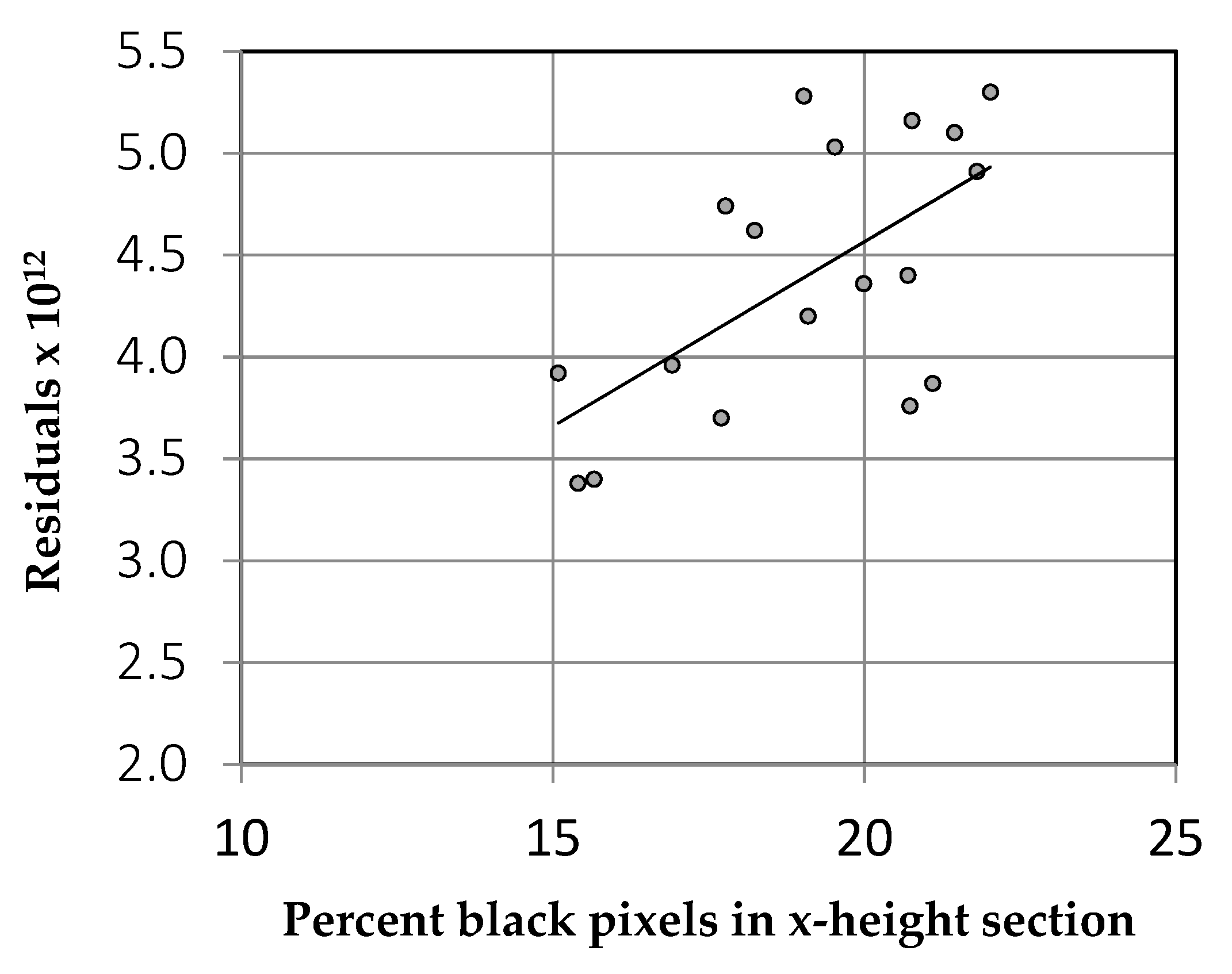
3.2. Serifs Versus Rhythm
3.3. Equating Empty Space
3.3.1. Procedure
3.3.2. Results
3.3.3. Discussion
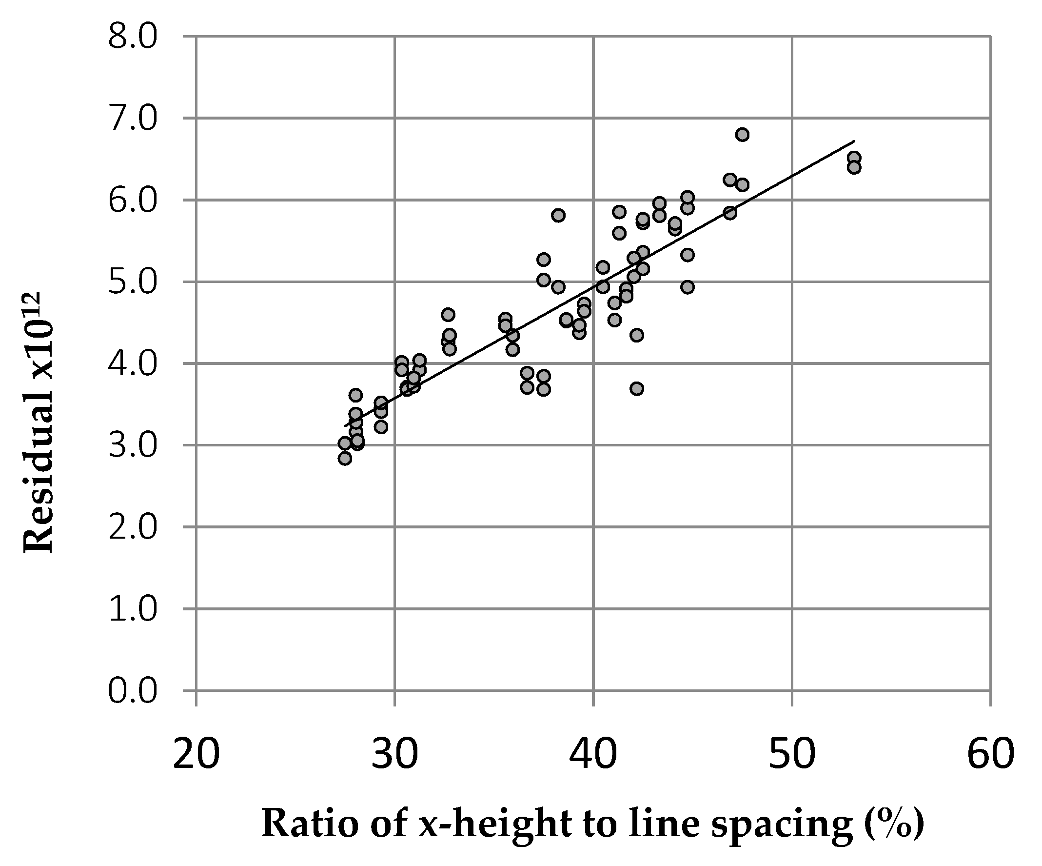
3.4. Horizontal Spacing
3.4.1. Font Compression and Expansion
3.4.2. Justification
4. Discussion of Study 1
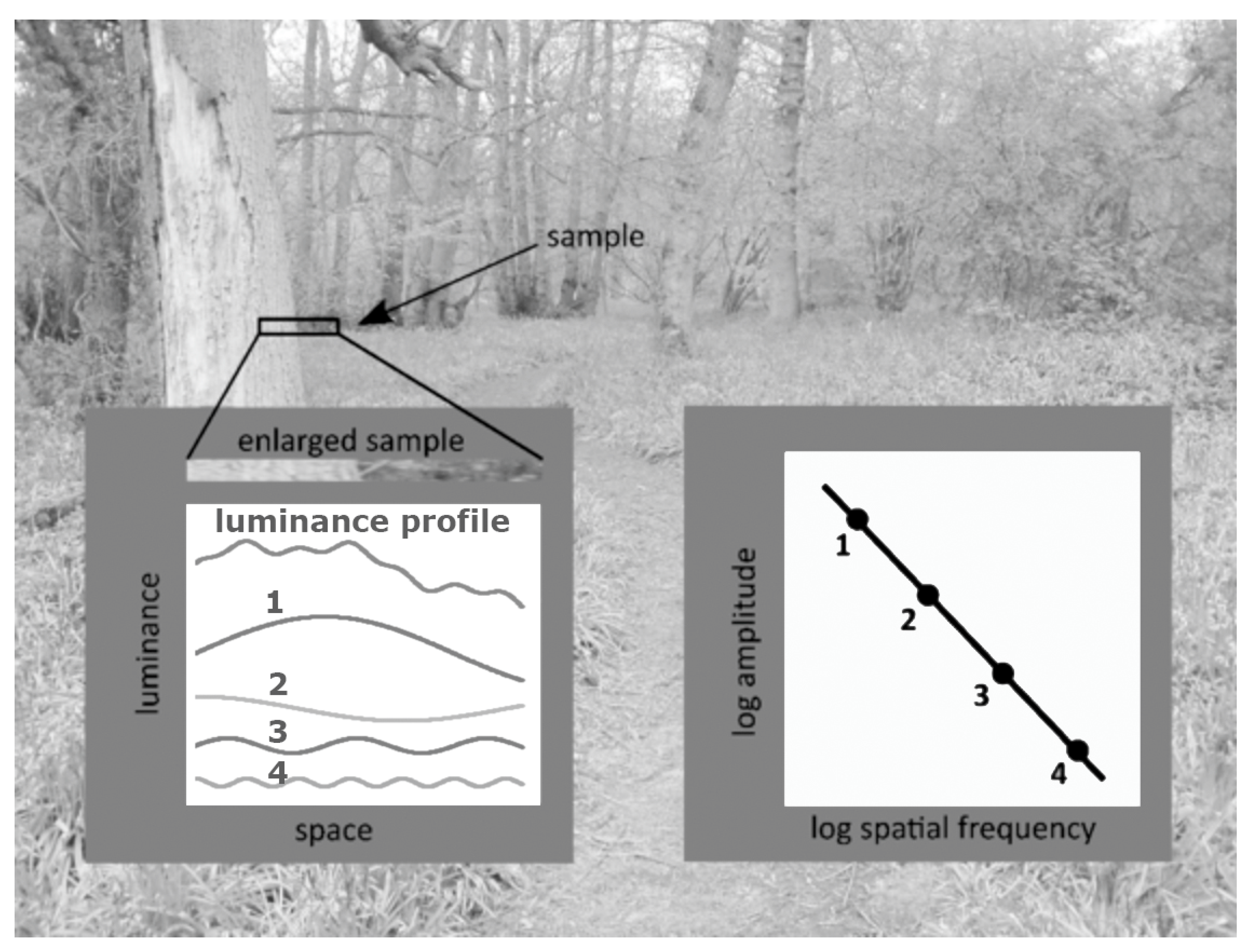
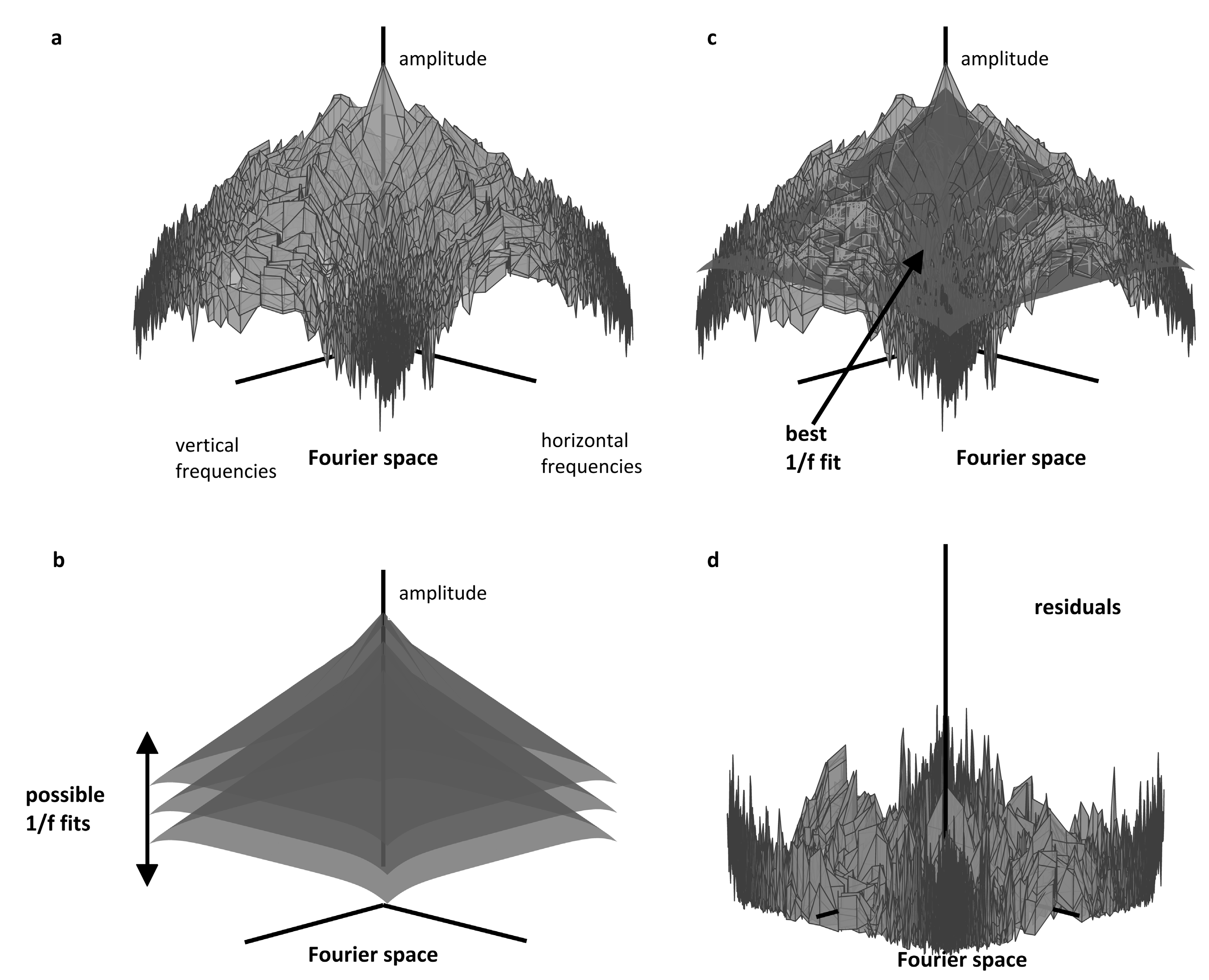
5. Vertical Spatial Periodicity
6. Study 2
6.1. Predicting Readers’ Choice of Text Characteristics
6.1.1. Participants
6.1.2. Procedure
6.1.3. Results
6.1.4. Discussion
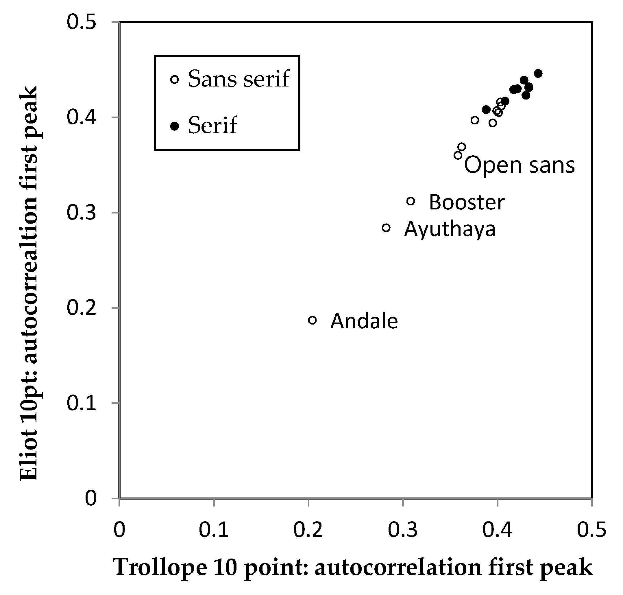
6.2. Fonts and the Algorithm Output
6.2.1. Procedure
6.2.2. Results
6.2.3. Discussion
6.3. Font Weight
6.3.1. Procedure
6.3.2. Results
7. General Discussion
8. Conclusions
Author Contributions
Funding
Acknowledgments
Conflicts of Interest
References
- Tinker, M.A. Legibility of Print; Iowa State University Press: Ames, IA, USA, 1963. [Google Scholar]
- Legge, G.E. Psychophysics of Reading in Normal and Low Vision; Lawrence Erlbaum Associates Inc.: Mahwah, NJ, USA, 2007; ISBN 0-8058-4328-0. [Google Scholar]
- Legge, G.E.; Bigelow, C.A. Does print size matter for reading? A review of findings from vision science and typography. J. Vis. 2011. [Google Scholar] [CrossRef] [PubMed]
- Williamson, H. Methods of Book Design; Yale University Press: New Haven, CT, USA, 1983; ISBN 9780300030358. [Google Scholar]
- Arditi, A.; Cho, J. Serifs and font legibility. Vis. Res. 2005. [Google Scholar] [CrossRef] [PubMed]
- Beier, S.; Larson, K. How does typeface familiarity affect reading performance and reader preference? Inf. Des. J. 2013. [Google Scholar] [CrossRef]
- Weaver, D.F. Font specific reading-induced seizures. Clin. Neurol. Neurosurg. 2014, 125, 210–211. [Google Scholar] [CrossRef]
- Wilkins, A.J.; Smith, J.; Willison, C.K.; Beare, T.; Boyd, A.; Hardy, G.; Mell, L.; Peach, C.; Harper, S. Stripes within words affect reading. Perception 2007, 36. [Google Scholar] [CrossRef]
- Liversedge, S.P.; White, S.J.; Findlay, J.M.; Rayner, K. Binocular coordination of eye movements during reading. Vis. Res. 2006, 46, 2363–2374. [Google Scholar] [CrossRef]
- Jainta, S.; Jaschinski, W.; Wilkins, A.J. Periodic letter strokes within a word affect fixation disparity during reading. J. Vis. 2010, 10, 2. [Google Scholar] [CrossRef]
- Perea, M. Why does the APA recommend the use of serif fonts? Psicothema 2013. [Google Scholar] [CrossRef]
- Slattery, T.J.; Yates, M.; Angele, B. Interword and interletter spacing effects during reading revisited: Interactions with word and font characteristics. J. Exp. Psychol. Appl. 2016. [Google Scholar] [CrossRef]
- Wilkins, A.J. Visual Stress; Oxford Psychology Series; Oxford University Press: Oxford, UK, 1995. [Google Scholar]
- Wilkins, A.; Nimmo-Smith, I.A.N.; Tait, A.; McManus, C.; Sala, S.D.; Tilley, A.; Arnold, K.; Barrie, M.; Scott, S. A neurological basis for visual discomfort. Brain 1984, 107. [Google Scholar] [CrossRef]
- Braithwaite, J.J.; Broglia, E.; Bagshaw, A.P.; Wilkins, A.J. Evidence for elevated cortical hyperexcitability and its association with out-of-body experiences in the non-clinical population: New findings from a pattern-glare task. Cortex 2013, 49. [Google Scholar] [CrossRef] [PubMed]
- Wilkins, A.J.; Nimmo-Smith, M.I. The clarity and comfort of printed text. Ergonomics 1987. [Google Scholar] [CrossRef] [PubMed]
- Wilkins, A.J.; Nimmo-Smith, I. On the reduction of eye-strain when reading. Ophthalmic Physiol. Opt. 1984, 4. [Google Scholar] [CrossRef]
- Tolhurst, D.J.; Tadmor, Y.; Chao, T. Amplitude spectra of natural images. Ophthalmic Physiol. Opt. 1992. [Google Scholar] [CrossRef]
- Field, D.J. What Is the Goal of Sensory Coding? Neural Comput. 1994, 6, 559–601. [Google Scholar] [CrossRef]
- Atick, J.J.; Redlich, A.N. What Does the Retina Know about Natural Scenes? Neural Comput. 1992, 4, 196–210. [Google Scholar] [CrossRef]
- Hibbard, P.B.; O’Hare, L. Uncomfortable images produce non-sparse responses in a model of primary visual cortex. R. Soc. Open Sci. 2015, 2. [Google Scholar] [CrossRef]
- Wilkins, A.J. A physiological basis for visual discomfort: Application in lighting design. Light Res. Technol. 2016, 48. [Google Scholar] [CrossRef]
- Juricevic, I.; Land, L.; Wilkins, A.; Webster, M.A. Visual discomfort and natural image statistics. Perception 2010, 39. [Google Scholar] [CrossRef]
- Fernandez, D.; Wilkins, A.J. Uncomfortable images in art and nature. Perception 2008, 37. [Google Scholar] [CrossRef]
- Penacchio, O.; Wilkins, A.J. Visual discomfort and the spatial distribution of Fourier energy. Vis. Res. 2015, 108. [Google Scholar] [CrossRef] [PubMed]
- McClelland, J.L.; Rumelhart, D.E. An interactive activation model of context effects in letter perception: I. An account of basic findings. Psychol. Rev. 1981. [Google Scholar] [CrossRef]
- Coltheart, M.; Rastle, K.; Perry, C.; Langdon, R.; Ziegler, J. DRC: A dual route cascaded model of visual word recognition and reading aloud. Psychol. Rev. 2001. [Google Scholar] [CrossRef] [PubMed]
- Davis, C.J. The spatial coding model of visual word identification. Psychol. Rev. 2010. [Google Scholar] [CrossRef] [PubMed]
- Grainger, J.; Jacobs, A.M. A Dual Read-Out Model of Word Context Effects in Letter Perception: Further Investigations of the Word Superiority Effect. J. Exp. Psychol. Hum. Percept. Perform. 1994. [Google Scholar] [CrossRef]
- Rayner, K. Eye Movements in Reading and Information Processing: 20 Years of Research. Psychol. Bull. 1998. [Google Scholar] [CrossRef]
- Bernard, J.B.; Castet, E. The optimal use of non-optimal letter information in foveal and parafoveal word recognition. Vis. Res. 2019. [Google Scholar] [CrossRef]
- Pelli, D.G.; Tillman, K.A.; Freeman, J.; Su, M.; Berger, T.D.; Majaj, N.J. Crowding and eccentricity determine reading rate. J. Vis. 2007. [Google Scholar] [CrossRef]
- Aurora, S.K.; Wilkinson, F. The brain is hyperexcitable in migraine. Cephalalgia 2007. [Google Scholar] [CrossRef]
- Crossland, M.D.; Silva, R.S.; Macedo, A.F. Smartphone, tablet computer and e-reader use by people with vision impairment. Ophthalmic Physiol. Opt. 2014. [Google Scholar] [CrossRef]
- Wilkins, A.; Cleave, R.; Grayson, N.; Wilson, L. Typography for children may be inappropriately designed. J. Res. Read. 2009, 32. [Google Scholar] [CrossRef]
- Bernard, J.B.; Aguilar, C.; Castet, E. A New Font, Specifically Designed for Peripheral Vision, Improves Peripheral Letter and Word Recognition, but Not Eye-Mediated Reading Performance. PLoS ONE 2016. [Google Scholar] [CrossRef] [PubMed]
- Cheong, Y.; So, R.H.; Wilkins, A.J. How vertical stripes affect recognition of Chinese characters. J. Vis. 2016, 16, 464. [Google Scholar] [CrossRef]
- Wilkins, A.J.; Kiff, I. On the clarity of the music stave. Psychol. Music 2015, 43, 870–880. [Google Scholar] [CrossRef]


© 2020 by the authors. Licensee MDPI, Basel, Switzerland. This article is an open access article distributed under the terms and conditions of the Creative Commons Attribution (CC BY) license (http://creativecommons.org/licenses/by/4.0/).
Share and Cite
Wilkins, A.; Smith, K.; Penacchio, O. The Influence of Typography on Algorithms that Predict the Speed and Comfort of Reading. Vision 2020, 4, 18. https://doi.org/10.3390/vision4010018
Wilkins A, Smith K, Penacchio O. The Influence of Typography on Algorithms that Predict the Speed and Comfort of Reading. Vision. 2020; 4(1):18. https://doi.org/10.3390/vision4010018
Chicago/Turabian StyleWilkins, Arnold, Katie Smith, and Olivier Penacchio. 2020. "The Influence of Typography on Algorithms that Predict the Speed and Comfort of Reading" Vision 4, no. 1: 18. https://doi.org/10.3390/vision4010018
APA StyleWilkins, A., Smith, K., & Penacchio, O. (2020). The Influence of Typography on Algorithms that Predict the Speed and Comfort of Reading. Vision, 4(1), 18. https://doi.org/10.3390/vision4010018